
At its core, X marketing requires conveying ideas in the fewest words, publishing multiple times a day, and actively engaging your audience.
As you grow, more dimensions are added to this equation. It gets more challenging and complicated. That’s why I’ve created this guide to help you crack the code for X marketing.
What is an X (formerly Twitter) marketing strategy?
An X marketing strategy is a plan centered around creating, publishing, and distributing content for your buyer personas, audience, and followers through X.
The goal of this type of strategy is to attract new followers and leads, boost conversions, improve brand recognition, and increase sales.
Creating an X marketing strategy will require you to follow the same steps you would if you were creating any other social media marketing strategy:
- Research your buyer personas and audience.
- Create unique and engaging content.
- Organize a schedule for your posts.
- Analyze your impact and results.
So, you might be wondering what makes X unique. Why would you want to actually invest the time in creating a profile and content for the platform? I’ll answer that below.
.png)
Free Twitter for Business Intro Kit
Master the essentials to better share, engage, and market on Twitter.
- Follower Growth Tracking Template
- Incorporating Visuals
- Twitter Analytics
- And More!
Download Free
All fields are required.
What makes X unique?
X is a great marketing tool for a number of reasons.
The platform:
- Is free to use.
- Expands your reach.
- Lets you provide quick customer service and support.
- Allows you to share and promote branded content in seconds
- Works as a search engine tool for you to search for your competitors.
- Can be used as a search engine tool for prospects to find and learn about your company.
- Allows you to converse with your followers, share the latest updates about your company, and address your audience.
Now that I’ve reviewed what an X marketing strategy is and what makes the platform unique, let’s cover the ways in which you can use X for your business.
These tips will help you boost conversions, create lasting relationships with your followers, and improve your brand awareness.
How to Use X (formerly Twitter) for Business
- Customize and brand your profile.
- Create X Lists.
- Host an X Chat.
- Advertise on X.
- Drive traffic to your website.
- Buy a premium subscription to get verified.
- Focus on building your follower count.
As you begin using X for your business, there are some steps you’ll want to take to ensure you reach your target audience.
Depending on your goals, company size, and industry, you may or may not choose to work through each of the following steps (or you may have already completed some of them), so tailor them to your needs.
Let’s learn how to use X for business to better share, engage, and market on the platform.
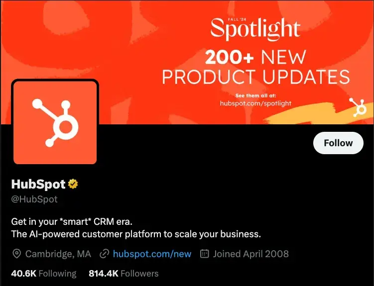
1. Customize and brand your profile.
When someone looks at your company’s X profile, you want them to automatically know it’s yours.
You should customize and brand your X profile with your logo, colors, and other recognizable and memorable details you want to incorporate.
Here are a few ways to customize your profile:
- Handle. Your X handle is your username (for example, our handle is @hubspot) — this should include your company’s name so your followers, customers, and fans can easily search and find you on the platform. You create your X handle when you sign up for an account.
- Header. The header on your X profile is your background image. You might choose to create a unique image for your header, use your logo, or another branded image.
- Profile picture. Your X profile picture represents your company’s every move, interaction, and post on the platform. It’s the image that sits above your bio and might include a picture of your logo, company’s initials, or CEO.
- Bio. An X bio provides everyone who visits your profile with a brief synopsis of what they’re about to see in 160 characters or less. It might include your mission statement, a blurb about what your company does, or something humorous and engaging.
- Website URL. Beneath your profile picture and bio, there’s a location where you can include your URL to direct traffic straight to your website.
- Birthday. In the same location as your URL, you can insert your company’s birthday — or the day when the company was founded — so your audience gets to know your business on a more personal level.
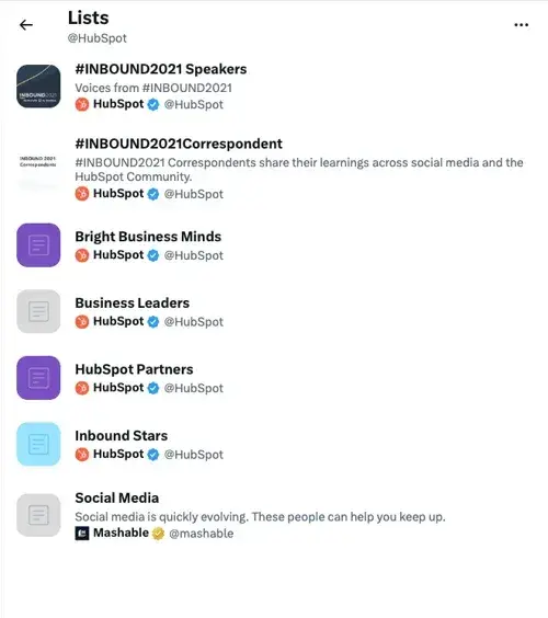
2. Create X Lists.
An X List — which any user has the ability to create and view — is an organized group of X accounts you’ve selected and put together in specific categories.
For example, at HubSpot, lists include Leadership Experts, Top Marketing Experts, Top Business Podcasters, and more. When you open an X List, you only see posts by the accounts on the list.
X Lists are great if you want to follow only specific accounts. You might segment your lists into groups such as business inspiration, competitors, and target audience so you’re able to easily review their posts, interactions, and content.
Here are a few lists available on HubSpot’s X profile:
3. Host an X Chat.
You can schedule and host an X chat to:
- Discuss a topic.
- Engage your followers.
- Create a sense of community.
- Ask your audience for their opinions.
- Get feedback on something you’re working on.
To host an X Chat (previously TweetChat), you’ll need to choose a topic, set a time and date for the chat to occur, and create a hashtag for the chat. Share this information with your followers in a post, on your website, in your X bio, and wherever else you choose.
Here’s an example by The SAS Collective. The post mentions what this chat is about, who will be participating, and a hashtag to track all conversations.

Everyone who wants to participate in the chat should be able to view all responses, questions, and comments regarding your topic by searching this unique hashtag.
Plus, they can share their comments and thoughts by adding this hashtag to their posts.
4. Advertise on X.
Advertising through X is a great way to reach your audience. This will make your posts easily discoverable by thousands of people, helping you increase your influence and following. You can do this through Promoted Ads or X Ads.
Promoted Ads (formerly Promoted Tweets)
Promoted ads or tweets make your regular posts appear in the X streams or search results of specific users.
This is a great option for anyone looking to increase the number of people on a specific webpage. Your business will pay a monthly fee if you promote a post.
X will use your promoted posts in a daily campaign targeting the type of audience you want to reach, as previously indicated in your settings. All X users can interact and engage with promoted posts like your organic content.
Here’s a glimpse at a promoted posts:

X Ads
X Ads is a great option if you’re using different types of tweets/posts to achieve one goal for your business. It’s ideal if you’re looking to grow your base of followers and brand awareness significantly through the platform.
Your business can decide between different objectives regarding your X ads, including app installs, video views, website conversions, and audience targeting for your campaigns. This decision will impact the price you’ll need to pay to run your ad.
Here’s an X Ad by the car manufacturer Kia:

5. Drive traffic to your website.
X can help you direct traffic to your website. There are several ways to include your website’s URL on your profile and add links to your web pages and blogs in your posts.
Here are some ways to use the platform to direct traffic to your website and increase conversions:
- Incorporate links to your website in your posts.
- Embed posts on your website with an X Timeline.
- Add your website URL beneath your bio on your X profile.
- Repost any content that includes links to your website and blogs others have shared.

The State of Social Media in 2025
Explore the top trends in social media for brands to know and optimize your social strategy.
- AI Content Creation
- Community Building
- Social Media Shopping
- Social Vs. Search Engine
Download Free
All fields are required.
6. Buy a premium subscription to get verified.
Depending on the size of your company and industry, you might choose to get your X profile verified.
Previously, businesses and public figures applied for a verified blue checkmark, but now you can get a similar checkmark by subscribing to X Premium.
Anyone can get an X subscription, but X will double-check your account to ensure you meet the eligibility criteria.
Once the platform verifies your profile, a badge with a checkmark will appear next to your handle. This symbolizes an authentic account.

Being verified prevents your audience members from following and being confused by impersonator accounts or accounts with similar content, usernames, and handles to yours. A verified account also makes your business look more legitimate and trustworthy.
7. Focus on building your follower count.
Needless to say, the more X followers you have, the more people there are looking at and interacting with your content. You’ll have a better chance to improve brand awareness and direct more traffic to your website when you build your follower count on X.
There are a number of ways you can increase your follower count on X — here are some to get you started:
- Ensure your content is shareable.
- Create engaging content (giveaways, contests, questions, surveys).
- Enlist the help of social media influencers.
- Include links to your X profile on your website.
- Interact with your current followers and repost their content so they’re more likely to do the same for you.
Now that we’ve reviewed how to use X for business, let’s cover some tips and tricks you can apply to your profile to improve your marketing efforts on the platform.
13
Use keyword targeting in your X Ads. Implement hashtags. Design a content publishing schedule. Create an X campaign. Write a strong profile bio. Use images and videos. Interact with your followers. Share media mentions. Keep an eye on your competitors’ X accounts. Focus on followers’ interests and needs when creating content. Promote your events. Check your direct messages regularly. Keep track of your analytics.
The following X marketing tips are universal, meaning they’re applicable to any type of business, in every industry.
1. Use keyword targeting in X Ads.
Keyword targeting on X is a critical component of X Ads.
Keyword targeting allows you to engage X users through the different words and phrases you've included in your content and they’ve searched for on the platform.
This means you’re able to reach your target audience at the exact time your business, content, and services are most relevant to them.
On X, there are two types of keyword targeting you can use including search and timeline.
Search Keyword Targeting
Search keyword targeting allows you to make your posts show up for users who are searching for the topics that you determined relate to your business.
For example, if you sell gluten-free cookies, you can target users searching for content about baking, cookies, gluten intolerance, or Celiac Disease.
Timeline Keyword Targeting
Timeline keyword targeting allows you to act on users’ specific feelings, thoughts, actions, and emotions they’ve posted about.
For example, if you’re a running gear company, you might target keywords and phrases users post about such as, “running a race,” “race day tips,” or “training for a marathon.”
2. Implement hashtags.
Posts (previously Tweets) with hashtags generate more engagement than ones without them.
Adding hashtags to your posts is a great way to expand your influence on X. However, there are some guidelines you’ll want to stick to when using hashtags to ensure that you reach the largest number of people possible.
- Create a hashtag unique to your business so your followers and target audience can easily find you and your content.
- Make relevant and memorable hashtags for other groups of posts, such as those related to a specific campaign you’re running.
- Use X Analytics to review your most successful hashtags so you can ensure their use in future posts.
- Don’t overuse hashtags. This may feel and look spammy to your audience (not to mention it isn’t aesthetically pleasing).
3. Design a content publishing schedule.
As you grow your base of followers, you’ll need to post on a regular basis to ensure they stay engaged with your business and content.
Not only do you want to post regularly, but you also want to post at the right times of the day.
Here are some details about the best times (on average) for businesses to share their X content:
- Between 8–10 AM and 6–9 PM (in correlation with commuter schedules) on weekdays.
- Around noon or between 5–6 PM on any day of the week.
- For B2C companies, the best days to post are weekends.
- For B2B companies, the best days to post are weekdays.
Here’s an X content calendar template I use to plan my posts:

You can review X Analytics to examine your engagement on the days you post more or less content to determine what’s working well for your specific audience.
Once you’ve determined when and how often you’ll post your content, you can use a social media management tool. This will allow you to both create your posts and schedule them in advance so you can focus on other tasks you have to complete.
HubSpot’s social media management tool lets you:
- Schedule posts in advance.
- Connect directly with your audience.
- Understand how your X interactions help your brand.
4. Create an X campaign.
Social media marketing campaigns of any kind are a great way to reach your audience, drive sales, and increase your website traffic.
You can create a social media marketing campaign specifically for X to target users, increase your base of followers, and raise your brand awareness through the platform.
To create an X marketing campaign, you’ll want to follow the same steps you would with any type of social media marketing campaign:
- Research your competition.
- Determine how you’ll appeal to your target audience.
- Choose the type of content you’ll create.
- Share and promote your content.
- Analyze your results.
The State of Social Media in 2025
Explore the top trends in social media for brands to know and optimize your social strategy.
- AI Content Creation
- Community Building
- Social Media Shopping
- Social Vs. Search Engine
Download Free
All fields are required.
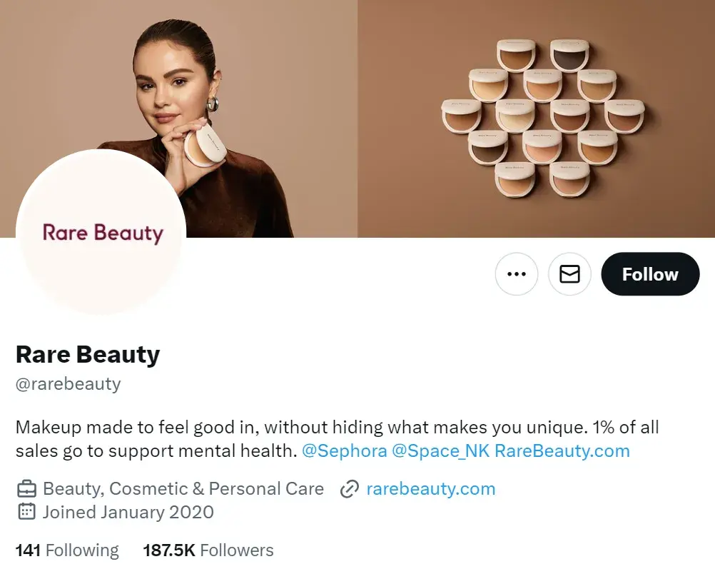
5. Write a strong profile bio.
Writing a strong and memorable bio for your X profile is crucial.
This is because your X bio is the first thing a profile visitor will read about your company — it’s your written introduction and should briefly explain what visitors can expect from your page and content.
You only have 160 characters to do this, so choose your words wisely to ensure your bio successfully represents your brand and reflects who you are as a company.
Here’s a great example of an X bio by beauty brand Rare Beauty.
6. Use images and videos.
When possible, try to include quality videos and photos in your posts. It’s been proven that posts with images outperform posts strictly made of text.
Photos and images provide an eye-catching and engaging element in your content as X users scroll through their feeds.
Videos are proven to outperform posts with images as well. In fact, posts with videos are likely to get an average of six times the amount of engagement than posts without them.
Videos and images are a great way to show your audience your product line or how to use an item you sell as well as make your content feel more personal.
Plus, images and videos in posts are proven to help you increase your engagement — and who wouldn’t want that?
7. Interact with your followers.
Remembering to engage with your followers as your business grows and X follower count increases is crucial.
This will help you create experiences for your followers and audience members that feel personal and keep them coming back to your profile all while fostering a sense of brand loyalty.
For example, if someone reposts your post or comments on your posts, you can “Like” that person’s interaction or even reply back to them.
In some cases, you might have a ton of ghost followers who follow your account, but never interact with your content. If your interaction rates are low, it may make sense to use unfollow tools to clean your followers list from ghost followers.
8. Share media mentions.
If your business is mentioned in the media, share the article, video, URL, or image on X.
This will make your business feel more legitimate to anyone checking out your profile and show prospective followers how many other people already know about your company and are enjoying your products and services.
This is an exciting way to broadcast your success to your audience.
Take a look at how Scribe posts all media mentions of the brand and its founders.

It also provides you with a way to incorporate backlinks in your posts which, when clicked, take your audience members to the original source of the mention.
Meaning you’ll also drive traffic to the website of the media outlet that mentioned you, likely boosting their follower count and/ or brand recognition.
This could potentially help you become mentioned, shared, or featured in one of their pieces of content again in the future.
9. Keep an eye on your competitors’ X accounts.
X is a great way to keep an eye on your competitors’ marketing efforts. You can follow them or simply search them to see what they’re posting.
You can also view basic details about their engagement such as their number of reposts, comments, and responses.
This is a simple way to see some of the X marketing strategies your competitors are implementing and whether or not they’re working.
10. Focus on followers’ interests when creating content.
If you want to reach your audience members and ensure your content resonates with them, you’ll need to focus on their interests and needs — whether that’s in relation to the way you share content, what you share, or how you present it.
When you meet the needs of your target audience and buyer personas, they’ll be more likely to continue to follow and interact with your company. You can build buyer personas with HubSpot’s free tool, Make My Persona.
As you study your buyer personas and target audience, you’ll be able to determine the type of content they’re likely looking for you to share.
Additionally, you can always post questions, send out surveys, ask for feedback, or even create an X Chat to get more ideas about the type of content your audience is looking for from your business and X profile.
11. Promote your events.
X is a great way to promote your business’ events.
Similar to the way you might for an X campaign, you can create a unique hashtag for various events (such as launch parties, giveaways, and contests) or schedule a variety of posts (using one of your social media management tools) to promote any special occasion your company is hosting.
This way, audience members — whether or not they’re your followers — will have the opportunity to learn about your event and get all of the details they need to sign up, be in attendance, or participate.
12. Check your direct messages regularly.
Like other social media platforms, X provides users with a Direct Message inbox where they can contact you in a private message regarding any questions, concerns, or comments they have.
So, be sure to check your inbox regularly as this can contribute to the type of customer service and support your business is known for, as well as the type of care you provide your followers and customers.

13. Keep track of your analytics.
With all of the work you’re putting into your business’ X marketing, you’ll want to ensure your efforts are successful in reaching your goals, whether they’re related to directing more traffic to your website, increasing conversions, or improving brand awareness.
You can determine your X marketing success in these areas (and many more) by analyzing your work. To do this, you’ll want to consider which metrics matter to you and then determine how you’re going to track them.
Which Metrics to Track on X
Due to every business being unique and having different goals, you might not be interested in tracking all of the following X metrics (or you might be looking to track additional metrics).
However, we’ve compiled the following list of possible metrics for you to consider to get you started.
- Engagement. Look at the number of reposts, follows, replies, favorites, and click-throughs your posts get (including all hashtags and links they include).
- Impressions. Review the number of times your posts appeared on one of your audience members’ timelines (whether or not they’re actually following you).
- Hashtags. Look at which of your hashtags are being used most frequently by your audience and followers.
- Top posts. Review your posts with the most engagement.
- Contributors. Keep up with the level of success each of your contributors — the people you give admin access to on your account — are having with their posts so you can implement some of their tactics more regularly or remove them completely.
How to Track X Analytics
You’ll find several social media management tools with analytics features that are automatically built in. This is convenient for those of you who were already planning on choosing a management tool to assist with scheduling your posts.
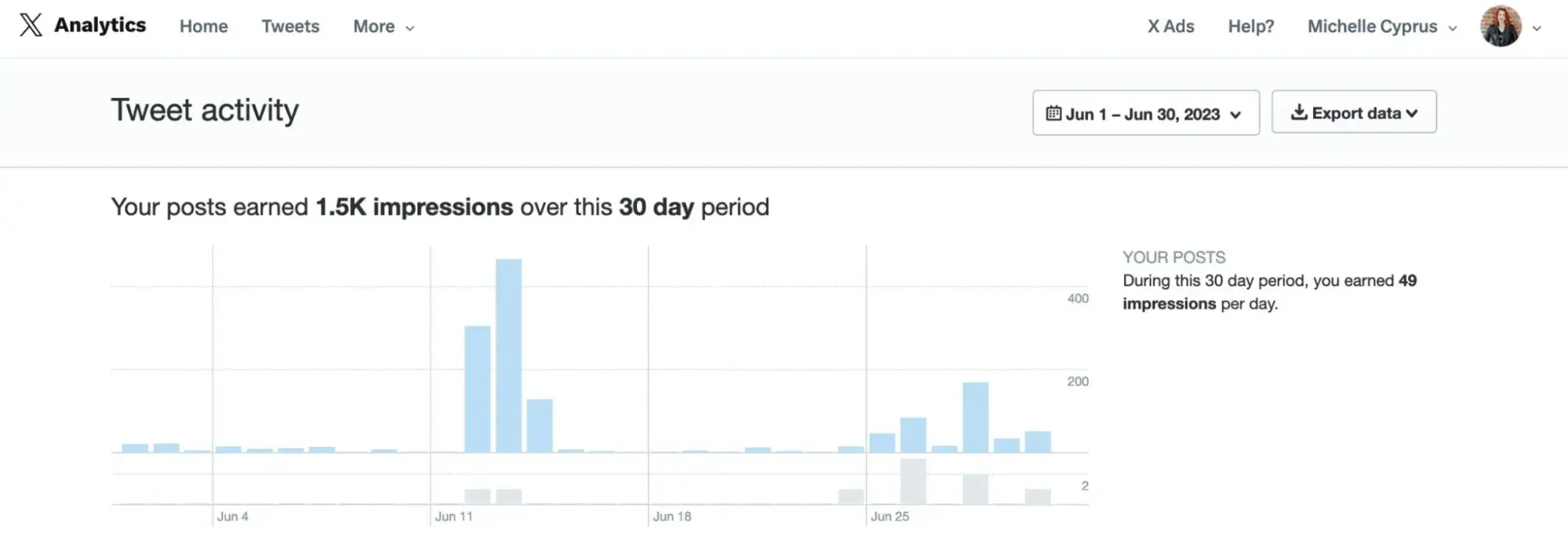
However, one of the most common analytics tools for X is the one created specifically for the platform: X Analytics.
X Analytics
X Analytics helps you understand how your content impacts your audience and the ways in which your activity on the platform can help you grow your business. The tool is free, accessible to all users, and shares information about:
- Engagement rate.
- Post activity.
- Impressions.
- Followers.
Depending on your business’ needs, you have the ability to incorporate X Ads (if you pay for the option) data in X Analytics as well.
Lastly, there are a number of other third-party resources and apps you can download and use along with X Analytics to take a deeper look at specific types of data such as detailed hashtag performance information or how other X handles in your industry are doing.
The State of Social Media in 2025
Explore the top trends in social media for brands to know and optimize your social strategy.
- AI Content Creation
- Community Building
- Social Media Shopping
- Social Vs. Search Engine
Download Free
All fields are required.
4 X (formerly Twitter) Marketing Tools to Level Up Your Strategy
Ready to make the best out of X? Here are my top four X marketing tools to drive results for your business.
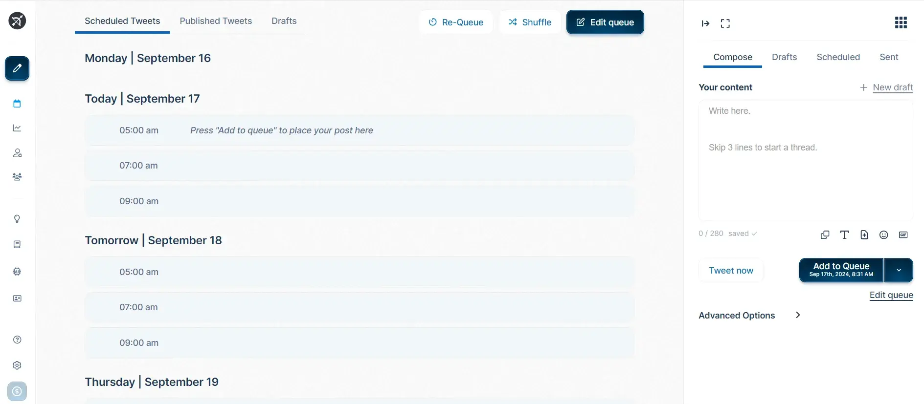
1. Hypefury: Best for scheduling and managing posts.
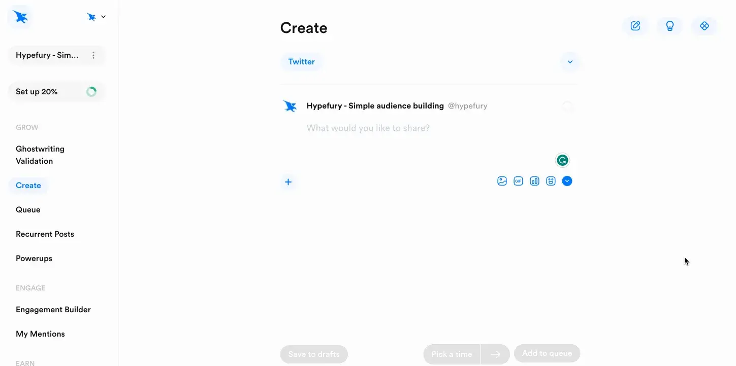
Hypefury lets you automate your X posting schedule and plan posts in advance. The tool is purpose-built for creators and marketers looking to build consistency on X and grow their audience.
One of Hypefury’s standout features is the ability to schedule threads. Create a sequence of posts to share long-form content through an X thread with an automated posting schedule.
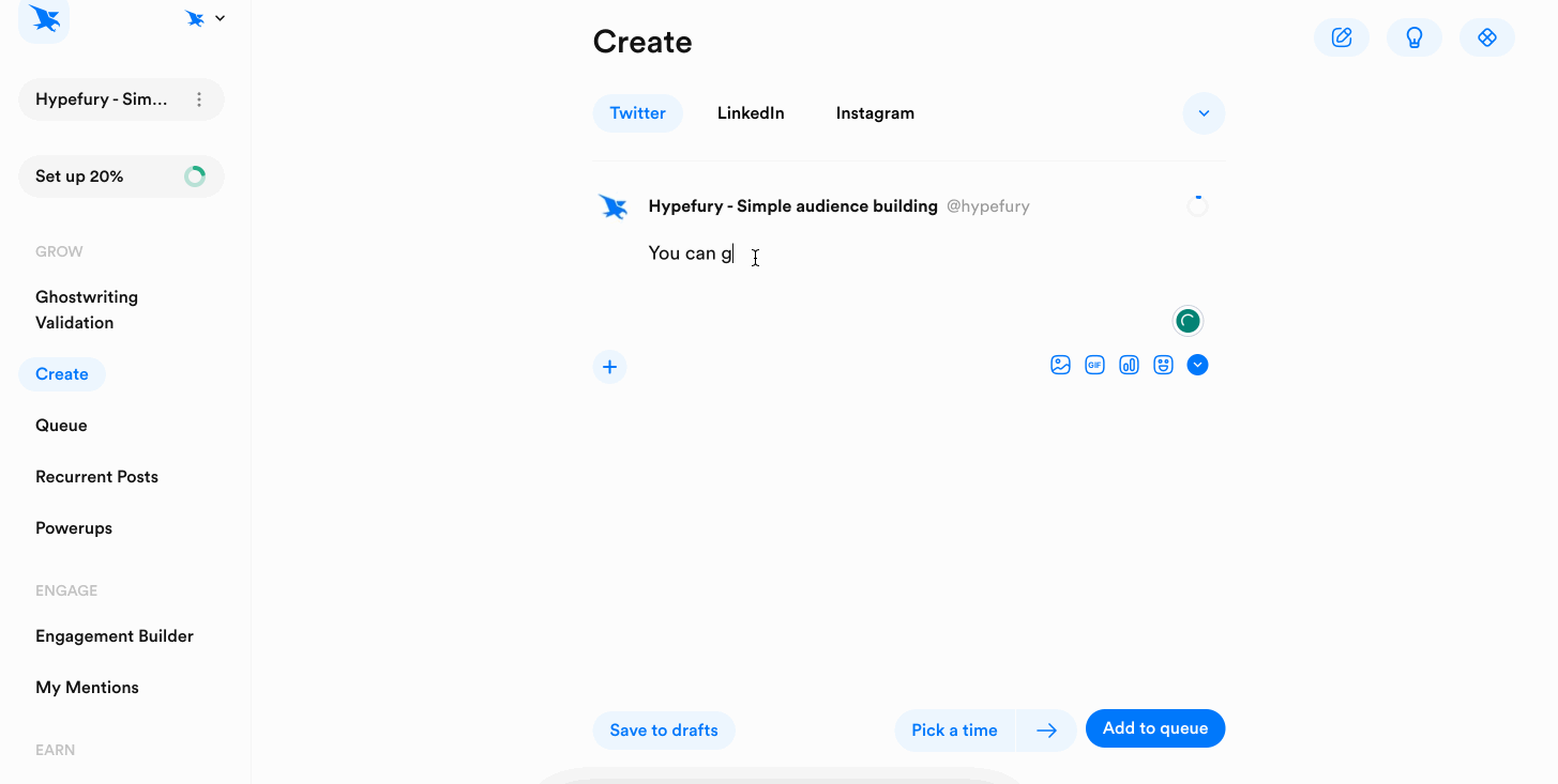
Hypefury also reposts some of your most popular posts at optimal times when you don’t have any posts scheduled. You can enable the option to share evergreen posts, and the tool will take care of the rest.
Besides, the tool can even automate product promotion. If you sell a product/service, Hypefury will add a post promoting your business under your best-performing posts.
What I Like
- Advanced automation saves time and effort in managing a posting schedule.
- Allows cross-posting content across multiple platforms like Instagram, LinkedIn, etc.
- Shares suggestions and writing prompts to inspire new posts when you’re out of ideas.
Pricing
7-day free trial. Paid plans start at $29/month. Check pricing here.
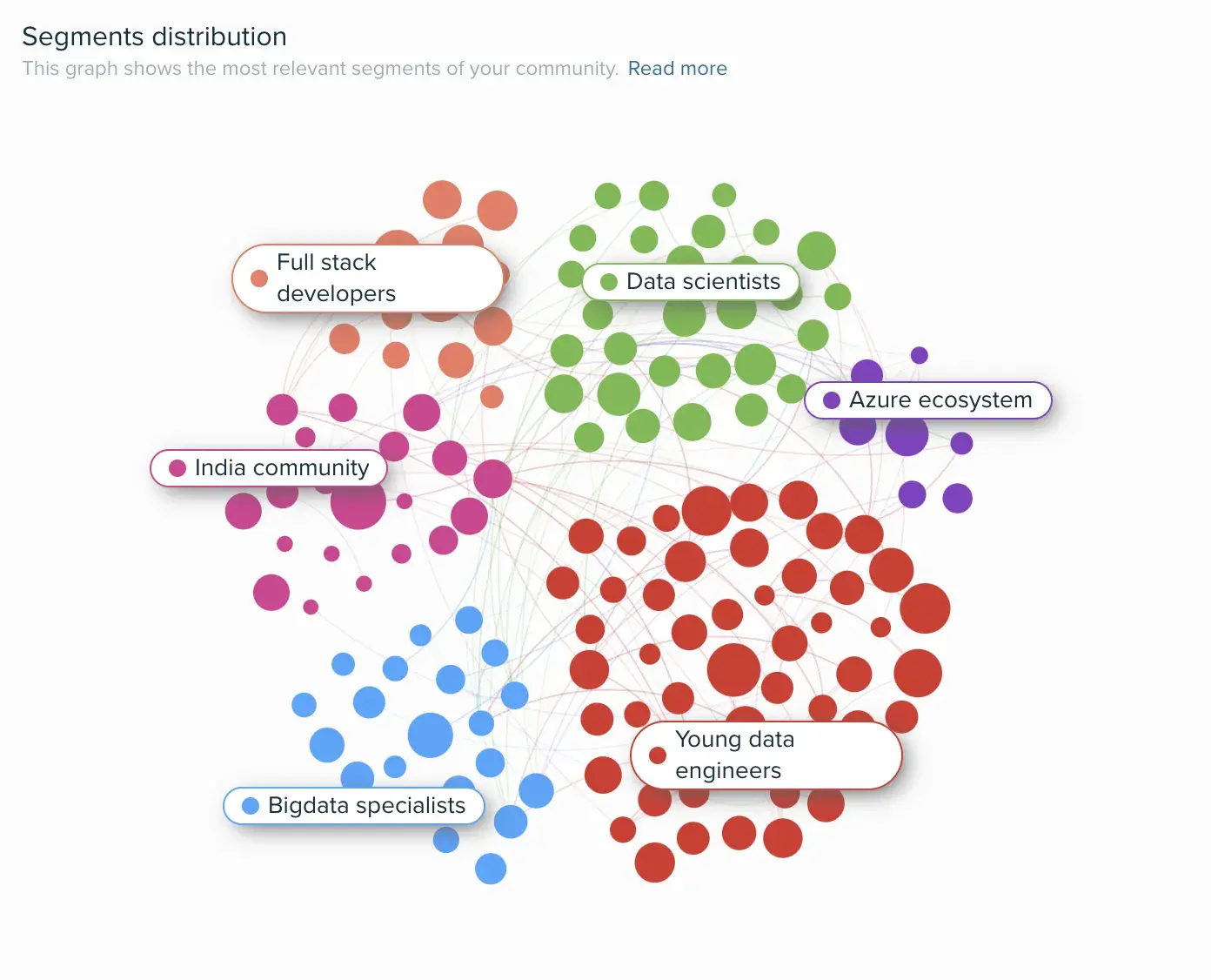
2. Audiense: Best for understanding your audience.
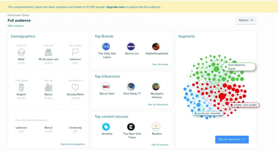
Audiense, a customer intelligence platform, collects real-time insights from multiple sources to help you understand the target audience.
You can create highly targeted audience segments based on demographics, psychographics, and behavioral data. The tool will use this segmentation to share specific information about each group for tailored X marketing campaigns.
You can also use Audiense to find the influencers your audience follows. This will help you connect with the right people and opinion leads to amplify your brand and grow your followers.
What I Like
- Built-in social listening tool to track brand mentions, conversations, and trends.
- In-depth reports on audience behavior to understand preferences and expectations.
- Updated data about audience segments with the latest insights to strategize your approach.
Pricing
Free forever plan. Paid plans start at £23/month. Check pricing here.
3. Tweet Hunter: Best for creating content and engaging with posts.
Tweet Hunter is an AI-powered content creation and publishing tool for X.
You’ll find personalized content ideas based on trending topics and your preferences. Use these suggestions to write new posts and predict their performance with TweetPredict. This feature analyzes a post in real-time and assesses how it will perform once published.
You can also automate the process of liking, commenting, and reposting. The tool puts engagement on auto-pilot and makes it easy to connect with your followers.
What I Like
- Easily ideate new content and schedule posts beforehand in a calendar.
- User-friendly interface with a minimal learning curve to get started.
- Integrates with your CRM tool to optimize X outreach.
Pricing
Paid plans start at $23/month. Check pricing here.
4. Circleboom: Best for accessing analytics and follower insights.
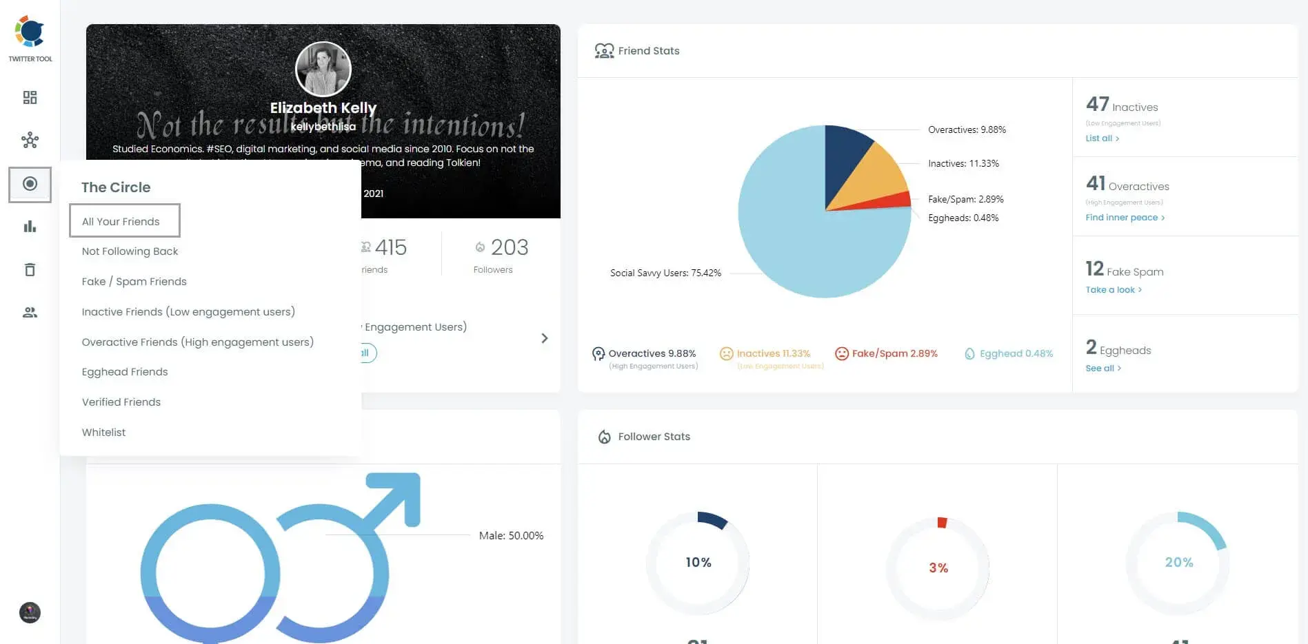
Circlebloom is an X management tool to manage your post archives and perform bulk actions like deleting posts. It also offers options for content scheduling and automation to post on X and other platforms.
What makes Circleboom a must-have X marketing tool is its advanced analytics.
You can get a pulse of your audience and understand exactly who you are targeting.
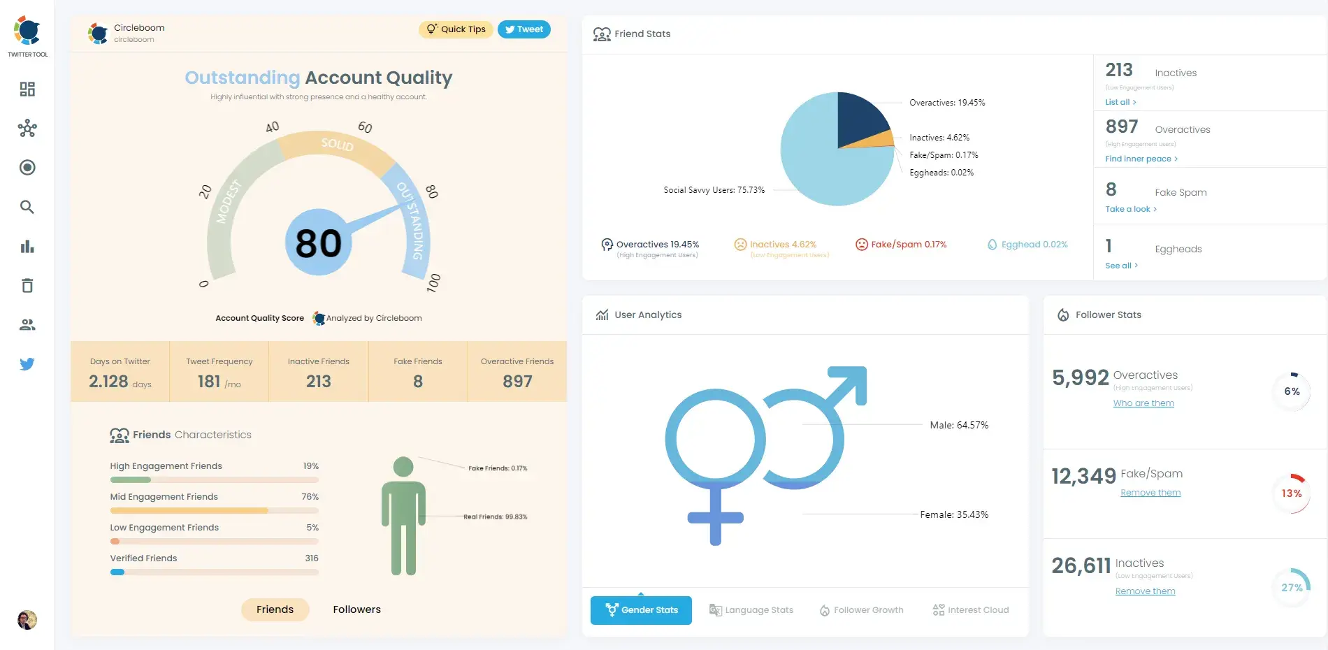
You can also discover articles and content ideas that resonate with your audience. These curated ideas help build a repository of new posts to maintain consistency.
What I Like
- Multi-platform management to integrate your X marketing efforts.
- Get detailed insights on follower activity and engagement like active/inactive followers.
- Access advanced search to find users via their bio and identify influencers in your niche.
Pricing
Free forever plan. Paid plans start at $9.99/month. Check pricing here.
Kickstart X Marketing Effortlessly
X is a powerful marketing tool and social media platform any business can take advantage of.
I’ve leveraged the platform to gain website traffic, boost brand awareness, and engage my target audience. I believe the key to succeeding on X is in building a data-informed strategy keeping your customers at the core.
Bookmark this guide to get a strong start with X marketing.
Editor's note: This post was originally published in March 2013 and has been updated for comprehensiveness.
Free Twitter for Business Intro Kit
Master the essentials to better share, engage, and market on Twitter.
- Follower Growth Tracking Template
- Incorporating Visuals
- Twitter Analytics
- And More!
Download Free
All fields are required.
Twitter Marketing
![X (formerly Twitter) vs. Threads: What brands need to know [data]](https://53.fs1.hubspotusercontent-na1.net/hubfs/53/x%20vs%20threads.png)

![Twitter is Dead (Kind of): Where X Stands With Consumers [New Data]](https://53.fs1.hubspotusercontent-na1.net/hubfs/53/Untitled%20design%20(32)-1.jpg)

![11 Twitter Alternatives Marketers Can Consider [Data + Expert Insights]](https://53.fs1.hubspotusercontent-na1.net/hubfs/53/Twitter%20Alternatives.jpg)