

What do good presentations have in common?
I’ve discovered that five elements are a must-have when creating a great presentation. Let’s look at each one.
1. The presentation is highly relevant to the audience.
A lot goes into creating presentations that hit the mark. First, I clearly define my audience. Then, I choose topics that genuinely interest them, offer actionable advice, answer their questions, or address their pain points.
But this isn’t just my strategy. Mike O’Neill, founder and CEO of Backspace Travel, a modern travel agency, also talks about things that matter to his audience.
He says, “We conduct dry runs with a smaller group to gather feedback and refine the presentation. Testing the presentation with colleagues allows us to identify areas that resonate [with our audience] or need improvement before the final delivery.”
I’ve found that crafting a captivating title influences how receptive my audience will be. For example, instead of a bland title like “New Product Features,” I’d go with something more intriguing like “Discover the Hidden Gems of Our Latest Product Features.”
It makes my audience wonder what those hidden gems are and still lets them know it’s about new product features.
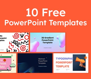
10 Free PowerPoint Templates
Download ten free PowerPoint templates for a better presentation.
- Creative templates.
- Data-driven templates.
- Professional templates.
- And more!
Download Free
All fields are required.
2. The presentation has a clear objective.
As a former content manager and strategist at HubSpot, I learned the importance of setting audience expectations. Whether it’s a new project, a marketing strategy, or even a sales pitch, I made sure my slides and commentary tied back to the key takeaways I wanted my audience to remember.
Alexandria Agresta, a corporate trainer and leadership development expert, uses what she calls the three Ps of a presentation:
- Purpose. What’s the purpose of the presentation?
- Challenge. What’s the challenge your audience is facing?
- Possible. What outcome do they desire?
She says this process empowers her to convey her message in a way that resonates with her audience. Once she establishes the three Ps, she creates a clear, concise outline that includes key points and topics she hopes to cover.
“I then create a dedicated slide at the beginning of the presentation that succinctly outlines what will be covered during the presentation. This sets expectations for the audience and gives them a roadmap of what to expect,” Agresta says.
Whatever the topic, highlight your key takeaways on a specific slide (ideally the cover slide), so your audience clearly understands what your presentation is about from the get-go.
3. The presentation follows an organized storyline.
One thing I’ve learned about presentations is that it isn’t just about conveying information; it’s about telling a story that guides your audience from start to finish. Each slide is a chapter that leads to a satisfying conclusion.
There are many ways to infuse storytelling into your presentations. You can get as creative as you want, like Aaron Wertheimer, a full-time SEO marketing copywriter for Marketing Reel, does.
He says, “I infuse storytelling into my PowerPoint presentations by including a Bitmoji sticker of myself as it relates to each slide, and I demarcate each slide with verbiage to indicate which part of the sequence we are currently at in the presentation.”
Just make sure to have a beginning, a middle, and an end so you can clearly demonstrate the point you’re leading towards.
4. The audience understands the next steps.
When creating my presentations, I always specify the action I want my audience to take by the time we conclude. Do I want them to sign up for a service? Consider a new perspective? Remember key points?
Chirag Nijjer, a customer success lead at Google, usually wraps up his presentations with two CTAs: one that’s beneficial to him and one that benefits his audience. His presentations are more impactful when he combines both CTAs.
He explains with an example: “If I’m presenting to a group of professors who intend to use the info to teach their students, I’d write, ‘Would you like access to the summary slides and a list of project ideas for your students to learn this topic? Fill out the feedback form and give me your email address.’”
I can see why this method works. The email address allows him to contact his audience, and he also benefits them by teaching them how to turn his presentations into valuable action. It’s like killing two birds with one stone!
Remember, though, if you want your audience to perform an action after your presentation, be clear about what you want them to do next.
5. The audience leaves with contact information and/or resources.
I’ve observed that at the end of my presentations, most attendees want more information or a chance to discuss the topic further.
That’s why I always provide my contact details or additional resources. So, if anyone wants to reach out for a one-on-one chat or read further, they’ll have what they need to delve deeper into the material.
For example, after a presentation on digital marketing strategies, I might provide my email address and invite attendees to reach out if they have any questions. I could also share a list of recommended books, articles, or even YouTube videos for those who want to take their digital marketing journey to the next level.
How to Do the Best Powerpoint Presentation
Now that I’ve covered what to look for in a killer slide deck, let’s jump right in and talk about how you can make your next presentation unforgettable.
1. Less is more.
I’ve used PowerPoint a lot, and it’s tempting to pack slides with flashy graphics and tons of text. However, I learned the hard way that less is often more.
Once, I was tasked with presenting a new content strategy to the marketing team. Eager to impress, I packed my slides with stunning visuals, intricate graphs, and loads of text explaining every detail of the strategy.
I thought the more information there was, the better. But as I started presenting, I quickly realized my mistake.
The team seemed overwhelmed by the sheer amount of information on the slides. They were so busy trying to decipher the infographics and read the tiny texts that they missed out on the main points I was trying to convey.
In the end, I could sense that I hadn’t made the impact I had hoped for. It was a humbling experience, but it taught me a valuable lesson: simplicity is key.
Since then, I’ve made a conscious effort to streamline my presentations with a clear message and avoid complex details that could distract my audience.
Here are some key points to always remember:
- Let the focus be on your message instead of the slides themselves.
- Keep the slides relevant and simple enough so people can pay attention to what you’re saying.
- Your visuals and fonts should support your message, not steal the spotlight.
2. Keep text to a minimum.
From my experience, you can tell that adding too much text overwhelms people, and instead of listening to you, they focus on trying to read the slides. And that’s not what you want. You want your audience to be engaged, hanging onto your every word, not trying to decipher paragraphs of text.
So, use fewer words in large fonts. That way, you’ll make sure everyone, from the front row to the back, sees what’s on the screen without squinting.
3. Rethink visuals.
People are 30 times more likely to read infographics than written articles. This stat just puts a stamp on what I’ve said about reducing the amount of text in your presentations. It’s like a neon sign screaming: “Less text, more visuals!”
However, that doesn’t mean you can just throw some nice-looking photos onto your pitch deck and move on. Like any other content strategy, your visual game must be on point and relevant.
Let me share the different types of visuals I’ve come across in my years of doing presentations to help you figure out what works best.
Templates
PowerPoint templates have come a long way since Microsoft first unveiled the program to the world, and I occasionally use them in my presentations.
However, to make my PowerPoint slides stand out, I always opt for a theme that my audience hasn’t seen dozens of times before — one that vibes with my brand and fits the topic I’m talking about.
Sometimes, I explore presentation platforms other than PowerPoint (like Prezi) to discover fresh templates. There are also tons of visual content design sites that offer customizable templates I can tweak to match my brand and topic perfectly.
Canva is one of my favorites. It offers a plethora of templates and allows me to create presentations from scratch.
I’ve also tested out Venngage’s free presentation maker and found it super handy for getting eye-catching slide templates, icons, and high-quality stock photos for my PowerPoint tutorials.

Pro tip: Download our 10 PowerPoint presentation templates for free to simplify your design process. Each template is made to add that extra flair to your presentation so that your slideshows not only look great but also resonate deeply with your audience.
Charts and Graphs

One of my favorite ways to back up what I’m saying in my presentation is to toss in some stats and data visualization. Charts and graphs jazz things up and make the numbers way more interesting.
However, I don’t just share the facts; I let my audience know the story behind those numbers. For example, instead of just presenting quarterly sales figures to my team, I would highlight the challenges we faced, the strategies we implemented, and the victories we celebrated to arrive at those digits.
One thing you always need to do, though, is to make sure your charts and graphs blend in seamlessly with the rest of your presentation’s visual theme. Otherwise, these graphics are more likely to steal the show than help you get your point across.
Color Scheme
I understand that colors can really play with my audience’s emotions. So, even if I’m not trying to close a deal with my presentation, I might want to stir up specific feelings or impressions, and the color palette I choose can help with that.
Max Shak, founder and CEO of nerDigital, even considers cultural differences and color associations to make sure his presentations hit the right notes with diverse audiences.
I’d recommend checking out Coschedule’s guide to color psychology in marketing. It’s a goldmine of how different tones, shades, and color combinations can sway buying decisions. You’ll definitely elevate your presentation game by following this guide.
Font
When I add text to my slide decks, I want it to be simple enough for everyone to read. If it’s tiny or crammed, people end up squinting and missing out on what I’m saying.
That’s why I recommend using web-safe fonts like Sans-Serif or Arial. They’re easy on the eyes and can display correctly even if a user hasn’t installed them on their computer.
4. Incorporate multimedia.
I could talk about something all day long, but it won’t have the same impact as showing it to you.
That’s where multimedia comes in — it’s the secret sauce for keeping people engaged in your presentations.
When I do a simple Google search for “music in presentations,” it pulls up a bunch of results that talk about how to add music to my slide decks. From this, it’s clear that using music in my presentations is a unique way to engage my audience or at least set a welcoming tone before and after I speak.
But if you want people glued to your slideshows throughout your presentation, incorporate videos. I mean, a whopping 96% of individuals admit they tune into explainer videos to learn more about a product.
So why not give people what they want? Videos can bring theories to life in a way that words or photos alone just can’t match.
10 Free PowerPoint Templates
Download ten free PowerPoint templates for a better presentation.
- Creative templates.
- Data-driven templates.
- Professional templates.
- And more!
Download Free
All fields are required.
Best PowerPoint Presentations
In my years of experience, I’ve come across many pitch decks, and the best ones always cut through the clutter. In this section, I’ll share 16 PowerPoint presentation examples that sets the bar for what a professional presentation should look like.
1. The HubSpot Culture Code by HubSpot Co-founder Dharmesh Shah

Not to sing our own praises, but The HubSpot Culture Code has been one of our most successful presentations. The secret? Shah chooses a central theme — the acronym HEART (humble, empathetic, adaptable, remarkable, and transparent).
This acronym embodies our company’s values while providing a central message for the presentation. Plus, heart icons on the slides make the connection clear.
I like the style and message of this presentation. It sticks to our brand colors and fonts and makes everything super clear and easy on the eyes.
I especially enjoy the superhero theme on slide 26 — it’s a fun way to say that we’re all about empowering our customers to be their best. It elevates the idea of customer support from a duty to a mission, which I find very motivating.
2. 2022 Women in the Workplace Briefing by McKinsey & Company

This slide deck lays out key data from McKinsey’s 2022 research on women in the workplace. It uses a mix of graphs, images, and other visual representations to illustrate how the expectations women face at work have evolved over time.
I’m impressed by how they’ve maintained their brand colors throughout the presentation. I’m a big fan of consistency, and this slideshow nails it by sticking to its color scheme from start to finish. It creates a cohesive look and reinforces their brand identity, which makes the presentation look professional.
Another thing I like about it is that the titles immediately say what each slide is about. It helps you navigate the presentation effortlessly and keeps you focused on the main points.
3. SEO, PPC, and AI in 2023 and Beyond by Lily Ray

Lily Ray and Inna Zeyger from Amsive Digital took inspiration from the world of science fiction. It’s pretty cool how they playfully bring in imagery from movies like “Blade Runner“ and “Ghost in the Shell” when talking about AI and the future of marketing in their SlideShare presentation.
The whole futuristic vibe with vibrant colors grabs my attention right away. It’s a fresh break from the usual bland corporate stuff, and they do a fantastic job of making sure you enjoy their presentation while learning something new.
4. ChatGPT: What It Is and How Writers Can Use It by Adsy

We all get writer’s block sometimes. Trust me, I’ve been there, staring at a blinking cursor, feeling the frustration build up. But ChatGPT acts like a trusted sidekick, nudging me along and whispering, “Hey, how about this idea?”
This presentation breaks down what ChatGPT is, its limitations, and more importantly, what it can do. I find it pretty helpful, especially if you’re new to the AI chatbot.
One thing I like most about the SlideShare presentation is that it has a lot of use cases that can inspire you. For example, if it tells you ChatGPT can write a YouTube script, it shows you the prompt the creator used and the results they got.
I also love how it uses a combination of bold white text against a blue background or black and blue text on a white background to call out important headings. And those key definitions are right there in the center, surrounded by all that whitespace, practically begging you to take a closer look.
5. Insights from the 2022 Legal Trends Report by Clio

I’m a big advocate of adding visuals to your business presentations. But it doesn’t have to be the same old boring office stock photos. Take a cue from Clio’s presentation.
Clio has incorporated abstract elements to keep things fresh — simple shapes like triangles, rectangles, and circles. These shapes blend seamlessly with different charts and graphs, adding an artistic touch to the slide decks.
6. Email Marketing Trends by Gabriel Blanchet

Gabriel Blanchet creates a short presentation to explain some key elements of email marketing and its trends to show us why it’s still a valuable tool despite the rise of social media.
What do I love about these slides? They’re awesome. Bright colors, clean visuals — they’ve got it all. What seals the deal for me is how Gabriel breaks down each point and explains why it matters.
7. 2022 GWI’s Social Report by GWI

I’m really impressed by how Leticia Xavier uses different shades of pink and purple to add some contrast to the slides. Everything, from the graphs to the backgrounds and images, sticks to this same color palette.
If I’m ever worried about my visuals not contrasting enough, I’ll definitely draw inspiration from Leticia’s color palette. Pick one or two colors and play around with different shades and tones to tie the slides together and make them pop.
8. Digital 2023 Global Overview Report by DataReportal

I chose this slide deck from DataReportal because it reminds me that strong contrast between text and background is crucial. It’s what makes my slides easy to scan.
The presentation uses a dark background throughout. The graphs and icons pop in bright orange, red, blue, and green, while the text keeps it white.
That said, if you’re prepping for an in-person presentation, think about the room. If it’s dim with the lights off, a dark background like this is spot on. But if it’s all bright and sunny, stick to a light background with dark text.
9. ThinkNow Culture Report 2022 by ThinkNow

ThinkNow impresses me with how they’ve mixed magenta and yellow in the background of their PowerPoint design. Meanwhile, the graphs stick to classic black and white. It’s a smart move that creates sharp contrast and makes the visual elements easy to scan.
Plus, I appreciate how the headers are in a readable font, summarizing what each slide covers.
10. Team Training Presentation By Visme
 Visme is the place to go for creating beautiful presentations that strengthen your business branding, seamlessly. This team training presentation uses duotones which give it a clean and fresh look and it doesn't have clustered text. These features make the presentation subtle yet powerful. I’ll always refer to this theme for creating any presentation for my team meetings or training.
Visme helps you tell stories visually and beautifully with powerful presentations. I love how it is spiced up by adding relevant visuals that create excitement, thrill, and interactivity. It has enough whitespace that makes it stand out both for online meetings and in-person presentations. You can always change color themes, background images, or text to align it with your brand.
11. 2023 Metro CERT Annual Event by MNCERTs

I’m surprised by how simple this Metro CERT presentation is. It displays just a few words per slide, all in big, bold fonts. The contrast between the blue and yellow colors is striking and makes everything really pop.
And you know what’s even more creative? There are loads of images of people sprinkled throughout. It adds a nice personal touch that keeps things interesting.
12. Pecan Creek Winery 2023 in Pictures Presentations

As I was going through Pekan Creek Winery’s business presentation, I noticed how it sticks to a simple color palette of just white and black. It’s clean and sleek and lets the content shine without any distractions.
It’s also packed with loads of pictures that showcase events and the wine-making process. That’s exactly how you craft a presentation that gets people pumped up about your brand.
13. LLMs in Healthcare and Pharma. VTI day

This engaging presentation impresses me with its visuals. From charts to photos and even some fun animations, it’s got a little bit of everything to keep its audience hooked.
It keeps the fonts simple, which I appreciate. Plus, those bright background colors make the black and blue text stand out.
10 Free PowerPoint Templates
Download ten free PowerPoint templates for a better presentation.
- Creative templates.
- Data-driven templates.
- Professional templates.
- And more!
Download Free
All fields are required.
The presentation is also spiced up by the story of a dog named Sassy. It adds a personal touch. And who doesn’t like a good story? It’s a surefire way to keep attendees glued to your presentation.
14. Exploring Advanced API Security Techniques and Technologies by Sudhir Chepeni

The next time I do a data-heavy presentation, I’ll take some inspiration from Sudhir Chepeni’s slide designs. The dark background paired with bright text commands attention. And those simple, readable fonts make it easy to digest the information.
Plus, I admire how he sprinkled charts and data throughout. It keeps things interesting and breaks up the text nicely.
15. Competition in Energy Markets by Georg Zachmann

Simplifying technical information can be a tough nut to crack, especially when you have to explain it in a slide deck. But Georg Zachmann isn’t afraid of the challenge.
He uses graphs and charts to break down complex technical issues about the energy crisis into clear visual representations, which I really love.
I also noticed the big, bold headings that immediately tell you what each slide is about. You can skim the document quickly and hone in on the key points you need to know.
16. 10 Things That Helped Me Advance My Career by Thijs Feryn

This presentation impresses me right from the cover slide. The image of a man ascending the stairs captures a sense of effort and accomplishment, which is precisely what the presentation is all about.
The keynote speaker, Thijs Feryn, nails it with the storytelling aspect. Each slide feels like a new chapter unfolding and transitioning seamlessly into the next.
And the visuals? They’re top-notch — from captivating photos to lively animations and even a handy map. Plus, those bright colors and huge text fonts make sure every detail pops, even for the person chilling in the back row.
Create the Best PowerPoint Presentation Designs
As someone who’s created countless presentations, I’ve seen firsthand the transformation that happens when you put a little soul into those slide layouts — whether adding sleek visuals, cutting down on clutter, or weaving a story that carries your message.
Implement the tips I’ve discussed here so that each slide can act as a stepping stone that gently guides your audience to where you want them next. These little touches can turn a good slide deck into your best PowerPoint presentation yet.
Editor's note: This post was originally published in March 2023 and has been updated for comprehensiveness.

Presentations
![PowerPoint Tips to Present Like a Pro [Expert Advice & Free Templates]](https://53.fs1.hubspotusercontent-na1.net/hubfs/53/powerpoint-design-tricks_7.webp)

![20 Great Examples of PowerPoint Presentation Design [+ Templates]](https://53.fs1.hubspotusercontent-na1.net/hubfs/53/powerpoint-presentation-examples.webp)


![How to Start a Presentation [+ Examples]](https://53.fs1.hubspotusercontent-na1.net/hubfs/53/how-to-start-presenting.webp)


![How to Create a Stunning Presentation Cover Page [+ Examples]](https://53.fs1.hubspotusercontent-na1.net/hubfs/53/presentation-cover-page_3.webp)