We’ve all been there. You click on a blog post about marketing tips ... or the latest attempts to colonize Mars (whatever strikes your interest). You skim the article for a few seconds, and then you click that back arrow so fast, it’s like you were never there.

“Not slogging through that one,” you think to yourself.
What is it about some blog posts that makes us not want to read them? Sometimes, the post just isn’t giving us the information we’re looking for. Sometimes, we don’t like the tone or the style. But more often than not, we don’t want to read it because it just looks boring, confusing, or downright overwhelming.
Call us shallow -- that blog post might have a great personality underneath -- but we just can’t get past its looks. So to help you figure out why it's so hard for people to read your blog posts, we've come up with eight reasons to look into.
Looking to take your blogging skills to the next level? Become a certified inbound pro with HubSpot's free digital marketing course.
8 Reasons Why Your Blog Post is Hard to Read
1) You didn't use enough whitespace.
When you blog, whitespace is your friend.
Whitespace is the empty space on the page. It helps the reader focus on your content, not the clutter. Space between each paragraph -- or even each line of text -- makes for easier reading. Space around images on the page draws the reader’s attention to them.
In fact, use of whitespace between paragraphs and in the margins increases comprehension by 20%.
Runnymede Capital Management does a nice job keeping things clean in this blog post:

The whitespace on this page is pretty consistent all around, but it’s the grey background behind the author and the quote that makes this such a strong example. It gives both elements room to breathe, pulls attention to them, and makes them stand out. Whitespace isn’t always white, my friends.
2) You didn't include section headers.
Sections can be as helpful to you, as the blogger, as they can be to your readers. For you, they force you to break your writing into chunks that represent the main points of your post. They serve as a great way to stay organized and make sure that each piece of information in your post is living under the right section.
For your readers, section headers on the page make it easy to comprehend those main points. According to an eye tracking study, adding subheaders to online articles increases comprehension by 12%.
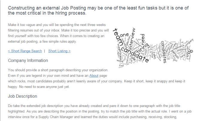
Just look at this post from Omni Circuit Board. If you’re the blogger, you’ve had to organize all of your information into clear, succinct sections, making you a better writer. If you’re the reader, it’s easy to grasp the main takeaways, or jump to the section that you’re interested in.
3) Your paragraphs are too long.
Don’t you just love it when you click on a blog post and find yourself staring at a page filled with a giant block of text? There’s nothing else that makes you want to dive in and start reading, right?
If we're being honest, there's actually nothing like too much text to send people running for the hills. This isn't to say that you should write less -- that's actually not the issue. The issue is with the length of your paragraphs.
Long paragraphs make your information look dense and hard to read. Short paragraphs, on the other hand, receive 50% more of a reader’s attention than long ones do. It's amazing what a difference it makes.
Outdoor Elegance Patio Design Center does this well in their blog post about wood pellet grills. Each paragraph is only a few sentences long, which makes it easier to read and comprehend all of the information they’re throwing at you.
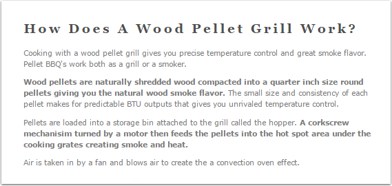
(And now you know how a wood pellet grill works. You’re welcome.)
4) Your font is hard to read.
Tiny fonts can often result in not so tiny headaches. Instead of forcing your readers to squint or do the dreaded pinch-to-zoom on mobile, pick a font size that’s large enough for all. Just like First Round Capital has done on their blog:
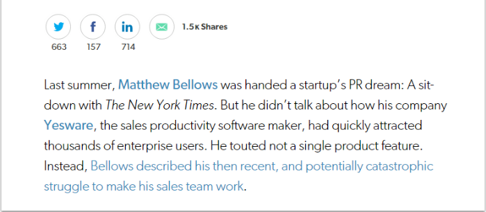
Now isn’t that easy to read?
When selecting a font, focus on clarity. At times, this can get a little technical. Serif fonts have little embellishments, or “serifs," on the top and bottom of each letter, like your Times New Roman or your Courier. Sans-serif fonts have no serifs -- in other words, the letters are straight, plain, and wonderfully clear.
For whatever reason (it has to do with your screen size and resolution), sans-serif fonts are much easier to read online. The most popular sans-serif fonts for online reading are Arial and Verdana, but we’ve also got some fun ones to try.
5) You didn't include bullet points.
We’re all busy people. We know that you don’t have time to read every single word in this post -- you want to learn why bullet points can help ... and you want to learn quickly.
You’re not alone. 79% of online readers scan the page instead of reading every word. So we’ll keep our explanation of bullet points short:
• Bullet points are great.
• They make it easy to process important information.
(In case you missed that, we just used bullet points to highlight the value of bullet points. Meta, I know.)
Keep your bullet points brief -- in fact, brevity is the whole point. Don’t put long-winded sentences behind bullet points and call it a day. That's simply not how it works.
6) You didn't bold or hyperlink anything.
Bolding or hyperlinking text can help readers quickly understand the key takeaways from the post. In fact, we don’t really care whether or not you’re reading the rest of this paragraph. We just wanted you to have read that first sentence. So we made it bold, so that it caught your eye. Gotcha.
Statistically, users read approximately 20% of the text on a page. So make sure that your most important information visually stands out by bolding it, or by hyperlinking it. This way, if a reader is skimming, they’ll at least remember that sentence over the others. Not to mention, those links can help boost your SEO.
7) You didn't use a numbered list.
This is number seven out of the eight reasons we've come up with that make your blog post hard to read. With that said, you’re almost there. This blog post is almost finished!
Numbered lists make blog posts easier to digest, easier to get through -- and let’s be honest, less intimidating to start. You know exactly what you’re getting into when you begin to read, how much information you’re going to walk away with, and even how much time it will likely take you to finish.
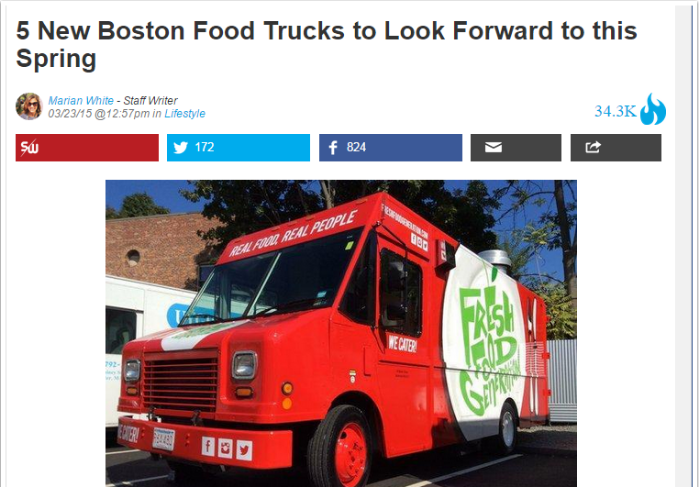
Five new food trucks in Boston? We’ll see you there, BostInno.
Essentially, numbered lists help readers mentally commit to read (or skim) all the way to the end. As a blogger, a numbered list is our way of getting you to read until the end.
Pro tip: According to a fascinating analysis by RJ Metrics, the magic number for Buzzfeed’s most popular list-based posts is 25.
8) You forgot to include images.
Remember when you graduated from reading picture books to books with no pictures? Well, unleash your inner six-year-old because pictures are back, baby.
Images visually break your text up to make it easy to scan. They can also help the reader understand your post at a glance. There are all sorts of fascinating statistics about the effects of visual content on your marketing, the most striking of which is that visuals are processed 60,000X faster in the brain than text.
Place one image at the top of every blog post to grab your reader’s attention and entice them to read further. The photos you use don't need to directly illustrate what your post is about, but they should be loosely related to your content.
Docalytics does this well in this blog post about how to sharing content on social media:
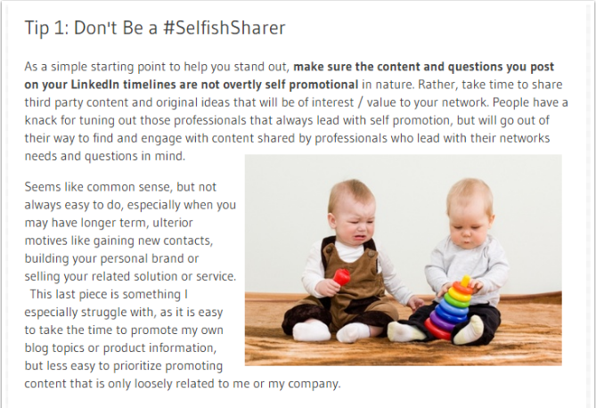
They’re using a picture of two adorable babies to capture your attention in this section. (And you’re going to read it now too, because no one wants to make a baby cry by not being a good sharer.)
For those of you who have struggled to find images to use, HubSpot has 550+ royalty-free stock photos to download for free. Or, you can search for your own using these free, non-cheesy stock photo sites.
What are other tips or tricks that you use to make your blog posts easy to read? Share in the comments below.

![How to Write a Blog Post: A Step-by-Step Guide [+ Free Blog Post Templates]](https://blog.hubspot.com/hubfs/how-to-start-a-blog-2.webp)
![Do People Still Read Blogs in 2023? We Asked Consumers [New Data]](https://blog.hubspot.com/hubfs/Untitled%20design%20%2835%29.jpg)
![How to Write a Blog Post Outline: A Simple Formula to Follow [+Tips from Our Blog Team]](https://blog.hubspot.com/hubfs/blog-post-outline.jpg)


