
Marketing is experiencing its biggest disruption in 20 years. AI is fundamentally changing how businesses find and engage customers. This year’s report covers just how saturated AI is in marketing, the top AI use cases, and ways brands can personalize content.
We also cover AI’s impact on marketing workloads, headcount, skills, and budgets — and how it actually impacts teams. Keep reading for insights from marketing leaders and fresh data.
Table of Contents
- TL;DR: Core channels still matter, but the approach has changed
- Top Digital Marketing Trends in 2026
- Digital marketing trend FAQs
TL;DR: Core channels still matter, but the approach has changed
The 2026 State of Marketing reveals that the core marketing channels — social media, email, website, and blog content — are as important as ever, but the rules have changed. Brands need to create more personalized, channel-specific content to stand out. Beyond that, teams need to optimize their content for AI search.
Marketers have made huge strides in adopting AI, personalization, and short-form video. Confidence is up, but professionals still face challenges with burnout, proving ROI, and keeping up with platform changes.
The top marketing trends identified in this year’s report include:
- Using AI to create personalized content (48.57%)
- Leveraging automation (47.38%)
- Creating content that reflects brand values (46.84%)
- Updating SEO for search changes (40.60%)
- Repurposing content across channels (35.08%)
Read on for data breakdowns and analyses from CMOs on these trends. To stay ahead, use unified platforms like HubSpot’s Marketing Hub for seamless execution.
The State of Marketing in 2026
HubSpot's Annual Marketing Trends Report
- AI in Marketing
- Branding and Growth
- Human-Led Creativity
- And More!
Top Digital Marketing Trends in 2026
1. Brands are recalibrating content for AI search
If 2025 was a panic year about what AI search would mean for SEO, 2026 is an action year. Updating SEO for search changes is one of the top trends brands are tackling this year (cited by 40.6% of marketers).
Half of all consumers use AI-powered search in 2026, and half of all Google searches include an AI overview. Brands know more than they did a year ago about what makes content rank in answer engines, and they’re recalibrating their content accordingly. Of marketers, 70.2% believe they’re able to adapt their marketing strategy to the changes in organic search (e.g., AI overviews).
Our survey showed that websites, blogs, and SEO remain the most popular and impactful channels in 2026, especially for B2B companies. So, it’s essential to get it right. Many teams are building or already implementing an answer engine optimization (AEO) strategy. Some brands are finding that they only need minor tweaks to their existing content, while other brands are making a more significant shift.

Companies also need to consider what role websites will play in the buying journey. Consumers are seeking top-of-the-funnel information in AI search summaries, not your website. The survey showed that websites will still be relevant, but consumers will come later in the process and will be better-educated, with higher intent.
2. Marketer confidence and AI adaptability are up
Tackling new tools and platforms is always part of the job, but the last few years in marketing have felt like trying to run on a slip ‘n’ slide. The 2026 State of Marketing revealed that marketers have made strides in bridging the gap, particularly in understanding AI.
Here’s what the data shows:
- 68.2% of marketers say they understand how to use AI in marketing, compared with 47% in 2025.
- 67.5% know how to measure AI impact, compared with 48% in 2025
Marketers are rising to the challenge, and they’re even having fun doing it.
“AI is such a disruptive technology. And whenever there's a disruptive technology, it creates huge opportunities to experiment,” shares Johann Wrede, CMO of UserTesting.

“Now you can give people the tools they need to personalize very quickly: It’s the stuff that I dreamt of five or 10 years ago. For me, it‘s making marketing incredibly fun because the old rules don’t apply. So, it's up to us as marketing leaders to figure out what the new rules are, and write, write the book,” Wrede says.
Marketer confidence is also up in other areas:
- 78% say they’re able to keep up with new cultural trends.
- 69.2% say they’re able to effectively use customer data to create personalized experiences.
- 68.8% feel confident keeping up with new social media platforms/features.
- 68.4% feel they can pivot their marketing strategy in response to major events.
Our team at HubSpot is outlining how marketers like you can successfully integrate AI into your workflows using Loop Marketing. Learn more about it here.
3. AI-enabled personalization drives growth
The number one trend for marketers in 2026 is using AI to create personalized content. Almost half the marketers we surveyed said they’re currently exploring this.
Marketers know that offering a highly personalized experience is valuable. 93.2% say that personalized/segmented experiences have led to more leads and purchases.
“Consumers are looking for content that feels like them,” explains Susan Ganeshan, CMO of Emplifi. So if I‘m going to purchase clothing, I want to see it on a body that’s like mine. If I'm going to purchase makeup, I want to see it on a woman aged like me. Essentially, we want authenticity at scale.”
The problem with creating personalized content has always been resources and scale, but AI is changing that. Now, instead of manually customizing from a template, creatives can feed AI their audience data, goals, and brand guidelines to create an on-brand, tailored draft.
To do this effectively, brands need high-quality data. Just 65% of marketers say they have high-quality audience data— a percentage that didn’t budge this year. That means there’s still a sizeable opportunity gap to bridge.

There’s also an opportunity gap for brands to improve their personalization. Only 12.6% of brands are using hyper-personalization, like behavior-based messaging or product recommendations, while the majority still use basic personalization, like simple dynamic fields.
Learn more about personalization with HubSpot CRM.
4. Lead volume and quality are up
Here’s a spot of good news: generating high-quality leads is getting easier.
While generating leads is still a top challenge for 30% of marketers, many others are seeing success. 55.7% of marketers say it’s easier to generate leads now than a decade ago.
When asked about the last 12 months, 24.5% said their lead volume significantly increased, and 50% said it somewhat increased. These leads are also better quality, with 93.8% of marketers saying their lead quality improved over the past year.
It’s hard to say exactly why this is. Perhaps tool advancements or personalization are enabling brands to reach the right audiences with targeted messaging. This upward trend doesn’t just follow lead generation.
5. Marketers are using AI for content creation, ad optimization, brainstorming, and more
AI saturation is here: 86.4% of marketing teams say they use AI in at least a few marketing areas. The percentage of marketers who don’t use AI and don’t plan to stands at just 1.7%.
Now, the ways marketers are using it are varied and interesting. The most popular uses are:
- Content creation (42.5% use extensively; 38% use occasionally)
- Media creation (37.2% use extensively; 37.7% use occasionally)
- Advertising automation and optimization (34.1% use extensively; 36.5% use occasionally)
- Administrative task automation (35.6% use extensively; 40.5% use occasionally)
- Learning and skill development (34.6% use extensively; 40.1% use occasionally)
- Brainstorming and ideation support (33.9% use extensively; 39.8% use occasionally)
- Strategic planning and forecasting (33.4% use extensively; 37.5% use occasionally)
That means marketers are using AI to do everything from creating blog posts to forecasting Q4 outcomes to teaching themselves Excel functions. As the learning curve flattens, they’re starting to see the impact. 26.5% say AI has significantly increased productivity, while 66.2% say it’s slightly or moderately increased productivity.
According to the survey, AI saves marketing teams time. About one-third say AI saves their team 10 to 14 hours per week, and another third say it saves them over 15 hours. Just under a third say it saves their team one to nine hours per week.

6. AI is making a major impact — but it shouldn’t replace humans
While many content marketers have voiced concerns about the potential for AI tools to replace human content creators, our recent data suggests that this is unlikely to happen.
The vast majority of marketers (73.4%) say that they see AI working in conjunction with marketers, assisting them in performing most of their job duties.

“The human in the loop is the most important part of any kind of workflow, especially involving AI. Real creativity takes the human mind,” states Wrede.
There’s also a strong argument that customers are already growing weary of mediocre AI-generated content and will respond better to authentic, people-centered content. According to the survey, 62.7% believe we need more unique, human-centered content to compete with AI content.
“From a marketing perspective, I think that means a stronger focus on real thought leadership, real stories with a lot of individual personality — not the boring, generic content that is flooding the world right now, generated by AI,” shares Amy Kenly, VP of Marketing at The Launch Box.
Kenly continues, “You have to find ways to stand out by being unique, and the only way to do that is to focus on the real words of real people.”
7. Marketing budgets are up modestly in 2026
Tariffs terrified companies and affected budgets in 2025, but budgets are back. Of marketing teams, 79.2% report that they expect at least a slight increase in 2026 budgets over 2025, and 21.2% expect a significant increase. Just 6% expect a decreased budget. Mid-sized companies expected larger budget increases than enterprise and SMBs.
The flip side of this is that budgets are under the microscope: 73% say their budget receives more scrutiny now than in the past.
So, where will that money go? Here’s where marketers plan to increase their marketing investments the most next year:
- AI chatbots like ChatGPT, Perplexity, Gemini, Claude (37.7%)
- Paid social media (37.4%)
- Video marketing (37.1%)
- Content marketing (36.9%)
- Website/blog/SEO (35.4%)
Conversely, here’s where marketers plan to decrease their spend the most this year:
- Physical ads like signage, billboards (23.3%)
- Direct mail (21.6%)
- Print advertising (21.4%)

8. Social media is king
Brands are still experimenting with newer channels like voice search and the Metaverse, and continuing analog advertising like print and out-of-home.
But the data shows that social media is the cornerstone of marketing in 2026, second only to website/blog/SEO. Organic social media content is leveraged by 40.3% of brands, followed by paid social media content with 39.4%. Social media channels dominate three of the top five impactful channels for brands, including:
- Paid social media content (25.9%)
- Organic social media content (23.5%)
- Social media shopping tools (22.7%)
Many brands are also using tactics like social shopping, influencer marketing, and direct messaging to reach new customers and drive sales.

9. Instagram passes Facebook as the #1 social media platform for brands
For the first time, Instagram has passed Facebook as the most leveraged platform, used by 70% of brands. Facebook sits at number two, leveraged by 69.6% of brands. Instagram also passed Facebook in ROI perception, with 48% of brands ranking it in their top three vs. 42.7% for Facebook.
Instagram’s short-term video, social commerce, influencer, and visual storytelling capabilities have made it a popular choice for brands. Investment intent for these platforms is nearly identical in 2026, with Instagram slightly ahead.
Instagram and Facebook remain the twin pillars of social marketing. The gap is narrow, but the trend shows Instagram gaining strategic priority, especially for engagement, video, and commerce, while Facebook remains useful for broad utility and reach. For 2026, brands are investing in both, but leaning into Instagram’s creative and conversion potential.
10. More brands use TikTok than X (formerly Twitter)
TikTok now edges out X on both brand usage and ROI. Of brands, 54.5% use TikTok as a marketing platform, while over 55.8% use X. TikTok has also passed X in ROI perception, with 32% ranking it in their top three over X at 31.3%.
While X remains relevant for real-time conversation and customer service, news, and B2B thought leadership, TikTok dominates for short-form video, social commerce, and Gen Z engagement.
One telling indicator is planned investments for 2026. Nearly twice as many marketers say they plan to increase investments in TikTok over X next year.
Featured Resources
- X vs. Threads: What Marketers Need to Know
- The Fastest Growing Social Media Platforms [New Data]
- Which Social Media Channels are Gaining & Losing Steam? [Data]
11. Short-term video is the best investment you can make in 2026
HubSpot’s latest survey data shows that visual formats — including short-form video, images, and live-streaming video — are particularly popular and are driving results. But when asked which media formats earned the biggest ROI this year, one wildly outperformed the rest. Take a look:
- Short-form video (48.6%)
- Long-form video (28.6%)
- Live-streaming video (25.1%)
- User-generated content (24%)
- Blog posts (22.3%)

This dominance holds true across B2C, B2B, and non-profit/governmental. Formats like case studies (16.5%), interactive content (9.8%), and podcasts/audio content (0.2%) don’t even come close. Just because you don’t sell makeup or a buzzy consumer product doesn’t mean you can’t succeed with short-term video. Platforms like TikTok, YouTube, and Instagram are excellent starting places.
AI tools are making video production faster and more affordable for teams. Media creation is the second-most popular use of AI in marketing. Tools like HubSpot's Content Remix can automatically convert your existing blog content into video scripts, social posts, and audio content.
12. Channel-specific content performs better
The fifth most popular digital marketing trend of 2026 is repurposing content across channels. But how marketers choose to do that is critical.
Of teams, 49.4% reuse the same content across platforms, while 39.5% tailor the content for each platform. This could be as simple as resizing an image to platform specifications and trimming text, or it could mean completely reworking the creative for the distinct platform audiences.
At the end of the day, this goes back to understanding your audience and who is on what platform for what purpose.
“Approach each channel and ask, who is the audience on this channel? What behavior do I want this audience to take from my ads or organic content? And then, how am I going to measure success?” suggests Ganeshan.
AI tools can speed up the repurposing process by allowing marketers to publish to multiple platforms while customizing to that platform’s requirements. However, Ganeshan cautions that brands must build AI workflows with human approvals that ensure a brand’s guidelines and quality standards remain intact.
13. Influencer marketing is impactful, but underutilized
While influencer marketing has been an important marketing channel for some time, the State of Marketing highlights its lasting impact. Influencer marketing drives particularly strong ROI in B2C companies.

Despite the buzz of influencer marketing, just 21.2% of brands say they’re leveraging it (23.6% of B2C vs. 18.6% of B2B). That means brands may be missing out on opportunities for engagement and growth.
Respondents said they saw the most success with micro-influencers this year (32.4%), followed by macro-influencers (30.2%), then mega-influencers (13.1%).
Our respondents noted that despite their relatively small number of followers, these smaller influencers offered access to audiences with strong brand loyalty and trust, making them especially valuable. Brands also say that influencers have helped them amplify content reach beyond its initial publication.
Bitly CMO Tara Robertson shared the impact that an influencer marketing campaign had on her Bitly awareness and engagement. Robertson reports, “The results were strong. Compared to our average Instagram performance, we saw 5X higher impressions and video views, 6X higher engagement, and 82% growth in followers.”
“As a result, partnering with influencers is becoming a larger part of our overall marketing strategy as a way to broaden our reach, connect more effectively with our target audiences, and show measurable results while still maintaining trust and authenticity,” says Robertson.

14. Data is still a struggle
The key to executing many of these powerful marketing strategies is great data.
Unfortunately, obtaining clean customer data remains a challenge, with many marketers reporting that they struggle with disconnected data sources, company silos, and a lack of a centralized and accessible source of information about their customers.
Marketers cite adopting a data-driven marketing strategy (19.5%), difficulty sharing data across their organization (12.4%), and lack of high-quality data (9.2%) as top challenges.
“We’re being intermediated with our customers as they turn to AI search tools,” says Wrede. “If they’re not coming to our website, we’re not even getting behavioral analytics. Being able to hear the voice of the customer will become much more challenging.”
Marketers are left with a few choices:
- First-party sources (website and app analytics, CRM systems, and transactional data) give powerful behavioral insights and intent signals.
- Third-party sources, like data management platforms, give insights into behavior beyond your website, though this is becoming more difficult due to tighter privacy laws.
- User research (surveys, user interviews, and focus groups) helps marketers understand their audience.
- Zero-party sources, including preference centers and explicit opt-ins, build trust with customers by building an exchange of data in return for a benefit like a discount or personalized assessment.
To address these challenges, I recommend HubSpot’s CRM and Marketing Analytics tool. This tool provides helpful insights into customer behavior, preferences, and engagement patterns, helping marketers create more personalized and effective campaigns.
15. Brands are showing their values
One of the top digital marketing trends identified this year is brand values-driven content. Almost half of marketers (46.8%) are exploring how to apply brand values in 2026.
The question is, what does this mean? Values-based differentiation can help businesses connect with customers through shared values, like sustainability, transparency, and diversity and inclusion.
Three-quarters of marketers say their brand has a clear understanding of its values on social, cultural, and social issues, but only 23.9% strongly agree. Validation can help. Companies can validate their brand values through efforts like customer surveys, engagement metrics, and A/B testing positioning statements.
16. Marketing teams face pressure to prove ROI.
The number one challenge that marketers face in 2026 is measuring marketing ROI, cited by 33% of respondents.
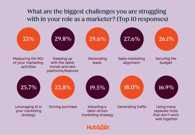
Marketers continually collaborate laterally with teams like sales (sales-marketing alignment is another top challenge), and they also need to manage up to leadership. When asked, 37.9% say leadership views marketing as less important to the business than in past years.
Marketing teams are under immense pressure to deliver more with less. Expectations are higher because of AI: 83.5% of marketers say they’re expected to produce more content, and 35.7% say they’re expected to produce much more content.
17. Burnout is looming.
Seventy percent of marketers believe that marketing has changed more in the past three years than in the past 50. This combination of overwhelm, disruption, and downward pressure means marketers are prime candidates for burnout.
While the allure of AI promises to make marketers’ jobs easier, most companies haven’t reached that level of maturity yet. Most companies won’t add significant marketing headcount in 2026.
In the meantime, workloads are up significantly: 25.7% say their workload increased significantly over the last year, while 47.4% say it increased moderately. Less than 5% reported a decrease of any degree.

To avoid mass burnout, leadership should recognize these challenges and support employees accordingly.
18. Marketing teams need AI, data, and communication skills in 2026
While team sizes remain fairly flat, the skills needed in marketing are changing. Hiring managers say that finding candidates with the right skill set is their top challenge in 2026. These three skills rose to the surface as companies look to the future of marketing.
1. Automation and AI prompting
Every marketing executive I spoke to looks for AI skills or, at the very least, curiosity.
“What I‘m looking for is different than what I’ve looked for in the past,” shares Wrede on UserTesting’s marketing hires. “I‘m looking for people who do not see AI as something to be afraid of. I’m looking for people who have really curious minds and the mindset of being a coach, not a doer. They’re a coach of AI, because AI is the doer.”
The future of the entry-level marketing role may look more like prompt engineering and AI management in the near future, rather than a traditional individual contributor who does the work themselves.
Ganeshan echoes the importance of AI skills: “The number one highest priority in terms of skills is understanding how to work with AI engines to get the best possible product out of them, including variations in all the ways the product needs to show up.”
2. Communicating across an organization
The second most important skill for a marketer is communication across the organization, according to Ganeshan. Sharing outcomes, presenting to leadership, and defending a budget are essential skills to succeed — and advance — in marketing.
3. Data and analytics
Data is another must-have skill in 2026. “Being good with data and analytics is imperative. You couldn’t enter the marketing world right now without those skills,” says Kenly. Her team at The Launch Box recently reorganized around helping some marketers build data analytics skills and certifications, while focusing others on human content creation.
“We look for someone who can interpret data into business results and actionable advice, since that’s going to be the bulk of the marketing role in the next few years.”
Digital marketing trend FAQs
1. What digital marketing trend should I prioritize first?
If you’re just getting started, focus on AI-driven content creation and workflow automation. According to HubSpot’s 2026 State of Marketing Report, 86.4% of marketers now use AI tools, especially for content and media creation. Start by automating repetitive tasks, then expand into AI-assisted creative ideation, reporting, and strategy.
Quick win: Use HubSpot’s Free AI Content Creator or Content Remix to transform existing blog content into social posts, videos, or emails in minutes.
2. How much should I budget for AI marketing tools?
AI tools can fit nearly any budget. For instance, HubSpot goes from free to enterprise pricing.
Aim to allocate 5-10% of your total marketing budget to AI tools initially, then scale based on ROI. HubSpot’s data shows marketers who automate content and analytics report higher efficiency and faster campaign execution (HubSpot AI Trends Report).
As Briana Rogers, VP of Marketing at Miro, explains, “The space is moving so quickly and we need to experiment with everything… from the more well-established use cases — like leveraging machine learning to improve ad buying, or creating predictive customer value models — to newer spaces, like identifying patterns in user research and data, assisting in creative development, and building full customer campaigns that are powered by AI.”
4. What's the difference between marketing automation and AI?
While both improve efficiency, AI and automation serve different purposes:
- Marketing automation executes predefined workflows (e.g., drip campaigns, email sequences).
- Artificial intelligence adapts and learns (e.g., predicts lead scores or personalizes content dynamically).
Automation is the engine; AI is the driver guiding smarter actions over time.
5. How do I measure ROI from influencer marketing?
Start by setting measurable goals — impressions, engagement, conversions, or follower growth — and tie results to CRM data.
HubSpot’s research shows that micro influencers (under 100K followers) deliver the highest ROI. Even Bitly CMO Tara Robertson reported 5x more impressions and 6x higher engagement through a micro influencer pilot.
Use tracking links (e.g., Bitly) and HubSpot CRM integrations to attribute influencer content to real business outcomes.
6. Which social media platform offers the best ROI for B2B vs. B2C?
According to HubSpot’s 2026 State of Marketing report,
- For B2C: Instagram and Facebook dominate in ROI, cited by 47.4% of B2C marketers each. The next most impactful are YouTube (43.9%) and TikTok (35.2%).
- For B2B: Instagram (48.4%), Facebook (36.9%), YouTube (40.5%), and X/Twitter (31.3%).
7. What’s the future of digital marketing beyond 2026?
The next frontier of marketing revolves around hyper-personalization and AI. Expect to see:
- AI-enabled personalized content, like personalized ads, website experiences, and chats.
- Data privacy-first marketing, as 84% of consumers view data privacy as a human right.
- Zero-party data, where customers exchange select data with companies for tangible benefits.
Marketers who combine human creativity with machine intelligence — leveraging unified platforms like HubSpot’s CRM for a single source of truth — will lead the next era of growth.
8. How are marketers using AI?
According to the 2026 State of Marketing, top ways marketers are using AI extensively are content creation (42.5%), media creation (37.2%), and administrative task automation (35.6%).
9. What are the top challenges in marketing today?
The top challenges marketers cited in the 2026 State of Marketing survey are measuring the ROI of marketing activities (33%), keeping up with the latest trends and new platforms/features (29.8%), generating leads (29.6%), and sales-marketing alignment (27.6%).
10. How can I future-proof my marketing team’s skills in 2026?
Marketers can future-proof their skills by training and upskilling in data analytics, AI, cross-departmental communication, and authentic human storytelling.
11. How do I optimize my content strategy for search in the age of answer engine optimization (AEO)?
Marketers can optimize their content strategy for AI search by answering users’ questions directly in conversational language, creating structured, scannable content, and injecting content with their niche authority and expertise.
What's Next: Your Marketing Action Plan
Today’s marketing landscape demands both strategic vision and tactical agility. While this report covers twelve major trends, not every trend requires immediate action.
Instead, audit your current capabilities against these trends, identify two or three that align with your audience and resources, run pilot programs to test impact before full investment, then measure results and scale what works.
The winners in 2026 won't be those who chase every trend, but those who thoughtfully integrate the right innovations for their specific context. Start small, measure everything, and scale strategically.
Ready to dive deeper? Download our complete 2026 State of Marketing Report for detailed implementation guides, benchmarks, and exclusive data to guide your strategy.
The State of Marketing in 2026
HubSpot's Annual Marketing Trends Report
- AI in Marketing
- Branding and Growth
- Human-Led Creativity
- And More!
Marketing Trends
![4 shopping trends to expect in uncertain financial times [data + how marketers can adapt]](https://53.fs1.hubspotusercontent-na1.net/hubfs/53/consumer-recession-spend.webp)
![The Future Consumer: State of Consumer Trends in 2025 [Data from 700+ Consumers]](https://53.fs1.hubspotusercontent-na1.net/hubfs/53/consumer%20trends%202023-1.png)
![The top 7 marketing trends of 2025 that we expect to continue in 2026 [Data from 1,500+ global marketers]](https://53.fs1.hubspotusercontent-na1.net/hubfs/53/Marketing-Trends-1-20260114-3357043.webp)
![4 Marketing Trends & Strategies That Might Not Survive in 2025 [New Research]](https://53.fs1.hubspotusercontent-na1.net/hubfs/53/marketing%20trends%20that%20might%20not%20survive%202024.png)
![The HubSpot Blog's Marketing Leadership Report: How 720+ Brand Leaders Will Get Ahead in 2025 [+ How to Join Them]](https://53.fs1.hubspotusercontent-na1.net/hubfs/53/Copy%20of%20The%20Future%20of%20Work%20is%20Flexible%20%5BImage%2c%20IG%5D%20(598%20%C3%97%20398%20px)%20(595%20%C3%97%20400%20px)%20(517%20%C3%97%20517%20px).png)
![Top Shopping Trends of 2024 & How They've Changed [New Data]](https://53.fs1.hubspotusercontent-na1.net/hubfs/53/shopping-trends_3.webp)
![How Each Generation Shops in 2024 [New Data from Our State of Consumer Trends Report]](https://53.fs1.hubspotusercontent-na1.net/hubfs/53/how-each-generation-shops-1-20240801-5345961-1.webp)
![Millennials vs. Gen Z: Why Marketers Need to Know the Difference [New Data]](https://53.fs1.hubspotusercontent-na1.net/hubfs/53/Untitled%20design%20-%202024-05-14T151228.178.jpg)