
Infographics are one of the best methods to convey complex information in an easy-to-digest way. But for me personally? My favorite thing about infographics is their versatility.
 I’ve used a single infographic — yes, yes, just one! — to:
- Add visual media to a blog post.
- Generate backlinks.
- Pin the blog post to relevant Pinterest boards.
- Distribute on social.
- Use as print-based marketing materials for in-person events.
Despite their many, many strengths, I’ve also spent many, many hours designing infographics from scratch. Seven years on from creating my first one, I now know that infographics don’t have to take a lot of time. There are a plethora of affordable and user-friendly tools that make it easier to create impactful graphics, especially if you’re working with a budget or are not very tech-savvy. Good news, right?
Keep reading and you’ll learn different ways to create an infographic in under an hour.
Table of Contents
- How to Make an Infographic
- Free Infographic Tools
- Creating an Infographic
- How to Make an Infographic for Free
- Testing it Out
- Tips for Creating a Great Infographic
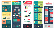
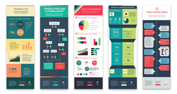
15 Free Infographic Templates
Build better infographics with these free designed templates.
- Color schemes
- Icons & shapes
- Fonts
- Eye-popping themes
Download Free
All fields are required.
Creating an Infographic
According to HubSpot research, 88% of marketers planned to increase or maintain their investment in infographics in 2025. With readers retaining 65% of information when it’s paired with a relevant infographic, this re-investment should come as no surprise. Further, “Infographics are 30 times more likely to be read than a written article.”
If you’re a visual learner like me, that last statistic, in particular, will resonate with you. Beyond catering to visual learners like you and me, Infographics are among the most effective types of marketing. In my experience, this is because they help readers digest writing and understand the importance of a product at a glance.
It can take a lot of effort and time to condense complex information into an impactful visual. That’s why I’m a fan of these 15 Free Infographic Templates in PowerPoint created by HubSpot. I’ve personally used the templates to create high-quality, professional infographics in minimal time.
Download the free infographic templates now.
With these templates, you can add your own content to premade outlines in a cinch. And if you need a helping hand, I’ll show you how to personalize your infographic in PowerPoint (and other tools).
If you prefer watching, this video shows the process of creating an infographic step-by-step:
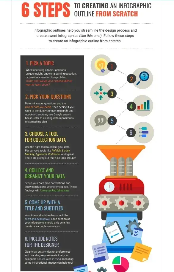
How to Make an Infographic
- Decide on a goal for your infographic.
- Identify the audience for your infographic.
- Choose your desired infographic template.
- Collect your content and relevant data.
- Download your template to PowerPoint.
- Customize your infographic.
- Include a footer with your sources and logo.
- Promote and publish your infographic.
1. Decide on a goal for your infographic.
If you’ve read any of my “how-tos” before, you’ll notice a recurring theme: I usually suggest starting with your end goal in mind.
Of course, you can be flexible in how you get there. You can even amend your end goal within reason as you gather more information throughout your journey. But I just don’t think you can realistically create anything impactful in marketing, including infographics, without a clear “why.”
If you start an infographic without a goal, it may include too much information or fail to convey your message clearly. You might choose an ill-fitting template or design, or realize you lack important information needed to create a compelling infographic in the first place.
Now I’ve established why you need goals, here’s how to set them.
When defining your goal(s), I recommend including the broad purpose of your infographic. Do you want to educate, persuade, inform, or inspire your audience? Next, you’ll need to think about what specific aim you’d like your graphic to achieve.
No idea where to start on the latter? No worries! You can use infographics to:
- Quickly summarize complex topics.
- Simplify complicated processes.
- Highlight research or survey results.
- Condense long-form content, like blog posts or case studies.
- Analyze and compare different products or concepts.
- Boost awareness about a topic.
In my opinion, an infographic is for more than just presenting information. That’s why I suggest considering what action or response you’d like your audience to take after consuming your infographic. Do you want your audience to sign up for a newsletter, visit a website, or do something else? And, yep, you guessed it, you also need to factor this into your goal.
Example: Aside from the general bulleted list above, I’ve also used infographics to achieve hyper-specific marketing goals. In one case, my end goal was to generate high-quality backlinks to a website. To achieve this, I knew it was more important to create original research rather than cite third-party data. (Sharing original research increases your chances of folks wanting to cite, and therefore link back to, your page.)
Before I even started making the infographic, I had to consider what kind of original research I’d need to either conduct or commission as a priority. Imagine how many hours I could’ve wasted gathering useless third-party data if I didn’t understand my end goal first. That’s just one way you can needlessly spin your wheels without a clear goal.
2. Identify the audience for your infographic.
Infographics aren’t just pretty visuals; they’re about communication. Communicating well means knowing who you’re communicating with. That’s why I recommend identifying your target audience before designing your infographic.
Note: You could combine this step with deciding on your goal. Honestly, it all depends on how you work best. No process is one-size-fits-all. It’s a guide for you to make your own!
If you’re unsure how to define your audience, I recommend following Harvard Business Review’s (HBR) advice on telling a story with data. According to HBR, five possible audiences can change how you choose and visualize your data: novice, generalist, managerial, expert, and executive. Consider which one applies to the broader goal of your infographic, and ultimately, who you want it to reach.
By identifying your audience using HBR’s suggested categories, you can also determine how advanced your information should be. For example:
- A novice audience might need data with a more obvious meaning.
- A generalist may want to see how the information ties into the big picture.
- A managerial audience might need to see how different groups or actions affect one another.
- An expert might be more interested in getting into the weeds of your numbers and posing theories around them.
- An executive has more in common with a novice audience. That’s because they only have time for the simplest or most important information and the impact it’ll have on the business.
In my experience, the audience is the most crucial part of communicating your data and information. So, once you identify who you want to see your infographic, dig deeper into that persona.
“Okay, cool. But what do you mean by this?” I hear you asking.
I suggest you consider what interests that audience, what motivates them, and what specific information they need.
I would then go a step further. Where will this audience likely stumble upon and consume your infographic? Will it be on a website, shared on social media, or presented at a conference? I also like to explore ways to leverage (aka repurpose) the heck out of my content. To that end, I suggest you take time to consider how you might repurpose your infographic with different marketing channels in mind.
The bottom line here? The platform and situation should influence the design and format of your infographic. Keeping these details in mind will make your infographic stand out and impact relevant channels.
Example: I used to work on marketing campaigns in the mental health and well-being space. In one case, I knew that my client’s target audience typically spent time on Pinterest and Instagram. So I created an infographic that stuck to Pinterest’s recommended image sizes, and then repurposed the visual using the “Story” feature on Instagram.
If there was a lot of information in a single infographic, I’d resize it to fit Instagram’s recommended story image dimensions precisely so as not to lose quality. But in most cases, the Pinterest sizing works for both.
Pro tip: Take audience awareness a step further by conducting research or gathering feedback from your target audience. These details make it easier to tailor your infographic to their specific needs.
15 Free Infographic Templates
Build better infographics with these free designed templates.
- Color schemes
- Icons & shapes
- Fonts
- Eye-popping themes
Download Free
All fields are required.
3. Choose your desired infographic template.
Now that you have your goal and a clear idea of your target audience (including where they hang out online!), it’s time to choose an infographic template that A) matches your goal, B) represents your data, and C) caters to your target audience.
The important thing is to choose a template that works explicitly for the type of data set and content you want to present. It should also help you tell the story you have in mind.
You could arguably collect your content and relevant data before choosing your template, BUT… this guide is about creating an impactful infographic — fast. Templates aren’t just great for speeding up the design process: I always find they help with inspiration, too.
I also find templates help me to visualize how I can organize and present my data. This allows me to narrow my focus before I get into the design stage. You can always stay flexible with the templates, though. If you decide to go in a different direction with what data you need to present, choose a different template if need be. I’ve spent many wasted hours trying to make information “fit” when it would have been quicker to select something new and start again.
As you saw pictured above, you can download our 15 infographic templates in PowerPoint and choose the template that will best help you communicate (and even inspire) your data choices.
Infographic templates also have premade sections or modules to help you structure your content. This makes it easy to understand how your information will fit within each section, giving your infographic a logical flow. So you’re speeding up your thinking and design process.
Other vital qualities I suggest thinking about as you choose a template include:
- Whether your infographic uses quantitative, qualitative, or categorical data.
- How complex your data set is.
- Whether the infographic design elements align with your brand.
- Accessibility, including readability for all audiences.
I also highly recommend factoring in where you intend to share your infographic. For example, if you want to distribute it on Pinterest, choose Pinterest-friendly image dimensions (around 1000 x 1500 pixels for Pins in the feed). It doesn’t have to follow those exact image dimensions. However, the infographic template shouldn’t be so large that Pinterest’s detection system interprets it as spam.
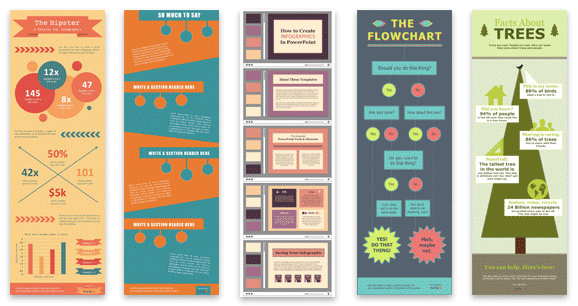
Some of your template options in the offer linked above include a timeline, flowchart, side-by-side comparison, and a data-driven infographic.
Pro tip: Remember what I said about staying flexible with your design as you go further into the process? Choosing a template that offers a range of layout options for different types of information will help you do just that.
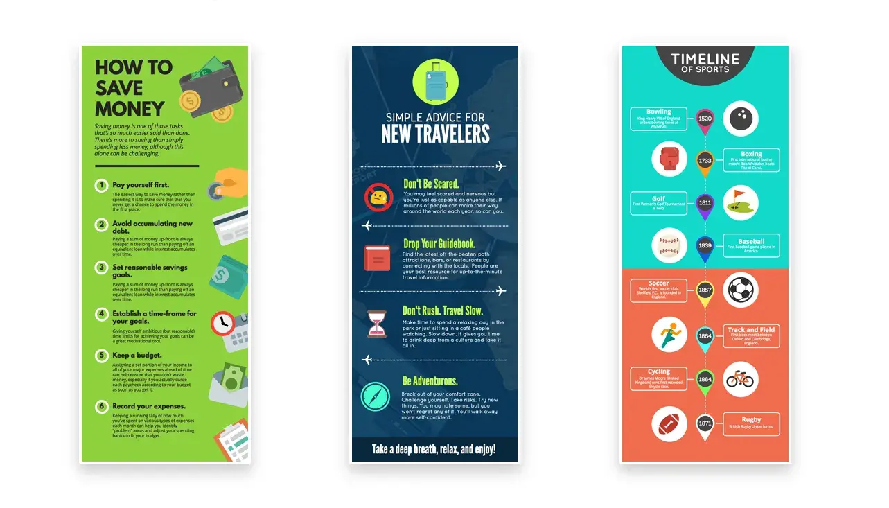
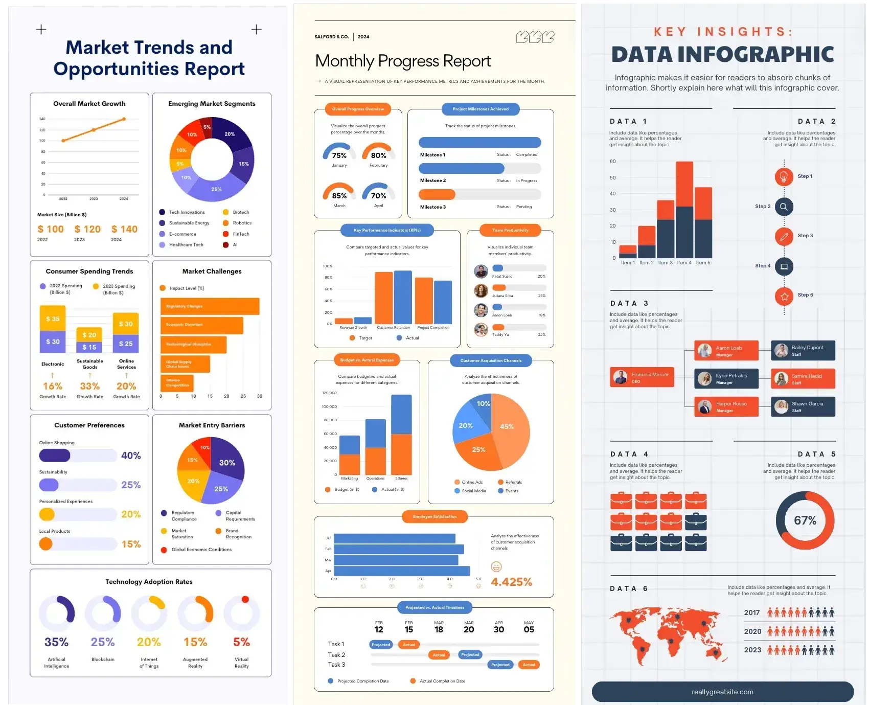
Types of Infographics
Here’s something I wish I knew when I first started experimenting with infographics for marketing — you can use different kinds of infographics to achieve different goals.
If you don’t know your flowchart from your timeline, I’ve compiled a list of some of the most common infographics below. I hope this information will help you choose an infographic template that suits the story you want your data to tell.
Side-By-Side Comparison Infographic
I generally use the side-by-side infographic design to help prove the advantage of one concept over another. I also use this design style to help me explain the differences between two competing entities.
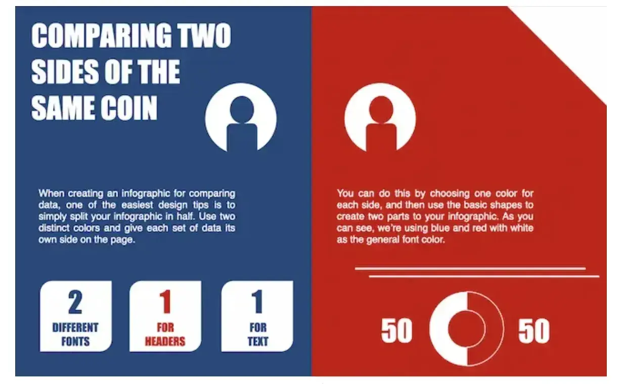
Use this type of infographic for: Showing the head-to-head differences between two options or ideas.
Flowchart Infographic
Enter the trusty flowchart infographic if you need to:
- Present a new workflow for your organization.
- Show the mechanisms behind a linear or cyclical process in your industry.
- Walk people through a decision.
I genuinely love seeing these types of flowcharts when brands have a humorous take on something. For example, they are a playful way to show how one conclusion is self-evident.
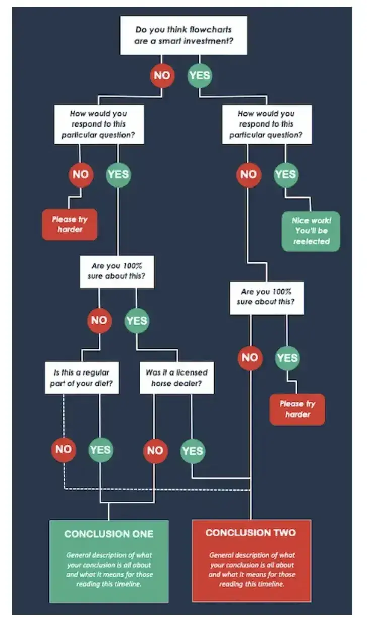
Use this type of infographic for: Highlighting a decision tree or process.
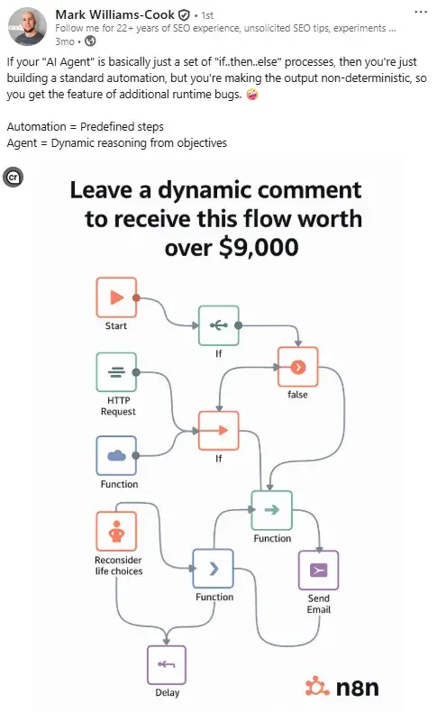
Pro tip: If your brand is playful, your conclusions could be “Yes” and “Yes, but in red.” You could also adopt Director at Candour, Mark Williams-Cook’s hilarious approach and create a flowchart that literally makes no sense… on purpose.
The joke is that much like many of the n8n automations offered by the “comment for” posts, the flowchart doesn’t actually work. I mean, the “Reconsider life choices,” with the hand on hips icon had me chortling, anyway.
Timeline Infographic
I use the timeline infographic to tell a chronological story. This is great for showing the history of a business, industry, product, or concept.
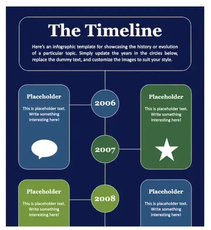
Use this type of infographic for: Sharing a timeline to illustrate a journey from where you were to where you are now.
Graph-Based Infographic
This design is perfect if you’re publishing a high volume of data and statistical information, making it a good fit for expert-level audiences.
I love looking at these because they make it easy to review data and see how different categories or responses compare.
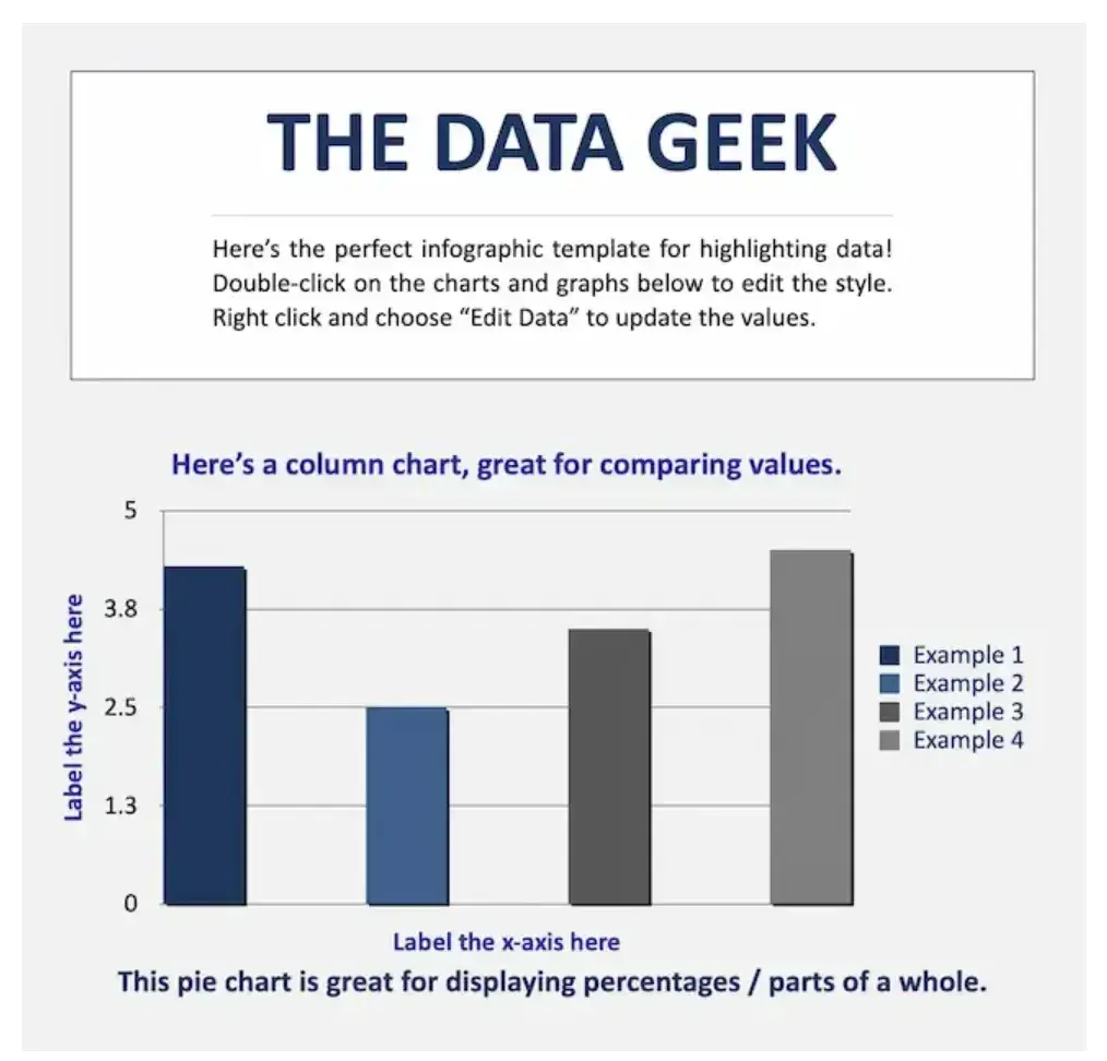
Use this type of infographic for: Simplifying or comparing massive amounts of data.
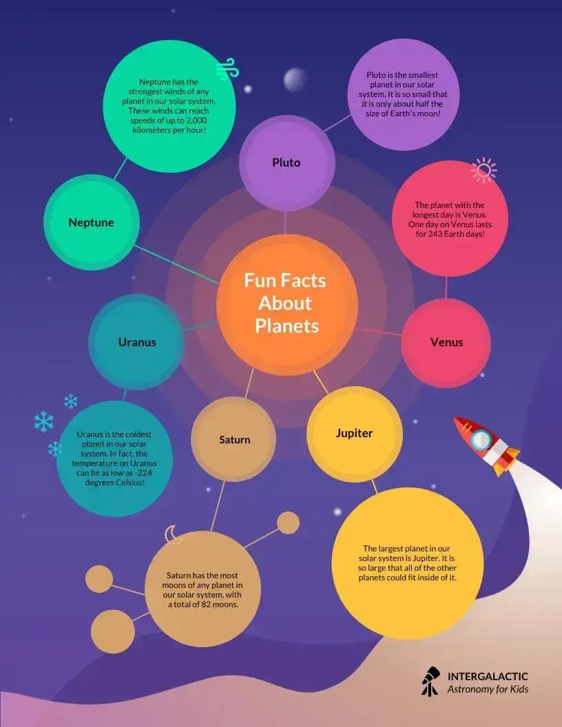
Image-Heavy Infographic
This design caters to content creators who are trying to reveal trends and information from shapes, designs, or photography — rather than just numbers and figures.
They usually fall on the complex side of things, but I think these infographics are worth the effort. You can compare and contrast multiple types of information in one image. They’re also SO aesthetically pleasing, meaning people are more inclined to repost them, especially on visual platforms like Pinterest.

Use this type of infographic for: Displaying a variety of information sources and categories to paint a comprehensive picture.
A word of caution: Be sure to consider where people will interact with your infographic to determine if it’s an appropriate size and sufficiently readable on different types of devices. Hint: Something like this image may work better in print than online.
4. Collect your content and relevant data.
Phew, I’ve thrown a lot of information at you. We’re about halfway through this process, so if you need to take a breather, go for it.
Back to it…
As a refresher, for this next step to work, you’ll definitely need a goal and target audience. Depending on how you do your best creative work, you may also need your templates ready for inspiration. You can also pick your templates after this step. The most important thing is to make this process work for you.
The target audience and goals you’ve chosen will guide what data and content you choose and how you organize it in the infographic. You can either collect third-party data or use your own original data.
Like I mentioned above, if you’re hoping to earn quality backlinks from your infographic, original data is the way to go. This is because it’s more likely to get cited and attributed back to you. Original research can also help you shape important conversations in your industry. Conversations like “why XYZ feature (that your product has) in a specific product is important,” for example.
If you’re hoping to inform your target audience about an existing concept, third-party data can often do the job. Third-party data also works if your main aim is to condense a blog post into an engaging visual. You can simply use the data and research you’ve included in the initial post!
Choose your data.
For your data to be compelling, you must provide proper context. When collecting your data, I recommend getting super clear about the story you want to tell. Data for the sake of data won’t add value to your infographic at all.
In my experience, you can achieve this in two ways.
The first is to start with the story and work backwards.
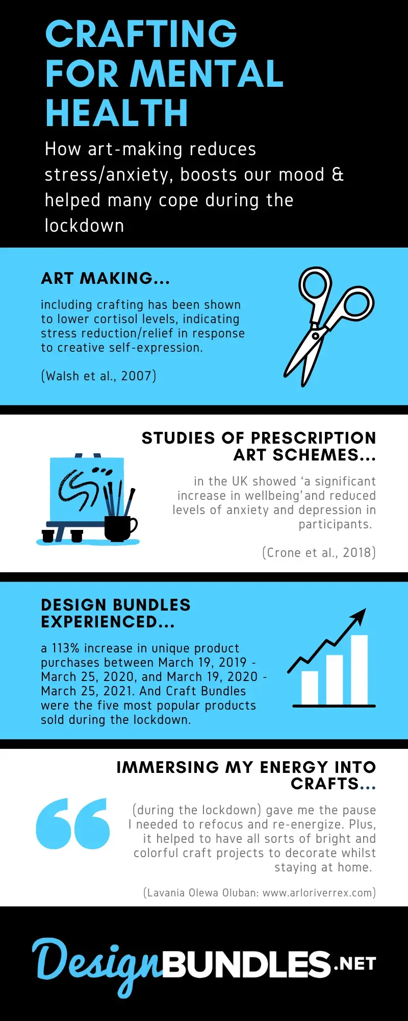
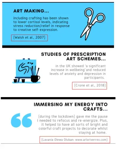
This happened while I was working as a content manager for a company in the digital design niche. I knew for a fact that the demand for at-home crafting had skyrocketed during lockdown. Based on that, I already knew there was some semblance of a story to tell: I just needed to choose the correct data to share it with others.
For context, my goal was to earn backlinks. I intended to achieve this by writing a case study around this insight and consolidating it into an infographic. Original research was key. But I used a combination of original research and third-party data.
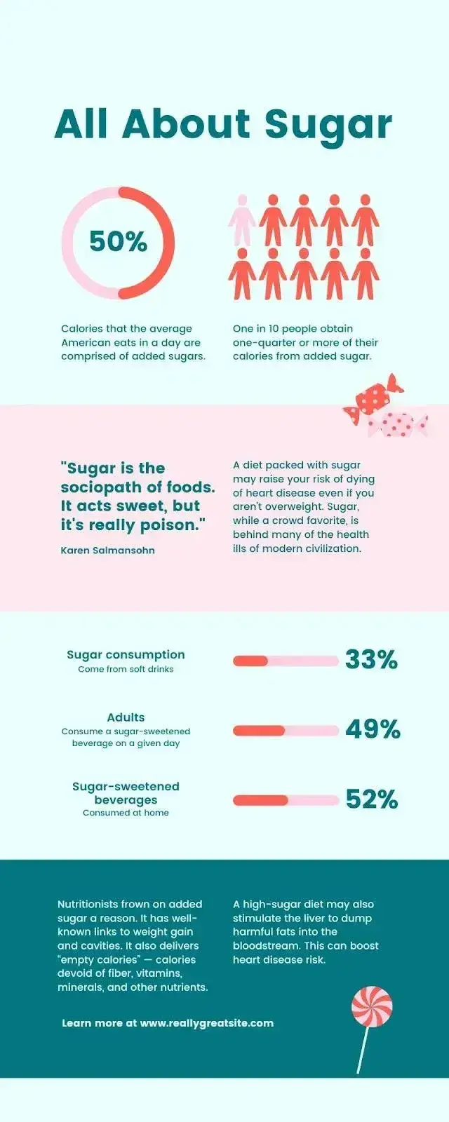
The original research was sales data compiled from the brand’s website analytics. It showed how demand for home crafting products had surged during lockdown. More specifically, it highlighted “a 113% increase in unique product purchases between March 19, 2019, and March 25, 2020, and March 19, 2020, March 25, 2021.”
I also gathered quotes from home crafters who used our products. The quotes shared their personal experiences about how crafting helped them cope with stress and anxiety during lockdown.
I used the third-party data to shape the broader “angle” I chose for the story. I wanted to highlight how people used home crafting during lockdown to help with their mental health during periods of isolation. The third-party statistics I used showed the links between improved mental health outcomes and art therapy.
Now, onto the second way to approach choosing your data.
We live in an imperfect world. That means we’re not always going to have an obvious story to tell straight out of the gate. This is where reverse engineering comes in very handy.
It’s not the most linear process, and it requires some mental heavy lifting. But sometimes it’s the only option available. In short, you need to start diving into any existing data that you have. You might begin by comparing numbers or looking at trends over time to uncover a story within your data.
I always like to look at abnormalities and see what might have caused them. Before you know it, the mental wheels start turning, and you gather angles for your infographic that you might never have thought of otherwise.
For example, a spike in website traffic from one month to the next doesn’t mean much — until, say, you reveal that traffic was on a steady decline over the previous three months. Suddenly, you have a story about how you reversed a downward trend.
Organize your data.
You must, must, must organize your data in a way that makes sense so your audience can understand the story without having to exert too much effort. To do this, spend some time upfront thinking about what data points are most important. I then recommend creating a structure (or outline) that emphasizes that data.
One of my favorite strategies is starting with a quick outline of your data story. Then, I match data points with each relevant section of the outline.
Example: If you look at the infographic I designed above, you can see that I’ve started by outlining the general premise so readers know what to expect. The premise is that creativity (including home crafting activities) can reduce anxiety and stress. I establish this by first backing up my claim with relevant statistics. I then back up this third-party data with the original research to make the story more specific to the brand.
Looking at this over four years later (eep!) I think I’d likely front-load the original research, as this is the data that’s most likely to generate broader press coverage and backlinks. You live and you learn, hey?
Cite your sources.
Most importantly of all, if you use third-party data, be sure you properly cite your sources — just like you would in any other good piece of content!
Beyond that, try to keep your infographic uncluttered by a ton of different source URLs. One tip I wish I’d known sooner is to cite your sources via a simple URL at the bottom of your infographic that links to a page on your site.
You can also list the individual stats used in your infographic and their sources on a landing page. But if you do, don’t forget to link your landing page to an offer that includes your free infographic.
If you don’t want to create separate web pages, or you’re citing academic research from a book or something similar, you can also add the sources as smaller text in brackets under each piece of data. That’s what I did when I created the infographic example below.
Pro tip: If, like me, you always forget how to reference using different citation styles, you can use a referencing generator, like this one.
With these tips, your infographic will look clean and professional, and people will be able to access the sources no matter where the infographic gets shared or embedded. It may even drive visitors back to your site.
Pro tip: Think about different types of charts and graphs to present your data. Look for chances to turn complex statistics or concepts into easy-to-understand visualizations.
15 Free Infographic Templates
Build better infographics with these free designed templates.
- Color schemes
- Icons & shapes
- Fonts
- Eye-popping themes
Download Free
All fields are required.
5. Download your template to PowerPoint.
For the sake of time (remember, our mission is to create an infographic in under an hour), I’m going to make an infographic with PowerPoint.
This is the easiest tool to use because it’s a widely accessible software that’s already on most computers. I also love that you can work on your infographic even without an Internet connection. The user interface is also familiar and user-friendly, making it easy for beginners.
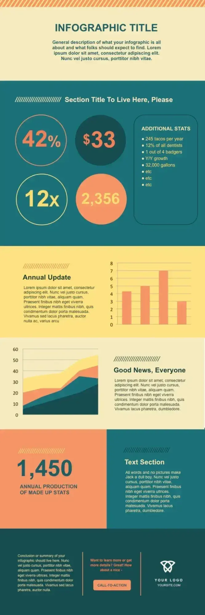
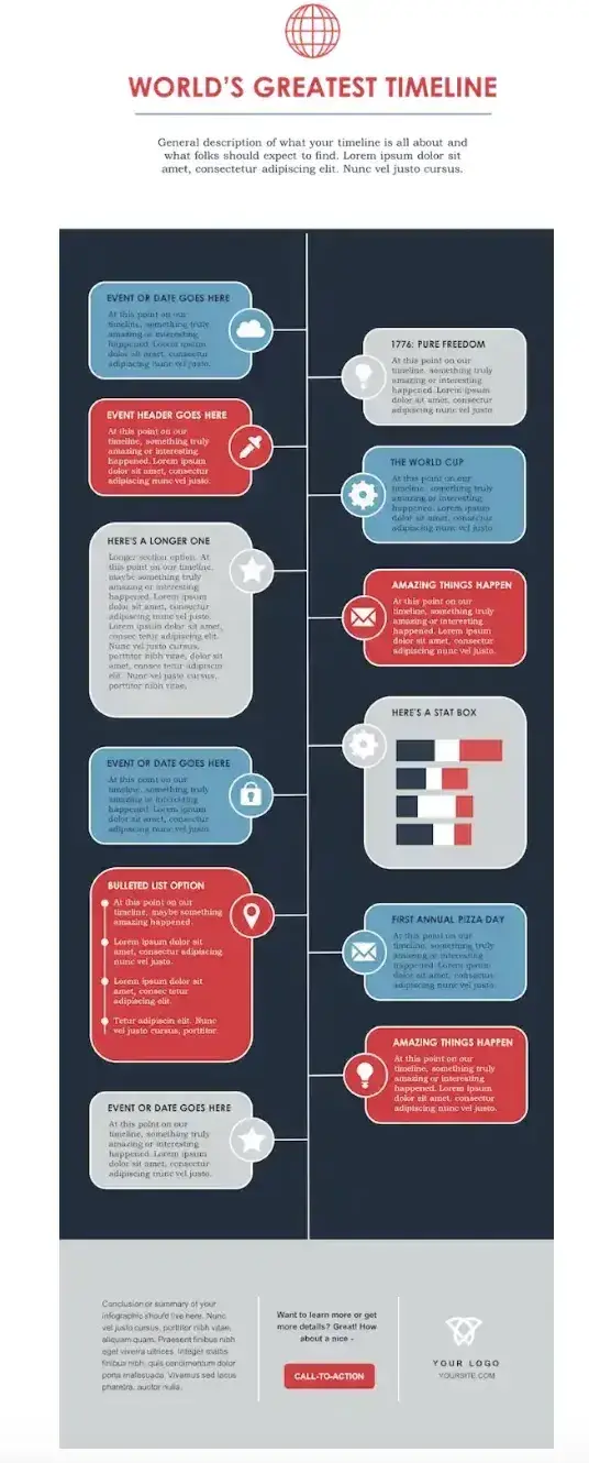
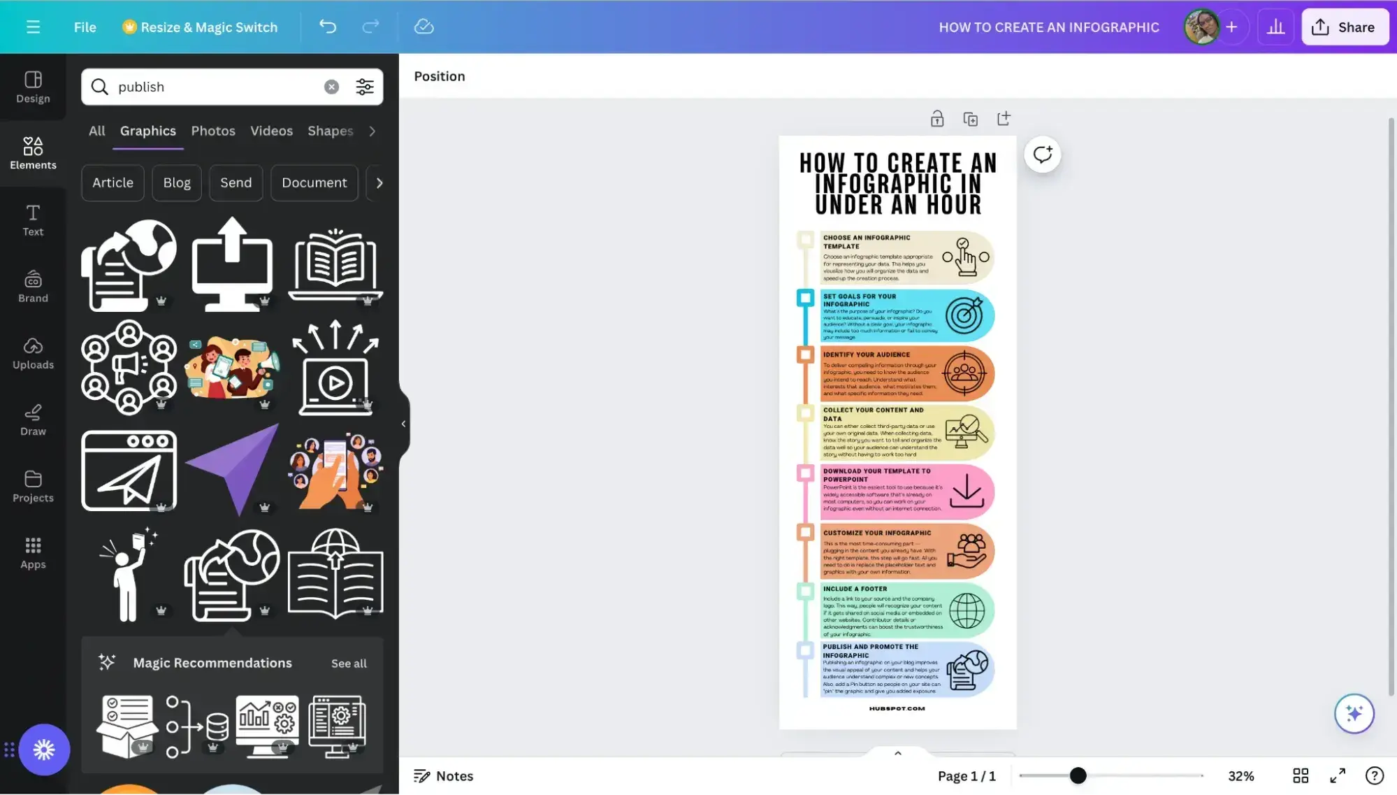
This example is based on steps and best practices from our guide, How to Create Effective Inbound Marketing Campaigns. I’ve picked the “World’s Greatest Timeline” infographic template from our collection of infographic templates. This template is best suited for my data set since it will allow me to outline each step of the campaign creation process in chronological order.
If you’re ready to get started, just open the infographic template in PowerPoint.
This will create a new presentation based on the selected template. Then, you can start customizing it.
6. Customize your infographic.
If you already have your data, this next step — plugging in the content you already have — is the most time-consuming part. But I assure you, with the right template, this step will go fast. All you need to do is replace the placeholder text and graphics with your own information.
Come up with a catchy title, plug in your data/content, and adjust your font sizes and formatting. I recommend switching up the graphics and colors, too, so they’re relevant to your brand and the data you’re providing. To further customize the look of the infographic, add or
Remember, the template is just a starting point, and you can customize it however you want, using PowerPoint’s tools to create different types of visuals to support your data.
(Want a cheat sheet on how to use PowerPoint’s tools? Download our free infographic templates.)
As you adapt the template, focus on making sure the visuals are:
- Readable.
- Make sense in the order they’re shared.
- Support and enhance your data.
Pro tip: Use consistent visual cues such as icons, color schemes, or illustrations to create a consistent visual language for your infographic and reinforce your brand. What’s more, if you plan to use infographics regularly, consider creating a style guide for your infographics. If you make a style guide, I suggest including what citation style (APA, Harvard, etc.) you’d like folks to use and your recommended citation-generating tool.
7. Include a footer with your sources and logo.
Finally, include a link to your source (mine is here) and the company logo. This way, people will recognize your content if it gets shared on social media or embedded on other websites.
After all, one of the main benefits of creating infographics is their shareability. These details will also make your infographic feel more credible and authentic.
Pro tip: Contributor details or acknowledgments can also boost the trustworthiness of your infographic. In my experience, this extra step has increased brand visibility because the contributors have shared the infographic with their networks.
8. Promote and publish your infographic.
Now it’s time to release your awesome new infographic into the wild. Huzzah! There are several places and methods to publish and promote your infographic. It all depends on your goal(s) and target audience(s).
I’m going to share a few of my personal favorites below. Oh, and another cool thing about what I’m going to share? You can actually do all of them with a single infographic. It all starts with your blog.
Publish your infographic on your blog.
Research from HubSpot finds that 21% of marketers list using “visual content to boost dwell time as a top SEO marketing strategy.” Aside from meeting SEO goals, I regularly hear from the folks actually consuming content, and they love reading blogs with visuals. That’s because publishing a visual (like an infographic!) on your blog improves the readability of your content. Why? Readers don’t have to wade through endless walls of text. It also gives your audience a tool to understand complex or new concepts.
Long story short: An infographic in a blog post can give your SEO and user engagement a boost.
Add a Pinterest button.
I absolutely love Pinterest. Fun fact, I got into Pinterest optimization before I even knew that search engine optimization existed. The cool thing about infographics is that they are already very close to the dimensions of Pinterest “pins.” So you can repurpose a blog infographic via Pinterest with minimal fuss.
Because of this, I suggest making it easy for people to “pin” your infographic directly from your blog post. You can do this by adding a Pinterest sharing or “Pin it” button. If you’re going this route, don’t forget to add a caption for Pinterest sharing to help draw interest and boost engagement. You can also optimize it for Pinterest’s search algorithm. (Whatever you use as your caption is automatically populated when someone pins your blog infographic to Pinterest.)
I also recommend pinning your infographic to a few relevant Pinterest boards as soon as you’ve published your blog post. By doing this, you can get it circulating in relevant spaces — i.e., where your audience is — straight away.
Create and add an embed code.
The easier you make it for people to share your infographic, the more likely you are to get those shares. Check out how I did it below.
Share This Image On Your Site
<p><strong>Please include attribution to blog.hubspot.com with this graphic.</strong><br /><br /><a rel=“noopener” target=“_blank” href=‘https://blog.hubspot.com/marketing/create-infographics-with-free-powerpoint-templates’><img src=‘https://blog.hubspot.com/hs-fs/hubfs/free_infographic_template_custom-1.png?t=1519094621186&width=1138&height=3412&name=free_infographic_template_custom-1.png’ alt=‘free_infographic_template_custom-1’ width=‘660px’ border=‘0’ /></a></p>
With the infographic complete and published, that’s a wrap. It won’t take you long to create some impressive infographics of your own once you get started — but before you begin, I’ve got some tools to make the creative process even smoother.
How to Make an Infographic for Free
Now, you may be wondering how much making an infographic will cost.
The good news is you can make engaging and effective infographics for free with many tools on the market.
Here are some of my favorites, and I’ll be testing one of them to show you how easy the process is.
Free Infographic Tools
- Canva
- HubSpot
- Piktochart
- Snappa
- Venngage
- Visme
1. Canva
Canva is a design platform that can help you create a variety of media, like presentations, blog graphics, and posters in addition to infographics. It’s easy to get started using one of their templates.
The tool works by simply dragging and dropping the elements that you’d like to use into place. Once you’re satisfied with your graphic, you can easily download it in a variety of formats to share with your team.
What I like: Since I discovered Canva a couple of years ago, I’ve been obsessed with it. I love how easy it is to use and how much Canva is doing to stay ahead of the curve with new capabilities and tools that, in turn, make it easy for creators to develop trendy visual content.
2. HubSpot
As I showcased earlier, HubSpot’s free, customizable infographic templates make it easy to quickly create new visuals for your project. Simply download the template and open it in PowerPoint.
From there, you can replace text by typing into the template and changing the colors to suit your brand’s palette. Our offer comes with step-by-step directions to ensure a hiccup-free experience.
Branding and color schemes are crucial in creating a memorable and cohesive visual identity for organizations. They help establish brand recognition, build trust, and communicate the desired message to customers.
HubSpot’s color palette generator is a tool that allows you to select a primary color. It then automatically generates a complementary palette, ensuring consistency and professionalism in branding across various marketing channels.
What I like: Well, I may be biased, but our templates are pretty great. They give people with limited design know-how and less time the ability to create impactful graphics that wow their colleagues and clients.
3. Piktochart
Piktochart is a free online tool to help you create infographics with zero design experience required. Where Piktochart shines is its many offerings to help visualize data.
The free version gives you access to pie charts, maps, bar charts, and pictographs to display data in a variety of formats.
Users have the option to upload a CSV, Google Sheet, or Excel file into the graph maker. They can also copy/paste data into the template. The brand stands by its user-friendliness, aiming to help novices create infographics in 30 minutes or less.
What I like: Piktochart offers a ton of different designs and styles and has an easy learning curve. I’ve found that creating professional-looking infographics is as easy as choosing a style and updating it.
Plus, with built-in chart-making capabilities, it takes my numbers and turns them into graphics that make sense with little to no manipulation on my part.
4. Snappa
Snappa’s infographic maker pushes the limits of creating media on the fly — claiming users can make infographics in just five minutes.
Snappa offers a variety of ready-made templates and an easy drag-and-drop builder to help users quickly create the content they need.
Users have the option to add and take away graphics, text, and stock images to customize their creations. Once completed, the finished product can be easily downloaded for use.
Snappa also makes it easy to repurpose the infographics you’ve made by offering several formats for social sharing.
What I like: Snappa has (dare I say) a “Snappy” how-to video demonstrating how to repurpose their templates into something that fits your brand. Their templates are fresh and easy to use.
5. Venngage
Similar to others on this list, Venngage uses a drag-and-drop editor and an infographics maker to help users create infographics without any design experience.
Start with a template, then customize colors, text, and shapes as you see fit.
Venngage also has a robust stock photo library, with an impressive 40,000 icons and images available for use, plus another 3 million from Pixabay.
The only drawback is that the collaboration features and brand kit are only available with paid tiers.
What I like: When you first sign up, Venngage asks a few questions about how you plan to use its designs and tailors the page based on your preferences, making it easy to quickly find an infographic template to customize.
6. Visme
Visme helps users make graphics in three easy steps: choose a template, upload or input your data, and customize.
If you prefer to start a graphic from scratch, there is also an option to swap specific portions of your infographic using blocks instead of using a full template.
Once finished, users can opt to share their project with a link or download the infographic in a variety of formats. While the basic version of Visme is free, you’ll need to opt for a paid tier for access to the brand kit feature.
What I like: In addition to Visme’s templates, I love that they have design blocks you can use to quickly assemble your infographic, which makes it easy to pick and choose parts of a template that work for you and adapt other areas.
What’s more, if you plug in your website, it can extract your logo, fonts, and brand colors and start adapting templates to fit your brand.
15 Free Infographic Templates
Build better infographics with these free designed templates.
- Color schemes
- Icons & shapes
- Fonts
- Eye-popping themes
Download Free
All fields are required.
Testing it Out
I’ve already shown how to use HubSpot’s free infographic templates to create your own infographics. But if you’d like to try out other free tools like the ones listed above, I’ll be testing Canva to show you how it works (the process is similar to the other tools).
The infographic I’ll create is one that explains how to create an infographic in no time (see what I did there?). Let’s proceed.
1. Create an account on Canva.
I already have a Canva account, so all I have to do is navigate to canva.com and start the process of creating the infographic. But if you don’t have an account yet, go ahead and sign up.
2. Choose a blank infographic canvas.
Once you’re done creating your account, your Canva dashboard will look like the image below.
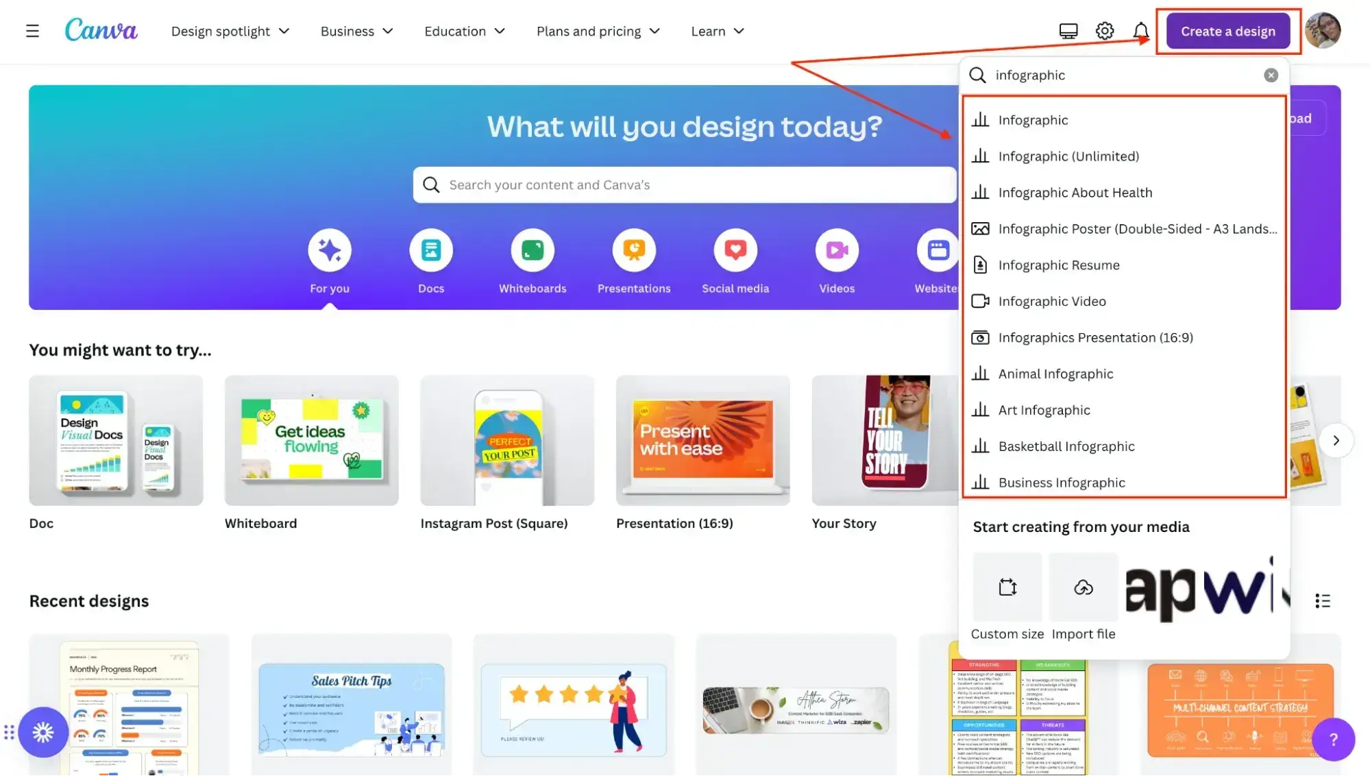
The next thing I do is click on Create a design and type “Infographic” into the search field, which results in a list of pre-built infographic options.
I choose the regular infographic canvas, which is the first option (it’s the one you’ll usually use, unless you want to create something more specific, like a resume or a video).
3. Choose an infographic template.
After clicking on Infographic, here’s what my screen looks like:
There’s a blank rectangular canvas on which I can design my infographic on the right, and on the left, there are tons of free infographic templates I can choose from.
After browsing through the available options, I settle on a timeline infographic design as it will help me clearly outline the steps to take. Once I click on the design, it replaces the blank canvas like so:
4. Customize the design.
Now, I can start replacing the text and changing elements in the infographic to suit my needs.
After customizing it, here’s what it looks like:
5. Download the infographic.
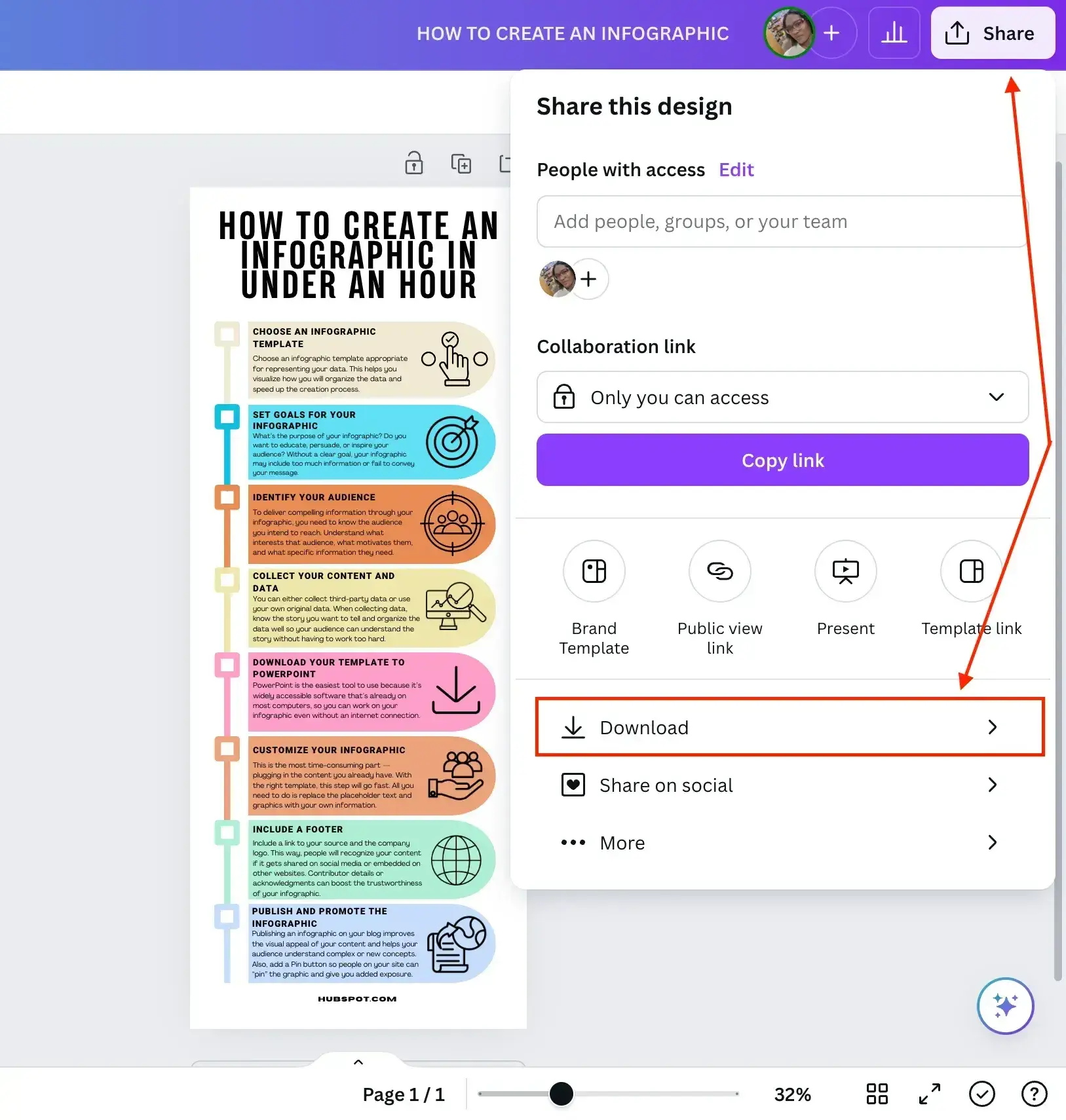
Finally, I give the infographic a name, How to create an infographic, and click the Share button on the top-right corner of my screen.
In the dropdown menu that pops up, I click Download, like so:
Canva suggests that I download the infographic as a PDF document. If I want to go that route, I’d just click the purple Download button, and that’s it.
But I’d rather download it as a PNG image, so I click the dropdown arrow on the File type field and choose PNG. Then tap the purple Download button and, voila — my infographic’s ready.
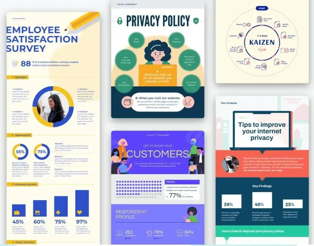
If you’d like to create more complex infographics that include elements like charts (pie charts, bar charts, bubble charts, stacked charts, line charts, donut charts), progress bars (radial progress bars, progress rings), pictograms, maps, and hierarchies, Canva allows you to do that with templates like these:
Tips for Creating a Great Infographic
Are you ready to get started on creating your own infographic? Here are some guidelines I highly recommend following throughout the process.
1. The information you communicate matters more than its design.
You can make the most visually appealing infographic of the year, but if it doesn’t clearly communicate a purpose or message, then what’s the point? I’m telling you now, it won’t land with your audience. Or it might land, but for all the wrong reasons.
A good infographic tells the audience what they need to know and adds more depth or dimension when paired with a good design.
So when I develop content for infographics, I start with that exactly — the content — and ask four questions:
- Why am I creating this infographic? (My goal)
- Who is this infographic for? (My target audience)
- What do I want the person looking at it to walk away knowing and/or doing? (How what I share will help me reach my goal)
- What is the minimum amount of information that they need to get the story? (What data and content do I need to collect and organize?)
2. Know who you’re making the infographic for.
“Picture one person, and imagine you’re writing just for them,” is singlehandedly one of the best pieces of copywriting advice I’ve ever digested. For me personally, writing for a single person (who represents a broader audience) helps me to stay focused on what will:
Grab > Retain > Convert their online attention into action.
I think this advice pertains regardless of what type of content you’re creating. Be that copy, content, audio, video, or, that’s right, infographics. Which brings me to another incredible piece of copywriting advice that’s relevant to content marketing generally: Specificity drives action.
I can’t emphasize this enough: If you don’t know who you’re making your infographic for, it won’t be specific enough to elicit a desired action. When you are specific in your marketing, your target audience will feel like you’re speaking straight to them. That connection is how you drive those folks to take action.
That’s why, before I start writing or creating anything, I spend some time thinking about the audience profile:
- Who are they?
- What do they already know?
- What do they want to know or do?
- How will this piece of content help them along the way?
Armed with that, I find it much easier to create content that appeals to my audience.
3. Avoid adding clutter to your infographic.
To keep my infographics looking clear and skimmable, I keep the reader in mind. Remember that one person from before? Well, they shouldn’t have to think too hard to find the information they need. Your infographic can also encourage an “aha!” moment.
I also stay flexible and reiterate as needed throughout the design process. If I find the design too cluttered, I’ll reduce the information on the graphic to simplify it even more.
Pro tip: If I’m unsure whether it’s simple enough or has the correct information, I find that stepping away from the design for a bit can give me the clarity I need. When in doubt, I ask a trusted friend to take a look and share their perspective.
4. Ensure the visuals add value to your data.
It’s more important to be clear than clever.
Echoing my last point, the visuals that do make it to your infographic should be there to add value to the data, not distract from it.
Whether I’m using graphs, diagrams, icons, or real-life imagery, I always remind myself that the goal is to take the key messages and provide enough context to tell the story. This is especially true when I’m using numerical values. This way, there’s an emotional element behind the messaging, not just bolding percentages.
In my experience, staying true to this advice also helps keep my infographic designs clear, crisp, and clutter-free.
Pro tip: We all get lost in the woods during the creative process. What’s important is that you have a couple of North Stars to guide you home. If I’m getting lost in the design, I ask myself: “Will this infographic help me meet my goal(s)?” and “Does it communicate directly and clearly to my target audience?” I then use those guiding principles to help me discern what visuals to keep or remove.
5. Test for readability and user experience.
With 1 in 6 of the world’s population experiencing significant disability according to the World Health Organization (WHO), web accessibility is something that every online design should take into consideration.
So, before you share your infographic, make sure it’s legible and accessible to a wide range of users. This means testing the font size, color contrast, and readability on different screens and devices.
I always keep in mind that a considerable number of people view content on their mobile devices, so it’s essential to make sure the information is as clear on a small screen as it is on a large desktop monitor.
To that end, also make sure you’re considering any usability factors like navigation and calls-to-action.
6. Create a thoughtful repurposing plan.
One of my favorite things about infographics is how versatile they are. I’ve used a single infographic as a visual in a blog post, distributed the blog post on Pinterest by pinning the infographic, and then shared it via social channels.
But that’s not all. I’ve even repurposed infographics as physical marketing materials. Believe it or not, I once scaled an infographic up to become a physical pull-up banner for an in-real-life networking event.
The crux? Prioritize how and where you repurpose your infographic based on A) how your audience consumes information and B) where they consume it.
7. Factor repurposing into the design stage.
I recommend thinking about image dimensions during the design process. You don’t want to create unnecessary work for yourself, but at a minimum, I’d suggest sticking close to Pinterest’s image dimensions (1000 x 1500 pixels).
These dimensions will also work if you use your infographic within a blog post. Plus, because infographic designs are vertical by nature, you can share them across social channels that support vertical content. So things like LinkedIn Stories or Instagram Stories, for example. Of course, all of this depends on where you plan to distribute your infographic in the first place.
Share your professional infographic today.
Infographics are one of my favorite design media for marketing. I love that you can repurpose them — going from serving as a single blog post image, to a Pinterest “Pin,” and so much more.
BUT, your goal and target audience should be the guiding stars behind everything. From the design phase to hitting publish and then your distribution, it should all help you achieve your goal and grab your target audience’s attention. And, if relevant, your infographic should drive your target audience to take specific action.
When it comes to the designing aspect, the example I shared during the “Testing it out” section took me under an hour to put together — much less time (not to mention more professional looking) than it would’ve taken if I’d started from scratch.
It’s also less expensive than hiring a designer and using the resources you might want to save for larger campaigns. Although if you’re attempting a hyper aesthetic, image-heavy infographic, you might want to draft in a design pro.
That’s enough from me. Now it’s your turn. It’s time to make a professional and informative infographic.
Editor's note: This post was originally published in May 2020 and has been updated for comprehensiveness.
15 Free Infographic Templates
Build better infographics with these free designed templates.
- Color schemes
- Icons & shapes
- Fonts
- Eye-popping themes
Download Free
All fields are required.
Graphic Design

![How to create an infographic in PowerPoint [free templates]](https://53.fs1.hubspotusercontent-na1.net/hubfs/53/Untitled%20design%20(85)-2.png)
![AI in Graphic Design: The Pros, Cons and What it Means for Designers [+ Expert Insight]](https://53.fs1.hubspotusercontent-na1.net/hubfs/53/Untitled%20design%20-%202024-10-15T175328.927.jpg)


![How to Create an Infographic Using Poll & Survey Data [Infographic]](https://53.fs1.hubspotusercontent-na1.net/hubfs/53/00-Blog_Thinkstock_Images/Survey_Data_Infographic.jpg)