Ecommerce marketers can use social media, digital content, search engines, and email campaigns to attract visitors and facilitate purchases online.
Before we dive into more detail about what ecommerce marketing is and how to implement a strategy of your own, let's review the definition of ecommerce advertising and advertising's parity with marketing for an ecommerce business.
Free Ecommerce Business Kit
Download this ecommerce kit for free marketing, sales planning, and abandoned cart email templates.
- Abandoned cart email templates.
- Ecommerce marketing plan template.
- Ecommerce sales tracker.
- And more!
Download Free
All fields are required.
Form not available
Ecommerce Advertising
In similar fashion to the way advertising falls beneath the umbrella of marketing, ecommerce advertising falls beneath ecommerce marketing — and when used in tandem, you have the ability to more effectively reach your audience members to boost conversions and improve brand awareness.
As mentioned in our definition above, ecommerce marketing is about driving awareness and action towards your product or service.
Meanwhile, ecommerce advertising includes the methods through which you actually promote your product. In terms of online or ecommerce marketing and selling, these ads may come in the form of display ads, banner ads, or rich media ads.
The main takeaway here is that ecommerce advertising is a highly-effective method to implement while developing your ecommerce marketing strategy to focus your product or service promotion.
Now, let's get back to our in-depth discussion about ecommerce marketing.
Types of Ecommerce Marketing
To give you a sense of what an ecommerce marketing strategy looks like, here are some common marketing channels and how you'd use them to build an online store.
Social Media Marketing
Brands, publishers, contractors, and growing businesses all launch pages on today's most popular social networks to connect with their audience and post content that the audience is interested in.
As an ecommerce marketer, you can do the same thing, but the campaigns you run might look a bit different, and not every social network is a good fit for your needs.
Ecommerce websites are highly visual — you have to show off the product, after all — so your success on social media depends on your use of imagery to drive attention and traffic to your product pages.
Instagram is an appropriate platform for ecommerce businesses because it enables you to post sharp product photography and expand your product's reach beyond its purchase page.
You can take your social media posts a step further by creating shoppable content, which is content that enables visitors to buy right away. That can include anything from strategically placed display ads within a social feed to additional tags that take users directly to a shopping cart. These methods help you eliminate friction from the buying process.

An ecommerce business is no stranger to product reviews, either. Using a Facebook Business Page to share product praise is a perfect fit for businesses that already solicit customer reviews across their online store. We’ll dive deeper into product reviews below.
Content Marketing
When you hear "content marketing" you might think of blogging and video marketing — content that is meant to improve your website's ranking in search engines and answer questions related to your industry. But if you're selling a product online, do you really need articles and videos to generate transactions? You sure do.
Here are some ways to use content to market your ecommerce store.
Optimize your product page copy.
Optimize your product pages for short, product-driven keywords that include the name of the product. If you sell wedding dresses, for example, a Google search for "brown bridesmaid dress" is more likely to produce product pages like yours if you’ve included that term on the page.
Also, make sure that your page titles, headers, and image alt text focus on the right keywords so search engines know to return your ecommerce store for the right query.

Write relevant blog posts.
If you manage an online wedding dress store, writing blog posts about "how to plan a wedding" can attract everyone involved in wedding preparations no matter where they are in the planning process.
As visitors become more engaged, you can create posts that will move them into consideration, like “how to select the right wedding dress", and turn them into leads, like a downloadable “wedding planning checklist”.
Create guest posts for external websites.
Guest posts can get you and your products in front of relevant audiences (oftentimes for free). Submitting guests posts will also help you get more domain authority for your ecommerce site, thereby telling search engines that you have a reliable site.
You’ll need to search for sites that rank for keywords related to your product. Sometimes you won’t even need to create an entire post. If a site already has a relatable post, offer to expand on it by providing additional context, like a video or infographic with a link to your site.
Put product-related videos on YouTube.
YouTube has over a billion active users … chances are your target audience is somewhere in there. It’s also the second-largest search engine behind Google. If you’re looking for a massive, captive audience, YouTube is where you’ll find it. Use highly searched keyword terms to determine your topics, then share videos that are related to your product and helpful to your audience.
This is also a great option for tutorial videos that show current customers how to use your product — these videos can show people how best to use your product, increasing customer satisfaction and building long-term relationships with website visitors.
Include a keyword-driven FAQ section on your website.
If your audience is asking questions related to your product, then you need to be the one to answer them. Create an FAQ page on your website with responses to high volume, long-tail keyword searches to get users to your site. You’ll be building both authority and traffic — two crucial components of a successful ecommerce store.
Search Engine Marketing
Search engine marketing (SEM) includes both search engine optimization (SEO) and paid advertising. While SEO relies on your knowledge of Google's ranking algorithm to optimize content, SEM can involve pay-per-click (PPC) campaigns, display campaigns, or product-specific ad campaigns (think Google Shopping), which allow you to pay for top spots on search engine results pages.
On Google, PPC campaigns guarantee that potential buyers will see a link to your page when they enter search terms that match the terms of your campaign. But because you're paying Google each time a person clicks on your result, the payoff to you should be high.
This is why ecommerce marketers often register with Google AdWords and promote their product pages through PPC campaigns. The campaign puts searchers right in front of the business's product when they click on a paid result, increasing the likelihood that the searcher will make a purchase before leaving the business's website.
Free Ecommerce Business Kit
Download this ecommerce kit for free marketing, sales planning, and abandoned cart email templates.
- Abandoned cart email templates.
- Ecommerce marketing plan template.
- Ecommerce sales tracker.
- And more!
Download Free
All fields are required.
Form not available
Email Marketing
Email marketing is one of the oldest forms of digital marketing, and believe it or not, it holds specific value in the world of ecommerce marketing.
The best part about email marketing? It can be automated. Automation means that you can set up a successful drip campaign to subscribers that are segmented by interest or stage in the buyer’s journey and let your email campaign do its magic. It’s one less marketing tactic that you need to worry about on your long list of tasks.
Even so, it’s imperative that you’re meticulous about your email list so you maintain trust among your leads. In a time when data privacy runs high on an internet user's priority list, not every commercial email is welcome in that user's inbox. Ecommerce marketers need to be careful when and how they add website visitors to their mailing list.
Here are two ways an ecommerce marketer might use email marketing.
1. Post-Purchase Follow Up
If a user has already purchased a product from your website — and agreed to receive emails from you during the checkout process — sending a follow-up email a few days after the product is delivered keeps the conversation going and gauges their future interest in your product line.
A post-purchase follow up also shows that you care about them beyond a sale and that your company has an interest in their success using your product. It gives you an opportunity to get feedback on their purchase experience, which, in turn, helps you reduce friction for future customers.
Some best practices for this type of email are to ask them to write a review of your product and/or read original content on how to use your product (those YouTube videos you created would be perfect here).
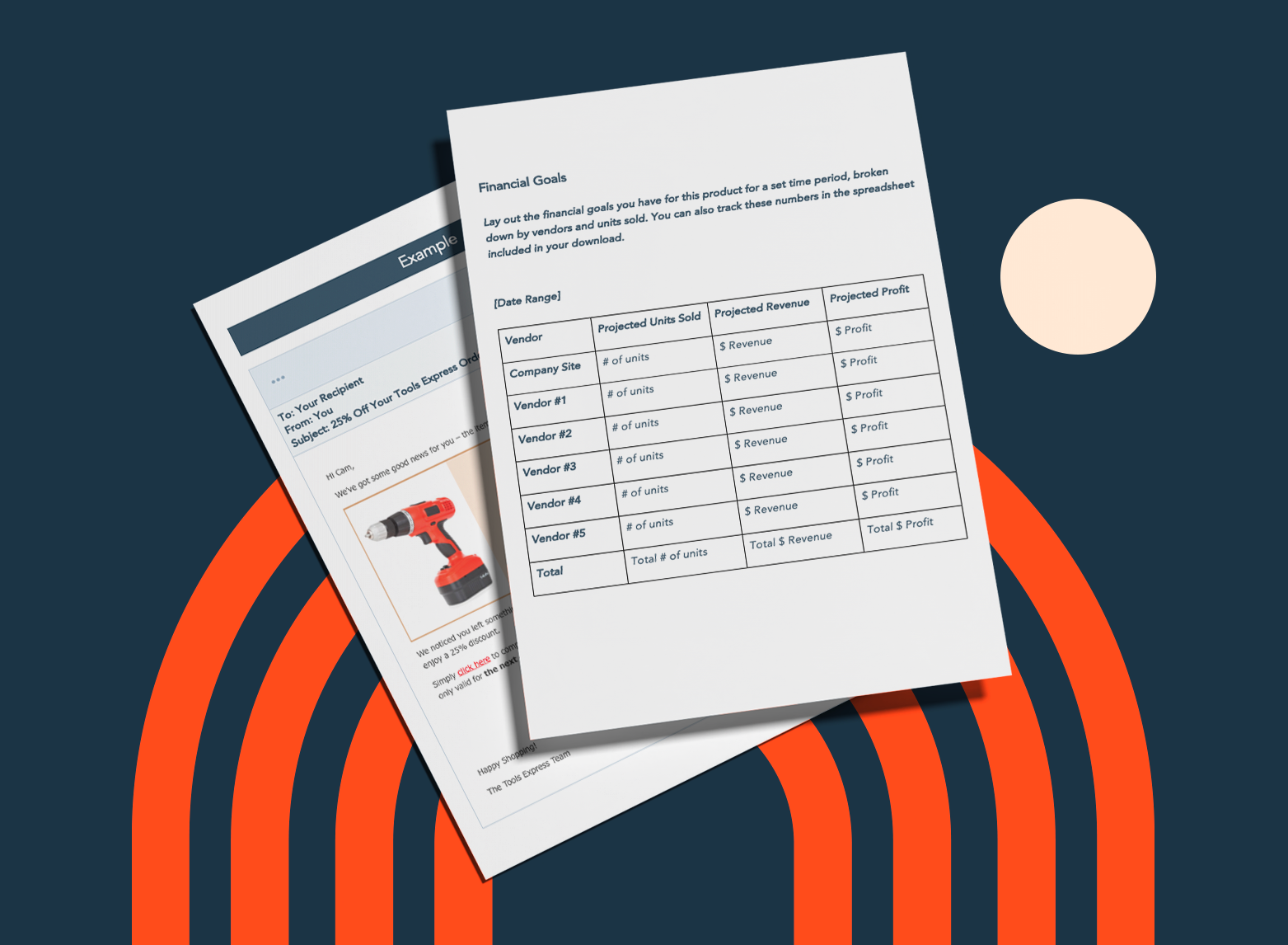
2. The Abandoned Shopping Cart
Users abandon their shopping carts for a number of reasons, and emails to diagnose the problem and retain their business can make the difference between a purchase and a lost customer. We’ll cover ways to reduce shopping cart abandonment below.
If a website visitor fails to complete a transaction while they’re in your shopping cart, consider sending a polite email to remind them to complete the checkout process, offer assistance, or recommend other related products to get their mind back on you and their browser back to your ecommerce store.
Learn more about why users are abandoning your shopping cart and how to fix it.
Influencer Marketing
Influencer marketing focuses on people or brands that influence your target market. The term is commonly used to denote Instagram accounts with several thousand followers, but it could also mean a celebrity or community that your target audience follows or belongs to.
Influencers build communities of people that know, like, and trust them. It is, therefore, easy for them to garner attention around your online product through a recommendation, or “sponsored post.”
Affiliate Marketing
81% of brands employ affiliate marketing, and ecommerce sites are particularly good candidates. Affiliates are people or businesses that help sell your product online for a commission.
Unlike most social media influencers, affiliates generate interest in products via old fashioned (yet effective) marketing tactics. They often use paid advertising, content marketing, and other means to drive traffic to your their pages on your product — it’s like having a team market for you.
HubSpot affiliates promote its software in content like blog posts, email marketing, podcasts, and YouTube videos and in return receive 30% recurring commission for purchases made through their affiliate link.
Local Marketing
This is an often-overlooked tactic for ecommerce businesses, but local marketing allows you to double down on the areas where most of your prospects are (if you have a large population of them in one area) and allows you to offer incentives to your potential customer base.
Here’s how: use tracking cookies to determine where your prospects are located. Then, offer discounted (or free) shipping to potential customers in the areas where you have warehouses or shipping facilities. The incentive might be just what you need to gain a new customer.
Ecommerce Marketing Tips
- Use personalization.
- Capitalize on user-generated content (UGC).
- Build a loyalty program.
- Invest in live chat.
- Cater to the shopping cart.
- Implement a responsive website design.
There are countless ecommerce marketing tactics that you can employ to drive visitors to your online store beyond the traditional methods that we reviewed above. Let’s get into some more creative ways you can market your ecommerce business.
1. Use personalization.
Companies that use personalization are seeing revenue increases ranging from 6-10%. What is this magic bullet?
Personalization is finding ways to cater to individuals within the marketing materials that you already have; it is tailoring your outputs to reflect the unique needs of your consumer.
This can come in the form of a prospect’s name in the subject line of an email, recommended content or products based on a visitor’s behavior, or even showing smart content on a webpage when a user visits for a second time or has moved along their buyer’s journey.
Personalization can move people along their buyer’s journey faster — instead of searching for what they need, you put it right in front of them, making it easy for them to take your desired action, that is, make a purchase.
Free Ecommerce Business Kit
Download this ecommerce kit for free marketing, sales planning, and abandoned cart email templates.
- Abandoned cart email templates.
- Ecommerce marketing plan template.
- Ecommerce sales tracker.
- And more!
Download Free
All fields are required.
Form not available
2. Capitalize on user-generated content (UGC).
What if you could have your customers market for you for free? That’s exactly what user-generated content, or UGC, is. It’s about finding ways for your customers to promote and share your business.
This helps in a couple ways: 1) It drives traffic to your ecommerce store, and 2) it builds an authentic following of people who are interested in what you offer.
Coca-Cola® did an amazing job of this with their “Share a Coke” campaign by creating customized Coke® bottles with people’s names, which naturally was shared across social media platforms.

Here are some effective ways to drive UGC:
- Competitions, where customers enter to win by displaying your product in some way
- Review platforms, where customers share feedback about your product
- Social media hashtags, where users submit content using a branded hashtag
3. Build a loyalty program.
A loyal customer is a long-term customer, and who doesn’t want repeat business? A loyalty program provides an incentive for a customer to continue doing business with you through relevant offers and discounts. While building a customer loyalty program takes some planning and work, it pays off in repeat business, UGC, referrals, and retention.
There are a couple of things to consider as an ecommerce business when building out a loyalty program. For one, consider diversifying the ways in which customers can show loyalty, whether it be through repeat purchases, mentions on social media, or sharing your content. Also, think about how you will pay off their loyalty, be it through points, discount codes, or exclusive perks.
Generate Word-of-Mouth Marketing (WOMM)
Word-of-mouth marketing is one of the most powerful marketing tools out here. It’s based on the premise that people want advice from others like them. As buyers becoming more skeptical of marketing tactics from companies, the need for word-of-mouth marketing in your business becomes more apparent.
While you can make this to happen organically by providing a great customer experience, you can also encourage, and even create, forms of WOMM that are equally as effective.
Reviews
Remember how I just said that prospects trust companies less and less? Well, customer reviews help mitigate that mistrust because they come from people who are not invested in the success of your company — instead, they’re an authentic and oftentimes brutally honest review of your product and how it worked out for them.
Reviews serve as marketing tools for you because they include mentions of your product and oftentimes they do the selling for you … people think, “If it worked for them, it might work for me, too.” Encourage your customers to leave reviews however you can, and that post-purchase email we talked about above might be a good start.
Referral Marketing
When customers solicit their friends, family members, and co-workers to buy from you, that is a referral. Sure, this may happen naturally if they really enjoy your product, but you can ensure that it happens more frequently through a referral program.
Simply ask your customers to refer others in exchange for something of value (e.g. discount, money, free gift) that you can offer to either your new customer, your existing customer, or both. Dropbox does a good job of this — they offer additional cloud storage space when you refer a friend to sign up.

Testimonials
You can use customer testimonials to get the word out about how great your product is. Testimonials are essentially tailored reviews because you typically produce them from interviews where you can ask specific questions that get to the points you want to address and share with prospects.
Being that you have an ecommerce store, some topics you might want to focus on for your testimonial interviews would be ease of the buying process, the level of customer support, and frictionless delivery and setup methods.
Case Studies
Case studies allow you to promote customers’ successes in a way that pushes prospects over the edge. They are meant to relate to your buyer persona, so you should interview customers that most closely represent your target audience. Case study best practice is to show a customer’s life before your product and how it has drastically improved since.
4. Invest in live chat.
Chatbots — you’ve heard about them, right? Well, they’re one of two ways to employ a live chat strategy. Depending on your business size, you can have a live person available to chat with potential customers who visit your store.
Whether you decide to go the bot or human route, live chat will prove especially effective while people are browsing your store so they can get answers right away and when they’re in the checkout process to mitigate any objections just before buying.
5. Cater to the shopping cart.
We discussed the reasons why people abandon their shopping cart above, and a lot of it has to do with trust in your business, in the product, or in the delivery system. You want to give customers every reason to want to buy from you without hesitation by confronting their objections head on.
Some ways to mitigate shopping cart abandonment are:
- Money-back guarantees
- A clear and simple return policy
- Superior delivery options
- Immediate access to customer support
If you’re using WooCommerce to run your online shop, take a look at HubSpot for WooCommerce to add abandoned cart sequences into your marketing program.
Free Ecommerce Business Kit
Download this ecommerce kit for free marketing, sales planning, and abandoned cart email templates.
- Abandoned cart email templates.
- Ecommerce marketing plan template.
- Ecommerce sales tracker.
- And more!
Download Free
All fields are required.
Form not available
6. Implement a responsive website design.
No matter which aspect of your ecommerce strategy you're working on, it should include a responsive design. Your ecommerce marketing tactics will be viewable and easily maneuverable via any device (e.g. laptop, smartphone, iPad or tablet).
Meaning, in a world where people are always on-the-go and visiting websites and viewing ecommerce marketing materials via a variety of devices from an array of locations, your content will be easy to read and simple to navigate for all users. (Check out this post for some examples of successful responsive web design.)
Ecommerce Marketing Strategy
Now that you know the ins and outs of ecommerce marketing, let’s put it all together and review some tips for building a successful marketing plan for your online store.
Set goals based on industry benchmarks.
Depending on your industry, location, business size, and a multitude of other factors, there are some standards you can use to measure your goals against — those standards are industry benchmarks.
Consider goals like website visits, click-through rates, conversion rates, and customer acquisition cost and compare those to other ecommerce business in your field.
Break down your strategy into small tactics.
When building out a marketing plan for your online store, there are several paths you could follow — we listed many of them above. It can be tempting to chase after every single one, but that’s a sure way to not be effective at any of them.
We recommend that you focus on a couple key strategies first that you believe will have the most ROI — and are the most accessible to you — and create action items for each.
For example, say you decided that you wanted to focus on a paid strategy to drive users to your store. A few of your action items would be: set up a Google Ads account, determine your ad spend, create an ad group based on your target keywords, and monitor your account daily.
This may sound oversimplified — that’s because it should be. You don’t want to get lost in chasing the next “great ecommerce strategy” without executing on one thoroughly and allowing it to work for you.
Delight your new and long-term customers.
Marketing doesn’t stop after a sale is made. Once someone becomes your customer, you should continue to engage, nurture, and delight them.
This way, you’ll support your customers' long-term success which, in turn, will boost loyalty. It'll also make your customers want to share their positive experiences with your leads and target audience members through cause studies, reviews, testimonials, and word-of-mouth.
Ready, Set, Sell
Ecommerce businesses have several marketing tools at their disposal. Using digital and inbound marketing just the right way, you can create campaigns that are designed to help your online store attract customers and grow better.
Editor's note: This post was originally published in February 2019 and has been updated for comprehensiveness.
Ecommerce Marketing
![How to Write an Ecommerce Business Plan [Examples & Template]](https://53.fs1.hubspotusercontent-na1.net/hubfs/53/ecommerce%20business%20plan.png)


.jpg)
![How to Start an Ecommerce Business [Steps + Must-Follow Tips]](https://53.fs1.hubspotusercontent-na1.net/hubfs/53/how%20to%20start%20an%20ecommerce%20business.jpg)