That’s why I’ve become a little obsessed with studying high-performing form examples. They’re tiny lessons in psychology and design, showing how smart brands make it effortless for users to say “yes.”
In this post, I’ll share 10 that do it best, plus what I’ve learned from optimizing forms across dozens of my own campaigns.
Form Examples
Over time, I’ve realized the best way to get better at building forms is to study the ones that make you stop and think, “Oh! That’s smart.” I’ve been saving my favorites for years, and a few of them have completely changed how I approach conversion design.
Here are 10 web form examples that stand out for all the right reasons, and what you can take from each to improve your own.
1. ClickUp
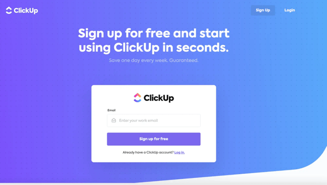
I love how simple this form from ClickUp is. It’s just one field and you’re in. No unnecessary steps, no extra clicks, no long signup flow that makes you second-guess whether it’s worth it.
Whenever a form isn’t performing well for me, the first thing I do is go back and look for ways to simplify it. Ten times out of ten, removing unnecessary fields improves conversions. People don’t want to hand over more information than they have to. They just want to get to the good part.
ClickUp gets that. The headline tells you exactly what’s going to happen: Sign up for free and start using ClickUp in seconds. It’s confident, but not pushy. You know what you’re getting, and you know it’ll be quick.
Pro tip: Only ask for the bare minimum. Every extra field is another reason for someone to drop off.
2. Tawk.to

This one stands out because it does something I wish more forms would: It offers help right where you need it. The tawk.to signup form includes built-in live chat support, so if you hit a question or run into a snag, you can ask for help without ever leaving the page.
I’ve worked on plenty of signup flows where people dropped off simply because they got stuck, not because they weren’t interested. Whether it’s a confusing password rule or a field that doesn’t make sense, even seemingly small asks can kill momentum. Having real-time support inside the form removes that barrier completely.
Pro tip: Add support where users are most likely to hesitate. Whether that’s a chatbot, tooltip, or short explainer, meeting people in the moment keeps them moving forward.
3. Zappos

I can’t tell you how many times I’ve abandoned an online purchase simply because I didn’t want to create an account. When someone’s ready to buy, the last thing they want is another login to remember. Zappos gets that, and it’s why their checkout form works so well.
The “Continue as Guest” option is front and center, making it clear you can check out fast without any extra steps. But right beneath it, they smartly list the perks of signing up, like faster checkout, easy returns, and VIP rewards. It’s a subtle nudge that gives customers the choice: Get what you need now, or join for a smoother experience later.
I’ve tested this exact approach in ecommerce campaigns before, and it consistently performs better than forcing account creation. People appreciate being trusted to decide for themselves, and many come back to create an account once they’ve had a good first experience.
Pro tip: If your product or service allows it, don’t make sign-ups a barrier to purchase. Let people buy first and build loyalty later. And notice how even the guest experience still captures an email? Zappos can continue marketing through newsletters and exclusive offers without forcing a full account signup.
4. Feedbackly

Is it just me, or do forms feel longer than they actually are when you can’t see how far you’ve come? That’s why I love how Feedbackly structures its feedback forms. There’s one question at a time, with a simple progress bar that shows exactly where you are in the process.
It’s such a small touch, but it makes a huge difference. When people can see that they’re almost done, they’re so much more likely to complete the form. I’ve seen this firsthand in user testing: Even when the number of questions doesn’t change, breaking them up into smaller steps almost always improves completion rates.
The single-question view also helps keep users focused. No distractions, no scrolling through endless fields — just a clean, visual experience that feels almost satisfying to click through.
Pro tip: Add a progress indicator to longer forms. It gives users a sense of control and reduces drop-offs, even if nothing else about the form changes.
5. Spotify
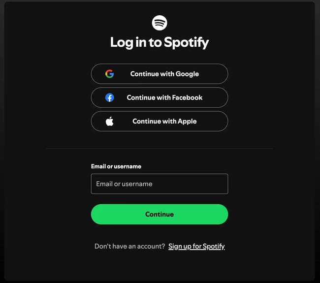
The best forms shouldn’t make you think very hard. They should just make it easy to keep going. Spotify’s login form is a perfect example. It gives you options: sign in with Google, Facebook, or Apple, or just enter your email and password. However you want to log in, Spotify gives you the option.
I’ve seen this approach work wonders for conversion. Back when I helped optimize a client’s onboarding flow, simply adding social logins cut drop-offs by more than half. It’s not just about convenience. It’s about removing the mental load of remembering yet another password.
What I like most, though, is how consistent the experience feels. The design is minimal, with a clear hierarchy that draws your eye straight to the green “Continue” button. It’s fast, familiar, and friction-free — exactly what users expect from a brand like Spotify.
Pro tip: Give users flexibility. Whether it’s social login or autofill, the easier you make it for someone to take action, the less likely they are to abandon the process.
6. Calendly
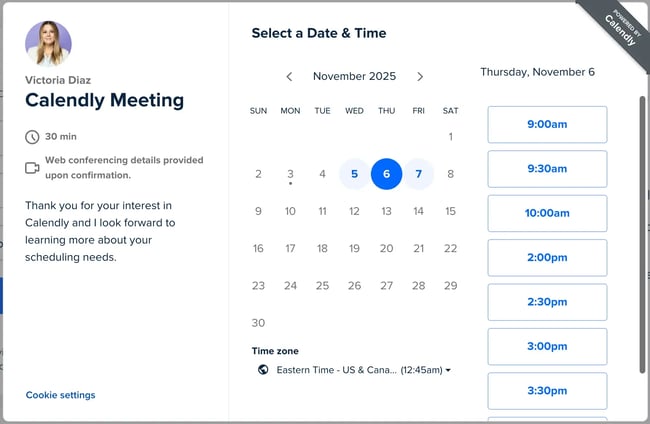
Calendly is one of those tools that completely redefines what a “form” can look like. Instead of a static list of fields, it turns scheduling into a quick, visual flow that feels effortless from start to finish.
The brilliance is in how it collects information without feeling like data entry. Each step — from picking a date, selecting a time, and confirming details — replaces traditional form fields. And because the interface updates in real time, you never feel stuck or unsure of what comes next.
I’ve used Calendly forms for everything from demo requests to client onboarding, and the difference is huge. People move through it faster because it doesn’t feel like work. The built-in calendar sync and automatic confirmation emails are just the cherry on top. Proof that a form can be both functional and genuinely enjoyable to use.
Pro tip: Think outside the text boxes (pun intended). Turning form inputs into interactive steps or visual selections keeps users engaged and gets you better completion rates.
7. Kit
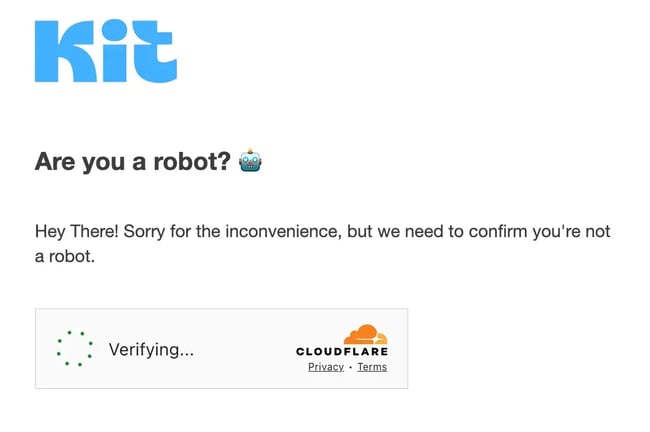
Sometimes it’s not the design of a form that stands out but the tone. Before you even start filling anything out, Kit greets you with a simple, human message, “Hey there! Sorry for the inconvenience, but we need to confirm you’re not a robot.”
It’s such a small moment, but it instantly shifts the experience. Instead of a cold CAPTCHA box, you’re met with friendly, empathetic copy that makes you feel like there’s a real person on the other side. That kind of tone builds trust before the form even begins.
I’ve written and tested plenty of forms over the years, and I’ve seen how much the right words matter. When you frame fields as a way to help the user, not just collect data, completion rates go up. People are far more willing to share information when they feel it benefits them.
Pro tip: Use human language wherever you can. Even a simple line of empathetic copy can make your form feel like part of a conversation instead of a transaction.
8. Betterment

I love when a form sets clear expectations upfront, and Betterment does it perfectly. Right at the top, it tells you that opening an account takes as little as three minutes. It’s simple, but that tiny detail matters more than most people realize. Like I said before, when users know how long something will take, they’re much more likely to start (and finish).
The form also uses smart visual cues to guide choices. Each account type includes a short description, and labels like “Most Popular” or “Special Offer” help users decide quickly without overthinking. It’s clean, scannable, and makes what could be a complex financial decision feel straightforward.
When I’ve A/B tested similar time estimates or “most popular” indicators in signup flows, the difference was huge. Users moved through faster and with more confidence.
Pro tip: Tell users what to expect before they even start. Time estimates, helpful labels, or small bits of guidance can make your form feel faster and more approachable.
9. Twilio

I’m a big fan of forms that do more than just ask for information. They build trust while they do it. Twilio’s contact sales form nails this by addressing every potential objection right next to the form itself.
Before you even start filling it out, the page tells you exactly what you’ll get after submitting: tailored product recommendations, pricing insights, and a one-day turnaround. That context matters. It turns a “sales form” into a promise of value, which makes people more willing to complete it.
I also love the small box beneath that highlights the free trial — no credit card required. It’s a smart move that removes one of the biggest conversion blockers. I’ve used a similar approach when writing B2B signup flows: If you know what’s stopping people from converting, address it right on the page.
Pro tip: Don’t wait until after submission to handle objections. Use the space around your form to answer questions, clarify value, and reduce anxiety before someone even clicks “submit.”
10. Duolingo
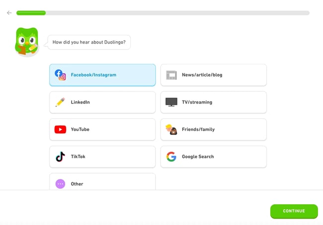
Few brands make forms feel as fun as Duolingo does. Every part of this one reflects the brand’s personality, from the friendly tone to the colorful icons that make each option instantly recognizable.
The design checks all the boxes for great UX. There’s a progress bar at the top that shows exactly how far along you are, clear visual options that replace traditional dropdowns, and a bold “Continue” button that’s impossible to miss. It’s clean, quick, and genuinely satisfying to complete.
What I love most is how it combines form and brand experience seamlessly. I’ve worked on plenty of signup flows where the form felt like an afterthought — but here, it’s an extension of the product’s energy and playfulness. That’s what keeps users engaged all the way through.
Pro tip: Visual elements aren’t just decoration, they’re communication. Use icons, color, and microcopy to guide users naturally and make the process feel intuitive from start to finish.
What Great Forms Have in Common
If I’ve learned one thing from all my trial and error (and believe me, there’s been plenty), it’s that whenever I simplify or humanize a form, I almost always see the same result: higher completion rates and happier users. When you make things easier for people, they usually return the favor.
And when in doubt, test. A/B testing small tweaks like reducing fields, rewording microcopy, or updating your CTA is still one of the best ways to learn what really works for your audience.
So, keep it simple, keep it human, and keep experimenting. You’ve got this.
Editor's note: This post was originally published in June 2018 and has been updated for comprehensiveness.
Forms

