.png?width=112&height=112&name=Image%20Hackathon%20%E2%80%93%20Horizontal%20(25).png)

A few years ago, I worked on a website refresh where everything looked polished — except the hero section. The photo was crisp, but it didn’t connect with the brand or the audience. After swapping in a custom visual and refining the copy, the page’s conversion rate jumped. That experience changed how I approach hero design.

Your page opener is often the first thing people see. It sets the tone, communicates value, and directs the eye to the call-to-action. When the visual and message don’t fit, the whole page feels off. After managing dozens of launches, I’ve seen effective hero sections make the difference between a page that underperforms and one that converts.
In this post, I’ll break down what makes an impactful hero section, how to size and structure it, and the practices I rely on to drive results across industries.
Table of Contents
- Hero Image in Web Design
- Hero Image Dimensions
- Hero Image HTML
- Hero Image CSS
- 6 Hero Image Examples
- Hero Image Best Practices
.png)
50 Social Media Image Templates
Get more fans to share your content with these 50+ customizable graphic templates, including:
- Facebook Cover Photo Templates
- Instagram Story Templates
- LinkedIn Post Templates
- And More!
Download Free
All fields are required.
Hero Image in Web Design
A hero section is your website’s opening statement. It’s the visual and textual combination that immediately communicates who you are and what users can accomplish on your site.
Core components of a hero section include:
- Headline. State your primary value proposition clearly. Answer “What’s in it for me?” within seconds.
- Subheading. Add context or detail. Keep it concise while clarifying the headline’s promise.
- Call-to-action (CTA). Include a clear button or link that tells users what to do next. Stick to one primary CTA to avoid choice overload.
- Hero visual (image, video, or animation). Use a visual that reinforces your message and creates an emotional connection. It should complement, not compete with, the text.
Together, these web design elements set the stage for the rest of the page.
An effective page opener builds credibility. It signals professionalism, clarifies the offer, and can lift conversion rates. Underperforming sections usually rely on generic stock photos, overload the space with text, or slow the site with heavy file sizes.
The most common mistakes I see come down to fit. A photo might look nice but miss the audience’s context, or text may sit awkwardly over the image, making both harder to read. These details matter because the hero section guides attention in the first few seconds.
The right visual depends on your goals and resources:
- Images create instant emotional connection, especially with real customers or products.
- Illustrations and abstract graphics give SaaS and tech brands a modern, flexible look.
- Video works best for showing a product in action or creating atmosphere quickly.
Today’s most effective hero sections also reflect personalization, accessibility, and inclusivity — whether by featuring real customers, using accessible color contrast, or adapting visuals dynamically to device and location.
Hero Image Dimensions
Hero image dimensions affect clarity, cropping, and load speed. An image that’s too small looks pixelated on larger screens. An image that’s too large slows down the page and hurts the experience. Dimensions also determine how text overlays fit without being cut off on different devices.
I recommend using dimension benchmarks as a starting point, then testing across your CMS and common devices. Every platform renders images slightly differently, so the only way to know what works best for your audience is to preview and adjust.
Keep text and CTAs within safe zones. A safe zone is the central area of an image where text won’t get cut off when the screen size changes. Placing content outside this area risks losing critical messaging.
1. Full-Screen and Banner Image Dimensions
A reliable baseline for a full-screen or banner header visual is 1920 x 1080px, which aligns with a 16:9 aspect ratio. I always test at 2560px for clients targeting high-resolution displays, which preserves clarity on larger monitors without slowing render time when compressed properly.
For high-resolution and retina displays, increase the size to 2560 x 1440px or higher. Always keep an eye on file weight as you increase resolution — larger images load slower, so balance sharpness with speed.
2. Mobile Hero Image Dimensions
Mobile devices require a different approach. A vertical orientation around 1080 x 1920px works well as a starting point. Because mobile screens crop differently, design with a mobile-first mindset.
Keep the focal point centered and avoid placing text near the edges. Safe zones are tighter on mobile, so always check how the image scales in both portrait and landscape views.
3. Hero Image Compression
In my eyes, file size is as important as dimensions. Use modern image formats like WebP, which compress well without visible quality loss. Tools like TinyPNG, Squoosh, or built-in CMS optimizers make this process straightforward.
Aim to keep hero images under 500KB whenever possible. Compressing below this level helps pages load quickly, especially on mobile.
Load essential content first. That means the headline, subheading, and CTA should appear as soon as the page opens, while secondary visual effects like animations can load after. This approach keeps the experience smooth even if the hero image is still rendering.
Hero images also affect SEO. Large file sizes can hurt Core Web Vitals by slowing page load times, which search engines factor into rankings. Adding descriptive alt text supports accessibility while giving search engines context about your content. Optimizing hero images for speed and clarity strengthens both user experience and search performance.
Once you’ve optimized dimensions, the next step is implementing them on your site.
50 Social Media Image Templates
Get more fans to share your content with these 50+ customizable graphic templates, including:
- Facebook Cover Photo Templates
- Instagram Story Templates
- LinkedIn Post Templates
- And More!
Download Free
All fields are required.
Hero Image HTML
HTML is a coding language made up of elements used to give structure to a web page. It creates order and lets you embed content (like hero images) into a site.
Creating a hero image with HTML ensures your visual appears on a web page, while CSS makes it look good on a screen. Both require coding skills, so you may need to brush up on your HTML and CSS knowledge or enlist the help of a developer.
The main things to keep in mind are:
- The hero section needs to be centered.
- The text needs to be easy to read.
- Make it look great on all screen sizes.
- The image should cover the entire viewport.
Follow these steps to set up an eye-catching hero image. Note: The examples below include HTML elements and CSS rules, but I’ll explain the difference between the two later on.
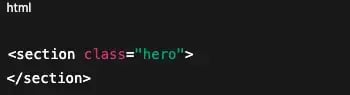
1. Create the structure.
Set up two containers for your hero image using the coding conventions of your website. For instance, the first example below uses .hero for the structure and .hero-content for the image, text, and button, while the second uses .image-container and .inner-container.
2. Add your content.
Once the structure is in place, it’s time to personalize your image. Add an image, choose a custom font, craft a header and subheader, and create a button with an enticing CTA. If you want to add a filter to your background image (without applying it to the text), DeveloperDrive recommends including the filter before your .hero-content code.
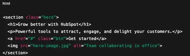
Notice how the width and height under the .hero section are set to 100vw and 100vh. This ensures the image fits the entire viewport, both vertically and horizontally, so it spans the whole screen.
No hero image is complete without a button that drives people to take action. Incorporate one into your image with the <button> element. Just make sure to include the font-family since the text doesn’t automatically translate from the .hero-content element.
3. Center key elements.
Not all hero images have centered text, but most have a centered image. To balance your background image, you can make a flex container by incorporating display, justify-content, and align-items under your .hero element.
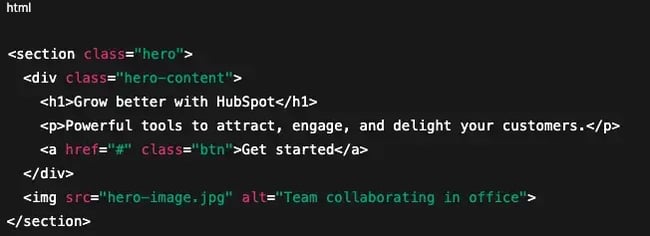
For centered text, include a .text-align: center rule under your core content element. In the above example, the text is nested under the .hero-content code.
4. Make it responsive.
You want your hero image to look good no matter the screen size. Setting media queries allows you to create parameters so your image is responsive at a particular screen width.
5. Test the view across devices.
Congratulations, your HTML structure is set! Test out how the image, text, button, margins, padding, and centering look on different screen sizes. If something seems off, comb through your code to see if you can find issues.
Hero Image CSS
While HTML builds the structure of a hero section, CSS (Cascading Style Sheets) controls how it looks and feels. CSS is a rule-based language that applies style to HTML elements. You can adjust typography, colors, spacing, and positioning so the hero section reflects your brand.
Without CSS, a hero section will display in the browser’s default styles, which are plain and unbranded. Adding CSS rules transforms that basic layout into a polished design that supports your message.
The HTML snippets earlier already included some CSS, but here’s a simple example of how CSS styles a full-screen hero image:
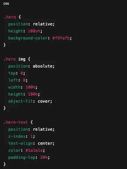
This structure gives you a centered block of text over a full-screen background image. From here, you can adjust the rules — like font-family, color, border, or padding — to match your brand identity.
Adding CSS to your hero section makes the design cohesive, accessible, and responsive. The right combination of structure and style helps your hero image communicate clearly and guide visitors toward the next action. If you’re not working in code, most CMS builders handle these steps for you behind the scenes.
6 Hero Image Examples
Like all creative work, hero image design evolves with trends. Over time, we’ve seen everything from splash pages to clipart-heavy banners dominate the web. Today’s best hero images lean on simplicity, brand identity, and intentional design choices that guide visitors toward action.
Here are six current trends worth noting, with examples of brands using them effectively.
1. Parallax and Scrolling Animation
Parallax design creates the illusion of depth by moving foreground and background elements at different speeds. When done well, it adds a sense of dimension that feels engaging without being distracting. Scrolling animation builds on this idea by encouraging interaction — content comes to life as the visitor moves down the page.
Notion uses light parallax and animated illustrations in its hero, followed by a video walkthrough of the product. The motion draws attention but never overshadows the content. Visitors get an immediate sense of how the product works, which builds both curiosity and understanding.
2. Abstract Compositions
Geometric shapes, waves, and layered color blocks are increasingly common in hero design. These abstract elements help break away from rigid grids and give the page a more creative or futuristic feel. The key is to use abstraction to frame the core message rather than replace it.
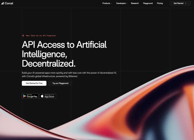
Corcell.io’s hero section uses fluid, wave-like shapes as the backdrop for its headline and CTA. The design feels modern and adds movement without relying on heavy animation. It supports the content while creating a distinct brand impression.
3. Soft Color Schemes
As users spend more time online, eye-friendly design has become a priority. Hero images that lean on neutral, muted, or pastel palettes create a welcoming experience. Soft colors also help text and CTAs stand out clearly without visual strain.
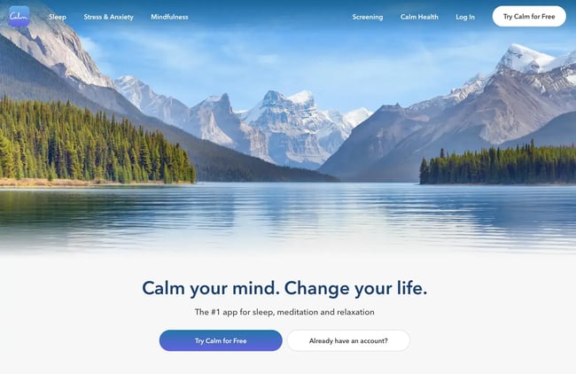
Calm’s hero blends soft blues and earthy tones to match the app’s mission. The palette conveys relaxation and focus, and it immediately sets the mood for visitors. The visual direction supports the brand promise, making the hero image feel both beautiful and functional.
4. Products as Design Elements
Products often work best when they’re not just shown, but integrated into the hero itself. This approach turns the offering into part of the design — highlighting form, variety, or function in a way that feels intentional. It works well for ecommerce brands and startups alike.
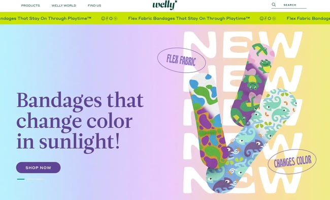
Welly leads with a hero full of colorful bandages arranged in bold layouts. The products don’t sit passively in the frame — they are the frame. Visitors know as soon as they arrive what the company sells, and the bright presentation creates a memorable first impression.
Of all the trends I’ve worked with recently, product-focused hero images are my favorite. They bring clarity to what the brand offers and cut through noise faster than abstract visuals or motion-heavy designs.
5. Lifelike Color
Flat colors have given way to richer, more dimensional palettes. Gradients, shadows, and blended hues create lifelike depth that feels immersive. When used in hero images, this approach can highlight vibrancy and mood while drawing attention to the product or service.
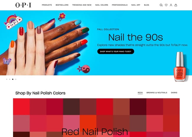
OPI’s “Nail the 90s” campaign brings color to the forefront. The hero highlights a range of shades that capture the energy of the decade, followed by a full grid of polish colors. The effect is bold and playful, showing how lifelike color can carry both storytelling and visual appeal.
50 Social Media Image Templates
Get more fans to share your content with these 50+ customizable graphic templates, including:
- Facebook Cover Photo Templates
- Instagram Story Templates
- LinkedIn Post Templates
- And More!
Download Free
All fields are required.
6. Videos
Video hero images deliver instant context. They can demonstrate a product in action, create atmosphere, or tell a story in seconds. Videos work best when they’re short, looped, and compressed for performance. Many brands also use a static fallback for mobile to keep load times fast.
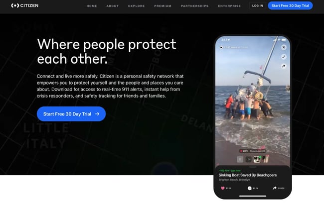
Citizen’s hero section features a scrolling video with real emergency scenes. The clips immediately communicate urgency and purpose, setting the tone for what the app delivers. It’s a powerful use of video to connect mission with visual impact.
Hero images also benefit from regular updates. I recommend reviewing them at least once a year or whenever your brand launches a new campaign, product, or visual identity. Fresh hero images keep your site relevant, signal that your brand is active, and can prevent visual fatigue for repeat visitors.
Now let’s translate these ideas into daily work with the following practices.
Hero Image Best Practices
Over the years, I’ve tested dozens of hero image variations across websites and campaigns. The most impactful results always come from a few consistent practices.
Optimize size.
I keep hero images optimized for fast load without losing quality. A large, uncompressed file slows the page and creates friction. I aim for images under 500KB whenever possible, use modern formats like WebP, and run tests on both desktop and mobile. A sharp image that loads quickly creates a smoother first impression.
Match imagery to brand story for harmony.
A hero image works best when it matches the brand’s story, colors, and typography. When those elements feel aligned, the page feels intentional. I always check the balance between the visual and the headline — neither should compete with the other. When color, type, and imagery are in harmony, the CTA naturally stands out.
Guide attention with organization and focal points.
High-performing hero images use focal points to guide attention. That focal point might be a person looking toward the CTA, a product placed at the center, or an action shot that creates direction. I look at the hero section as a visual hierarchy: first the headline, then the supporting copy, and finally the CTA. The image should support that flow instead of pulling the eye away.
Use original visuals.
Stock images feel generic and don’t build trust. Real photos or custom graphics create stronger connections. On one project, I swapped a stock photo of “business people in a meeting” for an actual headshot of the client’s team. Bounce rate dropped, and engagement improved within weeks. Authentic visuals show visitors who they’re interacting with and why it matters.
Maintain visual consistency.
Hero sections should reflect the same style, tone, and visual identity across the site and campaigns. Consistent use of color, photography style, and typography builds recognition. I also prioritize accessibility — alt text for screen readers and strong color contrast for legibility. A consistent and accessible page opener makes every user’s experience smoother and more reliable.
Accessibility guidelines also go beyond alt text and color contrast:
- Avoid autoplay videos with sound, which can disrupt or overwhelm users.
- Steer clear of flashing animations that could trigger motion sensitivity.
- Provide captions or transcripts so everyone can understand video or motion graphics.
- Respect prefers-reduced-motion and pause animations on request.
- Keep overlay text at WCAG-compliant contrast; avoid image areas that reduce readability.
- Provide keyboard-focusable CTAs in the hero.
Test and iterate regularly.
Hero sections perform best when you test them over time. I look at three areas:
- Performance Metrics. Track render time and file size through tools like Google PageSpeed Insights.
- Design Fit. Review headline placement, image cropping, and safe zones across devices.
- Engagement. Measure click-through rates on CTAs and scroll depth to see if the hero drives action.
Running A/B tests on different visuals can also highlight what resonates most with your audience.
- Track LCP under 2.5s on mobile, CTA CTR, scroll depth, and bounce rate.
- A/B test headline, CTA label, and focal crop before swapping entire visuals.
Turning Hero Images Into Conversions
Hero images do more than sit at the top of a page. They set the tone, build credibility, and guide visitors toward action. Designed with intention, they become one of the most effective tools for conversion.
In my experience, the difference between a generic image and a carefully crafted hero image often determines whether a page underperforms or converts. Details like file size, focal points, and authentic visuals create measurable impact. These choices also align with broader design trends — supporting accessibility, adapting to mobile, and building trust through authentic elements.
Keep testing, iterating, and refining. Every audience responds differently, and the most effective hero image is the one that represents your brand clearly while moving visitors to take the next step.
Editor's note: This post was originally published in June 2021 and has been updated for comprehensiveness.
50 Social Media Image Templates
Get more fans to share your content with these 50+ customizable graphic templates, including:
- Facebook Cover Photo Templates
- Instagram Story Templates
- LinkedIn Post Templates
- And More!
Download Free
All fields are required.
![How to Create the Perfect Marketing Timeline [Template + Examples]](https://53.fs1.hubspotusercontent-na1.net/hubfs/53/project-timeline-template-1-20240919-3074583.webp)
![My Tips for Designing Great Website Imagery [With Canva, HubSpot, + 3 More Tools]](https://53.fs1.hubspotusercontent-na1.net/hubfs/53/Untitled%20design%20-%202025-02-14T161951.776.png)

![How to design a logo [step by step]](https://53.fs1.hubspotusercontent-na1.net/hubfs/53/Operation-everest-free-advertising-1-20250922-654468.webp)

![How to Make an Animated GIF in Photoshop [Tutorial]](https://53.fs1.hubspotusercontent-na1.net/hubfs/53/how-to-create-animated-gif_6.webp)