
Last month, I pitched a potential client who seemed perfect for my content strategy services. I had researched their company thoroughly, created what I thought was a compelling proposal, and delivered it with confidence.

Their response? “We'll think about it.” That dreaded phrase that usually means “thanks, but no.”
Afterward, I realized my mistake: I had focused too much on what I could do and not enough on what they actually needed to hear. My presentation was about me, not about solving their problems.
As a content strategist who regularly creates sales materials for B2B SaaS companies, I‘ve learned that the best sales presentations don’t make your prospect the hero of their own success story. However, following a few key sales presentation guidelines can prevent this.
Let me show you some stand-out sales presentation examples. I’ll cover some common pitfalls to avoid to help you perfect the pitch.
Table of Contents
- What is a sales deck?
- Sales Deck vs Pitch Deck
- Sales Deck Examples
- Example Sales Presentation
- Sales Deck Presentation Tips
- How to Find a Sales Deck Template
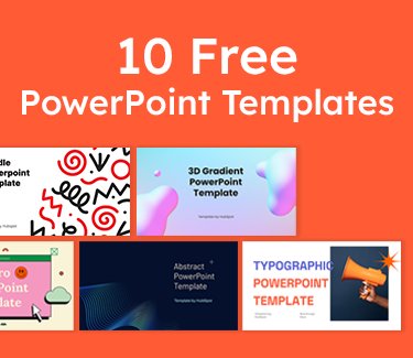
10 Free PowerPoint Templates
Download ten free PowerPoint templates for a better presentation.
- Creative templates.
- Data-driven templates.
- Professional templates.
- And more!
Download Free
All fields are required.
What is a sales deck?
A sales deck is a visual presentation (typically created in PowerPoint, Keynote, or modern tools like Pitch or Canva) that supports your sales conversation with prospects. Unlike a generic company overview, an effective sales deck tells a focused story: it identifies your prospect's specific challenges, presents your solution, and demonstrates proven results through customer success stories.
The primary goal isn‘t just to showcase your product — it’s to create a compelling narrative that guides prospects toward a clear purchasing decision.
Here‘s the reality: Even with perfect discovery calls where you’ve uncovered every pain point and mapped out exactly what your prospect needs, a weak presentation can derail the entire sales process. If you‘re hearing responses like "we need to think about it" or "let’s circle back next quarter," your deck likely isn't connecting the dots between their problems and your solution clearly enough.
Sales Deck vs Pitch Deck
While these terms are often used interchangeably, they serve different purposes:
Sales deck: Designed to convert prospects into customers by focusing on specific problems, solutions, and outcomes. Your audience is potential buyers who want to understand how your product will impact their business.
Pitch deck: Created primarily for investors, partners, or stakeholders who need to understand your business model, market opportunity, financial projections, and growth strategy. Think of it as your business plan distilled into slides.
The key difference? A sales deck answers “How will this solve my problem?” while a pitch deck answers “Why should I invest in this company?”
Now, let's dive into some standout sales deck examples that nail this distinction.
Sales Deck Examples
- Leadnomics
- Stripe
- Synergy
- Freshworks
- Nimbus
- Introva
- Stairway Collective
- Kibris Developments
- OfferBite
- Accern
- OpenFortune
- Airbnb
1. Leadnomics Sales Deck by Katya Kovalenko
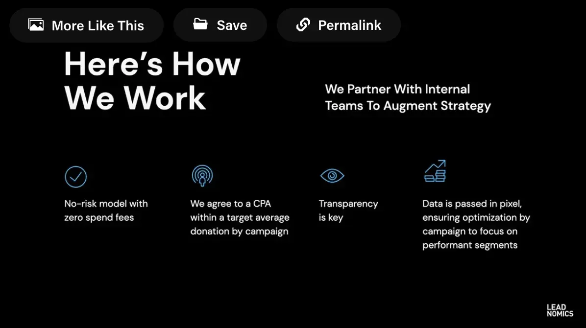
Leadnomics shows how a sales deck can reflect brand identity without losing clarity. Instead of filling slides with long explanations, it focuses on bold visuals, sharp contrasts, and just enough data to prove results.
For example, one slide highlights a 50% increase in ROAS and 20% lower CPA, backed by a clean chart that tells the story at a glance. Another confidently states, “We Find Your Highest-Value Customers,” supported by icons for services like offer syndication and social strategy.
What I like: The deck feels sleek and professional while staying simple. Each slide has one clear message, whether it’s proof of results or a high-level value proposition. Combining strong branding with data and customer-focused messaging keeps attention on how they can help prospects achieve measurable outcomes.
2. Stripe Sales Deck by Zlides
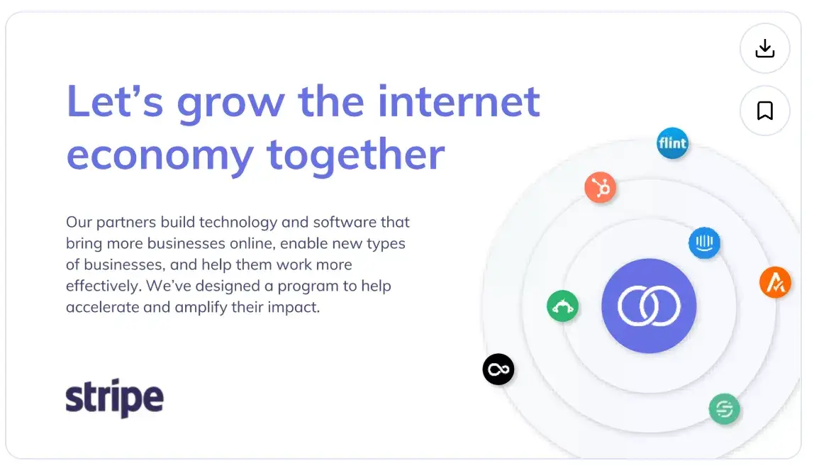
Stripe’s deck takes a straightforward approach, keeping the focus on a few core themes rather than overloading the audience with details. Slides highlight ideas like being developer-first, offering a complete toolkit, and maintaining global reach.
The messaging is pared down to short phrases with supporting visuals, which makes the content easy to follow and flexible enough for the salesperson to elaborate on during the conversation.
What I like: The design is clean and minimal, which keeps attention on the key points. Instead of trying to explain everything, the deck establishes credibility and leaves space for the discussion to go deeper based on the prospect’s needs.
3. Synergy Sales Deck Presentation
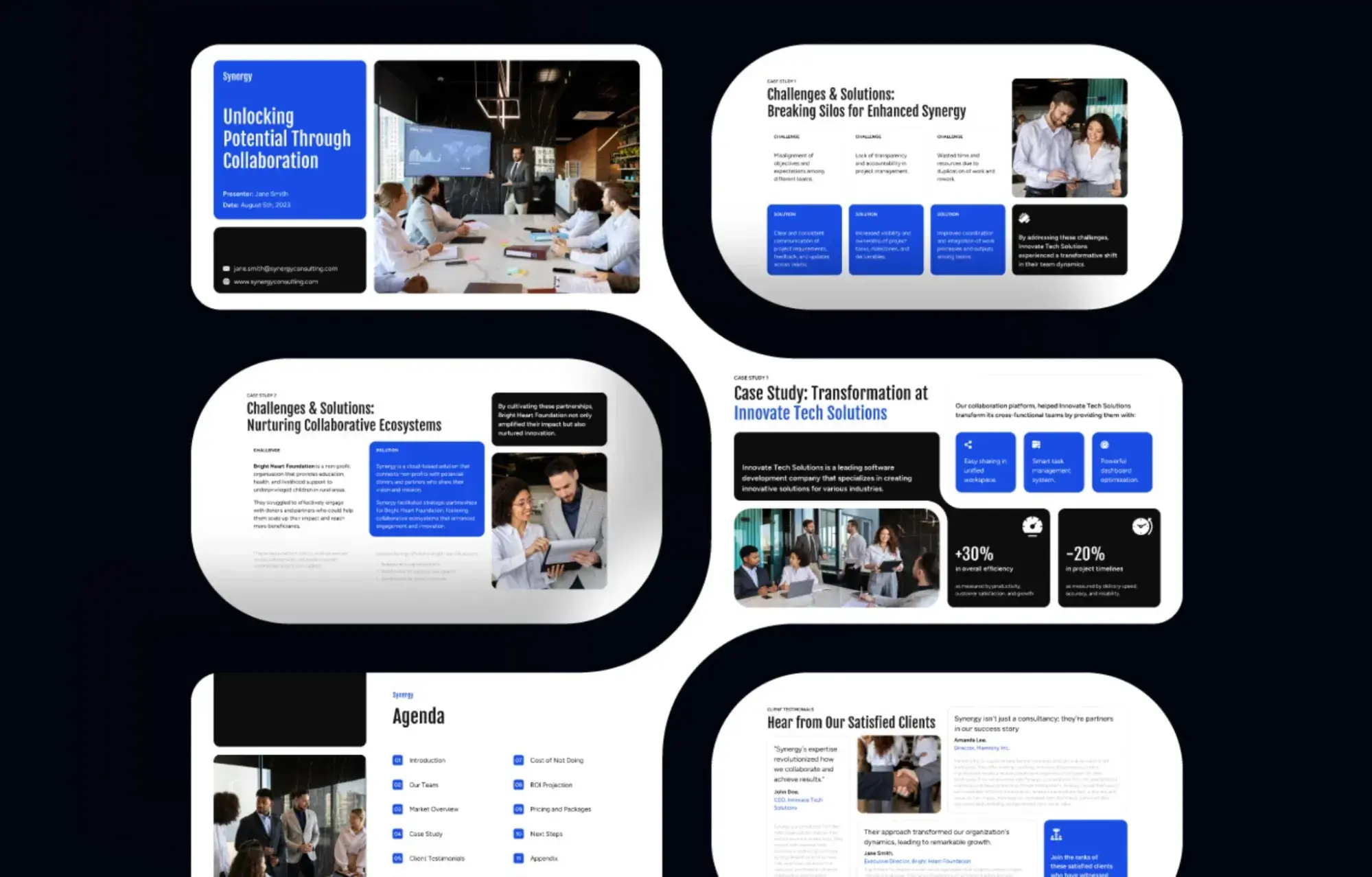
The Synergy sales deck leans heavily on storytelling through case studies and challenges. Rather than only listing features, it frames problems, like siloed communication or wasted resources, and then follows up with solutions and measurable results. This makes the slides more relatable, as prospects can see their own pain points reflected in the examples.
Visually, the deck uses a consistent layout with bold blocks of color, clean icons, and supporting photos to create structure without overwhelming the viewer.
What I like: The deck prioritizes clarity by breaking complex ideas into challenge-and-solution pairs, supported by data. It avoids over-explaining, instead relying on proof points and structured flow to keep attention anchored on how collaboration translates into business impact.
4. Freshworks Sales Deck by BrightCarbon
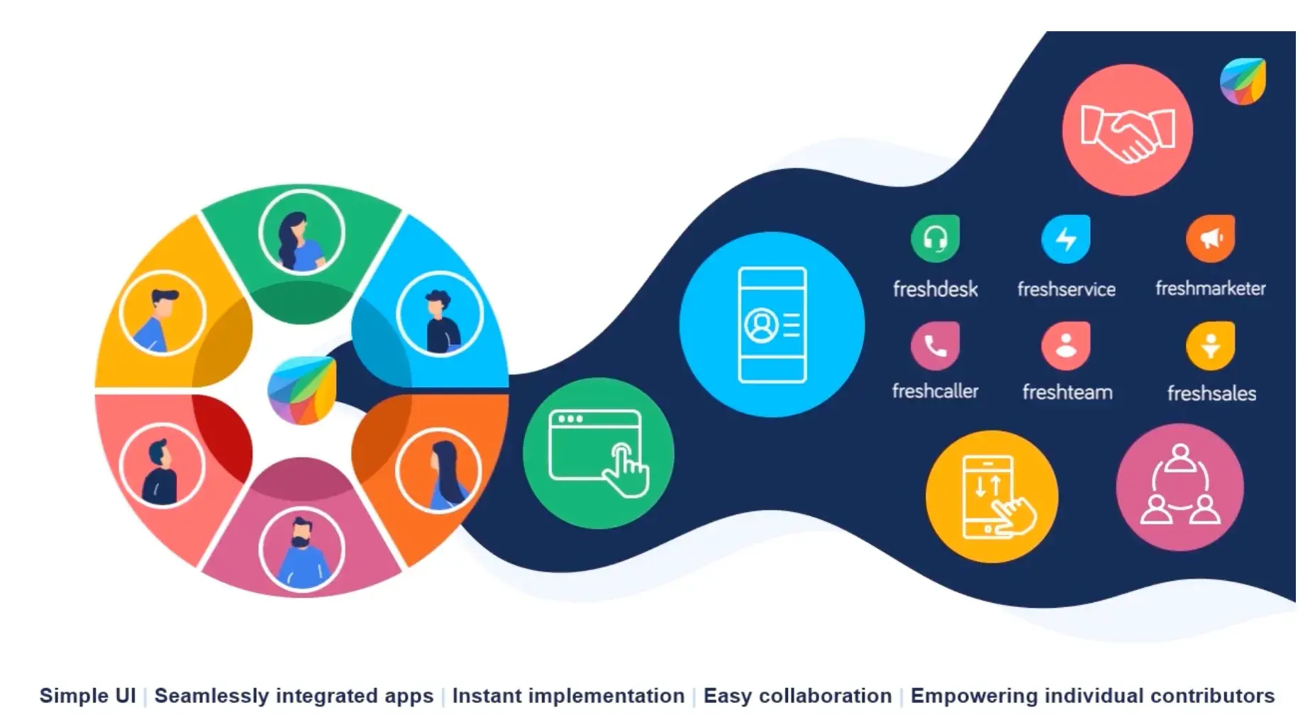
Freshworks is a B2B software platform that promises an all-in-one package for businesses. Its sales deck emphasizes simple text and organization. The problem and solution are introduced using graphics, which I think makes the text easier for readers to prioritize.
I like how they include a dedicated slide to their mobile app (which serves as a “solution slide”), one of the product's key differentiators and most salient benefits. The following slides provide a step-by-step walkthrough of how customers are onboarded and what they can expect on a regular basis.
Since the slides aren't text-heavy, the salesperson can easily elaborate and answer any questions the prospect might have.
What I like: I love that this sales presentation makes the customer's problem so clear and memorable (“the cloud is broken”) and then focuses on product features and solutions.
10 Free PowerPoint Templates
Download ten free PowerPoint templates for a better presentation.
- Creative templates.
- Data-driven templates.
- Professional templates.
- And more!
Download Free
All fields are required.
5. Nimbus Sales Deck by Katya Kovalenko
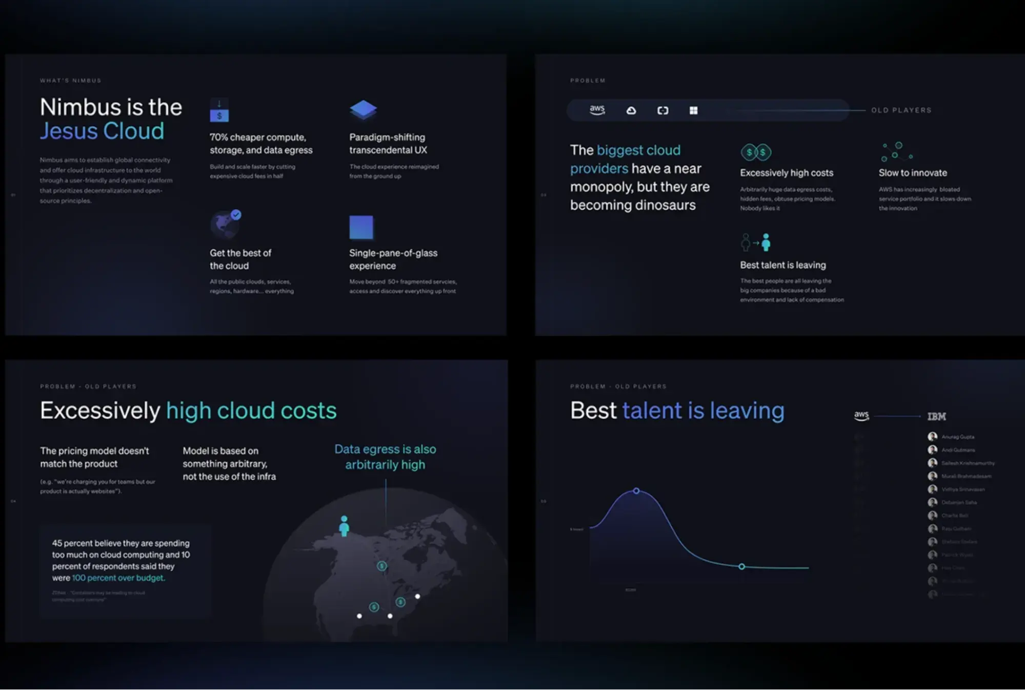
The Nimbus sales deck takes an assertive approach by opening with a bold claim and then contrasting old industry players with Nimbus’s alternative. The problem is made clear: cloud providers have high costs, rigid models, and are losing top talent. Nimbus positions itself as the antidote with benefits like 70% cheaper compute and storage, better UX, and a simplified “single-pane-of-glass” experience.
The visuals reinforce these points — dark, futuristic slides with bursts of blue highlight key issues like high cloud costs and talent drain. Charts, maps, and icons are used sparingly but effectively, ensuring each slide communicates one focused message.
What I like: The structure is strong. It frames the competition as outdated before laying out Nimbus’s unique value, including its disruptive pricing model and architecture. By moving logically from pain points to differentiation, the deck gives prospects a clear reason to reconsider their current providers.
6. Introva Sales Deck Presentation
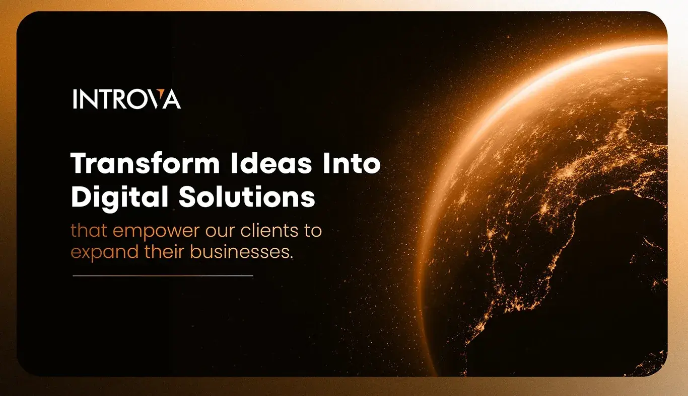
Introva’s sales deck focuses on credibility and structure. The slides combine a dark, modern design with orange highlights to emphasize key points — helping prospects immediately notice important details without being distracted.
The opening frames establish trust with quick stats: 10+ years of experience, 20+ projects delivered, and industries served from fintech to healthcare. Instead of broad claims, the deck shows exactly how Introva engages with clients, whether through fixed-price projects, team augmentation, or ongoing support. The inclusion of agile methodology visuals and tools like Jira, Slack, and GitHub reinforces that they operate with transparency and modern workflows.
What I like: It’s organized around the buyer’s decision-making process. Prospects see not just what Introva offers but how projects are managed, delivered, and supported. By laying out the process clearly, the deck reduces uncertainty and positions the company as a reliable partner for digital transformation.
7. Stairway Collective Animated Sales Deck by Ahmad Geno
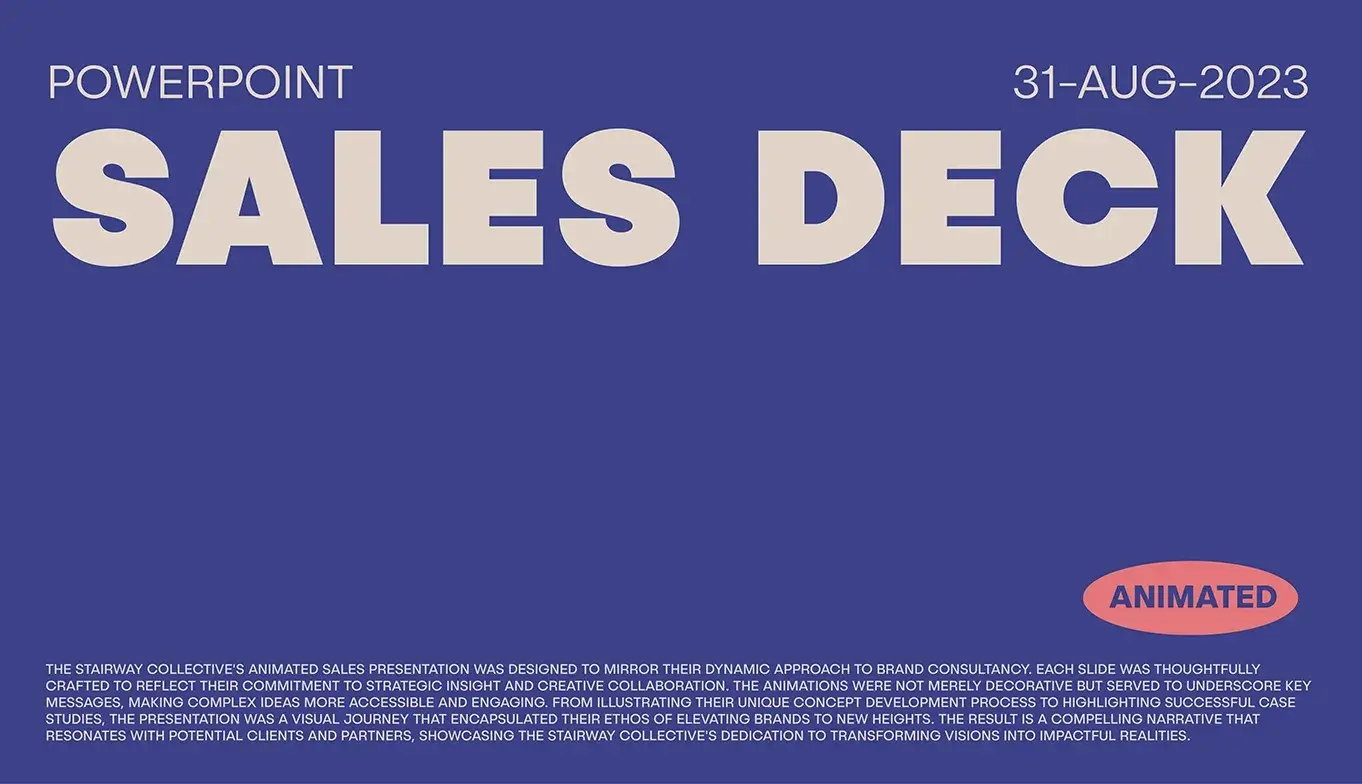
This animated deck takes a bold and minimalist approach, relying on color blocks, typography, and motion to create impact. Instead of filling slides with dense copy, it uses short, striking statements like “Total Brand Experience” and “Because we are client first” to anchor the narrative. Animations are integrated not as decoration but as a way to emphasize transitions and keep the flow engaging.
The design choices — muted backgrounds paired with pops of red, pink, and cream — give it a modern, almost editorial feel. Key ideas such as collaboration, strategy, and client-first values are highlighted through simple icons and clear layouts. This makes the deck highly scannable while still memorable.
What I like: The restraint. It doesn’t try to explain everything in the slides, but instead creates an energy that reflects the agency’s identity. The animation elevates the minimal content, turning a straightforward deck into a dynamic storytelling tool.
8. Kibris Developments by Katya Kovalenko
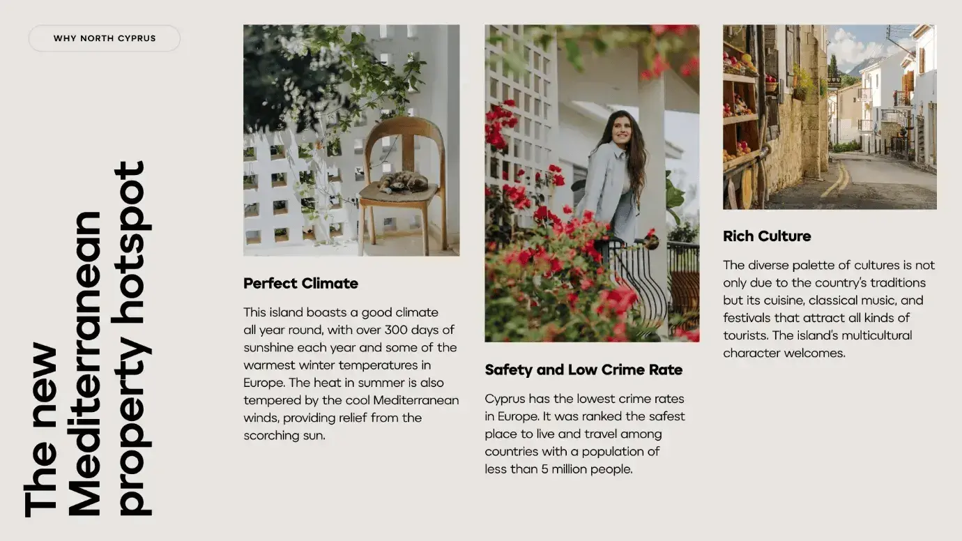
What you'll first notice when scrolling through Kibris Developments ’ sales deck is that it's straightforward and easy to scan (not to mention stuffed with beautiful imagery and branding).
The brand kept it simple with its deck, making it easier for consumers to consume. On every slide, Kibris Developments has one main message with supporting information in smaller font. Too often, companies stuff their decks, and the result is viewers who are overloaded and stop listening.
What I like: While some brands don't include any photography in their sales decks, I love how this brand uses photography heavily to tell a story and compel viewers.
9. OfferBite Sales Deck
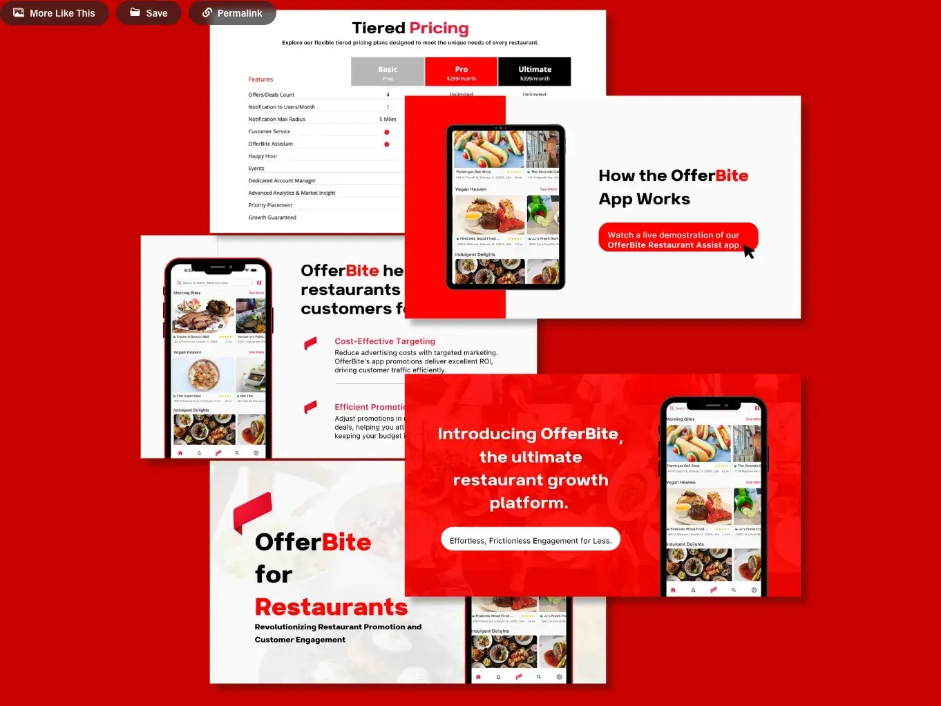
OfferBite’s deck is direct and product-driven, built around showing how the app works and why it matters for restaurants. The slides highlight clear benefits like cost-effective targeting and efficient promotions, supported by screenshots of the mobile app to ground the claims in a real interface. This makes the deck practical, as prospects can immediately picture how the platform would function in their own business.
The design leans on a bold red-and-white color scheme that reflects urgency and energy. Pricing is clearly presented with tiered plans — Basic, Pro, and Ultimate — removing ambiguity for decision-makers. The use of call-to-action slides, like “Watch a live demonstration”, helps move prospects toward the next step in the sales process.
What I like: The clarity of purpose. Instead of overwhelming with vision statements, the deck goes straight to what the app does, how it saves restaurants money, and how they can get started. It’s functional and persuasive.
10. Accern SalesDeck by Katya Kovalenko
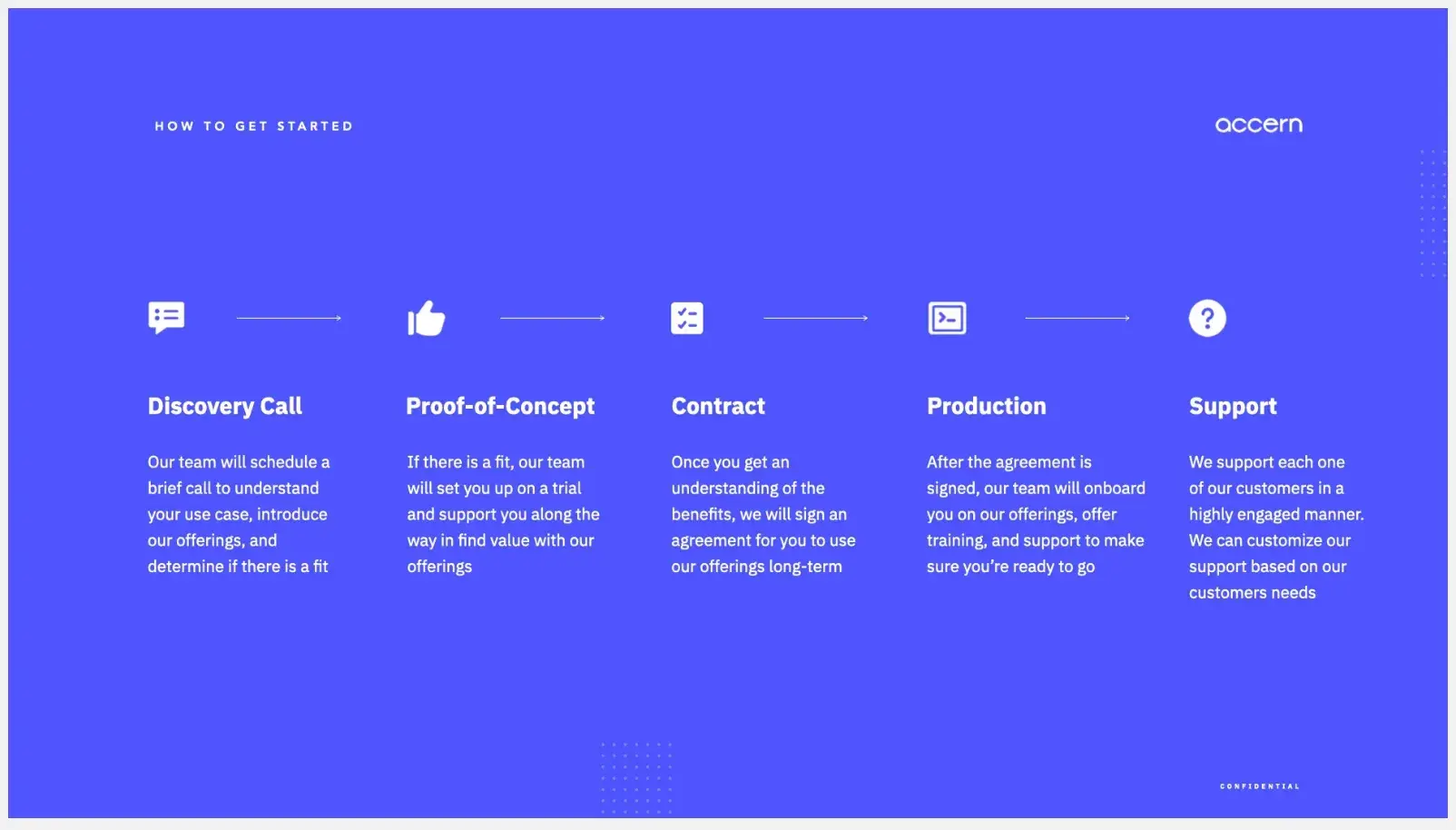
Similar to Leadnomics, software company Accern puts its branding at the forefront of the sales deck.
In addition to the use of design to make the sales deck stand out, Accern also highlights customer case studies in its deck, another form of social proof that shows the success other customers have found with this tool.
What I like: In my experience, the most effective sales decks will leverage customer success stories; this shows a beautiful way of achieving that.
11. OpenFortune Sales Deck by Katya Kovalenko
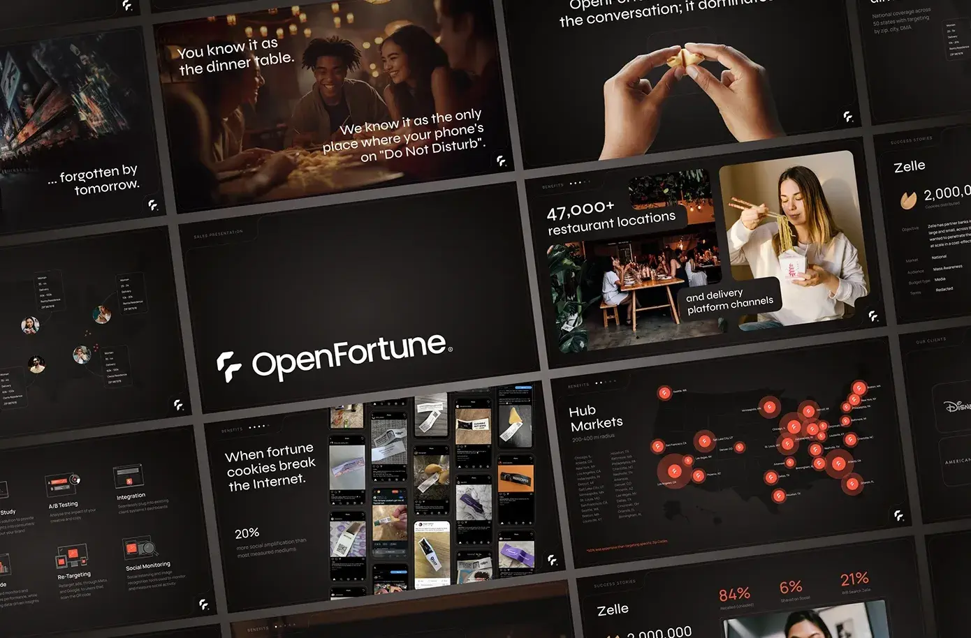
The OpenFortune sales deck stands out by weaving a narrative that contrasts traditional advertising with its own unique medium — fortune cookies. Instead of opening with features, it frames the problem: most ads are forgettable. Then it introduces its solution in a clever way: the dinner table, where phones are on “Do Not Disturb” and the brand message arrives in a cookie.
Visually, the deck uses dark, cinematic imagery with pops of warm light to create a polished, high-end feel. Data points like “47,000+ restaurant locations” and client logos add credibility, while playful lines like “Our targeting’s so good it’s almost creepy” keep the tone memorable. The map of hub markets and case study slides give prospects a clear sense of reach and impact.
What I like: The deck blends storytelling with proof. It doesn’t just describe a channel — it dramatizes the moment of engagement, which makes the concept harder to forget.
12. Airbnb
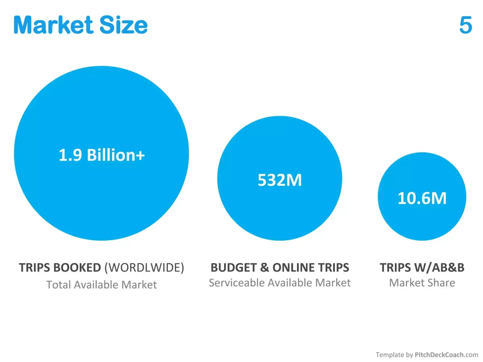
So far, most of these examples have been beautiful, sleek slides designed to get the audience‘s attention and look professional. There’s value in great graphic design, but there's more value in the hard details and facts of your product or service. Nothing showcases that better than Airbnb 's slide deck from 2008.
This is a presentation so basic it could‘ve practically been handwritten on Post-it notes, and it puts 100% of the focus on the product concept and impact. I think it’s a masterclass in clear communication.
We can learn a lot from the older generation of sales presentations. I think too many sales presentations start with flash and sprinkle product clarity on top as a final step, and it should be the other way around.
When you're designing your sales presentation, I recommend starting with bare-bones ideas and making sure the communication is spot-on before moving on to the pizzazz.
What I like: Ideas, product details, and data shine above all else in this presentation.
10 Free PowerPoint Templates
Download ten free PowerPoint templates for a better presentation.
- Creative templates.
- Data-driven templates.
- Professional templates.
- And more!
Download Free
All fields are required.
Example Sales Presentation
While there are plenty of videos online on how to deliver a sales presentation, there aren’t quite as many live sales presentations to watch.
That’s because sales presentations are delivered in the privacy of a meeting between the sales rep and the prospect and are often not recorded with the intention of sharing online.
As a sales rep, though, you have an excellent resource for inspiration: explainer videos. Companies publish explainer videos to pitch their products to qualified leads. (Sound familiar?) I recommend using the below examples to hone your own pitch to buyers, and pay close attention to the structure of each video.
1. Leadjet
This explainer video for Leadjet starts with an urgent problem: Finding leads on LinkedIn and moving them to a CRM loses valuable time and minimizes lead opportunities. Leadjet then presents its product as the solution.
The video jumps into the benefits users can enjoy, such as synchronizing conversations over both your CRM and LinkedIn, keeping the lead status updated, and adding custom details. In this video, Leadjet follows the ideal sales presentation structure: problem, solution, and benefits.
What works: Starting with the customer's pain point makes the product benefit clear and memorable.
2. Node Influencer App
The Node influencer app allows small business owners to connect with influencers on social media. It starts its video with a simple question: “Looking to promote your brand with social influencers?” I like how the presentation effectively identifies and addresses the target market before pitching the product to viewers.
This presentation is more tutorial-based, making it ideal inspiration if you‘re creating a sales deck for someone who’s closer to making a decision. People most often want to see actionable demos when they're ready to choose a provider.
What works: Rather than telling viewers that this app is easy to use or explaining how it works, this video showcases that ease by putting the product itself on display.
3. StoreTrack
This product video for StoreTrack starts by addressing a familiar frustration: outdated, clunky store maps that make it hard for customers to find locations. It introduces StoreTrack, a no-code tool that helps businesses create a stylish, functional store locator in just a few clicks.
The presentation flows smoothly through the benefits: simple CSV upload to set up all locations, full customization to match brand colors and fonts, and seamless performance across both desktop and mobile. It also emphasizes flexibility by showing compatibility with platforms like WordPress and Shopify, plus easy updates when adding new locations.
What works: The video keeps the focus on the customer’s problem — confusing, unattractive maps — and clearly contrasts it with StoreTrack’s ease and design flexibility. Showing how fast a locator can be made and updated makes convenience the core value.
4. Flike
The Flike sales presentation frames the problem right away: reps drowning in emails, follow-ups, and chats. It then positions Flike as the co-pilot that automates the toughest parts of outbound: writing personalized emails, timing follow-ups, and handling objections.
Flike integrates directly with Gmail, LinkedIn Outreach, Salesforce, and SalesLoft, so adoption feels natural. It shows how AI-driven personalization analyzes CRM data, conversations, and prospects' intent to generate relevant, ready-to-send messages.
What works: The pitch leans on vivid metaphors and a conversational tone to keep attention while underscoring value. Presenting Flike as a “co-pilot” conveys both assistance and empowerment.
Sales Deck Presentation Tips
Have you ever watched an episode of Shark Tank where a great product flops because of the sales pitch? The reality is, there are more bad sales presentations out there than good.
Stick to these five simple sales presentation guidelines (recommended by Marc Wayshak) to help yours succeed.
1. Lead with solutions.
A common mistake in sales decks is starting with your company history or a long feature list. Prospects don’t want to sit through a backstory before they understand how you can help them. Instead, open with the solution you provide.
For example, when I pitch my content services, I don’t begin with my years of experience or client list. I start by showing how consistent, product-led blog content can shorten sales cycles and generate inbound leads. That instantly addresses the marketing manager’s biggest concern — getting measurable results from content — and sets the stage for how I’ll deliver it.
Expert in sales strategy and training for outbound organizations and founder of The Sales-Led GTM Agency, Leslie Venetz, explains how to do lead with solutions mindfully:
“When sellers lead with features, they skip the most important step in the process: understanding what the buyer actually needs. That’s where I teach the GOGO Needs Analysis Framework. It gives sales professionals a structured way to uncover real pain points and align solutions to them.
GOGO stands for Goals, Outcomes, Gaps, and Options.
You start by clarifying the buyer’s goals. Sellers need to understand what the buyer is trying to achieve and why it matters before they can recommend a solution. Next, the seller must identify the buyer’s desired outcomes. They need to ask questions that help the seller uncover what success looks like and how it will be measured.”
Once a seller understands what the buyer wants and why it matters, they can identify the gaps between the current state and those goals. That’s the moment to highlight the cost of inaction — only then is the seller ready to recommend options that address the buyer’s outcomes.
Leading with solutions shifts the focus from you to them. Simply dive into how you're going to solve the deepest frustration your prospect is facing right now. I think this Zillow presentation is a great example of a solution-oriented sales deck:
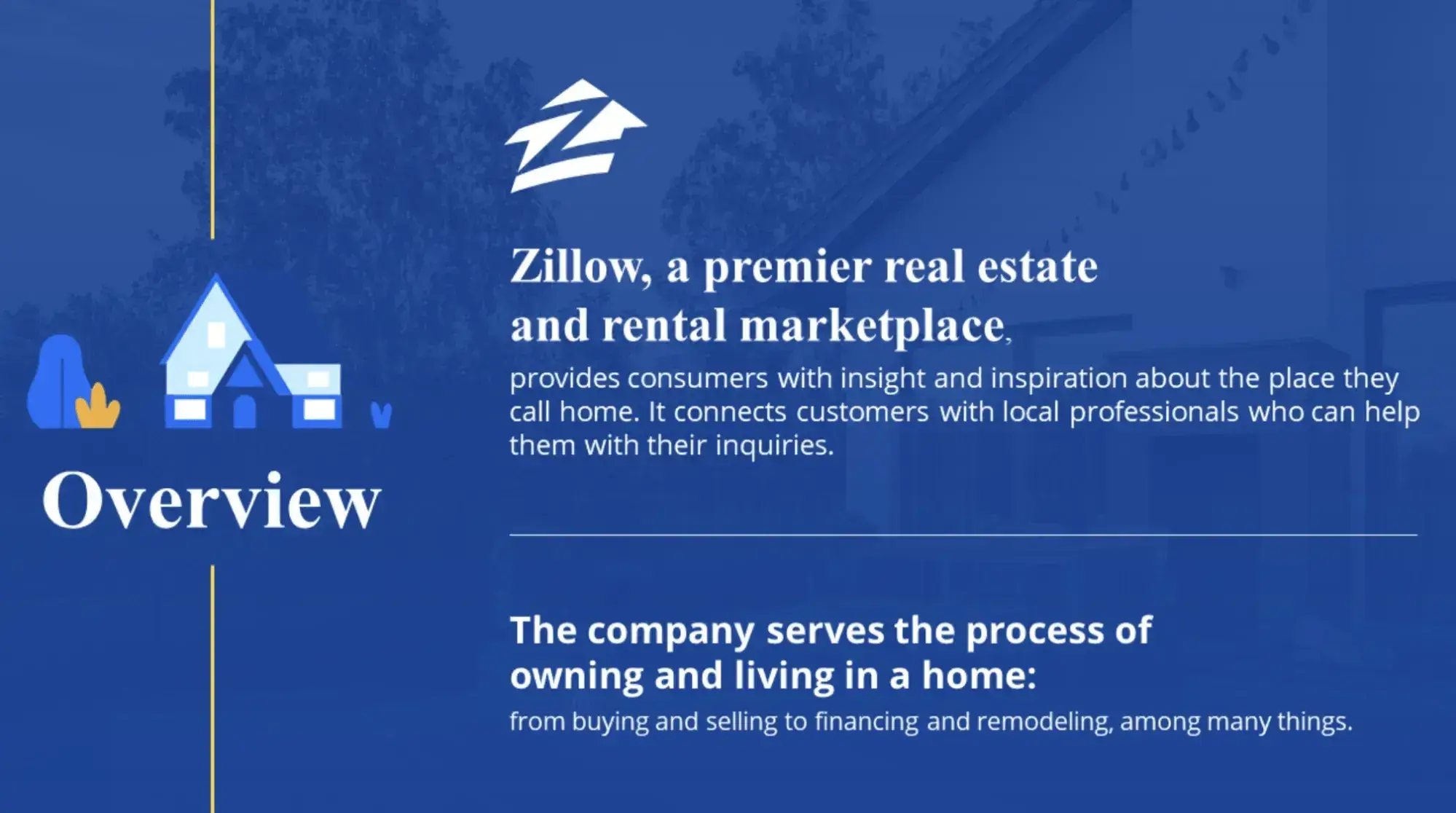
What I like: The mission slide starts this presentation off on a strong and memorable note.
2. Incorporate case studies.
Once you’ve introduced the solution, the next step is to show that it works. The easiest way to build credibility is with case studies.
When I present my services, I often share how a SaaS client went from publishing irregular blog posts to doubling their inbound demo requests after we built a content system around their product. Instead of just saying “I can help you generate leads,” I walk them through the process and results. It gives the prospect something tangible to connect with — and helps them imagine similar outcomes for their own business.
This sales presentation template from Visme has a concise case study slide that introduces successful customers and details the product's impact on their lives:

If you don’t have full case studies, highlight specific metrics or stories from past clients. The goal is to give your audience evidence that your solution delivers real results, not just theory.
Why it works: Your audience members are asking themselves, “How can this product or service impact my life?” By including case studies in your presentation, you show that you understand them and can back up your claims with proof.
10 Free PowerPoint Templates
Download ten free PowerPoint templates for a better presentation.
- Creative templates.
- Data-driven templates.
- Professional templates.
- And more!
Download Free
All fields are required.
3. Ask for feedback throughout.
Sales presentations often turn into monologues, which makes it easy for prospects to tune out. A better approach is to invite feedback as you go.
I’ve found that asking simple questions like, “Would this solve the challenge you mentioned earlier?” or “Does this workflow fit with how your team operates?” keeps the conversation active. It also shows that you’re listening rather than just pitching.
The benefit is twofold: you catch objections early and you keep prospects engaged. Treat the presentation less like a script and more like a dialogue — your deck guides the story, but their input drives it.
Pro tip: Having a text-heavy presentation makes this more difficult. If you're focused on reading out your slides, spontaneous questions are more likely to throw you off. Keep text on slides light to make you agile during your presentation.
4. Welcome interruptions.
Interruptions during a presentation can feel like a setback, but they’re actually valuable signals.
If a prospect cuts in with a question or even a skeptical look, that’s insight into what matters most to them. Instead of pushing through your slides, pause and address it directly.
As Leslie explains:
“When a buyer interrupts with an objection, sellers should view the interruption with gratitude. Instead of hanging up, staying silent, and telling a white lie — they’re being honest about their hesitations. Instead of defaulting to selling and telling — thank them and get curious about the question they raised. A single follow-up question can turn resistance into momentum.”
I’ve had prospects stop me mid-pitch to ask about pricing or ROI. Those moments were often the most productive because I could clarify concerns in real time. Welcoming interruptions shows you’re adaptable and focused on their priorities.
5. Wrap it up quickly.
It’s tempting to over-explain when you’re excited about what you’re selling, but long presentations risk diluting the message.
Prospects need clarity and confidence that you understand their problem and can solve it.
When I create sales decks for my own services, I aim for six to eight focused slides. Just enough to frame the challenge, present the solution, and share a relevant proof point. Keeping it short leaves room for discussion and follow-up questions, which is often where the real selling happens. A concise deck respects your prospect’s time and attention.
What I like: This sales deck prioritizes clarity with its use of imagery, icons, and text. The length leaves people wanting more, instead of leaving time for people to daydream and disconnect.
Here's an example of a brief 6-slide presentation for Lyft:
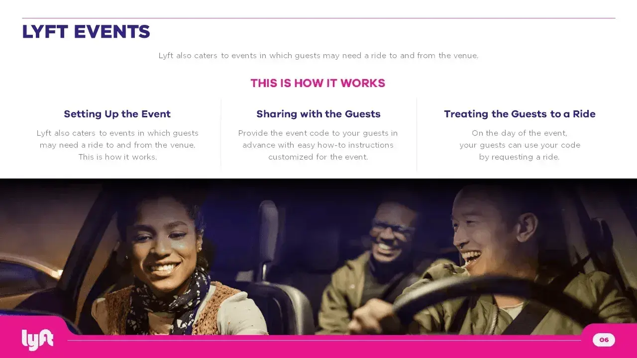
What I like: This sales deck prioritizes clarity with its use of imagery, icons, and text. The length leaves people wanting more, instead of leaving time for people to daydream and disconnect.
How to Find a Sales Deck Template
Haven’t found what you’re looking for? Here are additional resources to find a sales deck.
Pitch
This presentation platform allows you to pick from hundreds of templates and fully customize the template you choose. The best part? It’s free and offers premium packages for teams who want analytics, multiple users, and live video collaboration.
Ellty
On this platform, you can choose from 100+ ready-made sales deck templates. It’s a bit unusual since the presentation is made up of tiles, but it speeds up the time to create. You can work with your team, share your presentation with a link, and see when someone opens it.
Canva
On this graphic design platform, you can search through countless presentation templates and customize them. Canva also offers extensive collaboration features, such as file sharing and commenting.
Get inspired with these sales presentations.
Looking through these examples, what stands out to me is how the best decks stay focused on the essentials: the prospect’s problem, the solution, and proof that it works.
Everything else — design flourishes, long company overviews, even extra data — can distract from that core flow. When I build my own sales presentations, I try to strip them down to the slides that truly move the conversation forward.
That often means fewer words, more clarity, and a sharper story that a prospect can easily follow. If there’s one takeaway, it’s this: a sales deck is only about showing just enough for the buyer to see why working with you makes sense.
Editor’s Note: This post was originally published in April 2019 and has been updated for comprehensiveness.
10 Free PowerPoint Templates
Download ten free PowerPoint templates for a better presentation.
- Creative templates.
- Data-driven templates.
- Professional templates.
- And more!
Download Free
All fields are required.
Sales Presentation

.png)

.jpg)
![How to Make a Business Presentation in 7 Easy Steps [Free Business Presentation Templates]](https://53.fs1.hubspotusercontent-na1.net/hubfs/53/how-to-make-a-business-presentation.jpg)