
In the modern service landscape, customers must be able to contact teams when they need help or have a question. If they can’t, the customer might churn.
 This is why having a great “Contact Us” page on a company’s website is so important. By providing an easy-to-navigate Contact Us page, teams ensure customers can easily reach the right department at the right time to address their needs.
This post shares the most important elements of a Contact Us page and features some of the best real-life examples on the web. Teams can start building contact us pages with HubSpot’s free form builder.
Table of Contents
- Best Practices for a Contact Us Page
- AI Chatbots vs Contact Pages
- 15 Best Contact Us Page Examples to Inspire Your Design
- Contact Page Design Ideas
- 5 Contact Us Page Templates to Get You Started
- Frequently Asked Questions About Contact Us Page Best Practices
.png)
Contact Us Page Examples Guide
42 inspiring industry examples to help you reimagine your existing contact page.
- Retail Examples
- Finance Examples
- Agency Examples
- And more!
Download Free
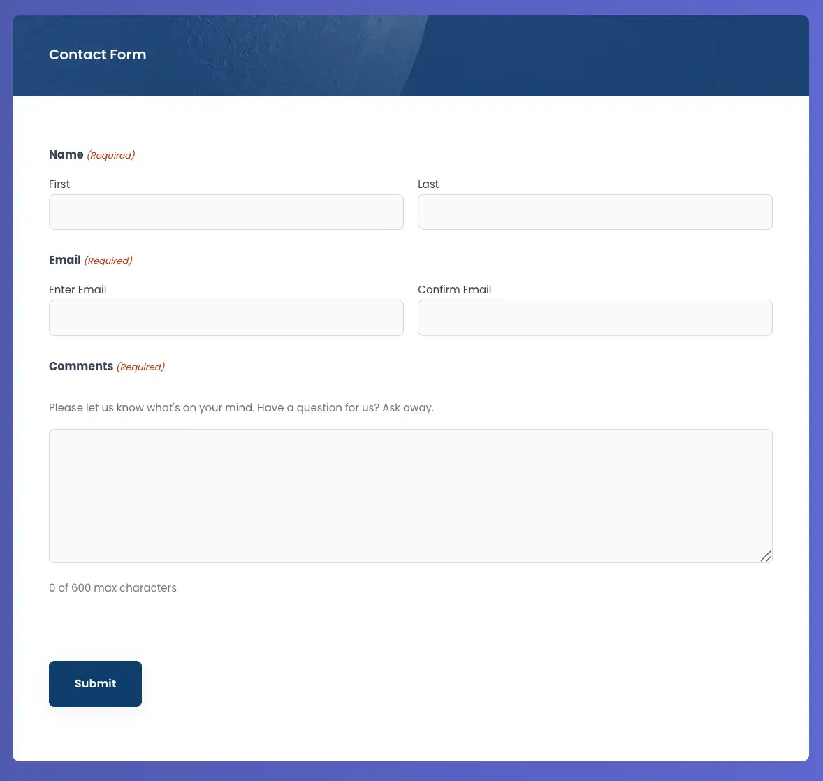
All fields are required.
Best Practices for a Contact Us Page
The majority of customers today say that quick issue resolution is the most important factor in a positive customer experience. That makes a Contact Us page one of the most valuable pages on a website.
Despite this, I was surprised to learn that many companies don’t take the time to build a cohesive and easy-to-navigate Contact Us page. So, I’m going to review the elements and features of an effective Contact Us page so you have best practices at your fingertips as you build your web form.
The best contact us pages feature visual inspiration, concise copy, and mobile-friendly design. Here’s how sites get it done.
User-Friendly Design and Navigation
- Accessibility: Ensure the contact form is easily accessible for visitors.
- Optimal Design: Utilize user-friendly layouts, themes, and clear formatting for a seamless experience.
- Reduce Friction: Create interactive elements, such as one-click experiences, for things like initiating live chat and phone calls.
Clear Purpose and Contact Options
- Be specific: Clearly explain the reasons why visitors should contact the business. If applicable, specify the department or area to contact for different inquiries.
- Contact Information: Provide email and phone number for immediate communication.
- Set Expectations: Include hours of operation so customers know when to expect to reach teams or receive a response. During the busy season, display messaging to let customers know they may experience delays.
- Call-to-Action: Include alternative actions for visitors who prefer not to fill out the form, like the option to reach out directly via live chat.
- Social Media Links: Connect visitors to active social media accounts for further engagement.
Helpful Content and Interactivity
- Promote Resources: Provide links to helpful content and resources for visitors, like an FAQ document or a link to a help center.
- Creativity: Infuse creativity to create a memorable and positive experience for visitors.
- Redirection : Direct visitors to a thank you page after they complete their outreach, detailing what they can expect next from your team.
- Simplicity: Keep forms simple and avoid unnecessary fields and words so the page remains as straightforward as possible — no fluff. Tools like HubSpot’s free AI Paragraph Rewriter can help web teams effortlessly fine-tune form content.
Pro tip: Businesses can ensure all of these criteria are met by using a free website builder with templates, social icons, and more. A dedicated customer service software can help visitors access more advanced features, like a knowledge base builder, omnichannel messaging, ticket management, and more.
AI Chatbots vs Contact Pages
Well-trained AI chatbots can handle many basic customer inquiries that were previously handled by customer service teams, like information on returns, shipping updates, etc. According to HubSpot’s State of AI report, 79% percent of customer service pros who are using AI say that it's effective.
Can an AI chatbot replace your contact page?
No — never. AI isn't able to solve every problem, nor is every customer comfortable with using it.
Where it goes wrong: AI chatbots should never be used as a total replacement for human-to-human contact. At the end of the day, there will be customers who want or need to talk to a human. If they can’t easily figure out how to reach someone, they’ll get frustrated and lose trust in a company.
I’ve seen this happen to companies that hide their contact information and force customers to jump through too many hoops within a chatbot experience before talking to a support rep.
For a better user experience, I suggest including a flow in your bot that quickly offers up the option to talk to a human when a customer can’t resolve their issue the first time within the bot experience. AI chatbots can supplement traditional contact forms for faster responses.
Now that we've gone over a few components that make a great contact page, let’s review examples of some of the most effective Contact Us pages on the internet.
15 Best Contact Us Page Examples to Inspire Your Design
Technology & SaaS
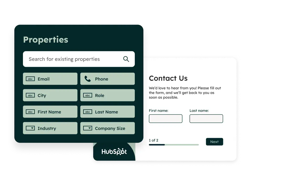
1. HubSpot
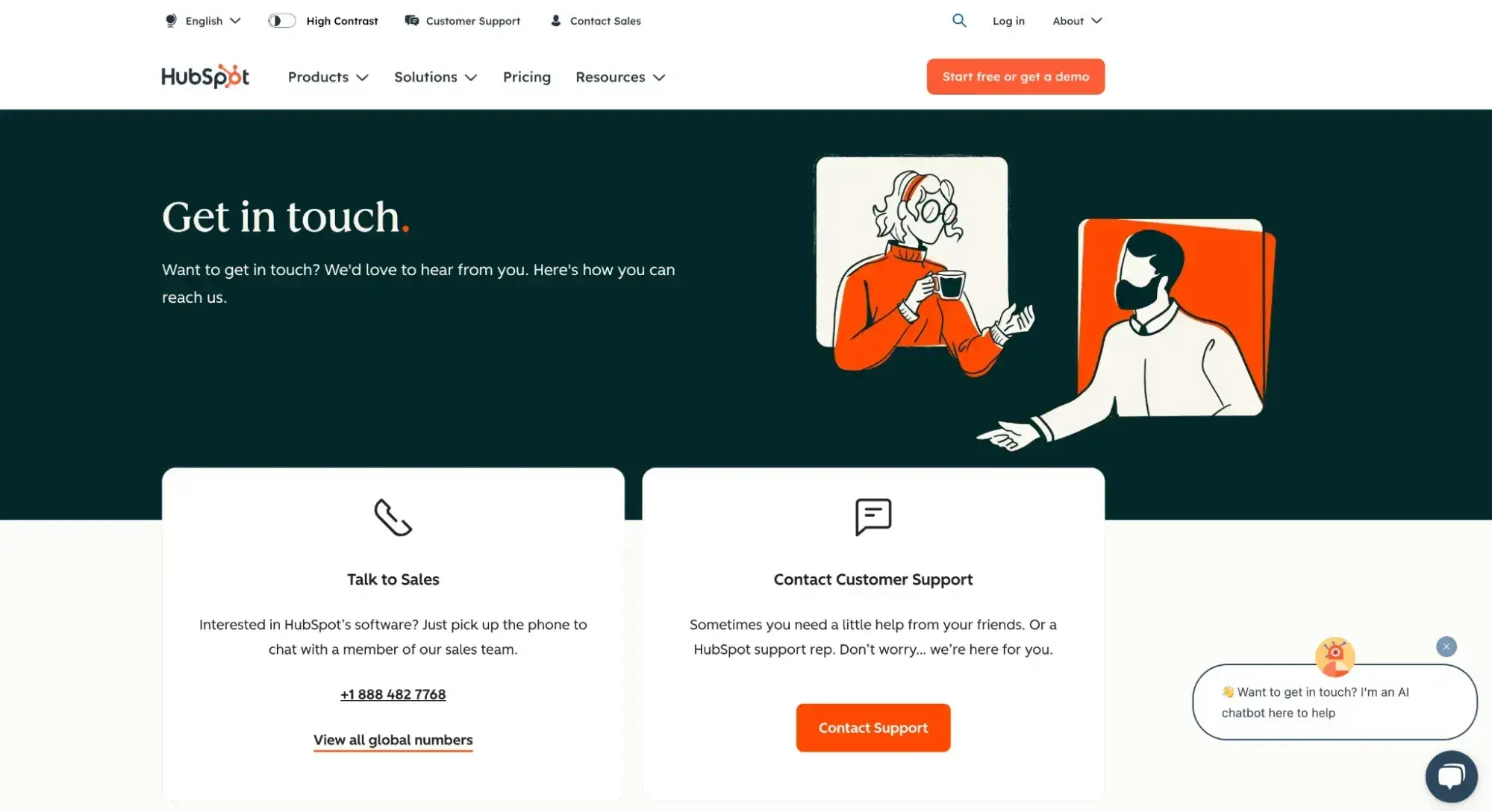
HubSpot's Contact Us page is a great example of how a contact page can go beyond just a static webpage and actually become a customer service tool .
The top of the page includes two prominent CTAs where visitors can connect with either Sales or Support. HubSpot recognizes that its visitors are likely either interested in purchasing a product or need help troubleshooting their existing product. By placing those buttons at the top of the page, HubSpot provides proactive customer service to its visitors.
HubSpot also offers visitors the option of immediate support by accessing a live chatbot in the bottom right corner of the page. This is perfect for those who want to handle simple inquiries without having to wait for live agent intervention — it saves time for both visitors and agents. Businesses can also implement this feature with live chat software.
Why I think this Contact Us page stands out: A notable feature is how the Contact Us page is embedded into the HubSpot portal. I like how this complements the user experience by not only enhancing accessibility for existing customers but also eliminating the need for customers to exit their workflow to find contact information.
2. Atlassian
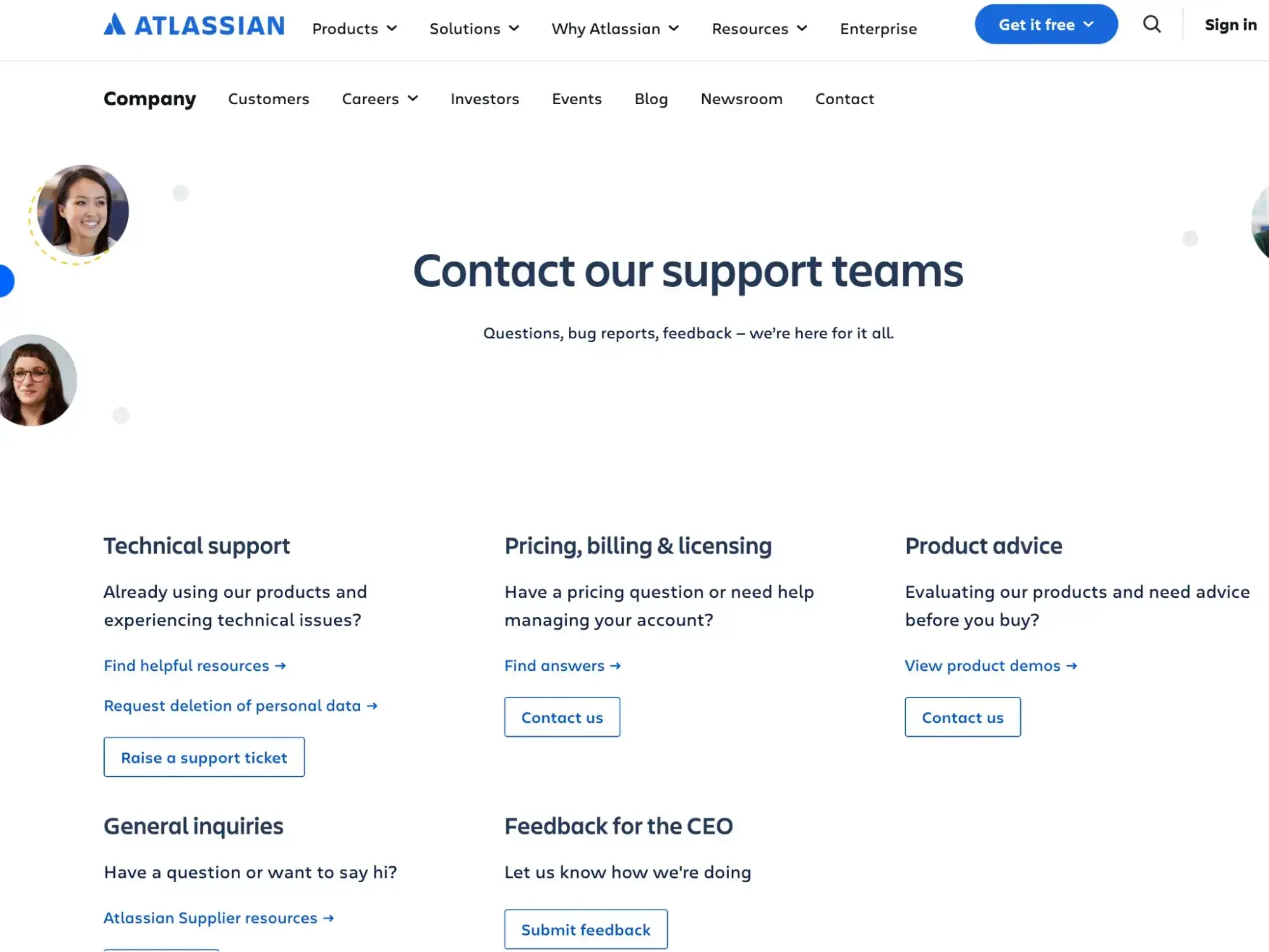
Enterprise software company Atlassian offers a ton of different products for large companies to use to stay organized. But despite that, its Contact Us page is exceptionally well-organized and clear, so visitors can quickly sort through its website to find the help they need.
Why I think this Contact Us page stands out: It‘s clear that the headshots aren’t stock photos. They’re the real, friendly faces behind the emails and phone calls who are available to help. This is a unique touch that adds authenticity to their brand.
I’m really impressed that Atlassian included an option to submit feedback directly to their CEO — that’s a unique level of “contact us” that I don’t think many companies have considered. This direct line to the CEO shows that Atlassian’s leadership cares about receiving customer feedback, which in turn builds trust with their customers (and prospects!)
3. Greenhouse
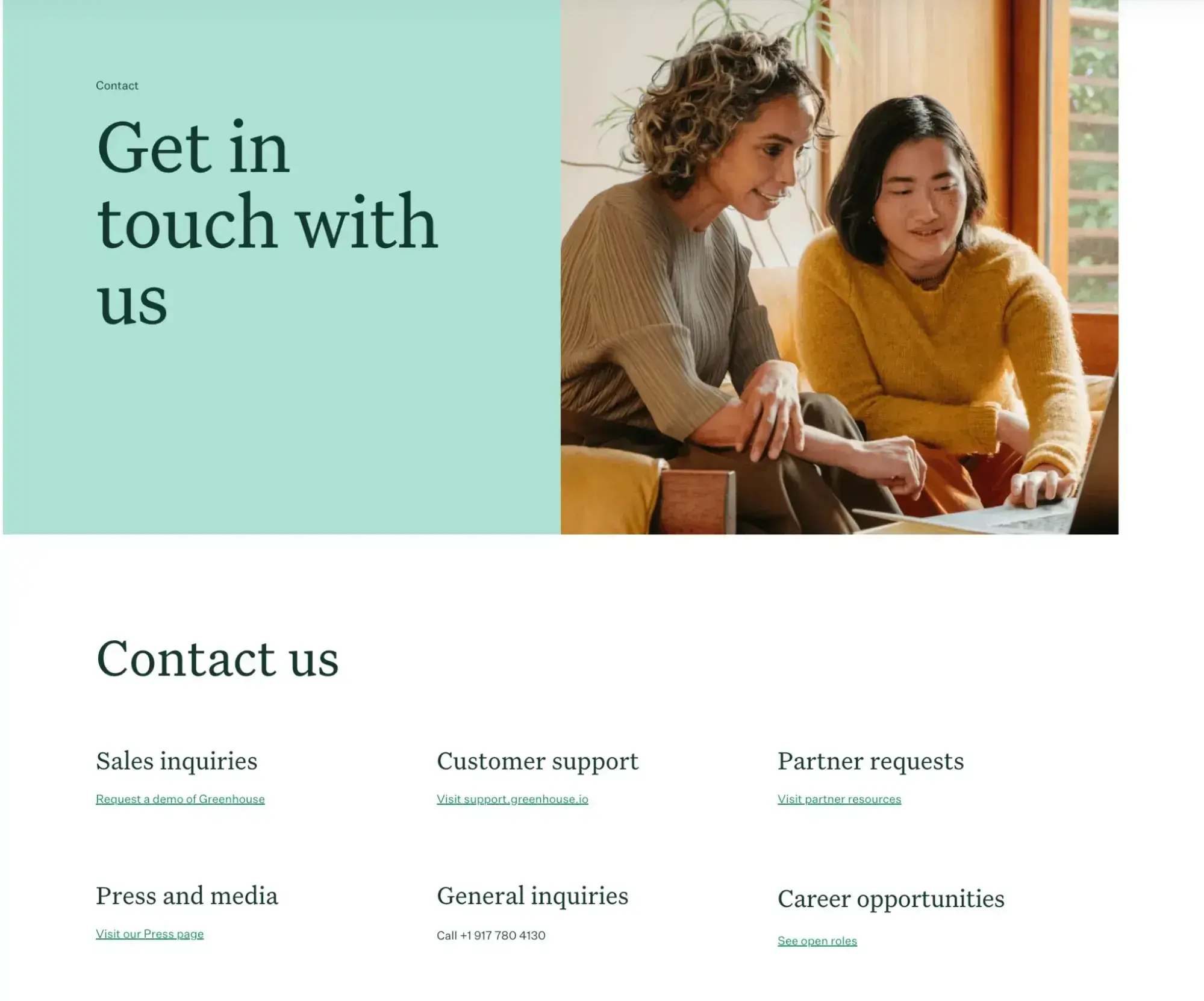
Greenhouse’s contact page feels casual and inviting, with a photo of two people happily working alongside each other and the tagline “Get in touch with us.” In the B2B space, this softer approach is refreshing to see, as B2B organizations can sometimes get bogged down with stuffy and formal language that can feel almost off-putting to customers. This approach matches their brand and also helps their customers feel encouraged to use the listed options to reach out.
Why I think this Contact Us page stands out: I’m a big fan of Greenhouse’s inviting copy and use of positive-feeling imagery. Greenhouse’s page is a great example of how to make the process of reaching out feel a bit more inviting for your customers while still keeping it professional.
4. Zendesk
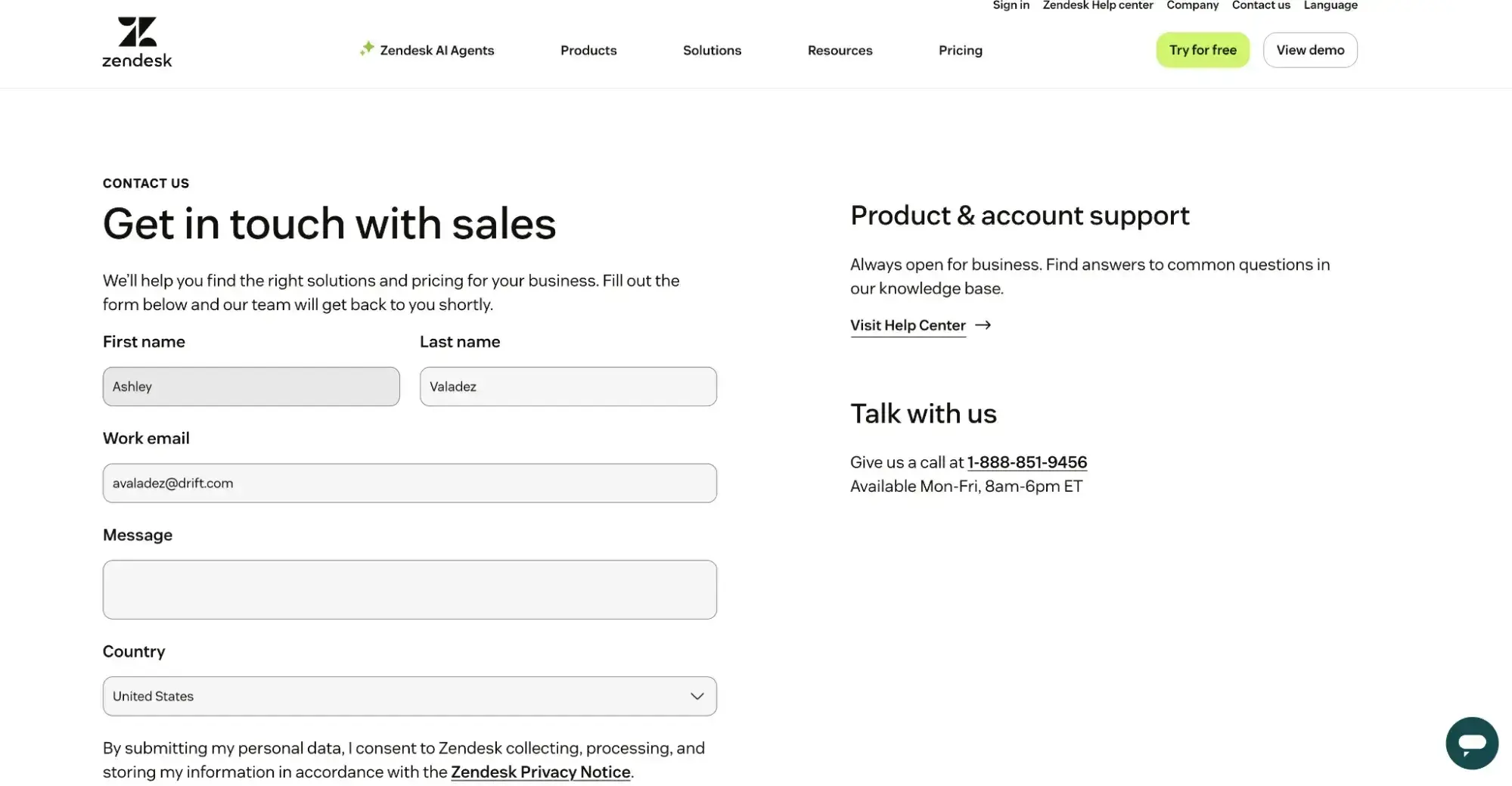
In the B2B space, website real estate is precious. This makes it tricky to balance using a contact page for sales inquiries as well as support, corporate, or other inquiries.
Zendesk manages this balance well, with a large spot for sales leads to express interest and an eye-catching section for current customers to click on if they need product & account support.
Why I think this Contact Us page stands out: Everything on the Zendesk website is minimalist, clean, and color-coordinated. The aesthetic carries over to its simplistic and effective contact page. When it comes to web forms, businesses that keep them as straightforward as possible experience higher conversions, and that is the reason Zendesk is on my list. Zendesk also makes it easy for customers to call or chat with them, taking the friction out of trying to find their contact information.
5. Slack
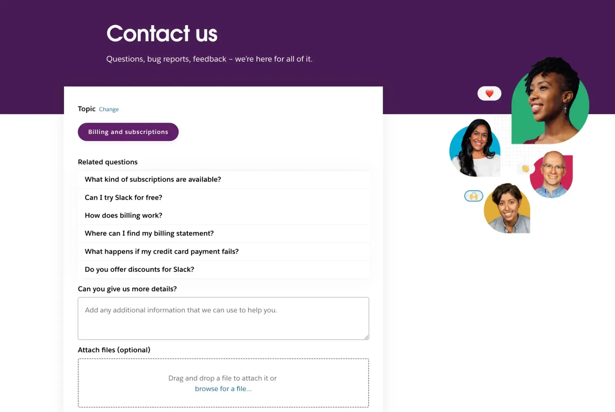
Slack’s contact page prompts users to sign in for a tailored experience and then asks the visitor to identify the reason for their outreach. Once the user has identified their question or issue, Slack offers up related articles and resources to help the visitor troubleshoot on their own.
If needed, the visitor can instead send a message to the Slack team or start a live chat during business hours.
Why I think this Contact Us page stands out: I like that Slack offers users the option to either send a message or start a live chat. Providing both outreach methods allows customers to have the option of either initiating a live conversation (if they need immediate help) or submitting a message that isn’t urgent (like for reporting a bug or giving product feedback).
I personally use the “submit a message” method of outreach sometimes when I can’t wait around to have a live conversation but need to get an inquiry sent in.
I also give Slack bonus points for using employee photos and welcoming language to make the process feel more human. I especially like the inclusion of the line “We’re here for all of it.”
Contact Us Page Examples Guide
42 inspiring industry examples to help you reimagine your existing contact page.
- Retail Examples
- Finance Examples
- Agency Examples
- And more!
Download Free
All fields are required.
Ecommerce & Retail
6. Ulta Beauty
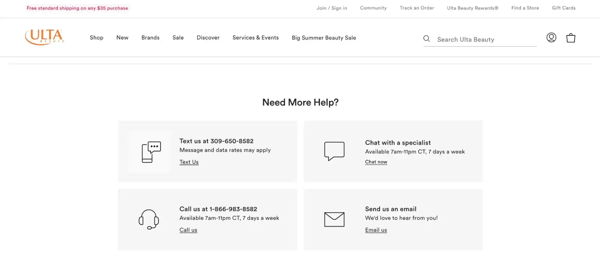
As a direct-to-consumer company, Ulta sees an influx of customers reaching out about various issues. I’m sure this is why their Guest Services page offers up self-service resources first, including sorting them into categories. If the self-service resources don’t suit user needs, they can scroll to the bottom of the page and find options to contact the company in a variety of ways.
Why I think this Contact Us page stands out: I give them an A+ for including a variety of contact options. I’ve personally used their text function before and found it to be convenient for me (no more sitting at my computer waiting for an agent to respond to a chat!). I’ve also found their chatbot to be pretty robust as well, as I’ve used it to troubleshoot order and coupon issues.
7. Quince
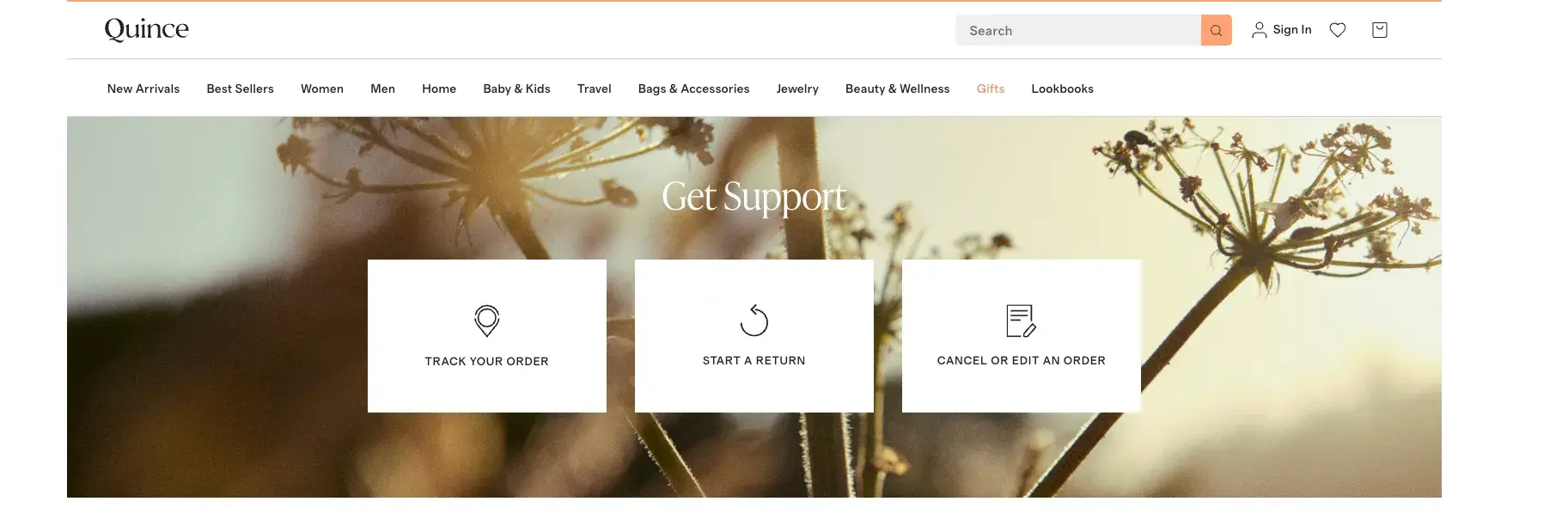
Quince’s Contact Us page header does a nice job of surfacing what we can assume are the three most common needs that their customers have. Quince also offers more topics later on the page, as well as a search bar to make it easy to find information.
If visitors were to scroll down to the bottom of the page, they’d see a “Still Need Help?” section with Quince’s phone number (where they can text or request a callback), as well as the option to live chat with someone.
Why I think this Contact Us page stands out: I like that they make tracking, returns, or editing/canceling an order easy to find when you land on the page. I also like that they list out multiple FAQ links so you can easily self-service. Finally, I give them a gold star for offering a texting option (millennials and Gen Z rejoice — no talking on the phone required!). This is a great example of meeting your customer where they’re at.
8. Glossier
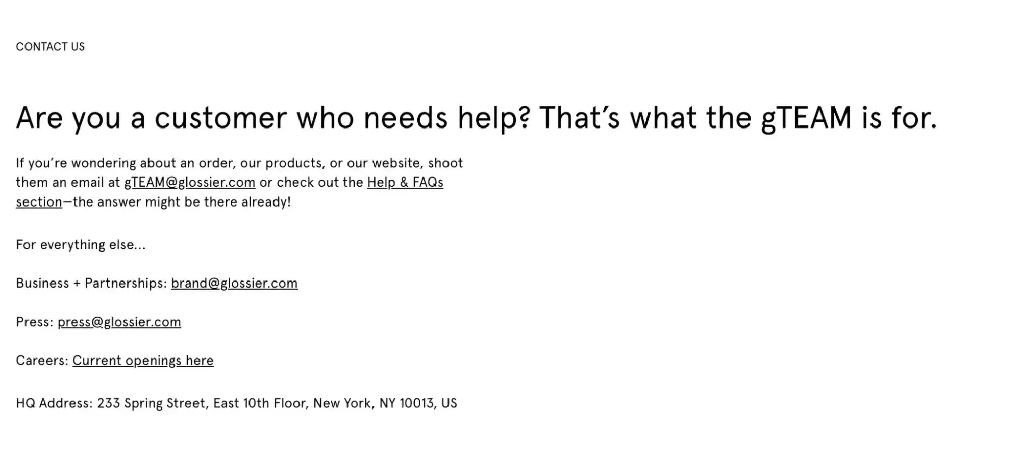
Skincare and makeup brand Glossier’s Contact Us page is clean, simple, and easy to read. However, its simplicity belies Glossier's secret weapon: the gTEAM. This customer service arm responds to every message and comment the team receives via email or social media.
Why I think this Contact Us page stands out: Glossier's Contact Us page offers visitors various options for contacting the correct team, including its Help and FAQ section. The web page makes it easy to get the information you need.
9. Yeti
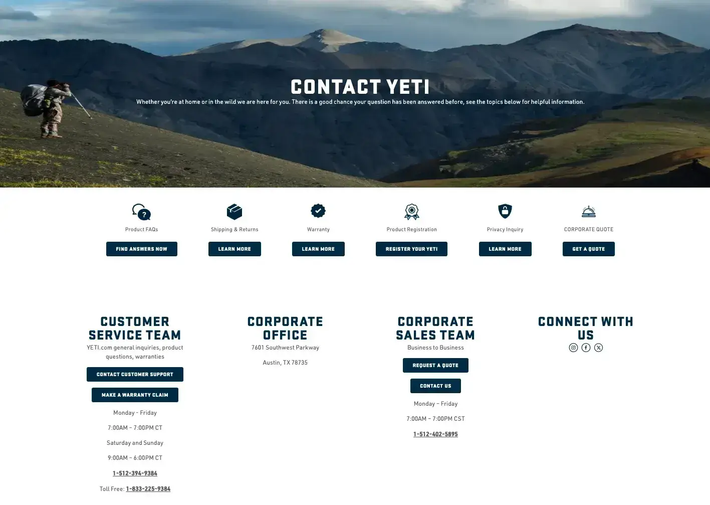
Yeti’s contact page stays true to its brand style with its outdoorsy header photo, making navigating to this section of its website feel like a seamless transition. They include multiple sections for customers to find their own answers, but they also list contact information for customer service, sales, and corporate, as well as their social media channels.
Why I think this Contact Us page stands out: Besides being a fan of the design and imagery, I think Yeti’s contact page would get an A+ if graded on the Nielsen recommendations I mentioned earlier. They’ve included direct contact information, including phone numbers and contact forms, as well as listing the physical office location, social media handles, and a chatbot option. A+ from me!
10. REI
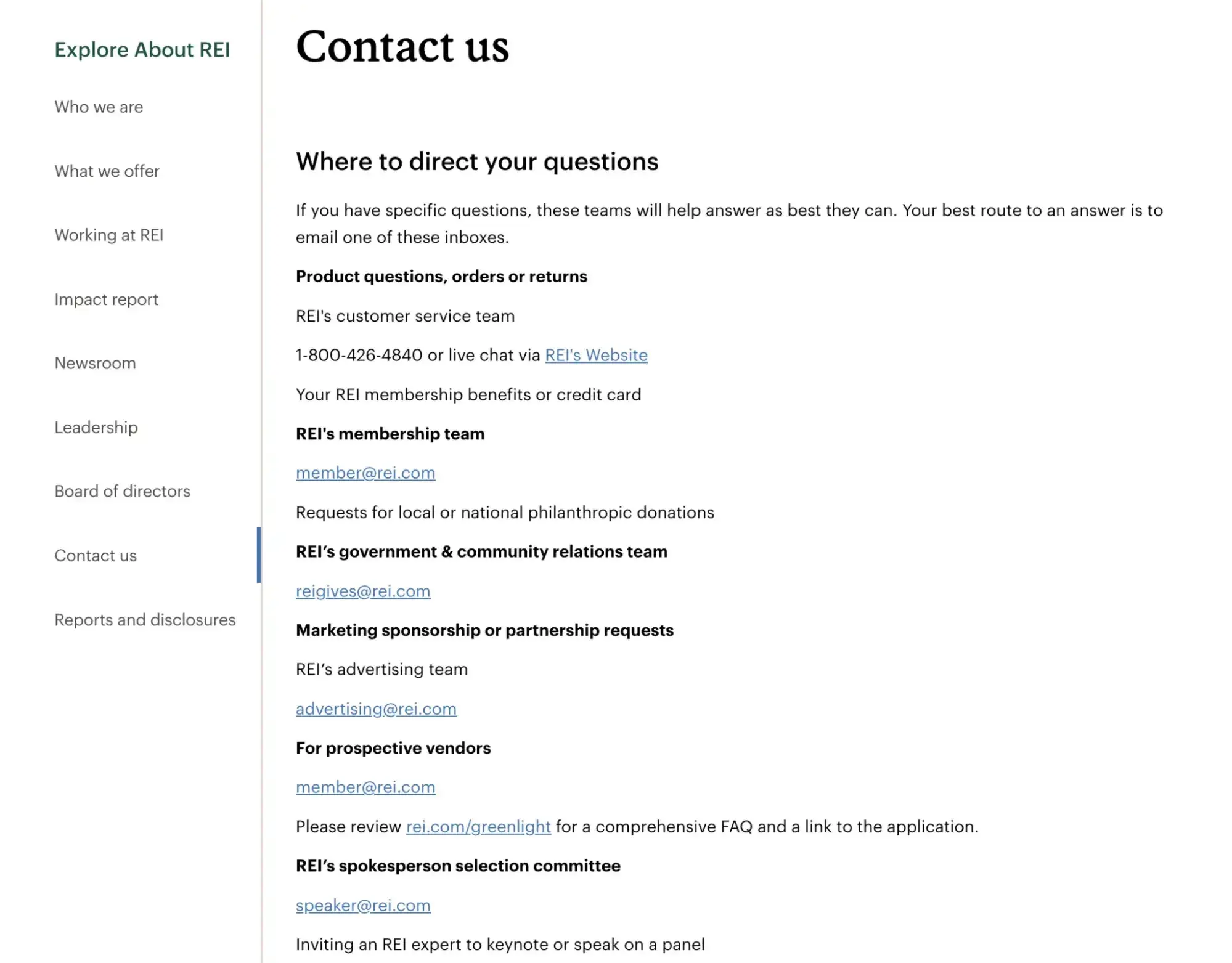
Known for its exceptional customer service, REI built a contact page that ensures its customers, regardless of their specific inquiry, can find the right person to talk to.
They include phone numbers as well as instructions for live chatting with a team member, as well as contact information for specific kinds of inquiries.
Why I think this Contact Us page stands out: This is one of the only contact pages I’ve seen that provides actual email addresses (versus solely using an intake form) while also providing a direct phone number. I think this is a nice way to build trust with customers.
Media & Publishing
11. Scribd
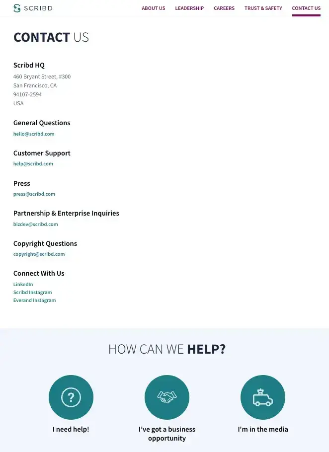
Scribd’s contact page is efficient and no-fuss, including the company’s office headquarters, email addresses to reach out to for various inquiries, and the company’s social media handles.
Why I think this Contact Us page stands out: I like how simple and effective this contact page is — it’s straight to the point. I also like how the very bottom of this page includes a few large icons that you can click on to begin the task of reaching out for specific needs, such as “I need help!”, which opens up a chatbot widget so you can begin a conversation.
12. Hulu
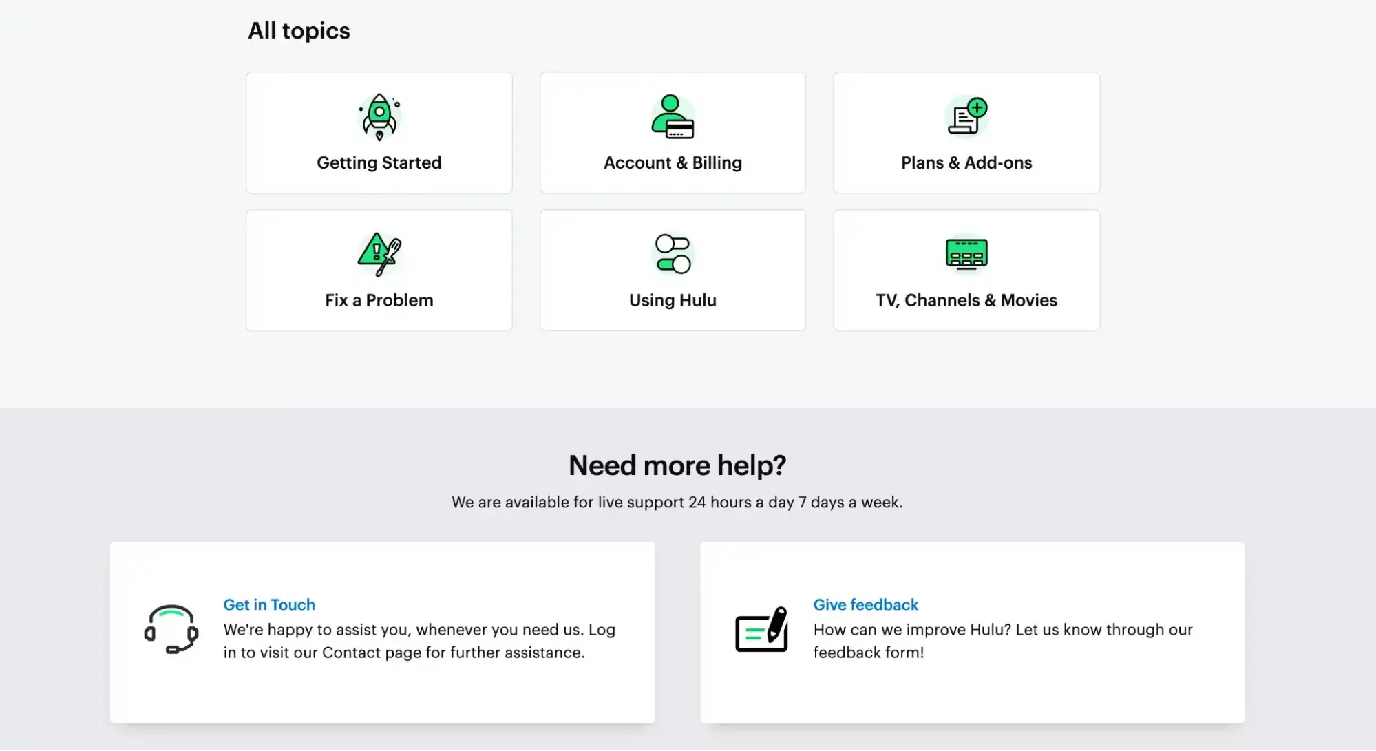
Hulu combined its Contact Us page with its knowledge base. Users can search the knowledge base for solutions, and if they still need help, they can navigate to the bottom of the page to contact support.
This approach to customer support has been shown to improve the customer experience and reduce case volume for its support team.
Why I think this Contact Us page stands out: I’ve talked a lot about using “welcoming language” already in this list, but I really like how Hulu made their “Get in Touch” banner. Something as simple as saying “we’re happy to help you, whenever you need us” feels very customer-centric. When you combine that positive language with the fact that they offer 24/7 support, you’re well on your way to creating loyal customers.
I also have to commend the inclusion of a feedback form on the contact page. This is a fantastic addition and a great way to give customers the chance to provide feedback!
Non-Profit Organizations
13. Gulf Coast Humane Society
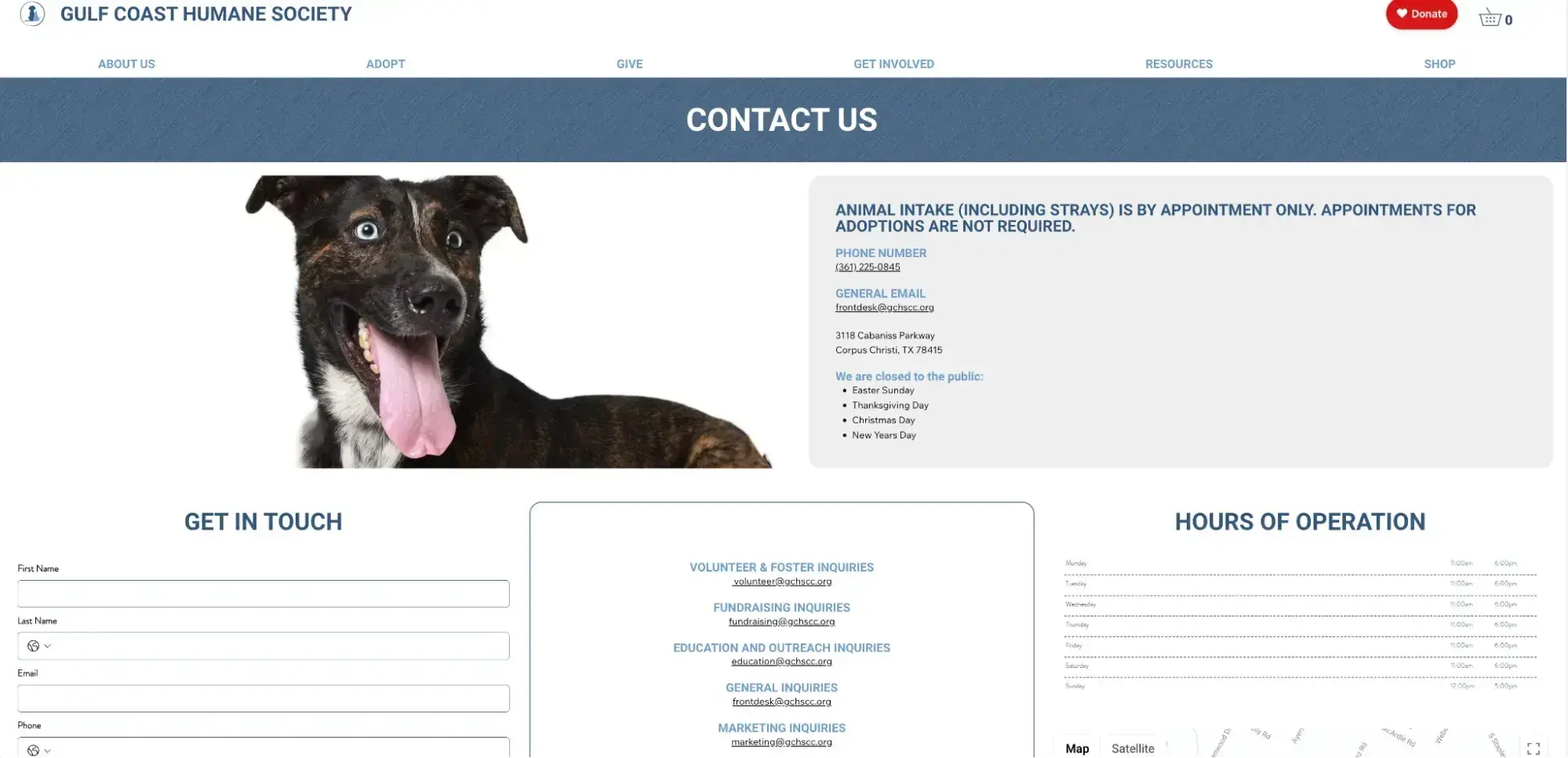
The Gulf Coast Humane Society manages to include a lot of information all on one page. Since they’re a company with a lot of different stakeholders, they leveraged their contact page to list contact information for each specific type of interaction they have — from fundraising inquiries to animal intake.
They offer a variety of contact options, including a webform, phone number, email addresses, their hours of operation (as well as days they’re closed each year!), and their physical address. A+ for comprehensiveness!
Why I think this Contact Us page stands out: Studies show that the human brain releases dopamine when looking at pictures of puppies. While I’m not saying every contact page should include a picture of a fluffy dog, I am saying that using imagery to evoke feelings is a tactic worth considering!
14. World Wildlife Fund
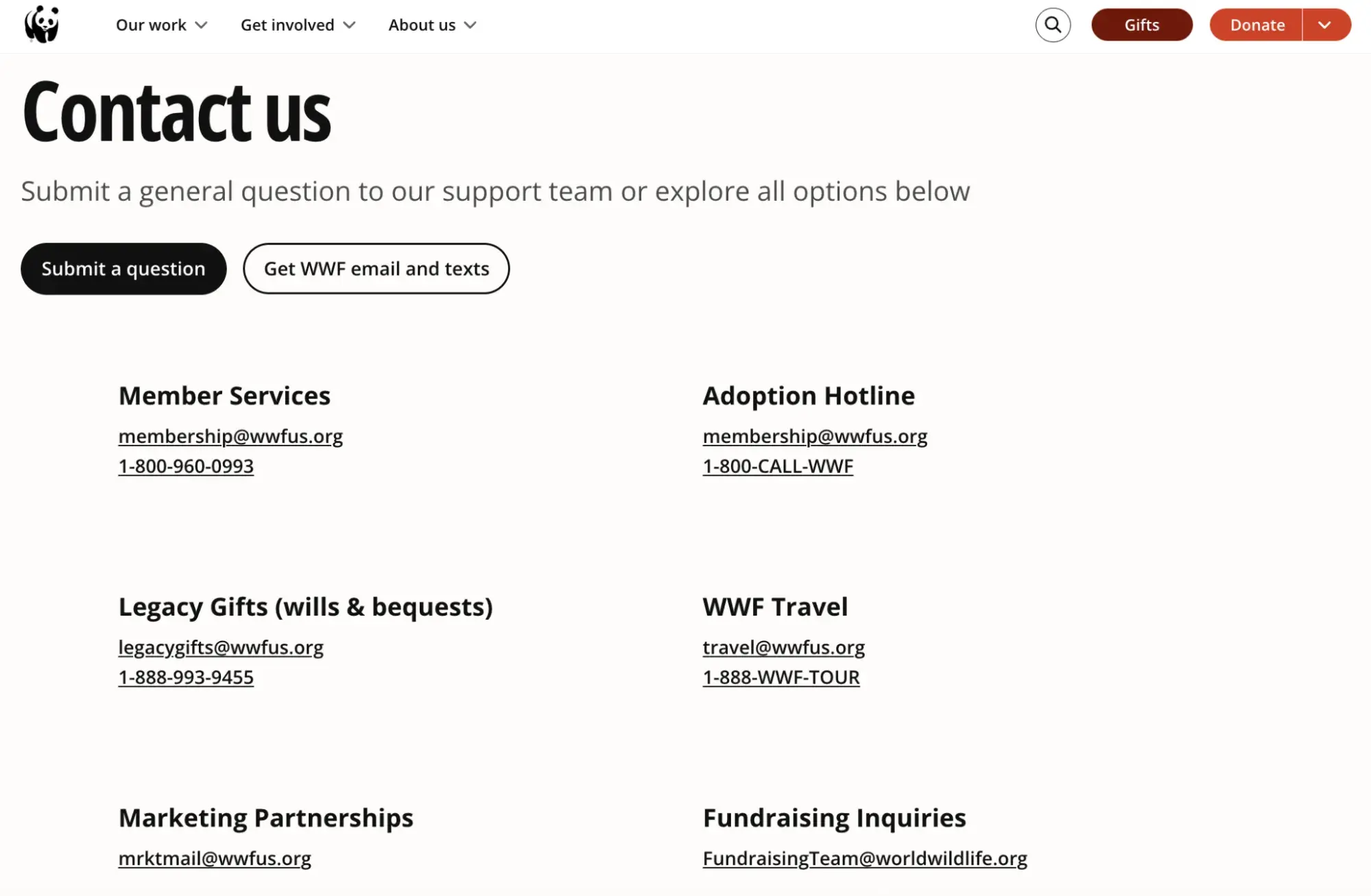
The WWF contact page makes it easy for users to find the right contact for their specific needs — whether they're seeking help with their membership, a partnership, educational materials, or making a donation. This clear taxonomy prevents frustration and ensures people reach the right department quickly.
Why I think this Contact Us page stands out: When people are looking for help, simplicity wins. Explicitly stating who to contact for what type of inquiry reduces friction in the site visitor’s experience.
15. ACLU
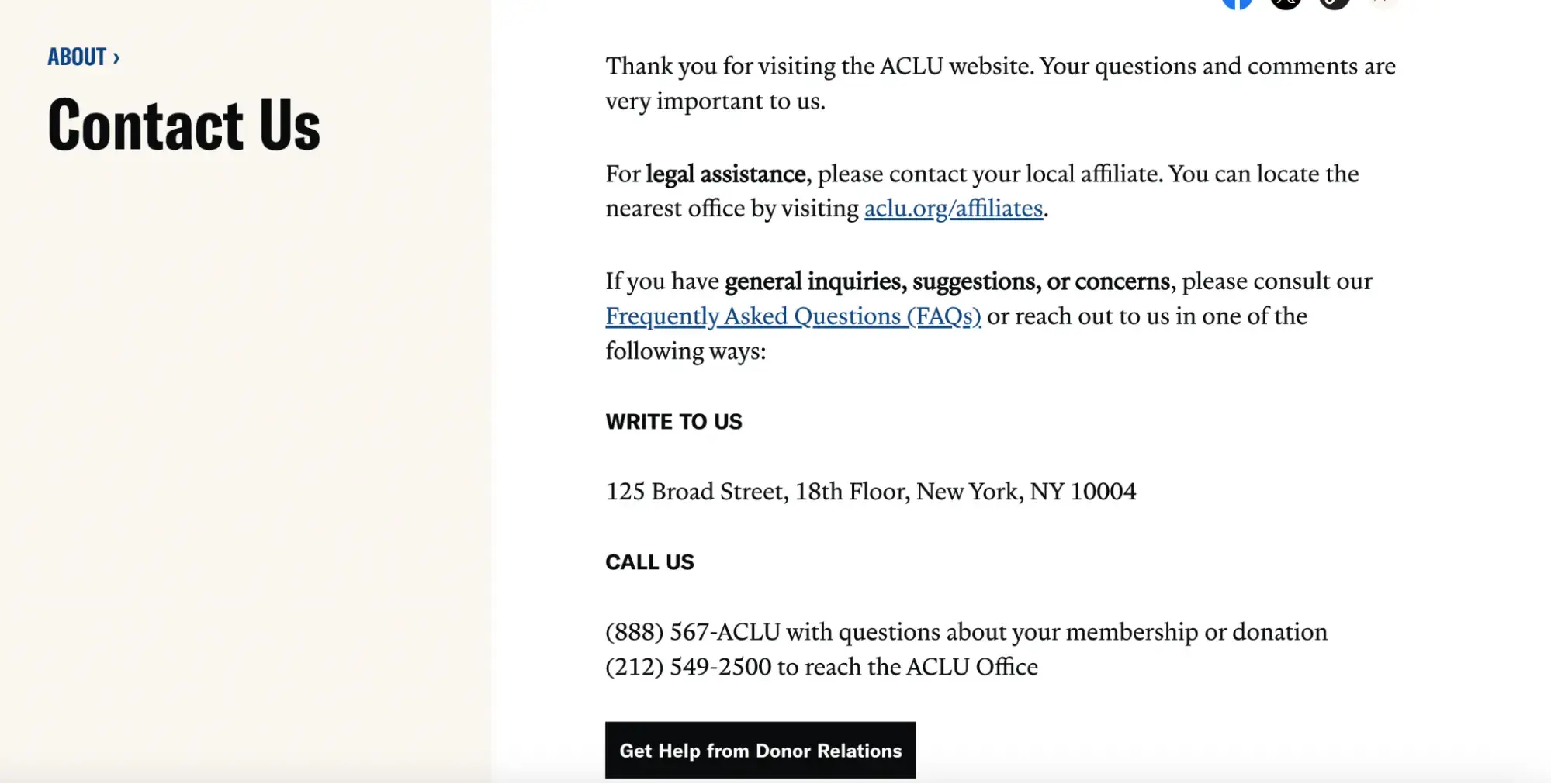
Many non-profit organizations have several branches with one main office. That structure may leave clients, donors, or folks just seeking information scratching their heads. The ACLU clearly explains what people should do to get in touch with legal help. Visitors know that they should reach out to local chapters for urgent legal advice.
From there, people are directed to an FAQ for general inquiries and given contact information for the main office. There’s also an address for people looking to send mail.
Why I think this Contact Us page stands out: If site visitors should reach out to local chapters of a non-profit, that information should be clearly stated on the site’s contact us page.
Professional Services
16. Accenture
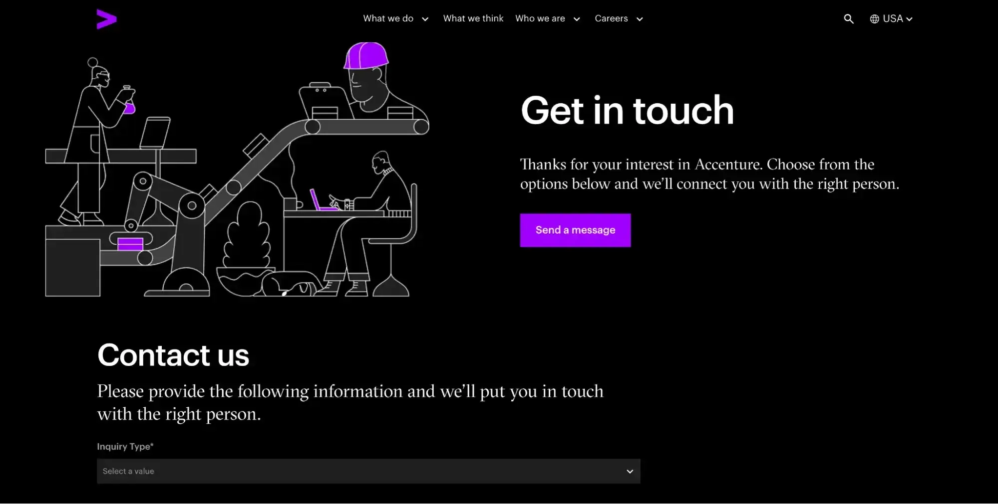
Accenture’s contact page allows visitors to send a message via a contact form that includes their inquiry type, ensuring their message makes it to the right team.
They also include department-specific contact options for inquiries related to things like media, new business, suppliers, etc. Accenture also includes a phone number for general inquiries at the very bottom of the page.
Why I think this Contact Us page stands out: I think this multinational corporation has figured out how to present a lot of information compactly on its Contact Us page — and I like how they use expandable sections visitors can click into to get the information they need. The Contact Us page is actually chock-full of helpful contact information for any request under the sun, but by organizing it compactly, Accenture prevents too much confusion while still giving the information needed.
17. Nopar & Associates
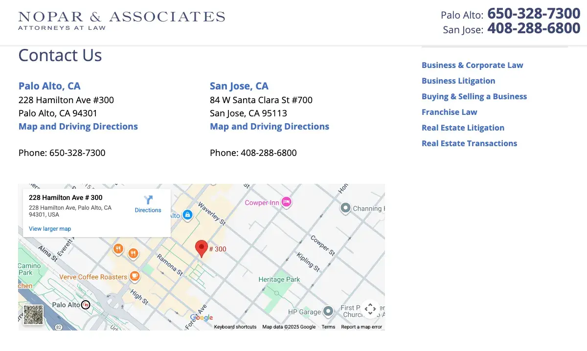
Nopar and Associates has a strong contact page that clearly displays both their San Jose and Palo Alto office locations. Clients can easily find the nearest office. The phone numbers are prominently listed, allowing people to call immediately when they need legal assistance. The page also includes a contact form for those who prefer to reach out online.
Why I think this Contact Us page stands out: I like that the site offers multiple ways for people to get in touch — clients can drive to an office, make a phone call, or submit a form. This variety of contact methods is particularly valuable for client-facing businesses like law firms.
18. KPMG
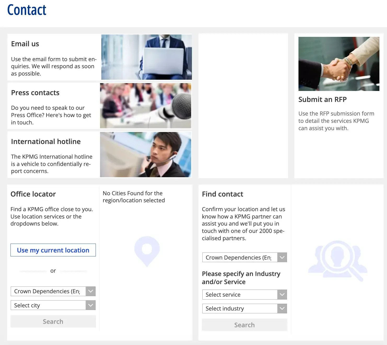
KPMG has organized modules that help people reach the right department for their needs. The page includes a general email address, a dedicated contact method for their media team, and a hotline. Potential clients can also locate their closest office, making it easy to find a more specific regional point of contact.
Why I think this Contact Us page stands out: I like how there are two search sections — one to find an office and one to find a contact. KPMG is such a big company, and these search functions make finding the right person easy.
Creative Agencies
19. Jives Media
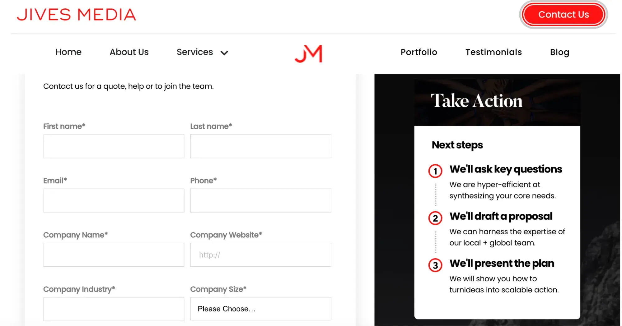
Jives Media applies web design best practices to create a sleek, polished contact page. The form is straightforward to complete. There's a section where visitors can check off the services they need, making it immediately clear what the agency offers.
A well-crafted “Take Action” sidebar sets expectations by explaining exactly what happens next, helping visitors feel confident that their creative project is in capable hands.
Why I think this Contact Us page stands out: I like the parallax scrolling effect, where the background image stays static as users scroll down the page. Strong UX design demonstrates to clients that the agency understands both creativity and industry best practices.
20. Leadige
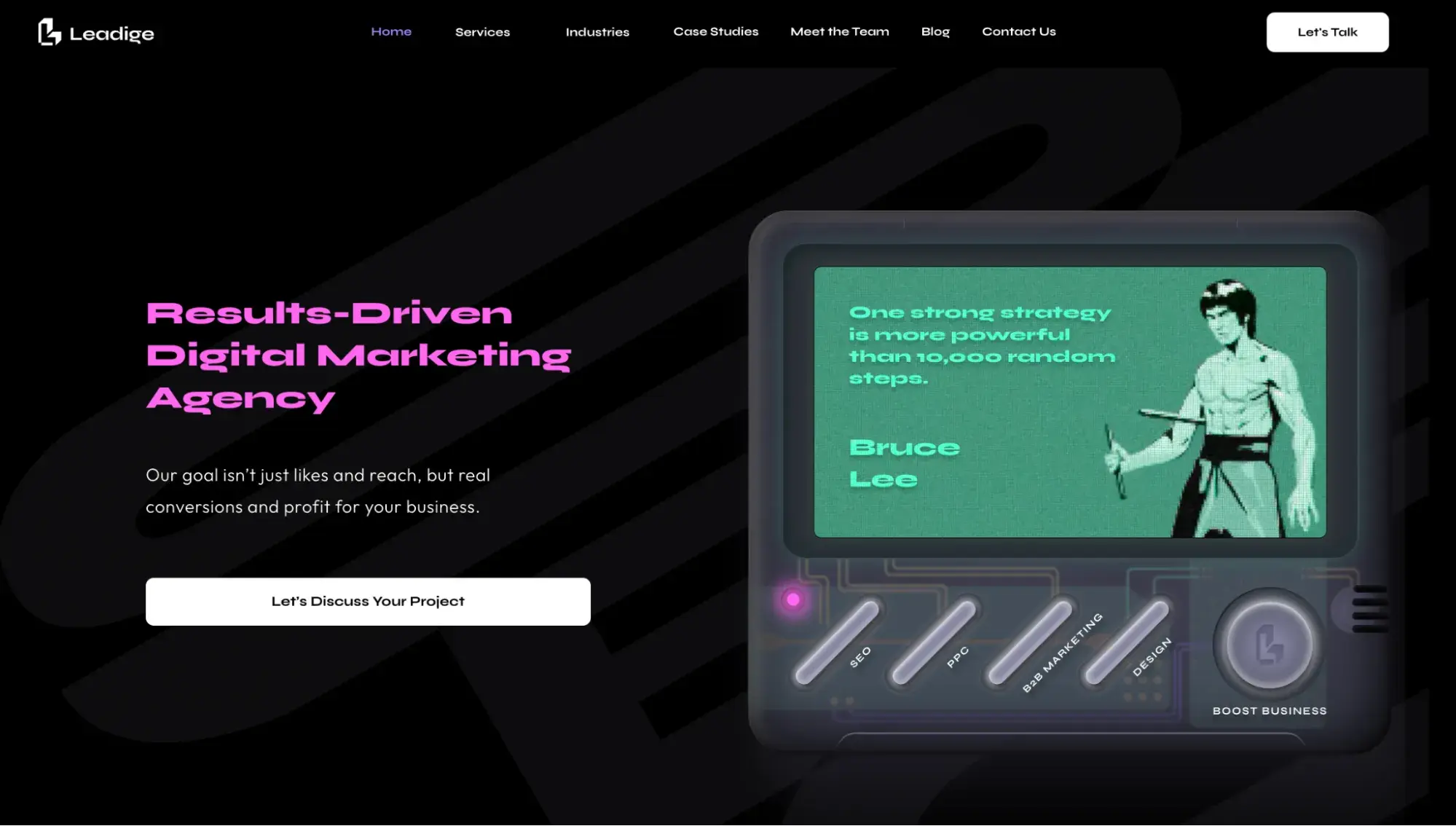
Leadige is another creative agency that transforms its contact page into an engaging experience. The page features a video game console with Bruce Lee and buttons highlighting the different services the agency provides. This playful association demonstrates to clients that the team has mastered the art of marketing.
When visitors click “boost business,” a contact form slides out smoothly, turning what's typically a mundane task into a delightful interaction.
Why I think this Contact Us page stands out: As someone who grew up with old-school gaming, I find this page especially fun. Leadige proves that even routine experiences can be made innovative.
21. Factor
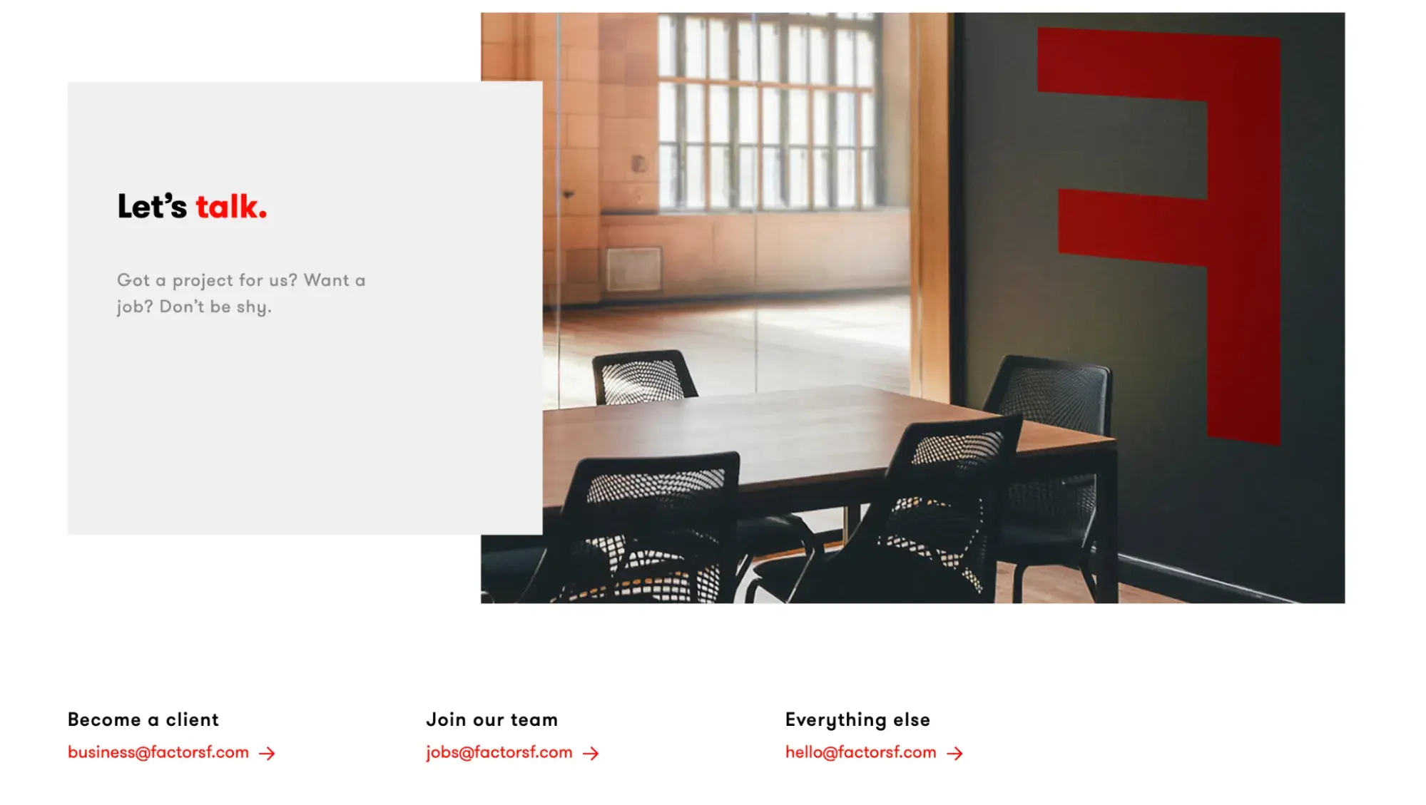
Simple and elegant approaches still work for creative agencies. Factor features a minimalist contact page with direct email addresses for outreach. For customers, forms can feel like black boxes where inquiries disappear into the void. Providing a way to contact the team directly via email gives potential clients extra confidence that their message will actually reach a person.
Why I think this Contact Us page stands out: I like that the contact page shows the office space. It gives potential clients a way to envision themselves in the environment and picture what working with the team would be like.
Startups & Small Businesses
22. Maeve Chocolate
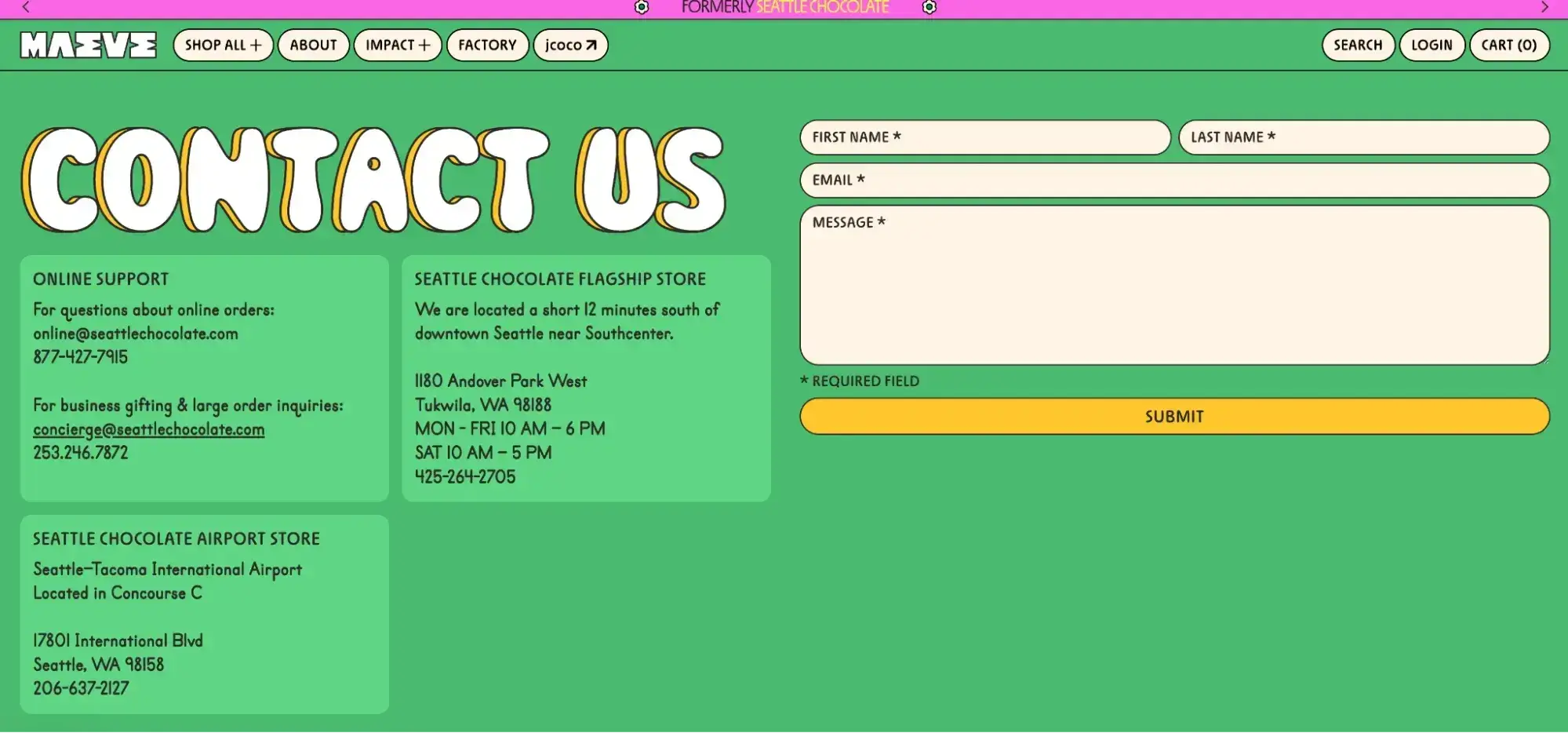
Maeve Chocolate gets maximalism right. From the bright colors, to the loud fonts, to the interactive design (hello spinning flowers!) Maeve Chocolate basically wrote the book on making a contact page that feels “on brand.” Their contact page includes a submission form, information on how to reach out to them by phone or email, and contact information for their storefronts.
Why I think this Contact Us page stands out: As you may have guessed by now, I like companies that take chances and thread their brand story throughout their entire digital experience. It’s no secret that customers want to feel connected to the brands they love and use. Maeve said “no” to a boring contact page and instead made it an extension of their overall digital experience.
23. Waterstones
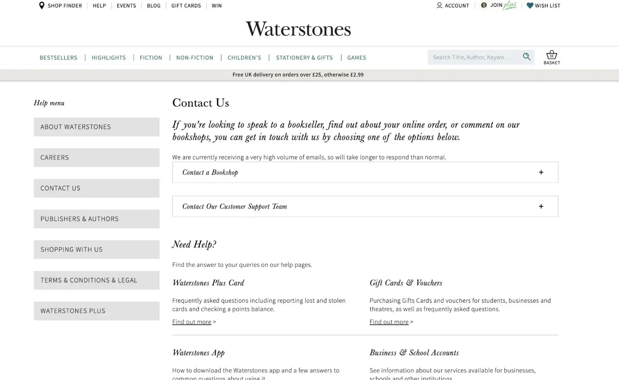
I love supporting a local bookstore whenever I can, and Waterstones is one of my favorites to shop with. While I’m in the U.S. and they’re in the U.K., they make it easy for every customer to find contact information for the customer support team or for an individual bookstore location.
If a visitor is looking to contact a physical bookstore, they can use Waterstones’ handy “Contact a Bookshop” tool that lets visitors search for locations via map or by city name.
Their “Contact Our Customer Support Team” toggle provides visitors with the email address, phone number, and even physical address (if visitors want to write to them!) for their customer support team.
Why I think this Contact Us page stands out: I like that they include the option to write to them as a contact method — this is unique and feels very on-brand for a brick and mortar bookstore. (I’m tempted to send them fan mail now!) The bookstore locator is also clever and seems like a great tool to implement on a page like this, especially for companies that have multiple locations.
24. Sprinter Health
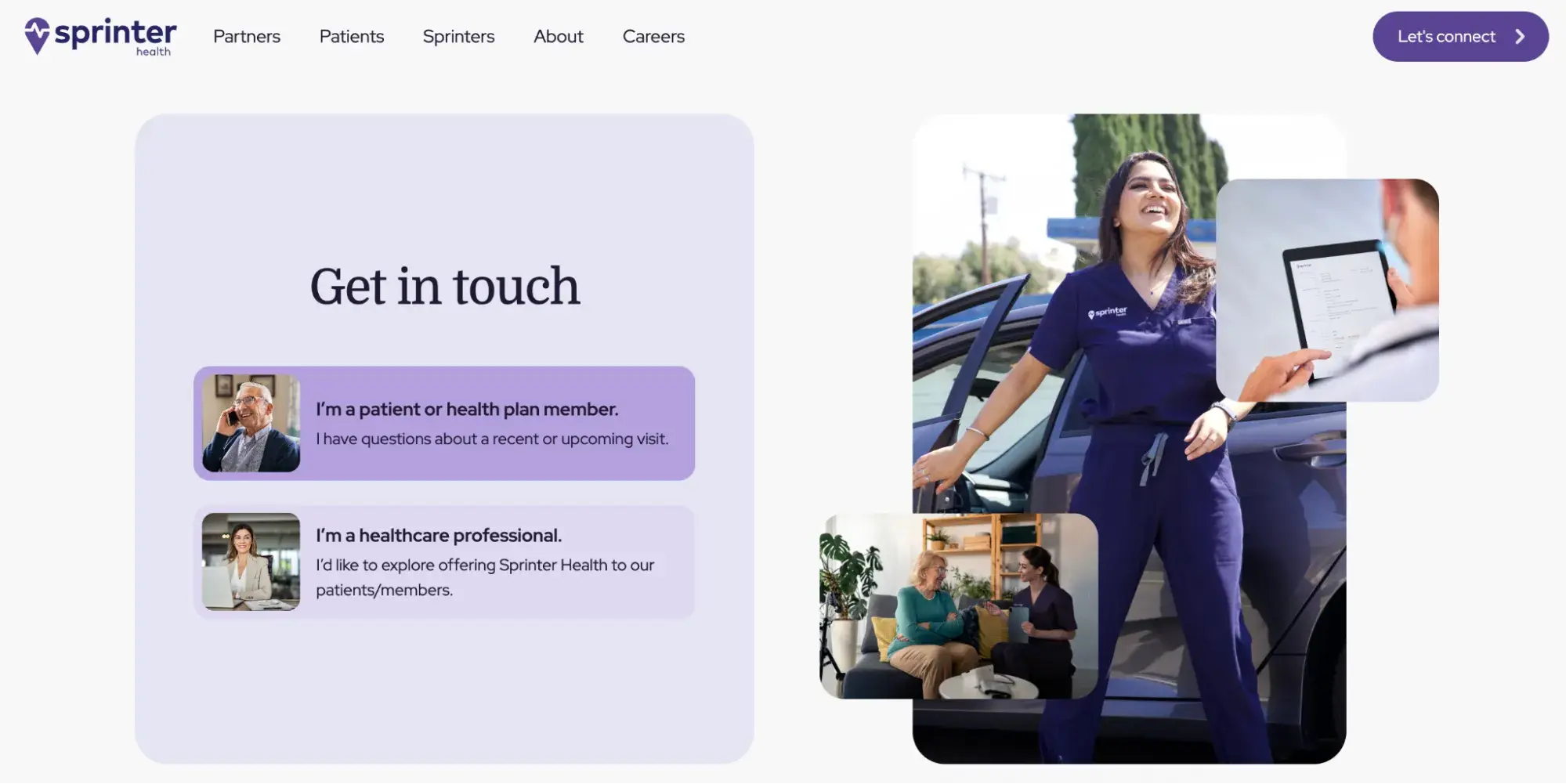
Sprinter Health is a startup that focuses on at-home care. Their contact page is very easy to navigate, with a button for health care plan members and another for health care professionals. When clicked, each button leads to an easy-to-submit form tailored to that audience.
Why I think this Contact Us page stands out: If there are two different departments handling different types of inquiries, sending people to the right place is essential. The page is structured so that each type of visitor can get to the right form easily.
Contact Us Page Examples Guide
42 inspiring industry examples to help you reimagine your existing contact page.
- Retail Examples
- Finance Examples
- Agency Examples
- And more!
Download Free
All fields are required.
Contact Page Design Ideas
When designing a contact us page, web teams should balance interactivity, information, and multiple ways of getting in touch. Here are some design ideas to consider.
- Multiple contact methods: Phone numbers, email addresses, live chat, text messaging, social media links, and physical office addresses
- Self-service resources: FAQ sections, knowledge bases, searchable help centers, and chatbots for immediate answers
- Department-specific routing: Buttons or modules that direct visitors to sales, support, media, partnerships, or other relevant teams
- Interactive design elements: Parallax scrolling, animated buttons, sliding forms, hover effects, and one-click call/chat initiation
- Visual brand alignment: Header images that reflect company style
- Office/location finders: Interactive maps or search tools to help visitors find physical locations or regional contacts
- Employee photos: Real team member headshots instead of stock photos to add authenticity and human connection
- Hours of operation: Clear display of when support is available, including weekend hours and holiday closures
- Multi-page or conditional forms: Progressive forms that adapt based on user responses to reduce overwhelming visitors
- Feedback submission options: Direct lines to leadership or dedicated feedback forms to show commitment to customer input
- Thank you pages: Post-submission redirects that set expectations for next steps and response times
- Expandable sections: Collapsible modules that organize extensive information compactly without overwhelming visitors
- Open-ended inquiry forms: Flexible message fields for startups and small businesses that want to hear what‘s on customers’ minds
- Tailored user experiences: Sign-in prompts or role-based buttons for personalized routing
5 Contact Us Page Templates to Get You Started
While every business needs a contact us form, they don’t need a developer to get it set up. Here are five templates and forms teams can use to get started..
Free Templates
1. HubSpot
HubSpot provides free contact page templates and integrated CRM tools. HubSpot's free online form builder helps teams create professional contact forms without any coding knowledge. Using a drag-and-drop editor, businesses can build custom forms from scratch or select from pre-built templates.
Every visitor who completes a form is automatically added to HubSpot's Smart CRM, allowing businesses to nurture leads with personalized email campaigns and route qualified prospects directly to the sales team. The platform also sends automatic follow-up emails after form submissions and filters out spam, streamlining the lead management process.
2. FormPlus
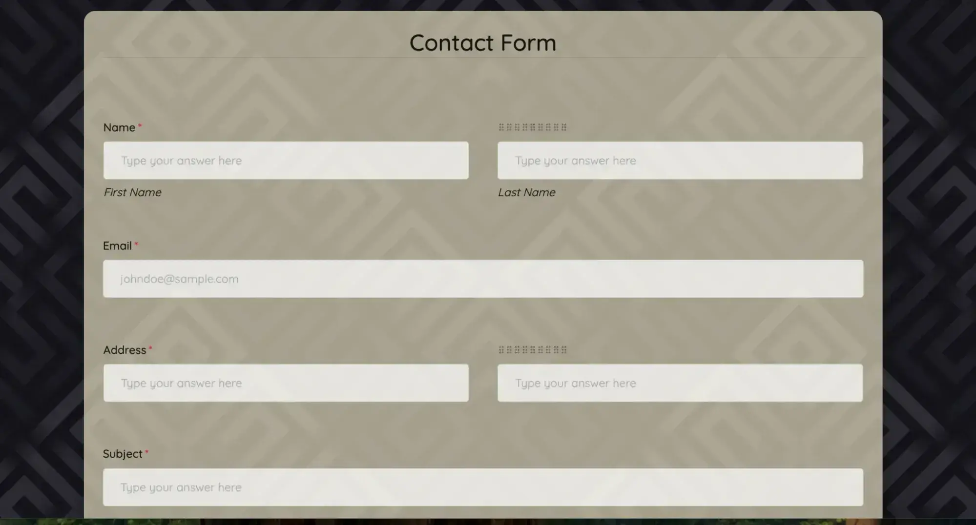
FormPlus doesn’t require much customization, considering there are several templates readily available that can be embedded on a site. No matter what industry a business is in, chances are FormPlus has a template that will work for their needs. Free forms are available with limited submissions.
This contact form template includes common fields like name, email address, and a paragraph box for a brief message. However, it also includes a file submission option. This can be helpful for things like allowing customers to upload a visual of an issue they’re having, enabling a team to assist them more quickly.
Premium Templates
3. JotForm
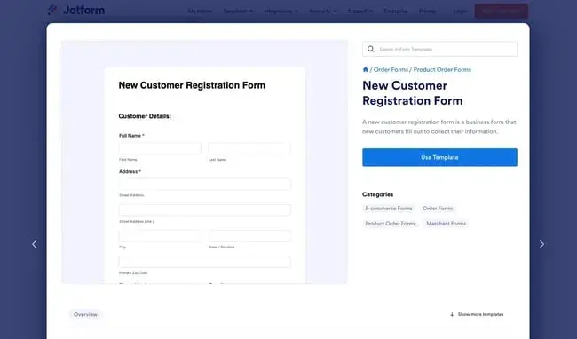
If a business is looking to capture inbound leads, adding a follow-up call form to a contact page is a great idea. This form is a gentle, pressure-free way to get more information about the visitors who land on a website in an effort to contact the team directly.
While free forms are available, if forms receive more than 100 submissions, users will need a paid plan.
Jotform makes a flexible follow-up call form that businesses can customize to fit their needs. The template includes the standard fields like name and phone number, but it also allows business owners to add things like an appointment scheduler, address, sticker, and even a product list. Website visitors say exactly what they’re looking for, giving the team all the information they need to respond to them and close the deal.
4. Typeform
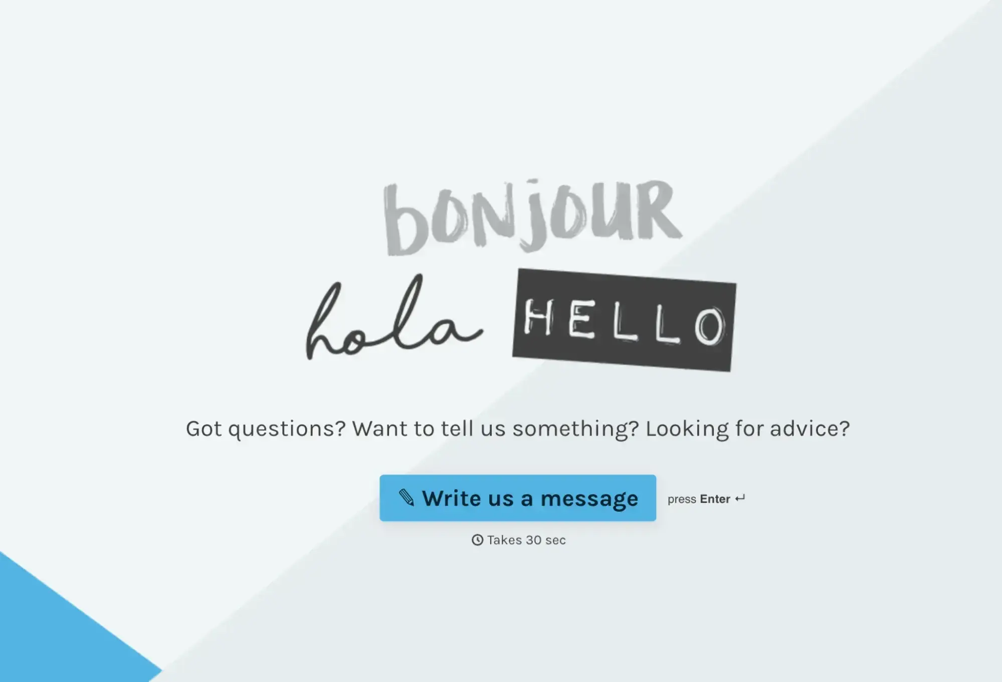
Looking to break the monotony and create a fun take on the Contact Us page? Typeform is worth checking out. This free, customizable Contact Us page can be edited to include new copy, images, and even videos.
The best part of this template is the multi-page option. Rather than having each form question as a separate field, they'll appear on different screens so the user can focus only on the information in front of them. Customers won’t feel overwhelmed, and teams will still get all the information they need to offer the best support possible.
Basic plans start at $25 per month.
Website Builder Templates
5. Gravity Forms
Gravity Forms is a powerful WordPress form builder trusted by millions of sites globally. The plugin allows users to build advanced forms for any data capture need, including contact us forms. The form builder ships with extensive built-in features, including multi-page forms, file uploads, conditional logic, and spam protection.
Gravity Forms offers contact us templates like the one above that can be added directly to a WordPress site.
Frequently Asked Questions About Contact Us Page Best Practices
1. What should be on a contact us page?
A contact us page should include a clear headline, contact form, email, phone, address, and response time. Add a map or address if there is a physical location, and set clear expectations for response times.
Want to build a high-converting contact page fast? Try HubSpot’s free templates.
2. How do I write compelling contact page copy?
Great contact page copy should be warm, inviting, and aligned with a brand’s voice rather than formal and generic. Use welcoming phrases like “We'd love to hear from you” or “Get in touch with us” instead of simply stating “Contact Us” at the top of the page. Keep language concise and action-oriented, avoiding unnecessary jargon or overly corporate phrasing.
3. What's the difference between a contact us page and an about us page?
A contact us page is specifically designed to facilitate communication between the business and visitors, providing the tools and information needed to reach the team. An about us page tells the company's story, mission, values, and background.
4. How many form fields should I include on my contact page?
Contact form should have 3-5 fields for higher conversion rates. Forms should be as simple as possible while still gathering the information your team needs to respond effectively. At minimum, include fields for name, email address, and a message box.
5. Should I include a CAPTCHA on my contact form?
Including a CAPTCHA or spam protection on contact forms is generally a good idea to prevent bots from flooding inboxes, but it‘s important to balance security with user experience. Modern, user-friendly options like Google’s reCAPTCHA v3 prevent bots but don’t make users solve puzzles.
6. How do I make my contact page mobile-friendly?
Mobile optimization is essential for contact us page usability and conversions. Making contact pages mobile-friendly starts with using a responsive design. That ensures that all elements are easily readable and clickable on smartphones and tablets. Test contact pages on multiple devices to ensure all elements load properly and navigation feels intuitive.
7. What's the best way to organize multiple contact options?
For businesses with distinct departments or customer types, use clear visual sections or buttons that direct visitors to the appropriate contact method. Consider prioritizing contact methods based on what customers prefer and what the team can handle efficiently.
8. How can I track and improve my contact page's performance?
Track contact page performance by monitoring key metrics like page views, form submission rates, bounce rates, and time spent on the page. A/B test different elements like form length, copy, button placement, and design to continuously optimize for higher conversion rates.
Build a stellar Contact Us page.
I covered a variety of different Contact Us pages that ranged from super simple to eclectic and creative. My favorite examples are the ones that felt true to the brand, created an opportunity for open-ended feedback, and made the experience feel inviting.
My takeaways: No matter what type of contact page you create, make sure that the contact options for your company are clear and easy to find. Use language that fits your brand and resonates with your customers. Where possible, meet your customers where they are and give them options for how to reach out to your company.
Editor's note: This post was originally published in May 2025 and has been updated for comprehensiveness.
Contact Us Page Examples Guide
42 inspiring industry examples to help you reimagine your existing contact page.
- Retail Examples
- Finance Examples
- Agency Examples
- And more!
Download Free
All fields are required.


![How to Respond to Customer Complaints [+Complaint Response Examples]](https://53.fs1.hubspotusercontent-na1.net/hubfs/53/Copy%20of%20Featured%20Image%20Template%20Backgrounds%20(8)-1.png)


![How to Write an Apology Letter to Customers [12 Templates & Examples]](https://53.fs1.hubspotusercontent-na1.net/hubfs/53/ai%20customer%20service%20predictions%20(6).png)