

Bootstrap Form CSS
Thanks to the predesigned templates included in Bootstrap, creating forms for your site is easy.
You’ll just need to add the necessary code into the body section of your index.html file. Say, for example, you want to add a form to capture a customer’s account information so they can log into your site faster and easier next time. It might look something like this:
Here’s the code you’d use:
Notice that you have the opening and closing tags for a <form> element. And, within those tags, you have a variety of HTML elements, including dividers, labels, inputs, and buttons, that all together make up the form. For these to work, they need to be styled with the correct form classes in Bootstrap.
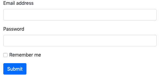
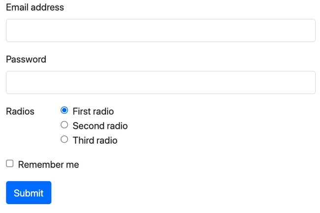
We can see a few of these in action in the three containers of the snippet above. Let’s break down the elements and styling used in each.
Form Controls
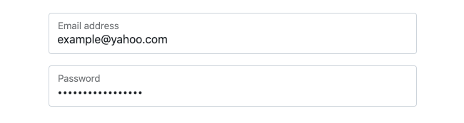
See the first two <input> elements? These are styled with the .form-control class so that they span the entire width of the page and are responsive. On the front-end, these are where the user will enter in their email address and password.
Form Labels
These <input> elements are preceded by <label> elements so the user knows what information to enter in and to which box. In Bootstrap 5, the latest version of Bootstrap, form labels require the .form-label class.
Margin Utilities
Together, each <label> and <input> pair are wrapped in their own container, or <div> element, which is styled with the margin-bottom utility .mb-3.
Margin utilities provide basic grouping of form labels, controls, text, and validation messaging, so they're a great way to add structure to forms.
Form Checks
The third container is styled with the .mb-3 class as well as the .form-check class because it contains a checkbox. To create this checkbox, the <input> element is styled with the .form-check-input class (instead of the .form-control class applied to the other <input> elements). Lastly, the <label> element comes after the <input> element and is styled with the .form-check-label class.
Button
Finally, there’s a button element included. This requires styling with the button class rather than a form class.
Now that we understand how to build a basic form in Bootstrap, let’s look at how else you can modify and extend the form class. We'll start with a basic overview of the different styles Bootstrap offers, then walk through examples.
Bootstrap Form Styles
You can use any of the predefined form styles, as shown in Bootstrap’s documentation, to quickly add forms on your site. Let's take a brief look at the most common styles below.
Bootstrap Select Form
The Bootstrap select form includes a drop down menu with a range of options. Users can select one of these options. It requires the .form-control class.

Bootstrap Text Area Form
The Bootstrap text area form includes a text area where users can input comments or reviews. A text area can contain an unlimited number of characters — unless a limit is set. It requires the .form-control class.

Bootstrap Attachment Form
The Bootstrap attachment or file input form allows users to choose and upload a file. It requires the .form-control-file class.

Bootstrap Grid Form
The Bootstrap grid form is any form that has multiple columns, varied widths, and other alignment options. It requires the .row and .col classes.
Bootstrap Address Form
The Bootstrap address form is an example of a complex form built using Bootstrap grid classes. The .row class is used to form groups and the .col-*-* classes used to specify the width of the labels and controls so that the city, state, and zip are all on a single horizontal row.
Bootstrap Horizontal Form
The Bootstrap horizontal form displays labels and their associated form controls on the same horizontal rows. Like the address form style, it requires the .row class and .col-*-* classes. The .col-form-label class is also used to ensure the labels are vertically centered with their associated form controls.
Bootstrap Inline Form
The Bootstrap inline form displays a series of labels, form controls, and buttons on a single horizontal row. It requires the .row-cols-* classes. (Note that the .form-inline class has been deprecated in Bootstrap 5.)
Bootstrap Form Validation
The Bootstrap validation form provides valuable, actionable feedback to users, typically after they try to submit a form. This form style typically uses custom colors, borders, focus styles, and background icons to communicate feedback. It requires the .{valid|invalid}-feedback classes.
Bootstrap Range Input Form
The Bootstrap range input form allows users to horizontally scroll range inputs. It requires the .form-range class as well as the input type attribute be set to “range.”

Bootstrap Checkbox Form
The Bootstrap checkbox form allows users to select one or several options in a list. It requires the .form-check class as well as the input type attribute be set to “checkbox.”

Bootstrap Radio Form
The Bootstrap radio button form allows users to select only one option in a list. It requires the .form-check class as well as the input type attribute be set to “radio.”

Bootstrap Floating Labels Form
A new style in Bootstrap 5, the Bootstrap floating labels form has labels that float over your input fields when a value has already been defined. It requires a pair of <input class="form-control"> and <label> elements to be wrapped in the .form-floating class.

Bootstrap Form CSS Examples
Below are some examples that demonstrate the range of Bootstrap’s form styles. Each example will show the different required classes, form layouts, and more.
I’ll be using the CodePen Editor to create the examples so you can click any of the Source links to view the full code snippet behind the example.
1. Bootstrap Select Example
Best for: Adding a dropdown menu for users to select one of multiple options
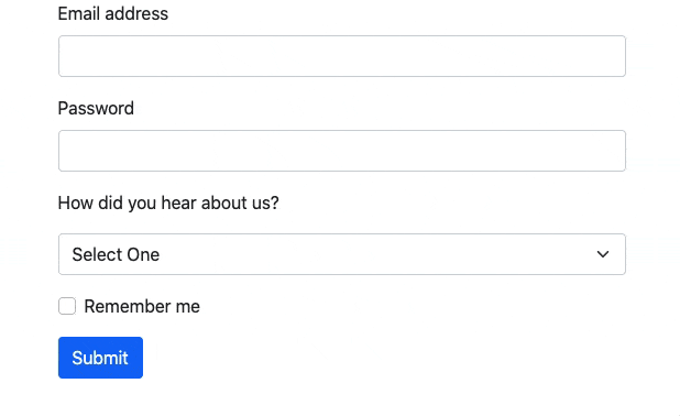
Let’s say you want to add a dropdown menu in your existing form to learn how users hear about your brand. Then you’d add the following code in your HTML, right before the <div> containing the checkbox.
This code snippet contains two divs wrapped in the .mb-3 utility class. The first <div> contains a label for the dropdown menu. The second div contains the <select> element with the .form-select class.
Here’s the result:
You can learn more about creating dropdown menus in forms, navigation menus, and other parts of your site in How to Create an HTML Dropdown Menu [+ Examples].
2. Bootstrap Text Area Example
Best for: Asking an open-ended question
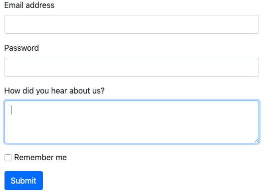
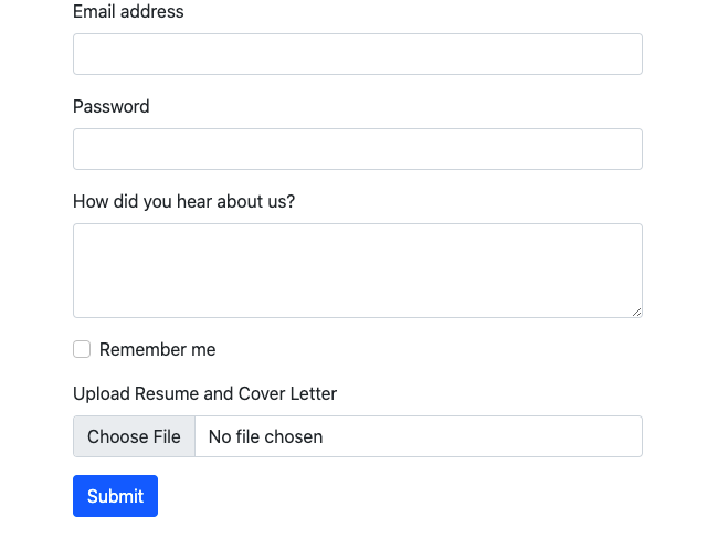
Let’s say you want to ask the user the same question, “How did you hear about us?” But rather than offer a limited selection of answers, you want to include a text area so they can write whatever they want.
Then you’d add the following in your HTML, right before the <div> containing the checkbox. Notice this code snippet contains a <label> element styled with the .form-label class and <textarea> element styled with the .form-control class. Both are wrapped in a <div> element with the .mb-3 class.
Here’s the result:
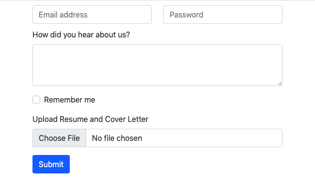
3. Bootstrap Attachment Example
Best for: Asking users to upload a file
If you’d like to let users upload a file before submitting a form, then you can use an <input> element and style it with the .form-control class. You’ll pair it with a <label> element and wrap it in a <div> styled with the .mb-3 class as usual.
Here’s the code you’d add right before the button:
Here’s the result:
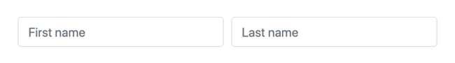
4. Bootstrap Grid Form Example
Best for: Creating forms with multiple columns, varied widths, and additional alignment options
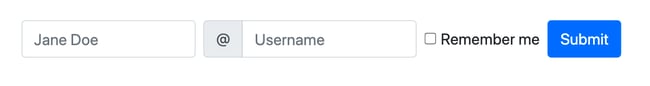
To build more complex forms, you can use Bootstrap’s grid classes. For example, say you want the input fields for email address and password to be side-by-side and the rest of the elements to be stacked vertically. You also want to remove the labels above the input fields and instead have that text inside the fields.
Then you can replace the first two <div> containers with three divs. The first will be style with the .row class. It will contain two divs, each of which is styled with the .col class and has a placeholder attribute.
Here’s the result:
Please note: I added some margin settings in the CSS to make the layout look better. You can see that code by clicking on the source link.
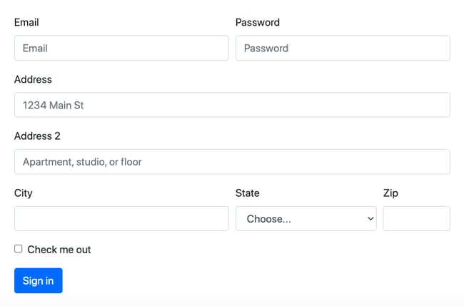
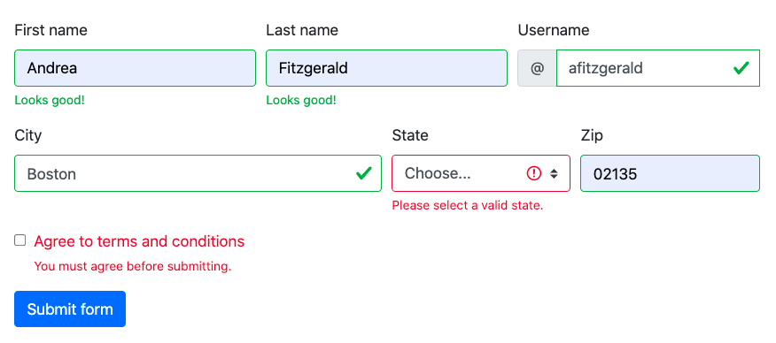
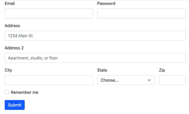
5. Bootstrap Address Form Example
Best for: Creating forms with a different number of columns per row
You can create an even more complex layout with the Bootstrap’s grid classes than the layout above. For example, say you want the input fields for email address and password to be side-by-side. Then you want two address fields stacked vertically and the city, state, and zip fields on the same row.
First, you want to style the <form> element with the .row class and a gutter modifier class. Use the .g-3 class to set the horizontal and vertical gutter widths, or padding between columns.
Since Bootstrap is a 12-column system, you’ll have to specify the number of twelve available columns you want each input to span. So to put the email and password inputs in two equal-width columns, you'd use the .col-md-6 class. The next two divs — for address and address 2 — will need a .col-12 class because they each take up an entire horizontal row. For the final row, you want the city input to be the same size as the email and password inputs. You want the state input to be two-thirds that size and the zip to be half that. So you'd use the .col-md-6 for city, .col-md-4 for state, and .col-md-2 for zip (6 + 4 + 2 = 12).
Here's the code all together:
Here's the result:
6. Bootstrap Horizontal Form Example
Best for: Placing labels next to their respective fields
You can also display labels and their associated form controls on the same horizontal rows, instead of stacked on top of each other.
To do so, you'd apply the .row classes to the parent divs. Then you'd apply the .col-sm-2 classes to the label elements and the .col-sm-10 classes to the div elements containing input elements. You'd also apply the .col-form-label classes to the label elements to ensure they're vertically centered with their associated form controls.
Here's the code all together:
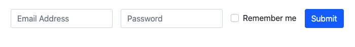
7. Bootstrap Inline Form Example
Best for: Creating forms for smaller screen sizes
If you’re looking to take up less space, then you might want to create an inline form in which all of the elements are on one line. You can do this by using the .row-cols-* classes.
In the code snippet below, the <form> element is styled with the .row and .row-cols-auto classes, which gives the columns their natural width. The .g-3 class is included to set the horizontal gutter widths and the .align-items-center class to align the form elements to the middle.
Here’s the code:
Here’s the result:
8. Bootstrap Form Validation Example
Best for: Providing feedback to users as they fill out a form
Let’s say you want to include actionable feedback to users filling out your forms, like a reminder to check the “Remember me” box if they forgot before submitting. You can do so by applying validation classes to the Bootstrap <form> element.
For example, the .was-validated class will let users know what fields must be filled out or checked off before submitting, whereas the .needs-validation class will only let users know if fields are missing after they try to submit.
Whichever class you use, input fields that have been filled out will have a green border, while input fields that haven’t been filled out will have a red border. If you’d like to tell users exactly what information is missing (and what info has been successfully provided), then you can even add .valid-feedback and .invalid-feedback messages.
In the example below, let’s use the .needs-validation class so that the user will know if anything is missing.
Here’s the HTML you’ll need to add in the <body> of your HTML.
And here's the starter JavaScript you’ll need to add below that in the <body> of your HTML.
Here’s the result:

9. Bootstrap Help Text Form Example
Best for: Providing directions proactively to users before they fill out a form
Another way to provide actionable feedback to users filling out your forms is to include help text. For example, you might explicitly state password requirements below the password input field, or next to it. You can do so by applying the .form-text class to a block-level or inline element.
Make sure to include an aria-describedby attribute so that assistive technologies, like screen readers, can understand and read the help text to users.
Here's the code you'd add after the email address input and before the checkbox:
Here's the result:

10. Bootstrap Disabled Form Example
Best for: Preventing user interactions with a question or section of a form
Let’s say you want to disable an option or section of your form to make it unclickable and unusable. You can add the disabled boolean attribute on an individual input to prevent user interactions and make it appear lighter, or you can add it to a <fieldset> element to specify that the group of related form elements is disabled.
Here's the code for a disabled fieldset:
Here's the result:

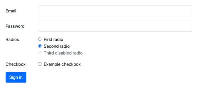
11. Bootstrap Checkbox and Radio Form Example
Best for: Asking users to select either one or several options in a list
You can achieve more user interaction in your forms by adding interactive elements like checkboxes and radio buttons. Let’s say you want to provide users with a simple yes-or-no option like “remember me.” Then you could include a checkbox. Users can choose one or no option. Radio buttons, on the other hand, let users select exactly one option per group.
Both checkboxes and radio buttons require the .form-check class. They must also have their <input> elements styled with the .form-check-input class and their type attributes set to “checkbox” and “radio,” respectively.
The code below will create three radio buttons in a horizontal layout and a checkbox element.
Here's the result:
12. Bootstrap Floating Labels Form Example
Best for: Providing context to users as they fill out the form
Some Bootstrap forms, like the inline form example above, have placeholder text instead of labels. This placeholder text disappears as the user begins typing in an input field.
Let’s say you want to create form labels that float over these input fields as the user fills them in, instead of disappearing. That way, a user always knows what information they’re being asked for and can easily review their completed form before submitting.
To achieve this effect, wrap a pair of <input> and <label> elements in a div with the .form-floating class. The input element must come first, and have the .form-control class and a placeholder attribute.
Here’s the code all together:
Here’s the result:
Adding Forms to Your Bootstrap Site
Web forms are an important design element for your website. They can enable you to generate newsletter signups, accept orders online, and keep track of both customers’ and potential customers’ information.
If you’re using Bootstrap, then you can use the templates above to create different forms with less code and in less time. You just need to be familiar with HTML and CSS.
Editor's note: This post was originally published in June 2020 and has been updated for comprehensiveness.

CSS


![How to Create Scrolling Text With CSS [+ Code Examples]](https://53.fs1.hubspotusercontent-na1.net/hubfs/53/Google%20Drive%20Integration/scrolling%20text%20css.jpeg)


