

What is a box shadow?
The box shadow property allows you to add multiple shadows to an HTML element. You can customize each shadow‘s effect by placing a comma between each set of values. The offset-x and offset-y values determine the shadow’s position in relation to the HTML element.
A shadow can have a maximum of six values. The offset-x and offset-y values are required. Let's take a look at what these values can be.
Offset-x
This value controls the horizontal distance of the shadow from the element. Changing the value sign from positive to negative affects its position. A positive value moves the shadow to the right, whereas a negative value moves the shadow to the left.
Offset-y
This value controls the vertical distance of the shadow from the element. Changing the value sign from positive to negative affects its position. A positive value moves the shadow down, while a negative value moves it up.
Blur-radius
This value specifies the amount of blurring applied to the shadow. The higher the value, the softer and bigger the blur. If no value is specified, the default value is 0.
Spread-radius
This value controls how far the shadow spreads outward from the HTML element. A positive value makes the shadow more significant, and a negative value makes it smaller. If no value is specified, the default value is 0.
Color
This property specifies the color of the shadow. You can set the color using different CSS color formats, including named colors, hexadecimal, RGB, and HSL values.
If not specified, this property defaults to the current color, which is inherited from the color property.
Inset
This specification uses the word “inset” instead of numbers like a few other properties. This value indicates that the shadow should be inside of the element.
Box Shadow Benefits
Box shadows can be cool to feature on your web page. Let's check out three essential benefits box shadows can provide.
- Adding depth and dimension. Adding a shadow can give your HTML element depth and dimension. Doing so can make your element appear raised off the page or float over other HTML elements.
- Highlighting elements. You can highlight elements like buttons or icons by adding a shadow effect. This will catch the reader's eye and draw their focus to the element.
- Creating contrast. Using the shadow effect, you can set boundaries between two different elements. Users can visually distinguish between two other elements when shadows are displayed.
Navigation Tabs
If your web page has multiple pages or sections, it's important to provide an easy way for users to navigate. Tabs are a cool feature that allows easy navigation and organization. Tabs are commonly seen at the top of web pages or inside sidebars.
You can improve your user‘s experience with tabs. Instead of scrolling through a bunch of content, users can click on the tab that references the section they’re interested in. They can then jump right to that content.
Tabs can also help your web page be super organized. You can group content based on categories and display the name on the tabs. For example, if you have a restaurant web page, you can have tabs for different food groups, such as a tab for desserts, lunch, drinks, etc.
You can also add various CSS styles like borders, box shadows, or gradient colors to make your tabs visually appealing. For example, you can add the box shadow effect to give your tabs more depth and engagement. In the next section, let's check out a cool website that uses tabs with the box shadow effect.
CSS Box Shadow in Action
On a live web page, it’s common to see tabs that you can click on to navigate to new pages or different sections. Let's check out a real-world example that uses tabs, Smashing Magazine.

Smashing Magazine is an online publication and community for web designers that features resources. Designers can find free fonts, icons, and templates to use in their work.
Smashing uses tabs to help readers quickly identify where to click to access specific categories. In this example, when users click on each tab, a darker red box highlights the section to let the reader know what page they’re currently on.
This highlighting feature is best used to help avoid confusion and provide a clear context for readers on what they are viewing.
How to Create a Box Shadow with CSS
This section will give you step-by-step instructions on creating your own box shadow.
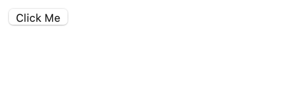
1. Decide which HTML elements you want to add a box shadow to. This example will use a button. In your HTML file, type the following code.

The following button will display on your webpage:
Use the CSS type selector in your CSS file to select the button element and add styles.
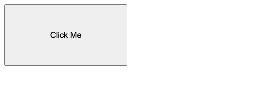
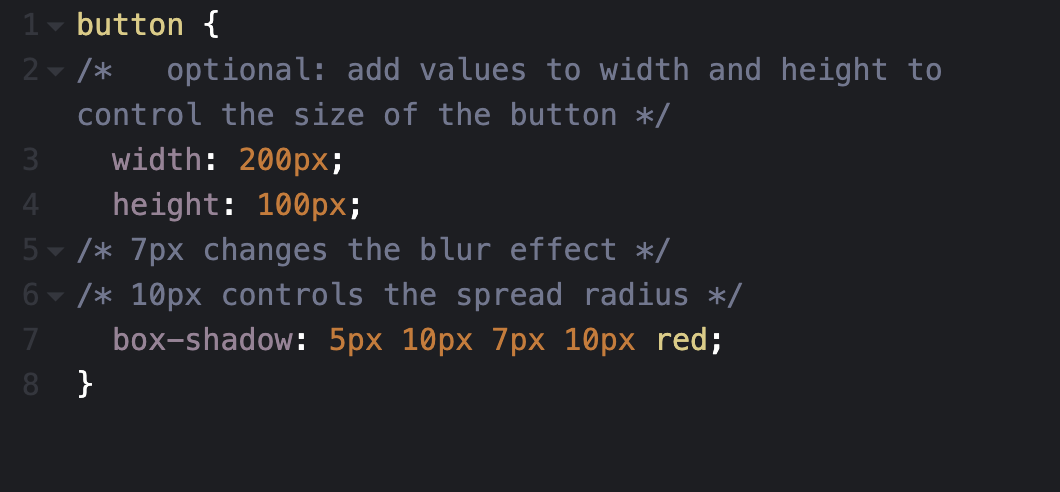
2. This step is optional. Use the width and height properties to control the size of the button.

The button should display bigger on your web page like the following:
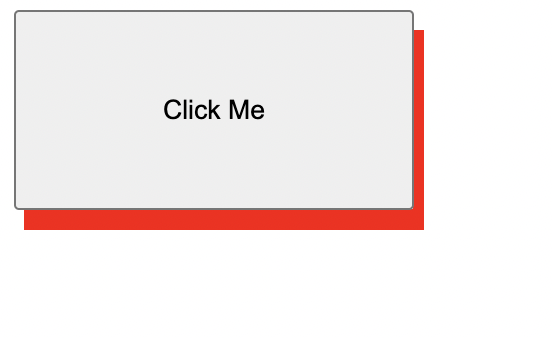
3. Remember, the horizontal and vertical offset values are required. In this example, the shadow will set the horizontal offset to 5px and the vertical offset to 10px.

Your button will have a red shadow effect like the following:
4. The box shadow can take up to six values. Let's add 7px to the blur effect and 10px to spread the radius.

5. Use the inset keyword after your specified color to make the shadow sit inside the button.

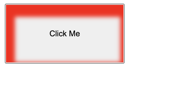
6. To add multiple shadows to the button, add a comma after your first set of values and specify new ones.

.webp?width=536&height=380&name=css%20box%20shadow_42023-2%20(1).webp)
Create Your CSS Box Shadow
CSS box shadows’ flexibility and versatility help make it a long-lasting CSS trick that's here to stay. With creativity and knowledge of the box shadow property, you can create unique effects that will make your website stand out from the crowd.
CSS


![How to Create Scrolling Text With CSS [+ Code Examples]](https://53.fs1.hubspotusercontent-na1.net/hubfs/53/Google%20Drive%20Integration/scrolling%20text%20css.jpeg)


