Since the Internet was invented, web developers have been looking for the most efficient way to display content on web browsers. Often, they've settled for workarounds in lieu of more effective solutions like the growingly popular CSS grid.

Float-based layouts and table-based layouts are two such examples. While they work, neither of these approaches are perfect since floats and tables were never equipped to be used as layout tools.
In fact, use of the HTML5 table element for layout purposes has been deprecated, which means using this element for stylistic purposes is considered bad for your website structure and can also hurt your SEO.
So, what's a marketing-minded web development team to do?
![Download Now: 50 Code Templates [Free Snippets]](https://no-cache.hubspot.com/cta/default/53/34adf7eb-7945-49c4-acb8-f7e177b323e5.png) The solution: a CSS grid layout.
The solution: a CSS grid layout.
What Is a CSS Grid?
The CSS grid layout (also referred to as "the grid") was proposed to the CSS Working Group by Microsoft and the Grid Layout Working Draft was first published in April 2011.
Over time, this specification has been improved thanks to feedback from developers and browser vendors who work together to make the grid a truly effective layout solution.
The grid acts as an addition to CSS that allows you to control the size and placement of grid items. You can use media queries to automatically adapt your grids to diverse contexts.
Benefits of a CSS Grid
Thanks to its flexibility, a CSS grid allows web designers to achieve almost any type of layout that they need. It's great for dividing up the major regions of a page into smaller sections or setting the relationship between elements in terms of size and position.
While it aligns page elements by columns and rows just like tables, the grid isn't limited by a particular content structure. This makes it possible to create a wider variety of website layouts than would be practical with tables alone.
Additionally, without a content structure, the grid layout can easily adapt to changes in device, space, and orientation without requiring a semantic change in the content. You can rearrange grid elements — no matter their source order — which makes it possible to fit the layout to the context without changing the underlying markup.
A powerful auto-placement feature lets you easily fill up available space, eliminating the need for complex calculations. The grid even allows you to overlap items when you need to, which is definitely not possible with tables.
Now that we're familiar with the CSS grid, let's explore how to use it.
How to Use CSS Grid
For this example, if you want to set up a grid layout, you must create a parent div element (the grid container) and one or more child div elements (the grid items).
Setting the display property of an HTML element makes it a grid container.
Grid items are the direct children of the grid container. They are arranged vertically into columns and horizontally into rows.
The space between a row and a column is called a gap. You can adjust the gap using these properties:
- grid-column-gap, which defines the gap between columns;
- grid-row-gap, which defines the gap between rows; or
- grid-gap, which is a shorthand property for grid-column-gap and grid-row-gap.
In between columns and rows, there are lines referred to as column lines and row lines, respectively. We can see an example of this below.
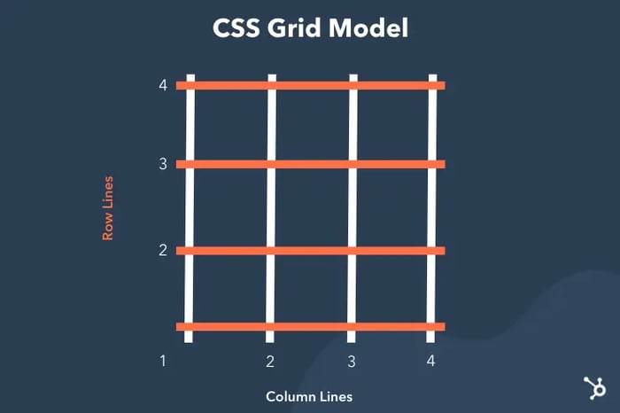
When positioning a grid item inside a container, you reference the line numbers.
How to Center a Grid in CSS
The grid is two-dimensional, which means that the layout is completed with two axes: The y-axis (block axis) and the x-axis (inline axis).
In CSS, the align property is used to define the block axis while the justify property defines the inline axis.
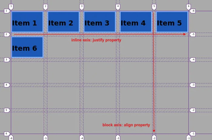
To start centering your grid items, use the align-items property. Some of the values that you can assign to this property are start, end, and stretch.
When the value of the align-items property is set to start, this places the items to the vertical start of their corresponding grid area while setting it to end places them at the end. When the value is stretch, the items are spread out across the grid area.
The justify-items property works similarly to the align-items property and accepts the same values on the inline axis.
To target just one item so you can center it, use the align-self and justify-self properties, respectively, at the item level.
The last step is making your grid responsive to a mobile layout. After all, if you create an amazing display you want it to be shareable through a mobile interface.
How to Make a CSS Grid Responsive
One of the best features of the grid is that it's fairly responsive from the get-go.
To build a responsive Grid, first set the box-sizing property of all HTML elements to border-box. This includes the padding and border to the width and height of the elements.
Add this code to your CSS:
Next, you'll create a simple responsive web page for practice using the follow ing CSS classes:
For a web page with only two columns, the example above will suffice. However, if you want to have more control over the web page you can use 12 columns on the grid.
You must first calculate what percentage each column occupies. For example, 100% / 12 columns = 8.33% per column.
Next, make a class for each column, class="col-", as follows:
We mentioned float-based layouts at the beginning of this article. Although a CSS grid layout isn't entirely based on this system, it makes use of some similar properties.
In this example, you'll set your columns to float to the left with a padding of 15px, which gives each element room to breathe:
Each row is wrapped in a <div> and the number of columns inside a row always adds up to 12:
Next, you'll want to make sure to clear the float, ensuring all columns inside the row are within the flow of the page:
From there, you can add additional styling to customize the grid according to your website's branding.

If this sounds like too much work, then you might want to build with a front-end development framework like Bootstrap CSS. You can use the Bootstrap's built-in grid system so you're not creating grids from scratch. That way, you can focus on the content in the grid rather than the grid itself.
Learn more about the difference between CSS Grid, Bootstrap, and Flexbox.
CSS Grid Example Layouts
Now that we've covered the basics of the CSS grid, let's look at basic CSS grid layout examples. Some of the examples below are by web designer Rachel Andrew and cited accordingly.
Line-based Placement Layout
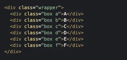
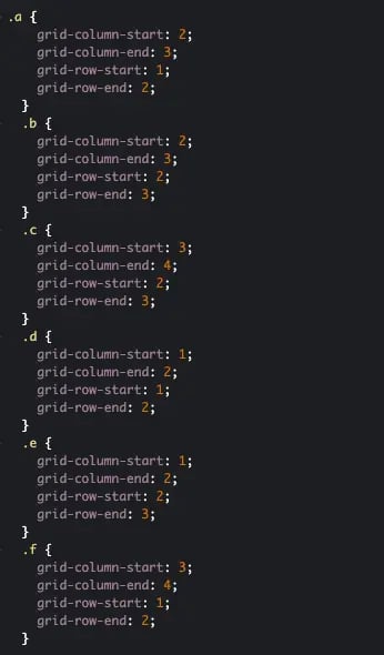
When creating CSS grids, it's common to position items on the grid based on column and row lines. The example below is a simple grid with three columns and two rows. It contains six items, none of which span multiple grid tracks.
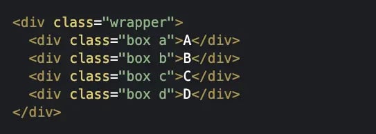
Here's the HTML that defines the grid. Notice that each grid item has its own class name. That will enable you to use class selectors to apply unique styling to each grid item in your CSS.
Below is the CSS that defines the placement of the six grid items. Notice that there are six rule sets that define the grid-column-start, grid-column-end, grid-row-start, and grid-row-end properties with line numbers for each grid item.
Here's the result on the front end:

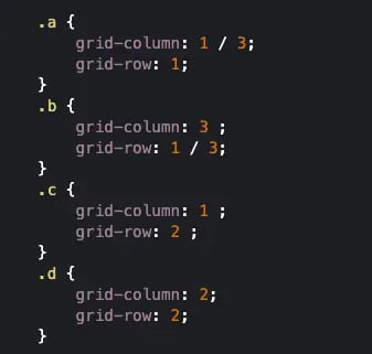
Using Shorthand Grid-Row and Grid-Column Properties
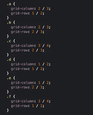
We can create the same grid layout from above using shorthand grid-column and grid-row properties.
These shorthand properties can save you time and make your code look cleaner. Rather than writing out the grid-column-start and grid-column-end properties on two separate lines, you can combine them into one line under the grid-column shorthand. To define this shorthand property, make the first number the column line where the grid item starts and the second number represents the column line where the grid item ends. Separate the values with a slash.
You can do the same for the grid-row shorthand property.
Here's the same CSS from the example above rewritten using the shorthand grid-column and grid-row properties:
The HTML would stay the same, and the grid would look the same on the front end.
Using Shorthand Grid-Area Property
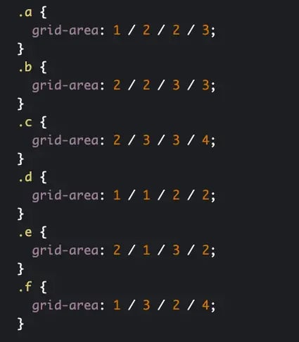
We can also create the same grid layout by using the shorthand grid-area property.
This shorthand property can save you even more time by requiring less code. It's just a bit more difficult to remember the order of property values.
For each of the six rule sets, all you need to do is define the grid-area property with four values. The order of the values is: row line where grid item starts / column line where grid item starts / row line where grid item ends / column line where grid item ends.
Here's the same CSS from the example above rewritten using the shorthand grid-area property:
The HTML would stay the same, and the grid would look the same on the front end.
Using Column and Row Line Names
In addition to using line numbers, you also have the option to name your grid lines and use those instead. This will require you to change the CSS that defines the grid as a whole and the CSS that defines the placement of the six grid items.
First, under the class selector .wrapper, you'll find the grid-template-columns and grid-template-rows property. In the previous examples, only the grid-template-columns property was defined with 100px three times. Meaning, each column was equally sized as 100px wide. Here's how that looked in CSS:

For this example, we'll have to define both the grid-template-columns and grid-template-rows property with lines names and values. Each column will be named "col1-start," "col2-start," and "col3-start," respectively, and set to 100px. Each row will be named "row1-start" and "row2-start," respectively, and set to "auto." Here's the CSS:
Now here's the same section of CSS from the example above, rewritten using shorthand properties and grid line names.
The HTML would stay the same, and the grid would look the same on the front end.
Line-based Placement Layout Spanning More than One Grid Track
Now that we understand the different ways we can write the code for line-based placement layouts, let's consider a more complex example: positioning items that cover more than one grid track. The grid below will contain only four grid items. One item will span more than column, and another will span more than one row.
Here's the HTML that defines the grid.
Below is the CSS that defines the placement of the four grid items. Notice that the shorthand grid-column and grid-row properties are being used and that most instances only have one value defined. That's because you only need to define the start and end values for the grid items that you want to span multiple tracks.
For example, to have grid item A span two columns, you can define the grid-column shorthand property by making the first value a "1" and the second value a "3." To have grid item B span two rows, you can define the grid-row shorthand property by making the first value a "1" and the second value a "3."
Here's the result on the front end:

Using the Span Keyword
We can create the same grid layout from above using the span keyword.
Rather than writing out the end value for the grid-column and grid-row shorthand properties of the two items spanning more than one grid track, you'd write "span" and include the number of columns or grids you want the item to span.
Here's the same CSS from the example above rewritten using the span keyword. Items A and B span two columns and two rows respectively, so the end value is "span 2." Note that many properties are only defined by one value. In that case, the default of spanning one column or row is assumed.
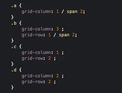
The HTML would stay the same, and the grid would look the same on the front end.
Holy Grail Layout
You may have noticed many web pages have a similar structure. There'a header at the top, footer at the bottom, and content area in between. This content area is situated between two columns. Let's say you were to look at the source code of these pages. Ideally, you'd see the content area come first, followed by the two columns. Before CSS grid, this was difficult to achieve. With the CSS grid, it's easy.
Below we'll take a look at the code and layout that's been coined the "Holy Grail Layout."
Here's the HTML defining the header, navigation sidebar, main content (the <article> element), right sidebar (the <aside> element), and the footer. Note that you can replace the <nav> item with another <aside> element if you prefer.
Here's the CSS defining the grid and grid items. Note that I used the fr unit to define each column. The fr unit represents a fraction of the available space in the grid container rather than a set amount, and ensures that grid tracks grow and shrink according to the available space. Note that I also used three different value types to define the track size of the rows. I also made every grid item (represented by the asterik) into a flex item with center alignment and justified content.
Now it's time to style the content. First I'll change the background color and padding of the header, nav, article, aside, and footer element. Then I'll set the grid-column-start and -end properties to 1 and 4 so they span the length of the grid. Finally, I'll set a minimum width for the article element so that the main content takes up most of the page.
Here's the result on the front end:

Classic Blog Layout
You can create another similar and extremely popular layout with CSS grid known as the "Classic Blog Layout." This layout also has a full-width header and footer and a content area — but it has one sidebar instead of two.
Here's the HTML:
Here's the CSS:
Here's the result on the front end:

As shown by the examples above, the CSS grid was designed as a flexible solution to be applied to different use cases. While the basic concept of this layout tool remains the same regardless of your situation, the devil is in the details — you must understand how the various elements work together to produce a useful end result.
Websites Using CSS Grids
We’ve talked a lot about CSS grids in theory, but how do they actually look? Next, let’s check out five excellent, real-world examples of the grid in action, starting with the Calendly Blog.
Calendly Blog
Calendly is a scheduling application that also runs a blog. Its main article directory displays links to posts in a grid format, each card a preview of its article. Here, the traditional grid format serves to make Calendly’s content digestible — while most cards are white with a subtle border, the most prominent posts are filled in and displayed prominently at the top to draw the eye.

Ikea
Ikea’s website implements a grid format on its main pages. Each item serves as a navigational link to a different area of the enormous website. Unlike the previous example, cells in this grid do not keep uniform widths and heights, but the widths of each item are all proportional to each other. In the screenshot below, the cell on the left is twice the width of the right-side items.

Montreal General Hospital
This website was created to celebrate the 200th Anniversary of Montreal General Hospital. Its home page features a grid-based navigation menu. Interestingly, when you hover your cursor over each item, the child elements animate a fill change to indicate selection. It’s a creative example of how designers can place other dynamic elements in grid cells besides images and text.

Filson
Filson sells outdoor clothing and accessories, and this couldn’t be more apparent from its homepage, which presents its site links as a broken grid. The rows are slightly misaligned, but the website stays tidy as it maintains whitespace and keeps things minimal.

R64X
Finally, R64X is a digital gallery for art in the crypto space. This site also breaks the grid. However, Since its rows maintain equal widths, everything appears orderly. This is a smart way to accommodate the different dimensions of each piece while maintaining a grid for navigational ease

Perfecting the CSS Grid
By spending the time necessary to understand the CSS grid, you're creating a strong foundation for producing responsive websites that make Google happy, unlike the deprecated table tag previously used for similar website layouts.
Editor's note: This post was originally published in November 2020 and has been updated for comprehensiveness.


![How to Center an Image with HTML and CSS [+ Code Modules]](https://www.hubspot.com/hubfs/center-an-image-in-html.jpg)

![How to Import Bootstrap in React [The Beginner's Guide]](https://www.hubspot.com/hubfs/import-bootstrap-in-react.jpg)
![How to Create Scrolling Text With CSS [+ Code Examples]](https://www.hubspot.com/hubfs/Google%20Drive%20Integration/scrolling%20text%20css.jpeg)