These example websites and dark color themes span a range of niches, from agencies to personal portfolios, business websites, concept pieces, and more. The one commonality? They all have great-looking dark website color schemes.
The Best Dark Website Themes
1. Refraction

Refraction is an AI-powered tool that helps users refactor code, generate documentation, create unit tests, and more. It uses a clean dark theme with accents of purple, including some animations on the CTA buttons that bring in brighter colors.
What we like:
- The bright purple animated gradient draws attention to the CTA buttons.
- The dark website theme matches Refraction's audience, as many developers use code editors in dark mode.
Primary colors: Black (#040404), Light Gray (#F2F1F2), Purple (#95A1F9)
2. Awwwards Conference

The Awwwards Conference is an online conference for all types of digital design. It uses a black background with light gray text. To add some color, it also uses pink accents.
What we like:
- The black and light gray theme creates a very classic look.
- The pink accent adds a feeling of creativity, which matches the digital design audience.
Primary colors: Pink (#FC93AD), Light Gray (#FEFDFB), Black (#1F1F1F)
3. Evervault

Evervault is an encryption platform for developers that helps them securely work with customer data. It uses purple gradients across its site that shift from a deep, dark purple to a brighter purple. It also utilizes dark purple as a solid background in many areas.
What we like:
- The purple gradients mix dark and light in an eye-catching way.
- Because Evervault is a developer-focused product, the dark website theme fits very well.
Primary colors: Dark Purple (#010314), Bright Purple (#592DD1), White (#FFFFFF)
4. Ventriloc
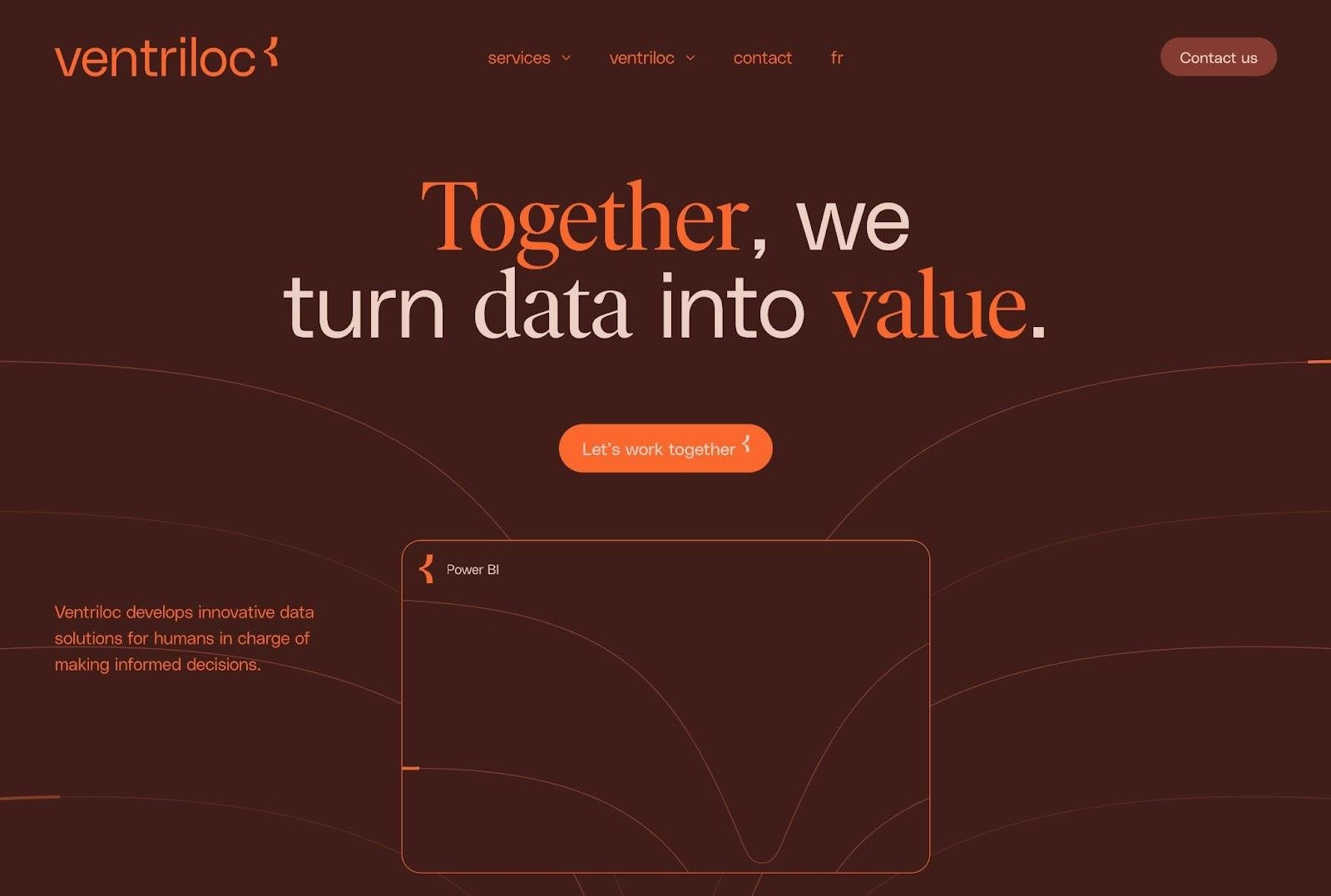
Ventriloc is an agency that helps businesses with data integration and analysis.
Ventriloc’s website has one of this list's more unique dark website themes. Its background is a dark, almost brown, red. To keep the text readable, the designers choose an orange text color.
What we like:
- This site has a unique combination of colors that definitely stands out.
- Despite using shades of orange and red for everything, there's still enough contrast for the text to be easy to read.
Primary colors: Dark Red (#401D19), Bright Orange (#F9672C), Light Red-Orange (#ECCFC5)
5. Opera
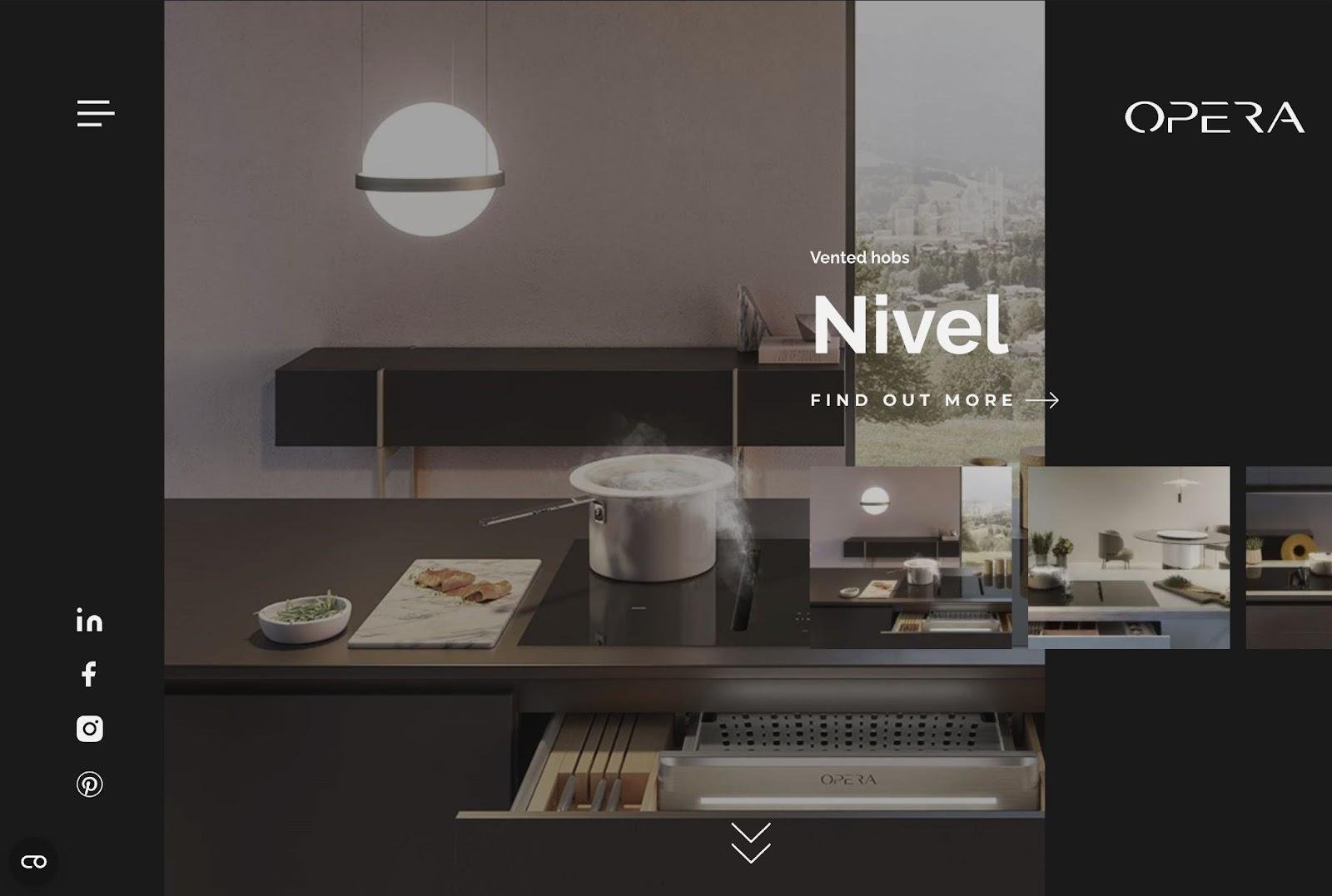
Opera offers vented hobs and hoods to help people create more stylish kitchens. The Opera website uses a dark website theme with a dark green background (almost black). Dark gray and soft white text stand out on the site.
What we like:
- The dark green background creates an earthy feel, which works well for a kitchen business.
- It has an overall luxury feel thanks to the classic color scheme.
Primary colors: Dark Green (#191A19), Soft White (#F2F2F2), Dark Gray (#444544)
6. Memo
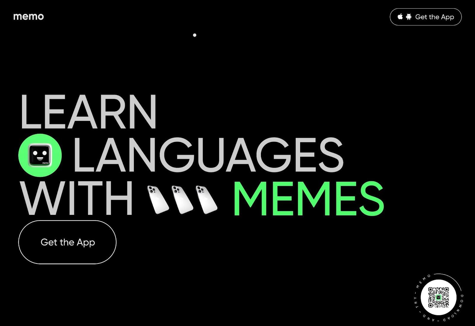
Memo is an app that helps people learn languages in a fun way using memes and videos. It uses a full black background with grey text and then bright green accents.
What we like:
- The bright green really stands out against the otherwise black-and-gray theme.
- The light gray text has a different feel than white text, while still offering enough contrast to be easily readable.
Primary colors: Black (#000000), Light Gray (#CDCDCD), Bright Green (#5AFE73)
7. Paxafe

Paxafe is a software company that helps improve infrastructure management. It uses a dark background with light gray text. It then brings in some color with pastel green and blue accents.
What we like:
- The dark cyan background is softer than a straight black background.
- The pastel greens and blues add some energy to an otherwise dark design.
Primary colors: Dark Cyan (#03131A), Light Gray (#F8F8F8), Pastel Blue (#8FD6E8), Pastel Green (#D4FF9D)
8. Kinsta

Kinsta is a popular managed WordPress host that's also expanded into general application hosting.
While much of the Kinsta website uses a royal purple color theme, the Kinsta team has shifted the homepage and other areas to a new blue-magenta background, while still bringing in accents with royal purple and teal.
What we like:
- The gradient on the blue-magenta background creates an eye-catching look that attracts attention to the interface screenshot.
- The teal CTA button really stands out and drives action.
Primary colors: Blue-Magenta (#0E0A1B), Purple (#5333EC), Teal (#32D3D8)
9. eJeeban Design Agency
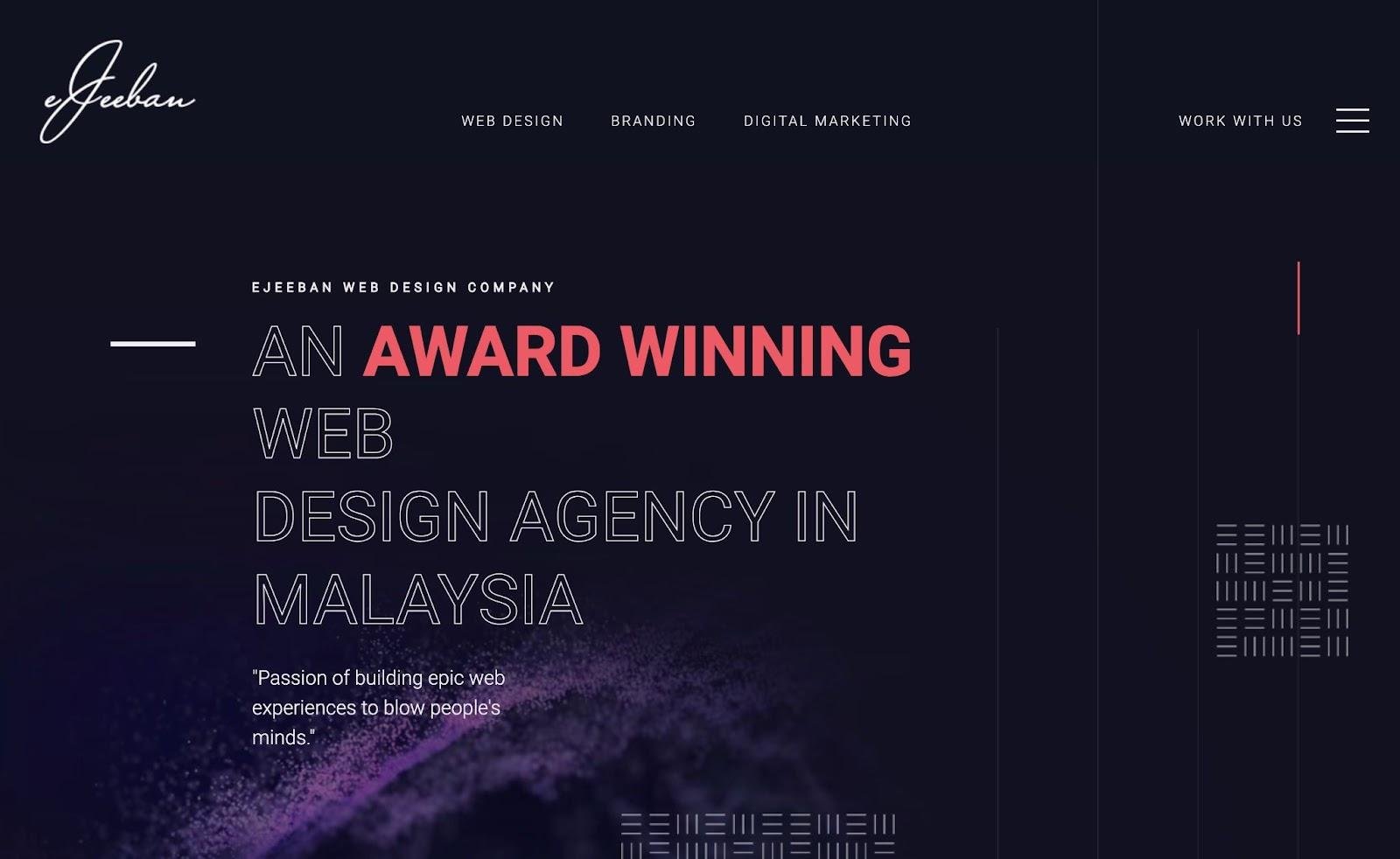
EJeeban Design Agency is a web design agency based in Malaysia. The eJeeban Design Agency website uses a dark blue-magenta background and light gray text. It then adds some energy and creativity with a pink-red accent.
What we like:
- The pairing of the dark blue-magenta background and light gray text is a little softer than a classic black-and-white design.
- The sparingly used pink-red accent is very well done and adds creativity and energy.
- The website pairs colors with background textures to give the site additional dimension.
Primary colors: Blue-Magenta (#121220), Light Gray (#F0EDF2), Pink-Red (#EC5A64)
10. Eco

Eco is a fintech app that's backed by many of the largest VC funds. The Eco website is lighter than some of the other dark website themes on this list, but the royal blue background still creates a nice, dark design.
What we like:
- Blue has associations of trust, which is great for businesses in the financial space or other YMYL niches (your money or your life).
- The teal accent adds some energy and interest.
Primary colors: Royal Blue (#18148A), White (#FFFFFF), Teal (#67DEE5)
11. Le Studio Culotté

Le Studio Culotté is a French design agency that works with businesses in the wine and alcohol space. The Le Studio Culotté website uses a dark purple/magenta background, with brighter purple for the CTAs and eye-catching color gradients.
What we like:
- The gradients add some brightness and energy to an otherwise dark website theme.
- The bright purple CTAs still have enough contrast to grab visitors' attention.
Primary colors: Magenta (#020021), Bright Purple (#5D13F9), White (#FFFFFF)
12. Cuberto
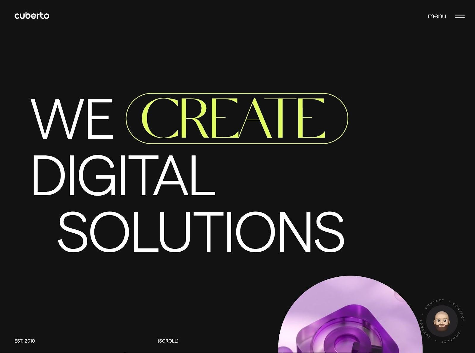
Cuberto is a digital agency located in Alexandria, Virginia. The Cuberto website uses a classic black-and-white color scheme and adds some interest with bright yellow accents.
What we like:
- Black-and-white is a classic dark website theme.
- The yellow accent still adds some interest and energy to the design.
Primary colors: Black (#121212), White (#FFFFFF), Yellow (#E0FD60)
13. GetSport
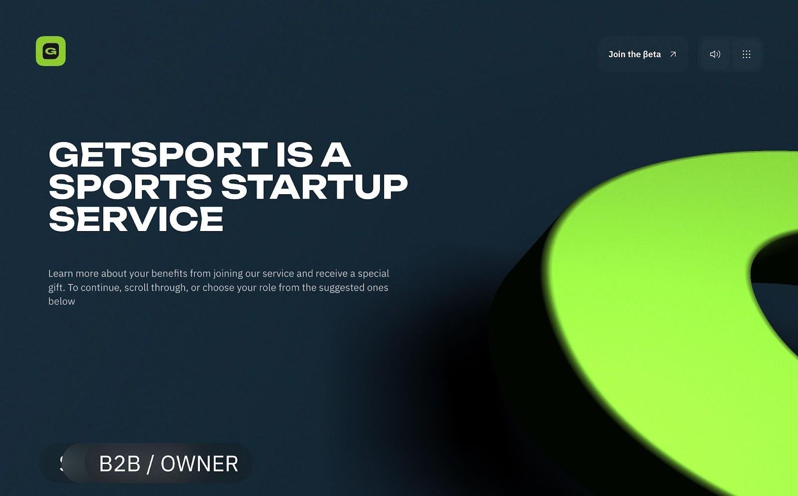
GetSport is a sports-focused startup that works with athletes, trainers, and business owners. The GetSport website uses a dark cyan-blue background and white text as its primary scheme. It also brings in a bright green which stands out against the dark background.
What we like:
- The dark cyan-blue background offers good contrast with the white text.
- The bright green accent adds some interest and energy to the page.
- Green is also associated with health, which connects to the sports-focused offering.
Primary colors: Cyan-Blue (#162936), White (#FFFFFF), Bright Green (#8CC92D)
14. Critical Danger

Critical Danger is a non-profit that supports endangered animal species. The Critical Danger website uses a dark burgundy background with brighter red text, which fits the "red alert" message that Critical Danger is trying to promote.
What we like:
- The all-red color theme fits the message that Critical Danger is trying to communicate.
- The all-red design still has enough contrast for the text to be readable.
- Blurring adds dimension to the text used on the website.
- Many images have green in the background, as the site focuses on nature. Red and green complement each other on opposite sides of the color wheel, making this a harmonious choice.
Primary colors: Dark Burgundy Red (#3B1C1C), Bright Red (#E41E2D)
15. Daily Gogen
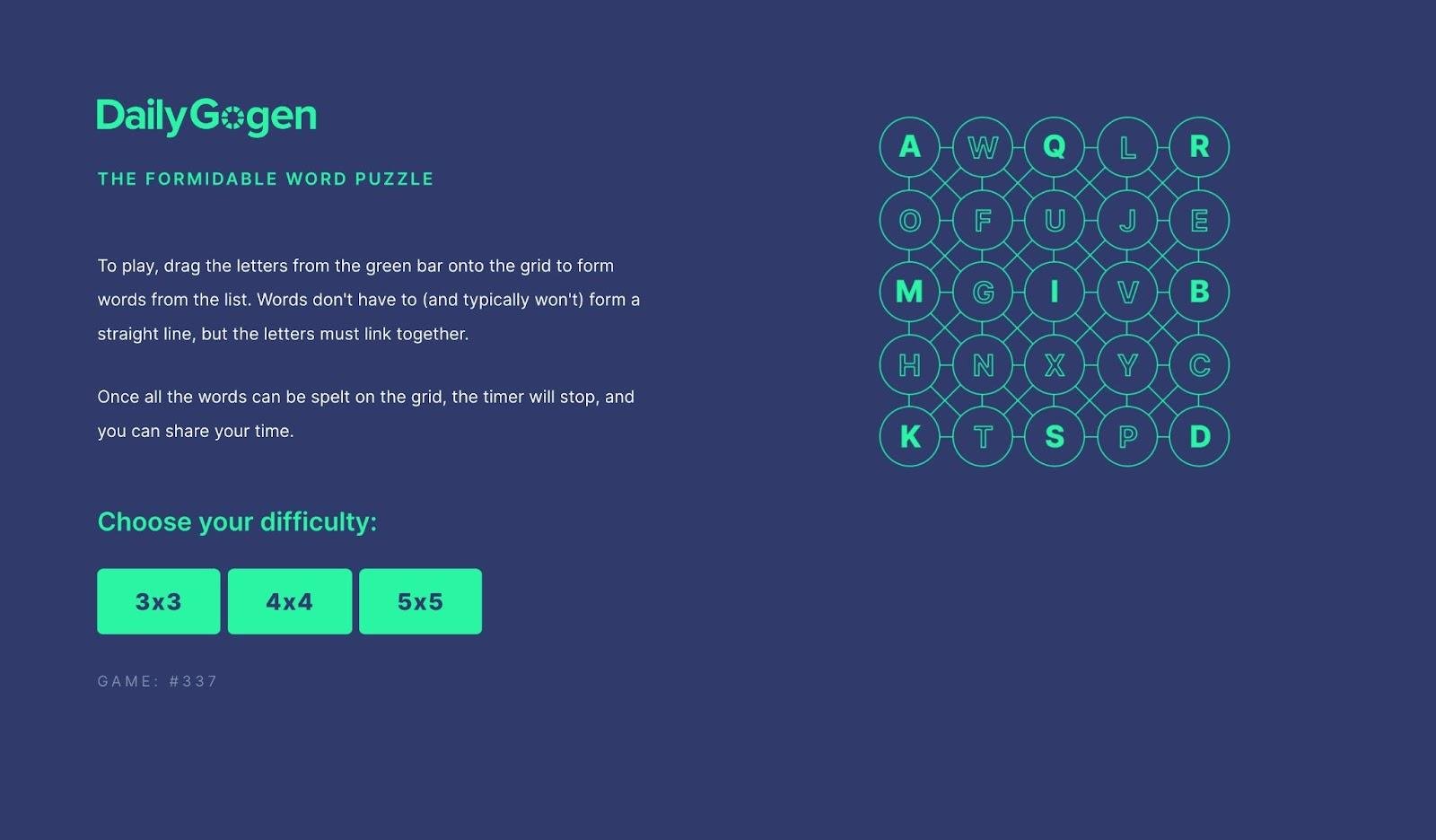
Daily Gogen is a daily word puzzle game. It has a very simple dark website theme, with a dark blue background and then green-cyan headers, game interface, and CTAs. It also uses light gray text for the paragraph text.
What we like:
- Even though it's a dark website theme, this website still has good energy.
- The cyan-green CTA buttons really stand out.
Primary colors: Dark Blue (#2F3B6D), Cyan-Green (#2AF6A2), Light Gray (#F2F3F6)
16. GBL Studio
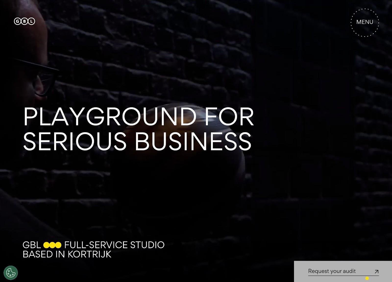
GBL Studio is a full-service design agency located in Kortrijk, Belgium. The GBL Studio website uses a classic black-and-white color scheme with bright yellow accents to add interest.
The hero section also uses a black-and-white video, which fits well with the rest of the dark website theme. If you’re worried about colors on your site clashing, black-and-white can help make your images feel cohesive.
What we like:
- This site offers a classic black-and-white website theme.
- The yellow accents add interest and energy to the design.
Primary colors: Black (#000000), White (#FFFFFF), Yellow (#FBE10F)
17. Made In Evolve

Made in Evolve is an Italian digital agency specializing in fashion and lifestyle. It uses a classic black-and-white website theme but with purple accents.
Made in Evolve also offers both light and dark modes, with light mode flipping the black and white (e.g., the background becomes white and the text black if you enable light mode).
What we like:
- The purple accents add interest to the design.
- By keeping the color theme simple, Made in Evolve can offer both light and dark modes.
Primary colors: Black (#222222), White (#FFFFFF), Purple (#A09DFF)
18. The Quake
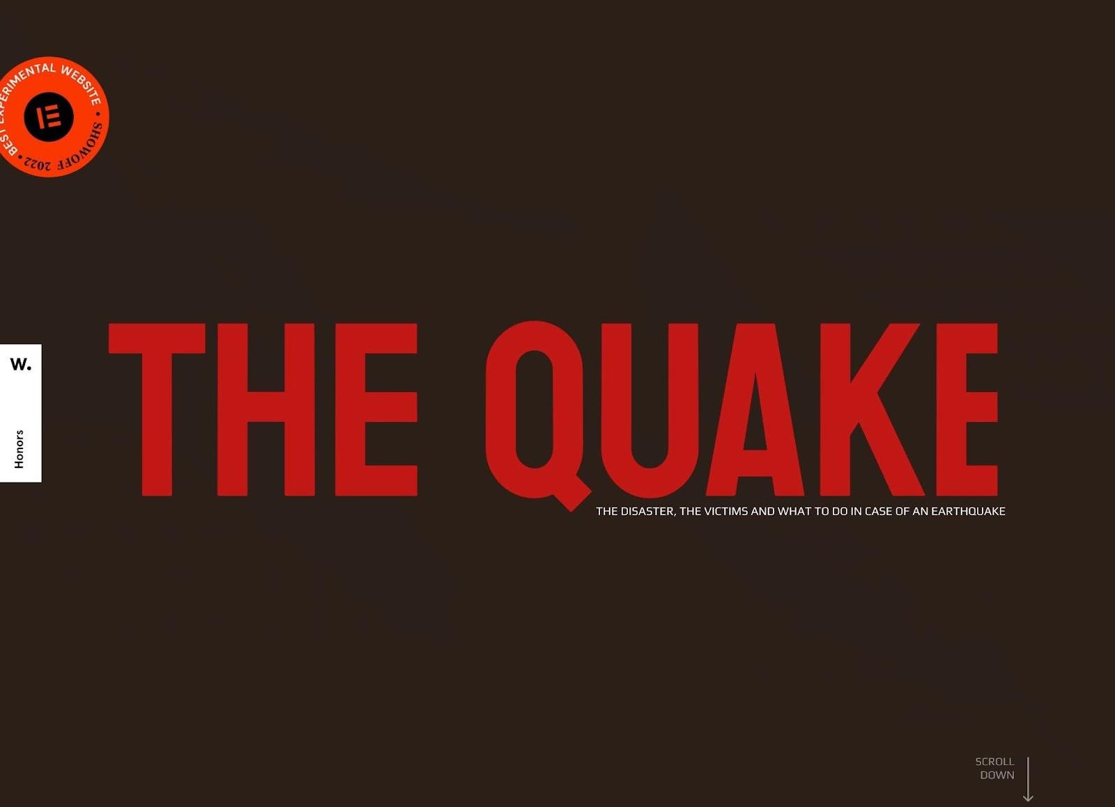
The Quake is an informational site that educates people on what to do if they ever experience an earthquake. Like the Critical Danger example above, The Quake uses a dark red background with bright red heading text.
What we like:
- The all-red color scheme matches the feeling of "danger/alert" that The Quake wants to create.
- The white paragraph text offers good contrast against the dark red background.
Primary colors: Dark Red (#2B1F17), Bright Red (#C21814), White (#FFFFFF)
19. Spectral

Spectral aims to be the first Web3 credit score to help people monitor their on-chain creditworthiness. It uses a black-and-white website theme as the base but adds color via its diamond logo and animations.
What we like:
- This site has a black-and-white, classic dark website theme.
- The animated rainbow spectrum coming from the diamond creates a very engaging effect against the black background. It's a great example of how small tweaks can add interest to a very simple, dark website theme.
Primary colors: Black (#000000), White (#FFFFFF)
20. CardioOne
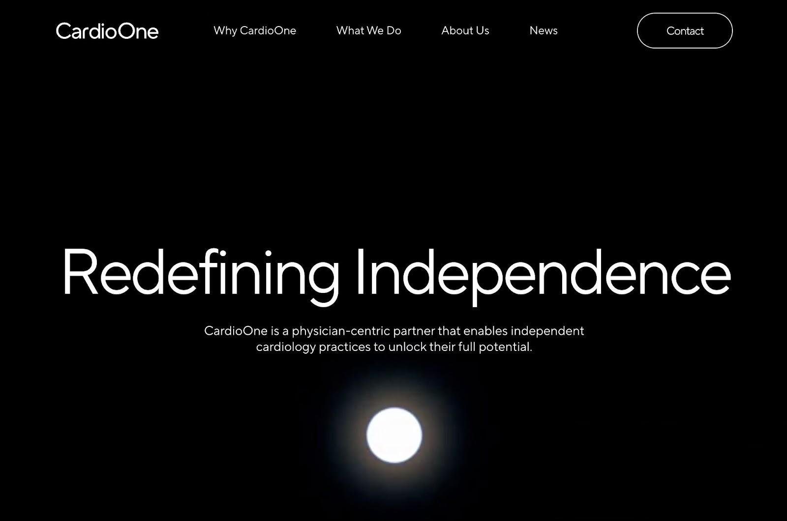
CardioOne works directly with physicians to create a network of independent cardiology practices. The CardioOne website uses one of the most classic dark website themes that you'll find — pure white and pure black.
Further down the page, it does bring in some color with a gradient background that changes color as users scroll.
What we like:
- Black and white is a classic dark website theme.
- CardioOne adds some color, which is a good way to switch things up and make this classic color theme your own.
- The white glowing orb on the home page creates visual intrigue, showing how simple colors can pull you in.
Primary colors: Black (#000000), White (#FFFFFF)
21. Web-Systems Solutions

Web-Systems Solutions is a development agency that works with Shopify (and also WordPress). Web-Systems Solutions primarily uses black-and-white. However, the site brings in green accents, which fits its focus on Shopify development well.
What we like:
- Black and white is a classic dark website theme.
- The green accents help reinforce the website's core focus and connection to Shopify. This is a great reminder of how you can use colors to achieve something similar for your website.
Primary colors: Black (#151515), White (#FFFFFF), Green (#67C22F)
22. Aaron McGuire Design

Aaron McGuire is a designer who works with UI, motion, video, and more. Aaron's portfolio website uses a simple, yet classic, dark website theme with black and soft white/yellow.
What we like:
- The entire website is just two colors.
- By using soft yellow/white instead of pure white, Aaron's portfolio stands out against pure black-and-white, dark website themes.
Primary colors: Black (#111013), Soft White/Yellow (#F5EFDF)
23. Peter Arendt

Peter Arendt is a front-end web developer and designer based in Warsaw, Poland. Peter's portfolio website uses a very similar color theme to the Aaron McGuire portfolio above. However, Peter uses a yellow slightly brighter yellow than Aaron's portfolio.
Peter also adds tiny color accents, such as the red on the "L" in "Developer."
What we like:
- The small color accents add interest, especially because 99% of the design is just two colors.
- By using soft yellow instead of pure white, Peter's portfolio stands out against true black-and-white dark website themes.
Primary colors: Black (#0F0D0D), Yellow (#FBE094), Red (#FA2256)
24. Valemtimes

Valemtines uses GPT-3 AI to generate messages for your significant other. It's more of a concept piece than a serious tool, but it does have one of the nicer dark website themes.
Valemtines uses a classic black-and-white design with a grainy background instead of a solid black one. It also does an excellent job of bringing in red via the heart and cupid character.
What we like:
- The dark background isn't solid, which creates visual intrigue.
- The small use of red connects with the tool's branding/message (Valentine's/love).
Primary colors: Black (#121212), White (#FFFFFF), Red (#A7445D)
25. Alster

Alster is a digital agency located in Stockholm, Sweden. The Alster website uses a classic black-and-white dark website color theme, with gray added in some places (such as the single-page navigation menu at the bottom of the screen).
What we like:
- The gray menu bar stands out while still maintaining the dark website theme.
Primary colors: Black (#0F1217), White (#FFFFFF), Gray (#3F4246)
26. David Lubofsky

David Lubofsky is a consultant/agency who helps with UX and product development. David's website uses a classic black-and-white theme as its base but builds in lots of yellow accents for CTAs, underlining key terms, and a few other areas.
What we like:
- The yellow CTA buttons really grab your attention and stand out against the otherwise black-and-white theme.
- The theme uses dark grey shapes, giving the site a modern feel.
Primary colors: Black (#161617), White (#FFFFFF), Yellow (#FAD700)
27. SunVest

SunVest is a USA-based vertically integrated developer of distributed solar projects. The SunVest website uses a very dark blue background but then adds color with bright yellow accents alongside the white text.
What we like:
- The bright yellow accents add energy and connect to the idea of sunlight and solar power.
- The dark blue color feels like nighttime and connects to the animated spinning earth in the website's hero image.
Primary colors: Dark Blue (#0F1625), Yellow (#FACE34), White (#FFFFFF)
28. Shahadat Hussain
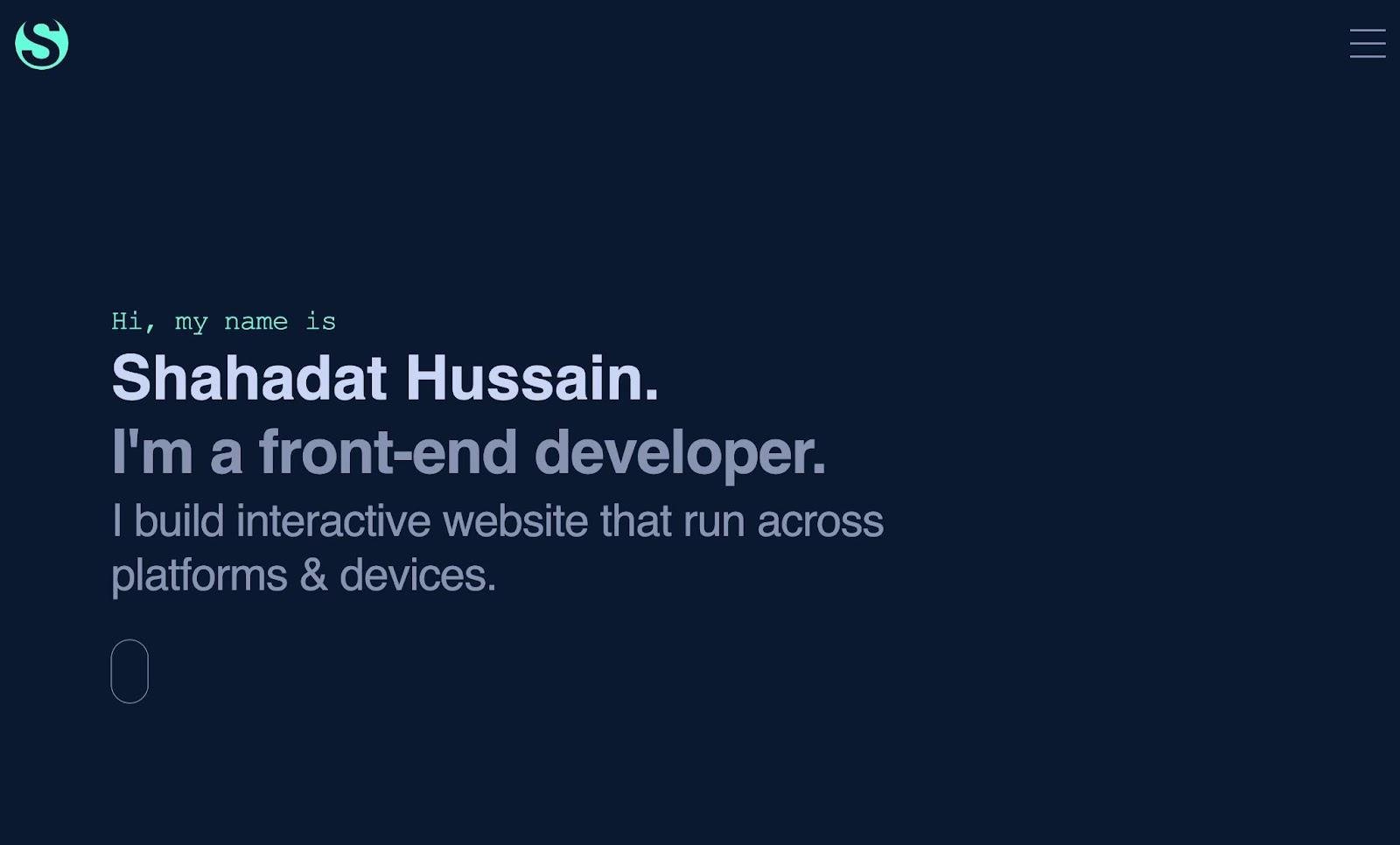
Shahadat Hussain is a front-end web developer based in India. His portfolio website uses a very dark cyan-blue background with lighter blue text and teal accents. While the background isn't black like some of these other dark website themes, the combined effect is striking.
What we like:
- The dark cyan-blue background is a little softer than a black background, and blue is associated with trustworthiness.
- The light blue text creates a unique look while still offering enough contrast to be readable.
Primary colors: Dark Cyan-Blue (#0A192F), Light Blue (#CBD5F5), Teal (#64FDDA)
29. Alukaze

Alukaze is a Singaporean company that offers high-quality aluminum window systems. The Alukaze website uses a classic black-and-white dark color theme but with accents of bright yellow to add some interest to the design.
What we like:
- The yellow accents add some energy and interest to an otherwise classic design. The yellow arrow button makes it intuitive for visitors to scroll.
- The silk texture gives the site an elegant touch that builds intrigue.
Primary colors: Black (#000000), White (#FFFFFF), Yellow (#FBFA03)
30. 3AI

3AI is a financial company that aims to use AI and financial data to improve returns. The 3AI website uses a dark cyan-blue background with white text. It also adds color and emphasis with a salmon-pink accent.
What we like:
- Blue evokes feelings of trustworthiness, which is why you'll see a lot of businesses in the financial space incorporate it.
- The pink accent adds creativity and interest, especially because pink is traditionally associated with creativity.
Primary colors: Cyan-Blue (#3D4045), Pink (#ED9B81), White (#FFFFFF)
31. Flow Ninja

Flow Ninja is a Webflow development agency with offices in the U.S. and Serbia. The Flow Ninja website uses a dark blue background with white text and light blue accents for key elements, such as CTAs.
What we like:
- Webflow also uses a similar blue color scheme. Flow Ninja reinforces its connection by using similar colors.
- The lighter blue accents still have enough contrast to stand out against the dark blue background.
Primary colors: Dark Blue (#19224C), Light Blue (#DEE2FF), White (#FFFFFF)
32. Broadgate Creative

Broadgate Creative is a U.K.-based design and marketing agency. At first glance, Broadgate Creative uses a fairly classic dark website color theme — a dark blue-magenta background with very light gray text.
The website also incorporates color with an animated fingerprint consisting of an entire rainbow of colors.
What we like:
- The dark blue-magenta background and light gray create a very classic design, just a little softer than a true black-and-white design.
- The animated fingerprint adds color and energy to help the website stand out. It's a great example of making a classic dark website theme more interesting.
Primary colors: Blue-Magenta (#15151B), Light Gray (#F3F3F3)
33. Regeneration: Black Cinema

Regeneration: Black Cinema is a website that "explores the rich history of Black participation in American cinema from its beginnings to just beyond the civil rights movement."
The website uses a classic black-and-white color theme in the hero section, but adds bright yellow text as users scroll down the page.
What we like:
- The yellow text adds energy and creativity to the page.
- The website changes some colors on hover to differentiate different sections and engage visitors, which is a nice way to build on the classic black-and-white foundation.
Primary colors: Black (#282828), White (#F9F9F9), Yellow (#FCE48B)
34. Lonsdale
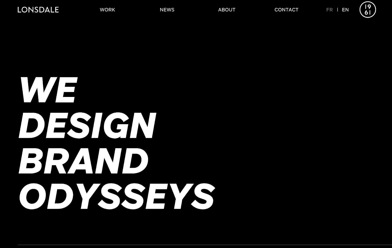
Lonsdale is a design and branding agency with offices in Paris and Singapore. The Lonsdale website uses a classic black-and-white color theme which, when combined with excellent typography, creates a striking effect.
What we like:
- While opting for black-and-white, this site uses other elements, like typography, to get visitors interested.
- Lonsdale still adds some color by showing different colors on hover, including blue, purple, red, orange, and more.
Primary colors: Black (#000000), White (#FFFFFF)
35. Makers Bolt

Makers Bolt is a supplier of black-coated fasteners. The Makers Bolt website uses a dark blue background and white text, with a bright yellow color for design accents and CTA buttons.
What we like:
- Blue evokes feelings of trustworthiness, which is important for a supplier of essential construction materials.
- The yellow CTA button really stands out against the dark blue background.
- By putting the black fastener over a light blue blob (one of the brightest colors on the page), the product stands out.
Primary colors: Dark Blue (#082048), Yellow (#F6B701), White (#FFFFFF)
Try These Dark Website Themes Today
That wraps up our collection of 35+ beautiful dark website themes.
If there's a website that you particularly like, you could adapt that exact theme to your own website. Or, you're always free to mix and match dark website schemes to create your own unique style.
Start designing today, and you'll be seeing your own website on lists like this in no time.
Website Design Examples
.png?width=112&height=112&name=Image%20Hackathon%20%E2%80%93%20Vertical%20(50).png)


![15 black and white website designs to inspire your own [+ pro tips]](https://53.fs1.hubspotusercontent-na1.net/hubfs/53/black-and-white-website-design-1-20250520-1336267.webp)

![15 Brochure Website Examples to Inspire You [+ How to Make One]](https://53.fs1.hubspotusercontent-na1.net/hubfs/53/brochure-website-examples-1-20250319-362228.webp)
![28 Types of Websites to Inspire You [+ Real-Life Examples]](https://53.fs1.hubspotusercontent-na1.net/hubfs/53/types-of-websites.png)

