.png?width=112&height=112&name=Image%20Hackathon%20%E2%80%93%20Vertical%20(50).png)

Design systems ensure the maximum amount of cohesiveness across all your company’s digital spaces and assets and create efficiencies in the design and development process.
So, let’s dive into what constitutes a design system, how to decide if and when you need one, and the process of creating your own.
Table of Contents
What is a design system?
A design system is a repository of repeatable components and standards for how to use those components to design and develop products. Using pre-built, global assets enables teams to build products that provide better user experiences in less time.
A design system is more than a style guide or pattern library, although these are part of the system. It is also made up of documentation and guidelines that explain how and why the company designs in this way.
When I’m working on a website for an app or software company, I’m often working with product marketers as well to ensure consistency. Then, the product team needs to get involved to ensure their designs are consistent. Finally, the engineering team also needs to be looped in to ensure consistency in the actual product build.
The design and building of products and websites get handed off to many different teams and pairs of hands throughout their life cycles. That’s why I always recommend considering a design system as early as possible.
Here’s an example of Atlassian’s design system, which is made up of a component library, pattern library, brand guidelines, logo library, illustration library, presentation kit, visual elements including colors, iconography, and typography, and content guidelines covering language and grammar, vocabulary, and writing style.
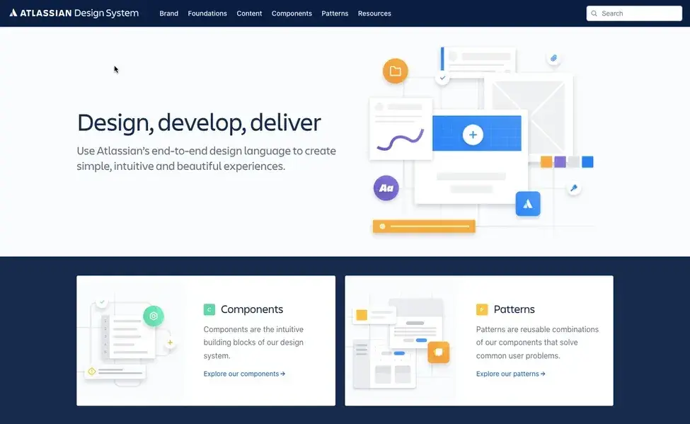
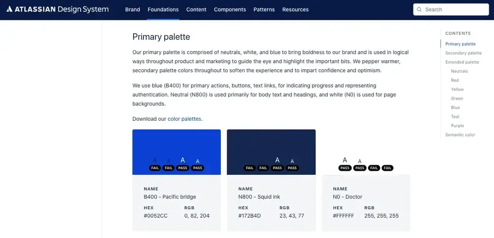
Each part of this design system contains guidelines for how to use a specific component and why. Atlassian doesn’t simply provide the color palette, for example. Instead, it details how they use color to distinguish their brand and create accessible, consistent experiences across products. Here’s an explanation for its primary color palette specifically:
Components and documentation explaining how a company uses them — and why — make up a design system. Without these guidelines, it’s just a library of components and code snippets. With these guidelines, it’s a design system that can be adopted by teams across product design, engineering, customer experience, and other parts of your organization.
Now that we have a better understanding of what a design system is, let’s take a closer look at what it’s made up of.
For a quick overview of what a design system is made up of and what benefits it provides a company, check out this video first:
Design System Components
- Component Library
- Pattern Library
- Brand Style Guide
- Brand Values
- Design Principles
- Icon Library
- Content Guidelines
- Accessibility Guidelines
- Design Tokens
The components I’ll discuss below are some of the most common in design systems. However, they’re not required. The exact ingredients included in your organization’s design system will depend on your unique needs, teams, and products.
1. Component Library
A component library — also known as a UI kit — contains reusable user interface (UI) components. Each component in a design system meets a specific interaction or UI need and has been created to work together to provide intuitive user experiences. An avatar, badge, dropdown menu, icon, logo, page layout, spinner, and tag are all examples of components.
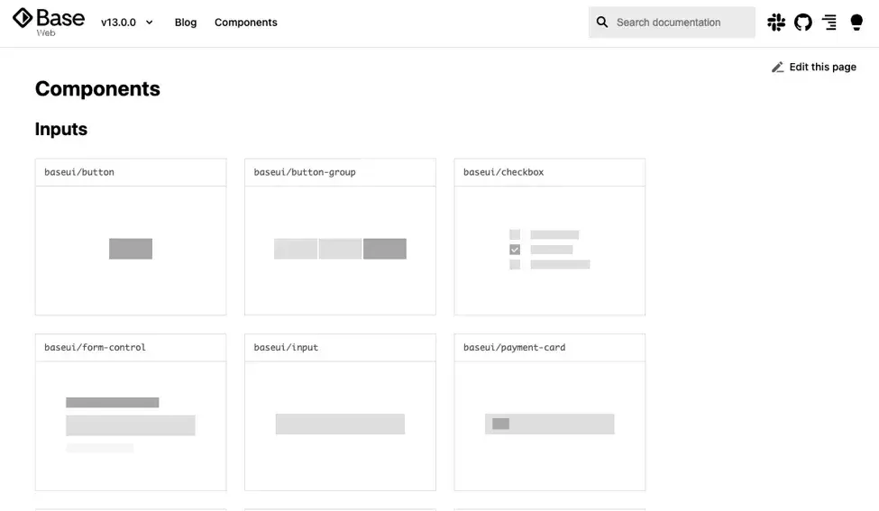
Below is a look at the component library of Base Web, Uber’s design system:
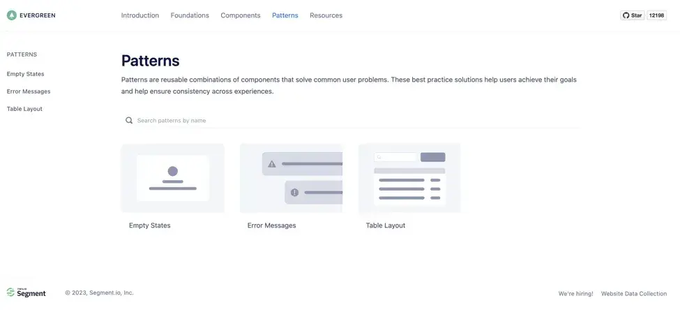
2. Pattern Library
Components can be used in particular combinations to provide intuitive and consistent user experiences. These combinations are called patterns. For example, a vertical dropdown menu is a web design pattern that solves the challenge that many larger websites face of fitting links to multiple site sections on a single page without cluttering it.
These patterns are usually contained in a separate library from components. As an example, check out the pattern library of Segment’s design system, Evergreen, below:
3. Brand Style Guide
A brand style guide governs the general look and feel of a company's branding. It dictates what colors, fonts, font sizes, logo variations, and types of images to use.
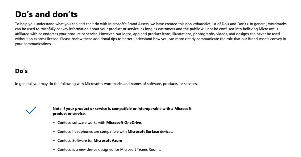
Microsoft’s brand style guide, for example, covers how to use the Microsoft brand assets — and how not to — to manage and protect the value of the brand and the trust it represents.
Here’s a section detailing appropriate usage of Microsoft’s wordmarks and names of software, products, or services:
4. Brand Values
An essential part of a brand's identity, brand values are overarching ideals for aligning teams and their designs across a company. They are meant to guide every design and content decision and help teams stick to the brand objectives. Brand values not only define how teams should create products and content but also define how users should feel when interacting with the brand.
.png)
Free Website Design Inspiration Guide
77 Brilliant Examples of Homepages, Blogs & Landing Pages to Inspire You
- Agency Pages
- Ecommerce Pages
- Tech Company Pages
- And More!
Download Free
All fields are required.
Form not available
Help Scout’s brand values are helpful, trustworthy, human and organic, energetic, and curious. Since these values are intended to inform everything Help Scout designs, writes, codes, and otherwise creates, readers are encouraged to explore them first before browsing other parts of the design system.

5. Design Principles
Most design systems will include a set of design principles. These are intended to help teams across an organization align on common goals, use the design system, and make meaningful design decisions, no matter how they build. While brand values are focused on the overall brand, design principles are more focused on products and what they should look like.
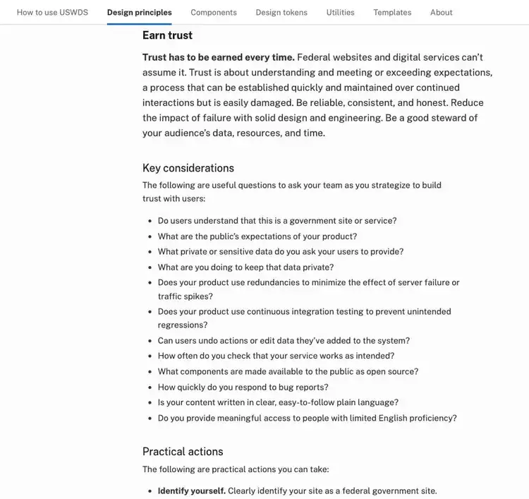
For example, the U.S. Web Design System (USWDS) has five design principles. One is “Earn trust,” and includes key considerations and practical actions teams can take to understand and meet or exceed expectations in order to gain users’ trust. Some of the recommended actions are to clearly identify the site as a federal government site, use the proper government domain, and fix broken links.
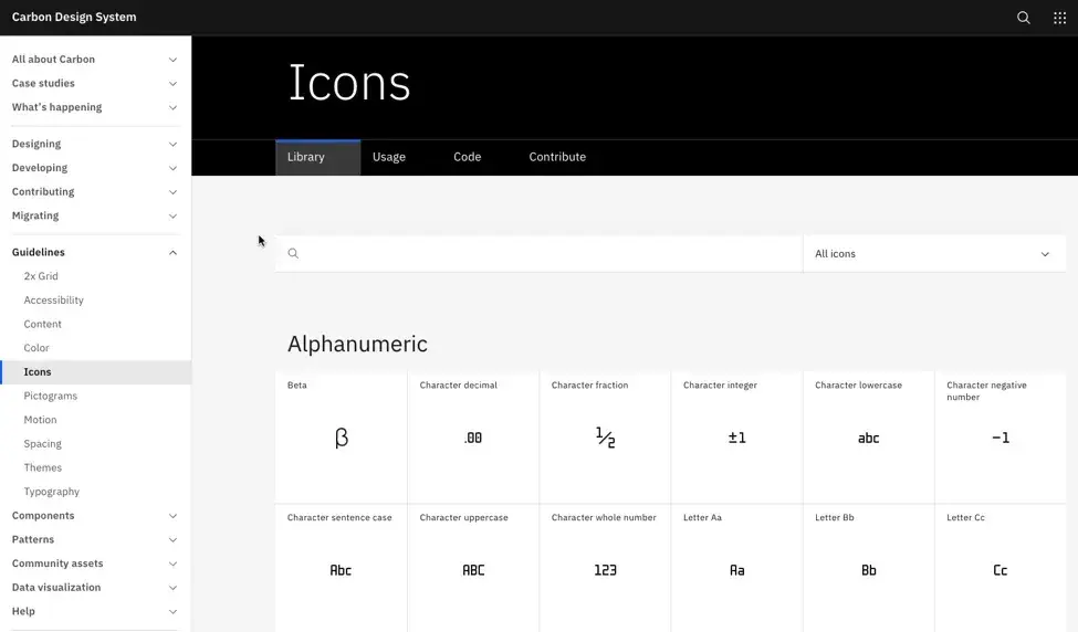
6. Icon Library
An icon library contains the visual symbols of a design system. These symbols are used to represent ideas, objects, or actions and to guide the user to take a particular action or draw their attention to important information on the page.
IBM’s design system Carbon contains an icon library as well as usage guidelines. These detail what sizes, colors, and alignment to use when designing with icons.
7. Content Guidelines
Design systems are intended to ensure all products not only look and act consistently — but speak consistently.
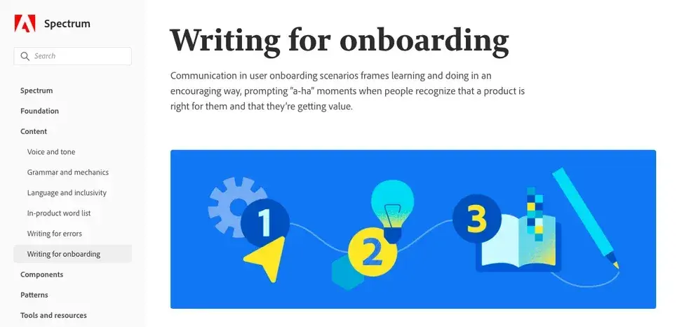
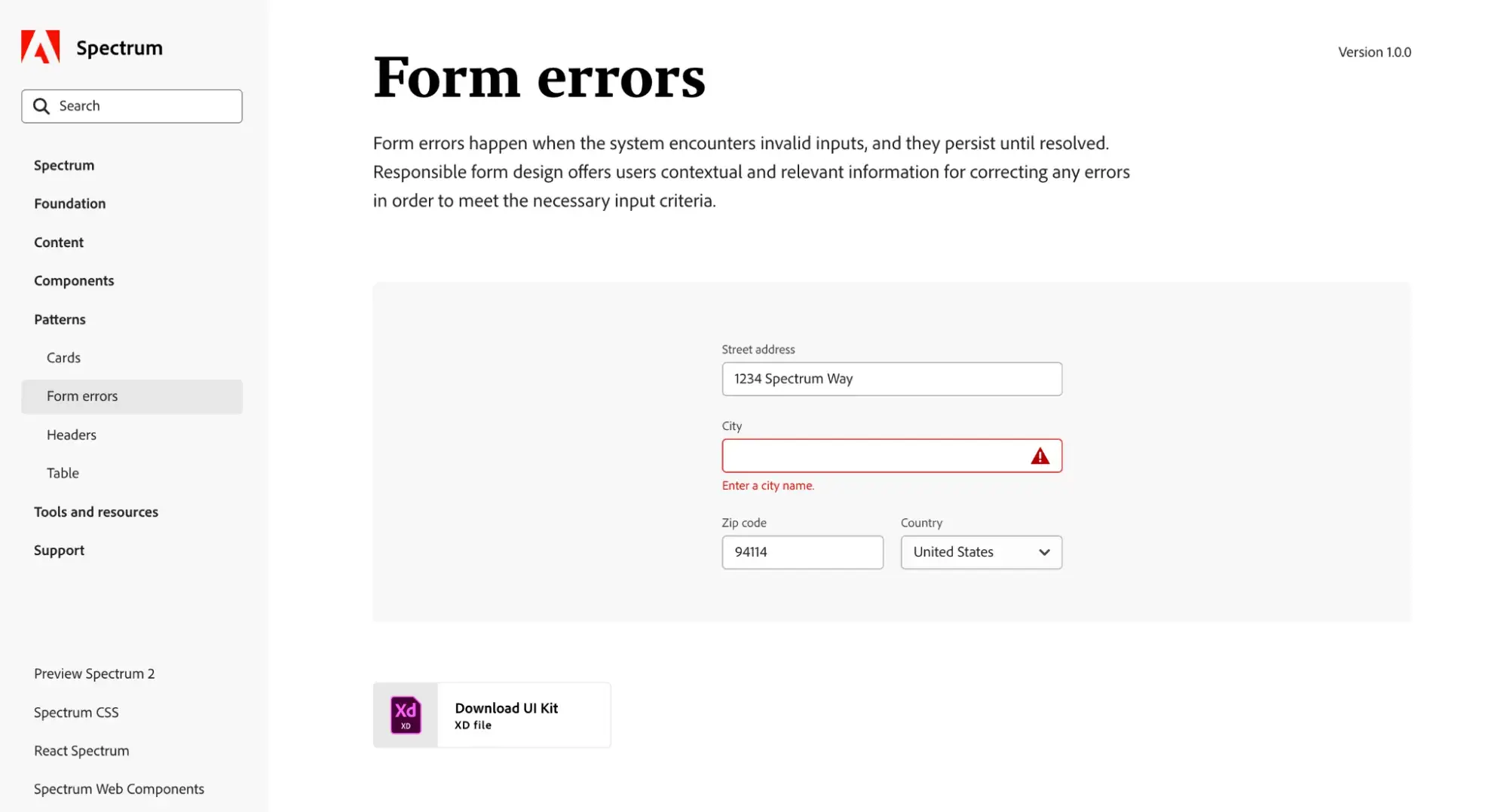
That’s what Adobe’s design system Spectrum intends at least. Its content guidelines cover voice and tone, grammar and mechanics, and language and inclusivity, which is common in most design systems.
Spectrum also details what words to use in Adobe’s in-product experiences, when to use them, how to write error messages, and how to write and design user onboarding experiences.
8. Accessibility Guidelines
Many design systems today include accessibility guidelines that underscore why accessible design is important and define what an accessible product means or does.
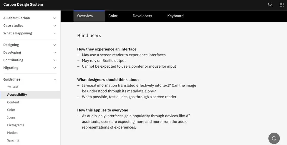
For example, IBM’s Carbon design system states that an accessible product should “give all users the same quality of experience and adapt to users and situations.” It also goes through different groups of users with disabilities and what designers should think about when designing accessible products for these and all groups of users.
9. Design Tokens
Design tokens are names used to represent hard-coded values for spacing, color, typography, and other parts of a design system. For example, a design token might be a color, typeface, opacity level, border radius, icon, or animation ease. These tokens can be transformed and formatted to meet the needs of any platform, from Android to iOS to Web. By taking the place of absolute values like hex codes, RGB values, and Bezier coordinates, design tokens ensure consistency and flexibility across a company’s brand assets and products.
In some design systems like Spectrum, design tokens are directly integrated into the component library. In other systems, design tokens are contained in a separate library.
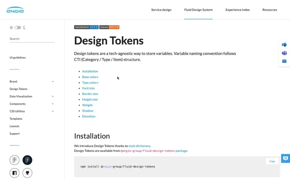
Here’s a look at some of the design tokens in ENGIE’s Fluid design system:
3 Design System Examples
The best way to understand design systems is to take a look through some examples yourself. I’ve gathered three exceptional examples of design systems here that illustrate how they should be organized and what can be included in them.
Adobe Spectrum
Adobe Spectrum is a comprehensive design system that covers everything from copy and writing styles to a component library and patterns. From third-party developers in the open-source community to in-house teams and agencies, the system ensures consistency in user experience across all Adobe products.
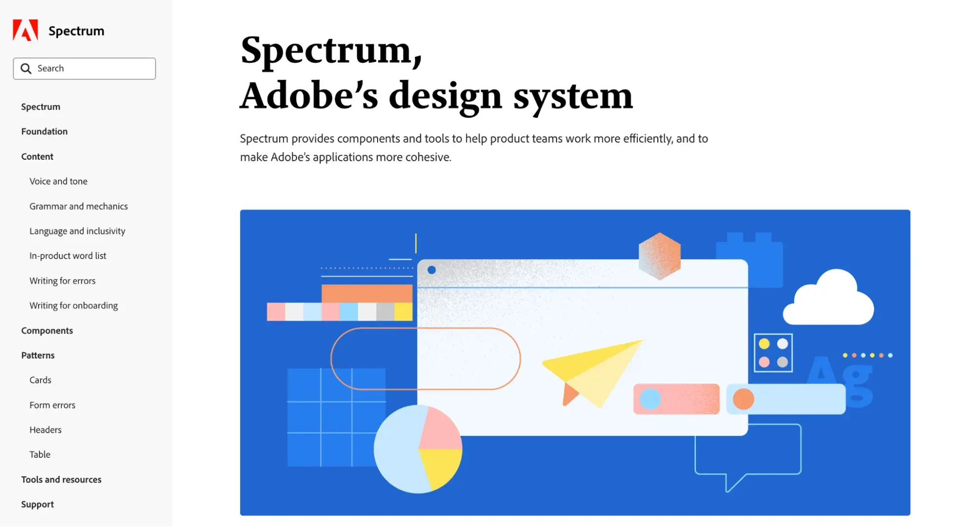
What I like: How well the documentation is organized. It’s clear and easy to navigate, with downloadable guides and kits for each individual element.
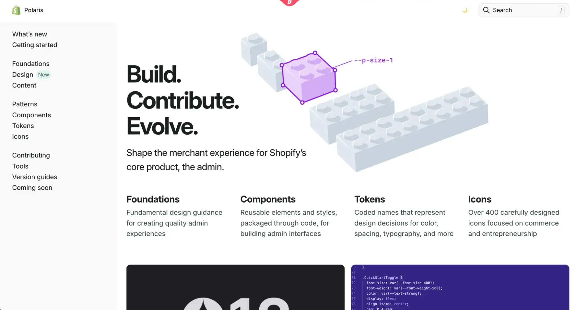
Shopify Polaris
Platforms like Shopify rely on a lot of third-party design and development for templates, plugins, and apps. Their design system, Shopify Polaris, provides detailed guidance for designers and developers to ensure the functionality and UX of all products are consistent in build and interface.
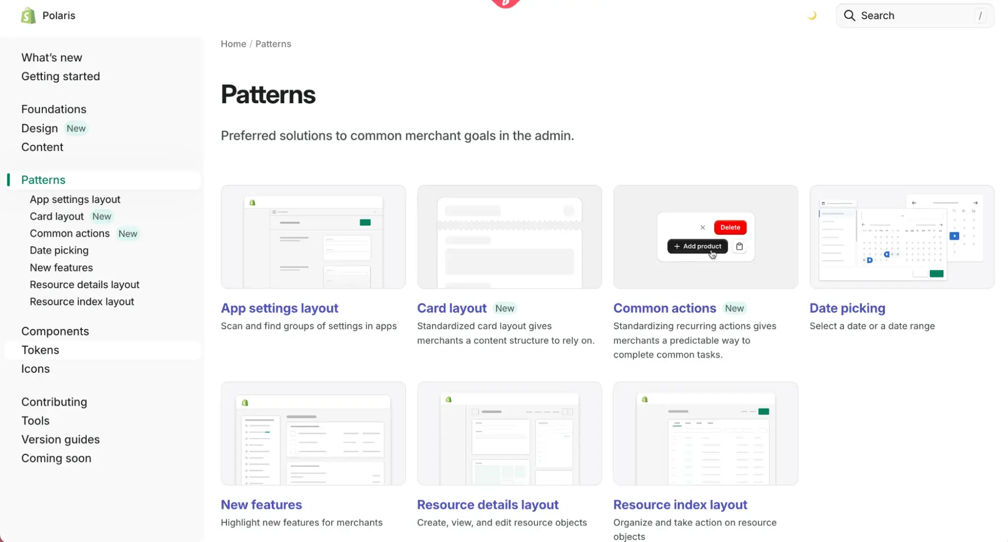
Shopify keeps the Polaris library updated regularly, with new versions of the system available for download and guidance on new features published regularly. I also noticed it provides an extension for VS Code (Visual Studio Code — a popular platform used by developers) that will autocomplete Polaris tokens within the code editor.
Free Website Design Inspiration Guide
77 Brilliant Examples of Homepages, Blogs & Landing Pages to Inspire You
- Agency Pages
- Ecommerce Pages
- Tech Company Pages
- And More!
Download Free
All fields are required.
Form not available
Apple Human Interface Guidelines (HIG)
Apple wants to ensure that any third-party app designed for iOS is designed and built to the same high standard as its own. So, Apple’s Human Interface Guidelines (HIG) provides guides and resources on everything from branding to accessibility best practices.
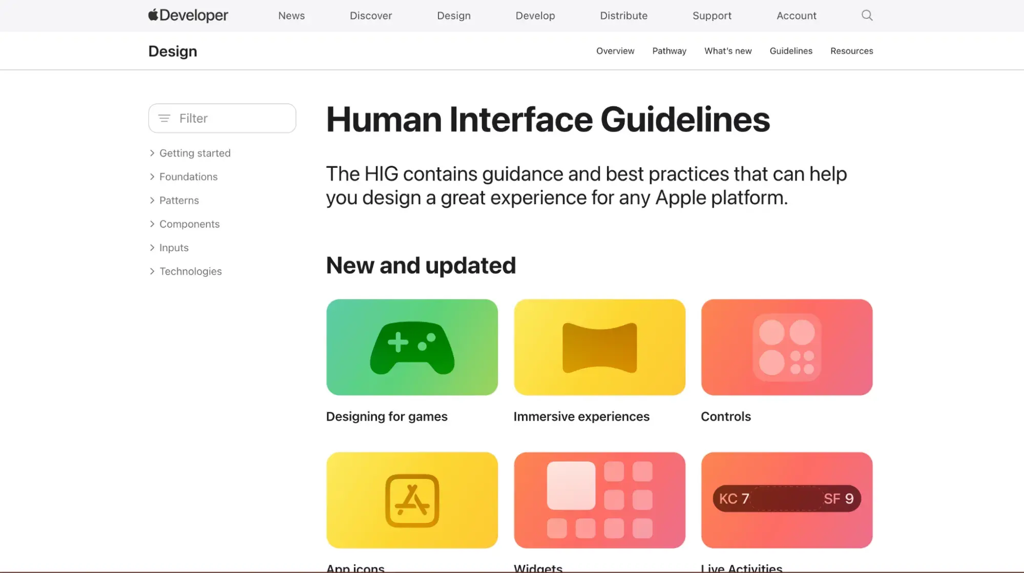
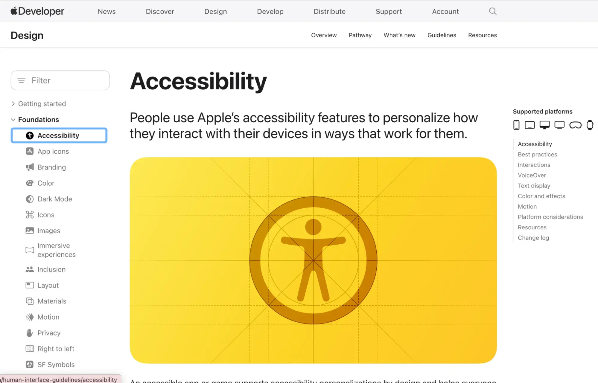
Since Apple has such a broad range of products, it’s no surprise that HIG is one of the most detailed design systems out there. It even provides resources for developing immersive experiences in visionOS, Apple’s operating system for augmented reality (AR) experiences.
Should you create a design system for your company?
Design systems are composed of many libraries, style guides, and guidelines, which are all designed to optimize your design efforts. While a challenge to maintain and drive adoption across a company, design systems can help you create products that provide better user experiences.
One question that occasionally comes up when I suggest implementing a design system is, “Do we really need one?” Sometimes, it’s not necessary. It’s also worth noting that a design system can be built out over time.
You may not need something quite as complex or in-depth as those provided by big brand names. But putting one in place early makes it easier to adapt and update as your products get more complex.
Below are some benchmarks that can indicate that the time is right to create a design system.
Your company is scaling fast.
As your company scales, it’s likely that your product and engineering teams need to scale quickly as well. Onboarding new team members quickly requires training to get them up to speed on design and development standards. Your existing team also needs to spend more time reviewing and providing feedback on other people’s work.
Design systems provide a foundation to make this transition much smoother. New team members have ready-made design and build guidelines to work with, and experienced team members can feel more comfortable handing work off to a quickly expanding team.
Your team (and customers) are starting to notice inconsistencies in your product.
People don’t need a designer’s eye to know when your product is starting to feel inconsistent in design or usability. It’s true your customers might not articulate it that way. But when I notice higher rates of feedback about the product being broadly difficult to use, I’ll often recommend taking a look at consistency as part of an overall evaluation of the feedback.
Additionally, your team members may start to flag concerns about inconsistencies. For example, a front-end developer gets a design mockup from a UI/UX designer, but the button style is not consistent with existing components. This requires extra work for the developer and confusion for the whole team.
Design systems provide component libraries to take all the guesswork out of these decisions and keep designers and developers aligned.
There are inefficiencies in your design and development processes.
There is so much room for inefficiency in product design and development. Lack of consistency and rules means duplicated efforts, unnecessary redesign and development of elements and a fragmented user experience.
I’ve seen front-end developers spending extra time figuring out new components like form behavior because it doesn’t align with previously implemented versions, and QA engineers having to test multiple versions of the same components. If you spot patterns like this, it’s time to stop and think about a design system.
You are planning a redesign or rebrand.
A redesign or rebrand is a common scenario in which I work on new websites and digital strategies. It’s the perfect opportunity to start introducing a design system, even a fairly simplified version that you can build on.
It can be tricky to implement a design system for products and websites that have already gone awry in terms of consistency. However, with a rebrand, you can build your design system as you design your new site or product.
Pro tip: A rebrand is also a good opportunity to incorporate more detailed customer and UX research into the process to guide the design principles you set.
How to Create and Implement a Design System
As I’ve said above, design systems do not need to be large and complex right away. That being said, you should be as detailed as possible. The more detail there is, the more useful the system will be for your designers and developers.
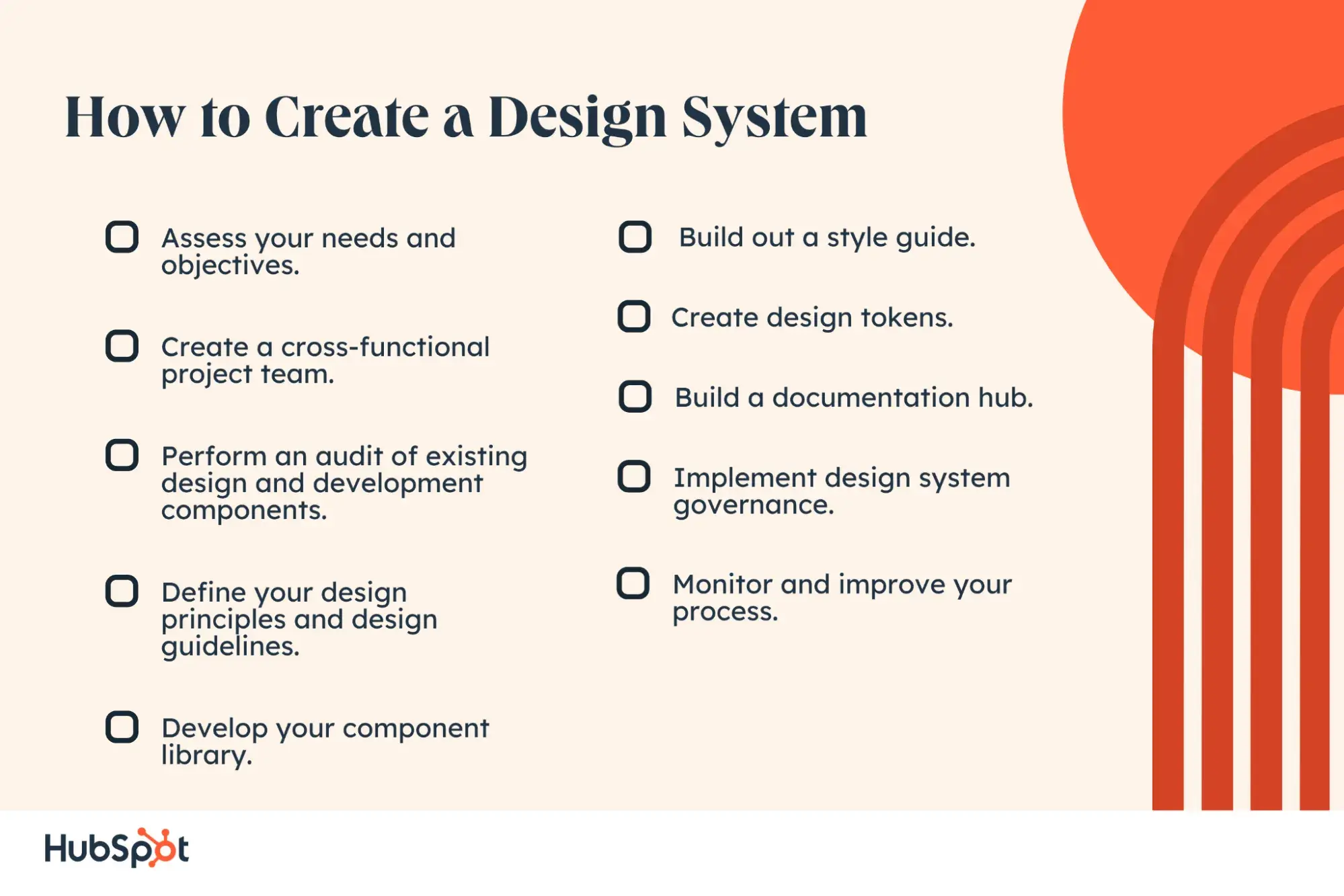
1. Assess your needs and objectives.
Like any project, my first recommendation is always to take a temperature check with a current state analysis. What are the problems currently? How would you prioritize them? That way, you can shape your design system around solving these specific challenges.
Pro tip: Well-organized feedback is essential here. You can use survey tools or group sessions with your product and engineering teams to identify key problems.
2. Create a cross-functional project team.
No design system can be created in a silo. You need representatives for everyone who will be creating and interacting with the design system to help guide the process.
A cross-functional project team across product and engineering ensures all bases are covered. I also recommend including stakeholders from customer success and marketing to include the customer perspective and for assistance with anything on the messaging side of things.
3. Perform an audit of existing design and development components.
Next, it’s time for the design system team to take a deep dive into the current interface and code base of your site and product. Identify what can be discarded and completely redeveloped and what should be retained and built into your component library or branding guidelines.
You can also identify any gaps in terms of components or patterns you’re likely to need in the near future by cross-referencing your existing UI components with the product roadmap.
4. Define your design principles and design guidelines.
Before getting into the specific components and patterns, take some time to outline and develop the fundamental design principles and guidelines for your system.
For example, Apple’s HIG system highlights simplicity, responsiveness, and ergonomics for its iOS development guidelines. Adobe Spectrum focuses on rational, human and focused UI design for as effortless a UX as possible.
5. Develop your component library.
Next, these design principles can be applied to the building of individual components for your component library.
Start with components that your team already uses, especially those used more regularly. For each component, describe the anatomy, options, behaviors, and content standards of each component.
Pro tip: Visual examples make any guidance you provide come to life for your designers and engineers, so be sure to include them.
6. Build out a style guide.
A style guide helps to define and standardize the overall look and feel of designs. It can include typography, colors, spacing, and more.
Pro Tip: I find it useful to develop overarching brand guidelines first, which can then be expanded into more specific guides for marketing assets, website development, or product design as needed.
7. Create design tokens.
Design tokens are useful anywhere you have hard and fast style guide rules to implement. A good example is a specific level of opacity on certain elements. Or corner radius levels for buttons.
Design tokens take your component library and make it far more scalable and efficient for your developers to implement.
8. Build a documentation hub.
When all the specifics are nailed down, I recommend making a well-organized space to document your entire design system.
Platforms like Confluence or Notion are good options, but anywhere you can publish and organize text, files, and links together will do. Hosting a design system like this also makes it easier to update individual areas as needed. I’ve worked on projects where early versions of design systems consisted of folders in a Google Drive, for example.
9. Implement design system governance.
Design systems are rarely static. As your brand or product develops, new components will need to be added, style guides updated, and guidance refreshed.
To keep up with these changes, regular reviews of the design system will help ensure it remains a useful asset for your team. This could be quarterly or annual, depending on how complex your design system is.
Pro tip: I also recommend setting up training for your team members on the new system once it’s ready. It’s something I always do with marketing and sales teams when introducing a new brand guide, and I find it helps enforce usage of the guidelines.
As you update your design system, regular refresher training on the design system also ensures new and existing team members are kept up to date.
10. Monitor and improve your process.
It’s unlikely that any design system is going to be perfect right away. Make sure you get feedback from the designers and developers who use it to see what improvements can be made.
As part of your governance structure, team surveys and feedback sessions can be incorporated into any updates plans you make during regular design system reviews.
Design Systems Create Cohesion and Efficiency — For Your Team and Users Alike
I know from experience that design systems can sound like a time-intensive and unnecessary task, especially for high-growth stage companies whose design and development teams are already under pressure.
But I’ve also learned that the resources you put into developing a design system will save hours and hours per team member once completed. It’s a long-term and highly worthwhile investment that keeps your development processes cost-effective and your websites competitive.
Editor's note: This post was originally published in April 2022 and has been updated for comprehensiveness.
Free Website Design Inspiration Guide
77 Brilliant Examples of Homepages, Blogs & Landing Pages to Inspire You
- Agency Pages
- Ecommerce Pages
- Tech Company Pages
- And More!
Download Free
All fields are required.
Form not available
Design


.webp)


![Icon Design: A Beginner's Guide [+ Resources]](https://53.fs1.hubspotusercontent-na1.net/hubfs/53/icon-design.png)