.png?width=112&height=112&name=Image%20Hackathon%20%E2%80%93%20Vertical%20(50).png)

In this article, I’ll show you how to use gradients in web design, including when (and when not) to use them. I’ll even show you the best gradient websites I found — showing you that, when done right, this design technique is fun and fresh.
Table of Contents
- What are gradients in design?
- Why Use Gradients in Web Design
- When I Avoid Gradients
- 20 Examples of Gradient Websites That Nail This Trend
- How to Make a Gradient for Your Website Design
- How to Use CSS to Create a Gradient in Your Website
- Could gradient web design work for you?
What are gradients in design?
Gradients are visual effects that involve a gradual and smooth transition between two or more colors. They add depth and a new dimension to a design, increasing its aesthetic appeal and making it look more real.
There are different kinds of gradients. For example, here’s a linear (or axial) gradient:

This gradient has two colors on opposite sides. In this case, there’s a light green color at the top of the box and a blue color at the bottom.
The green color smoothly transitions vertically, darkening gradually till it becomes blue. Linear gradients can go from top-bottom, bottom-top, left-right, right-left, and diagonal.
There’s another kind of gradient: radial gradient.

This gradient also has two colors: black and white. The white color, however, starts in the center of the box and gradually gets darker as it moves outwards in a circular shape until it becomes a deep black.
Color gradients are used in all kinds of things, from social media ads and websites to product packaging and even hair colors.
Here are some ways gradients are used specifically in website design:
- Backgrounds. Like me, many web designers use gradients as background colors for sections, headers, or entire web pages. This creates a more dynamic and visually interesting backdrop, as opposed to solid, flat colors.
- Buttons and UI elements. Gradients are applied to buttons, icons, and other user interface elements to give them a three-dimensional or glossy appearance. This can help draw attention to interactive elements.
- Text effects. Gradients can be used to add color variations to text, creating a subtle or bold effect. This is often seen in headings or call-to-action (CTA) text.
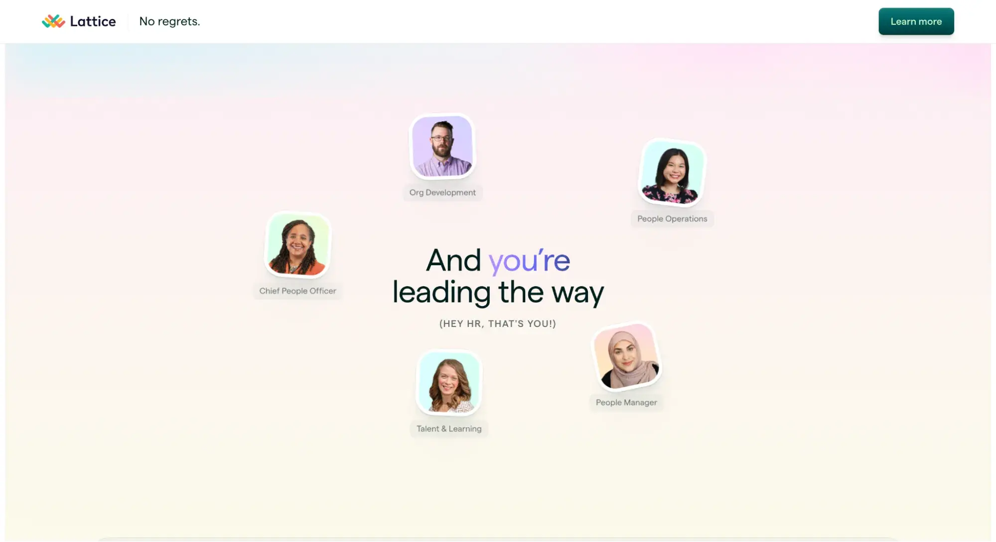
Here’s an example of a text gradient from Lattice:
- Image overlays. Some designers overlap gradients on images to enhance or modify the color tone of the images, making the text more readable or creating a specific mood.
- Shadows and highlights. Gradients can be used to simulate shadows or highlights, providing depth to the elements on the page. This technique is commonly used in card designs and interface elements.
- Masking and transitions. Designers can combine gradients and masking techniques to create smooth transitions between different sections or images on a webpage.
.png)
Free Website Design Inspiration Guide
77 Brilliant Examples of Homepages, Blogs & Landing Pages to Inspire You
- Agency Pages
- Ecommerce Pages
- Tech Company Pages
- And More!
Download Free
All fields are required.
Form not available
Why Use Gradients in Web Design
While gradients are a great web design tool/technique, they shouldn’t always be used. Below are three instances where I use gradients in web design, with examples:
1. To Draw Visitors’ Attention
When you combine the right colors in a gradient, you can use it to draw visitors’ attention to certain parts of your design.
I find that gradients are a more efficient and aesthetically pleasing way to highlight certain parts of your design than, say, annotations.
For example, here’s Dribbble’s hiring page.
What I love: The white minimalistic background helped the gradient image borders pop. This way, as people scroll through the page, their eyes catch the different-colored gradients. They pause a bit to inspect the images.
Another example of this in action is on Dropbox’s homepage.
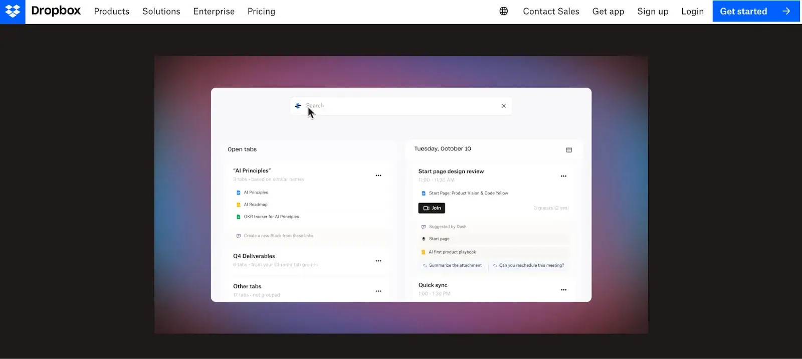
Apart from the animated video beneath the hero section (which is amazing, by the way), Dropbox’s background is a stark black color. This, I suspect, is why the gradient background works well to draw attention to the Dropbox demo halfway down the page.
What I love: The combination of blue, deep pink, and purple makes for a unique color blend that contrasts nicely with the black background and the bright white color of the demo video.
2. To Create a Cohesive Design
One of the best uses of gradients is to reinforce brand colors and maintain a consistent visual identity across a website. This helps you create a cohesive and recognizable brand presence.
A great example is Intercom’s homepage. The hero section’s background is blue, punctuated with a short video of how Intercom works when installed. Beneath the hero section are four other sections with gradients that represent Intercom’s brand colors.
Pay close attention to how Intercom combines radial and linear gradients to create a smooth transition of sections. It goes from a light blue to a dark blue and then a light yellow to a darker peach color.
What I love: As you scroll, the changes in the color are not jarring. Instead, they’re pleasing to the eye, and the different patterns of the gradients help you focus on the website copy.
Trello does the same thing on its homepage. In the hero section, we see a striking linear gradient that goes from deep purple to hot pink.
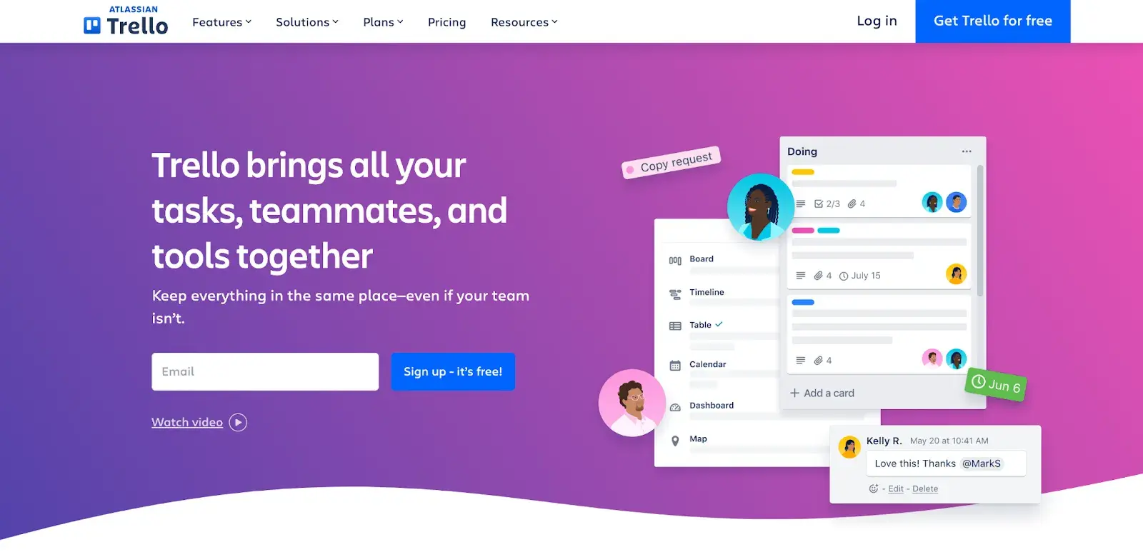
Underneath the hero section, there’s a small section that plays on these purple, blue, and pink hues to draw (and keep) visitors’ attention.
In a separate section close to the end of the page, there’s another linear gradient that goes from a dark blue to a lighter blue color.
At this point, you already know that blue, purple, and pink are Trello’s brand colors. Instead of using the solid versions of those colors, Trello combines them beautifully to create a stunning visual identity.
3. To Make a Design Memorable
Something I like to ensure when I design a website is that visitors never forget it. This is a tough feat to achieve, seeing as there are millions of beautiful websites scattered across the vast universe that is the Internet.
But in the few times I have designed websites (and the gazillion times I have browsed through websites), I realized that gradients that move are more memorable to me than static gradients.
Take a look at Lattice’s hero section:

The moving shades of green are so stunning to look at. While the moving gradient is only on the hero section of the Lattice website, it’s not one you forget easily. The same goes for Stripe, too:
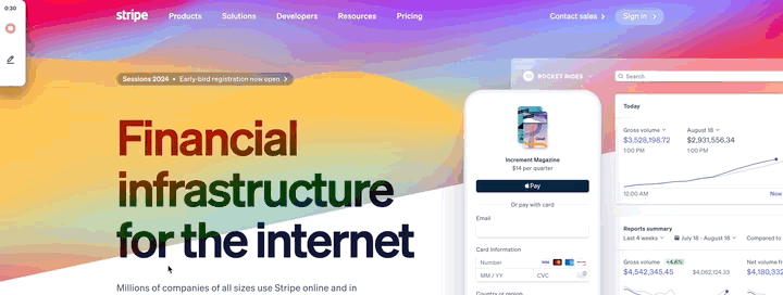
What I love: Instead of different shades of the same color, Stripe beautifully combined different but complementary colors, like blue, yellow, pink, purple, orange, and red, to create a breathtaking visual for its hero section background.
When I Avoid Gradients
Okay, now I have to share something with you: Gradients can get a bad rap in the design community. Why? They can easily be overused. They’re also often associated with the latest overhyped tech tool — especially if it’s an AI tool.
While gradients can enhance many designs, I believe that there are situations where you shouldn’t use them. Here are some examples:
- Minimalist designs. Although we’ve seen gradient borders used on a white background (which is moderate), gradients may not align with the aesthetic of minimalist designs, where simplicity and clean lines are prioritized. In such cases, gradients can introduce unnecessary visual complexity.
- High-contrast text. I’ve seen some websites that use gradients as backgrounds with readable text on top. It is possible (and common) to do, but if you’re not very good with colors or you need your text to be highly readable, it might be best to forgo gradients in that area completely. Failing to create sufficient contrast could negatively affect the user experience.
- Complex data visualization. If you’re including graphs and charts in your design, you should aim to make your data visualization clear and precise. Overly intricate gradients can distract from the information you’re presenting.
- Accessibility concerns. Brightly colored (and/or moving) gradients may not be accessible, especially for users with visual impairments. This is why you should know how to combine colors so that there’s enough contrast between text and background colors.
- Mobile responsiveness. Gradients may not always translate well to smaller screens, and their visual impact might be diminished on mobile devices. If you’re not sure how to make gradients remain effective and visually appealing across various screen sizes, it’s best not to use them.
If gradients won’t work, I opt for other ways to make my design cutting-edge. If you’re looking for more inspiration, check out our guide to the latest dominating design trends.
Free Website Design Inspiration Guide
77 Brilliant Examples of Homepages, Blogs & Landing Pages to Inspire You
- Agency Pages
- Ecommerce Pages
- Tech Company Pages
- And More!
Download Free
All fields are required.
Form not available
20 Examples of Gradient Websites That Nail This Trend
As I said above, these days, gradient web design is popular particularly in SaaS, AI, and other tech tools. It seems to be a shorthand way of communicating that something is techie or futuristic.
But, I wanted to show you the depth and breadth of gradient websites by finding examples across all sorts of industries.
So, below, get inspired by these examples of gradient web design — in technology, jewelry, eco-conscious products, and even entertainment.
1. HubSpot’s Breeze
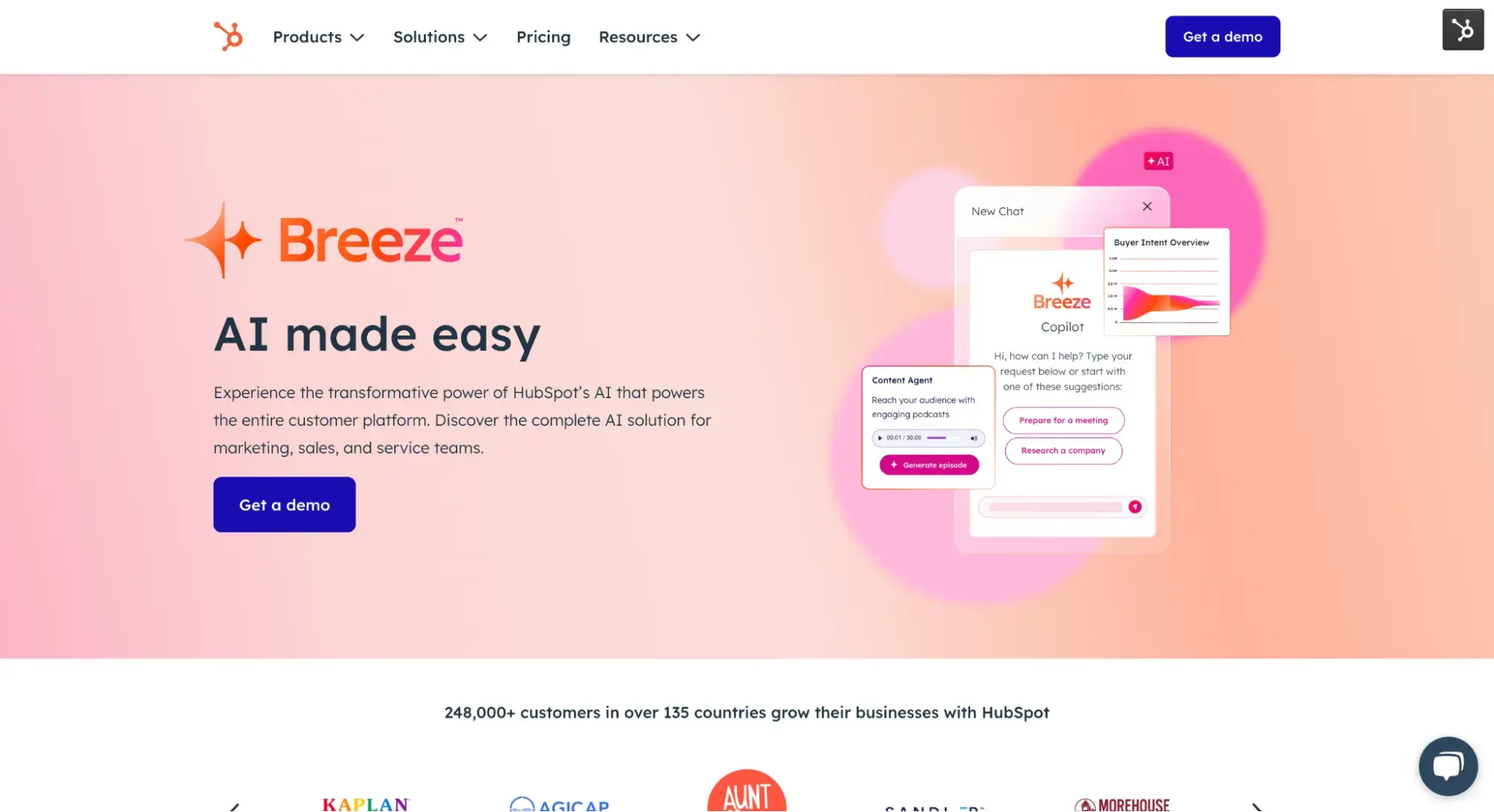
All right, so I might be a bit biased, but when I thought of examples of gradient websites, HubSpot’s Breeze landing page was the first thing to come to mind.
What I like: HubSpot’s designers chose to use pinks and oranges, plus some animations, to create a warm, on-brand, and futuristic-looking landing page for our AI product.
2. Tiffany & Co.
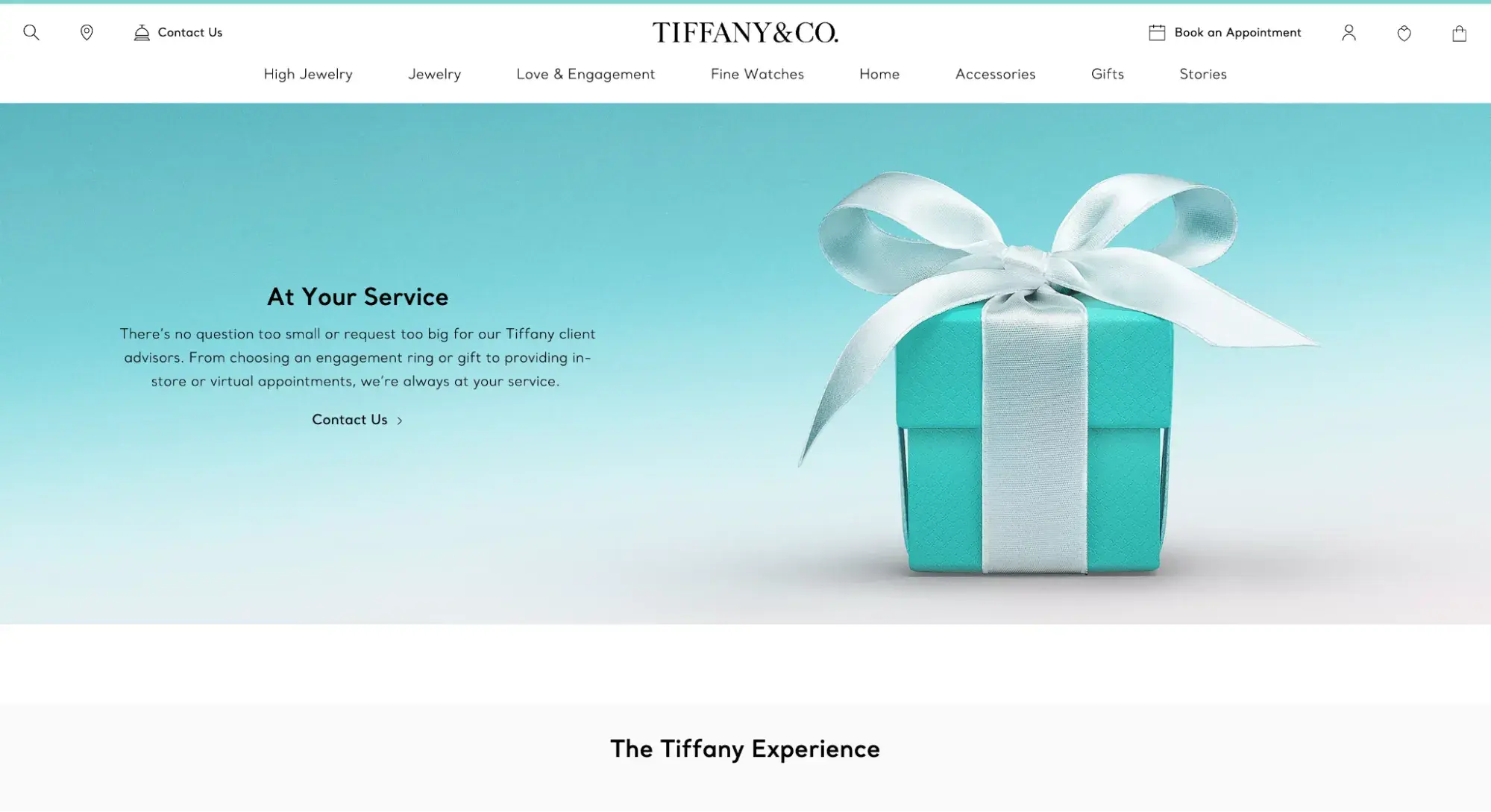
While gradient website design is rampant in the software industry, it’s rarer to find in high-end luxury brands. That’s why I was so excited to find this example of a gradient website from the iconic jewelry brand Tiffany & Co.
What I like: Tiffany managed to elevate gradients to the level of luxury. How? By keeping it simple with two colors from its brand palette. It also chose a static gradient, as motion can easily come across as gauche or overwhelming.
3. Capsul'in Zero Impact
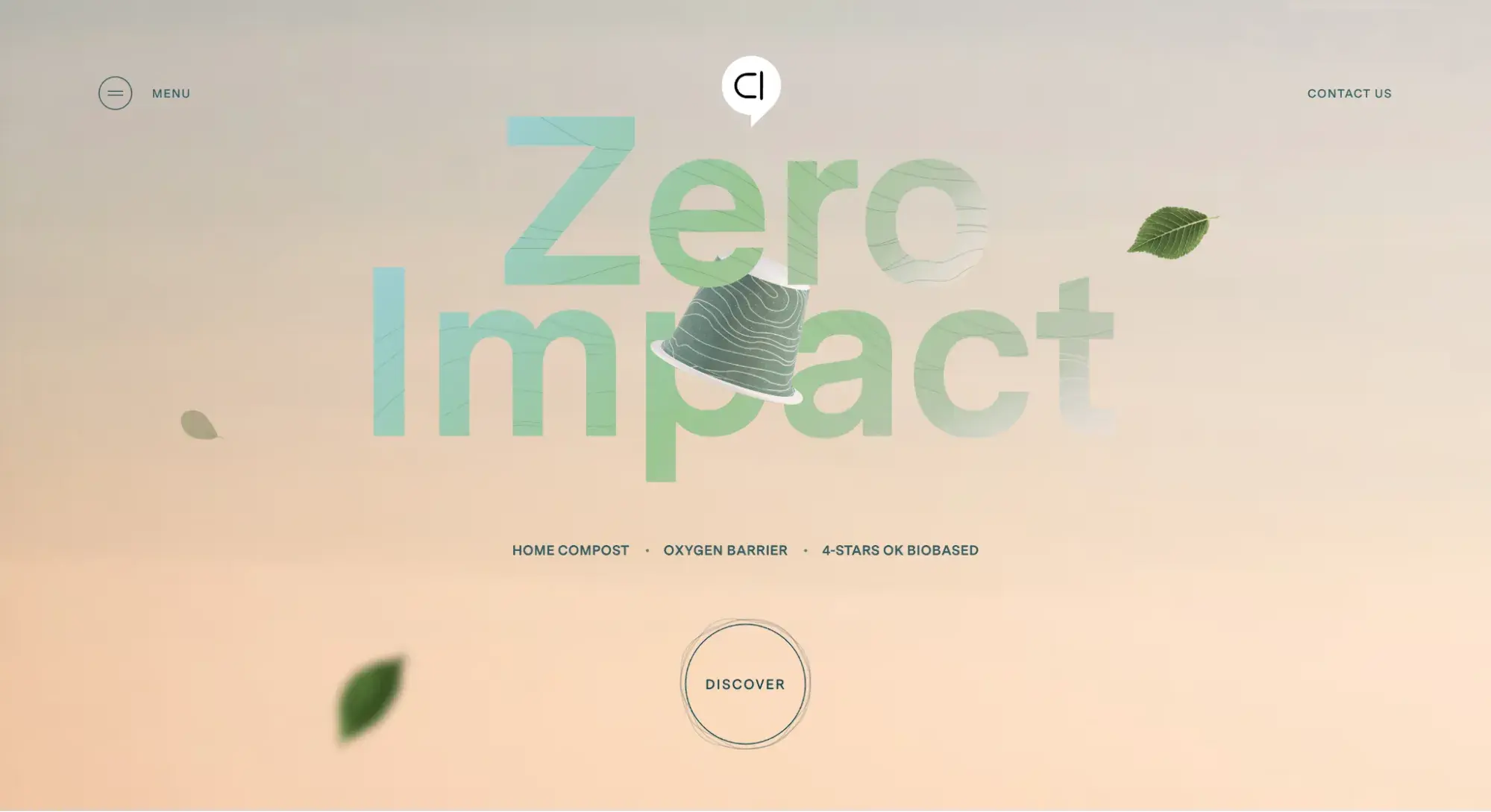
Capsul'in Zero Impact is a great example of using gradients to create a soothing, serene effect. This compostable coffee capsule brand uses both a gradient background and text gradient to convey tranquility and eco-consciousness.
What I like: Capsul'in Zero Impact uses a linear pattern along with the gradient effect inside of the text “Zero Impact.” This lends it some more texture, which I find visually appealing.
4. Vivian AI Copilot
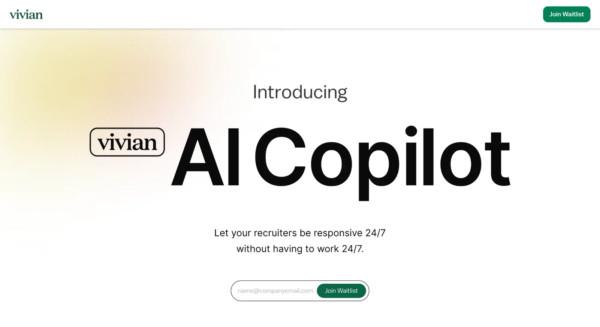
Here’s yet another example of how popular gradients are in AI products. Vivian AI Copilot, however, chooses to animate the entire gradient background to keep things lively.
What I like: Vivian carries the gradient background throughout the homepage as you scroll down, keeping the design cohesive.
5. Apple
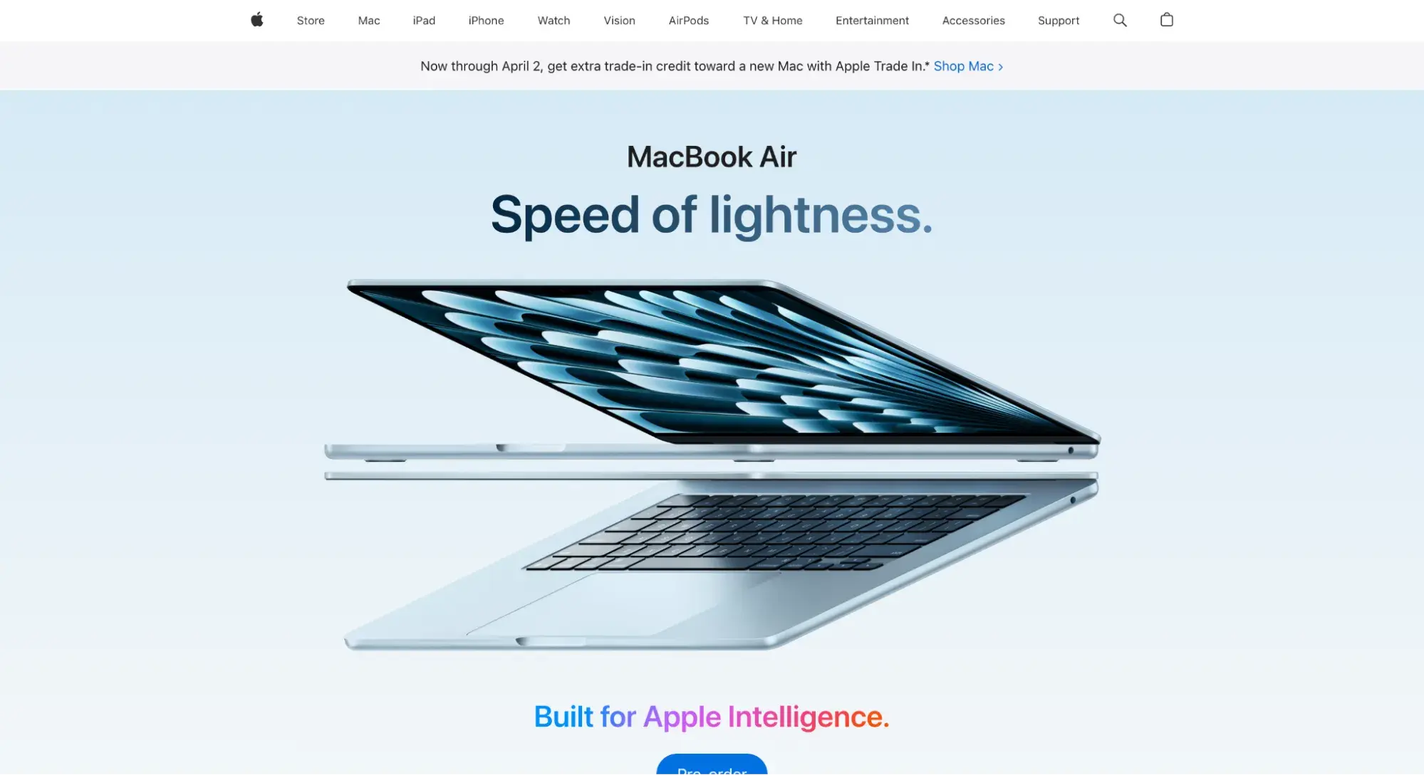
This MacBook Air example shows two uses of gradients: text effects (“Speed of lightness” and “Built for Apple Intelligence”) and background.
What I like: It’s also a great example of how subtle a gradient effect can be, as seen with the white-to-blue background, and how bold it can be, as seen in the vibrantly brilliant “Built for Apple Intelligence” text.
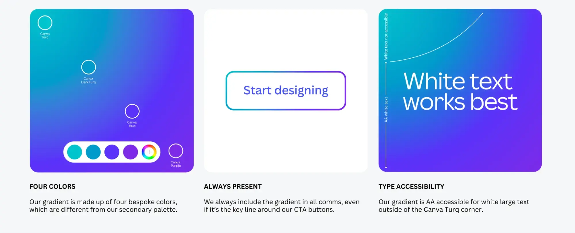
6. Canva
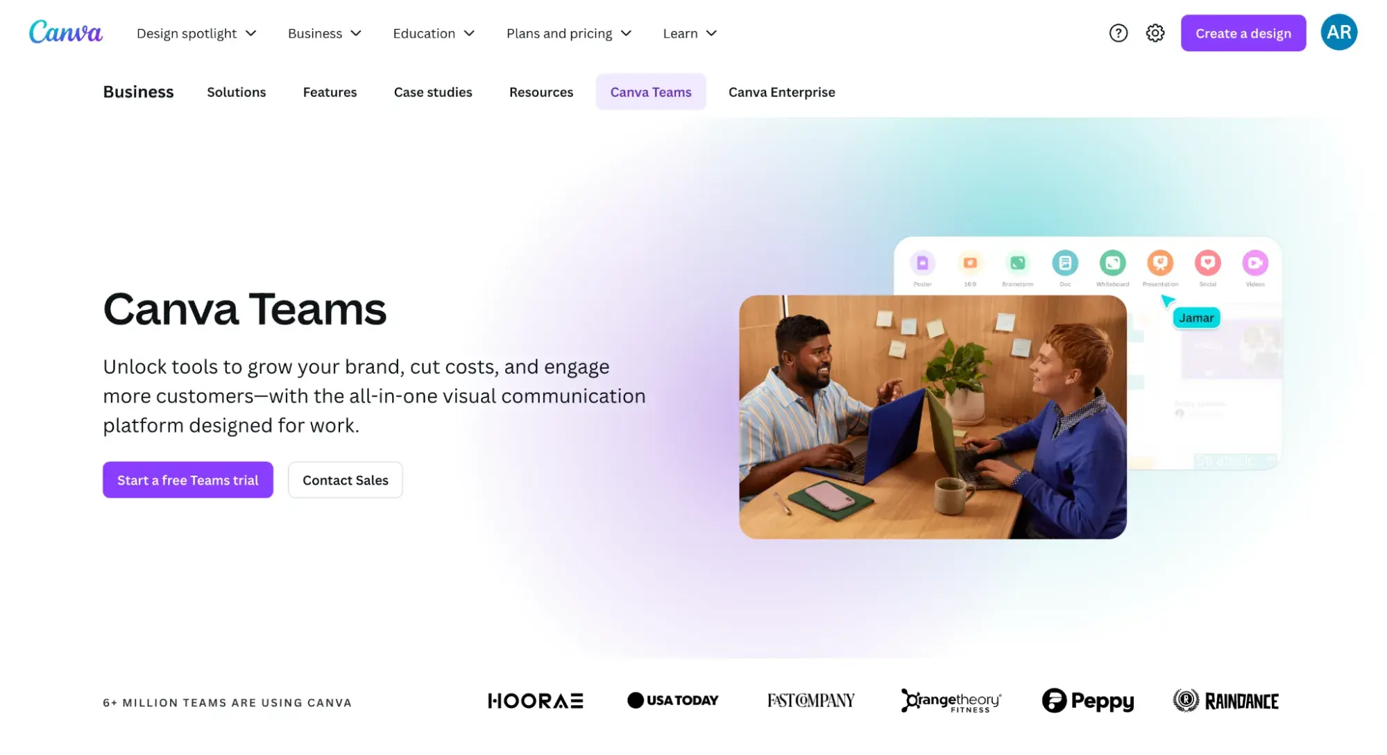
It’s no surprise that Canva uses gradients so well — it’s a design tool, after all! Notice the purple and blue gradient backdrop to the photos. It draws your eyes to them and really makes them pop in a way that a solid background couldn’t.
What I like: Canva is a great example of how to incorporate gradients into your brand identity. As its brand guidelines state: “You'll see our iconic gradient throughout our entire brand.”
The brand guidelines have an entire section dedicated to using the gradient properly, including how to align with accessibility standards. Bravo, Canva!
7. Mymind
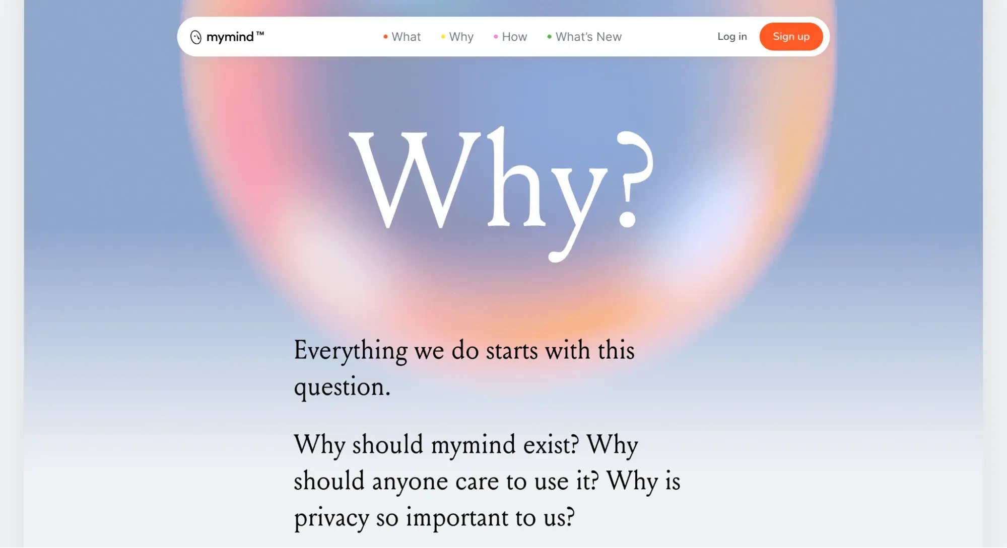
This prominent radial gradient gives the feeling of floating. The powder blue color mixed with oranges and pinks feels soothing.
What I like: This isn’t a tactic that would’ve worked for every website, but for mymind, it’s on brand. It’s a loud gradient that works well because it’s not on every page, which gives the eye a break.
8. Overflow
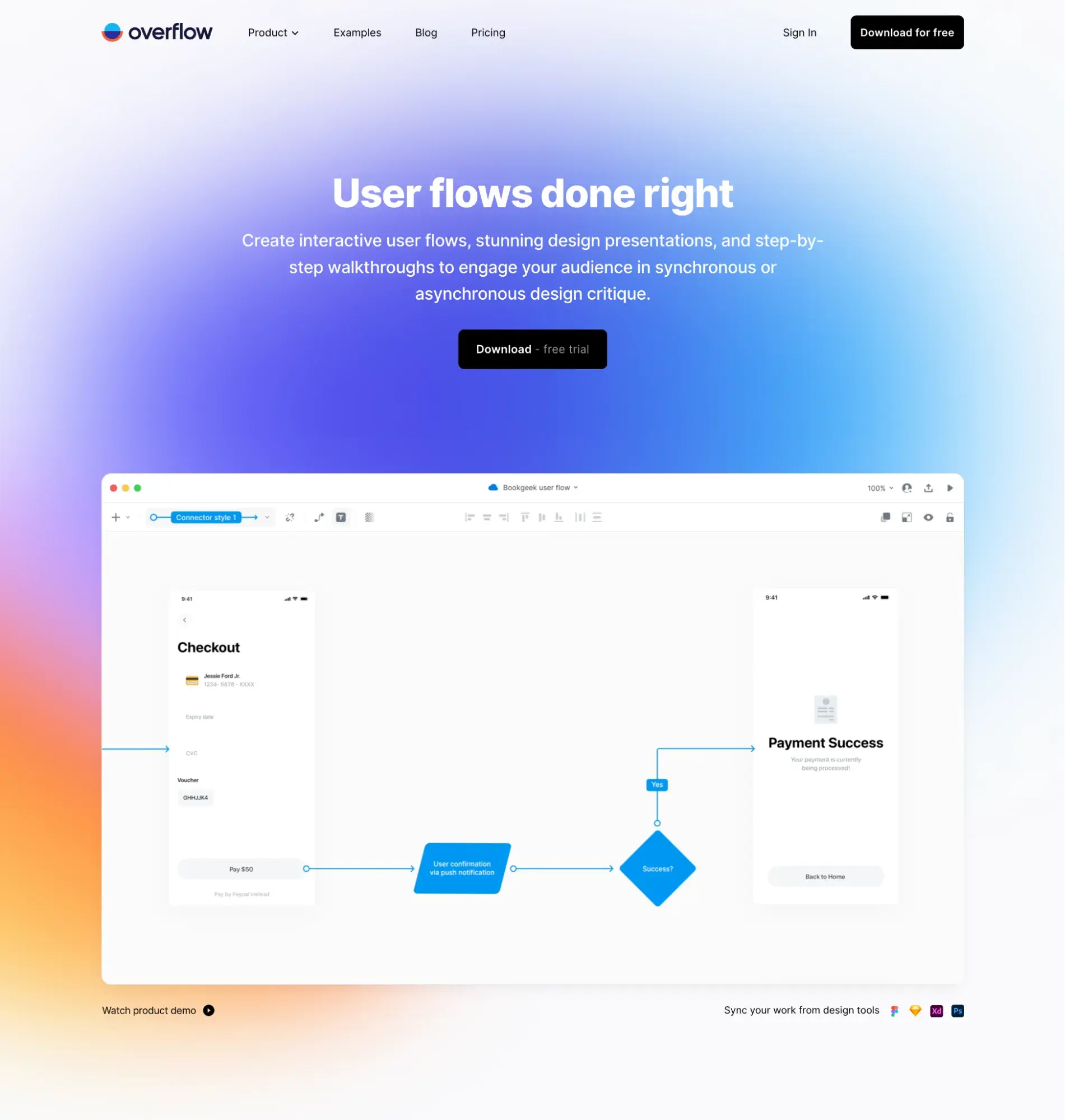
Overflow grabs your attention with a multi-colored gradient background that is big and bold. As you scroll, the gradient elements are still there, keeping things cohesive, but they’re subtler.
What I like: I hope you don’t overlook the complexity of incorporating this kind of gradient in a website. Because there are so many different colors taking up the entire background, Overflow had to carefully select the color of the text overlay and where it placed it.
I think Overflow did a great job of these design choices while keeping accessibility and color contrast in mind. Notice the placement of the main white text over the blue background.
But in places where the colors are lighter (such as the top navigation bar), Overflow switches to black text.
9. Wix
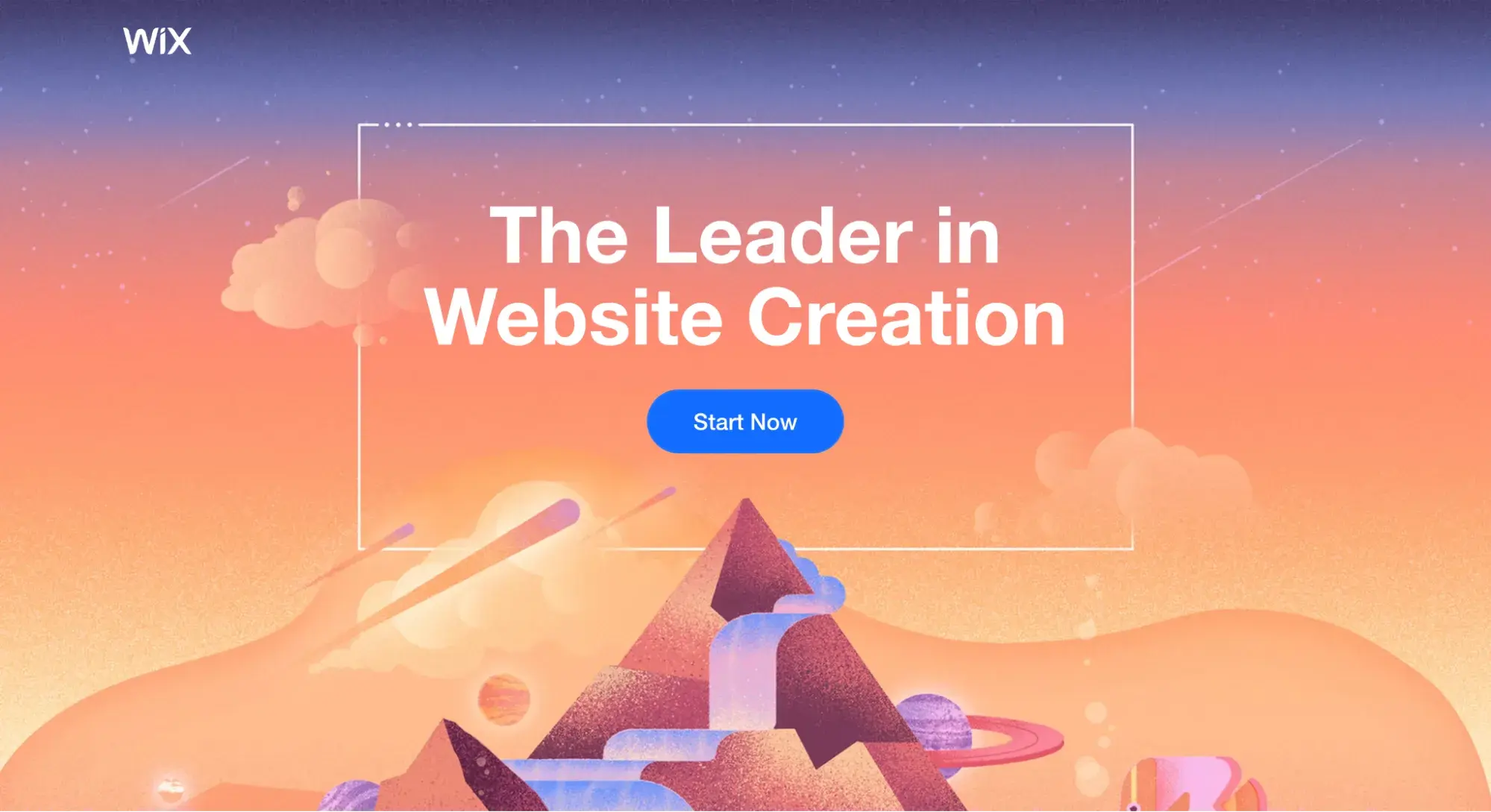
Wix uses a linear gradient and complementary colors to create a dazzling and futuristic landing page.
What I like: There is a lot going on with this landing page, and it easily could’ve been too overwhelming. But Wix balanced the strong colors with minimal text and futuristic-looking graphics to help me see the vision it had for its product.
10. Vercel
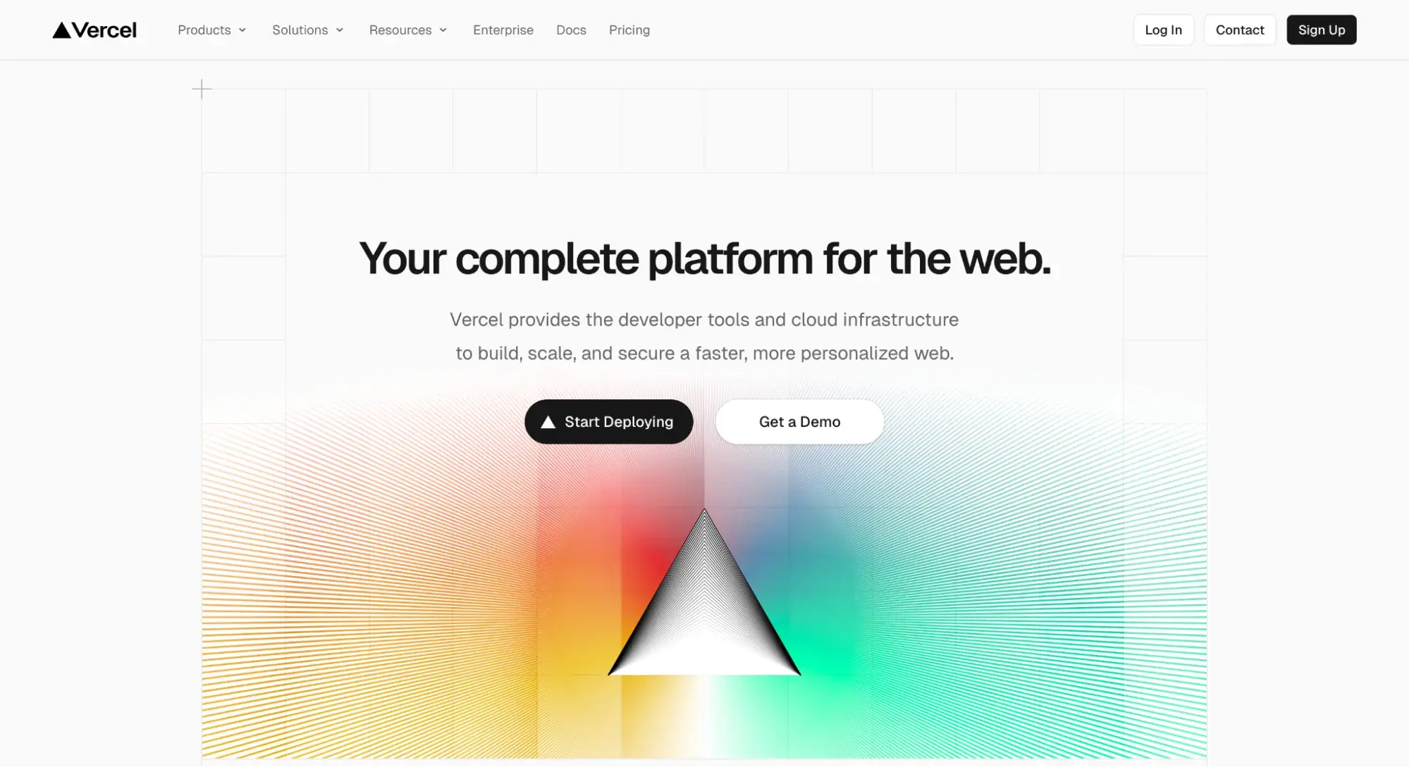
On its homepage, Vercel plays on the prism and the way it bends light to create this colorful gradient. There’s also animation and lines throughout the gradient.
What I like: This gradient/graphic choice is a bold, risky move, as it’s not directly related to the product (a cloud platform); it’s an abstract way of conveying a technical, forward-thinking brand.
11. McKinsey & Company
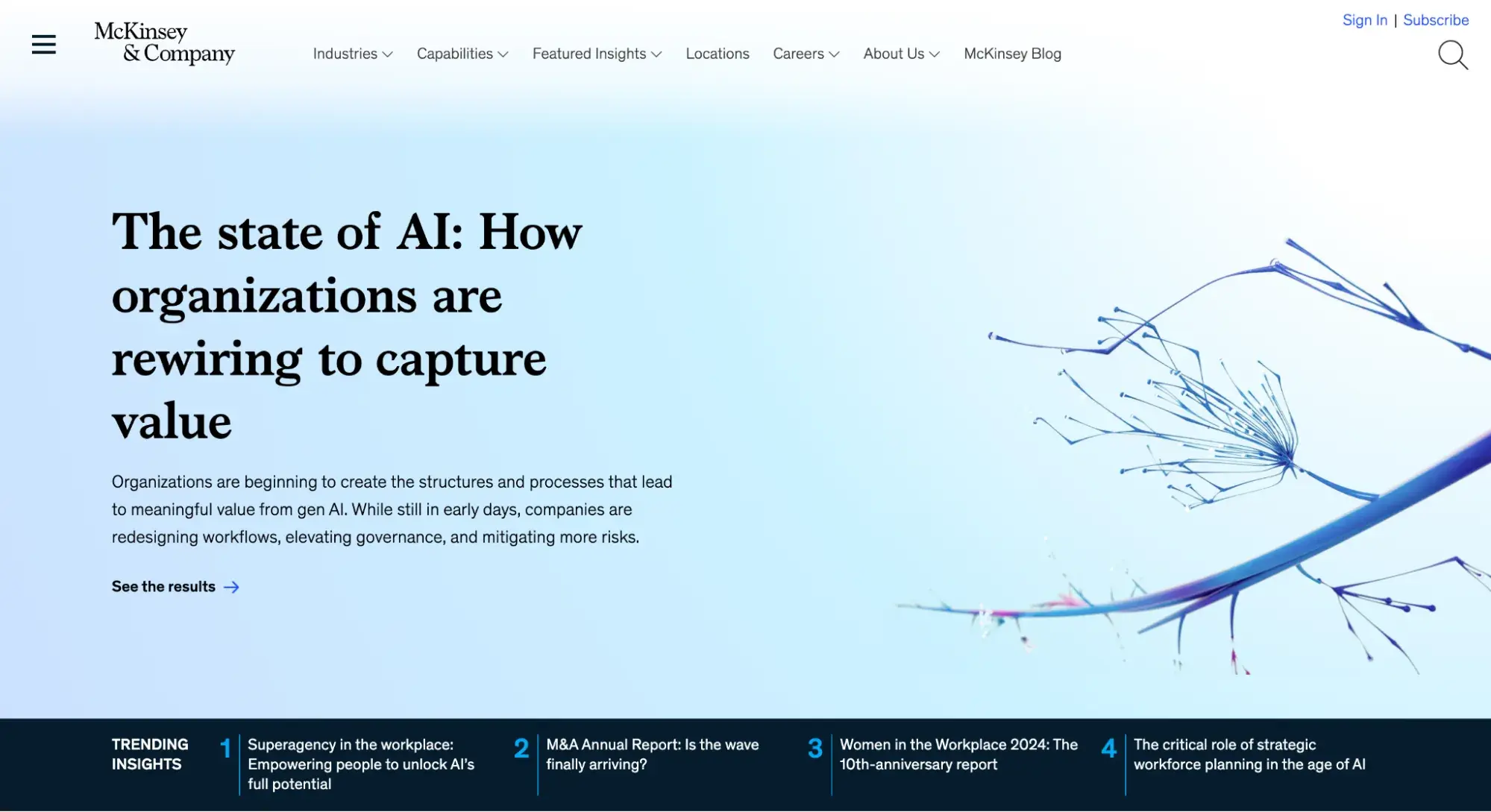
Shifting over to the world of consulting for a bit, McKinsey & Company shows how subtle gradients can still be corporate and professional.
Free Website Design Inspiration Guide
77 Brilliant Examples of Homepages, Blogs & Landing Pages to Inspire You
- Agency Pages
- Ecommerce Pages
- Tech Company Pages
- And More!
Download Free
All fields are required.
Form not available
What I like: McKinsey doesn’t overdo it. In this screenshot, it uses a subtle light blue gradient to add some depth to its hero section. Sometimes, understated is best.
12. Andrew McCarthy
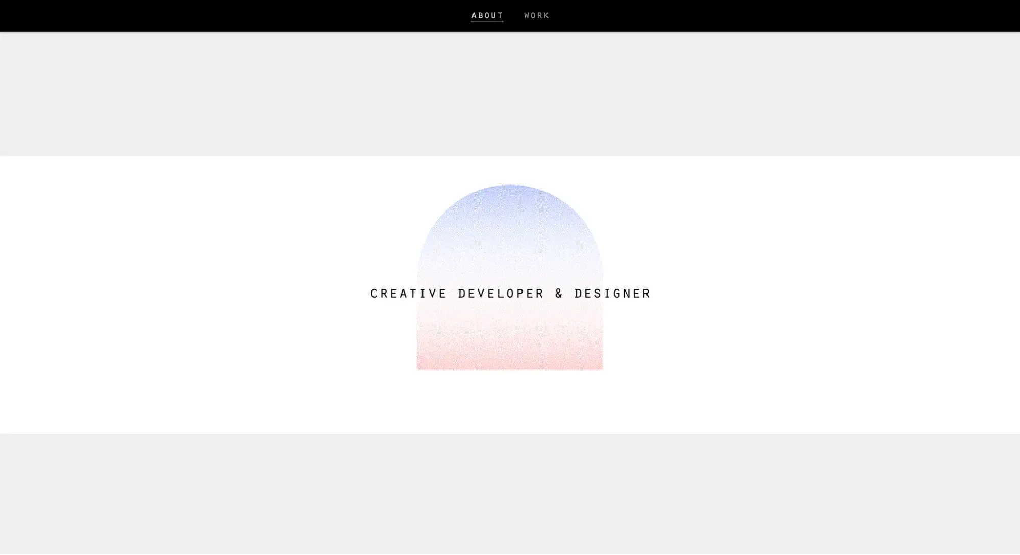
Developer and designer Andrew McCarthy uses a centered graphic with a gradient effect that changes as you scroll to keep things focused and visually interesting.
What I like: Similar to the Vercel example above, this is a bold move. But I like how the gradient graphic keeps my eyes focused on the words and shows off McCarthy’s creative side.
13. Luana Psaros
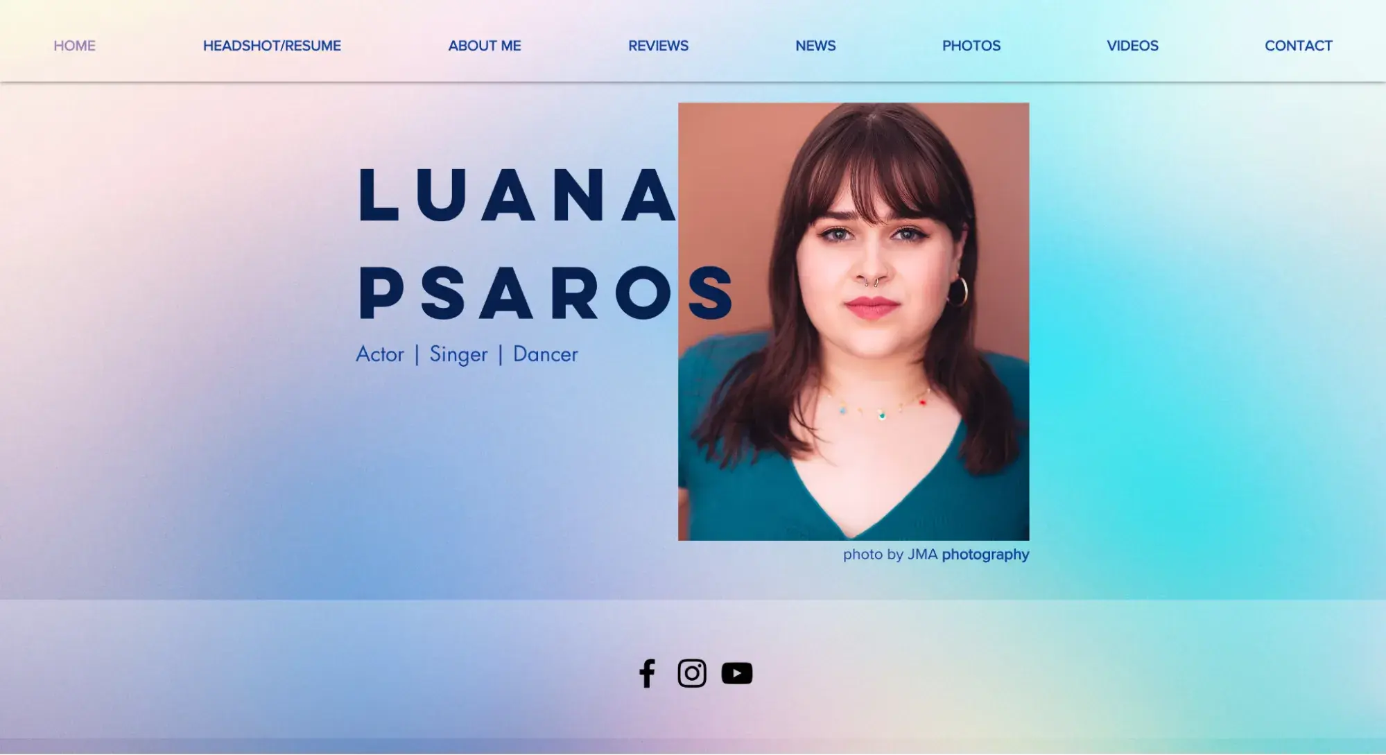
Here’s a gradient website design example from the entertainment industry. Luana Psaros’ resume site uses a gradient background to add visual interest to her website. The background remains consistent no matter which page you click.
What I like: I think this is such a pretty use of gradients and a great example that isn’t software-related! Also, some of the greenish blues match the hues in the shirt she’s wearing in her headshot, helping it feel cohesive.
14. Rivet Health
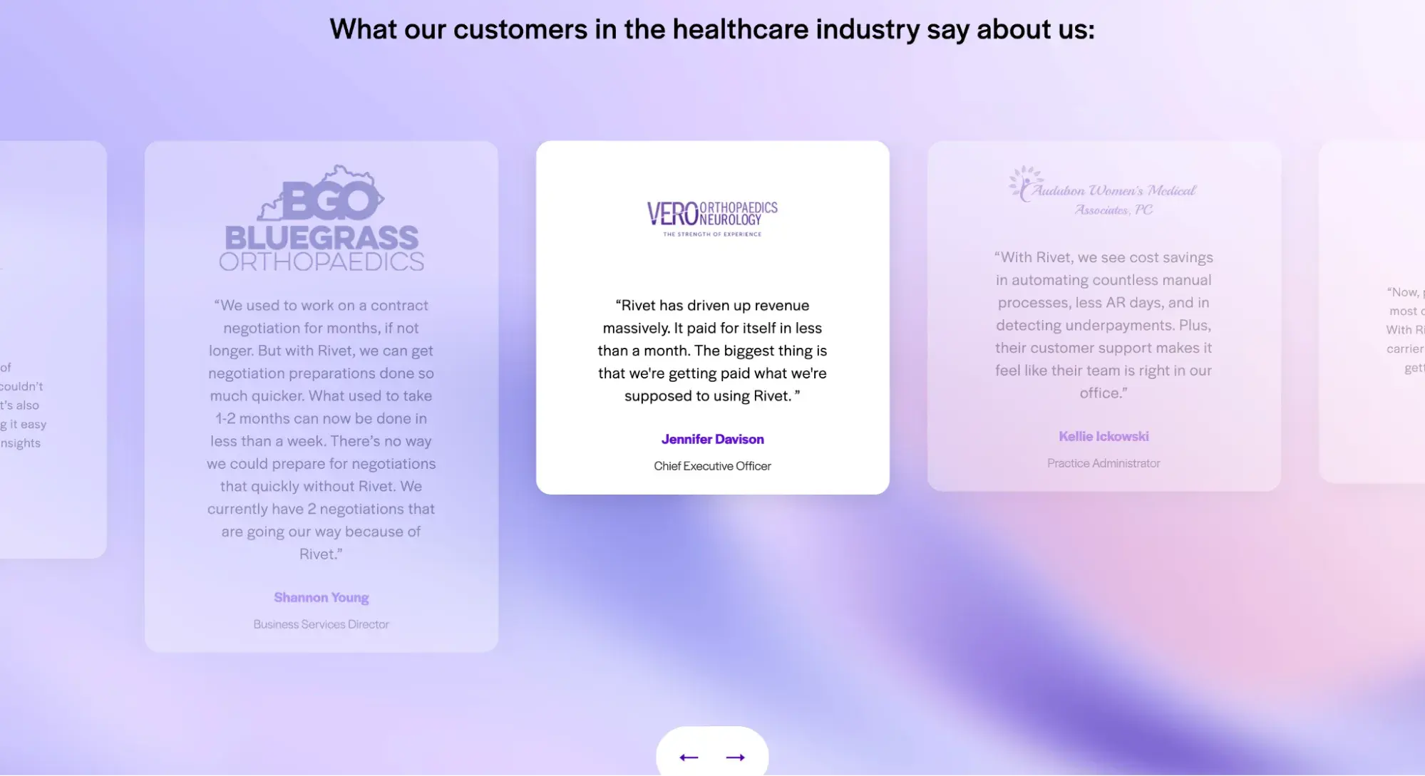
Rivet Health doesn’t lead with gradients. When you land on its site, you get a standard hero section with a solid gray background. But, as you scroll, you get pops of gradient backgrounds in some sections.
What I like: This is a great example of using gradients to add visual interest without overdoing it. The gradient sections add a nice break from the solid gray and white backgrounds.
15. Vye
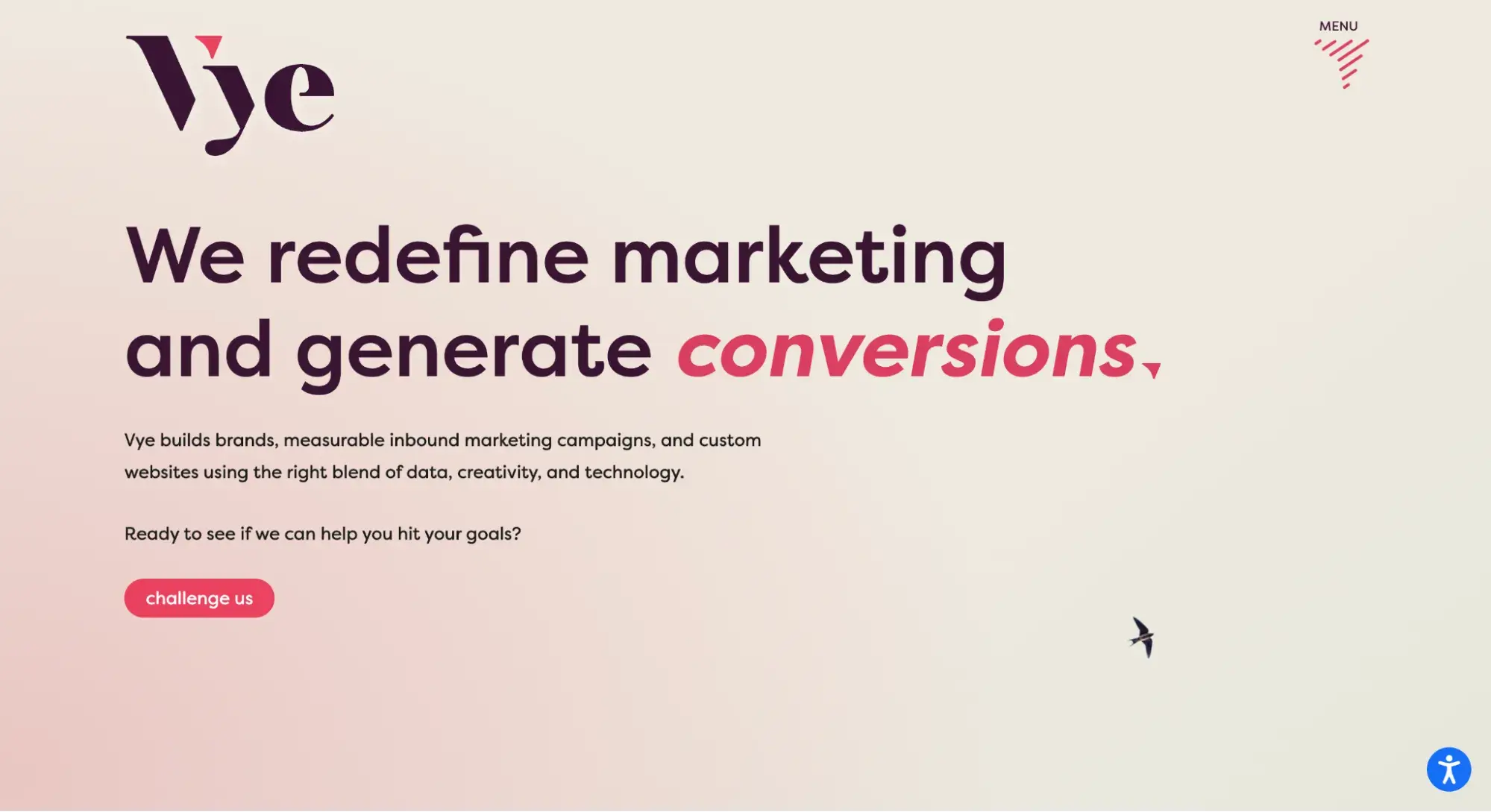
Vye agency’s gradient website is a great example of how this design technique can make up for a lack of images. When your product or service isn’t something that’s highly visual, you might struggle to find photos for your hero section.
Some sites might resort to stock images, but Vye does something else: It uses a pink and yellow gradient background to add visual interest.
What I like: Vye could’ve used a generic photo of people smiling at their computers, but that would be overplayed.
Instead, it uses a gradient background to add dimension while ensuring the visitor’s eyes remain focused on the value proposition: “We redefine marketing and generate conversions.” To me, that’s much more powerful than an image.
16. Friedrich
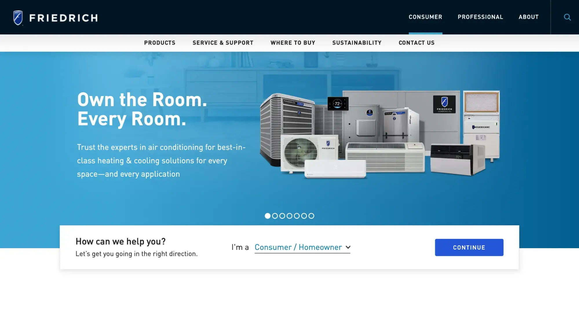
Here we finally have an example of a gradient overlay. Notice that there’s an image of furniture in the background that you can subtly see through the blue gradient — that’s an overlay.
It creates visual interest and, in this case, allows for two images to be layered together without clashing.
What I like: Friedrich uses gradients to infuse a bit of interest and fun into what could easily be a humdrum image of AC units.
17. Pillow
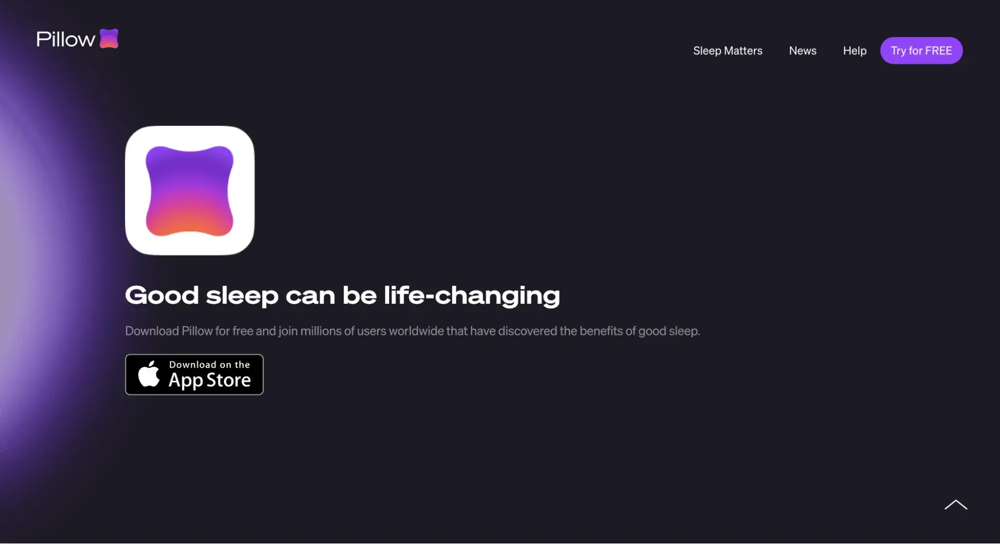
Pillow uses a gradient to add dimension to its logo. It also uses gradients across its homepage to highlight certain images and text. This creates a glowy, dreamy feel, which is fitting for a sleep app.
What I like: Pillow’s tasteful touches of gradients prove that this design technique doesn’t have to be loud or showy.
18. Ryze

Ryze’s gradient website design is so subtle you might miss it: The background of the hero image starts out lighter on the left and gets a tad darker as you move right toward the hand.
What I like: I can’t confirm, but I suspect that Ryze’s decision to use a gradient background on the image was so that the text would be higher contrast against the lighter background, and therefore, more readable. An accessibility win!
19. Bolt.new
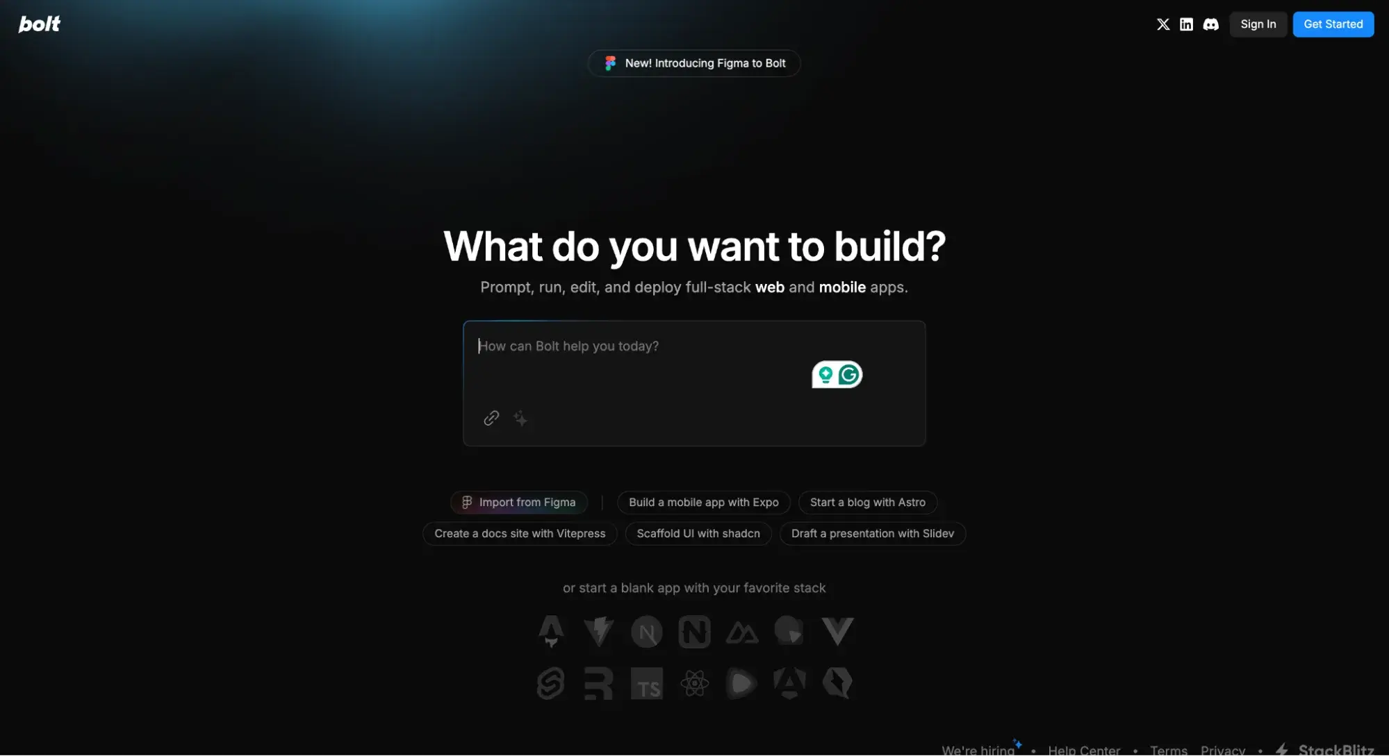
Like Pillow, Bolt.new uses gradients sparingly to highlight specific parts and add intrigue. Can you spot the three places?
- On the left of the top navigation bar
- On the left outline of the description box
- On the “Import from Figma” button
What I like: Bolt’s bold decision to use a black background means that the gradients really pop, creating a glowy, futuristic feel that’s fitting for the tech brand.
20. Sketch
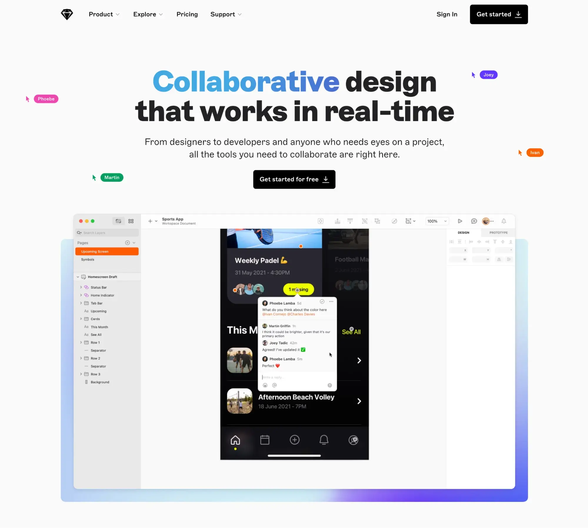
Sketch uses a text gradient to highlight the word “Collaborative,” plus a gradient background to help images stand out against the white background.
What I like: Sketch did a great job of using gradients tastefully. For example, had it made the entire headline a gradient, I think it would’ve been too much. But by intentionally choosing which parts it wanted to highlight, Sketch masterfully used gradients to its advantage.
Those were 20 of the best gradient websites I found, but if you want to broaden your scope and need more inspiration, take a look at these 77 examples of brilliant web designs.
How to Make a Gradient for Your Website Design
There are many ways to create a gradient effect for your website, but here are two simple methods:
- Use photo editing software to create a gradient image that you then upload to your site. You can easily do this through a CMS like Content Hub.
- Use CSS to create the gradient in the website itself.
I’ll walk you through both methods below.
Free Website Design Inspiration Guide
77 Brilliant Examples of Homepages, Blogs & Landing Pages to Inspire You
- Agency Pages
- Ecommerce Pages
- Tech Company Pages
- And More!
Download Free
All fields are required.
Form not available
How to Make a Gradient in Photoshop
If you’re looking to create a gradient in Photoshop, here are the steps to take:
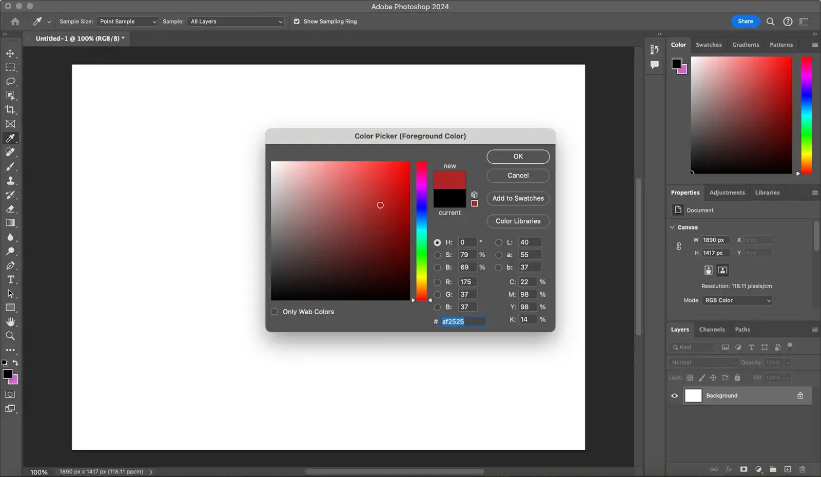
1. Open your Photoshop app and activate the Gradient tool.
When you open your Photoshop app, look at the toolbar on the left of your screen. Find the Gradient tool; it has a square-shaped black-to-white gradient icon.
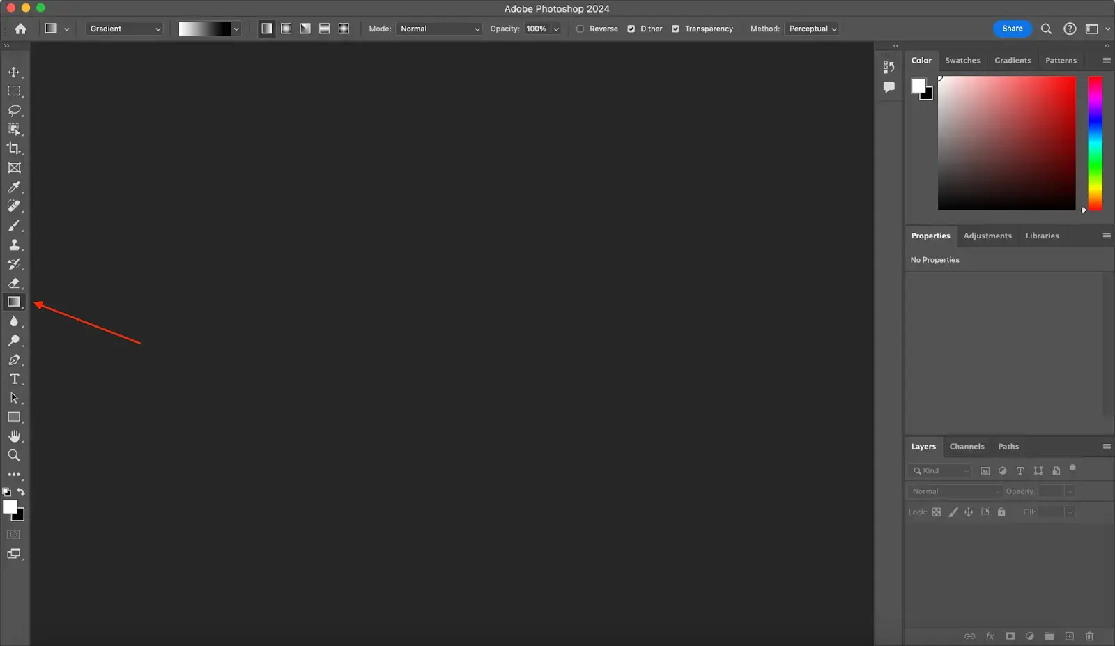
On the right side of the screen, you’ll see the color picker, where you can choose some basic colors you want for your gradient. In the top toolbar, you have a dropdown menu where you can pick a gradient from the gradient color classes (or gradient presets).
Beside the dropdown menu are icons representing the five common gradient styles: linear, radial, angular, reflected, and diamond.
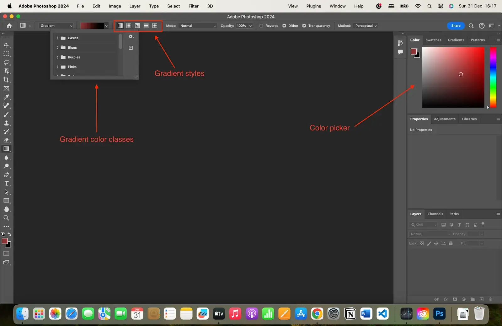
2. Set up your gradient.
If you want a simple gradient, pick one from the gradient presets in the dropdown menu. The options there are limited, but you can find some cool ones that may be just what your design needs.
But if you want to create a custom gradient, use the color picker and the toolbar to choose the gradient and gradient style you want.
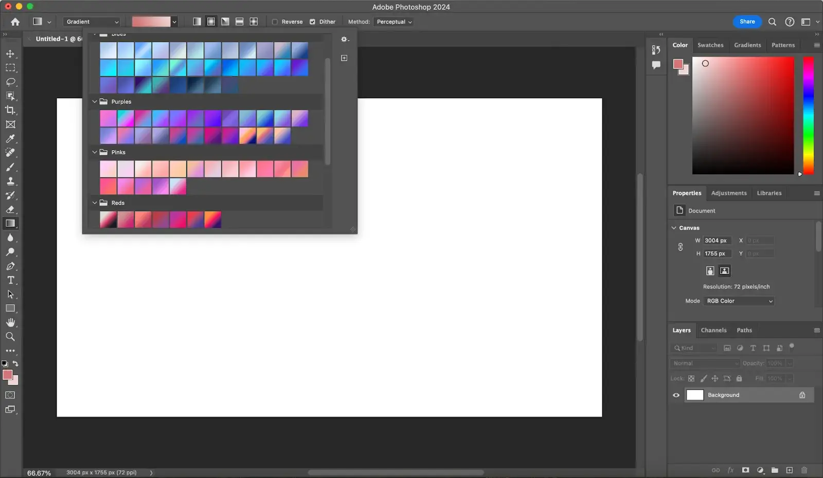
The colors you choose will stay in the Basics section of the gradient presets. Click on the dropdown menu, tap Basics, and choose your custom gradient.
3. Add and edit a gradient layer.
Next, click and drag across your canvas to add a gradient to it. If you have an image underneath, you can adjust the opacity of the gradient in the Properties panel. This makes the gradient transparent, so you can see the image below.
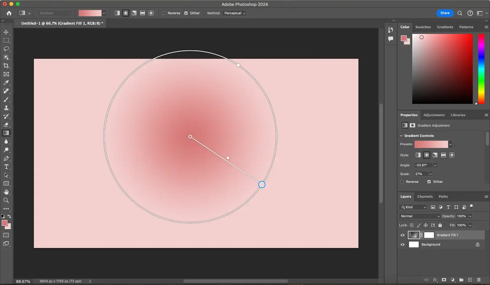
As you can see in the screenshot above, I have used a radial gradient style to create that gradient.
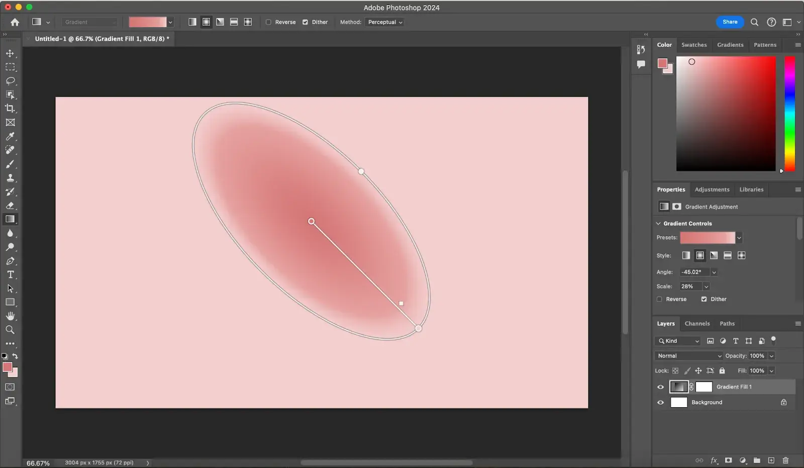
Once you create your gradient, use the on-canvas gradient tool to adjust the length and direction of the gradient. The further you drag the handle, the wider your gradient will spread.
If you’re creating a radial gradient like I am here, you can adjust the width of the circle to customize your gradient.
4. Add new colors.
You may notice that I’m currently using two colors in my gradient. But as you’ve seen, you can combine more than two colors to create a custom gradient. To do that in Photoshop, double-click on the color picker to choose a new color. I chose lilac.
Navigate to the Properties panel, where you’ll see the Gradient Controls Slider. Click anywhere along the bottom of the slider to add a new color stop and adjust its position. You can remove color stops by clicking and dragging them away from the slider.
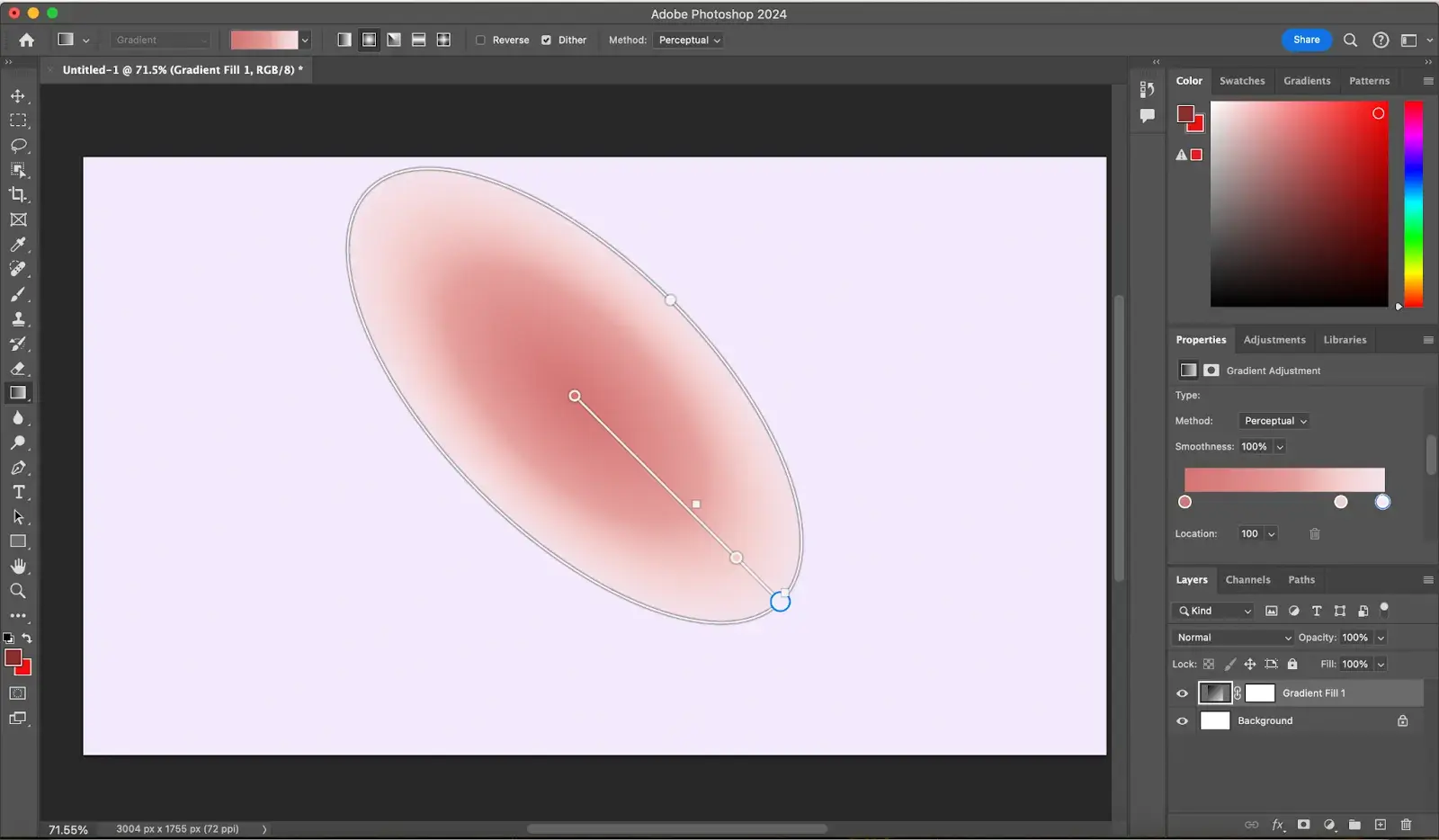
You can change where the colors meet and blend by adjusting the diamond-shaped icons on the canvas.
5. Change your gradient preset.
You can easily change the colors of your gradient by clicking the Gradient preset menu in the Properties panel or the options bar and selecting a new preset, which you can customize however you wish.
6. Change the blend mode, etc.
In the Properties panel or options bar, there are many features to customize your gradient. For example, you can choose a blending mode, change the opacity percentage of your gradient, and save the preset.
If you want to reverse the order of colors in the gradient fill, check the Reverse box. And if you want a smoother blend, check the Dither box.
7. Save your gradient.
If you plan to reuse the custom gradient you’ve created, click on Save preset in the Properties panel and choose a name for your gradient. Once you save, your new gradient will be added to the bottom of the Gradient preset dropdown menu.
How to Make a Gradient in Canva for Free
Adobe Photoshop is a paid tool — and you may want to create simple gradients without having to pay. That’s where Canva comes in. This free-to-use online graphic design tool has the features you need to create all kinds of gradients.
Here are the steps to take:
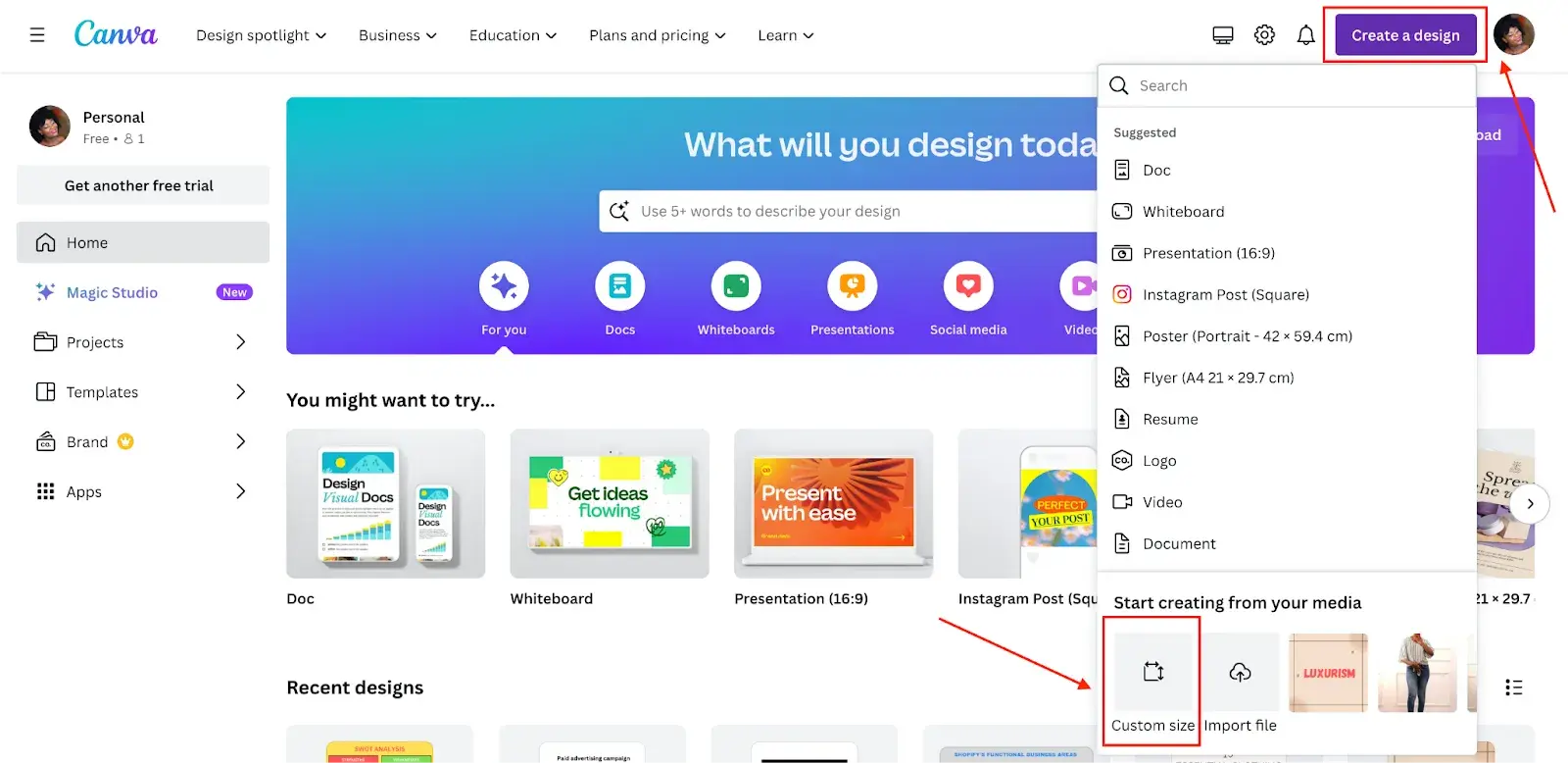
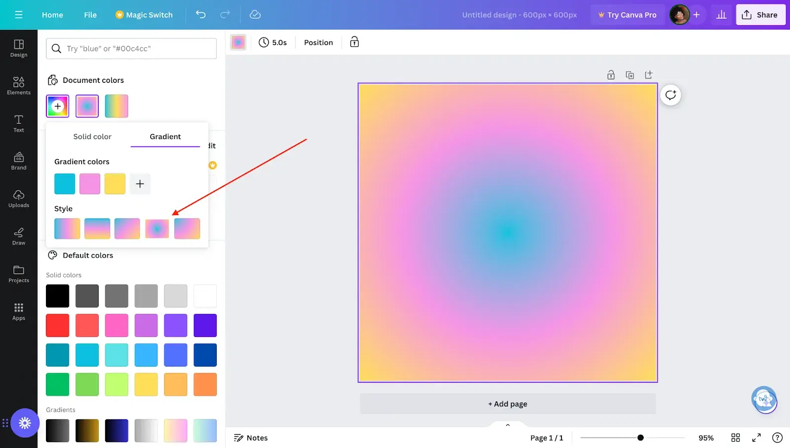
1. Open Canva and create a design.
Visit Canva.com, log in (or sign up), and click the Create a design button at the top-left corner of your screen. You’ll see some items with predetermined dimensions, such as doc, whiteboard, presentation, Instagram post, flier, logo, etc.
You can choose any of these depending on what you want to design, but if your preferred sizes are not there, click on Custom size and input your preferred width and height.
2. Add a color and use default gradient styles.
Here’s what your screen will look like after inputting your custom size. I did 600 x 600 px.
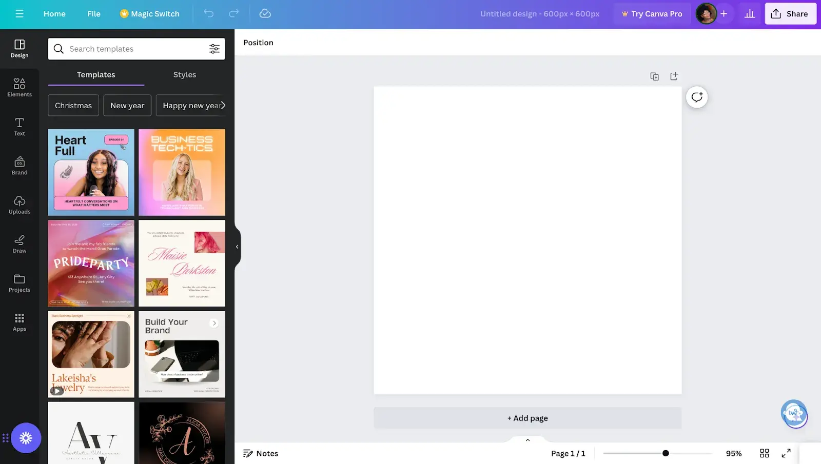
Click on the empty canvas and navigate to the color tile in the editor toolbar. Then, scroll down to the Gradients section and select your preferred gradient style.
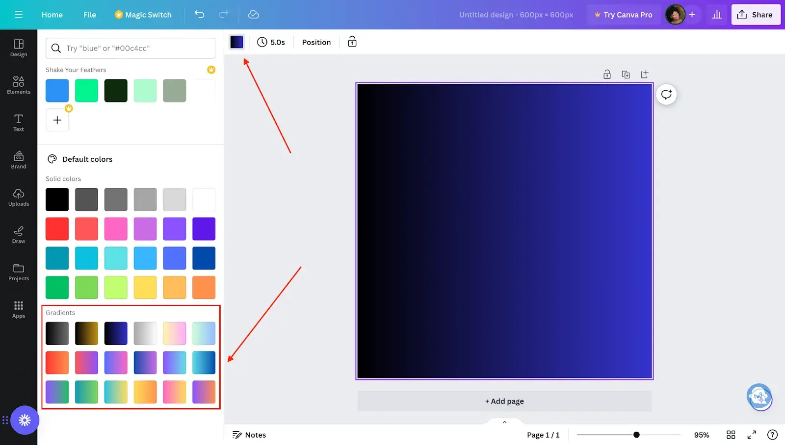
3. Create custom gradients.
As you can see, the default gradient options are very limited, and you’ll likely want to make a custom gradient with your own mix of colors. You can do that with Canva, too.
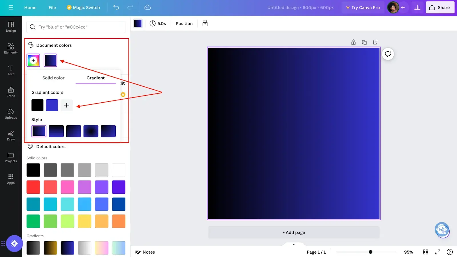
All you need to do is navigate to Document colors (this is above the Gradients section) and click the “+” to add a new color. Go to the Gradient tab and click the “+” sign to add a new color. You can add up to 10 gradient colors.
To delete a color, select the color tile you want to delete and click Delete color.
4. Style your gradient.
You can change the color order by moving the color stops underneath the Gradient colors subsection.
Beneath the Gradient colors subsection, change the style of your gradient (e.g., linear gradient, horizontal gradient, diagonal gradient, radial gradient, and more).
How to Use CSS to Create a Gradient in Your Website
Now that you’ve seen how to create gradient images to upload to your site, let me show you some ways you can use CSS to create gradients on your website.
We actually already have a few blog posts on how to do just that, depending on your goal:
Another option is to use a CSS gradient generator and copy-paste the code into your site.
Could gradient web design work for you?
Gradient web design isn’t for everyone, but I love how it can infuse a sense of fun and dimension. With gradients, you can play around with different colors, styles, and even movements to create a vibrant design that draws (and keeps) your audience’s attention.
Certain types of products and industries will be more conducive to this design technique, particularly design- or AI-related software. But you could always try pioneering it in your niche.
So, if your website is feeling a little flat, try adding gradients. You might just surprise yourself with how they can help your design come to life.
Editor's note: This post was originally published in January 2024 and has been updated for comprehensiveness.
Free Website Design Inspiration Guide
77 Brilliant Examples of Homepages, Blogs & Landing Pages to Inspire You
- Agency Pages
- Ecommerce Pages
- Tech Company Pages
- And More!
Download Free
All fields are required.
Form not available
Website Design Examples


![15 black and white website designs to inspire your own [+ pro tips]](https://53.fs1.hubspotusercontent-na1.net/hubfs/53/black-and-white-website-design-1-20250520-1336267.webp)

![15 Brochure Website Examples to Inspire You [+ How to Make One]](https://53.fs1.hubspotusercontent-na1.net/hubfs/53/brochure-website-examples-1-20250319-362228.webp)
![28 Types of Websites to Inspire You [+ Real-Life Examples]](https://53.fs1.hubspotusercontent-na1.net/hubfs/53/types-of-websites.png)


![10 of my favorite interactive websites [+ how I make my own]](https://53.fs1.hubspotusercontent-na1.net/hubfs/53/%5BUse%20(1)-Sep-27-2025-03-02-58-8817-PM.webp)