.png?width=112&height=112&name=Image%20Hackathon%20%E2%80%93%20Vertical%20(50).png)

1. Rush Medical Center
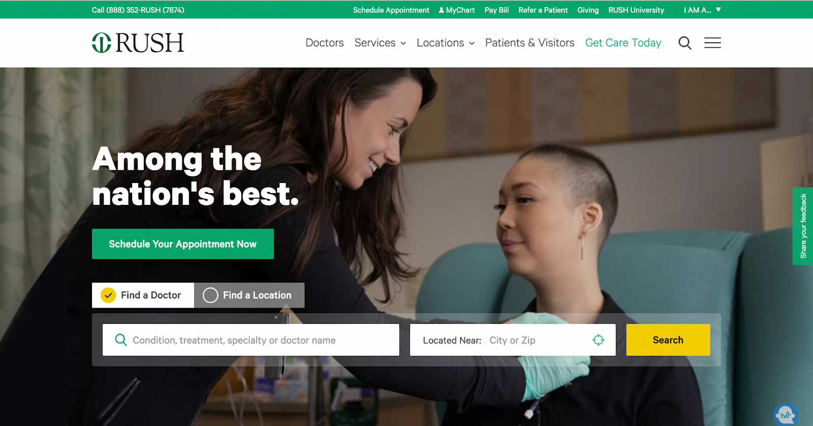
Based out of Chicago, Rush University Medical Center is a reputable hospital that aims to “transform healthcare through education, research, and innovation.”
The easy-to-navigate website conveys the importance of scheduling doctor’s appointments with the hero image of a person being examined by a doctor. Above the image, this website gives visitors a quick way to find a doctor, make an appointment, and get access to health information.
What we like: When you scroll further, you’ll find well-written articles on Rush Medical Center's achievements.
2. Rest Assured
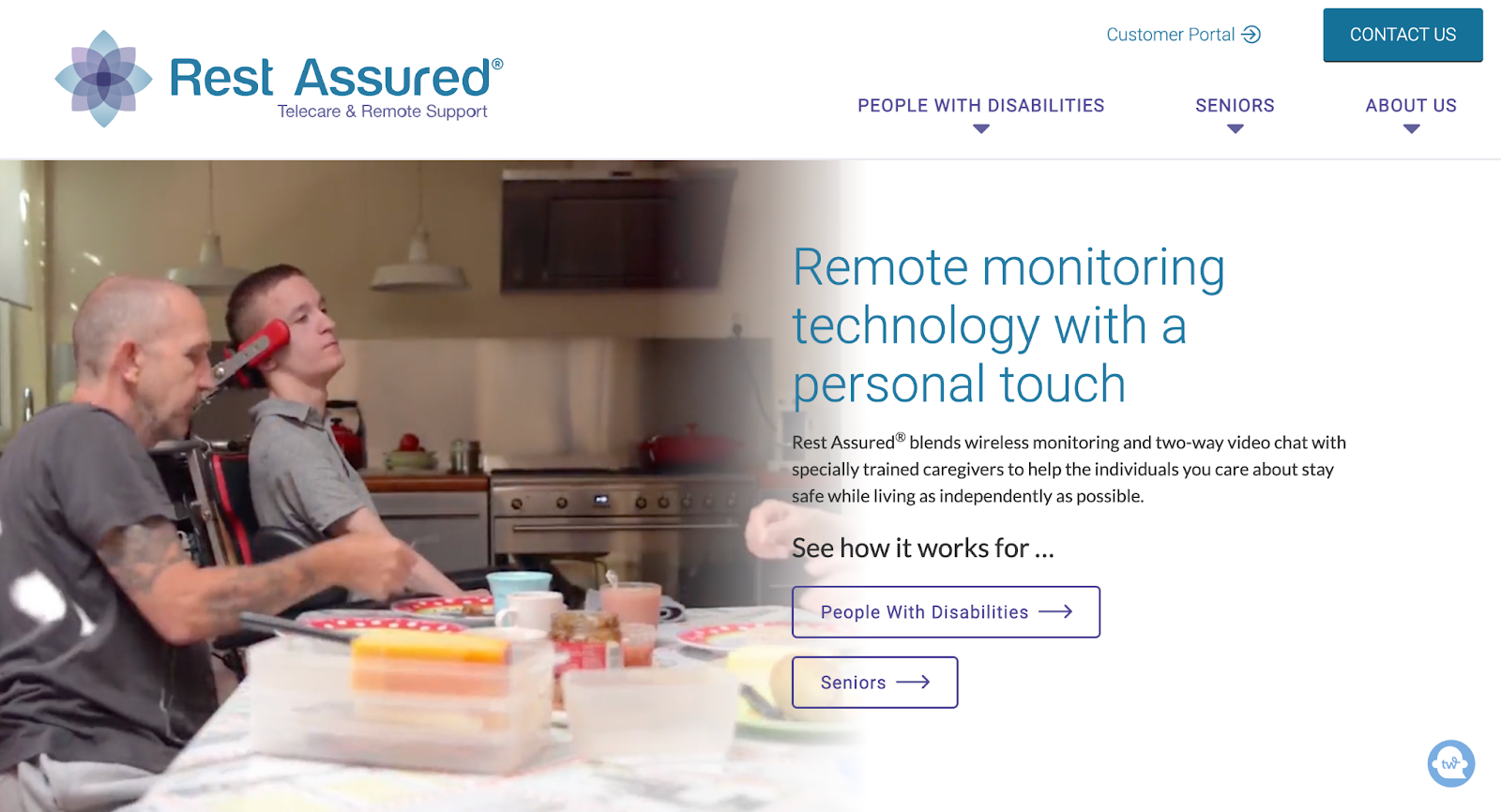
Rest Assured is a healthcare company that provides remote monitoring technology for seniors and disabled people — and its website does a great job of conveying that message.
Instead of a hero image, Rest Assured’s website features videos of older adults and people with disabilities in different settings (outdoors, dining room, school, etc.), which shows visitors the company caters to.
Right under the fold, Rest Assured breaks down the benefits of its products and how they can help its target audience lead better lives.
What we like: The website closes with glowing testimonials from people whose family members use Rest Assured’s products. These testimonials show prospects they can trust the company to deliver on their promises.
3. Benadryl
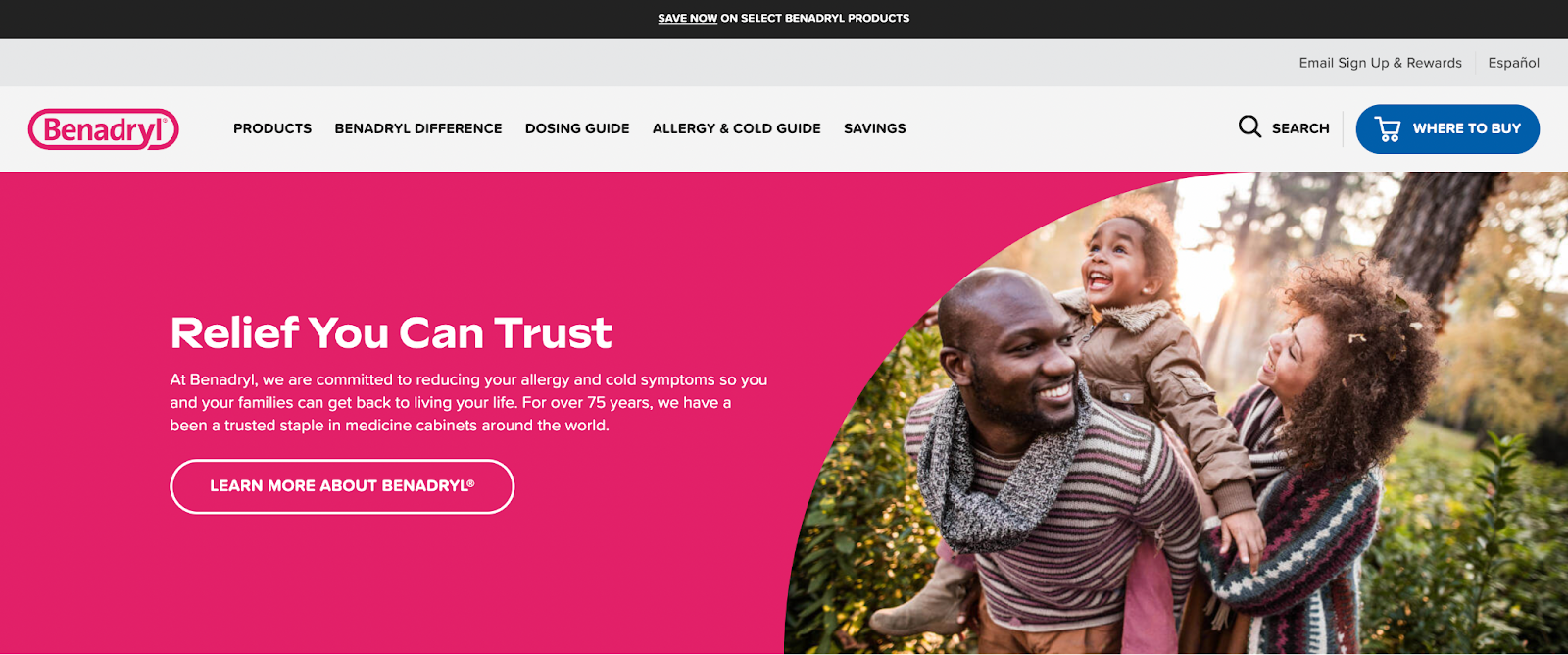
When you think of hospitals or healthcare, you probably associate them with dull colors like grey or beige. The allergy and itch relief drug company, Benadryl, disrupts this line of thought by using a hot pink color scheme throughout their entire website.
The bright color and the image of a happy family make you feel at ease as you peruse the site.
Beneath the fold, you’ll find all Benadryl’s products for both adults and children with links to buy. This section is well-organized, and the drug you need is only a scroll or a click away.
What we like: Underneath the product purchase section, you’ll find product guides and articles about identifying, treating, and preventing allergies and itchy skin.

HubSpot's Free Website Builder
Create and customize your own business website with an easy drag-and-drop website builder.
- Build a website without any coding skills.
- Pre-built themes and templates.
- Built-in marketing tools and features.
- And more!
4. Mayo Clinic
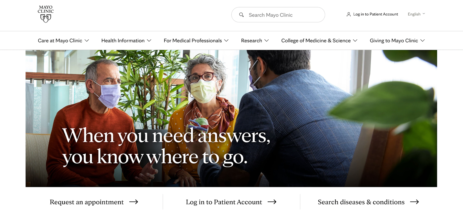
If you’re like me and you google every single health issue you have, then you’ve most likely stumbled on Mayo Clinic’s website.
In addition to being one of the top medical centers in the United States, Mayo Clinic has set up its website to provide top-notch medical information to its site visitors — and it’s a masterclass in website navigation.
Right off the bat, Mayo Clinic uses an extensive navigation menu to organize a wealth of information about care at Mayo Clinic, health problems, and more. The health issues category, in particular, is arranged alphabetically, making it easier for visitors to find what they’re looking for.
What we like: Below the Disease & Conditions section, Mayo Clinic shows the locations in which it is located, with links to an overview of each branch, directions to get there, and how to navigate the surrounding areas.
5. WebMD
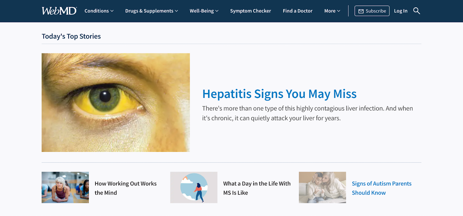
Although it’s not an actual clinic (like Mayo Clinic), WebMD is another website focusing primarily on providing its visitors with up-to-date health information.
This website uses a well-contrasting light blue and dark blue color scheme to outline articles across several categories, including mental health, healthy aging, fitness and exercise, and weight management.
There are also expert insights from WebMD’s Chief Medical Officer, John Whyte, on topics like heart disease, sleep, and cancer. You can also find stories of patients who struggle with sickle cell, opioid addiction, migraines, and other illnesses.
What we like: While WebMD takes the time to categorize health issues alphabetically, the most spectacular part of the website is the free tools — BMI calculator, ovulation calculator, pill identifier, pregnancy calendar, drug interaction checker, and lots more.
6. Maven Clinic
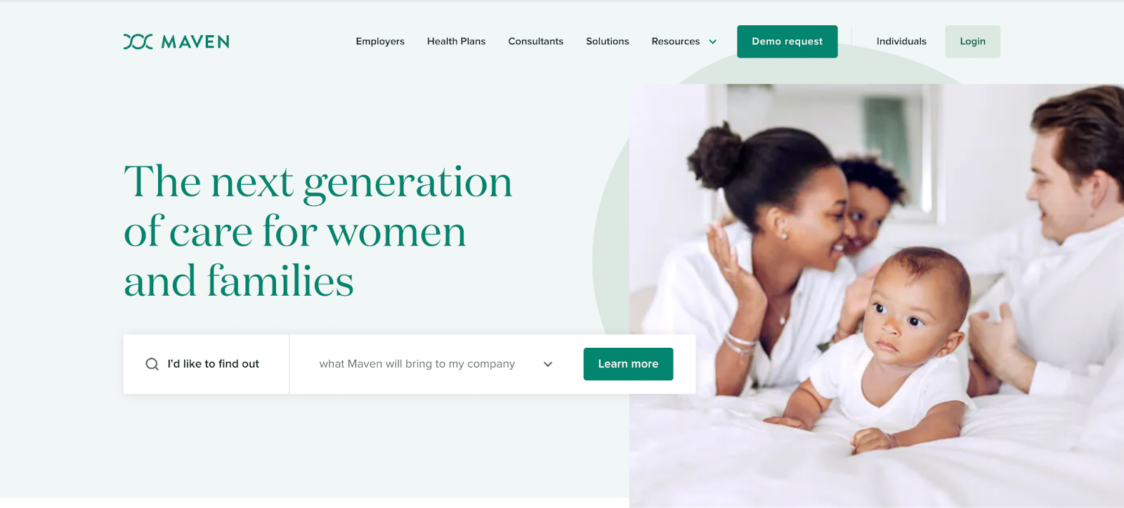
The first thing that stands out when you visit Maven’s website is its soothing green color scheme. In color psychology, green represents elements like nature, fertility, growth, and good health. Even research shows that the color green reduces anxiety and pain.
Maven focuses on providing care for women and families, and the website shows that through images of healthy families. The website’s copy succinctly explains why women and families should choose Maven Clinic for fertility, maternal, pediatric, and even menopause care.
What we like: There are also testimonials and case studies of Maven’s past and present clients, detailing the top-notch healthcare that the clinic provided during their antenatal and postpartum journey.
7. NextCare Urgent Care
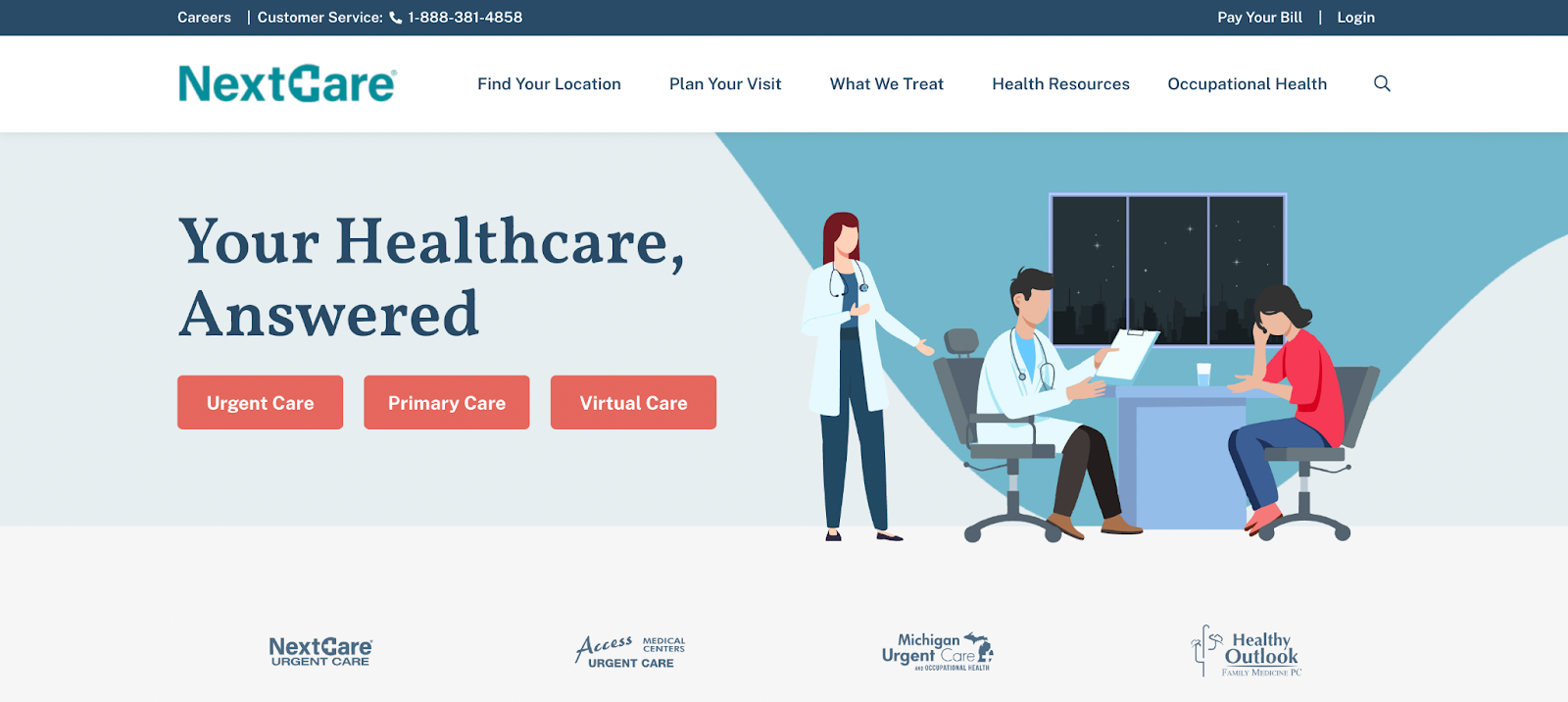
This expertly-designed website is simple and to the point. In the hero section, over an animated image of someone in a doctor’s office, the headline reads: “Your Healthcare, Answered.” With only three words, NextCare tells visitors they can find health-related information on the website.
Underneath the hero section, NextCare gives more information on its services and why people should get treatment at their clinics. You’ll find links to NextCare urgent care services near the bottom of the homepage, including virtual care, injuries, vaccinations, and pediatrics.
What we like: Throughout the website, NextCare made sure to use a lot of whitespace, which allows visitors to focus on the information on the site without getting distracted.
8. SonderMind
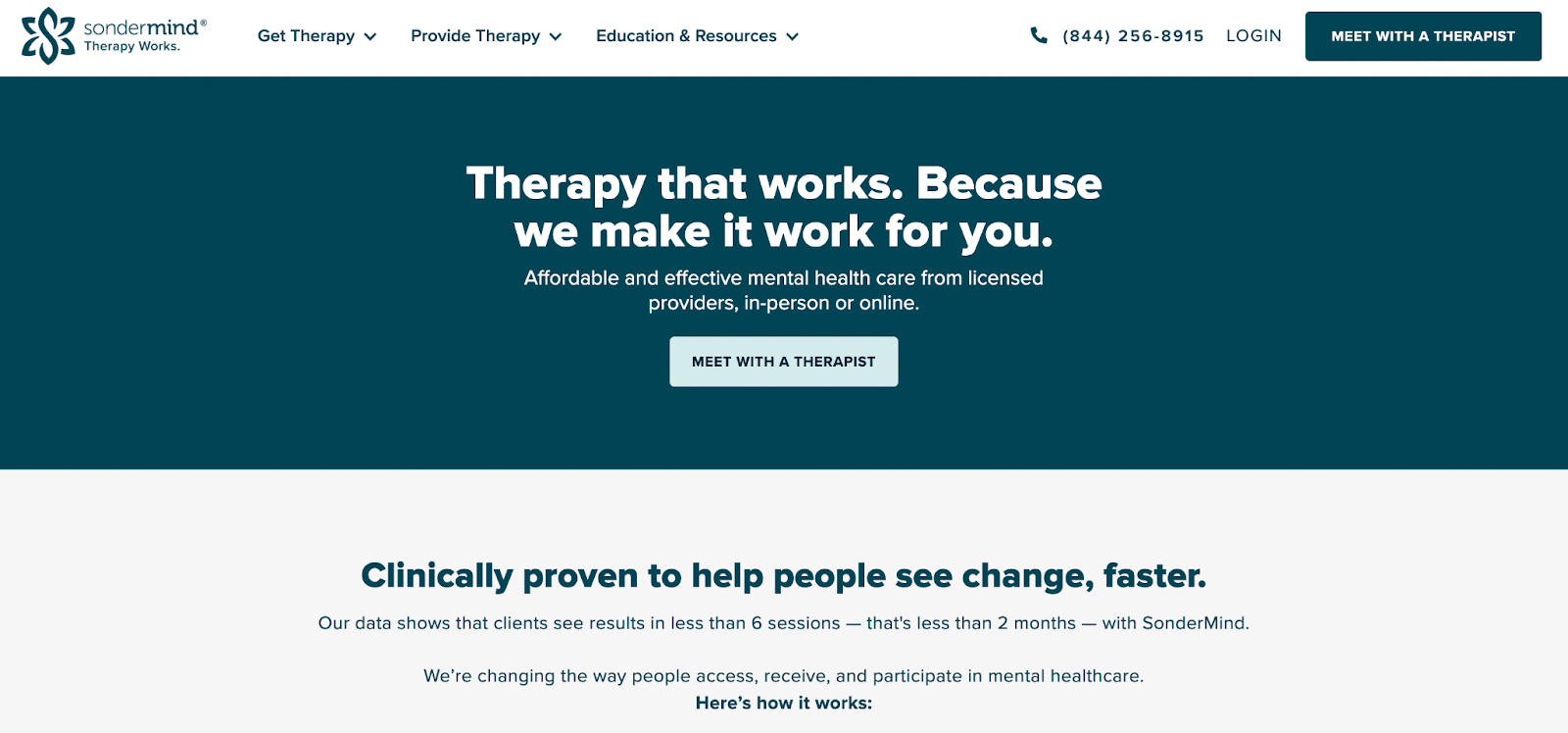
Unlike many healthcare websites, Sondermind doesn’t overwhelm its visitors with too much information. Instead, it uses a few words to tell people the main service it offers: therapy — and follows that with a clear call-to-action (CTA).
Halfway down the page, SonderMind gives insurance information, putting visitors’ minds at rest. And at the bottom of the site, there are answers to frequently asked questions (FAQs) that visitors might have.
What we like: Everything from the color palette, the messaging, the whitespace, and the attention to detail shows that SonderMind’s website was created to provide a pleasant user experience.
9. The College Nutritionist
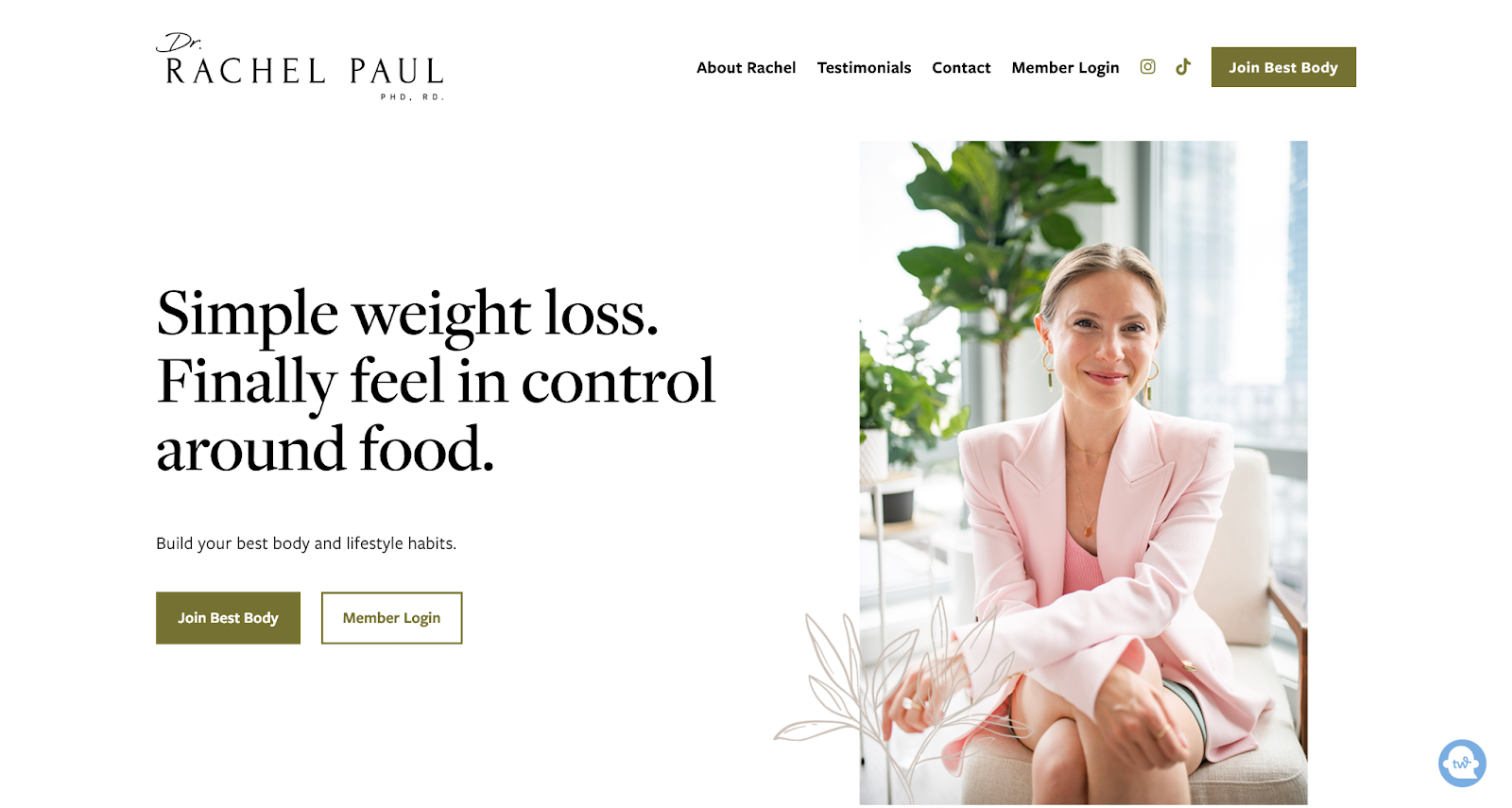
The College Nutritionist website advertises Dr. Rachel Paul’s service — healthy weight loss. The neutral colors of the website, coupled with the storytelling format of the website copy, make for a cohesive brand identity.
When they land on the website, visitors are greeted with a picture of a smiling Dr. Paul, with a promise to “finally feel in control around food.”
Underneath the hero section, Dr. Paul carves out her ideal audience by asking questions visitors can answer. Their answers determine whether they’ll benefit from Dr. Paul’s Best Body Program.
However, the website's star is the gallery of before-and-after photos of people who’ve lost weight healthily after signing onto Dr. Paul’s program. There are also videos of people telling their weight loss stories. These testimonials are irrefutable proof that the Best Body Program works.
What we like: Dr. Paul proves her credibility even further by featuring logos of huge publications that she’s been featured in, including HuffPost, Business Insider, Cosmopolitan, and Daily Mail.
10. Synergy Private Health
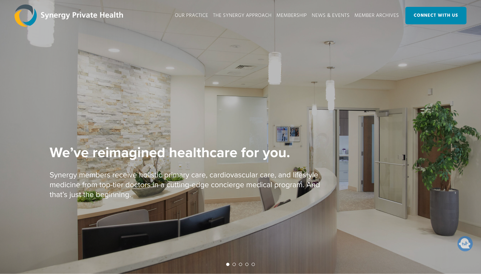
Synergy Private Health is a membership-based medical practice that offers personalized primary care, cardiology, health coaching, and more.
Instead of one hero image, the website has five full-screen sliding images that show the beautiful interior decor and medical practitioners at Synergy’s offices. These images give a good first impression and make you feel more comfortable getting treatment at this clinic.
What we like: At the end of the site, there’s a video of cardiologist and lifestyle medicine practitioner Dr. Kimberly Parks explaining the new standard of healthcare that Synergy aspires to.
11. Mercy Health
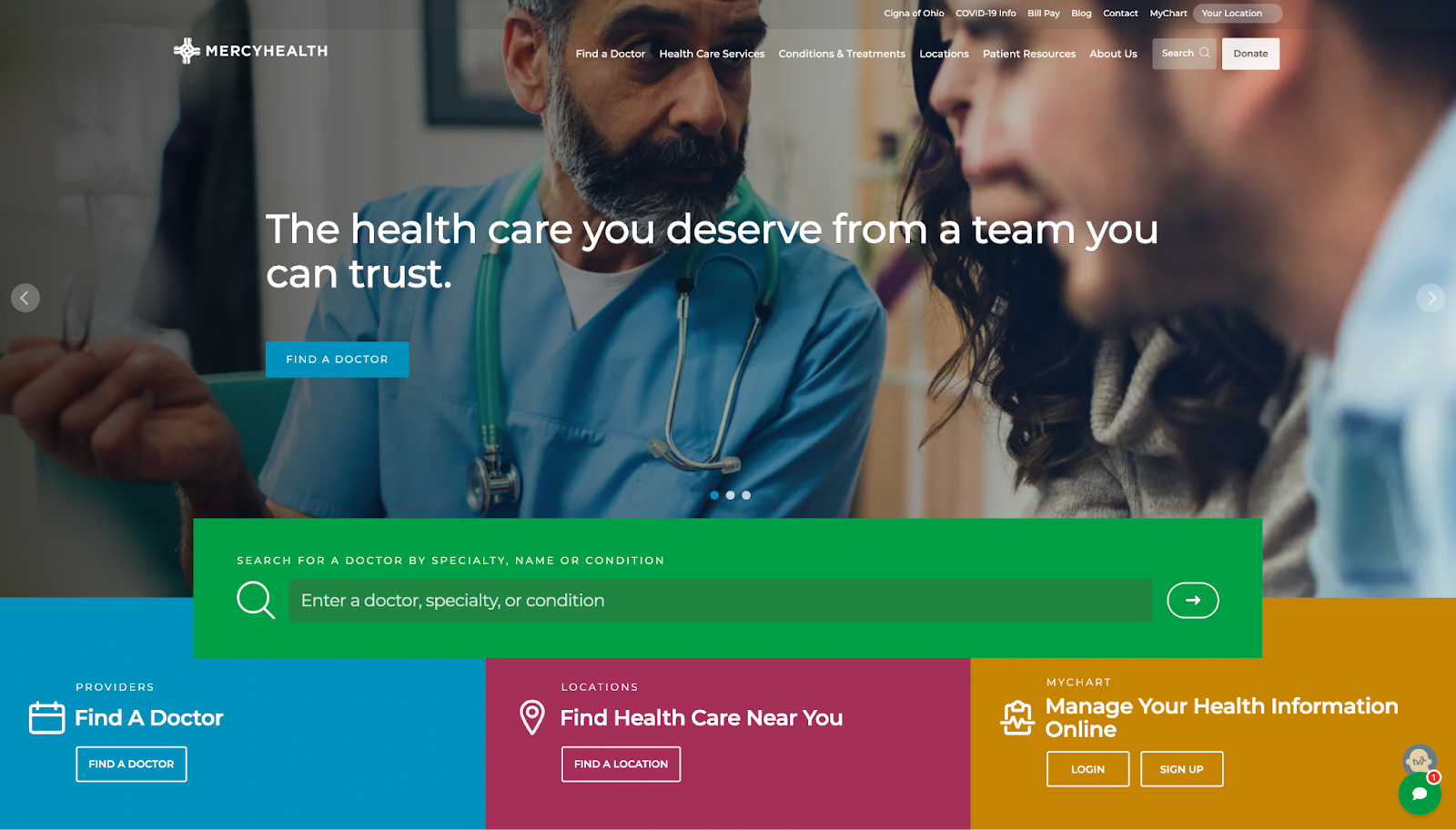
The most striking thing about Mercy Health is the use of high-quality, dynamic images and stunning colors to engage visitors. The carousel beneath the header promotes a sense of hope, pride, and community — which should be present in healthcare.
Like Maven Clinic’s website, Mercy Health uses a vibrant green color for the search box, attracting (and keeping) visitors’ attention. This makes it easier for visitors to find a doctor and healthcare center near them and manage their online health information.
What we like: Further down the page, Mercy Health advertises recent news and encourages visitors to use the chatbot at the bottom right corner of the screen.
12. Altus Emergency Centers
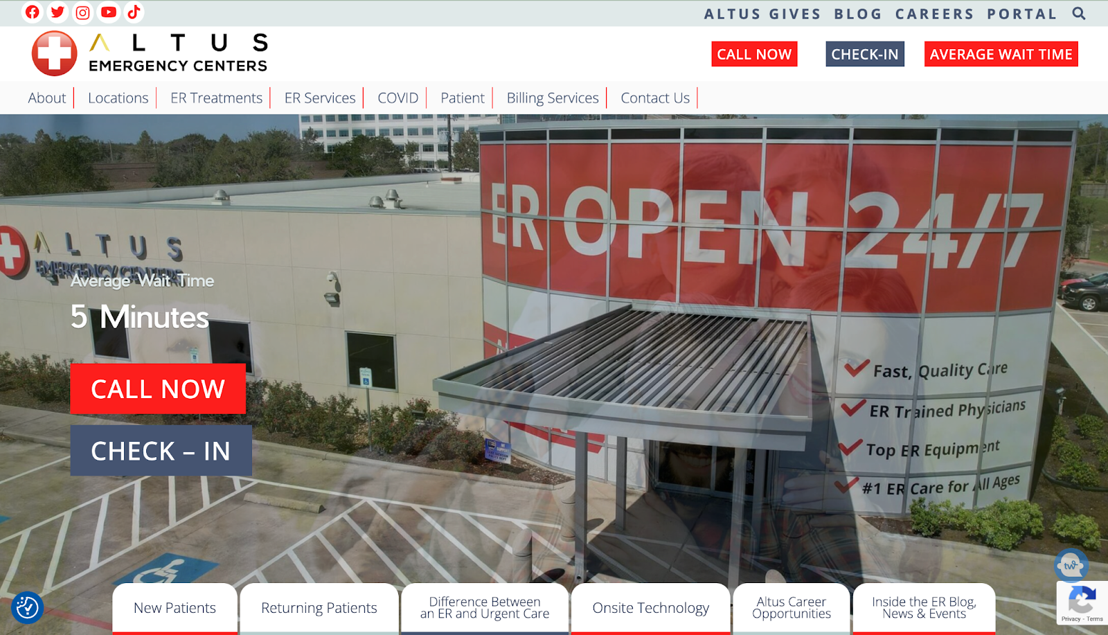
Altus Emergency Centers uses a striking white-and-red color scheme throughout their well-organized website. The red CTAs do a great job of drawing visitors’ attention and prompting them to make quick decisions that can save lives.
Take the hero section as an example. Over the sliding image, you can see the headline, “Average Wait Time. 5 Minutes,” and the red button that prompts people to call the center immediately.
Sure, you can check in, but Altus understands that some people perusing the website need emergency healthcare, so the option they want these people to go for is “Call Now.”
As you scroll further down the homepage, Altus gives several reasons why you should trust them with your healthcare and what the experience is like in their emergency facilities.
What we like: Altus also provides locations to its physical facilities and phone numbers you can call to make inquiries at the facilities closest to you.
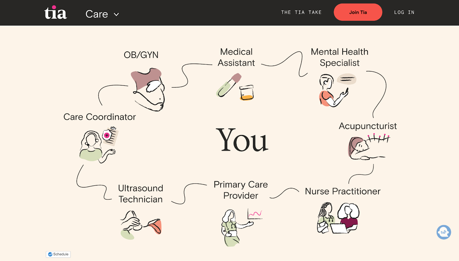
13. Tia
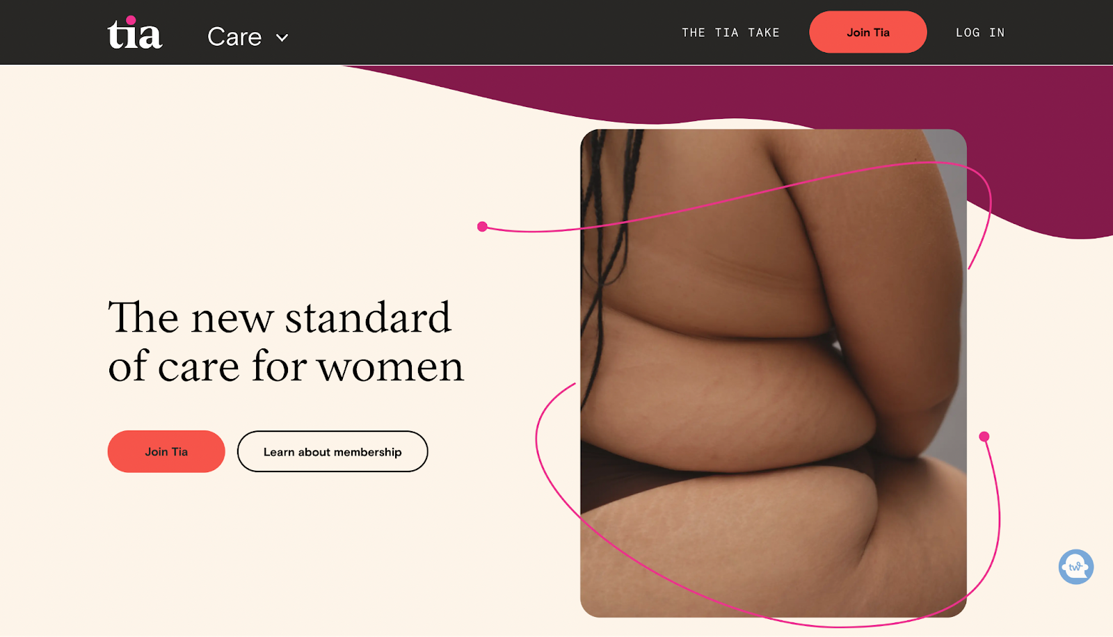
The cohesiveness of Tia’s website is a beauty to see. The neutral colors make the website warm and inviting.
Immediately, Tia establishes its target audience: women and people assigned female at birth (AFAB). They also make clear the kind of care they’re offering — gynecology, primary care, mental health, and wellness.
While the overall website uses hushed tones, bold colors like yellow, orange, and purple also draw visitors’ attention to important information about Tia.
What we like: The illustrations and photography also contribute to the execution of the brand identity — a casual and playful vibe that makes Tia feel professional and welcoming.
14. Kindbody
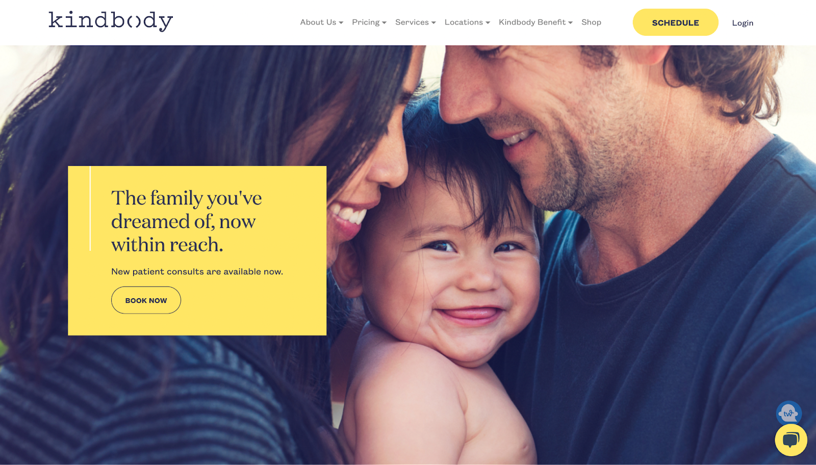
Dark purple and yellow make for a stunning combo on Kindbody’s website.
This fertility clinic offers everything from IVF to egg freezing. It uses this warm color palette and stunning photography to welcome visitors and make them feel at ease as they take in detailed descriptions of Kindbody’s services.
What we like: Kindbody instills trust in visitors by introducing visitors to their large team of specialized doctors and beautiful quotes from reputable publications, such as CNN, Well & Good, and CNBC.
15. One Medical
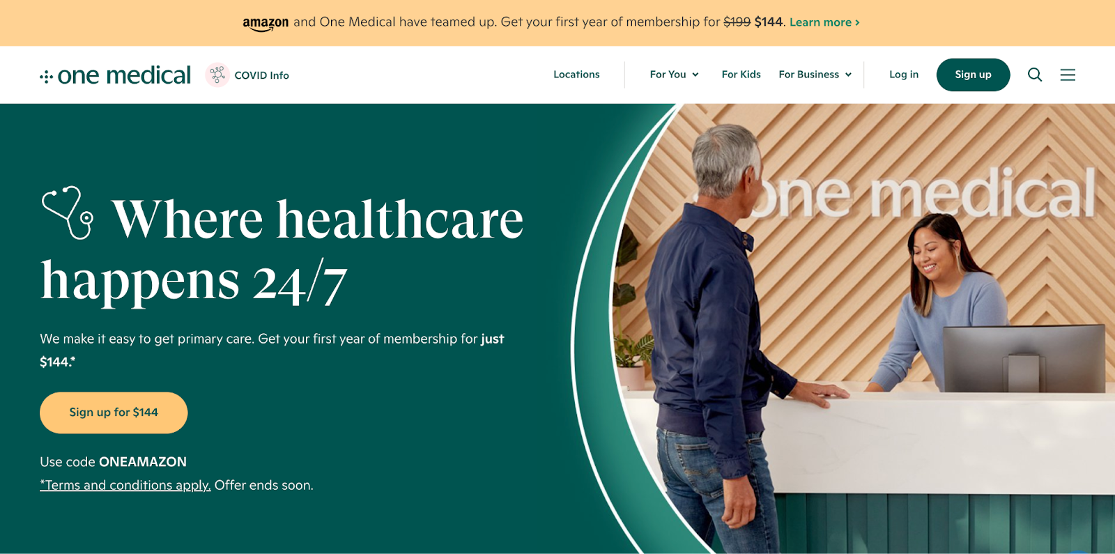
With an elegant design, One Medical uses bold headlines to pass important information to visitors in a welcoming manner. We’ve seen how green indicates good health and growth with other medical sites like Maven and Mercy Health.
One Medical uses greens and yellows on their site, too, to invoke a calming effect — which healthcare companies try to do.
At the top of the homepage, you’ll find a notification banner where they can add links to important information or advertise membership deals. Right beside the logo, One Medical has a link to COVID info for their visitors, which is important and timely.
What we like: Further down the page, there’s a video that gives visitors a glimpse into how the medical team at One Medical operates and their unique approach to healthcare.
How to Design a Healthcare Website
1. Study other similar healthcare websites.
It might be tempting to go straight to finding apps, themes, and hosting when you want to design your healthcare website. But a helpful first step is to study other healthcare websites (like the ones above) to get inspiration for your own.
Consider how they designed their menu, homepage, and site copy. Study these sites’ color schemes, illustrations, graphics, and other design elements.
As you look through these sites, make notes on what you like and dislike, the elements you think might resonate with your audience, and the ones you want to avoid altogether.
This will give you a good idea of how you want your healthcare website to turn out.
2. Choose a CMS.
A content management system (CMS) is a software platform that allows you to build and manage a website without writing any code.
With a CMS, you can add web pages, upload blog posts, use search engine optimization (SEO) best practices, and connect your website to your social media accounts, among other things.
You can use many CMS tools for your website, including WordPress, Wix, and Squarespace. However, HubSpot offers a free CMS tool that makes it easy to build a website.
This CMS offers:
- A theme library.
- Flexible and responsive templates.
- A drag-and-drop editor.
- Premium cloud hosting.
- Website analytics.
- An integrated customer relationship management (CRM) tool that allows you to capture qualified leads and follow up with them in one place.
HubSpot’s CMS tools give you all the resources you need to build an interactive and stunning healthcare website.
3. Choose a template or theme.
If you choose to design your healthcare website from scratch, you can do so with HubSpot’s drag-and-drop editor. But if you want a ‘base’ to start with, you’ll need to choose a healthcare template or theme that has the layouts and design elements you want in your final design.
For example, you may need a template or theme that has:
- Text-based menus.
- Multiple sections for contact information.
- Video sections.
- CTAs to book appointments with a medical practitioner, etc.
The CMS you choose would likely have a repository of both free and paid themes. Take the time to choose a template that resembles the design that would resonate most with your audience. You can use the search bar or filters to narrow down the options and find a template you like.
If you can’t find what you’re looking for, you can try using a marketplace like ThemeForest.
4. Customize your template or theme.
Once you’ve chosen a good template, the next step is to customize it to look like the design you want for your website. Without customizing the template, your website may look flavorless and generic.
As you customize your template, here are some things you need to focus on:
- Add your logo.
- Change the color palette and fonts to match your brand identity.
- Design your website navigation menu hierarchically to make it easier for visitors to find relevant information.
- Let your website copy/messaging reflect your target audiences, like Tia and Maven Clinic.
- Replace all stock images with original, high-quality images, illustrations, and/or videos.
- Strategically place clear CTA buttons throughout your website to lead visitors to high-priority pages, including an online booking system, a donation form, or your patient portal. Use bright, contrasting colors to draw attention to your CTAs.
- If you have a blog on the website, share healthcare-based content and news updates with your visitors. You can also use the articles for content marketing, should you decide to grow your visibility that way.
- Share written reviews and video testimonials from happy clients on your website.
- Provide your contact information (phone number, email, and address(es)) in the header and footer of your website.
- Connect your website to your social media accounts.
5. Make your website mobile-friendly
A mobile-friendly website conforms smoothly to all screen sizes and resolutions, which makes it accessible on smartphones, tablets, notebooks, laptops, and desktop computers. This allows visitors to interact with the website without constantly zooming in and out or changing their phone’s orientation.
In 2015, Google rolled out an update announcing that mobile-friendliness is a factor in how a website ranks on the search engine. If your website isn’t mobile-friendly, it likely won’t be visible on search engine results pages (SERPs).
Not to mention that, as of January 2023, over 5 billion people worldwide use mobile phones to access the internet. This means that a good chunk of your target audience — if not the majority — will likely visit your healthcare website with their smartphones. You'll lose out on those people if you don’t make your website mobile-friendly.
By making your site mobile-friendly, you’re increasing user experience for your visitors and boosting your chances of ranking higher in the SERPs.
6. Make your website accessible.
Making your healthcare website accessible helps you reach more potential patients, especially if your target audience includes people with disabilities. Here are some ways to improve your site’s accessibility:
- Use headings to organize the structure of your content.
- Use bigger, sans-serif fonts to make your copy easier for visually impaired people to read.
- Make your internal and external links descriptive.
- Add alt text to your images so that screenreaders can pick them up.
- Add captions and subtitles to your videos to help people with auditory problems.
- Pick your color palette wisely.
- Incorporate keyboard navigation into your website.
Get Inspired by the Best Healthcare Website Designs
Above, we outlined some of the best-designed healthcare websites on the web, touching on what made each of them unique — from the color palettes to the hero images to the web copy.
While each of these websites catered to different kinds of patients, they were all designed with an overarching goal in mind: to ensure that visitors take action.
You’ll need to remember this as you design your healthcare website. Feel free to play around with design elements, but not to the detriment of user experience. Whatever color, layout, or font you use, put your visitors at the forefront of your design decisions.

Website Design Examples


![15 black and white website designs to inspire your own [+ pro tips]](https://53.fs1.hubspotusercontent-na1.net/hubfs/53/black-and-white-website-design-1-20250520-1336267.webp)

![Gradient Website Design Examples That Prove This Trend Is Far From Over [+Tutorials]](https://lh7-us.googleusercontent.com/htOWIbyCIoCMxSjC4gJunkGnhCzXpccjTrL8NwoGdRdCsSiEmEAxe_qBFkMrzy2Y8d3cwEr_DMzSGHq9Xi-hQFnMJCo8HDQJ1yQGigcSfFxI2QKXo0s7xXSB2sY-eALG1iUqnHXgomcDsnp7AHRSH1s)
![15 Brochure Website Examples to Inspire You [+ How to Make One]](https://53.fs1.hubspotusercontent-na1.net/hubfs/53/brochure-website-examples-1-20250319-362228.webp)
![28 Types of Websites to Inspire You [+ Real-Life Examples]](https://53.fs1.hubspotusercontent-na1.net/hubfs/53/types-of-websites.png)

