Color always matters in web design — but it plays a critical role in the user experience of those with disabilities related to vision. Choosing the wrong colors can be a costly mistake.

Imagine your visitors being unable to read your content, pick out important information from a diagram, or click on your call-to-action (CTA) buttons. Most likely, they'd want to leave your site — perhaps, finding no interest in ever returning. That's why color in web accessibility matters.
Conditions that impact color perception are more common than you might think. So, in this post, we’ll go over how people with disabilities such as low vision, dyslexia, and color blindness experience the web.
Then we'll explain how you can improve your website's accessibility and UX by making smarter color and design choices.
How Vision Impairments Affect Web User Experience
Let's take a look at how various vision impairments impact the UX of your website for specific visitors.
Web Color Accessibility for Low Vision
Cataracts, the most common type of vision loss for people over 40, are a form of low vision that affects contrast perception. Someone with cataracts will struggle to read text on a low contrast background, such as light gray on white.
What people with low vision need are high contrast color schemes. High-contrast modes are actually built into Windows and Mac operating systems.
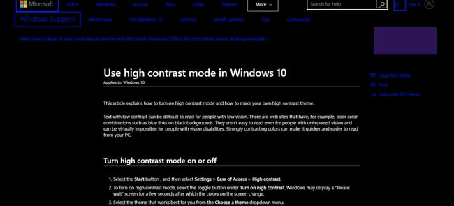
However, not everyone who needs high-contrast mode realizes it exists or knows how to turn it on. So, it’s wise to just stick to high-contrast colors on your website for ease of access.
.png)
Website Accessibility Checklist
This checklist will help you make the following more accessible on your website:
- Web Pages
- Navigation
- Video & Media
- And More!
Web Color Accessibility for Dyslexia
Dyslexia is a learning difficulty which affects reading and writing. The British Dyslexia Association estimates that 10% of people are dyslexic today. Dyslexia can influence how people see color, which may have impact readability.
While a high-contrast color scheme, such as pure black on white, will benefit someone with vision loss, this may be too great of a contrast level for a dyslexic person — they might find the words on the page blur together. A safer choice is dark gray on an off-white background.
Some websites offer alternative color schemes, which can be helpful for dyslexic users. For example, the Dyslexia Association of Ireland has a control which allows users to change the background color.
Take a look — users can change the background from this...
.webp?width=650&height=439&name=Screen%20Shot%202020-03-26%20at%208%20(1).webp)
... to this:
.webp?width=650&height=448&name=Screen%20Shot%202020-03-26%20at%208%20(2).webp)
Next let’s review how color blind people see the web.
Web Color Accessibility for Color Blindness
Can you see the number in the image below? Well, color blind people cannot.
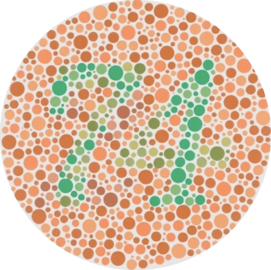
Color blindness affects 4.5% of the world's population, and men make up the largest portion of that percentage since 16 times more men are color blind compared to women. That's 8% versus 0.5%.
Red-green color blindness accounts for the vast majority of color vision deficiency. This includes people with protanopia (red-blindness), protanomaly (red-weakness), deuteranopia (green-blindness), and deuteranomaly (green-weakness).
A big problem for color blind people is information on websites that is conveyed by color only. This can slow down or confuse color blind visitors, as they have to stop and figure out the meaning.
For example, for someone with normal vision looking at the pie chart below, it’s simple to tell which grade goes with which percentage.
.webp?width=400&height=383&name=Screen%20Shot%202020-03-26%20at%208%20(3).webp)
Now look at the same chart as seen by someone with protanopia:
.webp?width=400&height=370&name=Screen%20Shot%202020-03-26%20at%208%20(4).webp)
The chart is really challenging to interpret because some of the colors look too similar. It’s hard to tell which segment goes with which values.
A better approach is to link the colored segments to the grade and percentage, or else superimpose the grade and percentage on each segment.
Another solution for labeling colored areas is to use a pattern. Trello devised a color blind friendly mode for labeling cards which uses textures as well as color.
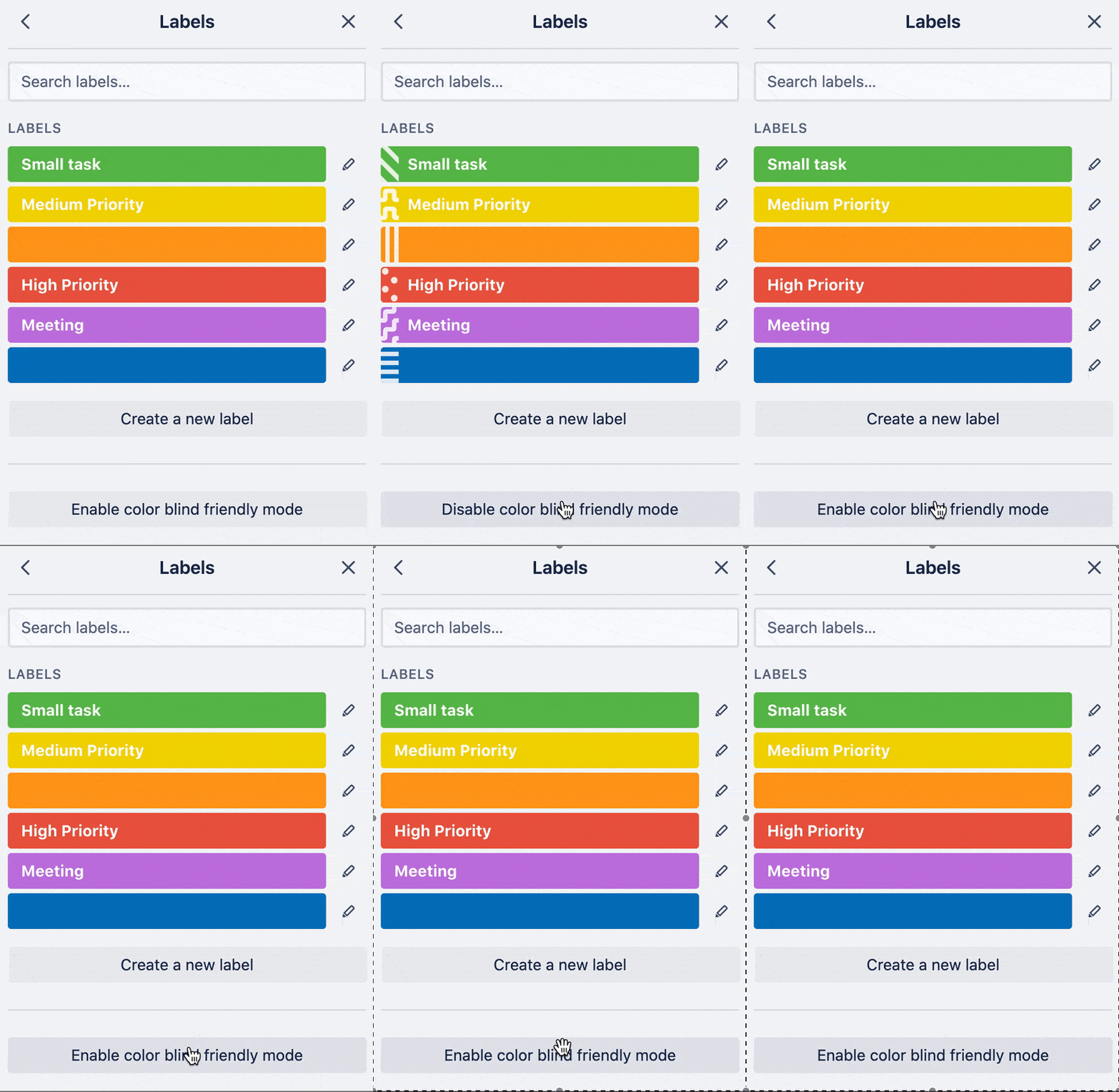
Now, returning to our color contrast discussion — how do you know if your site's colors are accessible or not? Fortunately, there are guidelines and tools to help you find out.
.png)
Website Accessibility Checklist
This checklist will help you make the following more accessible on your website:
- Web Pages
- Navigation
- Video & Media
- And More!
Web Accessibility Color Contrast
To meet a minimum contrast level, as specified by the Web Content Accessibility Guidelines (WCAG), colors need to meet the correct contrast ratio between text and background on a web page. Logos are not held to the web accessibility color contrast requirement.
When looking through the WCAG, you may see the terms level A, level AA, and level AAA. These represent the different levels of conformance that are defined by the WCAG, with A being the lowest and AAA the highest. While each level meets the requirements of the standard, site owners are encouraged to go beyond the minimum level of conformance and aim to progress toward the higher levels.
You can learn more about these levels of conformance and requirements in W3's Understanding Levels of Conformance.
Text Requirements
The WCAG requires you provide enough contrast between text and background color so that anyone, including people with moderately low vision, can read it.
The required contrast ratio between text and background color depends on the size and weight of the text. For example, larger text is easier to read at lower contrast so the contrast requirement is lower. Let's specify the requirements below.
- Normal Text: There should be a contrast ratio of 4.5:1 between text and background. This is the ratio chosen for level AA.
- Large Text. For large text, there should be a contrast ratio of 3:1 between text and background. Text that's 18pt (approximately 24px) or greater is considered "large." If the text is bold, it only needs to be 14pt (approximately 18.5px) or greater to be considered large text.
- Enhanced Contrast. A contrast ratio of 7:1 for normal text, and 4.5:1 for large text is considered enhanced. This is the ratio chosen for level AAA. Black on white has the highest contrast ratio of all, at 21:1.
Color Requirements
Only using color to indicate an action, prompt a response, or distinguish an element on your site will exclude users who have difficulty perceiving color. That’s why the WCAG includes a guideline that forbids color from being the only visual means of conveying information.
To meet this success criterion, you must provide another visual means besides color to convey the information. For example, a form that labels its required input fields with red text fails to meet the success criteria for use of color. However, if this form also labelled its required fields with an icon with alt text that said “Required,” then it would meet the criterion.
Background Colors for Websites
Another requirement of the WCAG is to distinguish the foreground from the background to make it easy for users to see content.
That is why you must specify a background color. If text color is specified but a background color is not on your site, then it will be considered failing to meet the WCAG's "distinguishable guideline." That's because the user's default background color is unknown and cannot be evaluated for sufficient contrast. The same applies if a background color is specified but text color is not.
Web Accessibility Color Checkers
While you should be familiar with the requirements above, you don’t need to memorize them. That’s because online tools today known as color checkers will automatically evaluate color combinations using the WCAG guidelines for contrast accessibility. Most will not only tell you if a color combination meets the guidelines — they’ll also modify any failing combination to find the closest approximation that is accessible.
Let’s take a look at two of the most popular color checkers below.
WebAIM Color Contrast Checkers
WebAIM offer two contrast checkers.
The standard contrast checker tests the contrast ratio between foreground and background colors. Enter your colors’ hex codes in the foreground color and background color boxes.
In this example below, the contrast ratio between the pink and white backgrounds is 2.97:1. This fails the contrast test for WCAG level AA and WCAG level AAA.
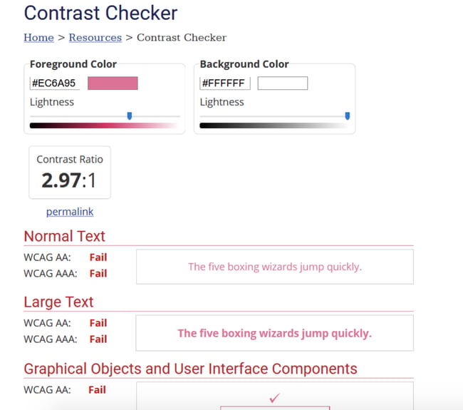
For failing color combinations, use the lightness slider under a foreground or background color to lighten or darken it. The contrast ratio will update instantly to let you know if your colors pass. This is useful if you have brand colors that are just shy of the contrast ratio needed.
Darkening the pink color against the background produces a contrast ratio of 4.52:1 which meets the minimum contrast requirement.
.webp?width=650&height=479&name=Screen%20Shot%202020-03-26%20at%208%20(5).webp)
The second contrast checker, the link contrast checker, is useful for checking links that are not underlined. In this case the contrast ratio should be at least 3:1 between the link text and the body text.
Contrast Checker
To use ACart’s Contrast Checker, enter your hex codes in the foreground and background color boxes, highlighted in the screenshot below. Don’t include the # symbol, just the six numbers or letters of the code.
.webp?width=650&height=323&name=Screen%20Shot%202020-03-26%20at%208%20(6).webp)
If when you add colors you see all green dots, your colors have reached the enhanced contrast level — the colors will be fully accessible to all users.
.webp?width=650&height=353&name=Screen%20Shot%202020-03-26%20at%208%20(7).webp)
If you have green dots for AA but red dots for AAA, your colors still meet the minimum contrast of level AA.
For convenience, you can save your color samples to the browser history. You can also share them or save them to a PDF.
.webp?width=650&height=391&name=Screen%20Shot%202020-03-26%20at%208%20(8).webp)
If your color combinations aren’t accessible and you don’t have the means to change them, discuss the situation with your web designer or developer. You might want to use one of the following online tools to find an accessible color scheme.
.png)
Website Accessibility Checklist
This checklist will help you make the following more accessible on your website:
- Web Pages
- Navigation
- Video & Media
- And More!
Color Accessibility Test
Want to see how your website holds up to the standards above? You can in a few steps. We'll walk through the process of testing the color accessibility of your website below.
Step 1: Identify the hex codes of the colors on your website.
To make picking and testing colors easier, familiarize yourself with the concept of hex codes. Hex codes are six character codes beginning with a hash that represent colors. They range from #000000 (black) to #FFFFFF (white).
The best way to find out the hex codes of your website colors is to consult your style guide if you have one, or to ask your designer or developer for a list. Otherwise, you can use a color picker tool to find the hex codes of the colors you’re using.
ColorZilla is a browser extension for Firefox and Chrome browsers which lets you pick colors from a web page. Once you have installed ColorZilla in your browser, click on ColorZilla’s eyedropper icon and select Pick Color From Page.
.webp?width=650&height=486&name=Screen%20Shot%202020-03-26%20at%208%20(9).webp)
When the color picker is active, your cursor will change to a +. Hover over the part of the page you want to check, and click to copy the hex code to your clipboard.
You can then paste the code into a document. Your colors will also be saved to ColorZilla’s picked color history. Remember to find and save the text colors and background colors, as you’ll need them both to test if they’re accessible.
.webp?width=1500&height=184&name=Screen%20Shot%202020-03-26%20at%208%20(10).webp)
Step 2: Calculate the contrast ratios of all your existing colors.
Now it’s time to audit your website’s existing color scheme. Using the easy-to-use tools mentioned above, test the different colors in your palette against the background color of your site one-by-one.
Let's say I'm auditing the color scheme of the digital magazine NANA. Here's a look at one of its featured posts:

I would start by testing the color that's primarily used for heading and paragraph text (#1C1C76) against the background color (#FBFAF5).
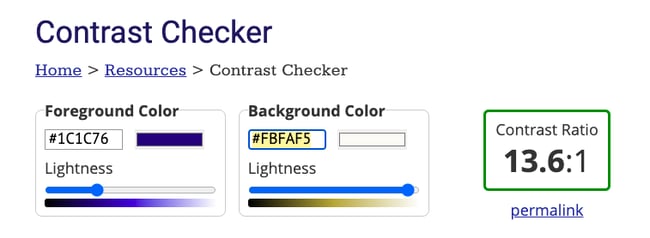 Since this meets the standard for Level AAA, I'd move onto the next color: a light pink called "Bittersweet" (#FE7773).
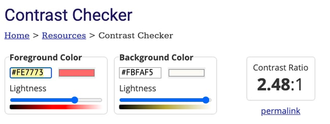 Since this fails to meet the standard for any level of conformance, I'll have to adjust or replace this color in order to meet the required ratio. For now, I'll just take note of any combinations that need more contrast.
Step 3: Adjust existing colors until they meet the ratio.
Once you're done testing the entire color scheme, you can identify and propose new colors to meet the minimum contrast ratio. The simplest approach is to increase the opacity of the text color until it meets the contrast ratio.
For example, let's say I want to adjust the Bittersweet pink color used on NANA's site. Using WebAIM's Contrast Checker, I can simply drag the slider to the left to increase the opacity until it meets the required contrast ratio.
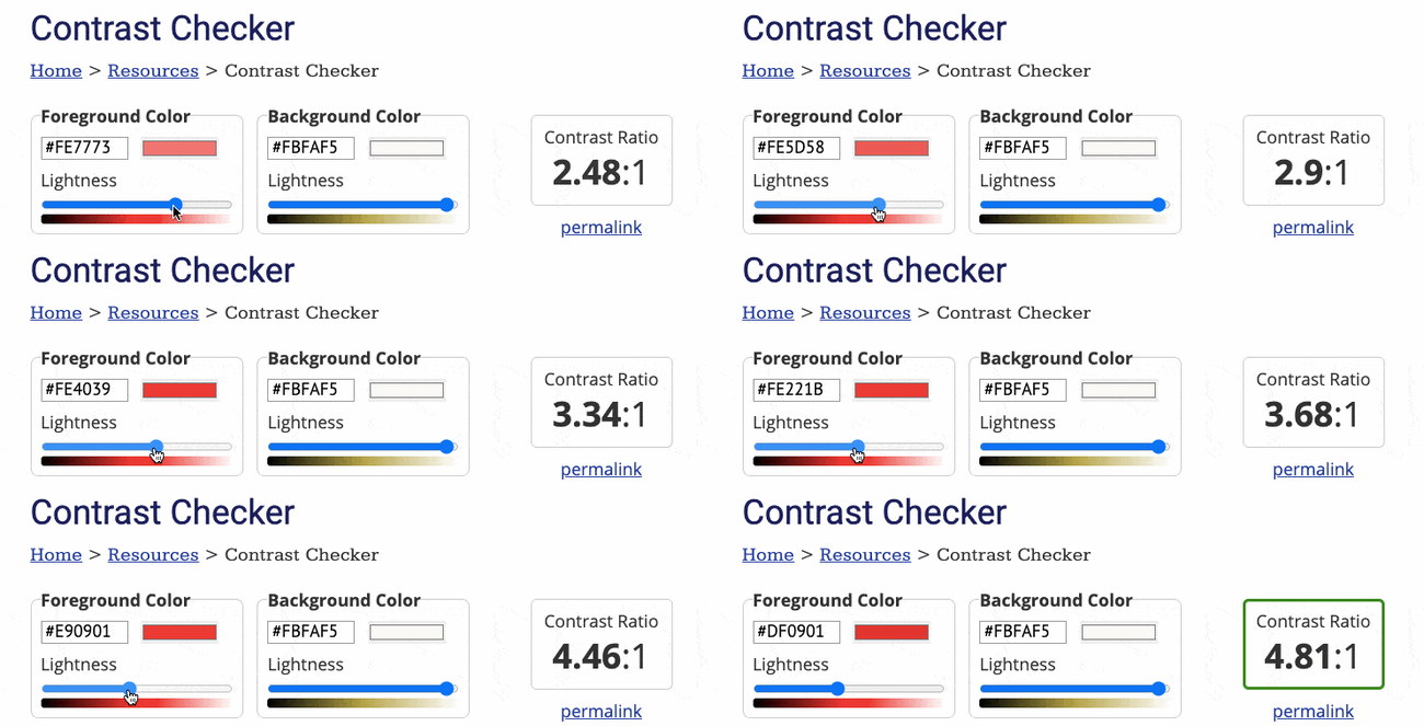 You can repeat this process for every color that failed to meet the required contrast ratio. When you have a full color scheme that meets the color accessibility guidelines, you can roll out the new colors in your stylesheet.
The process above will help you redesign an exisint website. But what if you haven't created your website yet, or you're preparing for a website redesign that will require a whole new color scheme? In that case, you don't have to start from scratch.
Web Accessibility Color Palettes
Creating an accessible color scheme doesn’t have to be a challenge. There are dozens of online tools that can automatically generate an accessible color palette for you.
Let's take a closer look at what an accessible color palette is and what tools can help you create one below.
Accessible Color Palette
An accessible color palette has to meet the contrast ratios designated in the WCAG guidelines (which we discussed above).
As a reminder, you'll need a contrast ratio of 4.5:1 for normal text and 3:1 for large text for level AA. To meet level AAA, you'll need a contrast ratio of 7:1 for normal text and 4.5:1 for large text.
So how you do take these numerical standards and turn them into a beautiful color palette? Pick one color to start. It will be easier to build out your scheme from one color, than multiple colors.
From there, you can identify analogous, complementary, monochromatic, triadic, or split complementary colors, depending on your goals and needs.
Because analogous colors are the two colors directly next to a color on the color wheel, they probably won't create a color scheme that meets the contrast ratio. Instead, you're better off identifying complementary colors.
Complementary colors are the two colors directly across from each other on the color wheel. Since they will provide the highest amount of contrast, you should select one color to use predominantly and the other to use sparingly, as an accent.
For a more in-depth look at the different types of color schemes, check out The Designer's Guide to Color Theory, Color Wheels, and Color Schemes.
Tools for Creating an Accessible Color Palette
Without tools, creating an accessible color palette would require a lot of trial and error. You'd have to pick colors that looked good together, then test and adjust each one against the background color.
To simplify the process, you can use a tool that will generate an accessible and beautiful color palette for you. Let's take a look at two popular options below.
Color Safe
Color Safe generates beautiful and accessible color schemes. To begin, choose Get started.
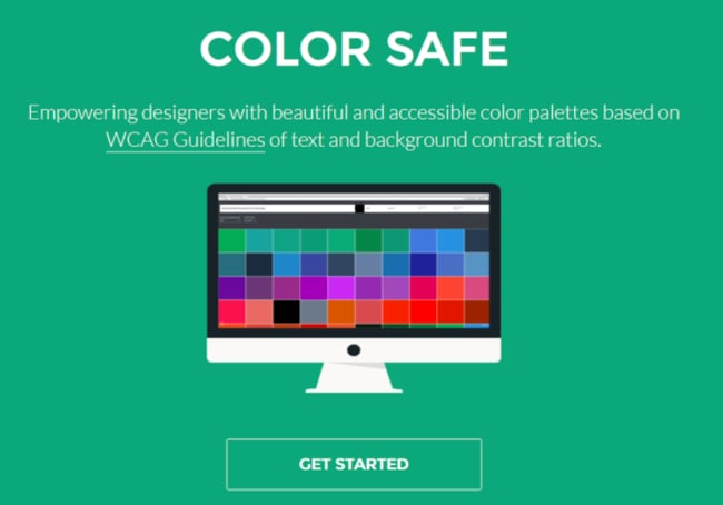
To find suitable colors, first pick the background color you want to use. If you know the hex code you can enter it in the background color box.
.webp?width=650&height=299&name=Screen%20Shot%202020-03-26%20at%208%20(11).webp)
If not, click on the background color box to open up a color picker. The slider bar on the right selects the main color from the spectrum.
Once you’ve chosen a general color, move the dot in the panel on the left to adjust the color’s brightness and intensity. The hex code of the color you chose will appear in the box.
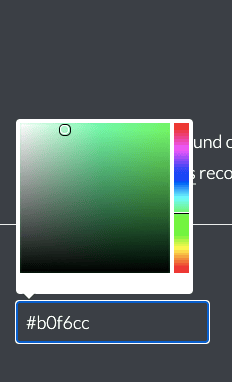
You can also specify a font and font size in pixels, and a font-weight. Font-weight ranges from 100, which is the lightest text, to 900, which is the boldest. Regular text is font weight 400. For the WCAG standard option, AA corresponds to minimum contrast and AAA to enhanced contrast.
You can see all accessible colors that ColorSafe found to match your background. Alternatively, filter the list by selecting a color swatch. To see all shades of a particular color, select one of the color swatches from the row.
Here are suitable shades of purple for a peach background. Clicking on a color shows you its hex code and the contrast ratio against the background.
.webp?width=650&height=292&name=Screen%20Shot%202020-03-26%20at%208%20(12).webp)
If you don’t see many options for the background color you want, use the start over button and try increasing the font size or bolding the text. Remember to note the hex codes of any colors you prefer.
Accessible Color Generator
Accessible Color Generator is a simple tool for finding suitably contrasting colors. The accessibility level of AA or AAA sets the degree of color contrast.
Choose your base color by entering a hex value, or click on the color for a color picker. The generator outputs six color shades which have sufficient contrast for text which is white, gray or a variant on your original color.
A useful feature is the option to copy or bookmark the sharing URL for the current colors, so you don’t have to remember them. You can look for an unlimited number of accessible colors.
.webp?width=650&height=295&name=Screen%20Shot%202020-03-26%20at%208%20(13).webp)
Accessible Color Palette Examples
Need some accessible color palette inspiration? Check out some examples below
The color palettes below were created using the color scheme generator Coolors and — at the minimum — meet the WCAG level AA guidelines for large text. To test any of the palettes, you can test any of the colors using the lightest shade as the background color.
Ocean Color Palette
Hex codes: #587291, #1F86FB, #EDFCFD, #19A388, #2B7494

Holiday Color Palette
Hex codes: #DA3338, #2F6F55, #4B9555, #F9F7DC, #43291F
Floral Color Palette
Hex codes: #4947F6, #785BD7, #B178BF, #F9F3F0, #B45558

Tropical Color Palette
Hex codes: #031627, #FDFFFC, #389F91, #E8373A,EF6C01

Make Your Website Colors More Accessible
By implementing high-contrast colors and labels on your website with the help of the tactics, guidelines, and tools we just reviewed, your website and content will be consumable for users with vision impairments such as low vision, dyslexia, and color blindness. Don’t be surprised if your general audience finds your website easier to use, too!
Editor's note: This post was originally published in March 2020 and has been updated for comprehensiveness.




![Best Fonts for Accessibility and Visually Impaired Users [ADA-Compliant Fonts]](https://blog.hubspot.com/hubfs/ada-fonts.jpg)