.png?width=112&height=112&name=Image%20Hackathon%20%E2%80%93%20Vertical%20(50).png)
.png)
The days of designing for a single screen size are long gone. As someone who owns and works daily with devices of all shapes and sizes, I’ve seen the same frustrating issue pop up over and over, not just on websites, but in web applications too: poor responsiveness.

Too often, I come across projects where developers build for one screen resolution, usually a laptop, without thinking about how that layout will appear on a tablet or smartphone. The result? Distorted layouts, broken navigation, and a user experience that sends visitors straight to the “close” button. And yes, that also means a higher bounce rate.
I’ve made those mistakes myself in the early days of my career. But over time, I learned that responsive design isn’t just a “nice-to-have” — it’s the baseline for building anything online in 2025.
In this post, we’ll walk through the most common screen sizes for responsive design, why they matter, and how we can code layouts that look great everywhere. I’ll share practical steps to create sites that are responsive, no matter the device.
Table of Contents
- What is responsive design?
- Benefits of Responsive Design
- Responsive Design vs. Adaptive Design
- What are screen sizes?
- Why Screen Size Matters
- Common Screen Sizes to Know
- How to Code for Different Screen Sizes
What is responsive design?
Responsive design is a web design approach whereby the layout of a website adjusts automatically to fit the user’s screen size and orientation. Same website, same functionalities, just a different layout to cater to every user regardless of their device choice.
Responsive design isn’t a “bonus feature” — it’s the default standard in 2025. Think about it: Have you ever landed on a website where text spills off the screen, buttons are impossible to tap, or images load half off the page? It’s frustrating, and most users will leave within seconds.
When building a website, I always keep responsiveness in mind, and a step I always take in my responsive design approach is thinking of my layout as a fluid system rather than a fixed block. I mostly use relative units when it comes to defining my layout. Also, I use flexible grids and media queries for a better design flow.
Let’s see some reasons why having a responsive design is in our best interest.
.png)
Free Website Design Inspiration Guide
77 Brilliant Examples of Homepages, Blogs & Landing Pages to Inspire You
- Agency Pages
- Ecommerce Pages
- Tech Company Pages
- And More!
Download Free
All fields are required.
Benefits of Responsive Design
The benefits that come with having a responsive design are countless, but here are the top reasons I always implement responsive design in any project I make regardless of how big or small the project is.
Improved User Experience (UX)
As a developer, this is one of the first things I consider when designing or coding a project. I always put my users first and try to see things from their perspective. How will my user perceive this application? How appealing does it look? How easy is it for my users to navigate through my application? These are all the questions I ask.
With a responsive design, most of these questions have been answered, as a responsive design improves my user experience by allowing users to access and navigate through my application smoothly, regardless of the device they use.
SEO Benefits
Responsive design doesn’t just make your site look good and accessible through any laptop, desktop, tablet, mobile phone, etc. The mobile version of your site is actually responsible for a better SEO performance.
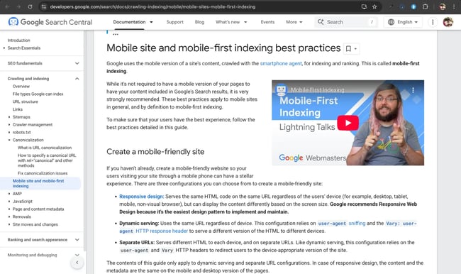
According to Google Search Central documentation, “Google uses the mobile version of a site’s content, crawled with the smartphone agent, for indexing and ranking.” This is called mobile-first indexing, and with the responsive design strategy, we are already a step closer to being on the screens of potential users.
Cost-Effective Maintenance
Responsive design saves costs. Imagine having to build a separate desktop and mobile version of a website. Stressful, right?
Also, developers know there is no such thing as a last commit. From time to time websites need to be updated, features need to be added, and components need to be adjusted. Having a responsive site cuts down the workload and work time. Instead of having to update two separate versions of the same website, a responsive design can tackle this need and save us time as well as money.
Future-Proof Flexibility
Updates are part of the technological era. There will always be a new device or a new technology. Having a responsive website design makes us prepared for whatever surprises come down the road.
With responsive design, I don’t have to build and change the layout of my website with the release of every new device with a different screen resolution. Responsive design uses a flexible layout, and these layouts adapt to any device with any screen size.
Faster Page Loading Speeds
Responsive sites often use optimized images and fluid grids, which help pages load faster — and faster sites tend to rank higher in search engines and have lower bounce rates.
Lower Bounce Rates and More Leads
Responsive sites often come off as trustworthy, with sections properly displayed, website components in the right position, etc. This plays a crucial role in lead generation and sales. Unresponsive site designs often lead to a high bounce rate, as they are often seen as scammy.
When site visitors try to navigate your website and find that it has some loopholes, some text written on top of each other, and some misaligned sections, it gives your business a bad rap. Having a responsive design helps prevent all this.
Personally, I see unresponsive sites as a form of neglect from the business, and I would be skeptical about using an application or buying a service from a company that can’t even pay attention to their website.
Responsive Design vs. Adaptive Design
Designers typically use one of two approaches — responsive or adaptive design — to ensure users have the best experience when browsing websites and applications. Though they have the same end goal, they work in different ways. Here’s how they compare.
Responsive design, as you’ve learned, involves creating a website that adjusts its layout and elements based on a device’s screen size.
Adaptive design, on the other hand, involves creating fixed layouts for specific screen sizes for devices. This means the layout created for a mobile device wouldn’t work for a desktop.
Key Characteristics of Responsive Design
- It uses fluid layouts that resize based on a user’s device.
- It uses CSS media queries to adapt a website to fit the dimensions of different devices.
- The code used in responsive design is from a single codebase.
Key Characteristics of Adaptive Design
- It uses layouts tailored to specific screen sizes or pixel widths — 320, 480, 760, 960, 1200, and 1600.
- It uses a method like user-agent detection to identify devices and deliver content that fits those device screen sizes.
- It uses multiple codebases since different layouts need to be created.
When to Use Responsive Design Over Adaptive Design
Use responsive design when you want a:
- Consistent user experience across different devices and screen sizes.
- Design approach that’s easy to maintain and update.
- Website that’s designed for mobile users and optimized for search engines.
- Reduction in design costs. Adaptive design requires creating six different site templates, which cost significantly more than a responsive design that only needs to scale up or down depending on the user’s device.
When to Use Adaptive Design Over Responsive Design
Use adaptive design when you want a:
- Hyper-tailored design or functionality for each of your target audience’s screens.
The video below provides more detail about responsive website design and how it differs from adaptive and fluid designs.
What are screen sizes?
To better understand responsive designs and how they work, we must first understand screen sizes.
Screen size measures a device’s diagonal length, usually from one corner to the opposite corner. Screen sizes are typically measured in inches (for example, 4”, 20”, etc.) or aspect ratio (for example, 16:9, 5:4, etc.).
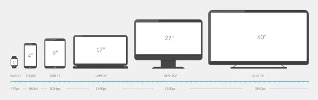
When coding and aiming to create a responsive site, just taking account of the screen size isn’t enough; another important factor to consider is the screen resolution. While screen size tells us how large the display is, screen resolution gives us details about how much content we can fit into it.
For example, let’s say my device has a resolution of 360 × 800 px. This means the screen can show 360 pixels horizontally and 800 pixels vertically. This means if an image with a horizontal width of 480 pixels is added, it won’t fit properly into the device, right? Well, that’s where responsive design comes into play.
The higher the resolution, the higher the quality and detail of a display. Devices of different sizes can also have the same resolution.
Why Screen Size Matters
Yes, size matters. As a developer, screen size is something I always consider before starting any project because it plays a huge role in how users experience my website. The way my website is displayed on a laptop cannot be the same way it is displayed on a desktop or mobile device.
Let’s take Instagram for example. Here is how the Instagram application is displayed on my iPad:

From the image above you can tell something isn’t right. Well, this is because the Instagram app is optimized for a specific screen size and resolution, so on a larger screen like a tablet, the content isn’t responsive and doesn’t fill out the space.
It’s a clear reminder that screen size impacts not just the amount of content visible but also how efficiently space is used.
Here are some reasons why screen sizes matter in responsive design.
Layout and Readability
Responsive design helps you adjust website layout and components and add certain styles to sections of your website on different screen sizes. The larger a screen is, the more content can fit side by side. With responsive design you can lay out your website components in a suitable way for all devices regardless of their screen size.
For example, you can stack up components of your website for devices of a smaller width and arrange the elements and sections in such a way that you maintain your brand style while not compromising the layout and readability of your website.
Free Website Design Inspiration Guide
77 Brilliant Examples of Homepages, Blogs & Landing Pages to Inspire You
- Agency Pages
- Ecommerce Pages
- Tech Company Pages
- And More!
Download Free
All fields are required.
User Experience
The whole point of responsive design is to give an excellent user experience. Say my design doesn’t account for mobile screens. It will leave users zooming in and out to navigate or scroll on the website.
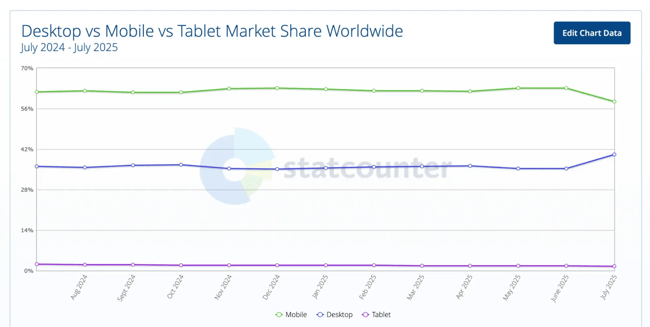
Such interaction will likely drive them away from my site. So as you design for the big screens, you must remember to do the same for the smaller ones. Since mobile devices have 58.39% of the worldwide market share, you’d be turning away a considerable amount of people if you don’t cater to their screen size.
Content Prioritization
Designing for different screens means accommodating different breakpoints. It is best to create the mobile (or smallest) screens first and then progress to tablets and desktops, as these have a higher breakpoint.
By prioritizing the smaller screens, you ensure that the crucial information users need doesn’t get lost.
Common Screen Sizes to Know
There are some common screen sizes to take note of when creating responsive design. These screen sizes are common to different types of devices and are perfect for keeping design responsiveness in check. Let’s take a look at them.
Mobile Screen Sizes
Mobile devices have grown popular over the years and are currently the most used device to access the internet. This is due to their compact size, which makes them easy to carry around.
But having a small display compared to other devices means developers must take account of this screen size difference when creating a website or application, so they don’t neglect serving the most popular demographic of device users.
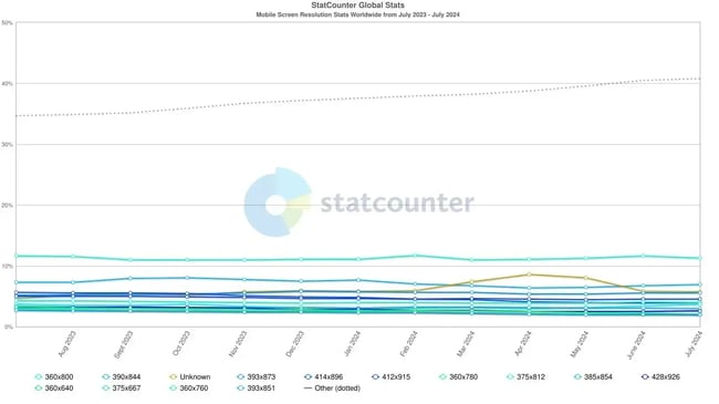
Also, having an idea of what phones are more popular can give you an idea of what screen size you should be looking at when creating responsive design. In the image above, you can see the most popular phone and the percentage of worldwide users.
Over the years, mobile screen sizes have changed, and we now see phones with displays of around 6.5-7 inches.
These are the most common mobile screen sizes to consider:
- 360 × 800 px. The most prevalent mobile viewport, accounting for approximately 10.27% of global mobile usage.
- 390 × 844 px. Common among some iPhone models, making up around 6.26% of mobile screens globally.
- 393 × 873 px. Often seen on devices like Google Pixel 6a, iPhone 15pro, with a share of about 5.23%.
- 375 × 812 px. Typical of various iPhone models (e.g., X/XS), comprising about 4.31% of devices.
- 412 × 915 px. Used by devices such as the OnePlus 8 and Galaxy Note 20; accounts for 3.99% of mobile screen usage.

Other screen resolutions for mobile devices include but are not limited to 360 x 780px, 375 x 812 px, 385 x 854 px, 428 x 926 px, and 360 x 640 px.
Tablet Screen Sizes
In my experience designing across devices, tablets are the often-overlooked middle ground between mobile and desktop. A prime example of this is the Instagram application we saw earlier, so you get why it’s crucial to account for their screen sizes intentionally.
Here are the most common tablet resolutions in use globally right now:
- 768 × 1024 px. Dominates the tablet landscape with approximately 15.18% of usage, typical for iPads in portrait mode.
- 810 × 1080 px. The second most popular option, capturing around 9.85%, common in newer iPad models.
- 820 × 1180 px. Sitting at about 8.5%, this resolution is seen in models like the iPad Air 10.1.
- 800 × 1280 px. Used by approximately 8.11% of tablets, often on Android slates.
- 1280 × 800 px. Accounts for about 7.21%, popular on midrange devices like some Samsung and Umidigi tablets.

Other tablet resolutions include 834 x 1194 px, 1024 x 1366 px, and 744 x 1133 px.
Remember to consider landscape and portrait orientations when designing mobile and tablet screens.
Desktop Screen Sizes
Desktops still represent a substantial portion of user traffic; it holds a good 40.4% market share worldwide, and designing for their most common screen resolutions is critical for both aesthetics and usability.

Here are the most prevalent desktop viewports globally right now:
- 1920 × 1080 px. Still the dominant desktop resolution, capturing around 20.28% of all desktop traffic worldwide.
- 1536 × 864 px. Found in many mid-range laptops and monitors, with approximately 8.91% share.
- 1366 × 76 px. Common in budget laptops and older screens, holding about 8.07% of the market.
- 1280 × 720 px. Still used in certain entry-level devices, accounting for 4.65% of usage.
- 1440 × 900. Seen on older and mid-tier displays, making up around 3.3% of desktop screens.

Why These Numbers Matter
I’ve learned from numerous projects that optimizing for real user devices is essential. Each of these five viewport sizes I have mentioned for the different device categories collectively represents a major chunk of device traffic. Focusing on breakpoints and testing them ensures smoother performance and fewer layout surprises across commonly used devices. It’s a practical way to cover most user scenarios without over-engineering for every single device.
How to Code for Different Screen Sizes
Over the years, I’ve learned that the key to building layouts that look amazing on any device is not guessing — it’s planning. I don’t just rely on default breakpoints from a CSS framework; I analyze my audience’s devices first and code for their actual needs. Here’s the approach I follow every time.
1. Start with a mobile-first approach.
I always begin coding for the smallest screens first. This keeps my CSS lightweight and ensures essential content works well without relying on big screens to “save” a layout. Mobile-first also forces me to make hard choices about what’s most important for the user.
2. Use CSS media queries strategically.
I set breakpoints where my design naturally “breaks,” not just at framework defaults. Common ranges I use in 2025:
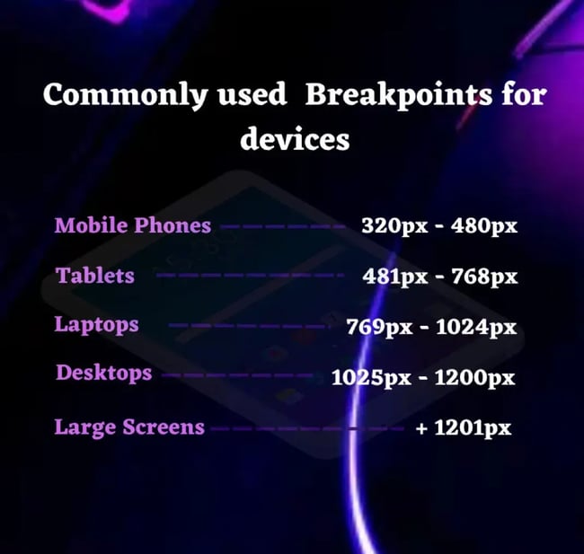
- Up to 480px – Small mobile phones.
- 481px to 768px – Larger phones and small tablets.
- 769px to 1024px – Tablets in landscape.
- 1025px to 1200px – Laptops and desktops.
- 1201px+ – Large desktops and ultra-wide monitors.
3. Use flexible units instead of fixed pixels.
I lean heavily on em, rem, %, and vw/vh units. They adapt better to user settings, accessibility preferences, and unexpected screen dimensions.
4. Test on real devices (not just your browser).
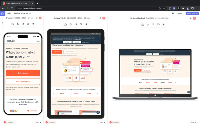
Browser dev tools are great, but they don’t replace testing on actual devices. I’ve caught plenty of spacing, touch, and font-rendering issues that only appear on real screens. I use a mix of my own devices and tools like the LambdaTest LT browser for this.
Virtual testing devices allow me to test my website on different screen sizes. I can test on the latest mobile, tablet, and desktop devices to ensure a great user experience for all my website visitors.
Example 1: Creating a Responsive Navbar
Navigation bars are very common in modern websites, and they are a good example of how useful responsive design is. A navbar is used to display navigation items, mostly links to important pages of a website, like the contact page, about page, product page, and so on.
In desktop devices, due to the large screen real estate, each of these navigation items can be displayed, but when we get to smaller screens, displaying all the navigation items does not seem right, as they take up space and break the visual aesthetics of the design. A common solution to this problem is to use a hamburger menu, which reveals and hides the navigation items on click.
With responsive design, I can set some media query rules to replace the navigation item with the hamburger menu for devices with a certain viewport width.
Let’s take a look at this Codepen.
See the Pen Hubspot blog: responsive designn example by Clinton Joy (@Cejay101) on CodePen.
On desktops and larger screens, the navigation (.nav-items) is displayed as a horizontal menu with multiple links. Users get immediate access to all options because there’s enough screen space.
When the screen width drops below 952px, the CSS media query kicks in and the hamburger icon becomes visible. The full navigation menu (.nav-items) disappears to save space. This ensures the layout remains functional without cramming too many links on smaller devices.
Example 2: Creating a Line Break for Different Screens
Another example we can use to illustrate responsive design is creating a line break for different screens.
In this example, a line of text will break into two lines on smaller screens but stay on one line on larger screens.
See the Pen media query syntax example 2 by HubSpot (@hubspot) on CodePen.
Running the code, we’ll discover that the line of text stays in one line on a laptop, and breaks on a smaller screen.
If the code doesn’t run on the first try, continue to test and refine until you get it right.
Make your websites responsive.
Responsive design is a huge part of my career as a software developer; it’s something I simply can’t do without. In today’s world, a modern website must be responsive because it directly impacts user experience and, by extension, business success.
I’ve listed several benefits of responsive design, but trust me, those aren’t all. That’s why I strongly encourage you to factor responsive design in right from the start of any project. If you’re new to web development, begin by learning the most common screen sizes, practicing regularly, and applying flexible coding techniques. Do this consistently, and you’ll see your websites deliver seamlessly across devices.
Editor's note: This post was originally published in September 2024 and has been updated for comprehensiveness.
Free Website Design Inspiration Guide
77 Brilliant Examples of Homepages, Blogs & Landing Pages to Inspire You
- Agency Pages
- Ecommerce Pages
- Tech Company Pages
- And More!
Download Free
All fields are required.
Responsive Design

![Responsive Text: Making Your Font Look Great on Every Device [+CSS & HTML Tips]](https://53.fs1.hubspotusercontent-na1.net/hubfs/53/responsie-text-1-20250206-8138788.webp)