As a HubSpot Website Blog staff writer who’s built and reviewed dozens of sites on platforms ranging from Squarespace to HubSpot Content Hub, I’ve noticed that the most effective simple websites share a few common traits — and none of them require advanced design skills. Whether you’re a first-time website builder or redesigning an existing site, these are patterns you can apply today.
Below, I’ll break down what makes each example work so you can use the same principles on your own site.
Table of Contents
- What makes a great simple website design?
- 20 Best Simple Website Examples
- Best Tools for Building Simple Websites
- Frequently Asked Questions About Simple Website Design
- Use these basic website designs to inspire yours.
20 Best Simple Website Examples
I’ve curated this list of simple website examples from several industries with diverse purposes — from static portfolios to dynamic websites — to show that many types of websites can be classified as simple.
1. Ollivere
Category: UX/UI design portfolio
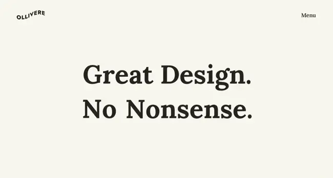
Ollivere is a simple one-pager portfolio site showcasing Martin Ollivere’s UX/UI design and creative direction work. When you land on the site, you immediately see the mission: “Great design. No nonsense.” Keeping the homepage simple, aside from mindfully placed copy, makes visitors want to learn more about the brand’s story. As you scroll down, parallax scrolling further brings that story to life with visually appealing sketches and compelling examples.
What I like:
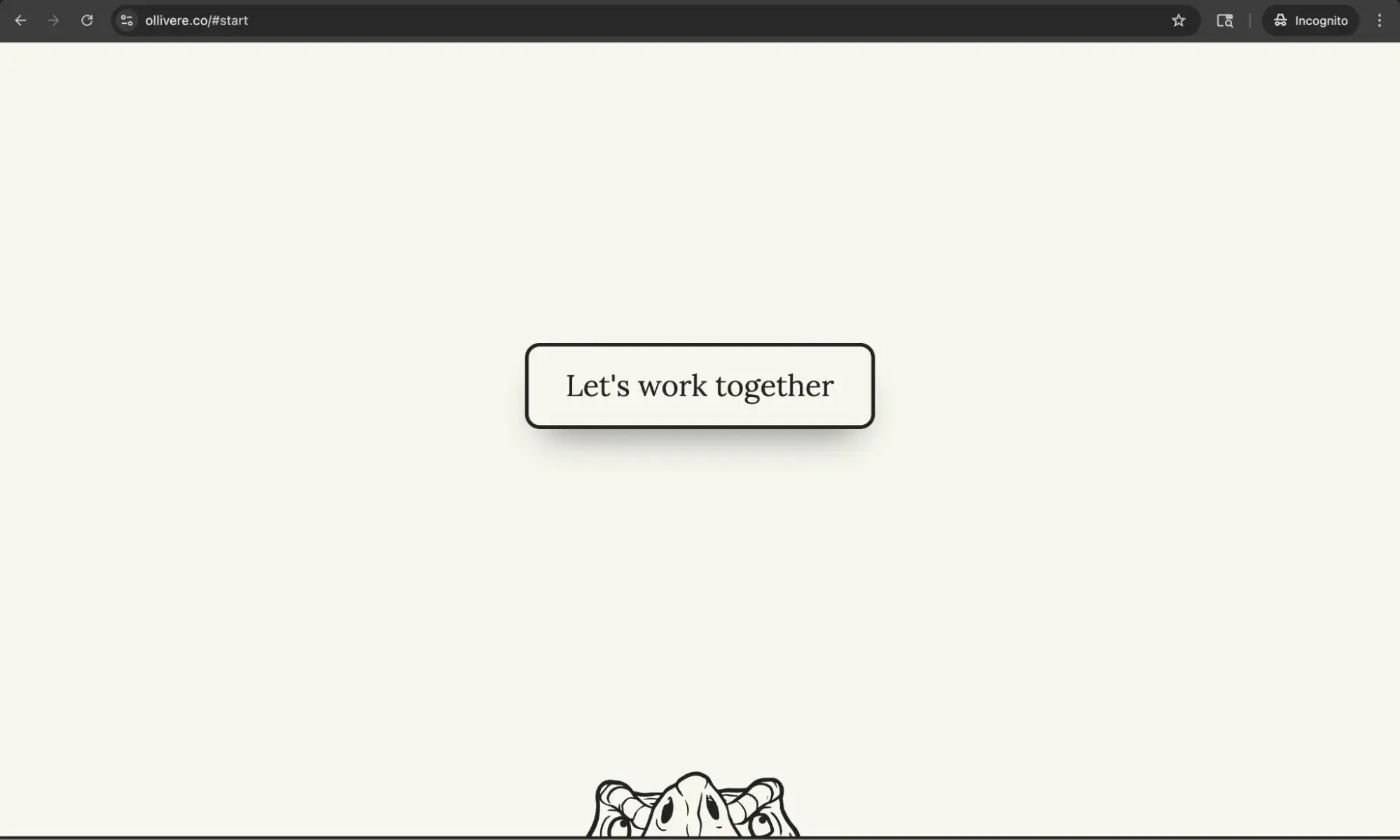
Ollivere’s website ensures that each section contains only one idea. This helps improve readability and conversions because there are few distractions for the visitor. For example, notice how the “Let’s work together” button is the only action available on this section (and hey, the animated T-Rex jumping up toward the CTA button upon hover is a fun touch!).
2. Ink
Category: CGI and animation studio

The Ink website is a simple design that highlights the CGI and animation work of this London-based digital studio. The homepage is image-centric and mindful of how much copy it uses. Instead of overwhelming visitors with a daunting paragraph of text, Ink keeps its copy sparse and uses an image grid to hold its visitors’ interest.
What I like:
Ink’s main navigation is indicated by a small dot in the top right-hand corner. Because of its clever placement, users can infer this is the menu without using any text. This simple yet visually engaging website uses parallax scrolling features to bring it to life.
In addition, I like how the website uses bold imagery to highlight the company’s projects.
3. Dr. Jennifer L. Ross
Category: Therapist website
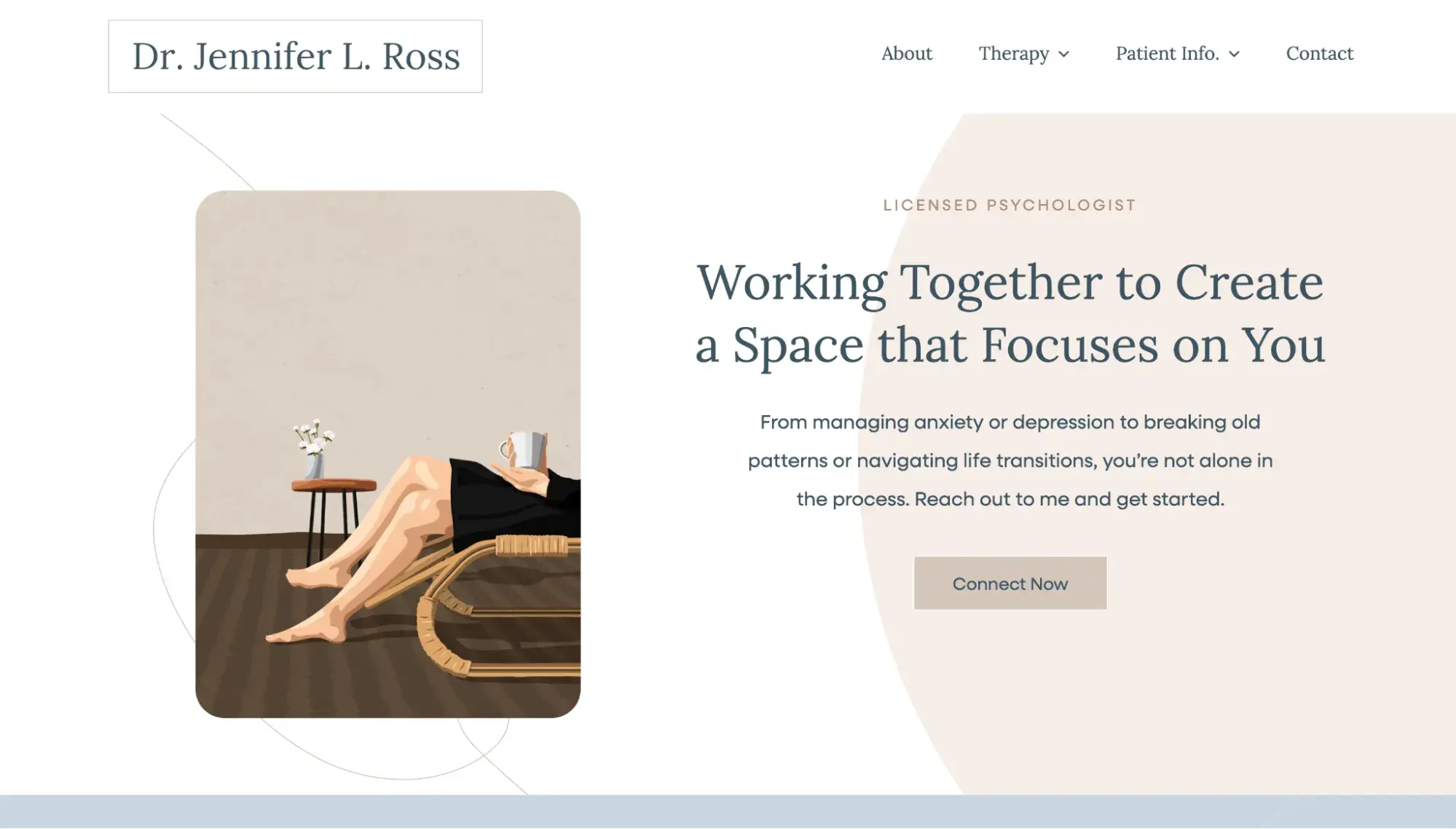
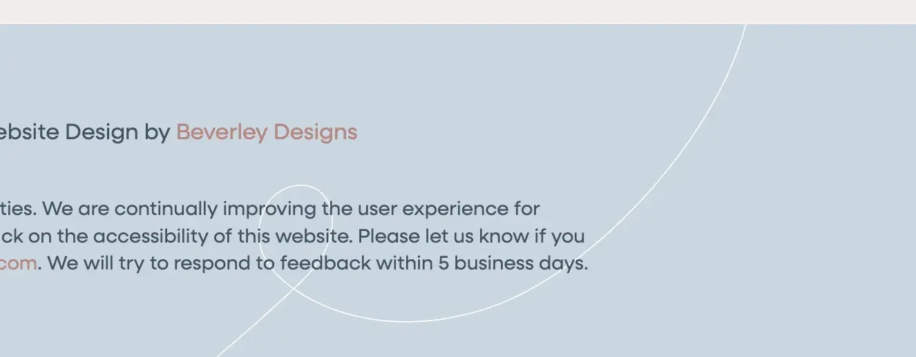
This simple therapist website features a design that’s soothing and inviting, with a muted three-color palette, soft line illustrations, and a clear description of her therapeutic approach. Designed by Beverley Delay, who specializes in sustainable web design, the website isn’t weighed down by any unnecessary design elements, which is helpful for improving conversions and protecting the environment.
What I like:
Dr. Ross’s website proves that you don’t need lots of photography to have a beautiful, simple website. Instead, it leans on soft line illustrations (like a potted plant) and subtle geometric accents to create visual interest.

4. Nate Smith
Category: Designer portfolio
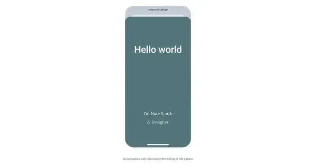
Nate Smith’s portfolio presents his UI work inside an animated device mockup, morphing from a mobile phone into a laptop as you scroll. It ends with a simple call to action coupled with his email address.
What I like:
Nate Smith’s portfolio site has no navigation and no links. Because of that, there is only one action a user can really take: copy his email address. While I don’t have any data from Smith, I would venture that his website converts well in terms of getting emails from interested prospects.
5. Alima Pure
Category: Ecommerce/clean beauty
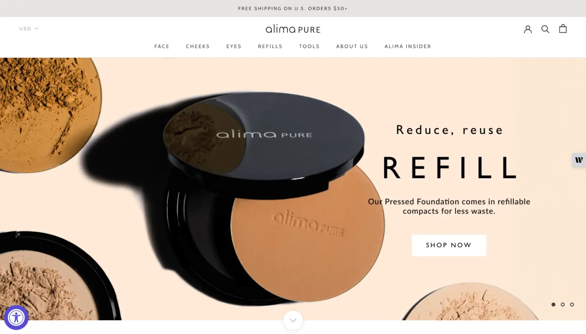
Clean makeup brand Alima Pure is a strong example of a simple ecommerce website design built on Shopify. The homepage leads with a full-width hero image showcasing its cosmetics against a neutral palette of white, gray, and beige, with minimal animation throughout.
What I like:
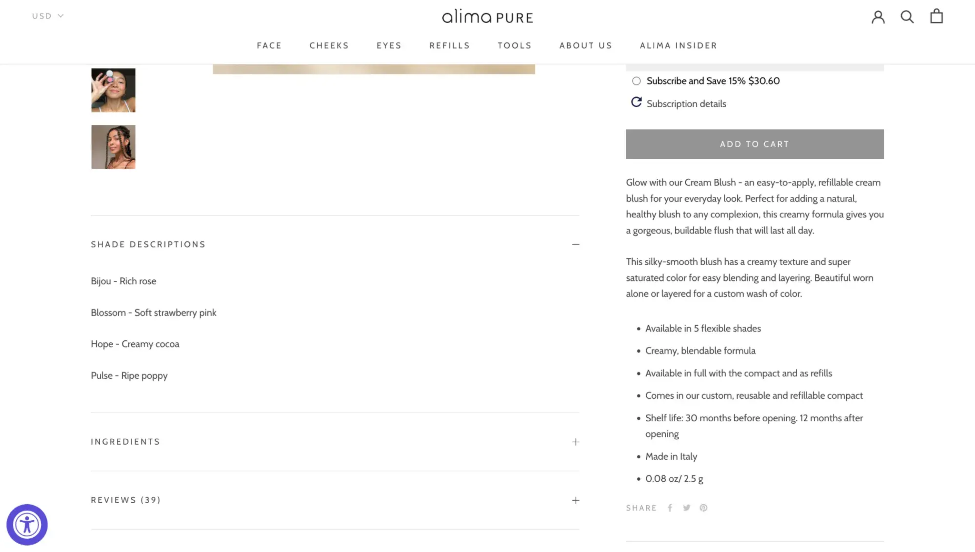
Ecommerce sites are notoriously maximalist, but Alima Pure stays minimal by using accordion components for product descriptions, ingredients, and reviews. Instead of bombarding visitors with a wall of text, it presents a clean product page where visitors can expand only the sections they need. It’s a smart UX pattern for any product-heavy site that wants to keep its layout simple.
6. Apelsyn
Category: Restaurant (HubSpot Content Hub theme)
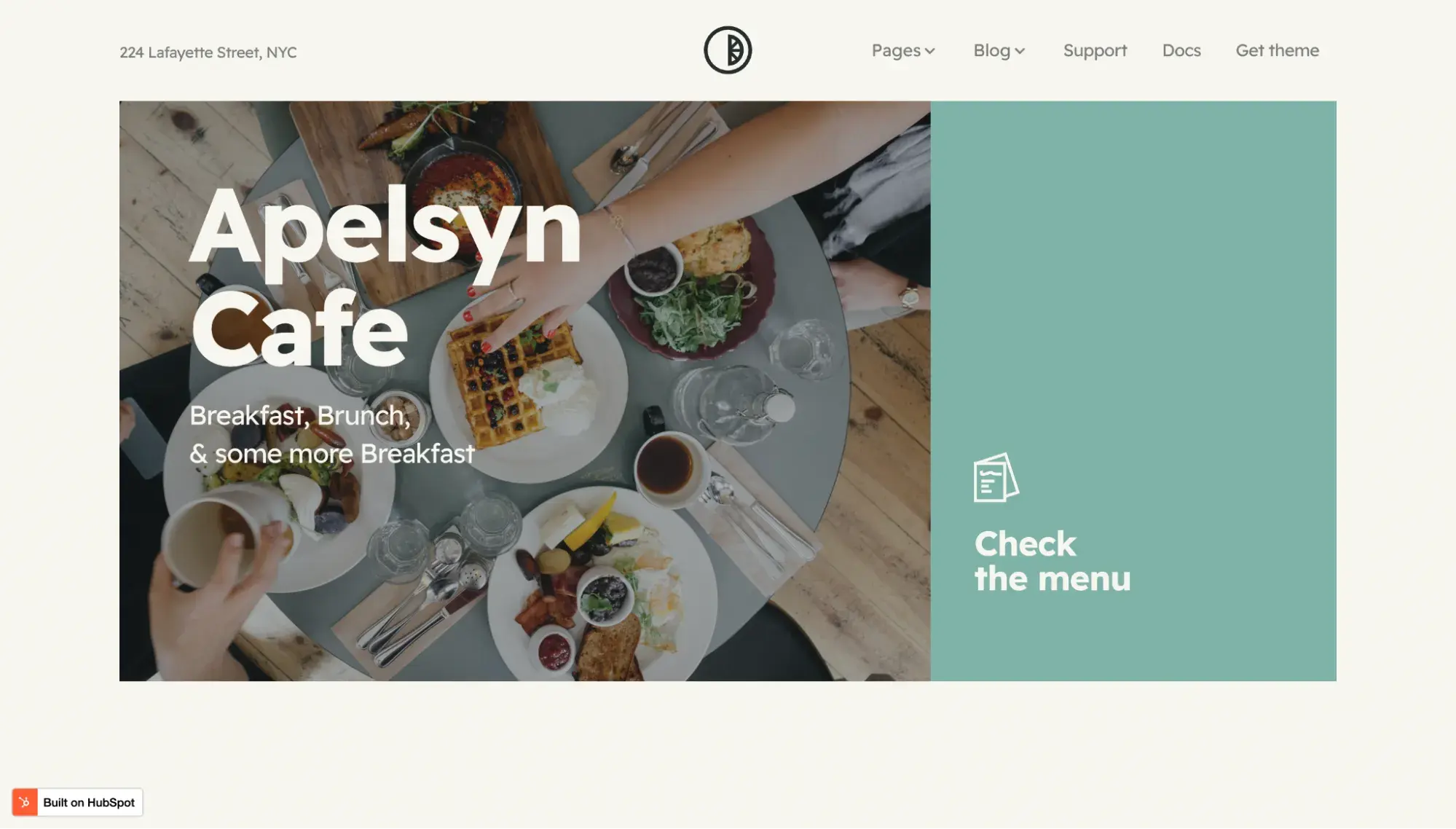
Apelsyn is a HubSpot Content Hub theme built by Kohorta Studio, and it’s one of my favorite simple restaurant website templates. The page uses a warm cream-and-sage color palette with pops of yellow in its branding, including a playful half-orange illustration that doubles as a visual motif. The layout gives each section plenty of breathing room so nothing feels cramped.
What I like:
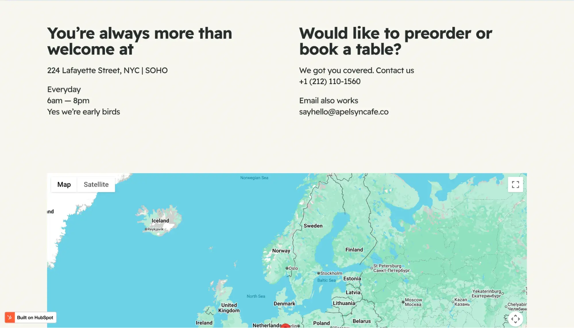
Apelsyn’s homepage is organized around two clear paths: “Sit-n-Indulge” for the dine-in menu and “Grab-n-Go” for takeaway, each anchored by an asymmetric photo grid that keeps the page visually interesting without overcomplicating it. Plus, the footer puts hours, address, phone number, and an embedded Google Map right where visitors expect them. For a local business, that’s exactly the kind of frictionless experience that turns a website visit into an actual visit.
You don’t need to start from scratch to get a polished result like Apelsyn. HubSpot’s Content Hub gives you access to a library of customizable templates with drag-and-drop editing so you can launch a clean, simple website without writing code.
7. Manuel Moreale
Category: Personal blog
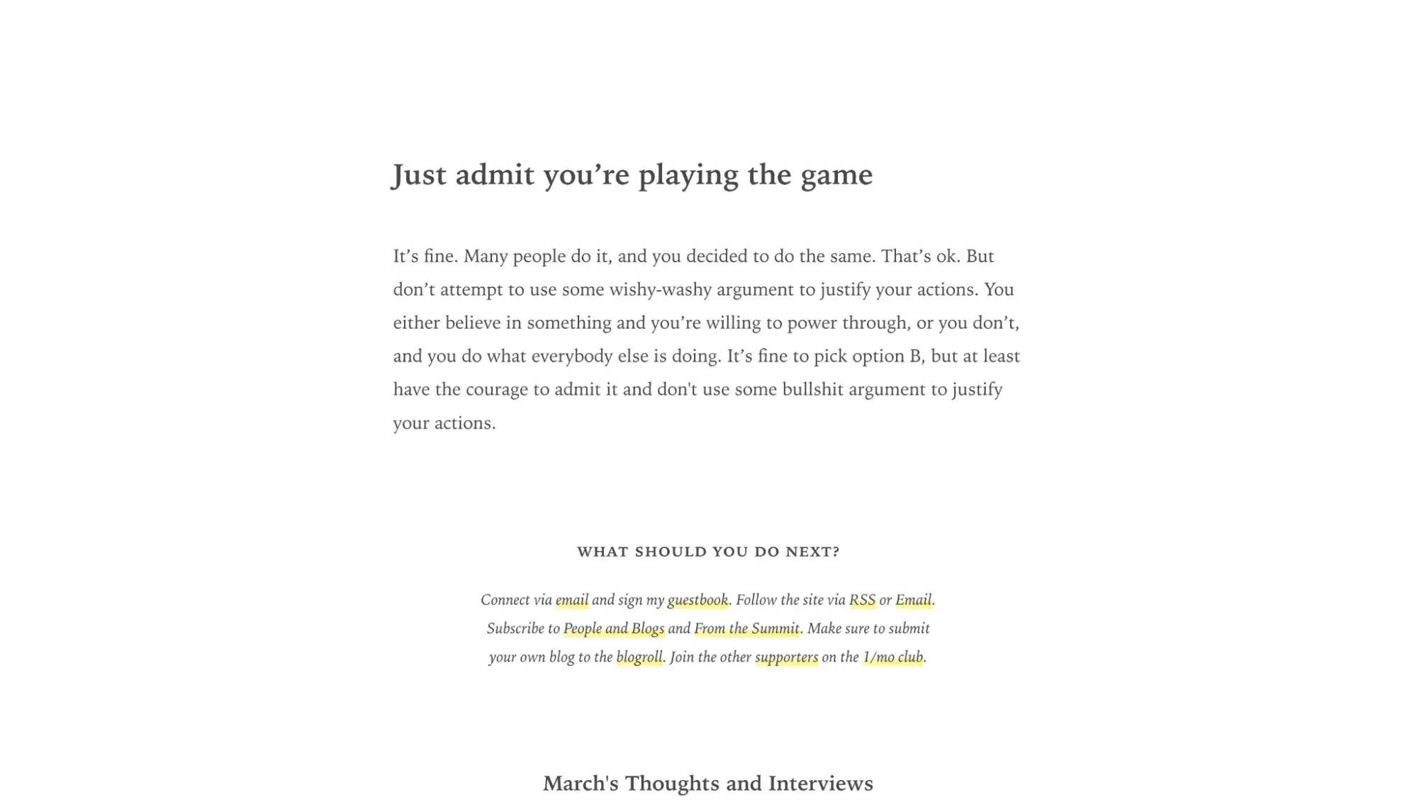
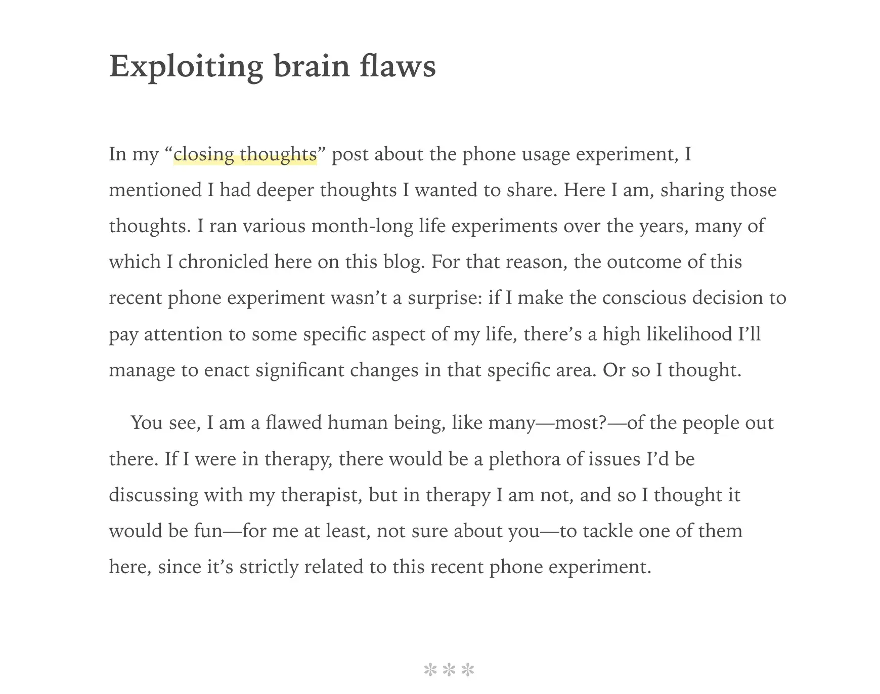
Manuel Moreale’s website is a text-only blogroll that strips away nearly every visual element. There are no images, no illustrations, and no color scheme beyond the occasional yellow-highlighted link. It’s a strong example of when simple website design crosses into true minimalism.
The homepage opens with his latest blog post in full, followed by a chronological archive organized by month with headers and dotted leader lines connecting each title to its publish date.
What I like:
A minimalist website lets visitors focus entirely on what’s being said rather than how the site looks. And when what you have to say is important, that focus matters.
Pay attention to the typography: A refined serif font gives the page a literary, editorial feel, and generous whitespace makes the reading experience calm and focused. The yellow-highlighted links are the only visual accent, and they guide your eye without competing for attention.
8. Greetabl
Category: Ecommerce/gifting
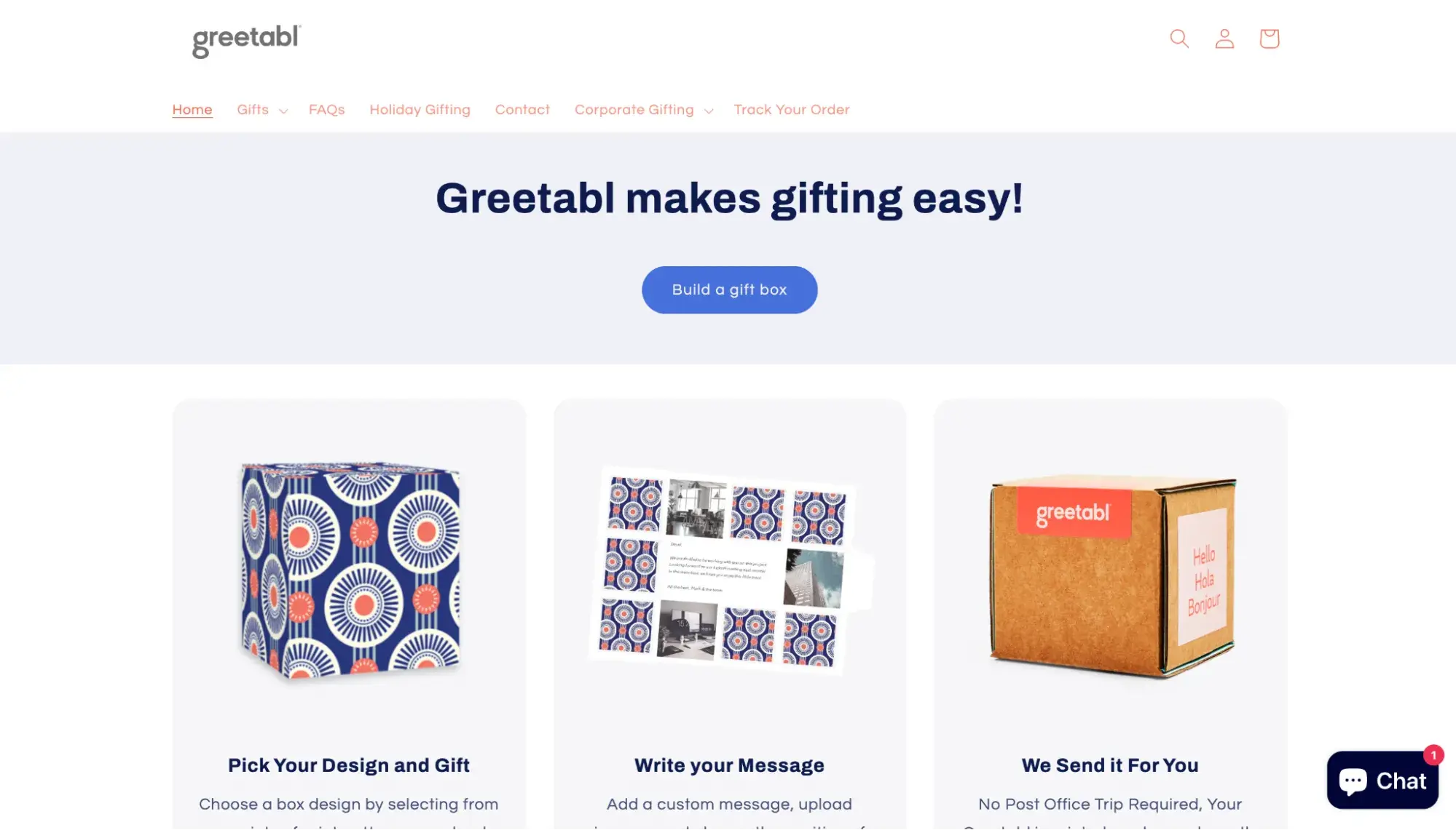
Greetabl is a gifting ecommerce site that makes its build-a-box process crystal clear through clear copywriting and high-quality images. The headline immediately states its value proposition: “Greetabl makes gifting easy!” The homepage uses a warm coral-and-navy color palette with ample spacing, and the layout walks visitors through each step with images before transitioning into corporate gifting benefits further down the page.
What I like:
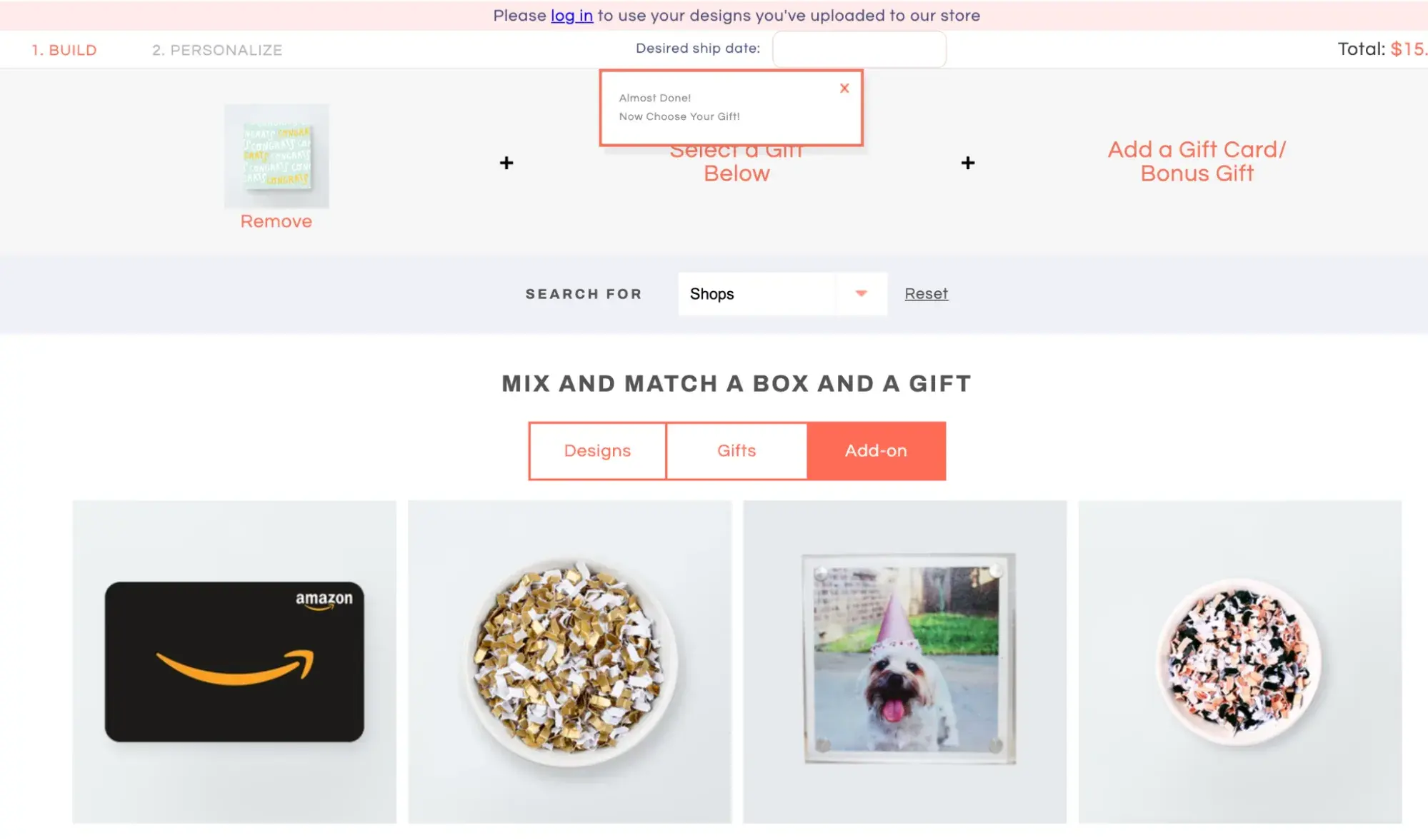
Despite offering a lot of functionality — including bulk sending, automations, and custom branding — Greetabl feels straightforward. Its interactive gift builder makes easy to send a gift box. It uses a clear two-step progress bar (Build → Personalize) with tabbed categories for box designs, gifts, and add-ons, so users can mix and match without feeling paralyzed by choices. (And as a customer myself, I can attest that it was a fun experience building and sending gifts through this site.)
Greetabl’s builder updates the running total in real time and nudges you forward with inline prompts like “Almost Done! Now Choose Your Gift!” — a smart UX pattern that keeps the experience feeling guided rather than open-ended. For an ecommerce site with this many customization options, maintaining that sense of simplicity is no small feat.
9. Doist
Category: SaaS/Productivity
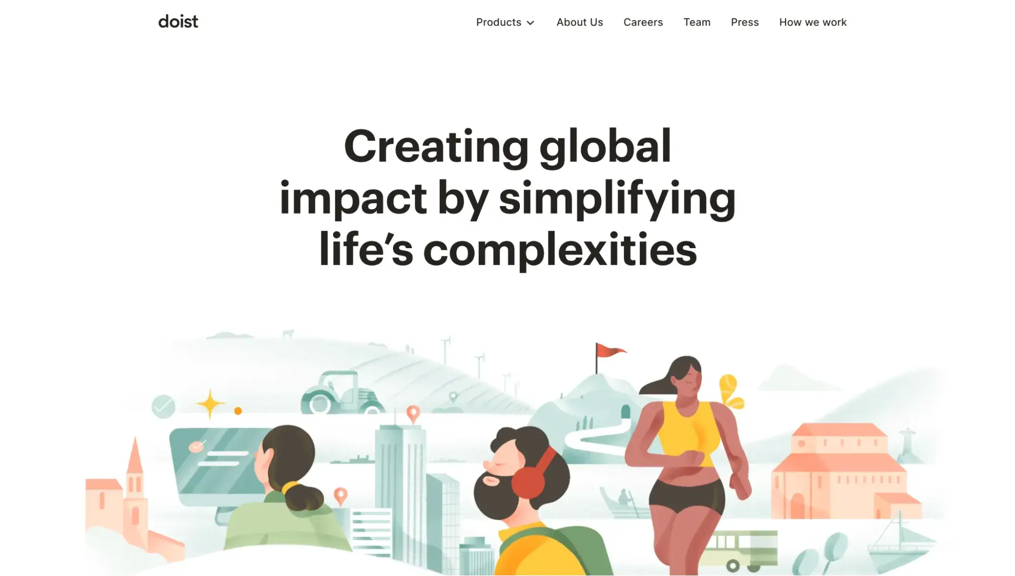
Doist is the bootstrapped, remote-first company behind Todoist and Twist, and its corporate site is a strong example of how a multi-product brand can stay visually simple. The homepage opens with a single mission statement (“Creating global impact by simplifying life’s complexities”) layered over a colorful, hand-drawn illustration with red and gold tones.
Below the fold, Doist introduces its two products side by side with one-line descriptions and “Learn more” buttons, rather than dedicating separate hero sections to each. The entire site relies on illustration over photography and sticks to a palette of warm neutrals with red accents.
What I like:
Doist’s homepage practices what the company preaches about simplicity. Rather than cramming both products, the company story, and a careers pitch into a single dense page, each section gets sufficient breathing room and makes exactly one point before the visitor scrolls to the next. A stat bar near the bottom is especially effective, containing only four numbers (including 97% employee retention and $0 VC raised), letting the figures speak for themselves.
10. Adrián Gubrica
Category: Developer/designer portfolio
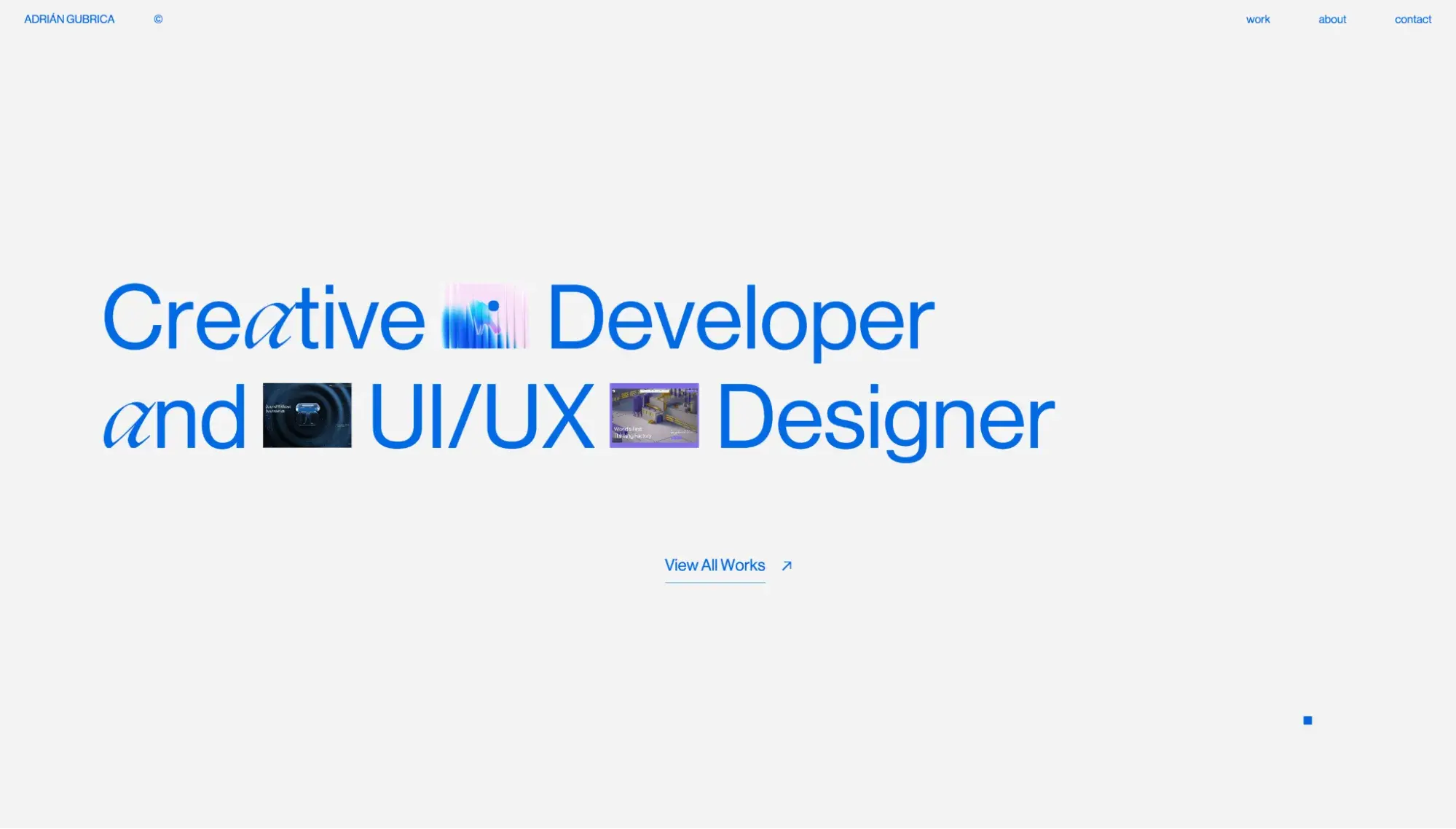
Adrián Gubrica’s portfolio website is more fanciful than other simple websites on this list, but it earns its place by minimizing images, avoiding clutter, and keeping navigation dead simple. When a visitor lands on the homepage, oversized blue text states exactly what Gubrica does: “Creative Developer and UI/UX Designer.” It’s a clear example of how a developer portfolio can feel playful and technically impressive without abandoning the fundamentals of simple website design.
Gubrica’s homepage adds intrigue by embedding small project thumbnails directly inside the headline text. When the user hovers over each image, a large arrow icon appears — the universal sign that clicking will open an external link.
Pro tip: Gubrica replaces the default cursor with a small blue square that transforms into a larger circle on hover — a technique known as a custom cursor. It’s a slick brand touch, though custom cursors can create accessibility friction for users who rely on the default pointer’s predictable shape and position. If you borrow this technique, keep the native cursor available as a fallback.
What I like:
With only three navigation links (Work, About, Contact) and a single “View All Works” CTA in the hero section, the site keeps decision fatigue to a minimum and funnels visitors toward exploring his creations.
11. Kobu
Category: Creative studio/travel
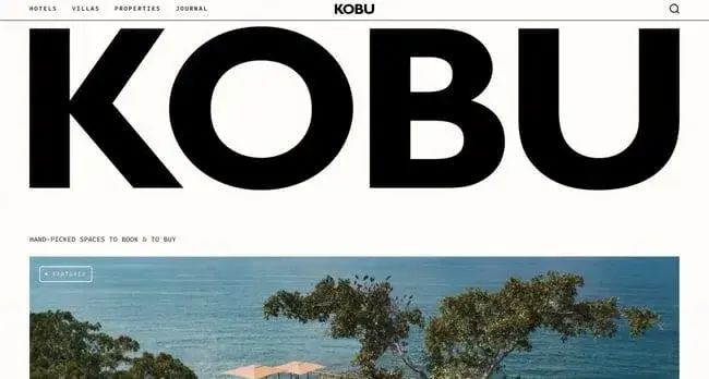
Kobu is a design-focused creative studio that curates boutique hotels, villas, and retreats across destinations like Mexico, the Mediterranean, and Asia. Its simple website design reads like the cover of a high-end travel magazine — oversized, heavy sans-serif typography dominates the layout, and the semi-grainy, warm-toned photography gives the whole site a tactile, editorial quality.
Despite featuring a lot of content (hotel listings, villa rentals, journal entries, etc.), the page feels soothing. Each section gets lots of whitespace and a color palette of black, cream, and earth tones — proof that content density and simplicity can coexist when spacing and color discipline are doing the heavy lifting.
What I like:
Kobu’s individual hotel pages are where the basic design really earns its keep. Each listing follows a consistent editorial structure: a cinematic hero image, a short written overview, tabbed navigation for rooms and villas, a “Local Favourites” section highlighting nearby spots, and an embedded directions map. You can explore a property in depth without ever feeling lost because the hierarchy is so clear — you always know what section you’re in and what to do next.
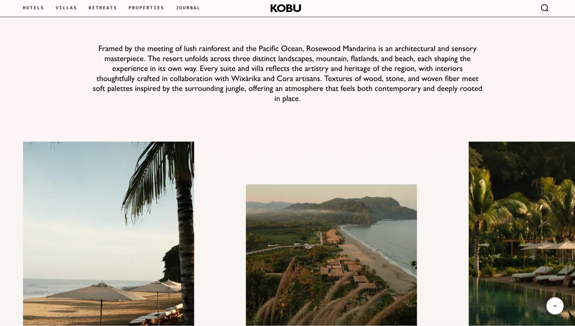
Viewing Kobu’s website made me want to book a vacation immediately, which is exactly the response a travel brand should provoke. It highlights how good design is more than just looking good — it captures a feeling, inspires an action.
12. Sequoia Capital
Category: Venture capital
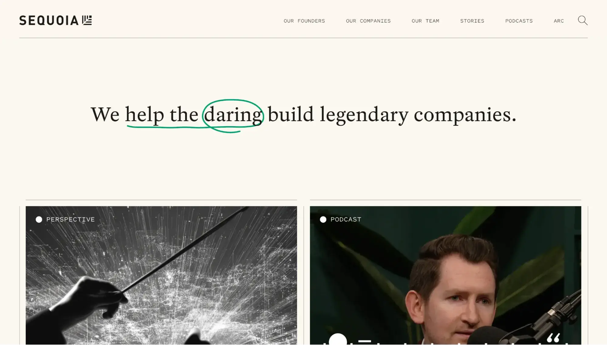
The website of Silicon Valley’s legendary Sequoia Capital VC firm is as sophisticated as it is simple. Its homepage image grid practices bold restraint, with the occasional box featuring motion (a video, scrolling text, or animated graphics). The hero section features one sentence that clarifies what the firm does: “We help the daring build legendary companies.”
What I like:
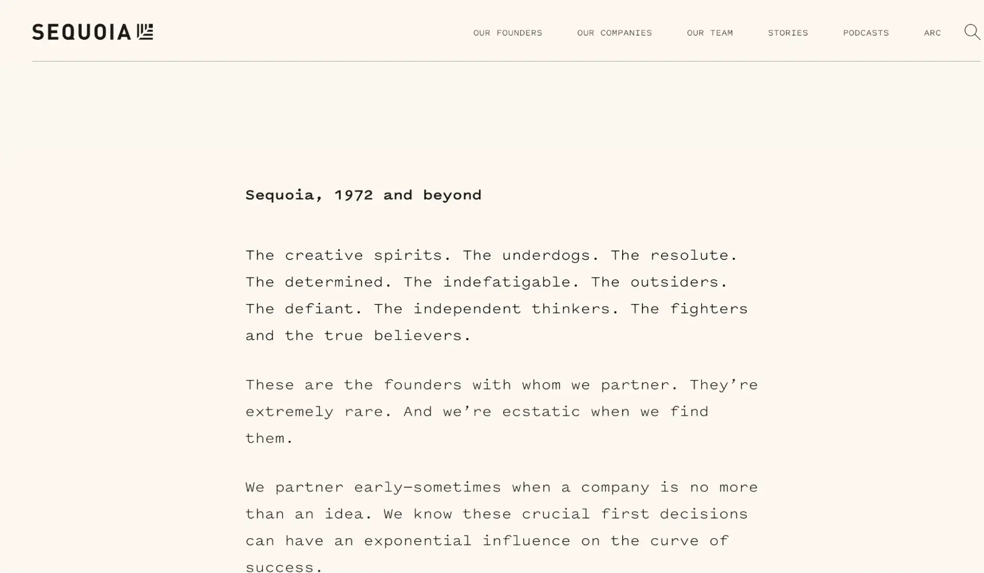
Sequoia’s Our Ethos page is a masterclass in letting copy do the work. It’s a single column of short, declarative paragraphs set in a monospaced typeface against a warm cream background — without a single image. Every paragraph makes exactly one point about the firm’s values, so each statement reads as a complete, standalone thought. That takes more discipline than filling a page with visuals, and it’s proof that simple website design can communicate authority through typography and whitespace alone.
13. Ainger Tomlin
Category: Accounting/professional services
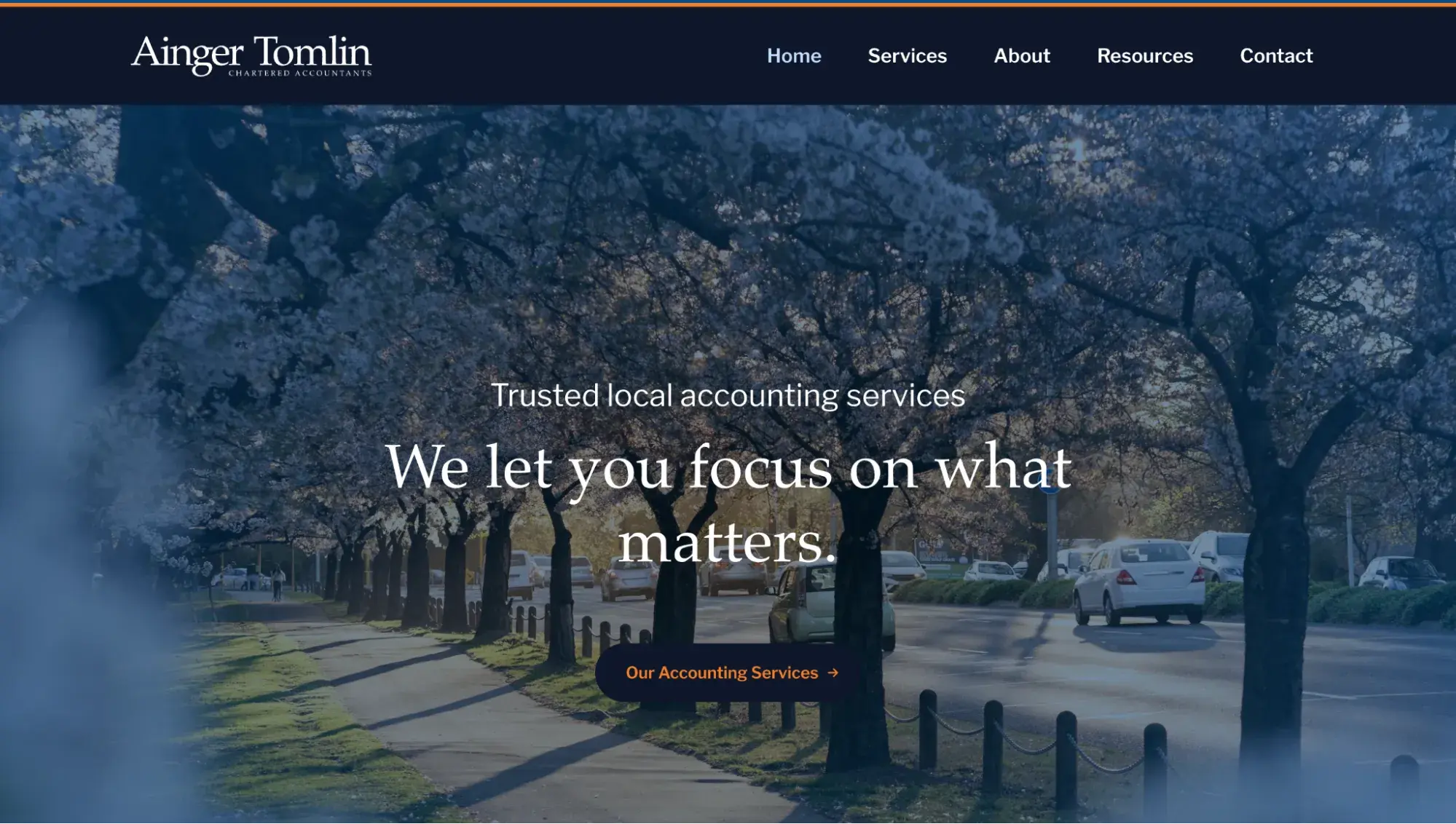
Ainger Tomlin is a Christchurch-based accounting firm whose website shows that simple design doesn’t have to default to an all-white palette. The homepage opens with a moody, tree-lined hero image set against a deep navy background, immediately establishing a sense of trust and professionalism. Below the fold, four service cards — Accounting and Tax, Business Development Experts, IT/Payroll/HR, and Audit and Assurance — are laid out in a clean two-by-two grid, each with a short description and a single link. The entire site sticks to a three-color palette of navy, white, and orange, keeping every page cohesive without relying on heavy imagery or decoration.
What I like:
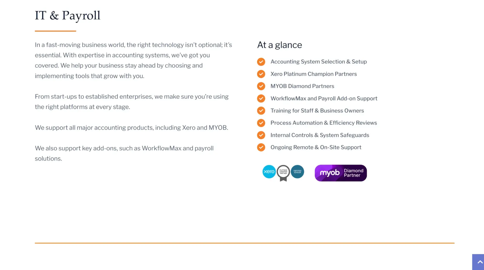
The homepage is one of the most intuitive on this list. Within a single scroll, it clearly answers three questions every visitor has: who is this firm, what do they offer, and how do I contact them. The services page follows the same discipline — each offering gets its own section with a brief narrative on the left and an “At a glance” checklist on the right, so visitors can either read the full pitch or scan the bullet points depending on how much detail they need.
14. Postevand
Category: Ecommerce/sustainable packaging
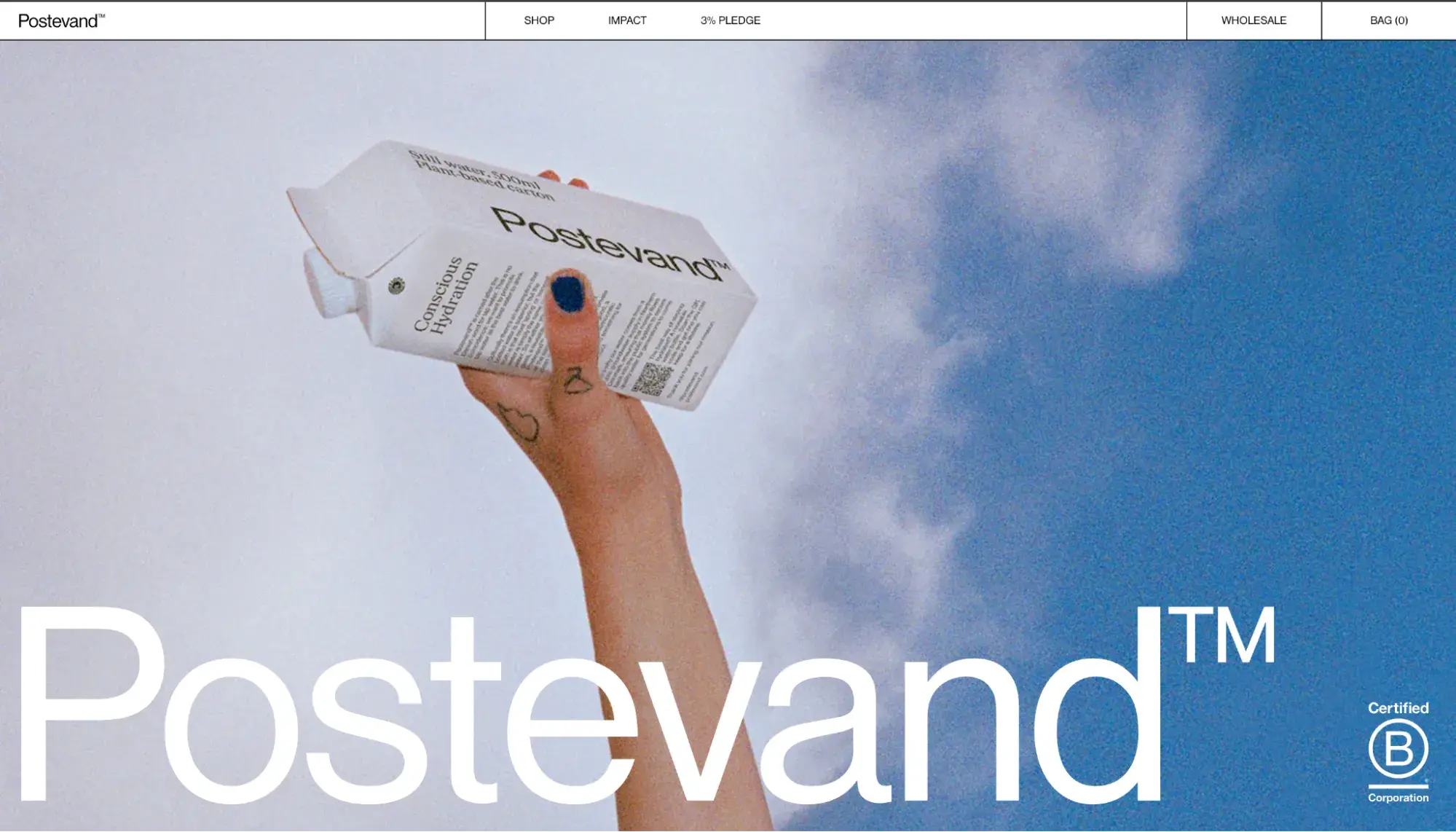
Postevand is one of the strongest simple website design examples on this list for a single-product brand. The Danish company sells tap water in plant-based cartons as an alternative to plastic bottles, and its site is as focused as its mission.
The homepage leads with a lifecycle study claim (18% lower climate impact than a bottle made from 100% recycled plastic), then walks visitors through the carton’s material breakdown, including FSC-certified cardboard and a plant-based cap. The simple website sticks to a palette of white, black, and the occasional muted lifestyle photograph, letting the product and its environmental credentials do the talking.
What I like:
Though verging on minimalism, Postevand’s simple website design is deceptively rich. The homepage features a 3D parallax sequence that “unfolds” the packaging as you scroll, revealing the cardboard layers, cap material, and lining — a clever solution for a brand whose key differentiator isn’t visible at a glance.
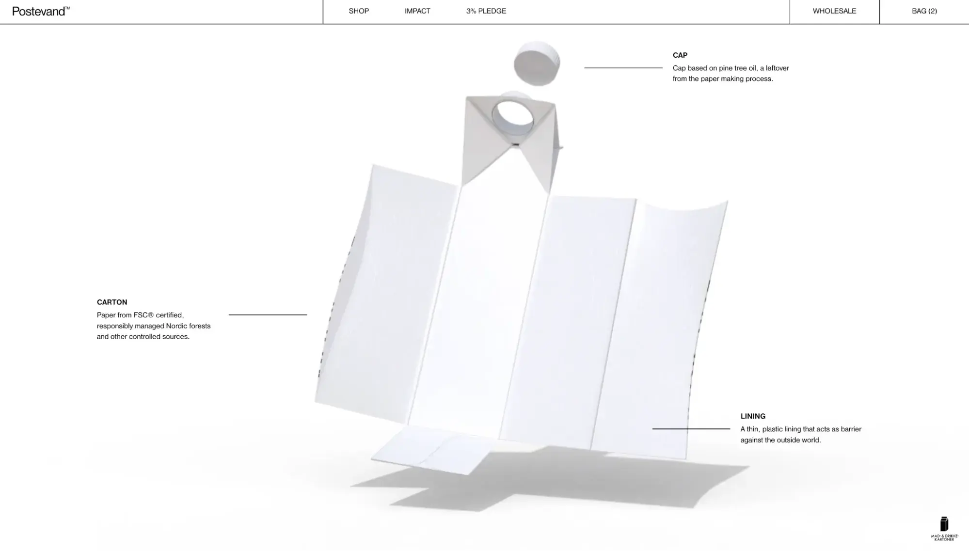
This simple website example shows that even a mission-driven ecommerce brand with a complex sustainability story can communicate it clearly when the design stays disciplined — one idea per section, generous whitespace, and zero clutter competing with the core message.
15. Frase
Category: SaaS/SEO
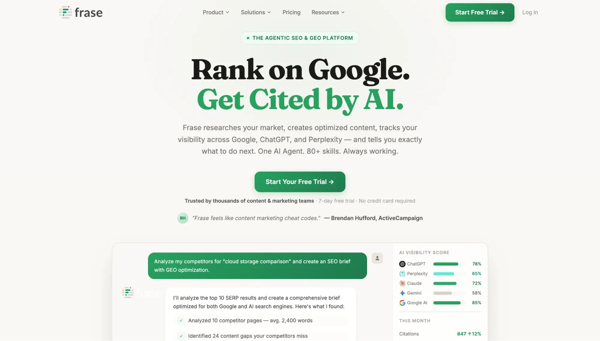
Frase is an SEO/AEO software tool with a simple website design that clearly communicates its value proposition in seven words: “Rank on Google. Get Cited by AI.” This is followed by a green CTA button and a product mockup that simulates a real interaction inside the tool.
What I like:
SaaS pricing pages can easily get overwhelming, but Frase keeps it simple with three tiers presented in side-by-side cards with clear prices and a single highlighted “Start Free Trial” button on the recommended plan.
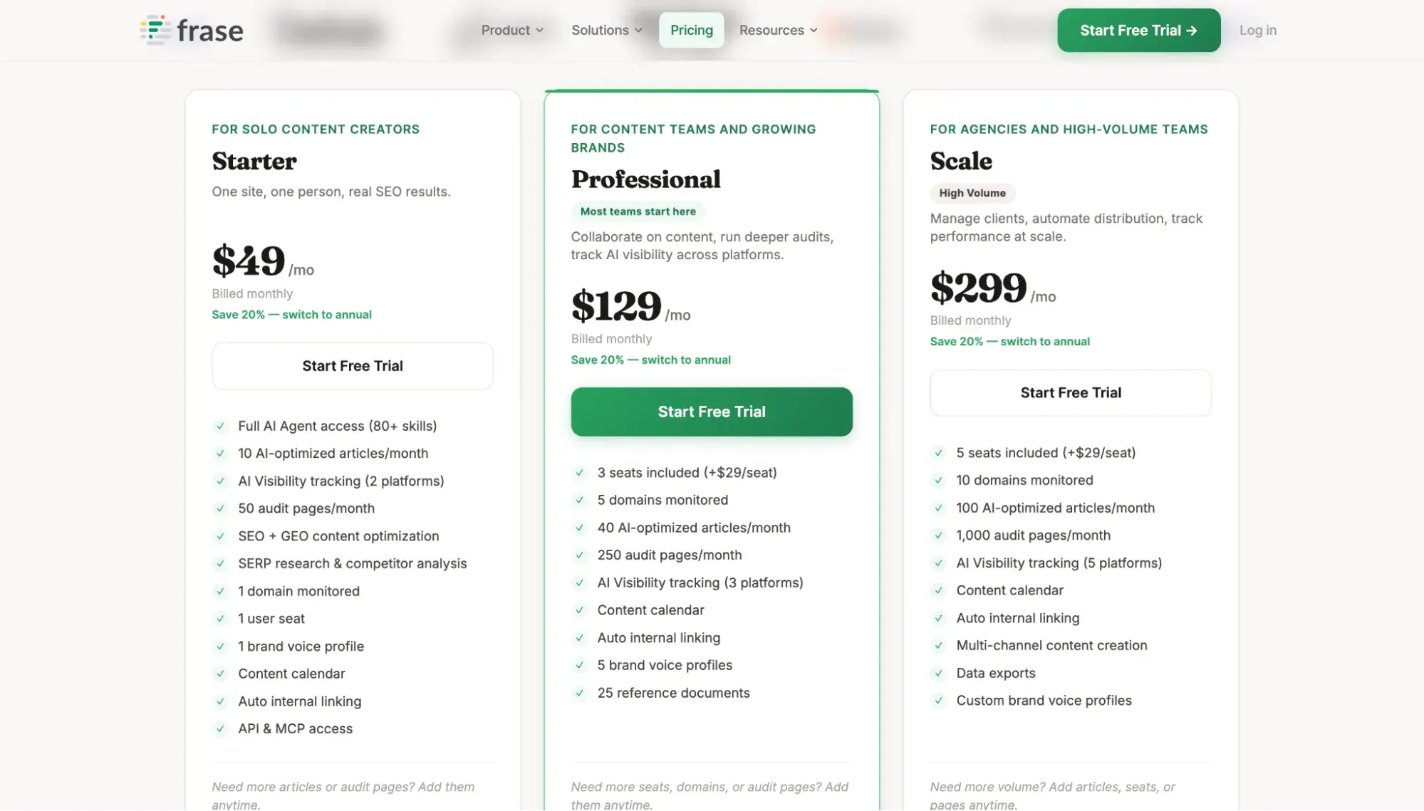
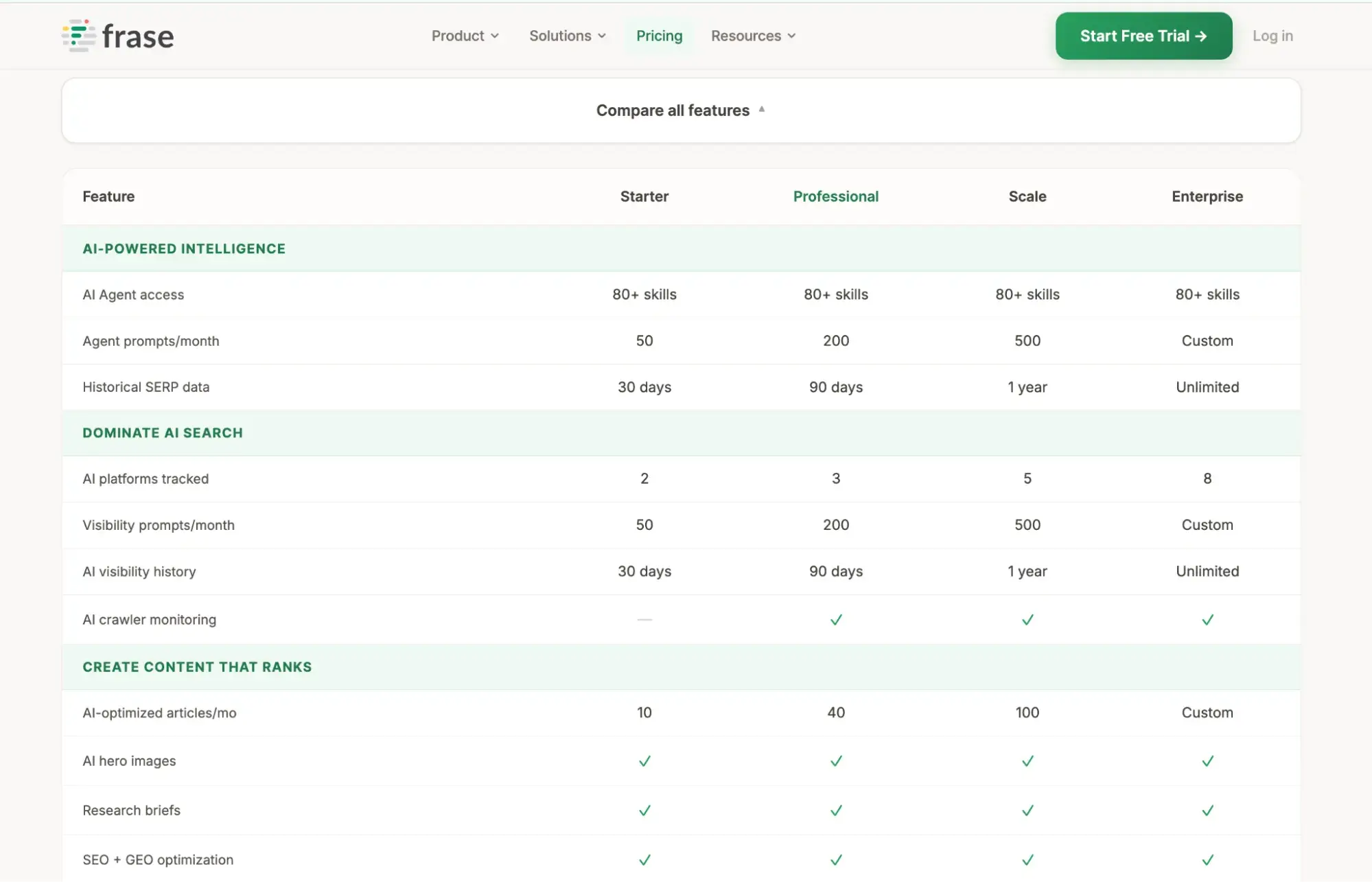
The page quickly answers, “What do I get and what does it cost?” And if visitors want more detail, they can expand the “Compare all features” to see a comparison table that clearly lays out what each upgrade gets them.
16. Kyle Johnson
Category: Photography portfolio

Kyle Johnson’s portfolio site lets his photography carry the design. The homepage arranges editorial portraits and travel work in an asymmetric masonry grid — images are staggered at different sizes and offset positions rather than locked into uniform rows — giving the layout a curated, gallery-wall quality. Navigation is stripped to just three elements: “All” in the bottom left corner, an “About” link in the top-left corner, and the photographer’s name in the top-right, rendered in elegant spaced serif capitals.
What I like:
Kyle Johnson’s site is one of the most image-dense portfolios on this list, yet it never feels cluttered, and that’s entirely because of how whitespace is used. Each photograph gets generous breathing room on all sides, so the eye moves naturally from one image to the next without competing focal points. That kind of spacing discipline is what separates a polished portfolio from a photo dump, and it just goes to show that simple website design can display a high volume of work without sacrificing clarity.
17. Easyplant
Category: Ecommerce/plants
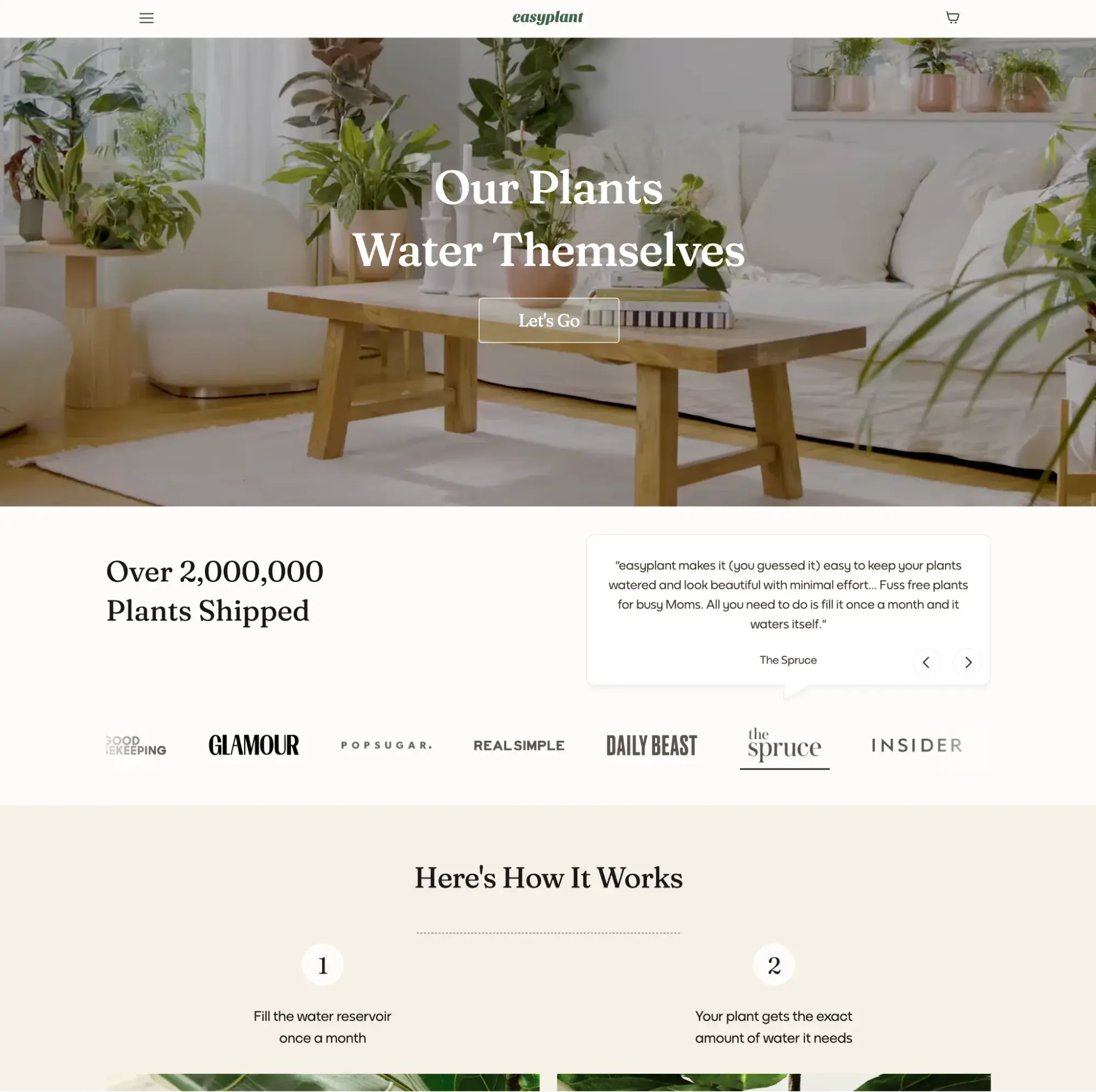
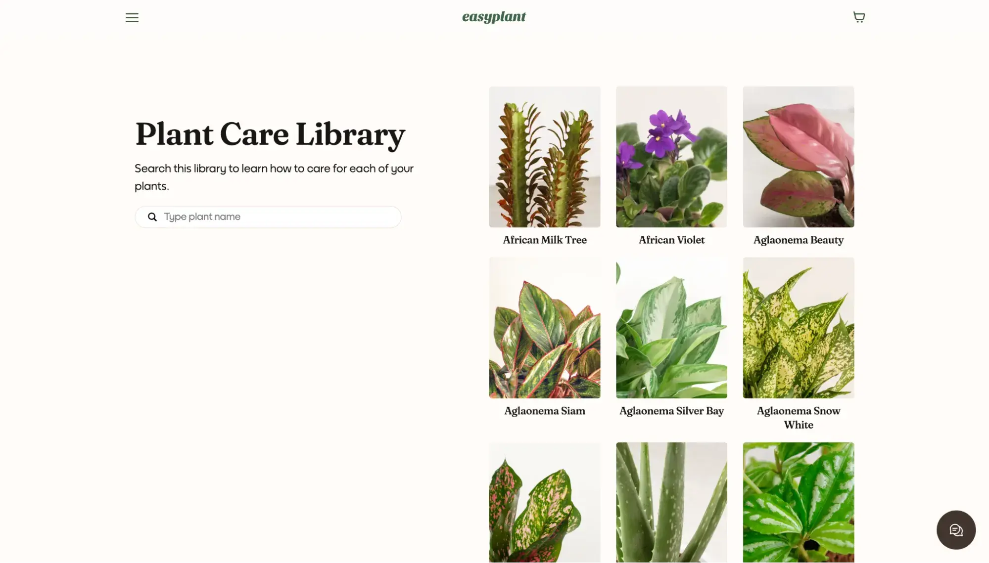
Easyplant is a direct-to-consumer plant brand that sells self-watering houseplants, and its website is a good example of how a product-heavy ecommerce site can stay clean and approachable. The homepage opens with a video hero and a four-word value proposition (“Our Plants Water Themselves”) followed by a two-step “Here’s How It Works” explainer with side-by-side photos. The site features a color palette of forest green, cream, and white that feels natural.
What I like:
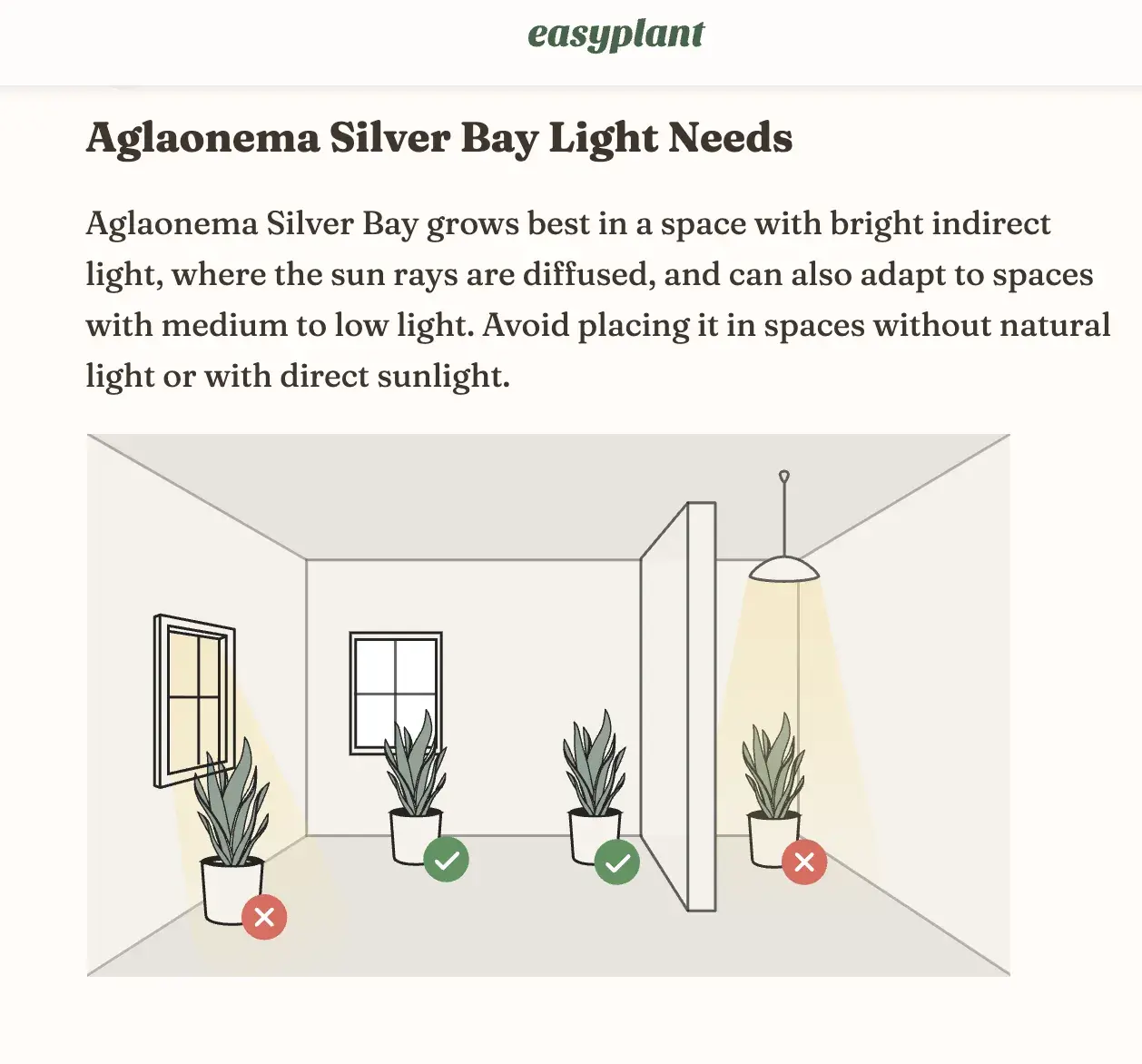
Easyplant’s Plant Care Library makes it easy to identify a plant and learn exactly how to care for it. Ease of use is a major facet of simple website design. Easyplant maintains a searchable visual grid of plants, each linking to a dedicated care guide with sections for watering, light, toxicity, and troubleshooting.
I appreciate the accompanying diagrams that show you the sweet spots for each plant in terms of lighting.
18. Ohm Studio
Category: Ecommerce/furniture
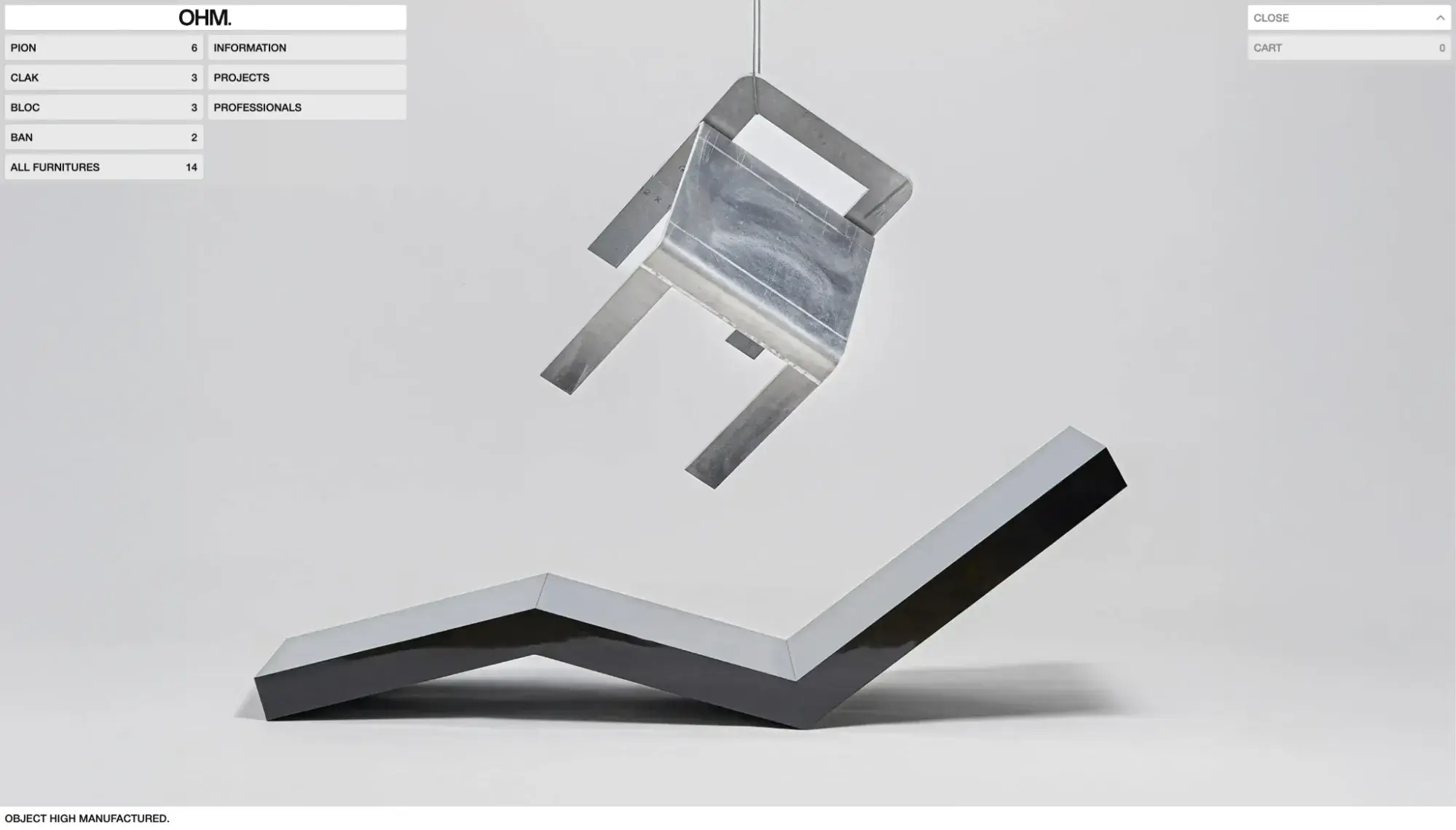
Ohm Studio is a French furniture brand that sells sculptural stools, benches, and side tables through a pared-back ecommerce site. The homepage opens with a single tagline (“Object High Manufactured.”) and a striking product shot of two pieces staged against a neutral gray background. The left side of the page doubles as both a product catalog and navigation, listing each furniture line (Pion, Clak, Bloc, Ban) alongside its number of variants. The entire Ohm Studio website uses fewer than 60 words on its homepage.
What I like:
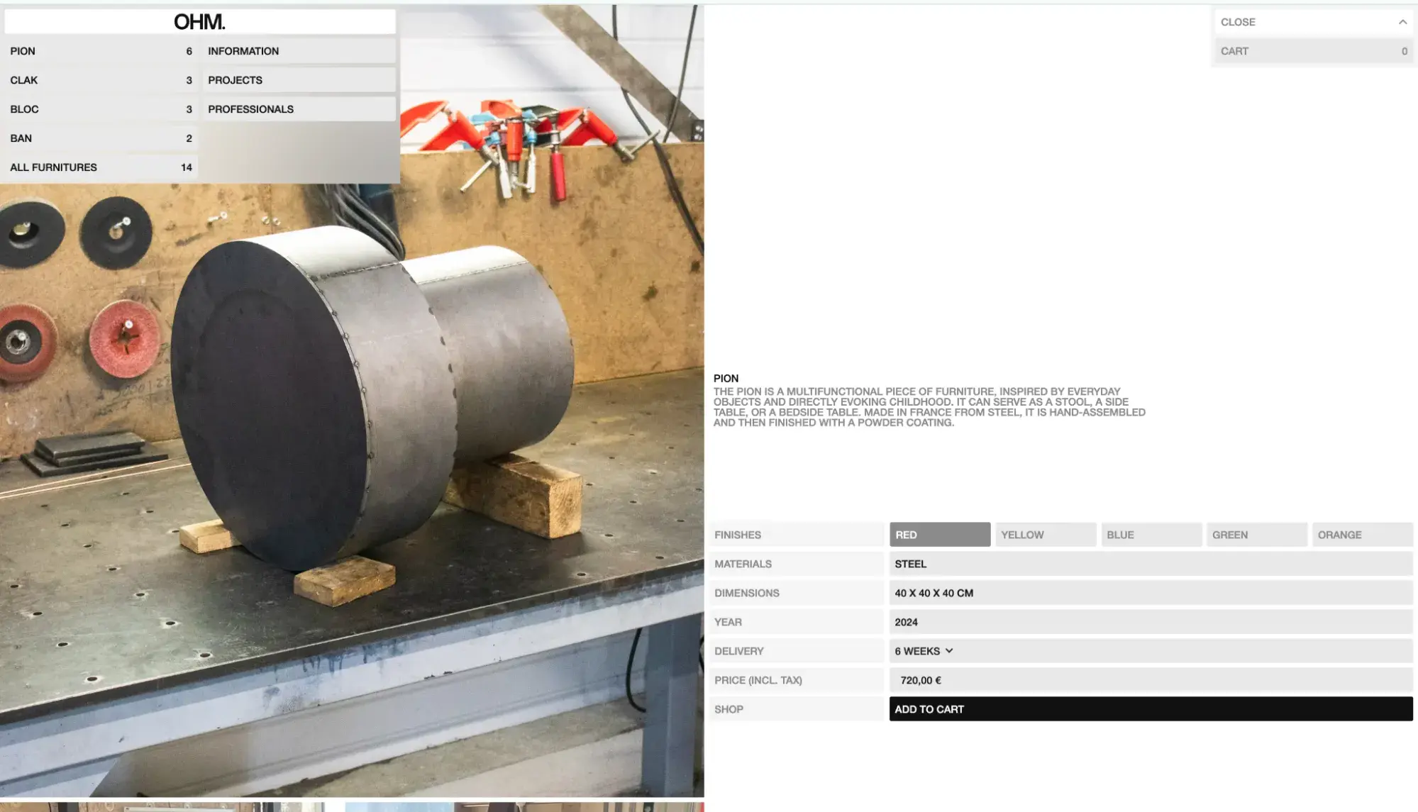
Ohm Studio’s product pages are incredibly simple. Each page features a vertical scroll of lifestyle and workshop photography that shows the piece in context — from the raw manufacturing floor to a styled kitchen interior. The layout keeps product details (dimensions, materials, price) in a compact right-hand column, so the visuals stay dominant without burying the information a buyer actually needs.
19. Uncle Bobbie's
Category: Local bookstore and café
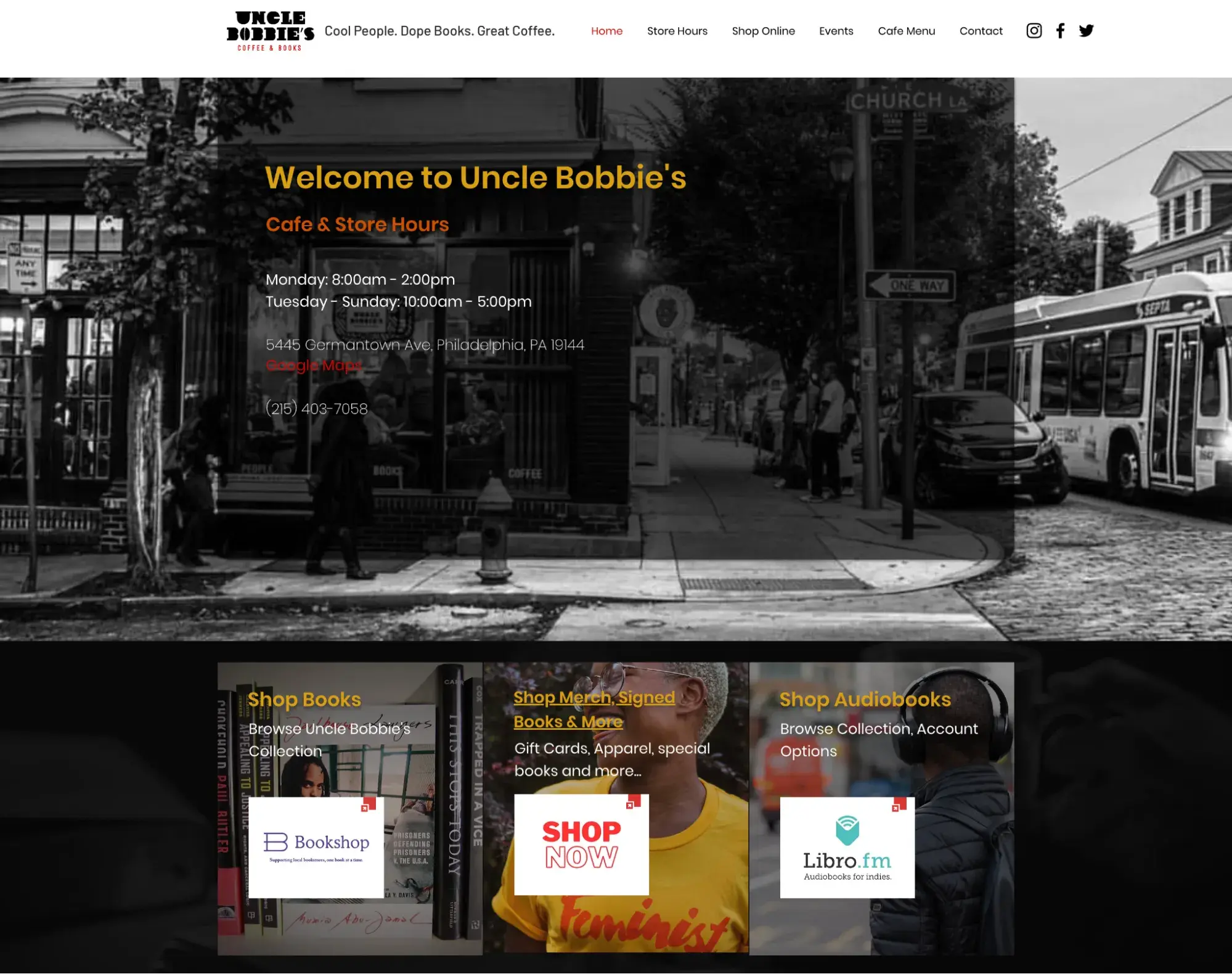
Uncle Bobbie’s Coffee & Books is an independent bookstore and café in the Germantown neighborhood of Philadelphia, and its website is an example of simple website design for a local business. It’s a one-page site built on Wix, with anchor-link navigation (Home, Store Hours, Shop Online, Events, Cafe Menu, Contact) that scrolls visitors to each section rather than loading separate pages. The hero section opens with a black-and-white photograph of the storefront overlaid with the store hours, address, and phone number — the three things most visitors to a local business site are looking for.
What I like:
Below the fold, Uncle Bobbie’s organizes its shopping options into three side-by-side cards: Shop Books (via Bookshop.org), Shop Merch & Signed Books, and Shop Audiobooks (via Libro.fm), each with a short description and a badge-style logo linking out to the relevant storefront. Rather than building a full ecommerce experience on-site, Uncle Bobbie’s keeps its own page simple and routes purchases to dedicated platforms. It’s a wise approach for a small business that wants a clean website without the overhead of managing product listings and checkout flows.
20. Nami Matcha
Category: Ecommerce/Specialty tea
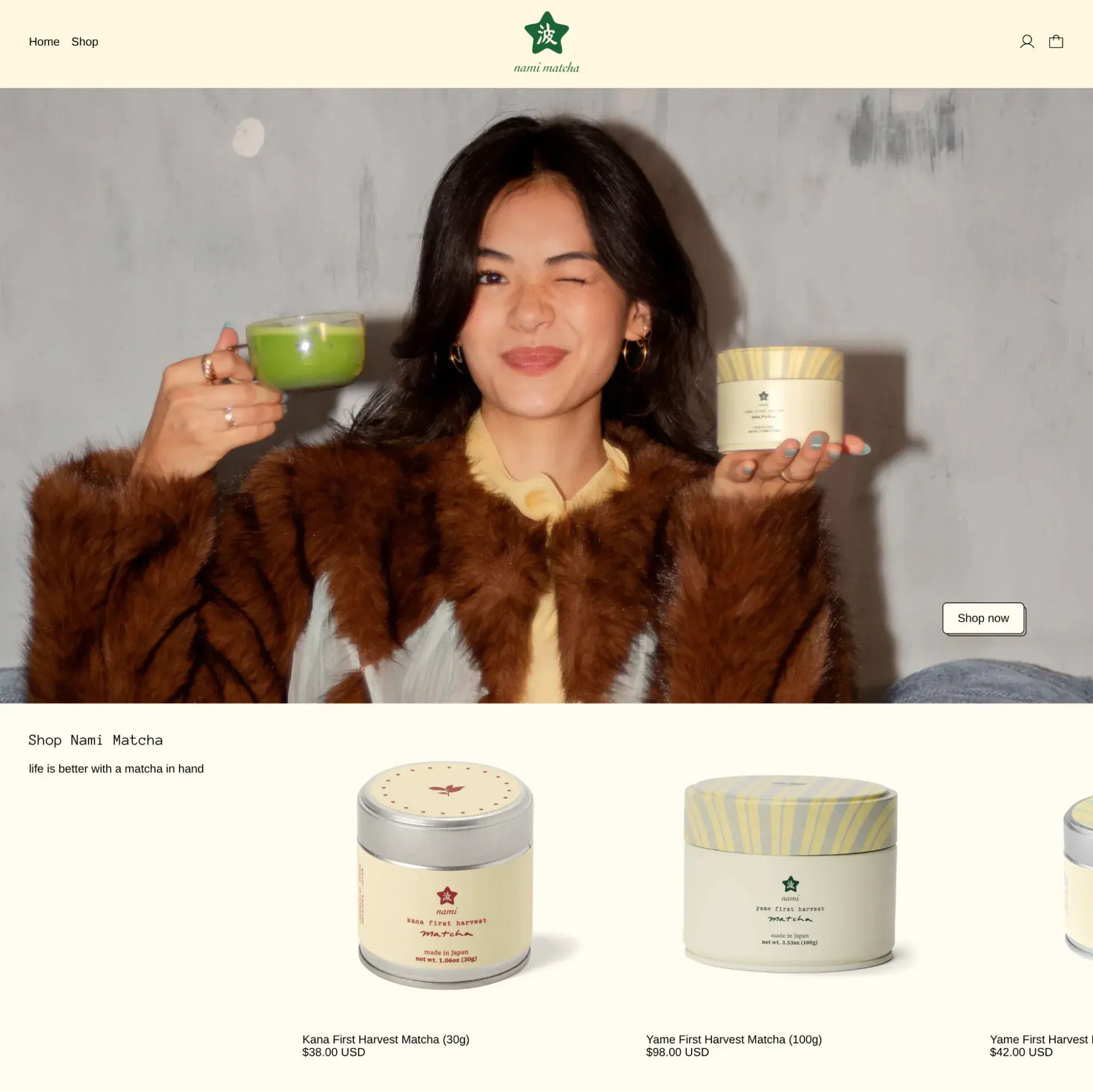
Our final simple website example comes from Nami Matcha, a direct-to-consumer matcha brand. The homepage opens with a lifestyle hero image of a woman holding a cup of matcha, paired with a single “Shop now” button.
Nami Matcha’s color scheme evokes feelings of warmth with its cream-and-green palette that mirrors the product packaging itself, so the branding feels cohesive from homepage to checkout.
What I like:
Nami Matcha’s navigation is about as simple as it gets: two links (Home and Shop) and nothing else. For a brand with a small product catalog, that restraint makes sense. There’s no “About” page buried in the header, no blog link, and no dropdown menus. The footer handles secondary information like FAQs, the referral program, and email addresses, keeping the primary browsing experience focused on the product.
Though they overlap, the difference between a simple website and a minimalist website is that the latter is more sparse, with more whitespace and fewer decorative elements. I like to think of the two on a spectrum, with minimalism on the farther end of it.
Here are the qualities I see in every great simple website design.
Restrained Color Palette
A great, simple website design typically limits its palette to two or three colors: a primary brand color, a neutral background, and one accent for CTAs or highlights. This constraint isn’t limiting; it’s clarifying. When every page shares the same color language, the site feels cohesive and visitors intuitively understand what’s clickable, what’s informational, and what’s decorative. Ainger Tomlin’s navy-white-orange palette (#13 on this list) is a great example: three colors doing all the work across every page.
Intuitive Navigation
Simple website design uses clean layouts and uncomplicated navigation so visitors can reach key information fast. I’d recommend three to six main menu links at the top of your website; avoid mega-menus or massive dropdowns.
Website navigation should limit top-level links to essential pages; if you find yourself needing more than six, that might be a sign your site structure needs reorganization, not a bigger menu. Adrián Gubrica’s portfolio (#10) demonstrates that three links — Work, About, Contact — are plenty when each one is well-defined.
Straightforward Copy
You might think it strange that I include words when we’re talking about design, but copy absolutely affects how a design looks and feels. A great simple website design includes copy that clearly states what the website is about and what the visitor should do. It avoids jargon, vague taglines, and paragraph-long mission statements above the fold.
Look at Frase (#15): It has simple copy in the hero (“Rank on Google. Get Cited by AI”). You instantly grasp the value that the tool offers you. That kind of clarity takes discipline, but it’s what separates a simple site from one that’s trying way too hard.
Clear Focus
You can easily tell when a website is trying to do too much; you typically feel overwhelmed when this happens. A great simple website design avoids that by maintaining a clear focus for each page or section. That means every page has one primary job: convert, inform, or direct. A primary call-to-action should appear above the fold on key pages, and secondary actions should be visually subordinate. Ollivere (#1) nails this; each section contains one idea and one action, so there’s never a question about what to do next.
Generous Whitespace, Minimal Clutter
Whitespace isn’t wasted space and it isn’t even necessarily white; it’s simply empty space that prevents your content from feeling cluttered. A great simple website design uses generous margins, padding, and line spacing to create visual breathing room between sections, and it keeps animations, decorative graphics, and competing visual elements to a minimum. Manuel Moreale’s text-only site (#7) is the extreme end of this principle, but even content-rich sites like Kobu (#11) can be simple by balancing images and text with spacing and color restraint.
Best Tools for Building Simple Websites
As a HubSpot Website Blog staff writer with a background in no-code website building, I’ve tested dozens of website builders over the years. Here are my favorite tools for building simple websites.
Here’s how I evaluated them:
- Are they simple to use? They need to be intuitive enough for a non-technical user to build a website with.
- Are their website templates simple in design? The premade website templates themselves need to have options that adhere to the simple website design characteristics I outlined in the section above.
1. HubSpot Content Hub
Best for: A simple website that’s natively integrated with marketing, sales, and service tools
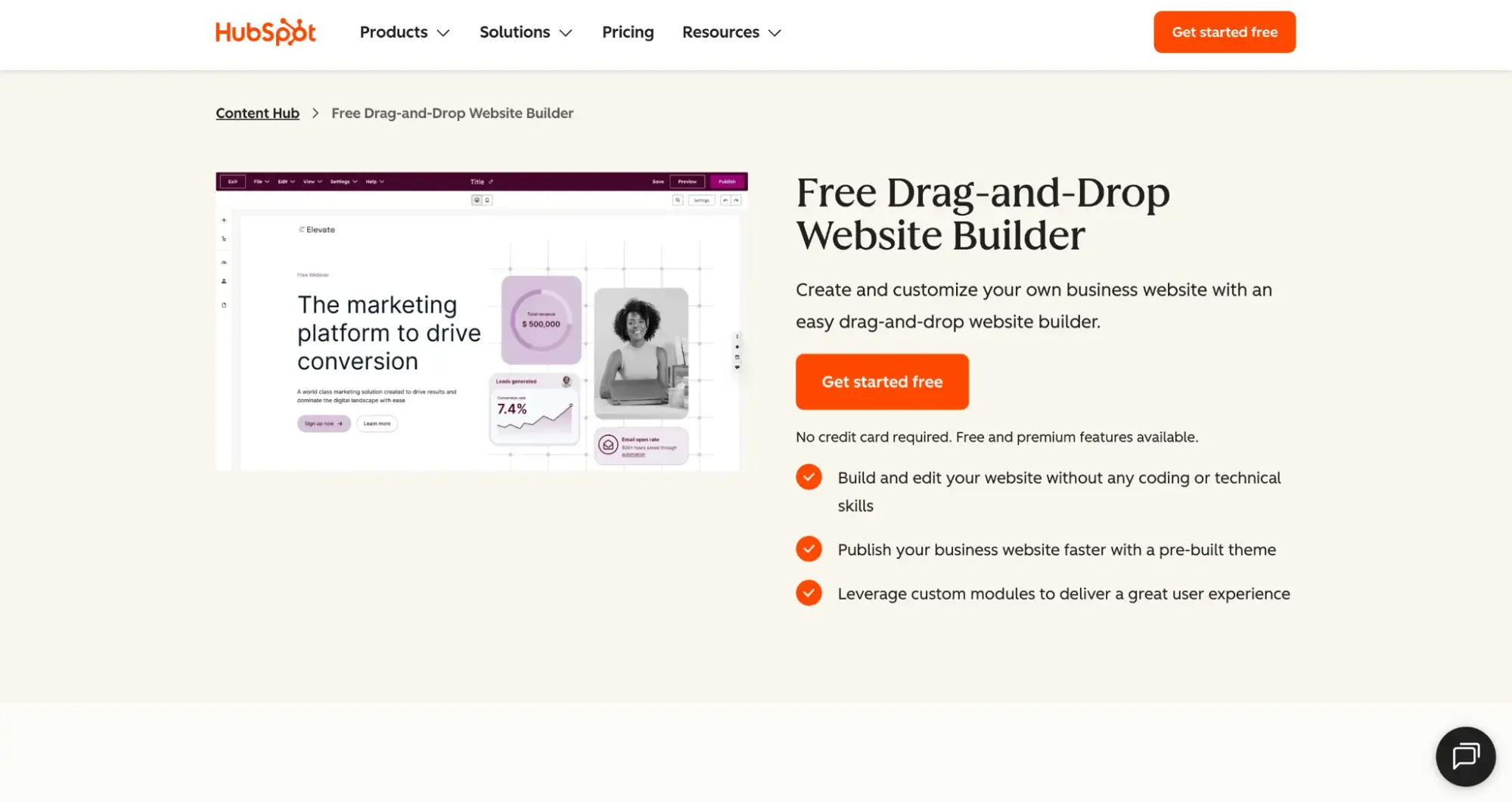
HubSpot Content Hub has a website builder, but HubSpot as a unified customer platform is so much more than that. A major advantage of using Content Hub to build your simple website is that you’re automatically connected to the sales, marketing, and service tools that come with the HubSpot CRM. What does that mean practically speaking? All your departments are in sync, and you can personalize your website much more deeply based on your actual customer data within the CRM.
2. Squarespace
Best for: A simple website with a clean aesthetic
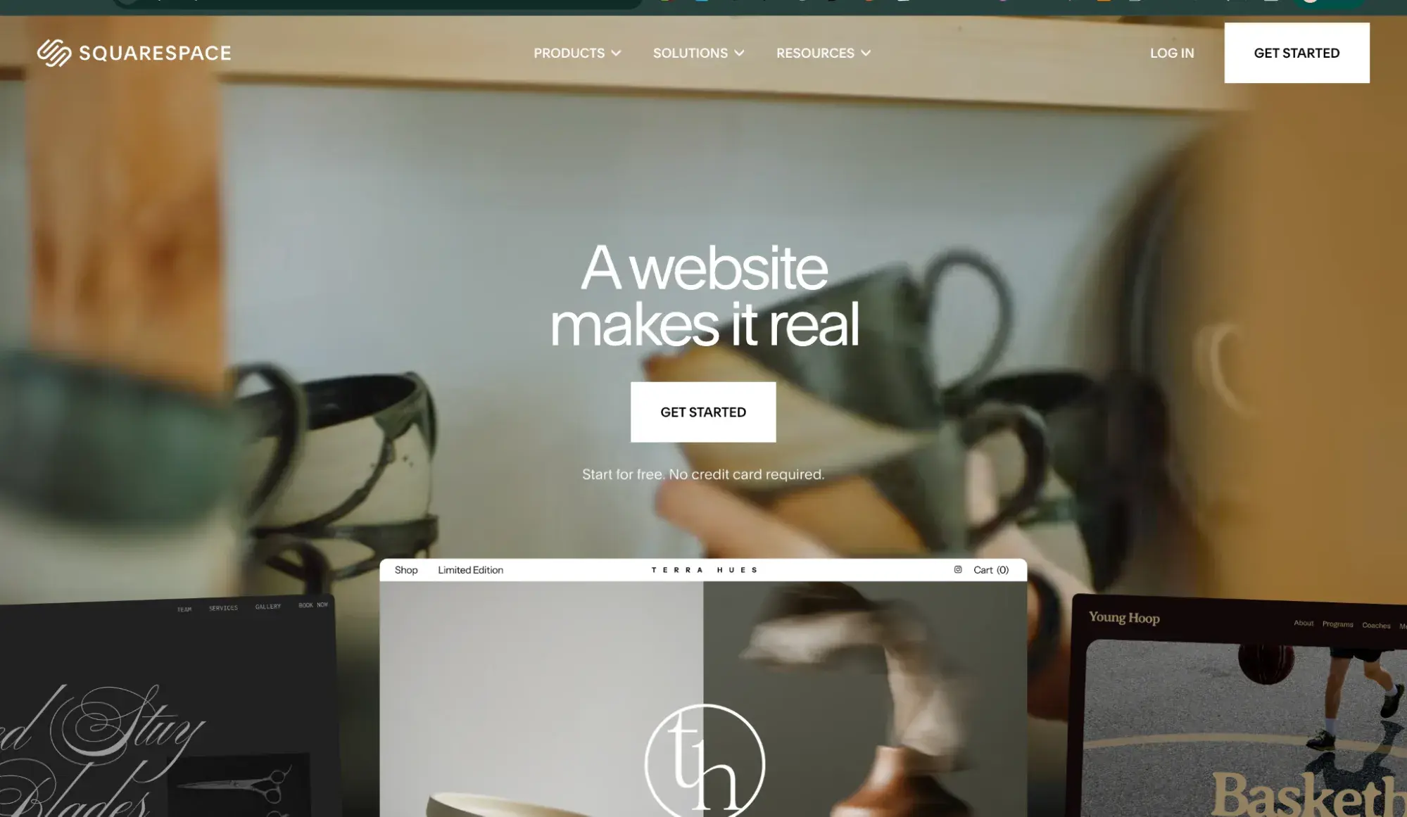
I’ve got a soft spot for Squarespace. It is, after all, where I built the latest version of my freelance writing website. Squarespace is perfect for simple websites because its UI and templates have a clean, sophisticated aesthetic that makes them feel intuitive and premium.
I’m not the only one to notice. Squarespace won a Fast Company 2024 Innovation by Design Award for a template collaboration with music producer Rick Rubin that was built around creating a quieter, less cluttered version of the internet. That award recognized a single branded project, not Squarespace’s template library as a whole, but it speaks to the design sensibility that runs through the entire platform.
3. Carrd
Best for: A simple one-pager website
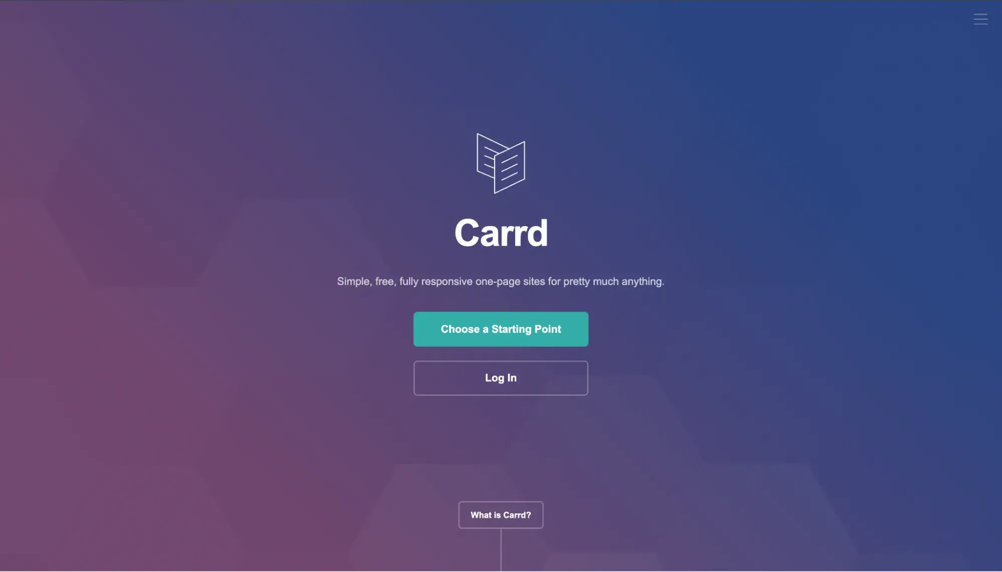
Carrd might be the simplest of all website builders on this list, as it focuses solely on one-pager sites. The Carrd UI is extremely basic and requires markdown for formatting. It doesn’t even come with stock image libraries or usable copy (it’s all lorem ipsum text). Having said that, I still enjoyed its 200+ website templates, which feature simple web design principles.
4. Wix
Best for: A simple ecommerce site
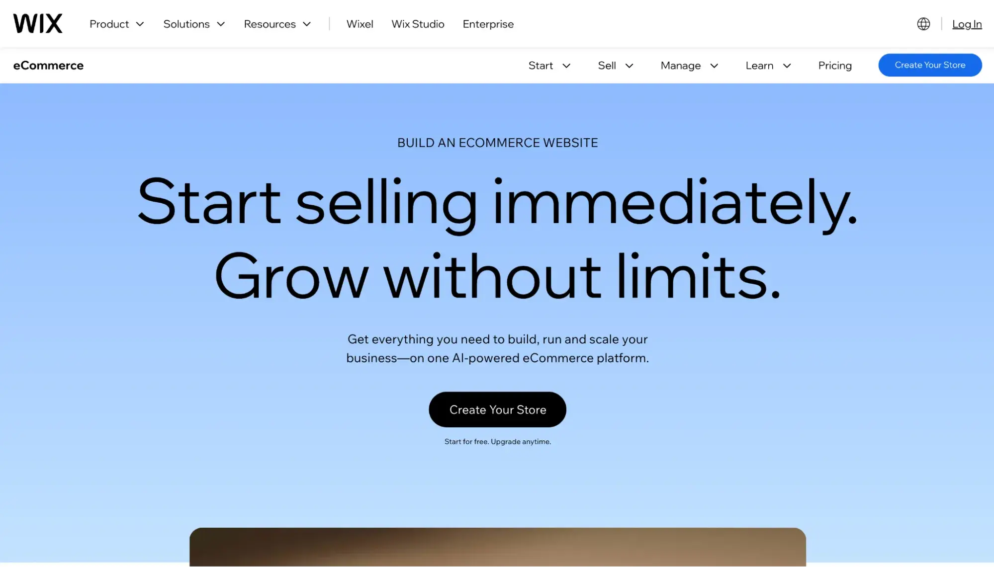
Wix is a favorite website builder in several HubSpot roundups, and I have tested it many, many times. I can tell you that Wix is great for a simple ecommerce website. Not only is its builder beginner-friendly, but the platform comes with many business tools, including online store capabilities.
For a simple ecommerce website, I recommend the Wix Core plan. That’s the one that’ll give you access to its basic ecommerce features, which include a product catalog of up to 50,000 products, abandoned cart recovery, a loyalty program, and automatic discounts.
5. Google Sites
Best for: A free simple website that has no vendor branding
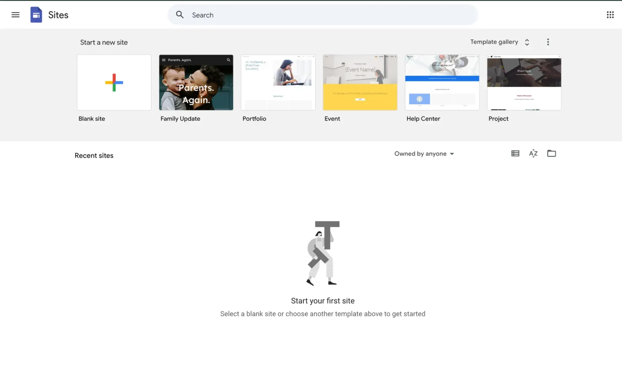
While I do not recommend free plans for a business website, if you really need a simple website at zero cost, Google Sites is your best bet. I’d reserve this for simple portfolios or maybe a wedding website. Google Sites is the only website builder I’ve found that is not only 100% free of charge, but it also doesn’t put any Google branding on the site. (Other free website builders put badges on the site, such as “Built on Wix.”)
Frequently Asked Questions About Simple Website Design
What is the easiest website to build for beginners?
Using a drag-and-drop website builder with templates is the easiest path for beginners. These tools let you customize layouts visually (no coding required).
For one-page sites like portfolios or landing pages, Carrd (#3 on my tools list) is hard to beat for sheer simplicity. For a more full-featured simple website, Squarespace and HubSpot Content Hub both offer intuitive editors with polished simple website templates that handle spacing, typography, and mobile responsiveness out of the box.
My advice: Start with a template that matches your site’s primary goal — whether that’s generating leads, selling products, or showcasing work — and edit from there. You’ll get to a clean, functional site much faster than starting with a blank canvas.
Can I make a simple website for free?
Yes, but with tradeoffs. Most free website builder plans include vendor branding (like a “Built on Wix” badge), limit your use of a custom domain, and restrict access to features like ecommerce or analytics.
The exception is Google Sites (#5 on my tools list), which is completely free and doesn’t add any platform branding to your site. It’s a solid option for a basic website design like a personal portfolio, informational website, or event page — but it lacks the design flexibility and marketing integrations you’d want for a business site.
If you’re building a website for a business, I’d recommend investing in a paid plan. Even entry-level tiers on platforms like HubSpot, Squarespace, or Wix remove branding and unlock the tools you need to actually grow.
How do I make my website look professional with simple design?
Professional-looking simple websites tend to share a few common traits. Here’s my quick checklist:
- Consistent color palette. Stick to two or three colors and use them uniformly across every page. Ainger Tomlin (#13) is a great reference for this.
- Intentional typography. Choose one or two fonts and apply them consistently for headings, body text, and captions. Avoid decorative fonts for body copy.
- Generous spacing. Give sections, paragraphs, and images enough breathing room so the page doesn’t feel cramped. Whitespace signals simplicity.
- High-quality images. A single sharp, well-lit photo does more for credibility than a dozen pixelated ones. If you don’t have original photography, use curated stock images sparingly.
- Restraint. Resist the urge to add elements just because you can. Every animation, icon, or extra section should earn its place by serving a clear purpose.
Simple website design looks professional when every element feels intentional. If something on the page doesn’t help the visitor understand who you are or what to do next, consider cutting it.
Use these basic website designs to inspire yours.
These simple website examples all display true hallmarks of simple website design: intuitive navigation, ample whitespace, pared-down color palettes, and clear copy. For even more design inspiration, see our roundup of best website designs. I hope they inspire you as you build or redesign your own website.
Need a simple website builder? Get started with Content Hub today.
Editor’s note: This post was originally published in April 2024 and has been updated for comprehensiveness.
.png?width=112&height=112&name=Image%20Hackathon%20%E2%80%93%20Vertical%20(50).png)
.png)


![15 black and white website designs to inspire your own [+ pro tips]](https://53.fs1.hubspotusercontent-na1.net/hubfs/53/black-and-white-website-design-1-20250520-1336267.webp)

![15 Brochure Website Examples to Inspire You [+ How to Make One]](https://53.fs1.hubspotusercontent-na1.net/hubfs/53/brochure-website-examples-1-20250319-362228.webp)
![28 Types of Websites to Inspire You [+ Real-Life Examples]](https://53.fs1.hubspotusercontent-na1.net/hubfs/53/types-of-websites.png)

