.png?width=112&height=112&name=Image%20Hackathon%20%E2%80%93%20Vertical%20(50).png)

In this article, I’ve curated a list of 31 of the best website designs — according to The Webby Awards, Awwwards, and other taste-making internet awards organizations — along with bonus lists of cool and modern designs. I’ll also toss in some website design tips and places to seek out new ideas, so you can ensure a well-designed website that stays competitive over the long haul.
Ready to be inspired? Let’s go.
Table of Contents
- Beautiful Award-Winning Websites
- Where to Get Your Design Inspiration
- Website Design Inspiration Sources
- Website Design Ideas
- Modern Website Design Tips
.png)
Free Website Design Inspiration Guide
77 Brilliant Examples of Homepages, Blogs & Landing Pages to Inspire You
- Agency Pages
- Ecommerce Pages
- Tech Company Pages
- And More!
Download Free
All fields are required.
Best Website Designs to Inspire You
- Raw Materials
- Just Curious
- Runway
- The Book of HOV
- Secrets of the Elephants
- Cowboy
- Jeff Koons: Moon Phases
- Google Fonts
- Shupatto
- Santa’s Magical Mailroom
- Vention
- IV State of Audio and Voice
- What Is Missing
- Persepolis Reimagined
- The Health Inclusivity Index
- RCA Records
- Design Threads
- Moooi Paper Play
- Hyer
- Mubasic
- Digital Cover
- Guillaume Tomasi
- Tej Chauhan
- Studio CL
- Lumin
- Unseen Studio
- ETQ
- Cyclemon
- Silencio
- Alexander McQueen
- Gapsy
From local boutiques to internationally recognized brands, the following sites push the status quo.
I’ll start with recent award winners for well-designed websites — from eye-catching designs to interesting interactive features, and then move on to cool, modernist, minimal designs that deserve a mention. I’m confident that, by the end, you won’t just have the tools you need to begin your own design, but that your creative energy will be sparked.
And if you’re starting from scratch, don’t worry. With HubSpot’s drag-and-drop website builder and the free CMS tools in Content Hub, you’ll be building and revamping your site like a pro in no time.
Read more: 77 Examples of Incredible Website Design

Download this free guide to see even more examples of website blog, homepage, and landing page designs.
Beautiful Award-Winning Websites
We'll dive into the best website designs in just a sec, but while you're here, check out some of the top web design trends from this year:
Best Website Designs from 2024
1. Raw Materials
Award: Best Navigation/Structure Webby Winner, 2024
Raw Materials is a design company focused on creative digital products with a website that shows off its talent for the “unusual.” Left sidebar navigation appears in bright primary colors with oversized buttons, making it both appealing and accessible.
I’m not surprised that it won an award for best navigation and structure given the ease of moving around the homepage. Scrolling down is like reading an ebook — but with giant print. The text colors match the sidebar navigation, keeping the information organized as you move down the page.
At the bottom, I found a CTA button (“Subscribe”), along with buttons to connect on social media. And that’s it. The site is just a straight-forward list, with an intro to the company, its approach, its work, its team, and how to get in touch.
But, the manner in which the info is delivered makes all the difference, exhibiting what the company can do and how it makes itself (and its clients) standout.
What I like: It’s easy to use, navigate, and understand, with varying color and text size to keep the information organized. Everything is on a single page, which means I didn’t have to wait for new pages to load.
2. Just Curious
Award: Personal Blog/Website Webby Award, People’s Voice Winner, 2024
This is a blog of questions and answers on a range of topics, but the beauty and orderliness of the site makes up for any seeming randomness in the Q&A. It exhibits clean lines, a limited number of categories (only five), and a black-and-white color scheme that makes the high-resolution images pop off the page.
What drew me in immediately was the focus on visual aesthetics, even though blogs tend to be focused on words. The homepage is not overloaded with information, and there’s a nice balance between the large images and small text. It gave me the impression of thoughtful curation, rather than tossing every article onto a single page to generate clicks. That less-is-more approach created a sense of trust that made me want to explore more.
What I like: The site is aesthetically pleasing with minimal articles on a single page, lots of white space, and high-resolution images that create a thoughtful vibe (which, to me, makes total sense for a blog called “Just Curious”).
3. Runway
Award: Financial Services/Banking Webby Winner, 2024
Runway is a finance platform for businesses whose website follows an aviation theme (“runway,” get it?). The homepage has a cloud background that stays constant as you scroll, while new info and graphics appear on top.
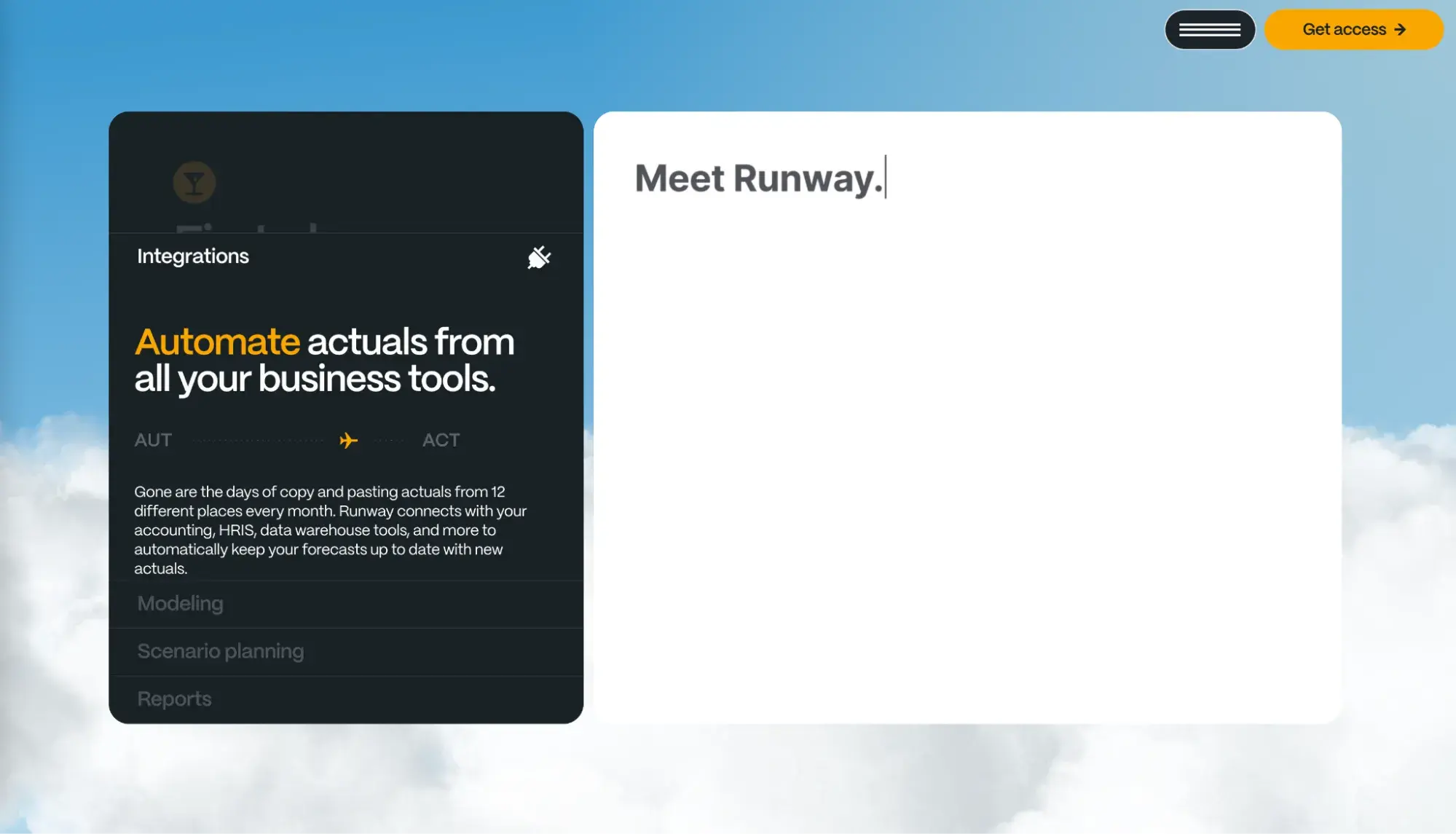
One thing I like about this site is that it lets you go at your own pace to read through how their platform works, what amenities they offer, and what their customers have to say about them. There are no videos running automatically and no looping texts that might disappear before I get a chance to read them. A platform like this has a lot to take in, and the site ensures there’s no overload of information.
What I like: It takes a topic that could be complicated and makes it accessible and breezy. I also like that the contact form is structured like an airline ticket, keeping with the site’s theme and adding a little fun to a regular, old signup process.
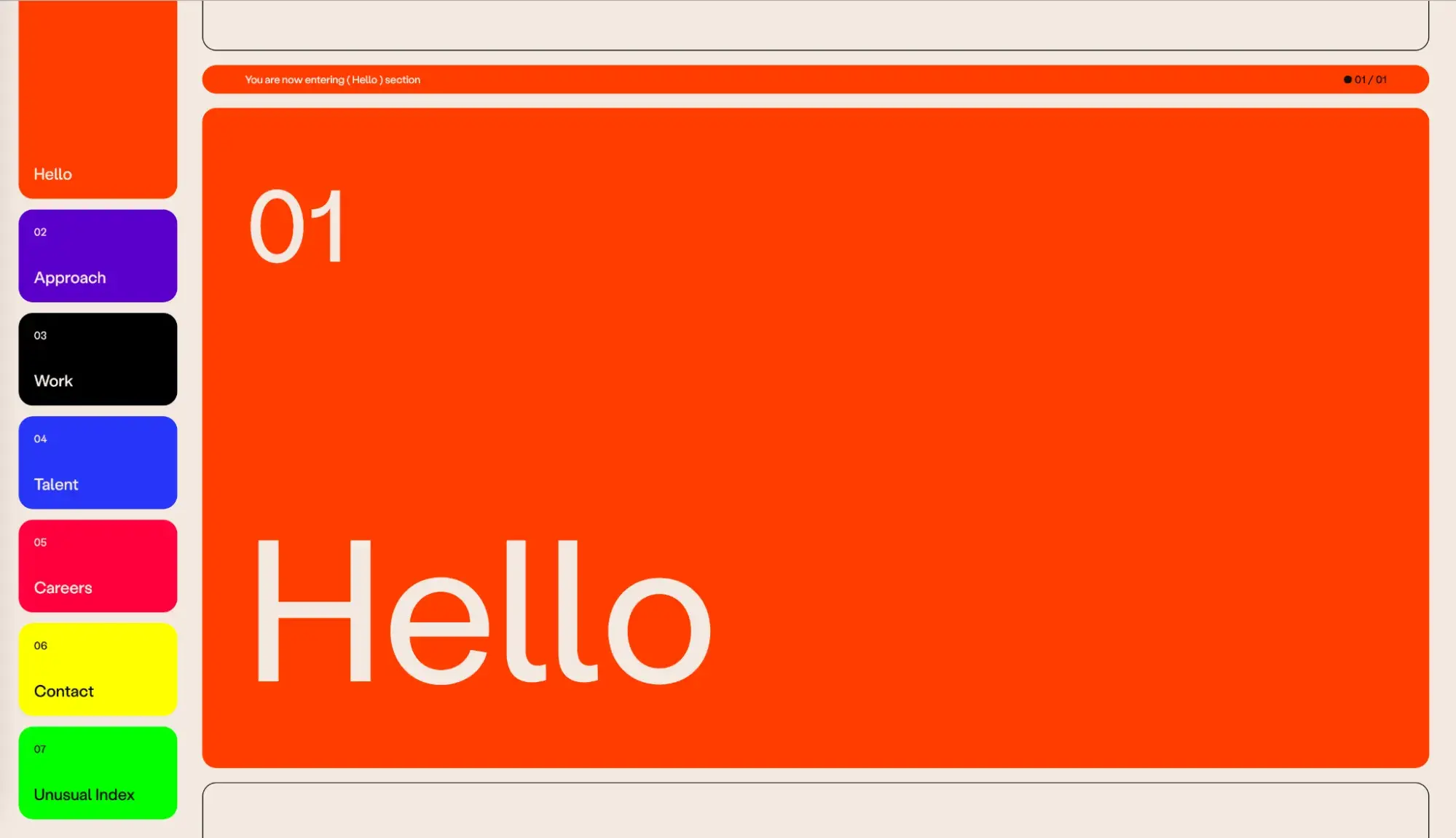
4. The Book of HOV
Award: Cultural Institutions Webby Winner, 2024
This site was established for a 2023 exhibit at the Brooklyn Public Library dedicated to the life and career of rapper and cultural icon Jay-Z. The immersive exhibit showcased thousands of archived objects from his life, from records to awards to magazine covers — which then became clickable images for this site.
What I find impressive about this site design is how it’s both filled with material and simple at the same time. Everything is housed on a single/simple page, but there are rows and rows of objects to click on. However, there are no words (except on the bottom buttons), which gives it a clean — rather than cluttered — appearance.
Also, clicking on any object brings up a sidebar with more information about it. The page doesn’t have to reload each time, which meant I could move through the archives quickly and easily – in my own order and at my own pace.
What I like: The site houses a ton of material in a simple fashion and allows for easy discovery of the archival objects. On a larger scale, for a cultural institution like a library, it does a great job of driving up interest in the exhibit by allowing users online access to what it has to offer.
5. Secrets of the Elephants
Award: Best Writing (Editorial) Webby Award & People’s Voice Winner, 2024
This National Geographic site is a long-form feature article about Asian elephants, which also appeared in the magazine. In its online form, it’s full of photos that smoothly glide down the page to relate each phase of the story, as small blurbs of text pass over top.
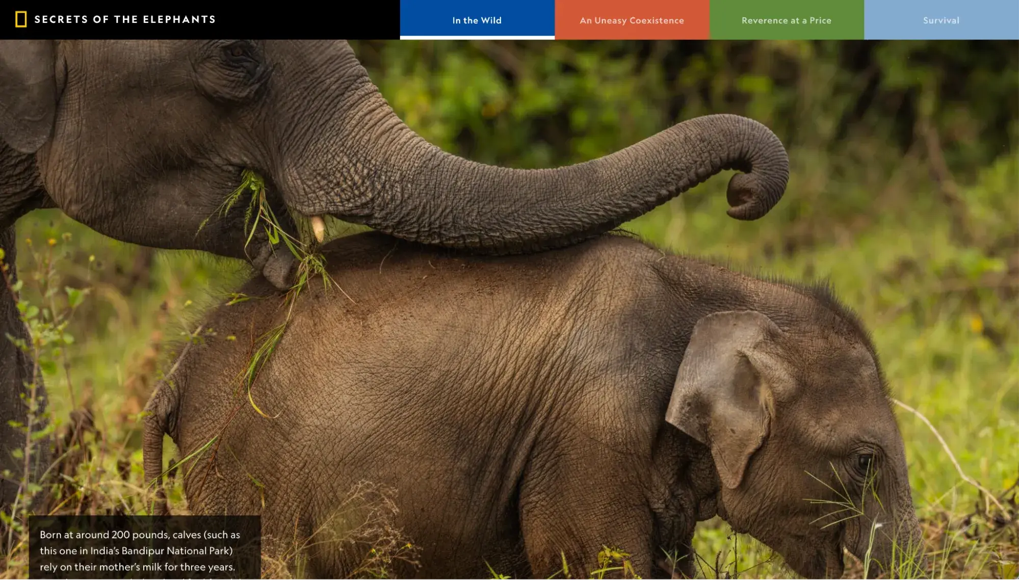
While this won a Webby Award for editorial (meaning it was judged on the writing), I found the shining aspect of the site to be in the overall storytelling. As you scroll, mesmerizing images fill the screen, while you’re given digestible chunks of text that don’t overrun the visuals. Instead, the two work in tandem to create a general atmosphere and feeling (which, in this case, I found to be a pretty heartbreaking one).
What I like: The site takes storytelling up a notch with striking visuals and text that create tension in a tale about survival.
6. Cowboy
Award: Best Visual Design Webby Winner, 2024
Cowboy is a European e-bike company whose website, like its bikes, is good-looking, minimalist, and largely monochrome. It lets images of the products take center stage, with only essential information (like price) to accompany them.
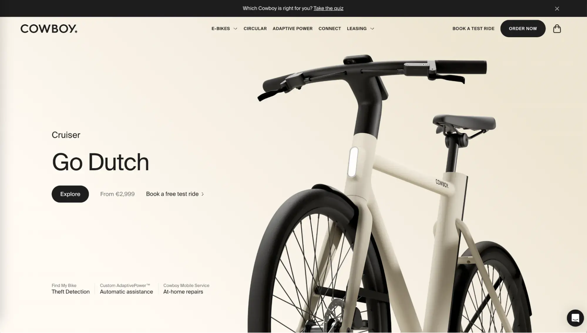
Since I wasn’t familiar with this company prior to its website winning awards for visual design, I liked that it didn’t take me long to understand what Cowboy makes, how it makes it, and why its offer is different from the competition. Not only could I see the styles of bikes on the homepage, but scrolling down led me to images of apps, letting me understand that these e-bikes have connectivity.
What I like: With a product-first design, I understood the product’s story just from the homepage, both in terms of what it is and why it's different.
7. Jeff Koons: Moon Phases
Award: NetArt Webby Award, People’s Voice Winner, 2024
To promote the latest project by artist Jeff Koons, “Moon Phases,” this site acts as an ad for the work, as well as curation for the project.
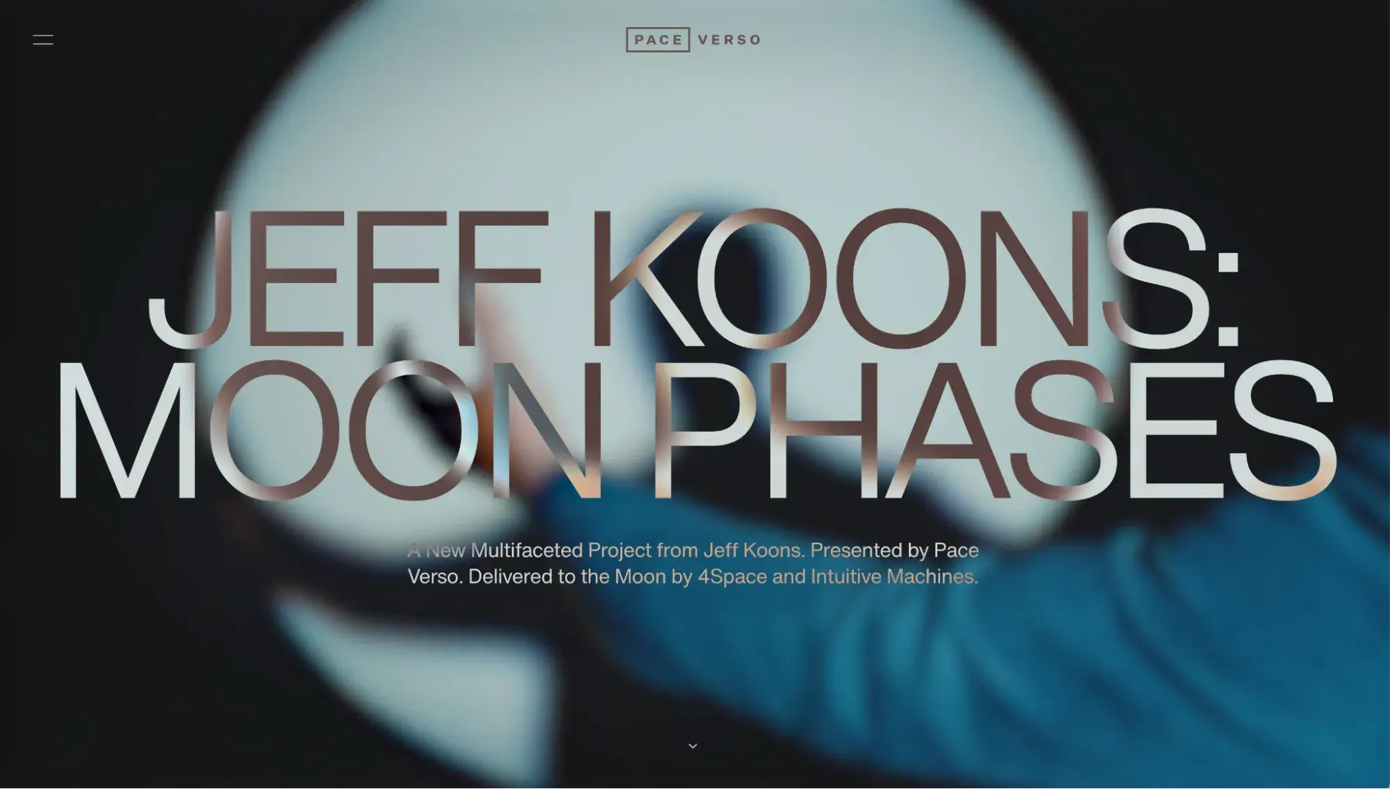
With a black background and a silver spinning orb to represent the moon in space, the site conforms to the theme of the artwork, while also staying centered on a single project. Since Koons is so famous, maybe he needs little introduction or explanation, but I appreciated that there’s no bio or place to discuss prior works. The site has a focus and it doesn’t stray from it.
At the same time, the project is extremely high concept — there are 125 mini-sculptures, each with one component that will remain on Earth, and another that will be placed on the moon. Which, to my mind, requires some explanation. So, the site also has some sections of dense text, like the kind you’d see on a plaque next to a museum exhibition.
What I like: The site is razor-focused on a single high-concept project without distractions, side stories, or places to click away. For art that’s meant to be provocative, this site works — keeping me there thinking about the project.
HubSpot's Free Website Builder
Create and customize your own business website with an easy drag-and-drop website builder.
- Build a website without any coding skills.
- Pre-built themes and templates.
- Built-in marketing tools and features.
- And more!
8. Google Fonts
Award: Best User Interface Webby Winner, 2024
One of Google’s many subsites, this page is the place to get new fonts. With clean, simple, and seamless design, it’s no wonder that it won an award for Best User Interface.
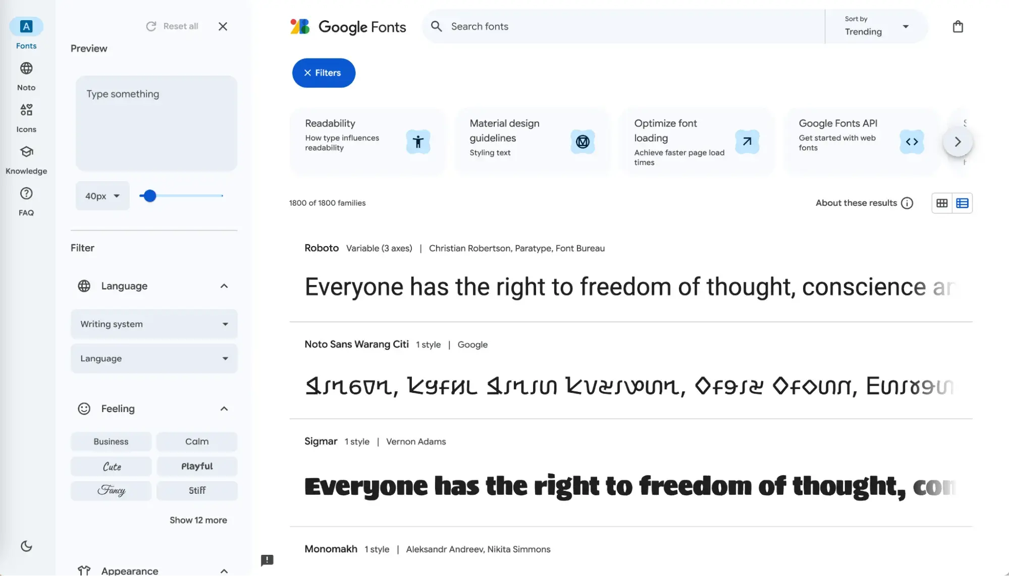
On the right, there’s a list of fonts, in large letters, making it easy to see how each font looks. Scrolling down produces a seemingly endless list to choose from, but the left sidebar allows filters and searches to help you narrow it down (like, “What feeling do you want to produce with your font?”).
The top of the page has clickable info about why fonts matter and how to choose one. And everything is black and white, easy on the eyes, and intuitive to use.
What I like: The simplicity — in color, in function, and in what it's offering. This is a great style for digital products with long lists of comparable items (like wallpapers, themes, etc.).
9. Shupatto
Award: Best Use of Video or Moving Image Webby Winner, 2024
Shupatto bags are designed to be folded up and taken with you. The website is a running loop of animations showing how the many varieties of bags look when folded and unfolded.
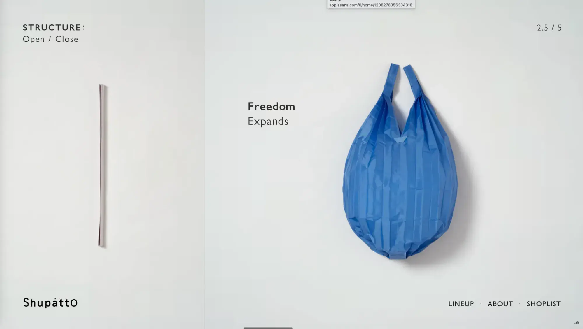
I can understand why this site won an award for moving images that “enhance the user experience and generate engagement.” The speedy loops of videos show the beauty, variety, and functionality of the bags, and if you turn on the peppy music it’s even more captivating.
There’s no scrolling on this site. To see the full lineup of bags, I had to click on a button in the lower right of the screen. But with such pretty products continually streaming across the page, and in such a fun way, I wanted to click to see more. And when I did, the entire collection of bags were animated as well, letting me see how any specific style and color choice looks in action.
What I like: The animations correspond with the product and are not just there for the sake of having animations. These bags need to be seen in action and the site is like a walkthrough of real-life use.
10. Santa’s Magical Mailroom
Award: Best Use of AI Webby Award, People’s Voice Winner, 2024
This site’s sole purpose is to generate a letter from Santa to be downloaded and sent to a person you care about. It begins by asking three simple questions, as holiday music plays in the background, and then uses AI to create a personalized letter from your answers.
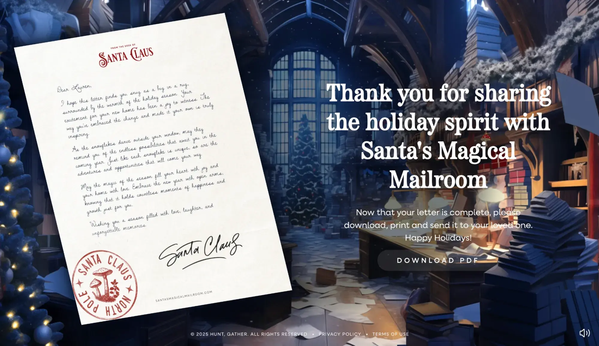
In terms of effectively using its CTAs and garnering engagement, landing on the homepage simply asks you to “start the magic” by clicking the only button available. It’s so simple and enticing, it’s hard not to do it.
And once I’d clicked, I was already engaged, and so, why not continue to play around with it by answering who the letters for and adding a memory from my year? It’s fun and easy, but also creates a narrative path that made me want to see where it would lead. Plus, I was pretty impressed with the final letter.
What I like: It’s a fun and heartwarming way to get customers interacting with your website. While it might not have utility as a standalone site for your product, adding a page like this to an existing site could generate positive feelings toward your brand, as it increases engagement.
11. Vention
Award: Best Individual Editorial Feature – Ind/Brand/Org Webby Winner, 2024
Vention’s State of AI Report features bright colors, easy language, and large font to spell out colloquial doomsday messaging about AI — and then get into the stats about how true those messages might be.
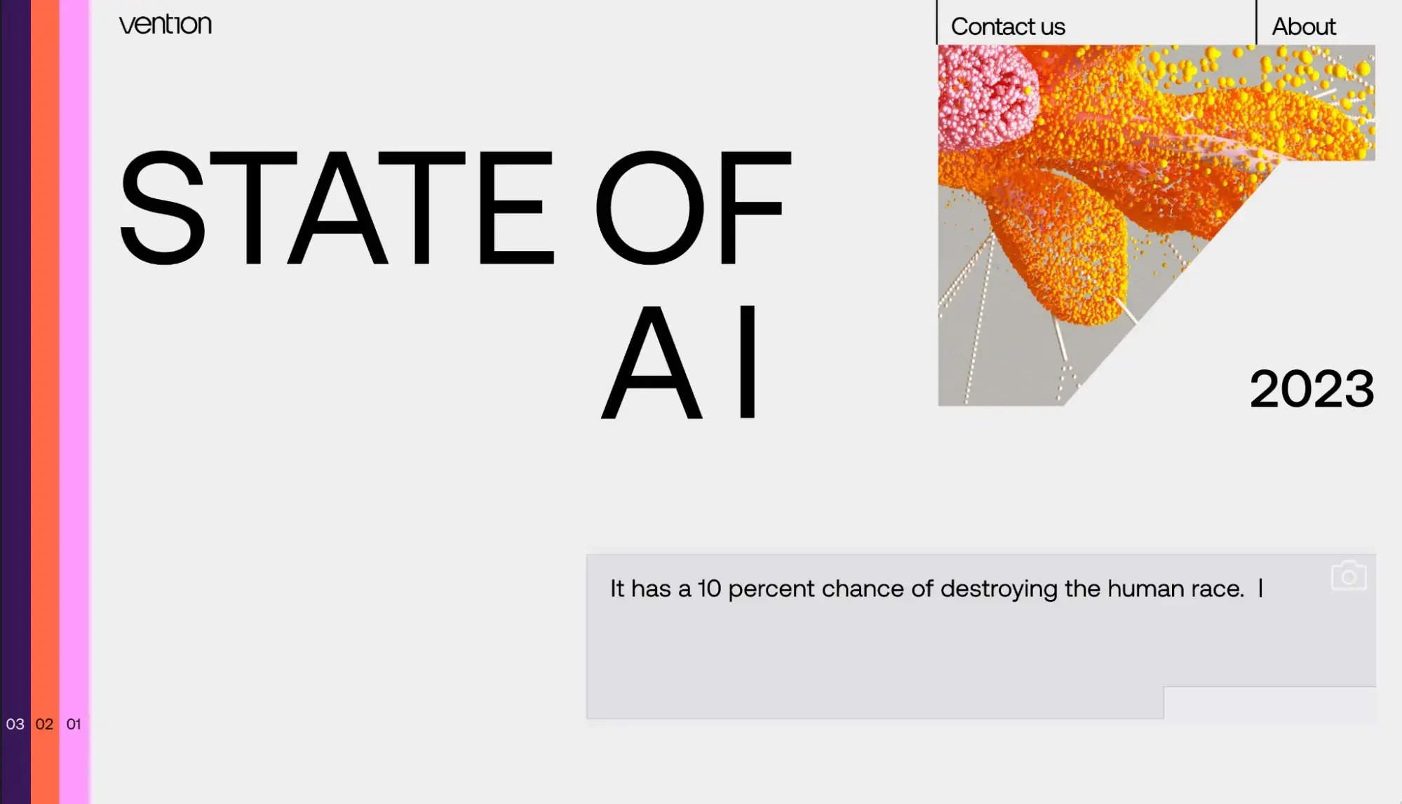
When you’ve got a serious and research-heavy topic, it’s easy to get bogged down with text or numbers. Vention’s report doesn’t fall into either of these traps, using varying hot colors to break up its sections and adding short paragraphs for pithy statements.
As you scroll, graphics unfold to tell a more detailed story, using animated bar graphs that expand and move. But all the information is kept basic, with only one element in each section. This means I got no headaches while looking at the stats — they were enumerated for me in big print (with lots of colorful space around them).
What I like: The oversized headers, multimedia elements, and easy-to-understand layout make it a breeze to skim the report and take in complicated info.
12. IV State of Audio and Voice (IV Estado del audio y la voz)
Award: Best Data Visualization Webby Winner, 2024
This website by the communication strategy company Prodigioso Volcán is a Spanish-language report that analyzes the market for use of podcasts, audiobooks, voice assistants, and smart devices in Spain. The way it turns complex datasets into visually appealing (and comprehensible) visuals earned it the Webby for Best Data Visualization.
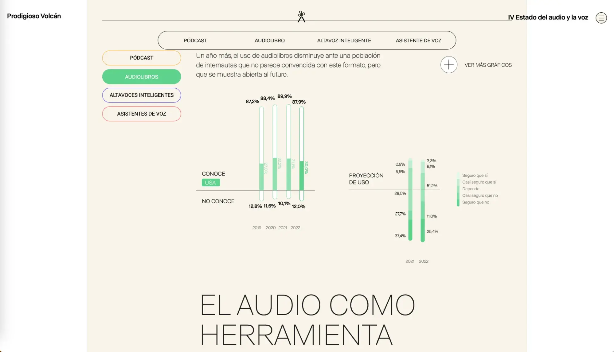
Scrolling the homepage shows the market stats as simple graphics that animate as you move down the page. At the bottom, there’s a map of Spain, showing use of each product type by region. And along the way, you can click any section to see more stats represented by even more visuals (e.g., why, when, and how much people are listening).
With an aim to communicate the results of this report, I think the site succeeds by putting the pertinent four categories on the homepage and allowing users to dig deeper into any one of them. For me (who likes data visualizations), the in-depth pages are fun and do a great job of visually transmitting the findings.
What I like: It takes what could be a dry report and makes it engaging and easy to understand with a series of data visualizations that don’t require much text to accompany them.
Best Website Designs from 2023
13. What Is Missing
Award: Activism Webby Winner, 2023
Websites are a powerful tool for storytelling, and What Is Missing showcases this with mastery by educating visitors about the Earth’s sixth mass extinction, with losses of species habitats and more.
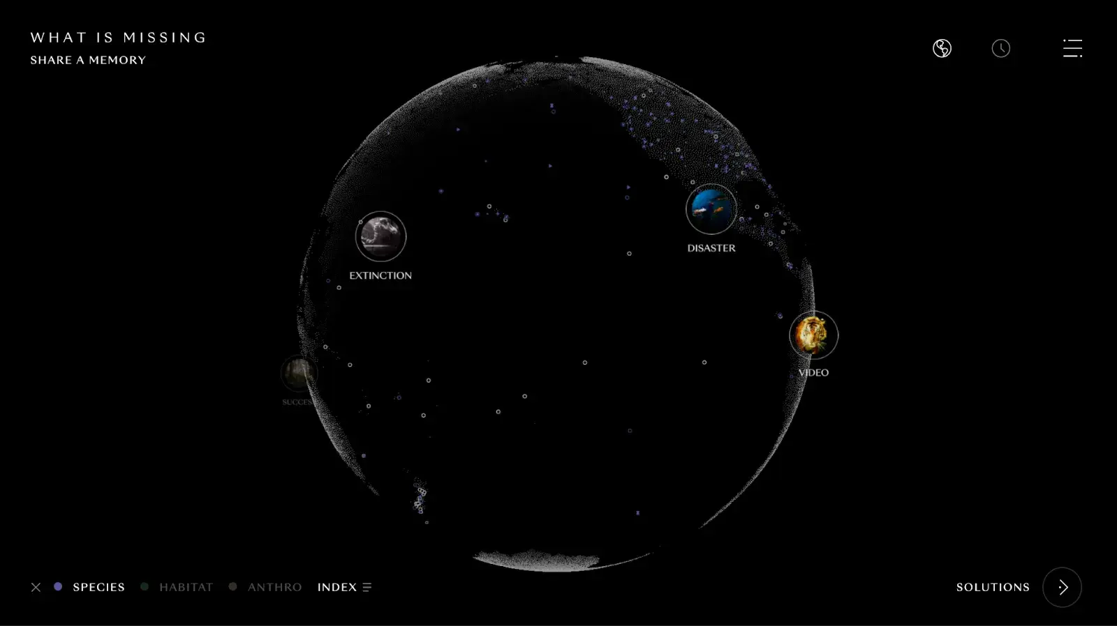
When I landed on the page, floating white dots on a black background told me we were talking about the stars in space, and then the text described the losses we’ve experienced from climate change here on Earth.
As the dots came together to show images of wildfires and plants growing, I was invited to enter the site. I clicked on categories to learn about various aspects of the natural world we’ve lost, and then read people’s memories, watched poetic videos about extinct species, and learned about habitats that have been destroyed. The soundscapes of birds chirping and wind rushing completed the experience.
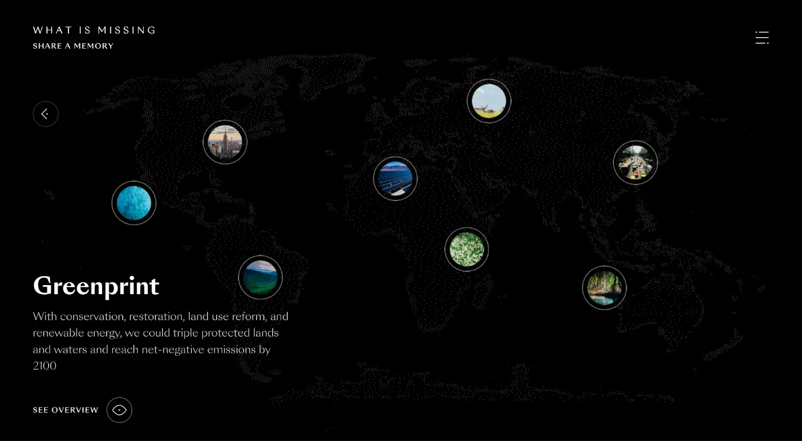
It might sound a little gloomy, but there’s a section for solutions, too. The mass of dots turns into a map with bubbles that I clicked on to learn about how we can slow climate change — which is the site’s aim.
What I like: The imagery and sounds fully immersed me in the site and made me want to stay and read more.
14. Persepolis Reimagined
Award: Art & Design Webby Award, People's Voice Winner, 2023
An immersive experience created by Getty, Persepolis Reimagined allows you to explore the ancient city of Persepolis as it was 2,500 years ago.
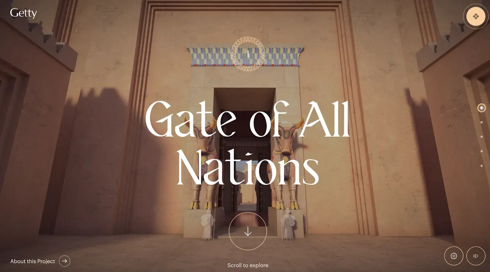
The site invited me to scroll in order to change the images of the narrative as it told a story. Once I entered the city’s walls, I explored its spaces, like the Gate of All Nations, by continuing to use the scroll as a means to move around the buildings. It felt like I was on a walking tour of this UNESCO World Heritage Site, which also allowed me to view what the ruins look like today.
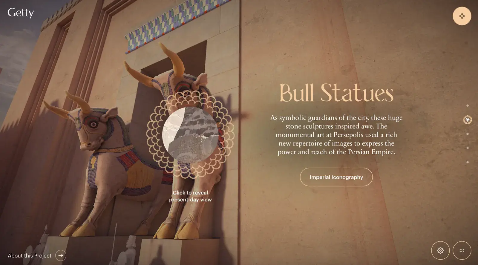
When I wanted to learn more about something, like the bull iconography for the empire, I scrolled horizontally to reveal history lessons.
What I like: I felt like I was visiting a museum without paying admission or hopping on a plane, which made the learning experience fun.
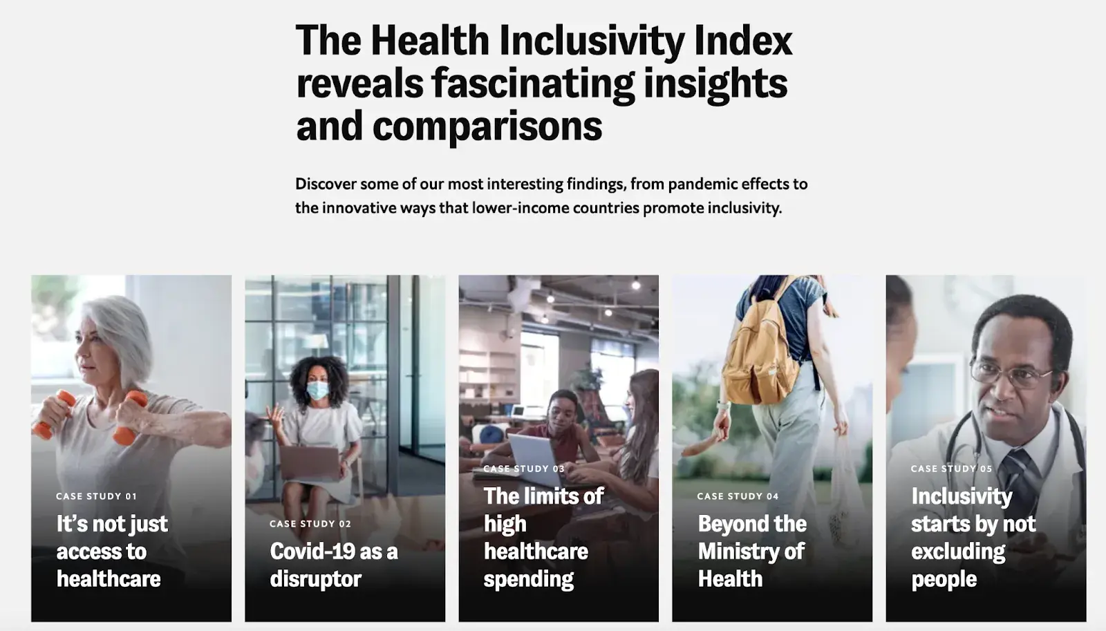
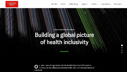
15. The Health Inclusivity Index
Award: Best Data Visualization Webby Winner, 2023
This site from Economist Impact analyzes the health landscape of 40 countries worldwide. The central feature of the site is a data visualization ring made up of lines. Each cluster of lines is a country, and each individual line is a health-data statistic.
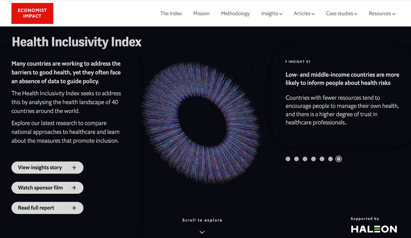
As I scrolled, I selected countries to see metrics like health equity or GDP per capita. When I hovered over a country, it showed me how that country ranked against others in terms of health inclusivity.
While the highlight of the site is the interactive visualization, I also clicked on case studies to read about COVID-19, access to healthcare, and the limits of high healthcare spending. The full research report, which covers the study’s key findings, is also available if you want to read it, rather than click around the site.
If you do want to interact — like I did — you can see visual data representations, showing where each country ranks in the index according to income and its relationship to health inclusivity.
What I like: The site is intuitive and easy to use, which made me want to stick around and play with the data visualization tools (i.e., interact and engage more).
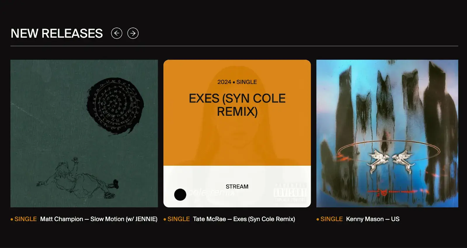
16. RCA Records
Award: Best User Interface Webby Winner, 2023
RCA Records’ site stunned me from the beginning with editorial photos of artists that almost popped off the screen. I noted recent favorites, like Doja Cat, along with the label’s historic musicians, like Elvis and David Bowie, creating an instant connection through familiarity.
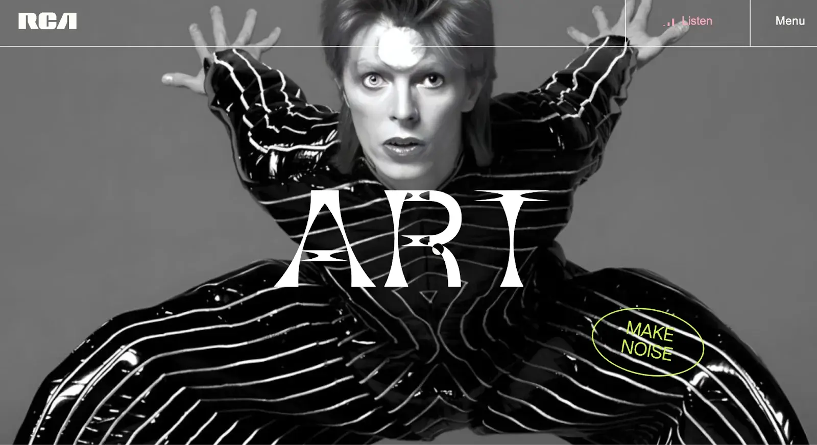
Scrolling down, I found sections on new releases, music videos, and curated playlists. And below, links to more info about the record label and its artists appeared as spinning records, inviting me to click.
The homepage is animated with places to explore the music, and when I clicked on a still of a music video, it took me to a new page to watch the full video and promote the label’s artist.
What I like: Eye-catching visuals of familiar artists grabbed my attention right away and access to music on the homepage makes it easy to explore artists I wasn’t already familiar with.
17. Design Threads
Award: Best Individual Editorial Feature Webby Winner, 2023
Design Threads uses a meta approach to tell a story. It’s a text-heavy site, but that’s because it’s a project to investigate the current state of design. It varies fonts, background color, and image and text placements to demonstrate the very concepts it’s discussing.
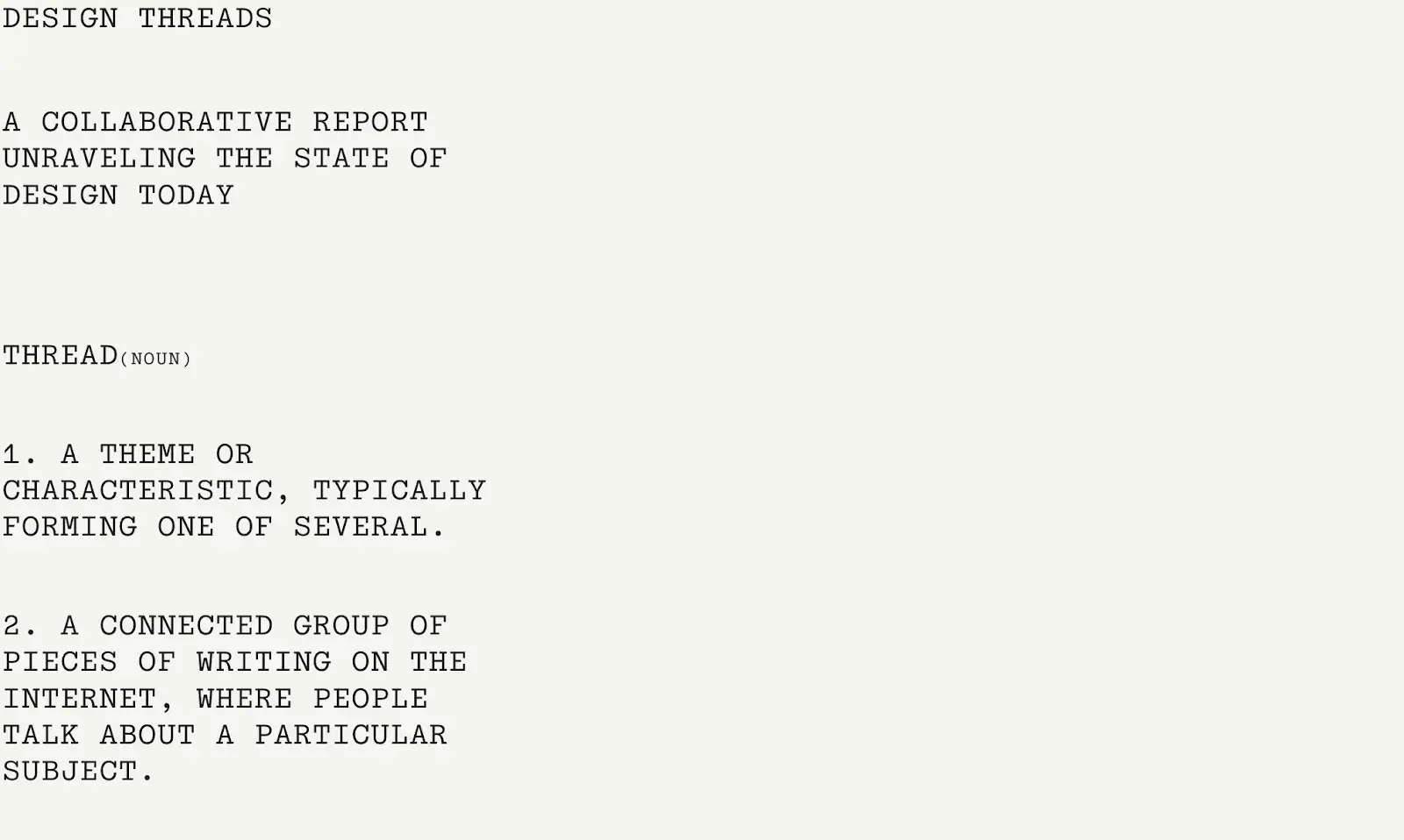
As I started to scroll, I was captured by the funny memes that accompanied the otherwise academic spread, which made it more approachable. Also, with the information for each “thread” (each topic) situated on one scrollable page a piece, I didn’t feel overwhelmed and could take in chunks of information as I skimmed.
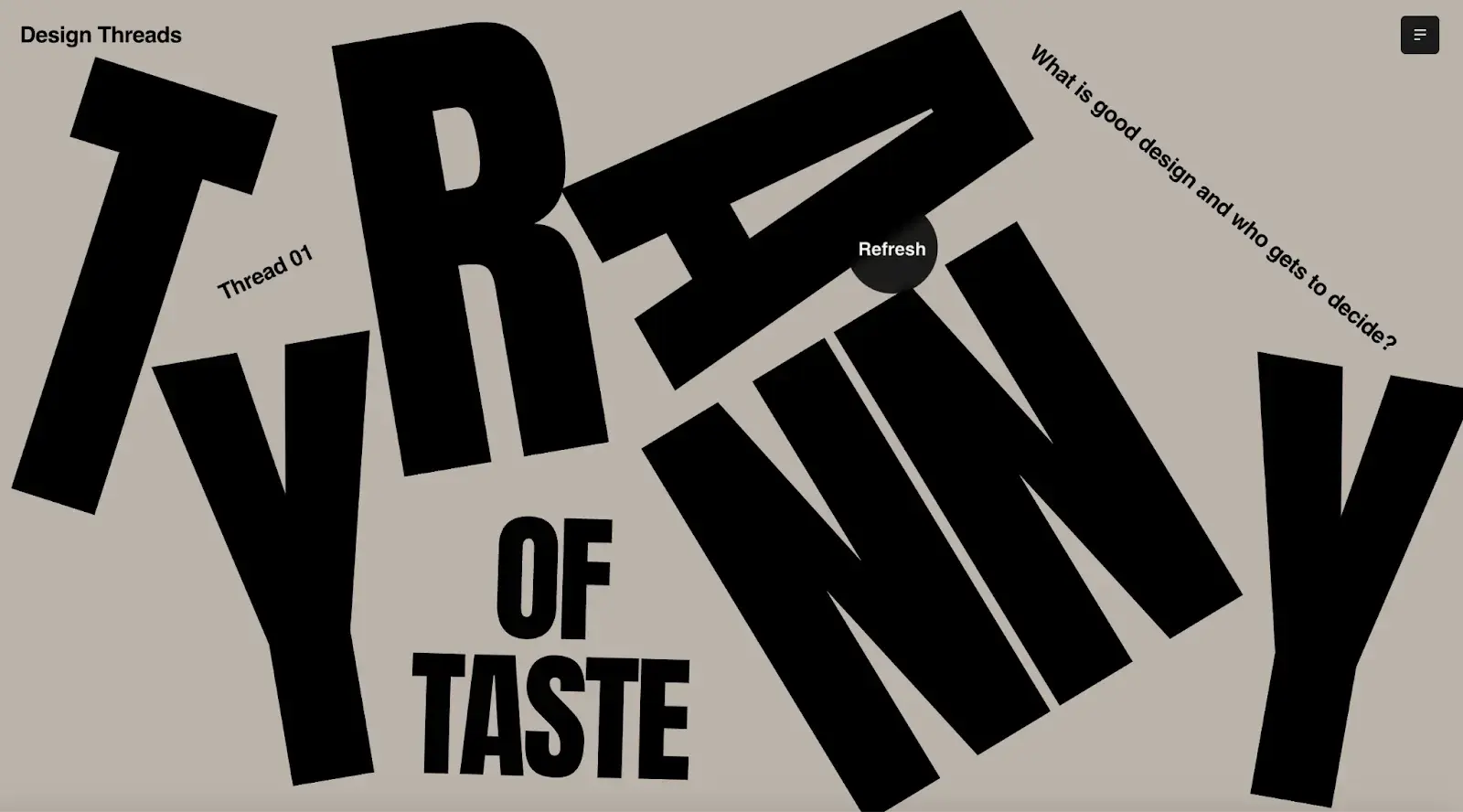
The site also invites a certain amount of interaction, polling users on design trends, and giving me the chance to scroll horizontally to view more blocks of text on a given topic. Each thread offers its own interactions in line with the varying themes.
What I like: With themes organized by thread, the density of ideas is easier to ingest as you skim and scroll. Also, I loved this animation of design books breaking apart, which is a great symbol for the site’s discourse.
18. Moooi Paper Play
Award: Best Visual Design — Aesthetic Webby Winner, 2023
Created by luxury furniture and lighting company Moooi, Paper Play showcases some of the company’s innovative products in an imaginary, digital room.
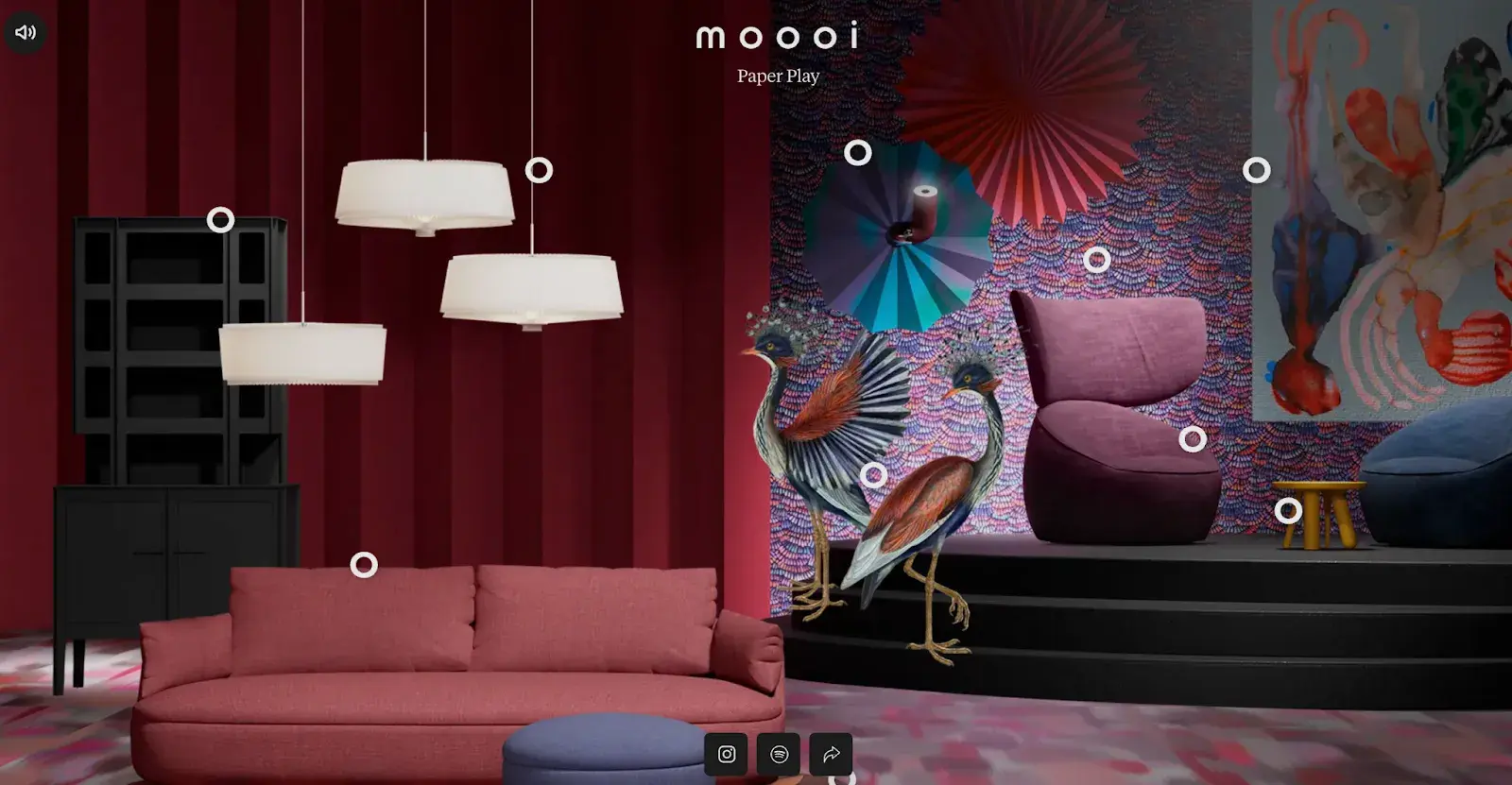
When I landed on the site, I was presented with a fully furnished room with dots beckoning me to hover over them. When I did, the name of each piece of furniture appeared and, clicking on one, I was taken to the furniture’s page to tell me more about the item.
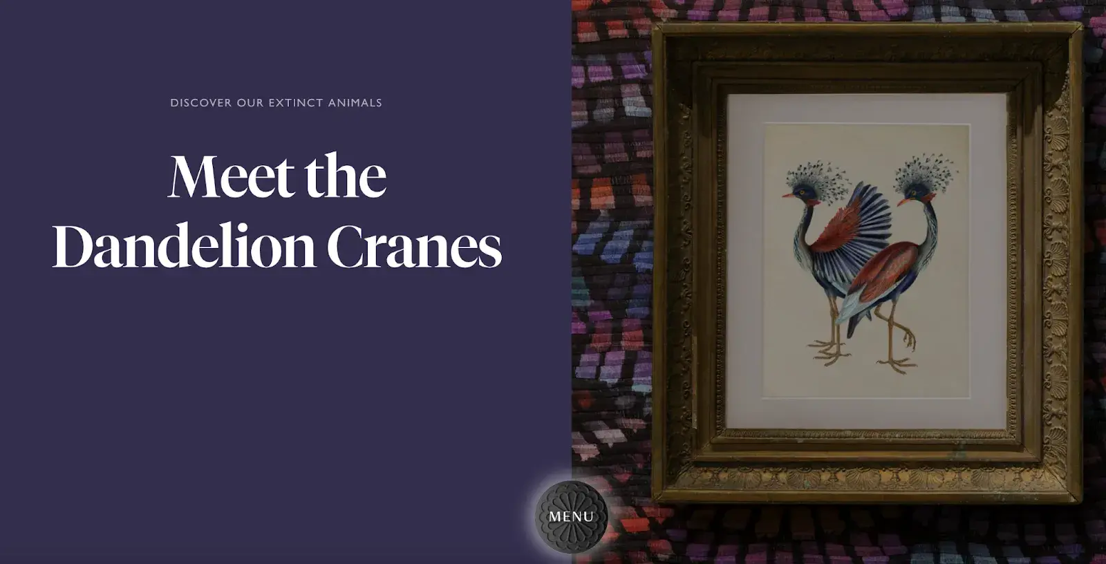
The first dot I clicked was for a specific item for sale (the PLIÉ PLISSÉ light that shifts as the ambient light of your room changes), while the second dot led me to explore more about the crane motif in the company’s wallcoverings, giving depth to why the products feature the animals they feature.
What I like: The aesthetic of the site — luxurious and whimsical — matches the personality of the brand.
Best Website Designs from 2022
19. Hyer
Award: Website of the Month (2022), CSS Design Awards
The Hyer homepage has everything it needs to be effective: an image that tells a story, good use of white space, an easy navigation bar, the company’s slogan, and a clear CTA.
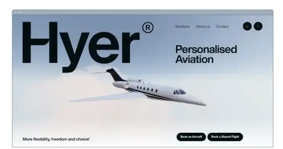
With its clean design, I didn’t get distracted and could focus on the goal of the site, which is travel. It’s also a nice touch that scrolling puts the plane in motion, showing it in flight.
Hyer is a private jet rental company and the site’s somewhat old-school vibe seems in line with its motto: “We believe that in a world where passengers have become numbers, a personal approach is key.” The site definitely has a sense of being personalized and scaled down for the individual.
What I like: Smooth scrolling transitions, simple layout, and a nostalgic vibe that fits the brand’s intentions.
20. Mubasic
Award: Website of the Day, August 10, 2022, Awwwards
Mubasic’s site isn’t just visually compelling; it’s dynamic. Mubasic is a catalog of high-quality music for children, and the website’s design decisions help it achieve a light-hearted, easy-going feel.
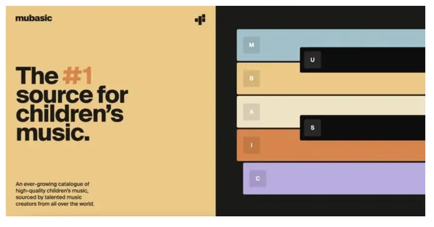
The poppy color scheme and effective visual hierarchy contribute to its design success. However, the real reason it shines for me is because of how the design feels authentic to the brand’s mission.
The homepage easily allows you to explore the company’s offerings and features a Q&A section in a unique format. Images pop up as you scroll down the page. But the fun part is playing the toy piano. Click on any key for kiddish sounds.
What I like: The color palette and the brand’s less-is-more approach make the site simple and fun at the same time.
21. Digital Cover
Award: Website of the Day, July 31, 2022, Awwwards
Everything from the loading screen to the homepage of this France-based digital agency’s website is a visual win. The homepage took me straight into Digital Cover’s world through a 3D graphic that popped up and welcomed me into its orbit.
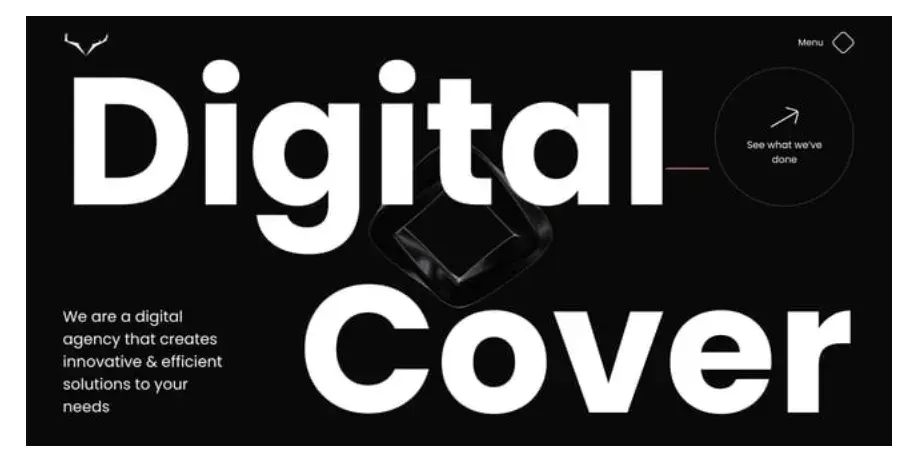
The animated nature of the homepage adds intrigue and, scrolling down, I could see the company’s featured projects, which, no surprise, are website designs. Creating strategic and notable websites for the brands it works with is the company’s mainstay.
Easy navigation to start a project with the company, or just inquire about one, makes this site simple while still giving a fun and interactive feel.
What I like: The dark and mysterious vibe and 3D motion. Plus, easy access to the company’s portfolio of prior work.
Free Website Design Inspiration Guide
77 Brilliant Examples of Homepages, Blogs & Landing Pages to Inspire You
- Agency Pages
- Ecommerce Pages
- Tech Company Pages
- And More!
Download Free
All fields are required.
Other Well-Designed Websites
22. Guillaume Tomasi
Montreal-based photographer Guillaume Tomasi has built a web-based portfolio that suits his unique and awe-inspiring photography. His surreal style is juxtaposed with a simple, flat, empty, and minimalistic portfolio design that places the focus on the work itself.
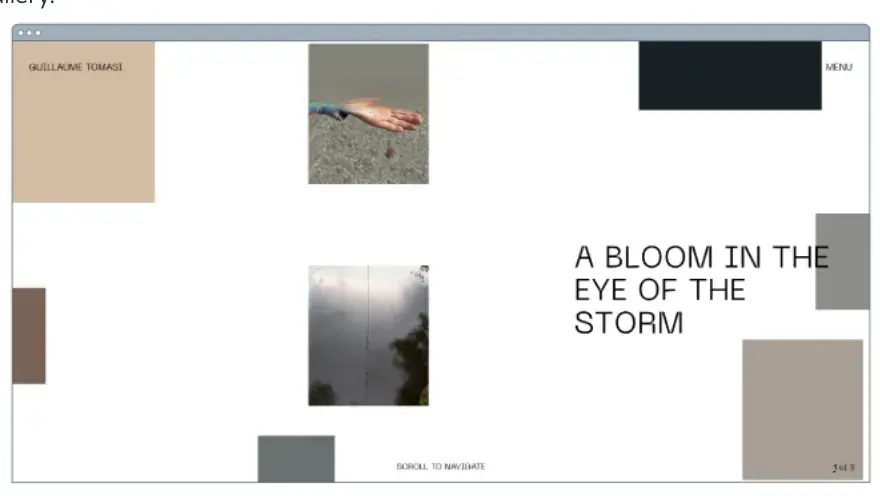
The homepage looks like a series of blank boxes, until you hover over them, and then images appear, showcasing his work. Clicking on any box loads a page of scrollable photos, which yields an experience reminiscent of an art gallery.
What I like: The mosaic layout that hides the images until you interact with them. It adds an element of surprise and made me want to keep hovering to see the rest of the works.
23. Tej Chauhan
Tej Chauhan is an industrial designer working with brands to create iconic products. As such, his homepage is a series of slides exhibiting some of his designs.
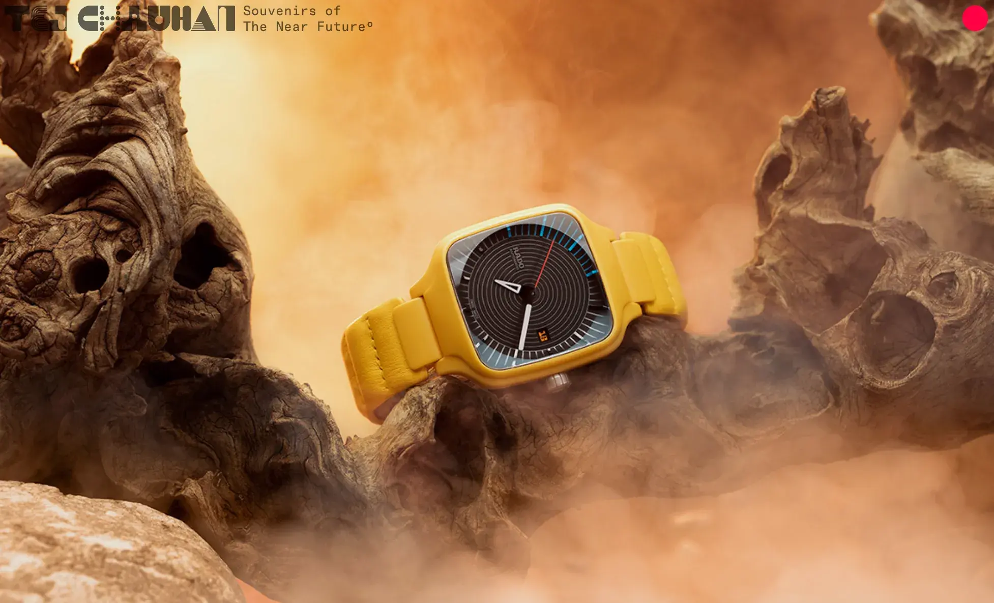
While the site doesn’t give the user the interactive experience of clicking an image or choosing when the next slide appears, the lack of context on the page made me want to learn more. There’s a singular red dot in the upper left, calling for a click, and when I tapped it, a menu appeared to dig deeper into his portfolio and prior work with clients.
This is a polished and effective site design for artists who want to display their portfolio.
What I like: I love the minimalism, which focuses on displaying the products and portfolio with visuals rather than explanations of the work.
24. Studio CL
Studio CL is a boutique architecture practice based in Chile with a focus on urban life and simplicity in design. And its website has that same element of purposeful simplicity with an image grid that displays its portfolio right on the homepage.
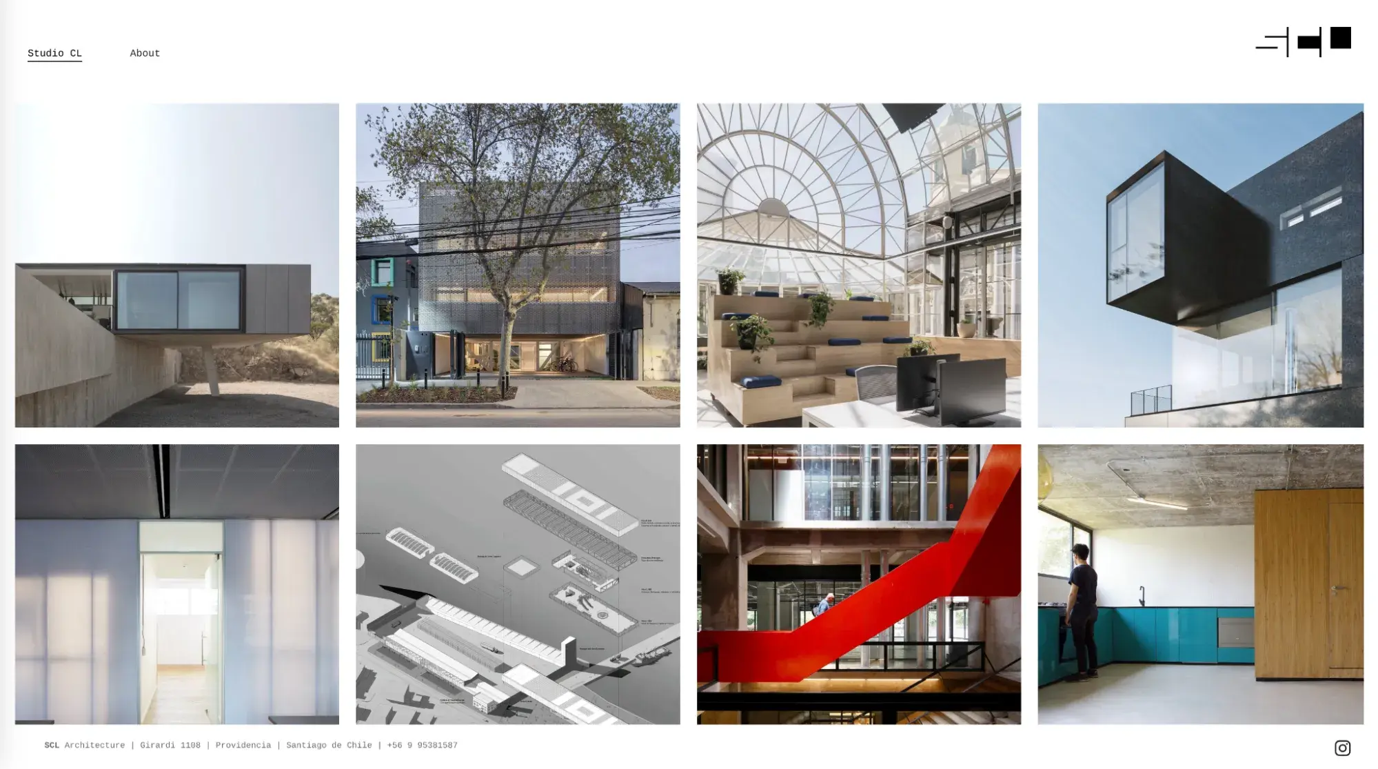
Hovering over any of the images reveals the project’s name. And clicking on them takes you to clean white pages with high-resolution photos of each building’s interiors and exteriors. Unobtrusive sidebars describe the context of each work and how it came to be — which to me seems especially pertinent for practices focused on delivering individual attention.
With an all-white background, easy scroll, and fine font, the architects’ work is allowed to speak for itself. And with easy navigation and nothing more than a portfolio and an About page, the studio’s value of simple design shines through.
What I like: The photo-centric design that let me see the full collection of work at once, and then took me inside the buildings to explore the stories behind them.
Modern Website Design Examples
25. Lumin
When I landed on Lumin’s site, the first thing I noticed was how clearly it explained itself: the headline “Take the work out of workflow” sits over a sub‑heading telling me I can collaborate, edit and get sign‑off in one place. I was drawn in by the soft pastel color scheme and playful illustrations: they make a potentially dull document‑management tool feel friendly. As I scrolled, benefit‑focused sections like “Streamline efficiency,” “Collaborate live,” and “Automate workflows” told me exactly how the product helps.
I also learned that the UX and software team at Designveloper built the platform and applied Google’s Material Design 3 principles to keep the experience consistent across devices. Knowing that Material Design 3 is applied to ensure consistency and responsiveness makes me trust that my experience will be smooth on any device.
What I like: The site’s friendly pastel color scheme, large illustrations and concise copy make a complex SaaS product feel approachable.
26. Unseen Studio
Unseen Studio is a creative studio crafting unique ideas and visuals to help brands stand out. It has a beautiful site that Awwwards named Site of the Month (SOTM) in February 2023.
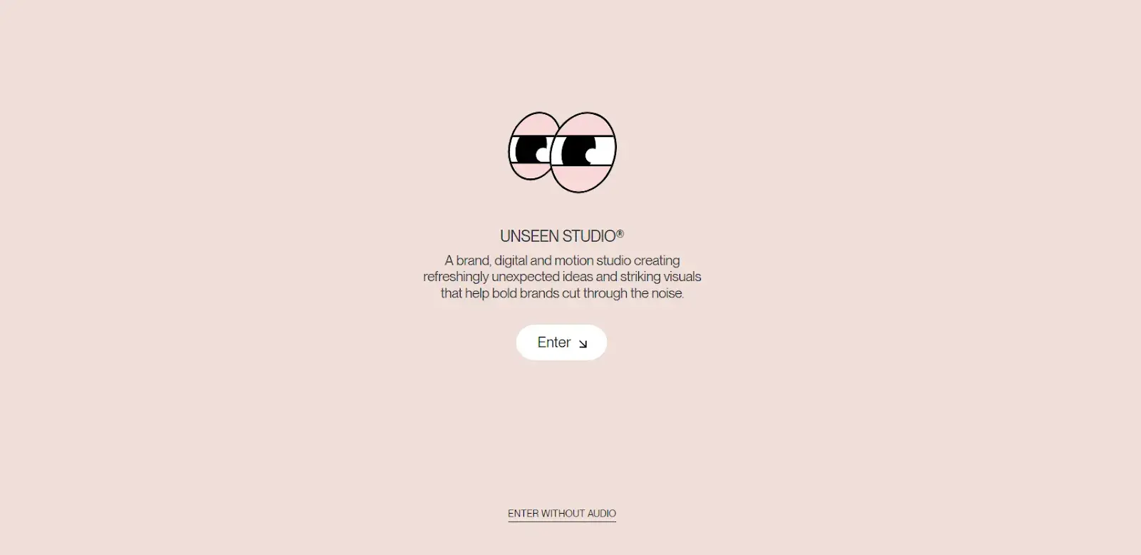
On the all-pink homepage, a pair of semi-open eyes represents “Unseen” and invites me to enter by clicking a button. When I did, I was in a mystical, watery, and (again) all-pink room.
Moving the cursor across the page makes everything move and come alive in 3D.
The best part is when you hover over water, it creates ripples.
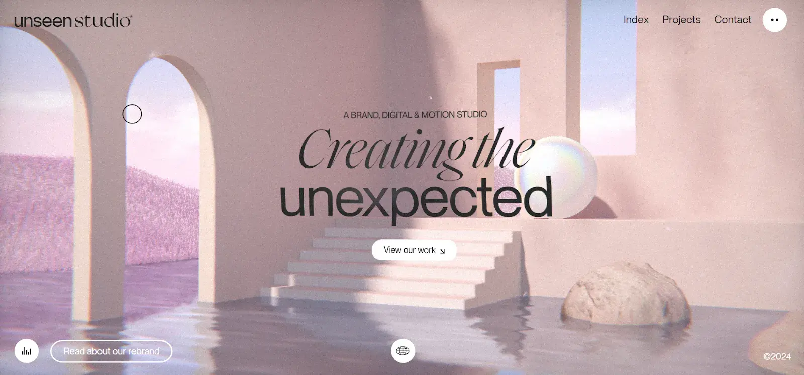
This site is totally on-brand for a studio that creates and sells 3D-motion visuals.
What I like: The site displays the work that the company does, showcasing what they have to offer through the 3D motion of its own site.
27. ETQ
ETQ takes a minimalist approach to ecommerce. Big, compelling visuals of their products lay against simple, flat backgrounds accompanied by strong typography that keeps the focus on exactly what the user came there to see: shoes.
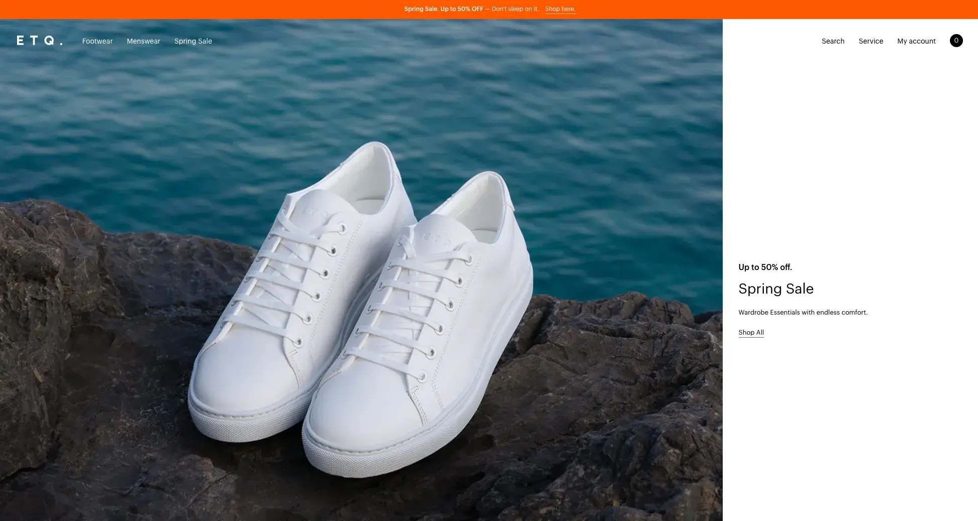
And while this is a great example of a modern ecommerce site, if you’re looking for broader ecommerce website inspiration, check out the Best Ecommerce Website Design Examples to Get Inspired.
What I like: The website’s simplicity, muted color palette, and minimalist product presentation.
28. Cyclemon
Cyclemon’s website is like a colorful picture book that I loved flipping through. The site is an ode to the 100th Anniversary of the Tour de France, and the illustrations it contains are posters of various bike styles.
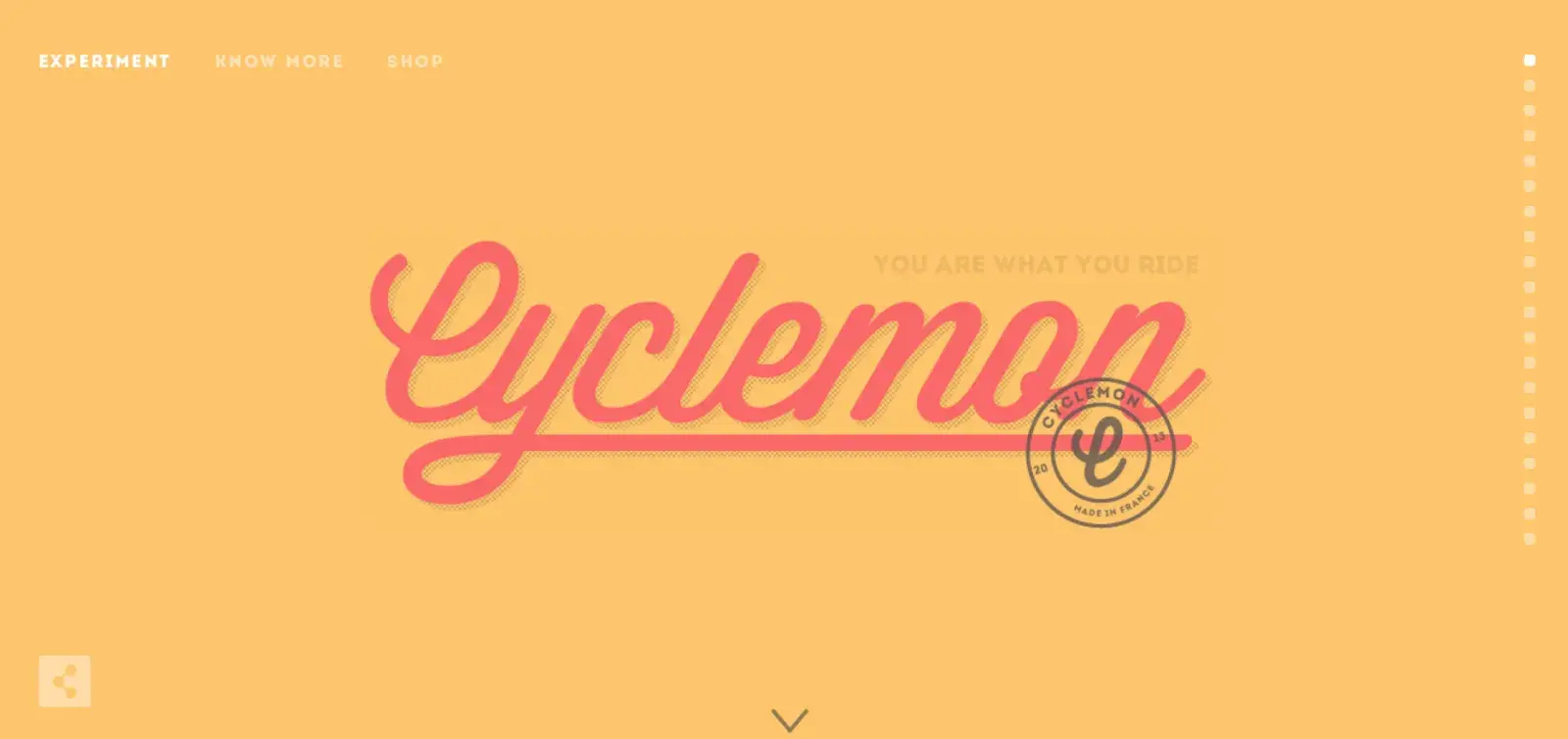
There’s a vertical row of dots on the right, which turns out to be the navigation menu, and when I hovered over each dot, I saw a series of words to describe people who ride different types of bikes.
You can click on a dot or scroll down to see all the bike styles, and when I scrolled, the pictures moved smoothly, making it feel like I was taking a breezy ride.
Here’s an example of a style of bike to match the name:
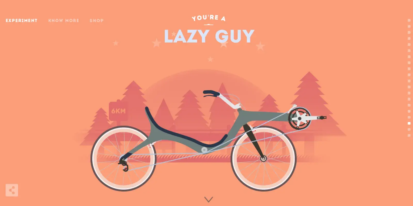
The illustrations are the highlight, with just three categories for navigation. You can “Experiment” on the homepage by seeing the different bikes. Click on “Show more” to learn about the artists behind the site. Or “Shop” to order a silkscreen of one of the images. It’s that simple.
What I like: Less is more with this site, which focuses on its products and theme in a fun, interactive, and humorous way.
29. Silencio
Silencio offers a surrealist experience with floating “products” that bopped around my screen when I landed on the site. The “products” are a soda can labeled “digital branding,” a juicebox labeled “interactive website,” and a snack package that reads “visual languages.”
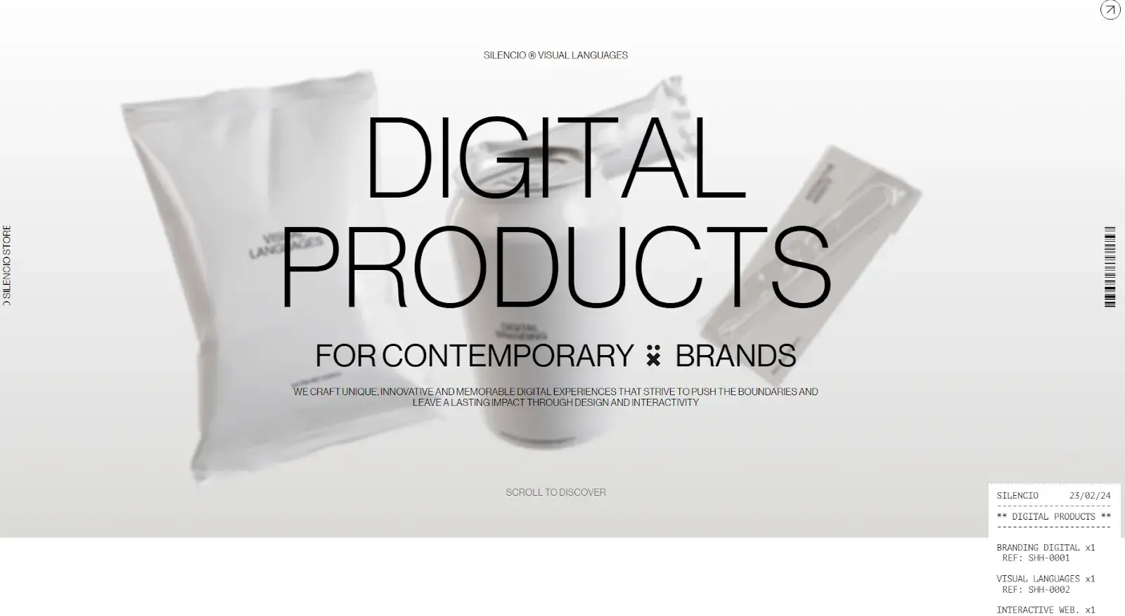
It’s a clever way to show off what the studio sells, using the idea of material products but giving them digital names (to showcase digital products).
As I scrolled, I followed the products through various stages: it looks like the products are being scanned in a checkout line, but it’s a way to discuss each stage of the digital development process as Silencio works with clients to create interactive sites.
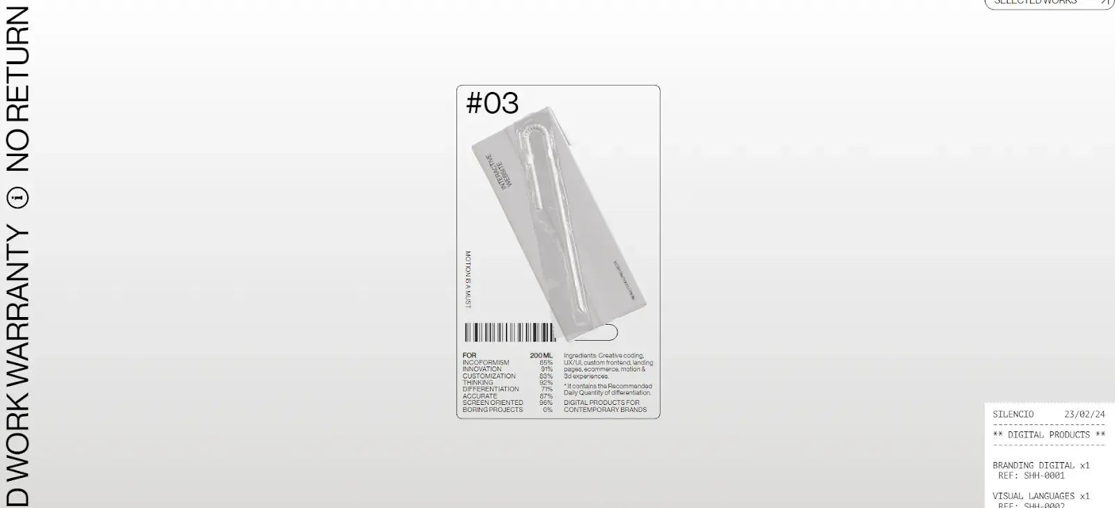
At the bottom, all the products finally land in a cart and the site invites you to reach out to the studio (i.e., clear CTA).
What I like: The interactive experience and minimalist design create a visually engaging site that transmits exactly what the studio does, how it works with clients, and what it has to offer (which: I’m sold).
30. Alexander McQueen
Alexander McQueen was known for being rebellious in the fashion industry. And this website tells the story of his brand in dark compositions that embody the spirit of his legacy.
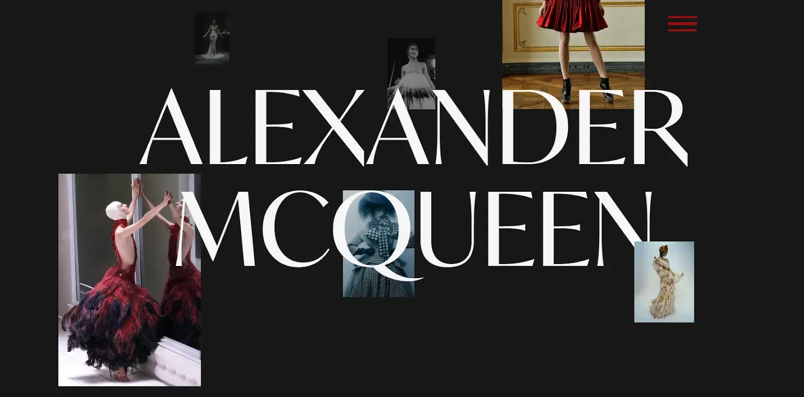
Beginning with a biography, his background in tailoring, and moving on to how he revolutionized fashion, the site is an ode to the designer, his work, and the mark he left. The timeline of his life is juxtaposed to a measuring tape, and the layout of the site looks like the pages of Vogue.
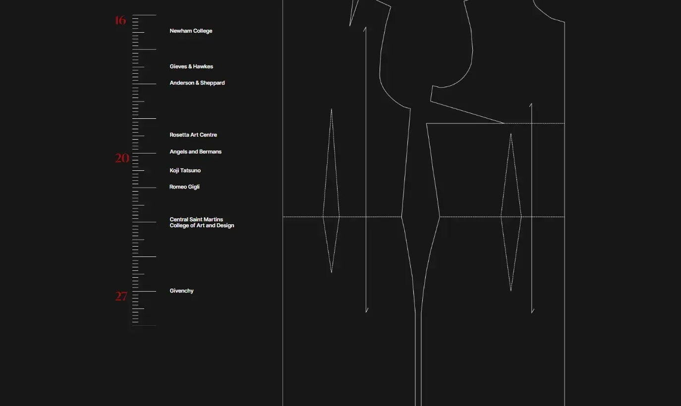
What I like: It’s a one-page site with no navigation that tells a linear story. And the style of the visuals matches the content it delivers.
31. Gapsy
Gapsy’s homepage first features text that resembles graffiti on a wall. But as I scrolled, the page moved horizontally, giving me the impression of walking through an art gallery where I could see the company’s projects and learn more about it.
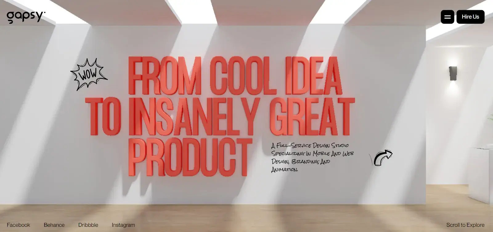
As a web and mobile app developer, it makes sense that the scroll feature would be front and center on their site, moving me through a 3D space that displays their portfolio. In the upper right, there's a menu that lets you bypass the gallery, if you want, to dig deeper into their projects and services.
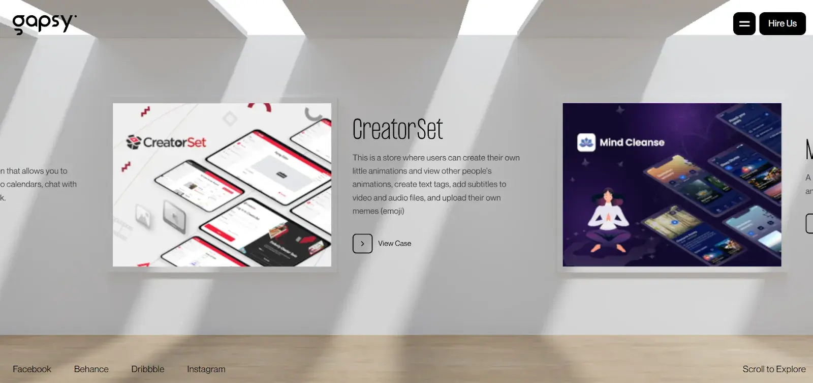
What I like: Exploring the website is an enjoyable experience and highlights what the company has to offer by putting it into action.
Where to Get Your Design Inspiration
If you want some design inspo, the good news is that you can find it just about everywhere, so long as you keep your eyes peeled.
New Environments
One of the best ways to get inspiration is through putting yourself in new contexts, for example, by traveling somewhere you’ve never visited — whether it’s a new country or a park across town.
When you’re surrounded by the unfamiliar, you’re forced to get out of your comfort zone, which is a great way to spark creativity.
Exploring Media
Another way to get design inspiration IRL is through media. Every day, we’re inundated with visual content and being intentional about our likes and dislikes can bring valuable insights into our own designs.
And it doesn’t have to be passive. You can seek out design advice through online communities, forums, lookbooks, or even classes — so long as there are designers present to share their expertise.
HubSpot's Free Website Builder
Create and customize your own business website with an easy drag-and-drop website builder.
- Build a website without any coding skills.
- Pre-built themes and templates.
- Built-in marketing tools and features.
- And more!
Website Design Inspiration Sources
Now that we’ve covered some IRL design inspiration sources, let’s cover the digital ones.
1. HubSpot’s Content Hub
HubSpot’s Templates Marketplace houses hundreds of website templates that you can sift through to get inspired for your own website.
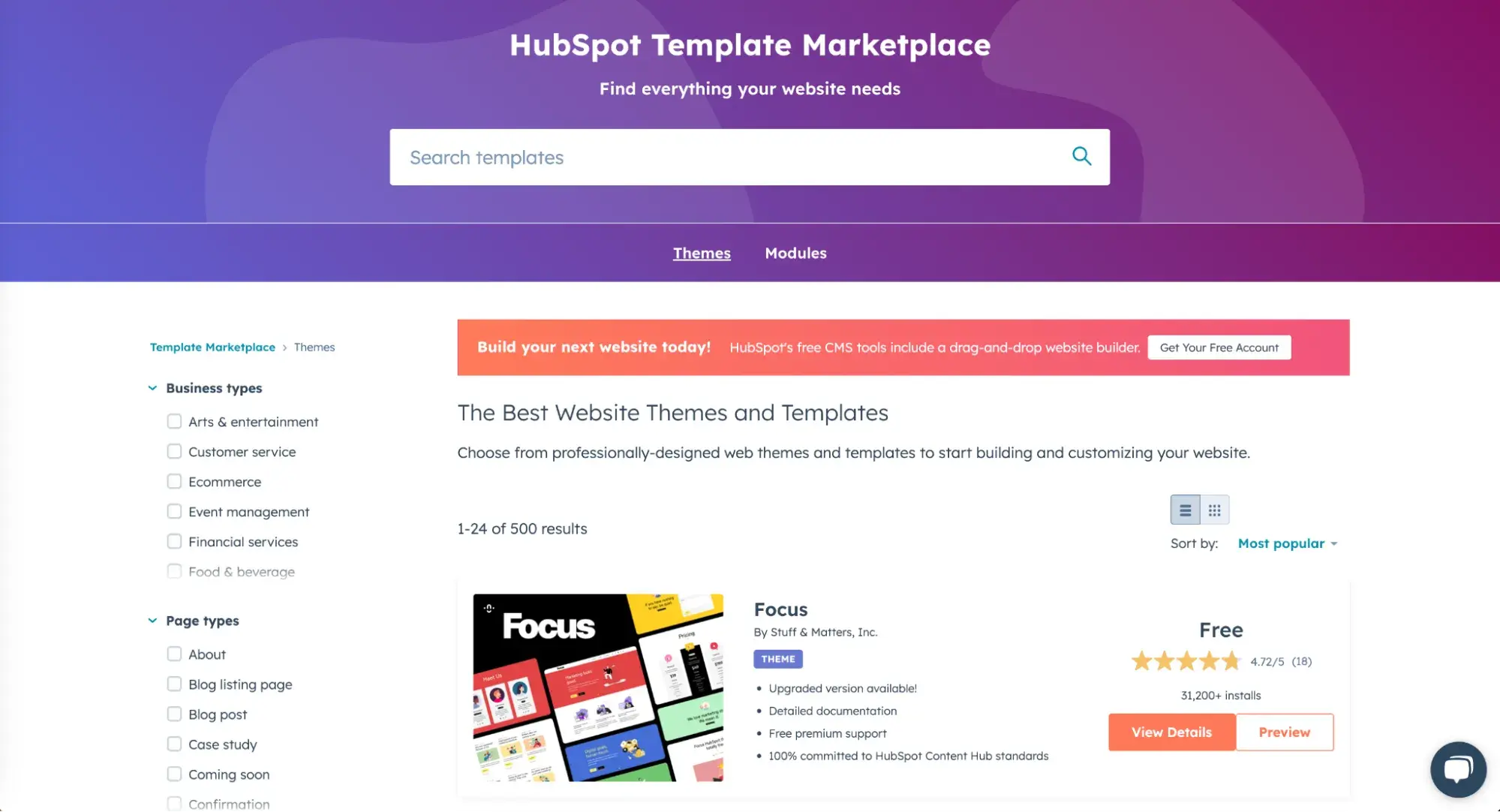
The best part of the marketplace is that you can narrow down by industry and feature, allowing you to see the templates that are most relevant.
Once you find a template you like, you can view a live preview of the site to get a full experience, then download it and customize it for free through HubSpot’s Content Hub.
To browse even more themes for any type of business, check out the Content Hub theme collection on the Envato marketplace.
2. Dribble
Dribble is where designers go to get inspired and to share their work. The website has everything from animation and branding to illustration and mobile.
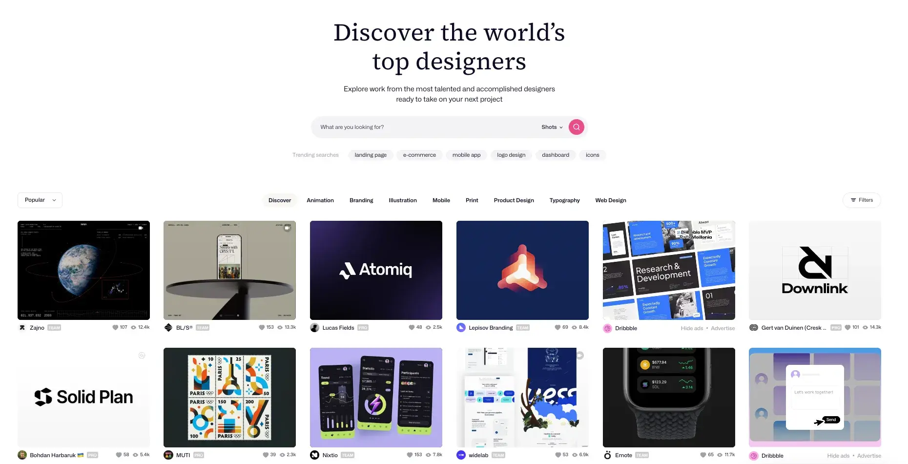
To get started, on the “Explore” dropdown menu, click on “Web Design,” and a grid of designs will appear for you to peruse.
If you find a designer whose work you like, you can save the design for future reference and follow their work to see other designs on their profile.
This is an incredible resource to use whether you’re starting from scratch or already have a solid plan in mind.
3. Bēhance
This is another digital platform full of creative inspiration to leverage ahead of your website design project.
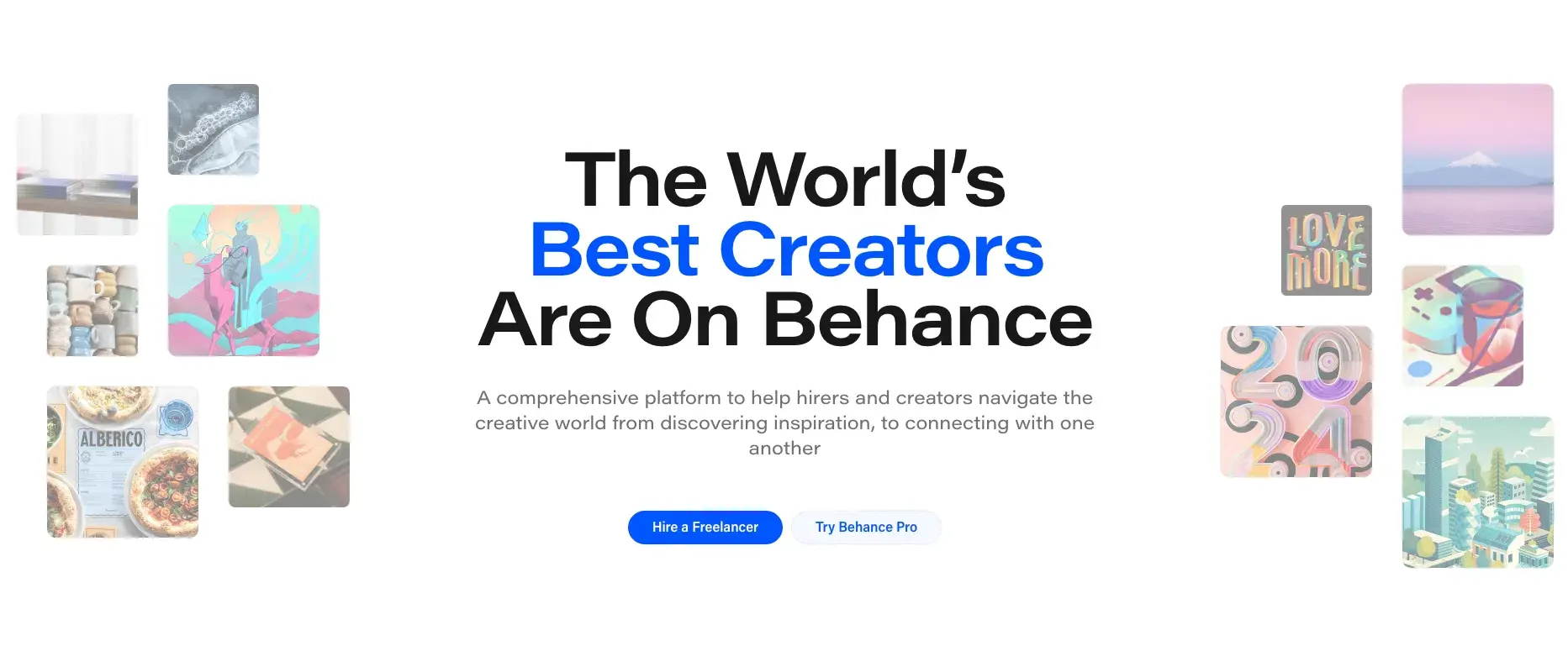
One of the best features of this site is the ability to filter by location. This allows you to see how designers in different regions differ in technique and style.
This can be helpful if you are designing a website for an unfamiliar market, but also if you’re trying to zero in on specific trends in your particular market so you can incorporate them.
4. Pttrns
Want to focus on mobile web design? Pttrns is the place to go.
This subscription-based platform allows you to access thousands of mobile design templates and to get advice from top designers all over the world.
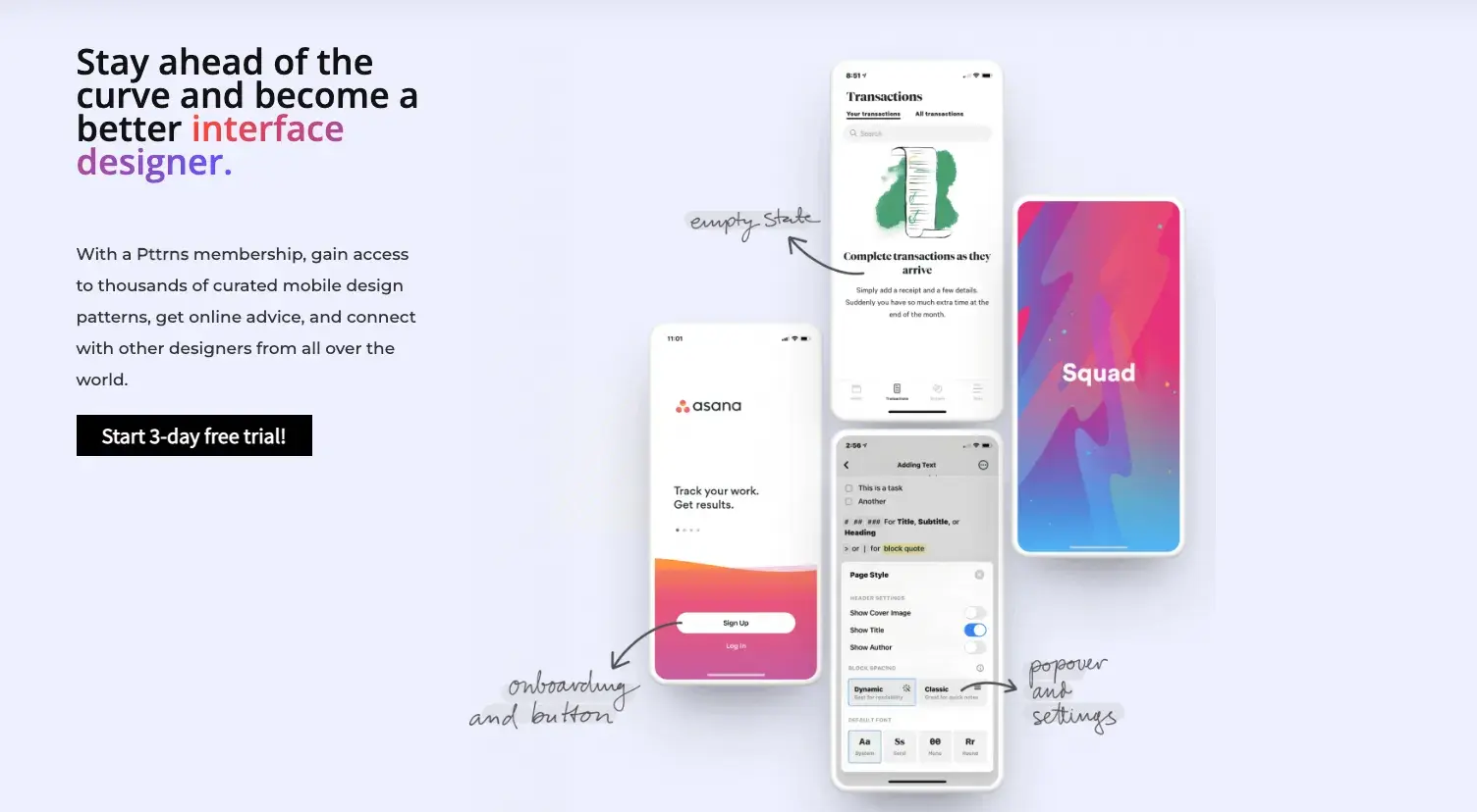
Additional features on this platform include:
- A favorites and collections folder to store your favorite designs.
- A studio to interact with other designers and get advice.
- A design guide to understand the strategy behind the designs.
Website Design Ideas
Now that I’ve taken you through a number of beautifully designed and award-winning sites, hold onto these inspirations as you plan your own.
Beyond that, I have a few suggestions to keep in mind as you create a site:
- Make your website interactive.
- Emphasize the mobile experience, making sure it still has good user experience (UX) on desktop.
- Tell a story about your brand with photos, text, video, or graphics.
- Create a visual portfolio of your work, especially if you’re an artist, designer, or architect.
- Ensure your CTAs stand out.
- Encourage continued exploration of the site.
- Keep navigation clean and make sure visitors can easily get back to the homepage.
- Integrate your social media via embed buttons so visitors can easily follow you on your various social channels.
- Keep each of your web pages consistent in design — including font, colors, images, and messaging.
- Test your website’s usability with a heat map, which will show you which pages visitors are most likely to bounce.
- Include a live chat or chatbot to give visitors the option to engage with you directly on your website. Live chat can automate functions for your sales and service reps and create a better communication experience for the customer.
- Get an SSL certificate to ensure your website is secure. SSL is part of Google’s search ranking algorithm, so having one can help you rank higher in search. You can get a free SSL certificate when you build your site with HubSpot.
Modern Website Design Tips
If you want to focus on modern design, I came across some great tips from UX Designer Vitaly Friedman on The Futur podcast, where he shared his Blueprint for Modern Website Design.
Here’s what I drew from his discussion:
- Skip the guesswork. Conduct testing to validate your design decisions. Create tasks that mirror real-life situations and recruit a diverse group of at least 15 participants to give feedback.
- Keep your design clear for everyone. Be mindful that what seems obvious to one person might not be so clear to another. Make it all look clear, fresh, and easy to understand.
- Make sure everyone has a good experience. Pay attention to accessibility features for screen reader users and people with disabilities. Focus on color contrast, typography, font sizes, and tab target sizes.
- Feel the vibes. Understand users’ emotional responses and brand perception through qualitative methods like descriptive feedback.
- Embrace the quirks. Imperfections and human mistakes make the design interesting. Or, as Friedman says, “Sometimes I can smell your GPT text. I want to see TYPOS.”
- Change is good. Be open to trying new things, making improvements, and bringing innovations.
- Stir up some emotions. Aim to surprise, delight, or even challenge your users to create memorable experiences.
- Add a sprinkle of humor. Injecting some fun into unexpected places like terms and conditions can make users feel at home.
Watch the whole episode here:
Build a Beautiful Website for Your Business
So, are you feeling inspired? Now is the time to take that inspiration and apply it to your own site. But the thing I try to keep in mind is that while inspiration is necessary, the key to the best website designs is making sure the experience matches your brand.
So, as you go about your design journey, remember to keep it focused, engaging, and visually pleasing — but especially, unique to your business.
Editor’s note: This post was originally published in January 2014 and has been updated for comprehensiveness.
Free Website Design Inspiration Guide
77 Brilliant Examples of Homepages, Blogs & Landing Pages to Inspire You
- Agency Pages
- Ecommerce Pages
- Tech Company Pages
- And More!
Download Free
All fields are required.
.webp)
![How to create a landing page with high ROI [+ expert and data-backed tips]](https://53.fs1.hubspotusercontent-na1.net/hubfs/53/%5BUse-2.webp)
![Signs it's time to redesign your website [+ 15 steps to follow]](https://53.fs1.hubspotusercontent-na1.net/hubfs/53/phaseswebsiteredesign%20copy.png)


![How to start a blog (the right way) and write posts people actually want to read [+ free templates]](https://53.fs1.hubspotusercontent-na1.net/hubfs/53/how-to-start-a-blog-2.webp)
![What is a lead magnet? 20 lead magnet ideas and examples [+ step-by-step]](https://53.fs1.hubspotusercontent-na1.net/hubfs/53/lead%20magnet%20represented%20by%20a%20magnet.webp)