.png?width=112&height=112&name=Image%20Hackathon%20%E2%80%93%20Vertical%20(50).png)
But before you read on to get design inspiration, let’s explore what makes a great SaaS website.
What Makes a Great SaaS Website?
The best SaaS websites balance aesthetics, usability, and clear messaging. They effectively communicate the product's value and drive conversions. In other words, a great SaaS website is more than just visually appealing.
Let’s discuss a few key elements that contribute to a great SaaS website.
Intuitive Navigation
Ideally, most users should be able to explore different sections of a site, find relevant information, and take the desired action without any external assistance.
Persuasive Calls-to-Action (CTAs)
Strategically placed and compelling calls-to-action (CTAs) are the way to convert visitors into leads or customers.
Clarity and Simplicity
Avoid making users wade through complex jargon or cluttered designs. Simplicity is when users get the information they need without getting overwhelmed.
Clear Messaging
Like the above, clarity in your choice of words is crucial for a website design — especially your homepage. Users should be able to tell what your product or service is with a simple scan of your main website headline. Again, less is more.
Fast Load Time
No one likes a slow-loading website. Optimizing for speed is important to keep users engaged and improve overall user experience.
Responsive Design
Users should be able to access websites from any device: desktops, tablets, or smartphones. In other words, the website must offer a seamless experience across all screen sizes.
Trust Indicators
Anything that reassures potential customers that they’re making the right choice is a trust indicator. Personally, I feel social proof is the best trust indicator, but customer testimonials, case studies, and endorsements also do the job significantly well.
Compelling Visuals
Aesthetically pleasing visuals that align with the brand’s identity almost always create a memorable experience. This means effectively using colors, typography, and imagery.
.png)
Free Website Design Inspiration Guide
77 Brilliant Examples of Homepages, Blogs & Landing Pages to Inspire You
- Agency Pages
- Ecommerce Pages
- Tech Company Pages
- And More!
Download Free
All fields are required.
Form not available
In the next section, I’ll showcase my favorite SaaS website design examples and analyze which have made use of these key elements.
My 30 Favorite SaaS Web Design Examples
1. HubSpot

I‘ll admit I’m biased for naming HubSpot one of my favorite SaaS website examples, but hear me out. For me, HubSpot's website stands out due to its CTAs and reassuring copy.
What I Like
Persuasive Calls-to-Action: Both the CTAs in the hero section are powerful — and offer visitors options. I like to explore software demos before jumping to pricing. Sometimes, I also like to explore a tool on my own without anyone giving me specific instructions on how to use it. Both CTAs serve that purpose.
I also liked how clicking on the “get a demo” button took me to the form submission page where the form was already filled (I was accessing the website on my browser and had personal information saved).
Clear Messaging: Even though I usually like exploring a tool on my own, I do like to have the option of knowing that assistance is available if I need it. As you scroll down on the homepage, you get this reinforcement.

The homepage copy covers all bases. It gives users the option to get started with a certification right away — this is great for students and employees looking to upskill. If you’re associated with a startup, you get separate support. For me — even though I’m not a developer — I was curious about the developer tools as I get to work closely with the development team.
In short, the homepage is all about what you as the user can gain.
Key Takeaway: Give the users a feeling that they will get a lot of value from your software.
2. Workleap

What I Like
Simple Design: The Workleap homepage has a simple white background without any distractions, which draws attention to the CTA right at the center of the website.
Clear Trust Indicators: The website has a slider that displays the logos of companies that use Workleap. As I got to know all the renowned brands that incorporate this software into their business, my trust in Workleap software increased.

Key Takeaway: A clean, distraction-free design with a prominent CTA does the job better than a complex website.
3. Linktree

What I Like
Fast Load Time: Linktree uses animations effectively to showcase what the product looks like to inspire visitors to get started. One thing I’ve noticed in websites that use animations is that their pages tend to load at a slower speed. This wasn’t the case with Linktree — so kudos to their development team.
Compelling Visuals: This website demonstrates that SaaS website design can be simple and still make an impact. Linktree’s website is colorful, but it doesn't feel like overkill. Using the right colors is also an art. I recommend reading this article if you need some suggestions for color combos to try on your own site.
Clear Messaging: The website copy here makes you feel included. For example, I don’t have a personal website, so I was wondering if I could still have a Linktree. The FAQ section on the homepage answered my concern by saying that having a website is not required.
Persuasive Calls-to-Action: I also love the clever copy in the call to action where I was able to insert my Linktree name and click on “Claim your Linktree."
Key Takeaway: If you design an animation website, make sure it doesn’t affect the page load speed.
4. Lucky Orange

What I Like
Clear Messaging: The very first thing that caught my eye was the main message that directly solved my pain point: “Less time crunching numbers, more time growing your business.” Lucky Orange also made the call-to-action visually distinct, guiding users to learn more about how the software works.
Clarity and Simplicity: The color scheme is minimal, and creates a modern look by using shades of gray and purple call-to-action. This way, the messaging actually complements the design. To me, the design feels more easy on the eye which makes it more compelling.

Trust Indicator: Showcasing to customers that your SaaS company is compliant with regulations such as CCPA and GDPR adds to the trustworthiness of your platform.
The designers that I have worked with are usually of the opinion that compliance logos don’t match with the overall theme of the website. They have a point. However, I think it’s worth it to include them as a trust indicator. Omitting them is losing the chance to showcase how the company deals with sensitive data.
I have found that the best compromise is to integrate these logos in a subtle, non-intrusive manner — usually at the end of the page or in the footer — and Lucky Orange has done exactly that by including it at the very end of the homepage.
Key Takeaway: Have a strong, clear message that directly addresses the user's pain points.
5. Medley

What I Like
Simple Menu: The Medley website features a simple menu that easily segments customers into the site section that is most helpful for them. I feel that the less choices you give to users, the more likely they are to take action without feeling overwhelmed.
Medley does exactly that with its four-button menu. The first button “Connect” and the last button “Book a Call” essentially serve the same purpose. The “Learn” button redirects to the blog page in case the user has any questions before booking a call.
Compelling Visuals: The website is about developing human-centric skills for leaders. To build that element of trust, Medley effectively uses the images of the co-founders (who also happen to be mother and daughter).

Apart from the visually appealing design on the homepage, the website also has an engaging copy — and no usage of unnecessary or complex jargon. As I scrolled on the homepage, I also learnt about Medley from user testimonials, who provide further insight into their experience with Medley’s services.
Key Takeaway: Make use of a minimalist menu and human-centered visuals.
6. Cococart

What I Like
Compelling Visuals: Cococart's website features a bold mustard yellow background which is an appealing change. I feel that the theme colors make the copy more engaging — which inspired me to take action.
Persuasive Calls-to-Action: I was tempted to test their CTA to see what I can do in one minute. Upon clicking, I was asked six unique questions. Each question was on a separate screen, meaning the next question only showed up when I had answered the previous one. While at it, I was curious what the next question was going to be. I feel this is a great way to get users to actually complete the entire form.
Free Website Design Inspiration Guide
77 Brilliant Examples of Homepages, Blogs & Landing Pages to Inspire You
- Agency Pages
- Ecommerce Pages
- Tech Company Pages
- And More!
Download Free
All fields are required.
Form not available
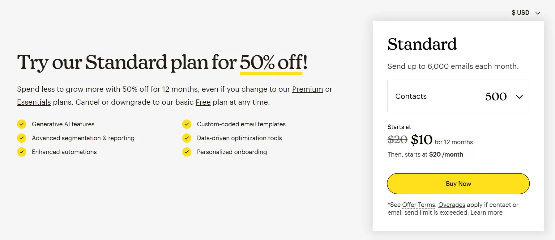
Clarity and Simplicity: At the end of the sixth question (and yes, I was able to reach this step in well under a minute), the pricing plans showed up. I viewed all the pricing options in detail, probably because I was made to do some work to get to this part, so I felt as if I earned it.
Key Takeaway: Utilize an element of curiosity in your CTA design.
7. Matomo

What I Like
Clear Messaging: I was looking for a web analytics tool that prioritizes privacy and data ownership, and the copy on the homepage immediately spoke to my pain point.
Not only does Matomo clearly state data privacy as its unique selling point, but it also gives an entire section to detailed feedback from customers. I was able to learn how the software is being used by over a million websites and by the European Commission as well.
Compelling Visuals: I liked the use of white space, simple fonts, and minimalistic design elements which made me feel that the website was organized. The “Try it for free” buttons caught my attention, since using a contrasting green color makes the buttons stand out.
Key Takeaway: A minimalist website with a well-thought copy does the job really well.
8. Buffer

What I Like
Compelling Visuals: Buffer's website demonstrates the power of white space — and includes imagery that feels authentic to your brand story on your website. I love how Buffer features cartoon-style images and uses these to walk you through the steps of using the software.
Trust Indicator: For me, testimonials hold more credibility if they also include an image of the customer. I also find it useful when the testimonials include the job title — this way I am able to look them up on LinkedIn and learn more about their company.
Buffer checked both boxes in their user testimonial section.
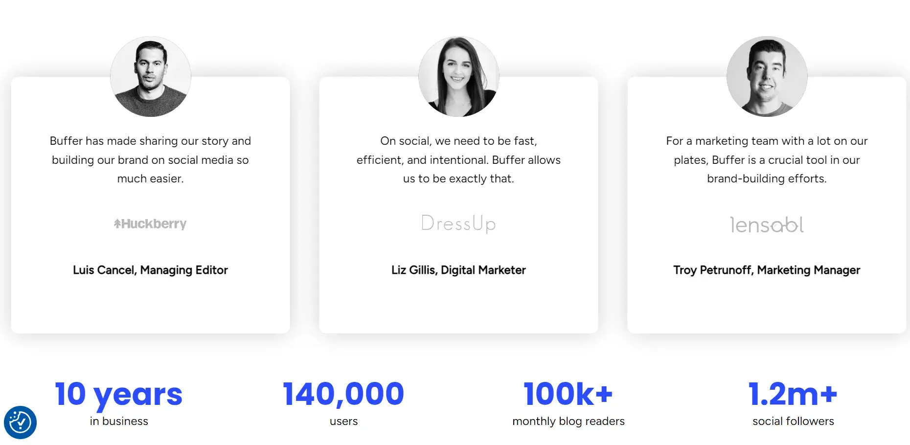
I also liked how they included data below the reviews to increase credibility. By giving key numbers such as users, blog readers, followers, and years in the business, Buffer reinforces trust through tangible performance figures.
Key Takeaway: Use a combination of reviews and hard data to create a convincing narrative for potential customers.
9. Hex
What I Like
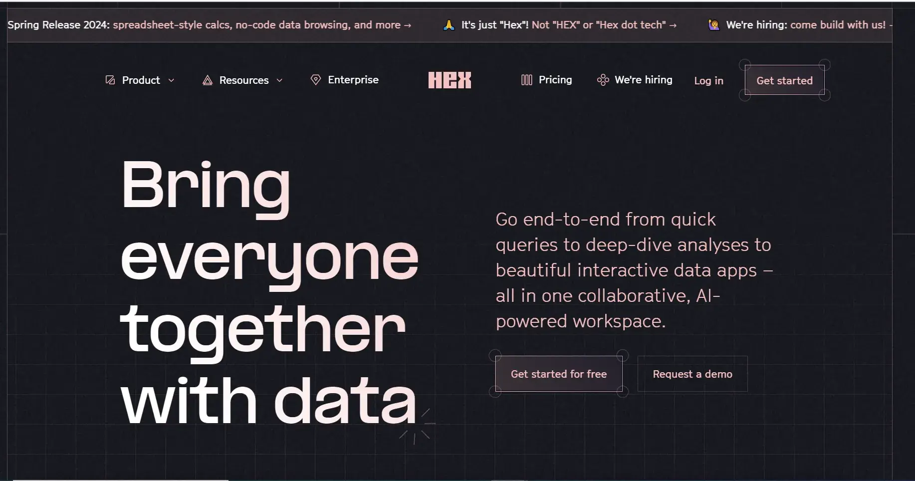
Compelling Visuals: I like how Hex has added a news ticker at the top of the website. The moving element caught my eye and ensured I read all three key pieces of information: their latest spring release, their company name, and the fact that they are hiring.
If you want to convey key messages to visitors right as they land on your website, I feel that adding a news ticker is the best way to go about it. Plus, Hex’s homepage is comprehensive and answered every question that I had.
Hex includes a demo video on its homepage so visitors can see the software in action. The play button on the video mentioned the length of the demo (5 minutes), which I feel was a good way to set my expectations.
The demo did an excellent job at explaining the access of different types of cells in Hex (including SQL queries, Python etc.), especially for new users.
Key Takeaway: Use unique elements such as a news ticker to get your key messages across.
10. Canva
What I Like
Clarity and Simplicity: As much as I love using Canva due to its simplicity and intuitive features, I have the same thoughts about Canva’s website as well.
Canva’s website exemplifies clean, modern SaaS design. The minimalist layout, with ample white space and intuitive navigation, made it very easy for me to explore the platform’s features without feeling overwhelmed.
Canva’s branding is consistent throughout, with a sleek design that mirrors the simplicity and ease-of-use of its product.
Trust Indicator: What further stands out is Canva's credibility, as it prominently highlights being trusted by thousands of leading companies worldwide.
For me, this emphasis on trust, paired with a clean interface, reinforces Canva’s position as one of my favorite SaaS websites (and my go-to design tool).
Key Takeaway: On your homepage, focus on clear calls-to-action and guide users seamlessly through different pages.
11. Loom
What I Like
Clear Messaging: Loom is another one of the best SaaS websites. I love how the team has smartly modified the famous phrase, “A picture is worth a thousand words” in their homepage copy. This line is something that stuck in my head, so I’ll automatically associate the phrase with Loom. If you’re struggling with writing impactful copy for your landing page, take some notes from Loom.
Intuitive Navigation: Another strength of Loom, in my opinion, is also how the navigation bar is simple and there is one clear-cut CTA in two places. From my experience A/B testing performance metrics on websites, I’ve seen that the fewer choices a user has, the higher the conversion rate.
The best part? If you’re not sure of what Loom is just by reading this copy, you get a walkthrough of how to use Loom on the homepage itself (just by scrolling down a bit).
Key-Takeaway: Keep it simple.
12. Homerun
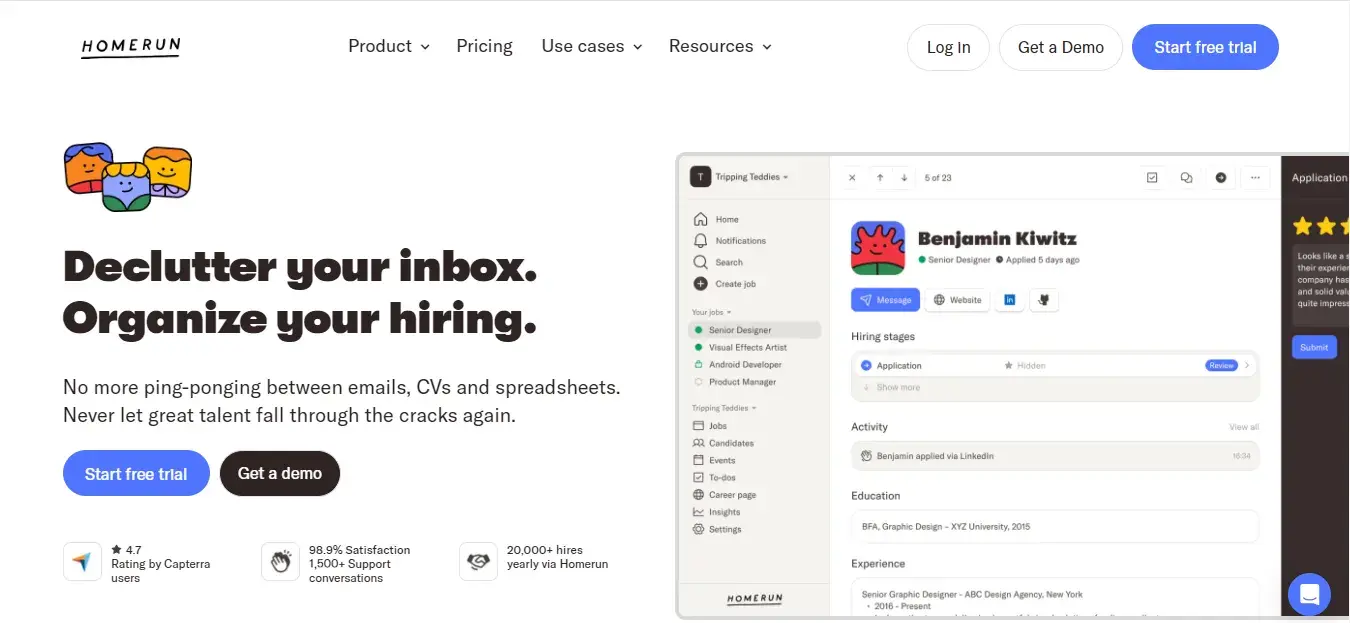
What I Like
Compelling Visuals: I like how Homerun has used contrasting colors in their website to make it more visually appealing. Even though they have a lot of information on the homepage — from products to customer reviews — they have divided it into multiple digestible sections which makes the website appear more clean.
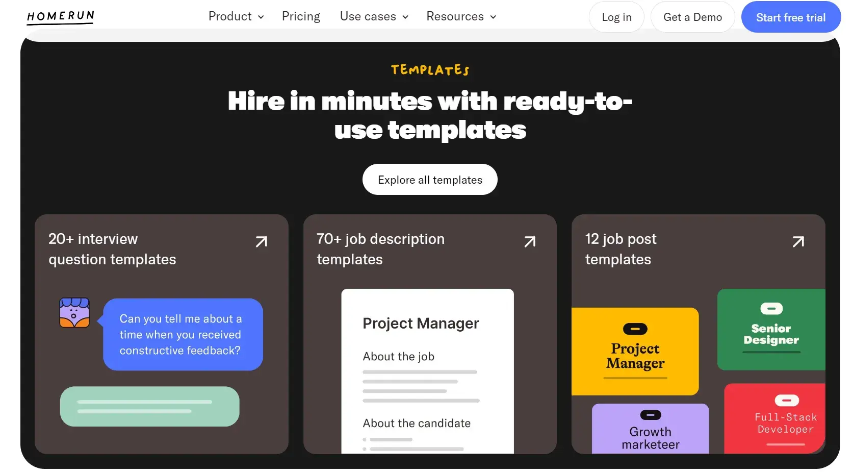
Clear Messaging: The visuals of the dashboard provide a quick snapshot of the product’s capabilities, such as “applicant tracking,” which helped me quickly grasp the functionality.
I particularly liked the way Homerun has presented the different templates related to hiring employees. For HR teams who are looking to set up their own career page, the website also does a great job at explaining what they do.
Key Takeaway: Even if you have a lot of information to convey, make sure your website doesn’t look cluttered.
13. Airtable
What I Like
Compelling Visuals: Airtable uses animations on its homepage to add visual interest and reveal how its software works. The moving elements kept me hooked and I read about building workflows and integrations with ease.
Clear Messaging: The copy in the calls-to-action is also particularly good. The sentence “Teams at over 500,000 forward-thinking organizations use Airtable every day. Join them.” serves two purposes:
- Builds my trust in Airtable as it’s already being used by half a million companies.
- Makes me want to join the “forward-thinking” club.
AI Chatbot Feature: Personally, I’m not a fan of chatbots and I don’t make use of them often. But on the Airtable website, the chatbot popped up with the image of an employee — something unique for sure.
Even though I don’t engage with chatbots often, I was tempted to start a conversation this time because it included a human element.
The comprehensive footer is also an appealing feature of this website.
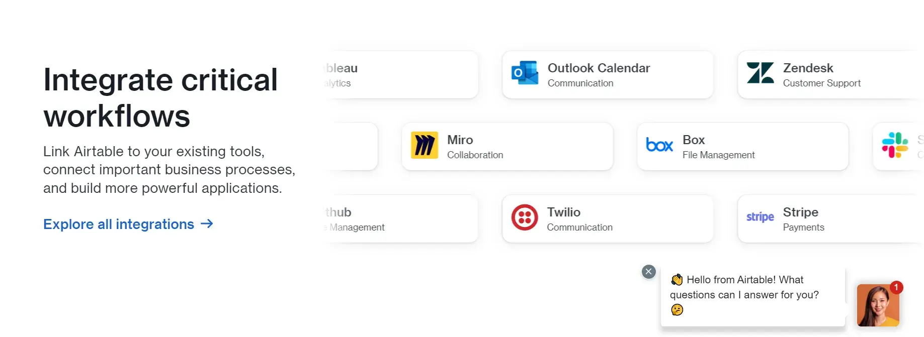
Key Takeaway: Include human elements in your website wherever possible.
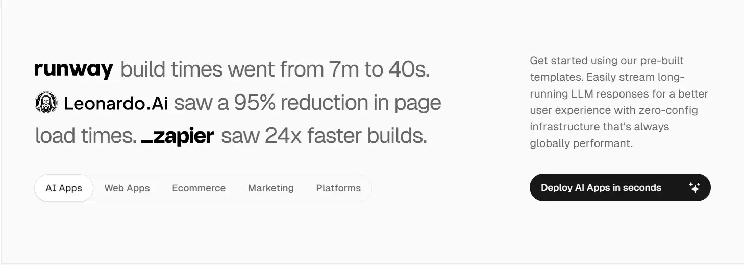
14. Vercel
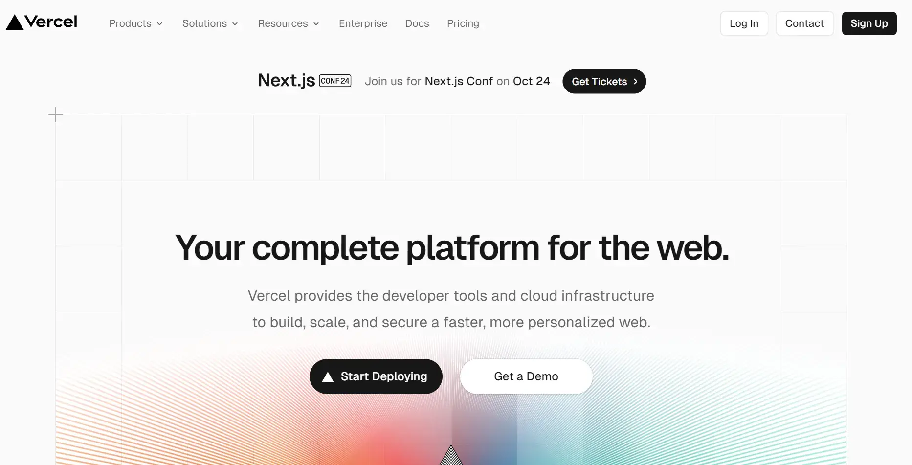
What I Like
Compelling Visuals: Vercel has taken the phrase “the first impression is the last impression” quite seriously. As the company is about building and scaling applications, it showcases this by “building” the Next.js line on the page in front of you. This made me feel that building applications isn’t that complicated — and perhaps that’s the message that Vercel is trying to send across.
Clear Messaging: I loved how intuitive scrolling down on the homepage felt. The team walks you through the entire process — from development to previewing to deploying. The company extends an invitation to get a demo as well.
Trust Indicators: To me, numbers always feel like a powerful way to communicate impact. Vercel’s homepage effectively does this by showcasing key metrics to highlight how customers are benefiting. The clean, minimalist design around these figures also makes the copy more powerful.
Key Takeaway: Make the message both compelling and easy to digest.
15. Orderful
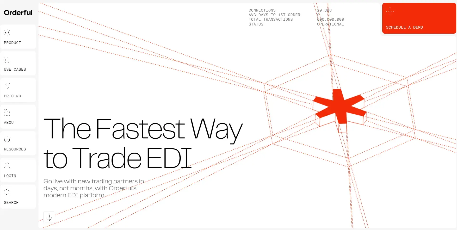
What I Like
Intuitive Navigation: Orderful’s website is different as it breaks away from the typical horizontal menu layout. The vertical menu displayed on the left-hand side creates a clear, uncluttered navigation path.
I found this a smart way to allow for more screen space and to showcase key content while keeping essential navigation easily accessible.
Free Website Design Inspiration Guide
77 Brilliant Examples of Homepages, Blogs & Landing Pages to Inspire You
- Agency Pages
- Ecommerce Pages
- Tech Company Pages
- And More!
Download Free
All fields are required.
Form not available
Compelling Visuals: Orderful’s clean and minimalistic style complements the overall modern design of the site, making it intuitive for users to explore different sections without feeling overwhelmed.
Trust Indicator: Orderful does an excellent job of showcasing the big-name clients that use this software to make their businesses successful. For smaller up-and-coming companies, this brand recognition can powerfully suggest that if you use the software, your organization can reach similar levels of success.
Key Takeaway: Have your website stand out by making use of a vertical menu.
16. Lokalise
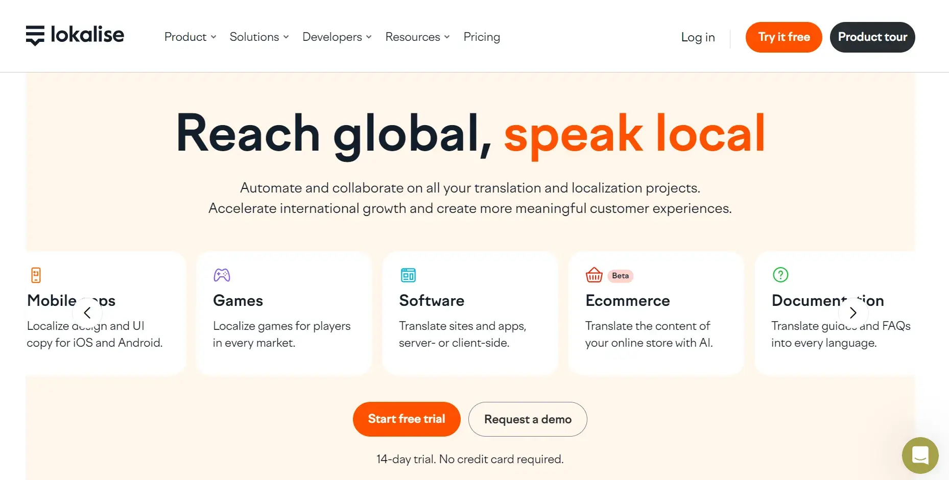
What I Like
Clarity and Simplicity: What stands out immediately upon arriving on the Lokalise homepage are the straightforward copy and digestible calls-to-action. As you scroll down, small sketches that match the rest of the branding explain how you can use this software.
I think Lokalise has done a great job of addressing the concerns of individuals in different job roles by dedicating a different section to each one (designers, software developers, product managers, and localization managers). Also, the software’s ability to connect with GitHub, Figma, and Jira resonates with teams for easier collaboration.
Trust Indicator: I particularly liked how Lokalise has highlighted success stories throughout the site. For example, the first case study comes after the section explaining the software. Then, the second case study is displayed a few sections below.
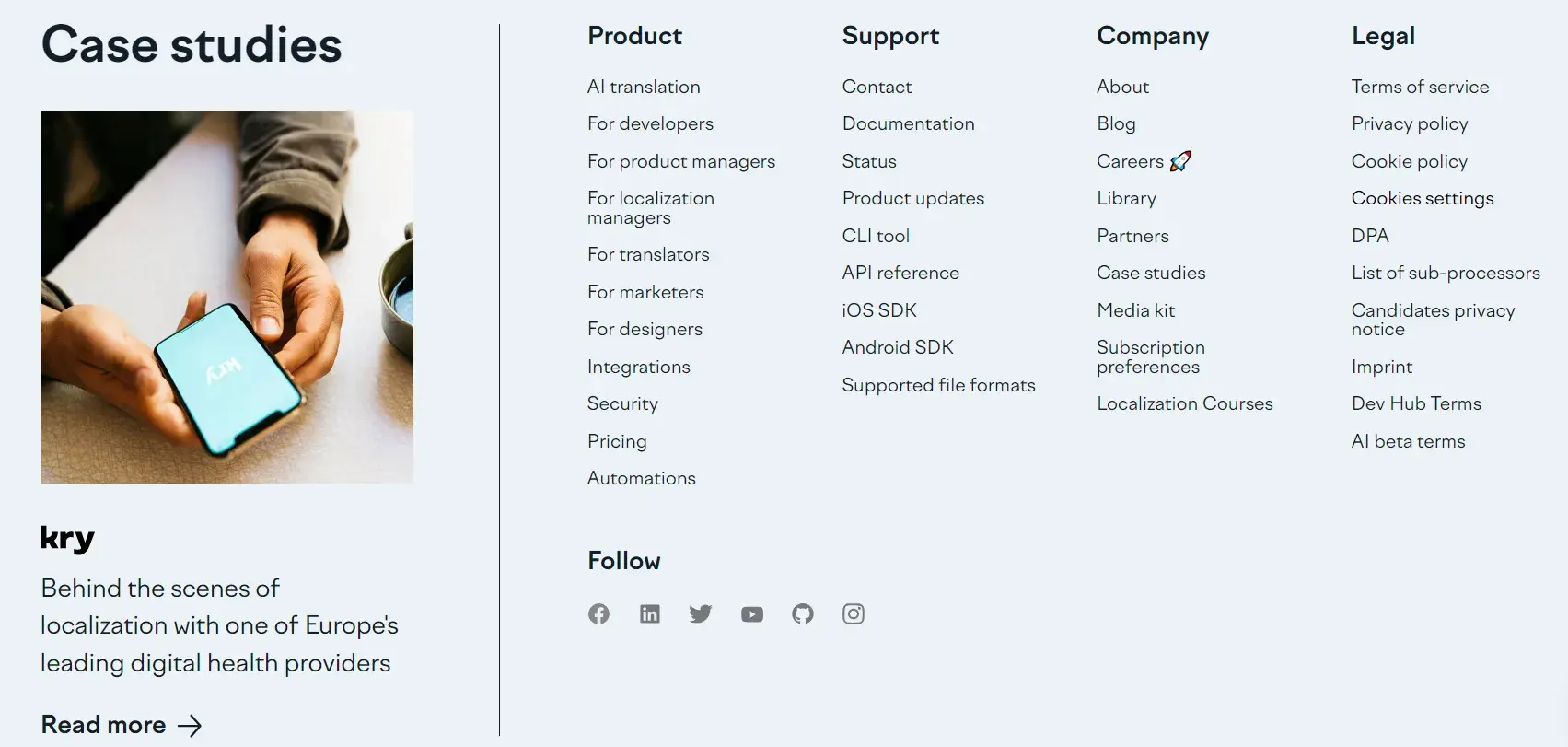
Key Takeaway: Design targeted sections for different roles to help users feel that your solution is the right one for their use case.
17. Gusto
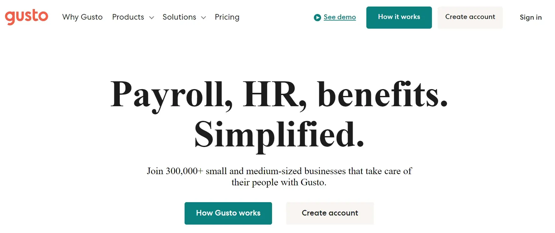
What I Like
Branding: I appreciate how Gusto prioritizes function and accessibility. The branding is clean, and the fonts used throughout the site are easy to read. Though Gusto's menu on top of the homepage is simple, when you select a tab, you are offered a wide range of smaller subsections.
Compelling Visuals: A new feature I found on the website is that the key features drop-down section has a timer that runs for a few seconds, automatically displaying the text explaining each of the features. This caught my eye, and this way, I read the sentences under all three features. If your website is text-heavy, I recommend adding this feature.
Key Takeaway: Make information appear concise by using a drop-down with a timer.
18. Milkshake
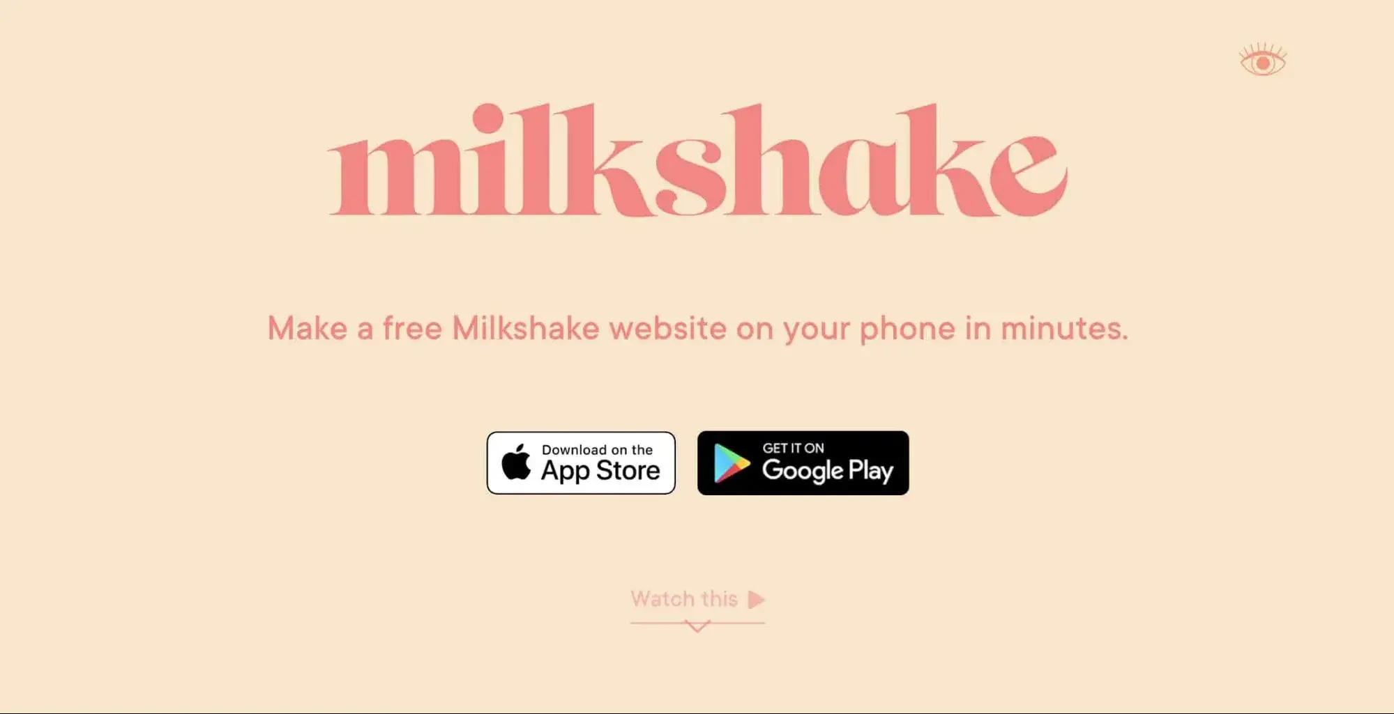
What I Like
Persuasive Calls-to-Action: The Milkshake website is simple and impactful. The first thing you see on the website is the calls-to-action to download the app on the App Store or Google Play Store.
As Milkshake is for building websites on your phone, it makes sense to prompt users to download the app on their phones. Once you do that, you can scroll down and learn more about how the app works.
Compelling Visuals: The changing background color caught my attention. It shows how you can create a customized website without any coding experience.
The background color also complements the other information that the website is trying to present, such as making use of “cards” to build website pages and some of the internationally recognized places the software has been featured.
Key Takeaway: Use dynamic background colors to engage users.
19. Mailchimp
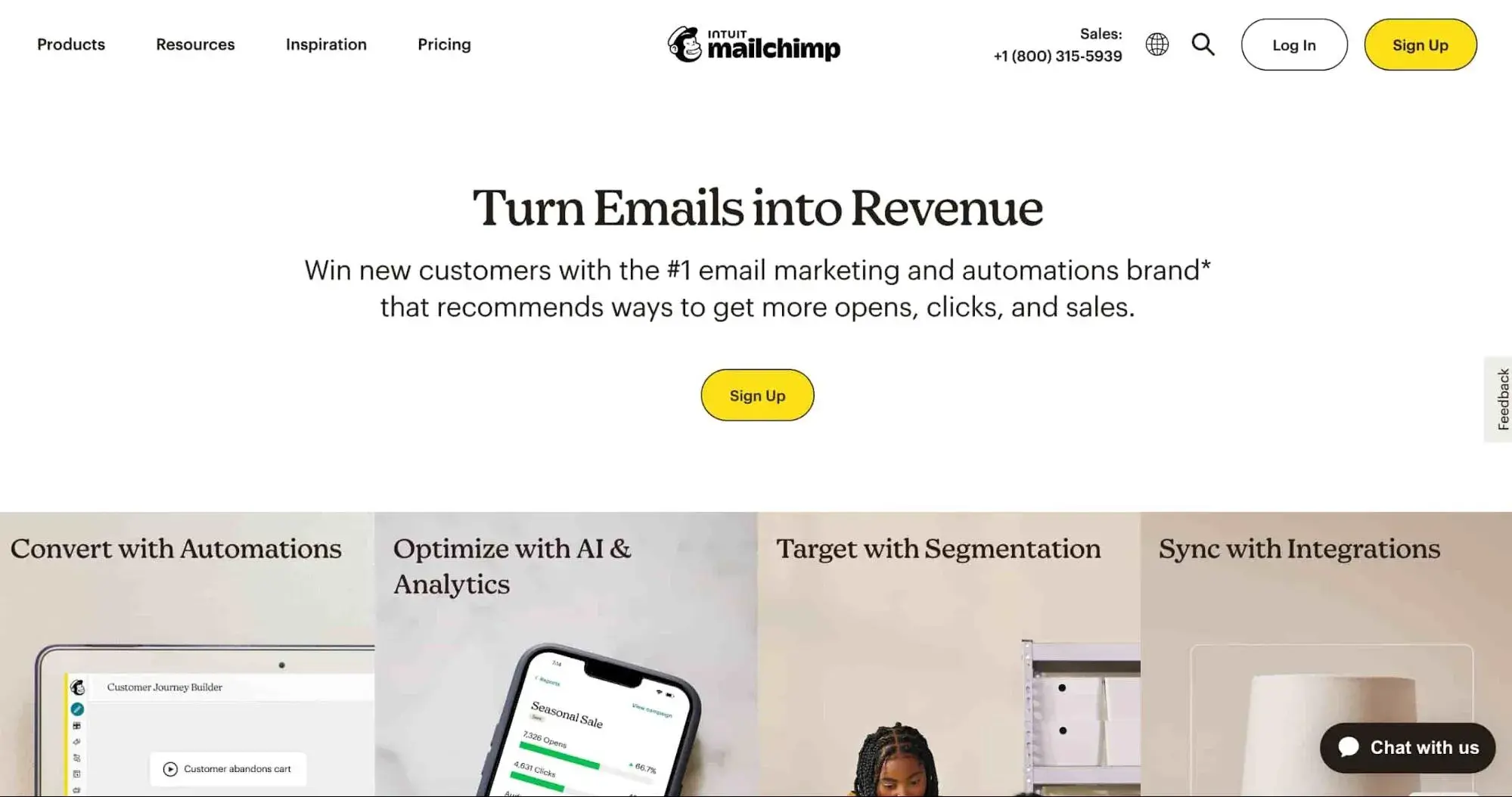
What I Like
Clear Messaging: Mailchimp’s website is full of content. But they do a great job of balancing copy and imagery. Plus, I’m a huge fan of how direct the copywriting is and how there's a clear sentiment: transform your emails into profit.
Mailchimp has also structured their pricing in an effective manner. It felt as if they had de-risked everything for me, so signing up for the tool didn’t seem like I was taking a big step.
Intuitive Navigation: Everything you need to know about Mailchimp is accessible on the homepage, from a video showcasing what the product does to information regarding pricing. I love how visitors don't have to search around for that information and instead are presented with it promptly.
Key Takeaway: Structure the pricing smartly to make it feel light on customers’ pockets.
20. Prisma Labs
What I Like
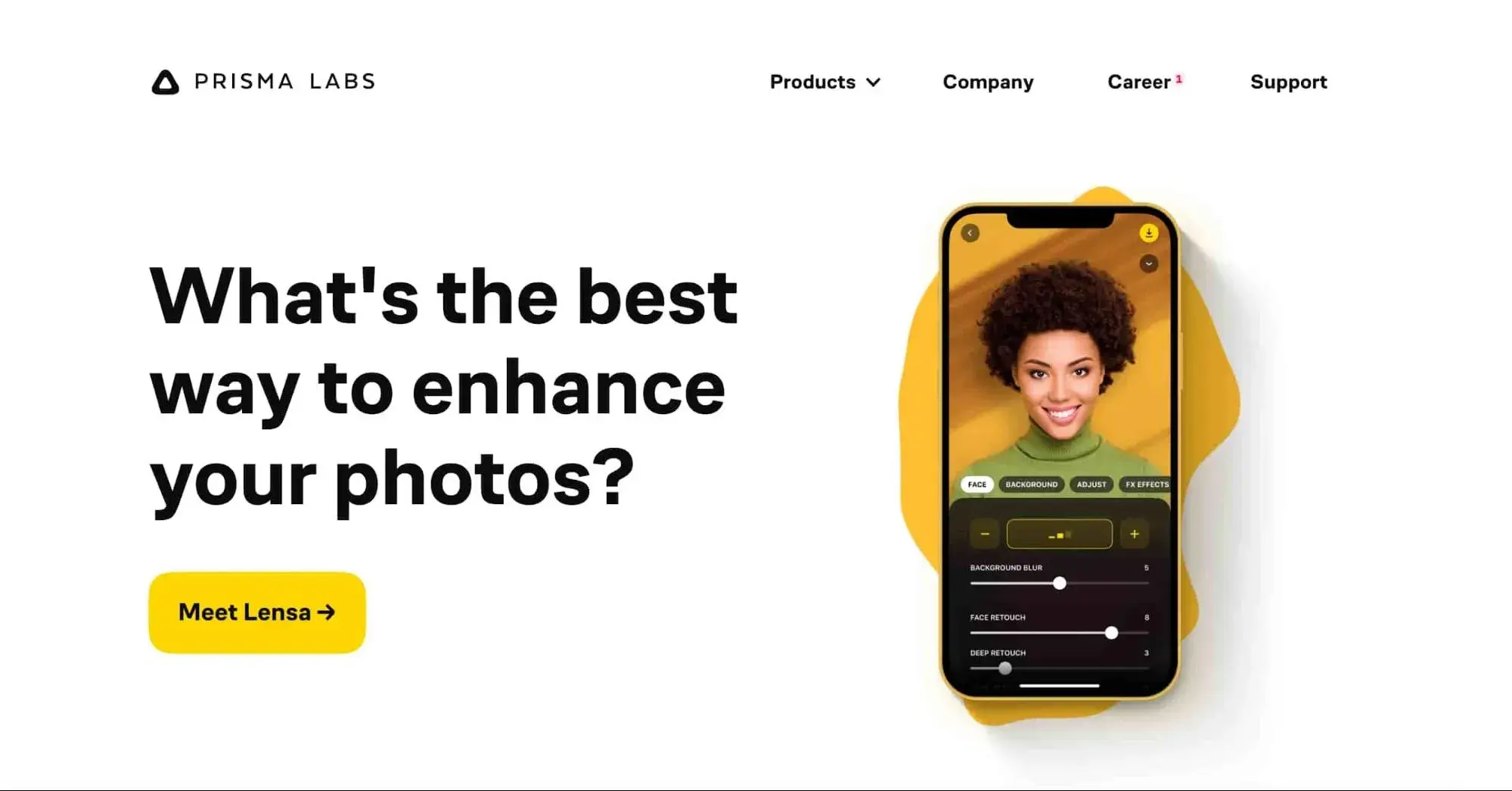
Clarity and Simplicity: Prisma Labs is one of the most minimalistic websites that I have seen in a while. They have taken the concept “less is more” and turned it into their strength. The central focus is a moving mobile phone image showcasing the product in use.
As I clicked on the CTA, I was given a walkthrough of the features of the application. I also love how the primary copy in the center of the homepage asks the visitors a question, making the entire page more engaging. As I scrolled, the moving image kept changing according to the copy and the feature that was being explained.
Key Takeaway: Make use of a dynamic visual experience to give a walkthrough of the product features.
21. Ghost
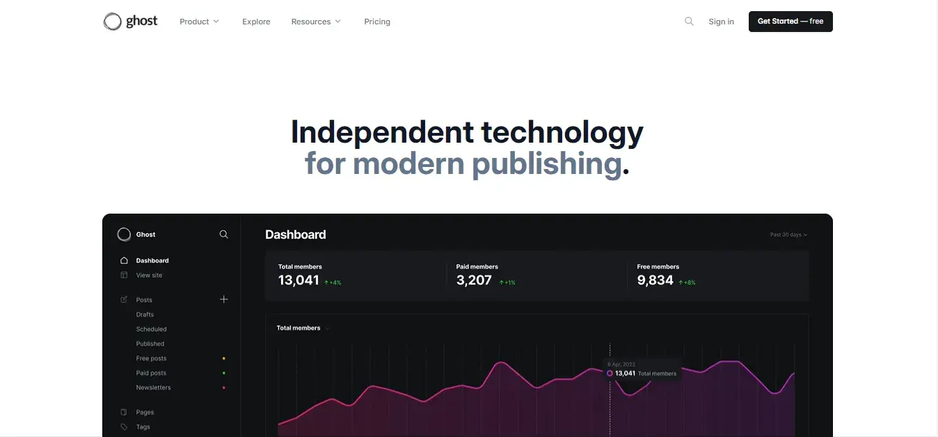
What I Like
Clarity and Simplicity: The website shows rather than tells, since as I scrolled down on the site, I was clearly shown how to custom make my website design according to my desired style and font.
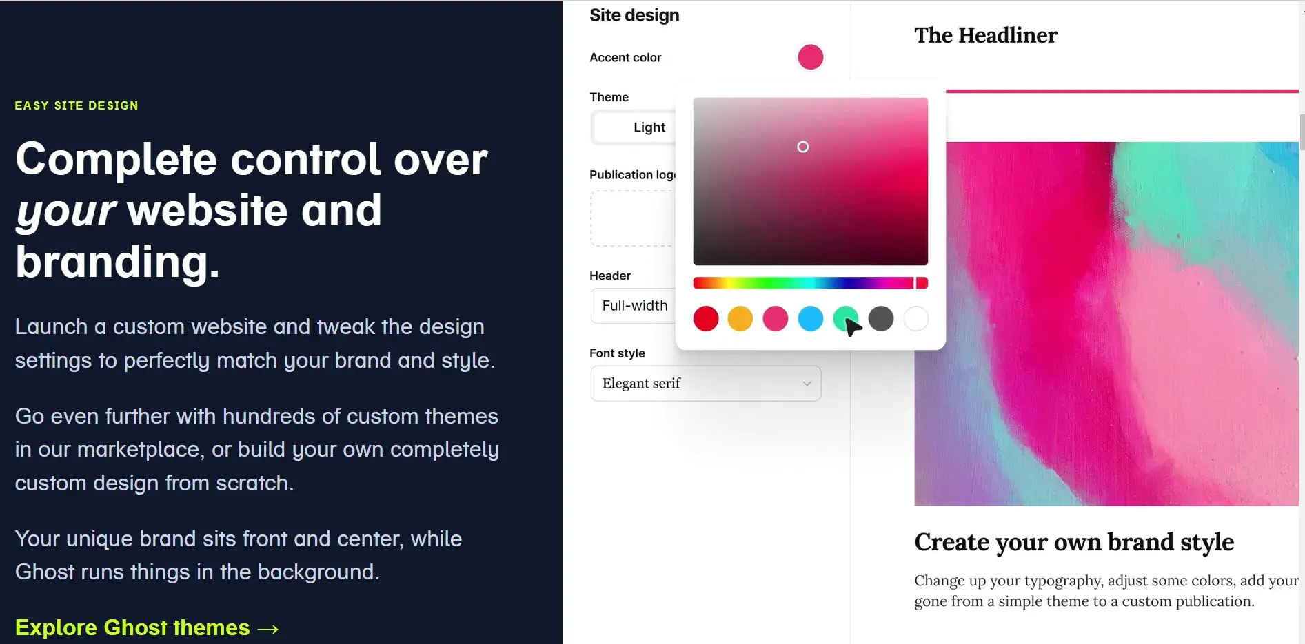
Also, it is visually appealing as I was able to see in real-time how the website would look as I changed the font style, theme color, header size etc.
Key Takeaway: Use animations to give users a live demonstration of your product(s).
22. Ramp
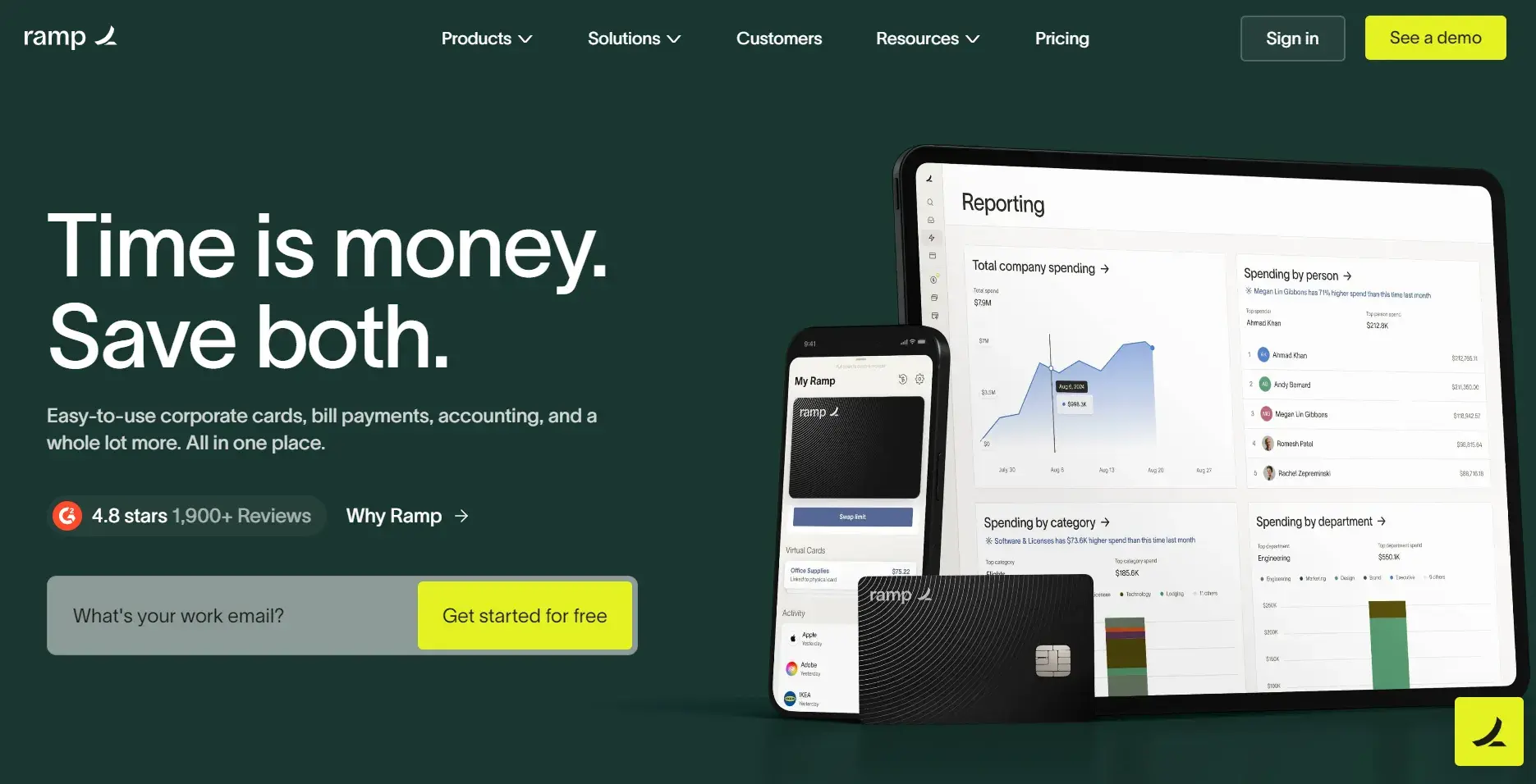
What I Like
Intuitive Navigation: Ramp recently updated their website design. From the revamp, I liked Ramp’s navigation bar the most because the clear categories allowed me to easily access all the information I needed.
Upon hovering over the products button, a comprehensive drop-down not only informed me about the products, but also the “Platform” and “Updates.”
Similarly, when I hovered on the Solutions button, I found that Ramp had also included a case study on one of its customers with catchy copy. I found that this was a smart way to showcase a success story.
Compelling Visuals: Previously Ramp’s website had a darker homepage background, but now they have changed it to a lighter theme. Even with the lighter theme, they are still using a yellow call-to-action which serves as an excellent visual cue color to direct the user's attention.
On mobile devices, the hamburger menu gives the same dropdown options. However, due to the usage of multimedia in the menu, it wasn’t loading fast enough.
Key Takeaway: Optimize the website for mobile devices.
23. Postalytics
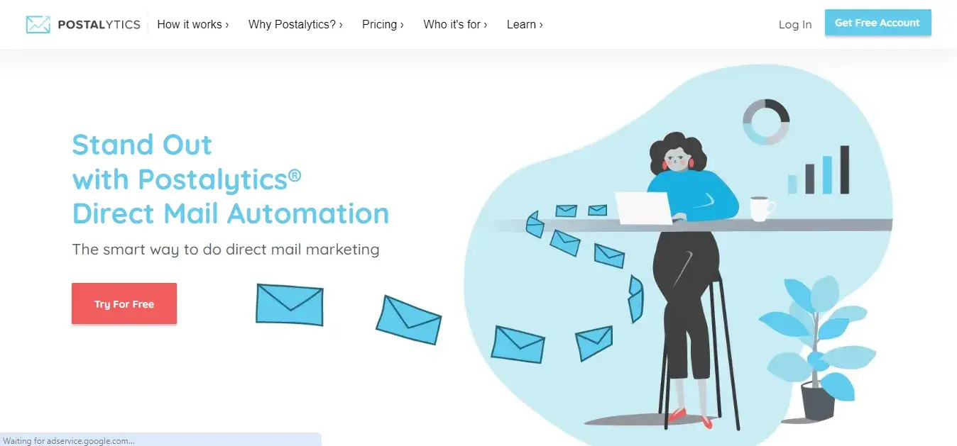
What I Like
Compelling Design: What I appreciate about the website is that its header effortlessly guides me to all the important pages that I want to explore. Also, what I like is how this website uses white space effectively, creating a clean layout.
As I scrolled down on their homepage, I found a two-minute overview video of direct mail automation. This highlighted their key features. I liked this addition because I didn’t have to go to another page to learn about the product.
Key Takeaway: Make the experience convenient by including important information concisely.
24. Blink
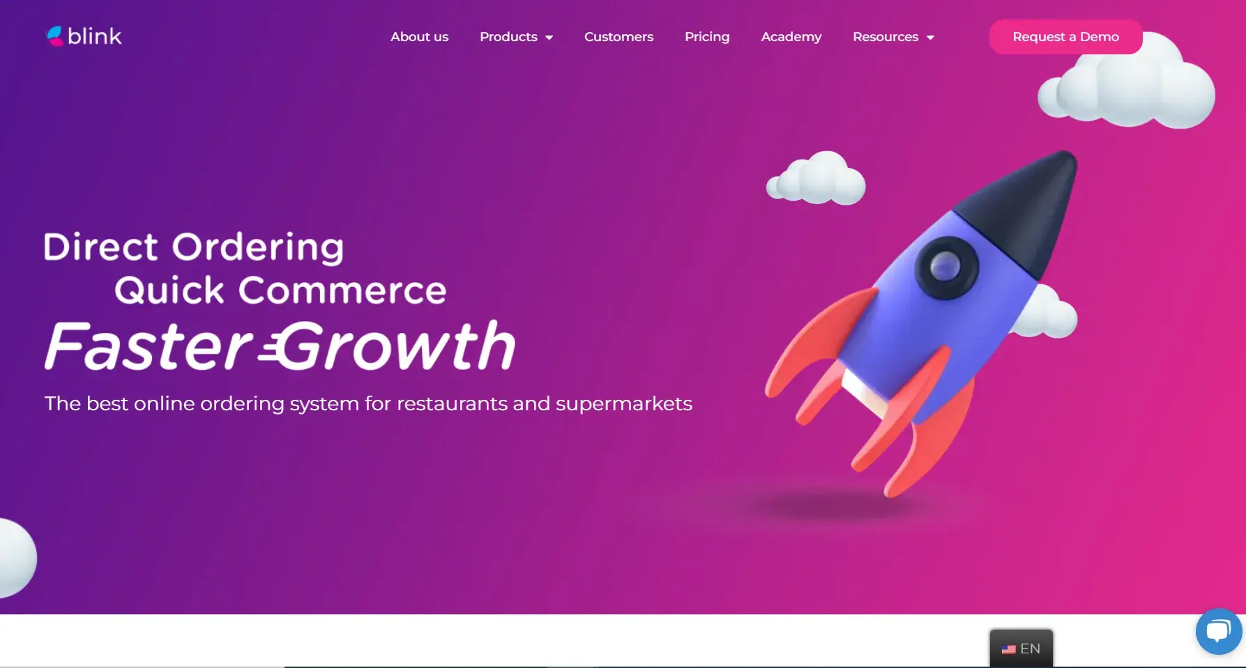
What I Like
Compelling Design: Other than the clear hero section, Blink’s website has a floating button that gives users the option to switch to their preferred language. In my article on multilingual website design, I mentioned the importance of having such an option. Blink executes it perfectly.
The website also does a great job showcasing its online ordering services and also provides the mobile layout of the design to give users an idea of the UI. This way I got the look and feel of the product without actually having to download the mobile app.
Key Takeaway: Give users the option to choose a language of their preference.
25. Deed Delivery
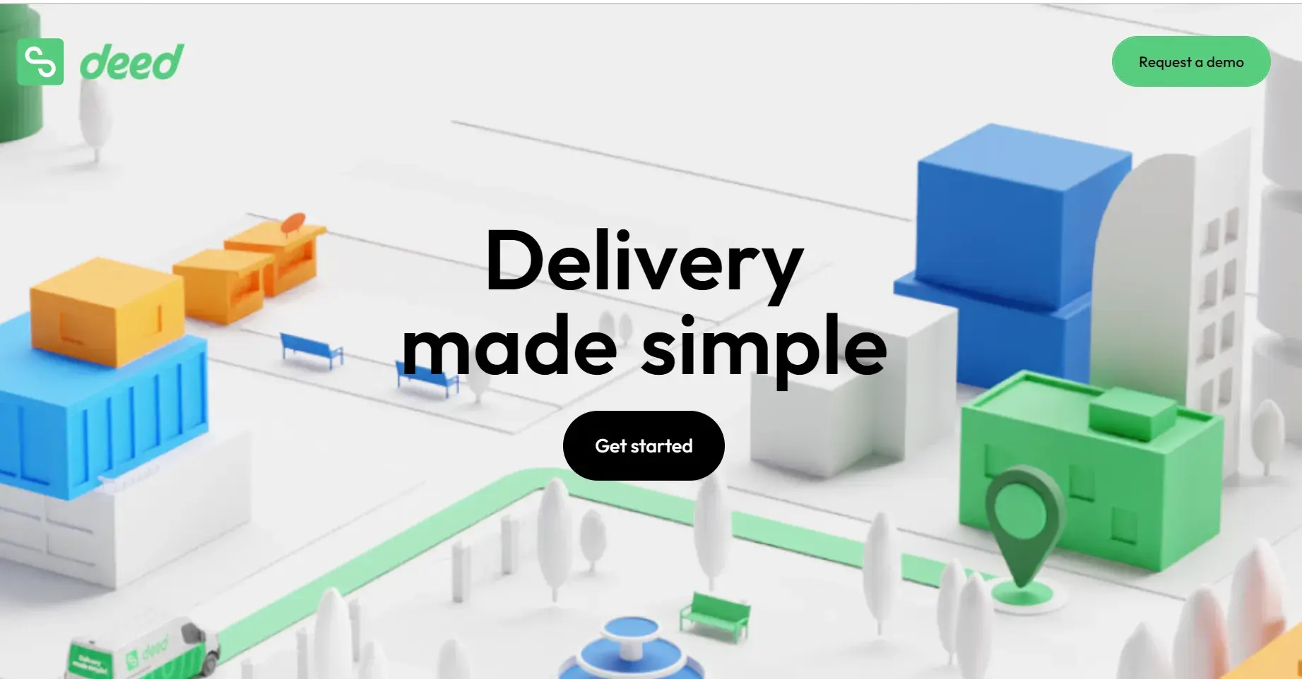
What I Like
Compelling Design: The first thing that caught my eye about Deed Delivery is the parallax scrolling. It makes the entire website more engaging and introduces different elements of the site in a more intuitive cadence.
Deed Delivery also demonstrates the power of having a simple, yet effective value proposition that’s shown in the form of a dynamic animation. I love how simply it explains what problems Deed solves for the delivery drivers.
Key Takeaway: Use parallax scrolling and dynamic animations to create an engaging and intuitive user experience.
26. Forter
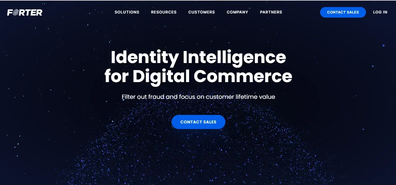
What I Like
Clear Messaging: Great copy here — the heading told me immediately what the company offered followed by a concise subheading. Also, the “Contact Sales” button is prominently displayed twice, once in the header and once in the hero section, which easily persuaded me to take action.
Moreover, the top navigation bar was simple and easy to follow which helped me quickly find the information I was looking for.
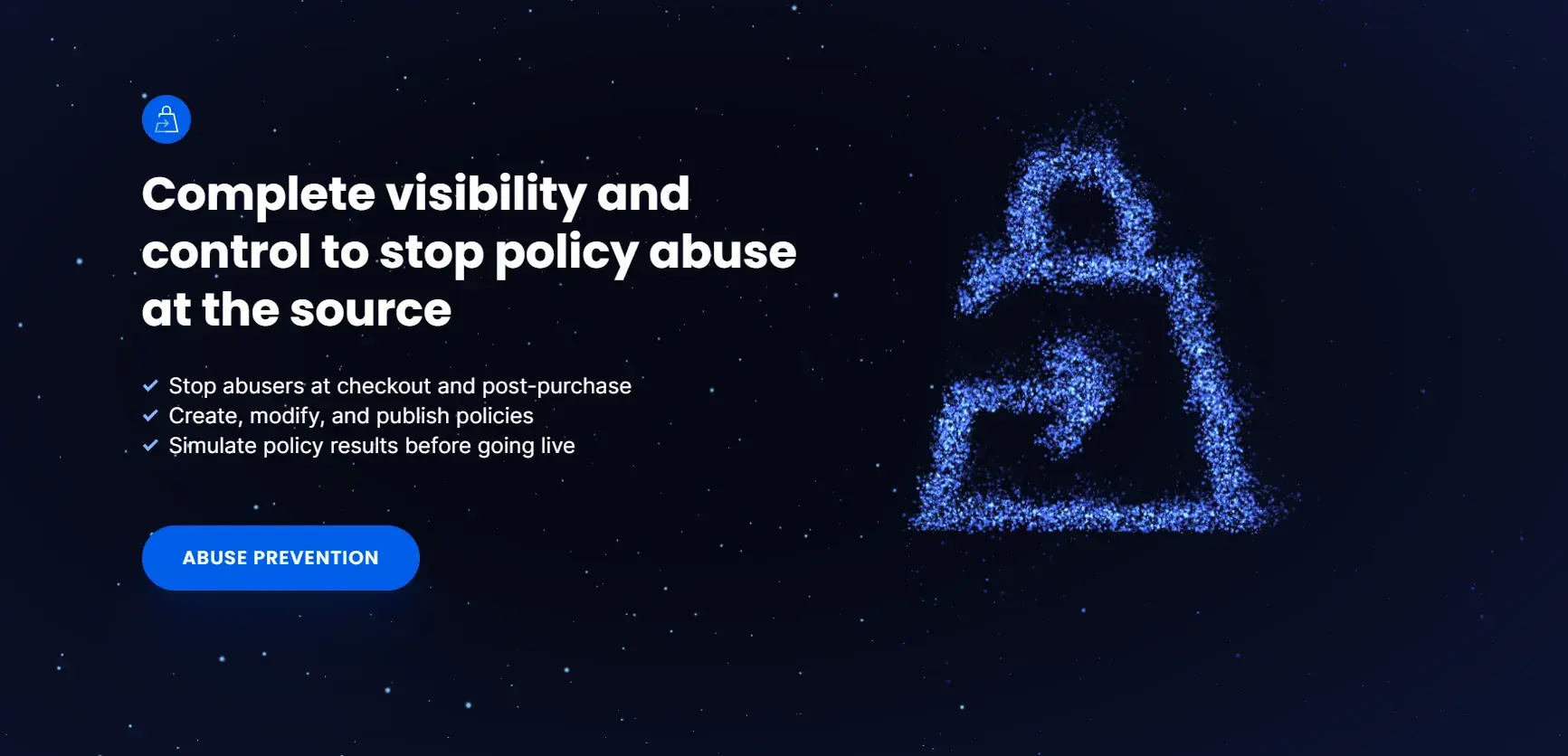
Compelling Visuals: The background is visually attractive with a dark blue, starry background and the main message popping in a white bold font. As I scrolled down on the website, the icons formed right in front of me. I found this design concept very unique. Usually, complex animations such as these means extra work for the developers. I recommend only using such animations if budget or time is not a constraint.
Key Takeaway: Get creative with animations.
27. MyMind
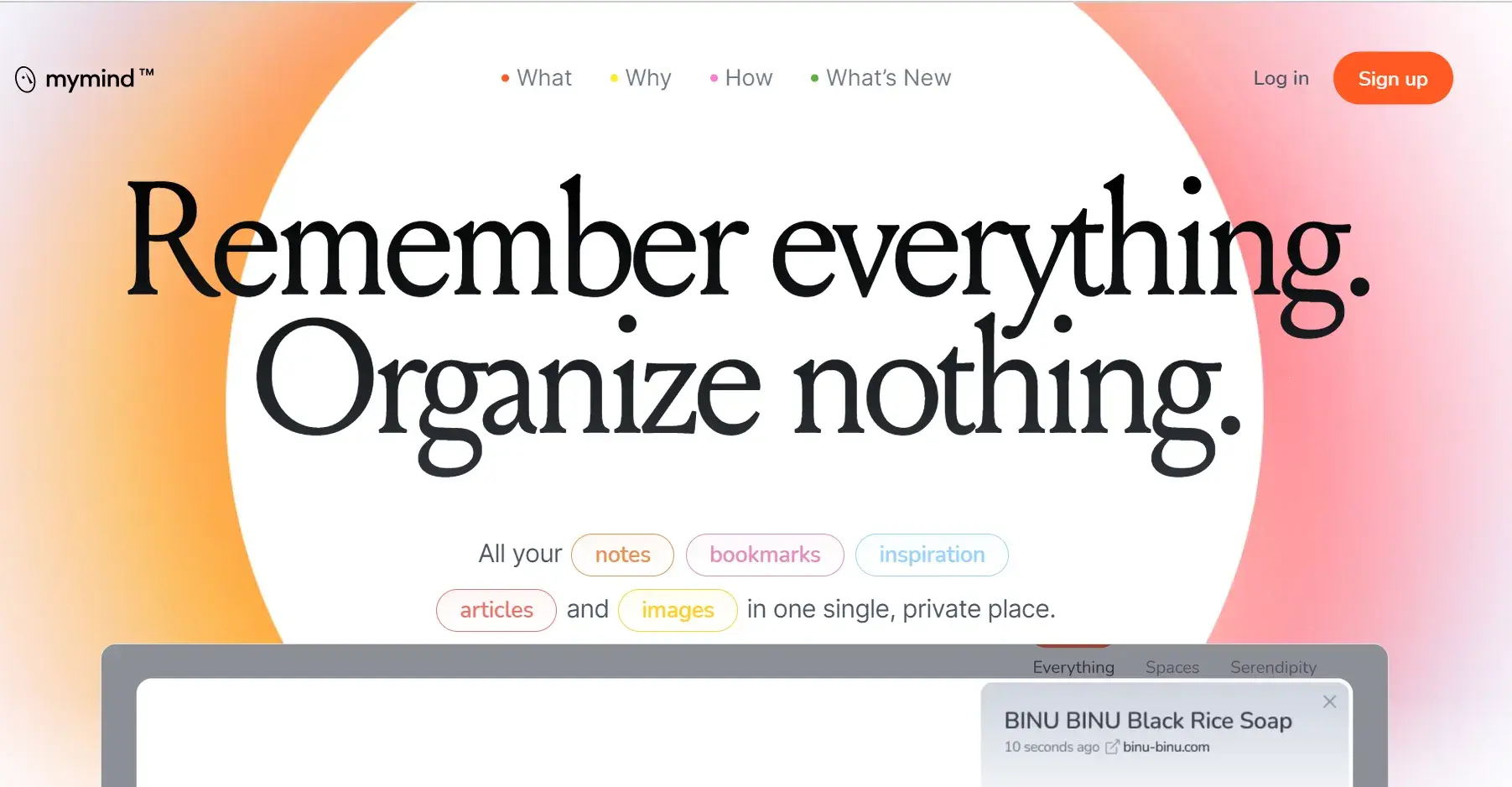
What I Like
Compelling Visuals: Gradient is one of my favorite web design elements, and MyMind uses it to perfection in their website. It’s not only eye-grabbing, but it’s also engaging without being too busy. I feel that their usage of soft pastel gradients creates a calm and inviting atmosphere that enhances the user experience.
Clear Messaging: I love the intriguing copy as well, which makes you want to learn more about this software and what it does.
Key Takeaway: Make use of gradients that align with the overall aesthetic of the website.
28. Dropbox
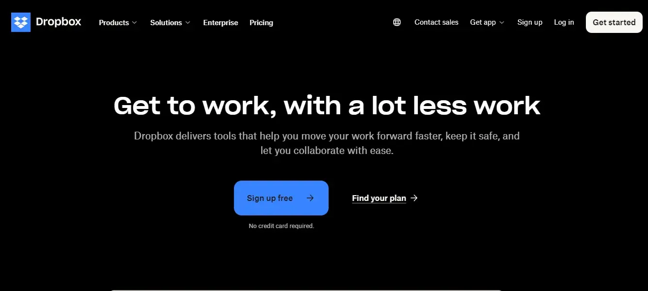
What I Like
Intuitive Navigation: I found the interface intuitive with a simple navigation bar at the top, allowing me to explore different sections such as Products, Solutions, and Pricing.
The “Products” section has a drop-down menu which includes one-liner explanations of products such as “Replay” and “Capture.” By reading about them from the navigation bar, I felt that it wasn’t evident enough what the products were for. But, as I scrolled down on the homepage, I started seeing a brief walkthrough of all these products. Dropbox has done a great job by showcasing explainer videos for these.
Compelling Design: The dark background in the hero section creates a strong contrast with the white text, making the headline and call-to-action buttons stand out. Personally, I would have liked it better if the website had maintained the same dark background theme throughout the main sections. However, the visual experience was still very smooth as is.
Key Takeaway: Make the website elements as intuitive as possible.
29. Rippling
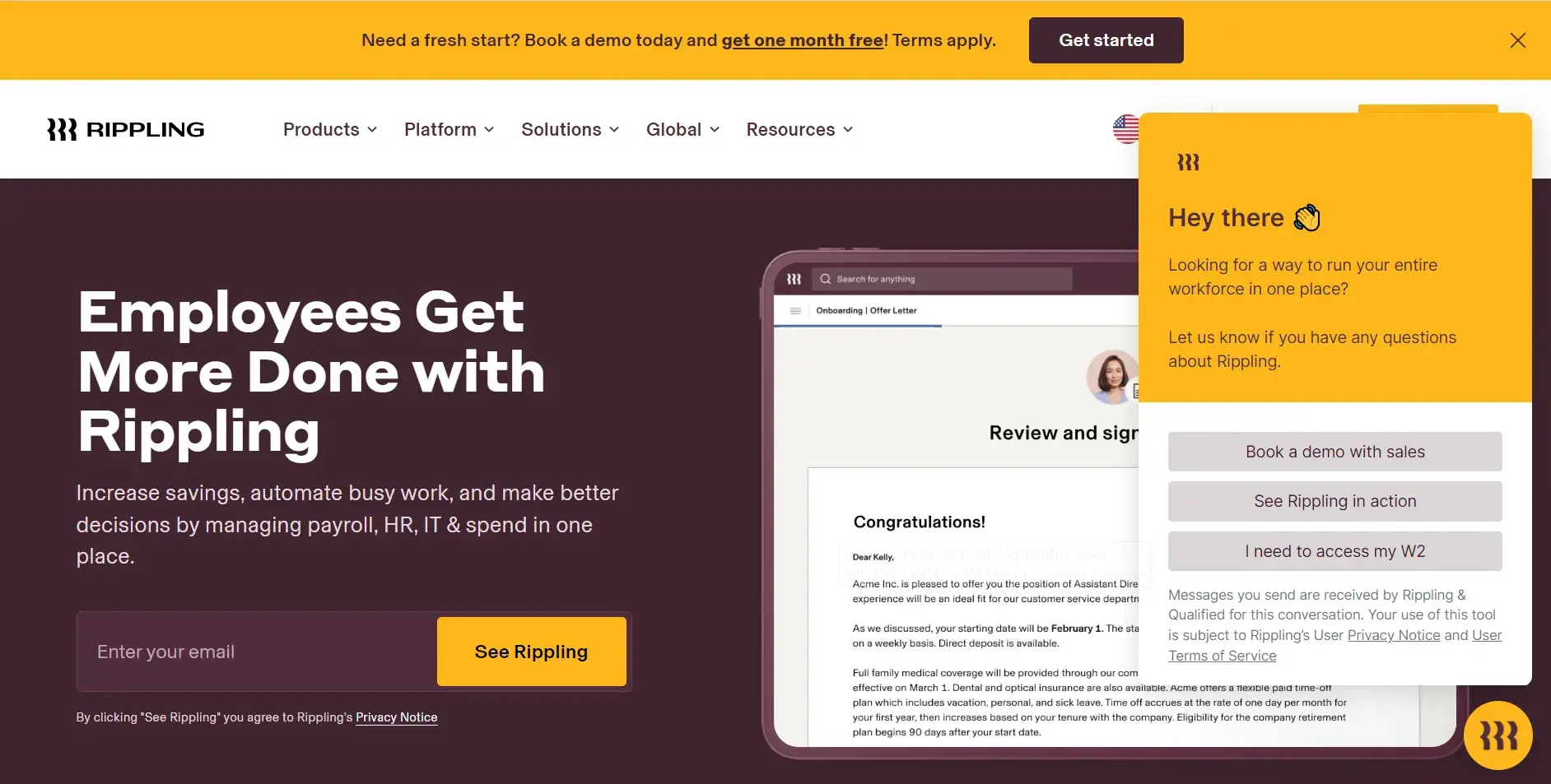
What I Like
Persuasive Calls-to-Action: This site asks you to input your email to “See Rippling,” which is an attractive CTA. I also like the colors on Rippling‘s CTA as they complement the overall background color of the website. As you scroll down, you learn more about the software’s different facets.
Previously, Rippling’s design used to be its strong point, but now I feel like there’s too much happening on the website. There are one too many pop-ups, so my attention gets divided. Just as I was thinking where to read, yet another pop-up showed up asking to watch a demo before I leave.
Remember, it is important to update your website design. But, avoid updating simply for the sake of adding elements that don't necessarily improve the UX.
Key Takeaway: Avoid too many pop-ups.
30. Appcues
What I Like
Clear Messaging: When I opened the website of Appcues for the very first time, my eyes immediately landed on the headline “Product adoption made easy.” I wasn’t very sure what that meant but my query was answered almost instantly with the help of the text below. It clearly and concisely communicated how Appcues simplifies in-app onboarding experiences.
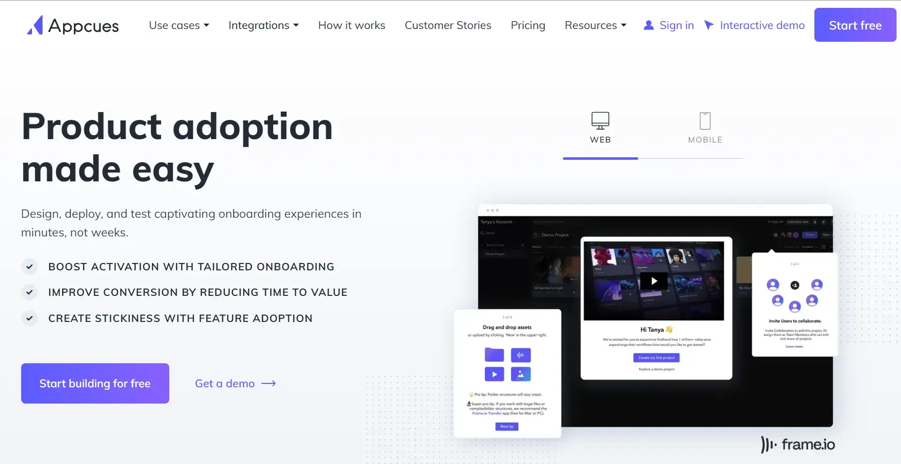
Intuitive Navigation: Just like their product, the Appcues website is also intuitive. The top menu is straightforward, and I like that the very first option was for use cases so visitors can learn more about the product before diving into pricing and integrations.
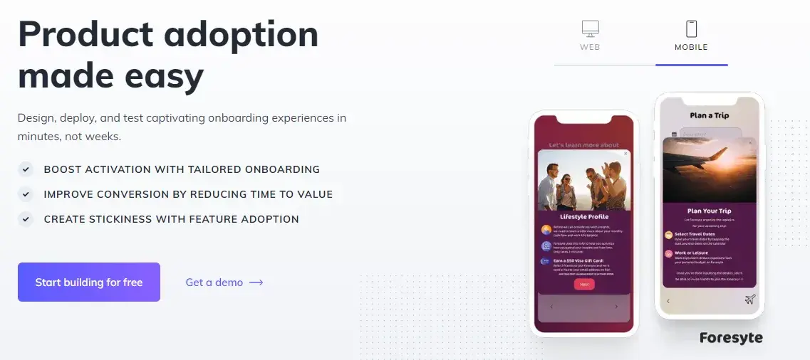
I was also tempted to click on the mobile view to see how it differed from the web version. I appreciate how Appcues offers the option to preview the mobile design in the hero section — this is something that’s not common on many other SaaS websites.
Key Takeaway: Highlight your offerings in an engaging manner.
Get Started With Your Own SaaS Website Design
They say that “while the content is king, design is the crown” and I can’t help but agree with this. The way you design your SaaS website is directly linked to the user experience — which is then linked to your website actually driving conversions.
Spend time in the design process, but remember not to overdo it. In my experience, keeping it simple is always the better choice.
Editor's note: This post was originally published in January 2023 and has been updated for comprehensiveness.
Free Website Design Inspiration Guide
77 Brilliant Examples of Homepages, Blogs & Landing Pages to Inspire You
- Agency Pages
- Ecommerce Pages
- Tech Company Pages
- And More!
Download Free
All fields are required.
Form not available


![15 black and white website designs to inspire your own [+ pro tips]](https://53.fs1.hubspotusercontent-na1.net/hubfs/53/black-and-white-website-design-1-20250520-1336267.webp)

![Gradient Website Design Examples That Prove This Trend Is Far From Over [+Tutorials]](https://lh7-us.googleusercontent.com/htOWIbyCIoCMxSjC4gJunkGnhCzXpccjTrL8NwoGdRdCsSiEmEAxe_qBFkMrzy2Y8d3cwEr_DMzSGHq9Xi-hQFnMJCo8HDQJ1yQGigcSfFxI2QKXo0s7xXSB2sY-eALG1iUqnHXgomcDsnp7AHRSH1s)
![15 Brochure Website Examples to Inspire You [+ How to Make One]](https://53.fs1.hubspotusercontent-na1.net/hubfs/53/brochure-website-examples-1-20250319-362228.webp)
![28 Types of Websites to Inspire You [+ Real-Life Examples]](https://53.fs1.hubspotusercontent-na1.net/hubfs/53/types-of-websites.png)