
Adding visuals is not only a smart way to enhance the quality of your content -- but it's also proven to make your content marketing more effective.
In fact, tweets with images receive 18% more clicks and 150% more retweets, photo posts on Facebook brand pages account for 87% of total interactions, and in a recent study by Demand Gen Report, 86% of buyers expressed some level of desire to access interactive/visual content on demand. If you still need more convincing, we've got even more content marketing stats on the importance of using visuals.
So are you ready to enhance your content with visuals? Here are some great ways to start incorporating visuals into your content marketing.
Visual Content Marketing: 8 Ways to Visually Present Information & Data
1) Include high-quality photos and images to attract attention to your content.
What's the first thing that you noticed when you clicked through to this blog post? Probably the photo at the very top, right? And if you came across this post through social media or a subscriber email, that photo probably caught your eye in those channels, too.
If you incorporate no other visuals into a piece of blog or website content, make sure it at least has an attractive featured image. That way, you know your piece of content will be accompanied by an eye-catching visual when it gets shared on social networks like Facebook and LinkedIn. And considering what we just told you about how much better visual content performs in social networks, I'm sure you can understand why.
(Tip: To make sure Facebook features your image prominently in the News Feed when users share links to your content, make sure the featured image you upload to your content is at least 600 x 315 pixels.)

When selecting a featured image for a piece of content, make sure you choose one that's relevant, high quality, and attractive (find more tips for choosing images for your content here). But most importantly, make sure you have the rights to use it. There are a lot of free stock photos out there that you can use; or you can purchase a stock photo subscription from a site like Thinkstock or iStockphoto.
In addition to including a featured image, add photos and images throughout the body of your content to offer readers visual examples that support your copy. Just be that if you're using an image of an example you found on another site, you attribute it properly.
2) Use infographics to visualize a collection of data or information in an easily digestible way.
Infographics continue to be a highly shareable, traffic-driving content type. In fact, in a recent content quality vs. quantity experiment we did on the HubSpot Blog, infographic posts were one of our blog's best traffic-drivers. And according to Demand Gen Report’s 2014 Content Preferences Survey, 39% of B2B buyers said they share infographics in social media frequently.
If the thought of creating your own infographic seems daunting, it doesn't have to be. We have a free guide to creating beautiful infographics, plus 10 free infographic templates you can download and use in PowerPoint. I've even used one to create a full infographic in under an hour -- check it out.

But here's another secret -- the infographics you publish on your blog don't have to just be the ones you create yourself. In fact, the majority of the infographics we publish on this very blog aren't ours -- they're just high-quality infographics with content that is relevant to our audience. Just keep in mind that if you source an infographic from another website, you make sure you properly attribute the original creator.
3) Use data visualization to present data, information, or concepts in a more compelling way.
While infographics are a great visual content format for portraying a collection of data, sometimes you just want to visualize a data point or two. Maybe it's a statistic you're using to support an argument you're making in a blog post, or perhaps it's a data point you want to visualize for a slide in a presentation.
Charts, graphs, diagrams, scatter plots, heat maps (and so many more) -- these are all great visualization tools to help you tell a more compelling story with your data, or put your data into perspective.
Here's an example of the latter. In a blog post I recently wrote about historical optimization, I wrote about how, prior to our historical optimization efforts, 46% of the monthly leads we generated from our blog came from just 30 individual blog posts. But in my opinion, the written stat alone didn't really do make as strong a statement I wanted it to. It needed more perspective.
So I visualized the data using two pie charts. The pie chart on the left shows the distribution of monthly leads we were generating, and the pie chart on the right shows the distribution of the number of total posts we had on our blog:

Much more impactful, right?
Data visualizations can be as simple as this, or they can be a little bit more creative or complex. The following example is a more complex interactive data visualization from Column Five. Using Forbes’ "Top 50 Most Valuable Sports Franchises 2014" list, the interactive visualization enables users to see the number of years each team has competed in addition to the number of championships they've won, offering a more complete look at the each team’s history and success as a franchise. (Check out the interactive version here.)

Visualizations can also be used to explain certain concepts that may be difficult to understand from a text description alone. In the following example, Randall Munroe, creator of the webcomic XKCD explains the concept of gravity wells via this straightforward illustration (click to enlarge):

To learn more about how to use data visualization in your content marketing -- and how to choose the right type of visualization for your data, download our free guide here.
4) Experiment with animated GIFs to delight and inform your audience.
All controversy about proper pronunciation aside, animated GIFs can be a delightful (and in certain cases, very useful) visual content tool. GIF stands for Graphics Interchange Format, and if you're not familiar, the format can used to display animated images.
But don't take my word for it -- here's an example of a GIF we created to promote our ebook How to Get 100,000 Blog Readers:
Delightful, right? But like I said, animated GIFs can serve more of a purpose than just sheer delight. They can be really functional, too.
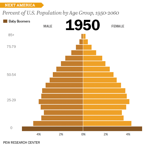
Here's a great example of how a data visualization can be made even more valuable when displayed as an animated GIF. This GIF, from Pew Research Center, uses animation to show how age demographics are shifting over time. It keeps the graphic more compact while still showing the changes in population over the years. What's more, this GIF is perfect to use in blog, email, and social media promotion of Pew Research Center's larger study.
Another great use for GIFs is to provide a preview of your downloadable content offers -- like ebooks, templates, or other downloads. The following is a GIF used to promote our free business-themed stock photos download. The GIF scrolls through a sampling of images to give potential downloaders a sense of what they'll get with the download. 
The animated GIF can then be used on the landing page for the stock photos download, in blog posts promoting the offer, and in email and social media promotion for the offer, too.
Want to learn how to create an animated GIF of your own? Check out this blog post.
5) Be smart about formatting to make your content more reader-friendly.
You have to admit that those big, discouraging chunks of text you often come across online would be much more palatable if they were broken up by some strategically placed headers and other types of formatting like bullets, bolded text, etc.
Want to make your content easier on the eyes? A little formatting can go a long way to make your content more reader-friendly. As much as you might not want to believe it, people rarely read blog posts, articles, and other types of online content in their entirety. Instead, they skim and scan and read only the parts that interest them.
Make it easier for readers to do just that by breaking up your copy with clear, concise headers that help them discover the bits and pieces they really want to read. Check out how we did it on this very post as an example.
If your content is on the longer side, you can also leverage the use of anchor links that enable readers to jump to different sections of a blog post or a longer form piece of content such as an ebook without having to scroll. Check out how we did it in this post, which includes a table of contents in the post's intro that allows readers to jump to different parts of the article:

Learn how to create anchor links here.
6) Create graphics to use as social media content.
Remember those stats I mentioned in the beginning of this post? Tweets with images receive 18% more clicks and 150% more retweets.
Is it really any wonder why? Which of the following tweets draws your attention?

Case in point.
And images don't just take the cake on Twitter. Photo posts account for 87% of total interactions for Facebook brand pages, too. Seems like you might want to use visuals in your social media updates if you aren't already.
Consider creating custom graphics to accompany the links and status updates you share on social networks. Here are a couple examples of images we created to promote our survey for the 2015 State of Inbound Report and our upcoming INBOUND event.

If design isn't exactly your forte, we have 60 free templates and tips you can use to easily create visual social media content right in PowerPoint. Download them here.
7) Bring your content to life with video.
When most people think of visual content, video tends to be the first thing that comes to mind. And rightfully so -- because video is such an engaging form of content, it's only increasing in popularity, especially in social media.
In fact, Facebook reports that on average, more than 50% of people who come back to Facebook every day in the U.S. watch at least one video daily -- which could explain why the amount of video from people and brands in the News Feed has increased 3.6X year-over-year, globally.
While video seems to be the golden ticket on social networks, it can also be used to supplement your website and blog content, too. Take the following video for example, which was used to within our blog post about how to create an infographic in under an hour (yup -- the one we mentioned earlier!). The video supports the existing content in the post by offering another form of media for people who prefer video to text.
This video was then also repurposed and promoted on Twitter and Facebook. Talk about killing two birds with one stone!
Here are just a few ideas for how you can use video in your content marketing:
- Create brief how-to videos to supplement blog content and share in social media.
- Conduct video interviews to enhance customer case studies.
- Create teasers for your downloadable content offers, as we did in this example.
- Use video to promote registration for upcoming events.
Because video production can be daunting if you're just starting out we recently released a new interactive guide that will teach you how to create high-quality videos for social media. Check it out here.
8) Create SlideShare presentations to tell visual stories.
Did you know that SlideShare -- a popular website for sharing slideshows and presentation slides -- has more than 70 million professional users? It also happens to be one of the top 100 most-visited websites in the world. That's no small potatoes.
Slideshows and PowerPoint presentations are another great form of visual content that can make great fodder for blog posts, landing pages, and social media content. You can use them in a variety of ways -- to promote your offers (example), provide quick, helpful tips (example), or to stand alone as a really shareable piece of content that tells a story (example).
Here's another example of a really awesome SlideShare presentation from Velocity Partners, which has generated over 1.2 million views on SlideShare to date (and here are several more presentation to get your creative juices flowing).
Want to create SlideShare presentations of your own, but aren't sure where to start? Here are some resources that can help:
- Templates: 5 Free Templates for Creating SlideShare Presentations in PowerPoint
- Blog Post Tutorial: How to Easily Create a SlideShare Presentation
- Ebook: The Step-by-Step Guide to SlideShare Marketing
Editor's Note: This post was originally published in November 2011 and has been updated for freshness, accuracy, and comprehensiveness.

Visual Content


![How Visuals Will Impact Marketing in 2017, According to New Data [Infographic]](https://53.fs1.hubspotusercontent-na1.net/hubfs/53/00-Blog_Thinkstock_Images/how-visuals-impact-marketing-2017.png)
.jpg)
![10 Types of Visual Content Your Brand Should Be Creating Right Now [Infographic]](https://53.fs1.hubspotusercontent-na1.net/hubfs/53/00-Blog_Thinkstock_Images/Visual_Content_Types.jpg)
![How Images Make Content More Shareable on Facebook, Instagram & Twitter [Infographic]](https://53.fs1.hubspotusercontent-na1.net/hubfs/53/shareable-images.jpeg)
![A Handy Little Guide to Creating Visual Content for Social Media [Infographic]](https://53.fs1.hubspotusercontent-na1.net/hub/53/file-2667260844.jpeg)
![How to Get More Engagement With Your Visual Content [Infographic]](https://53.fs1.hubspotusercontent-na1.net/hub/53/file-2415990899.jpeg)