

When marketers like us create landing pages, write email copy, or design call-to-action buttons, it can be tempting to use our intuition to predict what will make people click and connect.
But as anyone who’s been in marketing for a minute will tell you, always expect the unexpected. So, instead of basing marketing decisions on a “feeling,” you’re much better off running an A/B test to see what the data says.
Keep reading to learn how to conduct the entire A/B testing process before, during, and after data collection so you can make the best decisions based on your results.
.png)
The Complete A/B Testing Kit for Marketers
Start improving your website performance with these free templates.
- Guidelines for effective A/B testing
- Running split tests for email, landing pages, and CTAs
- Free simple significance calculator
- Free A/B test tracking template.
Download Free
All fields are required.
Table of Contents
- What is A/B testing?
- History of A/B Testing
- Why is A/B Testing important?
- How does A/B testing work?
- A/B Testing in Marketing
- What does A/B testing involve?
- A/B Testing Goals
- How to Design an A/B Test
- How to Conduct A/B Testing
- How to Read A/B Testing Results
- A/B Testing Examples
- 10 A/B Testing Tips from Marketing Examples
What is A/B testing?
A/B testing, also known as split testing, is a marketing experiment wherein you split your audience to test variations on a campaign and determine which performs better. In other words, you can show version A of a piece of marketing content to one half of your audience and version B to another.
A/B testing is helpful for comparing two versions of a webpage, email newsletter, subject lines, designs, apps, and more or to see which is more successful.
Split testing takes the guesswork out of discerning how your digital marketing materials should look, operate, and be distributed. I'll walk you through everything you need to know about split testing, but I've got you covered if you're a visual learner.
The video below walks you through everything you need to know.
History of A/B Testing
It’s hard to track down the “true” origins of A/B testing. However, in terms of marketing, A/B testing — albeit in its initial and imperfect form — arguably started with American advertiser and author Claude Hopkins.
Hopkins tested his ad campaigns using promotional coupons.
Still, Hopkins’ “Scientific Advertising” process didn’t include the key principles we use in A/B testing today. We have 20th-century biologist Ronald Fisher to thank for those.
Fisher, who defined statistical significance and developed the null hypothesis, helped to make A/B testing more reliable.
That said, the marketing A/B testing we know and love today started in the 1960s and ‘70s. It was also used to test direct response campaign methods. Another key marketing moment came to us in 2000.
At this time, Google engineers ran their first A/B test. (They wanted to know the best number of results to display on the search engine results page.)
Why is A/B testing important?
A/B testing has many benefits to a marketing team, depending on what you decide to test. For example, there is a limitless list of items you can test to determine the overall impact on your bottom line.
But you shouldn’t sleep on using A/B testing to find out exactly what your audience responds best to either. Let’s learn more.
You Can Find Ways To Improve Your Bottom Line
Let’s say you employ a content creator with a $50,000/year salary. This content creator publishes five articles weekly for the company blog, totaling 260 articles per year.
If the average post on the company’s blog generates 10 leads, you could say it costs just over $192 to generate 10 leads for the business ($50,000 salary ÷ 260 articles = $192 per article). That’s a solid chunk of change.
Now, if you ask this content creator to spend two days developing an A/B test on one article, instead of writing two posts in that time, you might burn $192, as you’re publishing fewer articles.
But, if that A/B test finds you can increase conversion rates from 10 to 20 leads, you just spent $192 to potentially double the number of customers your business gets from your blog.
… in a Low Cost, High Reward Way
If the test fails, of course, you lost $192 — but now you can make your next A/B test even more educated. If that second test succeeds, you ultimately spent $384 to double your company’s revenue.
No matter how many times your A/B test fails, its eventual success will almost always outweigh the cost of conducting it.
You can run many types of split tests to make the experiment worth it in the end. Above all, these tests are valuable to a business because they’re low in cost but high in reward.
You Can Find Out What Works for Your Audience
A/B testing can be valuable because different audiences behave, well, differently. Something that works for one company may not necessarily work for another.
Let’s take an unlikely B2B marketing tactic as an example. I was looking through HubSpot’s 2024 Industry Trends Report data for an article last week.
I noticed that 10% of B2B marketers planned to decrease their investment in NFTs as part of their strategy in 2024.
My first thought was, “Huh, NFTs in B2B?”
Then it hit me. To have that decrease, B2B marketers must’ve been using NFTs in the first place. Even more surprising than this revelation was that 34% of marketers plan to increase investment in NFTs as part of their B2B strategy.
That’s just one example of why conversion rate optimization (CRO) experts hate the term “best practices.” Because that “best practice”? Well, it may not actually be the best practice for you.
But, this kind of testing can be complex if you’re not careful. So, let’s review how A/B testing works to ensure you don’t make incorrect assumptions about what your audience likes.
HubSpot Marketing Analytics Software
Measure the performance of all your marketing campaigns in one place with built-in analytics, reports, and dashboards.
- Marketing Analytics
- Dashboard Software
- Website KPIs
- And More!
How does A/B testing work?
To run an A/B test, you need to create two different versions of one piece of content, with changes to a single variable.
Then, you’ll show these two versions to two similarly-sized audiences and analyze which one performed better over a specific period. But remember, the testing period should be long enough to make accurate conclusions about your results.

A/B testing helps marketers observe how one version of a piece of marketing content performs alongside another. Here are two types of A/B tests you might conduct to increase your website’s conversion rate.
Example 1: User Experience Test
Perhaps you want to see if moving a certain call-to-action (CTA) button to the top of your homepage instead of keeping it in the sidebar will improve its click-through rate.
To A/B test this theory, you’d create another, alternative web page that uses the new CTA placement.
The existing design with the sidebar CTA — or the “control” — is version A. Version B with the CTA at the top is the “challenger.” Then, you’d test these two versions by showing each to a predetermined percentage of site visitors.
Ideally, the percentage of visitors seeing either version is the same.
If you want more information on how to easily perform A/B testing on your website, check out HubSpot’s Marketing Hub or our introductory guide.
Example 2: Design Test
Perhaps you want to find out if changing the color of your CTA button can increase its click-through rate.
To A/B test this theory, you’d design an alternative CTA button with a different button color that leads to the same landing page as the control.
If you usually use a red CTA button in your marketing content, and the green variation receives more clicks after your A/B test, this could merit changing the default color of your CTA buttons to green from now on.
A/B Testing in Marketing
Here are some elements you might decide to test in your marketing campaigns:
- Subject lines.
- CTAs.
- Headers.
- Titles.
- Fonts and colors.
- Product images.
- Blog graphics.
- Body copy.
- Navigation.
- Opt-in forms.
Of course, this list is not exhaustive. Your options are countless and differ depending on the type of marketing campaign you’re A/B testing. (Blog graphics, for example, typically won’t apply to email campaigns.)
But product images can apply to both email and blog testing.)

But let’s say you wanted to test how different subject lines impacted an email marketing campaign’s conversion rates. What would you need to get started?
What does A/B testing involve?
Here’s what you’ll need to run a successful A/B test.
- A campaign: You’ll need to pick a marketing campaign (i.e., a newsletter, landing page, or email) that’s already live. We’re going with email.
- What you want to test: You’ll need to pick the element(s) you wish to A/B test. In this case, that would be the subject line used in an email marketing campaign. But you can test all manner of things, even down to font size and CTA button color. Remember, though, if you want accurate measurements, only test one element at a time.
- Your goals: Are you testing for the sake of it? Or do you have well-defined goals? Ideally, your A/B testing should link to your revenue goals. (So, discovering which campaign has a better impact on revenue success.) To track success, you’ll need to select the right metrics. For revenue, you’d track metrics like sales, sign-ups, and clicks.
A/B Testing Goals
A/B testing can tell you a lot about how your intended audience behaves and interacts with your marketing campaign.
Not only does A/B testing help determine your audience’s behavior, but the results of the tests can help determine your next marketing goals.
Here are some common goals marketers have for their business when A/B testing.
Increased Website Traffic
You’ll want to use A/B testing to help you find the right wording for your website titles so you can catch your audience’s attention.
Testing different blog or web page titles can change the number of people who click on that hyperlinked title to get to your website. This can increase website traffic.
Providing it’s relevant, an increase in web traffic is a good thing! More traffic usually means more sales.
Higher Conversion Rate
Not only does A/B testing help drive traffic to your website, but it can also help boost conversion rates.
Testing different locations, colors, or even anchor text on your CTAs can change the number of people who click these CTAs to get to a landing page.
This can increase the number of people who fill out forms on your website, submit their contact info to you, and “convert” into a lead.
Lower Bounce Rate
A/B testing can help determine what’s driving traffic away from your website. Maybe the feel of your website doesn’t vibe with your audience. Or perhaps the colors clash, leaving a bad taste in your target audience’s mouth.
If your website visitors leave (or “bounce”) quickly after visiting your website, testing different blog post introductions, fonts, or featured images can retain visitors.
Perfect Product Images
You know you have the perfect product or service to offer your audience. But, how do you know you’ve picked the right product image to convey what you have to offer?
Use A/B testing to determine which product image best catches the attention of your intended audience. Compare the images against each other and pick the one with the highest sales rate.
Lower Cart Abandonment
E-commerce businesses see an average of 70% of customers leave their website with items in their shopping cart. This is known as “shopping cart abandonment” and is, of course, detrimental to any online store.
Testing different product photos, check-out page designs, and even where shipping costs are displayed can lower this abandonment rate.
Now, let’s examine a checklist for setting up, running, and measuring an A/B test.
The Complete A/B Testing Kit for Marketers
Start improving your website performance with these free templates.
- Guidelines for effective A/B testing
- Running split tests for email, landing pages, and CTAs
- Free simple significance calculator
- Free A/B test tracking template.
Download Free
All fields are required.
How to Design an A/B Test
Designing an A/B test can seem like a complicated task at first. But, trust us — it’s simple.
The key to designing a successful A/B test is to determine which elements of your blog, website, or ad campaign can be compared and contrasted against a new or different version.
Before you jump into testing all the elements of your marketing campaign, check out these A/B testing best practices.
Test appropriate items.
List elements that could influence how your target audience interacts with your ads or website. Specifically, consider which elements of your website or ad campaign influence a sale or conversion.
Be sure the elements you choose are appropriate and can be modified for testing purposes.
For example, you might test which fonts or images best grab your audience’s attention in a Facebook ad campaign. Or, you might pilot two pages to determine which keeps visitors on your website longer.
Pro tip: Choose appropriate test items by listing elements that affect your overall sales or lead conversion, and then prioritize them.
Determine the correct sample size.
The sample size of your A/B test can have a large impact on the results — and sometimes, that is not a good thing. A sample size that is too small will skew the results.
Make sure your sample size is large enough to yield accurate results. Use tools like a sample size calculator to help you figure out the correct number of interactions or visitors to your website or participants in your campaign you need to obtain the best result.
Check your data.
A sound split test will yield statistically significant and reliable results. In other words, your A/B test results are not influenced by randomness or chance. But how can you be sure your results are statistically significant and reliable?
Just like determining sample size, tools are available to help verify your data.
Tools, such as Convertize’s AB Test Significance Calculator, allow users to plug in traffic data and conversion rates of variables and select the desired level of confidence.
The higher the statistical significance achieved, the less you can expect the data to occur by chance.
Pro tip: Ensure your data is statistically significant and reliable by using tools like A/B test significance calculators.

Schedule your tests.
When comparing variables, keeping the rest of your controls the same is important — including when you schedule to run your tests.
If you’re in the ecommerce space, you’ll need to take holiday sales into consideration.
For example, if you run an A/B test on the control during a peak sales time, the traffic to your website and your sales may be higher than the variable you tested in an “off week.”
To ensure the accuracy of your split tests, pick a comparable timeframe for both tested elements. Run your campaigns for the same length of time to get the best, most accurate results.
Pro tip: Choose a timeframe when you can expect similar traffic to both portions of your split test.
Test only one element.
Each variable of your website or ad campaign can significantly impact your intended audience’s behavior. That’s why looking at just one element at a time is important when conducting A/B tests.
Attempting to test multiple elements in the same A/B test will yield unreliable results. With unreliable results, you won’t know which element had the biggest impact on consumer behavior.
Be sure to design your split test for just one element of your ad campaign or website.
Pro tip: Don’t try to test multiple elements at once. A good A/B test will be designed to test only one element at a time.
Analyze the data.
As a marketer, you might have an idea of how your target audience behaves with your campaign and web pages. A/B testing can give you a better indication of how consumers really interact with your sites.
After testing is complete, take some time to thoroughly analyze the data. You might be surprised to find that what you thought was working for your campaigns was less effective than you initially thought.
Pro tip: Accurate and reliable data may tell a different story than you first imagined. Use the data to help plan or change your campaigns.
To get a comprehensive view of your marketing performance, use our robust analytics tool, HubSpot's Marketing Analytics software.
How to Conduct A/B Testing
Follow along with our free A/B testing kit, which includes everything you need to run A/B testing, including a test tracking template, a how-to guide for instruction and inspiration, and a statistical significance calculator to determine whether your tests were wins, losses, or inconclusive.

Before the A/B Test
Let’s cover the steps to take before you start your A/B test.
1. Pick one variable to test.
As you optimize your web pages and emails, you’ll find there are many variables you want to test. But to evaluate effectiveness, you’ll want to isolate one independent variable and measure its performance.
Otherwise, you can’t be sure which variable was responsible for changes in performance.
You can test more than one variable for a single web page or email — just be sure you’re testing them one at a time.
To determine your variable, look at the elements in your marketing resources and their possible alternatives for design, wording, and layout. You may also test email subject lines, sender names, and different ways to personalize your emails.
Pro tip: You can use HubSpot’s AI Email Writer to write email copy for different audiences. The software is built into HubSpot’s marketing and sales tools.
Keep in mind that even simple changes, like changing the image in your email or the words on your CTA button, can drive big improvements. In fact, these sorts of changes are usually easier to measure than the bigger ones.
Note: Sometimes, testing multiple variables rather than a single variable makes more sense. This is called multivariate testing.
If you’re wondering whether you should run an A/B test versus a multivariate test, here’s a helpful article from Optimizelythat compares the processes.
The Complete A/B Testing Kit for Marketers
Start improving your website performance with these free templates.
- Guidelines for effective A/B testing
- Running split tests for email, landing pages, and CTAs
- Free simple significance calculator
- Free A/B test tracking template.
Download Free
All fields are required.
2. Identify your goal.
Although you’ll measure several metrics during any one test, choose a primary metric to focus on before you run the test. In fact, do it before you even set up the second variation.
This is your dependent variable, which changes based on how you manipulate the independent variable.
Think about where you want this dependent variable to be at the end of the split test. You might even state an official hypothesis and examine your results based on this prediction.
If you wait until afterward to think about which metrics are important to you, what your goals are, and how the changes you’re proposing might affect user behavior, then you may not set up the test in the most effective way.
3. Create a 'control' and a 'challenger.'
You now have your independent variable, your dependent variable, and your desired outcome. Use this information to set up the unaltered version of whatever you’re testing as your control scenario.
If you’re testing a web page, this is the unaltered page as it exists already. If you’re testing a landing page, this would be the landing page design and copy you would normally use.
From there, build a challenger — the altered website, landing page, or email that you’ll test against your control.
For example, if you’re wondering whether adding a testimonial to a landing page would make a difference in conversions, set up your control page with no testimonials. Then, create your challenger with a testimonial.
4. Split your sample groups equally and randomly.
For tests where you have more control over the audience — like with emails — you need to test with two or more equal audiences to have conclusive results.
How you do this will vary depending on the A/B testing tool you use. Suppose you’re a HubSpot Enterprise customer conducting an A/B test on an email, for example.
HubSpot will automatically split traffic to your variations so that each variation gets a random sampling of visitors.
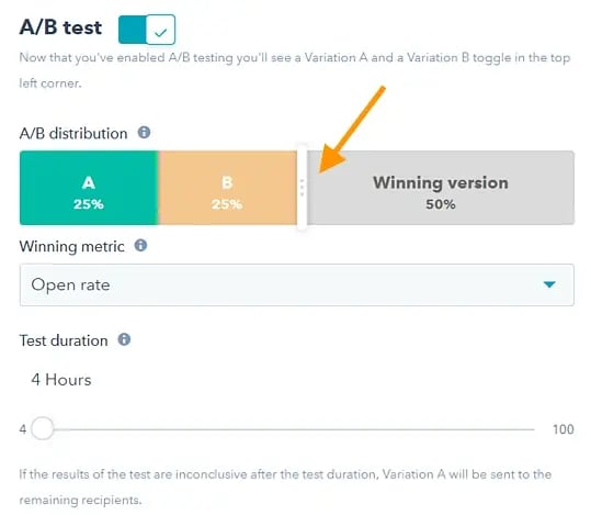
5. Determine your sample size (if applicable).
How you determine your sample size will also vary depending on your A/B testing tool, as well as the type of A/B test you’re running.
If you’re A/B testing an email, you’ll probably want to send an A/B test to a subset of your list large enough to achieve statistically significant results.
Eventually, you’ll pick a winner to send to the rest of the list. (See “The Science of Split Testing” ebook at the end of this article for more.)
If you’re a HubSpot Enterprise customer, you’ll have some help determining the size of your sample group using a slider.
It’ll let you do a 50/50 A/B test of any sample size — although all other sample splits require a list of at least 1,000 recipients.
If you’re testing something that doesn’t have a finite audience, like a web page, then how long you keep your test running will directly affect your sample size.
You’ll need to let your test run long enough to obtain a substantial number of views. Otherwise, it will be hard to tell whether there was a statistically significant difference between variations.
6. Decide how significant your results need to be.
Once you’ve picked your goal metric, think about how significant your results need to be to justify choosing one variation over another.
Statistical significance is a super important part of the A/B testing process that’s often misunderstood. If you need a refresher, I recommend reading this blog post on statistical significance from a marketing standpoint.
The higher the percentage of your confidence level, the more sure you can be about your results. In most cases, you’ll want a confidence level of 95% minimum, especially if the experiment was time-intensive.
However, sometimes, it makes sense to use a lower confidence rate if the test doesn’t need to be as stringent.
Matt Rheault, a senior software engineer at HubSpot, thinks of statistical significance like placing a bet.
What odds are you comfortable placing a bet on? Saying, “I’m 80% sure this is the right design, and I’m willing to bet everything on it,” is similar to running an A/B test to 80% significance and then declaring a winner.
Rheault also says you’ll likely want a higher confidence threshold when testing for something that only slightly improves the conversion rate. Why? Because random variance is more likely to play a bigger role.
“An example where we could feel safer lowering our confidence threshold is an experiment that will likely improve conversion rate by 10% or more, such as a redesigned hero section,” he explained.
“The takeaway here is that the more radical the change, the less scientific we need to be process-wise. The more specific the change (button color, microcopy, etc.), the more scientific we should be because the change is less likely to have a large and noticeable impact on conversion rate,” Rheault says.
7. Make sure you're only running one test at a time on any campaign.
Testing more than one thing for a single campaign can complicate results.
For example, if you A/B test an email campaign that directs to a landing page while you’re A/B testing that landing page, how can you know which change increased leads?
The Complete A/B Testing Kit for Marketers
Start improving your website performance with these free templates.
- Guidelines for effective A/B testing
- Running split tests for email, landing pages, and CTAs
- Free simple significance calculator
- Free A/B test tracking template.
Download Free
All fields are required.
During the A/B Test
Let's cover the steps to take during your A/B test.
8. Use an A/B testing tool.
To do an A/B test on your website or in an email, you’ll need to use an A/B testing tool.
If you’re a HubSpot Enterprise customer, the HubSpot software has features that let you A/B test emails (learn how here), CTAs (learn how here), and landing pages (learn how here).
For non-HubSpot Enterprise customers, other options include Google Analytics, which lets you A/B test up to 10 full versions of a single web page and compare their performance using a random sample of users.
9. Test both variations simultaneously.
Timing plays a significant role in your marketing campaign’s results, whether it’s the time of day, day of the week, or month of the year.
If you were to run version A for one month and version B a month later, how would you know whether the performance change was caused by the different design or the different month?
When running A/B tests, you must run the two variations simultaneously. Otherwise, you may be left second-guessing your results.
The only exception is if you’re testing timing, like finding the optimal times for sending emails.
Depending on what your business offers and who your subscribers are, the optimal time for subscriber engagement can vary significantly by industry and target market.
10. Give the A/B test enough time to produce useful data.
Again, you’ll want to make sure that you let your test run long enough to obtain a substantial sample size. Otherwise, it’ll be hard to tell whether the two variations had a statistically significant difference.
How long is long enough? Depending on your company and how you execute the A/B test, getting statistically significant results could happen in hours... or days... or weeks.
A big part of how long it takes to get statistically significant results is how much traffic you get — so if your business doesn’t get a lot of traffic to your website, it’ll take much longer to run an A/B test.
Read this blog post to learn more about sample size and timing.
11. Ask for feedback from real users.
A/B testing has a lot to do with quantitative data... but that won’t necessarily help you understand why people take certain actions over others. While you’re running your A/B test, why not collect qualitative feedback from real users?
A survey or poll is one of the best ways to ask people for their opinions.
You might add an exit survey on your site that asks visitors why they didn’t click on a certain CTA or one on your thank-you pages that asks visitors why they clicked a button or filled out a form.
For example, you might find that many people clicked on a CTA leading them to an ebook, but once they saw the price, they didn’t convert.
That kind of information will give you a lot of insight into why your users behave in certain ways.
After the A/B Test
Finally, let's cover the steps to take after your A/B test.
12. Focus on your goal metric.
Again, although you’ll be measuring multiple metrics, focus on that primary goal metric when you do your analysis.
For example, if you tested two variations of an email and chose leads as your primary metric, don’t get caught up on click-through rates.
You might see a high click-through rate and poor conversions, in which case you might choose the variation that had a lower click-through rate in the end.
13. Measure the significance of your results using our A/B testing calculator.
Now that you’ve determined which variation performs the best, it’s time to determine whether your results are statistically significant. In other words, are they enough to justify a change?
To find out, you’ll need to conduct a test of statistical significance. You could do that manually, or you could just plug in the results from your experiment to our free A/B testing calculator. (The calculator comes as part of our free A/B testing kit.)
You’ll be prompted to input your result into the red cells for each variation you tested. The template results are for either “Visitors” or “Conversions.” However, you can customize these headings for other types of results.
You’ll then see a series of automated calculations based on your inputs. From there, the calculator will determine statistical significance.

14. Take action based on your results.
If one variation is statistically better than the other, you have a winner. Complete your test by disabling the losing variation in your A/B testing tool.
If neither variation is significant, the variable you tested didn’t impact results, and you’ll have to mark the test as inconclusive. In this case, stick with the original variation or run another test.
You can use failed data to help you figure out a new iteration on your new test.
While A/B tests help you impact results on a case-by-case basis, you can also apply the lessons you learn from each test to future efforts.
For example, suppose you’ve conducted A/B tests in your email marketing and have repeatedly found that using numbers in email subject lines generates better clickthrough rates. In that case, consider using that tactic in more of your emails.
The Complete A/B Testing Kit for Marketers
Start improving your website performance with these free templates.
- Guidelines for effective A/B testing
- Running split tests for email, landing pages, and CTAs
- Free simple significance calculator
- Free A/B test tracking template.
Download Free
All fields are required.
15. Plan your next A/B test.
The A/B test you just finished may have helped you discover a new way to make your marketing content more effective — but don’t stop there. There’s always room for more optimization.
You can even try conducting an A/B test on another feature of the same web page or email you just did a test on.
For example, if you just tested a headline on a landing page, why not do a new test on the body copy? Or a color scheme? Or images? Always keep an eye out for opportunities to increase conversion rates and leads.
You can use HubSpot’s A/B Test Tracking Kit to plan and organize your experiments.
![]()
How to Read A/B Testing Results
As a marketer, you know the value of automation. Given this, you likely use software that handles the A/B test calculations for you — a huge help. But, after the calculations are done, you need to know how to read your results. Let’s go over how.
1. Check your goal metric.
The first step in reading your A/B test results is looking at your goal metric, which is usually conversion rate.
After you’ve plugged your results into your A/B testing calculator, you’ll get two results for each version you’re testing. You’ll also get a significant result for each of your variations.
2. Compare your conversion rates.
By looking at your results, you’ll likely be able to tell if one of your variations performed better than the other. However, the true test of success is whether your results are statistically significant.
For example, variation A had a 16.04% conversion rate. Variation B had a 16.02% conversion rate, and your confidence interval of statistical significance is 95%.
Variation A has a higher conversion rate, but the results are not statistically significant, meaning that variation A won’t significantly improve your overall conversion rate.
3. Segment your audiences for further insights.
Regardless of significance, it’s valuable to break down your results by audience segment to understand how each key area responded to your variations. Common variables for segmenting audiences are:
- Visitor type, or which version performed best for new visitors versus repeat visitors.
- Device type, or which version performed best on mobile versus desktop.
- Traffic source, or which version performed best based on where traffic to your two variations originated.
Let’s go over some examples of A/B experiments you could run for your business.
A/B Testing Examples
We’ve discussed how A/B tests are used in marketing and how to conduct one — but how do they actually look in practice?
As you might guess, we run many A/B tests to increase engagement and drive conversions across our platform. Here are five examples of A/B tests to inspire your own experiments.
1. Site Search
Site search bars help users quickly find what they’re after on a particular website. HubSpot found from previous analysis that visitors who interacted with its site search bar were more likely to convert on a blog post.
So, we ran an A/B test to increase engagement with the search bar.
In this test, search bar functionality was the independent variable, and views on the content offer thank you page was the dependent variable. We used one control condition and three challenger conditions in the experiment.
The search bar remained unchanged in the control condition (variant A).
In variant B, the search bar was larger and more visually prominent, and the placeholder text was set to “search by topic.”
Variant C appeared identical to variant B but only searched the HubSpot Blog rather than the entire website.
In variant D, the search bar was larger, but the placeholder text was set to “search the blog.” This variant also searched only the HubSpot Blog.

We found variant D to be the most effective: It increased conversions by 3.4% over the control and increased the percentage of users who used the search bar by 6.5%.
2. Mobile CTAs
HubSpot uses several CTAs for content offers in our blog posts, including ones in the body of the post as well as at the bottom of the page. We test these CTAs extensively to optimize their performance.
We ran an A/B test for our mobile users to see which type of bottom-of-page CTA converted best.
We altered the design of the CTA bar for our independent variable. Specifically, we used one control and three challengers in our test. For our dependent variables, we used pageviews on the CTA thank you page and CTA clicks.
The control condition included our normal placement of CTAs at the bottom of posts. In variant B, the CTA had no close or minimize option.
In variant C, mobile readers could close the CTA by tapping an X icon. Once it was closed out, it wouldn’t reappear.
In variant D, we included an option to minimize the CTA with an up/down caret.

Our tests found all variants to be successful. Variant D was the most successful, with a 14.6% increase in conversions over the control. This was followed by variant C with an 11.4% increase and variant B with a 7.9% increase.
3. Author CTAs
In another CTA experiment, HubSpot tested whether adding the word “free” and other descriptive language to author CTAs at the top of blog posts would increase content leads.
Past research suggested that using “free” in CTA text would drive more conversions and that text specifying the type of content offered would help SEO.
In the test, the independent variable was CTA text, and the main dependent variable was conversion rate on content offer forms.
In the control condition, the author CTA text was unchanged (see the orange button in the image below).
In variant B, the word “free” was added to the CTA text.
In variant C, descriptive wording was added to the CTA text in addition to “free.”

Interestingly, variant B saw a loss in form submissions, down by 14% compared to the control. This was unexpected, as including “free” in content offer text is widely considered a best practice.
Meanwhile, form submissions in variant C outperformed the control by 4%. It was concluded that adding descriptive text to the author CTA helped users understand the offer and thus made them more likely to download.
4. Blog Table of Contents
To help users better navigate the blog, HubSpot tested a new Table of Contents (TOC) module. The goal was to improve user experience by presenting readers with their desired content more quickly.
We also tested whether adding a CTA to this TOC module would increase conversions.
The independent variable of this A/B test was the inclusion and type of TOC module in blog posts. The dependent variables were conversion rate on content offer form submissions and clicks on the CTA inside the TOC module.
The control condition did not include the new TOC module — control posts either had no table of contents or a simple bulleted list of anchor links within the body of the post near the top of the article (pictured below).
In variant B, the new TOC module was added to blog posts. This module was sticky, meaning it remained onscreen as users scrolled down the page. Variant B also included a content offer CTA at the bottom of the module.

Variant C included an identical module to variant B but with the CTA removed.
Variant C included an identical module to variant B but with the CTA removed.

Both variants B and C did not increase the conversion rate on blog posts. The control condition outperformed variant B by 7% and performed equally with variant C.
Also, few users interacted with the new TOC module or the CTA inside the module.
5. Review Notifications
To determine the best way of gathering customer reviews, we ran a split test of email notifications versus in-app notifications.
Here, the independent variable was the type of notification, and the dependent variable was the percentage of those who left a review out of all those who opened the notification.
In the control, HubSpot sent a plain text email notification asking users to leave a review. In variant B, HubSpot sent an email with a certificate image including the user’s name.
For variant C, HubSpot sent users an in-app notification.

Ultimately, both emails performed similarly and outperformed the in-app notifications. About 25% of users who opened an email left a review versus the 10.3% who opened in-app notifications.
Users also opened emails more often.
10 A/B Testing Tips From Marketing Experts
I spoke to nine marketing experts from across disciplines to get their tips on A/B testing.
1. Clearly define your goals and metrics first.
“In my experience, the number one tip for A/B testing in marketing is to clearly define your goals and metrics before conducting any tests,” says Noel Griffith, CMO at SupplyGem.
Griffith explains that this means having a solid understanding of what you want to achieve with your test and how you will measure its success. This matters because, without clear goals, it’s easy to get lost in the data and draw incorrect conclusions.
For example, Griffith says, if you’re testing two different email subject lines, your goal could be to increase open rates.
“By clearly defining this goal and setting a specific metric to measure success (e.g., a 10% increase in open rates), you can effectively evaluate the performance of each variant and make data-driven decisions,” says Griffith.
Aside from helping you focus your testing efforts, Noel explains that having clear goals also means you can accurately interpret the results and apply them to improve your marketing strategies.
2. Test only ONE thing during each A/B test.
“This is the most important tip for A/B marketing from my perspective... Always decide on one thing to test for each individual A/B test,” says Hanna Feltges, growth marketing manager at Niceboard.
For example, when A/B testing button placement in emails, Feltges makes sure the only difference between these two emails is the button placement.
No difference should be in the subject line, copy, or images, as this could skew the results and make the test invalid.
Feltges applies the same principle to metrics by choosing one metric to evaluate test results
“For emails, I will select a winner based on a predefined metric, such as CTR, open rate, reply rate, etc. In my example of the button placement, I would select CTR as my deciding metric and evaluate the results based on this metric,” Feltges says.
3. Start with a hypothesis to prove or disprove.
Another similarly important tip for A/B testing is to start with a hypothesis. The goal of each A/B test is then to prove the hypothesis right or wrong, Feltges notes.
For example, Feltges poses testing two different subject lines for a cold outreach email. Her hypothesis here is:
“Having a subject line with the prospect’s first name will lead to higher open rates than a subject line without the prospect’s first name,” she says.
Now, she can run multiple tests with the same hypothesis and can then evaluate if the statement is true or not.
Feltges explains that the idea here is that marketers often draw quick conclusions from A/B tests, such as “Having the first name in the subject line performs better.” But that is not 100% true.
A/B tests are all about being precise and specific in the results.
4. Track key test details for accurate planning and analysis.
“I keep a running log of how long my A/B tests for SEO took, and I make sure to track critical metrics like the statistical significance rate that was reached,” says NamePepper Founder Dave VerMeer.
VerMeer explains that the log is organized in a spreadsheet that includes other columns for things like:
- The type of test.
- Details about what was tested.
- Dates.
“If I notice any factors that could have influenced the test, I note those as well,” he adds. Other factors could be a competitor having a special event or something that happened in the news and caused a traffic spike.
“I check the log whenever I’m planning a series of A/B tests. For example, it lets me see trends and forecast how the seasonality may affect the test period lengths. Then I adjust the test schedule accordingly,” VerMeer says.
According to VerMeer, this form of tracking is also helpful for setting realistic expectations and providing clues as to why a test result did or didn’t match up with past performance.
5. Test often…
When I spoke to Gabriel Gan, head of editorial for In Real Life Malaysia, for my guide on running an email marketing audit, he set out two main rules for A/B testing.
For the A/B testing email, Gan recommends setting email A as the incumbent and email B as the contender.
Like Hanna, Gabriel emphasizes changing only one variable at a time. “For example, in email B, when testing open rates, only tweak the subject line and not the preview,” says Gan.
That’s because if you have more than one variable changed from the old email, “it’s almost impossible to determine which new addition you made has contributed to the improvement in OPR/CTR.”
Aside from only changing one variable at a time, Gan recommends testing often until you find out what works and what doesn’t.
“There’s a perception that once you set up your email list and create a template for your emails, you can ‘set it and forget it.’” Gan says. “But now, with the power of A/B testing, with just a few rounds of testing your headlines, visuals, copy, offer, call-to-action, etc., you can find out what your audience loves, do more of it, and improve your conversion rates twofold or threefold.”
6. …But don’t feel like you need to test everything.
“My top tip for A/B testing is only to use it strategically,” says Joe Kevens, director of demand generation at PartnerStack and the founder of B2B SaaS Reviews.
Kevens explains that “strategically” means that only some things warrant an A/B test due to the time and resources it consumes.
“I’ve learned from experience that testing minor elements like CTA button colors can be a waste of time and effort (unless you work at Amazon or some mega-corporation that gets a gazillion page visits, and a minor change can make a meaningful impact),” Kevens says.
Kevens recommends that instead, it’s more beneficial to concentrate on high-impact areas such as homepage layouts, demo or trial pages, and high-profile marketing messages.
That’s because these elements have a better shot to impact conversion rates and overall user experience.
Kevens reminds us that “A/B testing can be powerful, but its effectiveness comes from focusing on changes that can significantly impact your business outcomes.”
7. Use segmentation to micro-identify winning elements.
“When using A/B testing in marketing, don’t limit your target audience to just one set of parameters,” says Brian David Crane, founder and CMO of Spread Great Ideas.
Crane recommends using criteria like demographics, user behavior, past interactions, and buying history to experiment with A/B testing of these different segments. You can then filter the winning strategy for each segment.
“We use core metrics like click-through rates, bounce rates, and customer lifetime value to identify the combination that converts the most,” explains Crane.
.webp?width=650&height=650&name=Copy%20of%20Linkedin%20-%201104x736%20-%20Quote%20+%20Headshot%20-%20Orange%20(2).webp)
8. Leverage micro-conversions for granular insights.
“I know that it’s common to focus on macro-conversions, such as sales or sign-ups, in A/B testing. However, my top tip is to also pay attention to micro-conversions,” says Laia Quintana, head of marketing and sales at TeamUp.
Quintana explains that micro-conversions are smaller actions users take before completing a macro-conversion.
They could be actions like clicking on a product image, spending a certain amount of time on a page, or watching a promotional video.
But why are these micro-conversions important? Quintana states, “They provide granular insights into user behavior and can help identify potential roadblocks in the conversion path.”
For example, if users spend a lot of time on a product page but do not add items to their cart, there might be an issue with the page layout or information clarity.
By A/B testing different elements on the page, you can identify and rectify these issues to improve the overall conversion rate.
“Moreover, tracking micro-conversions allows you to segment your audience more effectively. You can identify which actions are most indicative of a user eventually making a purchase and then tailor your marketing efforts to encourage those actions. This level of detail in your A/B testing can significantly enhance the effectiveness of your marketing strategy,” says Quintana.
9. Running LinkedIn Ads? Start with five different versions and A/B test them.
“A best practice when running LinkedIn Ads is to start a campaign with five different versions of your ad,” says Hristina Stefanova, head of marketing operations at Goose’n’Moose.
Stefanova reminds us that it’s important to tweak just one variable at a time across each version.
For a recent campaign, Stefanova started with five ad variations — four using different hero images and three having the CTA tweaked.
“I let the campaign run with all five variations for a week. At that point, there were two clearly great performing ads, so I paused the other three and continued running the campaign with the two best-performing ones,” says Stefanova.
According to Stefanova, the two ads performed best and had the lowest CPC. The A/B testing exercise helped not only the specific campaign but also helped her to better understand what attracts their target audience.
So what’s next? “Images with people in them are better received, so for upcoming campaigns, I am focusing right away on producing the right imagery. All backed up by real performance data thanks to A/B testing,” Stefanova says.
10. Running SEO A/B tests? Do this with your test and control group URLs.
“Given that the SEO space is constantly evolving, it’s getting increasingly difficult to run any sort of experiments and get reliable and statistically significant results. This is especially true when running SEO A/B tests,” says Ryan Jones, marketing manager at SEOTesting.
Luckily, Jones explains that you can do things to mitigate this and make sure that any SEO A/B tests you run now — and in the future — are reliable. You can then use the tests as a “North Star” when making larger-scale changes to your site.
“My number one tip would be to ensure that your control group and test group of URLs contain as identical URLs as you can make them. For example, if you’re running an A/B test on your PLP pages as an ecommerce site, choose PLPs from the same product type and with the same traffic levels. This way, you can ensure that your test data will be reliable,” says Jones.
Why does this matter? “Perhaps the number one thing that ‘messes’ with A/B test data is control and variant groups that are too dissimilar.
But by ensuring you are testing against statistically similar URLs, you can mitigate this better than anything else,” Jones says.
Start A/B Testing Today
A/B testing allows you to get to the truth of what content and marketing your audience wants to see. With HubSpot’s Campaign Assistant, you’ll be able to generate copy for landing pages, emails, or ads that can be used for A/B testing.
Learn how to best carry out some of the steps above using the free ebook below.
Editor's note: This post was originally published in May 2016 and has been updated for comprehensiveness.

a-b-testing

![How I Use Landing Page Split Testing to Find Untapped Marketing Potential [+ 12 Places to Start]](https://53.fs1.hubspotusercontent-na1.net/hubfs/53/landing-page-split-testing-1-20250121-3573417.webp)
![How to Understand & Calculate Statistical Significance [+ Example]](https://53.fs1.hubspotusercontent-na1.net/hubfs/53/how-to-calculate-statistical-significance-1-20250106-7754856.webp)


.png)