Want to hear a secret? Almost every image associated with my recent blog posts has been made in PowerPoint.
Yep, whether starting from scratch or purchasing a photo to build off of, PowerPoint is my secret design weapon. I've even used it to create, and write tutorials on traditionally "designed" things like CTAs and infographics. Even now, when I launch a new marketing offer, I create an accompanying visual -- whether it's an infographic or just a picture to post on Facebook -- in PowerPoint to pair the campaign with visual content.
Download 195+ visual marketing design templates to use for social media posts, infographics, and more.
And while I can't explain the creativity behind these visuals (though the end of this post will show you my thought process), we can certainly dive into some step-by-step explanations of how to produce two different types of visual content in PowerPoint. That should provide you with enough PowerPoint knowledge to start building your own images! Let's get started.
Visual 1: Creating a Landing Page Visual
Let's start with a simple visual. Typically at HubSpot, we use simpler visuals for promoting our marketing offers -- ebooks, webinars, etc. We want the visual to capture a visitor's attention, demonstrate the value of the offer, and influence them to download it. We don't want it to overtake the corresponding landing page that it's on. With that in mind, let's build out an example for one of our recent offers on How to Determine Your 2013 Marketing Goals.
Step 1: Pick a shape.
First, pick a shape to be your base for the visual. There are a bunch of shapes you could choose, as you can see in the screenshot below.
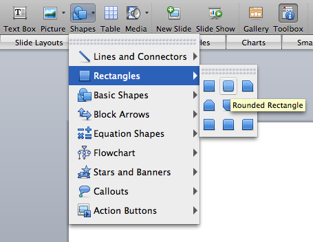
For this example, I’ll use a circle.
Step 2: Use shapes to build other shapes.
How meta, I know. But it’s true. Shapes are your secret weapon when it comes to visual content creation. Whether you’re using PowerPoint, Photoshop, or any other tool, you can create just about anything with the Shapes tool. In this example, I’m going to create a piece of paper (to illustrate a "template," the hypothetical lead generation offer for which I'm creating our hypothetical landing page) using the square tool.
To create the paper, I’m going to set the fill to "None," and make a thick border.
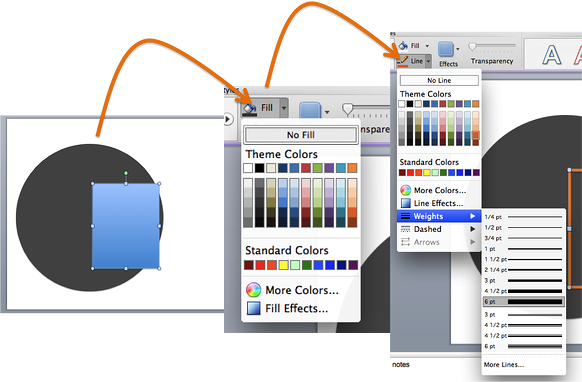
Now, I’m going to make a small triangle in the same color as the border of the rectangle, and place it in the upper left corner of the rectangle by using the green Rotate tool, which you'll see when you click on the triangle.
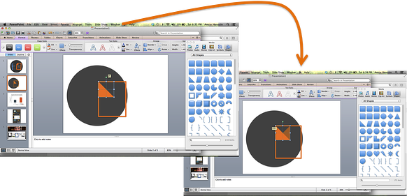
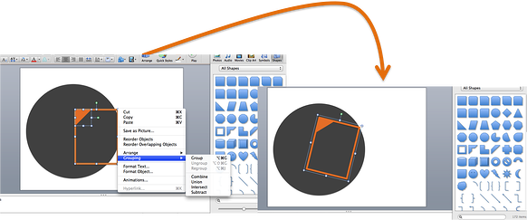
Next, I’m going to click on the triangle, hold the 'Shift' button, and then click on the rectangle, as well. With both objects clicked, I’m going to "group" the shapes together by right clicking, grouping, and selecting "Group."
Then, turn that grouped object juuuust slightly to give it a nicer look within the circle. I use the up and down arrows on my keyboard to ensure it’s placed appropriately inside the circle’s border.
Step 3: Add explanatory copy.
To explain the image, add some text by clicking "Insert," then "Text Box." Choose a font of your choice -- keep it simple -- that's easy to read. Ease in readability is better than a super fancy font that isn’t clear, especially when viewed on a mobile device, and when you're trying to solve for conversions. Then, I’m going to use the same green Rotate tool mentioned before to rotate the text to be centered in the page image I made earlier.

Step 4: Add elements that fill the visual.
To fill the white space in the circle and complete the visual, I’m going to copy and paste the orange page I created, and make it smaller by clicking on one of the circles, clicking "Shift," -- this will help you maintain the aspect ratio so your images don't get stretched and skewed --and using my mouse to adjust until it’s the size I desire.
To make it pop, I’ll change the color from orange to white, and rotate it slightly the opposite direction of the larger, orange paper.
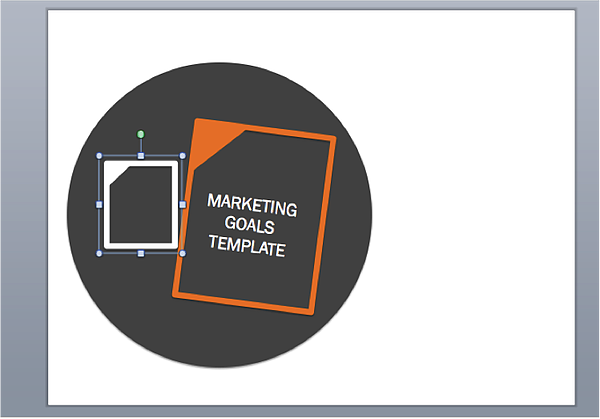
Step 5: Save your image.
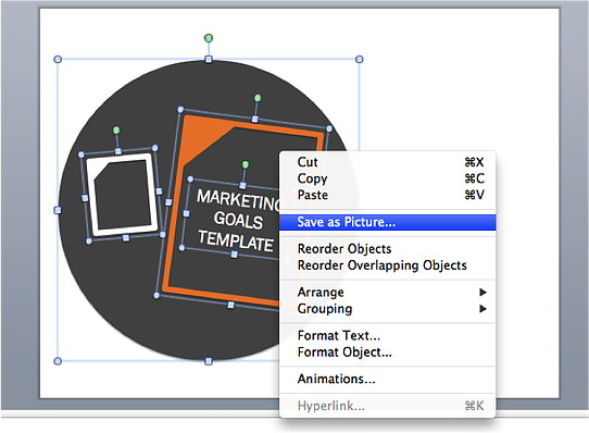
Now that I have every component I desire for the image created, I'm going to select all the components of it. Or, you could just hit "Control" and the "A" keys on your keyboard at the same time to perform a "Select All." Once all is selected, right click and choose "Save as Picture..."
Voila! We now have a simple, but descriptive image for our landing page that represents our template offer -- a marketing goals template offer to help marketers set (and hit!) their monthly, quarterly, and annual goals.
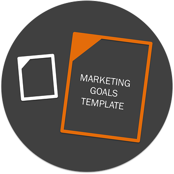
The best part of this visual is that you can repurpose it for your entire campaign surrounding that offer. That means this one visual is not only going to help you convert more visitors on your landing page, but it can be used in the call-to-action that leads visitors to that landing page, in your email used to promote the offer, and on your social media networks with a link to the landing page. That's a quadruple whammy -- not too shabby for a little dabbling in PowerPoint, eh?
Visual 2: Creating a Blog Post Visual
When it comes to blog posts, you want a captivating image to draw in readers. Blog posts are shared at rapid rates across the interwebs. People share it on social media platforms, in email attachments, and -- our favorite -- as inbound links. You want an awesome image that keeps people clicking and reading! In fact, studies show 90% of information transmitted to the brain is visual, and visuals are processed 60,000X faster in the brain than text. If you're not using images, you're losing out large amounts of potential traffic to your blog!
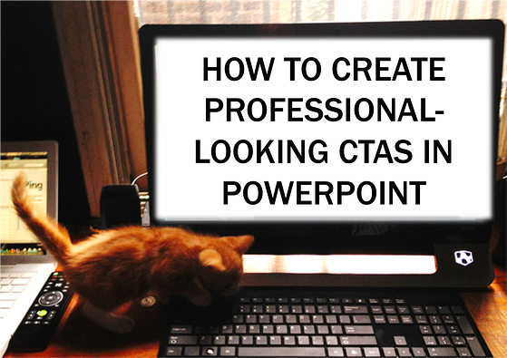
With that, let's recreate the image used in this blog post, "How to Create Professional-Looking CTAs in PowerPoint."
Step 1: Pick a free image to alter.
First, think about the blog post at hand and what you want to communicate it. This is where shameless marketing tactics -- such as babies and kittens -- are allowed ;-) Search for the type of image you want on something like CreativeCommons (make sure you're allowed to use it for commercial purposes, modify, and adapt it) or iStockphoto. For this offer, I'm going to search for "cat on computer" on CreativeCommons. I get the following image, which I insert into PowerPoint by clicking "Insert," and then "Picture."
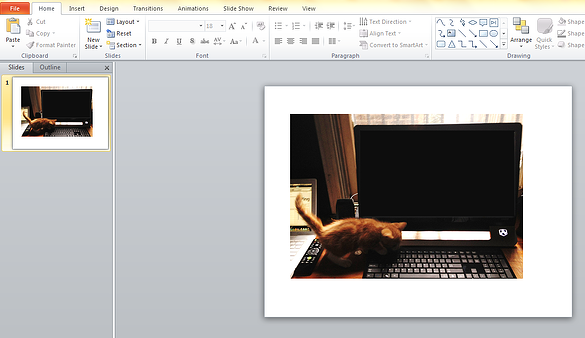
Step 2: Overlay a shape.
I want this blog post to show that creating a compelling visual in PowerPoint is so simple, that even a cute kitten could do it! I'm going to insert a shape over the laptop screen and make the fill and outline white. That way, it kind of looks like a PowerPoint slide in presentation mode.

Step 3: Add visual copy.
To continue with that idea of making the image look like it's part of a PowerPoint presentation, I'm going to treat the white square shape as a title slide and simply, well, put the title of the blog post that I am attempting to promote through this image.
Step 4: Apply soft edges.
As you may have noticed, the white shape we made doesn't seamlessly fit in the computer screen size of our photo. While fancy editing tools in Photoshop can fix, we can make it work in PowerPoint, too. By going to "Format," and then, "Soft Edges," I can play with the Soft Edges tool and increase and decrease the extent to which the edges will be softened. Zero represents no soft edges, while 100 represents completely soft edges. A safe spot is usually under 15.

Step 5: Save your image.
It's that time again -- time to save the image! Simply select all elements, right click, and click "Save as Picture."
Visual 3: Creating a Social Media Visual
In terms of creative angles and tools used, social media visuals include many of the components previously mentioned. So if you've made it this far, congratulations, this is the final flourish!
But, there are particular aspects of a social media visual that need to be addressed. Let's build an image that will help us promote one of our most recent ebooks, "How to Engage Fans on Facebook."
Step 1: Build a square or rectangle.
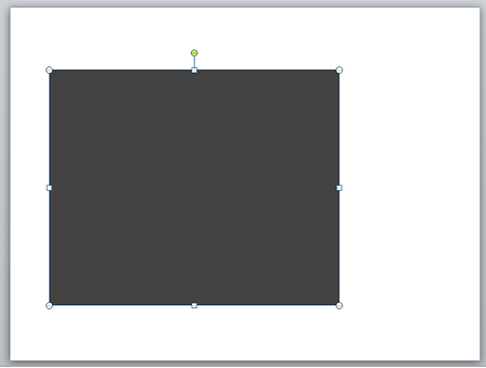
Think about the way a place like Facebook, Instagram, or Pinterest presents images -- they always have four corners! Your images should, too. So for your social media image, select a rectangle or a square -- I'm going to use a square.
Step 2: Use shapes to build an image.
Now I want something that illustrates the concept of "engaging." The first thing to comes to my mind is an engagement ring -- so ... let's make one!
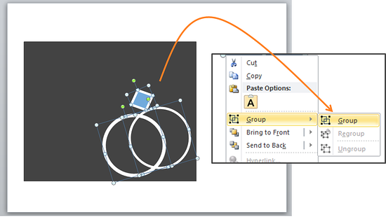
Start by inserting a circle. Then, set the circle's fill to "No Fill," and make the outline a fill color of your choice. Just make sure you adjust the line weight to be thicker so you can really see the outline. Next, I'm going to insert the diamond shape just as I did the circle shape -- except this one will be much smaller, and on top of the circle! This time, I'll make the fill a calm shade of blue, but keep the outline of the diamond the same as the ring to show the two elements are connected. I used the little green Rotate tool (you remember our friend, the Rotate tool, right?) to curve and place it on the ring nicely.
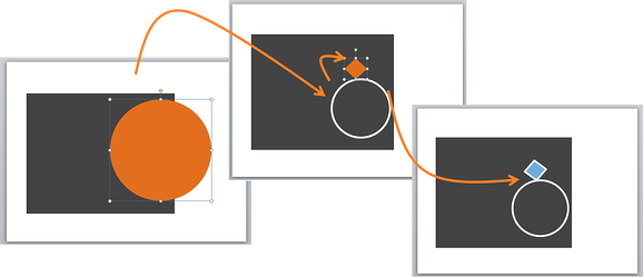
To truly emphasize that this is an engagement ring, and not just some random ring, I'm going to add another circle with a thicker weight, and overlay it over the previously made ring to emphasize engagement between at least two people (your business and your fans, perhaps?).
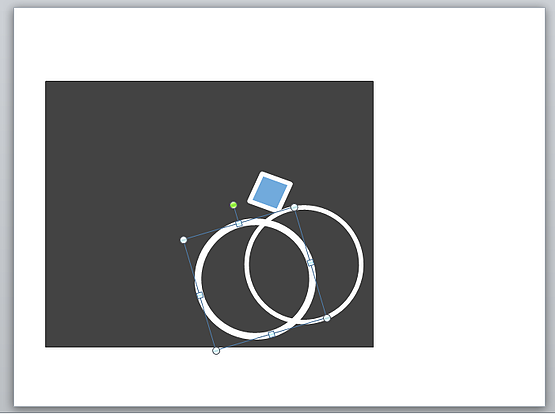
Now, just in case I want to move this around, I'm going to select every element of both rings, and group them together by right clicking, grouping, and selecting "Group." With all the elements grouped, I can now use the Rotate tool to rotate the whole object at once.
Step 3: Add visual copy.
While this step exists in the blog visual example, it could be removed there -- you don't need text on a blog visual. But you do usually need copy on a social media visual. A blog visual becomes an image permanently associated with content, so people can discern its meaning with context. But with a social media visual, people share, re-pin, and re-post images all the time, during which your original accompanying update might be lost. Additionally, not everyone will click through your visual to read the content it is linked to.
For this reason, you want the visual you create to explain everything the reader needs to know. Here's an example of how we incorporated text into one of our social media visuals:
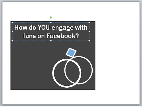
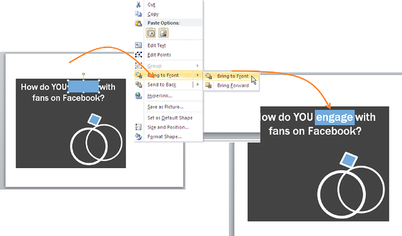
To make the visual just a tad more interesting, I want to bold the word "engage." But instead of merely using the bold font option, I'm going to add some color behind the word. I'll do this by inserting a rectangle with the same color blue as the diamond ring. To make the text appear in front of it, simply click the text box, right click, and select "Bring to Front."
Step 4: Add a logo.
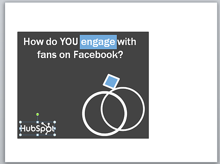
Just as we want to add text to ensure that any shares of the photo include the meaning behind the offer, you also want to brand the image with your logo. Remember, this image doesn't live on a landing page or a blog post where it is clearly associated with your brand. As a social media post, this image becomes free for all to use and share, and you want all the people the image eventually reaches to recognize the image came from your brand. So, stamp on a logo!
Step 5: Add a call-to-action (CTA).
If you want to generate leads from this image, add some CTA copy to prompt readers to, well, act.
In this case, our CTA is to download an ebook. But instead of just having dead white text on the image, I'm going to click "Format," then "Image Fill," and select the nice blue color I've been using elsewhere in the image. Now the text box I inserted has a blue background, and the CTA is more visible on the page.
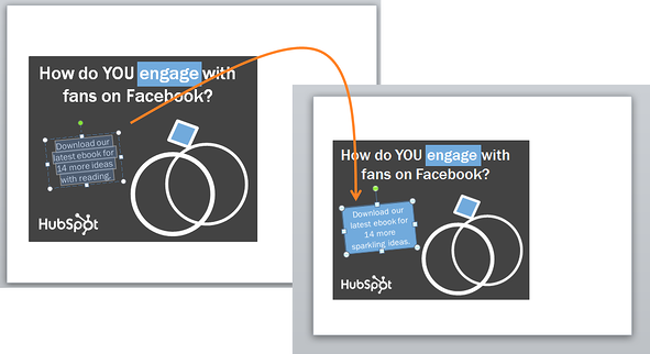
Step 6: Save as picture.
Here we are again! Time to select all the elements, and them together as a picture -- but at this point in the blog post, you probably know that whole process ;-) Here's the final image we put together for social media:
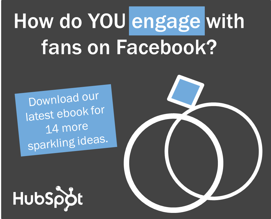
That's way more interesting than just typing the question out on Facebook, isn't it?
5 More Examples of Marketing Visuals Made in PowerPoint
While the above three examples of building visual content in PowerPoint can help equip you with the basic tools needed to fill your design toolset, it can't magically think of what the image will actually be for you. From here on out, it's just about getting comfortable with using PowerPoint as your "design software," and being open to playing around to create interesting images.
But just because we can't be creative for you, that doesn't mean we can't try to inspire you! Here are a few other images created in PowerPoint that might help get your creative juices flowing.
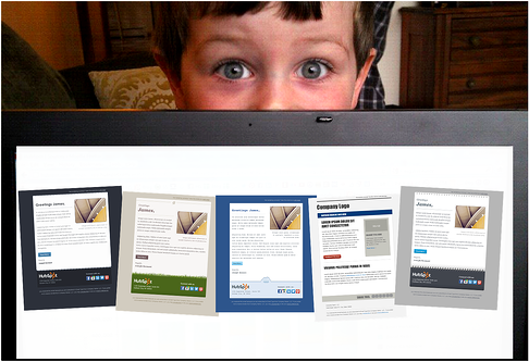
1) 11 Types of Email Marketing You Could Be Sending
This photo followed the steps shown in visual two of this post. This is a picture of our blog manager's son. It was too cute to not use, so I put a white rectangle shape over her computer screen, took screenshots of some of the various email templates we have been offering users for free, and used the rotate tool to place them in a cool format across the screen. His popping eyes are suggesting the email templates really are for YOU.
2) How to Painlessly Transition Your Company to Inbound Marketing
This post focuses on being a little sneaky. Often, top management isn't willing to hear about a new and modern way of doing business. So to help people transition their marketing to inbound marketing, we wrote a post, the image for which started as a purchased stock photo. Then, I used the speech bubble shape in PowerPoint to show how this employee is thinking about his sneaky method of attack ...

3) How to Create a Facebook Business Page in 5 Simple Steps
We have a tutorial on creating a business page with Facebook timeline. So, obviously, we decided to pretend it was a cat presenting on the subject matter. This image was built by taking this cat from a free meme on memegenerator.net (all memes are publicly uploaded visuals meant for altering). Next to the cat, the presentation board was made with the square and line shapes in PowerPoint.

4) Twitter & LinkedIn Break Up, Disabling Automatic Posting of Tweets
When Twitter and LinkedIn ended their social relationship, we found a free image of a broken heart, and simply added each social platform's logo onto each side of the heart. They were placed more snuggly in the heart by using the Rotate tool.

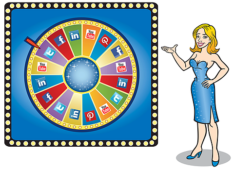
5) If You Were a Social Network, Which Would You Be?
For this image, I grabbed a free stock photo from by searching "pick one." Yes, that's what I started with. From there, I started to see spinning wheels, so I changed my search to "wheel to choose from." This is how a lot of creativity sparks -- just search for terms that describe what you're trying to communicate, and based on what you see, you'll get inspiration for other search terms! I ended up finding this wheel-of-fortune-esque photo. I then found the icon for every social network used in my post, made them all teeny tiny, and used the rotate tool all day long until I got each one snug in a part of the wheel.
And there you have it, folks. Some tips on how to use PowerPoint to make visuals, as well as some PowerPoint-made visuals to inspire you!
Want more? Read 20 Tools for Creating and Delivering Amazing Presentations.
Presentations


![PowerPoint Tips to Present Like a Pro [Expert Advice & Free Templates]](https://53.fs1.hubspotusercontent-na1.net/hubfs/53/powerpoint-tips-1-20260223-6190610.webp)

![20 Great Examples of PowerPoint Presentation Design [+ Templates]](https://53.fs1.hubspotusercontent-na1.net/hubfs/53/powerpoint-presentation-examples.webp)
![How to Create the Best PowerPoint Presentations [Examples & Templates]](https://53.fs1.hubspotusercontent-na1.net/hubfs/53/powerpoint.webp)


![How to Start a Presentation [+ Examples]](https://53.fs1.hubspotusercontent-na1.net/hubfs/53/how-to-start-presenting.webp)

