
Famous Rebrand Examples
- Meta
- Petco
- Dunkin'
- Adobe Creative Cloud
- Starbucks
- GoDaddy
- Pottery Barn
- I ❤️ NY Logo
1. Meta
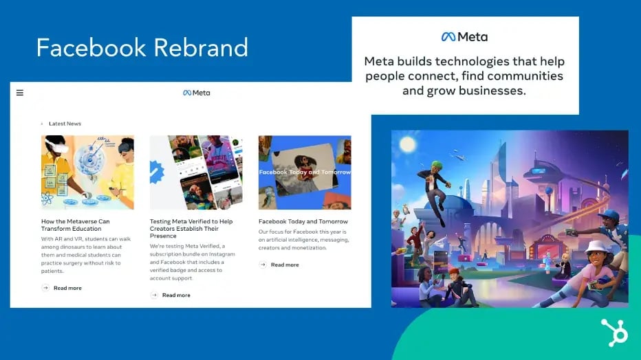
In October 2021, Facebook underwent a significant rebranding effort, changing its name to Meta. This change reflects the company's shift in focus from being a social media platform to becoming a metaverse company. It now focuses on creating virtual reality experiences that allow users to interact in a more immersive and interconnected way. This rebranding effort also included a whole new visual identity and logo design.
One lesson marketers can learn from this rebranding effort is the importance of staying relevant and not shying away from innovation. Facebook recognized that the world is changing and that people are increasingly looking for new and creative ways to connect and engage with each other.
By shifting its focus to the metaverse, Meta is positioning itself as a leader in this emerging field and demonstrating a willingness to adapt and change in response to evolving consumer needs and preferences. Marketers could learn a thing about the importance of staying attuned to changes in the market and being willing to make bold moves to stay ahead of the competition.
2. Petco

In October 2020, Petco announced it would no longer sell electronic "shock" collars. The announcement highlighted the company's rebranding efforts as a health and wellness company for pets.
The pet store redesigned Petco's homepage, as well as the Petco app, to focus on their new initiatives — including health and wellness resources for pet parents, a "Right Food Finder" tool to help parents identify the healthiest foods for their pets and an extended range of pet healthcare and insurance offerings.
Nowadays, many American pet owners treat their animals as family members — so Petco's rebranding makes a lot of sense. The new design better reflects the brand's more holistic approach to animal wellness — including a dedicated landing page that outlines how to take care of your pet's mental, physical, and social health, with a tagline, "We're working with trusted experts to improve pet wellbeing by raising the standards of everything we do. Because it's what we'd want if we were pets."
Overall, this was an extremely successful rebrand as it focused on a shift in consumers' lifestyles and ensured the company's refreshed vision reflected those priorities.
3. Dunkin'

In 2019, Dunkin' Donuts announced a rebranding effort, changing its name to "Dunkin'." The move was designed to reflect the company's expanding focus beyond donuts and towards a wider variety of food and drink options, including breakfast sandwiches, coffee, and other snacks. The rebrand also included a new visual identity and logo featuring a bold, modern font and an updated color scheme.
Dunkin' recognized that consumer tastes and preferences were changing and wanted to rival the coffee giant Starbucks more than retain its identity as a donut shop. The brand knew it needed to adapt to remain competitive, and it was a successful rebrand that's still going strong. By rebranding as "Dunkin''" and expanding its offerings, the company was able to position itself as a more modern, versatile brand that could meet the changing needs of its customers.
This highlights the importance of regularly reassessing your brand's positioning and messaging and being willing to make bold moves to stay ahead of the curve. Additionally, it underscores the importance of keeping your brand consistent across all touchpoints, from visual identity to customer experience, maintaining a solid and cohesive brand identity.
4.Adobe Creative Cloud

In May 2020, Adobe released a blog post, "Evolving Our Brand Identity." The article dives into the decisions behind Adobe Creative Cloud's rebranding and states, "We're making these branding changes to ensure our portfolio continues to be easy for our customers to navigate and understand, as well as maintain a fresh look and feel."
Among other things, Adobe Creative Cloud redesigned its:
- Logo: The company redesigned the logo to an all-red logo with warmer hues.
- Creative Cloud logo: The new logo uses a colorful gradient to represent "the importance of creativity." The colors in the logo are pulled together from various Adobe products and the latest Adobe red logo.
- Product logos: The company is adding 3-letter mnemonics to help viewers determine product families — like Adobe Photoshop (Ps) and Adobe Photoshop Camera (PsC). The designers also used colors to organize products into categories.
These redesigns successfully highlighted and organized the many product offerings of Adobe Creative Cloud. For instance, when you navigate to the "Video" product page on Adobe's website, all apps within the Video category are similar shades of blues and purples.
While some designers have expressed frustration over the new logo color similarities, it makes sense that the brand needed to organize its products better — with a catalog of over 50 products, choosing the right ones for your needs can feel overwhelming. The updated logos should help make it easier to pick and choose.
5.Starbucks
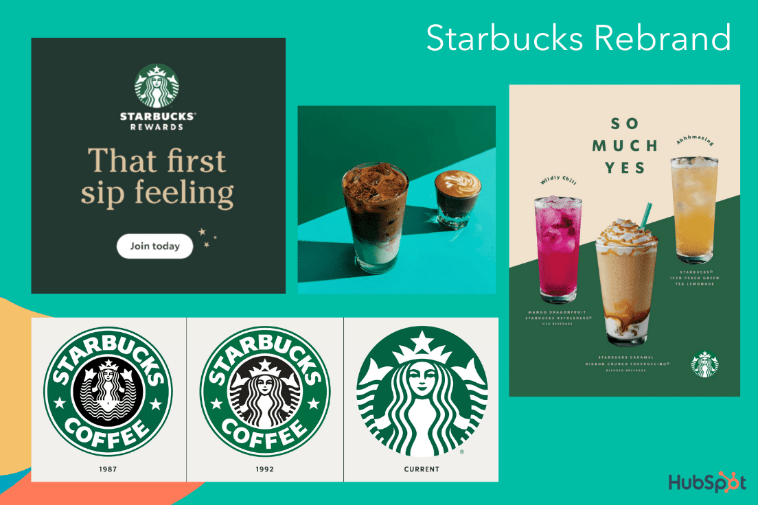
Over the years, Starbucks — one of the most valuable brands in the world — has proven the true power of a good brand. And one of the telltale signs of a good brand is the ability to consistently innovate and push the boundaries rather than settling for what's already working.
In 2020, Starbucks released its "Starbucks Creative Expression" brand expression guide. The site focuses on Starbucks' defined voice, typography, and logo to create consistency across channels and Starbucks locations.
In a few words, Starbucks aims to create an open, creative, carefree, and modern brand. On the Voice page, for instance, it reads, "We're confidently turning down the volume of competing messages to elevate experience, removing obstacles in the way of people finding exactly what they seek at Starbucks." The guideline adds, "When we have the space, we tell a passionate coffee story. But even with just a few words, our copy can make you smile."
Ultimately, this most recent Starbucks rebrand is simple and effective. Rather than moving too far in the opposite direction of the brand's roots, the company sticks to its fundamental company vision while making slight alterations to continue serving the needs and preferences of its consumers.
6.GoDaddy

A web hosting service founded back in 1997, GoDaddy needed an upgrade. In early 2020, they created a brand-new logo, refreshed their website design, and created new marketing campaigns to match the new look. Their design page reads, "A new brand for a new era" and focuses on how GoDaddy's users — the everyday entrepreneurs — inspired the new look.
One of GoDaddy's most striking changes is the new logo, named the GO. GoDaddy believes the GO represents "the indomitable spirit of everyday entrepreneurs." Its contemporary design uses colorful visuals, hand-drawn illustrations, and a bold, serif font to evoke a sense of inspiration and joy. GoDaddy's brand voice, depicted in recent campaigns, aims to be casual, human, and friendly.
While some brands might need less of a makeover, GoDaddy's older image felt outdated and less cohesive. Their rebranding reflects the modern tastes, personalities, and needs of the modern user.
7.Pottery Barn

Pottery Barn, a roughly 70-year-old home furnishing company, has now put sustainability as the central focus of their brand, promising consumers that what they purchase will be worthwhile — both in terms of quality and environmental impact.
Pottery Barn, named the most sustainable home furnishings retailer, has focused its efforts on sustainability with a dedicated landing page outlining its commitments:
- Plant a tree (with the Arbor Day Foundation) every time a consumer purchases a piece of indoor wood furniture.
- Use responsibly-sourced cotton.
- Keep products out of landfills by restoring items with a new Pottery Barn "Renewed" line.
- Contribute money for communities to invest in health clinics, water filtration systems, and more (the brand has currently contributed $3 million).
Ultimately, as your brand grows with your consumers, it's essential to consider what matters to them today. Pottery Barn has done an excellent job identifying a sweet spot in the furniture marketplace: Sustainability. As consumers continue to use this value as a guiding light in their purchasing decisions, it makes sense for Pottery Barn to ensure all their updated marketing materials reflect its mission.
8. I❤️NY Logo

We've spoken about all these successful rebrands, but marketers have just as much to learn from famously failed rebrands.
On March 20th, 2023, the "We ❤️ NYC" logo by Graham Clifford was announced to be New York City’s new branding campaign to replace the iconic "I ❤️ NY" logo by Milton Glaser — but it failed to capture the same emotional connection and visual appeal that made the original so famous.
While the new logo featured a more modern font and a heart symbol made up of various New York City icons, it lacked the simplicity and elegance of the original design, which has become synonymous with the city itself. Additionally, the new logo failed to resonate with New Yorkers and visitors like the original, eventually abandoning it.
Marketers can learn from this failed rebrand attempt the importance of respecting and building upon existing brand equity. The "I ❤️ NY" logo had become an iconic symbol of New York City and its culture, and attempting to replace it with a new design was a risky move that ultimately backfired.
Marketers should carefully consider the existing brand equity of a company or product before making any significant changes and focus on building upon that equity rather than starting from scratch. Additionally, marketers should listen to the feedback of consumers and stakeholders before making any major branding decisions and be willing to pivot or change course if necessary.
Key Takeaways from Famous Rebrands
The above examples make it easy to spot some similarities that made them all strong contenders for best rebrands. But before you begin your rebrand for your own business, remember these takeaways:
1. Keep your audience at the forefront of your plans.
What tastes and preferences do they have? What inspires or excites them? How would they want your website designed? Identifying and catering to a specific audience or buyer persona will give you a better chance of succeeding through a rebrand than trying to appeal to the masses.
2. Use your consumers' outside preferences to shape your rebranding.
Consider your consumers' passions beyond your products or services and what they care most about — you can weave those into your brand story.
Like Petco and Pottery Barn's successful rebrands, ethical or sustainable marketing can garner attention from those who want to see their money fuel a socially responsible business.
3. A rebrand is more than just a logo change.
You want your rebrand to be bold. Otherwise, it's just a brand refresh.
To properly rebrand, you'll want to conduct a content audit and analyze all your existing content to ensure each webpage, logo, graphic, and advertisement is updated to fit your new image.
Pro tip: Looking to refresh your brand? Try our Brand Kit Generator. It gives you access to a free logo maker, color palette generator, icon creator, and more.
4. A brand guideline page is critical for cohesion.
Most examples in this list have a dedicated brand guideline page for ensuring each employee is empowered with the right tools to create content that fits the new look.
Both GoDaddy and Starbucks, for instance, outline how the voice should sound, what fonts to use, and even what colors to include in any public-facing marketing materials.
Rebrand with your customers in mind.
Ultimately, a rebranding strategy can be an exciting and effective opportunity to delight existing customers while attracting new ones. We hope these famous rebrands inspire you to get started with your fresh look.
Editor's note: This article was originally published in May 2021 and has been updated for comprehensiveness.

Branding

![How Internal Marketing Helps You Build a Strong Brand From the Inside Out [Experts Weigh In]](https://53.fs1.hubspotusercontent-na1.net/hubfs/53/internal-marketing-1-20241126-7031360.webp)
![3 Easy Steps to Build Your Brand Promise [+ Examples]](https://53.fs1.hubspotusercontent-na1.net/hubfs/53/brand-promise-1-20240926-7059896.webp)
.png)

.jpg)

%20(1).png)