Good website navigation is an essential website feature. And I’m not just saying that — there's research to back it up. According to a study by Top Design Firms, 38% of consumers look at a page's navigational links and layout when looking at a site for the first time.


The importance of navigation can‘t be understated. And, it’s understandable why visitors prefer sites that implement website navigation best practices. It can help them quickly and easily find the information they're looking for, so navigation is a quintessential part of the user experience and your website strategy.

In this post, I’ll start by taking a closer look at website navigation design so you can create a system that suits your visitors. I‘ll also explore website navigation best practices. After that, I’ll check out website navigation examples and explore some must-haves for effective design. Let's get started.
Table of Contents:
- What is Website Navigation?
- What is a Website Navigation Menu?
- What Are the Types of Website Navigation?
- Website Navigation Bar Design
- Website Navigation Examples
- Website Navigation Best Practices
What is Website Navigation?
Website navigation is a collection of user interface components that allows visitors to find content and features on a site. These components can be in the form of copy, link text and buttons, and menus.
While helping visitors move from one web page to another is a main priority, it isn‘t the only one. Navigation also helps visitors comprehend the relationships between individual pages on a website. But what exactly does that look like in practice? Let’s break it down.
What is a Website Navigation Menu?
A website navigation menu is an organized list of links to other web pages, usually internal site pages. Navigation menus appear in page headers or sidebars across a website, allowing visitors to access the most useful pages quickly.
Navigation is seen as the tip of the iceberg of a website's information architecture (IA), according to IA analyst Nathaniel Davis in an article for UXmatters.
Below the water‘s surface are the portions of this iceberg the front-end visitor can’t see: the research, strategy, management, and organization that went into building the website's IA. Above the surface is the navigation interface, most often represented as a series of hypertext links and a search bar.
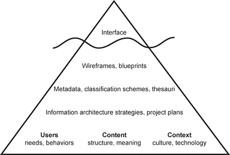
So, your website‘s IA isn’t visible in the navigation interface but is the foundation of that interface. This ultimately provides visitors the sense that the content is connected and categorized to meet their needs and expectations but never actually shows all the spreadsheets and diagrams that went into identifying and organizing those relationships among your content.
Here‘s a look at an example of a website’s hierarchy. A little intimidating at first glance, but it‘s digestible when you get a feel for what each term means. You’d likely only see the three section names in a primary navigation menu from that first level. Then, the subpages will likely be nested in a sub-navigation menu.
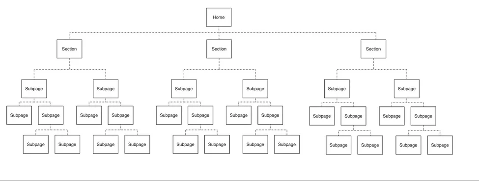
What is sub-navigation on a website?
Sub-navigation, or local navigation, is the interface where your site visitors can locate lower-level categories of a site's IA. These are usually sub-categories of the main navigation links.
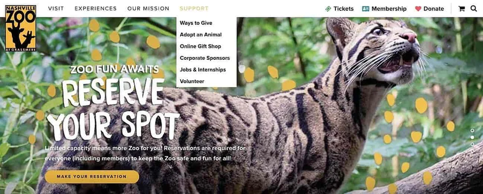
Take the nonprofit website for the Nashville Zoo, for instance. The primary navigation menu contains the navigation item “Support.” When you hover over that item, a sub-navigation menu appears, offering multiple ways to support the zoo. This is effective because visitors can seamlessly find what they‘re looking for, but the menu is not overwhelming at first glance. It’s a win-win.
What Are the Types of Website Navigation?
Why exactly is website navigation so crucial? Well, for starters, it impacts whether visitors arrive on your homepage and browse or click the “Back” button, leading to a higher bounce rate. As a result, you should deeply consider the best way to structure your website navigation. And that's where the different kinds of website navigation come into the picture.
How you structure your website navigation depends on your target audience and what format you think would be most intuitive and accessible. Below I’ll share some common types of website navigation you can consider as you build your site.
Horizontal Navigation Bar
Let's kick it off with the horizontal navigation bar. As you might have guessed, the horizontal navigation bar is the most common type. It lists the major pages side-by-side and places them in the website header. Many websites feature the same sections, like “About,” “Products,” “Pricing,” and “Contact,” because visitors expect to see them.
While these sections are popular for a reason, you shouldn't be afraid to customize your site by tailoring your menu. When you build your navigation bar, consider your website’s purpose and audience. What are you trying to achieve on your site, and what are visitors looking for? I recommend you start by answering those two questions and then go from there.
Take the nav bar on Blavity as an example. The sections featured include three content categories — “Entertainment” (with a sub-menu), “Culture,” and “Small Business” — as well as links to “Blavity U” and “Blavity Brands.” These curated categories more likely to give visitors easy access to the pages they're looking for rather than the standard About, Pricing, and Contact pages.

Dropdown Navigation Menu
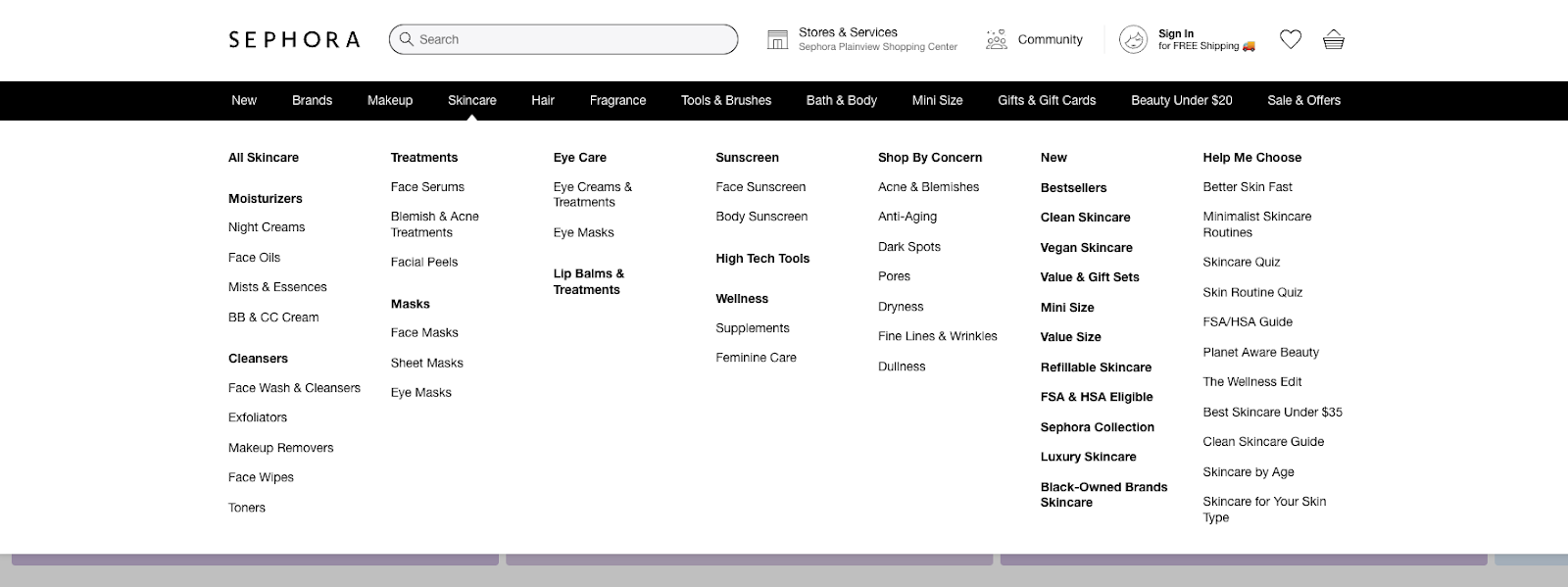
Up next, we have the dropdown navigation menu. This option is ideal for content-rich sites with a complex IA. If you want your menu to include plenty of links to pages, you may consider using this option, as you can't list all the options side-by-side. Instead, you can list the most crucial or general items in the top-level navigation bar. Then, you can add the rest in a dropdown menu.
Take Sephora, for instance. This site offers an excellent example since it offers so many products and services. You can hover over any primary navigation link on its website, and a detailed dropdown menu will appear. In the screenshot below, when I hover over “Skincare” the sub-menu appears.
Hamburger Navigation Menu
Another option you should keep in mind for website navigation is the hamburger. You might already be familiar with this menu because it's popular with mobile web design. If you use this approach, your navigation items will be listed horizontally on larger screen sizes.
.png)
Free UX Research Kit + Templates
3 templates for conducting user tests, summarizing your UX research, and presenting your findings.
- User Testing Template
- UX Research Testing Report Template
- UX Research Presentation Template
On a smaller screen, however, they will collapse behind a hamburger button on smaller screen sizes. And when visitors click on this three-line icon, a vertical drop-down or horizontal pop-out appears with the navigation links. If there‘s limited real estate on your site or you don’t want navigation taking up a large chunk of space, the hamburger navigation menu might be the right pick.
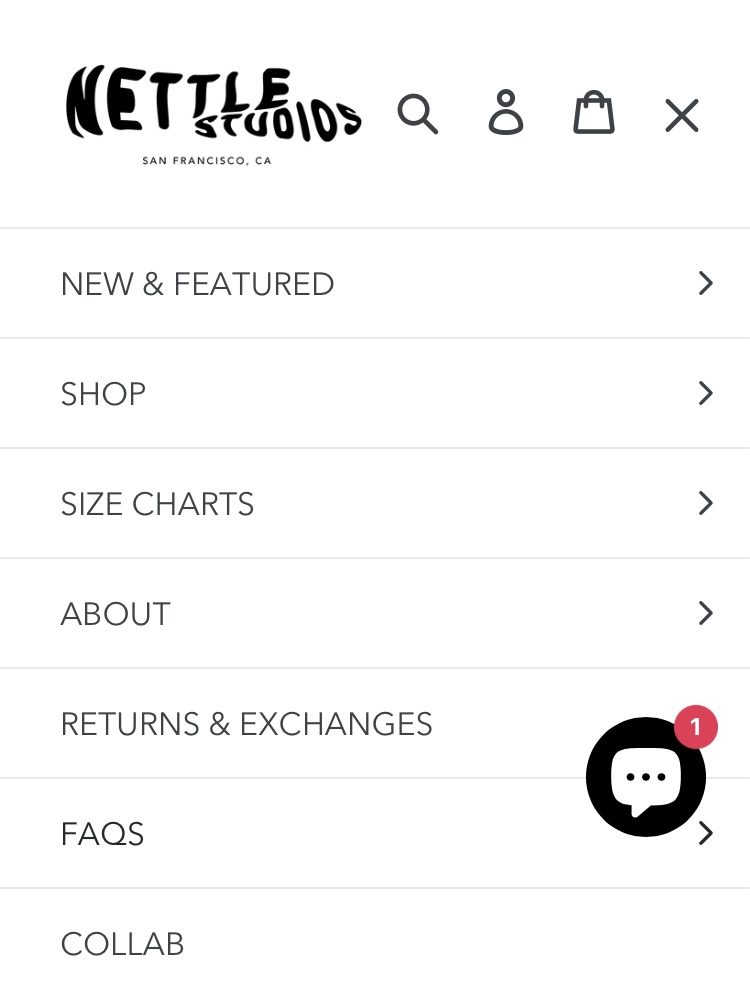
Check out the hamburger menu on Nettle Studio's mobile site.
Vertical Sidebar Navigation Menu
Next up we have vertical sidebar navigation menus. This is an excellent choice for website navigation because it offers a seamless user experience. The items are stacked on top of each other and positioned in the sidebar. Admittedly, this is less popular than horizontal navigation, but vertical navigation has benefits. Real estate isn‘t as limited so that you can write longer navigation links. There’s also the opportunity for more top-level options.
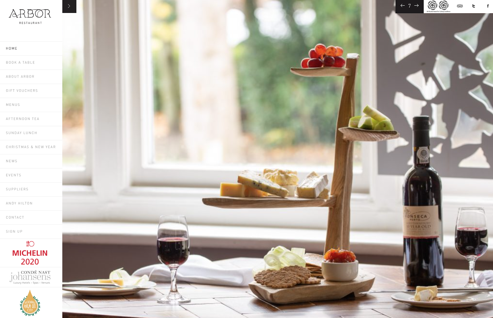
Take a look at Arbor Restaurant's vertical sidebar below.
Footer Navigation Menu
Another option is the footer menu. It is typically paired with — and expands upon — a horizontal navigation bar. If visitors don‘t see the link they need in the header, they can scroll down to the bottom of the page where they’ll find more options.
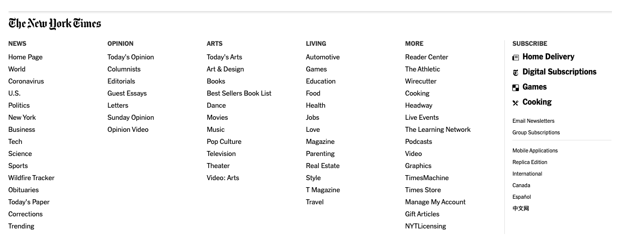
The New York Times has many nav links in its horizontal navigation menu at the top of the page. Its footer menu has over 50 links, and most of them belong to one of the categories listed in the primary navigation menu. While this does offer easy access to important subpages, it can get overwhelming — so use your discretion.
Website Navigation Bar Design
With website navigation design, there‘s no one "right" way. But there is a right way to think about how you’ll set up your navigation: By considering how you can enable first-time and repeat visitors to make the most of your website. I guarantee that you can't go wrong if you create your website navigation with that in mind.
When you center your focus on your site visitors, your navigation structure may look and function differently than a navigation structure on another site. That‘s actually a good thing because it means you’re adequately considering your target audience in mind. However, consider the other elements that should be in your homepage too.
Next, I’ll walk you through the design process as you create your website navigation.
What should be included in your website navigation bar?
Because there are a lot of pages on your site, determining which are crucial enough to be part of the universal navigation can be tricky. For SEO and user experience, Orbit Media recommends keeping your navigation limited to seven items at most.
But how do you begin to narrow the field? Stakeholders from your company may have varying opinions about what is nav-worthy and what is not, but keep user experience central. Ultimately, consider your website visitors to determine which route you should take. Here are some strategies you can use to get started deciphering what your site visitors want to see on your menu.
Card Sorting
Card sorting is a simple user experience technique that helps you get into the minds of your website visitors and design the navigation from their standpoint. And I love that you don't need any UX experience to try this exercise.
To get started, invite people from outside of your organization for a 20-minute exercise. Lay out a stack of index cards on the table, each representing a significant page on your site.
Next, ask the participant to organize the cards however they feel suitable. Look for trends in how your participants group the pages on your site and ask them how they would name each category. This is an extremely effective way to understand what feels intuitive to users.
Attribution Reports
Next, your website navigation design can benefit from attribution reporting. If your marketing analytics software provides it, this is perfect for deciding what should go into your main navigation.
This report attributes the number of newly created contacts to their interactions with your business, so you can better understand the content and functionality on your site that's converting visitors into leads.
If you use HubSpot as your CRM software, you're a step ahead, as you can easily get started with attribution reports. Here‘s a look at some sample reports available in HubSpot’s attribution reporting tool.
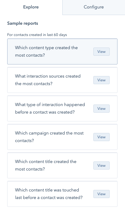
Take HubSpot's website, for instance. While some of our content offers garner lots of traffic, the most common pages viewed by people buying HubSpot software include product pages, pricing, case studies, and partners.
Look at our homepage, and you'll see that the navigation reflects this finding and prioritizes those critical pages.
Users Flow
If you don't have an attribution report, you can still see which pages are essential on your site through the Users Flow report in Google Analytics. This report doesn't differentiate standard traffic from customers, but it highlights how people navigate their experience on your site.
In Google's own words: “The Users Flow report is a graphical representation of the paths users took through your site, from the source, through the various pages, and where along their paths they exited your site.”
How should you order your navigation items?
Order matters in website navigation. Cognitive studies provide evidence that web page viewers tend to remember links on either end of the navigation most vividly. Often referred to as the primacy and recency effects, they speak to the phenomena that words presented either first or last in a list tend to pull more heavily on the attention span of viewers. So for your website, you'll want to be very intentional about what items you place in these spots. Think about what is most important for your typical visitor.
In an article for Neil Patel’s blog, web strategist Andy Crestodina says, “Put your most important items at the beginning of the navigation and the least important items in the middle. ‘Contact’ should be the last item on the list, putting it at the far right in top-level horizontal navigation, a standard location.”
How should you phrase your navigation options?
The best way to phrase your navigation options varies depending on the type of organization or business you run. For starters, you can opt for straight-forward navigation or experiment with more creative labels. Of course, make sure whatever you choose feels intuitive to your brand.
When choosing the words to use in your main navigation links, what's most important to remember is to think first about the terms your customers would use to describe those pages. Then, think of search engine optimization. But just SEO optimization isn’t going to cut it, there are a few more website optimization tactics you must follow to ensure a seamless user experience.
Object-Based
Arguably the most clear-cut option for websites is object-based navigation. Object-based navigation places content under concrete (typically noun-only) categories. HubSpot.com is an example of object-based navigation, as is Emerson College's site below. This type of organization treats the navigation as a table of contents and groups pages into the topics or categories that best fit.

Notice that the navigation links to the right are more action-based than object-based. Let’s define this below.
Action-Based
Action-oriented navigations may be a better fit for other sites. To know when this is appropriate, ask your audience whether they primarily come to your website to learn about something or to take a specific action.
In the example below from Howard University, visitors come with an action in mind. They aren‘t visiting to read the "About" page — they’re coming to apply, visit, or donate.

Audience-Based
For companies with multiple audiences with clear lines, you may want to consider audience-based navigation or sub-navigation, as in the example below. This only works, however, if a visitor can easily classify themselves. For example, you wouldn't want to use small versus medium size company, or marketing versus advertising agency, since those lines are often blurred and may leave your audience confused as to where to go first.
In the example below, Boston College does an excellent job of using an audience-based approach in combination with object-based navigation.

Search Engine Optimized
In addition to matching how your audience instinctually organizes your site, you'll want to think of how to optimize your navigation terms for search best. In an article on Distilled (now Brainlabs), SEO strategist Kristina Kledzik advised using Google Analytics and Google's Keywords tool to identify the search terms that most commonly bring people to your site. Then, you can use variations on those words as the guide for your website navigation.
Apart from the traditional tools, you can also check out how to leverage Hubspot’s ChatSpot AI tool to save time on keyword research.
Free UX Research Kit + Templates
3 templates for conducting user tests, summarizing your UX research, and presenting your findings.
- User Testing Template
- UX Research Testing Report Template
- UX Research Presentation Template
Website Navigation Examples
By now, you know that there‘s no "right" way to create website navigation. As long as your site navigation enables your visitors to find the information they’re looking for and encourages them to take action, it‘s successful. Let’s check out some navigation bar examples and more below that do exactly that.
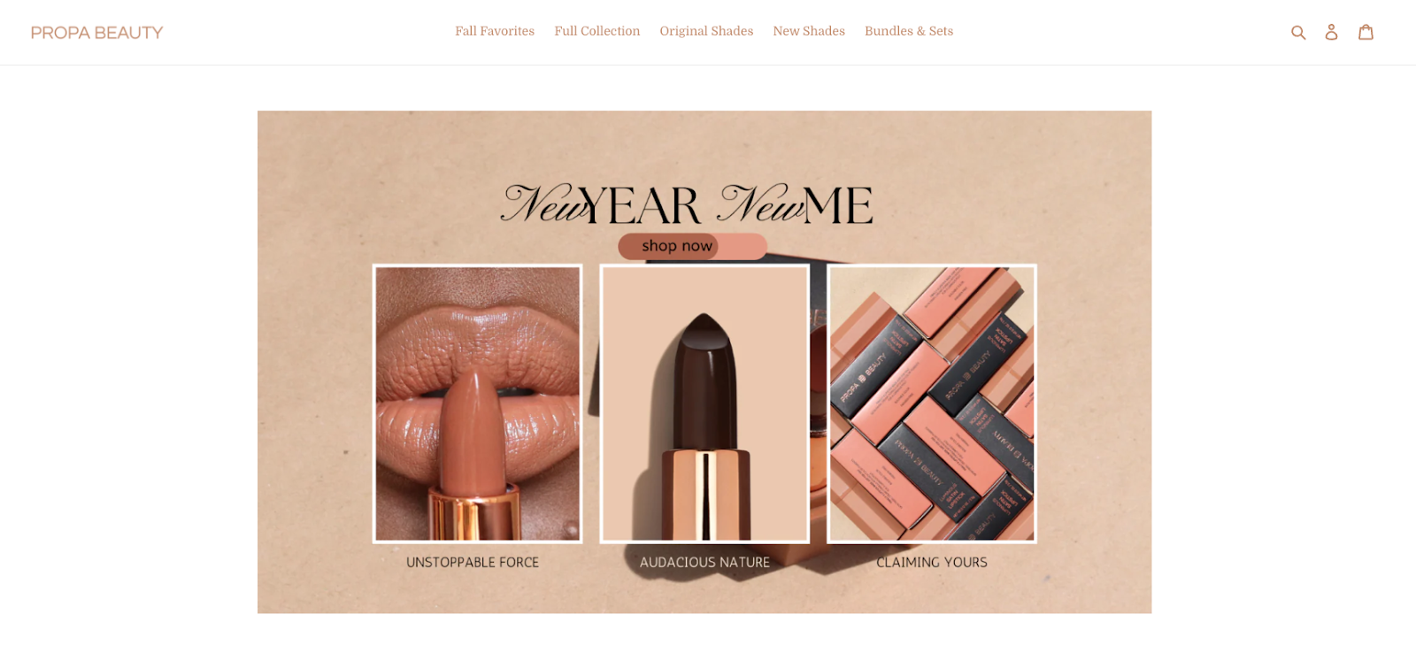
1. Propa Beauty
Propa Beauty has a minimalist horizontal navigation bar designed to generate sales or convert visitors into members. Its logo is to the left. At the center is a link to its product archive page. To the right, there are three icons, each respectively representing a search box, link to a member login page, and link to a shopping cart.
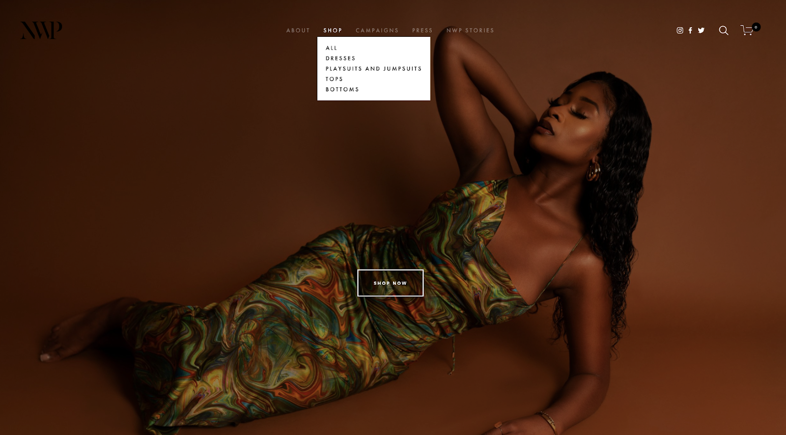
2. NWP
NWP is another ecommerce site with a horizontal navigation bar. Unlike Propa Beauty, however, NWP’s navigation bar is a combined menu. When the page loads, you can only see the primary navigation links. However, if you hover over “Shop,” a dropdown menu appears listing the different sub-categories of clothing you can shop for on the site.
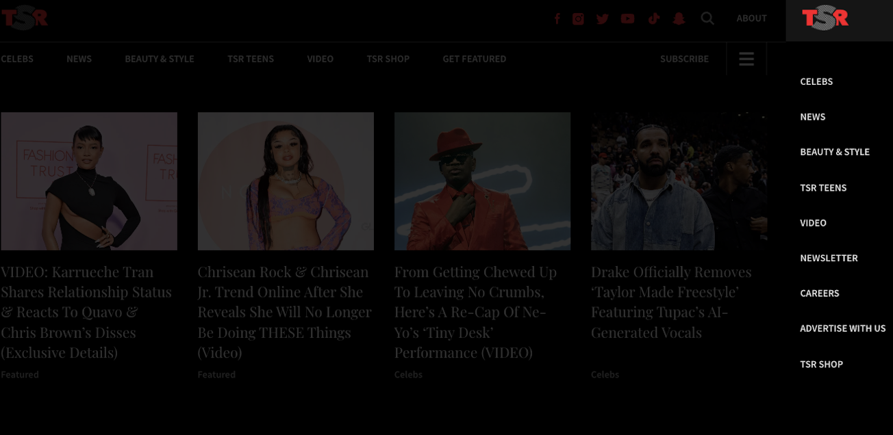
3. The Shade Room
The Shade Room makes use of two styles of navigation menus as well. At the top of the page, you see a standard horizontal header. Notice that this header contains a hamburger button to the right. If you click on this button, a secondary navigation interface appears to the right. This acts like a lightbox popup, blocking some of the content and dimming the rest of the background, and contains more navigation links that you can use to browse the site.
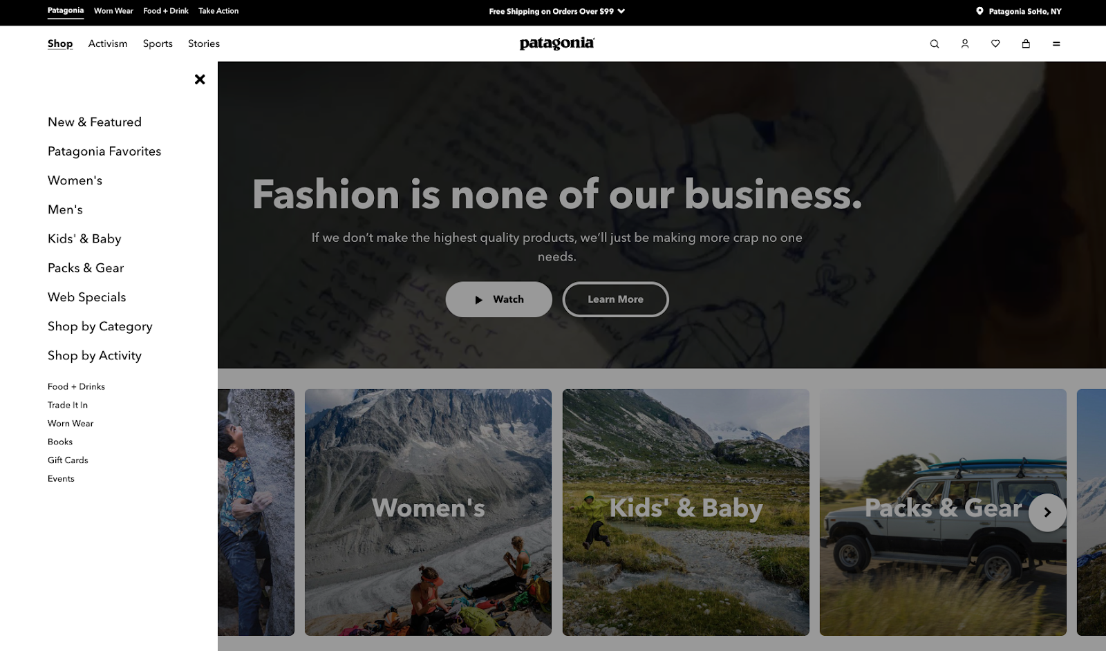
4. Patagonia
To accommodate its large catalog of items, Patagonia implemented a mega menu on its website. When users hover over the “Shop” item in the horizontal navigation bar, a giant list of links appears as a left-side panel for anything you might want to browse.
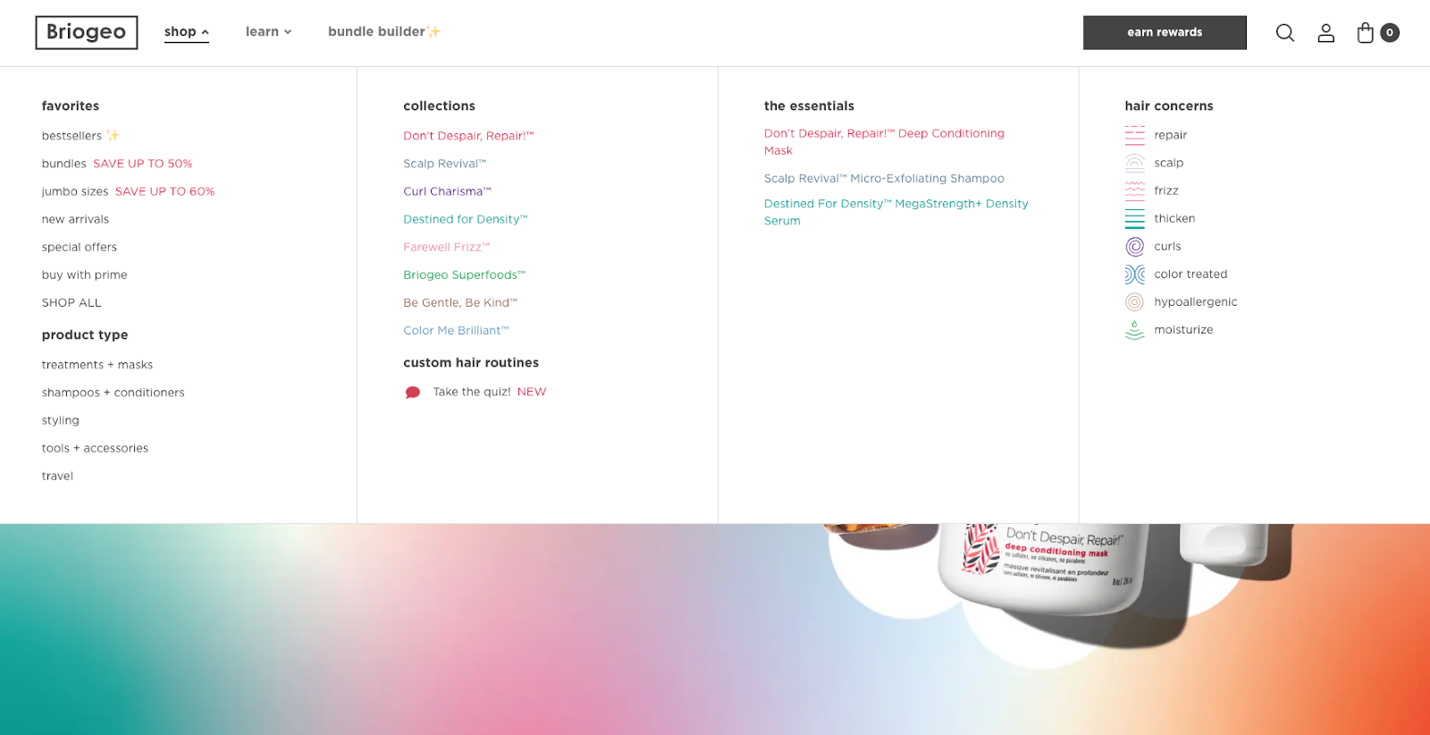
5. Briogeo
Like Patagonia, the website navigation on Briogeo.com centers on a horizontal navigation menu that reveals different navigational options depending on which item you hover over. The main “shop all” item (pictured below) shows a mega menu with site-wide links, plus images to represent its collections.
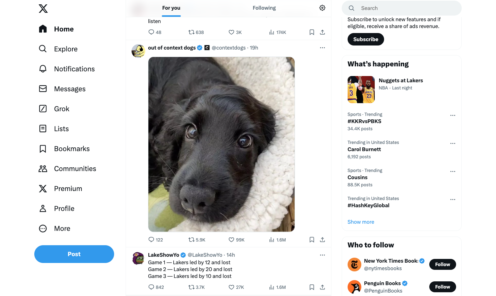
6. X (formerly Twitter)
X features one of the standard navigation types — the vertical sidebar menu — but with a twist. Instead of simply featuring text navigation items, it includes icons next to each item. Notice the strategic color use as well. The Home icon is highlighted, because that’s the page I’m on. The only other pop of color in the nav bar is the CTA button.
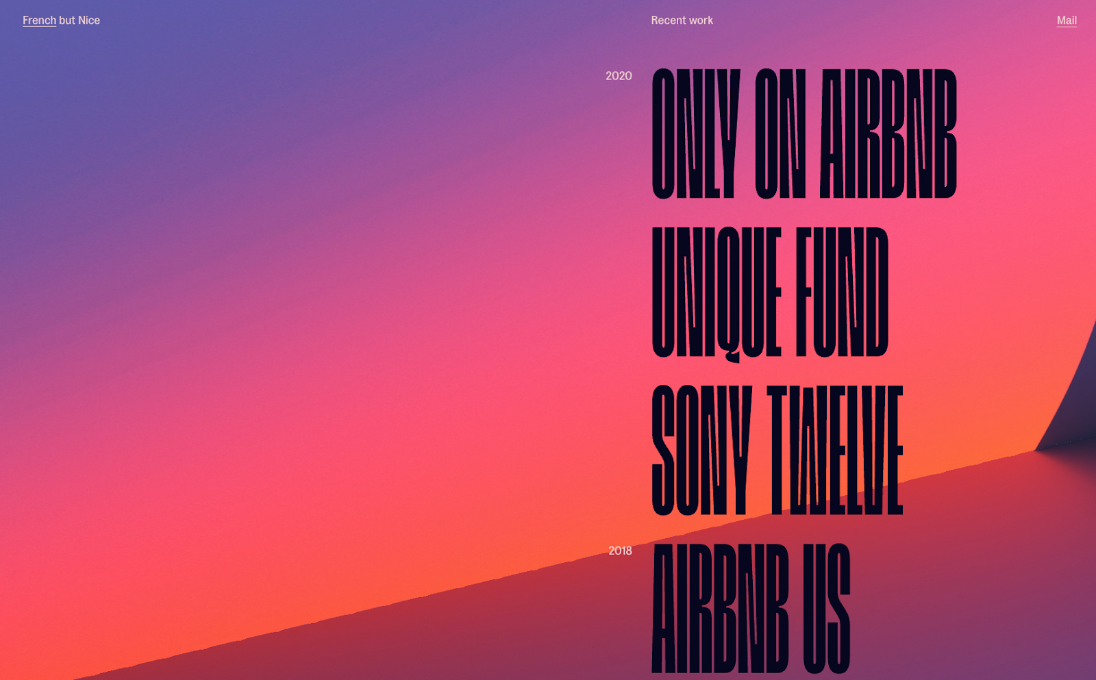
7. Olivier Gillaizeau
The portfolio site of creative director Olivier Gillaizeau features an eye-catching vertical sidebar menu that displays his projects on a timeline. When you hover over one of the nav items, a video preview of the project shows. Clicking the nav item will take you to a page with more information about and visuals of the project.
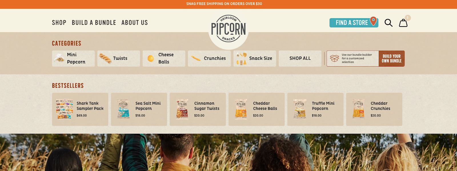
8. Pipcorn
So far, we’ve mostly discussed the functionality of navigation menus, but tweaking the styling can make for a delightful user experience as well. Take Pipcorn’s website for example — its horizontal navigation reveals further dropdowns that expand into categories that showcase their product line from different angles. Having multiple entry points — and still keeping the design fun and simple — is definitely a feat.
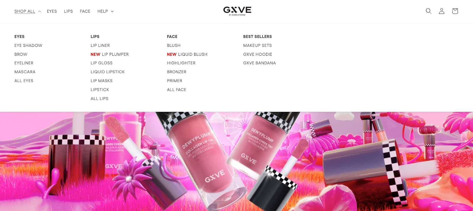
9. GXVE Beauty
The strength of GXVE beauty's website navigation is how simple it is. The font is clean, the design is minimal, yet it truly offers visitors everything that they want. If you want to shop for a specific item, you can click the “Shop” page and expand. Then, there are options to even dig deeper as you can expand the pages again.
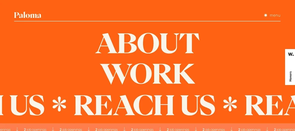
10. Paloma
This website navigation is an excellent reminder that you can infuse your site with a healthy dose of playfulness, as long as it is in sync with the rest of your branding. This creative agency takes the opportunity to tell its brand story with an animated menu when you hover over each page.
11. Living Corporate
Living Corporate‘s website navigation scores points because of how unique it is. When you arrive on the site, there’s no menu in sight — but when you click the top of the page, it expands. As you hover over the different pages, images and videos pop up, and a graphic mouse, which we appreciate as a fun detail.

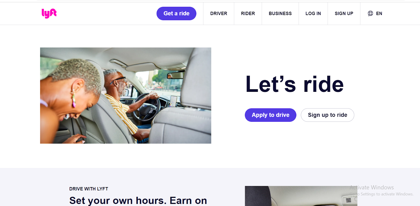
12. Lyft
Lyft has a navigation bar providing a different user experience on the website for each of its target personas. Looking inside each category, you can see that the corresponding page is curated with all the information needed for the user to start using Lyft.
This simplistic design allows for a more cohesive experience based on user needs, and there are fewer friction points as well.
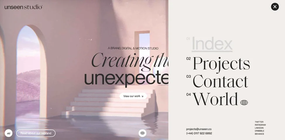
13. Unseen Studio
And last but certainly not least, let's dive into what makes Unseen Studio one of our favorite website navigation examples. The menu is tucked away in the right hand corner and when you click on it, it expands beautifully. We love the text contrast, color selected and how it works with the background image, and the addition of contact info and social links.
Now that I’ve shared some of my favorite navigation bar examples, you can understand why these websites excel. However, just emulating what these sites have done isn’t enough — there are also some best practices you’ll want to consider.
Website Navigation Best Practices
- Be consistent.
- Design for every screen size.
- Make the most important information accessible.
- Add breadcrumbs.
Free UX Research Kit + Templates
3 templates for conducting user tests, summarizing your UX research, and presenting your findings.
- User Testing Template
- UX Research Testing Report Template
- UX Research Presentation Template
The golden rule of website navigation? Don't make people think. As you can see from these website navigation examples, the more obvious it is, the better. Usability consultant Steve Krug bases an entire book on this sentiment. Follow these website navigation best practices to enable users to navigate your site without feelings of frustration or confusion.
1. Be consistent.
Consistency is key, and website navigation design is no exception. This is a crucial website navigation best practice because it can make or break a user's experience. Be consistent in how you format and design your navigation interface. This is all about aligning with the current knowledge and expectations of the visitor.
For instance, consider how visitors would feel if your homepage links were black, and an underline appeared when a user hovers their mouse over them. Then, when they check out the “Contact” page, the links are blue, and there‘s no underline. That’s confusing, right? Instead, your links should have the same style on every site page. Otherwise, visitors won‘t know which text is hyperlinked and which isn’t in your navigation menus.
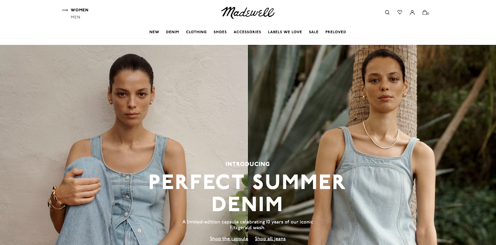
Notice that Madewell's primary and sub-navigation menus have consistent link styling. The text in the primary navigation menu — particularly the use of bold and the graphical arrow — make it clear which category you’re in. Then, the menu beneath is given the context you need.
Pro Tip: Your navigation menus must be readable for the visually impaired, so consider using high-contrast colors for the text and backdrop. These also help guide other users to follow the menus according to the categories or subcategories.
2. Design for every screen size.
With mobile devices accounting for over 59% of global website traffic in Q4 2022, it's increasingly essential your website and navigation is optimized for all screens regardless of size. And, according to Shopify, 45% of all U.S. web traffic will occur on a mobile device — so prioritizing mobile is crucial. Yes, that extends to your website navigation menus.
When designing your menu, we encourage you to think about mobile first. By starting with the smallest screen size, you'll have to prioritize what links are most important to include in your primary navigation and in what order. This is also an excellent exercise in prioritization.
You‘ll also have to decide what navigation features — like a hamburger button — are necessary on mobile and how they’ll fit into your desktop design. This will help you shift into designing for larger screen sizes with a clear idea of what pages and navigation features are most important.
Pro Tip: Websites must adapt to provide an optimal user experience, whether viewed on a large desktop screen or a small mobile device. Remember this when you arrange your menus. Try your menu with various screen sizes. Make sure hamburger menus are visible and simple to reach and that lengthy menus don't take up too much room. Keep in mind that a responsive website design modifies its layout according to the screen size.
3. Make the most important information accessible.
Are you familiar with the three-click rule? Essentially, this concept speaks to the idea that every website navigation structure should enable someone to land on any page on a website and find what they need within three clicks.
And though this concept is deeply entrenched in the world of web design, it's been largely discredited. One study found that users weren't any more likely to quit a task after three clicks than after 12 clicks. The chart below shows that some users kept trying to find their desired content after as many as 25 clicks.
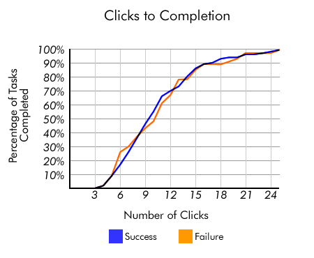
Though the rule might not be exact, the basis teaches us an important principle. You do want to limit the effort required for visitors to access key information or accomplish a task on your site.
Counting clicks is just too superficial a metric. So, instead, we encourage you to invest time in mapping your website, establishing clear pathways, reducing page load time, and removing other friction points in the user journey.
A good way to understand what your clients seek is to put yourself in their shoes. Look into why they’re on your website; for example, they’d probably like to see your product or service pages to get additional information about your company. This is why having links to these sites on your main navigation is crucial.
Pro Tip: My recommendation would be to feature” Home,” “About Us,” “Blog”, “Contact,” and “Products or Services,” but you should take a look at what works best for your specific case. You can use Google Analytics and heatmap tracking to analyze your results, determine what works, and make necessary changes to optimize user experience and outcomes.
4. Add breadcrumbs.
If you need an example of breadcrumb navigation, remember the fairytale of Hansel and Gretel. As the two travel through the woods, the children drop breadcrumbs so that they can find their way home.
Similarly, with breadcrumb navigation, visitors can visualize where they are in the website‘s structure. Then, they can retrace their steps to other pages with a simple click. And the best part of this is that it won’t take up much real estate on your site. This secondary navigation bar is typically made up of text links separated by the “greater than” symbol (>) and placed below the header.
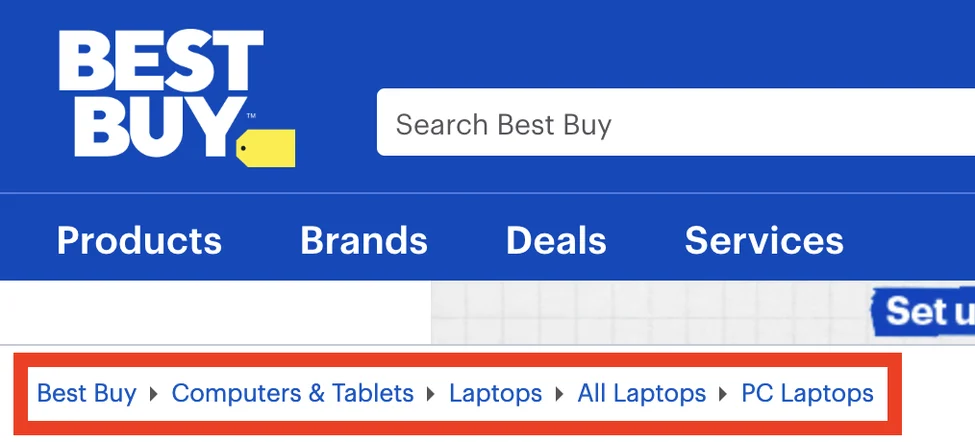
Take the example from Best Buy below, for instance. If you are browsing PC laptops and realize you want a tablet, you can use the breadcrumbs to get back to the page you need. Instead of starting over with a new query in the search box, you could click the “Computers & Tablets” link in the breadcrumb menu. Once again, the purpose here is to reduce friction and improve user experience.
Pro Tip: You can also use appropriate search terms and tags to help users find where they are. For instance, when writing about food, you can include tags regarding your recipes under particular subcategories. For example, you can put chicken piccata, chicken pot pie, and other recipes under the chicken subcategory.
For a more visual approach, you can use arrows or other graphics. If a website has a lot of content, a status bar is a simple way to let users know where they are on a page.
Designing Your Website Navigation
When you design your website navigation, you must carefully consider your visitors and website goals.
Remember: There are humans on the other side of the screen that will have to navigate through your site, and their ability to do so can significantly impact their willingness to stay.
Plus, search engine bots can also benefit from strong website navigation design.
Editor's note: This post was originally published in July 2021 and has been updated for comprehensiveness.

![What Is End-User Experience Monitoring? [+Tips For Implementing It]](https://blog.hubspot.com/hubfs/end-user-experience-monitoring.png)