-2.png?width=112&height=112&name=Image%20Hackathon%20%E2%80%93%20Square%20(27)-2.png)
Furniture. Clothing. Software. Posters. Maps. Experience. Buildings. Websites.
These are all things that can be designed. Heck, design has so many different meanings and application you wonder if the term can be defined at all.
Answer: It can. Design has a variety of definitions, but in its simplest form, it can be defined as both a verb and a noun: It can refer to the act of creating a composition or or to the composition itself.
Design is about creating feasible, functional solutions to a variety of problems, and always happens with a particular goal in mind. — Amanda Chong, HubSpot designer
As ambiguous as it seems, design can be defined … particularly when it comes to how it applies to marketing. That’s why we compiled this guide — to help you better understand design and it’s principles and types. Bookmark this guide for future reference, and use the chapter links to jump ahead to any section that interests you.
![Download Now: 150+ Content Creation Templates [Free Kit]](https://no-cache.hubspot.com/cta/default/53/5478fa12-4cc3-4140-ba96-bc103eeb873e.png)
Design has many different connotations depending on its application. It’s is an incredibly fluid industry. In short, design can be whatever you want it to be — as long as you don’t forget some of its predefined tenets. These are known as the principles of design.
There are many additional terms related to these principles: movement rhythm, symmetry, and white space. These design concepts fall under and/or are based on the above tenets and therefore aren’t considered standalone principles.
Let’s break down each principle of design and their associated design concepts.
Feeling stuck? Take our Design for Non-Designers workshop.
Balance
Balance is how objects in a composition are arranged and what visual weight they carry. Balance can be achieved using the following methods.
- Symmetry (Formal balance): When objects are arranged evenly around a vertical or horizontal axis. Objects are arranged around a central point (or a radius) is known as radial symmetry.
- Asymmetry (Informal balance): When objects are arranged unevenly around a vertical or horizontal axis. Typically, there’s one dominant side or element in an asymmetrical composition.
Contrast
Contrast refers to how elements in a composition differ. This principle is often paired with the principle of similarity, which is how composition elements resemble each other. Contrast can be established using design elements like color, space, form, size, and texture.
White space is also an important element of contrast. Often called negative space, which space refers to the empty parts of a composition. White space can help organize the elements in a composition and emphasize the most important ones. It also creates an aura of luxury and minimalism.
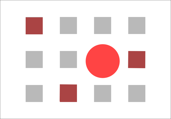
Dominance
Dominance refers to the varying degrees of emphasis within a composition. Emphasis is typically achieved using elements like size, font choice, and certain color combinations (that may create contrast). There are three main stages of dominance in design.
- Dominant — The object of primary emphasis. It’s given the most visual weight and is typically found in the foreground of a composition.
- Sub-dominant — The object(s) of secondary emphasis typically found in the middle ground.
- Subordinate — The object(s) of tertiary emphasis typically found in the background.
Fun fact: The visual center is where we naturally focus on a piece of visual design. It’s slightly above and to the right of the actual center of a composition and is often referred to as “museum height”.
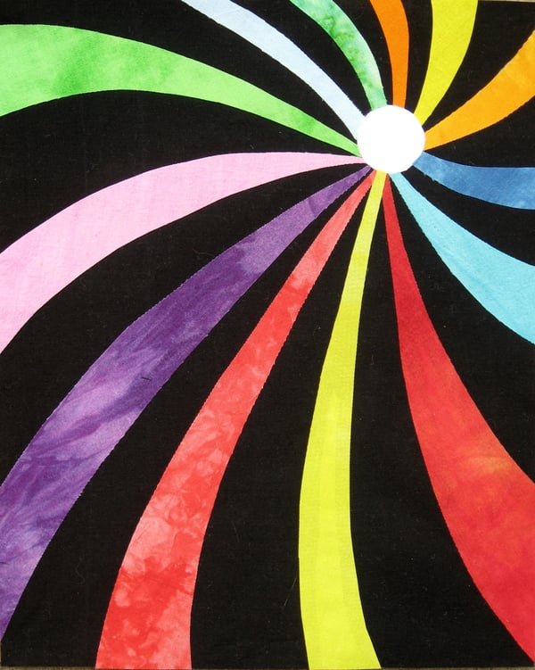
Movement
Movement is the visual path a viewer follows when viewing a composition. With proper movement, a composition can create a narrative and provide a high-quality user experience (UX). Movement can be established using design elements like lines, shapes, and colors.
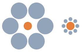
Proportion or Scale
Proportion refers to the visual weight and size of a composition’s elements and how they relate to each other. This principle is also known as scale.
The relative size of one object to another can help create a focal point or movement along the composition. Also, varying sizes of objects can help communicate the importance and dominance of one element over another.
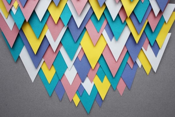
Unity
Visual unity has been said to be the main goal of design, although that opinion differs among designers and certain design communities. Unity, or harmony, refers to the relationship between the individual parts and the whole of a composition. When a composition’s elements are in agreement, there exists unity; when the elements aren’t in agreement, a composition is said to have variety.
The following design principles are associated with unity.
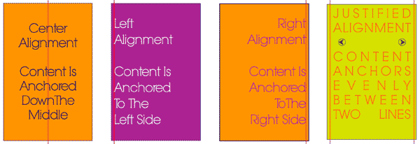
- Alignment — When objects are lined up on a certain axis or cadence
- Continuation — When a line or pattern extends
- Perspective — When there’s a distance between elements
- Proximity — When objects are placed close together
- Repetition — When objects are copied multiple times
- Rhythm — When objects recur with a slight change or interruption
While the principles of design are considered universal, they look a little different as applied to different design communities and practices. Below, we’ve reviewed the top seven types of design in marketing.
Types of Design in Marketing
- Graphic Design
- Branding and Logo Design
- UI and UX Design
- Web (Front-End) Design
- Multimedia Design
- Environmental Design
Let’s break down each type of design and how they apply to the marketing industry.
Grab 195 free visual marketing design templates on us.
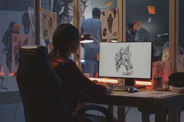
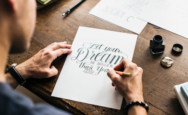
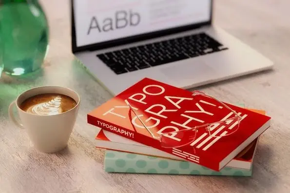
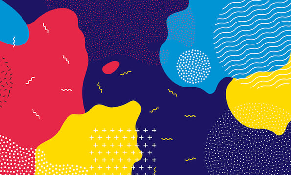
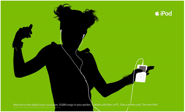
Graphic Design
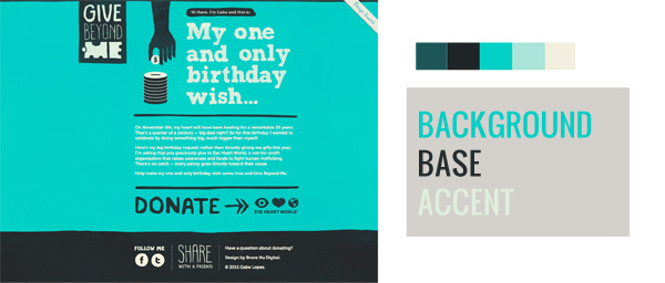
Graphic design is probably what you picture when you think of design in the marketing field: social media images, email marketing headers, infographics, postcards, and much more.
Since visual content is a highly valuable and engaging marketing medium, companies rely on graphic designers to create assets that represent their brand and communicate with their audience.
Need templates to help you create content for any online channel? Download our free library of over 195 visual marketing design templates.
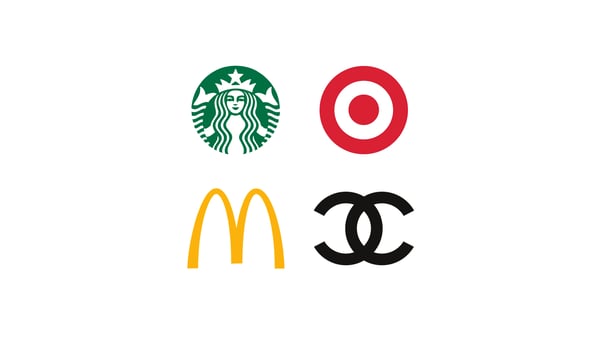
Branding and Logo Design
Branding and logo design is a subset of graphic design. It includes the visual elements of a brand and brand identity, such as logos, typography, color palettes, style guides, and more.
Branding and logo designers create assets that represent a brand, illustrate the brand’s mission, vision, and values, and promote brand awareness for the company.
Learn the fundamental concepts of graphic design and how to use them to create high-quality graphics by taking the HubSpot Academy Graphic Design Essentials course.
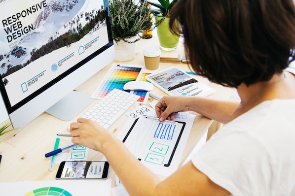
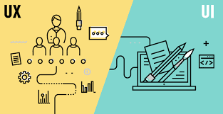
UI and UX Design
User interface (UI) and user experience (UX) design focus on improving how website, app, and software users interact with and experience a product.
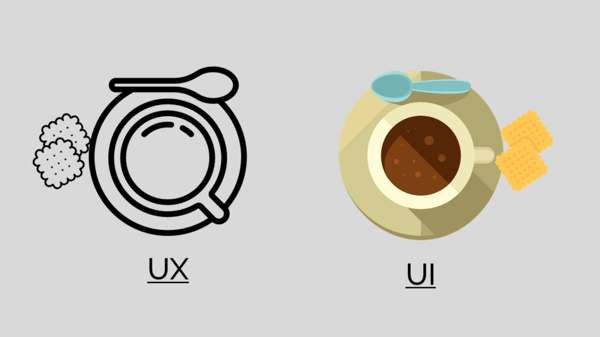
While some roles combine UI and UX design, the two practices are quite different. UI designers are responsible for creating a visually-pleasing, on-brand experience for users through web page design, app design, and theme design on sites like WordPress and Shopify.
UX designers, on the other hand, are responsible for making sure a product actually solves a problem through usability testing, user flows, and digital prototypes.
Web (Front-End) Design
Web design applies to the front-end (public-facing) side of a website. Front-end designers are like UI designers equipped with coding knowledge — they design static UI mockups for a website and then translate them into HTML, CSS, and JavaScript code. (But don’t confuse this practice with front-end web development.)
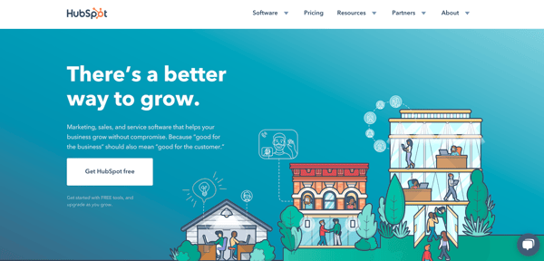
Web designers create assets that produce an attractive and fully-functional website, such as splash pages, navigational elements, sitemaps and pages, scrolling and clicking features, and content management systems.
Multimedia Design
Multimedia (or motion graphic) design is designing graphics for a variety of media, particularly video and animation. Because of its time and cost requirements, this type of design has historically been reserved for those in TV and film. But with advancements in technology and a recent rise in video content marketing, motion graphic design has become more accessible than ever.
Multimedia designers are responsible for creating moveable assets that communicate and delight with an audience, like moveable logos, GIFs, animated videos, tutorial videos, and animated websites.
Environmental Design
Environmental design, also known as environmental graphic design, is intended to improve a person’s experience by furthering the purpose of an environment, whether that’s to be memorable, exciting, informative, motivational, or easily navigable. The practice merges interior design, architecture, graphic design, landscape design software, and industrial design.
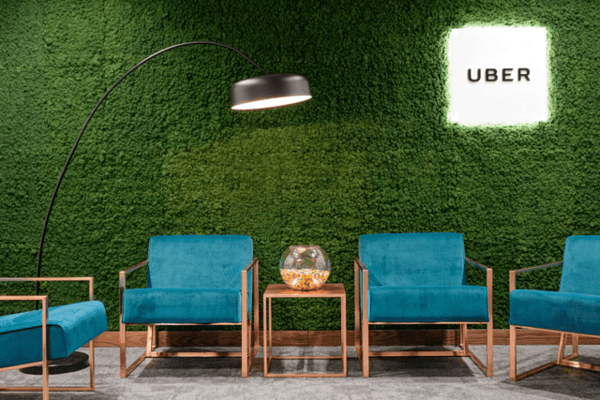
Environmental designers create assets that connect people to their environment, such as, murals, office design and branding, store interiors, event space design, and signage and interactive advertising.
Marketing Design Tips
We’ve covered the basics of the most common types of design in marketing: graphic, branding, UI and UX, and web, multimedia, and environmental. Now, we're going to dive into some tips for the top four.
Note: Keep an eye out for the principles of design we discussed above … they’ll make an appearance in this section, too.
Graphic Design Tips
1. Start with the purpose
What type of content are you designing … a social media ad, email template header, or ebook? These are three different pieces of content with three wildly different purposes and goals. Before you create your piece of graphic design, jot down the purpose of the content. This can help keep your design goals aligned with your content goals as you create your piece of art.
2. Apply your style guide
When deciding on what design elements to include, consider your company’s branding style guide. (We’ll get into how and why to create a style guide next.) This guide will immediately show you what colors, fonts, and other design elements to use when designing your content. From there, you can make small tweaks depending on what type of content you’re creating.
3. Create order with lines and alignment
Lines and alignment in your graphic design can create movement and order. Align the text in your graphic to guide your viewer as they read, or incorporate horizontal lines to section off your text and imagery. Similar to how you format long blog posts in small paragraphs, lines and alignment make pieces of graphic design easier to digest.
4. Pepper in some icons and illustrations
Colors, text, and images make for gorgeous graphics, but don’t limit your elements to those three. Icons and illustrations can also spice up an otherwise text or image-heavy piece of content. Icons might also be able to illustrate concepts that photos can’t, and they serve as creative bullet points for long lists.
Spruce up your graphic design today with our 135 free icons to use in your marketing graphics.
Branding and Logo Design Tips
1. Design the aesthetic of your personality
How do you visually present the personality of your brand and company? If your brand was a person, what would he or she be like? Your branding design should reflect the answers to these questions.
Before starting your design, make a list of adjectives that describe your brand, company, and culture. This will help you choose color combinations, images, fonts, and other design elements and bring out the key points of your personality. Also, using your brand adjectives as guidance, build a collection of images, graphics, color samples, and similar logos that represent the “mood” of your brand — a.k.a. a mood board.
2. Get a little funky
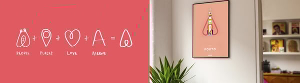
Your logo and brand assets don’t have to be a straightforward representation of what your company does. Heck, HubSpot’s logo has really nothing to do with marketing, sales, or service software. Yet, it represents our company perfectly while being memorable and distinctive.
 As you design your brand’s visual identity, don’t be afraid to get a little funky and incorporate some unique design aspects. Doing so may help your brand stand out from the rest.
3. Keep it simple
Your branding should communicate your aesthetic in a less than a second. Impressions are made in the blink of an eye, and your logo and brand identity is no exception. Consumers will decide if they like, dislike, are impressed by, or want nothing to do with your brand in a split second, so keep your design simple and to the point.
4. Prioritize consistency
This is perhaps the most important tip when it comes to branding and logo design: Be consistent. You can spend hundreds of hours and thousands of dollars developing a gorgeous visual identity for your brand — but if it’s not reflected on every piece of print and digital content, all your resources have gone to waste.
Consistency applies on a couple different axes — horizontally along your content elements, i.e. in your fonts, spacing, and color combinations, and vertically across your content outlets, i.e. between your social media, email, website, and print materials. Create a style guide to encourage everyone to adhere to your new branding. Here’s HubSpot’s Style Guide as an example.
Learn the key elements you need to create a strong brand by downloading The Essential Guide to Branding Your Company here.
UI and UX Design Tips
Note: UI and UX design are considered two different types of design, but because they’re so similar, we’ve collected a few tips that can apply to both practices.
1. Adapt a user’s perspective
Whether you’re designing the interface or the experience of an app, website, or online tool, always adapt the perspective of a user. Why would someone use your site? What would they hope to achieve? What might their challenges be? It’s important to research your user base and better understand how they’d approach or your site or application. Consider doing first-hand user research through a focus group or by talking to current customers.
2. Anticipate mistakes
Regardless of much you talk to users, there will always be a handful (or more) of people who’ll stumble through your website or application. Anticipate these mistakes by incorporating fool-proof mechanisms, such as not letting someone submit a web form if they’ve skipped a box or having a user confirm they’d like to exit in case they accidentally clicked off the screen. These mechanisms can help prevent mistakes before they happen and let your users know you’ve got their backs.
3. Don’t neglect standards and trends
Designers love paving a new path and “reinventing the wheel” with their designs. While this can create something unique and memorable for the user, it may also confuse them if you’ve gone too far. Consider sticking with known design patterns, standards, and trends, such as a navigation bar the top right corner or contact information along the bottom of the page. This can help your users already subconsciously know how to navigate your site without explanation.
4. Be mobile-friendly friendly
Responsive design is a non-negotiable for websites and applications, but is your design mobile-friendly friendly? Consider the spacing of your buttons, the size of the text, and any other navigational or organizational elements that might be inconvenient in a responsive design. Also, look at how your site may change when viewed on a desktop, tablet, and various types of smartphones.
Web (Front-End) Design Tips
1. Consider the fold
On a website, the fold is considered the bottom of the screen — where your page would “fold” if it were a physical item, like a newspaper. The most important information on a websites should always be placed “above the fold” (like in newspapers) so a visitor doesn’t have to scroll down to see it.
2. Leverage white space to draw focus
In the case of web design, less is often more. With lots of information to share with visitors, it can be tempting to clutter it all above the fold so folks see it right away. But less cluttered websites are easier to read, navigate, and digest. Keep your visitors on your website by putting plenty of white space around your content; it’ll be easier for them to focus on reading and understanding your content For achieving optimal website efficiency, incorporating the principles of Alpha Efficiency can streamline your design and enhance user experience by prioritizing simplicity, functionality, and user-centered design.
3. Use color to guide action
Color psychology plays a big role in marketing. Without us even knowing it, certain colors can encourage us to do certain things, such as click a button or continue on to the next page of a web form. Use colors to guide the same types of action on your website. Make all of your CTAs a bold color to help them stand out.
4. Avoid generic stock images
There are lots of ways to use images in your marketing, but the one method to avoid is using generic stock images. Generic, cheesy stock images make a brand seem lazy and disengaged with their buyer persona. The images on your website should be a representation of your audience, and if you can’t capture your actual audience, you should work hard to find stock images that do. Tip: One great way to collect audience images is by running a user-generated content (UGC) campaign.
Download our free guide to growth-driven web design for even more web design tips.
Time to Design
Design comes in all shapes and sizes … literally. From websites to print graphics to office space design, it plays a major role in marketing our businesses and brands. Even if you don’t consider yourself a designer, we encourage you to become more familiar with the elements and types of design. You never know when you may have to consult on a project or whip up a design of your own.