When I first moved into marketing, I was transitioning from an admin role at the same company — and honestly, it was a genuinely exciting time (yes, I’m a nerd). Even though marketing only filled two of my five working days back then, it felt like freedom. I was finally doing the work I’d been curious about for years.

Because of that, I’m largely self-taught. I took courses, started a blog in my spare time, experimented on my own social channels, and went deep on Pinterest. I applied everything I learned to the company I worked for — alongside designing endless PowerPoint decks for corporate workshops and print materials for in-person events.
In reality, I was a one-person marketing band. Repurposing became essential, and that’s where my love of infographics began. One well-designed graphic could live everywhere: blog posts, Pins, social content, presentations, even print. Whether it’s a funnel breakdown or a customer journey map, great infographics make complex ideas simple — and shareable.
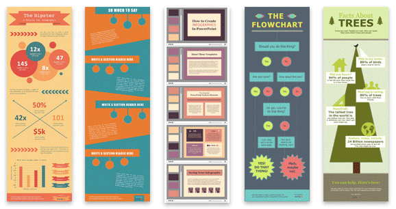
In this guide, I’ll walk you through creating an infographic in PowerPoint. Even better, I’ll throw in some helpful tips and give you examples of different types you can work with using our 15 fabulous infographic templates for free within PowerPoint.
Table of Contents
- How to Create an Infographic in PowerPoint
- Marketing Use Cases for PowerPoint Infographics
- PowerPoint Infographic Tips
- Are PowerPoint infographics useful for marketers?
- PowerPoint Infographic Examples
Marketing Use Cases for PowerPoint Infographics
PowerPoint infographics are a powerful tool to present data-heavy information in an accessible, digestible format — no matter if you plan to disseminate the infographic digitally or in person.
You can also simply use PowerPoint as an infographic maker if it’s your preferred design software.
Here are some of the ways I like to use PowerPoint infographics:
15 Free Infographic Templates
Build better infographics with these free designed templates.
- Color schemes
- Icons & shapes
- Fonts
- Eye-popping themes
Download Free
All fields are required.
Form not available
1. Presenting a Case Study
I’m a big fan of using case studies to get buy-in from clients, stakeholders, and prospects. I take this approach because it demonstrates social proof. You’re essentially building trust by showing what you can do, rather than just telling people what you could do. Infographics go beyond this, though.
In my experience, it’s unlikely that clients or employers will add specific results into reviews, recommendations, or testimonials. But with a case study, you can choose to showcase the particular results that will speak best to the audience you’re presenting to. I also like to back up my case studies with relevant results and client testimonials.
I’m saying this as if it’s easy to write a beautiful, readable case study. It’s not.
Half the battle is choosing a relevant project and curating the data based on what you need to achieve from your presentation. The other half is presenting the information in a way your audience can quickly digest and understand.
To help with the latter, I suggest creating a PowerPoint infographic showcasing the key facts of your case study. You can include key information such as the problem your customer experienced, the solution you served, and the outcome.
You can include aesthetically pleasing graphics and dynamic typography — something you may not be able to include in a traditional, one-page case study.
2. Presenting Research
I’ve worked as a business development administrator, a content manager, and a one-human marketing band. All of these roles have required that I present research to clients and stakeholders.
For example, I’ve had to present research to get approval for social media and content strategies from the mighty guardians of the budgets — CEOs, founders, directors, the rest. As a freelance writer, I often present data, trends, and research in my content.
If you’re in the same boat, you’ll be happy to know you can use all the data visualization options PowerPoint offers to present your data in a digestible way.
Since the infographic will be larger than a typical slide, you can be as descriptive as you want. However, if you’d like to reuse the same information, you only need to copy it into a new presentation.
Pro tip: HubSpot’s Content Hub is all-in-one, AI-powered content marketing software that helps marketers create and manage content. You can start for free here.
3. Presenting a Pitch
Similar to case studies and research — both of which should encompass any good pitch — you can use PowerPoint infographics to present a pitch to stakeholders or potential buyers.
In my experience, pitches need to cover a lot of ground and build trust — fast. For the trust element, I like to draft in case studies and previous client recommendations.
I also like to add research that I’ve conducted specifically for the person(s) that I’m pitching to. So if I’m pitching a content strategy, I’ll share relevant competitor or keyword research I’ve done for that specific company.
Infographics will also be your best friend here. I recommend including data points, testimonials, expected results, and even descriptions of the prospect’s problem to emphasize the importance of purchasing your solution.
Images and graphics can be more effective than just words. And since you’re in PowerPoint, you can create an infographic of any size, including the horizontal 16:9 dimensions.
Want to create sales presentations that actually sell?
HubSpot’s free sales training lesson shows you how to answer prospects’ questions, focus on their needs, and motivate them to buy.
4. Presenting a Multi-Step Process
As a content manager, I guided a global team of eight wonderful humans across roles such as research administrators, content writers, PR specialists, and designers. As you can see, I oversaw different specialists. But I also oversaw multiple projects.
One of the biggest challenges I faced was kick-starting new projects and getting team members moving in the same direction. To clarify, my team was AMAZING. But this is always, always the challenge with anything related to project management.
To lessen the information overload of introducing new processes or projects, I found visual communication the most effective medium — especially when there were language barriers. And this is where PowerPoint infographics come in. PowerPoint comes packed with plenty of “process” graphics, such as text-filled arrows, cascading charts, and grids.
5. Presenting an Announcement
A complicated company announcement — with many moving parts or components — merits an infographic to make it easier for stakeholders to read and understand.
You can create one right in your PowerPoint presentation and include all pertinent information on a single convenient slide.
Alternatively, you can use PowerPoint as a design tool and download your infographic for effortless saving and sharing.
Did you know you can upload your PowerPoint presentations to HubSpot?
Just head to Library > Files, click Upload files, and select your PowerPoint from your computer — or simply drag and drop it in. Once uploaded, you can add it as a downloadable link in emails, landing pages, or blog posts.
Keep in mind that files are public by default, so if needed, you can adjust the visibility settings in HubSpot.
How to Create an Infographic in PowerPoint
- In the Design Tab, adjust the Slide Size to best fit your infographic.
- Map out a basic layout.
- Find a graphic that fits your data.
- Finalize your infographic layout.
- Start inputting relevant information.
- Edit the text and imagery of your SmartArt graphic.
- Adjust the color scheme to match your story.
- Add finishing touches and polish the layout.
Okay, now you know the different uses for PowerPoint infographics — time for me to show you what you’re here for.
To improve comprehension, I’m going to walk you through creating a simple timeline-esque infographic in PowerPoint.
The timeline infographic is inspired by a white-label content strategy I was recently commissioned to create. For context, it was an annual roadmap for a specific content hub. I presented the strategy as a slide deck. But I designed the executive summary as an infographic.
1. In the Design tab, adjust the Slide Size to best fit your infographic.
To begin making an infographic from scratch, you have to readjust the size of the PowerPoint Slide to give you more space to work with.
Begin by opening a new PowerPoint. In the top navigation bar, click Design, then select Slide Size.
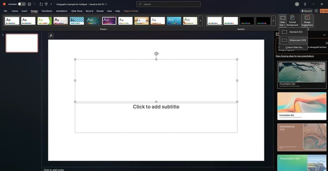
Then, in the drop-down menu, select either one of the predetermined sizes or click Custom Slide Size.
Then enter your preferred width and height and click OK.
Here’s how I customized my slide size. Because I’m creating an infographic, I wanted my slide to be Portrait, so that’s what Orientation I selected. I also set the specific dimensions to 25.1 cm (Width) and 76.2 cm (Height).
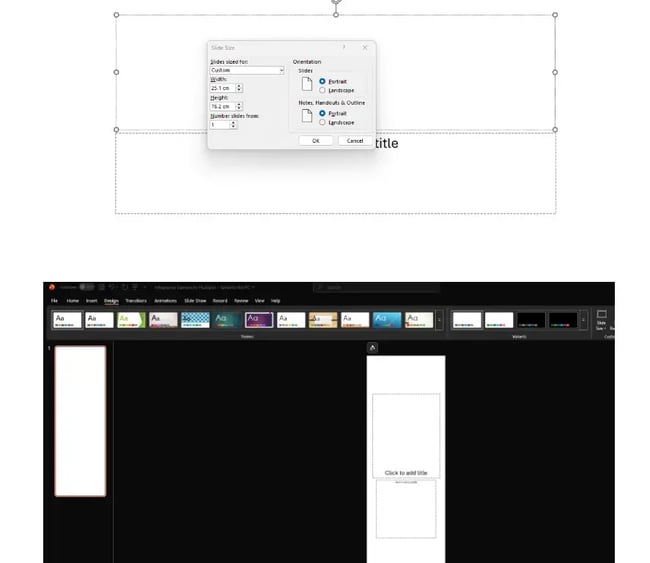
After I clicked OK, I was asked if I’d like to “Maximize slide size,” or “Ensure fit.” I chose the latter.
As you can see, my canvas looks more like an infographic now than a standard PowerPoint presentation.
2. Map out a basic layout.
Before I get started on any design, I like to map out a basic layout. It doesn’t have to stay like this. The layout may evolve as I get further into the design. But it at least gives me a starting point to work with that isn’t the anxiety-inducing blank canvas.
As I’m creating a timeline infographic for the executive summary of an annual content strategy, I broke the design into quarters — Quarter 1, Quarter 2, you know the rest.
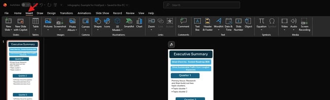
To start with, I selected Insert from the menu, as this is where most of the customization options live.
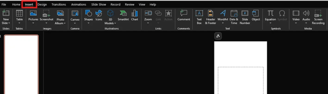
At this point, I wanted to add headings and text boxes to my layout. So I decided to work with what was already on the canvas. My goal was to divide the four headings and textboxes into quarters.
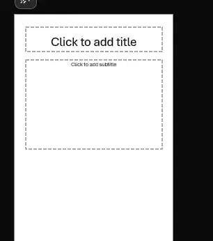
If, like me, you’d like to customize your text boxes, all you have to do is highlight each one and right-click it for customization options. I did this now because I wanted to achieve some uniform formatting for each “quarter.”
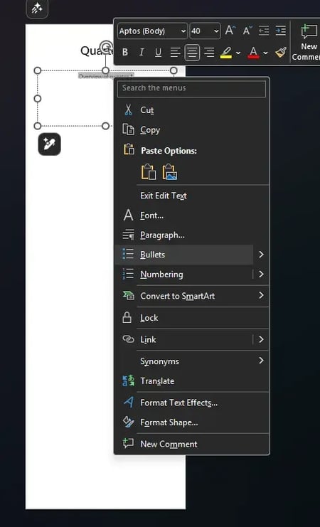
You can also achieve the same thing by selecting the SmartArt icon beneath the navigation bar, where you’ll find several categories of graphics to choose from.
Plot twist: At this point, that’s what I decided to do because it would save a bit of time I’d spend formatting. The design process is fluid. It’s all about trial and error… I told myself as I completely changed the direction of travel.
3. Find a graphic that fits your data.
Once you click on SmartArt, you’ll find the options from lists to pictures. I picked the Vertical Bullet List one for my needs:
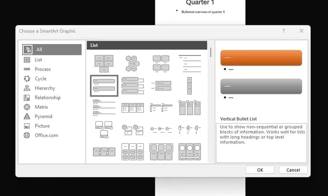
I wanted more control over the customization, so I deleted one of the shape templates and duplicated the one I left in that I had customized to my specifications.
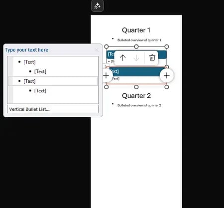
As you can see, my outline needed some work, but I had something to get started with.
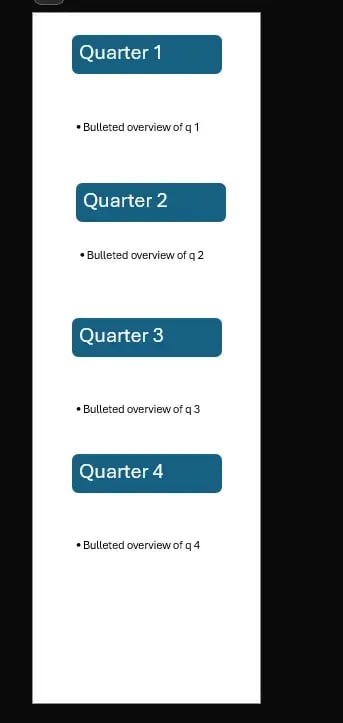
4. Finalize your infographic layout.
At this stage, the goal is to finalize your layout, rather than add specific data points — that comes next.
One thing I realized as I mapped out my infographic was that I didn’t have a clear heading to communicate the purpose of my design. So that’s something I added during this step.
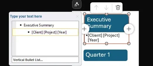
To do this, I used the same SmartArt (Vertical Bullet List) and customized the box and text sizes, as well as the colors of each, to my needs. I also removed the bullets from the second box as I wanted it to be a subheading.
I took this approach to maintain similar formatting without having to replicate it from scratch in a new graphic.
Here’s a specific example of one of the customizations I did. I selected the box I wanted to use as a subheading, right-clicked, and selected Size and Position.
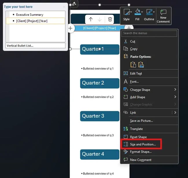
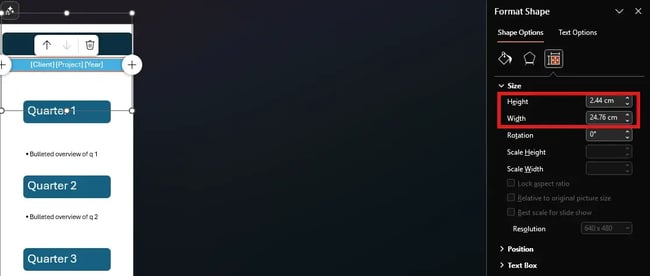
I then reduced the height and width to make it evident that it was a subheading related to the heading above it.
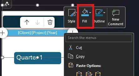
I also changed the color. It follows the same color theme, but it is a lighter blue once again to distinguish it as a subheading.
At this stage, I had designed a layout that I was happy to repeat for each quarter section.
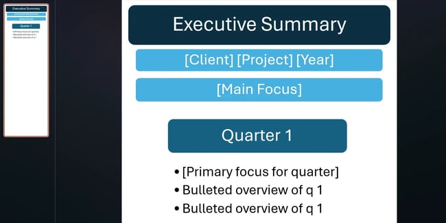
So the next stage was to highlight the layout box for the Quarter 1 section, right-click, select Copy, and then begin pasting.
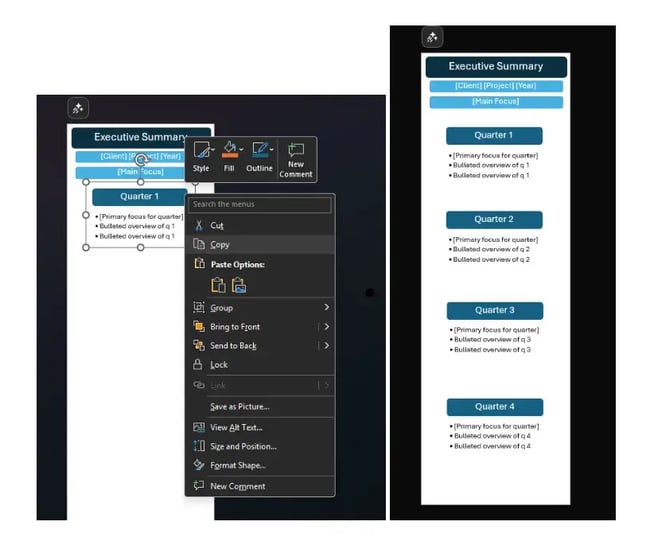
I mapped out where each quarter would sit within the layout. However, I didn’t spend too much time on this. I’ve created enough designs to know that each section of this will likely change in size and position depending on the amount of information needed per quarter.
5. Start inputting relevant information.
Now it’s time to start adding the relevant information into your infographic. To save boring us all to tears, I will work through the rest of the tutorial showing how I finalized up to “Quarter 1,” rather than the entire infographic.
As you can see below, when I started adding text into the Type your text here box, the formatting changed. So this is something that I had to amend as I went.
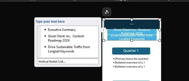
6. Edit the text and imagery of your SmartArt graphic.
To reformat the design so that all the text was visible, I hovered my cursor over the center dot (where the arrow is below), left-clicked, and dragged the box until more of the text appeared.
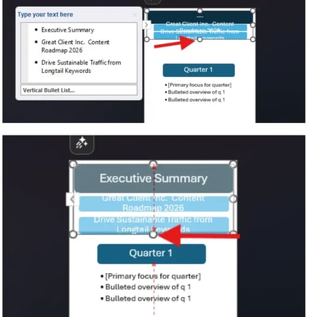
Then I selected each section of text, right-clicked, and began reducing the font size. I also increased the height of the text boxes using the same method outlined in Step 4.
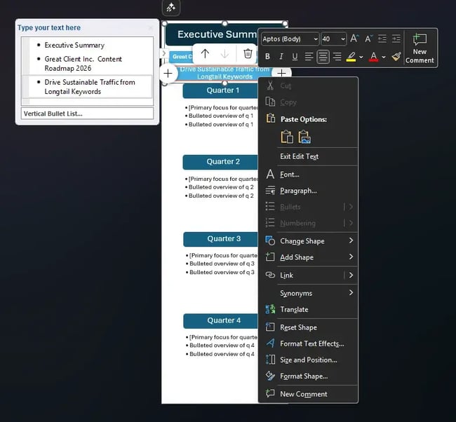
Then I moved the Quarter 1 section to the left of the infographic. I did this to make space to add an image. Warning: I didn’t do anything super fancy here. I took this next step to show you how you can add more graphics to your infographic, if you’d like.
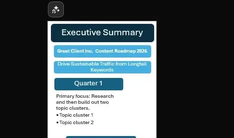
To add an image, I clicked Insert and then selected Icons.

I then typed “research” into the search bar, selected an icon, and clicked Insert.

To reformat the graphic, I selected it and then used the image box to resize and reposition the icon. But you can also use the Format Graphic options available on the right-hand side of the design.

I won’t lie, I have done A LOT of repositioning and resizing so far. It’s taken some time to put together the first section alone. You can save yourself this time by using a pre-existing template.
Something like HubSpot’s SWOT Analysis Template, for example, would help you assess strengths, weaknesses, opportunities, and threats — plus, it includes a step-by-step guide, a real-world example, and a customizable worksheet to turn insights into action.
Get it now to save time on designing.
7. Adjust the color scheme to match your story.
Before I finish up the tutorial, I want to show you how to customize the colors of your infographic.
To change the color scheme, I clicked the first SmartArt design, which brought up the Format Shape options on the right side of the screen.
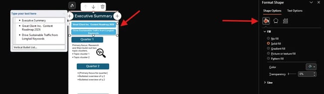
To change the color, I clicked the paint pot icon and then selected Color. I chose the plum color to highlight more of a contrast between the color schemes.
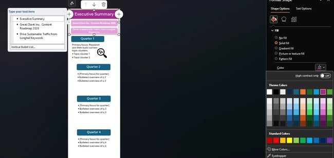
Note: You must select each section within the SmartArt and the text boxes to customize their colors. You can’t do it all in one go.
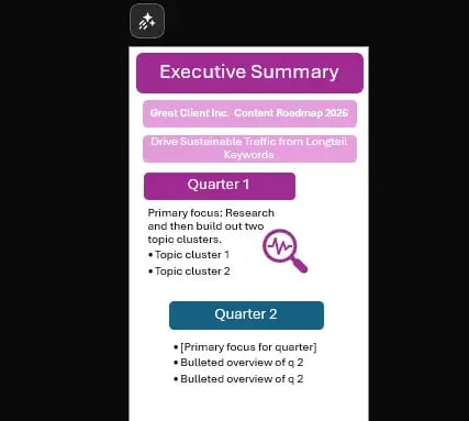
8. Add finishing touches and polish the layout.
Now it’s time to fine-tune your infographic. Basically, you can design your infographic however you want — adding background colors, more visuals, or other elements to make it stand out. This was just a basic example, but there are many ways to refine it and make it look even better, more interactive, and more catchy.
If these “design” things are not your cup of tea, you can download HubSpot’s infographic templates that open directly in PowerPoint so you can start creating faster and easier.
PowerPoint Infographic Tips
1. Keep your infographics simple.
I’m a big advocate of the K.I.S.S. (Keep It Simple, Sweetheart) approach for everything I do. Whether it’s content strategy, writing, or design, I think we (me included!) often overcomplicate things when simple is usually best. But this really rings true for anything visual, like graphic design.
That’s not to say that simple is always easy. In my experience as a visual creative, simple is actually the hardest aesthetic to achieve. Nine times out of ten, it’s a muddled design that boasts too much information, ill-fitting photos, and unnecessarily long sentences.
When designing your infographics, keep sentences short and only include the most crucial information. Imagery is helpful, but don’t go overboard. Ask yourself whether this image or icon helps illustrate your point or is just distracting.
2. Use complementary colors.
Ok, this is the HARDEST lesson I have had to learn about creating impactful graphics (just don’t ask me about my abstract art)… You don’t need to, and really shouldn’t, use every single crayon in your crayon box.
Trust me, I hate that this is true, but most of the time, it just is.
Instead, I recommend using a scheme that has 3–4 main colors that complement each other. Aside from not using too many colors, I also don’t recommend using ones that clash. Otherwise, your infographic will look too busy and will distract from the information you’re trying to convey.
That said, I always emphasize that there’s a time and a place to break the rules. So if using lots of color is your jam, you could make it work. But if you’re a beginner, you’ll most likely need a design pro to help.
If you work for, or run, a company with established brand colors, save yourself some hassle and use those. That way, your infographic will fit with your organization’s aesthetic. I actually did this recently for a content strategy deck I’d designed. It was white-label work, so I saved myself a headache and used the agency’s color scheme.
3. Jazz it up with icons, borders, and fonts.
I know I said to keep it simple, and you should… but that doesn’t mean you can’t have a little fun with icons, borders, and fonts.
You still want your image to stand out, so consider incorporating these elements (sparingly) to leave a lasting impression on your audience. As I mentioned in the first tip, ask yourself if what you’re adding creates impact or just distracts from the information you’re trying to communicate.
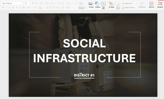
I think District #1’s presentation, shown below, strikes the right balance. The lined border on the category slide does draw your eye to the information. It doesn’t add confusion to the design.
4. Emphasize numbers.
Ultimately, this tip depends on the type of infographic you’re designing. The example infographic I created in the step-by-step guide above didn’t include many numbers. That’s because it was for a broad-brush stroke overview of an annual content strategy.
But if I were doing an annual content report (i.e., reviewing how the above roadmap actually worked out), I would be relying heavily on numbers.
In that case, I’d use my color scheme to emphasize crucial numbers when presenting the quantitative data. For example, I’d use the boldest and/or brightest colors to draw viewers’ eyes to the numbers.
You could also use shapes, such as circles or squares, to further highlight the information.
Are PowerPoint infographics useful for marketers?
Absolutely. A well-designed infographic in PowerPoint can make a huge difference in how marketing data is received.
From experience, visuals help a lot with these three things:
1. Presenting Results & Pitching
A study reviewing the effects of text illustrations found that people following directions with illustrations perform 323% better than those following directions without illustrations.
It makes sense, then, that a clear, data-driven infographic outlining a roadmap for “why” and “how much” makes budget requests simpler to understand — and more likely to get approved.
In my experience with being pitched, I tend to remember more of the information when it’s paired with a relevant infographic. So when pitching clients and sending proposals myself, I will favor a compelling visual story over long blocks of text.
2. Aligning Teams on Strategy
Infographics keep marketing plans from getting lost in translation across departments. Speaking from experience — laying out a strategy without visuals or a solid presentation is a waste of breath. People hear it, nod, and forget five minutes later.
And if we consider that our brains process images up to 60,000 times faster than text, it’s easy to see why infographics are such a powerful tool for communication and understanding.
Plus, when the team hits a roadblock or blanks on something, they can always reopen the presentation and quickly find what they need without back-and-forth.
3. Internal Training & Onboarding
A quick visual guide can be more effective than a lengthy document when training new team members.
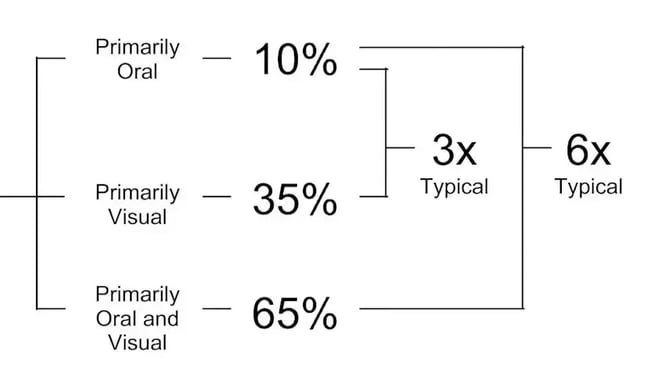
Dr. John Medina says we forget 90% of what we hear after three days. But throw in a picture, and suddenly, we remember 65%.
Want to generate even more leads with visuals and other marketing tools? Try out HubSpot Marketing Hub — a leading AI-powered marketing software, and drive revenue with memorable campaigns.
PowerPoint Infographic Examples
1. Data-Centric Infographic Example
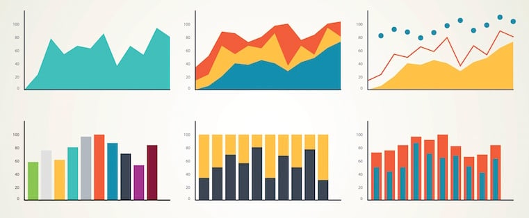
Data-centric infographics like this template usually include multiple charts and graphs that you can easily update with your own data.
In the example I’ve shared below, you can right-click on a graph, choose Edit Data, and then customize the values in an Excel spreadsheet.
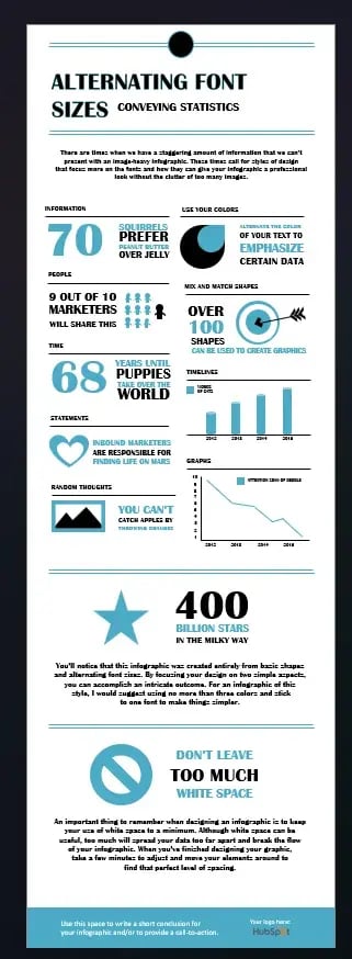
What to Add to a Data-Centric Infographic
- Column chart. Use for comparing different categories or for showing changes over time (from left to right).
- Pie chart: Use for making part-to-whole comparisons. (Note: They work best with small data sets.)
- Line graph. Use this visualization to show data that changes continuously over time. Ideal for displaying volatility, trends, acceleration, or deceleration.
- Doughnut chart. Use a pie chart. This stylistic variation allows you to put a number, graphic, or other visual in the center of the chart.
- Bar chart. Use a column chart. (The horizontal bars make it easier to display long category names.)
What I like: I love that this infographic uses a simple color scheme with complementary pairings. This is necessary because the design presents a large amount of quantitative and qualitative data. If the infographic had too many colors that clashed, there would be visual disharmony, and the data would be harder to read and digest.
When to use: Broadly speaking, data-centric infographics are ideal for, you guessed it, presenting a lot of data in one go. For the specific template above, I recommend using it to collate a bunch of related but distinct statistics in one place. So to visualize themed statistics (like why infographics are amazing!) in a blog post, for example.
2. Timeline Infographic
Telling the history of a particular industry, product, brand, trend, or tactic can be an excellent topic for an infographic. In the spirit of “Keeping it Simple, Sweetheart,” a timeline is the easiest design method for showing the passage of time.
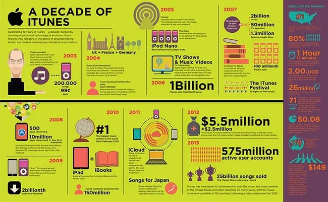
Timeline Infographic Best Practices
- Research. Research. Research. The best timeline infographics aren’t just beautifully designed — they also tell a great story based on extensive research. So, before you start the design phase of your infographic, put in the time to surface the best information possible.
- Narrow the scope. Timelines that cover hundreds or thousands of years can certainly be interesting, but they can also require weeks or months of research. To keep your sanity, stick with shorter time periods.
- Keep your copy concise. Infographics are supposed to be visual. If you find yourself writing 100+ words for each date on your timeline, a blog post may be a better content format.
Why I like it: I like this infographic because it goes against the familiar vertical layout, in favor of a horizontal one. This, paired with the bright green color scheme, naturally catches my eye, making me want to explore all of the information included on the graphic.
When to use: When consolidating marketing activities, I recommend using a timeline infographic as a visual roadmap. For example, you could map out the project timeline for a content strategy, detailing each step and the reasoning behind it.
3. Modern Design Infographic
Here, we focused more on making the design feel dynamic instead of sticking to strict straight lines. If you’d like to add more charts or change the existing one, go to Insert > Chart and pick the style you want.
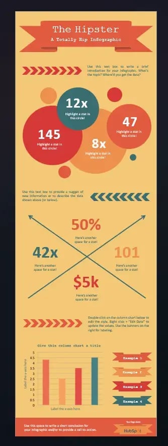
Modern Design Infographic Best Practices
- Experiment with new color palettes. There are tons of free color palettes online. Do a Google image search for “Color Palette.” When you find a palette you like, drag the image directly into your PowerPoint presentation.
- Next, select the Color Fill bucket, choose More Colors, and click on the eyedropper icon. With the eyedropper tool, you can select colors from your palette and use them for elements in your infographic.
- Take the time to manipulate shapes. PowerPoint has an extensive library of shapes — including banners, ribbons, and arrows — that you can use in your infographic design.
By clicking and dragging on the little yellow diamonds that appear on these shapes, you can customize them. For example, you can make the pointy ends of a ribbon longer or shorter. You can also make the body of an arrow thinner or thicker.
What I like: I love this infographic because it presents a ton of quantitative data without putting the viewer to sleep. I also think the color scheme is modern enough to keep the design visually appealing, but classic enough not to distract from the information presented.
When to use: If you have to present a lot of numbers in a short time, I recommend this or a similar infographic. I would personally use this infographic as an executive summary that recaps the main numbers from an end-of-year marketing report.
You could also use a modern infographic to help you display both quantitative data and text. Ultimately, that depends on the specific template design.
4. Flowchart Infographic
Flowchart infographics can help you present new workflows to your team or walk people through decision-making.
I also appreciate when people use funny flowchart infographics on social media as a playful way to show when a conclusion is self-evident. “Is cake amazing?” for example. Who among us is saying no?
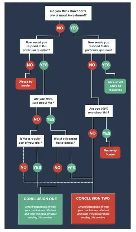
Flowchart Infographic Best Practices
- Draw out the branches beforehand. Before you dive into PowerPoint, get out a pen and paper and do a rough outline of your flowchart. Test for weaknesses in your logic by answering questions in every possible combination and seeing where you end up.
For best results, have a friend or coworker run through the flowchart, too.
- The smaller the scope, the easier the execution. The more questions or stages you add to your flowchart, the more difficult it will be to create (and the harder it will likely be for viewers to understand). So, try to narrow the focus of your flowchart.
What I like: The art of a flowchart is to walk people through a decision or process without adding anxiety to the experience. So I like that this template isn’t completely overloaded with different questions or stages. There’s enough of them to tell a detailed story, but also enough space to take a breath in between each stage — and thus, digest the information on the flowchart.
When to use: I personally love using infographic templates to map out a process, including the team members or departments responsible for each stage.
For example, when I was an office administrator, I created a workflow infographic that walked multiple departments through a paperwork compliance process. I included steps for “If X happens, return paperwork to Y person/department.” By visualizing it this way, we all (finally!) signed off on a process that had been in the making for about six months.
5. Side-By-Side Comparison Infographic
We know sometimes you need an infographic to demonstrate a comparison. That’s why we created the side-by-side comparison infographic template to make it easy for you to compare and contrast two different things.
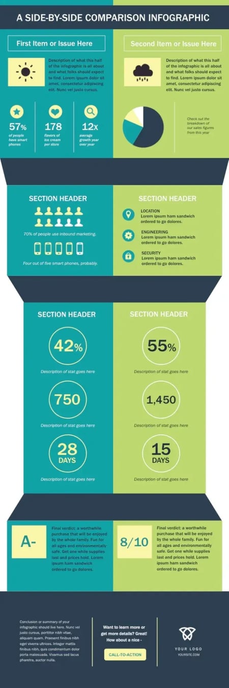
Side-By-Side Comparison Infographic Best Practices
- Use appropriate data. It’s best to use data that can be easily represented in a chart. Use pie charts, graphs, or other data points to clearly and fairly compare and contrast.
- Use borders. Adding borders to your images will make them feel like they’re part of a cohesive design. In PowerPoint, you can control the size, style, and color of borders under the Format Picture tab.
- Save your infographic as a PNG file. This is a best practice for all infographics, but is particularly relevant when publishing an infographic that contains photographs. The PNG extension offers better quality than other options. To save your finished infographic as a PNG file, choose File > Save As… and select PNG from the dropdown.
Ready to create your own side-by-side comparison infographic? Download 15 free infographic PowerPoint templates to get started.
What I like: When comparing anything, you need to take a balanced approach. For example, if you wanted to compare two specific marketing tactics, you’d look at the pros and cons of each. With this in mind, I love that this comparison infographic is visually balanced. Each side has a similar amount of designated space for each section of the design. And even the coloring pairings create balance between the opposing sides.
When to use: I like to use side-by-side comparison infographics to explain the similarities and differences between two approaches. I’ve also seen image-heavy variants of this type of infographic used to compare products. I’d love to explore doing something similar for ecommerce clients in the future and then circulating the infographic on Pinterest as part of the distribution plan.
Make your slides speak louder than words.
It’s easy to sleep on PowerPoint. In reality, it’s packed with so many features that help you present ideas in the best way possible. That said, and as I painfully demonstrated in the design walkthrough section of this post, you can spend a lot of time reformatting designs if you create them from scratch.
I also don’t find PowerPoint as user-friendly as other tools. I’ve just had to use it so much in previous roles when creating all the slides for all the departments. Now, I know my way around it pretty well.
So, here’s my advice: Always choose the right template. It will save you time and effort since you won’t have to build everything from scratch.
But if you prefer to start from zero, at least try to visualize your concept in your head or, even better, sketch it out on paper. You can even do what I do, which is to map out a rough format directly on PowerPoint. This way, you won’t end up with cluttered slides that say a lot yet communicate nothing.
Remember: Nobody wants to sit through a presentation that looks like a bad Wikipedia page. PowerPoint infographics exist for a reason — to keep things smooth, snappy, and actually memorable.
So, if you’ve been pitching ideas or explaining strategies with just words and boring docs, it’s time for a change. Make it visual, make it engaging, and for the love of all things good — make it make sense.
Editor’s note: This article was originally published in March 2013 and has been updated for comprehensiveness.
15 Free Infographic Templates
Build better infographics with these free designed templates.
- Color schemes
- Icons & shapes
- Fonts
- Eye-popping themes
Download Free
All fields are required.
Form not available
Graphic Design

![AI in Graphic Design: The Pros, Cons and What it Means for Designers [+ Expert Insight]](https://53.fs1.hubspotusercontent-na1.net/hubfs/53/Untitled%20design%20-%202024-10-15T175328.927.jpg)
![How to create an infographic in under an hour [+ free templates]](https://53.fs1.hubspotusercontent-na1.net/hubfs/53/create-infographic-fast-1-20251029-7083334.webp)



![How to Create an Infographic Using Poll & Survey Data [Infographic]](https://53.fs1.hubspotusercontent-na1.net/hubfs/53/00-Blog_Thinkstock_Images/Survey_Data_Infographic.jpg)