
Email design best practices are a mix of art and science. You can have the best email body copy ever written, but if your design and layout don’t support it, it can still flop. I know. I’ve been focused on email marketing for more than 20 years, and I’ve seen the good, the bad, and the ugly in email design.

I often start client engagements with an audit of their past email marketing efforts. I see the same design and layout errors repeatedly, and when we correct them, we inevitably see a performance boost. Not just opens and clicks — but conversions which are what really matter.
So, let me give you some free advice on how to boost your email performance with email design best practices.
Table of Contents
- What is email design?
- Why Email Design Matters
- Email Design Best Practices
- Email Design Tools
- Email Design Examples
Free Email Marketing Tools
Create, personalize, and optimize your marketing emails without waiting on designers or IT.
- Boost email opens.
- Design stunning emails.
- Automate follow ups.
- And more!
What is email design?
Email design refers to the visual and structural layout of an email message, including how content is organized, styled, and optimized for user engagement and readability across devices and email platforms.
Why Email Design Matters
You've crafted compelling email copy, but your click-through rates are still disappointing. Sound familiar? Poor email design can sabotage even the best messaging — rendering content unreadable, breaking on mobile devices, or simply failing to guide readers to take action.
Great email design has a direct impact on your bottom line. For example, 91% of consumers want to receive interactive emails in their inboxes. Well-designed emails can boost click-through rates and increase conversions by making your content accessible, scannable, and actionable across all devices and email clients.
While an email designer can be helpful, you don't actually need an email designer to make your emails look professional. There are a lot of tools you can use to design emails (we’ll cover some of them later in this article). But they aren’t a replacement for understanding best practices in email design.
When in doubt, stick to a single-column layout, use two fonts at most, keep paragraphs under 5¼ lines, and use white space generously. A clean, simple email with readable copy will consistently outperform a cluttered design, regardless of who created it.
Here are some of the simple-to-fix design issues I see frequently. As you look over these best practices, take a minute to review your templates and see if they need an update. I’ll go into detail on each.
Key Elements of Effective Email Design
Before diving into best practices, let's understand the core components that make up every marketing email:
Header: Your visual introduction, typically featuring your logo and navigation elements. This establishes brand recognition and sets expectations.
Body Content: The main message area where typography, layout, and visual hierarchy guide readers through your content. Strategic use of white space and formatting makes content digestible.
Call-to-Action (CTA): Buttons or links that drive the desired action. Their size, color, placement, and copy can dramatically impact conversion rates.
Images and Visuals: Supporting graphics that enhance your message without overwhelming it. Remember the 60/40 rule — aim for 60% text and 40% images to maintain deliverability.
Footer: Contains essential information like unsubscribe links, company details, and social media icons. While often overlooked, it builds trust and ensures compliance.
Email Design Best Practices
- Use a meaningful "from" address.
- Engage recipients with the first 25 characters of your subject line.
- Make your preheader text support your subject line.
- Focus your copy on what’s in it for your readers.
- Use inverted pyramid style when you write body copy.
- Keep your paragraphs short.
- Email copy loves bullet points.
- Use bulletproof buttons in your emails not text links.
- Make your calls-to-action benefit-oriented.
- Don’t send image-only emails.
- Hero images are good for websites but not for email.
- If you want it read, don’t embed it in an image.
- Use images that support the copy.
- Make sure you have adequate color contrast.
- Include alt tags on all your images.
- Test into design changes whenever possible.
- Design mobile-first — because that's where your readers are.
- Make your CTAs thumb-friendly.
- Test across devices — not just your iPhone.
- Create visual hierarchy with your CTAs.
Inbox View
There are three elements of your email that appear in your recipient’s inbox (hopefully!) without any effort on their part. They are:
- Your from address
- Your subject line
- Your preheader text
This is the “prime real estate” you have to entice recipients to open your email. If you don’t engage readers here, you won’t engage them at all.
Here are tips for each of the three key elements of your email program.
1. Use a meaningful “from” address.
There is always an “actual” email address that’s required for an email to be sent. But here we’re going to talk about the friendly “from” address, which is what should appear in your recipients’ inboxes.
If you neglect to provide a friendly from address, your actual from address will show up in the inbox, which is not a best practice.
Here are a few examples from my inbox:
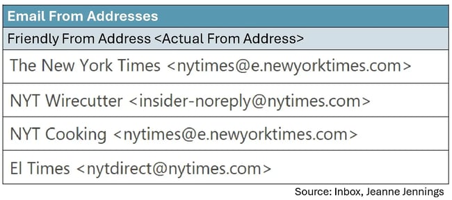
All of these are from the New York Times, but as you see, the friendly from addresses (and some of the actual from addresses) are different.
The first from address is what most of their online publications and promotions carry — just the brand. But NYT Wirecutter and NYT Cooking, which offer product recommendations and recipes, respectively, each have a friendly from address that includes copy that differentiates them from other NYT publications as well as an abbreviation for the brand (NYT).
This is great for readers, like me, because I always look forward to the NYT Cooking newsletters and open them as soon as they arrive. While I enjoy the other content, it’s not a must-read like the cooking content is.
The last friendly from address, El Times — you may have guessed it — is the Spanish language version of the NYT newsletter. Here the friendly from aligns with the language used in the newsletter.
You might be wondering: Should you include something other than just the brand in your friendly from addresses?
If it will help the readers more easily identify content of interest to them, the answer is yes!
Another thing you may have heard is that including a person’s name in the friendly from address will help boost your open rate. In truth, it depends. But if there is a person who is associated with the content in the email, by all means, include a person’s name. Just be sure that your brand or organization name is there too.
Here are a few examples of how to do it right, from my inbox:
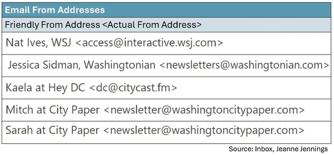
In each of these, the brand is there (Citycast named their email newsletter ‘Hey DC’) as well as a person’s name.
2. Engage recipients with the first 25 characters of your subject line.
It’s not that your subject line should be only 25 characters long — it’s that that’s all you are guaranteed the recipient will see in the inbox, so make those first 25 characters count.
I find that subject line testing is often overused, but in some cases it makes sense. I’ve tested this 25-character rule over and over again and it’s never failed me. Is the lift in bottom-line performance like conversion rate or revenue-generated-per-email-sent dramatic? Not usually, but even a lift of 10% adds up over time.
For example, the case study below is based on work I did with a client during the holiday season. They were in the midst of their “12 Days of Christmas Sale” and they were leading with this phrase in each of their subject lines. The offer, which was different every day, followed that phrase.
So we did a test …

We moved the offer, which is what recipients really cared about, to the beginning of the subject line and we got a 14.4% boost in revenue-generated-per-email-sent. You can read all the details here.
3. Make your preheader text support your subject line.
Preheader text is another misunderstood element of the inbox view — master it and you’ll be head and shoulders above your competitors. The preheader text appears either after or below the subject line; the subject line is usually bold, while the preheader text is not.
Here are a few examples:
%20depending%20on%20inbox%20provider1.webp)
In this example, Monumental Sports Network does a good job with their preheader text. They use it to expand on the subject line. You should do the same.
Don’t:
- Leave it blank
- Restate the subject line
- Keep the same form each time
Do use it for:
- Secondary key messages
- Providing dates
- Any additional information that will build on the subject line and motivate the recipient to open and act on your email
Want to learn more about preheader text? I was obsessed for a while. Here’s a good place to start.
Copy
For most email marketing messages, copy is king. Copy is what’s going to motivate the reader to take the action you want them to. Here are some tips to get you on the right track.
Free Email Marketing Tools
Create, personalize, and optimize your marketing emails without waiting on designers or IT.
- Boost email opens.
- Design stunning emails.
- Automate follow ups.
- And more!
4. Focus your copy on what’s in it for your readers.
It’s not that your readers are narcissists, but you need to give them a reason to read and act on your email. The way to do that is with benefit-oriented copy, or to put it more bluntly, copy that clearly states what’s in it for them (WIIFT).
Note: This is true for the subject line, preheader text, and the copy in the body of your email.
One way to do this is to use the words “you” and “your” generously, while using “we,” “our,” and your company name sparingly. For instance:

I always try to imagine the reader, also known as the target audience, when I write copy. To do this, I think about:
- Who they are
- What’s important to them
- What would entice them to take the action the email is asking for
- Where they will be when they are reading this email
If you can get into your reader’s headspace, you’ll be better able to write copy that motivates them to action. Want more? Here’s an article to help you write better body copy.
5. Use inverted pyramid style when you write body copy.
Inverted pyramid style just means putting the most important information first. By getting to the point, you won’t risk boring your reader.
Here’s an example from work with one of my clients:
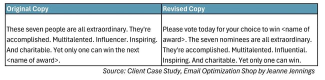
See what we did there? We told readers, right up front, what we wanted them to do. Then we spoke about who the nominees were. This is important. You want them to understand why what you’re telling them is important, so you don’t lose their interest.
Here are some more tips on writing body copy.
6. Keep your paragraphs short.
It’s rare that people read emails in detail. Most of us skim, looking for something of interest. As a result, you have to make sure your email is easy to skim. One of the best ways to do this is to keep your paragraphs short.
Many years ago (like 20 or more) I read a case study from Microsoft about writing for online audiences. They said that paragraphs should be 5-¼ lines (not sentences, but lines) or less to make them easy to skim. I wish I had a link to the case study. I cannot find it, but I have lived by this rule ever since — and it works.
Here’s an example from work from one of my clients:

Which one of these do you find more readable? If you’re like most people, the one on the right, with shorter paragraphs and bullet points (we’ll talk about those in a minute), will be easier to skim, and your eye will gravitate toward it. This is just one of the tips on body copy discussed here.
7. Email copy loves bullet points.
Anytime I have a list of things that need to be included in email or online copy, I make it a list. You should too.
Bullet-pointed lists, as you can see in the example above, are naturally skimmable. Notice how there’s a blank line between each bullet point? This is also helpful, as white space like this aids in readability. Otherwise, the bulleted list would look like a block of text that your eyes don’t want to read (just like the sample on the left above).
Calls-to-Action
An email without an effective call-to-action (CTA)? It’s like a car without an engine. You’re unlikely to get any movement out of it.
Here are a few tips to make sure your CTAs drive action.
8. Use bulletproof buttons in your emails — not text links.
We’ll cover buttons versus text links first. Buttons get more attention, so your primary CTAs, or any CTA that you really want people to engage with, should be buttons.
Here’s a chart showing monthly newsletter clicks by CTA format:

Do you see what I see? The design elements that drive clicks are buttons, benefit-oriented copy, and strategic image placement. More than 50% of clicks occur on buttons. Only 10% or fewer clicks occur on text links.
- Bonus tip #1: Look at the data under video — 16% to 29% of newsletter clicks. When we say video, we mean a screenshot of a video that, when clicked, takes the recipient to a landing page where the video plays. Videos are a great way to engage readers. If email copy loves buttons, email readers love videos.
- Bonus tip #2: Do you see the data under image? It’s not as high as video, but it’s higher than text links. That’s because people will try to click on the images in your emails. I highly recommend you don’t disappoint them. Make sure their click lands them on a page with content relevant to the image, either a blog post, an article, a product page, or something else.
Now let’s talk about bulletproof buttons.
In olden days (and still on the web today), buttons were/are images. But that’s not a good idea in email, due to image blocking (refer to best practice #10 for more on that.)
Bulletproof buttons aren’t images. They are table cells with a colored background and rich text copy which is linked to your landing page. Since they aren’t images, they will appear even if images are blocked. If you want to make them pill-shaped instead of rectangular, you can add white images at the corners to change the look of the shape.
Bulletproof buttons aren’t difficult to build in HTML, but drag and drop interfaces make it even easier to include them. So do it!
Want more? Here are some additional tips on effective CTAs.
9. Make your calls-to-action benefit-oriented.
Whenever I see “Click Here” I am transported back to 1995. Back then, we had to tell people to click. The World Wide Web was relatively new and clicking was not yet a learned behavior.
But now? Everyone knows to click. So consider your CTA copy another opportunity to make the case for the reader taking the action you desire.
Here are some examples for inspiration:

Images
Copy may be king, but images are queen when it comes to email marketing. Here are some tips to make effective use of them.
10. Don’t send image-only emails.
I have spoken to many organizations that are using image-only emails for their sends. We will talk through the pros and cons, but let’s just start with a visual.
Here’s an example from my inbox of an image-only email:
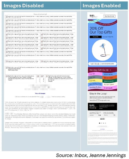
Wait, why are we looking at it with images disabled? Because many programs that recipients use to read your email messages still disable images by default. While not as prevalent as it used to be, image blocking is still an issue — see this case study I did with a client that proves it.
If you can convince your recipients to whitelist your sender address, that usually enables images by default. Usually.
But why risk it?
Most senders using image-only emails cite that it’s easier than sending HTML. No need for a coder or a drag-and-drop editor. Just have a designer create an image, and slice it up if you have more than one link, and then send it off.
Some also like the control. I worked with a membership organization that created their own font. They were sending image-only emails because that’s the only way they could ensure that the copy would be in their proprietary font, not in a default font that was on the recipient’s computers.
But if images are disabled or if it lands in the junk mail folder, they’ll see something like the version on the left of the example.
And one more reason to stop sending image-only emails: Now that many inbox providers are using AI to generate summaries of emails for recipients, you’ll want to be sure there is copy there for the AI to read to build the summary. We’ve seen reports of summaries that just talk about how to unsubscribe from the email, since all that the AI could read was the footer.
11. Hero images are good for websites but not for email.
A hero image is a large, prominent image at the top of a webpage, usually spanning the full width. They can be great for websites but not so much for email. That's because of the image blocking we talked about in the last tip.
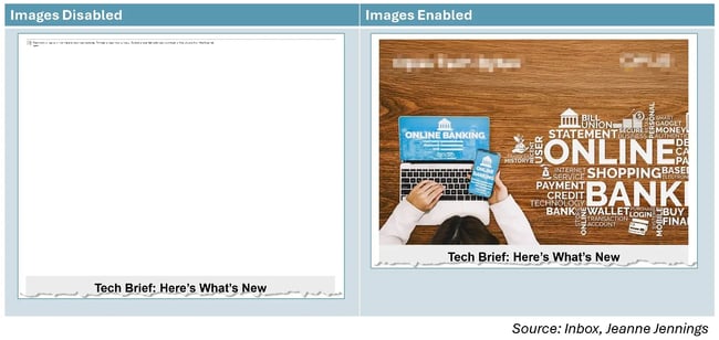
Here’s an example from my inbox:
I’ve done a lot of testing of hero images vs. no hero image, and no hero image almost always wins. Instead of a hero image at the top I like to either:
- Good: Put a rich-text headline above the hero image, or
- Better: Make your image half-width and put a rich-text headline next to it
This ensures that there’s something at the top of the email to engage readers, not just a blank space that they need to scroll past to get to your valuable content.
12. If you want it read, don’t embed it in an image.
Do you see the image above, in Tip #11? At the top left and right of the “Images Enabled” image I’ve blurred out the brand name and logo of the sender to allow them their anonymity.
I didn’t have to do that on the “Images Disabled” image because both their brand name and their logo were embedded in the image. Neither were seen when images were disabled. If they had a headline there (which I see a lot), that would not have been seen either.
Moral of the story: If you want your recipients to read it, make it rich text, not part of an image.
Free Email Marketing Tools
Create, personalize, and optimize your marketing emails without waiting on designers or IT.
- Boost email opens.
- Design stunning emails.
- Automate follow ups.
- And more!
13. Use images that support the copy.
Unless you’re selling a visual product, like a piece of furniture or a dress, it’s probably the copy that’s going to convince your readers to engage and learn more.
If yours is a visual product, by all means, use an image of it. But if it’s not, don’t clutter up your email messages with stock photography. I’m talking about images of business people sitting around a table in a conference room. Or an attractive, well-dressed person smiling in front of a computer with a headset on. Even a picture of that perfect family standing outside their perfect house.
It doesn’t matter what you’re selling, stock photography screams ‘inauthentic.”
But here’s what does work:
- A picture of your CEO or your prospect’s sales rep next to his signature, if the email is from him.
- In a newsletter, a small version of the featured image tied to an article you’re including, to provide a visual cue that the reader has landed in the right place.
- Authentic photography (my favorite free source is Unsplash.com) that illustrates the point of the copy without looking like a stock photo.
The question I often get asked is “Images or no images?” But that’s not the right question. Use images when they provide value, but skip them when they do more harm than good.
Looking for more? Here are additional tips on the use of images in email.
Pro Tip: Maintain brand consistency by documenting your email style guide—fonts, colors, logo usage, and tone—and creating modular templates that lock down branded elements.
Create template variations for various email types that share core brand elements while allowing for content flexibility. Don't let brand requirements override email best practices; use brand fonts in logos or headers only, and web-safe alternatives for body copy.
Accessibility
You know how, in the real world, we have ramps to help the disabled, and anyone else challenged by steps, to access buildings? The Web Content Accessibility Guidelines (WCAG) are similar guidelines about accessibility for websites and email messages.
Unfortunately, WCAG guidelines aren’t as widely implemented as they should be. But the changes required are much less difficult than building a ramp, and, like ramps, they not only help the disabled, but all your readers. Below are two tips to get you started.
If you’d like to learn more, check out the a11y.email blog from Sarah Gallardo. Sarah is an expert on online accessibility, with a focus on email.
14. Make sure you have adequate color contrast.
Look at the copy samples below. Which do you find easiest to read? Which are the most difficult to read?
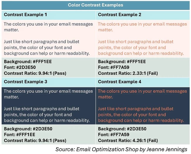
Options 1 and 3 passed the color contrast test. Options 2 and 4 did not. Can you see the difference in readability?
It’s easy and free to test for color contrast. I like to use the WebAIM Contrast Checker for this, but there are other tools out there. It doesn’t matter which you use, as long as you use one.
You don’t want people struggling to read the copy in your email messages.
15. Include alt tags on all your images.
Alt tags are another simple, free way you can increase the accessibility of your email messages. First and foremost, alt tags help those who are visually impaired and use a reader to engage with your email. The alt tags are read by screen readers, so that those who can’t see the image understand what’s in it.
Alt tags are also shown when images are blocked, but they're usually in a very small font and after a note from the inbox provider explaining why the image was blocked. Honestly, they aren’t much help here.
But these do help those who are visually impaired, which is reason enough to take an additional minute or two to provide an alt tag for each image. They also have an impact on SEO.
Optimization
16. Test into design changes whenever possible
One of my least favorite asks from clients is to provide a brief to “just freshen up” their email design. Why? Because any material change you make could negatively impact engagement.
I suggest testing email designs by isolating one variable at a time and measuring impact on conversions, not just opens and clicks. Use A/B split testing with statistically significant samples, focusing on metrics like revenue per email sent or conversion rate.
Let your audience's behavior guide decisions rather than aesthetic preferences, as even small optimizations can produce 10-15% performance lifts that compound over time.
It doesn’t matter what I like, what you like, what worked for my client last week, what a friend of yours said worked for their organization last month. All that matters is how your recipients do — or do not — engage with the design.
Mobile Optimization
17. Design mobile-first — because that's where your readers are.
With 62% of email opens occurring on mobile devices, designing for desktop first is akin to building a house from the roof down. Your emails need to look great on a 5-inch screen before you worry about how they'll appear on a 27-inch monitor.
Start with a single-column layout that's 600 pixels wide or less. This ensures your content displays properly without requiring horizontal scrolling. Multi-column layouts that look great on desktop often become cramped and unreadable on mobile devices.
18. Make your CTAs thumb-friendly.
Mobile users navigate with their thumbs, not a precise mouse cursor. Apple recommends a minimum touch target of 44x44 pixels, but I've found that buttons perform best when they're at least 48 pixels tall with ample padding around the text.
Place your primary CTA buttons in the center of your email where they're easy to reach with either thumb. Avoid placing critical links near the edges where they're harder to tap accurately.
19. Test across devices — not just your iPhone.
Your email might look perfect on your device, but what about your subscribers using a three-year-old Android phone or an iPad mini? Test your designs across multiple devices and email clients before sending.
Tools like Litmus or Email on Acid allow you to preview how your email renders across over 90 email clients and devices. Pay special attention to Outlook (which has unique rendering quirks) and Gmail's mobile app, which together account for the majority of email opens.
CTA Hierarchy
20. Create visual hierarchy with your CTAs.
Not all CTAs are created equal. Your email should have one primary CTA that drives your main objective, with any secondary CTAs clearly differentiated through design.
Use color and size to establish this hierarchy. Your primary CTA should be the largest button with the highest color contrast — aim for a contrast ratio of at least 4.5:1 between button and background colors.
Secondary CTAs can be smaller, use outlined styles instead of filled buttons, or appear as text links.
21. Limit yourself to one primary CTA per email.
Here's a truth many marketers resist: emails with a single, clear CTA generate 371% more clicks than those with multiple competing calls-to-action. When you give subscribers too many options, you're essentially asking them to make multiple decisions, which often results in no decision at all.
If you must include multiple CTAs, ensure they all align with the same goal. For example, "Shop Women's" and "Shop Men's" both lead to shopping, just different categories. Avoid mixing objectives, such as "Shop Now" and "Read Our Blog," in the same email.
Email Design Tools
While email design tools are invaluable, you still need some basic technical knowledge on email design to get the most use out of them.
Here are some quick requirements to remember:
Email design requires table-based HTML layouts with inline CSS, as many email clients use outdated rendering engines. Keep total email size under 102KB to avoid clipping, never use JavaScript or browser storage APIs, and build bulletproof buttons from table cells rather than images.
Always include alt text for images and host them externally rather than embedding them directly.
That all said, there are a number of email design tools with a wide range of capabilities (some completely unrelated to email design!). Here are some popular examples.
1. HubSpot
HubSpot’s Email Marketing software allows you to create, design, personalize, and optimize all of your emails.
You don’t need any IT or coding knowledge, and you can easily customize * mobile-friendly emails. The software allows you to A/B test emails to determine which designs work best.
Additionally, it includes an AI-generated email feature that can significantly enhance your productivity.
* Pro Tip: Mobile-friendly emails require responsive design techniques with a flexible grid layout that stacks vertically on small screens. Keep email width to 600 pixels maximum, use font sizes of at least 14 pixels, and make buttons large enough to tap easily (minimum 44x44 pixels).
Test on actual mobile devices and front-load your most important content so it appears without scrolling.
2. Beefree
As a Beefree user, you can design responsive emails in just minutes.
Smart design tools provide you with a quick way to format your emails and ensure your layout complements your content.
You can also customize and save various email design templates so your messaging and branding are consistent.
Pro Tip: Responsive design automatically adjusts layout based on screen size using media queries, while mobile-optimized design ensures readability on mobile with single-column layouts from the start.
Responsive emails require sophisticated HTML/CSS and may not work in all email clients that strip media queries. For most email marketers, mobile-optimized single-column templates are more reliable and sufficient unless you need complex multi-column desktop layouts.
3. EngageBay
EngageBay offers thousands of free HTML email templates for various industries.
You can customize these prebuilt templates, personalize them to reflect your brand image, and even automate the campaigns — all without writing a single line of code. EngageBay also offers A/B testing and scheduling to help you craft the perfect email campaigns.
You can also integrate these templates with EngageBay’s CRM, making creating and managing subscriber lists easy.
4. MailChimp
With over 100 templates offered, MailChimp allows you to customize your email design for your target audience.
If you’re someone who does have coding experience, and you want to take your design a step further, MailChimp offers you the ability to code your template too.
5. Stripo
Stripo requires no HTML knowledge to create and design professional email templates. All of their pre-made templates are responsive so readers can easily view them via any device.
You can also sync your current email service provider (ESP) with the software to access all of your email and contact information from a central location.
6. Chamaileon
As a collaborative email builder, Chamaileon gives you the ability to invite members of your team to collaborate on your designs.
The software ensures your emails will have a responsive design and automatically comes with over 100 pre-made templates to customize for specific recipients.
Ultimately, you need to choose email design tools based on your technical skill level and whether they integrate with your existing systems.
If you're using platforms like HubSpot, use their built-in designer; for standalone solutions, Beefree offers drag-and-drop simplicity while Stripo provides advanced customization.
The right tool makes it easy to execute fundamentals consistently—bulletproof buttons, responsive design, proper text-to-image ratio—not the one with the most features.
While these tools can help you create visually appealing emails, it's also valuable to see how other successful companies are designing their emails. For inspiration and ideas, check out our curated list of effective email marketing examples.
These real-world examples can help you understand how to apply design principles and best practices to your own email campaigns.
Email Design Examples
HubSpot asked me to provide you with some examples of email messages with good design, and I have provided them below.
But here’s the thing …
When you’re a consultant, you’re always looking at ways to make things more effective and more profitable. Even with clients, we test something, it boosts performance, and then I see something else we should test. You’re never really done.
So, for each of the very good design examples below, I’ve included lists of what they are doing right and what they might do better, based on my experience. This includes a transactional email from HubSpot which is very good, totally does the job, but which could still be improved with some of the best practices we discussed here.
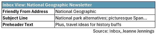
National Geographic THE COMPASS Newsletter
I like this email newsletter because the content makes every issue seem like a little mini-vacation. Oh, and their email design is focused on (and succeeds at) readability. I’ll include some screenshots from it below and highlight what I think are the strengths and weaknesses.

Wins from a design perspective:
- Inbox view
- Friendly from address includes the brand
- Subject line is benefit-oriented and engaging
- Preheader text builds on the subject line
- Copy
- The copy is benefit-oriented, telling you why you might be interested in the article plus the destination.
- The paragraphs are short and easy to skim.
- Calls-to-action
- The key CTAs are buttons and all are bulletproof.
- Some of the CTA copy is engaging.
- Images
- There’s a rich text headline “In this week’s Compass …” that can be read even if images are blocked above the first large image.
- The images totally support the content. They actually enhance the copy about the content and entice you to click.
- The images are clickable.
- Accessibility
- The color contrast is good throughout the newsletter.
What could be better:
- Inbox view
- Why not add the name of the newsletter to the friendly from address. It appears nowhere in the inbox view.
- It would be nice to have more “you” and “yours” in the subject line and/or preheader text.
- Copy
- Once again, more “you” and “your” would make this more engaging (but I get the impression that’s not part of the National Geographic style guide).
- Calls-to-action
- I think they could have used a different verb at the start of “Click Here to Beat the Crowds.”
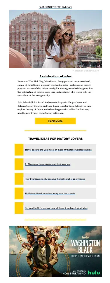
- The Bvlgari item CTA (“Read More”) seems like it belongs in a different newsletter.
- Images
- The newsletter title which appears just under the logo at the top of the email (“THE COMPASS”) is an image, so it’s not seen when images are disabled. It would be better if it were rich text; it might not even look any different to readers.
- The Hulu ad toward the end of the newsletter has no rich text associated with it — all the copy is embedded in the image. If images are blocked, none of this will be seen.
- Accessibility
- The images don’t appear to have alt tags. When I had my computer read the email aloud to me, it did read the attribution below each image, but it did not read an alt tag to explain to me what appeared in the image (which I would have needed if I were vision-challenged).
Free Email Marketing Tools
Create, personalize, and optimize your marketing emails without waiting on designers or IT.
- Boost email opens.
- Design stunning emails.
- Automate follow ups.
- And more!
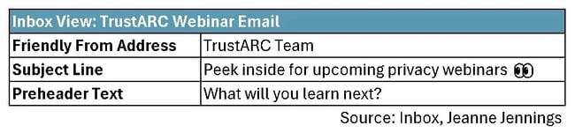
TrustARC Webinar Email
We didn’t talk specifically about design for webinar invites, but I wanted to include an example here. This is both to illustrate the tips we talked about and provide some additional tips for this type of email.

Wins from a design perspective:
- Inbox view
- Friendly from address includes the brand
- Bonus points for adding “Team” after the brand in the friendly from address to make it seem more personal
- Nice use of “you” in the preheader text
- Copy
- The opening paragraph copy is in rich text and does a great job of helping readers determine if these webinars are for them.
- Paragraphs are short and readable.
- Calls-to-action
- The key CTAs are buttons and all are bulletproof.
- The CTA copy is okay (“Register now”).
- Images
- There’s no hero image, which is perfect for this multi-webinar email.
- The email uses images to support the webinar titles — they are there but they don’t overshadow the copy.
- The images are clickable.
- Accessibility
- The color contrast is good throughout the email.
- Webinar-specific
- TrustARC does a good job at providing at a glance info on the webinar title, date, and time. You can skim the email and get the gist.
- The team did a good job of keeping each webinar description to a manageable length. Too often emails like this become unmanageable because each event includes a multi-paragraph description and additional content.
What could be better:
- Inbox view
- Why not include “Webinars” after the brand in the friendly from address instead of “Team”? Then, they would not have to use space for this in the subject line and it would prominently let the reader know what the content of the email was.
- I’m not sure the emoji in the subject line helps (it seems a little out-of-place in a serious email about webinars on privacy issues). But if they think it will, I would put it in the beginning, instead of the end, so it’s more prominent.
- It would be nice for them to use the subject line and preheader text to provide more detail on the content of the webinars. “Privacy” is pretty broad.
- Copy
- The webinar write-ups focus on “us” and their brand names; they would benefit from more “you/you” language.
- Bulletpoints would help the lists of key learnings from each webinar stand out more and be seen.
- Calls-to-action
- It would be great to have more benefit-oriented language like “Enhance your skills” or “Expand your knowledge” rather than just “Register now.”
- Accessibility
- There don’t appear to be alt tags on the images.
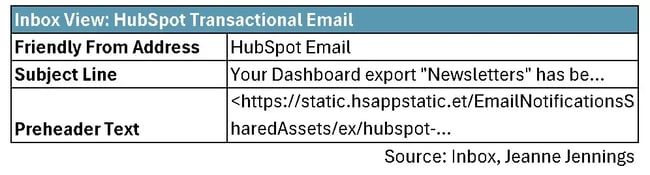
HubSpot Transactional Email
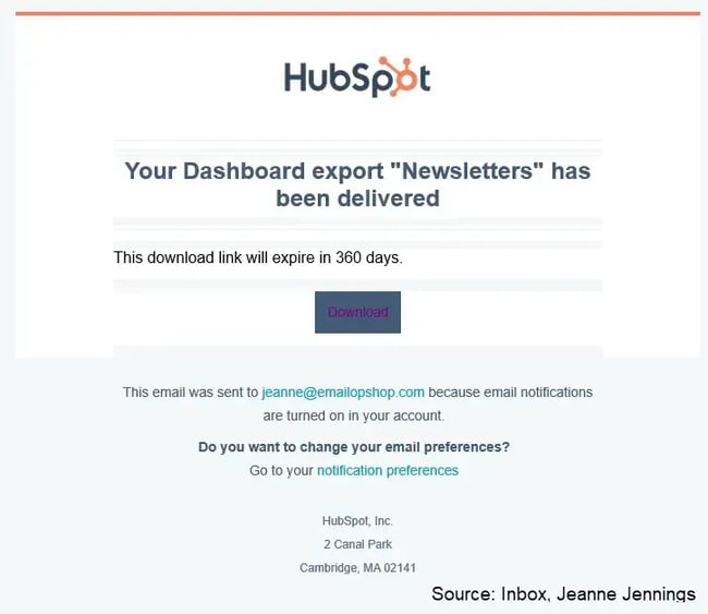
We didn’t talk much about transactional email messages, but following design best practices is just as important here as it is in your newsletters, promotional emails, and other sends. I receive this email whenever I download a report from HubSpot.

Wins from a design perspective:
- Inbox view
- Friendly from address includes the brand.
- Subject line includes the name of the export. This is huge, because I often request multiple downloads one after the other.
- Copy
- The copy here is minimal which makes sense for this type of email.
- Good use of “your”
- All the copy is rich text — exactly as it should be.
- Calls-to-action
- The key CTA is a bulletproof button.
- The CTA copy is very logical (“Download”) and describes exactly what happens when you click on it (as long as you are logged into HubSpot).
- Images
- There are no images — and that’s the right thing to do here. Any image would be strictly decorative, and there’s no need.
- Accessibility
- The color contrast is good throughout the email.
- Transactional-email specific
- You might notice that there’s no unsubscribe link in the footer of this message. That’s fine, since it’s a transactional message which has to do with an export I requested.
What could be better:
- Inbox view
- Why not include “Export” after the brand in the friendly from address instead of “Email”? That would make the type of content in the email more prominent and free up space in the subject line.
- And how about an emoji to start the subject line? Something like ‘📂’ (file folder). This would be a visual cue that this email is about a file.
- The name of the export is here, but could be more prominent. I’m thinking something like: 📂 Your “Newsletters” export is ready to download.
- The email could make better use of the preheader text.
Note: It appears that the preheader text field has likely been left blank; when that happens, the inbox view pulls in the first text it comes across, which in this case appears to be the web address where the logo is pulled from. I get it; there’s not much else that needs to be said when you look at the from address and the subject line, but still, I would suggest they use the preheader text to reinforce the 360 day link expiration timeline.
- Calls-to-action
- Although the CTA is clear, what if you have trouble with the link? It would be nice if the URL were also here in text-link form, just in case there’s an issue with the button.
- Images
- Although not a stopper, it would be nice if the HubSpot logo were clickable.
- Accessibility
- There don’t appear to be alt tags on the HubSpot logo. It would be nice to have it here, so that the reader would reiterate for the vision impaired who the email is from.
- Are you seeing the pale orange blocks of color in the body? While not a problem, it’s an odd look. It appears that the copy blocks have a white background, while the email background is pale orange. I’d make the background color in the body of the email consistent (and either of these background colors will provide sufficient contrast with the current font color).
- When you click on the “Download” button the copy goes from white text (totally readable) to dark purple text. This creates a contrast issue and should be addressed (see the image below).
Email Design Best Practices: Frequently Asked Questions
1. What's the ideal image-to-text ratio for emails?
A good rule of thumb is to avoid image-only emails entirely, as many email clients still block images by default, leaving recipients with blank spaces. Instead, aim for about 60-80% text and 20-40% images to ensure your message is readable even when images don't load.
In other words, use images strategically to support your copy rather than as the primary content carrier, and always include rich text headlines and body copy.
2. How do I know if my email design is working?
Track bottom-line metrics, such as conversion rate and revenue per email sent, rather than opens and clicks. Use A/B testing to compare design variations and see which version drives more of the actions you want recipients to take.
If you notice low engagement, analyze whether recipients are clicking buttons or text links, identify which sections receive more clicks, and test design changes one variable at a time.
3. Should I use the same template for all email types?
No. It's best to create template variations for different email types like newsletters, promotional sends, and transactional messages while maintaining consistent brand elements.
Each email type serves a different purpose: newsletters need space for multiple content blocks, promotional emails should emphasize a single call-to-action, and transactional emails require minimal, functional design.
Shared elements, such as headers, footers, fonts, and colors, ensure brand consistency across templates.
4. What's the difference between responsive and mobile-optimized email design?
Responsive design automatically adjusts layout based on screen size using media queries, converting multi-column desktop layouts to single-column mobile views.
In contrast, mobile-optimized design employs a more straightforward approach, utilizing single-column layouts from the outset that work seamlessly across all devices without the need for media queries.
For most email marketers, mobile-optimized templates are more reliable since some email clients strip the media queries that responsive design depends on.
5. How often should I update my email templates?
Update your templates based on performance data rather than arbitrary timelines. If metrics show declining engagement or you identify specific design weaknesses, test improvements immediately.
Avoid "freshening up" designs without data to back up the changes, as material changes can negatively impact engagement.
Review your templates quarterly to ensure they continue to follow best practices, work across current email clients, and align with any brand updates. Implement changes only after A/B testing confirms they improve performance.
6. Does HubSpot offer tools for responsive email design and testing?
Yes! HubSpot's Email Marketing software includes drag-and-drop design tools that enable the creation of mobile-friendly emails without requiring coding knowledge. The platform allows you to A/B test different email designs to determine which performs best with your audience.
HubSpot also offers an AI-generated email feature and the ability to customize and optimize emails for various devices directly within the software.
Grow better with good email design.
Email design best practices help you create professional, high-performing emails that look great on any device.
Start with a clear structure and use mobile-first layouts—mobile-first design improves email engagement and click-through rates by ensuring content displays properly on mobile devices before scaling up to larger screens.
Keep your branding consistent, as consistent branding builds trust and recognition with recipients across every touchpoint. Focus on strong calls-to-action (clear call-to-action buttons increase click-through rates), accessible color choices (accessible color contrast ensures readability for all users), and easy-to-read fonts.
Using responsive email templates ensures emails display correctly on all devices, so test every email on multiple devices—testing emails on multiple devices prevents broken layouts and poor user experience—and track key metrics like open and click-through rates.
For faster results, use tools like HubSpot's responsive email builder and built-in A/B testing. HubSpot's email builder provides responsive design and A/B testing tools for streamlined campaign optimization. Want to improve your next campaign? Get started free.
Editor's Note: This post was originally published in August 2017 and has been updated for comprehensiveness.
Free Email Marketing Tools
Create, personalize, and optimize your marketing emails without waiting on designers or IT.
- Boost email opens.
- Design stunning emails.
- Automate follow ups.
- And more!
Email Design
![Email signature examples: How to write a great one [+ free generator]](https://53.fs1.hubspotusercontent-na1.net/hubfs/53/Screenshot%20(1)-1.webp)
![How to Add Social Media Icons to Your Email Signature [+ Free Resources]](https://53.fs1.hubspotusercontent-na1.net/hubfs/53/email%20signature-Jul-25-2023-03-50-33-9137-PM.png)
![Creating HTML email marketing campaigns: The design playbook you need [+ free templates]](https://53.fs1.hubspotusercontent-na1.net/hubfs/53/html-email-marketing-1-20251029-6001253.webp)


.jpg)
![How to Make Your Emails More Interactive [Expert Tips + Examples]](https://53.fs1.hubspotusercontent-na1.net/hubfs/53/interactive-email.jpg)