As I scrolled through, a few things stood out. The design was super simple — no distractions, just a clear focus on the ebook. The copy was sharp and persuasive, and it made the offer feel like a no-brainer. Best of all, they only asked me for my name and email. I got valuable insights, and they got a new subscriber. Win-win. That’s the power of a well-built landing page.
Interested? Well, in this post, I’ll walk you through the key steps for creating a landing page that builds on those principles. Personally, I love starting with a template. It saves me from dealing with any code, and I can focus on making the page look great and convert well.
I used HubSpot's CMS, but you can use any similar software that offers landing page templates, like HubSpot's free landing page builder or Mailchimp.
Table of Contents
How to Create a Landing Page
- Choose a template that will help you achieve your goal.
- Name your landing page so you can find it later.
- Design your page layout according to what you want your audience to see first.
- Use the free Campaign Assistant to generate engaging copy.
- Communicate the benefits of completing the landing page form to the website visitor.
- Personalize the page so it's unique to the purpose and your brand.
- Test your landing page for dynamic content and user experience.
- If you desire, run a test to analyze page performance before pushing it live.
Landing pages usually fall into one of two categories: reference or transactional.
- A reference landing page is more like an informative guide — it explains a specific product or service in detail.
- On the flip side, a transactional landing page is all about action. It’s designed to get visitors to do something, like download an ebook, sign up for a webinar, or make a purchase, which is why it’s a go-to for marketing campaigns.
For this example, let‘s say that I’m a marketer for a fictional NASA-esque space corporation, and I‘ve been tasked with making a landing page for a fantasy ebook about space to get children interested in aeronautics. This landing page’s goal is to increase leads.
1. Choose a template that will help you achieve your goal.
To build my page, I chose from a list of templates, while keeping my end goal in mind.
Knowing that increasing leads and the customer experience were top priorities, I chose a template that showcased my ebook offer and provided a form. I also wanted a unique, eye-catching structure and a simple design.

What I like about this landing page template — in addition to the criteria above — is that it’s labeled as “Starter.” As a marketer with little to no design experience, a beginner-level working template sounded right up my alley.
2. Name your landing page so you can find it later.
Next, it's a good idea to name your landing page. If you plan on having multiple pages exist on the same system, be sure to name each something that will distinguish one design from future pages. For this example, I decided to name it “Ebook Offer One.”
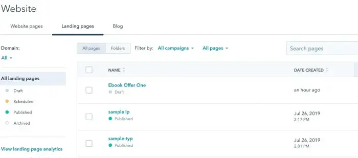
That way, when I check on the performance of this particular landing page, I'll locate it easily on my dashboard.
3. Design your page layout according to what you want your audience to see first.
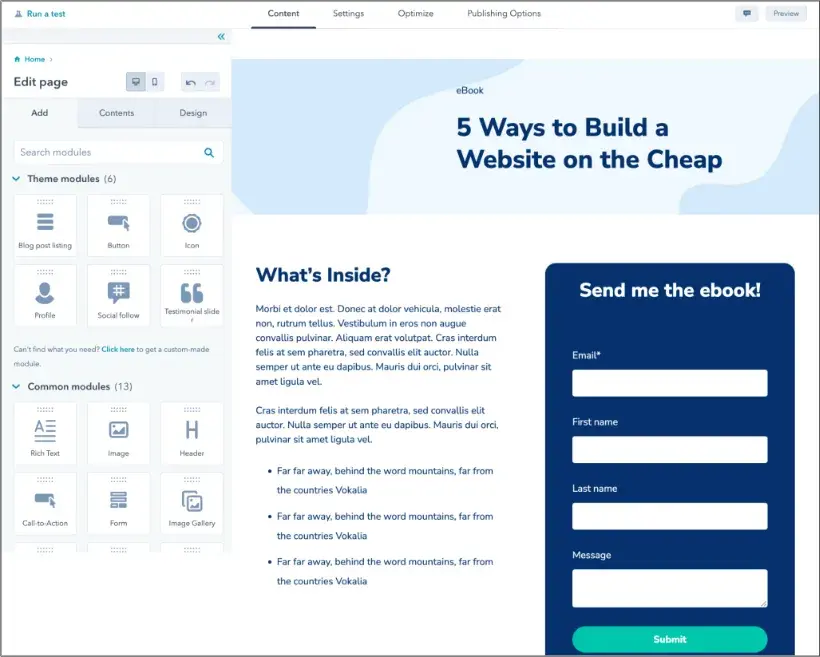
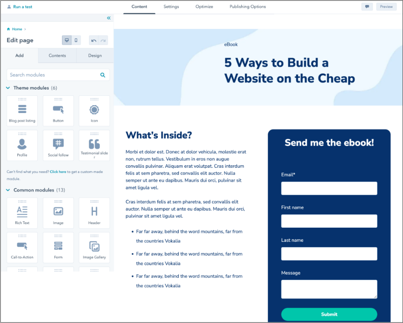
After labeling your landing page, let‘s start designing. For this step, I was able to use a drag-and-drop editor. I’d decided that it was important for the leads to see the ebook's cover, an engaging description, and the form.
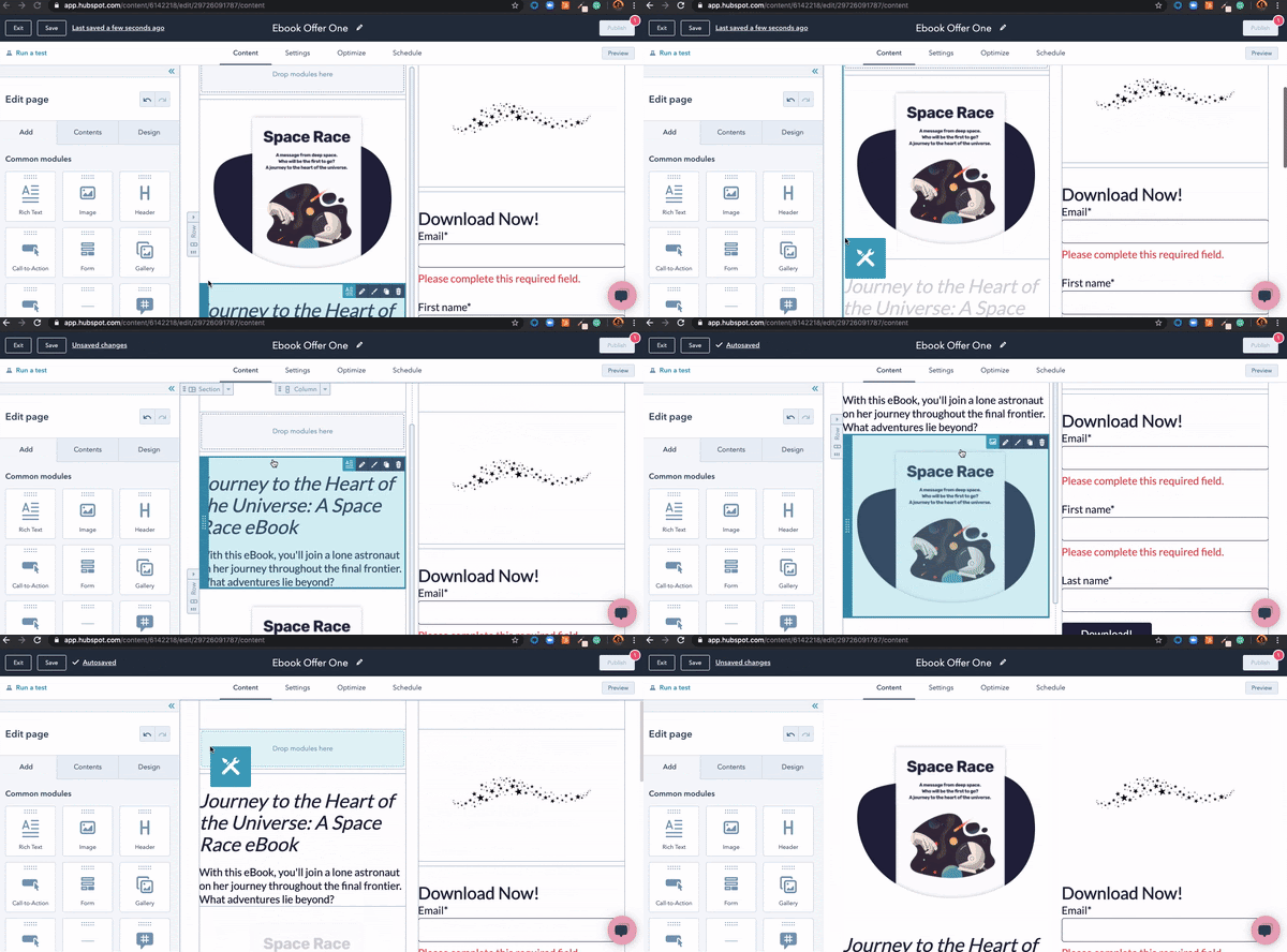
As a visual learner, a drag-and-drop editor is a dream come true. I can spend less time trying to learn code that would fix these elements and more time visualizing the experience for the lead. I can look at how the header‘s copy will be presented and if it’s effective at keeping audiences engaged.
4. Use the free Campaign Assistant to generate engaging copy.
This is the point where I’d like to ask you: Do you already have your landing page copy ready for publishing? The reason I’m asking is that I know from experience that it can take weeks to even draft a first version. If you don’t have text for your page yet, then I suggest using HubSpot’s free Campaign Assistant to generate copy based on your campaign goals and product/service information.
How does it work? Describe:
- The campaign you’re running.
- Who you’re targeting.
- What you’re offering
- What tone of voice you’d like to use.
For example: “I’m creating a landing page for a co-working space called [X], offering 25% off your first month for freelancers and remote workers. I’d like the tone of voice to be friendly and conversational.”
You’ll see a first version of the copy, which you can easily edit out. You can also regenerate the copy if you’d like to see an alternative. What I love is that you can save all versions of your copy and improve it as time goes by and you get the first results from your campaign.
5. Communicate the benefits of completing the landing page form to the website visitor.
Somewhere on my landing page, I wanted to provide short, impactful blurbs of value that would ultimately persuade the reader to complete the process.
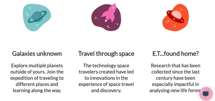
In my example, the three columns at the bottom of the form communicate the value of my ebook. These columns each had their own engaging icon that was colorful, professional, and clean. I used the text to communicate a main benefit, then described it in a sentence below.
6. Personalize the page so it's unique to the purpose and your brand.
The next step is sort of a “Choose your own adventure.” Here, I added elements that would fit with the brand of my imaginary company. I uploaded a logo image and made sure the colors were consistent throughout.
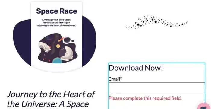
I wanted to make sure the text stayed black and white to match my logo and the images didn't disrupt the usability of my webpage. This choice makes the page look professional and functional.
Once you‘re satisfied with the layout and design, it’s time to move on to the final steps.
7. Test your landing page for dynamic content and user experience.
Because mobile phone usage is increasing each year, it‘s a good idea to test your page to ensure it’s dynamic. When your page is “dynamic” it simply means that the content on your webpage automatically adapts according to the type of screen being used to access the content.
Here, I tested my landing page for formatting on mobile. I wanted to make sure that the content was still displaying neatly and professionally, despite being shown on a different screen type than the one I used to create the page.
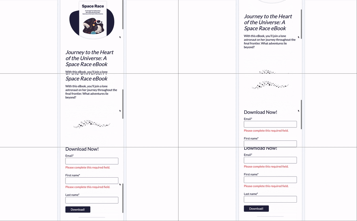
If you‘re using a CMS to make your landing page, check if the software offers dynamic content options. For example, if you find that the logo you’re using doesn't appear well on a smaller screen, you can make the necessary adjustments.
8. If you desire, run a test to analyze page performance before pushing it live.
Finally, consider running a test on your page. Testing can show variations of your page to audiences and analyze which variations perform better. In this case, the winning page would have the most conversions.
With the software I'm using, I can choose to run an A/B test or adaptive test. Both of them achieve the same goal, with the only difference being that the first runs two different versions and the latter runs many.
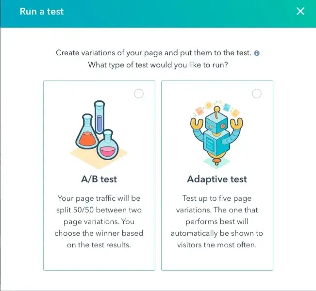
These tests will be running with a real audience, so make sure your pages look publish-ready before you begin. Be sure that the form fields work and your copy is free of any typos.
After completing these steps, your landing page is complete. I bet it looks fabulous.
Best Practices for Building a Landing Page
1. Only use one CTA per landing page.
Before you dive into building your landing page, hit pause and get clear on one thing: What’s the goal? What action do you want someone to take when they land here? Maybe it’s downloading an ebook, signing up for a free trial, or booking a call. Whatever it is, defining that goal upfront is key — it’ll guide how you write your copy, design the page, and choose the perfect call-to-action.
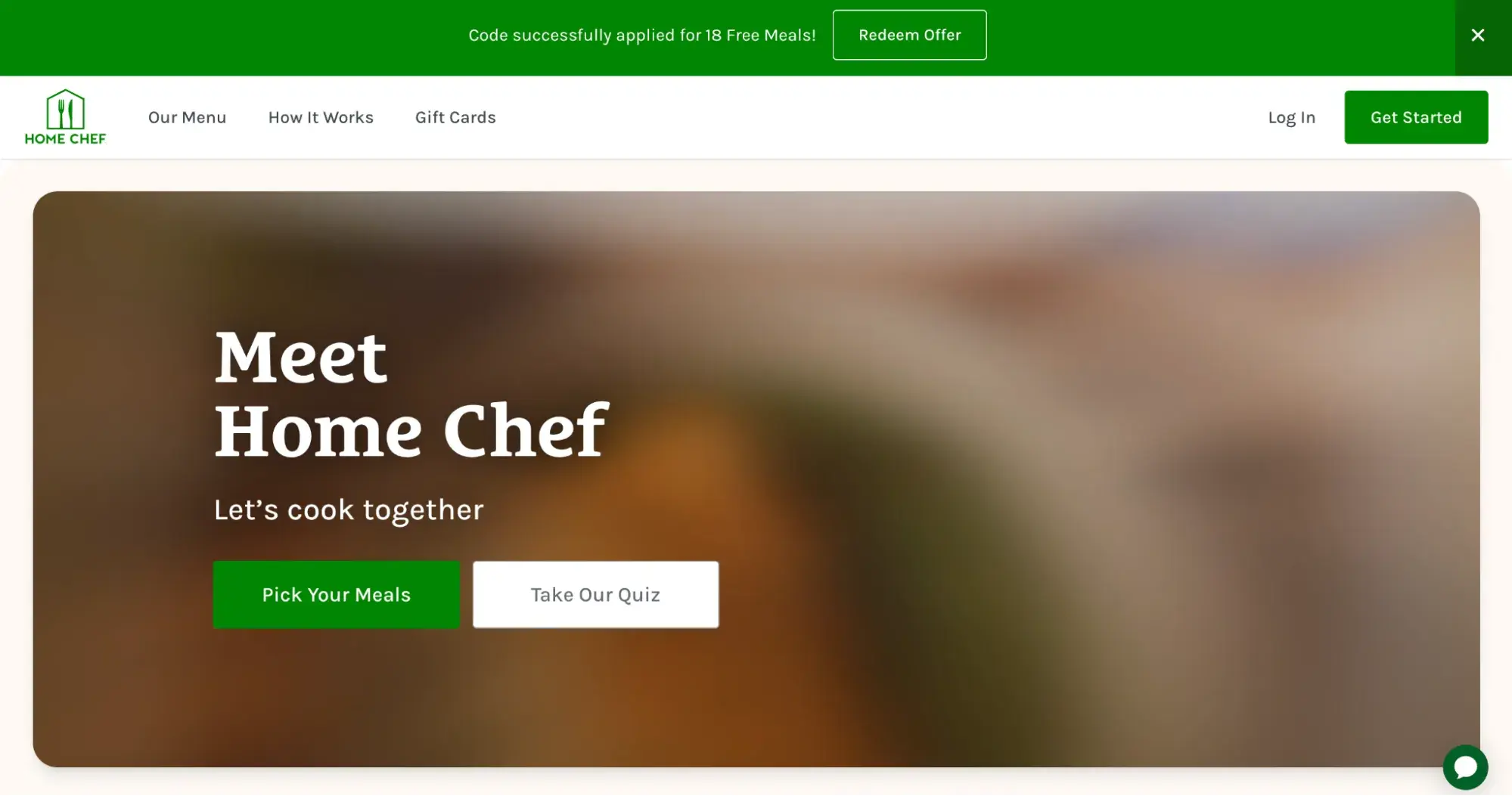
And while it might be tempting to include more than one CTA (I’ve seen brands like Home Chef try this), it’s rarely a good idea.
Speaking from experience as a marketer, every time I land on a page with two CTAs side by side, I catch myself rolling my eyes. It feels confusing. You want your visitors focused on one thing, not torn between options. If someone comes to download an ebook but sees another button like “Learn more about us,” they might click that instead and totally forget about the ebook.
One page, one goal, one CTA – that’s how you keep your audience on track and your landing page working the way it should.
2. Only feature key information.
What’s the one thing that drives you away from a landing page the fastest? For me, it’s definitely information overload.
When I see a wall of text, I’m usually out, unless that page happens to be the only place I can get what I’m looking for. But let’s be real, that’s rarely the case. Most of the time, I can find what I need somewhere else, and I’ll always choose the site that offers a cleaner, more pleasant experience.
So, make sure your design and copy stay focused and uncluttered. Zero in on the key information your audience needs to know.
I get it, sometimes you feel like there’s just so much to say about your product or service. But trust me, you’re better off highlighting only the most important benefits. People aren’t looking to spend forever on your site — they just want to know enough to make a decision.
A strong value proposition, a few standout benefits, some testimonials, and a persuasive CTA — that’s usually all it takes to get the job done.
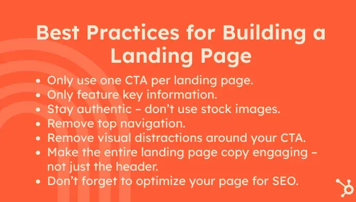
3. Stay authentic – don’t use stock images.
I can’t help but giggle a little when I see the same stock image popping up all over the internet; it definitely doesn’t do much for a brand’s authenticity.
Sure, using stock photos might seem like the most cost-effective option in the short term, but in the long run, it can really hurt your brand image. Inigo Rivero, managing director of House of Marketers and one of the first EMEA employees at TikTok, once told me that design is absolutely a key element to consider before launching any marketing campaign.
“In our work with TikTok campaigns and brand promotions, we discovered that simplicity and authenticity drive results. For one campaign, we transformed a generic landing page into a conversion powerhouse by replacing stock photos with real, engaging user-generated content (UGC),” he shared.
Instead of polished, overly staged visuals, they showcased raw clips of influencers actually using their clients’ products – straight from their TikTok campaigns. This change made the page feel alive and relatable, which resonated with audiences craving genuine connections.
“Visitors stayed longer, engaged more, and converted at higher rates. By showing real people using the product, we built trust,” Rivero added.
4. Remove top navigation.
Good landing page design really comes down to simplicity. One of the easiest ways to cut out distractions is by removing the top navigation bar. This helps keep visitors focused on what’s right in front of them on your landing page.
Brandy Hastings, SEO strategist at SmartSites, shared a great example with me about how they redesigned a page for one of their clients, MalpracticeOne.
“We removed the top navigation to eliminate distractions and keep users focused on conversion. The mobile version retains all critical elements: the logo, CTA, short copy, and form — with clear tap targets. We also used color contrast (teal + coral red) to draw the eye to the CTA buttons like ‘Get Quote’ and ‘Call Now’ without being overwhelming,” Hastings explained.
After that update, bounce rates dropped by 17% and quote submissions shot up by 29%. Plus, the mobile layout became much easier to scroll, with CTAs that stayed visible the whole time. This just goes to show that thoughtful design choices — like smart spacing and visual focus — aren’t just about looks. They make a real difference in how well your landing page converts.
5. Remove visual distractions around your CTA.
Your CTA can be in competition not only with other CTAs — it could also lose to distracting elements placed around it.
“I have optimized hundreds of landing pages for B2B and ecommerce, but one visual tweak consistently drives results was isolating the CTA in a contrasting color block with zero visual clutter,” Alan Muther, UX designer and marketing specialist at Ardoz Digital, told me.
“On a recent landing page revamp, I stripped the footer, removed secondary links, and surrounded the primary CTA in a solid white box against a dark background,” he said.
In this design, he featured no gradients, no shadows, and no icons. “That change alone boosted our form fills by 36% in 14 days.”
I agree with Muther that we shouldn’t give users reasons to wander around your site and choose a path that doesn’t end in your funnel. “When everything else fades to the background, the CTA becomes the hero,” he concluded.
6. Make the entire landing page copy engaging – not just the header.
Focusing on the above-the-fold of the site is a mistake I’ve seen quite a lot, especially from businesses that don’t have much website design or marketing experience.
Don’t get me wrong — nailing the top of your page is super important. It’s the first thing people see, and it plays a big role in whether they’ll stick around or bounce.
But here’s the thing: that top section is just the opener. Its real job is to spark enough interest for someone to keep scrolling. If the rest of the page doesn’t deliver, if it loses steam or doesn’t build on that momentum, people drop off. I think of it like a book with a killer first chapter that fizzles out, or a show that hooks you in the pilot but falls flat by episode three.
For me, the goal is to always make sure that the entire page tells a consistent story, not just the beginning.
7. Don’t forget to optimize your page for SEO.
Remember to optimize your landing page for SEO. Most CMS software is really good at pointing out SEO opportunities for web pages, and optimizing your page could get more traffic from queries on search engines.
For a quick starting point, to optimize my space ebook for SEO, I would make sure the ebook has an engaging, yet relevant title. I would also tag the post with relevant keywords in order to boost visibility on search engine results pages.
A great landing page makes a difference.
One of my favorite ways to learn and improve my own strategies is by observing what other brands are doing and seeing what I think works, and what I think doesn’t. How have you recently seen a landing page promoted? I've seen some while scrolling through LinkedIn and in email newsletters. Next time you do, take a closer look and analyze how the landing page was created.
After reading this article, I hope you’re feeling confident about how to create a landing page. With these high-level steps and my top-recommended best practices, you’re well on your way to creating an opportunity to earn more leads.
Editor's note: This post was originally published in June 2020 and has been updated for comprehensiveness.



.webp)
![How to create a landing page with high ROI [+ expert and data-backed tips]](https://53.fs1.hubspotusercontent-na1.net/hubfs/53/%5BUse-2.webp)

![Signs it's time to redesign your website [+ 15 steps to follow]](https://53.fs1.hubspotusercontent-na1.net/hubfs/53/phaseswebsiteredesign%20copy.png)


![How to start a blog (the right way) and write posts people actually want to read [+ free templates]](https://53.fs1.hubspotusercontent-na1.net/hubfs/53/how-to-start-a-blog-2.webp)
![What is a lead magnet? 20 lead magnet ideas and examples [+ step-by-step]](https://53.fs1.hubspotusercontent-na1.net/hubfs/53/lead%20magnet%20represented%20by%20a%20magnet.webp)
![15 best AI SEO tools & how I use them [new data]](https://53.fs1.hubspotusercontent-na1.net/hubfs/53/ai-seo-tools-1-20260313-9008245.webp)