

Background Images for Web Pages
Before you start your search for the perfect background image, you have to know some basic information about website backgrounds in general.
There are two types of website backgrounds: a body or content background. A body background covers most of or the entire screen. It can be an image, graphic illustration, single color, color gradient, or texture. A content background surrounds text, images, or other content, and can be layered on top of the body background.
Take the homepage of our blog, for example. The body background is white, whereas the content background is a light blue. The content background helps group the featured image, title, category, and read time of the individual blog posts together. This can help visitors browse the blog easier and make more informed choices of what to click on.

When using background images for your web pages, you can use images as the body background and place text directly over it. This is a common approach for creating a striking homepage. You can also use an image (or several) as the content background, layered over a single color body background. This is a common approach for portfolio sites.
Let’s take a look at some examples of website background designs below.
Website Background Design
- Warszawski UL
- Corvette Care
- Addictions Design
- ThruDark
- Colossal
- INSPiiR
- Morris Adjmi Architects
- hipcool Studio
- Goldling Drinks
- K+
- JVN
- Parques de Sintra
1. Warszawski UL

Warszawski UL is an interactive website that uses scrolling animations and big background images to capture and sustain visitors’ attention. Each image offers a closer look at the interior of the serviced office.
What we like: Each background image included in the homepage slider contains shades of blue that match the color used in the logo and other design elements, making the overall design more cohesive.
2. Corvette Care

Corvette Care is an image-rich website. Its homepage includes a hero image slider that is triggered when the user hovers over one of the words representing the company’s services. This is a visual way to show that the company not only offers basic maintenance and upkeep — but is also one of the nation’s premier Corvette restoration and performance facilities.
What we like: Rather than show three images side-by-side, this site uses a slider of different background images to represent its range of services, which is triggered by the user hovering over text.
3. Addictions Design
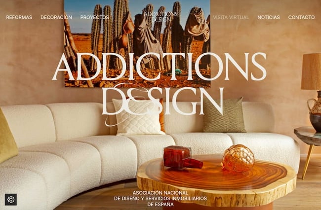
Addictions Design features many types of background images: some are full-body, layered, and featured in unique sliders. These background images help accomplish the company’s mission, which is to exhibit collections of artisans and furniture firms.
What we like: The background images, particularly the full-body website background image in the hero section of the homepage, make you feel like you’re stepping into one of Addictions Design’s showrooms.
4. ThruDark
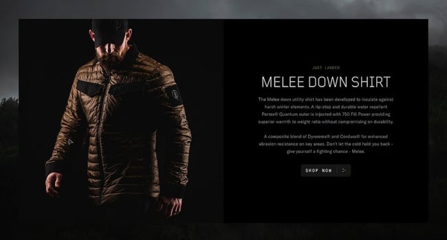
ThruDark combines background images and videos with a dark color scheme to convey the different climates and activities that its products are designed to work for, whether that’s an expedition in extreme cold tundras or humid jungles.
What we like: Product images are layered over images and videos of landscapes, emphasizing that ThruDark’s clothing and equipment are developed to assist customers in the most arduous environments.
5. Colossal
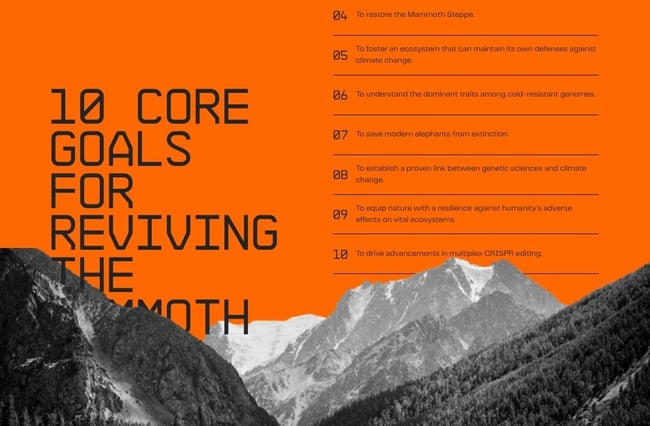
Colossal uses bold colors, images, and animations to tell the story of how it will create a path to de-extinction. The page dedicated to its landmark de-extinction project — the resurrection of the Woolly Mammoth — uses background images and animations to effectively explain what this species is and what its goals are for reviving it.
What we like: The background images combined with animations and other effects make this website as engaging as it is informative.
6. INSPiiR

INSPiiR showcases the INSPiiR Saint-Sauveur district with big background images across its site. The site uses opacity to make these background images somewhat transparent and darker, so it’s easy to read the text on top.
What we like: Semi-transparent overlays ensure that the text is still easy to read without obscuring the background images.
7. Morris Adjmi Architects
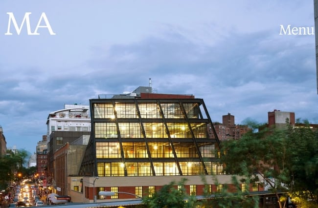
MA’s website is designed to fulfill the studio’s mission of creating buildings that stand out. To this end, the homepage features a hero image slider with an almost austere navigation bar with only the logo and button labeled “menu.” This ensures that MA’s projects are the focal point.
What we like: A minimalist navigation bar keeps the focus on the background images, which feature projects from the studio’s portfolio.
8. hipcool Studio
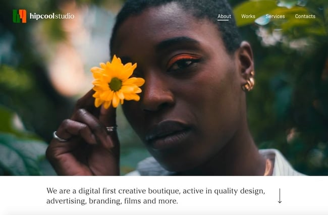
hipcool Studio is a minimalist website that masterfully uses whitespace, clean typography, and a white background color to make images from its portfolio stand out. Since the images are the only source of color (aside from the logo), they draw the visitor’s attention and keep it.
What we like: The site juxtaposes large, colorful background images with a stark white content background to really make the images pop.
9. Goldling Drinks

Like the products, the website of Goldling Drinks is designed to transport visitors into the world of its drinks’ flavor. To do so, it has a dreamy and playful graphic background that captures the “golden hour.”
What we like: The website background is composed of graphic illustrations that evoke the playfulness and complexity of its products and brand.
10. K+

K+ is one of the best photography portfolio websites. Its homepage features a hero slider with background images that look like full-body images until the user scrolls. The photos are perfectly chosen: the composition draws the eye to the centered text and scrolling arrow and to the logo and hamburger menu button in the corners.
What we like: The background images are colorful and detailed but manage to draw attention to — rather than distract — from the logo, menu button, text, and scrolling icon.
11. JVN
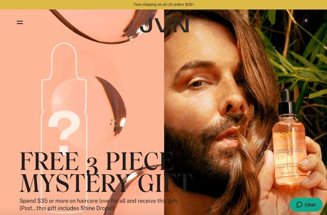
JVN’s website is focused on the ingredients that make these products different, which is reflected in the copy as well as in the videos and images. The background images showcase the products, their specific ingredients like sugar cane, as well as the results on real people’s hair.
What we like: The header background image juxtaposes a texture that looks like the product with an image of the founder holding the bottled product to showcase it in multiple ways.
12. Parques de Sintra

Parques de Sintra is designed to help visitors discover the many different ways to explore Sintra. To do so, it uses multiple image sliders. In its header section, for example, an animated image slider shows slices of images featuring Sintra’s many parks, monuments, and places. This is a great way to show that one person’s journey through the town may look very different from another’s.
What we like: This website’s paneled hero image slider is a clever way to feature multiple background images without taking up much space.
If you want to check out more website background designs, here’s a video by Flux that walks through five websites with cool background images and other effects and why they work:
13. Creperie Loheac
 Creperie Loheac is a French restaurant specializing in delicious and authentic crepes, offering a cozy and inviting dining experience. Its website is designed to give users a small taste of what's to come at the restaurant.
By showcasing the restaurant's enticing ingredients, every second spent on this website brings you one step closer to trying it out for yourself.
What We Like: A good restaurant website implants a visual into potential visitors' minds that encourages people to try their product after seeing it. This website is simple and proudly displays its products while giving visitors a quick and easy way to
14. Heartwood Resort
 Heartwood Resort is a serene and picturesque vacation destination in Wisconsin, offering a range of activities and accommodations for nature lovers and outdoor enthusiasts. The background image instantly takes your mind to the resort and also draws attention to the 'Book Now' call to action.
What We Like: The background image lets visitors imagine themselves at the Resort, drawing them in and pointing them to the quickest way to start their vacation plans.
15. Sun Chips
 Sun Chips is a brand well-known for its bold branding as much as it is known for its whole-grain chips. The website keeps a simple 4-color palette to keep your eyes on the prize: the chips.
What We Like: Most people buy products from well-known brands like Sun Chips while stopping by their local convenience store or as something to complete their meal at a fast food restaurant. This website isn't for the purpose of directly selling more Sun Chips. It's instead to help people create a connection with the brand, learn about the brand's story, and have a place with all the relevant social information available.
16. Pixel Perfect Development
![]()
Pixel Perfect Development is a digital agency that provides innovative design and development solutions, helping businesses create engaging online experiences and optimize their digital presence. This is a great example of a one-page website that makes the most of its design.
What We Like: The background image uses cool colors to contrast the bold messaging of the website. This makes it easy for customers to see the value Pixel Perfect Development is capable of getting across in their design solutions.
17. Quality Meats NYC

Quality Meats NYC is a premier steakhouse that offers high-quality cuts of meat, gourmet dishes, and a stylish atmosphere, perfect for a fine dining experience in New York City. The website reflects its high-quality food, with an image of the entrance to the restaurant.
What We Like: The imagery of this website takes you right to New York City where you're just one step away from trying the quality food. This website perfectly embodies the usage of a background image to virtually transport visitors to its business.
18. Polene

Polène Paris is a fashion brand known for its elegant and minimalist handbags, offering a wide range of sophisticated accessories crafted with meticulous attention to detail and quality. This website has a stunning background visual with an impressive header that showcases a collection of handbags, tells you the company story, various projects, as well as how the bags are made.
What We Like: This website captures the imagination of prospective visitors by showing off a dream-like sequence of a model holding a Polène handbag. This is a great example for eCommerce websites to emulate.
19. Homegrown

Homegrown is a food delivery service committed to providing fresh, locally sourced ingredients and healthy, delicious meals that can be enjoyed in the comfort of your own home. Scrolling on this website takes you to a compact menu of options to enhance navigability.
What We Like: The high-quality background image is the perfect complement to the business model of providing high-quality farm ingredients. This website carries on the theme of implanting memories into visitors' imaginations with a basket of fruits and veggies straight from Homegrown's farms.
20. Hard Lines Coffee

Hard Lines is a UK-based coffee company that focuses on providing exceptional specialty coffee sourced from around the world. The background image showcases some of Hard Lines' fun designs while playing on the delivery process by having coffee bags in front of a door. This allows visitors to insert themselves into the image, getting them one step closer to trying a coffee bag from Hard Lines.
What We Like: The approachable design of this website is aesthetically pleasing and smart in its intentions. The header gives you options to subscribe, buy merchandise, read more about the company, or see available locations.
21. Cedar & Hyde Mercantile

Cedar & Hyde is a boutique retail store that offers a curated selection of stylish clothing, accessories, and home goods. The simple background image has a model showing the company's clothing while also having a call to action to let you see more of the collection.
What We Like: The hovering dropdown menu lets visitors have a bevy of options to click through, creating an easy-to-navigate site.
22. Atlas Card

Atlas Card is a financial technology company that provides a secure and convenient digital wallet solution. The background image subtly points you toward the opaque clickable dropdown menu, which shows all the Atlas Card has to offer.
What We Like: This website keeps it simple. As a new-age credit card company, the Atlas website is a modern take on expressing visual cues to deliver a powerful message. This card has no limits. Get started as soon as possible. What better way to convert visitors into customers?
Website Background Image Best Practices
A background image on a web page has to do more than look good — it also has to enhance the user experience in some way. Let’s walk through some best practices so you can pick a background image that helps convey your brand and provide visual cues to your visitors.
1. Select high-quality images.
In terms of background images, quality refers to composition, resolution, and size. First, background images should have enough negative space and color contrast to make any overlaid text easy to read. Here’s an example:

Website background images should also be at least 72 pixels per inch (ppi) and 1920 pixels wide x 1080 pixels high ideally, according to NW Media Collective. This ratio of 16:9 is considered ideal because it spans the webpage without compromising the quality of the image.
2. Make text stand out.
If using a background image, then you need to ensure text stands out so visitors can read it. You can do so in a number of ways: by using contrasting colors, or a solid color content background in between the text and background image, or overlays on the images. You can also position the text over the darker, or lighter, parts of the background image.
Notice in the example below that the white content background helps the logo and text stand out against the body background.
3. Ensure images are responsive.
It’s essential that a background image is responsive so it adjusts to all screen sizes without noticeably impacting your website’s performance. To ensure images are responsive, you should:
- Set the CSS background-size property to “cover.” This value tells the browser to scale the background image’s width and height so that they are either equal to, or greater than, the viewport’s dimensions.
- Add a media query. This will tell the browser to serve a smaller background image for mobile devices, which will reduce the payload and therefore improve load times.
4. Place bold, colorful images in the header.
If you have an image with bold colors or illustrations, consider putting it in the header section of your homepage. That way, you can immediately establish your brand personality and website’s mood, and then place more text-heavy content below. Here’s an example of a video header followed by a more minimalist section:

Using Background Images in Your Design
Using a website background image can help immediately capture a visitor’s attention, tell a story, and provide important visual clues. Using one will require you to consider file sizes, load times, text color, and other factors — but when done right, background images will make your site more engaging and memorable.

Website Design Examples


![15 black and white website designs to inspire your own [+ pro tips]](https://53.fs1.hubspotusercontent-na1.net/hubfs/53/black-and-white-website-design-1-20250520-1336267.webp)

![Gradient Website Design Examples That Prove This Trend Is Far From Over [+Tutorials]](https://lh7-us.googleusercontent.com/htOWIbyCIoCMxSjC4gJunkGnhCzXpccjTrL8NwoGdRdCsSiEmEAxe_qBFkMrzy2Y8d3cwEr_DMzSGHq9Xi-hQFnMJCo8HDQJ1yQGigcSfFxI2QKXo0s7xXSB2sY-eALG1iUqnHXgomcDsnp7AHRSH1s)
![15 Brochure Website Examples to Inspire You [+ How to Make One]](https://53.fs1.hubspotusercontent-na1.net/hubfs/53/brochure-website-examples-1-20250319-362228.webp)
![28 Types of Websites to Inspire You [+ Real-Life Examples]](https://53.fs1.hubspotusercontent-na1.net/hubfs/53/types-of-websites.png)

