To do so, news sites must showcase as much of their content as possible in a way that’s as easy to read and make the rest simple to find. This means legible typography across all device types, detailed navigation menus that display all its categories and subcategories, and a clean news website layout with lots of white space.
But what separates the likes of The New York Times and Fast Company from the rest? I’ll share what I’ve learned below. I'll also showcase some of the best modern, minimalistic, and innovative news websites that utilize creative website templates to showcase their brand identities while delivering important content to readers.
1. Beautiful News
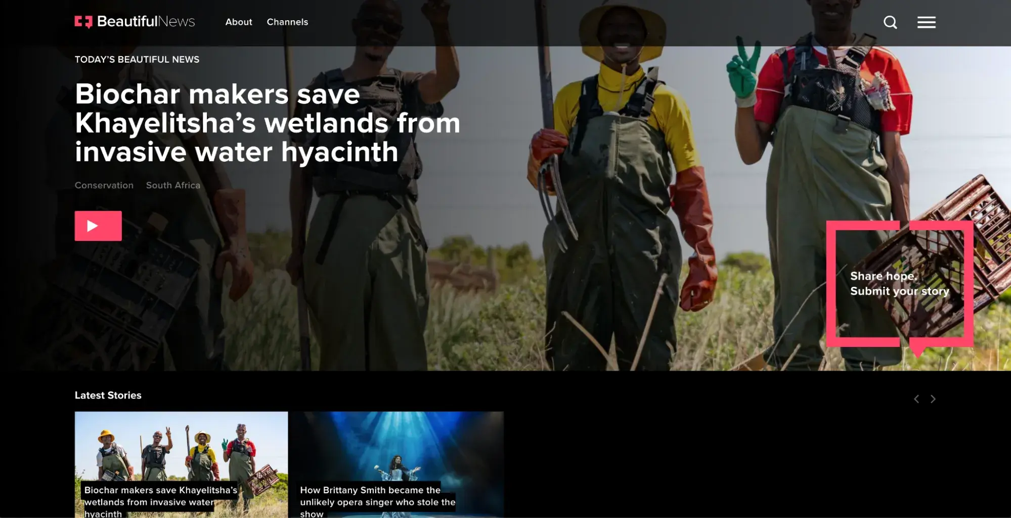
Beautiful News is a news site and content platform that publishes one video story daily. The stories reflect unique voices to reveal good actions in humanity, the beauty of our world, and the positive impact humans and organizations have made.
In addition to its publishing cadence and exclusive video content, Beautiful News is unique because it uses a black background, white text, and neon pink accent color. This color scheme functions in two ways: it separates the publication from a traditional newspaper website design by providing a more modern appearance, and it includes a high-contrast color scheme.
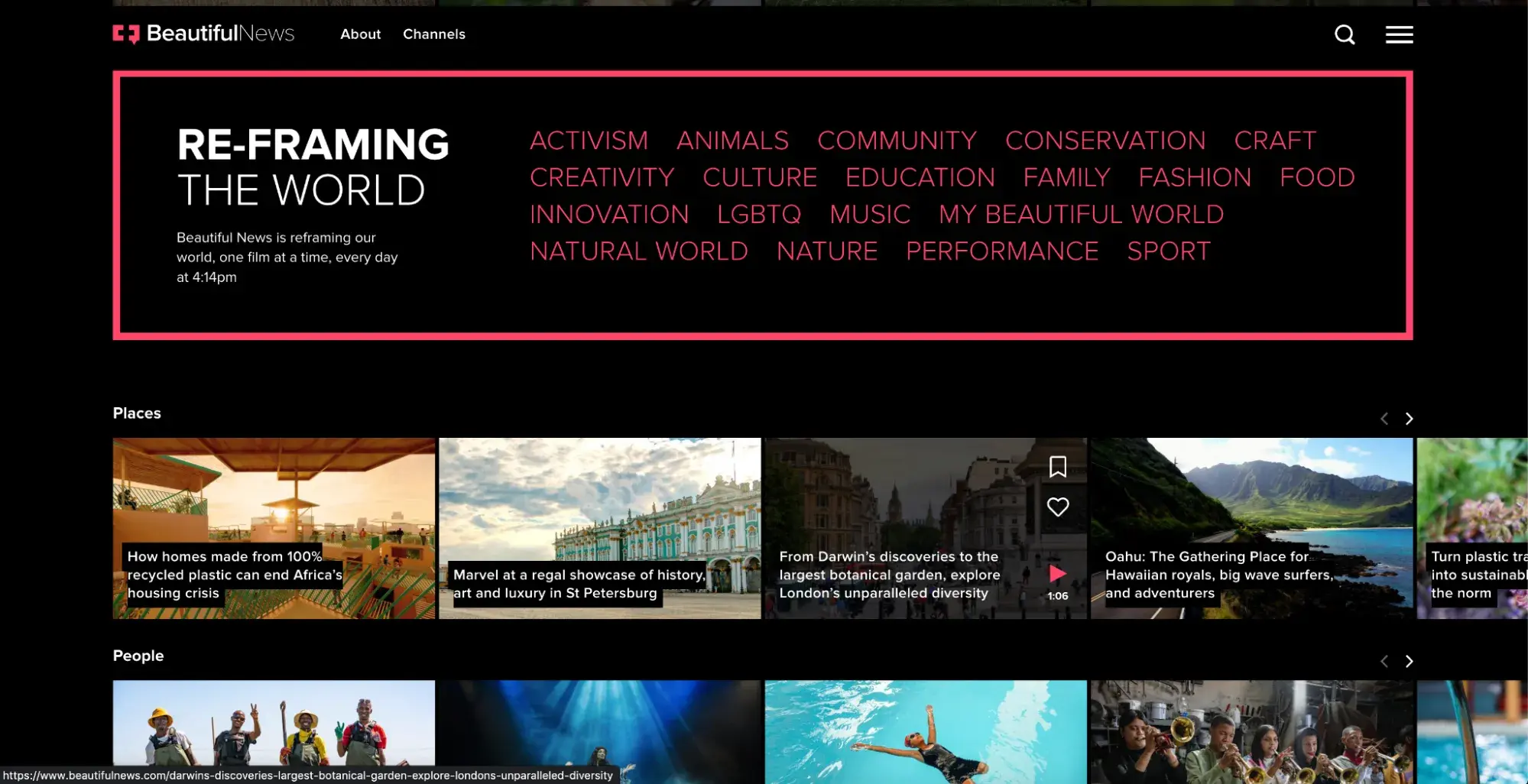
In Milliken’s experience assisting with the design of a news website, she explained that her team chose a dark color scheme with high contrast to improve accessibility. Beautiful News’ color scheme is similarly high contrast, which is the pairing of significantly different colors to help them stand out.
Using light colors, like white, or bright colors, like neon pink, on a dark background, like black, is an example of high contrast. High contrast makes text more accessible to people with color blindness or other visual impairments and older individuals.
Beautiful News also mimics dark mode in its appearance, which has become widely popular with device users. Dark mode may also provide health benefits to some individuals — it can reduce blue light exposure and glare when viewing a screen in a dark room.
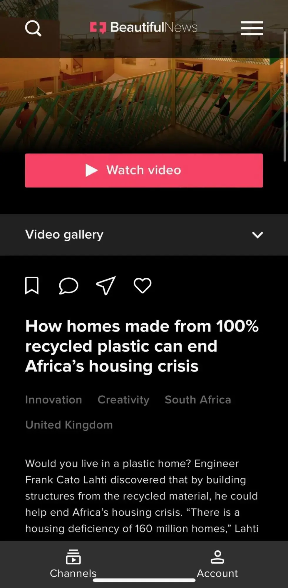
What I like: Since Beautiful News is a video-forward publication, it makes sense that they care about highlighting their videos and other visuals on their site. The black background allows the colorful videos and bright text to pop, while providing a more accessible experience.
2. The New Yorker
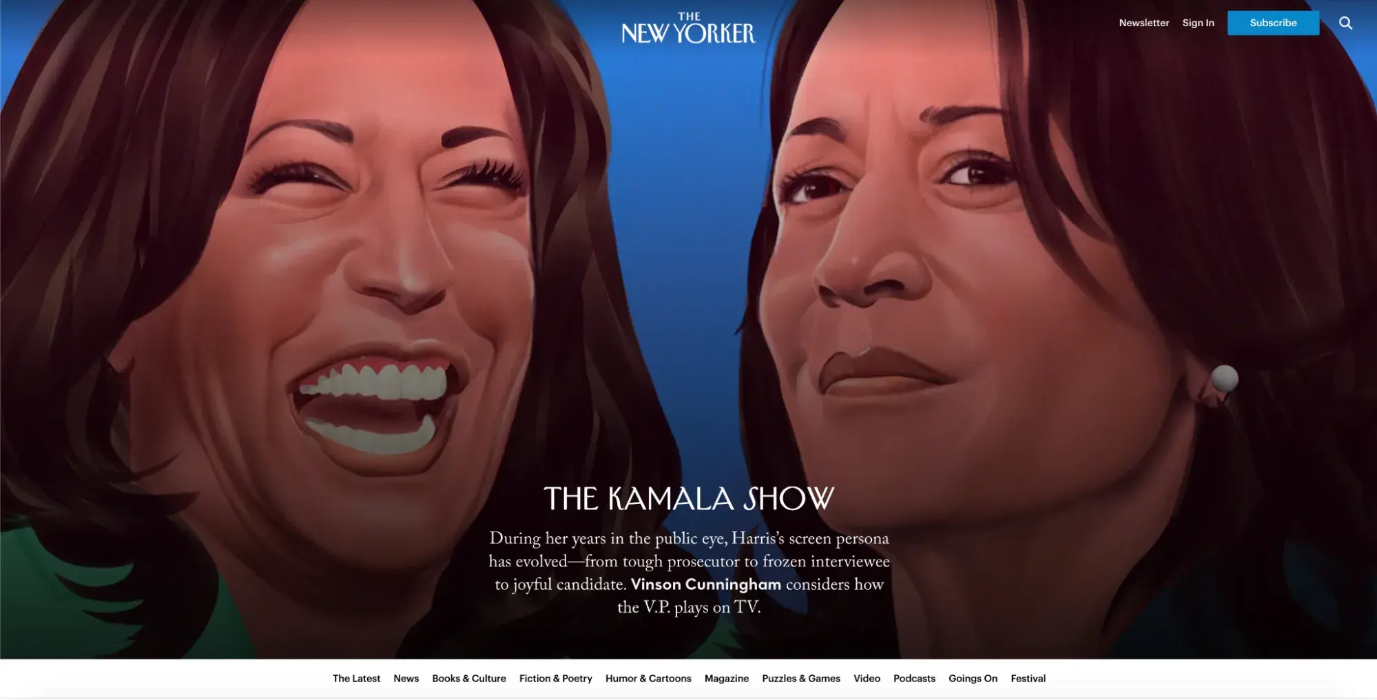
The New Yorker is renowned for blending news with cultural and political commentary, fiction, and fresh “Ideas.” It’s an insightful, thought-provoking publication that prides itself on comprehensive journalism, excellent literature, and stylistic opinions.
Some of the key distinctions of The New Yorker are its unique artwork and humor. Its website perfectly incorporates these elements with bright colorful cartoons in various artistic styles and a layout that breaks up articles to make them feel more fun and accessible.
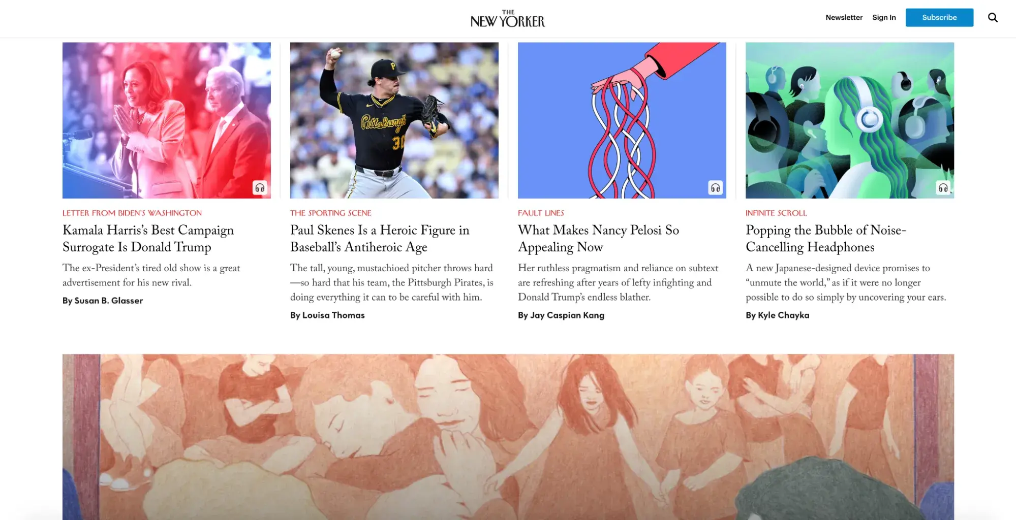
I also enjoy how the website interlaces various genres throughout its homepage, which adds to the funky individualism of the website. However, through it all, The New Yorker maintains its unique look and feel with its font and branding choices.
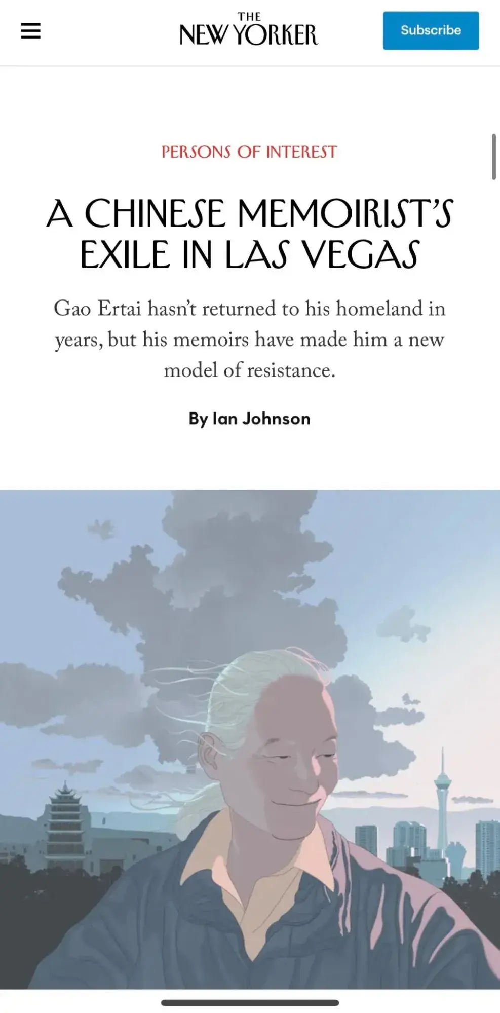
What I like: The New Yorker perfectly displays its publication’s unique and quirky elements on its website through high-quality photographs and creative artwork, which grab readers’ attention. However, the simplicity of design feels sophisticated, keeping the focus on what matters most: the storytelling.
3. The Art Newspaper
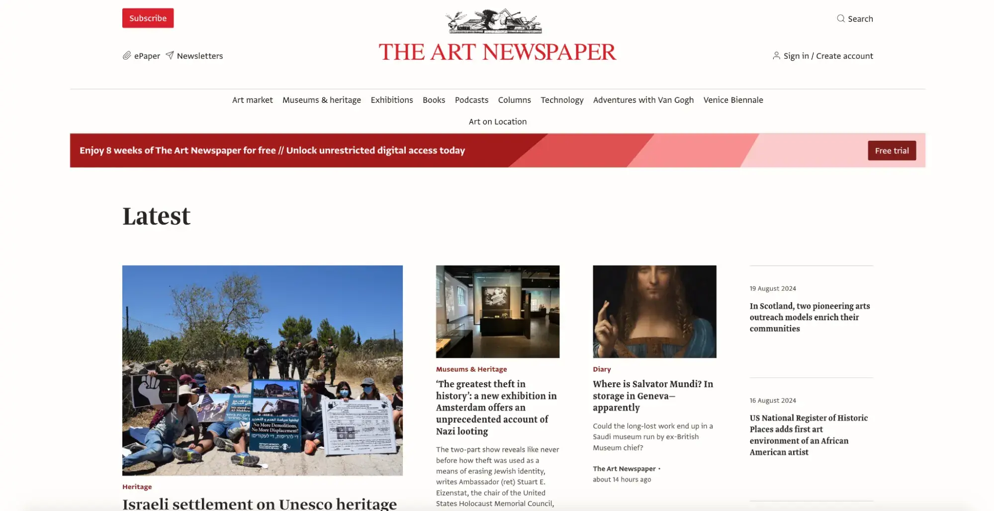
The Art Newspaper provides international news and events related to the visual arts world. With more than 50 correspondents in more than 30 countries, it can be trusted as a truly global and diverse account of the arts.
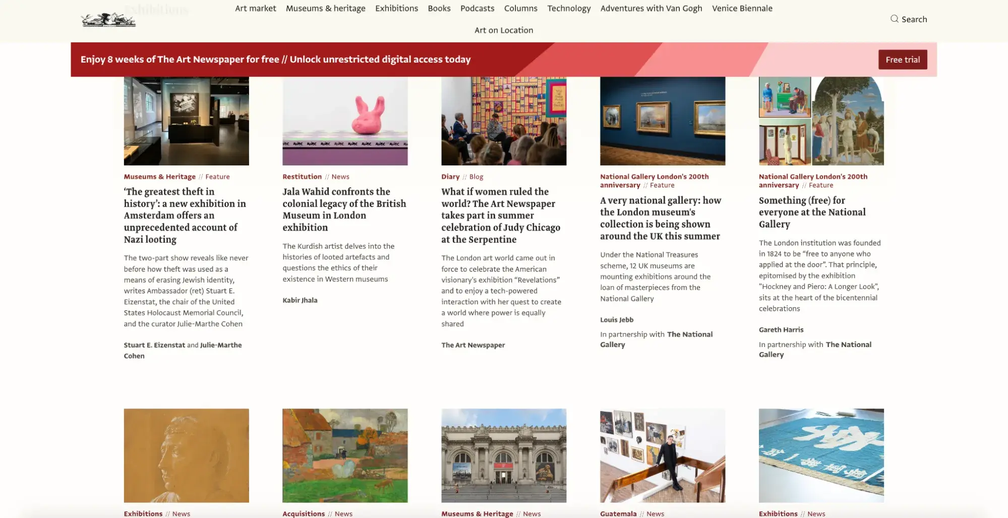
Its website uses a simple black-and-white design with a maroon accent color for categories and links on hover. This color scheme complements the minimalist layout that uses whitespace to noticeably separate sections and articles.
This aligns with Milliken’s experience, in which her team made sure to deploy enough white space so things didn’t look cluttered.
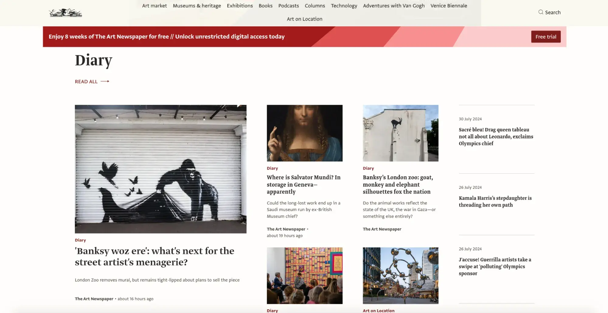
As a true arts publication, The Art Newspaper’s layout mimics that of a gallery wall. The whitescape resembles the space between masterpieces, giving the individual article thumbnails their space to shine.
Alternately, the mobile version of the website gives each “portrait” its moment in the spotlight, providing a new artistic experience.
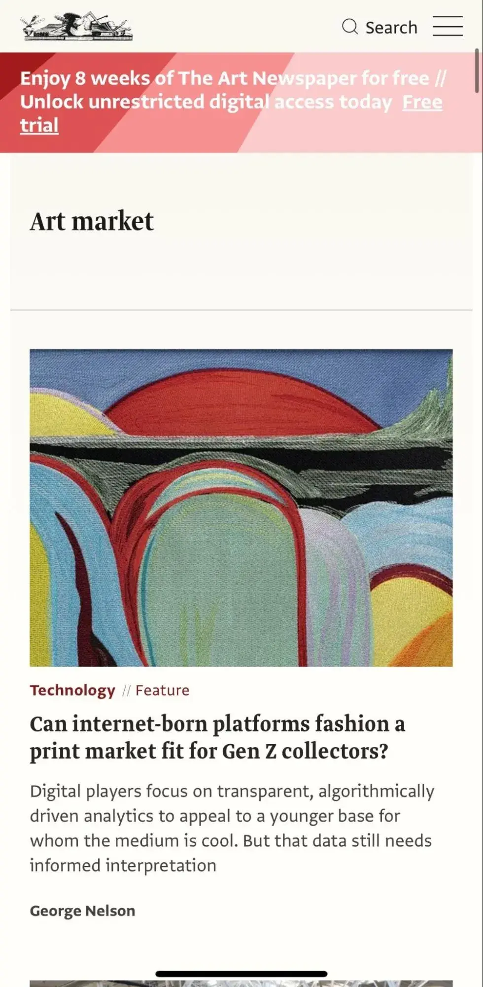
What I like: In the fashion of a visual arts publication, The Art Newspaper has a good eye for the visual story its website conveys. It doesn’t try to do too much to get its point across; instead, it couples a generous amount of white space with brilliant imagery to maximize readability and provide a museum experience straight from your device.
4. Badische Neueste Nachrichten
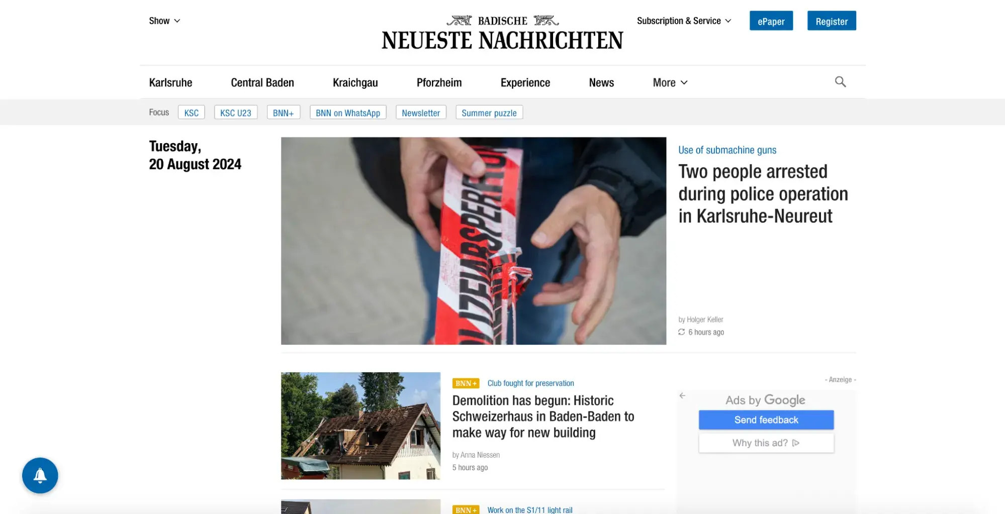
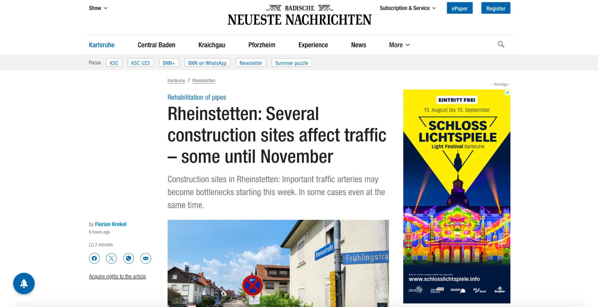
Badische Neueste Nachrichten (BNN) is a regional newspaper in Karlsruhe, Germany. It has a minimalist design that represents a traditional newspaper design. Especially for a regional newspaper, this is helpful, as the readership may include older, loyal readers used to the print look of the publication.
What makes this site unique is that it includes a series of icons. One — the yellow badge — denotes articles for paying subscribers. This both warns unpaying subscribers in advance that they cannot access the article and provides a boost to paying subscribers who will appreciate their special access.
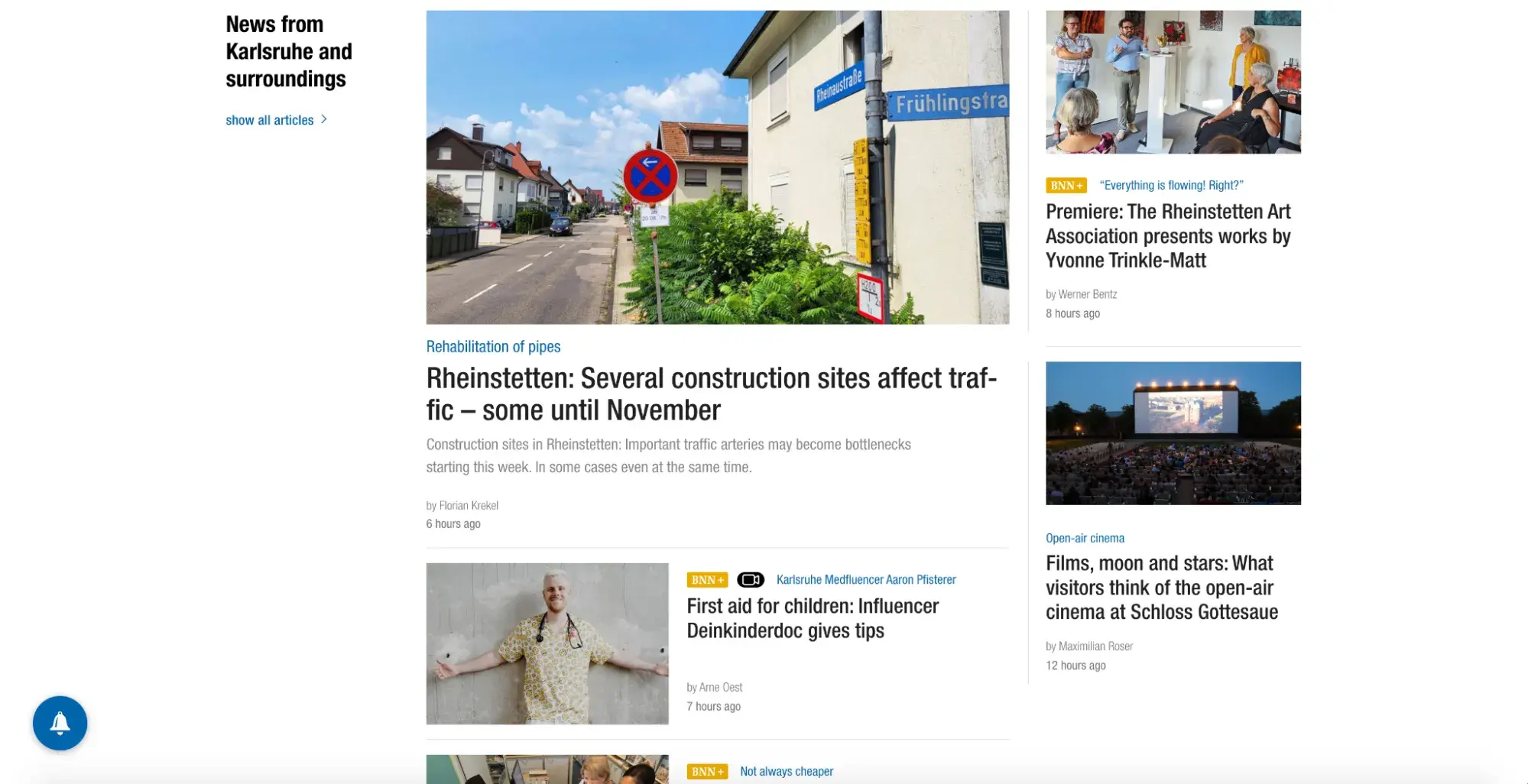
The other icon is an open book, which is located within an article on the left side. It draws attention to the reading time of each article.
I actually prefer the scrolling and reading experience of this publication on mobile, as the layout lends itself well to a vertical alignment.
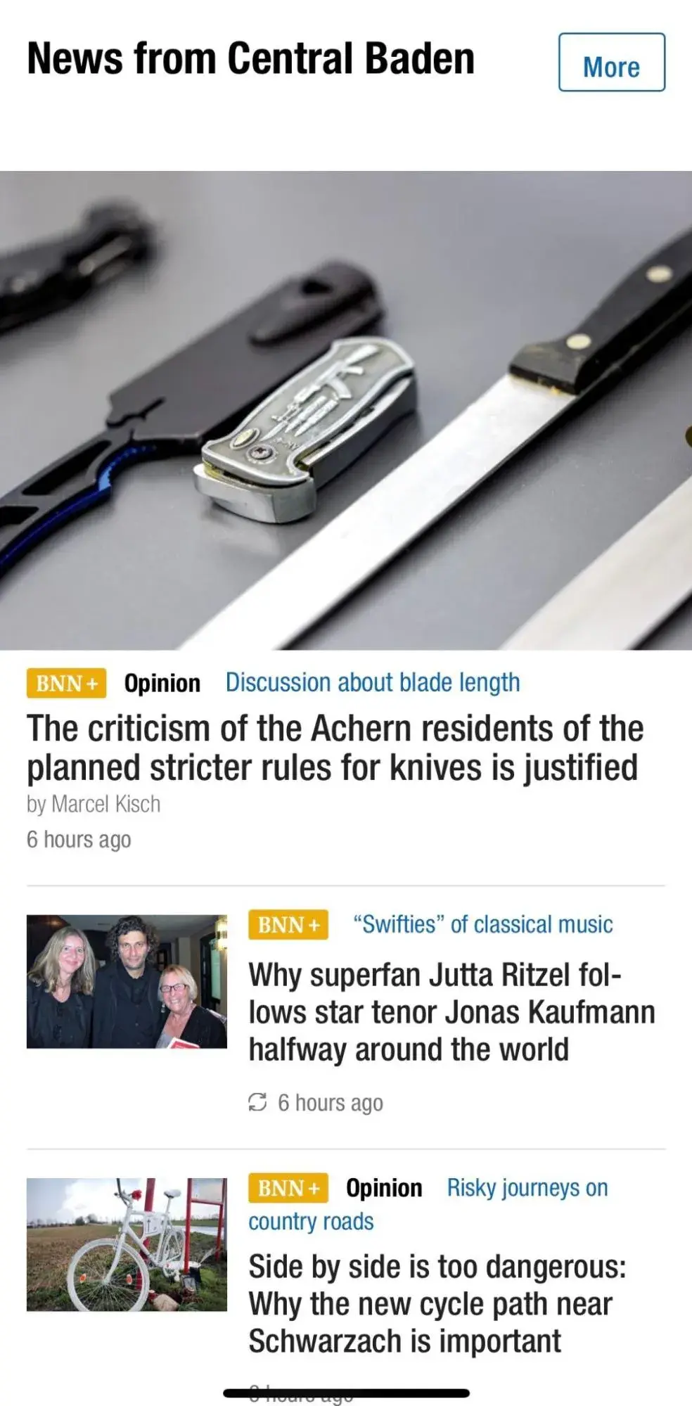
What I like: BNN uses iconography to clearly denote the reading time of each article and which ones are exclusive to subscribers. In an otherwise conventional news website layout, this shows that they are attentive to their loyal readers’ wants and needs.
5. The New York Times
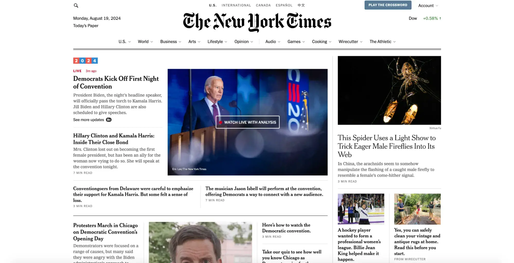
The New York Times (NYT) is my favorite news publication (and the only one I am a paid subscriber to!). I may be biased because I live in New York City, but I find it’s one of the most exhaustive, reliable, and exemplary publications.
Outside of its award-winning content, NYT is one of the longest-running American publications, established in 1851 as the New York Daily Times. Due to its prestige and rich history, it makes sense that, when going digital, NYT cared a lot about replicating its newspaper look and feel into its website design.
Milliken agrees, saying, “I have noticed that legacy papers make sure that fonts, color schemes, and logos carry over [from print to digital].” It’s a unique opportunity for publications like NYT to bridge the gaps between media.
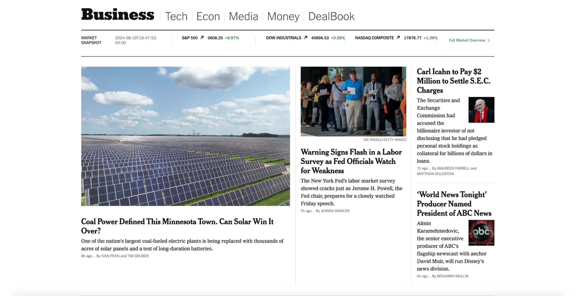
When I’m scrolling through pages on the website, I feel as though I’m flipping through pages in a print newspaper. The font, while not identical to the one used in print, is similar and provides a classic air while being easier to read on screens.
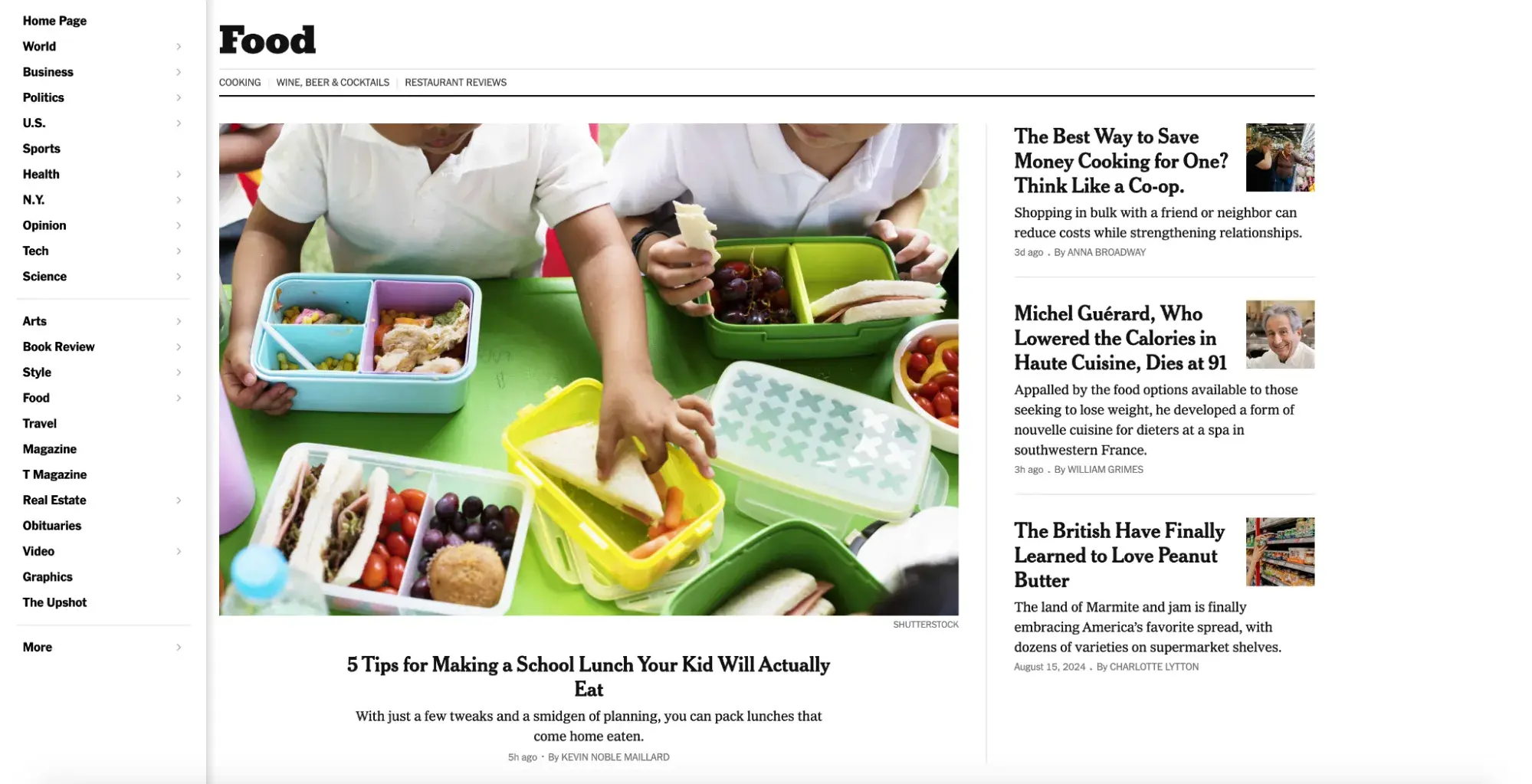
The homepage of NYT features the primary navigation menu just below the header and above the content, like most news websites. But if you click the hamburger button in the top left corner, a vertical menu will appear, as shown in the image above.
When you hover over one of these navigation links, like Food, a secondary drop-down menu will appear. This makes it easier for visitors to decide if they’d rather navigate to a niche section or freely browse.
What I like: The New York Times is a publication that wants to be taken seriously, and its website design reflects that. The layout is an ode to traditional newspaper designs while providing elements to simplify the digital experience, including clearer fonts and both a horizontal and vertical navigation menu for visitors searching for their preferred subsection.
6. Good Good Good
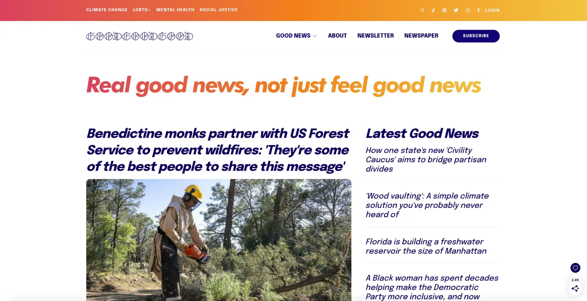
I first discovered Good Good Good during the pandemic as a beacon of hope during a dark time. This publication, similar to Beautiful News, is known for covering good news and sharing resources to inspire hope and more good deeds in the world.
Immediately when entering the website, you are exposed to gradient colors of pinkish red, orange, and yellow. Different colors can impact our emotions and moods. Pink is associated with innocence and softness, orange with warmth and enthusiasm, and yellow with joy and optimism. These colors blend well together on this site due to the nature of the news it shares.
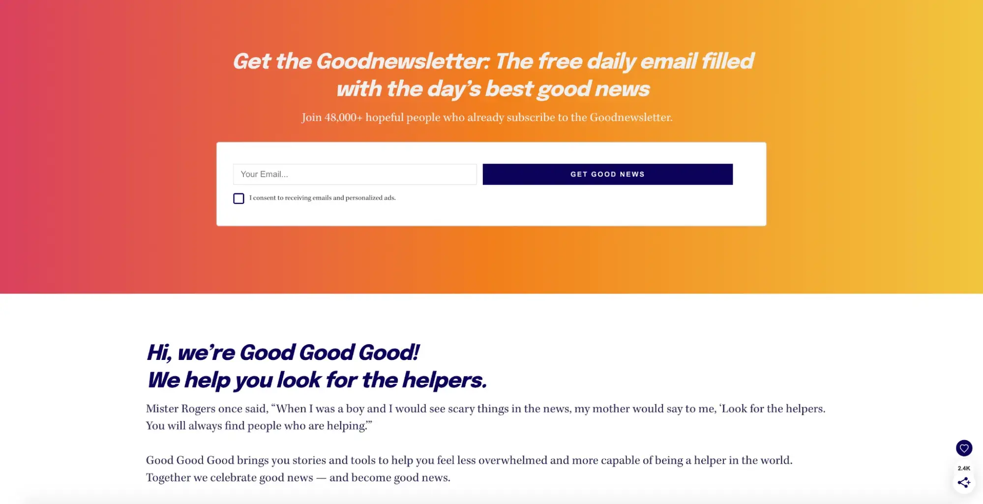
I appreciate that Good Good Good combines the best parts of a newspaper website design and a progressive website design. It organizes subsections in an easy-to-access manner and uses modern fonts.
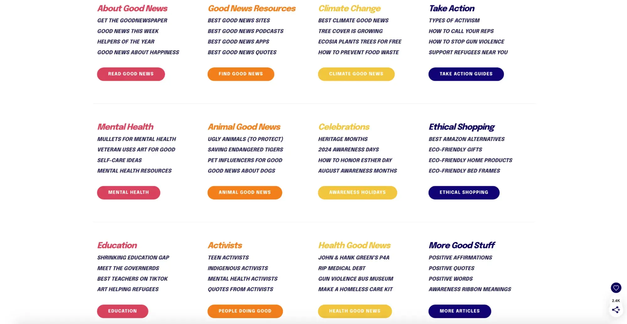
Its color scheme goes one step further; it incorporates dark blue text to add a sense of seriousness to the otherwise light theme. I noticed the dark blue text used for headlines, CTA buttons, and suggested opportunities for readers to take action.
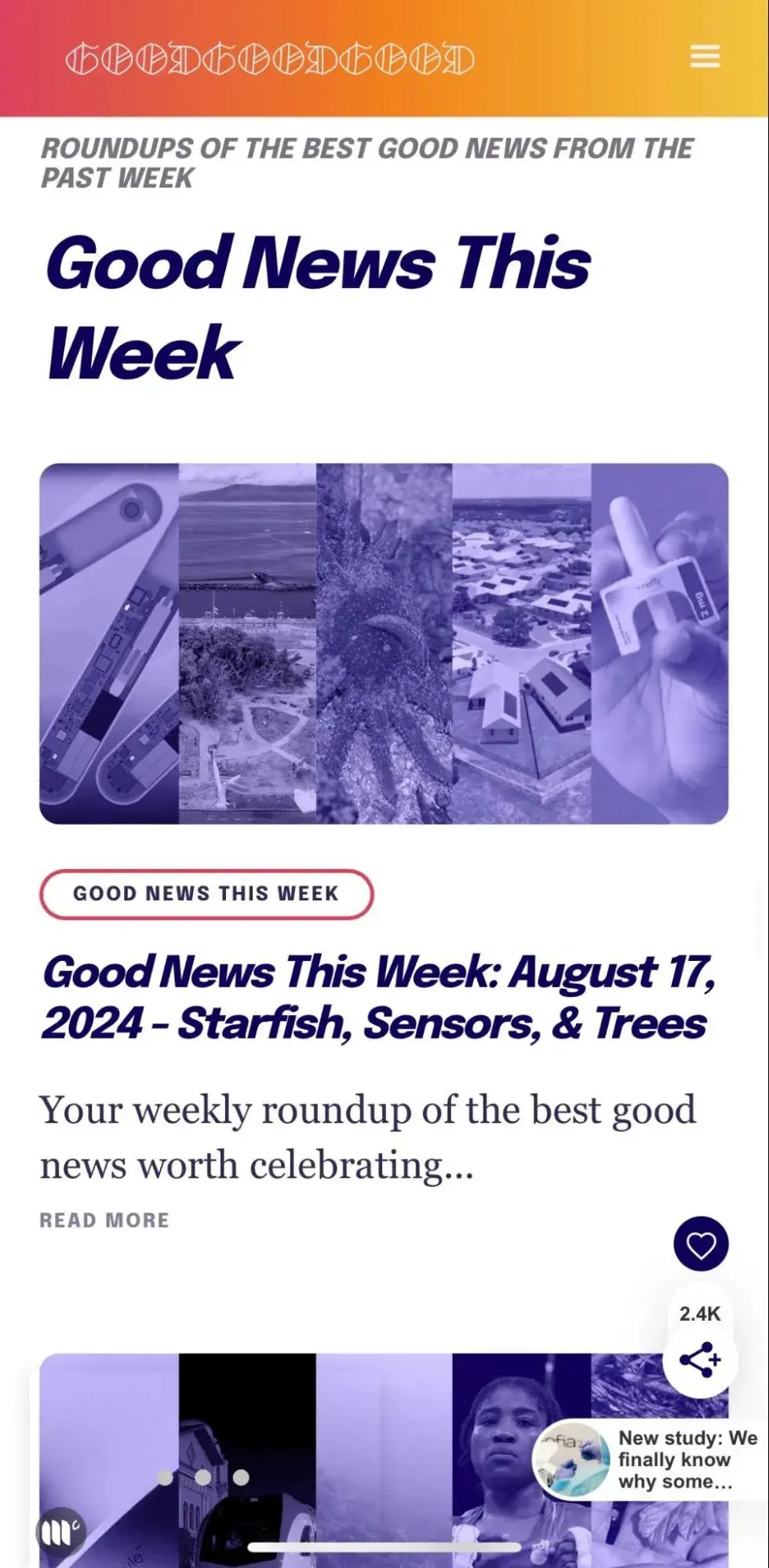
What I like: Good Good Good is a great example of knowing your brand and designing your site accordingly. As a site all about sharing good deeds and hopeful progress, it doesn’t take its news layout too seriously and instead incorporates fun, engaging colors into a creative website template to stand out in a sea of black and white.
7. Fast Company
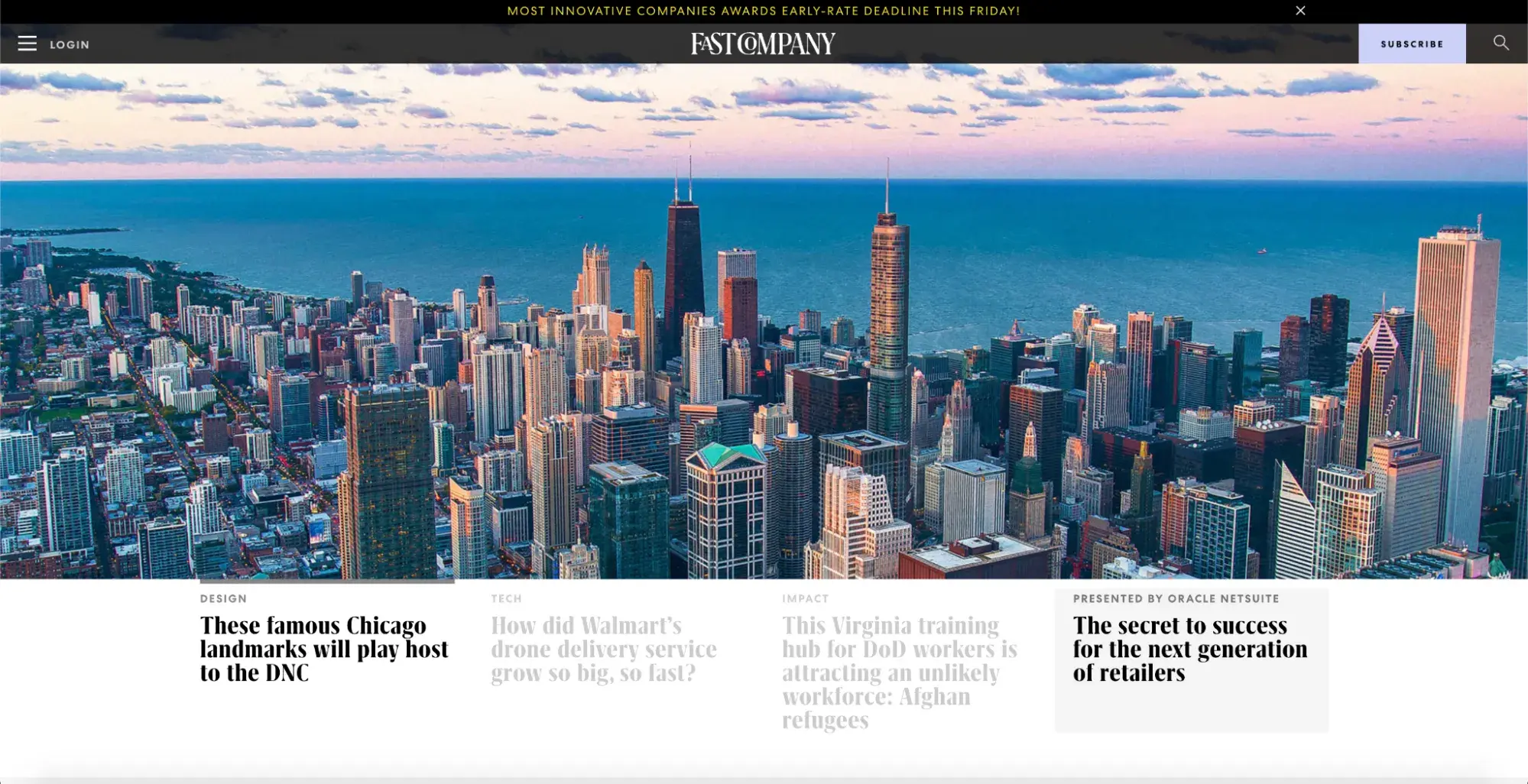
Fast Company is a magazine that prioritizes innovation in the fields of business, technology, design, culture, and leadership. The publication honors organizations and individuals with awards in categories such as “Most Innovative Companies” and “Most Creative People in Business,” so it makes sense that the magazine itself has an innovative, creative website.
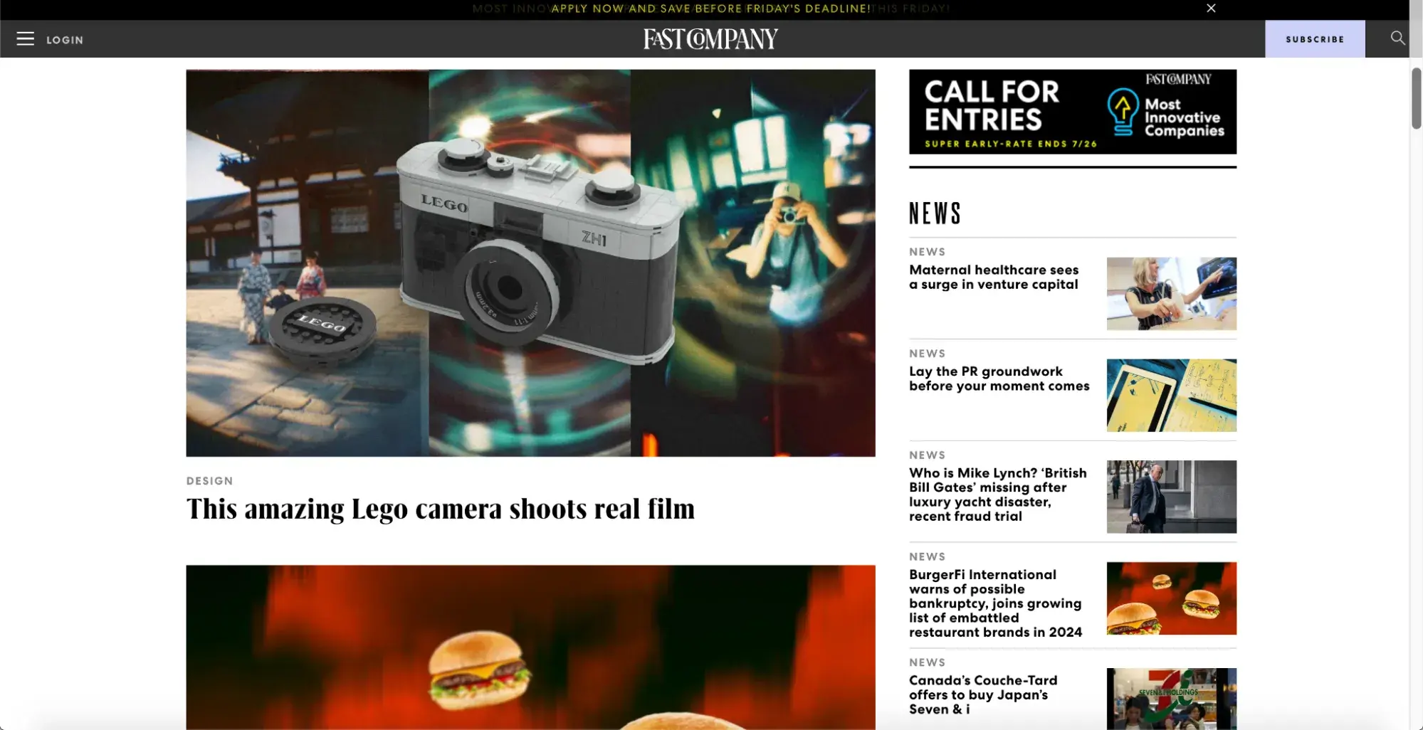
Fast Company has a more modern design than traditional news sites like NYT. It uses several fonts and colors, striking images with illustrations, and graphic design elements. As seen in the screenshot above, its hero section includes an animated slider that rotates through four articles, with a slightly transparent dark navigation menu overlaid on top.
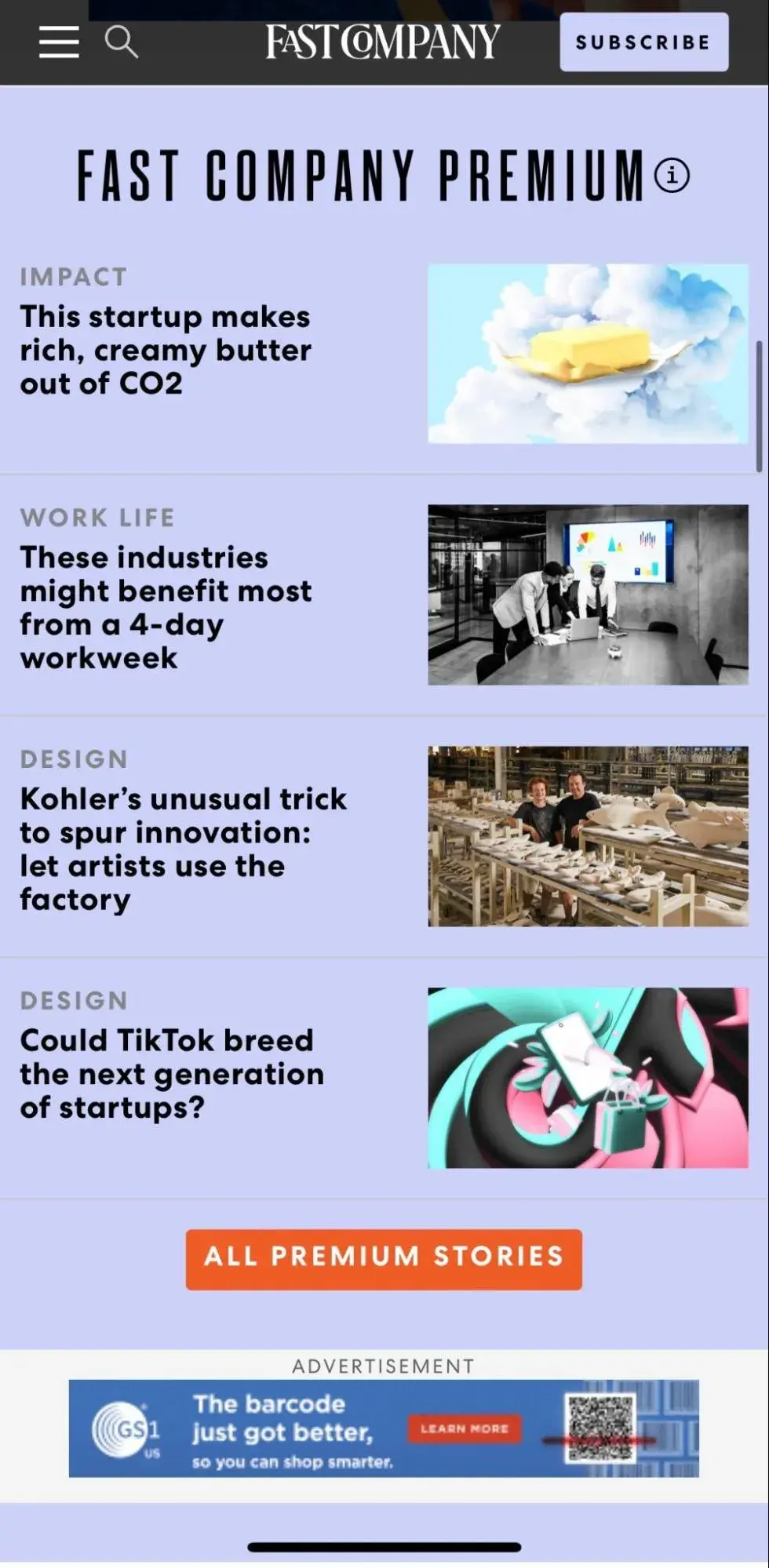
I like that Fast Company keeps its premium content separate in a section with a light purple background. These articles stand out from the rest while remaining in line with the futuristic, sharp appearance of the landing page.
What I like: Fast Company is all about technology, design, and revolutionary ideas, and its bold, striking layout is rightfully reminiscent of science fiction. I like that the site features four articles in an animated slider above the fold to immediately grab the reader’s eye and add movement to what could have been a stagnant landing page.
8. Los Angeles Times
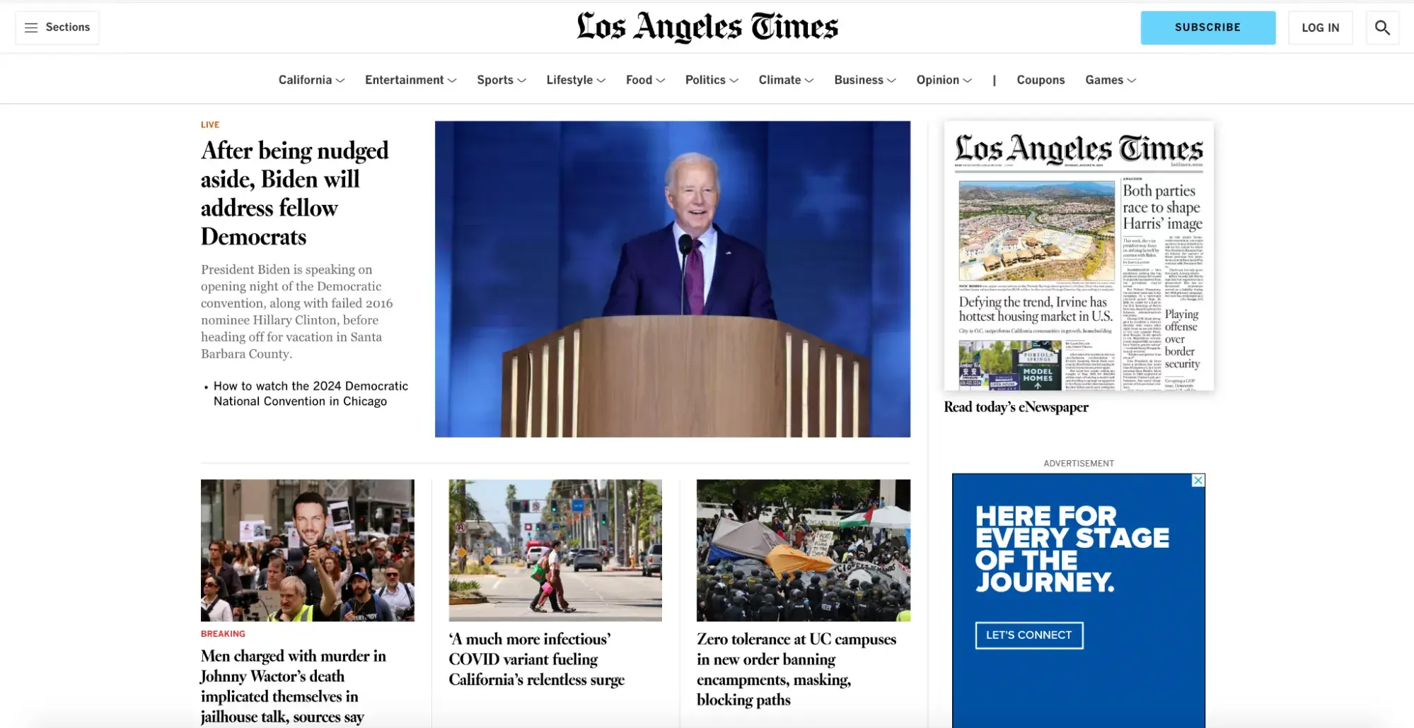
Los Angeles Times (LAT) is a leading source of breaking news, entertainment, science, sports, and more. It is the largest daily metropolitan newspaper in the country; the site receives more than 40 million monthly visitors.
Due to its acclaim and popularity, the website was clearly designed with readers in mind. As I scroll through LAT’s website, I’m blown away by the sheer number of news stories shared on its homepage while remaining fresh, clean, and orderly.
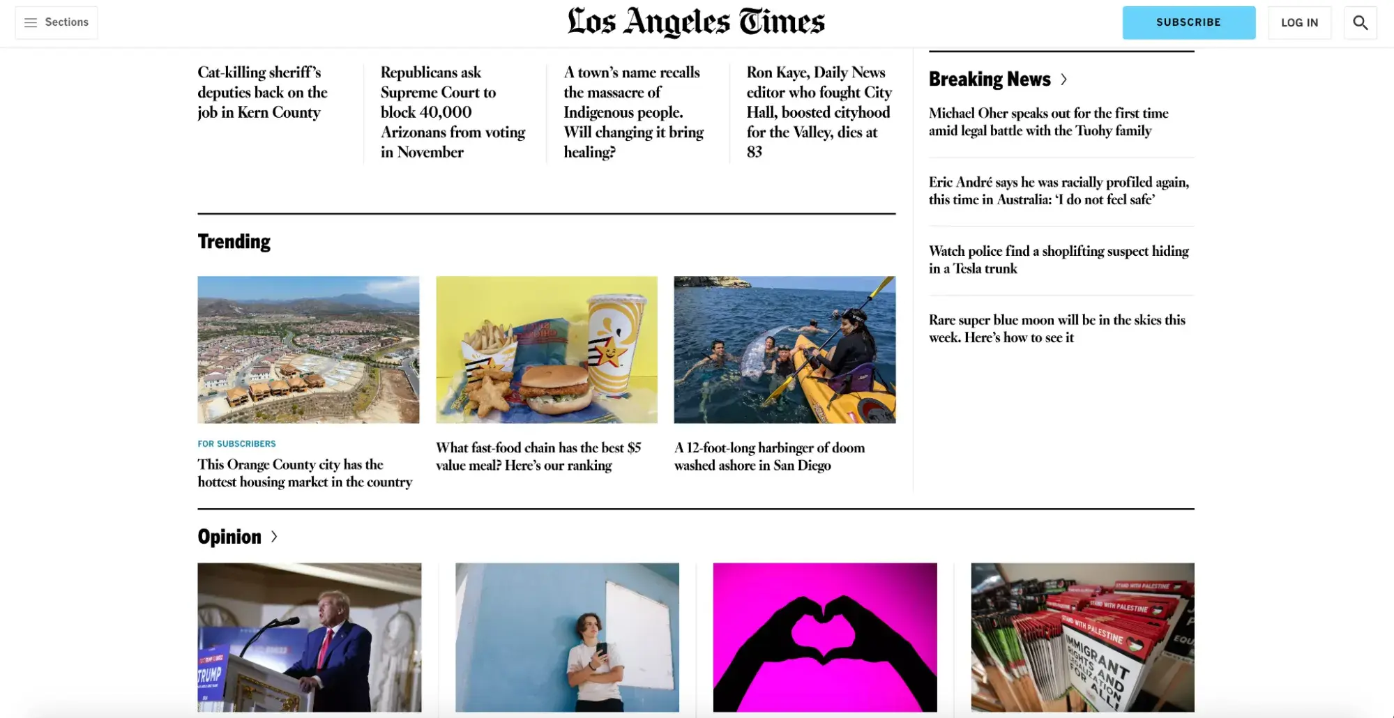
The website makes strategic use of typography, white space, images, and bold divider lines to organize its different sections. For example, the California section is divided into several categories, including California Politics, Crime & Courts, Most Read, Breaking News, and L.A. Influential.
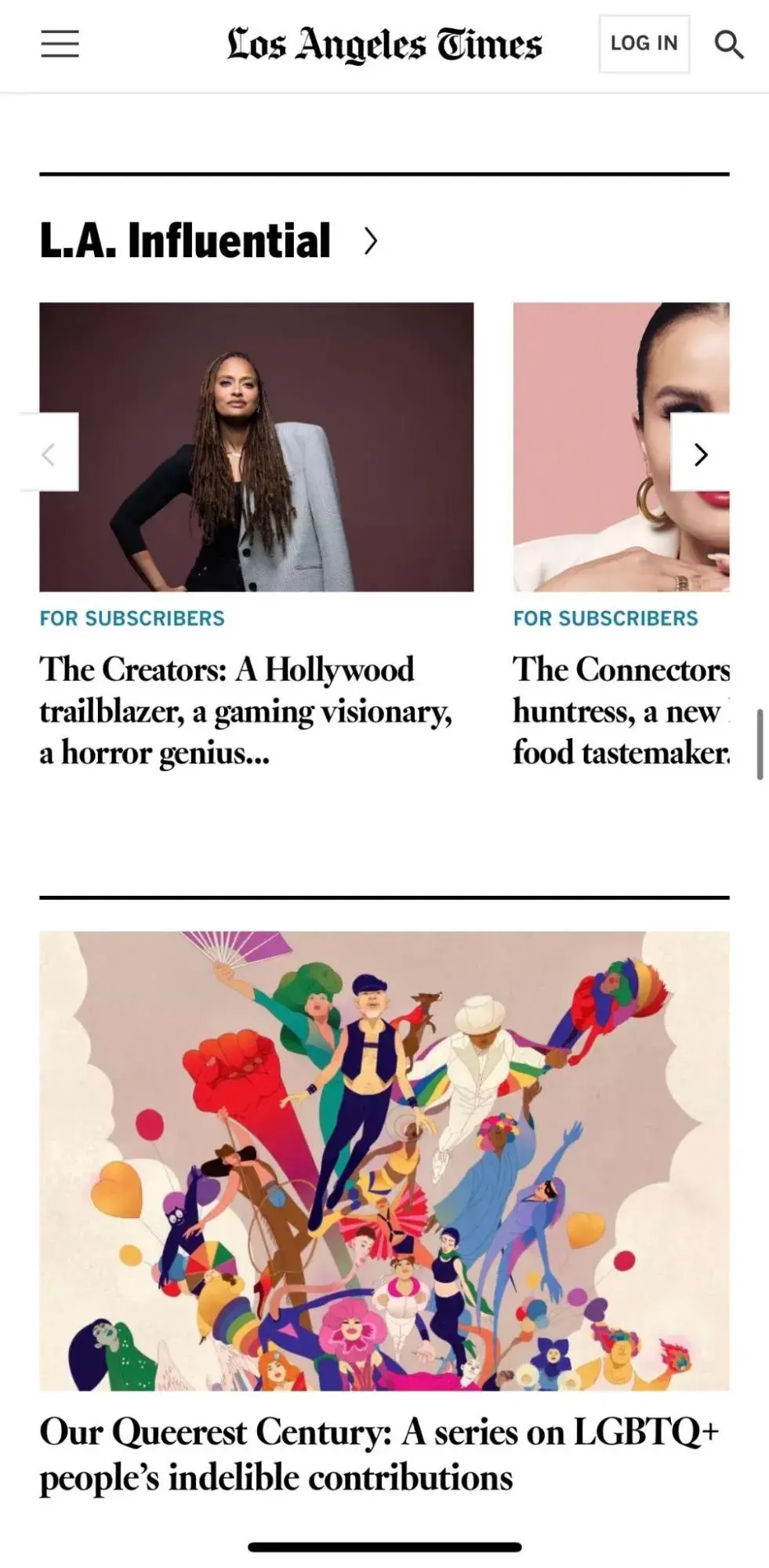
What I like: Los Angeles Times prides itself on having a large audience and being a metropolitan staple. Accordingly, the publication built its news website design to reflect important news through visual hierarchy and divider lines to create a clean, organized layout in sections that pop.
9. Blavity News
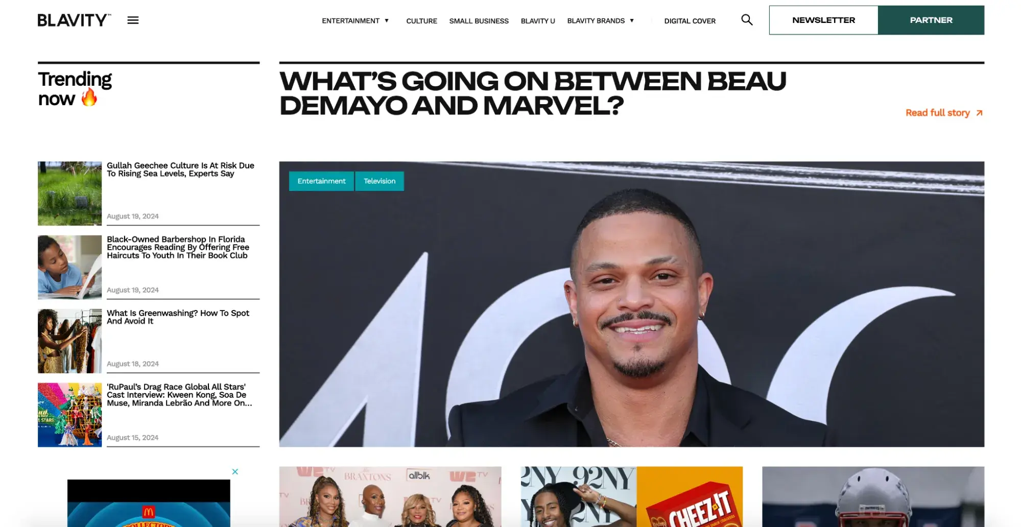
Blavity News provides culturally relevant news, insights, and commentary catered to Black millennials and Gen Z. The topics are often underrepresented in traditional media, so the publication creates space for diverse content, cultural discourse, and authentic representation of the Black community.
Its hero section is designed to draw visitors in with full-width images of Black celebrities and athletes. The site also features large titles and pops of color, and I especially like that every headline is accompanied by an image that helps liven the text.
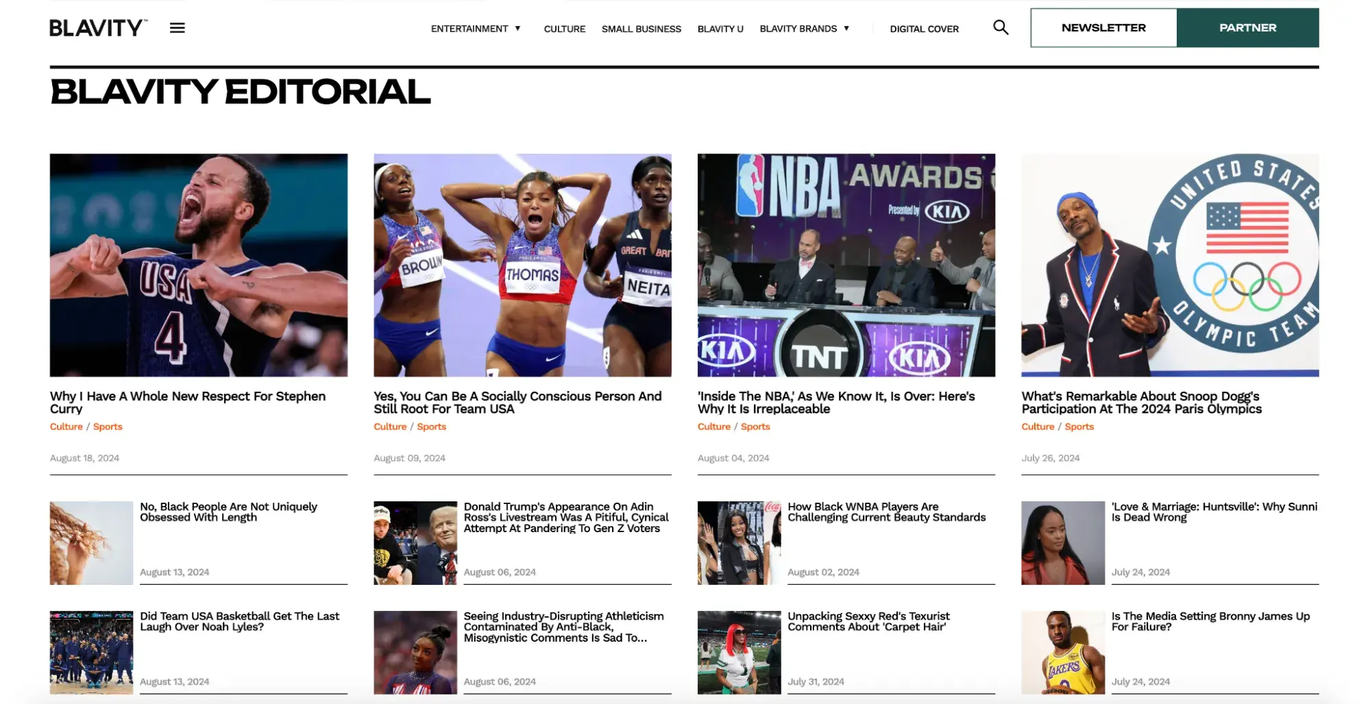
Blavity News successfully combines a standard, serious news website layout in some sections with a more vibrant, youthful layout in other sections that is more fitting for its audience of Black millennials and Gen Z.
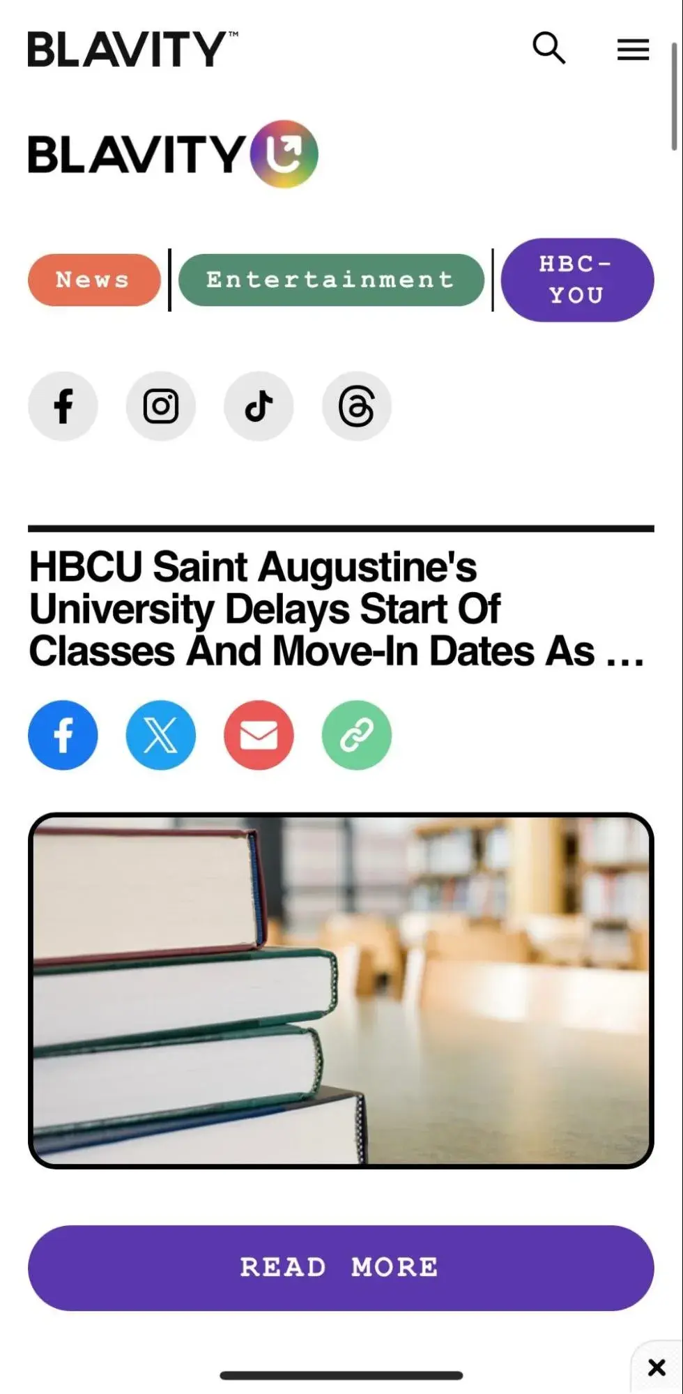
What I like: Blavity News is a site that wants to be taken seriously while creating a welcoming, inclusive space that empowers its readers to get involved. This is evident by its use of various design decisions. While it’s important to always stay true to brand, it can be fun to play around with different styles that align with the content — whether it be breaking news, celebrity gossip, or educational material.
10. TIME
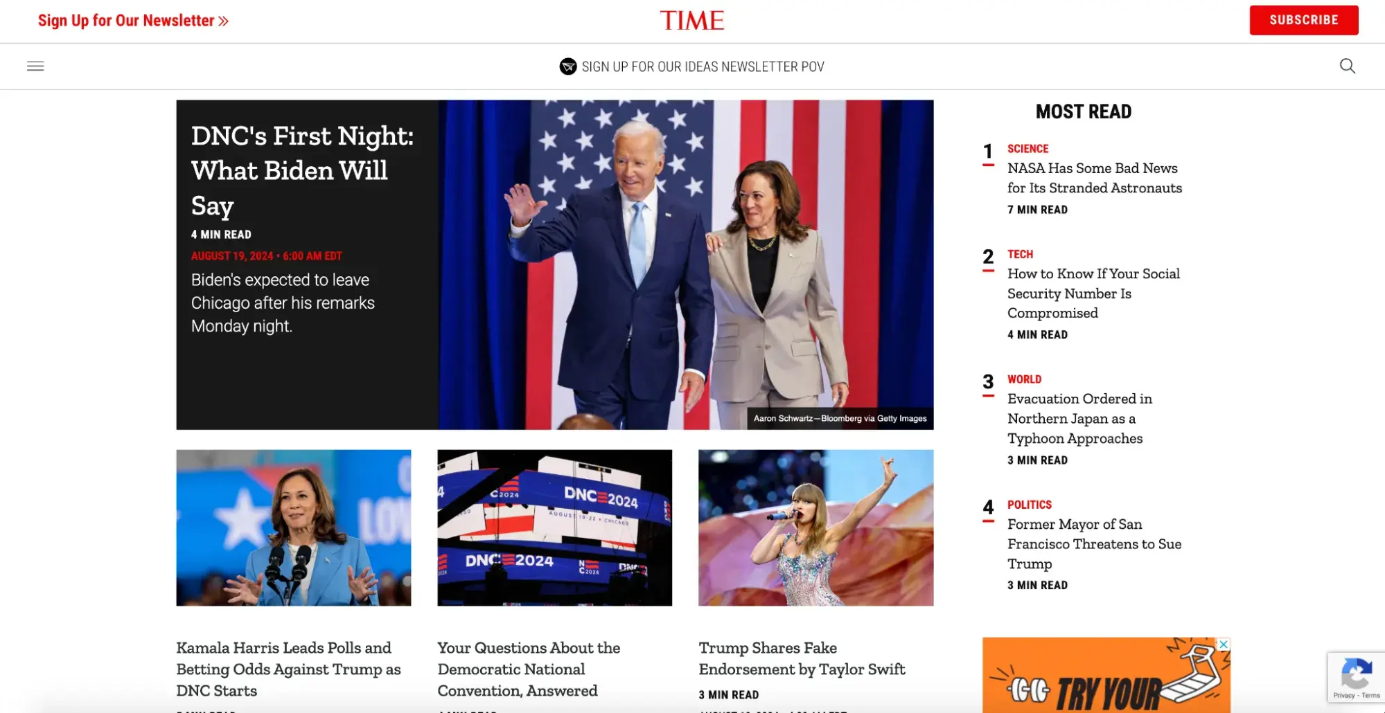
TIME provides coverage of breaking news and analysis in politics, science, health, entertainment, and more. It’s known for being the first weekly news magazine and was revolutionary for changing how news was presented. It was built on a platform for summarizing important global events into easily digestible nuggets for busy people.
TIME is known for its black, white, and red color scheme. Its print magazines are famed for their distinctive covers, which typically feature portraits outlined in a simple red border. Its website adopts this iconic style by adding pops of red throughout the text.
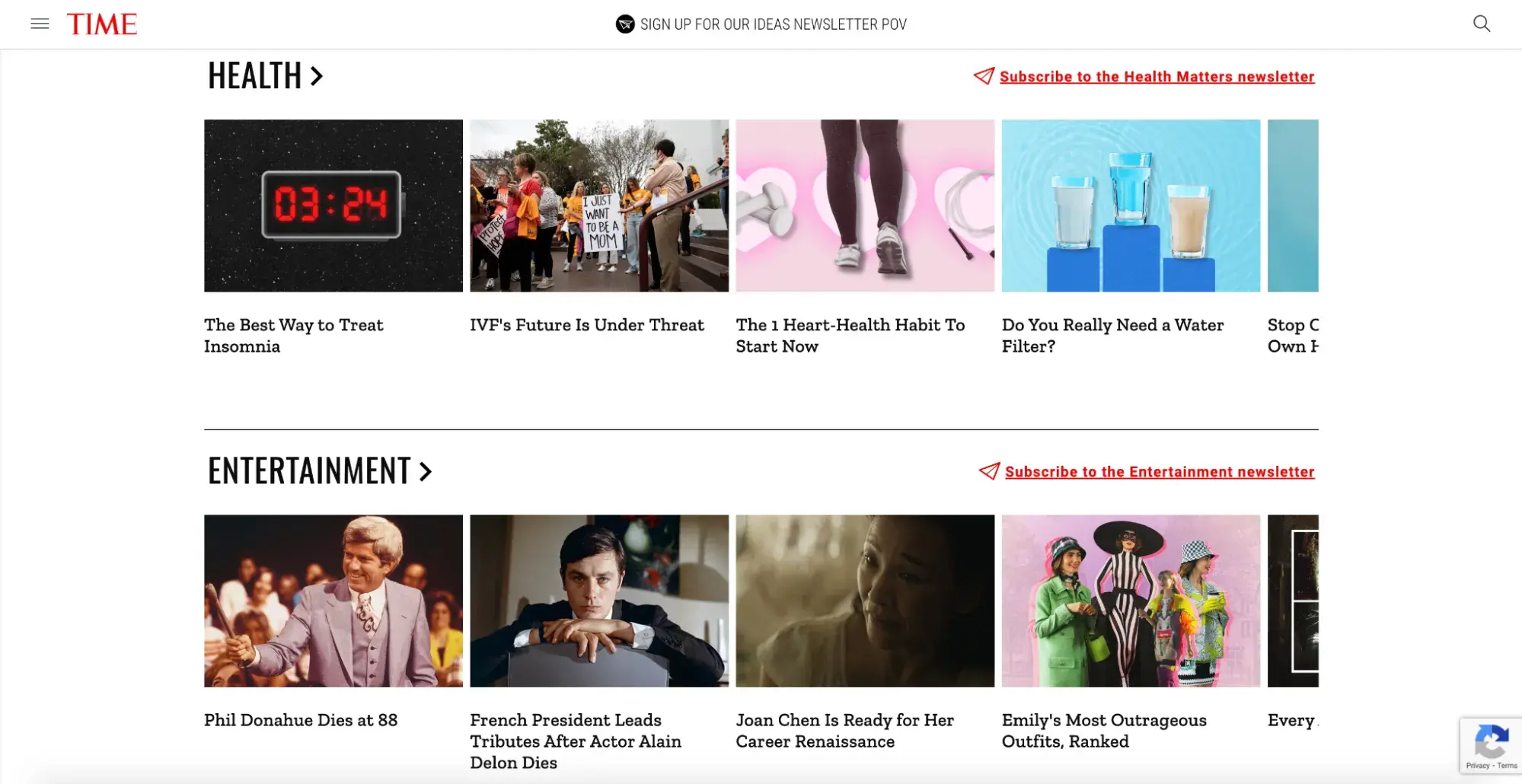
To align with its origin story of creating a magazine for busy readers, TIME has designed its website to be as clear and cohesive as possible. This also resonates in its mobile version — which is notoriously a news source for the busy individual — which is well-designed and just as accessible as its web version.
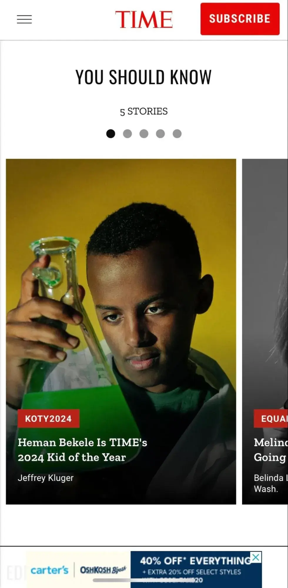
What I like: Unlike some other publications that have busy, crowded layouts to accommodate as much content as possible, TIME prioritizes a clean, uncluttered template that’s easy on the eyes and on time. It also uses red as an accent color to strengthen its brand identity and subtly draw readers’ attention to CTA buttons and other important elements.
A New News Era
News is ever-changing and of the moment. Similarly, the way you design your news website should allow for constant growth and updates.
Milliken’s parting advice is, “Iteration is everything. When designing a [news] site from scratch, you’ll be making changes from version to version. Even when that’s done, you’ll be making changes constantly....I always recommend that folks working on similar projects keep an open mind. If you’re overly committed to any particular design choice, it may be difficult to change that selection later, even if making a change would be better for your users and your site.”
Brand pages, portfolios, and other more creative websites get the bulk of thoughtful design work over news sites, which may not receive the same reflection since their content can be seen as no-nonsense. I myself have made decisions on which news publications to faithfully trust based not only on their content and level of journalism but on many other factors, including readability, simplicity, user-centricity, and satisfaction.
Design plays a pivotal role in most of these traits and can showcase your brand’s ability to adapt from the print world into a modern, digital space. If you find yourself in a creative rut when ideating your news website’s digital look, consider website design homepage examples to get the ball rolling. After all, the homepage is the first place readers land and can make or break their decision to keep scrolling.
Most of all, I’ve learned that there are countless ways to make a brand identity shine through on any website, with colors, fonts, layout, CTAs, logos, and more. Keep that in mind as you carry on with your design project.
Editor's note: This post was originally published in March 2022 and has been updated for comprehensiveness.
Website Design Examples
.png?width=112&height=112&name=Image%20Hackathon%20%E2%80%93%20Vertical%20(50).png)

.png)


![15 black and white website designs to inspire your own [+ pro tips]](https://53.fs1.hubspotusercontent-na1.net/hubfs/53/black-and-white-website-design-1-20250520-1336267.webp)

![15 Brochure Website Examples to Inspire You [+ How to Make One]](https://53.fs1.hubspotusercontent-na1.net/hubfs/53/brochure-website-examples-1-20250319-362228.webp)
![28 Types of Websites to Inspire You [+ Real-Life Examples]](https://53.fs1.hubspotusercontent-na1.net/hubfs/53/types-of-websites.png)

