

With these possible effects and benefits of a black and white website design in mind, I’ll show you some specific examples of websites using this color scheme. Each example will include a pro tip or takeaway that you can apply to your own website design, along with my own thoughts on what I like about the website design.
Black and White Website Design Inspiration
- Lionel Taurus
- Hudson Gavin Martin
- Golden Suisse
- Melanie DaVeid
- KeepGrading
- Replica Studios
- Henri Heymans
- Duft & Co Bakehouse
- Poklonnaya 9
- Universal Sans
- Apple AirPods Pro 2
- Physics of Beauty
- Bad Boys Supply
- Mysta Electric
- Longshot Features
Below, I’ll take you through some of my favorite black and white website design examples.
However, if you want to find some black and white designs that you can use for your own website, I recommend checking out HubSpot’s Content Hub website templates, as you can find some great black and white designs in the template library.
1. Lionel Taurus
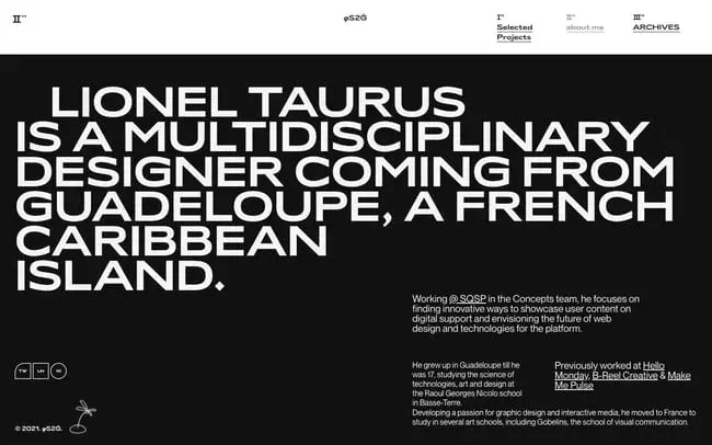
Lionel Taurus’s portfolio website is a fantastic, slightly mind-bending example of an interactive website. His “About” page exemplifies how bold but simple a black and white design can be. It’s also a smart choice since his layout is so unconventional. If paired with an unconventional color scheme, then it might be too difficult to read — but it’s easy to follow along with this timeless color combination.
.png)
Free Website Design Inspiration Guide
77 Brilliant Examples of Homepages, Blogs & Landing Pages to Inspire You
- Agency Pages
- Ecommerce Pages
- Tech Company Pages
- And More!
Download Free
All fields are required.
Form not available
Pro tip: A black and white design can complement a unique grid layout, making it seem bolder but still easy to read.
What I like: I love how Lionel has chosen to go with such a bold white headline at the top of the page. As you’ll see in a lot of these examples, bold typography is one of the best ways to add interest to a black and white website design.
2. Hudson Gavin Martin
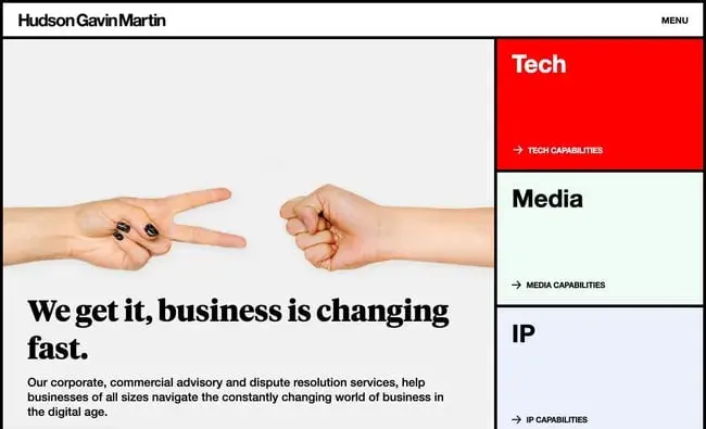
Hudson Gavin Martin has a unique grid homepage that looks clean thanks to its minimal text and black and white design. When a visitor hovers over some of the grids, however, they change background color. In the screenshot above, you can see the grid section labeled “Tech” changes to a bright red background color when hovered over. This makes it easier for users to know where they are on the page and to navigate to different parts of the site.
Pro tip: Using hover animations so that the black and white elements on your website change colors can help enhance your site’s navigability and interactivity.
What I like: This website is a great example of how you can use small pops of color to add interest to an otherwise black and white design. Because the vast majority of the website is only in black and white, the bright colors of the boxes really attract attention.
3. Golden Suisse
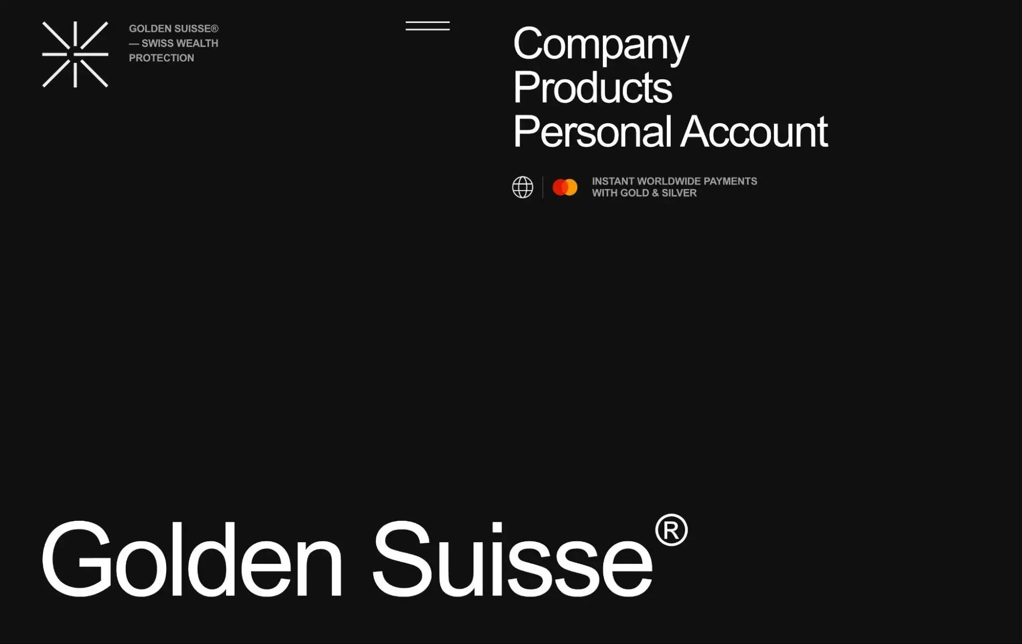
Golden Suisse is a Private Swiss Bullion Nonbank with a mission to “provide unmatched wealth protection and privacy” for their clients. That’s why the black background and white text on its website works so well: It conjures up ideas of privacy and exclusivity.
While the black background color and white text color combination can be difficult to read if there’s too much text, that’s not a problem on Golden Suisse’s website. On the homepage, there are fewer than 100 words with plenty of negative space in between.
Pro tip: Using minimalist white text against a black background can create a perception of security and confidentiality.
What I like: Because Golden Suisse is such a “serious” company, I think the black and white design does a great job of communicating how serious and exclusive Golden Suisse is. Choosing brighter, more exciting colors would create a younger, more playful brand, which is the opposite of what Golden Suisse is trying to communicate to its clients.
4. Melanie DaVeid
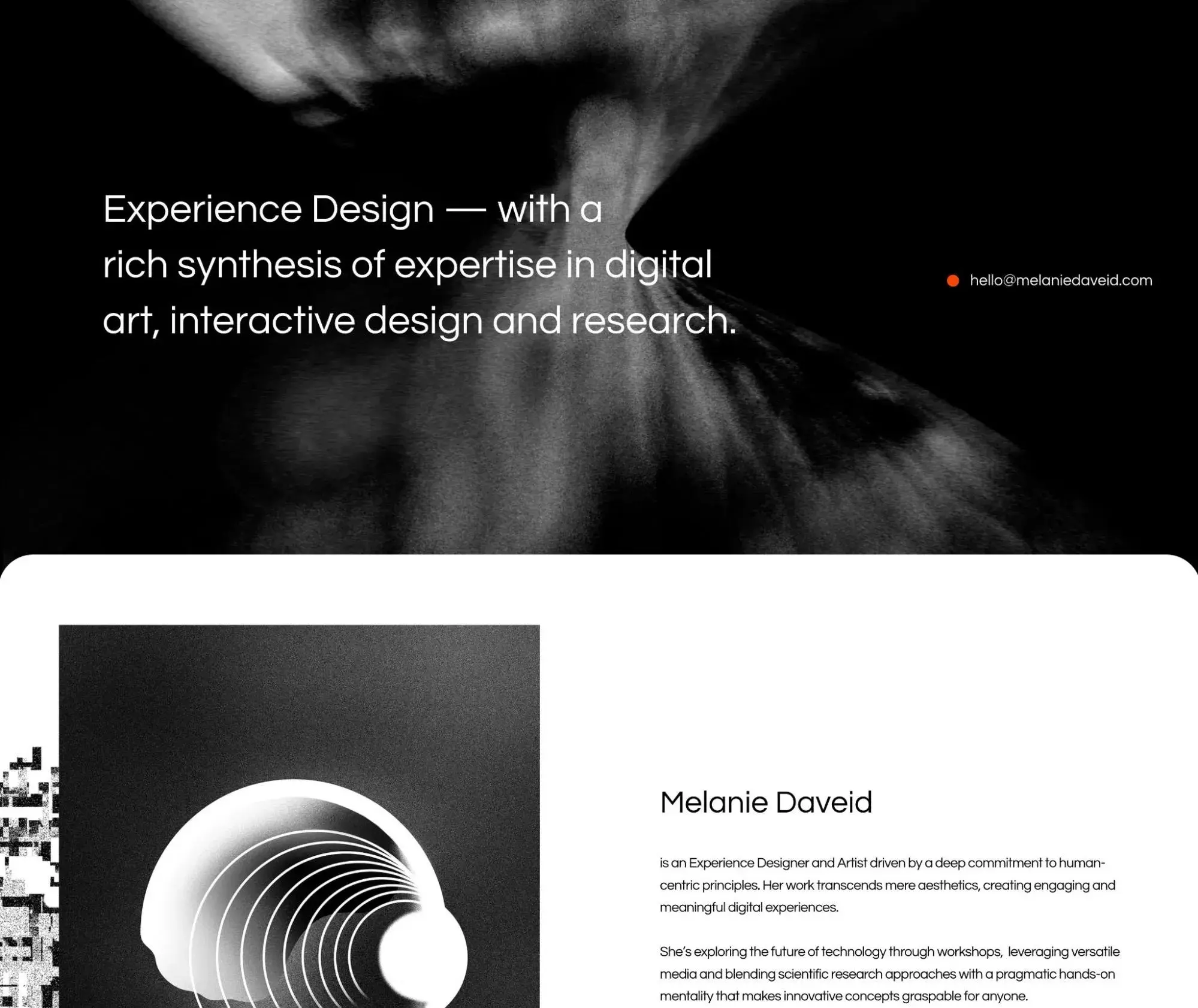
Melanie DaVeid is an artist and experience designer with a commitment to human-centric principles. For her portfolio website, she’s chosen to go with a black and white website design.
While the vast majority of the site is black and white, she does bring in a few very tiny pops of color with her contact email and portfolio items, which include eBay, Salzburg University of Applied Sciences, and Adobe Live.
Pro tip: Make important elements, like your contact information, pop with a bright color that starkly contrasts against the black and white.
What I like: I think Melanie was very smart with how she chose to bring in small bits of bright colors. Putting the emphasis on her contact details and portfolio items serves to really draw visitors’ attention to those elements, which are some of the most important parts of a portfolio website.
5. KeepGrading
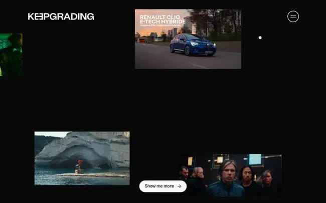
As a post-production studio focused on color grading for mainly advertisements, music videos, and film, KeepGrading makes sure its portfolio items catch and keep the visitor’s attention. These items — which include video thumbnails, GIFs, and image galleries — are the only sources of color against stark white and black backgrounds.
Pro tip: A black and white design ensures your multimedia content will be the focal point.
What I like: As I also highlighted in the previous example, the KeepGrading website is a great example of how a basic black and white design can work to really put the focus on your portfolio items. I think this approach can be especially effective with the visual arts, but it can work well for any type of portfolio.
6. Replica Studios
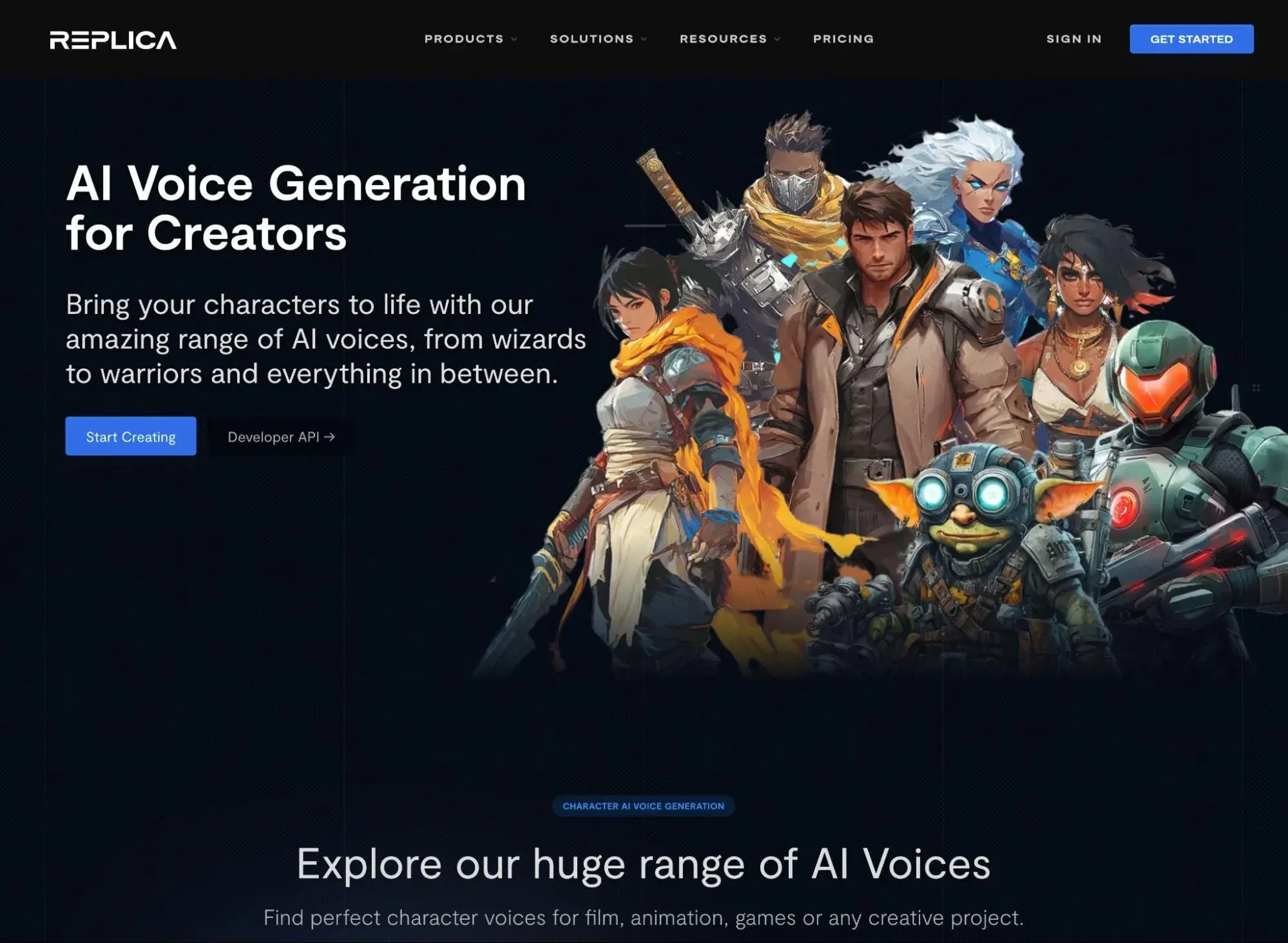
I’m guessing few readers are familiar with the concept of AI voice actors — Replica Studios understands that and has designed their website to present the topic as well as their company in the clearest, most informative way possible.
They offer succinct explanations, video tutorials, demos, and more so readers can learn and try their products. They also make use of a black and white color scheme in order to present their products as innovative without overwhelming visitors with information or color.
Pro tip: Tech companies or other companies in similarly innovative business niches can use a black and white website design to showcase their products or services in a clear, bold way.
Free Website Design Inspiration Guide
77 Brilliant Examples of Homepages, Blogs & Landing Pages to Inspire You
- Agency Pages
- Ecommerce Pages
- Tech Company Pages
- And More!
Download Free
All fields are required.
Form not available
What I like: I think this one is especially interesting because the basic black and white design kind of serves as a canvas for the video game characters. By making the characters stand out, Replica really highlights all the different ways in which its AI voices can be used.
7. Henri Heymans
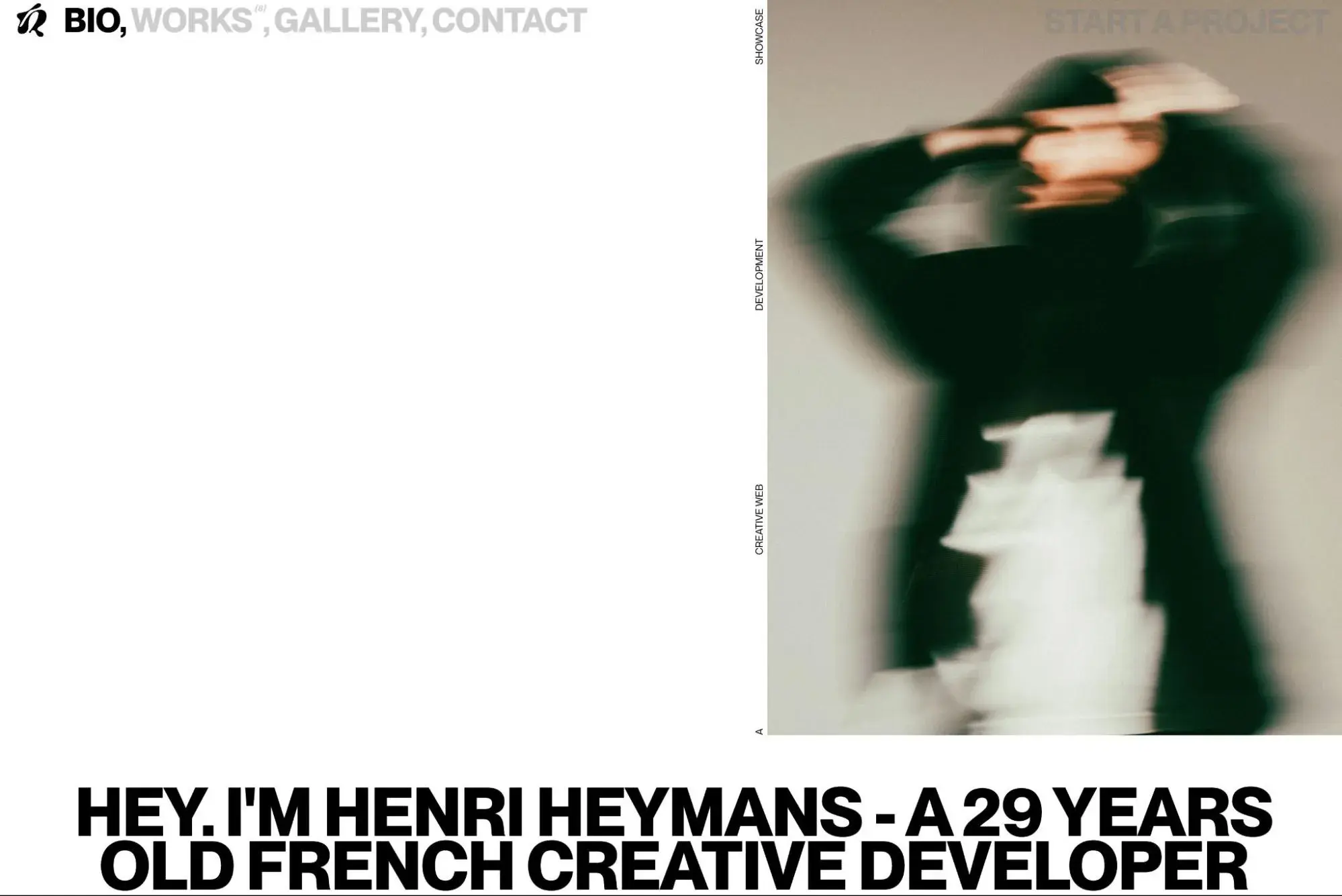
Henri Heymans is a French creative developer who uses technologies like JavaScript to create unique digital experiences.
When you first land on his site, he uses a mostly black entrance page. However, when you click to enter, he flips the scheme and switches to a white background with black text (pictured above).
In addition to the minimal black and white color scheme, Henri also uses a minimal design in general, which further enhances the effect.
Pro tip: Flipping between light and dark backgrounds can help you add variety even when sticking to a black and white color scheme.
What I like: I like how Henri has fully embraced minimal design to create a really open and airy feeling. Really the only time you see any color is when you hover over his recognitions and awards section to see some of the digital experiences that he’s created.
8. Duft & Co Bakehouse
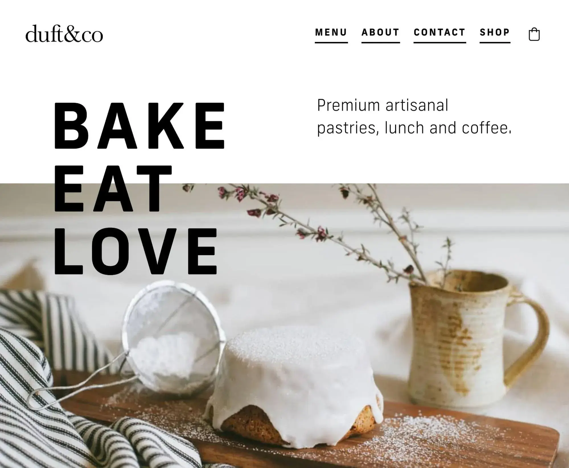
Duft & Co Bakehouse is known for its artisanal pastries, lunch, and coffee. So its website features large, high-quality images of those three items against a stark white background, with big and bold typography. The result is a mouth-watering, minimalist website that can serve as inspiration for any bakery website.
Pro tip: Keep the focus on your images with bold black typography against a white background.
What I like: I love how much the pictures of the delicious pastries, sandwiches, and coffee pop. For a restaurant or cafe, I think embracing a minimal design like this can be really effective for highlighting what you offer — just make sure you have good photos of your menu items, as I don’t think the effect will work as well with poor product photography.
9. Poklonnaya 9
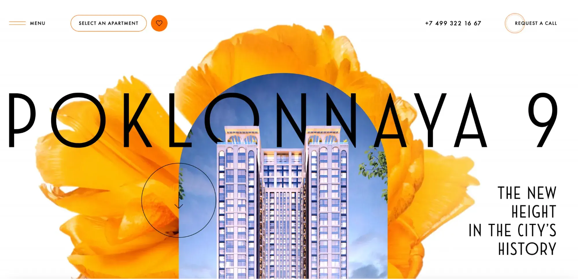
Poklonnaya 9 is an “ultra-contemporary” apartment complex in Moscow. Like the complex’s interior, its website is designed to be classic but futuristic, timeless but unique, elegant but eclectic — and these are just a few of the adjectives used on the site. Combining black, white, and neon orange, its color scheme is the perfect antithesis of the traditional black and white look.
Pro tip: Taking a twist on the standard black and white design by mixing in an unconventional color, like bright orange, can make your brand seem contemporary but still elegant.
What I like: While Poklonnaya 9 uses a mostly black and white design, I do like how they’ve brought in pops of other colors to create more interest. I think it’s a good reminder that you don’t have to limit yourself to black and white for every single element on your site.
10. Universal Sans
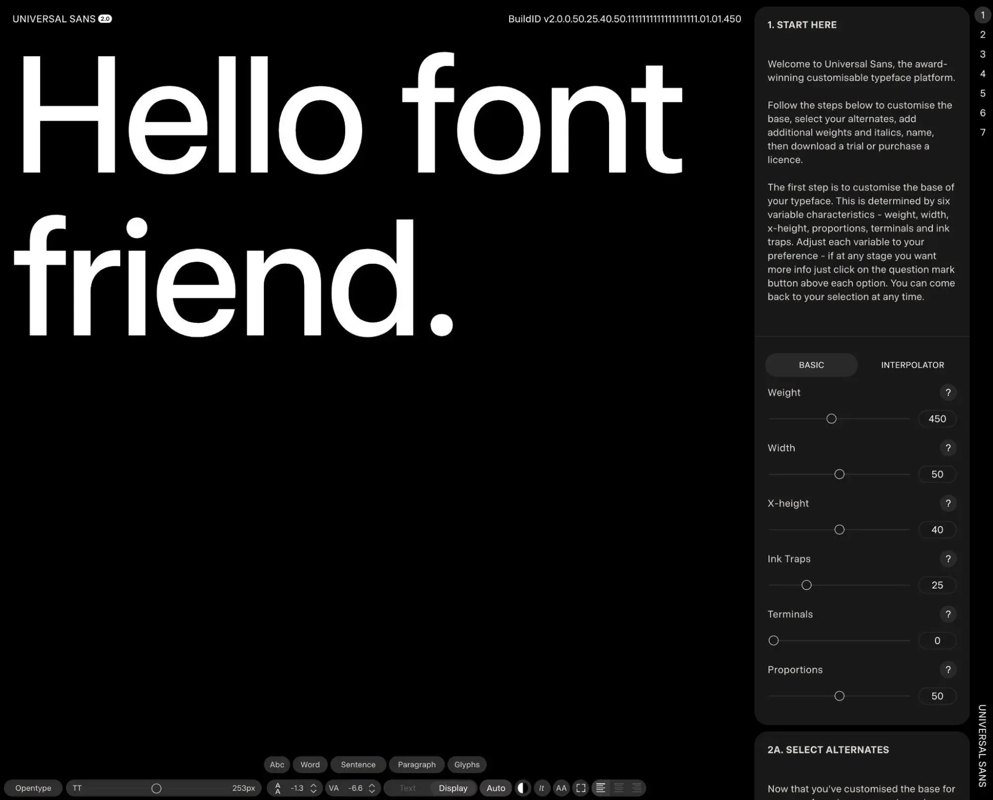
Universal Sans is a free tool that helps users create and download their own customizable typefaces. The entire design of the website and customization interface uses a clean black and white color scheme, with dark backgrounds and white text.
As part of its interface, it includes a huge live preview of the font that the user is creating. This huge block of white text also allows for full user interaction, which lets users preview how their fonts look with different words or sentences.
Pro tip: Sites with bold typography (such as Universal Sans) work great with black and white designs.
What I like: Because Universal Sans is a website that’s 100% focused on fonts, I think the black and white design aesthetic does a great job of keeping the focus on the fonts that users are creating/customizing. It’s a great example of how you can use a subdued color scheme to reinforce the goal of your website.
11. Apple AirPods Pro 2

While Apple doesn’t use black and white website designs for all of its product pages, the Apple design team did decide to go with an all black and white design for the AirPods Pro 2 product page.
Part of what makes this black and white design so unique is that it still includes all of the cool parallax and scroll effects that Apple’s web design is known for.
Pro tip: When done well, using parallax and scroll effects can be just as engaging as a colorful design.
What I like: My favorite thing about this design is the very minimal use of bright green for certain elements. When compared to the overall black and white design, these small accents really pop and add interest to the design. It’s a great reminder of how you can mix things up while still working within the black and white aesthetic.
12. Physics of Beauty
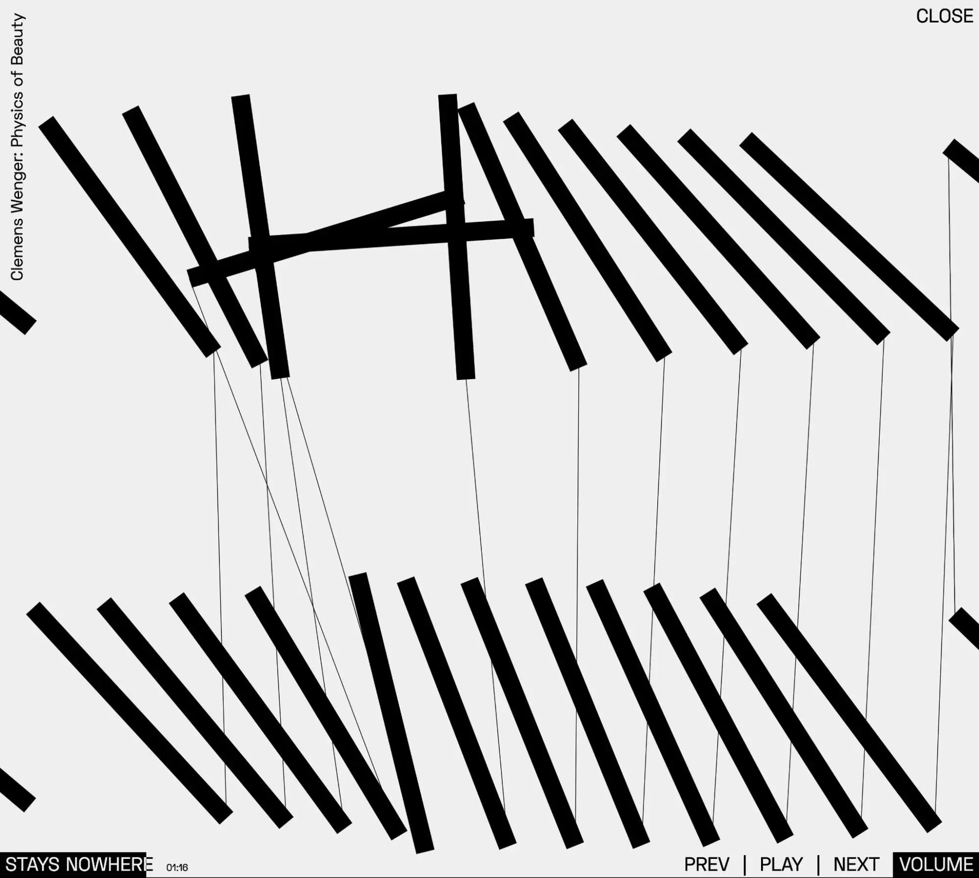
In my opinion, calling Physics of Beauty just a website is a bit of an understatement because it’s really more of a digital experience that combines music and visual art.
When you first land on the site, it displays a simple text-based black and white design. When you select one of the musical pieces, it launches the engaging visualization that you see in the screenshot above.
Free Website Design Inspiration Guide
77 Brilliant Examples of Homepages, Blogs & Landing Pages to Inspire You
- Agency Pages
- Ecommerce Pages
- Tech Company Pages
- And More!
Download Free
All fields are required.
Form not available
Pro tip: By combining a simple website layout with black and white design, you can really embrace minimalism with your website design.
What I like: The Physics of Beauty website is a great reminder that you don’t need lots of color to create an engaging experience. With just a black and white design, Physics of Beauty is still able to create something really unique.
13. Bad Boys Supply
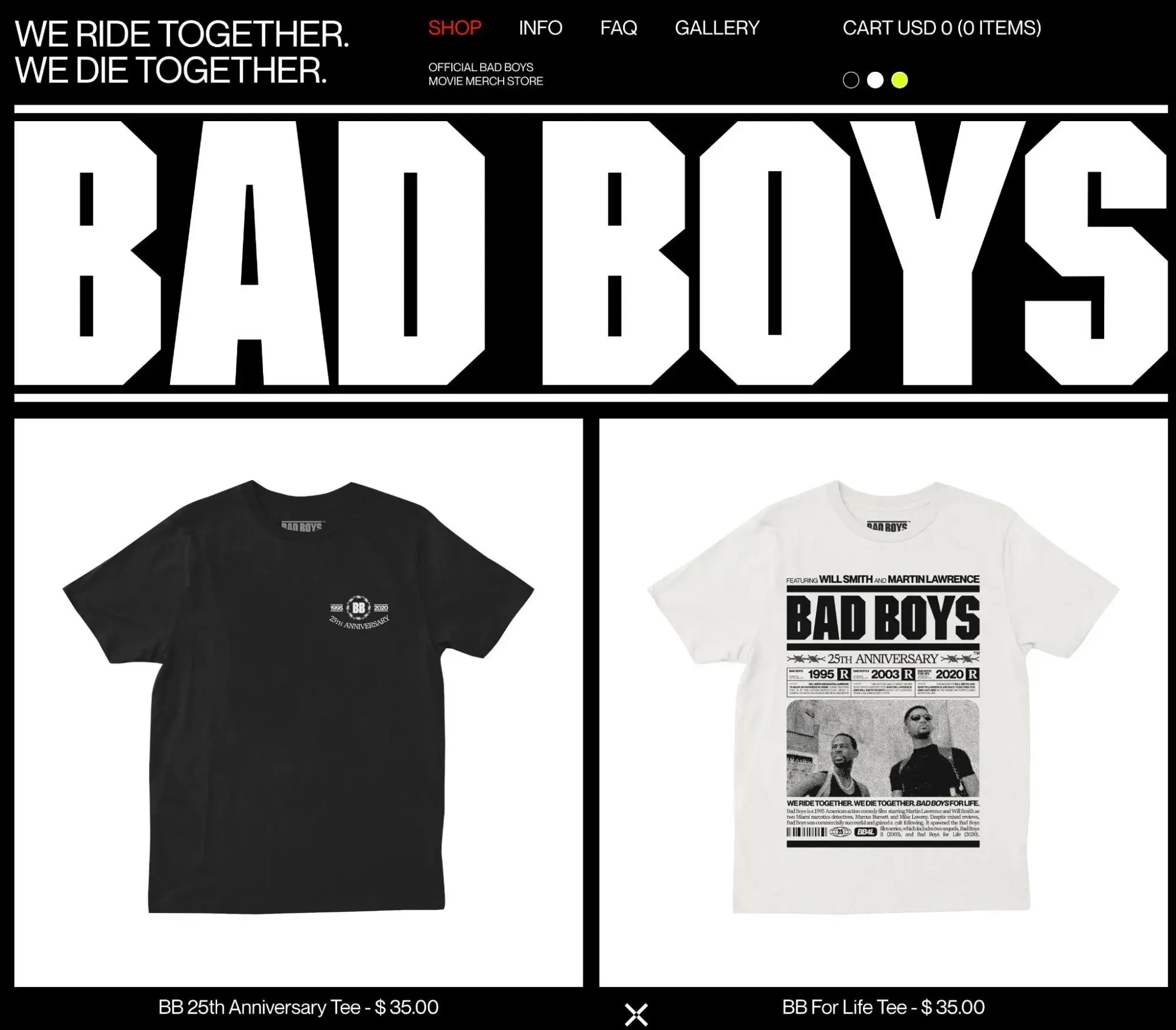
Bad Boys Supply is the “official Bad Boys movie merch store” and offers a variety of clothing and other items based on the popular movie. It was launched in 2020 to coincide with the 25th anniversary of the original Bad Boys movie.
In addition to using a black and white website design, all of the merchandise also uses the same black and white aesthetic.
Pro tip: Using bold typography can be a great way to add interest to an otherwise basic black and white design.
What I like: One of my favorite elements is how they’ve taken color stills from the movie and turned them into black and white dot designs (you can see these if you scroll down the page). This ends up creating a really cool scroll effect, even though the image doesn’t actually change based on the user’s scrolling.
14. Mysta Electric
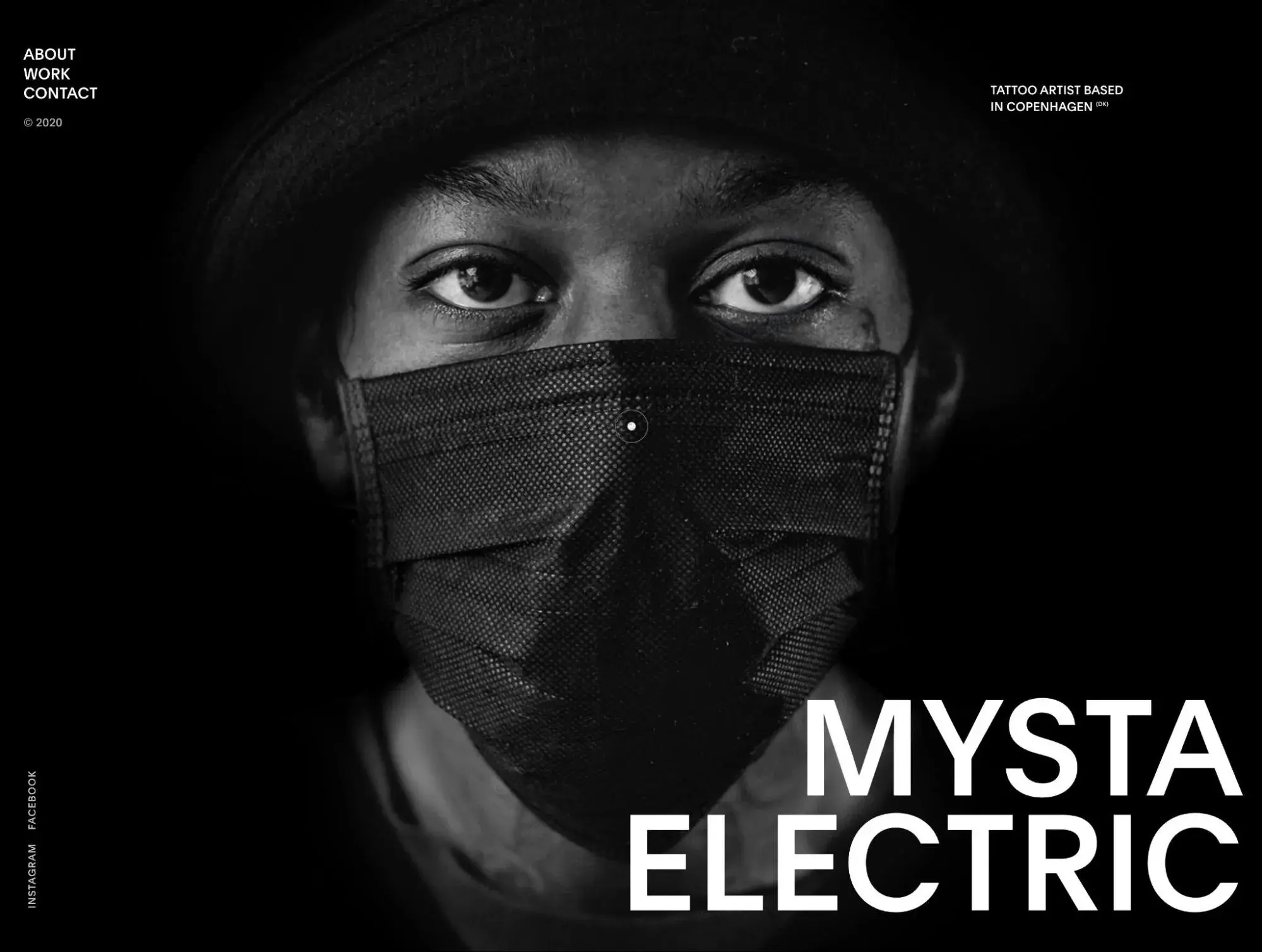
Mysta Electric is a tattoo artist based in Copenhagen, Denmark. His website acts as a portfolio of his tattoo work, along with a way for potential clients to get in touch with him. According to his site, Mysta “creates dark graphic tattoos with beautiful melancholy and explicit technique.”
What you can’t see in the static screenshot above, though, is that his face is actually animated and will move around as you move your cursor over the page. This effect continues even if you open other parts of the site, such as his portfolio or contact page.
Pro tip: You can use shadows to add interest to your black and white design, which is something that this website employs as you scroll down.
What I like: My favorite thing about this website is how the black and white design reinforces the aesthetic that Mysta uses in his tattoos. He likes creating “dark graphic tattoos,” so a dark black and white design scheme fits perfectly with that.
15. Longshot Features
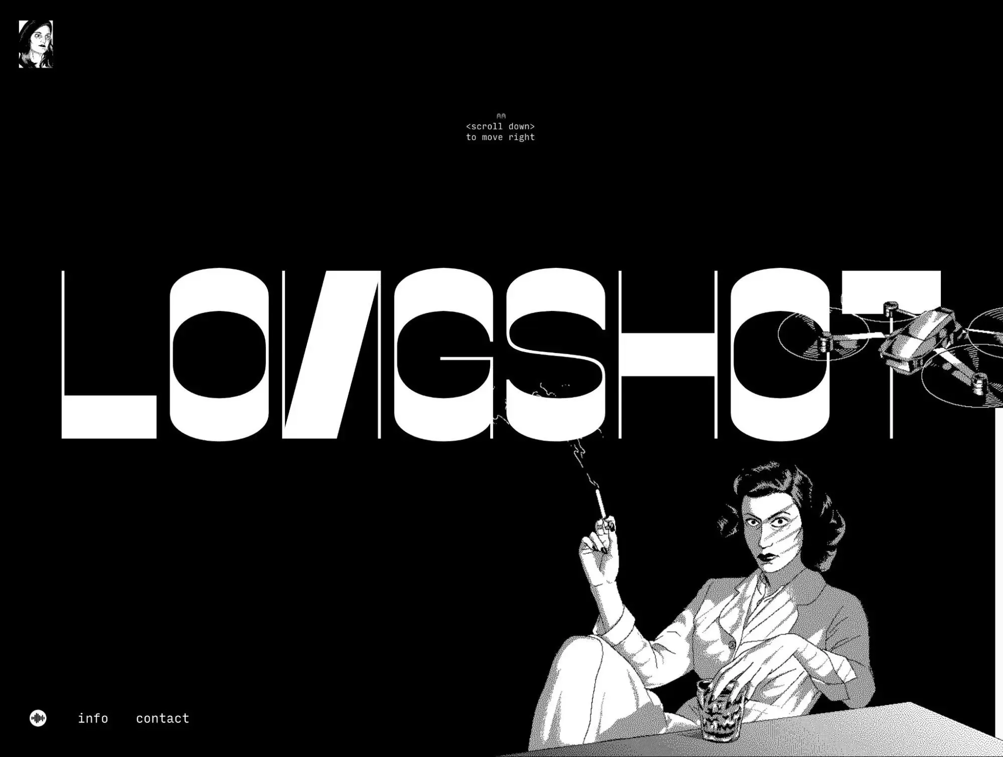
Longshot Features is a production company from Joe Talbot, a director and producer. Designed by Curate Links and illustrated by Mattis Dovier, the Longshot Features website acts as a sort of portfolio and showcase for Joe’s various works.
It uses a black and white design, along with custom illustrations, lots of custom illustrations, and a unique horizontal scrolling effect.
Pro tip: Adding animations can be a great way to add interest to a black and white website design.
What I like: In addition to the animations, one of my favorite things about the Longshot Features website is its horizontal scrolling effect. When I scroll “down” the page, it actually shifts horizontally to the right and moves through different designs and animations.
The “No Color” Website Design
Using a black and white color scheme might seem boring or easy — but I think the website design examples above prove that it’s a timeless combination that can make images and other visual elements pop, present information in a way that’s easy to read and understand, and inspire users to take action.
Because of how simple this color scheme is, you should have no issue implementing it regardless if you’re using a web design framework or a full content management system like HubSpot Content Hub.
Play around with this scheme on your own site, and I think you’ll end up creating something that’s worthy of being on this list!
Editor's note: This post was originally published in January 2022 and has been updated for comprehensiveness.
Free Website Design Inspiration Guide
77 Brilliant Examples of Homepages, Blogs & Landing Pages to Inspire You
- Agency Pages
- Ecommerce Pages
- Tech Company Pages
- And More!
Download Free
All fields are required.
Form not available
Website Design Examples


![Gradient Website Design Examples That Prove This Trend Is Far From Over [+Tutorials]](https://lh7-us.googleusercontent.com/htOWIbyCIoCMxSjC4gJunkGnhCzXpccjTrL8NwoGdRdCsSiEmEAxe_qBFkMrzy2Y8d3cwEr_DMzSGHq9Xi-hQFnMJCo8HDQJ1yQGigcSfFxI2QKXo0s7xXSB2sY-eALG1iUqnHXgomcDsnp7AHRSH1s)
![15 Brochure Website Examples to Inspire You [+ How to Make One]](https://53.fs1.hubspotusercontent-na1.net/hubfs/53/brochure-website-examples-1-20250319-362228.webp)
![28 Types of Websites to Inspire You [+ Real-Life Examples]](https://53.fs1.hubspotusercontent-na1.net/hubfs/53/types-of-websites.png)


![10 of my favorite interactive websites [+ how I make my own]](https://53.fs1.hubspotusercontent-na1.net/hubfs/53/%5BUse%20(1)-Sep-27-2025-03-02-58-8817-PM.webp)