In this article, I’ll walk you through how to sell stuff on your own website. But first, let’s build your online store using a no-code website builder in just seven steps.
Table of Contents
- How to Create a Website to Sell Products
- The Online Store Marketplace Today
- 6 Tips for Selling Your Product Online
- Ready to create a website to sell products?
How to Create a Website to Sell Products
Online marketplaces like Etsy and Amazon are great starting points when you’re new to selling online. But learning how to sell stuff on your own website becomes critical if you want to build a brand and boost your profit margins.
Here’s how to set up your own ecommerce site.
Step 1: Choose a domain name.
Your website’s domain is its online address. Make sure it’s short, easy to remember, and brandable. Once you decide on a name, check if it’s available, and then buy and register it.
My domain for this example? Well, it’s quite simple, as it’s my name: amyrigby.co.
If you need help choosing and registering a domain, check out the two guides below:
- How to Register Your Website's Domain Name (For Free)
- How to choose a domain name (from someone who’s done it many times)
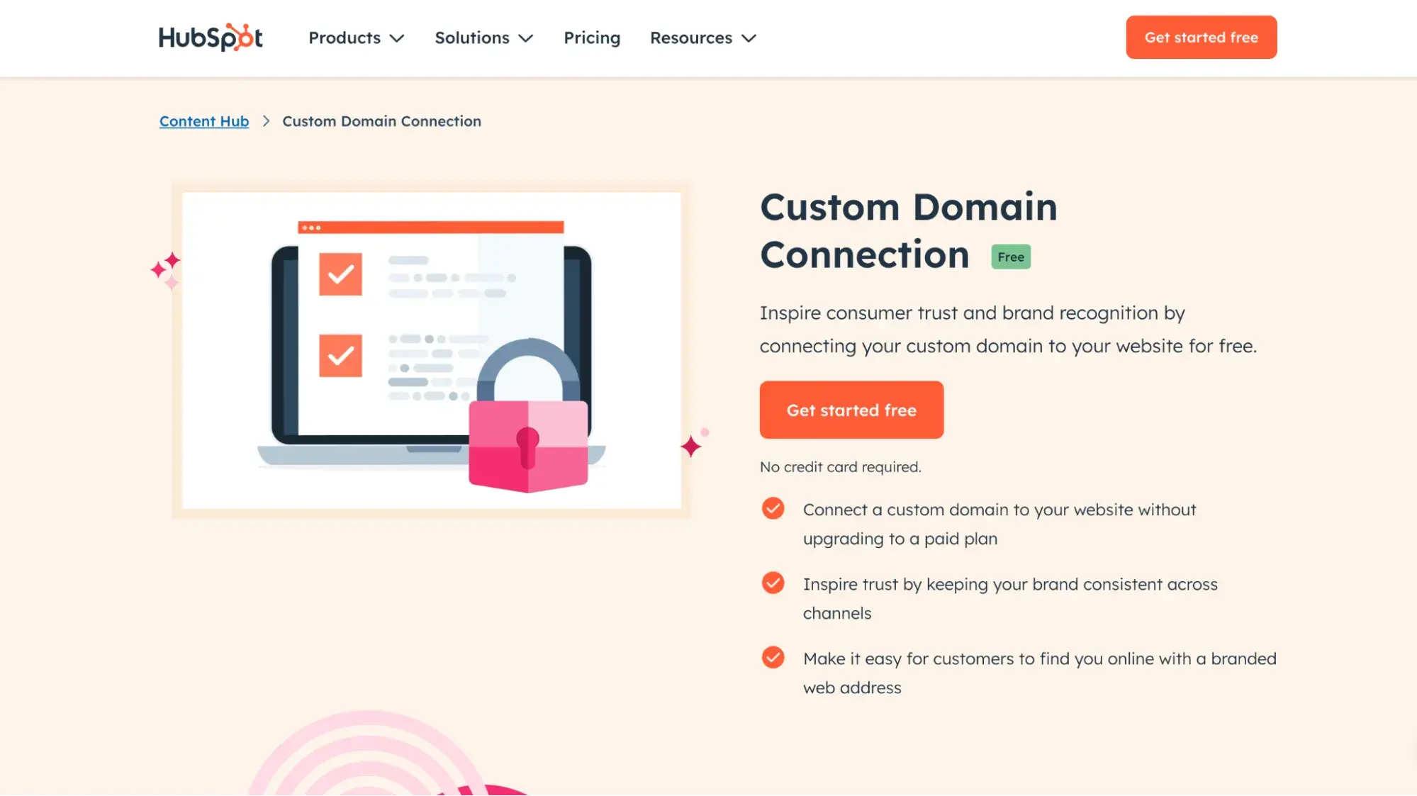
Pro tip: HubSpot lets you connect a custom domain for free from day one. You can enjoy a beautifully branded website without hidden costs or forced upgrades.
Step 2: Choose a website builder.
Once you’re done with the technical part, choose a website builder, such as HubSpot, WordPress, or Wix. A website builder hosts your website and lets you design it using premade templates and no-code editors.
To create a website to sell products, ensure your website builder has the following capabilities:
- Payment processing
- Inventory management
- Customer support
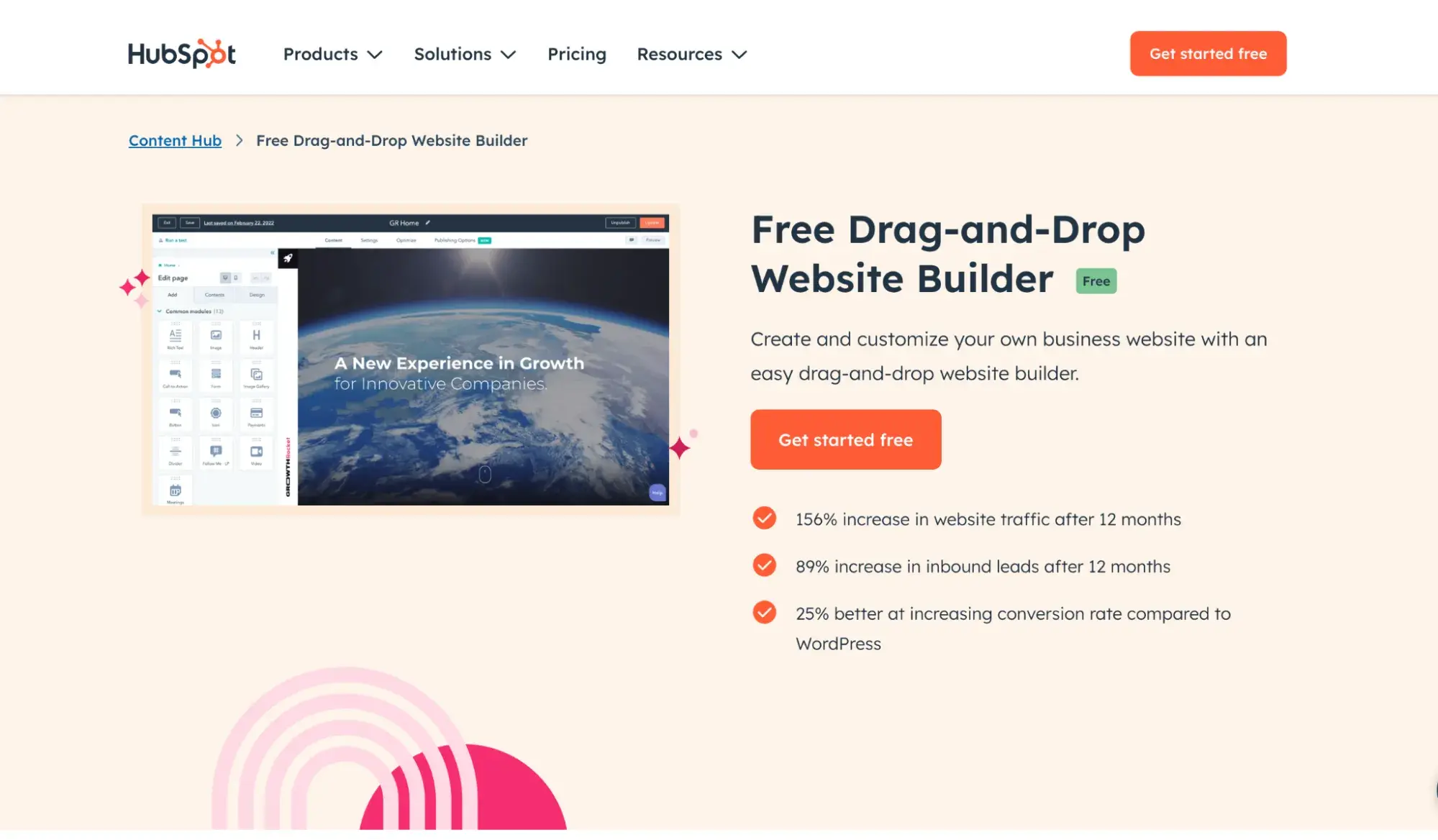
For this example, I’m using HubSpot’s free drag-and-drop website builder. It’s super easy to use with pre-built templates. No coding or tech skills required at all.
If you don't create your website directly on ecommerce builders (e.g., Shopify), you’ll need to integrate ecommerce functionality with options like:
- Shopify Buy Button: You can integrate the Shopify “Buy Button” feature into your existing website. It allows you to add shopping functionality without moving your entire site.
- WooCommerce: If your main website is on WordPress, you can add WooCommerce to manage your store. It integrates perfectly into WordPress sites.
- Ecwid: A flexible ecommerce solution that you can add to any website, including those built with custom code or other CMS platforms.
Pro tip: With the HubSpot CMS platform, you can incorporate ecommerce functionalities, such as payments, directly within HubSpot. And if you want to use ecommerce platforms like Shopify and Wix, you can easily sync them with HubSpot using the Shopify HubSpot integration or the Wix HubSpot integration.
Step 3: Refine the design.
At this step, it’s time to adjust the overall design of your website template, including fonts, images, and colors.
To test the HubSpot AI website builder, I typed a description of my freelance writing business:
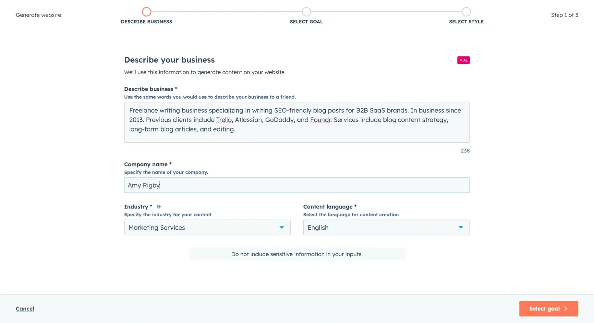
The builder then used AI to generate a website based on my description. Pretty cool, huh?
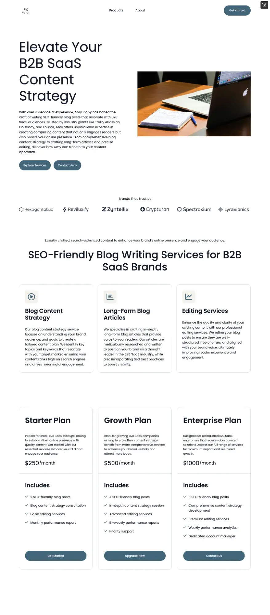
Now, of course, as with any AI output, I still need to review and refine it. The AI doesn’t know my business as well as I do, so I need to rewrite some of the descriptions.
It also generated some photos that aren’t quite aligned with my business, so I’m going to add my own photography.
Free offer: If you’re feeling stuck on the design part of the process, grab this free ebook showcasing 70+ website design examples. One of those examples is bound to spark some creativity in you.
Step 4: Add product/service information.
I suggest creating detailed listings for each item, including a clear title, description, and high-quality photos because SEO technical guidelines matter for a successful site.
And, of course, add details like price, size, and stock availability if you’re selling physical products.
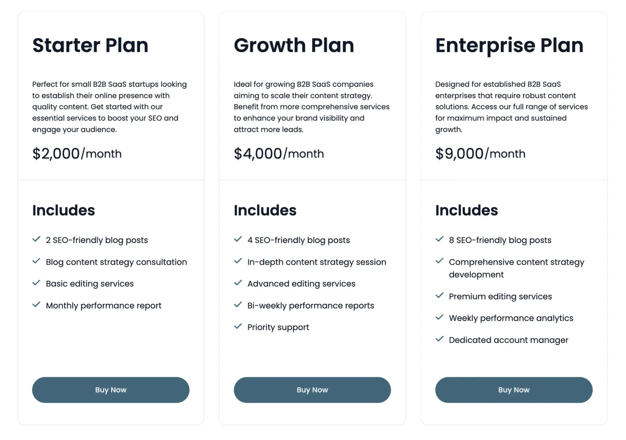
For my services website, HubSpot’s AI built a three-tiered pricing plan right on the homepage, which I find really useful. I adjusted the pricing and services description to suit my business.
Step 5: Set up payment and shipping.
It’s time to set up payments and choose and integrate a payment processor, like Stripe or PayPal, into your online store.
You’ll need to link your payment processor to your bank account to receive funds. Once set up, customers can check out smoothly, and you can manage transactions securely.
If you’re hosting your site on HubSpot, you’ve got two options when it comes to accepting payments on your HubSpot website:
- Use payment links. A feature of Commerce Hub, payment links can be one-time or recurring, and processed through HubSpot payments or Stripe.
- Add a third-party app. HubSpot-certified app eZo eCommerce lets you add the shopping cart functionality to your HubSpot website. It also lets you create shipping settings and track inventory.
Pro tip: In order for payment links to work, you must first set up HubSpot payments and get approved.
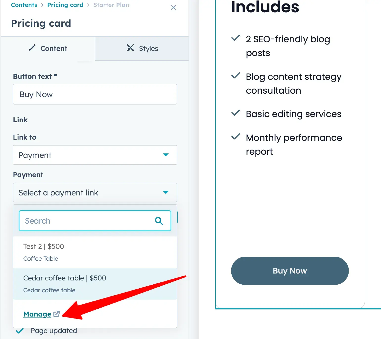
For my freelance writing site, it’s easiest for me to use HubSpot payment links. All I have to do is create a unique link for each of my three plan tiers. Then, I can add the link to the “Buy Now” button.
To do this, I click the Buy Now button. Then, in the website editor, I edit that portion and go to the Link to dropdown menu and select Payment. Under that, I click the Select a payment link dropdown menu and click Manage to create a new payment link.
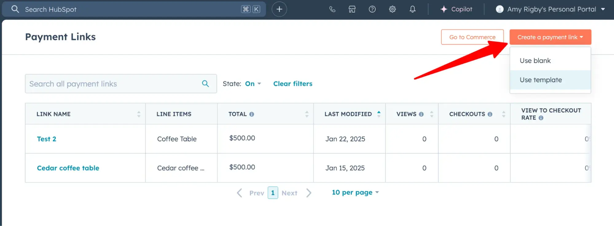
Here in the Payment Links dashboard, I’ll select Create a payment link and Use template.
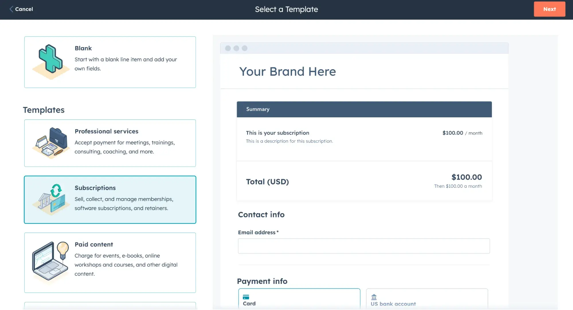
Since I’m selling recurring monthly writing services, I’ll select Subscriptions, then click Next.
Next, I’ll enter the information for my Starter Plan, including description, price, and billing frequency. Then, I’ll click Save.
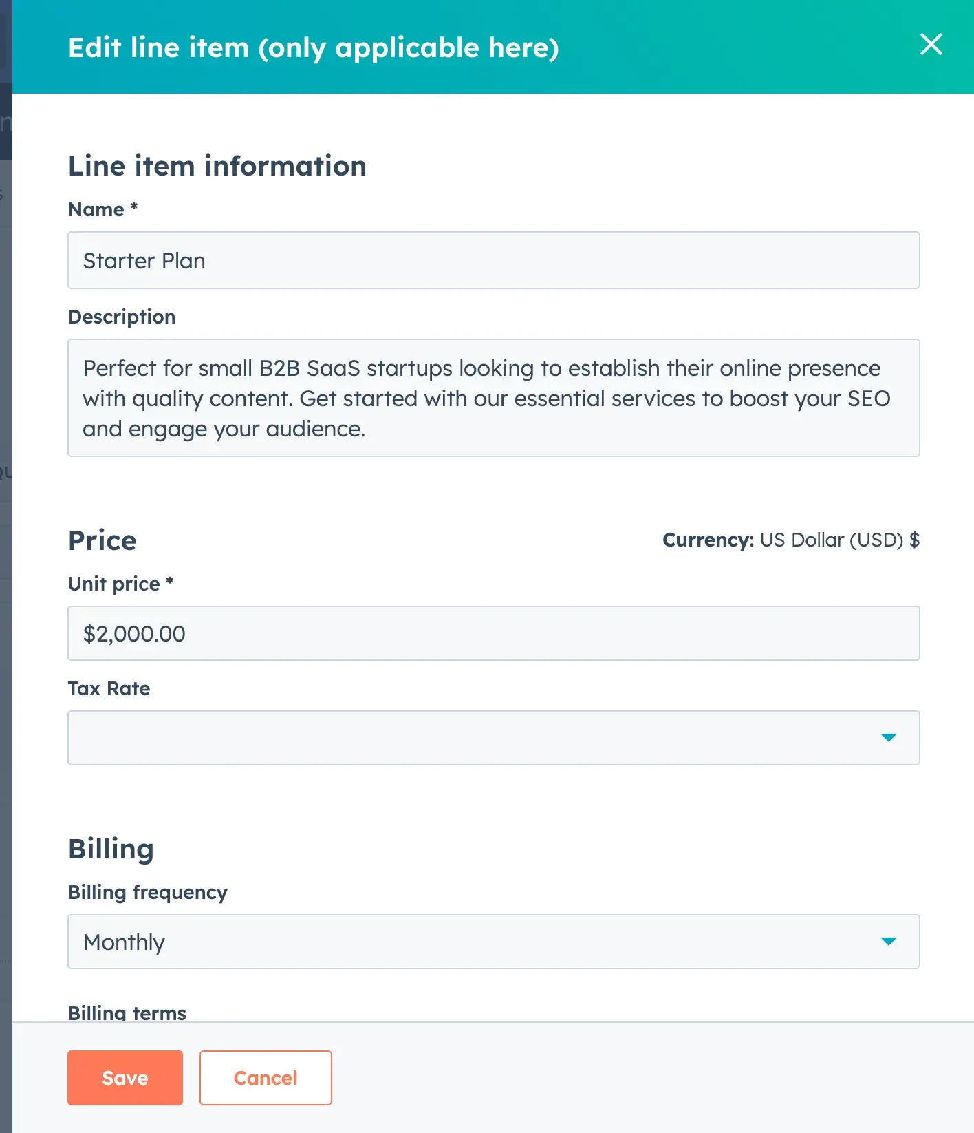
Then, I’ll name my payment link “Starter Plan” and click Create.
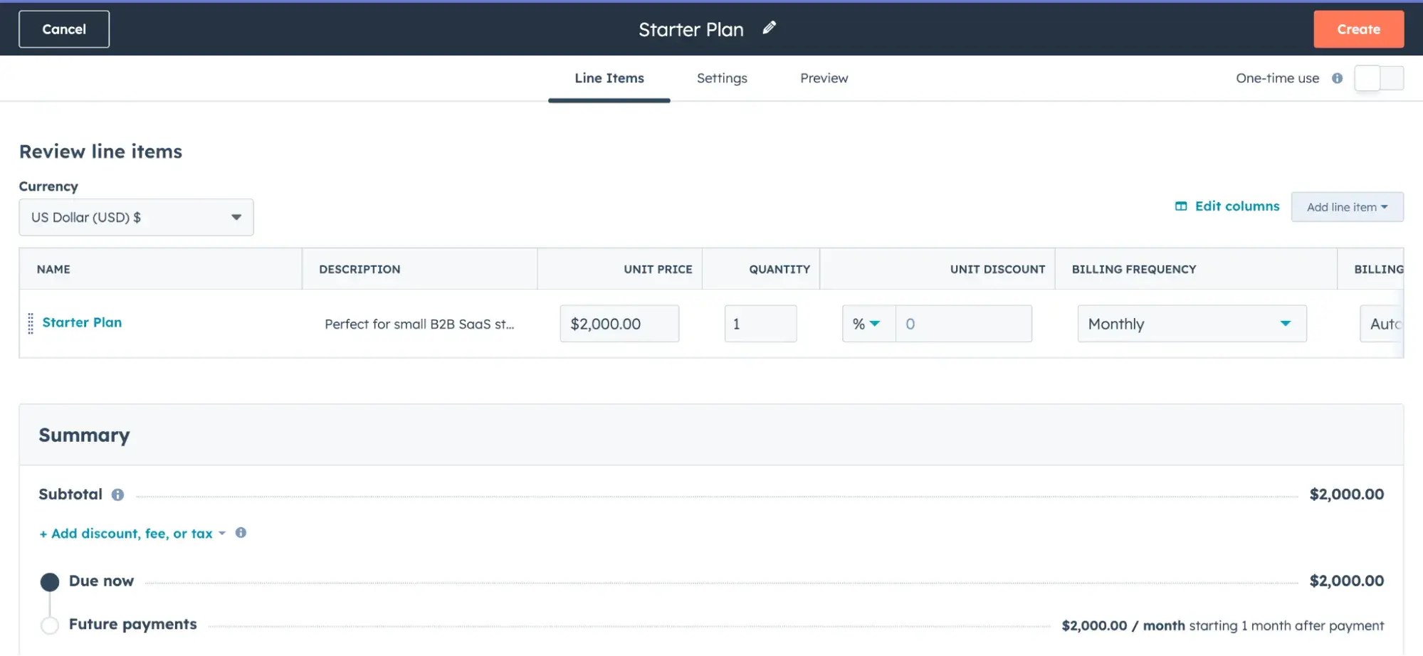
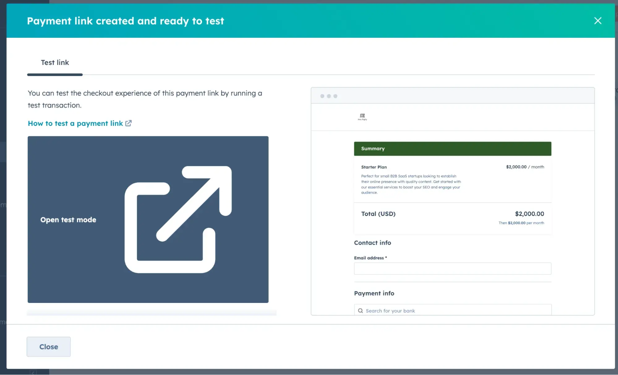
Tada! I now have a payment link for my Starter Plan. I can even test it to ensure it works.
Now, when I return to my website editor, I can add that payment link to the Buy Now button. See it below.
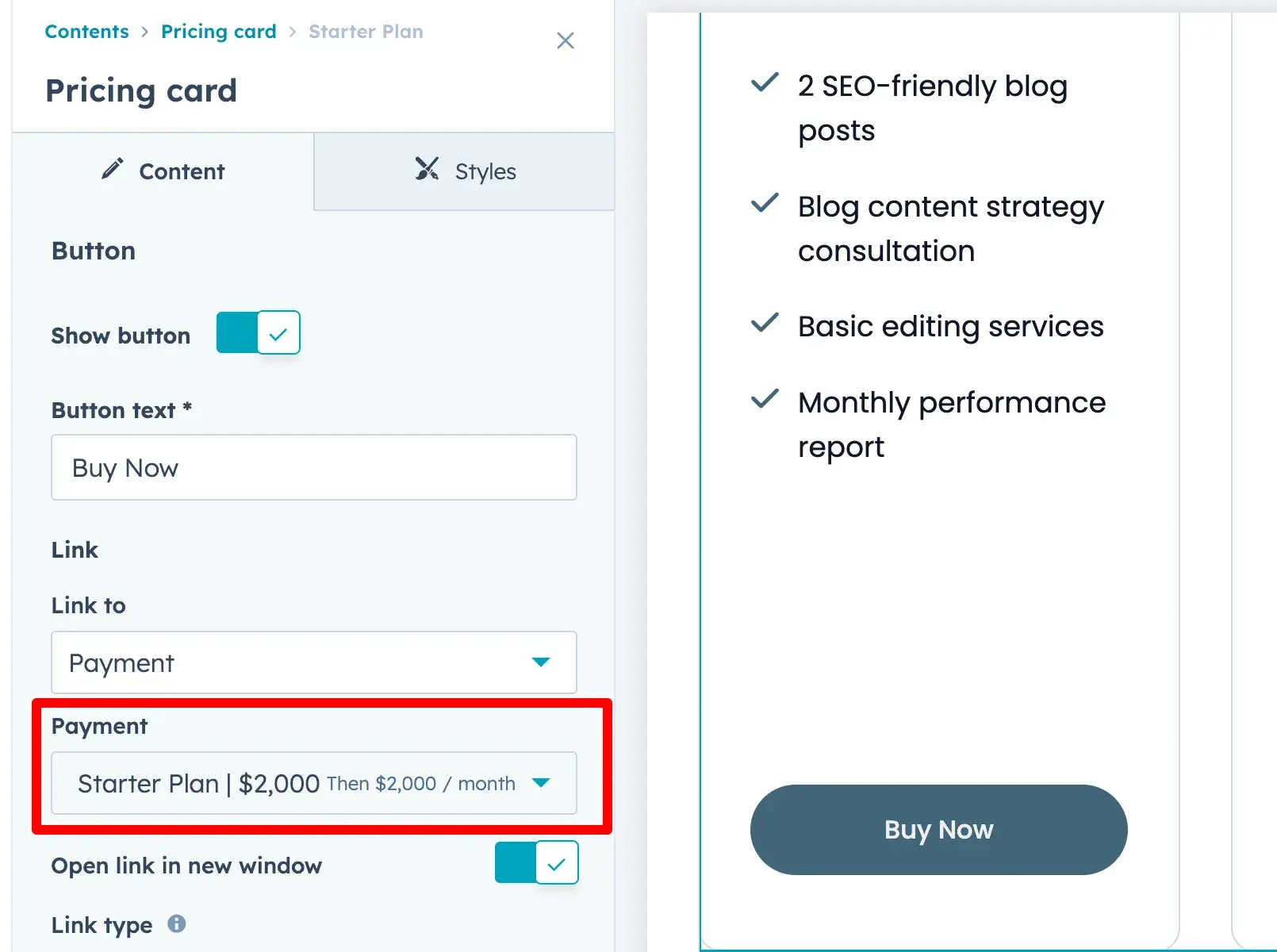
Now, clients can book and pay for my services directly through my website.
Step 6: Optimize your site.
Identify target keywords.
Now, you need to optimize your content, improve on-page elements, and add internal links. You can use SEO tools to find relevant keywords. Some recommendations:
Once you identify your target keywords, create content around these terms to improve your chances of appearing in search results. That’s known as on-page SEO.
Install Google Analytics.
Also, install Google Analytics to see your website traffic, conversions, and user behavior. This is key to optimizing your SEO strategy.
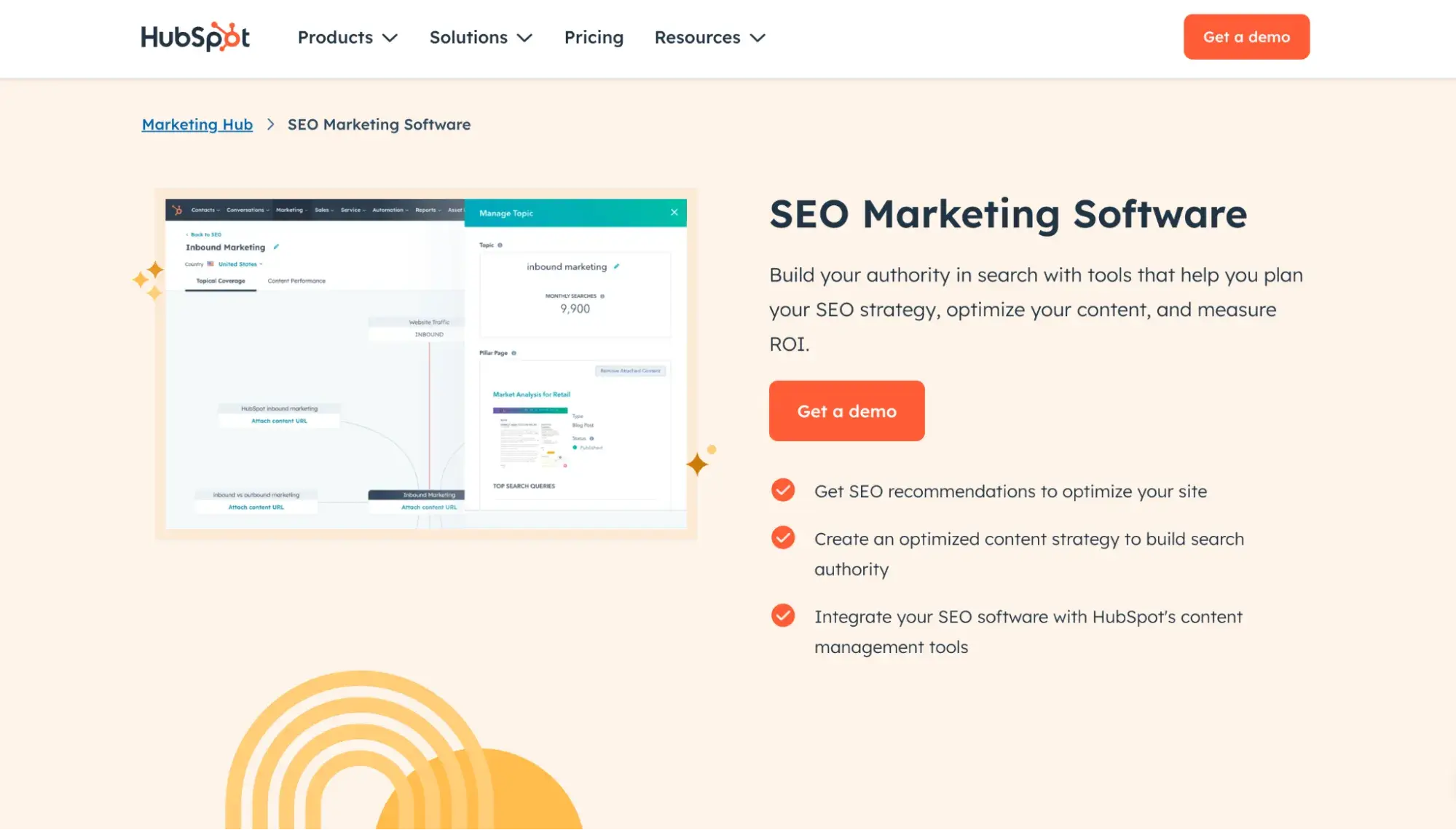
Pro tip: Plan your content strategy and integrate the right keywords with HubSpot’s SEO management tools. They’ll help you see which pages need updates for the biggest impact.
Step 7: Launch and promote.
Launching your website makes it visible to everyone. If it's not live, no one can find it. After you click that “Publish” button, it’s just the beginning of your ecommerce journey.
There are many paths to driving traffic to your site, including:
I’ve never run ads for my freelance writing business, but being present on social media, especially LinkedIn, has proven extremely useful for my website.
I’ve also had a lot of success with my other business websites performing well in organic search thanks to the SEO-friendly blog content I’ve written.
Experiment with different channels and stick with what works for you.
The Online Store Marketplace Today
Before going online with products, the main concern I hear is that the market is oversaturated. So, I did some research.
In 2024, global ecommerce sales reached about $6 trillion, and eMarketer predicts that global ecommerce sales will reach $7.886 trillion by 2028.

That’s overall positive news, but eMarketer warns that consumers are more cautious in 2025, slowing ecommerce growth. (It also says that’ll likely rebound in 2026).
According to Jungle Scout’s 2025 Annual Consumer Trends Report, 76% of consumers are worried about “inflation and rising costs.”
When Jungle Scout asked consumers to rank the factors that influence their purchasing decisions, “price and discounts” came out on top, with 63% ranking it as the most influential. “Product reviews and ratings” and “free or fast shipping options” came in second and third, respectively.
So, taking all this into account, how can your ecommerce site succeed among cautious and budget-conscious consumers? Let’s take a look at seven useful tips.
7 Tips for Selling Your Product Online
Now that I’ve walked you through how to create a website to sell products, it’s time to reveal some juicy tips on optimizing your ecommerce business. I asked proven ecommerce professionals for their best advice. Here’s what they shared with me.
1. Test the market first.
The nice thing about building a site with HubSpot is you can do it for free. But before you invest in a premium plan or go all in on 200 orders of inventory, it’s wise to test the market.
“Start small and scale as you iterate and learn. Having a mindset of experimentation is key,” says Tina Bar, an ecommerce coach and the founder of fair trade online shop Welljourn.
Before investing more in your online store, Bar recommends trying to sell your product to at least 10 strangers on marketplaces like Etsy or eBay or even at farmers’ markets or pop-ups.
“If you can‘t get those first 10 sales or the feedback isn’t what you expected, then don't give up, but take those learnings and either iterate or pivot,” she says. “This is all a normal part of being a business owner.”
When Bar launched her ecommerce business, the product she was sure would be a hit ended up flopping. She pivoted to a different product line that took off unexpectedly and is still her bestseller five years later.
“You just don't know until you test the market and find your winner,” Bar says. “I hear this all the time from my clients: A product that they made as an afterthought becomes the best seller.”
2. Solve a long-term problem, not a short-term fad.
“Trends quickly fade away, particularly in an economically difficult time,” says Safia Marmon, a project lead at Shopify solutions provider Sunbowl.
So while you might be tempted to ride the wave of the latest viral product, hit pause and consider whether your product is positioned for long-term growth.
“Remember the fidget spinner craze? Everyone was dropshipping them, but most failed because they chased the trend instead of thinking bigger,” Marmon adds. “They should’ve focused on the problem fidget spinners solved, like stress or focus, and built a catalog around that, not just one hype product.”
3. Provide a smooth experience for mobile shoppers.
Mobile shopping has become the norm. HubSpot's State of Consumer Trends 2024 found that consumers (especially Gen Zers) now shop on their mobile phones more than on any other device.
You need to adapt to this. If your online store isn’t mobile friendly, you’ll miss out on sales.
“Offer a quick checkout option for mobile users,” says Kasey Luck, founder of Luck & Co Agency. “Simplify the process so they can fill their cart and pay with a single click. If you have an app, use push notifications to engage customers and remind them of special offers or abandoned carts.”
4. Gather user-generated content (UGC).
Forty-one percent of US consumers spend more time watching user-generated videos online than they do watching TV or movies.
What does this mean for you?
Stop posting only generic pictures and professionally made videos on your site and social media. People want to see real people. Mix things up and show the human side of your brand.
According to Kasey Luck, there are three good ways you can take advantage of this:
- Create content that looks like user-generated content.
- Collaborate with influencers to feature your brand in their content.
- Motivate your existing customers to post about your brand by offering incentives and sharing their content.
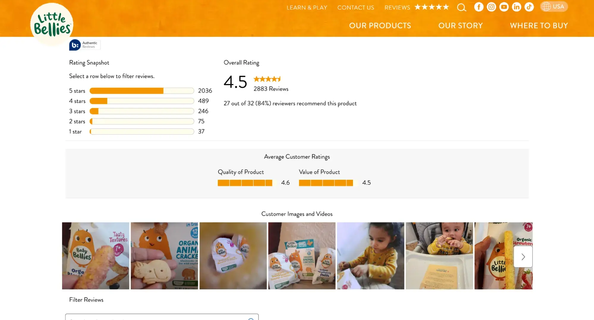
A great example is the Little Bellies site. It features real user photos and reviews, making it feel genuine. When parents see other parents using the products, it conveys trustworthiness.
5. Offer flexible payments to draw more shoppers.
Customers love flexible payment options. A 2025 J.D. Power study found continued growth in Buy Now Pay Later (BNPL) services, with Generations Y and Z using these services the most.
Just this month, BNPL giant Klarna reached 11 million active customers in the UK alone — its third-largest market. Offering flexible payments like Klarna and PayPal is a great approach for drawing and keeping budget-conscious shoppers.
6. Write keyword-rich product listings.
Remember when we talked about SEO earlier? It’s critical that you add those target keywords to your product pages, especially to the titles and descriptions. Otherwise, Google won’t know what your page is about, and your customers won’t find you.
Nikki Norris, the founder of digital marketing studio Root & Reach Media, knows this all too well.
“I once worked with an ecommerce client who sold high-end modular couches,” she shares. “During our initial call, he explained to me that anytime he does a search for ‘modular couches,’ or more specific searches like ‘brown leather modular sofa’ on Google, none of his products show up.
“He told me he was even running a Google Shopping campaign for his items with a very high CPC, and his items weren't showing up for any of the searches there either.”
The problem? “All of his product titles were branded,” she says. “For example, ‘Bellini Sofa’ and ‘Luna Lounger.’ While those product titles sounded luxurious, they lacked the descriptive keywords that people were searching for on Google.”
Norris went in and optimized his product titles and descriptions for search by adding the keywords his customers would type into Google. "For example, we changed ‘Bellini Sofa’ to ‘Bellini Modular Sofa in Brown Leather, 3 Piece Couch with Chaise.’
“Within a few weeks, his click-through rates and impressions increased drastically. His products finally started showing up in organic search results and Google Shopping.”
7. Simplify checkout so you don't lose orders.
According to the Baymard Institute, the global average cart abandonment rate is 70.19%, despite significant investments in various ecommerce strategies.
After researching checkout usability for over 14 years, the Institute’s findings show that poor checkout design is a major reason for cart abandonment, either due to user frustration or confusion.
This research includes benchmarking 280 major ecommerce sites against over 110 guidelines, revealing that most sites perform at a “mediocre” level, or worse. Improving checkout usability could potentially boost conversion rates by 35%.
That’s why you need to simplify your checkout process as much as possible. Minimize the number of steps and required fields.
Go for a streamlined, user-friendly experience so customers can complete their purchases fast and easy. You’ll reduce friction and increase the likelihood of conversion that way.
Ready to create a website to sell products?
Knowing how to create a website to sell products or services is crucial to launching fast. By taking the reins in building your online presence, you can move quickly and keep costs low.
I’ve sold physical products, digital products, and services, and every time, I’ve built my website myself with the help of website builders and templates. Give it a try; you’ll surprise yourself with how much you can do on your own.
Editor's note: This post was originally published in September 2024 and has been updated for comprehensiveness.


.png)
![Website design proposal: A streamlined approach to pitching [+ templates]](https://53.fs1.hubspotusercontent-na1.net/hubfs/53/%5BUse%20(1)-Oct-23-2025-03-34-31-8363-PM.webp)


.png)
-2.png)

