

Let's dive in.
What is the CSS transform property?
The CSS transform property changes the shape, position, and orientation of page elements. Values of the CSS transform property are functions that transform the target element, including translate(), scale(), and rotate().
A CSS transform rule is written as follows:
transform: value(argument);Here, value is the type of transformation and argument is the extent to which the transformation is applied. Note that some transformation declarations can take multiple arguments.
But, this explanation doesn’t mean much without examples of the transform property in action, so let's look at some.
2D CSS Transformations
CSS transformations can be split into two categories: two-dimensional transformations and three-dimensional transformations. We’ll look at two-dimensional transformations first.
Two-dimensional CSS transformations operate on the X (horizontal) and Y (vertical) axes.
In my examples, I’ll apply the transformation effects to a basic square-shaped div. The blue div will be untransformed, and the orange div will show the same element with the transformation effect applied.
CSS Transform: Translate
The translate() method translates (or moves) a page element up, down, left, and/or right on the page by a specified amount. In the parenthesis, the first number specifies the horizontal distance, and the second number specifies the vertical distance.
For example, we can translate our div by a specific number of pixels. In the example below, the orange div has been translated 100 pixels to the right and 75 pixels down:
See the Pen CSS transform - pixels by HubSpot (@hubspot) on CodePen.
Using negative numbers with the translate() method will move the element left or up:
See the Pen CSS transform - pixels by HubSpot (@hubspot) on CodePen.
You can also use percentages to specify the translation. Percentages move the element a horizontal distance proportional to its width, or a vertical distance proportional to its height.
In the example below, the orange div is transformed by 100% of its width and 50% of its height:
See the Pen CSS transform - percentages by HubSpot (@hubspot) on CodePen.
In addition to translate(), we can also use the translateX() and translateY() methods. translateX() moves an element only horizontally, and takes one argument:
See the Pen CSS transform: translateX by HubSpot (@hubspot) on CodePen.
Similarly, the translateY() method moves an element vertically. It also takes only one argument:
See the Pen CSS transform: translateY by HubSpot (@hubspot) on CodePen.
CSS Transform: Scale
The scale() transform method changes the size of the target element. If we provide one argument with scale(), we increase or decrease the size of the element by a multiple of its original size.
For example:
See the Pen CSS transform: scale 1 by HubSpot (@hubspot) on CodePen.
See the Pen CSS transform: scale 2 by HubSpot (@hubspot) on CodePen.
If we give two arguments to scale() (separated by a comma), the first argument specifies the horizontal scaling and the second specifies the vertical scaling:
See the Pen CSS transform: scale 3 by HubSpot (@hubspot) on CodePen.
We can also use the scaleX() and scaleY() methods. The scaleX() method changes the horizontal scaling of an element. It takes one argument:
See the Pen CSS transform: scaleX by HubSpot (@hubspot) on CodePen.
scaleY() does the same as scaleX(), but for vertical scaling:
See the Pen CSS transform: scaleY by HubSpot (@hubspot) on CodePen.
CSS Transform: Rotate
The rotate() method, as you might guess, rotates a page element. By default, the element will rotate around its center.
We can specify the rotation in terms of degrees, radians, or turns (from 0turn to 1turn). In the example below, I've shown each of these:
See the Pen CSS transform: rotate by HubSpot (@hubspot) on CodePen.
We can also change the point of rotation with the transform-origin property, as we'll see later.
CSS Transform: Skew
The skew() method skews, or slants, an element along its X and/or Y axes. Its arguments specify the horizontal and vertical angle of the skew, respectively.
See the Pen CSS transform: skew by HubSpot (@hubspot) on CodePen.
There's also skewX(), which skews our div on the horizontal axis only:
See the Pen CSS transform: skewX by HubSpot (@hubspot) on CodePen.
skewY() does the same on the vertical axis only:
See the Pen CSS transform: skewY by HubSpot (@hubspot) on CodePen.
Combining 2D CSS Transformations
If you want to apply multiple transformations to the same CSS selector, you don’t need multiple transform declarations. Instead, you can combine multiple CSS transform values into one declaration by simply listing them with a space in between each one.
Below, I've combined three methods — translate(), scale(), and rotate() — into one declaration:
See the Pen CSS transform: multiple transforms by HubSpot (@hubspot) on CodePen.
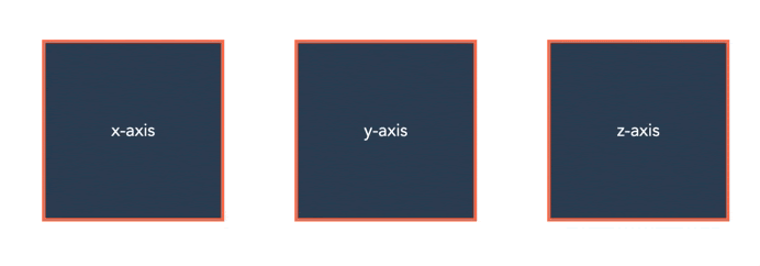
3D CSS Transformations
Three-dimensional CSS transformations utilize the Z-axis of the page. If you imagine the width and height of your screen as the X and Y-axes respectively, the Z-axis is the “depth” of your screen. A greater Z value makes the element appear "closer" to you.
Here are some ways to transform your elements to add this depth.
CSS Transform: Perspective
The perspective() value sets the depth of the element on the Z-axis. It toggles how “close” or “far away” the element appears. perspective() is used in conjunction with other 3D transformation methods, as we’ll see next.
CSS Transform: rotateX() and rotateY()
Like rotate(), the rotateX() and rotateY() values rotate our div, but “around” the X and Y-axes:
See the Pen CSS transform: rotateX and rotateY by HubSpot (@hubspot) on CodePen.
When these methods are used with perspective(), the rotated element appears to rotate toward us:
See the Pen CSS transform: rotateX and rotateY with perspective by HubSpot (@hubspot) on CodePen.
translateZ()
When used with perspective(), the translateZ() creates the effect of an element moving forward or backward on the Z-axis:
See the Pen CSS transform: translateZ by HubSpot (@hubspot) on CodePen.
The CSS transform-origin Property
transform-origin is another CSS property that can be used with transform. The transform-origin property changes the position of the origin, the point where the transformation starts or is based around.
We can see the effect of transform-origin most clearly with the rotate() method. In the following example, we use transform-origin to move the center point of rotation:
See the Pen CSS transform: transform origin 1 by HubSpot (@hubspot) on CodePen.
The origin can also be specified in pixel distance from the top left corner of the original element, like so:
See the Pen CSS transform: transform origin 2 by HubSpot (@hubspot) on CodePen.
Here's another example of using the transform-origin property with the scale() method:
See the Pen CSS transform: scale 1 by HubSpot (@hubspot) on CodePen.
CSS Animate Transform
All of our examples so far have been static, but we can do better than that. Any CSS transform method can be combined with CSS transitions to produce cool CSS animation effects.
For example, we can code an interactive hover button with the scale() method. Try moving your cursor over the div in the example below:
See the Pen CSS transform: animate 1 by HubSpot (@hubspot) on CodePen.
Or, we can produce a pinwheel-like effect with rotate(). Try hovering over this div:
See the Pen CSS transform: animate 2 by HubSpot (@hubspot) on CodePen.
For a more in-depth look at CSS transitions and how they can apply to the transform property, check out this video tutorial:
Let’s review.
We’ve covered a lot, so let’s go back over everything we’ve learned:
- transform: A CSS property for changing the shape, position, and orientation of page elements. It can take one or more of the following values:
- translate(): moves an element on the page
- translateX(): moves an element horizontally on the page
- translateY(): moves an element vertically on the page
- translateZ(): moves an element along the Z-axis, “toward” or “away” from the user
- scale(): increases/decreases the size on an element
- scaleX(): increases/decreases the width of an element
- scaleY(): increases/decreases the height of an element
- rotate(): rotates an element (around its center by default)
- rotateX(): rotates an element around the X-axis
- rotateY(): rotates an element around the Y-axis
- skew(): skews an element’s shape
- skewX(): skews an element’s shape horizontally
- skewY(): skews an element’s shape vertically
- perspective(): when used with a 3D transform value, gives the appearance of an element moving toward/away from the user
- transform-origin: A CSS property used with transform to change the origin of the transformation.
- transition: A CSS property to control animation speed. It can be used with transform to animate page elements.
There’s a lot you can do when you combine these powerful techniques — experiment and see what you come up with.
And remember, whatever cool effects you achieve, make sure they’re ultimately serving the user by enhancing the browsing experience, and not distracting from it.
Editor's note: This post was originally published in November 2020 and has been updated for comprehensiveness.

Css


![How to Create Scrolling Text With CSS [+ Code Examples]](https://53.fs1.hubspotusercontent-na1.net/hubfs/53/Google%20Drive%20Integration/scrolling%20text%20css.jpeg)


