In my experience, the best websites are those designed with users in mind. Interactive websites are particularly successful at user-centered design. They are not only personalized and playful — they also give users control over their experience and help guide them toward the information they want.
Visitors on interactive websites are invited to scroll, click on navigation items, view portfolio items, and participate in other ways. The result is a more engaged and memorable user experience.
In this post, I'll share more than a dozen interactive websites that can inspire your own web design. Then, I'll walk through some actionable steps you can take to make your site interactive.
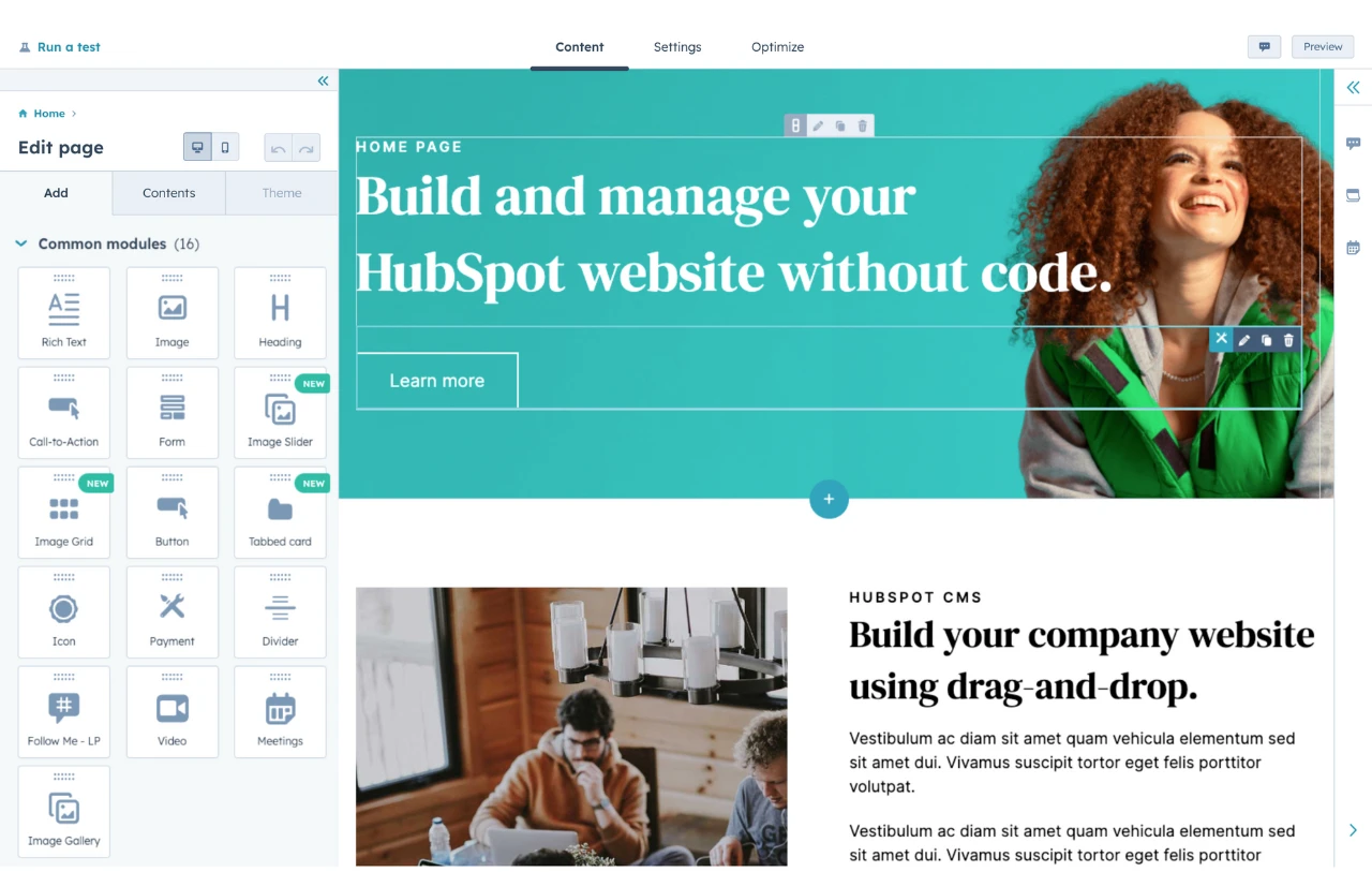
HubSpot's Free Website Builder
Create and customize your own business website with an easy drag-and-drop website builder.
- Build a website without any coding skills.
- Pre-built themes and templates.
- Built-in marketing tools and features.
- And more!
What is an interactive website?
An interactive website either responds to a user’s interaction or guides the user’s journey with captivating animations, videos, and other interactive elements (like on this homepage). This type of website does more than delight users — it helps keep them engaged on the site for longer.
An interactive website could just use interactive elements to display the same content to every visitor in a more engaging way. Or, some interactive websites will actually change and adjust based on how the visitor engages with the website.
As I take you through some real-world examples, you'll see how many different ways there are to build interactivity into your own website.
Interactive Websites vs. Passive Websites
A passive website is essentially the opposite of an interactive website. The website does not try to engage the visitor in any way — it just shows static content in a basic way.
Passive websites can work well when your primary goal is just to convey information to visitors in the quickest and simplest way possible.
For example, let's say that you have a website for a local restaurant. Visitors will typically only visit your website for two reasons:
- To see important details such as your address and opening hours.
- To read your menu.
In these situations, I don't think you really need to create an engaging, interactive experience for your visitors. Instead, you just want to communicate these important details as quickly as possible with a very clean user interface design (especially because a lot of visitors will be looking to quickly access this information on their mobile phones).
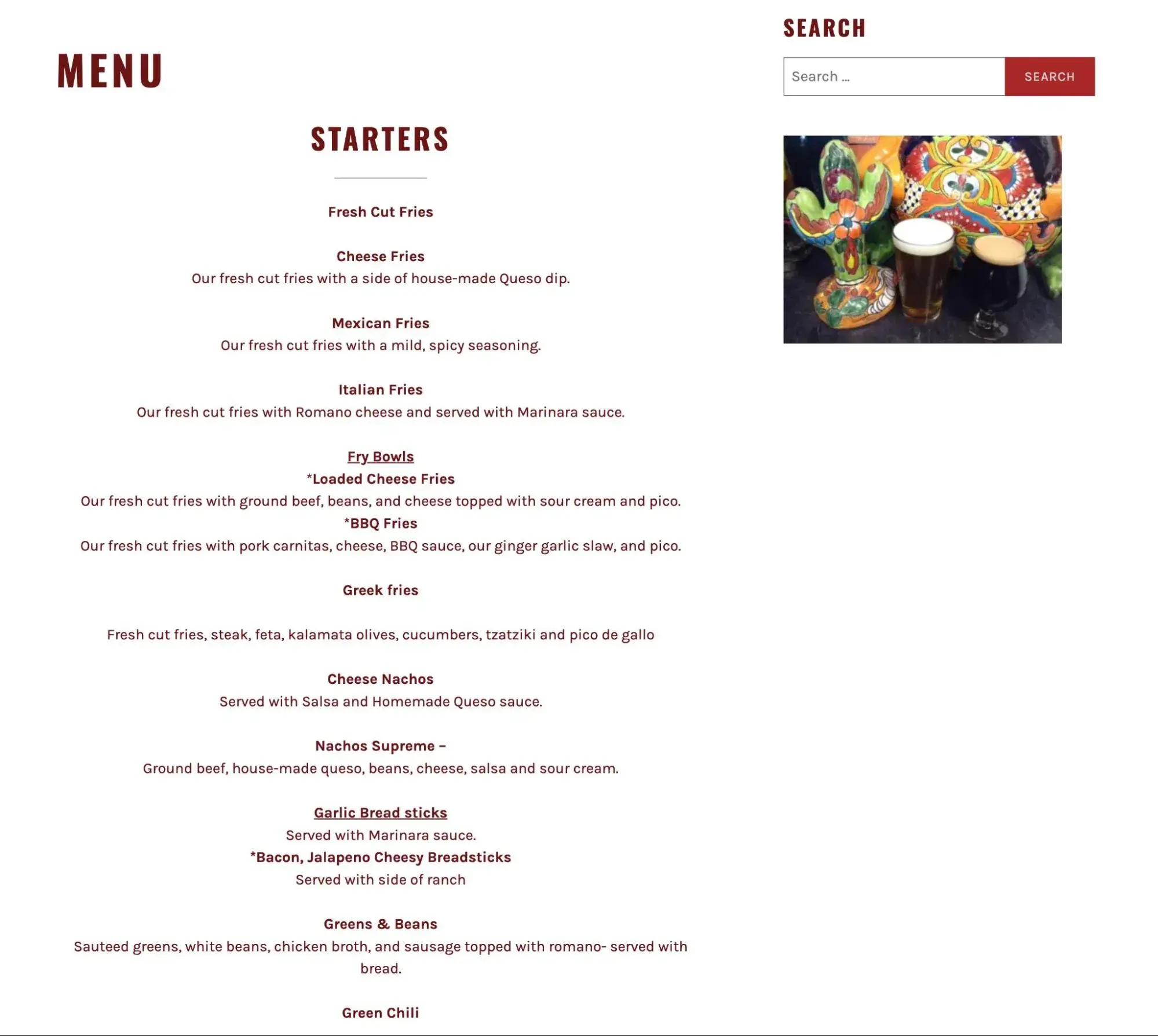
For example, look at the Mexitaly restaurant website — it‘s literally just a list of menu items, which is totally fine for this use case. I think this is a great example of a passive website that’s still effective at its goals.
To give you some comparison points to the passive website example above, I now want to transition to sharing some of my favorite interactive websites.
Best Interactive Websites
To build on the definition I gave you above, I think it's useful to look at some real-world examples of interactive websites.
Here are 15 of my favorite interactive websites from around the web.
1. Fern
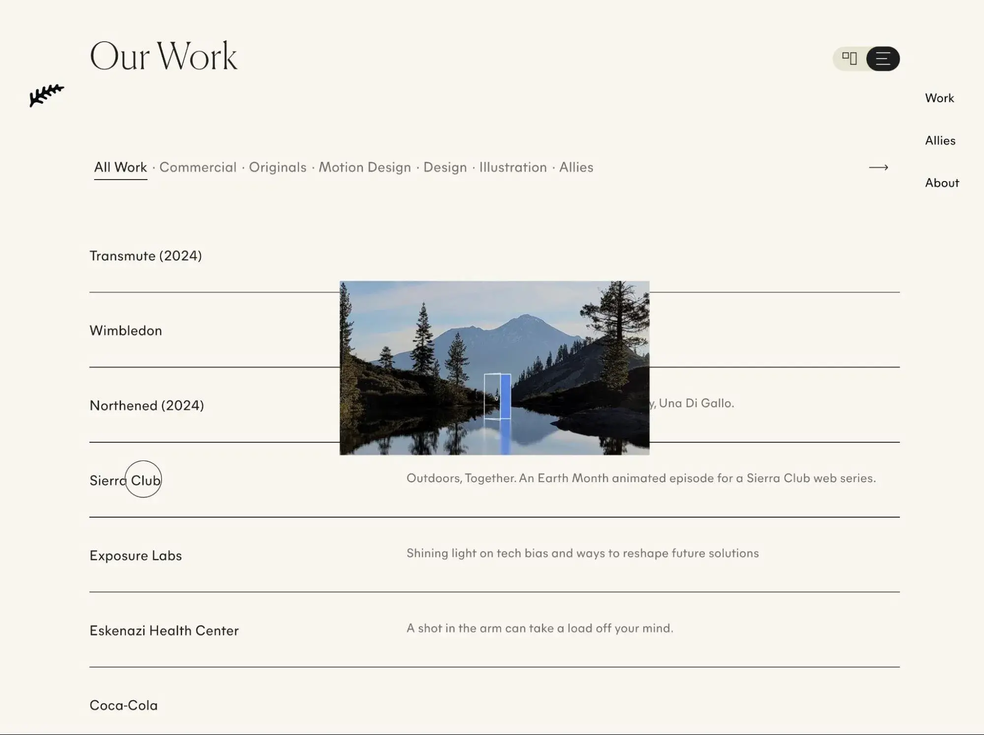
Fern is an Atlanta-based animation and design studio that specializes in animation, illustration, and storytelling. Their website offers multiple ways for visitors to interact, including horizontal scrolling, animated text, GIFs, and video backgrounds.
You’ll find one of the most unique interactive elements when you scroll down to their Archives. It seems like a simple table with the name of the brand the agency worked with and a short description of the project. But when you hover over one of these names or descriptions, the cursor reveals a short animated clip that’s basically a trailer of the project. It’s the perfect combination of interactive and informative.
What I like: It's great how the website essentially lets visitors choose how they want to browse and consume content. People who prefer a text-first approach can have that experience, while people who want an image-first approach can choose that — all they need to do is use the interactive toggle in the top right.
2. Earth Month With A Redwood
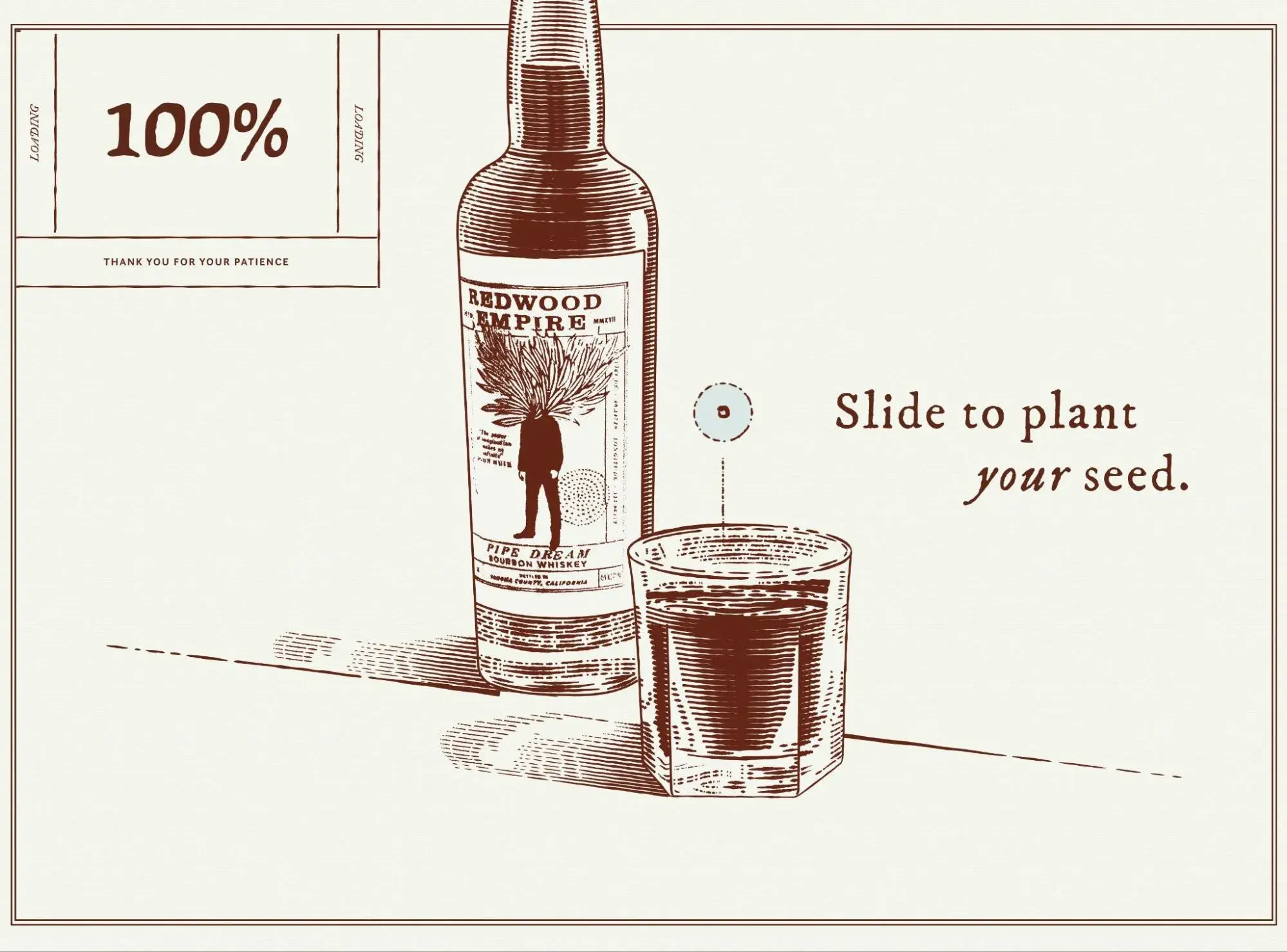
Earth Month With A Redwood is a microsite for Redwood Empire Whiskey. Designed and developed by Affinity Creative, its purpose was to educate and incentivize customers to enter the Redwood Glamping Experience Sweepstakes.
Earth Month With A Redwoof not only invites users to interact with the site — it requires it. When you land on the homepage, you are invited to “plant your seed.” You have to slide the rotating element into the glass to essentially unlock the rest of the site. Once you do, the background will be replaced by a hand-drawn map.

HubSpot's Free Website Builder
Create and customize your own business website with an easy drag-and-drop website builder.
- Build a website without any coding skills.
- Pre-built themes and templates.
- Built-in marketing tools and features.
- And more!
At the bottom, you’ll see a scrolling banner that invites you to enter the sweepstakes or share it on Facebook or Instagram to increase your own chances. Once you hover over the banner, it stops scrolling. As you scroll, you’ll notice plenty of additional interactive elements.
What I like: By requiring visitors to interact before they can advance, it guarantees that every visitor is engaged with the website. While this might have a slight negative effect on bounce rate, I think the tradeoff might be worth it, because you're getting access to a much more engaged audience.
3. Eamonn Day Lavelle
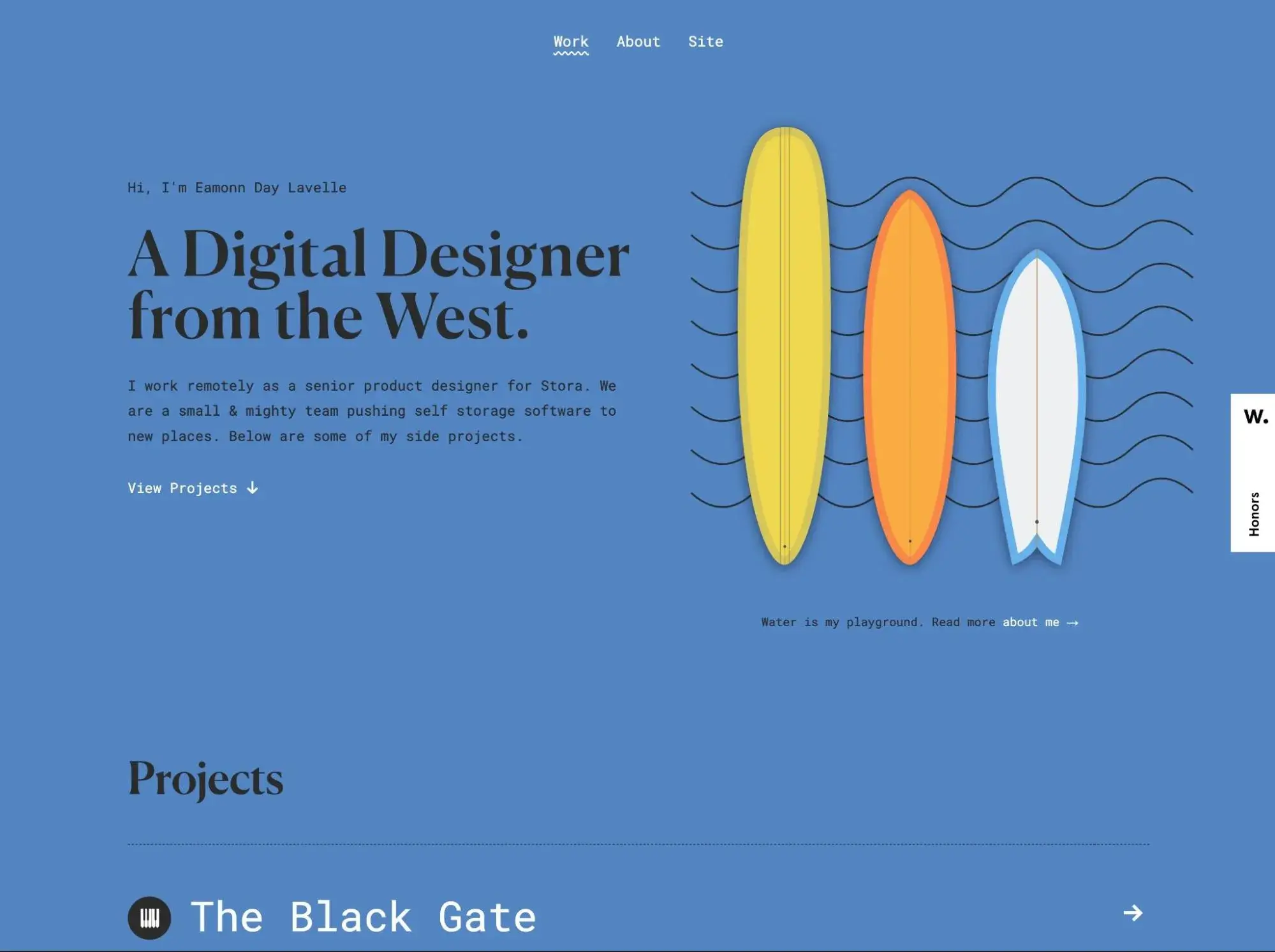
Eamonn Day Lavelle provides an excellent example of a simple interactive portfolio website. If you click “View Projects,” you are automatically scrolled down to a list of his projects. If you click on any individual project, then you are redirected to a more comprehensive landing page. Thanks to a fade-in transition effect, the page fades in and changes the background color to visually depict the loading process.
The best part about this site is that it’s optimized for performance. Coded with HTML5 and CSS3 and weighing less than 8MB, the site loads incredibly fast.
What I like: I'm a fan of this example because it proves that interactive design and website performance don’t have to be tradeoffs. You can still build interactivity into your website while delivering a quick-loading experience.
4. Whiteboard
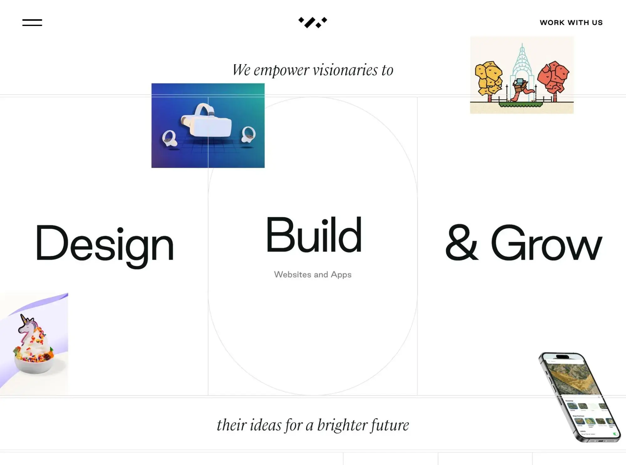
Whiteboard is a creative agency that drives strategy, designs brands, develops websites, builds apps, and launches campaigns, among other responsibilities. Its website is a treasure trove of interaction. You’ll find parallax scrolling, fly-in animations, hover animations, and much more.
For example, if you scroll down the page, you’ll find a unique portfolio section that looks like a collage board with images. If you hover over any of the individual images, then the image becomes a white text box with the brand’s name and an invitation to view the project, and the background becomes a full-width image from the case study.
What I like: I love how the website plays with a visitor's expectations by turning what looks like a very basic black-and-white design into a bright and visual experience. This type of interactivity can really create an engaging experience as visitors explore all of the different ways that they can interact.
5. Hi Fly
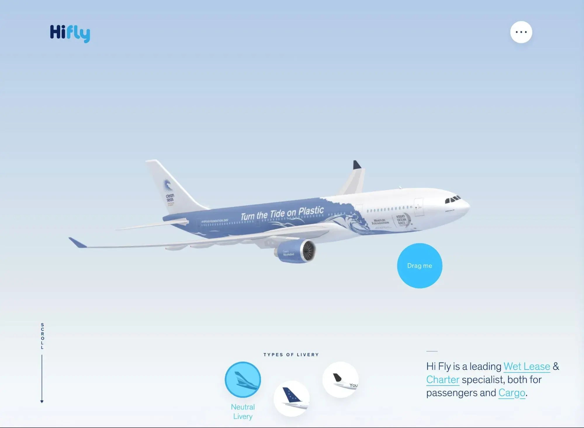
Hi Fly is an airline that specializes in “wet leases” and charter flights. To help potential customers learn about Hi Fly's fleet, the Hi Fly website uses a very cool interactive approach.
Once visitors choose the CTA to “Explore our fleet,” they'll see an interactive look at all of the different planes that Hi Fly uses. As visitors move their cursors around, the planes will move with them. Visitors can also click on a specific plane to see more information.
Scrolling down also adds another interactive experience that shows information on the interior of the planes, along with other important information. There are also other interactive pages, such as the pictured page above, where visitors can drag the plane to see it from all angles.
What I like: Unlike some other websites, Hi Fly maintains the same level of interactivity around pretty much its entire site. I get the same great interactive experience whether I'm learning about the planes or the company, and I find myself engaged across the entire website. If you have the resources to do it, I think that creating this type of universally interactive experience can be really effective.
6. (UN)TRAFFICKED
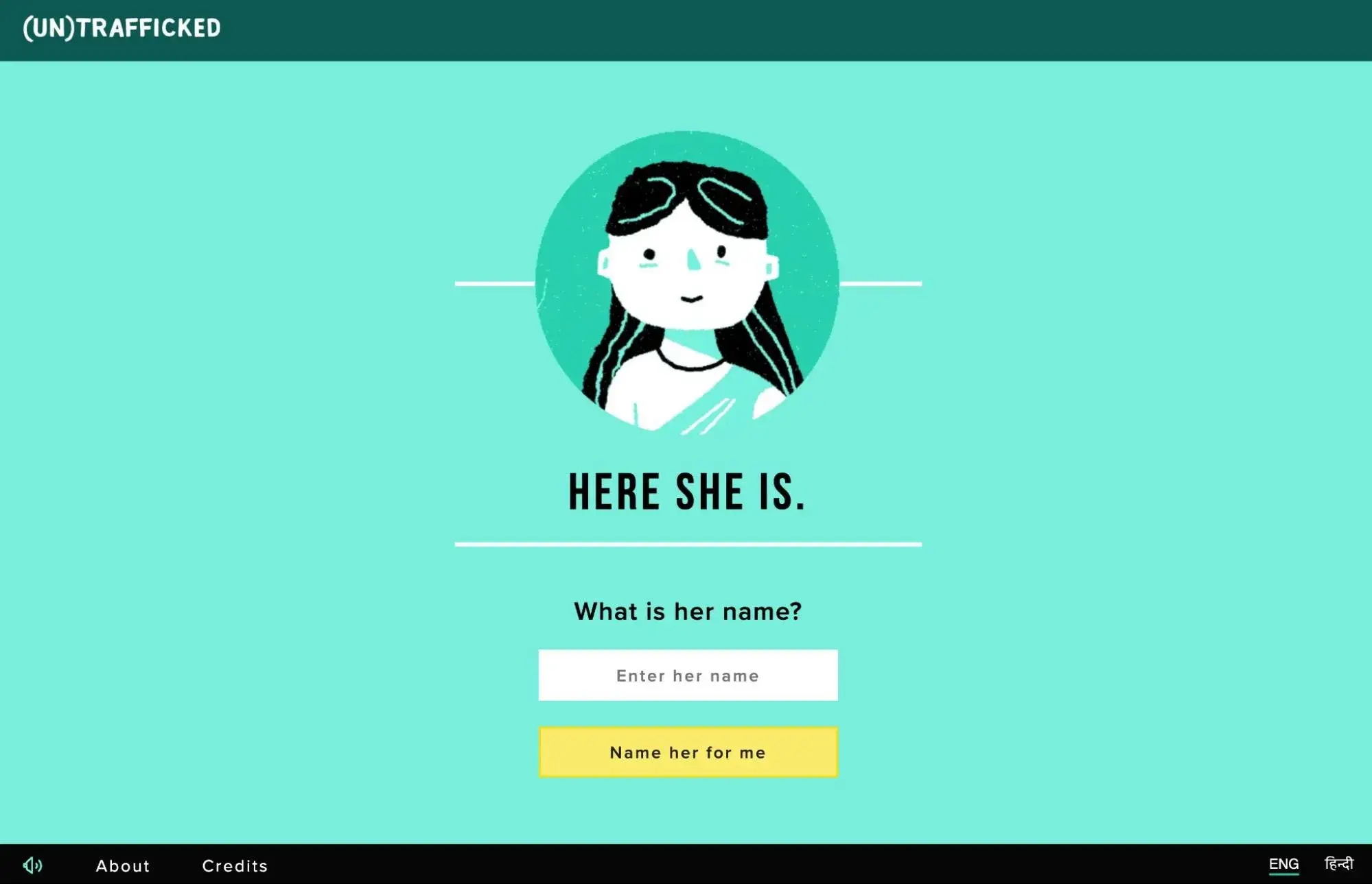
(UN)TRAFFICKED is an interactive digital story created to draw attention to the child trafficking crisis in India.
Based on the choose-your-own-adventure format, this interactive site has users follow a 13-year-old girl through a life-changing week and make decisions throughout that will impact the outcome of the story. (For example, you start by giving the girl a name.)
A soundtrack, in which you can literally hear the girl’s heart breaking, and up-to-date statistics on the state of child labor and sexual abuse in India are featured throughout.
After “playing” the game, users are encouraged to continue taking action by signing the pledge and sharing on social media.
As the digital centerpiece of a large-scale campaign by the Kailash Satyarthi Children's Foundation and the Children’s Investment Fund Foundation to end child exploitation in India, I think that (UN)TRAFFICKED shows how powerful interactive web design can be.
What I like: This interactive website does a great job of eliciting an emotional response in visitors so that visitors understand the scale and scope of the problem.
7. Cyclemon
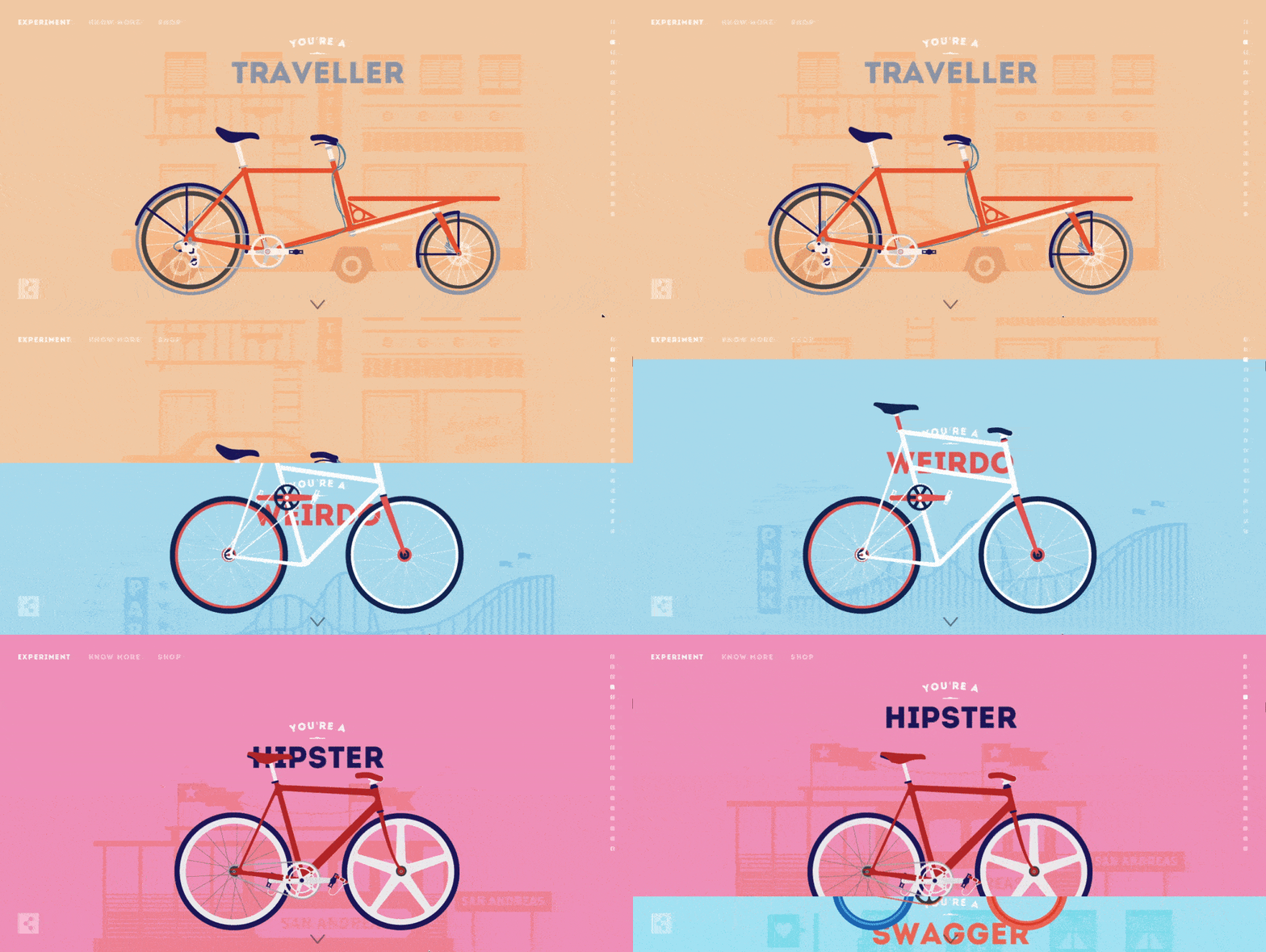
Cyclemon is an interactive illustrated website created by two French designers. This website allows users to cycle through (get it?) different bike models paired with different identities: traveler, weirdo, hipster, and swagger are just a few.
They can stop scrolling whenever they see a description or model that suits them. Parallax scrolling gives the illusion of traveling through the different places in the background, which include a hotel, amusement park, and ferry, among others.
The catch: the bikes aren’t actually for sale. If you scroll to the bottom like I did, you'll find that the designs are for sale instead.
What I like: This is one of my favorite implementations of parallax scrolling because it really demonstrates how you can use parallax to create interactive web experiences.
8. Bragg
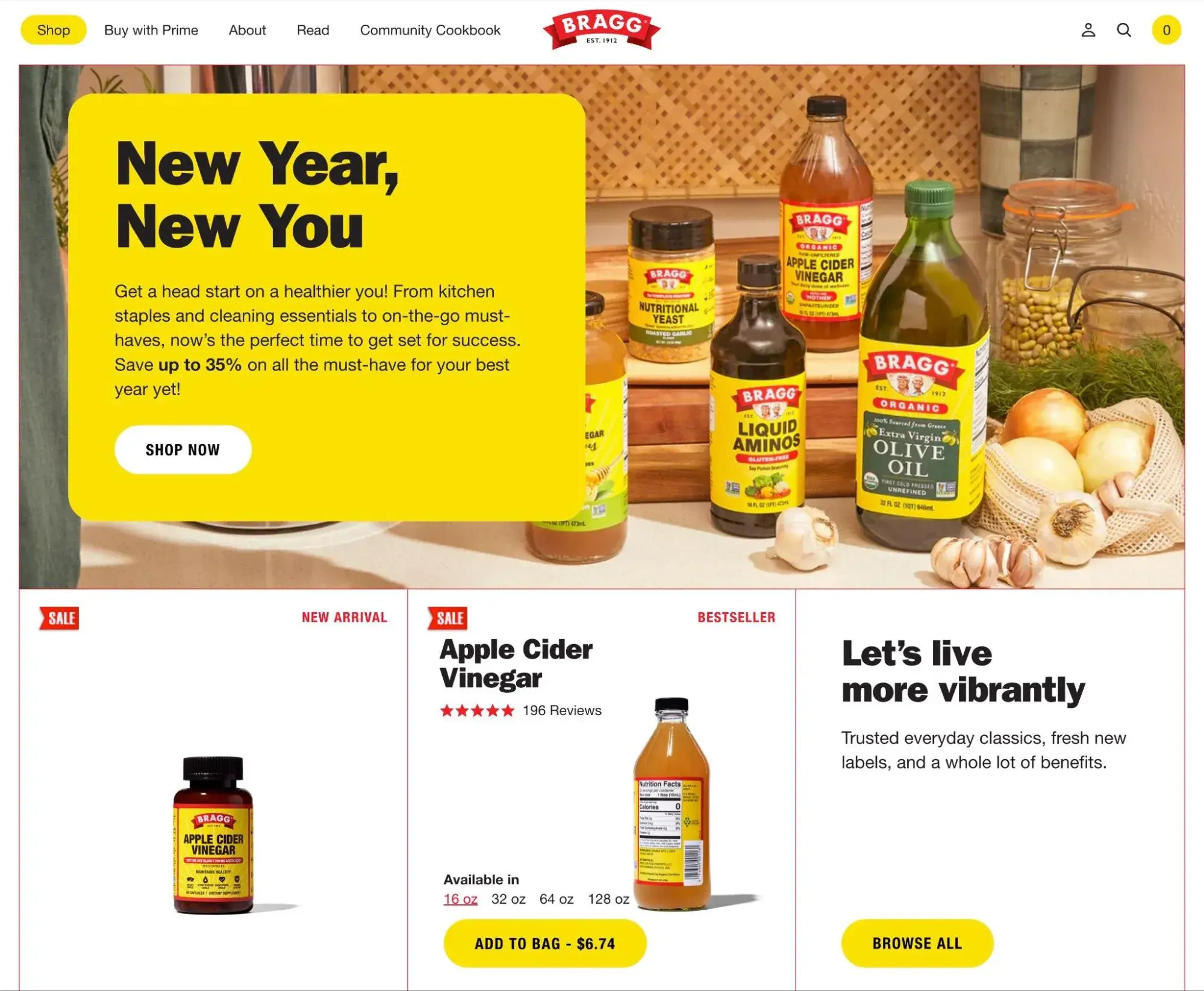
Bragg — short for Bragg Live Foods — is a health food company that’s dedicated to helping each individual eat better, feel better, and enjoy a more healthful and vibrant life. Bragg takes this personalized approach to its website as well.
As users hover over different elements, they change colors or move on the page. For example, there’s an interactive timeline that invites users to learn about the major landmarks in the company’s history, starting with its founding date.

HubSpot's Free Website Builder
Create and customize your own business website with an easy drag-and-drop website builder.
- Build a website without any coding skills.
- Pre-built themes and templates.
- Built-in marketing tools and features.
- And more!
Then, there’s a product slider. If a user hovers over one of the products, then more information appears thanks to the slide-in animation, including the product name, star rating, size availability, and price. The user can click on another available size, and the price will automatically change.
What I like: Bragg‘s website highlights that interactive design isn’t just for portfolio websites and agencies — you can use it to enhance ecommerce shopping experiences, as well.
9. Violet
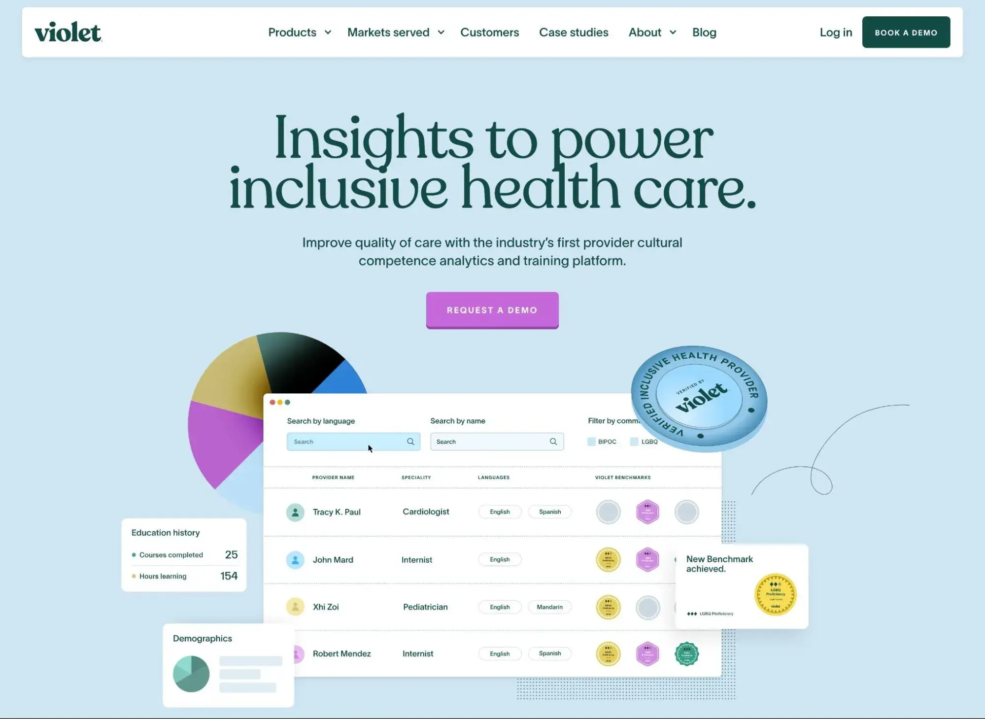
Violet is a company dedicated to making culturally competent health care accessible for all communities. Its website is characterized by bold colors and typography, animations, and illustrations.
Scrolling down the page, you’ll notice elements rotate as you scroll past them or the background color changes. Once you get close to the Library section, vertical scrolling changes to horizontal scrolling. The illustrated icons of each resource will also grow if you hover over them.
What I like: I like how the overall effect of the design is to create a personalized user experience, much like the company hopes all communities can receive from the healthcare system. The design and the mission tie together in an interesting way.
10. Decatur Dan
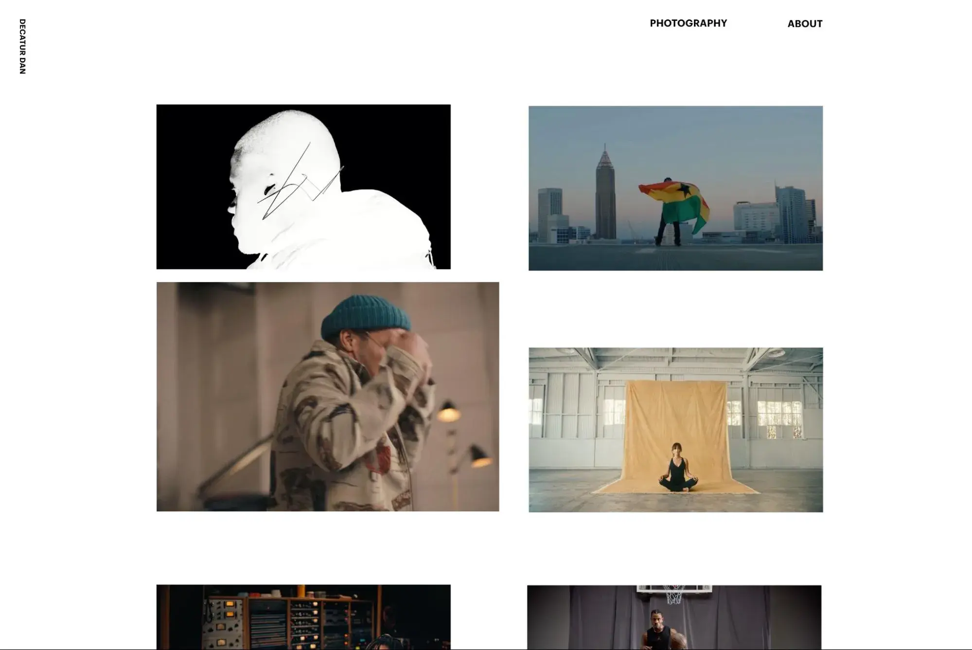
Dan Hall, better known as Decatur Dan, is a famous music video director who now creates visual stories for brands like Nike and Beats by Dre. His portfolio site — also developed by CTHDRL — exemplifies his visual storytelling skills.
Inviting users to share his commitment to what’s bigger, greater, and better, his website allows users to drag and resize all elements on the page. As a result, users can remix his work into their own layout.
What I like: Like the Whiteboard website, I love how Decatur Dan's website plays with user expectations. At first glance, it looks like just a very simple grid. Once visitors start interacting, though, they find out that they can customize everything about it.
11. Delve Architects
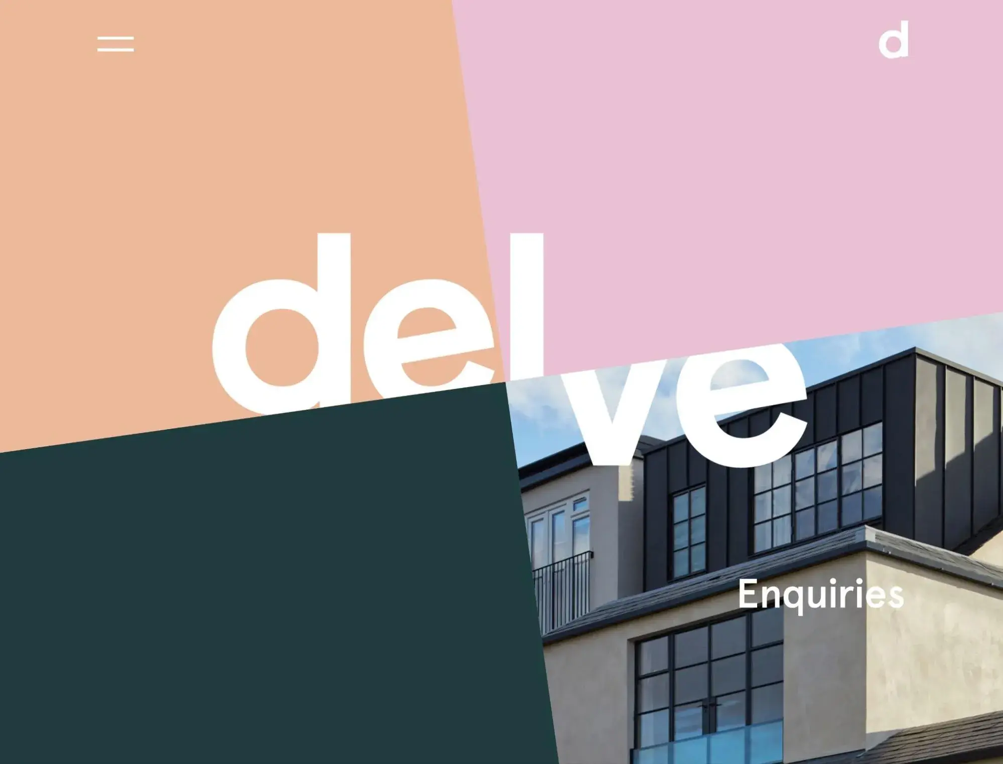
Delve Architects is a London-based company that aims to bring a light-hearted and personable approach to architectural design. These two values are reflected in its website’s design.
The color palette is mostly made up of light pastels. The homepage is interactive so the user can choose how they navigate the site. Clicking on one of the color blocks will reveal an image and category. Users can view their projects, learn more about their practice, read their blog, or contact them with inquiries.
What I like: This website manages to pack a great interactive experience into a very simple design. I like this because it demonstrates how you don't need to go crazy just to design a nice interactive experience for your visitors.
12. Cycles Gladiator
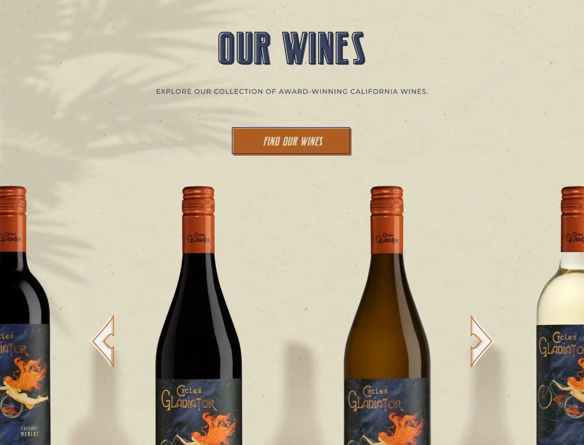
Cycles Gladiator is a California-based wine company dedicated to inspiring and empowering women. This interactive one-page website invites users to locate a nearby retailer or restaurant that sells their wines, learn more about their partnership with the non-profit group Do More Art, and join their mailing list.
Each of these calls-to-action has a button with a subtle hover animation. At the bottom of the page, there is a slider so users can view their wine collection one bottle (or can) at a time.
What I like: Cycles Gladiator says that its goal is “inspiring good times,” so I think that the fun interactive experience does a good job of connecting with the feeling that Cycles Gladiator wants to encourage.
13. Daniel See
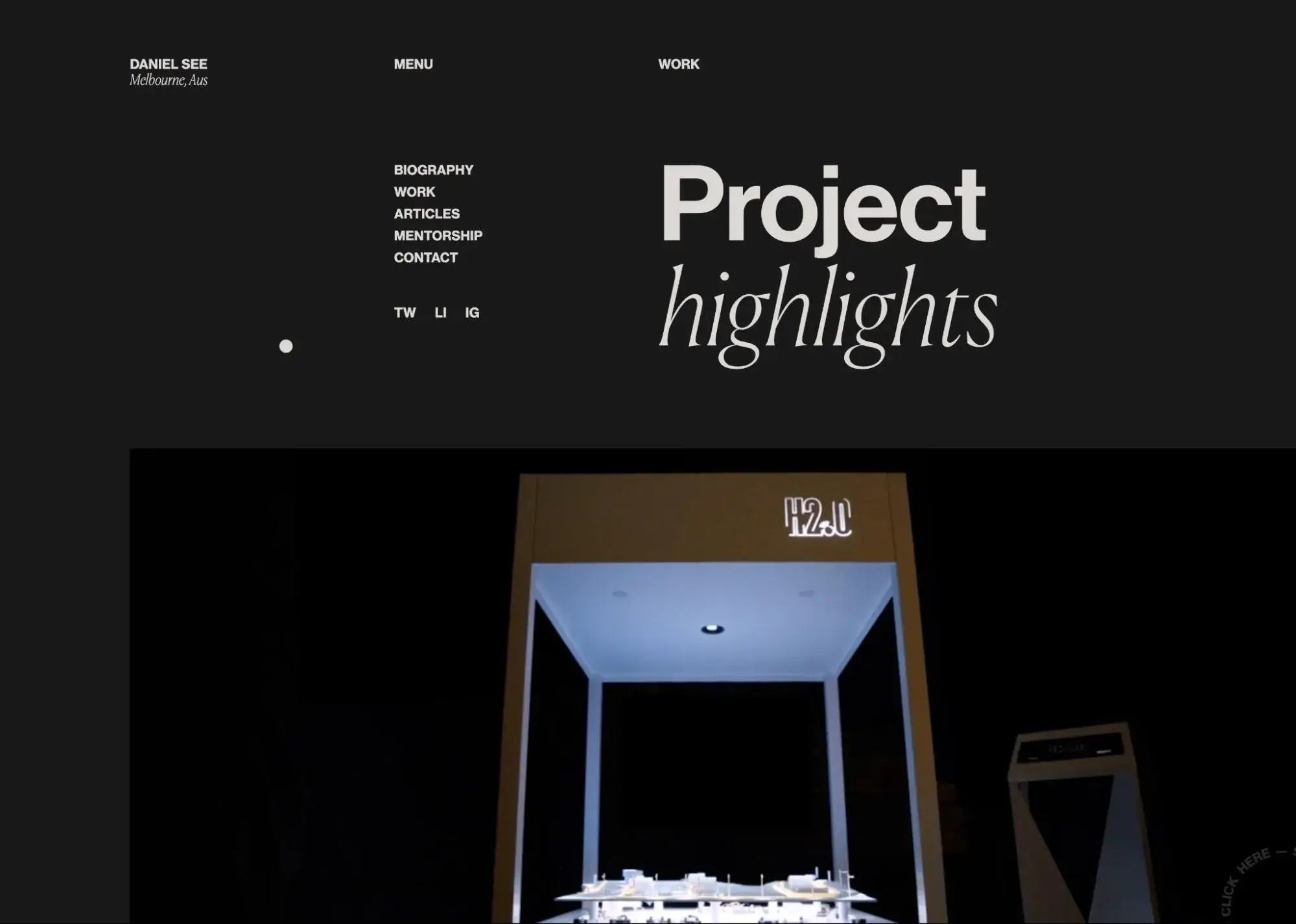
Daniel See is the principal national creative director for Deloitte Digital Australia. Since he’s been working in the digital industry for over two decades, he has a lot of projects to showcase. To make the viewing experience simpler and more interactive, infinite scroll and fly-in animations are used to reveal projects one at a time as the user scrolls.
I also like the rotating “click here to subscribe” option in the bottom-right corner, which expands a full-screen interface when visitors click it.
What I like: Daniel uses the interactivity of his website to highlight his skills as a creative director. As with some of the other examples, this is a good reminder that you should use interactivity to enhance what you're trying to accomplish, not just "because.”
14. SOS Violence Conjugale
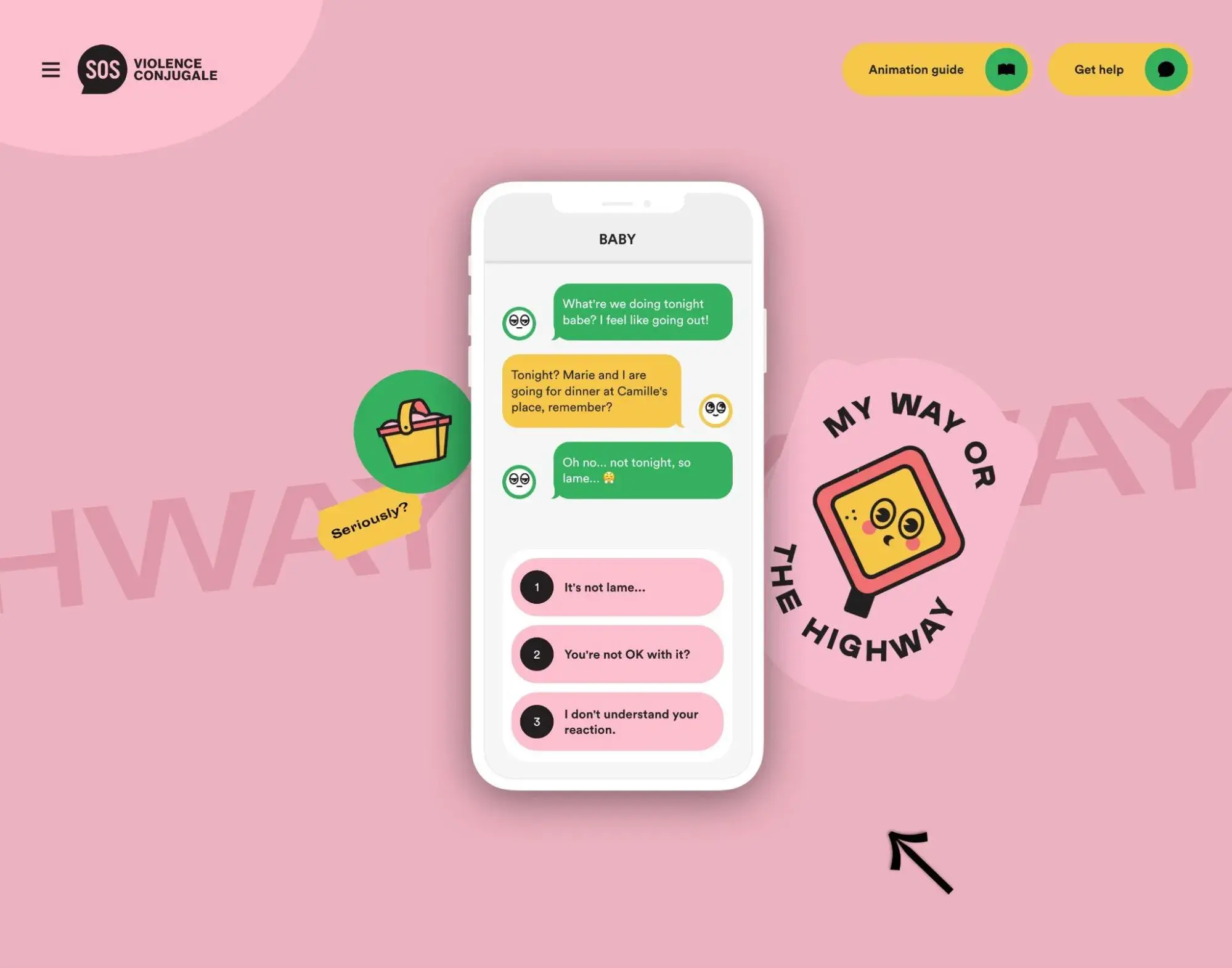
Similar to the (UN)TRAFFICKED example above, SOS Violence Conjugale is another example of an interactive website that tries to connect about a very important topic — intimate partner violence.
The main focus of the website is an interactive text thread on a mobile phone. Visitors will see example text messages and can choose from multiple options of how to respond. Based on the responses that the visitor chooses, the conversation will continue in a certain way.
In total, the website has five different interactive conversations that visitors can engage with.
What I like: This is another good example of how website interactivity can help communicate serious and emotional topics. The website uses its interactive elements to put visitors in the shoes of someone in that situation so that visitors can better understand and recognize intimate partner violence.
15. Prometheus Fuels
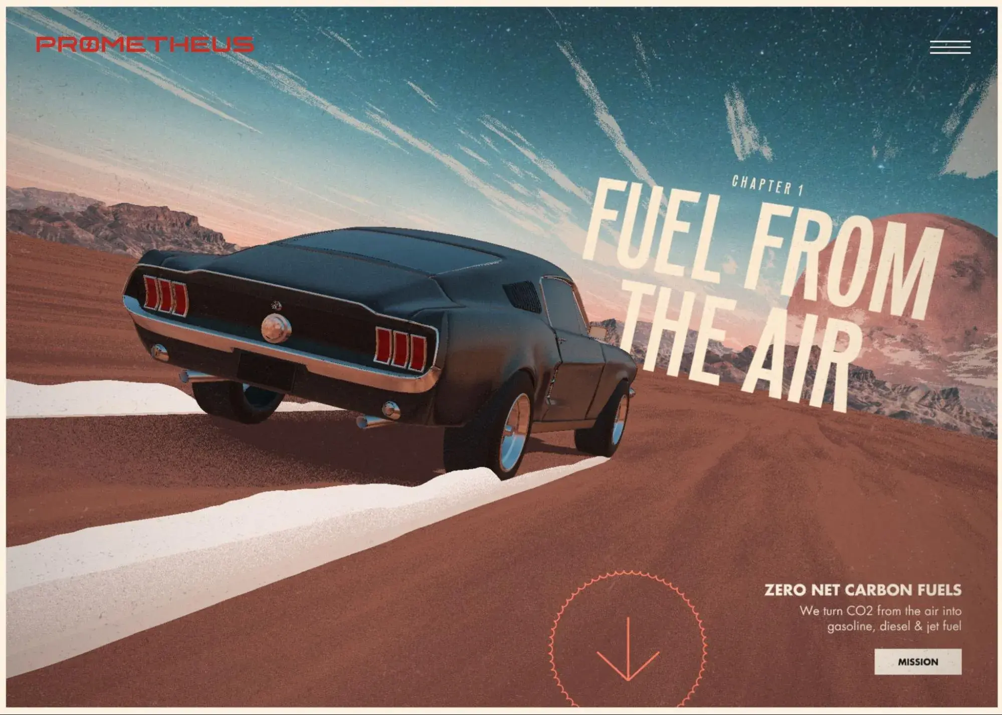
Prometheus Fuels invites readers to dive into an interactive story to learn how their company is creating fuel from the air. It’s basically part website, part video game.
When users hover over the background, the car moves as if by a game controller. If they hold the spacebar, they’ll see and hear the car accelerate. As the user scrolls and the car accelerates, bits of the story will be revealed.
What I like: I love how this one creates a video game-like experience out of a business website. It reminds me of Need for Speed while still effectively educating me about the company.

HubSpot's Free Website Builder
Create and customize your own business website with an easy drag-and-drop website builder.
- Build a website without any coding skills.
- Pre-built themes and templates.
- Built-in marketing tools and features.
- And more!
How to Make Interactive Websites
1. Create a loading animation.
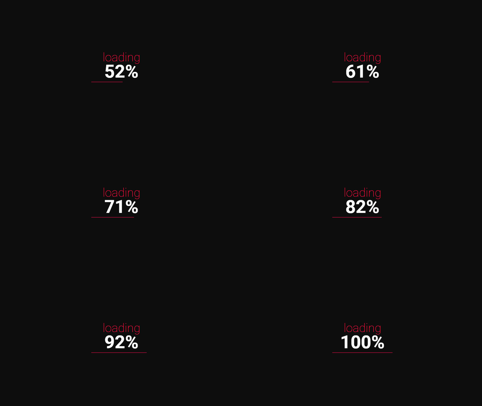
Loading animations are a great way to capture and keep the user’s attention immediately. Not only do they reassure users that the page is loading, but they can also show off your brand personality and delight users.
Many loading animations will indicate how long it will take for the page to load, which makes the waiting time seem shorter and makes users less likely to bounce.
Below is a simple and effective example.
2. Make scrolling fun.
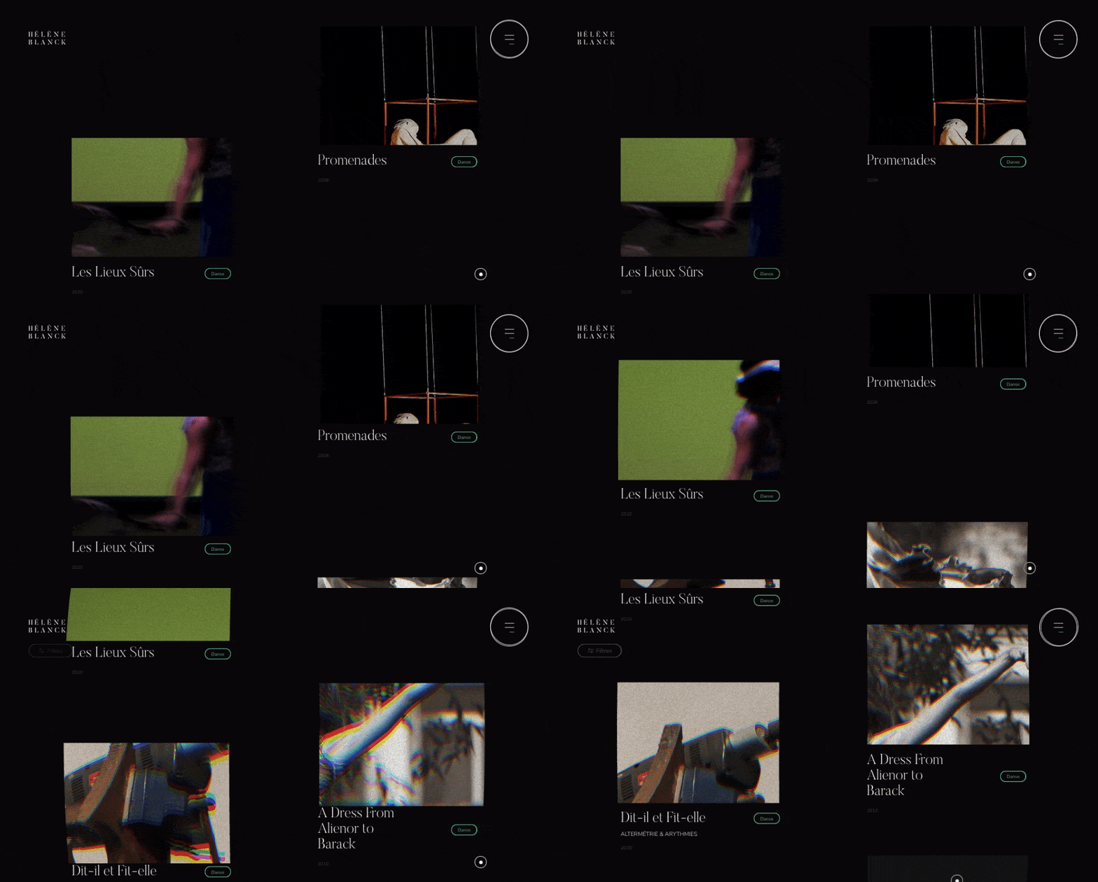
You want to make it as fun as possible for users to browse your site and discover your content. Scrolling patterns can help.
Here are some of the different scrolling patterns that I think could be worth including on your site:
- Horizontal scrolling. This scrolling pattern allows the user to scroll left and right to reveal content from the sides of the window or container — instead of up and down, which is a more traditional orientation.
- Infinite scroll. With this type of long scrolling, content continually loads once a user reaches the bottom of the page. Pinterest is one of — if not the — most well-known sites for using this scrolling pattern.
- Parallax scrolling. This scrolling pattern creates an illusion of depth. Basically, some elements are either fixed in place or set to scroll slower while other elements on the page scroll normally. This makes it look like some elements are moving in front of others, which simulates 3D movement. As I showed you above, I think the Cyclemon website is one of the best examples of parallax scrolling.
Here’s an example of dynamic scrolling on a portfolio site:
3. Leverage hover animations.
My experience has shown me that hover animations can be another effective, yet simple, way to create an interactive experience for your website's visitors.
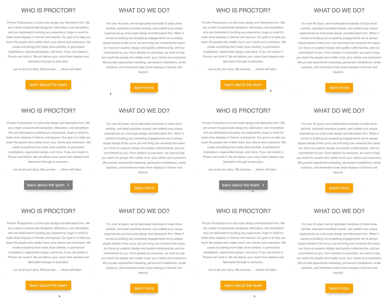
When a user hovers over an animated element like a button, for example, it can change color, grow, shrink, rotate, and more, depending on how you coded it. Like loading animations, hover animations are enjoyable for the visitor and assure them that your site is working.
You can also easily add animations using CSS, which I think is a great way to add interactivity without slowing down your site.
Here’s a great example of a hover animation that makes the primary CTA more clickable.
4. Incorporate video.
Since many users are more likely to play, share, and otherwise interact with videos than text, incorporating videos is an easy and effective way to make your website interactive.
Adding video can also help boost conversions, which I think makes it a double-whammy in terms of effectiveness. Because of these benefits, 91% of marketers use video as a marketing tool.
Taking interactive web design to a whole new level, Nikolaj Juhlsen uses video to literally show visitors how it feels to take a ride.

5. Add carousels.
A carousel — or carousel slider — is a slideshow for presenting a series of content. When done right, a carousel slider is a great way to organize serial content or multiple, separate pieces of content, like images.
In my experience, it can also boost user engagement and provide a better experience by allowing visitors to quickly and easily navigate this content, especially on mobile.
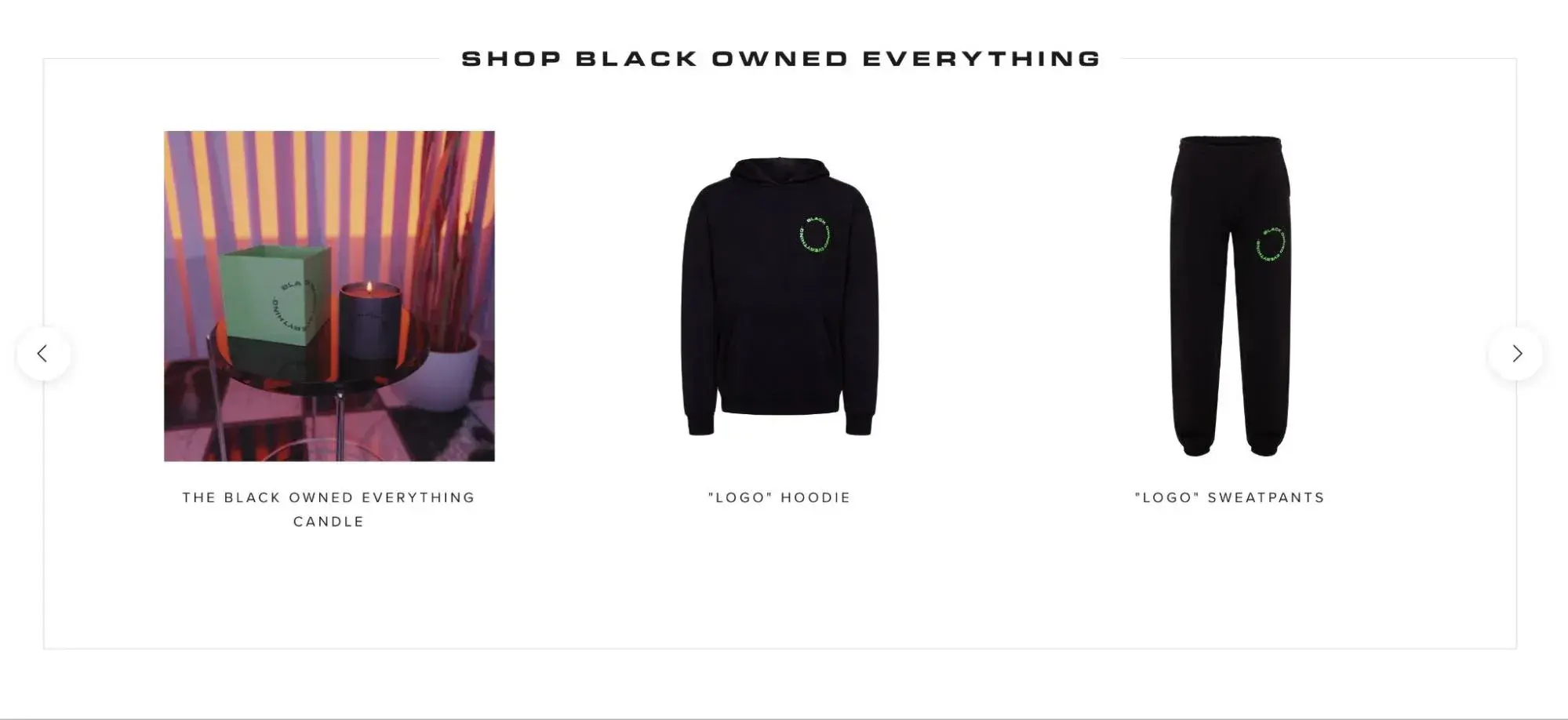
Here’s an example of a product carousel that encourages user interaction:
How will your website interact with visitors?
After curating this list of interactive website examples, I was reminded of just how much fun and engagement an interactive website can generate. Whether it's a full-on interactive experience or just a few engaging elements, I think adding interactivity can be a good decision for most types of websites.
The good news is that there are actionable steps you can take to add more interactivity to your site right away. You might add a video, re-organize a product display into a carousel, or create a loading animation, depending on your skillset and target audience.
Create your interactive website today, and maybe I'll add it to this list in the next update!
Editor's note: This post was originally published in June 2021 and has been updated for comprehensiveness.

HubSpot's Free Website Builder
Create and customize your own business website with an easy drag-and-drop website builder.
- Build a website without any coding skills.
- Pre-built themes and templates.
- Built-in marketing tools and features.
- And more!



![15 Stunning HTML Websites [+ How They Work]](https://www.hubspot.com/hubfs/Copy%20of%20Featured%20Image%20Template%20Backgrounds-1.webp)

![30 Furniture Website Design Examples I Love [+ How To Make Your Own]](https://www.hubspot.com/hubfs/Google%20Drive%20Integration/furniture%20website%20design_32023-1.png)


