So, whether you’re trying to upload a logo to your website or social media, or send it to a print shop for some branded swag, here’s what I learned about choosing the ideal logo size and file format for every asset.
Table of Contents
- Logo Size Basics: What You Need to Know
- Logo Size for Websites
- Logo Sizes for Social Media: Recommended Upload Sizes
- Logo Sizes for Print: What Is the Best File Format for Printing Logos?
- Logo Sizes for Mobile Apps
- Logo Size: More Important (and Complex) Than You Might Think
Logo Size Basics: What You Need to Know
1. Upload size isn’t always the same as display size.
First, let’s get one thing straight: Many blog posts that recommend logo sizes for various platforms conflate upload size and display size.
In this blog post, I will distinguish between:
- Upload size (AKA intrinsic size): The size of the original file that you upload to your CMS or to a social media platform
- Display size (AKA rendered size): The size of the image that actually ends up displayed on the screen
In responsive web design, websites automatically process and optimize uploaded images for faster load times and to accommodate different screen sizes and resolutions.
That means that the logo size you upload may be different from the logo size you see on your screen — so it’s crucial to know what it will be resized to (the rendered size).
You want the intrinsic size to be equal to or greater than the rendered size, preferably greater than.
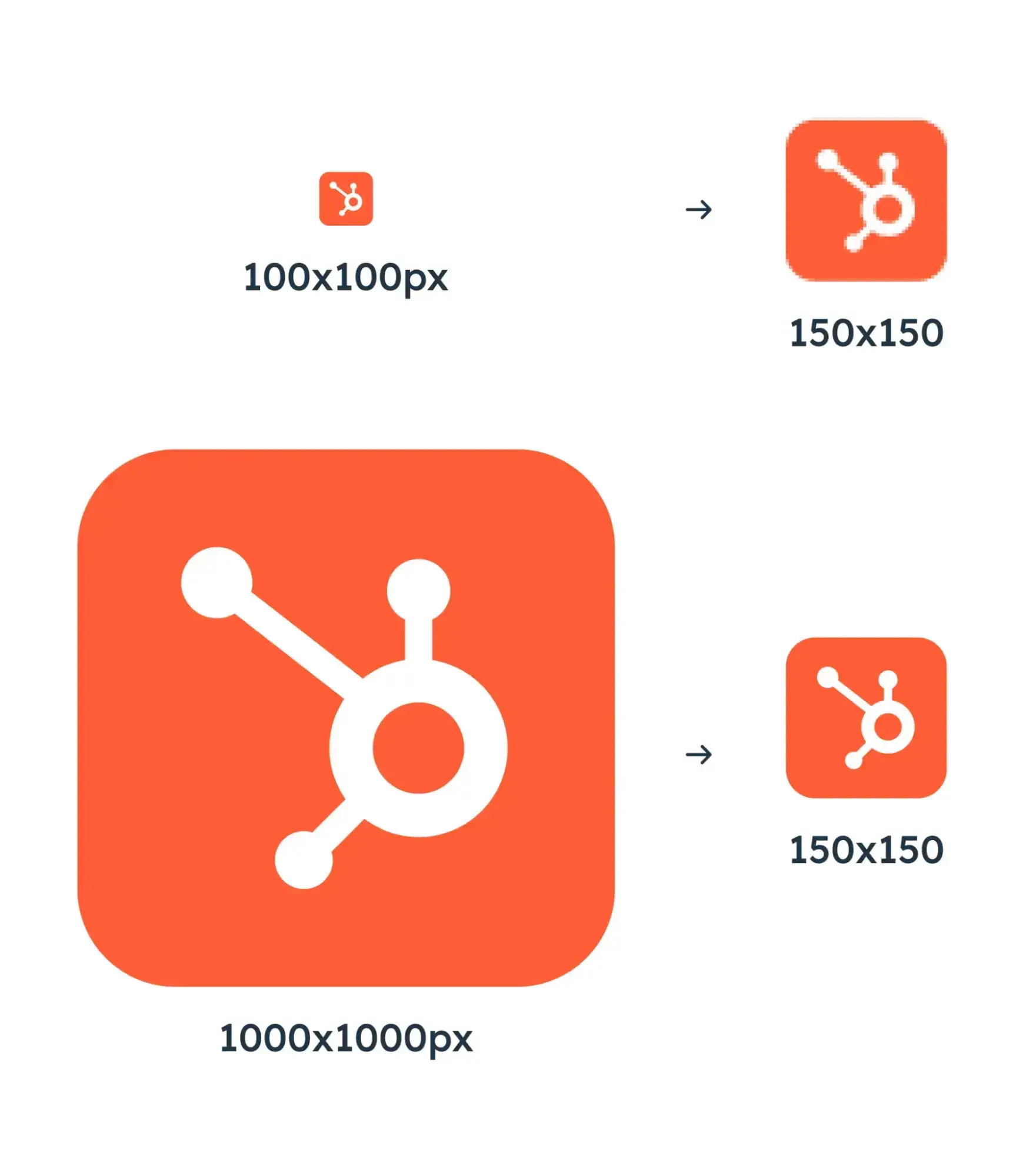
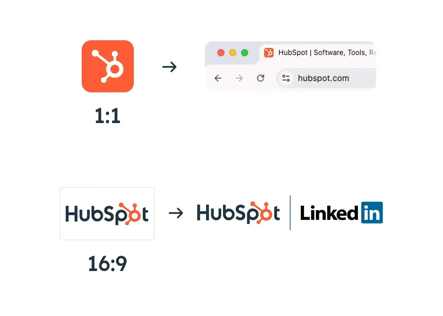
As Juan Manuel Devia Pinzon, senior UX designer at HubSpot Digital, explains: “A 1:1 (square) logo for a 150 x 150 Instagram user profile picture may be 100 x 100 pixels or 1000 x 1000 pixels.
“The higher-resolution image is typically better due to its enhanced clarity. In most scenarios, it is advisable to prioritize scaling down to maintain clarity rather than upscaling, which can lead to blurriness and distortion.”
Pinzon illustrates his point in this graphic he made:
2. Keep an original “source file” of your logo.
The source file will be the largest version of your logo. That way, you can always size it down depending on your use case. Anytime you need your logo for an asset (Instagram post, website, T-shirt, etc.), export it in the size and format you need.
The designers I spoke to highly recommended having a source file in a vector format, specifically SVG, because vectors can scale infinitely without losing quality.
However, SVGs can only be created and edited using specific design programs, like Figma or Adobe Illustrator. Don’t have access to those programs or the design skills? Use this free logo maker to generate a logo fast and export it in SVG format.
If you have the more popular raster file type (JPEG or PNG), ensure your source file is at least 2,000 pixels wide. The height will depend on your logo’s design and aspect ratio.
3. Choose the right file format based on the asset.
To find the right file format, answer the following questions:
- Which file types are supported by the platform you’re uploading to? Some platforms don’t allow you to upload a GIF, for example.
- Are you trying to make edits to the logo? If you want to edit the file, a vector format like SVG is ideal.
- Do you want to prioritize image quality or page load time? PNG files typically retain quality better than JPEG files, but JPEGs are more compressed and load faster.
- Does your logo need to have a transparent background? This is often the case when you’re uploading your logo to a website with a background that is a color other than white. JPEG files cannot support transparency. PNG files can.
Pro tip: Make your logo background transparent with a free Canva Pro trial to export images as PNG.
4. Have multiple logo versions and aspect ratios.
Your logo needs to accommodate various assets: digital collateral like your website and social media account and print collateral like branded T-shirts or posters.
“Design for flexibility,” recommends HubSpot graphic designer Malary Lee, “making sure your logo can fit various sizes and formats. Having different versions of the logo ready can be a key to success, like a horizontal and vertical design.”
For that reason, make sure you have multiple types of logos, including:
- Horizontal
- Vertical or square
- Light background
- Transparent background
- Dark background
- Black and white
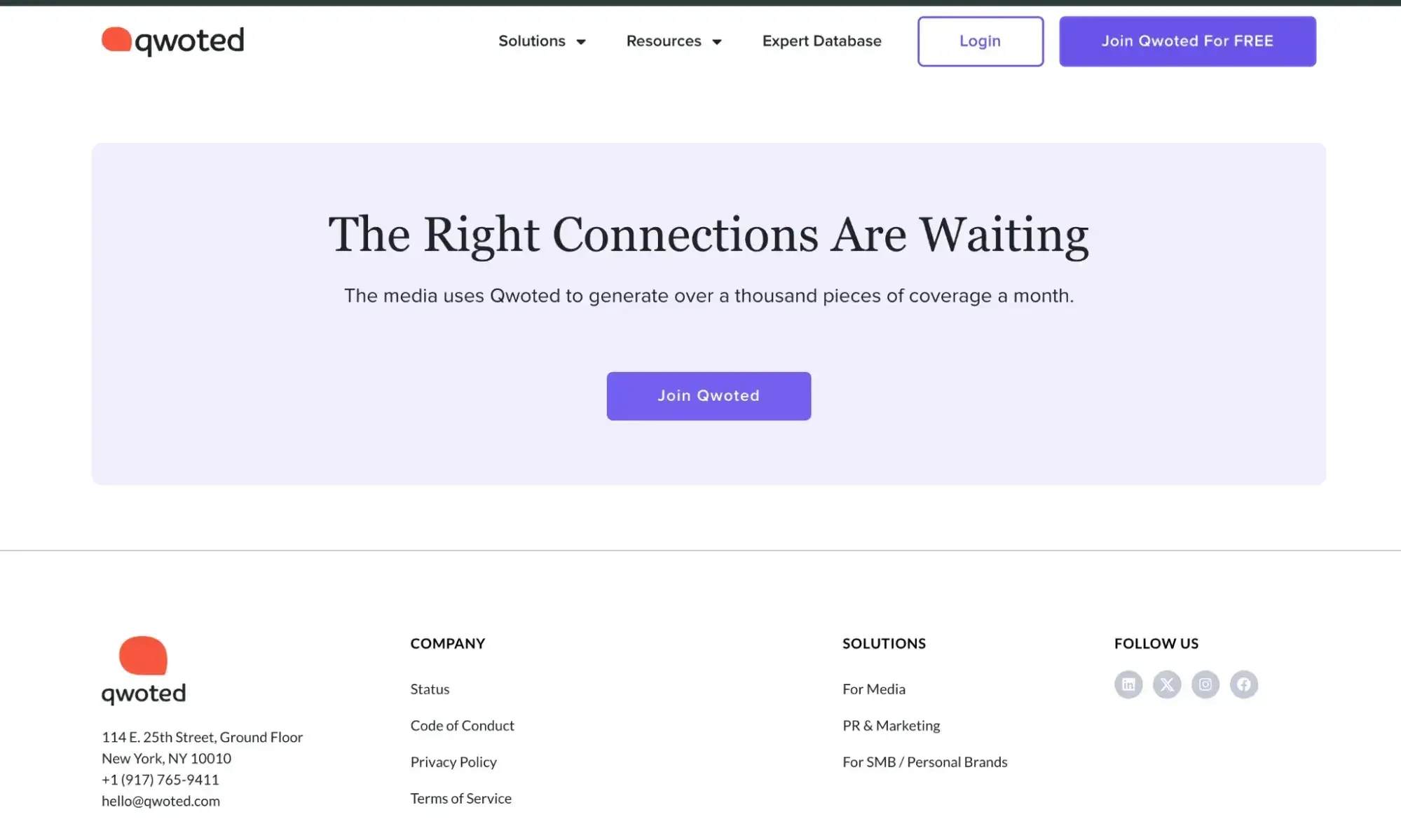
For example, you’ll notice in the screenshot of Qwoted’s website that there are two logos: one in the header that is horizontal and one in the footer that is more square.
Having logo options with different aspect ratios will make your logo more versatile across web and print assets.
Pinzon recommends at least having the following:
- 1:1 (square) for social media profile pictures, favicons, and app icons
- 16:9 (landscape) for videos, website headers, and marketing materials
“The 16:9 ratio provides additional space for combining a logotype (logo with business name), enhancing brand recognition,” he explains.
Notice how HubSpot’s sprocket logo is perfect for a 1:1 aspect ratio, and its logotype (“HubSpot” with the sprocket logo inside it) is ideal for 16:9:
5. Let your logo “breathe.”
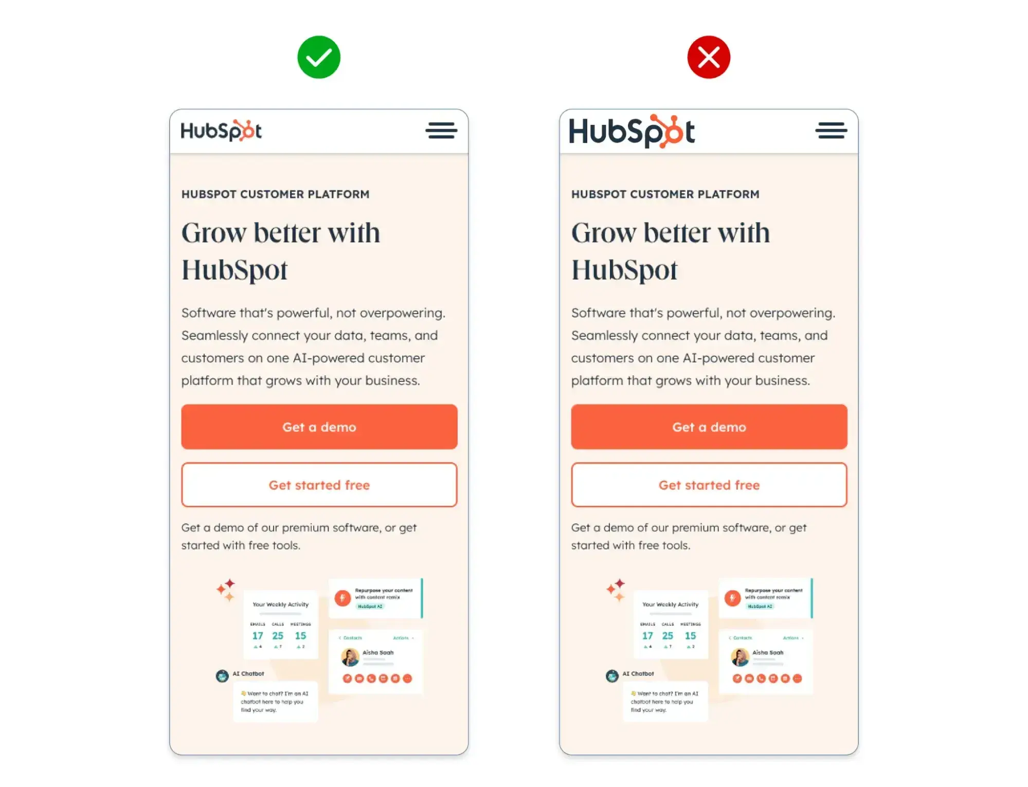
It may be tempting to make your logo as large as possible on a website or profile photo, but it’s not good design. You don’t want the edge of your logo to bump up against the edge of another design element.
As Pinzon explains, “While common sense might lean toward maximizing logo size, neglecting to add empty space can detract from a professional-looking logo and create visual clutter within the overall content layout.”
Instead, give your logos sufficient space from other elements for a cleaner design and better user experience.
Pinzon shows how to optimize white space around your logo in the graphic below:
Logo Size for Websites
What is the standard logo size for a website?
While there’s no one-size-fits-all “standard logo size,” logos on websites usually display at around 200 x 100 pixels (2:1 aspect ratio), so I recommend uploading a file that is at least double that size (400 x 200). If you have a square logo, try 200 x 200 pixels (1:1 aspect ratio) as a baseline original file size.
There is no “standard logo size” because it is highly dependent upon your website design and logo design. Based on my research, though, most desktop websites display their logos at no wider than 200 pixels and no taller than about 85 pixels.
By uploading a file that is at least double the rendered size, you’ll ensure that as your website resizes, your logo will remain crisp. If you go too large on the source file, you’ll risk slowing down your website because the file takes longer to process.
Need a real-life example? Take a look at Marine Layer’s gorgeous site and perfectly sized logo.
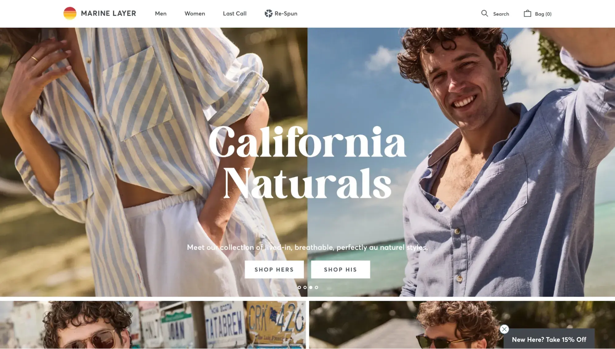
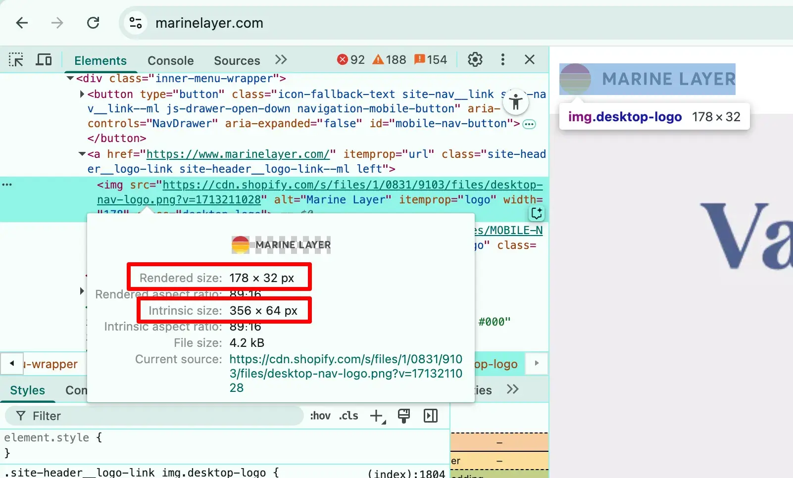
Using the Inspect tool on my MacBook, I can see that Marine Layer’s logo has a rendered size of 178 x 32 pixels. But its intrinsic size? That’s 356 x 64 pixels — double the rendered size.
If you’re using a CMS like WordPress, the CMS will likely automatically resize the logo when you upload it. The same is true for social media sites like Facebook and Pinterest.
Other content management systems, like HubSpot CMS, allow you to input the dimensions you would like your logo to be displayed on the website, which is why you need to know the ideal display size.
What is the best file format for website logos?
PNG is the best file format for website logos because it has two advantages over JPEG: higher image quality and the ability to have a transparent background.
Alternatively, if you have some extra time and want to learn a useful design skill, consider SVGs. With this file format, you can make your logo as big as you want, and it won’t become blurry.
Pro tip: Get a logo in SVG format in minutes by using this free Brand Kit Generator. It’ll create multiple logo versions plus a color palette for you to use.
If you don’t have access to a design program like Illustrator or Photoshop, Canva Pro lets you upload and edit SVG files. The problem with SVGs, though, is that many CMSs do not support them.
Website Header
Recommended upload size: 800 x 400 pixels
Recommended display size: 200 x 100 pixels
File type: PNG or SVG
The header of a website is wider than it is tall, which makes a rectangular logo ideal. If you can control your logo’s display size on your website, aim for at least 200 x 100 pixels for a rectangular logo or 100 x 100 pixels for a square logo.
Favicon
Recommended upload size: 512 x 512 pixels
File type: PNG
The favicon displays at 16 x 16 pixels in a browser tab, but you should upload a much larger size to account for the many other larger sizes it might be displayed at. Aim for an upload size of 512 x 512 pixels, as recommended by WordPress.
The favicon is the small square image you see in the browser tab that differentiates each website from the multiple ones you have open at one time in your browser (and if you’re me, that’s upwards of 30).

Logo Sizes for Social Media: Recommended Upload Sizes
For all of the logo sizes for social media below, I’ll specify a recommended upload size of your file.
I arrived at these sizes by reading the help center information from each platform (when available), testing the platforms by uploading images myself, and inspecting other brands’ social media.
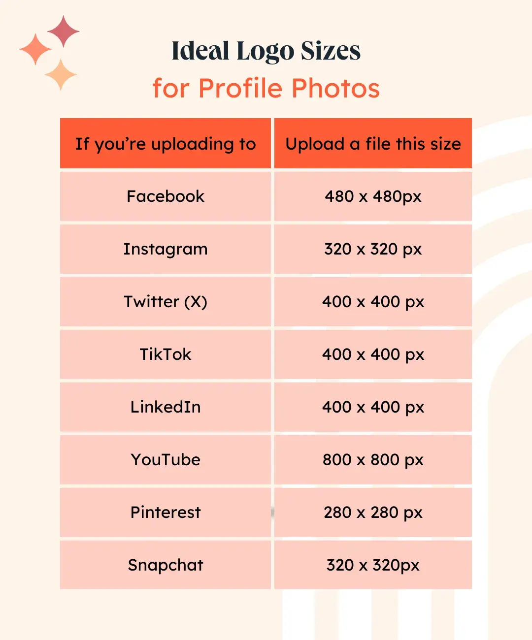
Profile photo: 320 x 320 pixels
File type: PNG or JPEG
Instagram’s help center doesn’t list a recommended profile photo size. However, most sources say to use a photo that’s 320 x 320 pixels when you upload. 320 x 320 is also the size of Canva Instagram profile picture templates.
Additionally, The Instagram Help Center states: “If you share a photo at a lower resolution, we enlarge it to a width of 320 pixels.”
That sort of minimum threshold seems to be why 320 x 320 is recommended. When I tested that size, the profile photo showed up nice and crisp on Instagram.
X (formerly Twitter)
Profile photo: 400px x 400px
Header photo: 1500px x 500px
Profile photo: 480px x 480px
Page cover photo: 1880px x 696px
File type: PNG
The Facebook Help Center says the Page profile picture will be displayed at 176 x 176 pixels, but I found that it won't let you upload anything smaller than 180 x 180. When I tried to upload a 150 x 150 image, Facebook gave me this warning:

So definitely don’t attempt an upload of a logo size below 180 pixels wide.
Further, Facebook automatically scales down profile photos. I uploaded a photo at 800 x 800, which was resized to 480 x 480.
Pro tip: While as of April 2025, the Facebook Help Center recommends a page cover photo size of 851 x 315, I found that that’s not a good idea if you want a crisp image.
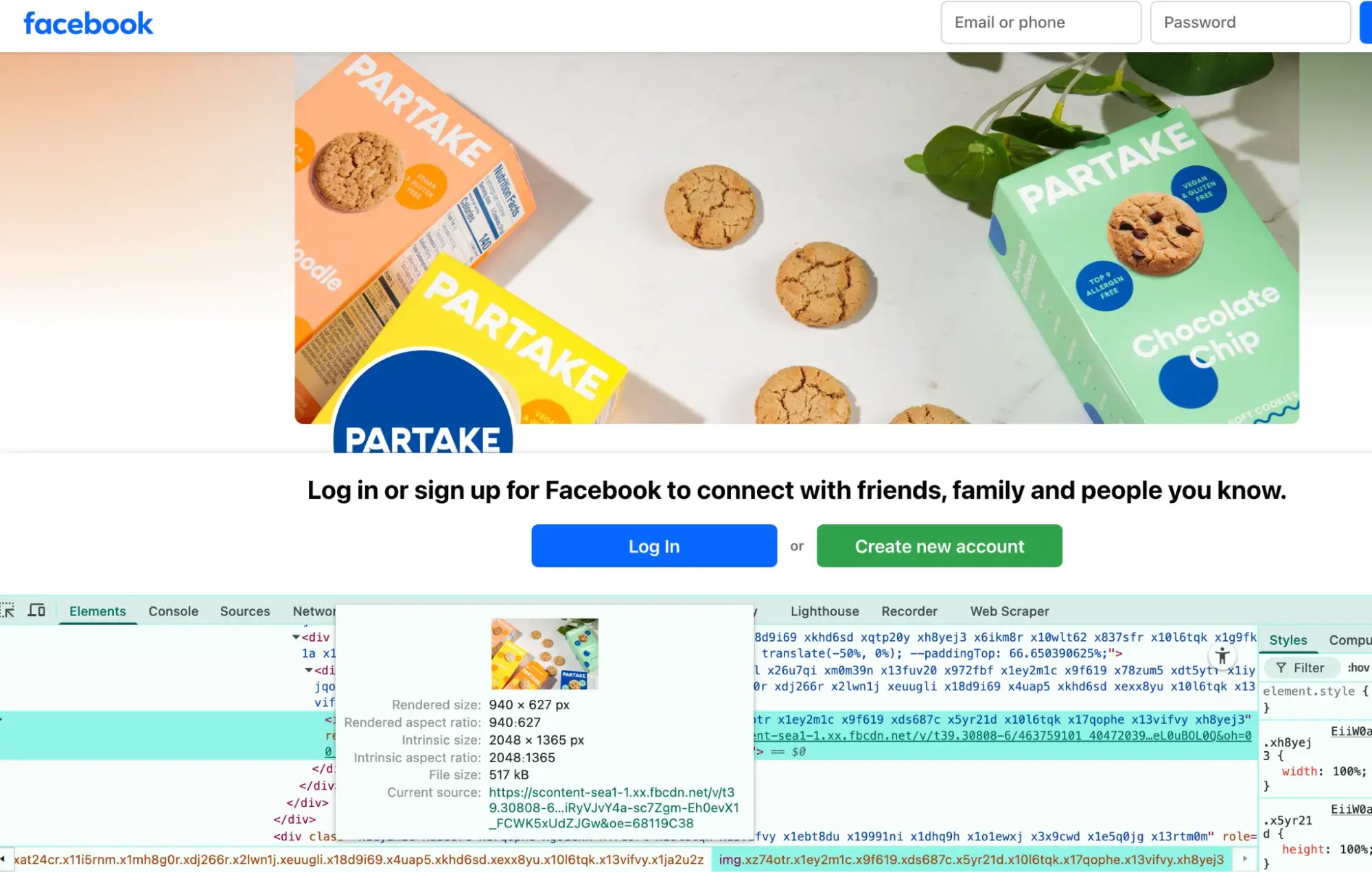
Facebook is actually displaying the cover photo at about 940 x 348 pixels, which is why I recommend uploading a cover photo double that size.
Brands that followed the 851 x 315 guideline had pixelated cover photos, while brands that uploaded a larger size (like Partake Foods below, which uploaded 2048 x 1365) had sharp images.
Profile photo: 280px x 280px
File type: PNG or JPEG
TikTok
Profile photo: 400px x 400px
File type: PNG or JPEG
Shockingly, the TikTok help center says that the minimum allowable profile photo (PFP) size for uploading is 20 x 20 pixels. It let me upload a PFP of that size, but it was extremely pixelated and didn’t even fill the circular frame on my profile page.
Uploading a PFP at 200 x 200 pixels looked great on my profile page but would become pixelated if viewed at full size or on a desktop.
That’s why I recommend 400 x 400 pixels: It was the right size to remain sharp even when tapped and seen in full or viewed from a computer screen.
Profile photo (square for companies): 400 x 400 pixels
Cover image: 1128px x 191px
File type: PNG or JPEG
Maximum size: 3MB
Unlike the circular profile photos on LinkedIn pages for people, company pages feature a square profile photo, so you don’t have to worry about your logo getting cut off.

Snapchat
Profile photo: 320px x 320px minimum
Header image: 375px x 569px
File type: PNG or JPEG
Maximum size: 2MB
Even though Snapchat requires the header image to be uploaded at a size of 375 x 569 px, the header image displays 375 x 258 pixels, meaning the height will be cut off.
Play around with different images to see where it gets cut off and ensure it looks good.
YouTube
Profile photo: 800px x 800px
Banner image size: 2560px x 1440px
File type: PNG or JPEG
Logo Sizes for Print: What Is the Best File Format for Printing Logos?
The best file format for printing your logo is a vector image like SVG, AI, PDF, or EPS.
Using the wrong file format is the biggest logo mistake Christine Geronimo sees in her Seattle-based apparel print shop, Midnight Supply Company.
“We need vectorized files that are scalable for print,” she explains. “AI, EPS, and PDF are preferred because they keep the quality of the image, details, colors, and layers intact, no matter the size.”
Vector files are file types that allow the designer to resize it (make it smaller or larger) within a design program like Adobe Photoshop or Illustrator, without sacrificing image quality.
Here are the logo sizes for print that Geronimo recommends for some popular merchandise items:
- Shirts and hoodies: 11 inches wide max on front. “If you go bigger than that, the artwork could run into the armpits on some of the smaller sizes,” Geronimo says.
- Mugs: Max imprint area is usually 2.5 inches x 2.5 inches
- Hats: No taller than 2.25 inches
Pro tip: Ask your printer for their preferred logo size and file format, as they may have a different preference from what’s listed here.
Logo Sizes for Mobile Apps
iOS, iPadOS, macOS, visionOS, and watchOS: App Store Guidelines
Recommended app icon upload size: 1024 x 1024 pixels
File type: PNG
tvOS
Recommended app icon upload size: 1280 x 768 pixels
File type: PNG
According to Apple documentation, after you upload the app icon at the recommended size above, the App Store will automatically scale it down for you to make the right sizes for other instances where it will show up.
Android: Google Play Store Guidelines
Recommended app icon upload size: 512 x 512 pixels
File type: PNG
Pro tip: Though the full size of the Android app icon is 512px x 512px, Google Play automatically applies a rounded edge.
This means that, ideally, you should keep essential parts of your app icon within the keylines of 384px x 384px to ensure parts of your logo don’t get cut off.
Logo Size: More Important (and Complex) Than You Might Think
A logo holds a lot of influence, and it's not as simple as finding the “standard logo size” and using it across all assets.
While this blog post is a great guide, be sure to test different logo sizes yourself. When in doubt, ask your design team (if you have one). I learned from researching and writing this article that they’re usually more than happy to help.
In fact, that’s the advice I got from another HubSpot designer I interviewed.
“I recommend working with the company design team to understand the design guidelines and the dos and don'ts of using the logo,” shares Kaiqi Zhu, a HubSpot UX designer. “I also recommend creating a long-term relationship with the design team.”
This article was written by a human, but our team uses AI in our editorial process. Check out our full disclosure to learn more about how we use AI.
Editor's note: This post was originally published in September 2024 and has been updated for comprehensiveness.
Design
.png?width=112&height=112&name=Image%20Hackathon%20%E2%80%93%20Vertical%20(50).png)

.png)


![What's a Design System & What Components Is It Made Up of? [Examples]](https://53.fs1.hubspotusercontent-na1.net/hubfs/53/design-system.png)
.webp)


