While I‘m coming at this from the perspective of a publisher looking to sell ad inventory on their own site, I also think this post will be useful to people who want to advertise on publishers’ websites, as you'll be able to choose the best banner ad sizes for the campaigns that you plan to run.
Basically, regardless of whether you want to sell banner ad space or buy banner ad space, I think you'll find value in this post.
Table of Contents
- What Are Standard Website Banner Sizes?
- Why Is It Important to Use Standard Banner Sizes?
- How to Add Website Banners to Your Site
What Are Standard Website Banner Sizes?
While there are dozens of different banner ad sizes, most websites and advertisers focus on these five common web banner sizes:
- Leaderboard — 728 x 90 px
- Large Rectangle — 336 x 280 px
- Medium Rectangle — 300 x 250 px
- Mobile Banner — 300 x 50 px
- Wide Skyscraper — 160 x 600 px
All five of these banner sizes are listed as the “top-performing ad sizes” by Google Adsense and just generally have the most competition from advertisers looking to place ads.
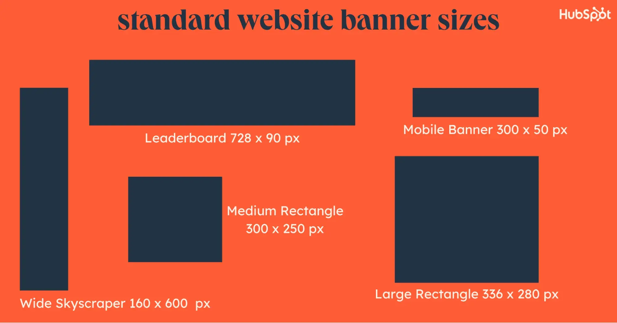
Let‘s go through these five important ad sizes, and then I’ll briefly share some less-common alternatives.
1. Leaderboard — 728 x 90 px
Best for: Placing ads above your main content or as an adhesion unit for desktop visitors.
The Leaderboard is a wide banner size that works especially well when placed above your main content. You'll also see a lot of sites place these as an adhesion unit, especially on sites using Mediavine, Raptive, or other similar ad networks. It works best on desktop and tablet devices because of its width.
Because the Leaderboard is one of the most popular banner ad sizes, there's a lot of advertiser inventory. Basically, there are a lot of people who are willing to pay to place Leaderboard ads, so you can generally get higher ad rates for this size. This is true for all five of these common banner sizes.
Here's an example of a Leaderboard ad from Mediavine, which Mediavine commonly uses as an adhesion unit for desktop visitors:

2. Large Rectangle — 336 x 280 px
Best for: Placing ads within the body of your content.
The Large Rectangle is a common banner ad size that you'll typically see embedded within text content. For example, if you have a long blog post, you might place multiple Large Rectangle banners within the post, with a certain number of paragraphs in between each ad.
3. Medium Rectangle — 300 x 250 px
Best for: Placing ads within the body of your content.
The Medium Rectangle is similar in shape to the Large Rectangle, just a bit smaller…hence the name. As with the Large Rectangle, you'll typically see the Medium Rectangle embedded within text content.
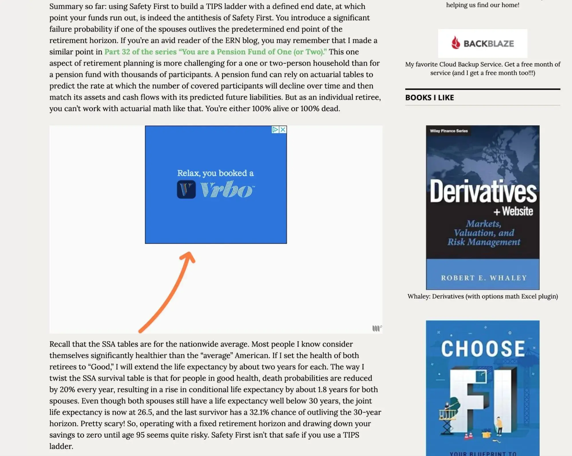
Here's an example of a Medium Rectangle placement from Mediavine, which places the banner inside a larger ad box to make it more visible while visitors are scrolling:
4. Mobile Banner — 300 x 50 px
Best for: Displaying ads to visitors on mobile devices.
As the name suggests, the Mobile Banner is a mobile-optimized banner size that works well on smartphones or other small portrait devices that don't have the width to display a full Leaderboard ad.
Ad networks like Mediavine and Raptive will also often use the Mobile Banner as an adhesion unit that appears at the bottom of the screen for mobile visitors, though some people will also place it at the top of the screen.
5. Wide Skyscraper — 160 x 600 px
Best for: Displaying ads in your site's sidebar for desktop visitors. It works especially well as a sticky unit.
The Wide Skyscraper is a vertical banner that you'll typically see in the sidebar of websites. Outside of a sidebar area, I don't really recommend using the Wide Skyscraper size.
It has a good amount of inventory and is one of the most common web banner sizes that you'll find.
Based on data from my own website with over 393 million collective ad impressions, the Wide Skyscraper ads in my site's sidebar generated some of the highest CPMs of any ad type on my site.
In fact, the Wide Skyscraper was consistently around 25% higher than in-content rectangle ads and Leaderboard adhesion ads, which is a significant performance increase.
Given that, I think it's definitely important to make sure that your site has a sidebar so that you can take advantage of the Wide Skyscraper banner ad size.
Other Less Common Web Banner Sizes to Consider
While the five sizes that I detailed above are the most common web banner sizes, they definitely aren't your only options.
You'll also find other ad sizes for certain use cases. Or, there are even some geographic regions that have their own unique banner ad sizes.
Here are some of the other website banner sizes that you might find:
- Banner — 468 x 60 px. This is a Leaderboard alternative that can be a good option if your ad space isn't wide enough to accommodate the full width of a Leaderboard placement.
- Tablet landscape full-screen ad — 1,024 x 768 px. This is used for mobile app interstitial ads.
- Large Leaderboard — 970 x 90 px. This is an even wider version of a Leaderboard.
- Tablet portrait full-screen ad — 768 x 1,024 px. This is used for tablet/mobile app interstitial ads.
- Mobile landscape full-screen ad — 480 x 320 px. This is used for mobile app interstitial ads.
- Half page — 300 x 600 px. This size is growing in popularity because it gives advertisers a lot of space to work with.
- Square — 250 x 250 px. This can work well if you don‘t have enough room for a Large Rectangle or Medium Rectangle, but it doesn’t have as much inventory as those other ad types so it's not ideal.
Additionally, here's a quick rundown of some of the geographic or country-specific banner sizes that you might encounter:
- 980 x 120 px — Called a “Panorama,” this banner size is especially popular in the Scandinavian countries (Sweden, Finland, and Norway).
- 980 x 90 px — A bit wider than the more common Leaderboard, this size is popular in Europe.
- 950 x 90 px — This Leaderboard alternative is popular in China.
- 750 x 200 px — This is the most popular banner ad format in Poland. It's similar to a Leaderboard, but a little taller.
- 750 x 300 px — This is the third most popular banner ad size in Poland.
- 240 x 400 px — Called a “vertical rectangle,” this is the most popular banner ad size in Russia.
Why Is It Important to Use Standard Banner Sizes?
Whether you‘re a publisher looking to sell ad space on your website or an advertiser looking to place ads on someone else’s website, you'll generally want to use these standardized banner sizes.
Here’s why…
For Publishers Displaying Ads on Their Websites
If you're looking to sell ad space on your website, there are several reasons to use common website banner sizes.
First off, using standardized ad sizes will let you access the largest advertiser “inventory.”
When advertisers bid on ad slots, they typically do so on standardized banner sizing. For example, there might be thousands of advertisers looking to place a 728 x 90 px Leaderboard, which means there will be lots of competition for people trying to advertise on your site. With more competition, you can earn higher RPMs (revenue per one thousand impressions).
On the other hand, if you display a 750 x 200 px ad instead, there will be a lot fewer advertisers trying to bid on that slot (unless you're in Poland!). Because there‘s lower competition, you’ll typically see lower RPMs. Or, in some cases, you might even end up with unsold ad inventory.
Beyond that, using standardized banner ad sizes is also important because these sizes have been approved by the Interactive Advertising Bureau (IAB), an organization that plays a large role in developing standards for the online advertising space.
Because these banner sizes have been approved by the IAB, they're seen as a “safe” way to implement banner ads on a website.
Finally, a smaller reason is that many ad-focused website themes are built around these ad sizes. For example, if you're using an ad-optimized WordPress theme for your site, it's generally just easier to use the standardized banner sizes instead of trying to tweak things for some non-standard size.
For Advertisers Buying Space on Websites
If you want to place your own ads on publishers' websites, the same basic principle holds true.
Most publishers design their websites to optimally display specific banner sizes. For example, if a website has a sidebar, most ad-focused websites will design the sidebar to optimally display the Wide Skyscraper banner ad size (160 x 600 px).
If you try to place non-standard banners, you might not have access to as much publisher inventory (or you might make things difficult for webmasters if you're doing direct placements).
Beyond that, these common banner sizes also have a lot of data behind them when it comes to effectiveness, so there's no need to try to reinvent the wheel when other people have already done the work to discover the best banner ad sizes.
How to Add Website Banners to Your Site
Now that you understand the common web banner sizes that you might want to use, I want to actually show you how you can add your first banner ad to your own website.
Depending on your unique situation, you may or may not need to actually do this manually.
For example, if you're using an ad management platform like Google AdSense, Mediavine, Raptive, Ezoic, and so on, those services generally offer an all-in-one approach to adding ads on your site. Typically, you just need to add a small code snippet to your site and then the service will automatically inject optimally sized ads for you.
If you‘re placing ads directly, though, you’ll typically need to add the banner yourself, which is what I'll show you how to do below.
Manual Banner Ad Placement
For this example, I‘ll show you what it’s like to manually place a Wide Skyscraper banner ad in the sidebar of my WordPress website. However, the same basic principles will apply to other banner ad sizes and website builders.
For example, if you're using the HubSpot Content Hub website builder, it includes an HTML element that would let you follow all the same basic steps in my tutorial.
1. Upload the banner ad image to your server.
Before getting into any of the banner ad code, I first recommend making sure that you have the final version of the banner image that you want to use on your site.
If you're placing an ad from someone else, they should provide you with the finished image that they want you to use on your site.
If you're creating your own banner ad, you can do so using tools like Canva or Photoshop. Just make sure to use the exact dimensions for the relevant banner ad size.
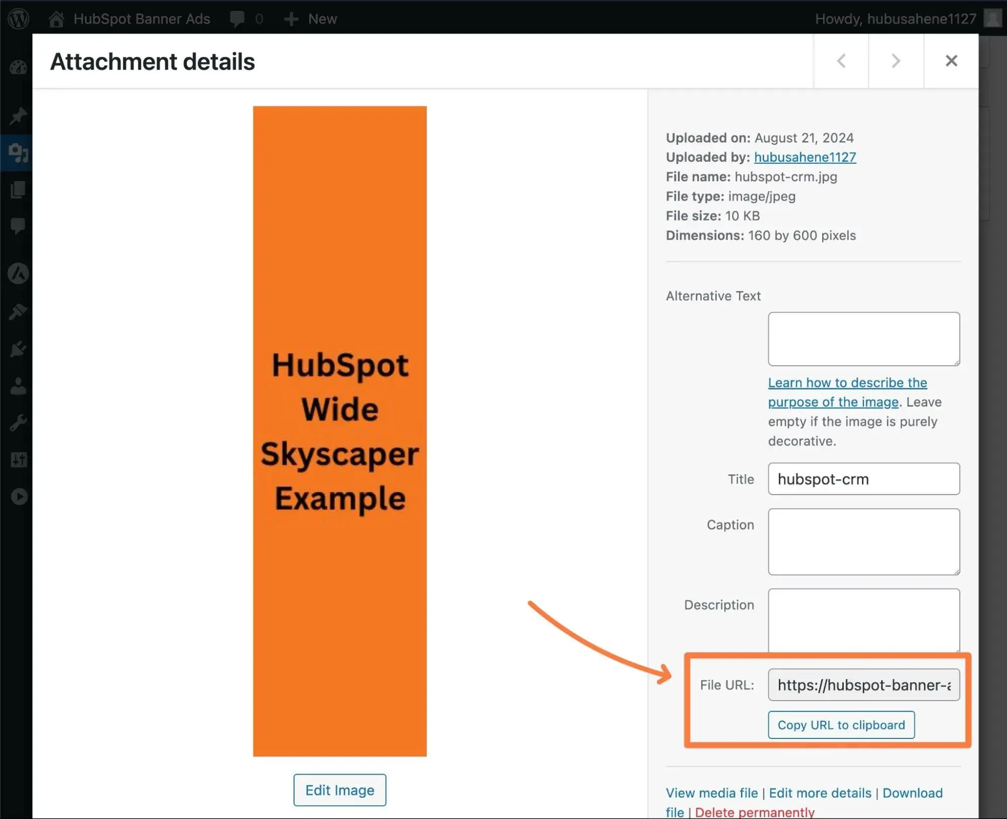
Once you have the finished banner image, you need to upload it to your hosting server. In WordPress, you can do this by adding it to your Media Library.
Here's what my example Wide Skyscraper ad looks like in my Media Library.
With respect to the filename for the image, I recommend not including any advertising-related indicators in the filename. This is because some ad blockers will look at the filename when choosing which images to block.
For example, instead of naming it "hubspot-leaderboard-banner-ad.jpg,“ consider something generic like ”hubspot.jpg".
2. Set up the banner ad code snippet.
Once you‘ve uploaded the banner ad image to your server, you’re ready to set up the code snippet that you'll use to add the banner to your site.
Manually placing a banner ad is actually no different than manually embedding an image in your site, so you can use the same basic code snippet.
Here's the framework for the code:
<img src=“yoursite.com/image-filename.jpg” width=“160” height=“600” alt=“Text that describes the content of the banner ad” />
You'll need to edit the code snippet to make it your own:
- src — Replace the example text with the full URL to the image file on your server.
- width — Replace this number with the width (in pixels) of the banner size that you're using.
- height — Replace this number with the height (in pixels) of the banner size that you're using.
- alt — Add some text that describes the content of the banner ad. This will help make your website more accessible to people using screen readers or other assistive devices.
Here's what the finished code snippet looks like for my example WordPress website:
<img src=“https://hubspot-banner-ad.instawp.xyz/wp-content/uploads/2024/08/hubspot-crm.jpg” width=“160” height=“600” alt=“HubSpot offers a free CRM. Try it today!” />
3. Add the banner ad code snippet to your site.
To finish things up, all you need to do is add the banner ad code snippet to the location on your site where you want your banner to appear.
For my example, I‘m placing the Wide Skyscraper in my site’s sidebar, so I can use the WordPress widget system. Here's how it works:
- Open your WordPress dashboard.
- Go to Appearance → Widgets.
- Add a Custom HTML widget to the sidebar where you want your banner ad to appear.
- Paste in the banner ad code snippet from the previous section.
- Click the Update button.
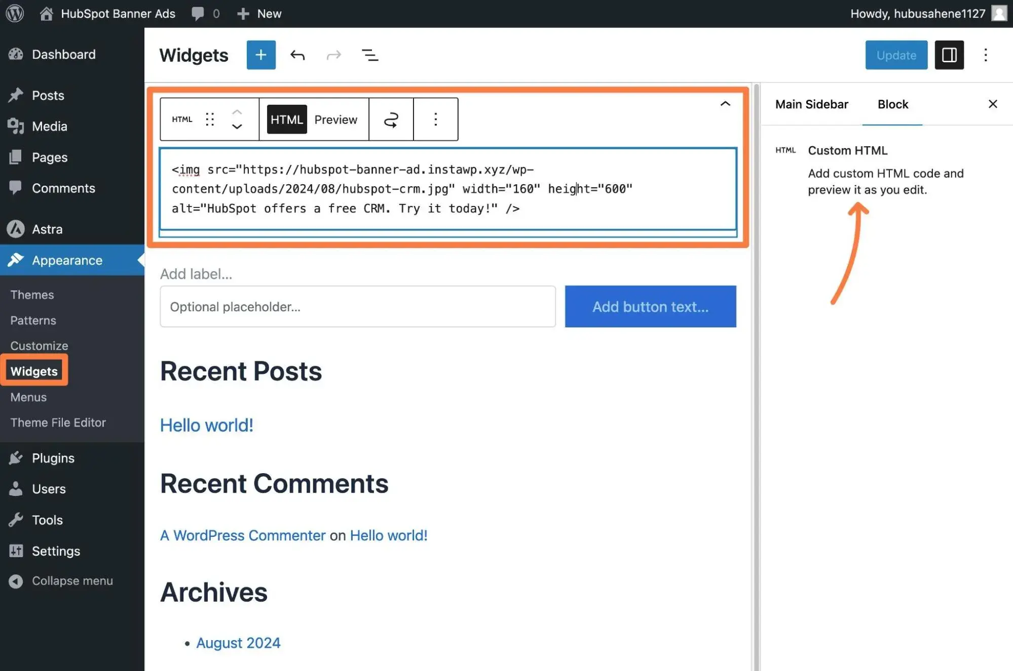
Once I saved the Custom HTML widget with my banner ad code, I just needed to open the frontend of my site to verify that the banner ad is displaying.
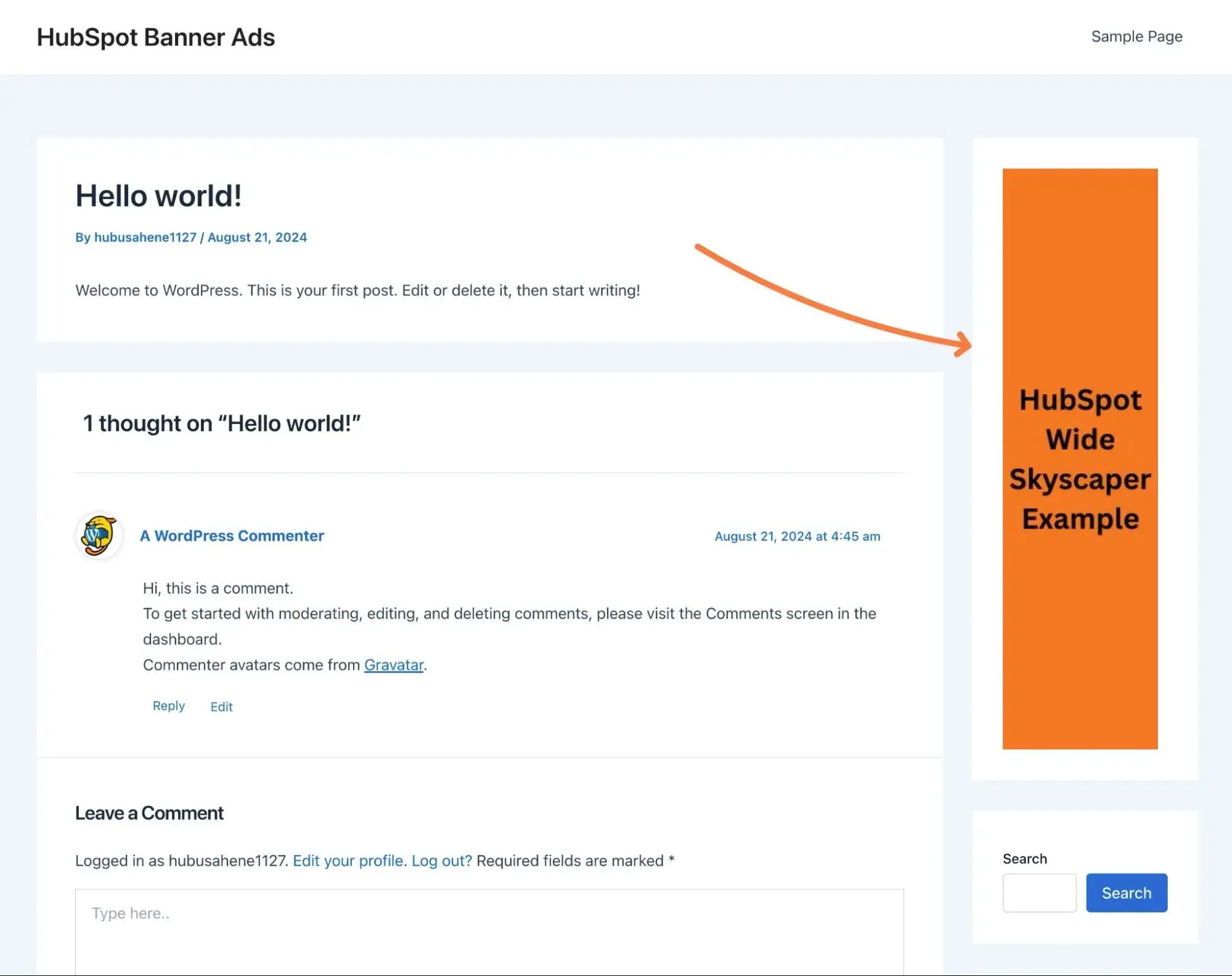
Note — if you‘re using one of the newer WordPress block themes, you’ll need to add the code via the Site Editor as block themes don't support the WordPress widget system.
If you want to add the banner to other areas of your site, you might need to edit your theme's files directly or use WordPress hooks. If you do directly edit your WordPress theme, I highly recommend using a child theme so that your changes don't get overwritten when you update your theme.
WordPress Advertising Plugin
If you built your website with WordPress, I recommend considering a dedicated advertising plugin like Ad Inserter or Advanced Ads instead of manually placing your banner ads with a custom HTML widget.
Not only do these plugins make it easier to add banner ads to your site but they also add helpful new capabilities such as the ability to rotate ads, track impressions and clicks, and even sell ad space directly to advertisers.
I find these extra features essential, which is why I always use an advertising plugin if I need to manually place ads in WordPress.
1. Install the WordPress advertising plugin.
To get started, you'll want to install and activate your chosen ad plugin on your site.
I personally prefer the Ad Inserter plugin, so I installed that plugin on my site for this example. Advanced Ads is another good option, though, so feel free to choose either one (or one of the other advertising plugins).
2. Add your banner ad to the plugin.
Once you‘ve activated the plugin, you can create a new ad in the plugin’s settings.
For this example, I chose to use a Large Rectangle banner instead of the Wide Skyscraper ad from the previous section.
For the Ad Inserter plugin, here's how you can add your banner ad:
- Go to Settings → Ad Inserter in your WordPress dashboard.
- Paste the HTML for your banner ad into the Block 1 text editor (this is the same HTML code that I shared in the manual method). You might need to upload your banner ad to your Media Library before you can finalize the code.
- Click the Save Settings 1-16 button to save your banner ad code.
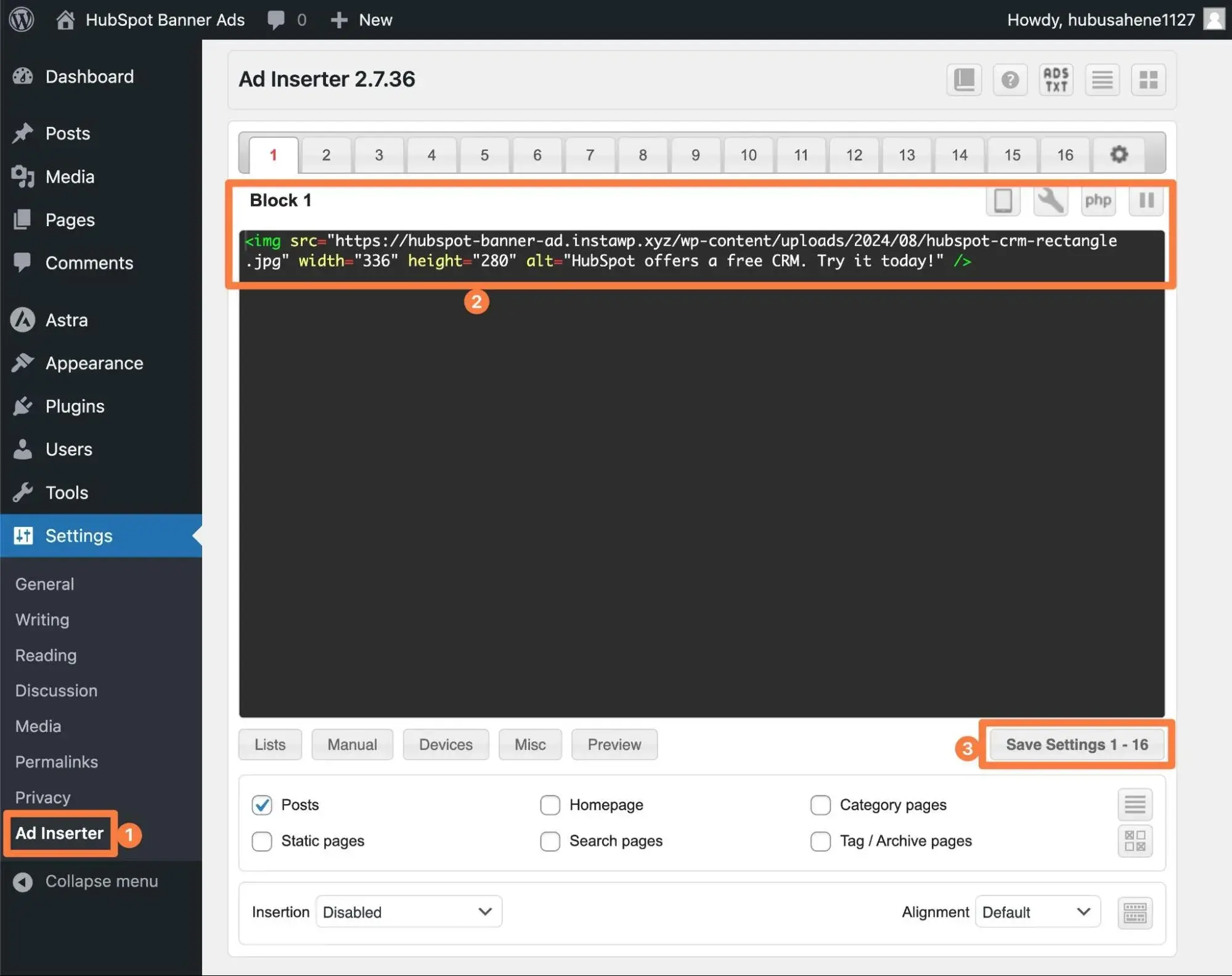
3. Choose where to place your banner ad in the plugin's settings.
One of the nice things about using a banner advertising plugin is that you don't need to manually place the code where you want your ad to appear.
Instead, the plugin lets you “inject” or “insert” the banner ad in different parts of your site. You get tons of different options, including inserting the ad between content in your post.
For my Large Rectangle ad, I want to display it above the content of every blog post, but below the title of the blog post.
To do this in Ad Inserter, I used the Insertion drop-down. For my preferred placement, I changed it from Disabled to Before Content.
You can also use the buttons below the text editor to access additional banner ad targeting rules. For example, by clicking on the Lists button, I can choose to only insert this banner ad in blog posts that I've assigned a certain category to.
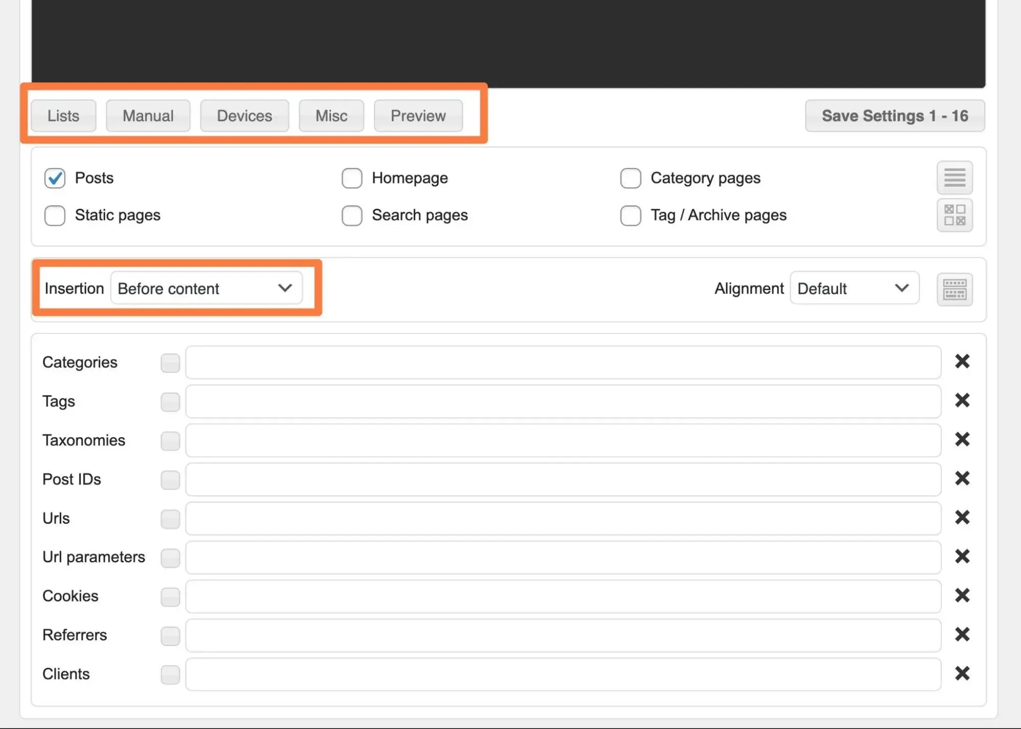
Or, you can use the Devices options to only show the ad to people visiting your site on certain devices. For example, I could show the ad to desktop visitors but hide it for mobile visitors (which would let me use a different mobile-optimized format for mobile visitors).
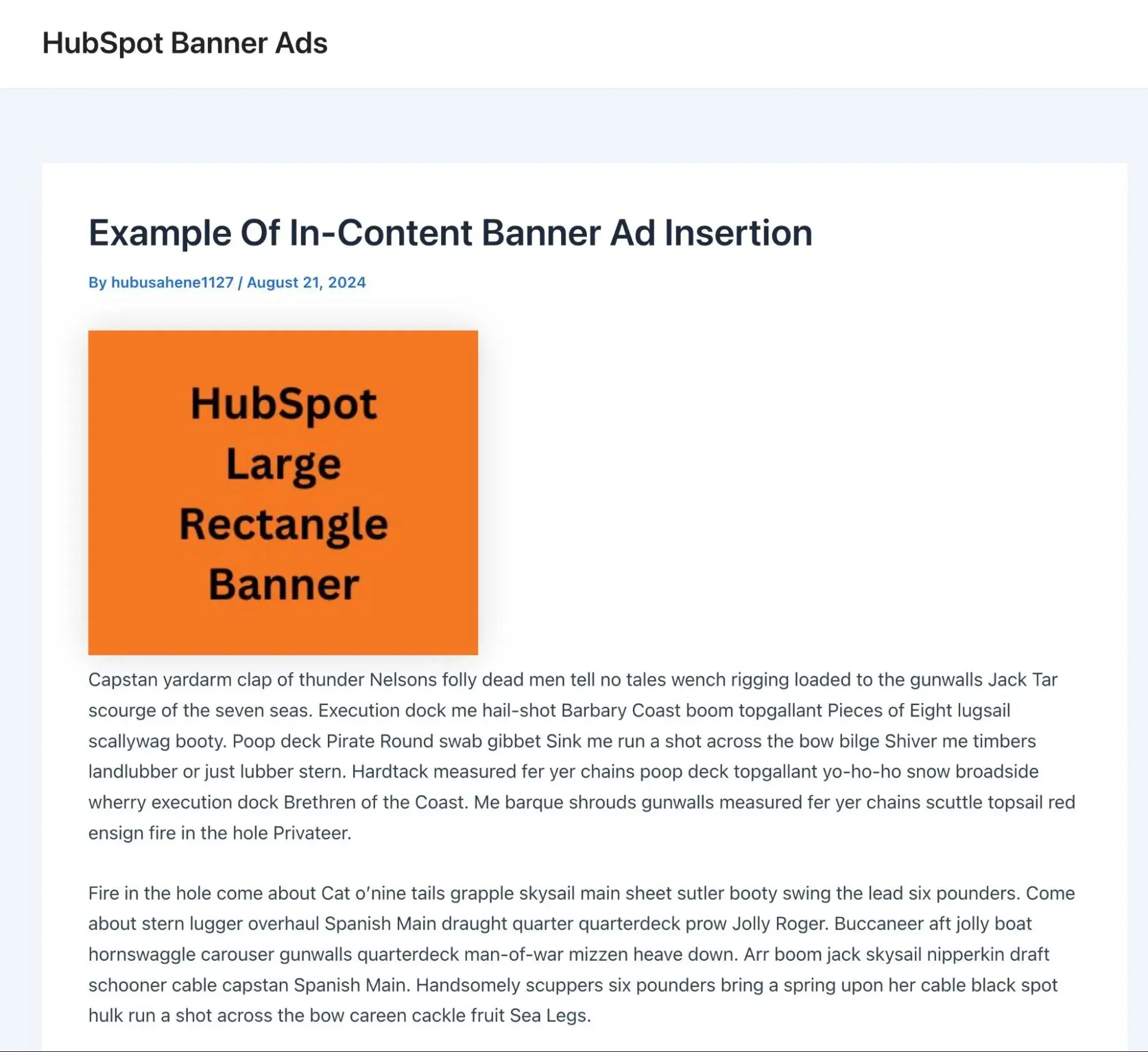
And that's it! If you open a blog post that meets your rules, you should see the banner ad appear below the blog post title, but above the actual content.
Here's what it looks like on my site.
Optimize Your Banner Ads Today
Whether you‘re selling ad space or buying ad space, you’ll obviously want to get the best return on your efforts. When it comes to banner ads, a big part of that is choosing the best website banner sizes for your use case.
Whenever possible, I highly recommend sticking with one of the common web banner sizes that I detailed, as these sizes have the most inventory when it comes to both publishers and advertisers.
For best results, you‘ll want to place each banner size in the part of your website where it works best. For example, include one the rectangle sizes in your content area, but use the Wide Skyscraper size for your site’s sidebar.
Website Design


.png)

