Whether you’re building a brand from scratch or giving a visual refresh to a client, there’s so much to steal from how the pros do it.
So, I rolled up my sleeves and put together 25 of my favorites. All very different brands with the same genius move: clear, intentional identity.
Table of Contents
.webp)
Free Brand Style Guide Template
Take your brand to the next level with this free guide + templates.
- Build your brand
- Define your voice
- Set image guidelines
- And more!
Download Free
All fields are required.
What are brand guidelines?
Brand guidelines, also known as a brand style guide, govern the composition, design, and general look-and-feel of a company’s branding. Brand guidelines can dictate the content of a logo, blog, website, advertisement, and similar marketing collateral.
Picture the most recognizable brands you can think of.
Chances are, you’ve learned to recognize them due to one of the following reasons:
- There’s a written or visual consistency across the messaging.
- The same brand colors are reflected across every asset.
- The language sounds familiar.
- It’s all very organized, and while not rigid, it’s cohesive.
But before you sit down to create your branding guidelines, I’d recommend taking a step back and defining your brand’s mission statement and buyer personas. These strategic elements will help you dive into the tactical components of your brand style guide later.
Brand Guidelines: Mission Statement
Your brand guidelines’ mission statement ensures that all your content is working toward the same goal and connecting with your audience. It can also guide your blog and paid content, ad copy, visual media, and slogan.
For instance, here’s how we at HubSpot define our mission:
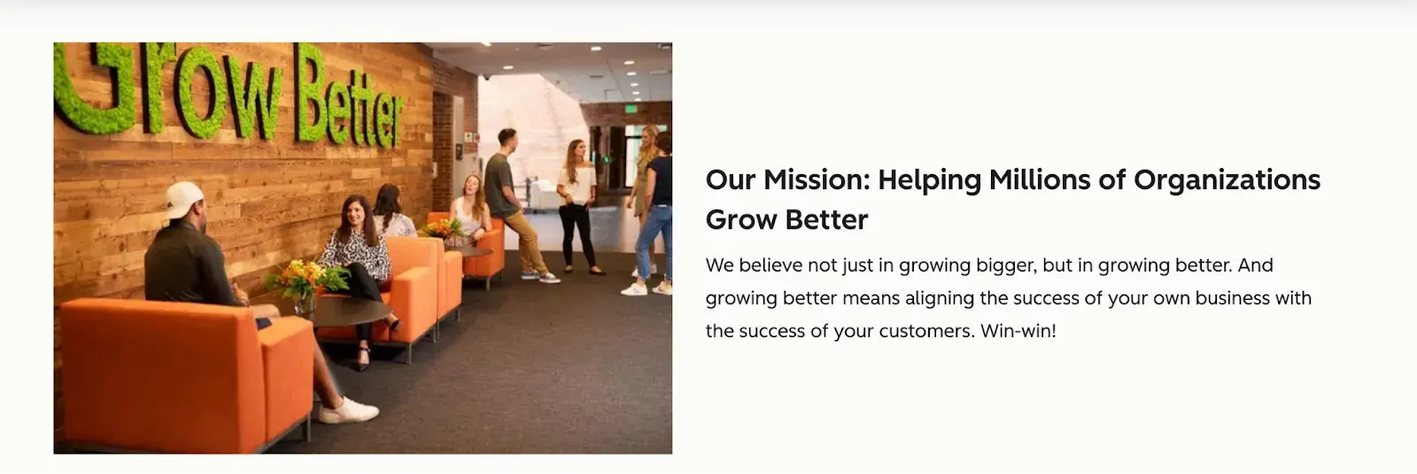
“Grow Better,” as simple as that, but so loud. It makes me insanely proud to put my experience on the HubSpot blog so you can learn from that and be part of the company’s mission.
Brand Guidelines: Buyer Persona
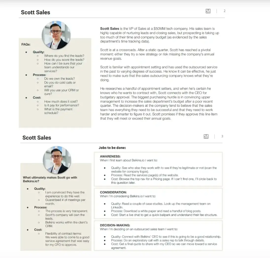
Your brand guidelines and buyer persona guide your blog content, ad copy, and visual media, which can attract valuable leads and customers to your business. I suggest creating one quickly with our free persona tool.
I particularly like the buyer persona template. It outlines key objections, questions, and the scenario where they’d seek help. It’s not just a sales leader at a fast-growing tech company. It’s a real person taken through the customer’s journey, with all the doubts that come with making a purchasing decision.
The Elements of a Brand Style Guide
A brand style guide encompasses much more than just a logo (although that’s important, too). It visually encompasses everything your brand is about, down to your business’s purpose.
Here are some key elements that I believe make or break a brand style guide, with links to in-depth articles if you need more guidance or info:
- Logo. Logos are a powerful way to determine how your brand is perceived. We’ve got a nine-step guide to walk you through it.
- Color palette. Your brand color palette affects every aspect of your design, especially visual impact and user experience. We’ve got tons of unforgettable palettes to inspire you.
- Typography. Typography plays a critical role on any website by ensuring we can comfortably read and process all its text-based content. If a website’s typography works, we won’t notice. If it fails, chances are we’ll bounce off the page.
- Imagery and iconography. Ensure the best possible user experience with these icon best practices.
- Brand voice. Build your best brand voice using our free brand-building guide.
25 Best Brand Style Guide Examples
For each example below, I’ll highlight the specific elements worth borrowing, along with what I generally liked about a brand guide.
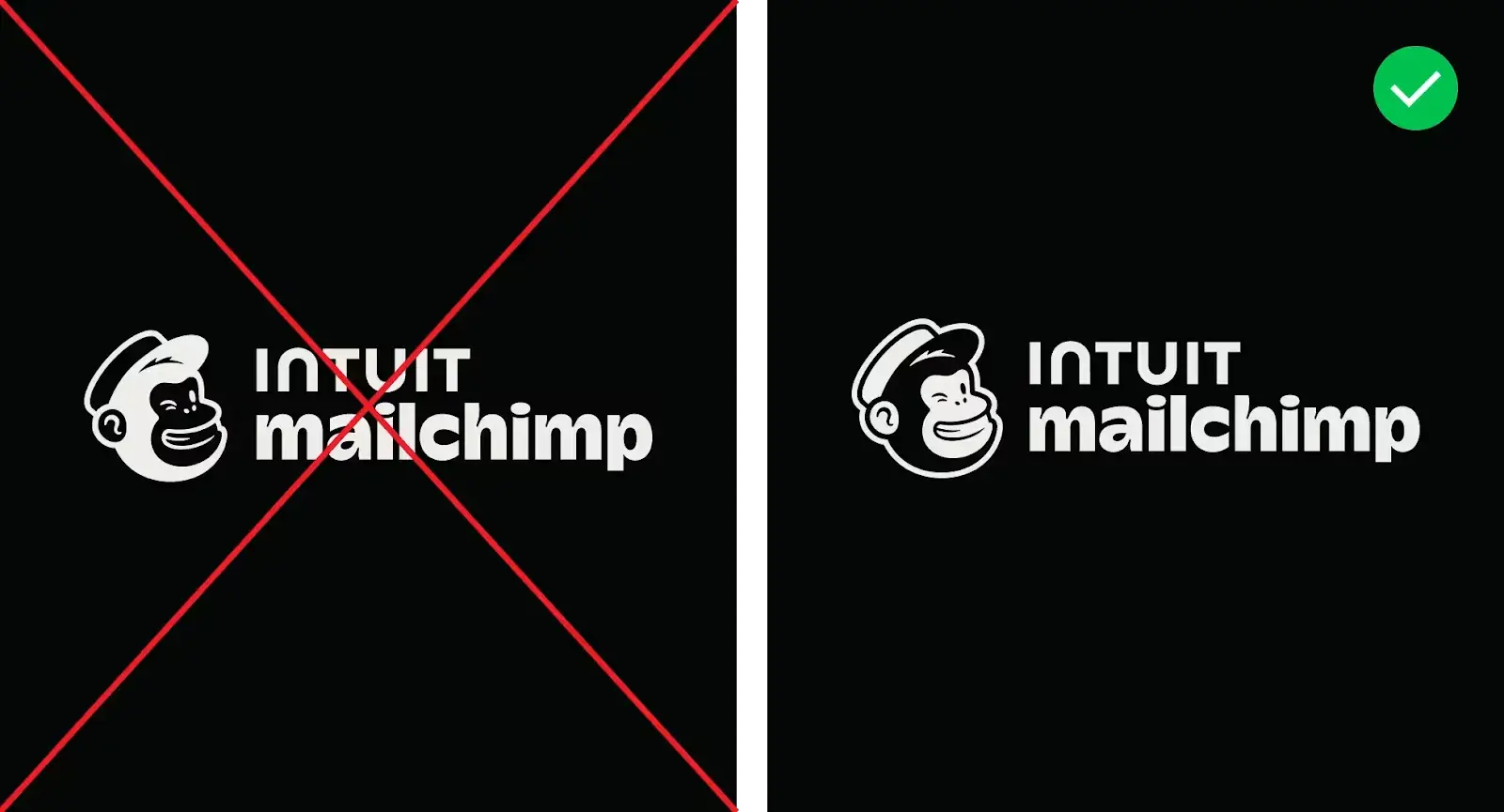
1. Mailchimp
See the full Mailchimp brand guide.
What I like: How the guide actually sounds like Mailchimp. It’s not corporate or robotic — it’s friendly, a little quirky, and easy to follow. Even small details like the lowercase “c” in Mailchimp come with a backstory.
My closer look: Mailchimp’s brand guidelines walk you through the basics — logo, color, type. The rule is: Always pair the winking Freddie icon with the Mailchimp wordmark, give it space to breathe, and never mess with the files.
Cavendish Yellow is the hero color, Peppercorn is used for contrast, and there’s a separate logo version for dark backgrounds.
2. Slack
See the full Slack brand guide.
What I like: It defines how the Slack brand can appear in co-branded situations, how to use illustrations and photography, and what’s allowed in video content (super helpful for partners and collabs).
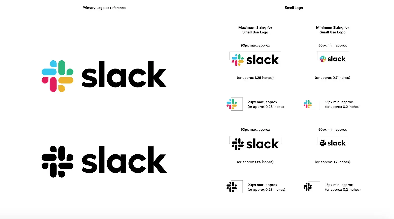
My closer look: Slack’s brand guidelines include rules for logo usage, spacing, color variations, and clear examples of misuse.
There are also different lockups (horizontal, stacked), acceptable background colors, and accessibility-safe versions. It specifies typography choices (Hellix and system alternatives) and provides exact hex and RGB values for core and secondary colors.
Beyond visuals, there’s a legal section with strict rules on using the Slack name, product UI, and screenshots, plus trademark and naming guidelines.
3. FedEx
See the full FedEx brand guide.
I’ve always admired how FedEx keeps their branding so clean and consistent — and this quick reference guide shows exactly how they do it. The iconic wordmark in purple and orange + variations in color depending on the service.
For example, FedEx Ground uses green, FedEx Freight uses red, and so on, but the structure and spacing of the logo always stay the same.
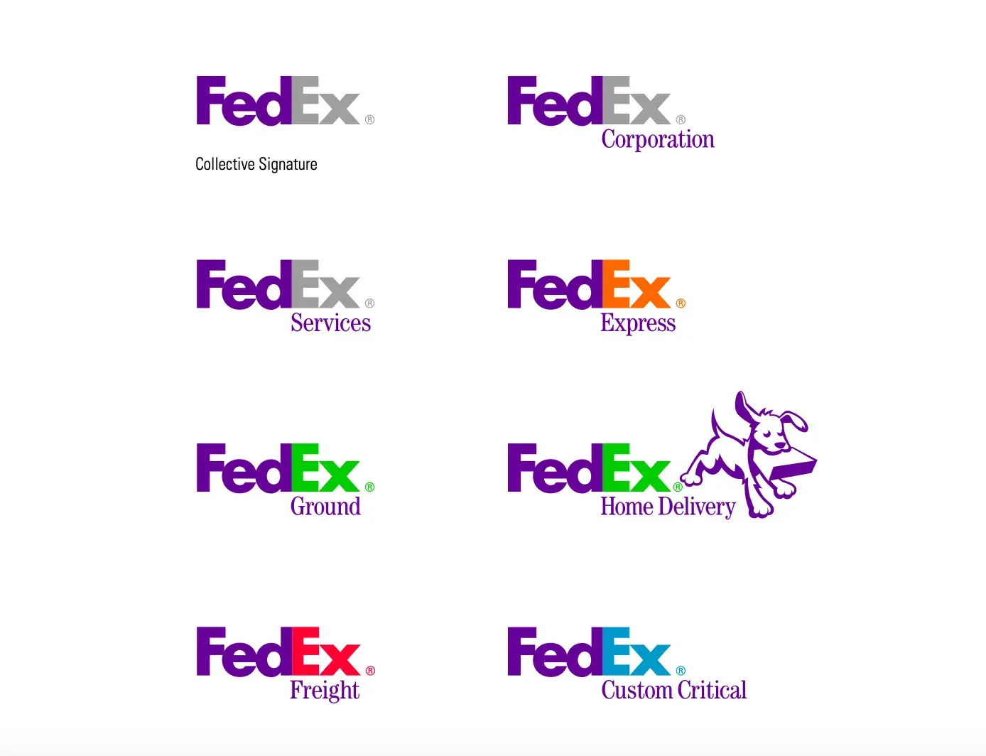
My closer look: It’s super practical. Even though it’s a short guide, it manages to cover everything from digital use to huge formats like truck decals and building signage. It’s proof that you don’t need a massive manual to keep a brand looking sharp at every touchpoint.
There are also clear-space rules, typography, and examples of what not to do with the logo.
4. McLaren Formula 1
See the full McLaren Formula 1 brand guide.
I’m a huge fan of Ayrton Senna, a legendary Formula 1 racing driver, who drove McLaren and Williams, so I couldn’t resist sharing McLaren’s guide that dives into brand assets: their signature Papaya color (with Pantone, CMYK, RGB specs), the Speedmark logo and wordmark, and the shorthand icon.
My closer look: It spells out when to use primary vs. secondary logos, color combinations across various media (print, wrap, digital), and clear-space rules. It also addresses secondary series like Formula E and includes usage in motion graphics, social media, and co-branding scenarios (with pre-approved examples for livery and merchandise).
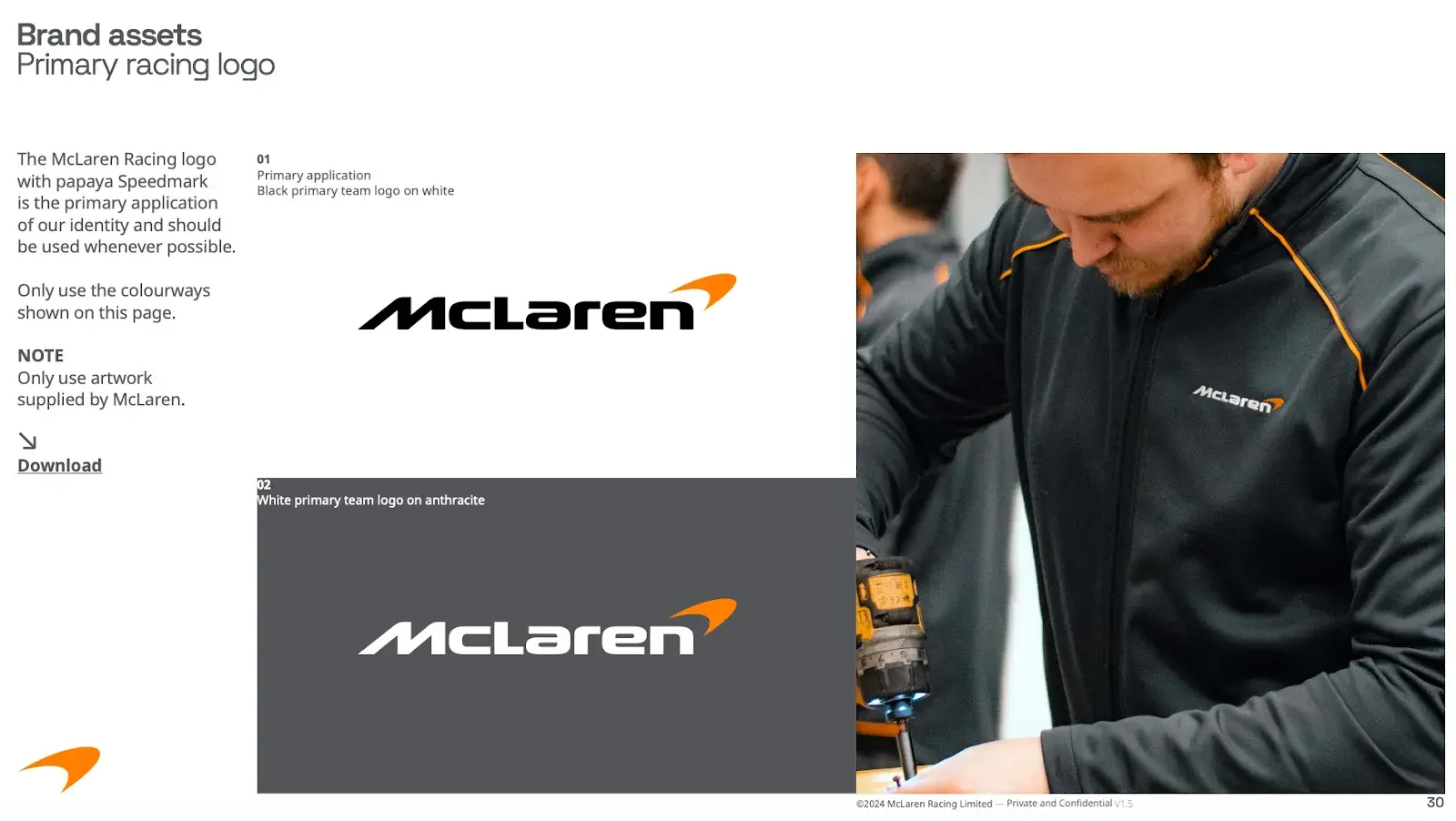
What I like: It sets voice-and-tone principles — confident but not arrogant, approachable yet professional. There is the brand architecture that outlines the relationships among McLaren Racing, its automotive divisions, and sub-teams like Formula E or IndyCar.
Free Brand Style Guide Template
Take your brand to the next level with this free guide + templates.
- Build your brand
- Define your voice
- Set image guidelines
- And more!
Download Free
All fields are required.
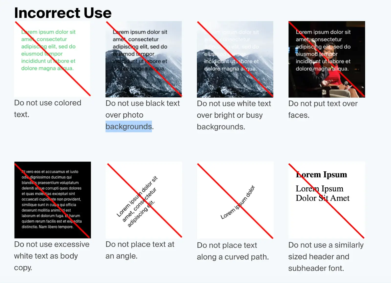
5. Varonis
See the full Varonis brand guide.
What I like: How clear and practical it is. Beyond showing how to “use the brand,” it also includes examples of incorrect usage to help protect brand integrity.
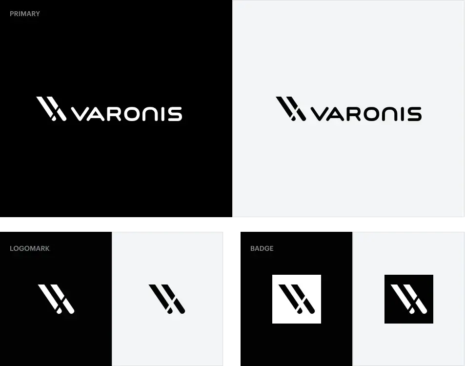
My closer look: A quick-start guide with logo rules, primary/secondary colors (like Electric Blue and Cyber Green), font choices, and clear direction on usage across print, web, and dark themes.
It also covers tone of voice — professional, clear, never fear-based — and includes specific guidance for compliant messaging under GDPR, CCPA, and HIPAA. Extended sections show preferred layouts for ads, blogs, presentations, and co-branded content.
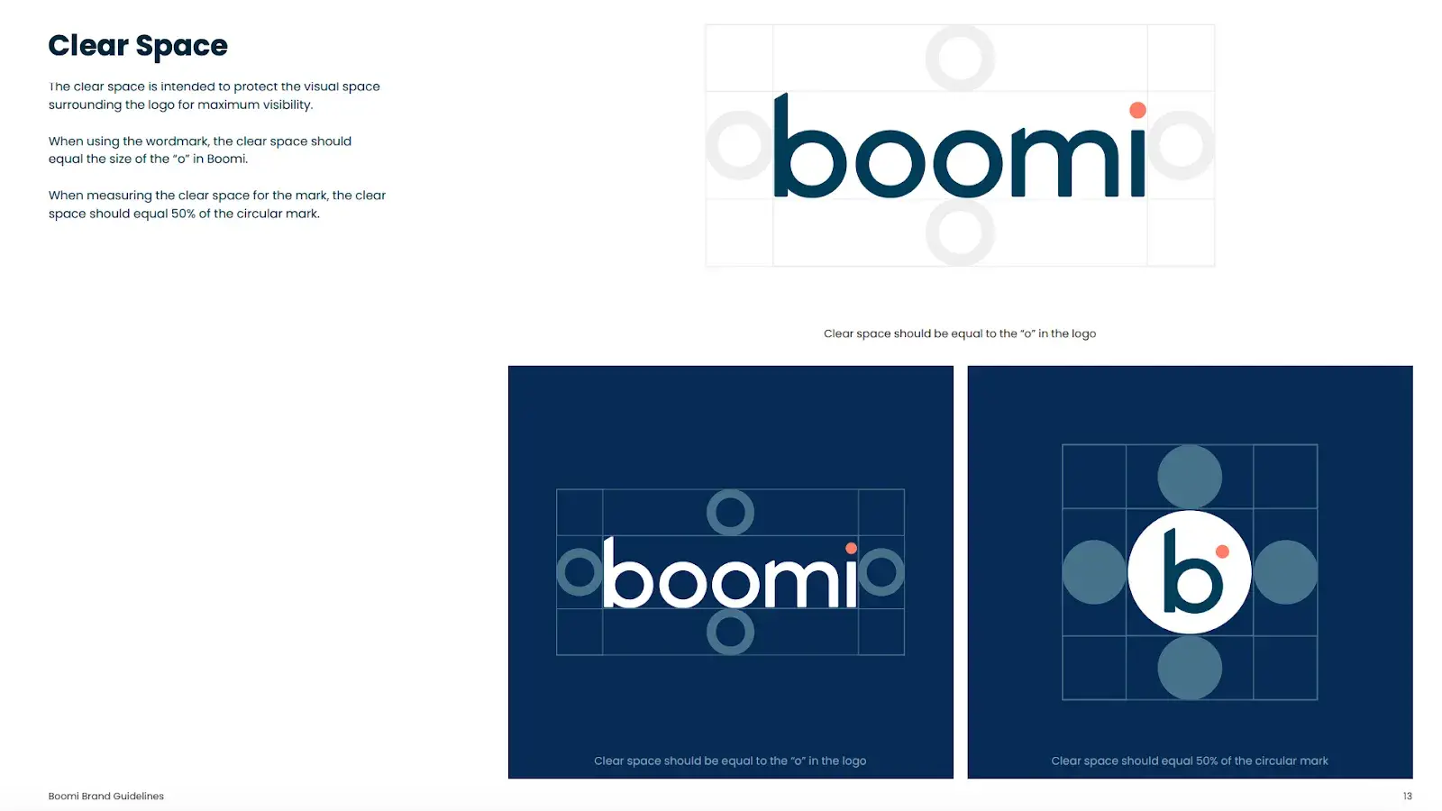
6. Boomi
See the full Boomi brand guide.
What I like: It’s a full internal and external brand system. The range of assets is impressive, and everything is organized by section and easily downloadable.
My closer look: Boomi’s brand guidelines cover everything from brand evolution and company mission (“Impact & Outcome,” “Future Forward”) to the full visual identity system — including logos, colors, gradients, and typography.
What I find important is that verbal identity rules around tone, grammar, and messaging. They also have detailed guidance for platform branding, the Boomiverse community, and employee assets like email signatures, business cards, and PowerPoint templates.
7. HERE Technologies
See the full HERE Technologies brand guide.
It clicked with me right off the bat because it so resembles HubSpot’s brand style guide while being completely different at the same time.
What I like: It’s not just rules — it’s purpose-driven. Every visual choice ties back to strategy, making the brand feel cohesive in every context. The clarity around co-branding is another plus. It’s easy to see how partners can integrate without compromising the core identity.
My closer look: HERE’s brand guide starts with the big picture — why the brand exists and what it stands for. It calls itself an “adaptive brand within a stable framework,” built around the mission: “Together, we move the world forward.” Core values like Progressive, Humble, Dynamic, and Inclusive guide both the visual and verbal identity.
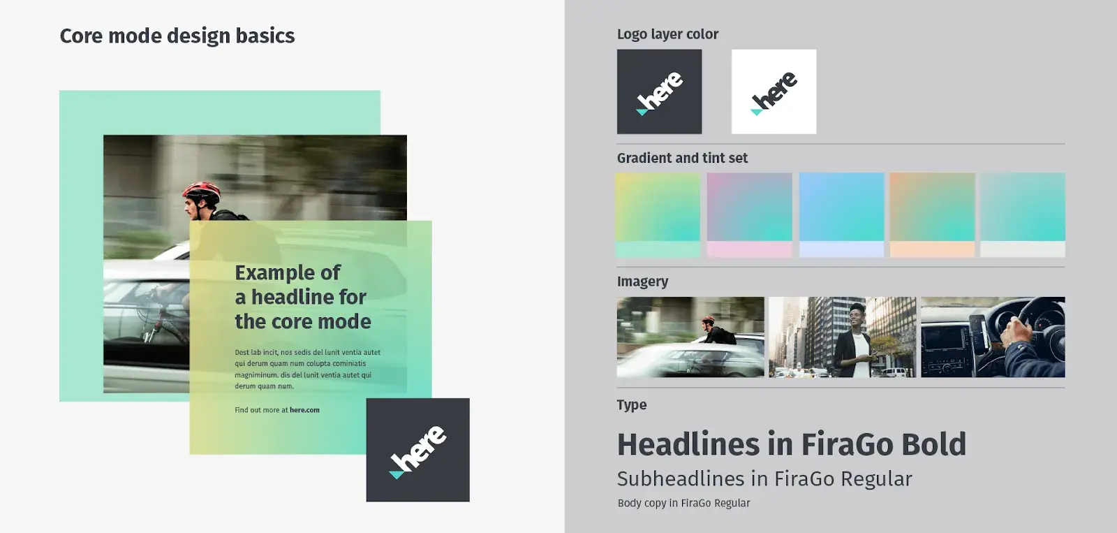
Then, the guide takes you into how those values show up in real assets. It covers everything from logo lockups and color palettes to iconography, 2D/3D illustrations, motion, and even sound — across digital maps, print, apps, and vehicles.
8. Techstars
See the full Techstars brand guide.
What I like: It balances inspiration with specifics. You get a sense of Techstars’ energy and vision, and also practical direction — logo files, usage examples, writing style. It bridges storytelling with sharp brand mechanics.
My closer look: The guide highlights Techstars’ core traits — entrepreneurial, bold, and community-driven — and gives clear direction on tone and messaging to keep content consistent across platforms.
It also covers visual identity, including logo spacing, colors, and usage rules. The underscore in the logo nods to developer culture, and there’s solid guidance on co-branding, especially for accelerator partners, events, and swag.
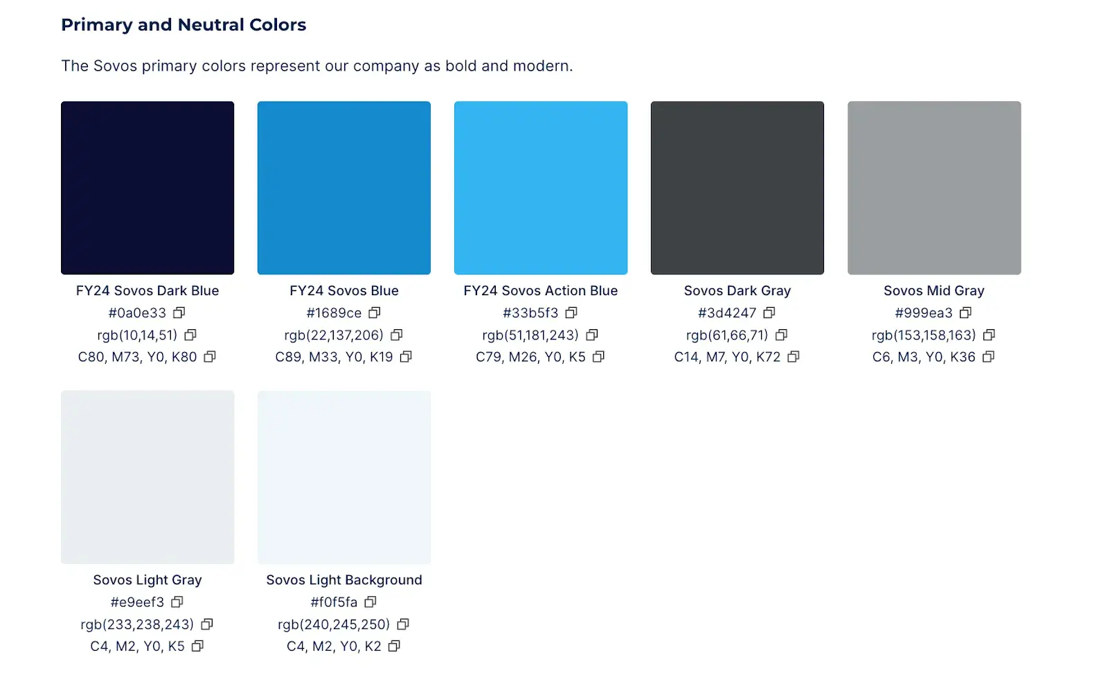
9. Sovos
See the full Sovos brand guide.
What I like: There’s a strong emphasis on inclusive marketing, with specific visual and language standards to reflect the company’s DEI values.
My closer look: Sovos’ brand guide starts with a solid foundation: their mission, messaging, and voice. It includes messaging pillars, a positioning statement, and a boilerplate for external communications.
From there, the guide moves into writing and style. It follows the Associated Press Stylebook with concrete examples.
The visual identity section includes everything I’d expect: logo usage (with spacing, color variations, and misuse examples), brand fonts (Montserrat and Inter), a detailed color palette, and photography style.
10. VyStar
See the full VyStar brand guide.
What I like: The brand architecture rules, showing how to apply the brand system across different services and departments, along with templates and resources to support internal teams.
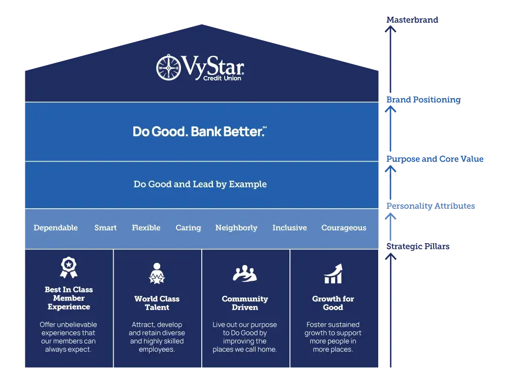
My closer look: VyStar’s brand guide dives into the story behind the name, tracing “Vy” back to its origins as Jax Navy Federal Credit Union, and “Star” as a symbol of guidance. Their compass-inspired symbol connects directly to their naval legacy, tying history and direction into one visual identity.
The guide outlines the visual system in detail: logo versions (primary, sub-brands, tagline lockups), spacing rules, and a set of dos and don’ts to protect logo integrity. It includes full color specifications, a font system, iconography styles, and guidance on how to use photography that reflects the brand’s values.
11. UPPAbaby
See the full UPPAbaby brand guide.
What I like: It’s one of the most complete brand systems I’ve seen. The guide supports every team (design, CX, social, sales) with real examples and workflows. Also, there’s a full Brandfolder section explaining how to access, download, resize, and crop assets correctly — operationally friendly resources for internal teams, partners, and retailers alike.
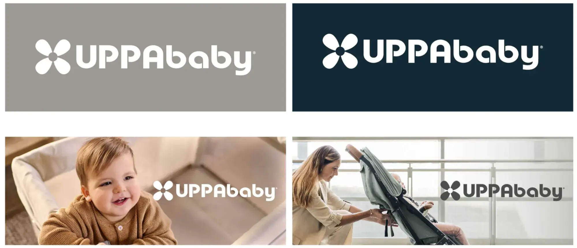
My closer look: UPPAbaby’s brand guide starts with the brand’s origin story, values, and mission, grounding everything in authenticity and a clear sense of purpose: to make parenthood easier, more stylish, and better supported.
The brand architecture lays out their messaging platform (“Parenthood, Understood”) and key pillars like family wellness, smart design, and child development.
I just love that thoughtful gesture towards their clients, even in the brand style guide.
The visual section covers all the basics: different logo versions, where and how to use them, and what to avoid. It also explains how to use brand colors and which fonts to stick with, like Agenda Light, Novecento Sans Wide, and Gelica.
Free Brand Style Guide Template
Take your brand to the next level with this free guide + templates.
- Build your brand
- Define your voice
- Set image guidelines
- And more!
Download Free
All fields are required.
12. Dropbox
See the full Dropbox brand guide.
What I like: It’s not a typical PDF. It’s a playground. That kind of hands-on clarity is rare and makes the guidelines stick. You walk away understanding not just what to do, but how and why it matters.
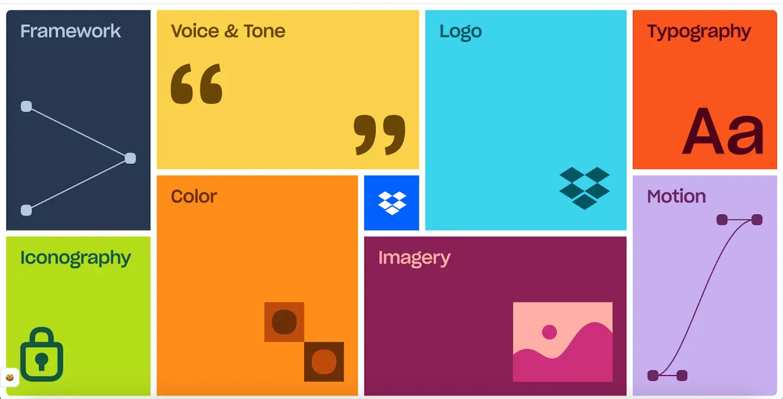
My closer look: Dropbox’s brand guide is an interactive site that shows you how the brand works in real time. It walks through core elements like iconography, illustration style, logos, voice, and messaging, all anchored by four clear brand principles: humanity, clarity, action, and delight.
Everything is hands-on. You can test font weight and width using their custom Sharp Grotesk type, explore how icons scale across UI sizes, and watch animations that show the motion guidelines in action. The guide makes it easy to see how each design choice supports simplicity, usability, and a consistent Dropbox experience.
13. Tyson Foods
See the full Tyson Foods brand guide.
What I like: It gives crystal-clear guidance on when to use “Tyson Foods” vs “Tyson Foods Inc.” and really drives home the importance of getting the company name right. It also does a great job explaining how to co-brand with retail sub-brands.
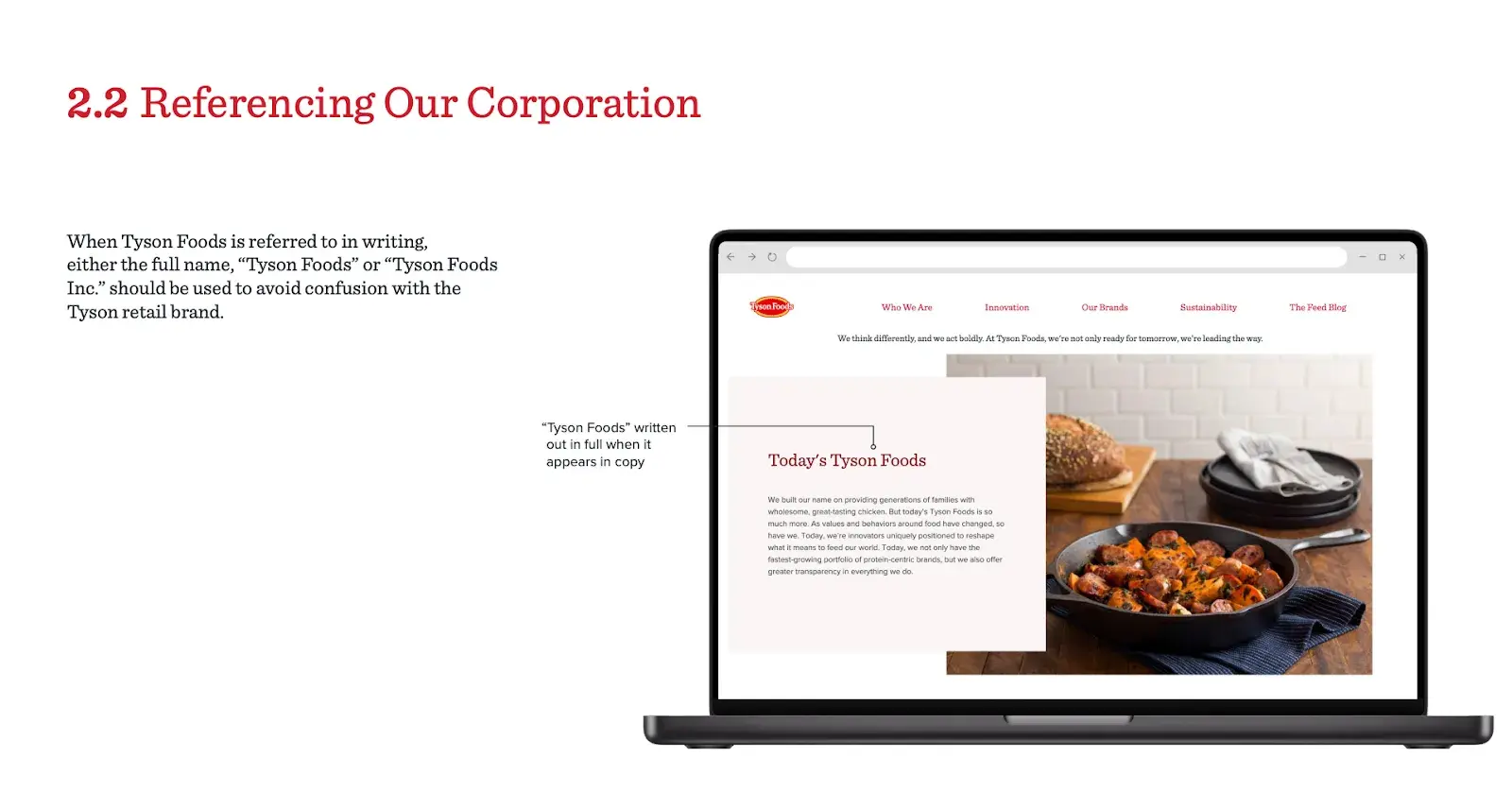
My closer look: The Tyson Foods brand guide starts with a quick look at Tyson’s roots and purpose. Then it gets right into the core branding elements, especially the logo system. The guide explains how to use the main full-color logo and when to switch to one-color versions (red, black, or white).
It lays out clear spacing rules (using the height of the “n” in Tyson as a buffer) and minimum sizing.
The do’s and don’ts are super clear: don’t skew the logo, separate the emblem and wordmark, use unauthorized colors, or lock the logo up with department names or other text.
14. Cloud Elements
See the full Cloud Elements brand guide.
What I like: It’s a compact guide, but not lightweight. The consistent use of chemistry-inspired naming (like “Water,” “Wind,” “Fire,” “Earth”) for brand colors and product categories is a clever nod to their modular API philosophy. It’s technical, tidy, and easy to implement across SaaS use cases.
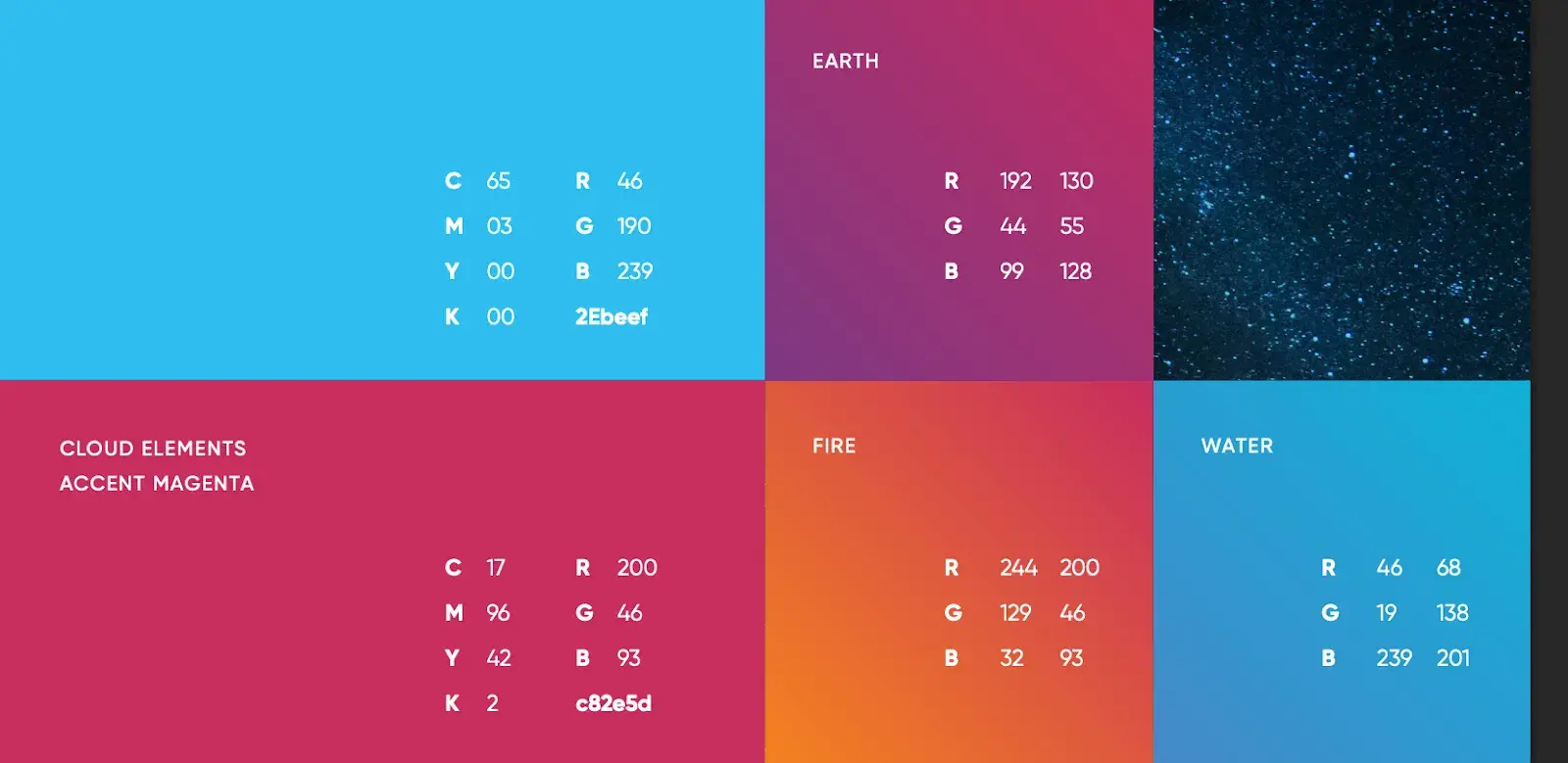
My closer look: Cloud Elements keeps its branding sharp, structured, and developer-friendly. The visual identity centers around the “Element” symbol paired with a custom logotype based on the Gilroy font. It’s a clean, tech-forward system that reflects their mission: to simplify API integration.
The guide outlines precise rules for using the logo in full color, black-and-white, and reversed formats. It also specifies minimum logo sizes and requires a clear space equal to half the height of the graphic symbol. For small applications, a condensed alternate logo is available.
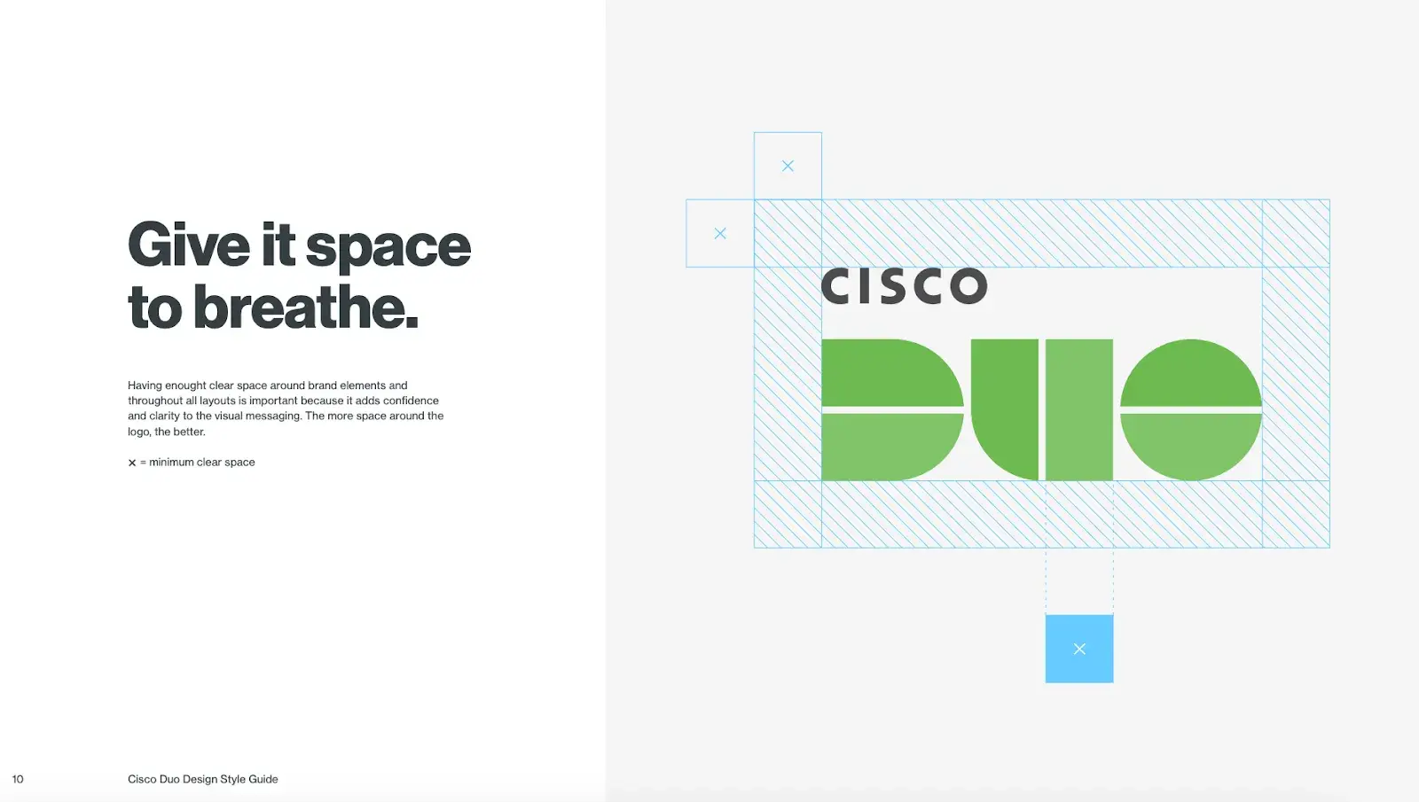
15. Cisco Duo
See the full Cisco Duo brand guide.
What I like: Photography rules: Real people, real life — never dark, dramatic, or overprocessed. Bonus points for the “visual language” section. It reuses logo shapes as design elements to create a sense of motion and protection across layouts.
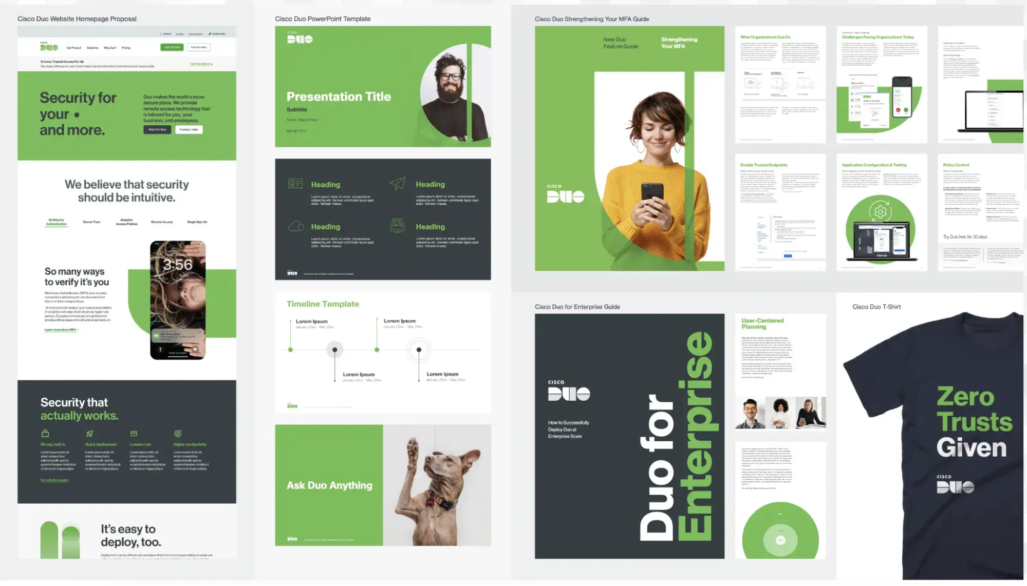
My closer look: The guide lays out logo usage, tone of voice, visual language, photography, and rollout strategy.
The Duo logo reflects its roots in two-factor authentication, designed as a lock-style mark. You’re not allowed to touch it — no stretching, skewing, outlining, or effects. It needs breathing room, too, with strict clear space rules. When space is tight, the Duo-only version is used without “Cisco.”
The typeface is Neue Haas Grotesk across all materials, with CiscoSansTT reserved for slides. The color palette centers on green, white, and dark gray, with yellow and red used only when necessary.
16. Payroc
See the full Payroc brand guide.
What I like: It’s rare to see a fintech brand pull off a strong visual identity and stay this practical with real-world assets like flyer templates, icon sets, and layout rules that actually get used.
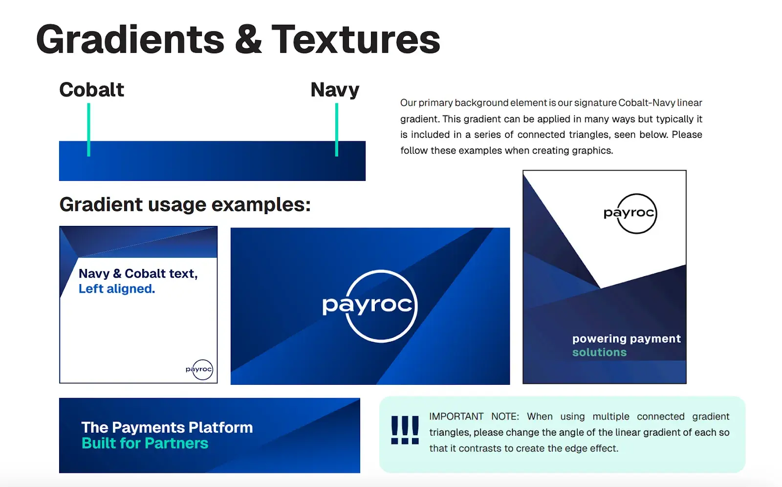
My closer look: Payroc’s brand system is clean, scalable, and partner-focused. The guide covers everything from logo usage and color rules to typography, gradients, and flyer templates. The voice is confident but practical, grounded in their mission to help partners win through reliable, flexible tools.
Logos come in two lockups — full and wordmark-only — available in black, white, and Core Navy. Their palette balances deep blues with pops of Mint Teal, and their design language leans on triangle gradients and mint line accents for structure.
17. Deltek
See the full Payroc Deltek brand guide.
What I like: The attention to spacing and structure is next-level — e.g., using the Deltek “k” or flipped “D” as actual measurement units.
My closer look: Deltek’s brand guide is built for consistency at scale — across sub-brands, product lines, partners, and acquisitions.
Partner logos and co-branding assets follow a clear visual hierarchy, with Deltek always appearing first unless the project is partner-led.
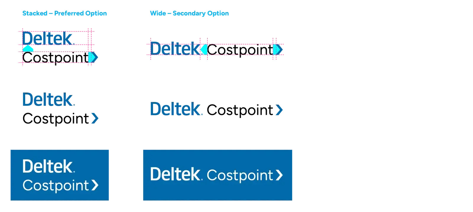
For internal and external programs, there’s even a framework for applying Deltek’s visual identity across cultural initiatives, presentations, and branded imagery. Everything ladders back to a clear brand promise: Better software means better projects, with a focus on powering success for project-based businesses globally.
18. TSYS
See the full TSYS brand guide.
What I like: Style-wise, TSYS uses AP rules for consistency and clarity, and offers specific do’s and don’ts for maintaining tone. Another thing I like are templates for slide decks, social posts, and print materials that make execution easier.
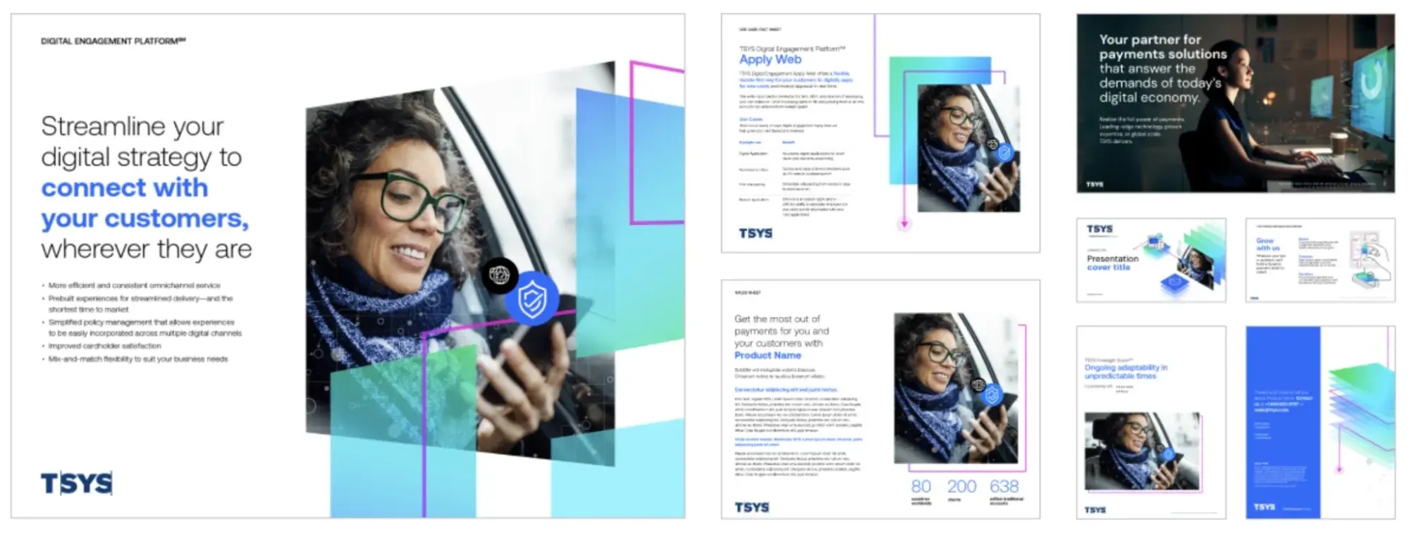
My closer look: TSYS’s brand guide covers the essentials: logo usage (full color, black, white, reversed), proper spacing, and size limits.
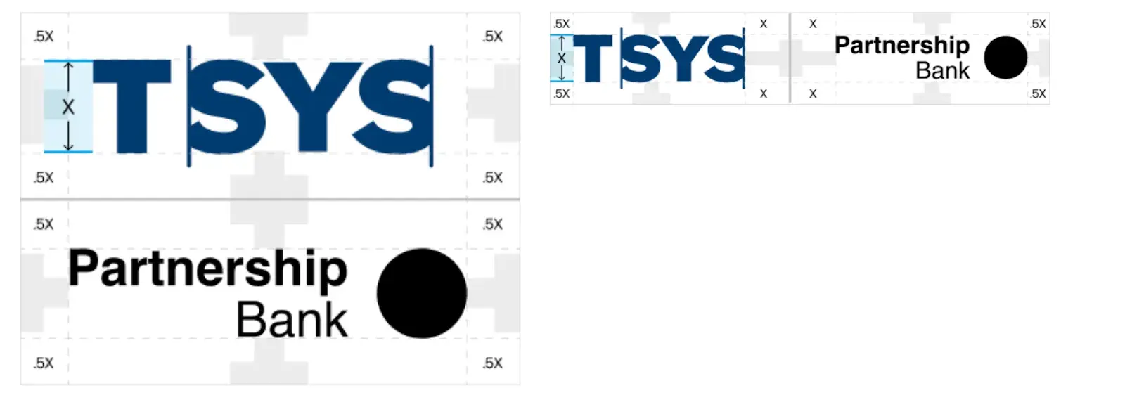
The color palette leans into navy and blue tones, with full HEX, RGB, and CMYK breakdowns. Typography sticks to clean sans-serif fonts, and there are set rules for headers, subheads, and body copy.
The guide also dives into photography style, plus a custom icon set for UI and product use.
Their brand pillars are front and center: a strong focus on future-proof tech, expert support, global scale, and rock-solid integrity. It’s all framed around helping businesses “realize the full power of payments.”
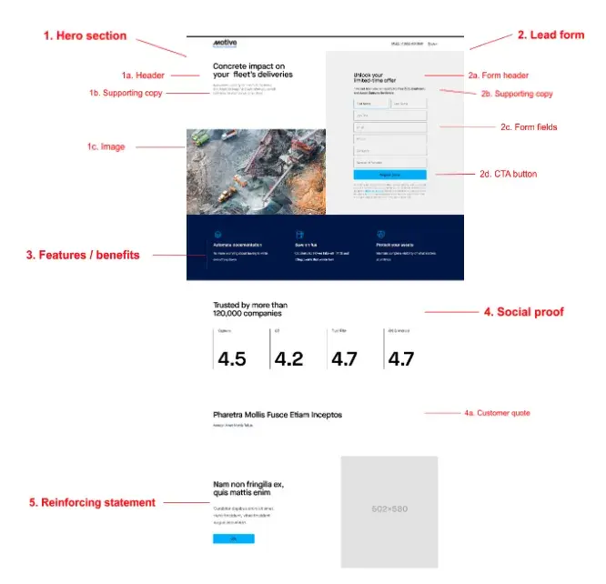
19. Motive
See the full Motive brand guide.
What I like: The “before vs. after” messaging examples and how they calibrate tone by persona and funnel stage. It’s one of the rare brand systems that actually teaches how to write, not just what fonts to use.
What also surprised me is that their guide has a letter from the CEO.
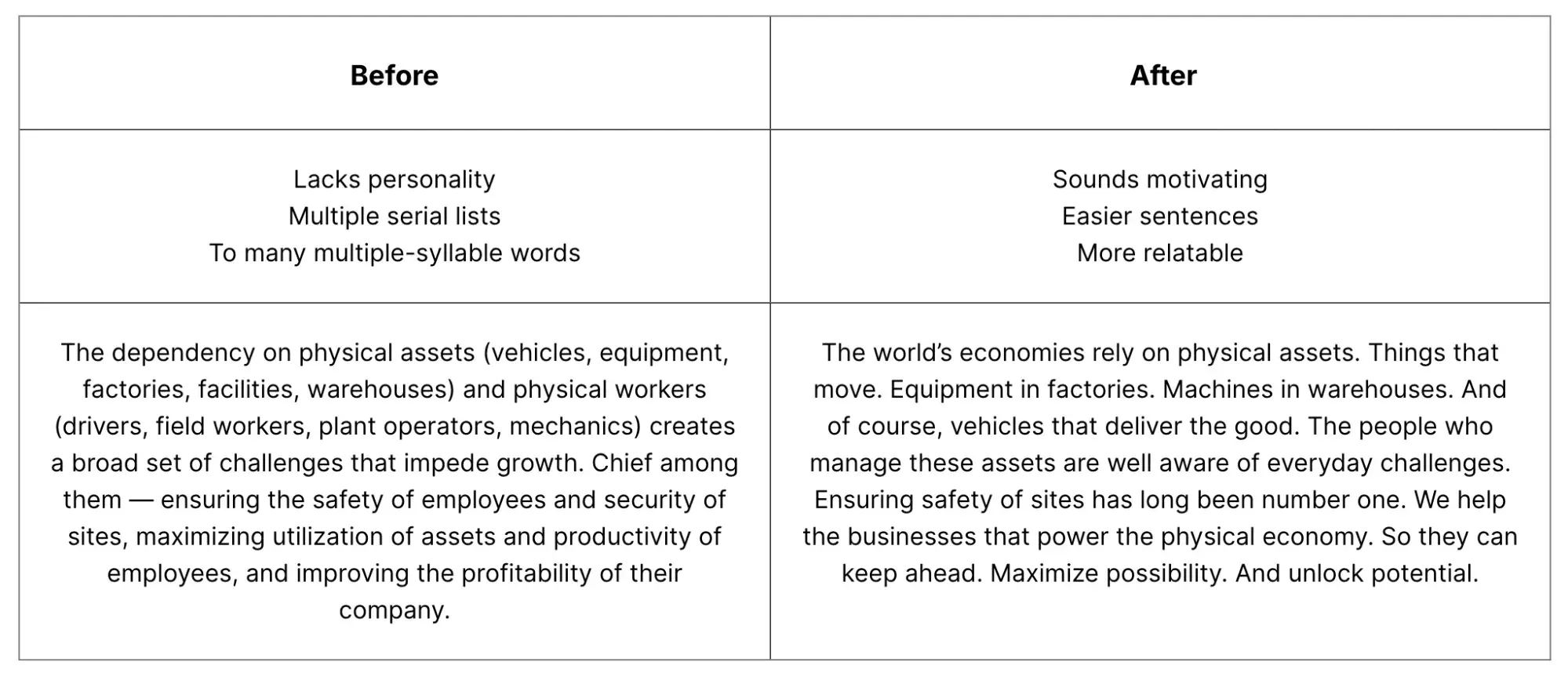
My closer look: Motive’s brand guide is built for scale and clarity — designed to support industries that power the physical economy like construction, trucking, and energy.
Their tone is confident, clear, and grounded in real-world utility. The guidelines go deep: Blog posts must be helpful, well-structured, and linked to credible sources; case studies follow a strict format focused on real results and strong customer quotes; emails are short, scannable, and built to drive action (open - click - convert).
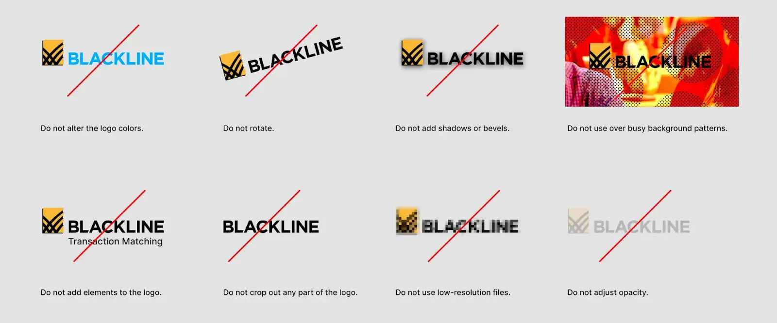
20. BlackLine
See the full BlackLine brand guide.
What I like: It’s one of the few SaaS brand guides that ties branding directly to the customer journey, not just design specs. And it’s cool to see how Studio360 has evolved from its BTB 2022 launch into a full-featured platform with Snowflake integration and AI-driven insights.
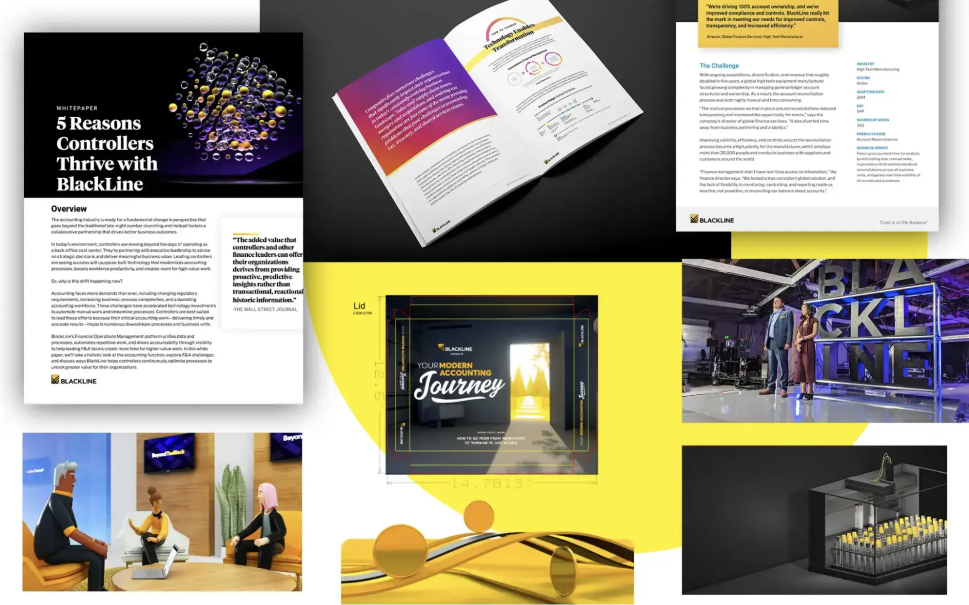
My closer look: BlackLine’s brand guide brings consistency to how the company shows up — visually, verbally, and strategically. It’s all built around their mission to lead digital finance transformation through Studio360, a unified platform that connects and automates finance operations.
The guide breaks down everything from logo usage and tone of voice to product naming and how to tailor messaging for different audiences, from CFOs to internal teams. It also dives into content creation, outlining how to write blogs, case studies, emails, and guides that feel sharp, useful, and on-brand.
21. ClickUp
See the full ClickUp brand guide.
What I like: The guide comes with detailed trademark rules: Always capitalize the “U” in ClickUp, use ™ for the U.S., and don’t suggest affiliation or endorsement, keeping misuse clear and legally sound.
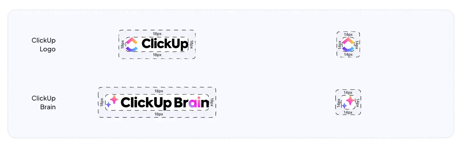
My closer look: ClickUp’s brand guide centers on two key symbols: the ClickUp logo, a bold upward curve representing growth and collaboration, and the ClickUp Brain icon, which highlights intelligent productivity through AI.
Clear spacing rules keep everything clean, while strict “no stretching, no color changes, no effects” rules ensure consistency across all uses.
Their vibrant palette — purple, blue, pink, yellow, navy — and one core typeface, Plus Jakarta Sans, work together to create an upbeat, modern look that’s instantly recognizable.
Free Brand Style Guide Template
Take your brand to the next level with this free guide + templates.
- Build your brand
- Define your voice
- Set image guidelines
- And more!
Download Free
All fields are required.
22. Asana
See the full Asana brand guide.
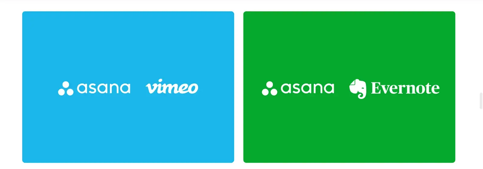
What I like: How strict, but helpful, the partnership section is. It tells you exactly how to co-brand without overthinking it. I like that they even explain what to do if a partner insists on using their original brand color — Asana switches to white on the partner’s color background. That’s practical and thoughtful.
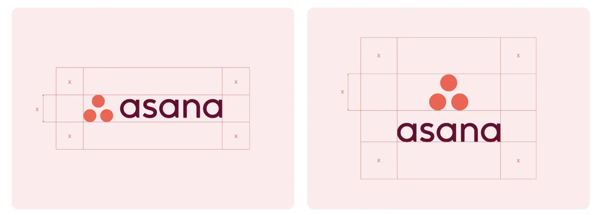
My closer look: Asana’s brand guidelines are clear and short. They outline when to use the horizontal versus vertical logo, how much clear space to leave, and which color combos are allowed.
There’s a strong focus on keeping the logo consistent — no shadows, no wrong colors, and definitely no tweaking the design. For partnerships, the logo must always be on the left, with equal sizing and spacing between brands.
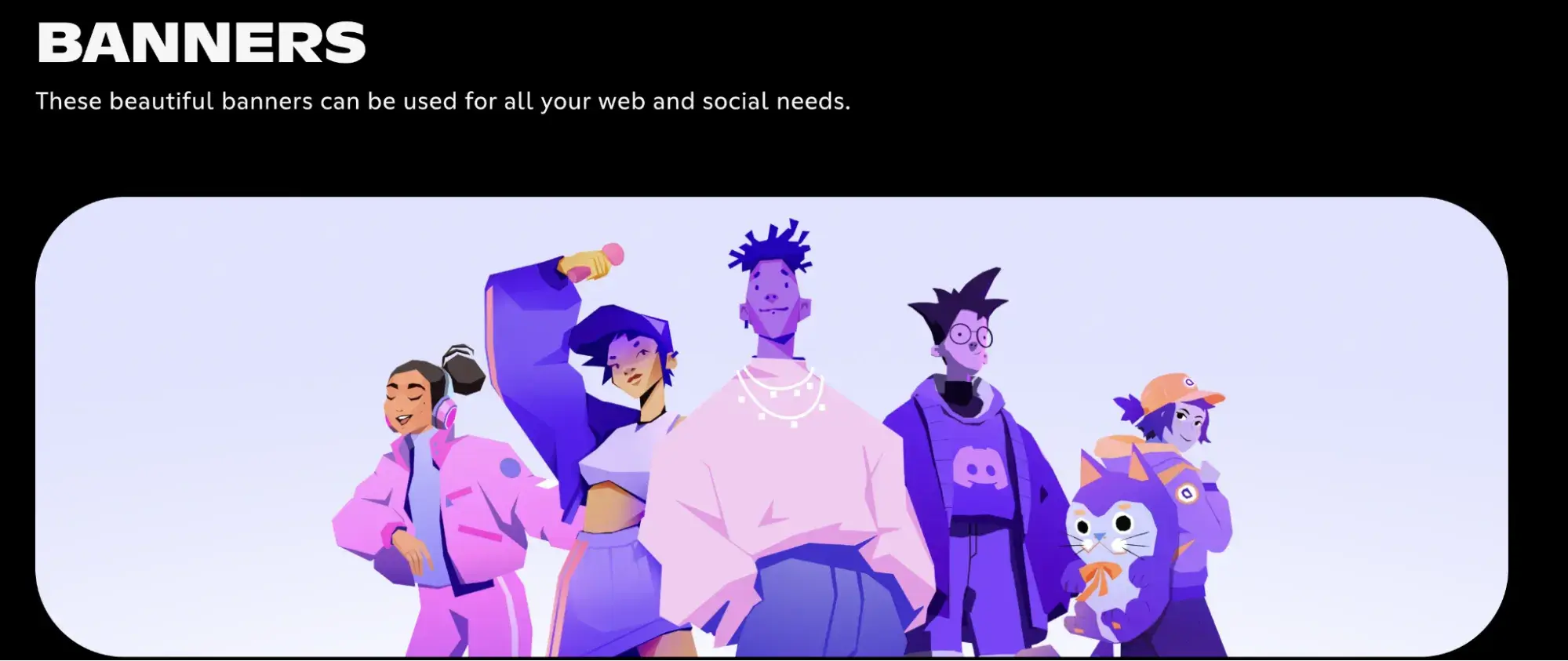
23. Discord
See the full Discord brand guide.
What I like: The branding’s celebration of motion and community. The “Community Pattern” of dots and the playful animations of Clyde evoke active engagement and connection. I also love the clever tone of voice and banner assets for social media.
My closer look: Discord’s brand guidelines strike a great balance between playful and practical. The centerpiece is Clyde — the friendly, symmetrical robot icon — now in bold “blurple” (#5865F2) to ensure crisp visibility across digital contexts.
The guide clearly outlines when to use the symbol alone (only in familiar settings) and provides strict clearspace rules. It also covers often-overlooked details like symbol scalability and shows clear “what not to do” examples.

24. NASA
See the full NASA brand guide.
What I like: In addition to virtual assets, there are rules for physical applications, including spacecraft, uniforms, and mission emblems. Even shuttles have their own branding standards. I admire how the manual respects both history and precision, keeping NASA’s visual identity cohesive while honoring its legacy.
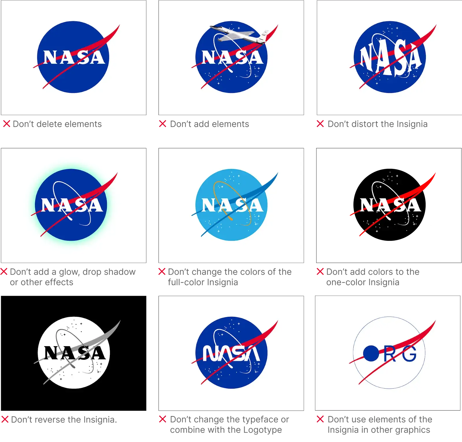
My closer look: NASA’s brand guidelines are some of the most detailed and structured I’ve come across. They cover everything — from the classic “meatball” insignia to the bold “worm” logotype.
Every visual decision is backed by a reason: Logos must be sphere-centered, not object-centered, and the protected space around them is non-negotiable. Typography is kept clean and functional, with Helvetica and Garamond in print, and Inter, Public Sans, and DM Mono used across digital platforms.
25. Barbican
See the full Barbican brand guide.
What I like: I like that even smaller sub-brands like the Barbican Shop get their own wordmark and palette. Also, there’s a distinct approach depending on whether a project is a rental, collaboration, or internal initiative.
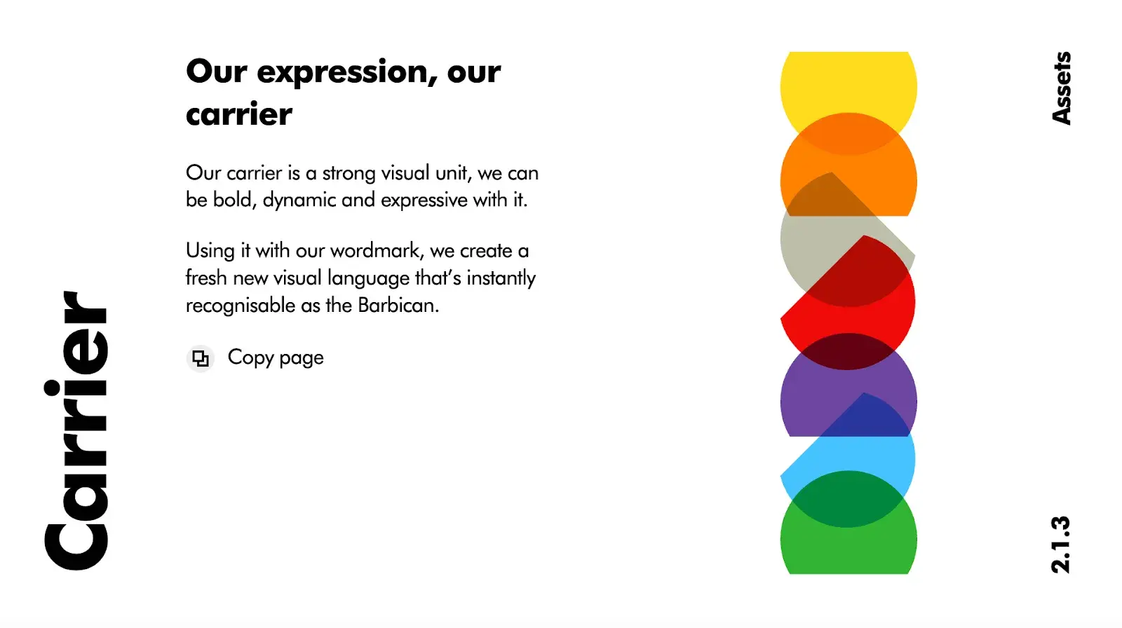
My closer look: Barbican’s brand guidelines are bold, flexible, and unapologetically design-driven. At the center is a confident, minimalist wordmark — always used in Futura, their sole typeface. The system encourages clarity and breathing room: Space is good is quite literally one of their guiding principles. Their visual identity is built around a “carrier” — a strong graphic frame that brings energy and consistency to layouts across events, venues, and promotions.
Branding Guidelines Tips, According to HubSpot Experts
If you want to take your branding style guide to the next level, my suggestion would be to let HubSpot’s Brand Kit Generator do some of the heavy lifting for you.
I’d also recommend following the best practices that our HubSpot Creative team has used to disseminate branding information to the rest of the HubSpot Marketing team.
This has made my job as a freelance writer easier and allows our brand to feel well thought-out and cohesive.
1. Make your guidelines a branded document.
Publishing your branding guidelines online or creating an internal presentation? I recommend making the guidelines themselves a branded document.
Ensure the published document follows your established brand voice, uses the symbols and imagery you’ve created, and employs the colors and typography that make your brand feel like you.
I recently watched a great YouTube video by James Martin, a graphic designer, who shared some golden tips on this matter:
“If you do make a full guidelines doc, make it clickable and easy to navigate. Don’t just give them a big PDF. Add a table of contents that they can click through. No one wants to scroll 80 pages to find hex codes.”
Also, Martin recommends giving clients two files:
- A full doc with all the strategy, visuals, and voice pillars.
- A quick-access one-pager with things like color codes, fonts, and logo files.
Insights from HubSpot’s Creative Team
When our Creative team rolled out a visual identity refresh for the HubSpot brand, we all received access to a branded playbook that summarized all the changes and described how we should represent HubSpot online moving forward.
Not only was I a huge fan of the refresh, but also of the way it was presented to our team in a branded document.
You can do the same, regardless of your budget. Our Creative team actually used a free tool, Google Slides — so it’s totally doable for a small or freelance brand!
2. Name your brand’s colors.
You’ve already chosen your color palette — why not go as far as naming the colors?
Giving your colors unique names (aside from “blue” or “orange”) can help you tie the tactical elements of your branding into an overall theme or ethos.
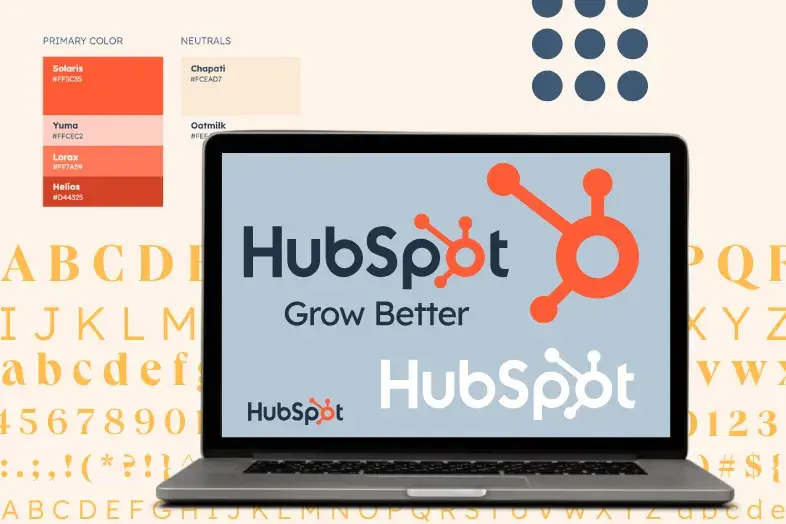
Not to mention that it’s awesome to be able to refer to company colors by a unique name. Imagine if I called Solaris, HubSpot’s primary brand color, “HubSpot Orange” — that simply doesn’t have the same ring.
Insights from HubSpot’s Creative Team
In our visual identity refresh, our Creative team brightened and intensified our color palette, then renamed the individual hues.
They wrote, “Every color, tint, and shade is based on central themes. [...] Whether it’s a subway line in Paris or a flower-lined street in Japan, the secondary color names are a veritable tour of important cultural and geographical touchstones from HubSpotters all over the world.”
I simply admire the result! Look at how well-designed a presentation is for the blog team and freelance writers. It screams HubSpot’s identity and mission: Grow Better. And that’s a simple deck for internal use.
Think about what makes your brand unique and why you chose the colors that you did. For instance, if you work at a law firm that specializes in car accident cases, you might choose red as one of the brand colors and call it “Stop Light.”
3. Create easy-to-use branded templates.
Alongside your branding guidelines, I advise you to use templates to empower your team to easily design branded assets, even if they’re not designers.
The Canva team preaches the same rule, by the way.
Because without templates, even good design gets messy.
Teams get busy. New hires jump in. Freelancers don’t always read the guidelines. But if you give them pre-built templates with a locked structure, you dramatically reduce the room for error.
I suggest you start by locking logos in place, restricting font changes, and partially locking sections like image frames or text boxes, so your team can swap content, but the layout stays solid.
Insights from HubSpot’s Creative Team
At HubSpot, we keep all of our templates in our team’s Canva account. There, anyone (myself included) can edit pre-made designs for any number of use cases.
If you already have a HubSpot account, the good news is that HubSpot directly integrates with Canva. If you don’t, well, I can say that you’re missing out on some real convenience!
For instance, as a writer on the HubSpot Blog, I have to create graphics to supplement the information I’m sharing. But I’m terrible at design. The branded templates made by our Creative team have been a rescue for me, and I can imagine that it’s the same for our Social Media team.
The truth is simple: Not everyone is a designer, but with templates, you can ensure your brand looks professional, regardless of who creates the asset.
4. Ensure your branding is optimized for all channels.
I always recommend including clear specifications for each channel you plan to use. From my experience, it’s also helpful to have assets and designs that are flexible enough to adapt across different media, not just in terms of sizing, but also accessibility.
For example, if I’m primarily marketing on Instagram and my website, I choose web-accessible colors and Instagram-friendly formats that align with my brand.
However, I’d avoid making drastic changes between channels. At the end of the day, I want my branding to feel consistent and recognizable, no matter where I’m showing up.
Build a memorable style guide of your own.
I used to treat brand style guidelines as an annoying, unhelpful asset that only says which quote marks to use. But the off-putting vibe I got was due to poor brand guidelines.
So, I won’t grow tired of repeating this axiom: “Once you’ve got a solid style guide in place, people will recognize your brand on sight. No words needed. That’s when your visuals start doing the talking.”
I hope this roundup gave you some solid inspo to make that happen.
Just remember: Great branding isn’t just about how things look. It’s about how they feel and what they stand for. Don’t settle for average. Build a style guide that makes your brand impossible to ignore.
Editor's note: This post was originally published in January 2017 and has been updated for comprehensiveness.
Free Brand Style Guide Template
Take your brand to the next level with this free guide + templates.
- Build your brand
- Define your voice
- Set image guidelines
- And more!
Download Free
All fields are required.

![Why Your Brand Needs A Strong Visual Identity [+ 5 Examples to Inspire You]](https://53.fs1.hubspotusercontent-na1.net/hubfs/53/artist-creates-brand-visual-identity%20(1).jpg)