Suddenly, you are "volunteered" to do it and suddenly you're thrust into the world of newsletter marketing. You've got to make sure that open and clickthrough rates don’t dip. Oh, and the first one needs to go out tomorrow.
I’ve been in that situation before, and I was terrified. Even though e-newsletters are one of the most common types of emails to send, they are actually some of the hardest to do right.
In this post, we'll teach you how to create an email newsletter your customers will enjoy reading. And if you love what you've read and want some extra help creating a newsletter people will read and enjoy, you can check out our free email marketing tools.
What is newsletter marketing?
Newsletter marketing is the use of newsletters to build your brand and foster a relationship with your consumers.
Email newsletters help establish your brand as an authority in its industry or on a relevant topic because it allows your business to send important information directly to your consumers via their inbox.
What makes a good newsletter?
HubSpot staff writer Erica Santiago is subscribed to quite a few newsletters and used to manage the HubSpot Marketing Daily Newsletter before it was folded into our new Masters in Marketing newsletter.
So, she knows a lot about email newsletters.
"The Marketing Daily Newsletter was such a huge success for years because it provided our audience with actionable marketing advice as well as updates on the latest trends," she says.
Santiago explains, "The Masters in Marketing newsletter is also appealing to our audience because it provides insight directly from marketing experts via exclusive conversations and interviews."
According to Santiago, a good newsletter consists of unique, relevant information and/or actionable advice delivered in a more personable way.
"Our newsletter has a very casual tone like you're chatting with a friend or like someone you know sent you some information they thought you'd find interesting," she says.
Her favorite newsletter outside of HubSpot is Bad Brain by music journalist Ashley Reese.
"Ashley Reese's husband tragically died of cancer shortly after their wedding," she says. "So her newsletter is her sharing how she's navigating grief and how her worldview has really shifted since then. She's also a music journalist and super tapped into pop culture, so she sprinkles a bit of that perspective in as well."
"Her mind is unlike any other, and she provides information and a perspective I can't find anywhere else, which makes her newsletter so valuable to me," Santiago says.
So, in short, a good newsletter consists of:
- Relevant information and/or actionable advice
- Unique perspectives and insight
- Friendly, approachable, and personable tone
Want to ace your new email newsletter project or rejuvenate an old one? Below are 10 things you need to do. And if you're looking for some inspiration, here are some awesome email newsletter examples you can check out.
1. Review successful newsletter examples.
Where do you start? Before you get started creating an email newsletter, look at some examples in (and outside of) your industry. We've compiled a list of dozens of our favorite email newsletters into an ultimate lookbook.
2. Evaluate whether or not you need an email newsletter.
I know it can be kind of scary pushing back on your boss about a project you’ve been handed, but if an email newsletter isn’t right for your marketing, you shouldn’t waste your time working on one.
To figure out what you need to do, first do some research. In your industry, are there successful email newsletters that people like to subscribe to? What’s in them?
With the resources you have available to you — budget, time, and internal support — could you be successful?
Then, re-examine your business goals. Are they trying to increase the number of leads? Better qualify leads to speak with salespeople? Close more deals? Retain more customers?
If your industry isn’t really interested in email newsletters, or if your goals don’t line up with what a newsletter could accomplish, your time might be better spent creating something else like alead nurturing email workflowor content for your blog.
So gather some data, create a plan-of-action (either for a successful newsletter or another activity), and go chat with your superior.
Even if you disagree with his or her vision in doing an email newsletter, your boss will be glad you came prepared with a plan for success.
Okay, let’s say you’ve found that you should do an email newsletter. What next?
3. Figure out what kind of newsletter you want to send.
One of the biggest problems with email newsletters is that they're often cluttered and unfocused because they're supporting every aspect of your business.
Product news goes right next to PR stories, blog posts go next to a random event week … it’s kind of a mess. Email, whether it’s a newsletter or not, needs one common thread to hold it together.
One way to help reduce the randomness of an email newsletter is by keeping it to one very specific topic. So, instead of it being about your company in general, maybe it’s dedicated to one vertical.
An example of a great, topic-based email newsletter is BuzzFeed's "This Week in Cats" newsletter. (Don't judge ... I recently adopted a kitten and I've become full-on obsessed with cats.)
Though BuzzFeed writes about pretty much everything under the sun, they offer up one specific newsletter for people who love reading about cats.
Because the niche is aligned with a specific interest, the articles have an opportunity to get way more engagement than they would in a newsletter featuring content from all over the website.

4. Balance your newsletter content to be 90% educational and 10% promotional.
Chances are, your email newsletter subscribers don't want to hear about your products and services 100% of the time. While they may love you and want to hear from you, there’s only so much shilling you can do before they tune out.
Case in point: I have a thing for shoes, and I especially love this one shoe site.
I willingly opted into the company’s email list, but it now sends me emails 2-3 times a day to buy, buy, buy … and when I see its sender name pop up in my inbox, I want to scream.
If they sent me educational content — about the latest styles of shoes or how to pair certain styles with certain outfits — I might be more inclined to buy from them, or at least start opening their emails again.
Don’t be that company. In your email newsletters, get rid of the self-promotion (most of the time) and focus on sending your subscribers educational, relevant, timely information.
Unless you actually have an exciting, big piece of news about your product, service, or company, leave out the promotional parts.
5. Set expectations on your "Subscribe" page.
Once you’ve figured out your newsletter’s focus and content balance, make sure you’re properly communicating about them on your subscribe landing page.
Get specific. Tell potential subscribers exactly what will be in the newsletter, as well as how often they should expect to hear from you.
Take a page out of SmartBrief’s book: On the subscribe landing page, it says what'll be in the newsletter. Check it out:

As a subscriber, wouldn’t that be awesome? You’d go in with open eyes knowing exactly who you'll be receiving email from, what they'll be sending you, and how often they’ll be sending it.
As a marketer, having this information up front will help diminish your unsubscribe and spam rates as well.
6. Get creative with email subject lines.
Even if your subscribers sign up for your emails, there’s no guarantee that they will open your emails once they get them in their inbox.
Many marketers try increasing familiarity with their subscribers by keeping the subject line the same each day, week, or month that they send it.
But let’s face it, those subject lines get old for subscribers — and fast. Why? Because there’s no incentive from the subject line to click on that specific email right this instant.
A better approach would be to try to have a different, creative, engaging subject line for each newsletter you send.
One company that does this really well is Thrillist. Here’s a collection of email newsletters I’ve received recently:

I’ve opened every single one of these because of the company’s subject lines. Even though I know that these emails are coming into my inbox every morning, the subject lines are what entice me to click.
If you need help with your email newsletter subject lines, check out this recipe.
7. Pick one primary call-to-action.
Okay, part of what makes a newsletter a newsletter is that you’re featuring multiple pieces of content with multiple calls-to-action (CTAs). But, that doesn’t mean you should let those CTAs share equal prominence.
Instead, let there be one head honcho CTA — just one main thing that you would like your subscribers to do. The rest of the CTAs should be “in-case-you-have-time” options.
Whether it’s simply to click through to see a blog post or just to forward the email to a friend, make it super simple for your subscribers to know what you want them to do.
Check out the Scott's Cheap Flights email newsletter below, which was promoting their newest travel deals.
It's got a photo to draw you in and chock-full of information ... but it's also pretty obvious what they want you to do: purchase the premium plan for exclusive travel deals.
By placing this CTA above all the other pieces of information, Scott's Cheap Flights increases the chance that their email recipients will click on it.

8. Keep design and copy minimal.
Like we said before, a newsletter can easily feel cluttered because of its nature. The trick for email marketers to look uncluttered revolves around two things: concise copy and enough white space in the design.
Concise copy is key — because you don’t actually want to have your subscribers hang out and read your email all day.
You want to send them elsewhere (your website or blog, for instance) to actually consume the whole piece of content. Concise copy gives your subscribers a taste of your content — just enough that they want to click and learn more.
White space is key in email newsletters because it helps visually alleviate the cluttered feel, and on mobile, makes it much easier for people to click the right link.
Look to Schwab's investing insights newsletter to see how this should be done. The design is clean, with just one thumbnail next to a paragraph of text, a link to read the article, and plenty of white space. The design feels uncluttered and easy to read.

9. Make sure images have alt text.
Given that visual content is incredibly important to the rest of your marketing activities, it’d make sense that you’d want to include them in your emails … right?
Right. But email’s a little bit trickier. Most of the time, people won’t have images enabled, so you’ve got to make sure your images have one essential component: alt text.
Alt text is the alternative text that appears when images aren’t loaded in an email. This is especially important if your CTAs are images — you want to make sure people are clicking even without the image enabled.
Each email marketing program is different, but here is one tutorial for adding alt text to email.
10. Make it easy for people to unsubscribe.
This seems kinda counter-intuitive, but it’s key if you want to maintain an active, engaged subscriber list. Don’t use weird language like “Alter your communication with us.”
Don’t hide an unsubscribe button behind an image without alt text. Besides keeping your list healthy, having a clear unsubscribe process will help ensure your email isn't marked SPAM before it hits the rest of your list's inbox.
Take a look at charity: water's newsletter below to see how to do this right. The link to unsubscribe is bolded and capitalized, making it really easy for you to take action on it (if you wanted).
No footer hunting required to uncover where the heck you can change your email settings.

11. Test, test, test.
I know I just listed out nine things you should do to make sure you’re doing email newsletters right, but you’ve also got to find out what works for your company and your list.
Just like different cultures of people prefer different things, different groups of email subscribers prefer different things.
So use these email newsletter best practices as a jumping off point … and then experiment to find your secret sauce. Here are a few things you can try:
Short, Funny Subject Lines
All of your subject lines should be on the short side. (They work better that way.) But have you ever tried infusing a little humor into your copy?
It could put a smile on your recipients' faces — and potentially improve your open and clickthrough rates. Below's a really funny subject line example from MasterClass:

This clever F-word subject line was used to introduce their new line of fashion-centered classes with Anna Wintour.
CTA Copy & Design
Maybe your readers like loud, bright colors on your CTA — or maybe drab, bland ones are the way to go.
Maybe they prefer really fun, excitable, action-oriented copy — or maybe a simple "click here" works. Definitely test out your CTA language and copy to see what resonates.
As a good example to follow, Etsy has multiple CTAs in its email newsletter, but the way that they use color and copy makes them seem very natural and easy-to-read.

No Images
Most of the emails featured in this post have lots of gorgeous, compelling images ... but that doesn't mean you need them in your emails.Try stripping away images in favor of seriously well-written copy.
Mobile Version
More and more people are surfing the web and checking their emails on mobile devices, so you should make sure that whatever design you work with is both visually pleasing and functional.
This will ensure that your mobile email is engaging to both desktop and mobile users.
Sender Name
Another way to get a subscriber's attention is to send an email with a name they recognize — whether it's their own or a brand leader they'd recognize.
This email from Gartner used the subscriber's first name in the subject line to grab their attention. If you have a company mascot that's widely recognized, you could test sending a newsletter from them.

Want to start designing but aren't sure how? Use a template! Check out our long list of effective email templates that are free or very affordable.
1. Blog Posts
Linking to blog posts will drive readers to your website and can establish trust and authority with your brand by relaying important, relevant information.
"I'm subscribed to a lot of bloggers' newsletters," Santiago says. "So, of course, they often include links to posts and I value their insight enough to click and read."
2. How-To Guides
Do you remember what I said about actionable advice? Well, a how-to-guide can be exactly that! Audiences love to learn, so providing a relevant how-to guide in your newsletter can be very beneficial to your brand.
For example, if your industry is finance, a how-to guide on building a strong savings account or how to navigate buying a house would be useful to your audience.
"I'm really into fashion, so I'm always looking up how-to guides on revamping my wardrobe or dressing up for warmer and cooler months," Santiago says.
3. Discounts and Promotions
Who doesn't love to here about opportunities to save money at their favorite stores? If you're a retail brand, consider including lates sales, discounts, and promotions in your newsletter.
Your audience will want to stay subscribed so they can keep track of hte latest deals from your business.
4. Contests and Giveaways
Like I said, people love a chance to save money. And what better to save money than to win a giveaway or contest? Think about fun ways to entice your audience into joining a contest.
Maybe you can giveaway an exclusive item or meet-and-greet with an influencer? Whatever your contest or giveaway is, include it in your newsletter.
5. User-generated Content.
"I used to manage a newsletter for a local TV news station I worked for and we would always encourage our audience send us fun videos or photos os weather of phenomena or local Florida happenings," Santiago says. "It definitely provided an incentive for them to subscribe to our newsletter because they wanted to see if their submission made the cut.
6. Testimonials
If consumers are taking to your social media or website to praise your product or service, considering using those in your newsletter.
Consumers want to hear from real people, so they'll love to see a real person praising the quality of your brand, product, or service.
7. Video Content
Videos are known to boost engagement and conversion rates, so adding video content to your newsletter can generate more interest. Plus, video is a great way to show your subscribers how to use a product or service.
8. Industry News
This is a great option if your target audience consists of those who are interested in the mechanics of your industry.
For example, if you're a company that manufactures specialized equipment for industry professionals, including news about shifts in the business would provide added value alongside your product.
9. Company Updates and Announcements
Your loyal consumers will want to know what's going on with your company. Do you have a new location opening? Are your collaborating with another organization that could impact (or improve) the customer's experience?
That could be great information to include in your newsletter.
10. Webinars
A newsletter is an efficient way to invote your consumers to an upcoming webinar you're hosting.
Now that you know how to put together your newsletter, it’s time to brainstorm what content your readers will enjoy. What you choose to offer will depend on your business, industry, and target audience.
If your website already has a blog, consider sending out a content roundup of your best articles and videos. Educational content is also valuable.
Sending a how-to guide in your newsletter can help establish your brand as the authority on a given topic and provide readers with content that is most relevant to their interests.
Get your subscriber list engaged with contests or scour your social media channels for user-generated content featuring your brand. Customer promotion adds social proof to your brand, making it more trustworthy.
Email Newsletter Best Practices
Once you're ready to put together your newsletter, be sure to follow the above steps. Here are some best practices to guide your efforts, regardless of your newsletter's formatting:
1. Keep things short and sweet.
When making a newsletter, don't overwhelm people with too much text or imagery. Level things out. Even if you choose a photo-less newsletter, keep your message quick and to the point so the email cuts to the chase and grabs attention the whole time.
2. Make your content valuable.
No one wants to open an email with a bunch of advertisements in it. So, include gems of wisdom, tips, and helpful blog posts along the way so the reader feels like they're actually learning something.
This will make the subscription feel much more valuable to them.
3. Always test your emails.
It's embarrassing when a link doesn't work or a design aspect looks wonky. So be sure to send test emails to yourself and a colleague who can give you helpful feedback.
Check them on both a computer and a smartphone inbox so you can confirm that both the mobile and desktop designs look good.
4. Don’t skip A/B testing.
Aside from testing emails to make sure the design looks as it should and all links work, you’ll want to experiment with A/B testing. Performing A/B tests will help you determine the types of emails your audience prefers.
You can also use A/B testing to see what works or doesn’t when it comes to CTA placement and other details.
5. Make it mobile-friendly.
With more users checking their email on mobile devices, it’s imperative that your newsletter is mobile-friendly.
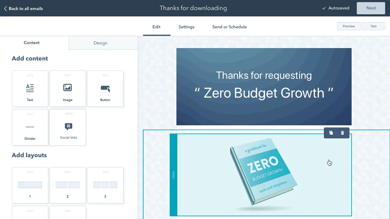
Nearly 60% of emails are opened on mobile devices. One way to ensure your emails display properly is by using a responsive email template. HubSpot’s drag and drop email templates are responsive by default and a great option if looking for an easy solution.
6. Monitor email frequency.
Another aspect to pay attention to is how many emails you’re sending and how often. Sending too many emails can cause recipients to unsubscribe.Send an Email Newsletter Your Subscribers Will Love
Email newsletters are something we're all familiar with, yet it can be challenging to create a successful one for your own brand. Use the examples above for inspiration and create an email newsletter that delights your subscribers.
Editor's Note: This article was originally published in September 2019 and has been updated for comprehensiveness.
Email Newsletters
.png?width=112&height=112&name=Image%20Hackathon%20%E2%80%93%20Horizontal%20(58).png)
.png)

.png)
![How to Create an Email Newsletter [+ Expert Tips & Checklist]](https://53.fs1.hubspotusercontent-na1.net/hubfs/53/how-to-create-email-newsletters-1-20250211-3097238.webp)
-Oct-10-2025-03-00-17-4988-PM.webp)

.png)


![When Do People Unsubscribe From Email Marketing Campaigns? [Infographic]](https://53.fs1.hubspotusercontent-na1.net/hubfs/53/00-Blog_Thinkstock_Images/Email_Unsubscribes.jpg)