
Being able to control the purchasing experience at this level is the power of branding at work.
This branding guide will help you create and manage a strong brand that’ll entice customers to admire, remember, and prefer your business over the competition.
So, keep reading or jump ahead to find what you need.
What is a brand?
A brand is the identity and story of a company that makes it stand out from competitors that sell similar products or services. The goal of branding is to earn space in the minds of the target audience and become their preferred option for doing business.
Brands are an effective way for companies to communicate their vision. A brand clarifies what a company stands for and why.
A brand also refers to the overall experience a person has when interacting with a business — as a shopper, customer, social media follower, or mere passerby.
What is branding?
Branding is the process of creating the brand identity of a company. This process also delivers materials that support the brand, like a logo, tagline, visual design, or tone of voice.
In a nutshell, branding is the process of researching, developing, and applying a distinctive feature or set of features to your organization so that consumers can begin to associate your brand with your products or services.
Branding is in social media captions, billboard color palettes, and the materials brands use for their packaging.

Free Brand Building Guide
A comprehensive guide to effectively define, launch, scale, and monitor your brand.
- Understanding brands today.
- Incorporating brand in marketing.
- Creating brand strategy.
- Measuring brand impact.
Download Free
All fields are required.
Form not available
Companies that create strong brands know that their brand identity needs to live everywhere. They know their names extend far beyond the label and can entice consumers to choose their products out of a lineup of options.
For example, the Coca-Cola brand has one of the most recognizable logos around the world. The classic red and white lettering, vibrant artwork, and distinctive font have captured buyers' attention for over a century.
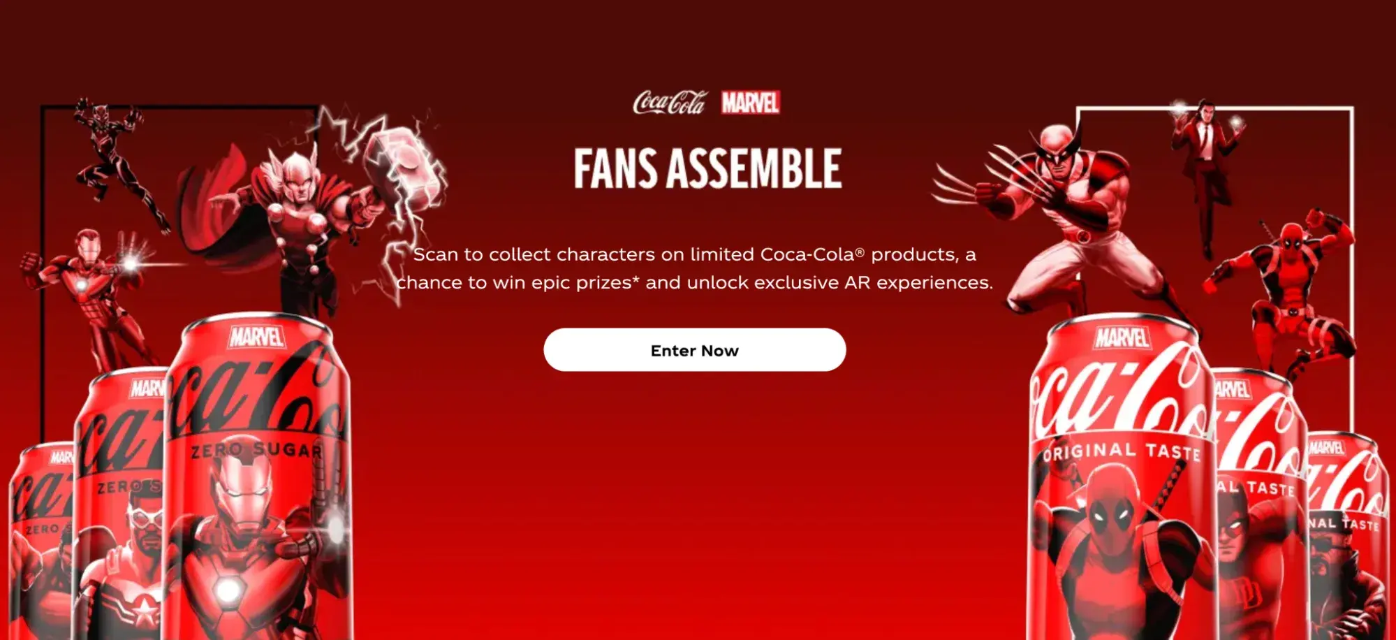
Having stood the test of time, the Coca-Cola brand is a testament to the power of consistent, successful branding that consumers have come to love.
That said, branding is an iterative process and requires getting in touch with the heart of your customers and your business. However, it's not exactly the same as marketing.
Next, we take a look at the similarities and differences between branding and marketing.
Branding vs. Marketing
While it‘s easy to combine branding and marketing into one discipline, they’re quite distinct. It's also common to hear branding and marketing compared in terms of priorities. The truth is they are both essential to a successful business and must work in harmony for a business to grow.
Put simply, branding is the identity of a company, and marketing includes the tactics and strategies, which communicate that vision.
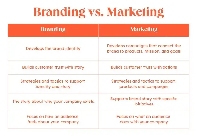
As a business grows, both branding and marketing get more complex. This growth often means that both areas of a business will develop strategies and tactics to support different goals.
In branding, these actions usually support the business’s story and identity. In marketing, these actions usually amplify a company's products, customers, or other initiatives in order to drive sales.
Branding is important for a variety of reasons — and we’ll go through them below.
The Importance of Branding
Your brand is arguably one of your organization’s most important assets. It gives your organization an identity, makes your business memorable, encourages consumers to buy from you, supports your marketing and advertising, and brings your employees pride.
Other benefits of branding include the following.
1. Influencing Purchasing Decisions
Branding shapes how consumers perceive a product or service.
A strong brand image can create positive associations with quality, value, or a particular lifestyle, influencing purchasing decisions.
In fact, 71% of consumers (particularly Gen Z) say they're more likely to by from brands they trust. Meanwhile, prior surveys we ran also showed that their purchases could also be influenced by brands with shared values.

Read our 2024 Consumer Trends Report here.
2. Creating an Identity for Your Business
A brand extends beyond a company’s product or service. Branding gives your business an identity. It gives consumers something to relate to and connect with beyond the product or service they're actually purchasing.
3. Helping Customers Remember Your Business
Branding makes your business memorable. It’s the face of your company and helps consumers distinguish your business across every medium.
Pro Tip: One of the best ways to be memorable is to create content that resonates with your audience. Here's a list of the top types of content consumers want to see, according to our annual consumer survey.
4. Boosting Advertising and Marketing
Branding supports your marketing and advertising efforts. It helps your promotion pack that extra punch with added recognition and impact.
5. Building Employee Support
Branding brings your employees pride. When you brand your company, you’re not only giving your business identity. You’re also creating a reputable, highly-regarded workplace. Strong branding brings in strong employees.
Brand Strategy Guide
It‘s true. Branding is creative work. It’s also a team effort, and there are many stakeholders who should be involved in the process. Everyone has an opinion. Navigating useful feedback and changes can make branding a challenge.
But you don‘t have to invent your brand without help — these templates can help you create a powerful brand. To show you how a template can improve the branding process, let’s walk through a few examples next.
- Company Profile Templates. This resource can help you pull together the story of how your company began and how you plan to position yourself in the market. This makes it easier to refine your brand identity and strategy.
- Company Culture Code Template. The culture of your business and your brand should be intrinsically connected. This useful template makes it easier for your team to hone the core of your unique culture so you can impart that knowledge into your brand.
- Value Statement Templates. These templates can help you refine the value your company offers to customers. It includes over 30 pages of useful prompts and visual tools to hone your messaging.
How to Create a Brand
- Determine your target audience.
- Establish your mission statement.
- Define your values, features, and benefits.
- Create your visual assets.
- Find your brand voice.
- Market your brand.
Here’s how you can create a brand — or begin the process of rebranding your business.
There’s a lot that goes into a brand, and there’s a lot to consider when building a strong one. So, grab a notebook and jot down ideas as you move through this section. Recognize that branding is an iterative process. This means you might be repeating some of these steps as you brainstorm and build your brand.
Want to build an effective, measurable brand? Download our free guide on how to build a brand.
Define your brand's purpose.
Before diving into the specifics, take a step back and define the overall purpose of your brand. What impact do you want to have on your customers and the world?
This purpose should guide all of your branding decisions.
Free Brand Building Guide
A comprehensive guide to effectively define, launch, scale, and monitor your brand.
- Understanding brands today.
- Incorporating brand in marketing.
- Creating brand strategy.
- Measuring brand impact.
Download Free
All fields are required.
Form not available
1. Understand your brand's origin story.
Every brand has an origin story — the reason the founders started the company and the problems they set out to solve. Building a brand that feels authentic and resonates with customers means understanding and communicating this story.
Real-Life Brand Example: Airbnb
Airbnb‘s origin story is that the founders couldn’t afford to pay rent, so they rented out air mattresses in their apartment to make extra money.
This experience made them realize there was an opportunity to create a marketplace for unique accommodations and experiences. Embracing this origin story has shaped Airbnb's mission-driven, community-focused brand.
Testing It Out
Let’s put this into action by creating a brand for a social media marketing platform.
I created a simple origin story for a social media marketing platform: "As a small business owner herself, our founder was frustrated by how time-consuming and challenging social media marketing could be.
She set out to build a platform that would simplify the process and enable authentic connection, to help small businesses like hers grow." Distilling this story will help humanize the brand.
2. Determine your target audience.
Branding leads to awareness, recognition, trust, and revenue. We’ve talked about that. But let’s take a step back and understand where those stem from: consumers. And not just any consumers — your target audience and customers.
70% of consumers say that they want a personalized experience. But how can you offer that experience if you don’t have a clear idea of who they are?
If your brand doesn’t resonate with your audience, it won’t lead to that awareness, recognition, trust, and revenue. That’s where target market research comes in.
Before pressing pen to paper (or cursor to digital document), you must understand to whom your branding will be speaking.
Who does your product serve? Who is your ideal customer? Why did you create your business in the first place?
What you learn about your target market and buyer personas will influence your branding decisions down the line, so make this step your first priority.
Testing It Out
For my social media marketing platform, I‘ve defined the target audience as small business owners who are looking to grow their business through social media, but don’t have a lot of time or resources to devote to it. They appreciate authenticity and want to connect with their customers in a genuine way.
3. Establish your mission statement.
Let’s return to a question I asked in the last step: Why did you create your business? Answering this will help you build your mission statement. This statement defines your purpose and passion as an organization.
Before you can craft a brand that your audience recognizes, values, and trusts, you must be able to show what your business has to give. Then, every part of your brand (logo, tagline, imagery, voice, and personality) can reflect that mission and vision.
Your mission statement is a building block of your brand manifesto. It encompasses why your organization exists and why people should care about your brand.
Featured Resource: Mission Statement Examples & Templates

Download these free mission statement examples and templates and learn the ins and outs of two of the most valuable strategic planning elements for businesses.
Real-Life Brand Example: Patagonia
Clothing brand Patagonia's brand purpose is to “Save our home planet.” This clear and impactful purpose guides everything they do, from their product design to their environmental activism.
Customers love it and consider it the most reputable brand in the United States.
Testing It Out
I wrote the following mission statement for the mock social media marketing platform: “To empower small businesses to authentically connect with their customers and grow their brand through innovative and accessible social media marketing tools and resources.”
This mission statement reflects the brand's purpose and the value it aims to provide.
4. Define your unique values, qualities, and benefits.
There are probably lots of businesses in your industry and niche. It’s easy to focus on your competition (and there’s a time and place for competitive analysis), but, for now, let’s focus on you.
What’s one thing that your business has that no one else can mimic (er, legally)? Your brand.
Because of that, you must make sure that your brand is made from and inspired by elements that are solely yours: the values, benefits, and qualities that make your company unique.
Take a moment to jot down a list of what sets your business apart from others. I’m not talking about product features (like appearance, components, or capabilities). I’m referring to how your products or services improve lives and contribute to success.
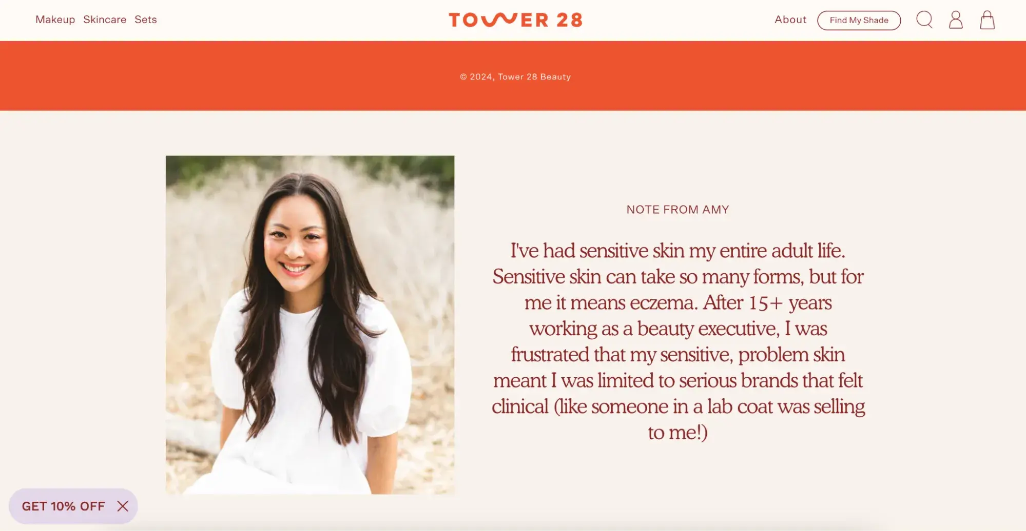
Real-Life Brand Example: Tower 28 Beauty
You may have heard of Tower 28; they’re a beauty company that went viral on TikTok in 2021. I order their skincare products for two reasons:
- They steer clear of harmful ingredients, and
- I trust and respect the brand (and it’s gorgeous.)
On their website, they’ve clearly and simply outlined their unique values and benefits as part of their overall brand. This makes it easy for customers like me to trust their products and choose them over competitors.
Testing It Out
Some unique values and benefits I defined for the social media marketing platform:
- Affordable and accessible for small businesses on a budget.
- Enables authentic connection and engagement with customers.
- Simplifies social media marketing to save small business owners time.
- Empowers small businesses to grow through social media.
5. Create your visual assets.
At this point, you should understand your target audience, your mission statement, and the unique qualities that make up your business.
Can you say with confidence that you’ve finished these steps? If your answer is yes, it’s time to move on to one of the more exciting parts of branding — the visual design. We’re talking about your logo, color palette, typography (fonts), iconography, and other visual components.
Featured Resource: How to Create a Brand Style Guide
As you create these elements, build a set of brand guidelines (or a brand style guide) to govern the composition and use of your visual assets.
This will ensure that whoever uses your new branding does so accurately and consistently. Check out these examples of brand style guides for some inspiration.
Note: Design can be just as intimidating as it is exciting. Consider hiring a professional with logo and identity design experience or starting with a few helpful design templates.
Real-Life Brand Example: HubSpot
Our visual branding is distinctive and consistent. We use the signature orange color across our website, advertising, and social platforms.

Our logo is also instantly recognizable.

Testing It Out
For the social media marketing platform, I selected:
- Logo. A chat bubble icon incorporating an upward trending arrow to symbolize growth through conversation
- Colors. A vibrant, friendly teal as the primary color. Gray and white as secondary colors.
- Fonts. A rounded, approachable sans-serif font for headings. A clean, easy-to-read sans-serif for body copy.
- Imagery. Photos featuring small business owners connecting with customers and growing their business. Minimalist illustrations. These visual elements create a cohesive brand feel that’s modern, approachable, and conveys growth.
6. Find your brand voice.
Next, consider the voice of your brand. What would your brand sound like if you had a conversation with it, or if it texted you?
How you communicate with your target market is also considered part of your branding. You want to define a brand voice that connects and resonates with your audience — otherwise, they probably won’t pay attention. Because of that, don’t hesitate to return to step one to get familiar with to whom you’re speaking.
From your advertising campaigns and Instagram captions to your blog posts and brand story, your tone must be consistent.
So, give your audience a chance to get familiar with your brand and learn to recognize the sound of your voice. Better yet, create a fun, entertaining voice, and your customers will look forward to your social media and email updates.
Real-Life Brand Example: MailChimp
MailChimp is a great example of a brand that speaks with a clear, consistent tone. When I used their free plan for my small business, I always chuckled when receiving their emails and scanning their Instagram feed.
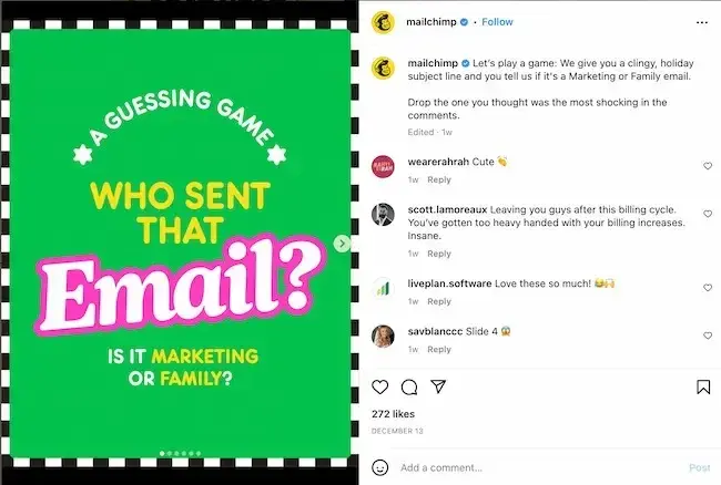
From its web copy to its social media posts, MailChimp has a clear brand voice that's personable, fun, and accessible. It can be hard to explain the technical parts of a software product (like A/B testing), but MailChimp has finessed that, too.
Testing It Out
I defined key traits of the social media marketing platform's brand voice:
- Friendly and approachable.
- Informative but not overly technical.
- Empowering and encouraging.
- Occasional use of humor.
7. Put your branding to work.
Your brand only works if you do. Once you finish designing and creating your new brand (or rebrand) integrate it throughout every inch of your business.
Pay extra attention to make sure that it’s displayed anywhere your business touches customers. Here are a handful of tips for applying your brand across your organization.
Want to build an effective, measurable brand? Download our free guide on how to build a brand.
Testing It Out
To implement the new branding for the social media marketing platform, I'd take the following steps:
- Apply visual branding elements to the platform interface, website, social media profiles, and any marketing materials.
- Refine messaging on the website and in marketing copy to align with brand voice
- Train team members on the new brand guidelines.
- Develop branded content like blog posts, social media posts, and email newsletters.
- Ensure branded visuals and voice are used consistently in all future designs, product updates, and customer interactions.
Free Brand Building Guide
A comprehensive guide to effectively define, launch, scale, and monitor your brand.
- Understanding brands today.
- Incorporating brand in marketing.
- Creating brand strategy.
- Measuring brand impact.
Download Free
All fields are required.
Form not available
How to Brand Your Business by Channel
1. Website
50% of internet users consider a website’s design when forming an opinion about a business. So, splash your logo, color palette, and typography across your website. Don’t use anything but your predefined assets in your brand guidelines.
Your website is a major part of your company identity — if it doesn’t reflect your brand, it will only create a jarring customer experience. Also, be sure that all web copy, calls-to-action, and product descriptions speak with your brand voice.
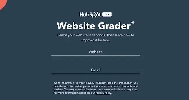
Try this website grader for a free evaluation of your website, with tips on how to make improvements.
Real-Life Brand Example: Shopify
Shopify‘s website perfectly embodies its brand. The clean, minimal design and straightforward copy reflect Shopify’s mission to simplify ecommerce. Consistent use of brand colors, fonts, and illustrations create a cohesive experience.

Testing It Out
For the social media marketing platform's website, I applied the teal and gray color scheme and rounded, friendly fonts. The copy emphasizes ease-of-use and authentic connection, in line with the brand voice. Customer testimonials and case studies showcase successful small businesses to inspire and build trust.
2. Social Media
Increasing brand awareness is a top goal for social marketers, according to 2022 research. All profile photos, cover art, and branded imagery should reflect your brand. Consider putting your logo as your profile photo. This will make it easier for customers to recognize your business. As with your website, be sure all profile information, posts, and captions show off your brand voice.
Real-Life Brand Example: Wendy's
Wendy's social media presence is a masterclass in branding. Their profile photos feature their iconic logo and mascot. Their tweets are sassy, playful and on-brand.
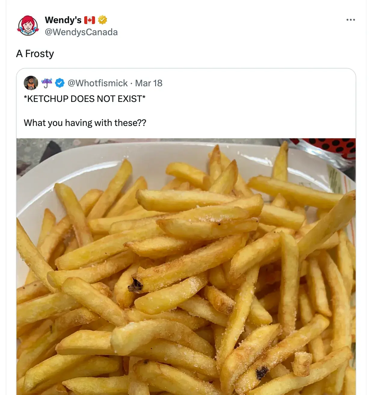
This strong branding has earned Wendy's a massive social following.
Testing It Out
Across social profiles, I used the branded chat bubble logo icon as the profile photo. Cover images feature the vibrant teal and photos of small business owners connecting with customers. Captions are written in a friendly, encouraging brand voice, with tips and resources to help small businesses grow using social media.
Consistent use of branded hashtags (#AuthenticSocialGrowth) reinforces key messaging.
3. Packaging
If you have a physical products business, your product is probably the most tangible way that customers interact with your brand. For that reason, your packaging should highlight your new branding — in its design, colors, size, and feel.
Real-Life Brand Example: Chobani
I love Chobani yogurt (confession: I’m eating it right now). Their branding immediately tells me that they produce authentic, healthy Greek yogurt.
That’s one of the main reasons I buy Chobani. It makes its yogurt packaging with recyclable paper cups — an intentional decision that supports the overall experience they’ve paired with purchasing and eating the Chobani brand.
4. Advertising
Advertisements (digital and print) are often used to establish brand awareness and introduce consumers to your brand. In fact, according to HubSpot research, 33% of marketers use paid ads to increase brand awareness.
Because of this, it’s critical that they display your branding. In fact, your branding should make the ad creation process easier. With your brand style guide, you already know how your ads should appear and what type of copy to write.
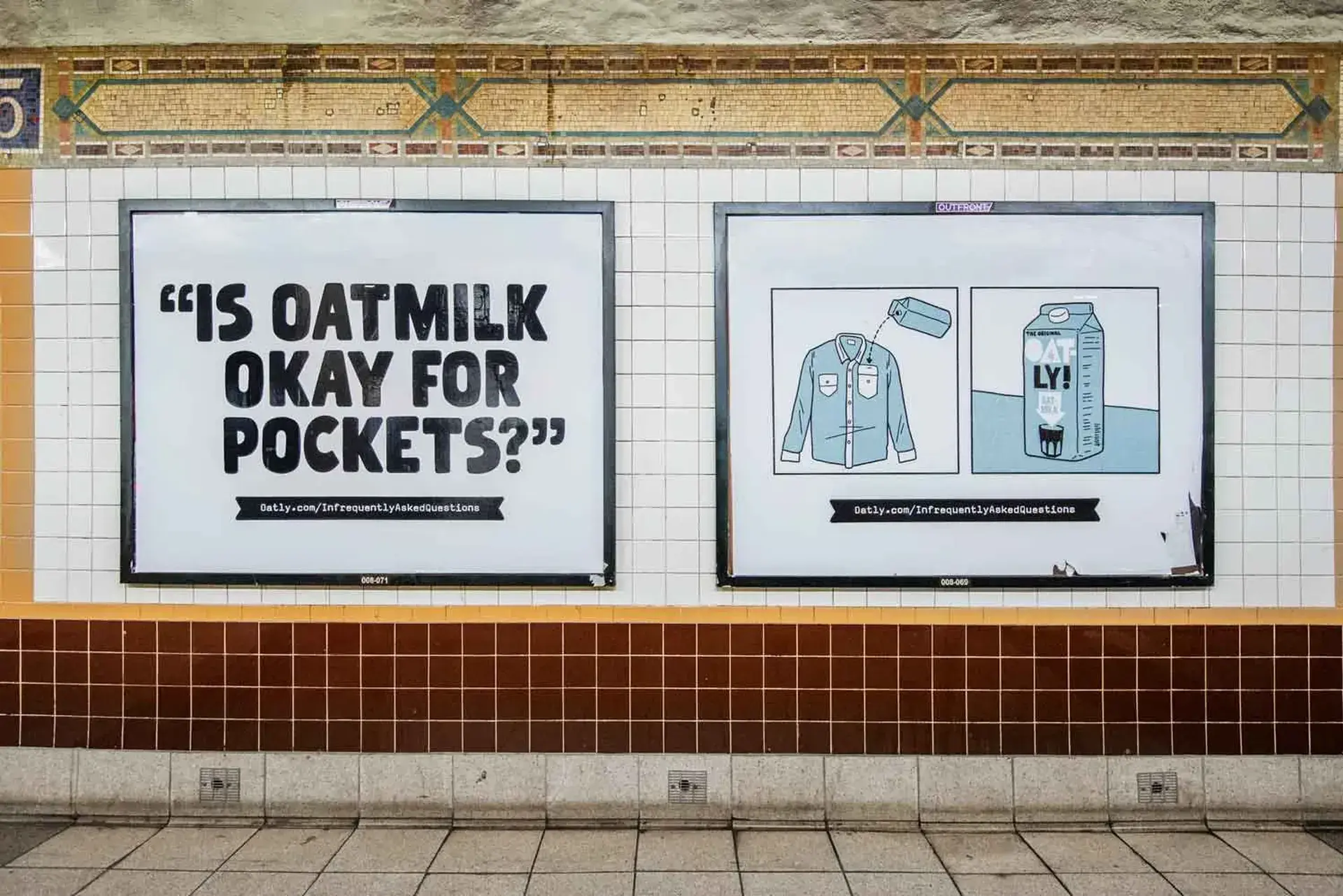
Real-Life Brand Example: Oatly
Oatly‘s ads are quirky, bold, and instantly recognizable. With irreverent copy, stark black and white imagery, and the consistent Oatly logo, they command attention. The ads perfectly capture Oatly’s unconventional brand.
Testing It Out
Digital ads for the social media marketing platform feature bold text in the brand fonts and colors.
Copy focuses on the pain points of the target audience (“Struggling to grow your small biz on social? We can help!”) and the benefits of the platform.
Branded illustrations catch the eye while reinforcing the message. A clear CTA encourages clicks.
Featured resource: Best advertising examples
5. Sales and Customer Service
A brand is only as powerful as the people behind it, and if your people aren’t putting your brand to work, it won’t work for you. Moreover, your brand applies to more than your marketing.
Inform your sales and customer service folks of your brand guidelines and tell them to use them, especially when they engage directly with customers. Whether they're sharing a branded product demo or answering customer questions, encourage them to use your logo, tagline, imagery, and brand voice.
Real-Life Brand Example: Amazon
Amazon is known for its exceptional customer service, which is a key part of its brand promise. For example:
- 24/7 customer support via phone, email, and chat
- No-hassle returns and exchanges
- Proactive communication about delays or issues with orders
- Personalized recommendations based on purchase history
Testing It Out
I developed a brand training for all customer-facing teams. It covers the platform's mission, target audience, brand voice, and visual guidelines. I also provided buyer personas using persona templates so teams understand who they’re addressing better.
Featured Resource: Buyer Persona Templates

Download our free Persona Templates to easily organize your target audience research and strengthen your marketing.
Sales reps use branded slides for demos, and stress ease-of-use and authentic connection in their pitches. Customer service reps spend as much time as needed to help small business owners succeed on the platform, in a friendly and encouraging tone. All teams have easy access to approved brand assets.
Check out these examples of small business branding for more inspiration.
Branding Terms to Know
Here are some other brand-related buzzwords you should know. They show the importance and value of branding your business.
Brand Awareness
Brand awareness refers to how familiar the general public and your target audience are with your brand. High brand awareness leads to brands being referred to as “trending,” “buzzworthy,” or “popular.”
Brand awareness is important because consumers can’t consider purchasing from your brand if they’re not aware of it.
👉🏼 Strong branding makes your business known.
Brand Extension
Brand extensions are when companies “extend” their brand to develop new products in new industries and markets. Consider Honda lawn mowers or Martha Stewart “Good Things.”
Brand extensions allow companies (or individuals) to leverage brand awareness and equity to create more revenue streams and diversify product lines.
👉🏼 Strong branding brings in more money.
Brand Identity
Brand identity is the personality of your business and the promise you make to your customers. It’s what you want your customers to walk away with after they interact with your brand.
Your brand identity is typically composed of your values, how you communicate your product or service, and what you want people to feel when they interact with it.
👉🏼 Strong branding gives your business more than a name.
Brand Management
Brand management refers to the process of creating and maintaining your brand.
It includes managing the tangible elements of your brand (style guide, packaging, color palette) and the intangible elements (how it's perceived by your target audience and customer base).
Your brand is a living, breathing asset, and it should be managed as such.
👉🏼 Strong branding requires consistent upkeep.
Free Brand Building Guide
A comprehensive guide to effectively define, launch, scale, and monitor your brand.
- Understanding brands today.
- Incorporating brand in marketing.
- Creating brand strategy.
- Measuring brand impact.
Download Free
All fields are required.
Form not available
Brand Recognition
Brand recognition is how well a consumer (ideally in your target audience) can recognize and identify your brand without seeing your business name — through your logo, tagline, jingle, packaging, or advertising.
This concept goes hand-in-hand with brand recall, which is the ability to think of a brand without any visual or auditory identifiers.
👉🏼 Strong branding keeps your business top-of-mind.
Brand Trust
Brand trust refers to how strongly customers and consumers believe in your brand.
Do you deliver on your marketing promises? Do your salespeople and customer service go above and beyond?
These things can create trust among your customers, which is important in a world where a mere 14% of people feel confident in large businesses.
👉🏼 Strong branding builds trust with your customers.
Brand Valuation
Brand valuation is the commercial valuation of your brand derived from consumer perception, recognition, and trust.
This concept goes hand-in-hand with brand equity. A powerful brand can make your business invaluable to investors, shareholders, and potential buyers.
👉🏼 Strong branding increases your business’s value.
Branding Tips for Small Businesses
- Treat your brand like a person.
- Prioritize consistency.
- Follow a brand strategy.
- Don’t let inspiration turn into imitation.
- Use branding to hire.
1. Treat your brand like a person.
To best wrap your head around the branding process, think of your brand as a person. Your brand should have an identity (who it is), personality (how it behaves), and experience (how it’s remembered).
Ask yourself these questions about your brand:
- How would your brand introduce itself?
- If it had to describe its appearance, how would it do so?
- How would your brand talk about your products or services? Would it be serious and professional, or would it be humorous and edgy?
- What would someone say about your brand after “meeting” it for the first time? What are a few sentences they’d use to describe it?
The purpose of branding is to create relationships with your customers. The easiest way to do this is to treat your brand as a person and understand that you want your customers to do the same.
Testing it out
I imagined the social media marketing platform brand as a person:
- She would introduce herself as a helpful, savvy friend who's excited to help small businesses grow using the power of social media.
- She would describe her appearance as modern, bright, and approachable, with a friendly smile.
- She would talk about the platform enthusiastically, emphasizing how it makes social media marketing easy and helps form authentic customer connections. Her tone would be warm and encouraging.
- After “meeting” her, someone would describe her as knowledgeable, supportive, and genuinely invested in their success. They'd say she made social media marketing feel accessible and even fun.
Envisioning the brand as a person helps create a cohesive, relatable brand identity to build customer relationships.
Featured Resources
2. Prioritize consistency.
SEMRUSH Social Customers want authenticity — Semrush’s research points out that customers want “natural”, user-generated-like content and “realness.”
Consistency is essential for branding because it builds trust and shows customers that your values are authentic. Without it, you could accidentally undermine your brand and confuse your customers.
Recognizable, valuable brands focus on consistency — and they reap the benefits.
So, make your brand a unified presence across mediums and platforms. This makes it easy for your customers to get familiar with, recognize, and come to prefer your brand over time. Brand guidelines can help with this initiative.
Take a look at this post for consistent brand examples and ideas.
Testing it out
To ensure consistency for the social media marketing platform brand, I:
- Created detailed brand guidelines outlining the mission, values, voice, and visual elements. Distributed this to all team members.
- Set up templates for marketing materials, social media posts, and sales docs to make it easy to maintain visual consistency.
- Scheduled regular brand audits to check that all branded assets are aligned and make updates as needed.
- Appointed a brand manager to oversee all branded content and communications.
3. Build and follow a brand strategy.
A brand strategy is more than your brand guidelines.
It’s a plan with specific, long-term goals that your team can achieve as your brand evolves. These goals typically revolve around your brand’s purpose, emotion, flexibility, competitive awareness, and employee involvement.
Remember how I said that branding is a continuous process? There’s a lot that goes into it. A brand strategy can help you turn that process into a well-oiled practice that keeps your brand moving toward success and recognition.
Testing It Out
I developed a brand strategy for the social media marketing platform that includes:
- Purpose: Empower small businesses to authentically connect with customers and grow using social media.
- Emotion: Supportive, empowering, approachable.
- Flexibility: Adapt voice and visuals for different social platforms while maintaining core brand elements.
- Competitive awareness: Regularly monitor competitor branding and identify opportunities to differentiate.
- Employee involvement: Engage employees in branding through training, encouraging brand advocacy, and reinforcing brand values.
4. Don’t let inspiration turn into imitation.
Competitive analysis is important. Not only does it educate you on where your competition stands and how they are excelling, but it can also give you ideas on how you can improve or further set apart your brand.
But be careful to not fall into an imitation trap. Keep your competitive research limited and focus on what your organization brings to the table.
Just because a competitor (or two) has branded their company in a certain way doesn’t mean that you have to follow suit. New, unique, provocative brands are memorable brands.
Testing It Out
While researching competitors in the social media marketing space, I noticed a lot of similarities — tech-focused language, muted color palettes, generic stock photos. Rather than imitate these trends, I saw an opportunity to set our brand apart with:
- Vibrant, eye-catching brand colors.
- Authentic lifestyle photography showing real small business owners.
- Approachable, jargon-free voice.
- Emphasis on building genuine customer relationships, not just metrics.
5. Use branding to hire.
Strong branding makes your employees proud. I know I’m proud to be part of HubSpot. Leverage your branding to attract talented people. If hiring is a strong initiative for your organization, dedicate some of your resources to employer branding.
Employer branding is how you market your company to job seekers and current employees. If you’re publicly proud of your organization, others will be, too.
Testing It Out
To attract top talent to the social media marketing platform team, I:
- Updated our careers page with compelling branded content about our mission, values, and culture.
- Developed a social media campaign featuring employee stories and behind-the-scenes glimpses of life at the company.
- Created branded welcome kits for new hires, including swag with our logo and colors.
- Encouraged employees to share their experiences on social media and Glassdoor.
Ready, Set, Brand
Branding is your organization’s name, logo, color palette, voice, and imagery. It’s also more. It’s that intangible feeling your customers have when they interact with your brand. You know, that experience we talked about in the beginning.
That’s how powerhouse brands deviate from all the others. The tangible components contribute to this — a gorgeous logo, a clever tagline, an authentic manifesto, and a clear brand voice — but truly strong brands thrive when they focus on the big picture of their brand.
Get to the heart and soul of your target audience and your organization, and a successful brand will follow.
Editor's Note: This article was originally published in March 2021 and has been updated for comprehensiveness.
Free Brand Building Guide
A comprehensive guide to effectively define, launch, scale, and monitor your brand.
- Understanding brands today.
- Incorporating brand in marketing.
- Creating brand strategy.
- Measuring brand impact.
Download Free
All fields are required.
Form not available
Branding


![How Internal Marketing Helps You Build a Strong Brand From the Inside Out [Experts Weigh In]](https://53.fs1.hubspotusercontent-na1.net/hubfs/53/internal-marketing-1-20241126-7031360.webp)