Table of Contents
- What is a Letterhead?
- Letterhead Examples with Logos
- How to Create a Letterhead
- Best Practices for Setting up Your Letterhead
- I Designed My Own Letterhead — Here’s What I Did
What is a Letterhead?
A letterhead is a printed heading placed at the top of stationery or a document, such as a letter or memo. A business letterhead typically contains the company or sender name, a logo, and contact information, and can be styled to align with the company’s branding.
Also, note that the term “letterhead” can also refer to the design of an entire page. For example, the design at the top of the page may extend to a page footer and/or the background of the page. Letterheads can also be placed elsewhere on the page, though placement at the top is most traditional.
Practically, a letterhead helps readers immediately recognize your company and read the message that you want them to read. It’s best to include one in some form than none at all.

HubSpot's Free Website Builder
Create and customize your own business website with an easy drag-and-drop website builder.
- Build a website without any coding skills.
- Pre-built themes and templates.
- Built-in marketing tools and features.
- And more!
But there’s more to it than that: Though the medium of paper and ink has been replaced by digital communications in many industries, a well-crafted physical branding set is another chance to make an impression on current and potential customers. Like with your website design or any marketing material, use your letterhead to convey personality and distinguish yourself from competitors.
So, how can you accomplish this? Easy. Let’s look at some model company letterhead examples and some design choices we can take away from each one.
Letterhead Examples with Logos
- Include a prominent brand logo.
- Feature one strong color.
- Embrace minimalism.
- Feature bold, bright colors.
- Leave some space.
- Add a creative footer.
- Experiment with typography.
- Use background color.
- Reposition elements on the page.
- Go off-center.
- Wrap it in a border.
- Draw geometric patterns.
- Place a watermark.
- Incorporate your logo into the page design itself.
- Apply touches of illustration.
1. Include a prominent brand logo.
What I like: By placing your company logo at the top of your letter, you’ll make your materials instantly recognizable. This is one of the most common approaches to branded letterheads: a big, bold logo in the left corner or centered at the top.
I like the example above because it features the brand’s logo against a green background to help it stand out and separate it from the rest of the content in the document without dominating the page or using too much whitespace. It feels decorative but not intrusive.
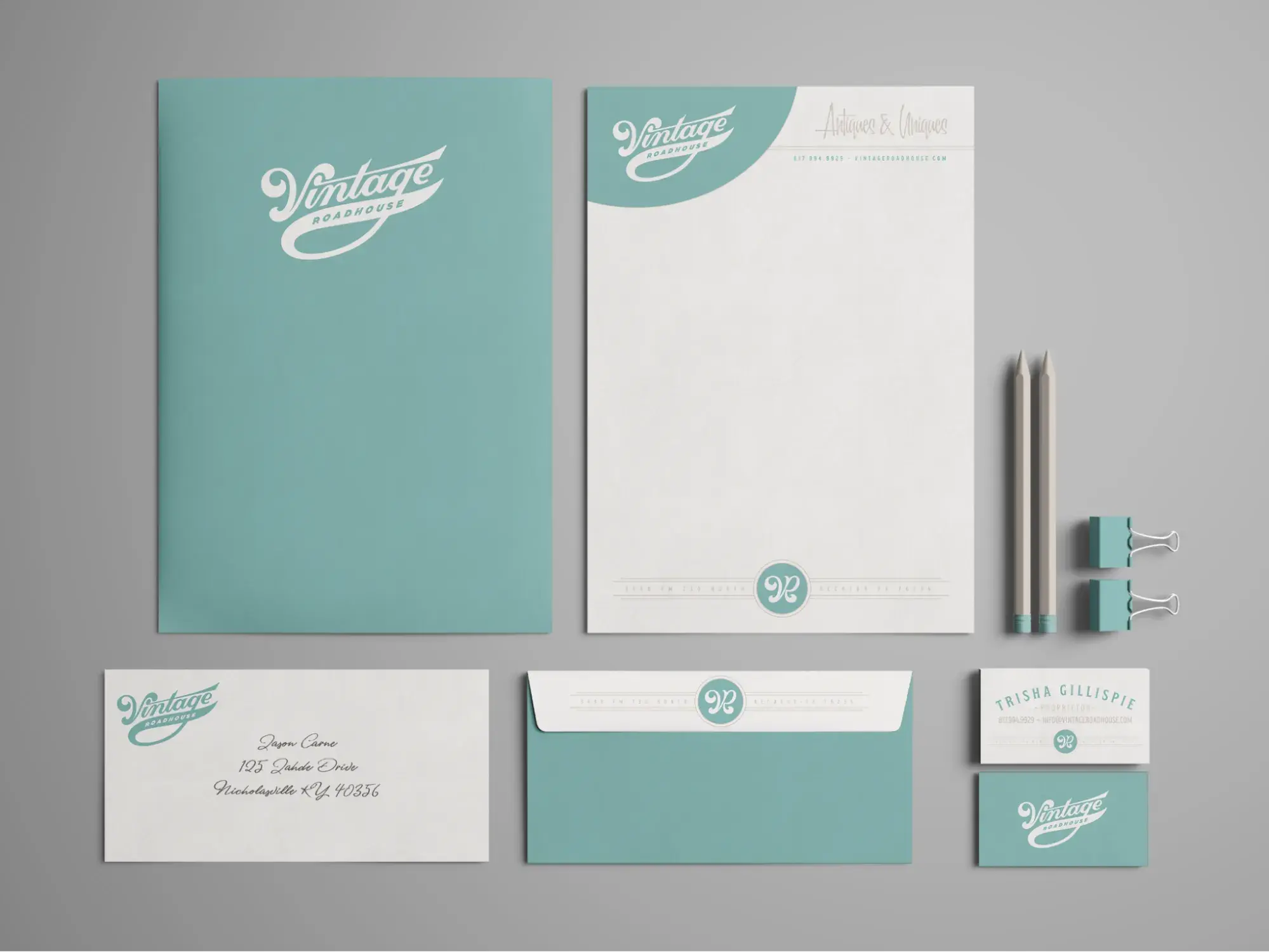
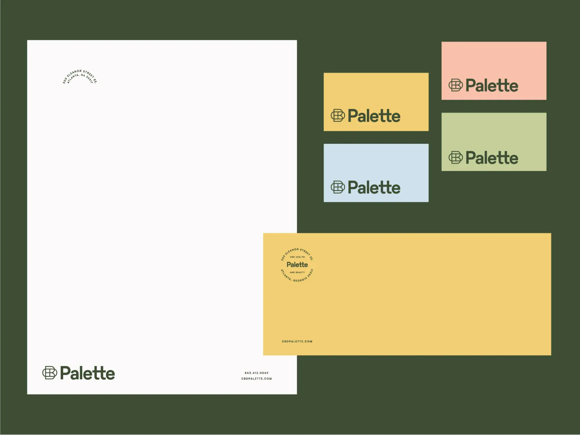
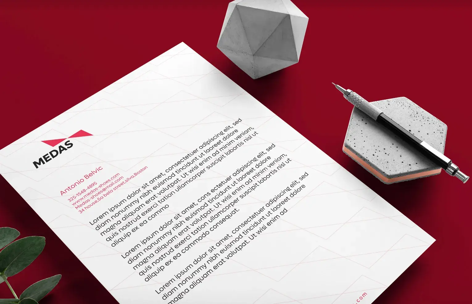
2. Feature one strong color.
What I like: You don’t need to be a designer or a marketer to know that color is a powerful thing. It can draw the eye in, guide focus throughout a page, and bring attention to its most critical parts.
Any more than three colors, though, and readers can start to feel overwhelmed. One popular approach that I like is to base your document around one color that aligns with your company branding. The example above uses just one shade of indigo to highlight specific areas of the page.
3. Embrace minimalism.
What I like: That last example was nothing crazy, but we can get simpler. In cases like this, it’s often better to underdo it than to overdo it. Remember that the body of your document is where you want readers to focus, and a minimalist letterhead like this one ensures that their eyes go to the right place.
Plus, in my opinion, minimalist designs have the added bonus of being easy to make. Not a designer? (And don’t want to hire one?) It’s hard to go wrong with a stripped-back look with a prominent logo. There’s no need to go overboard.
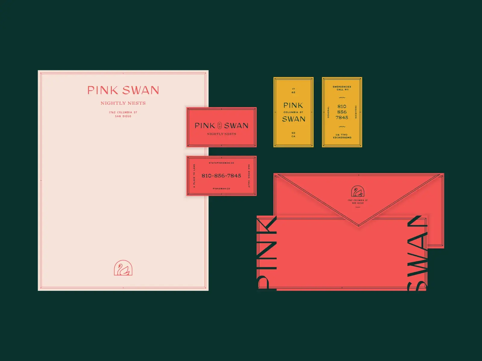
4. Feature bold, bright colors.
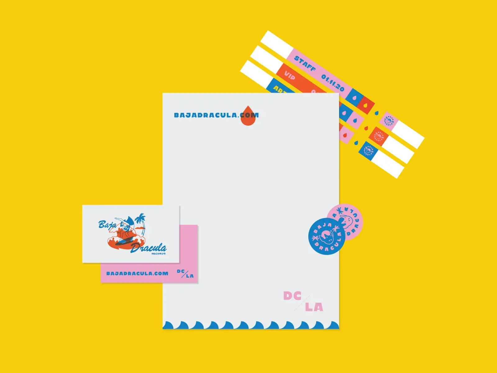
What I like: Don’t feel like using just one neutral color? Then forget everything I said before and find the boldest set of colors you reasonably can.
This doesn’t mean splatter-painting your stationery. (Though who am I to say no to that?) Rather, touches of brighter shades will accent your designs and add fun back into your standard business letter.
For help choosing your colors, check out our beginner’s guide to color theory.
5. Leave some space.
What I like: Impactful designs don’t have to be hectic designs. In fact, in many cases, it’s the opposite. By giving page elements some space, your choices stand out more. Plus, you save readers the cognitive work of separating out different items on your page.
I love the design above, which leverages whitespace (as well as background color) to emphasize its logo. It also lends a bit of an offbeat feel to the design that grabs attention and helps separate the brand from the competition.
6. Add a creative footer.
What I like: Footers are nothing out of the ordinary, and you’ll often see them used for placing contact information. By using colors and fonts that are consistent with the letterhead, footers also can make your documents feel more cohesive and balanced.
Still, that doesn’t mean you can’t inject some creativity into your footers as well. In this example, I appreciate how the footer template adds some personality to a pretty standard letter.
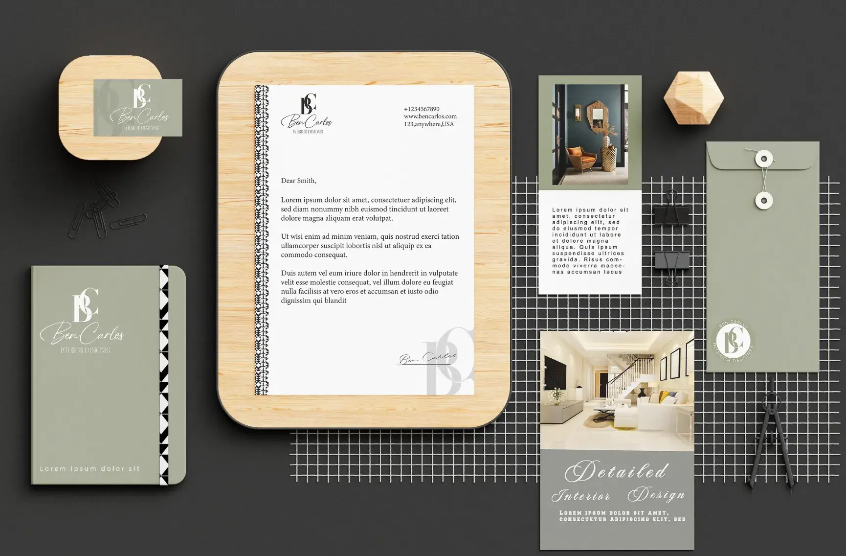
7. Experiment with typography.
What I like: No matter what design you pursue, you’ll have to consider typography to find a font that’s readable, visually pleasant, and in line with your branding. But, if you want to leave an impression, take inspiration from the example above and incorporate more risky text choices into the page design.
HubSpot's Free Website Builder
Create and customize your own business website with an easy drag-and-drop website builder.
- Build a website without any coding skills.
- Pre-built themes and templates.
- Built-in marketing tools and features.
- And more!
With highly prominent words on the page, you can achieve either a more vintage/retro look or something more modern, depending on the font family you choose. And I feel there’s no reason you can’t also throw your logo in there, either, as long as each element has enough room to breathe.
8. Use background color.
What I like: Your business letters don’t have to be plain white all the time. Consider using a colored background for your materials that complements your branding but still allows text to be readable. It’s an easy aesthetic enhancer, assuming you won’t deplete your printer ink supply too quickly.
There’s also a practical benefit to background color. I’ve found research has suggested that colored backgrounds like yellow, orange, and peach improve readability. That’s why we like the example above — the pastel tones elevate your branding beyond a simple logo.
Check out this list of favorite color combinations for help deciding which background color to pick.
9. Reposition elements on the page.
What I like: Who says your logo needs to go at the top of the page? By placing your logo in the bottom corner instead, it can feel like signing off on your message with your distinct branding.
I know this choice seems simple in concept, but the majority of companies stick to the standard letterhead format, so repositioning your branding like this can leave a different, more lasting impression.
10. Go off-center.
What I like: Minimal designs are also conducive to unconventional letterheads. For instance, try placing your letterhead content on one side of the page, rather than in the headers and footers, as the example above accomplishes.
When placing additional text, make sure to keep the visual hierarchy clear so readers aren’t confused by adjacent columns of text. One option here is to set your letterhead text to a smaller font size so that the reader's focus stays on the primary content of the document.
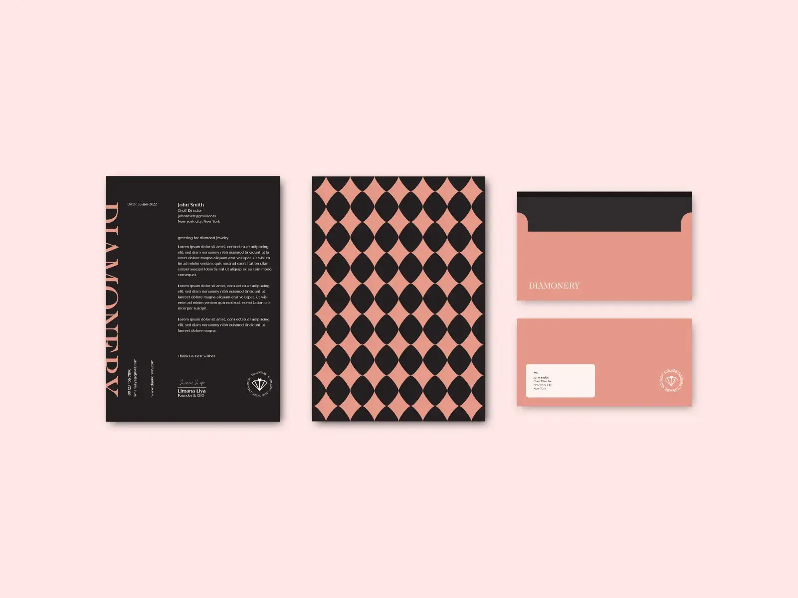
11. Wrap it in a border.
What I like: When done well, a border helps readers feel immersed in your branding. When applied to different branding materials, they can also keep everything looking cohesive, as shown in this example.
I think the above example pulls off a border well. However, be mindful of how borders take up extra page space and may make things feel more cluttered and dense.
12. Draw geometric patterns.
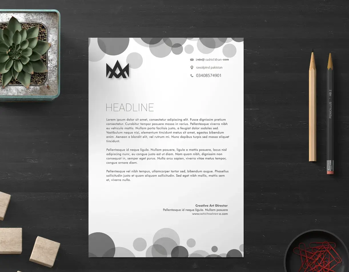
What I like: Subtle geometric patterns are another effective way to distinguish your header and footer from the rest of the page. Again, there’s nothing particularly fancy in this example, just grayscale circles. Still, this aesthetic is effective and achievable, even without a design degree.
There’s one thing I think is important to note, though: Be careful about layering text on top of shapes or any sort of color pattern, as that can affect readability. The example above avoids that issue by keeping text off the circles altogether.
13. Place a watermark.
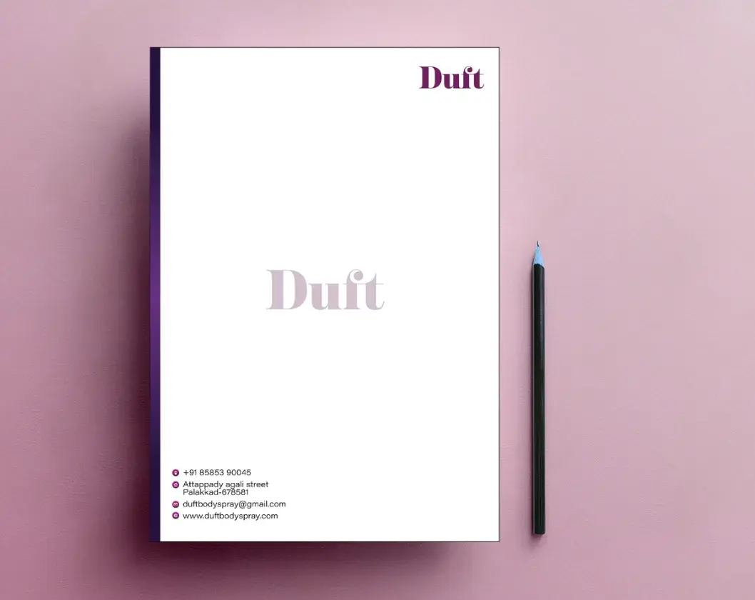
What I like: A watermark can reinforce the branding on your letterhead without impeding too much in the body of the document. Be sure to turn up the transparency enough that the text is still readable when layered on top.
14. Incorporate your logo into the page design itself.
What I like: Admittedly, this approach works best with simple, geometric logos. If yours fits that description, you can try repeating your letterhead logo across the page in a more subtle manner. As exemplified in this design, the result can spruce up an otherwise routine deliverable.
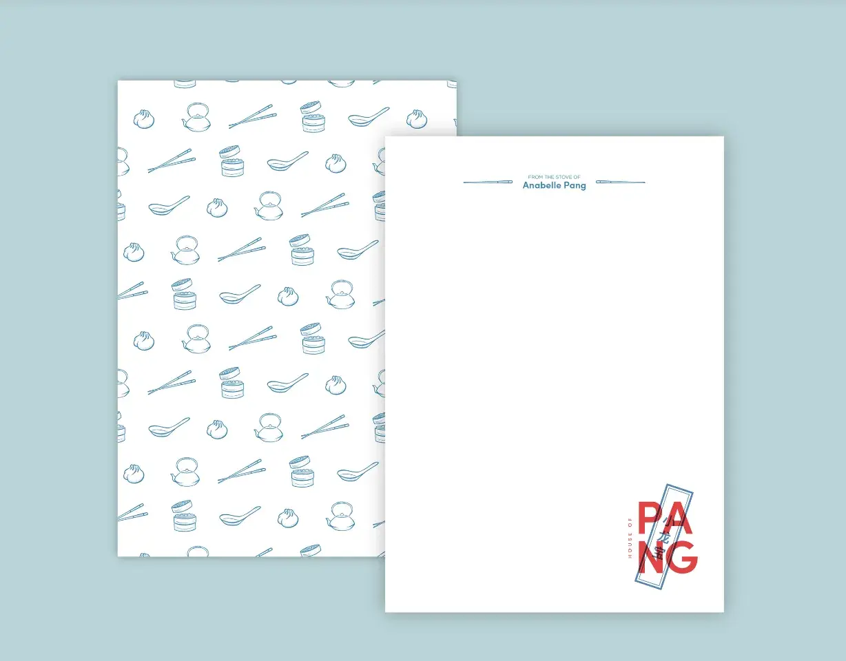
15. Apply touches of illustration.
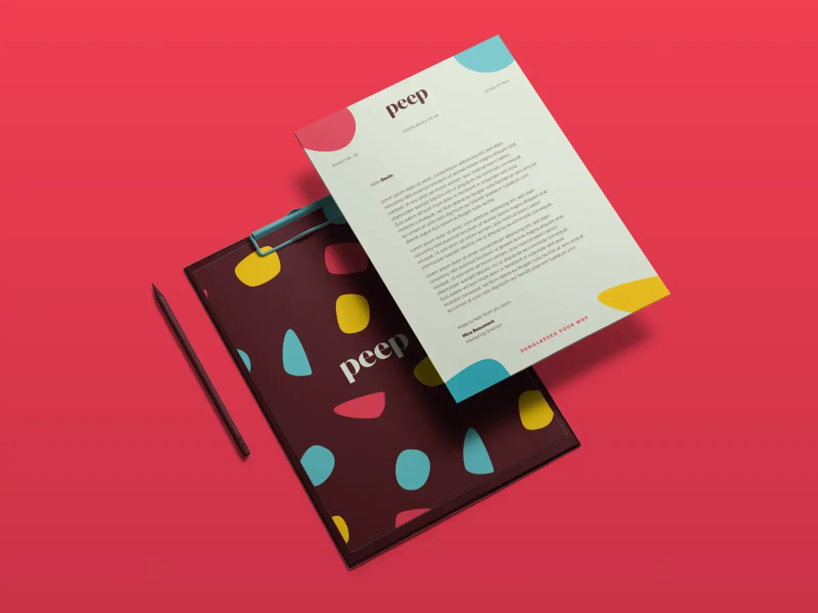
What I like: Finally, drawn elements can add a human touch to your letterhead, and they don’t even need to be fancy to work. Above, I like how some tasteful “blobs” mark each corner of the page and frame the letterhead and footer appropriately.
HubSpot's Free Website Builder
Create and customize your own business website with an easy drag-and-drop website builder.
- Build a website without any coding skills.
- Pre-built themes and templates.
- Built-in marketing tools and features.
- And more!
How to Create a Letterhead
Once you have your letterhead design planned out, it is relatively simple to make and add to your brand materials. You can upload a letterhead to your documents using a word processor like Microsoft Word. Here's a tutorial explaining how:
Best Practices for Setting up Your Letterhead
Your letterhead is more than just your company logo. I find it helpful to think of your company letterhead as both your business card and a fun design element. When designing yours, looking at a company letterhead example is helpful to find what you like and don’t like. Once you’re ready to design your own, remember these best practices.
1. Include essential contact information.
Your letterhead is the perfect location to include important information, like your business phone number, website address, and email address, because it will be the first thing your recipients notice. If you have the space in your design, be sure to include this information.
2. Maintain consistent branding.
Your company letterhead should look and feel similar to your other marketing materials, such as your company website. Consider using the same fonts and brand colors on your letterhead as on your website.
3. Keep it simple.
Maybe I am the only one, but I cannot stand clutter. And a cluttered letterhead? Icky. Try to avoid using too many design elements on your letterhead. A clean, simple letterhead is just as eye-catching as a crowded one.
I Designed My Own Letterhead — Here’s What I Did
Creating a letterhead is simple, especially if you use a design tool like Canva. Here’s what I did to create the letterhead for my business. (Not a fan of Canva? Check out our Template Marketplace.
1. Log into Canva.
Canva offers a free version of their design tool. You can sign up for Canva Pro if you want more editing options. However, I used the pro version to create my letterhead.
2. Search letterhead templates.
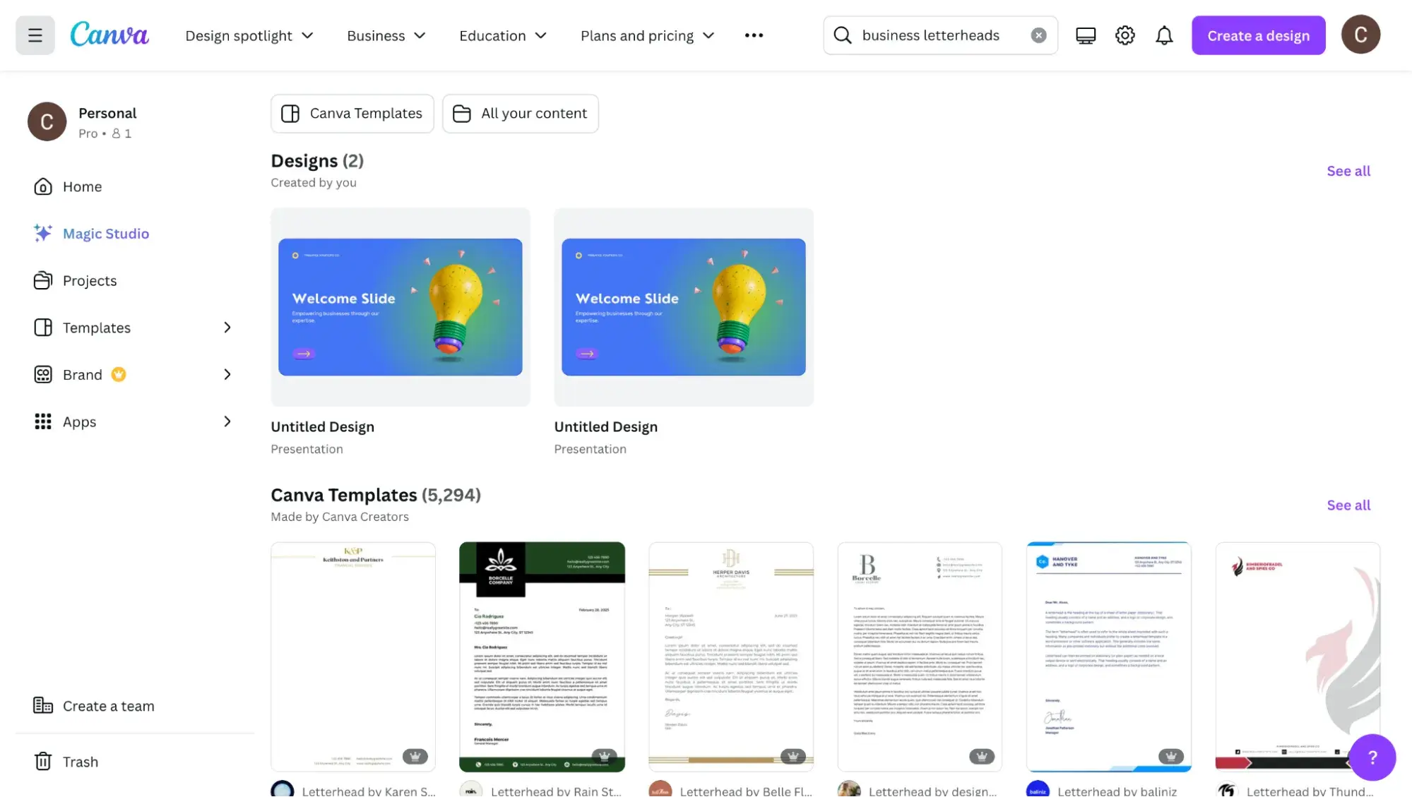
Canva offers over 5,000 letterhead templates. You can choose a simple letterhead template or a more complex design that covers the whole page. Personally, I like a simple, minimalist design.
I chose to customize the “Beige Classy Minimalist Professional Letterhead” design by Tamara Hall.
3. Customize the template.
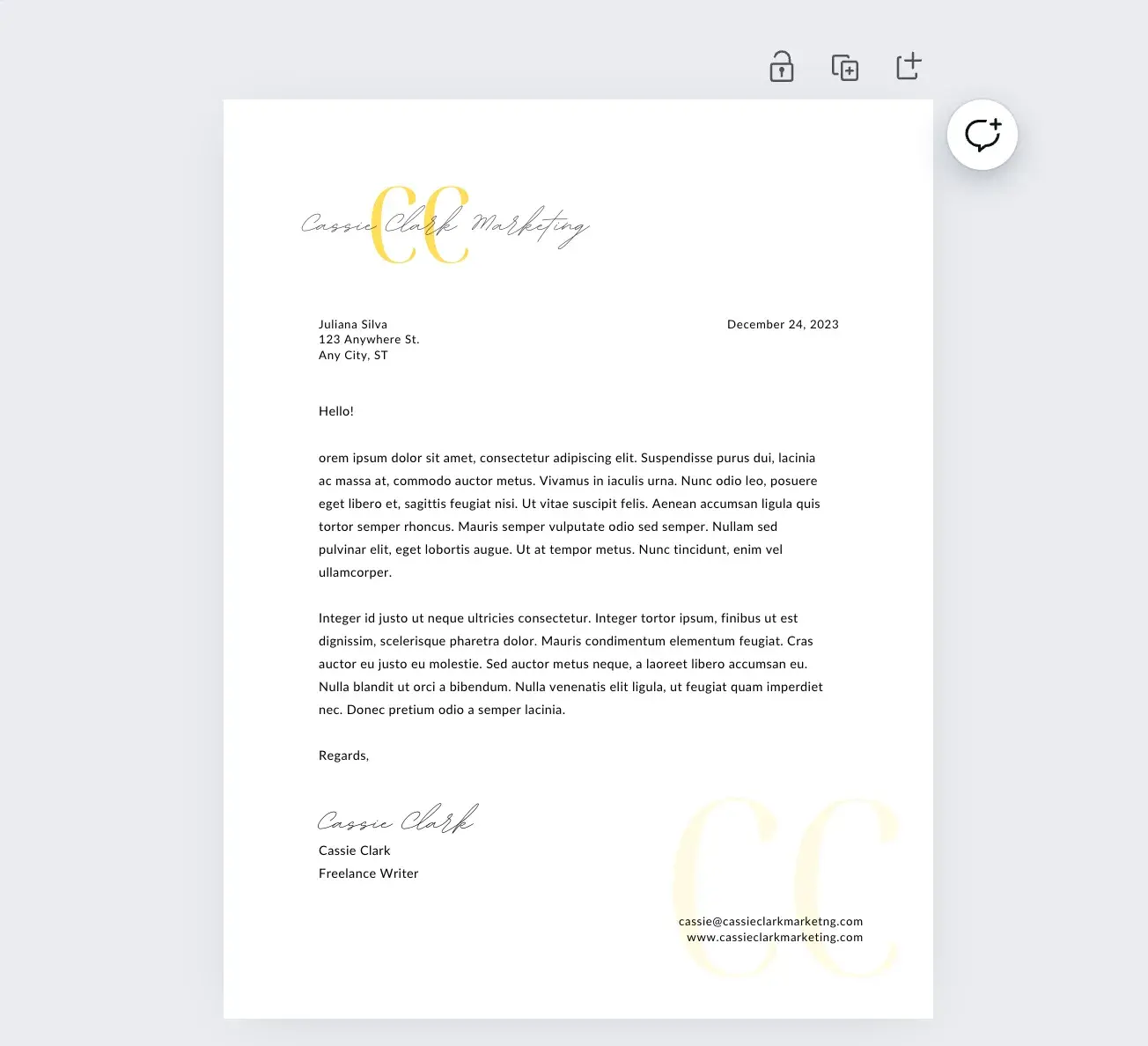
I like this letterhead design template because it’s simple, can be customized to match my brand colors, and offers a place for important contact information. Editing the letterhead to include my information was a breeze.
Pro tip: Depending on the template you choose, you may or may not be able to customize certain elements by color. Play around with the available templates until you find one you like. You can also use the Canva editor to create a letterhead from scratch. Just be sure to use the standard letter size for your project.
4. Save and print.
The nice thing about Canva is that you can order your letterheads directly from their website. If you would rather print your own, can you do that too. Just download your work as a PDF.
Pro tip: When you reprint your letter on your letterhead, take my advice: always do a test print with a blank piece of paper first. This will save you frustration in the long run!
Get Ahead with Your Letterhead
A well-designed letterhead can be an instant identifier for your brand. While a letterhead isn’t necessarily a requirement, I’ve found it can help make your direct mail stick out from the rest of the mail in your recipients' mailbox. Don’t make your letterhead an afterthought — instead, see it as another opportunity to reinforce your branding and personality and to make readers actually want to give your copy a skim.
The best letterhead designs feel fresh by straying a bit from the norm but not too far that it’s off-putting. Even if you're not a designer, the examples above show us that any business can pull it off.
Editor's note: This post was originally published in April 2022 and has been updated for comprehensiveness.
HubSpot's Free Website Builder
Create and customize your own business website with an easy drag-and-drop website builder.
- Build a website without any coding skills.
- Pre-built themes and templates.
- Built-in marketing tools and features.
- And more!
Design


![What's a Design System & What Components Is It Made Up of? [Examples]](https://53.fs1.hubspotusercontent-na1.net/hubfs/53/design-system.png)
.webp)