

When I built my first website, I felt overwhelmed (that's basically the official first step of the design process). Even though I was using a premade template, I kept endlessly dragging and dropping modules to create different page layout design options. I wasn’t getting anywhere.
Build your website with HubSpot's Free CMS Software
If you’re feeling like I was — a little intimidated by web design — you don’t have to go through the same struggles. There are fundamental rules of website layout that can guide you through creating an attractive webpage.
In this post, I'll show you the basics of page layout design, a list of design ideas, and tips for choosing the right page layout for you (plus tool recommendations, like our free drag-and-drop website builder).
Table of Contents
- What is website layout?
- The Basics of Page Layout Design
- Page Layout Design Ideas to Inspire Your Next Website
- How to Choose the Right Page Layout Design
- Website Layout FAQs
- Finding the Perfect Page Layout
What is website layout?
Website layout refers to the way design elements are arranged on a webpage, as in, where the text, images, videos, navigation, and graphics are placed. Layout deals more with positioning, not content. For example, the colors of buttons and the subjects of images would not affect the layout, but they would affect the design of a website.
If you ever get layout and design confused, just think of it this way: layouts help you get the lay of the land, while design refers to how you decorate it.
There are many standard website layouts, some of which we’ll go over below, but really, you can design your page layout however you’d like.
Website layouts can be conveyed quickly and easily through wireframes, which are barebones representations of how a website will look once it’s designed and developed.
The Basics of Page Layout Design
Use a grid system to balance your page.
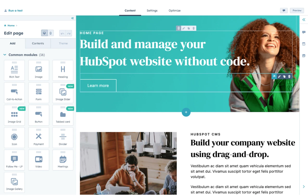
If you're starting from scratch, the first element that I recommend adding is a grid. Grid systems create a baseline template for your layout. It sets the margins to a consistent length and creates a designated space to add each piece of content.
That way, you have an idea of what you’re going to add to this page, and as you continue to add more elements, they’re spaced out evenly by default.
HubSpot's Free Website Builder
Create and customize your own business website with an easy drag-and-drop website builder.
- Build a website without any coding skills.
- Pre-built themes and templates.
- Built-in marketing tools and features.
- And more!
Follow the “rule of thirds.”
The rule of thirds is a common design principle used in photography. However, it also can apply to web design as well.
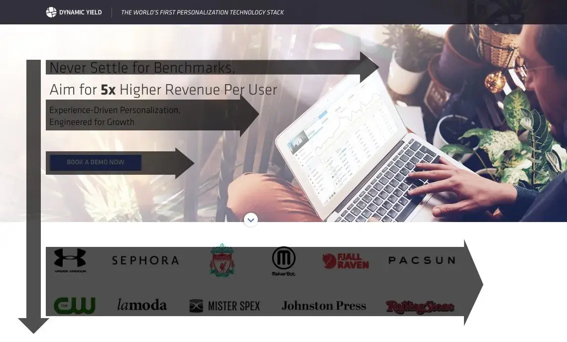
With the rule of thirds, your page is broken into three sections vertically as well as horizontally — giving you nine total sections. Here's an example from Trello’s homepage, over which I’ve placed rule-of-thirds gridlines:
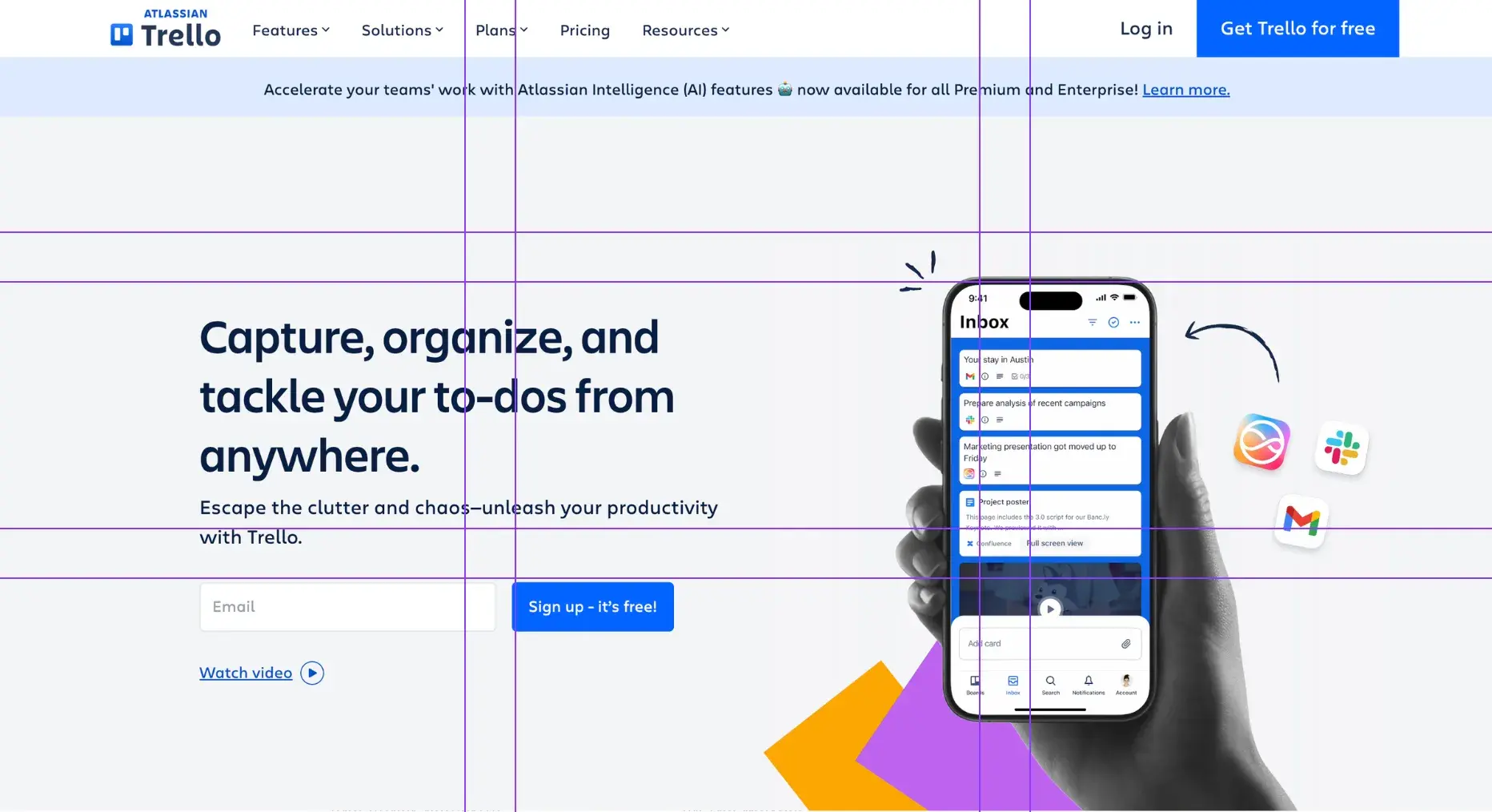
Following this rule, elements placed along the intersections of the gridlines will look more appealing to your audience than if placed perfectly in the center of the page.
This setup feels right to the viewer and can help you create webpages that direct your visitors' attention to the most important element on the page.
Use the negative space on a webpage.
Negative space, or white space, is the space between elements on your webpage. Too much space may make your page look minimal, and viewers might not be able to find what they‘re looking for.
Too little negative space will make your page feel cluttered and cramped, which can overwhelm the viewer and make it difficult to find the information they’re searching for.
Ideally, I recommend having a balance of negative and positive space on your page. Page elements should be spaced evenly, and it should be easy for visitors to locate the exact piece of content they're looking for.
Consider the “rule of odds.”
Similar to the rule of thirds, the rule of odds is another design principle used primarily in photography. It argues that people prefer to see an odd number of page elements versus an even number.
Typically, most designers go with three elements, as the outside two complement the focal point in the middle. But you can go with three, five, seven, or another number so long as the page still feels spaced evenly and directs attention to the center element.
Set a hierarchy for your content.
There's a reason why different pages have different layouts. Your homepage should look different from your individual webpages, and those pages may look different from each other, too.
Why? You should try to build your layout around the most important piece of content on that page. This creates a hierarchy that you can follow for the rest of the elements, so they’ll direct the viewer’s attention back to that main piece of content.
For example, let’s take a look at HubSpot's homepage, on which I’ve placed a rule-of-thirds grid overlay:
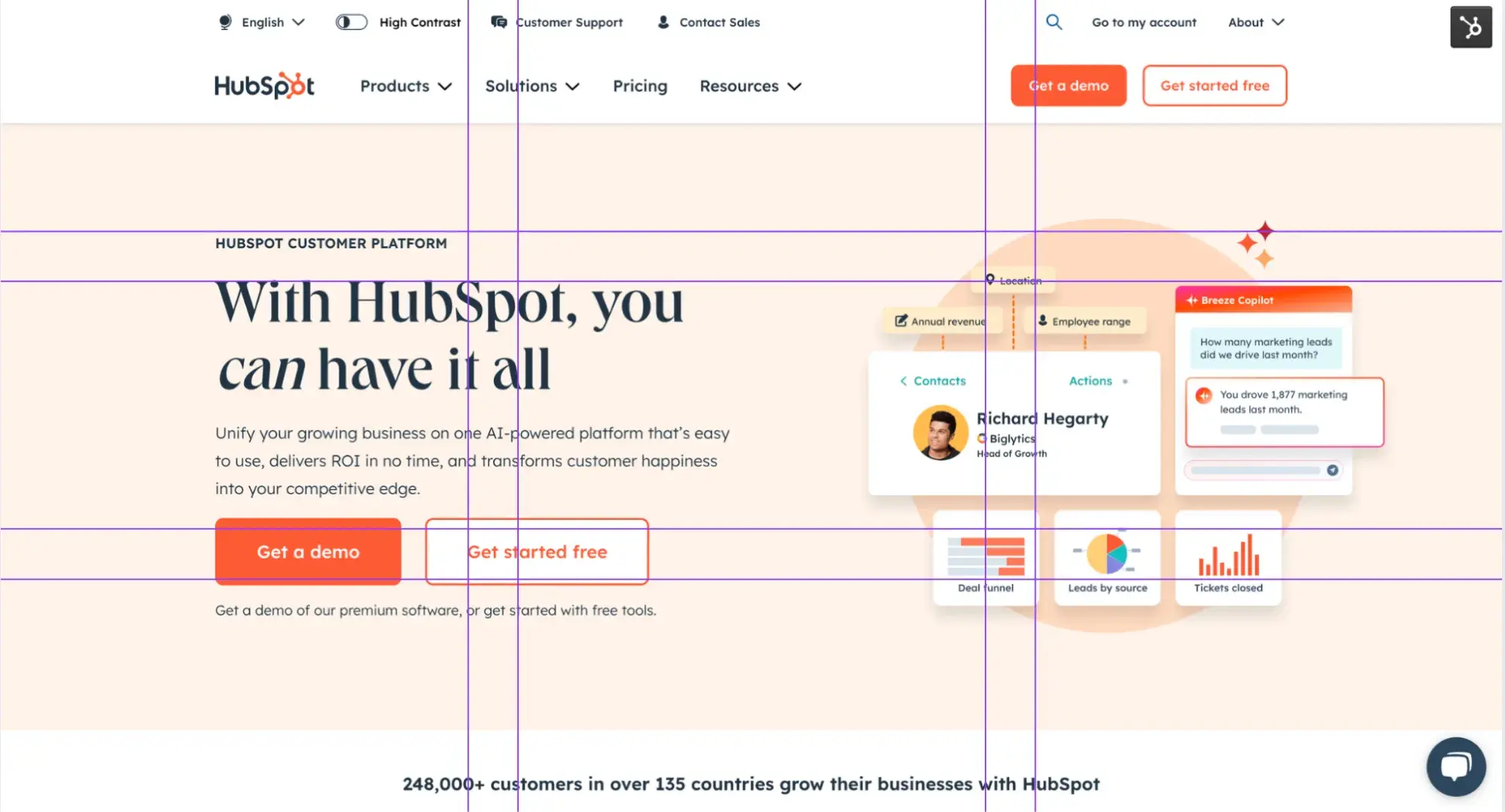
Making use of the rule of thirds, we created a hierarchy on the left side of the page. The headline “With HubSpot, you can have it all” is the focal point since it’s at the intersection of the gridlines. And since, in English, we read from left to right, it’s the first place our eyes land.
This then leads you to the next most important piece of content, which is the call-to-action (CTA), “Get a demo.”
If you're looking for more examples like this, I’ve curated a list of page layout design ideas below that you can use for your own website.
Why is website layout important? These statistics don’t lie.
- 61% of users said they‘ll leave a site if they can’t quickly find what they're looking for. (Google)
- 94% of people say easy navigation is a website’s most important feature. (Clutch)
- 83% of visitors appreciate a website that looks “attractive” and “up-to-date.” (Clutch)
- 66% of mobile sites put tappable elements too close together, making it harder for the visitor to use. (Baymard)
- The number one web design mistake that SMBs make is a crowded website, according to 84.6% of web designers. (GoodFirms)
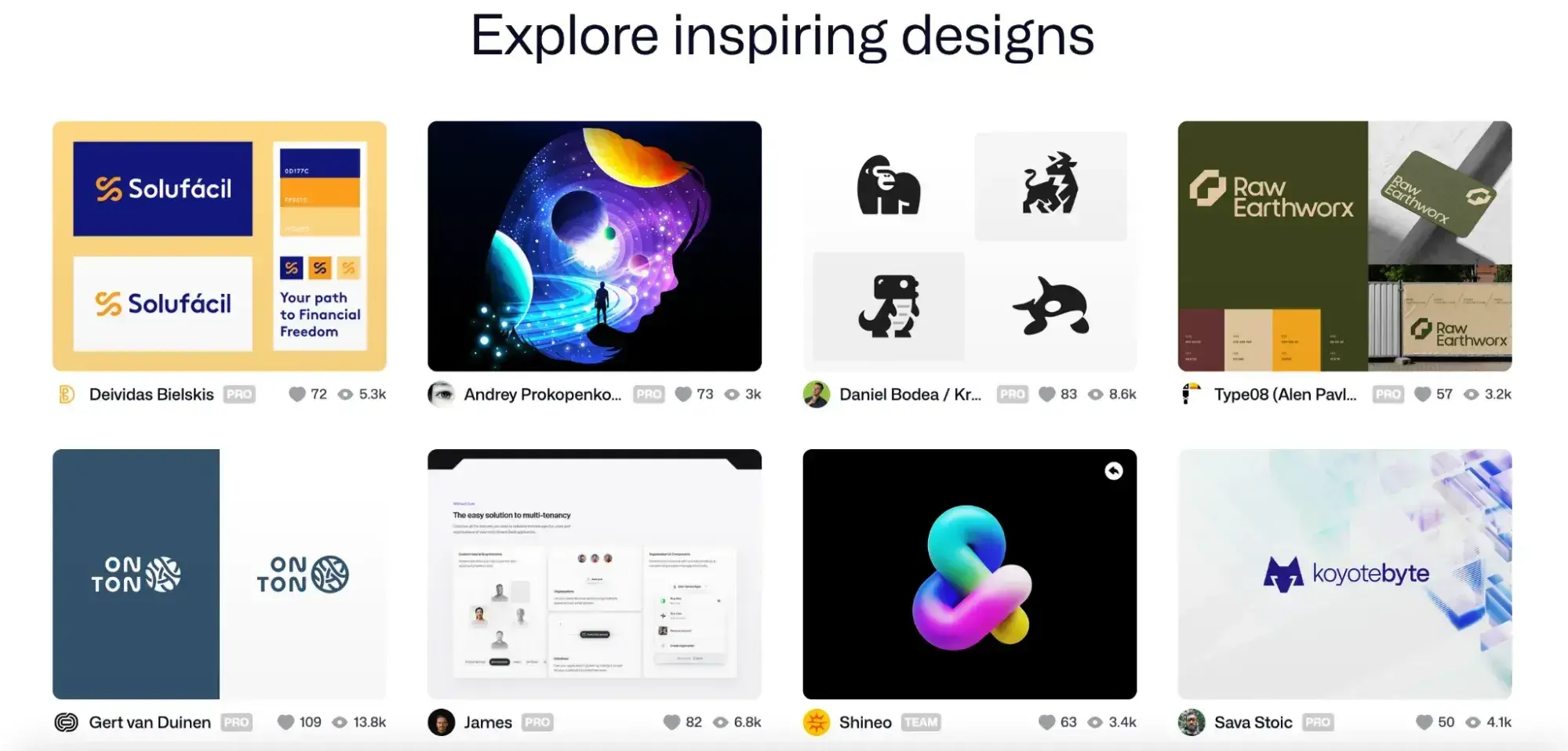
Page Layout Design Ideas to Inspire Your Next Website
I'm not exaggerating when I say there are tons of layout designs that you can look at for inspiration. Below are some of the most popular ones, and I broke them down into specific categories so you can look at homepage designs, single-page website designs, landing page layouts, and more.
Homepage Layout Design
A good website layout starts with your homepage. It's the “front door” of your digital business, and with the right website layout, viewers will learn about your company, values, and offers without feeling overwhelmed. These examples will give you layout ideas to apply to your own website.
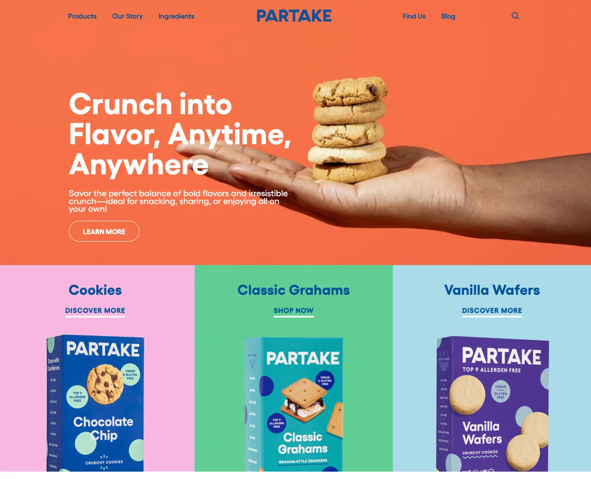
1. Full-Screen Hero Image
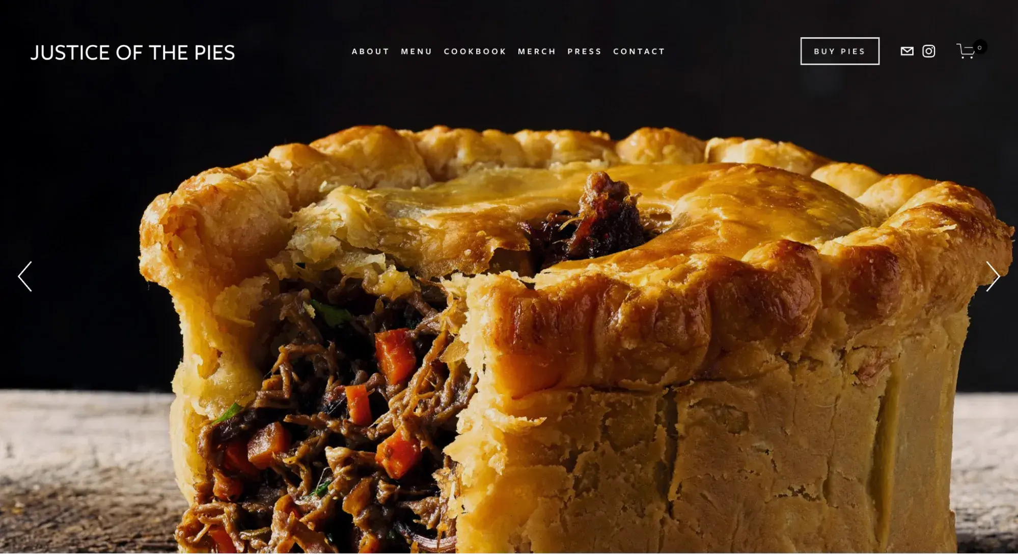
A full-screen hero image layout uses an image (or video) as your main background and fills the visible page/is above the fold. Text, navigation features, and CTAs typically are overlaid on the image.
This captures your audience’s attention immediately as they’ll see a bright, vibrant image at the forefront of your homepage.
Pro: With the right product (like the delicious pie in the screenshot above), a photo is the best sales tool for a stellar homepage.
Con: Not all businesses sell products or services that lend themselves to beautiful photography. Software, for example, might be challenging to convey through a photo.
When to Use This Page Layout
Businesses that sell visually appealing things like food, furniture, artwork, home decor, or travel planning services can really benefit from some high-quality and eye-popping images.
I think a full-screen background image is a great way to grab someone‘s attention. It’s hard to ignore and can really make your products and services stand out.
A full-screen video background can inject some POP into your homepage. In this example from Pinkanova, users can view different bits of information about the production company by clicking on the tabs on the right, left, top, and bottom of the page.
Pro: A video background (paired with creative tabs, like the above example) creates a unique and memorable website.
Con: Full-screen videos don't always translate well on smaller devices. I recommend testing before publishing this site layout. It can also add to your page weight.
HubSpot's Free Website Builder
Create and customize your own business website with an easy drag-and-drop website builder.
- Build a website without any coding skills.
- Pre-built themes and templates.
- Built-in marketing tools and features.
- And more!
When to Use This Page Layout
The best full-screen video backgrounds are the ones that seem to loop continuously without drawing attention to themselves. For example, the video in the example runs endlessly without having to manually reboot the video or watch an awkward filmmaking cut that sends you from the end back to the beginning.
2. Card-Based
A card-based layout showcases multiple elements on your homepage using different cards or boxes. This creates even spacing between content and makes it easier for visitors to locate a specific webpage or blog post.
Pro: Content-heavy websites get to show off knowledge or product depth at a glance.
Con: If the photos are all the same size, there's a lack of content hierarchy.
When to Use This Page Layout
A card-based website layout is ideal if you’re showcasing products or have a series of blog posts that you want to share with your audience. I like that it’s easy to navigate and allows you to promote several pieces of content at once.
3. Masonry
Similar to the card-based layout, the masonry layout also uses boxes to showcase content. However, rather than having the boxes stacked neatly and evenly in a row, this layout keeps things interesting by generating boxes of different shapes and sizes that fit together seamlessly.
Pro: You can showcase many pieces of content at once without overwhelming viewers.
Con: The lack of hierarchy can reduce conversion rates.
When to Use This Page Layout
If you want to showcase an image gallery, the masonry layout is an excellent choice. Not only is it ideal for publishing an array of high-quality images, but it also makes each image stand out because the size and shape of the box vary from image to image.
4. Grid Breaking
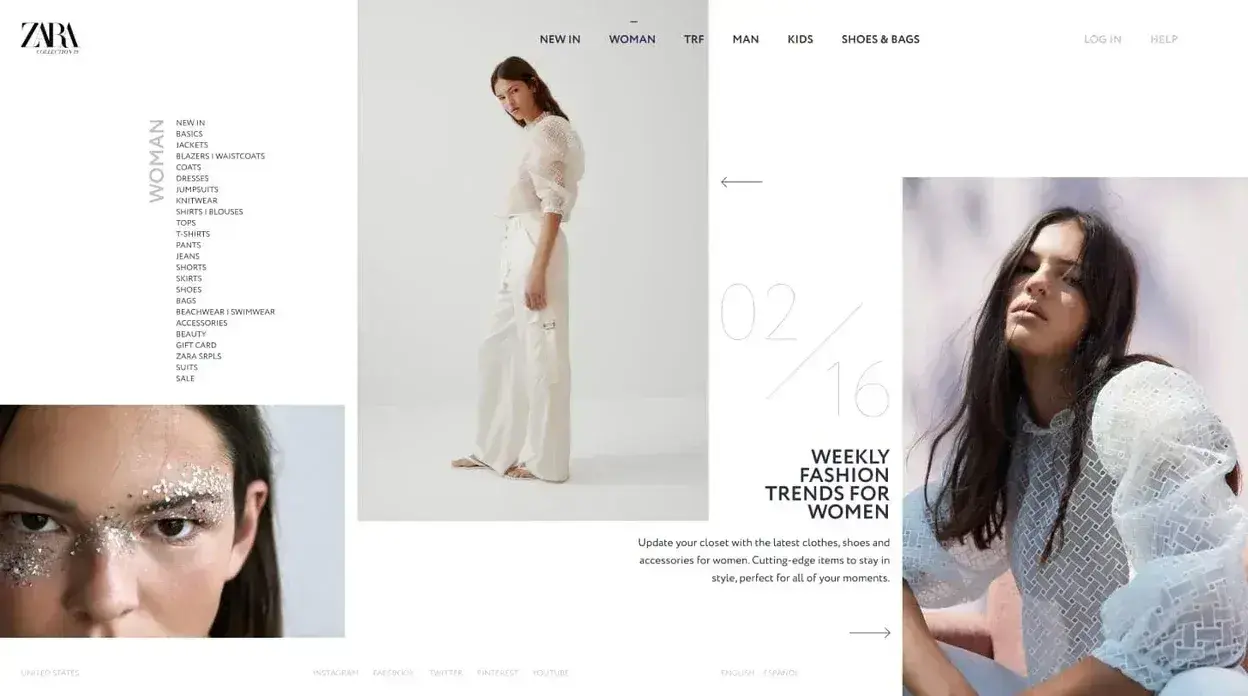
A broken grid layout is a rule breaker. But that doesn't mean it throws all of the conventions of grids out the window, but rather tweaks them and takes liberties when possible.
The example above is from Zara, where the columns vary in size and sometimes overlap each other.
Pro: Asymmetrical layout templates create visual intrigue and are perfect for artistic or creative websites.
Con: If your visual elements aren’t strong enough or you’re using stock photography, this layout can come across as random to the viewer.
When to Use This Page Layout
When done correctly, broken grid layouts can add a modern look to your site. However, depending on the CMS platform you're using and your level of website development expertise, designing the perfect broken grid layout may take some time.
5. Portfolio
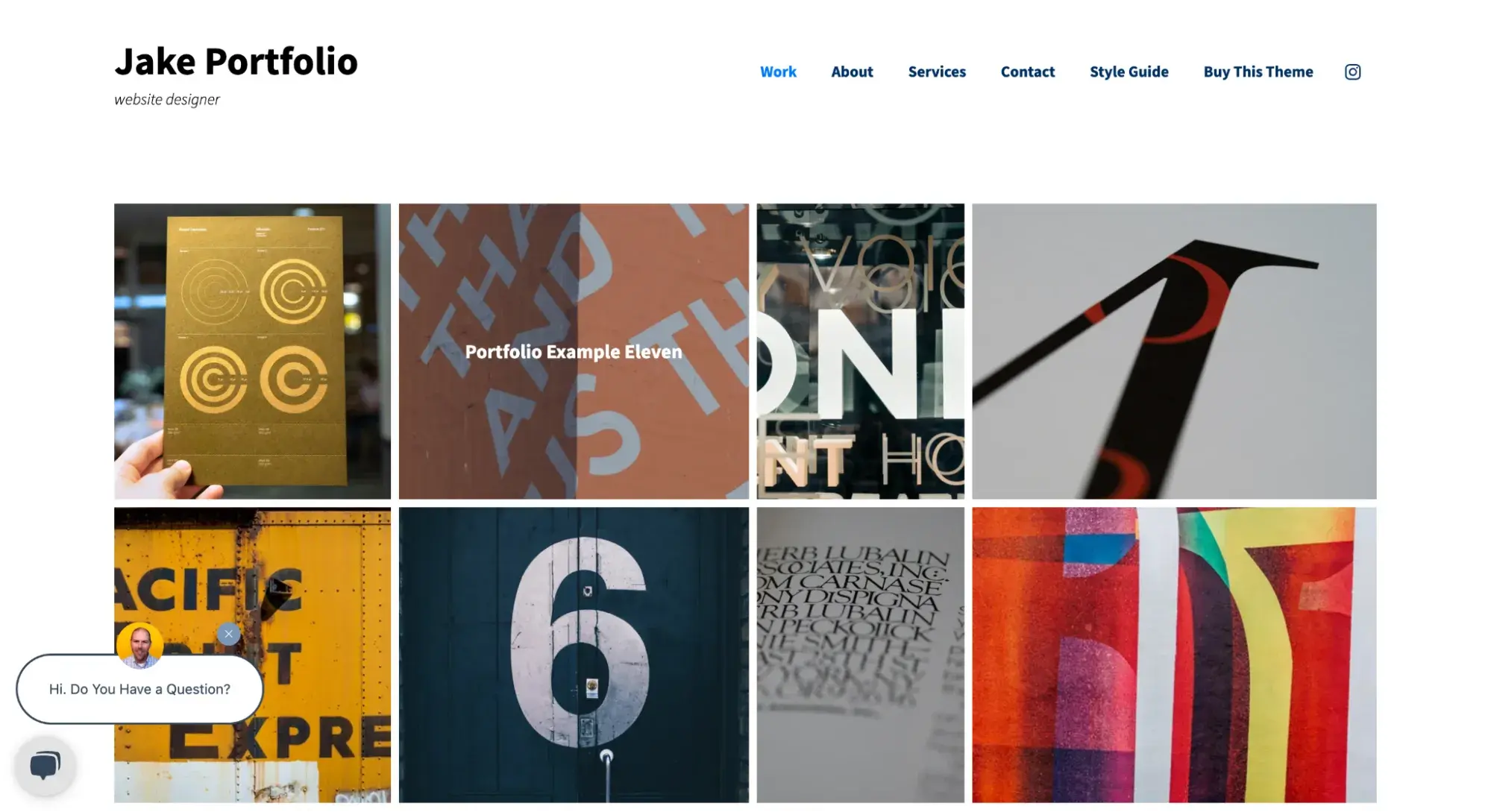
This is just one example of a portfolio layout. However, there are a few approaches you can take with these types of websites. In this example, the designer used a grid layout to prominently showcase work.
Pro: Portfolio website layouts let you showcase depth of expertise beautifully and encourage site exploration.
Con: Your hook (either imagery or headings) needs to be strong for this to persuade viewers to click.
When to Use This Page Layout
If you're an artist, freelancer, or digital marketer, you might want a website to showcase your work. In this case, having a portfolio layout will allow you to not only show off your work but also provide contact information so viewers can get in touch with you.
6. CV or Resume
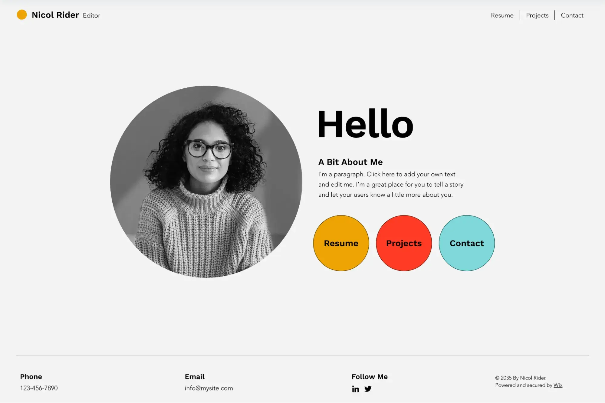
Similar to a portfolio site, a CV or resume layout is designed to sell your services or work. But unlike a portfolio layout, a CV layout is more pared-down, focuses less on imagery, and focuses more on you as a person.
As you can see in the above example, many CV websites are simple — not long, scrolling sites. They typically feature a prominent headshot of the website owner, a brief description of what services they offer, and links to pages that dive into more detail on their resume, projects, and contact information.
Pro: CV layouts are simple, so they keep the focus on you and what you do.
Con: It can be tough to sell your services when you’ve got such limited real estate.
When to Use This Page Layout
If you’re a one-person business selling services, or you’re just looking for a job, a CV site is the best way to make sure you and your experience shine.
7. Three-column
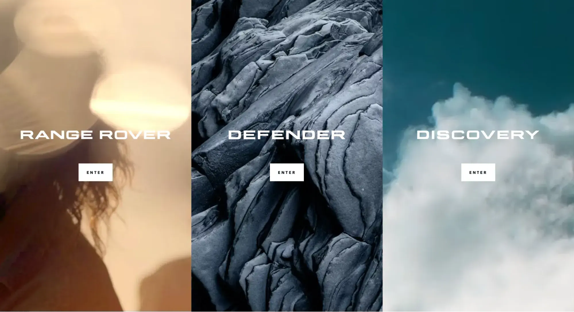
The three-column website layout follows the rule of thirds to a tee, with each vertical gridline creating three distinct sections.
This Land Rover homepage is a great example of how a brand can use a three-column layout to showcase its line of products.
Pro: Because it perfectly follows the rule of thirds, the three-column layout can be extremely appealing to the eye.
Con: Each section can end up being quite narrow, and then on mobile, it might not work visually at all. You might end up stacking the three sections vertically instead (which is what Land Rover does on its mobile site).
When to Use This Page Layout
If you just so happen to have three lines of products or three different services, this layout will work well for you. But even if you don’t, you can use this layout to structure your page content in a visually pleasing way.
8. Circle-Based Website Layout
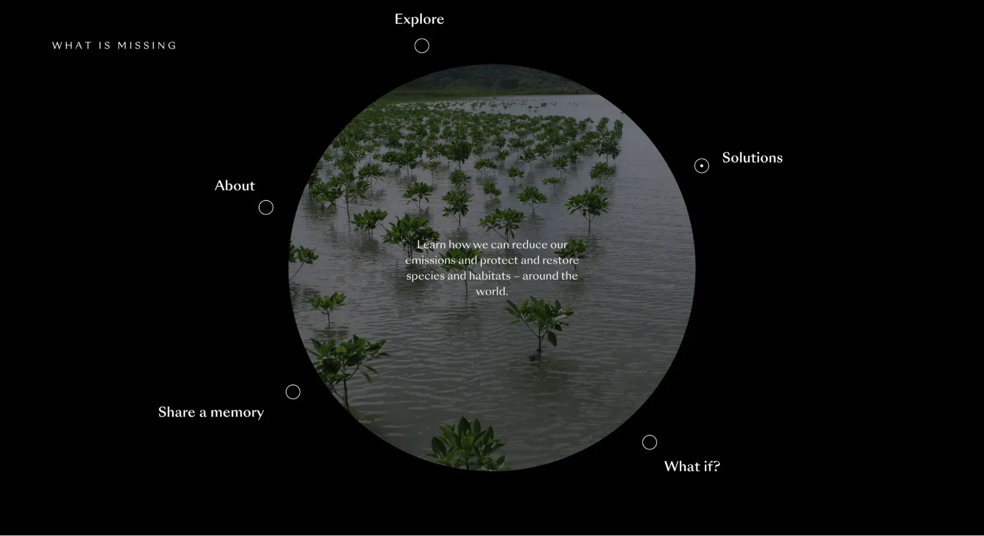
The circle-based website layout is rare to find in the wild, but it’s out there. And it catches the eye because it breaks from convention.
While most websites are based on rectangular shapes, the circle-based layout incorporates circular elements and might even make it the main focal point.
Pro: Circles are guaranteed to be an eye-catcher and can add a playful or softer touch.
Con: Circular elements are seen as trendy in the web design world, so if you choose this layout, it might look outdated if/when the trend passes.
HubSpot's Free Website Builder
Create and customize your own business website with an easy drag-and-drop website builder.
- Build a website without any coding skills.
- Pre-built themes and templates.
- Built-in marketing tools and features.
- And more!
When to Use This Page Layout
If your brand is more progressive, a circle-based website layout might suit you. It stands out from the crowd and shows you’re not afraid to take risks.
On the other hand, depending on the content of your site, circles can add a softer tone than the sharp angles of rectangles.
One-Page Layout Design
Sometimes, you don’t need an expansive website for your business. Maybe you’re a freelancer building a portfolio site or a production company promoting a film. Either way, for some companies, a simple, one-page layout design is all you need for an effective website.
Let's take a look at a few examples below.
9. Split-Screen
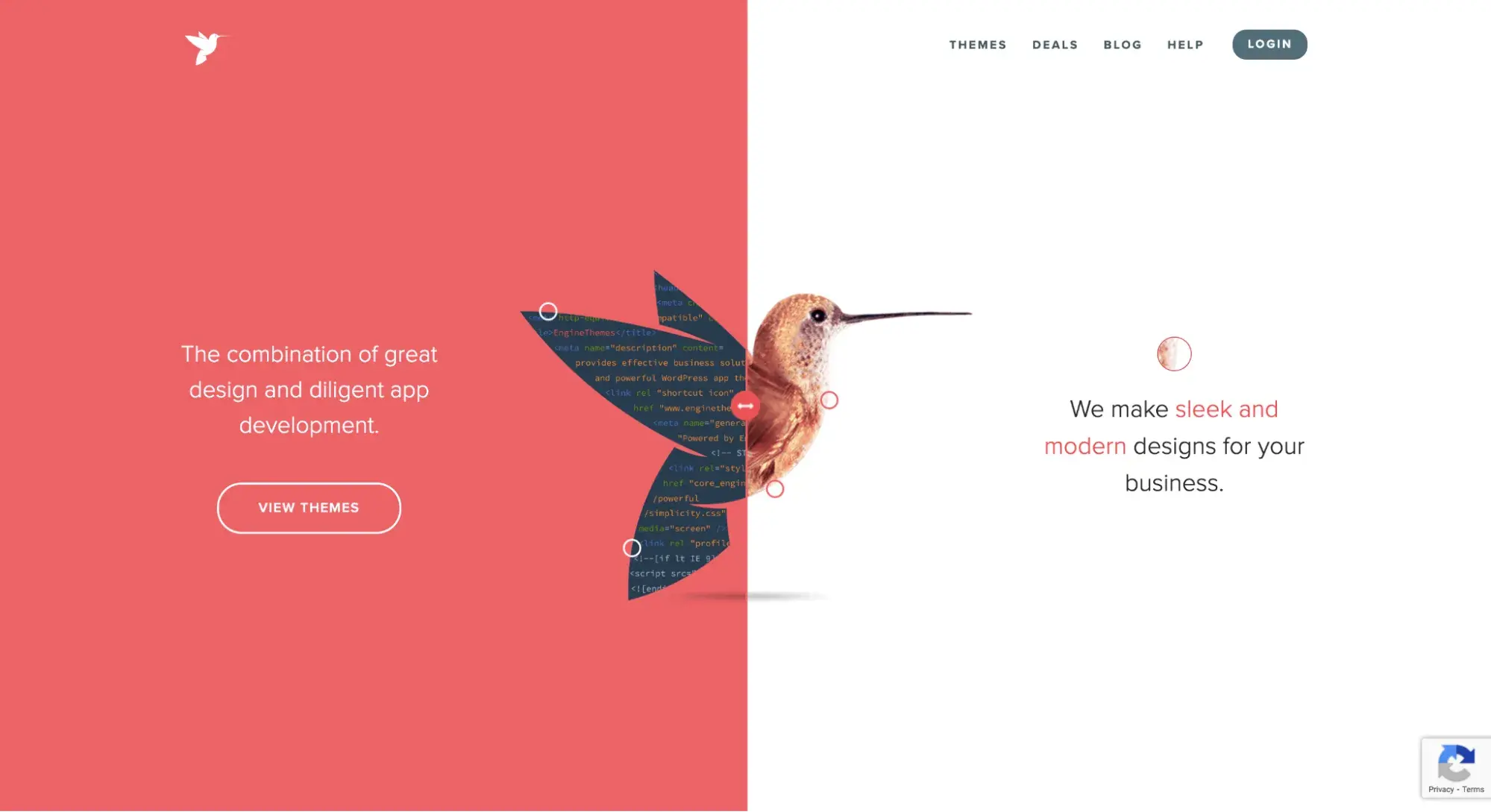
A split-screen layout divides your site into two halves. This is an eye-catching layout that creates a two-tone background on your homepage. You can keep this division as the reader scrolls, or alternate it to keep visitors on their toes.
Pro: It's attention-grabbing and highly visual, perfect for displaying one product or one CTA.
Con: The split-screen layout isn't as strong on mobile devices.
When to Use This Page Layout
Split-screen designs are ideal for any type of website. They create a modern look and can easily match your brand's color palette.
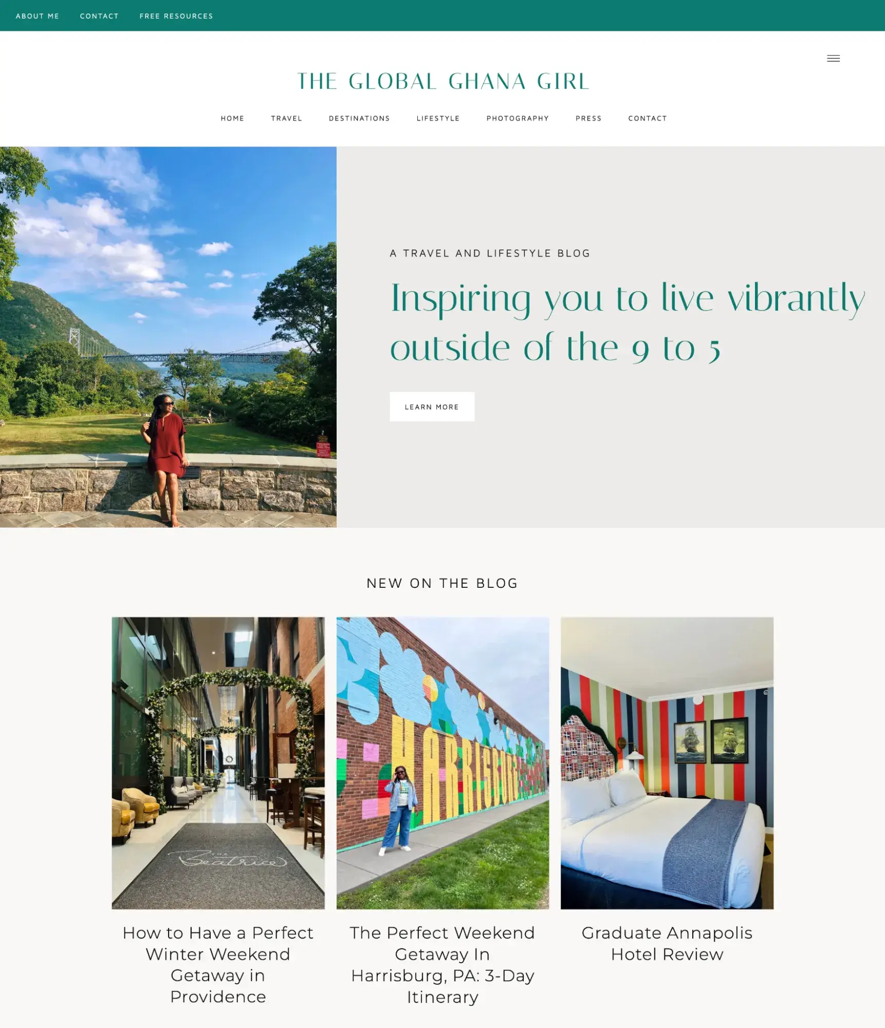
10. Hero Section With Three Columns
A three-column hero layout includes a banner image at the top of the page, along with three columns located directly underneath it.
Pro: The hero image with three columns maintains page hierarchy while still displaying multiple types of content for viewers to choose from.
Con: Conversion rate may be lower with the split layout because viewers' attention is divided among columns.
When to Use This Page Layout
This page layout is fairly common and can be effective for nearly any type of website or webpage. I’ve seen blogs use this layout to have a featured post or call-to-action in the hero section and then different categories or posts in the three columns below.
11. Text-Only
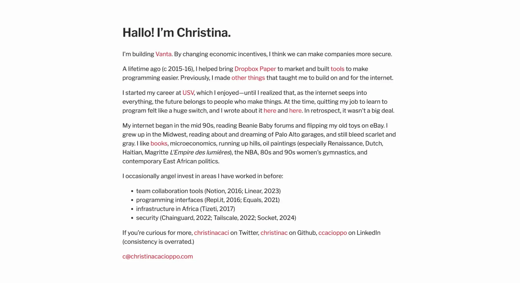
A text-only layout uses — you guessed it — only text on the webpage. It's the ultimate minimalist’s dream, and the pages tend to look similar to a Google or Microsoft Word document.
Pro: Simple copy website layouts are quick to make and don't require any complicated design elements. Plus, because they’re not weighed down by images, they’re super fast to load.
Con: Your copywriting needs to be strong enough to stand alone without imagery.
When to Use This Page Layout
If the focus of your website is words, this is the layout for you! Perfect for blogs.
Also, if your website's content is simple and straightforward, you might be interested in this page layout. Pages are remarkably easy to create as there are very few CSS or HTML elements. This is ideal for beginner web designers looking for a basic layout to test their development skills.
Landing Page Layout Design
Since landing pages are where you send visitors when they click on an ad, opt to subscribe, or take you up on another offer, it’s important to create webpages that are laser-focused on the content the visitor is expecting. Check out effective layout ideas that do just that below.
12. One-Column
A one-column landing page centers the text in the middle of the page layout. Below it is a CTA that directs users to your offer. It's simple and straightforward, improving your chances for conversion. Use our free landing page builder to build your own page today.
Pro: A one-column layout keeps viewers focused and concentrates on conversion.
Con: The timing and content of your text and images are important to keep readers on the page.
When to Use This Page Layout
When your main goal is to convert, the one-column landing page is your workhorse. This layout helps you get right to the point of your marketing message. You can add some enticing copy at the top of the page and follow it up with a clear CTA at the bottom.
13. Two-Column Website Layout
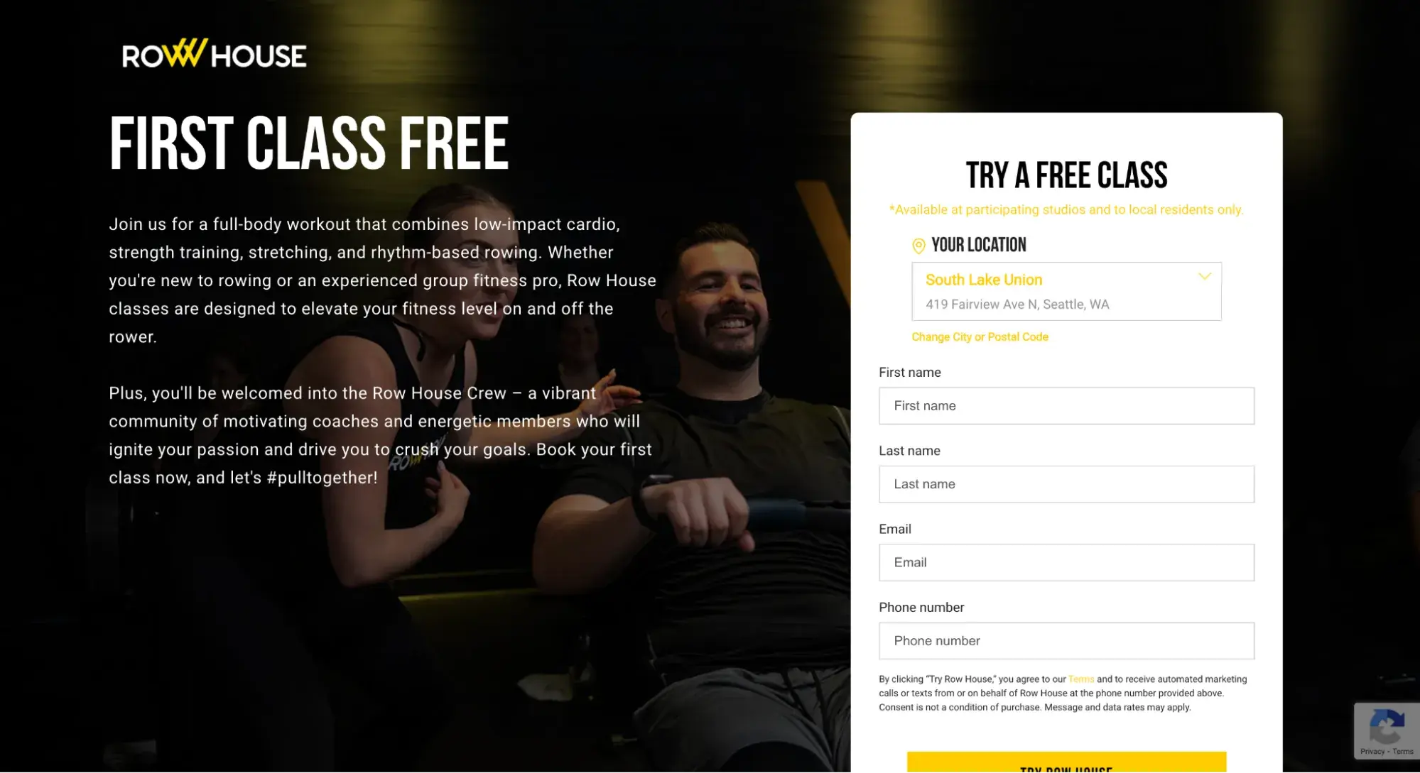
The two-column website layout, like in the Row House example above, typically has a headline on the left (since that’s the first place the visitor’s eyes go) and a registration form or other CTA on the right.
The Row House landing page also takes advantage of the rule of thirds to draw your eyes right to where it wants them.
Pro: Two columns lets you fit more content horizontally on a the desktop version of a site. It also gives you the option to create a sticky form that stays with the visitor as they scroll down the page.
Con: Because there tends to be more information in one glance, it can be distracting. Also, on mobile, it’ll just end up being a single column.
When to Use This Page Layout
If you want to convert visitors into leads but want to add a bit more visual intrigue, the two-column layout can be more appealing.
14. Coming Soon
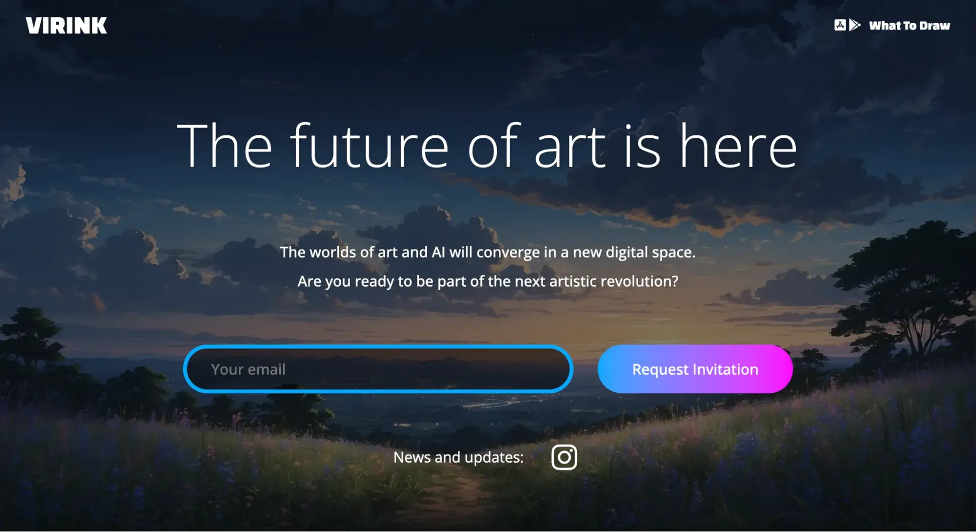
Designed to build hype pre-launch, the coming soon page layout is typically a single page with a headline, minimal body text, little to no scrolling, and a lead capture form.
Pro: Because it’s so simple, it’s easy and quick to build. Plus, it can be a lead-generation machine since that’s really the only thing the visitor can do on this type of page.
Con: It’s challenging to build excitement when you don’t have the product to show yet. So your copywriting needs to be exceptionally strong.
HubSpot's Free Website Builder
Create and customize your own business website with an easy drag-and-drop website builder.
- Build a website without any coding skills.
- Pre-built themes and templates.
- Built-in marketing tools and features.
- And more!
When to Use This Page Layout
If you still need time to build your full-fledged website, product, or service, don’t just leave your website blank. Get the domain name and put up a quick coming soon page so you can at least capture leads before launch.
15. Asymmetrical
An asymmetrical page layout divides your page into two sides, with one containing a high visual weight and the other containing a low visual weight. In this way, they actually balance each other out.
In the above example, the page’s left side is visually “lighter” due to ample white space and minimal text. That is counterbalanced by the visually “heavier” image on the right side.
Pro: Asymmetrical layouts are creative and engaging to look at.
Con: The impact is lost on mobile when the design elements are rearranged into a vertical format.
When to Use This Page Layout
This layout can be used for pretty much any landing page. At HubSpot, we use it for our product offering pages, where we place an image of the product on the right and a CTA on the left. You can see how we do this with Content Hub here.
16. Z-Pattern
The z-pattern directs viewers’ attention to alternating sides of a page, as though forming a “z.”
As you can see from the example above, visitors read the page header first, then move right to the CTA button, and continue down and to the left to another CTA button.
You can continue this pattern as much as you'd like throughout the page to keep visitors interested in your content.
Pro: The z-pattern layout mimics the natural path of the human eye, making it feel very readable and easy to skim.
Con: This layout contains more text and images on the page, which can lower conversion rates.
When to Use This Page Layout
I find the z-pattern is perfect when you want to educate customers about your product, service, or offering. You can add quick, need-to-know information next to the sign-up form.
You can then provide a more detailed explanation below it. The alternating pattern keeps visitors engaged and invested in the rest of your page as they scroll.
Blog Post Layout Design
Website layout can take many unique forms, as we saw in the homepage examples. Layouts for blog pages can be even more varied. Asymmetrical layout templates are embraced, and designers fight hard to keep users' attention as they read long-form articles. Here are common layouts that you should consider for your blog.
17. F-Shaped Layout
The F-shaped layout is effective because it appeals to how most people read a webpage. You start at the top of the page, reading left to right, and then you make your way down, repeating the process.
Pro: An F-shaped layout delivers a lot of information in a skimmable format.
Con: If your messaging is unclear, this format will feel unfocused to readers, and your conversion rate could drop.
When to Use This Page Layout
The F-shaped layout works well with pages that have a lot of text or images. Take, for example, the website above.
After reading about the product, you can see which companies are using it in the section below. Although there are over 10 companies featured in this section, you can quickly scan through them as you work your way down the page.
18. Blog Listing Page
Blogs typically have two page templates: one for individual blog posts and the other for the blog listing page. The blog listing page is like a homepage for your blog posts, where readers can see the most recently published posts and browse through older posts as well.
Pro: Having a centralized blog listing page helps create a magazine effect with your long-form content and will encourage readers to click around.
Con: If your blog is an afterthought and doesn't help sell your products, this will distract from the overall message of your website.
When to Use This Page Layout
Unless you have an RSS feed on your website's homepage, you may want a blog listing page to act as a central hub for your blog content. This will give readers a formal place to access recently published posts and subscribe to your blog.
19. Categorical
This blog listing page uses categories to organize its content. This makes it easier for users to find specific blog posts related to an individual topic. Categories are listed on the left and results are filtered as more criteria is selected from the sidebar.
Pro: A categorical page layout engages viewers by letting them select the most relevant and interesting content.
Con: If you haven't formatted your content correctly (such as adding tags, categories, etc.), the results will be too vague or will be missing important pages.
When to Use This Page Layout
This is an ideal layout if your blog hosts educational content. You can create lesson-type blog posts that are grouped together, creating courses for your readers to follow.
20. Magazine
The magazine layout mirrors a traditional newspaper or hardcopy magazine. It's organized into columns and there are several options for finding content on the page by section or topic.
Pro: No format displays written content as well as the magazine layout. Paired with strong images, the magazine layout will turn your website into a bingeable outlet for readers.
Con: If you display content that's thin, old, or outdated, readers could quickly lose interest in browsing.
When to Use This Page Layout
If you're managing a news website or writing about the latest trends and events, I think the magazine layout is an excellent choice for your blog. The multiple columns allow you to promote several pieces of content at once, and the search features make it easy to find content that you previously published.
Free resource: If you need additional ideas, check out 77 more examples of brilliant website layouts, from homepages to landing pages to blogs.
How to Choose the Right Page Layout Design
Which layout idea is right for you? That depends largely on three factors:
- Your buyer personas
- Your website goals
- Your content
I’ll walk you through a three-step process that will clarify which page layouts are best for your business.
HubSpot's Free Website Builder
Create and customize your own business website with an easy drag-and-drop website builder.
- Build a website without any coding skills.
- Pre-built themes and templates.
- Built-in marketing tools and features.
- And more!
Step 1: Define your buyer personas.
While it’s tempting to choose a website layout based on what looks good, you need to begin by asking, “Who am I trying to convert?”
The more you can humanize your visitors, the better you can serve them because you’ll keep your website layout user-centric.
To create a buyer persona (not to be confused with an ideal customer profile or ICP), consider the following characteristics:
- Age
- Industry
- Education level
- Job title
- Challenges they face
- Tools they use
Pro tip: There’s so much more to think about to create fully fleshed-out persona. This free Make My Persona tool makes it easy.
Step 2: Map out their journey.
Now that you have your buyer persona(s) in mind, it’s time to map out the journey they’ll take from the second they land on your website to the point of conversion (booking an appointment, buying a product, etc.).
I learned this one from award-winning web design agency founder Matt Sullivan, who shared his design process with HubSpot.
He begins the sitemapping process with this question: “What is the best thing that could possibly happen when someone lands on your website?”
So, whether you want them to book a call with you, purchase a course, or subscribe to your email list — that CTA should be at the top of the visual hierarchy in your website layout.
To do this, Sullivan uses Whimsical to map out the user’s journey, taking into account both macro and micro conversions.
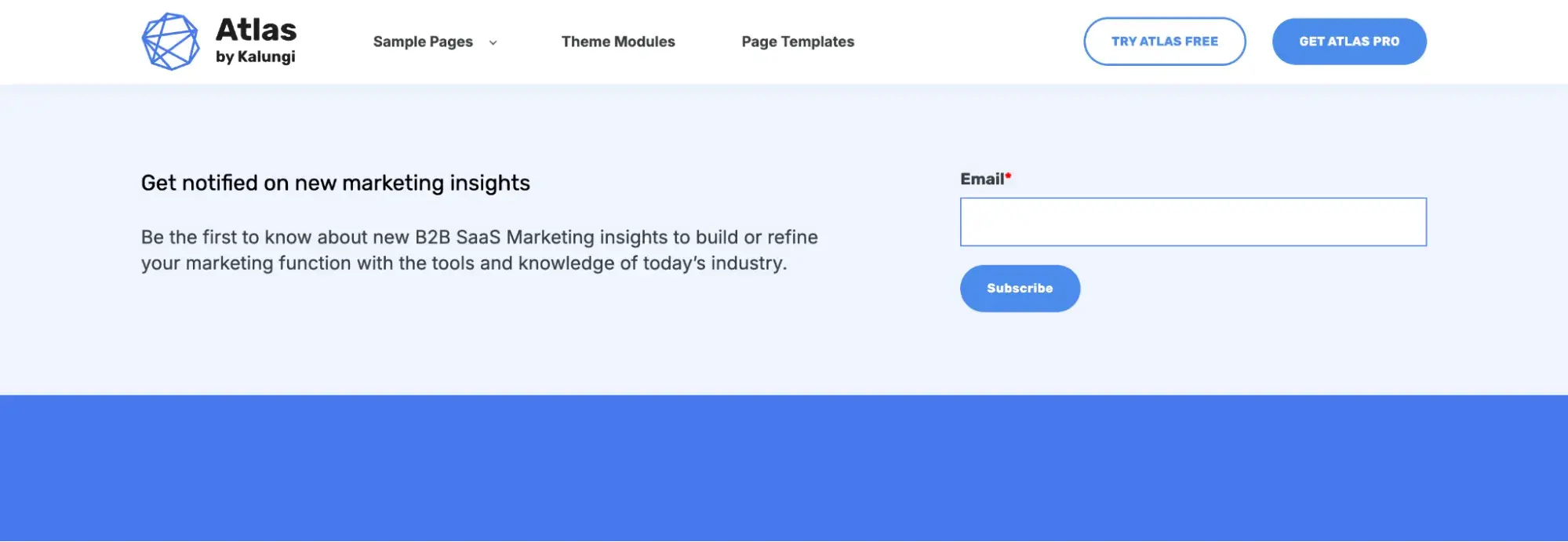
So, for example, if signing up for your product is the main CTA, but joining your email list is secondary, you might choose a layout like the free Atlas website template below. “Get Started” is a prominent blue CTA button in the hero section.
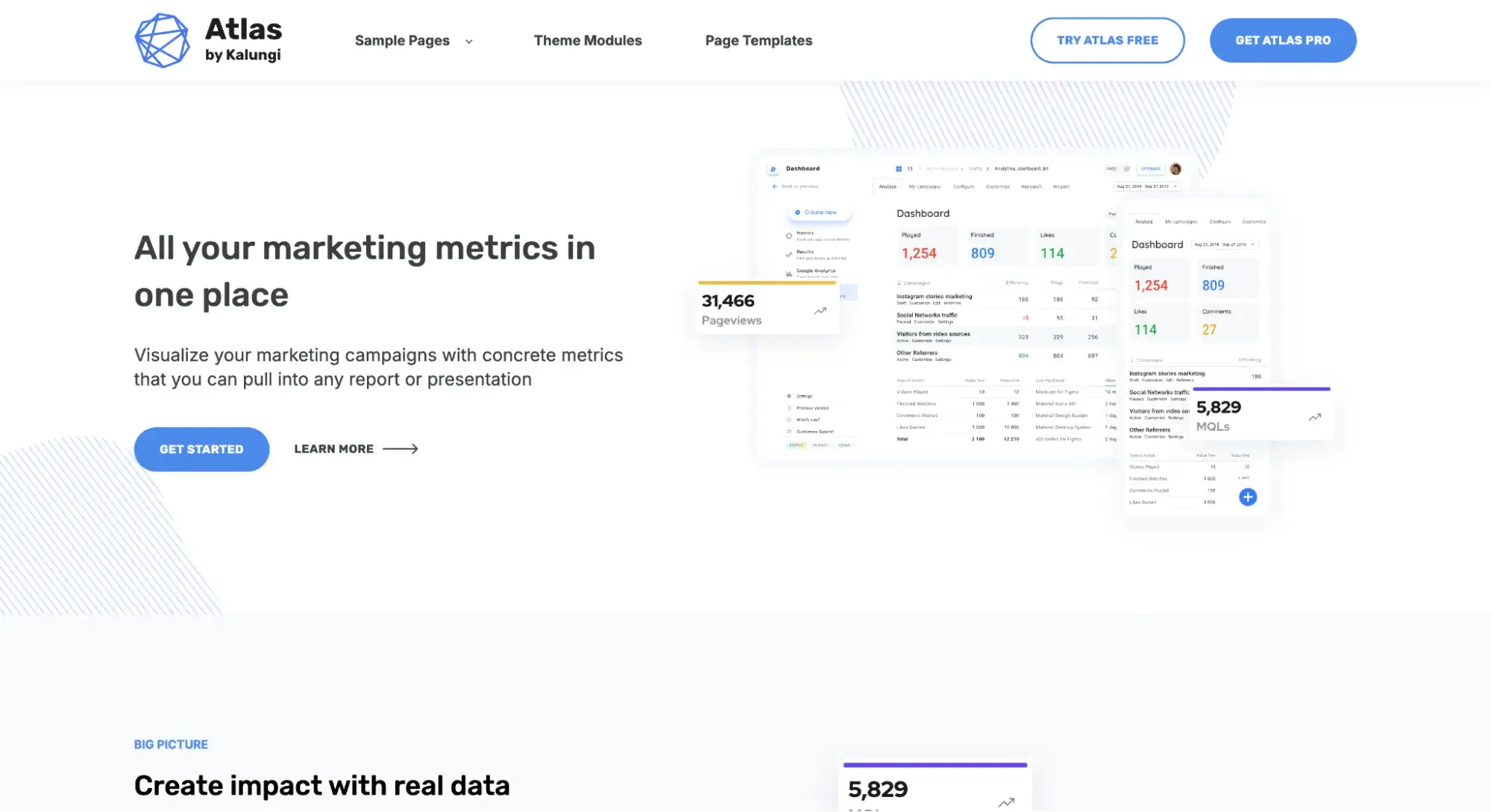
And when you scroll down to the bottom of the page, “Subscribe” is a secondary CTA just above the footer.
Your website layout should be informed by what you want your readers to do. Otherwise, you might accidentally choose a layout that limits your growth.
HubSpot Senior Staff Writer Amy Rigby has built blogs for over a decade. She knows this conundrum well.
“When I was a travel blogger, I made money partially from display ads on my site. So, I wanted my readers to see and click those ads. Because of that, I knew that the individual blog posts needed a two-column layout so I could have a sidebar,” Rigby says.
“Display ads in the sidebar were ‘sticky,’ which meant they stayed with the user as they scrolled, resulting in more ad revenue for my business. If I’d chosen a single-column layout, that would’ve hurt my bottom line because I wouldn’t have been able to display sidebar ads.”
Step 3: Consider your content constraints.
I know that earlier I said that layout deals with the position of elements on a page, not content. However, like it or not, your content will influence your layout.
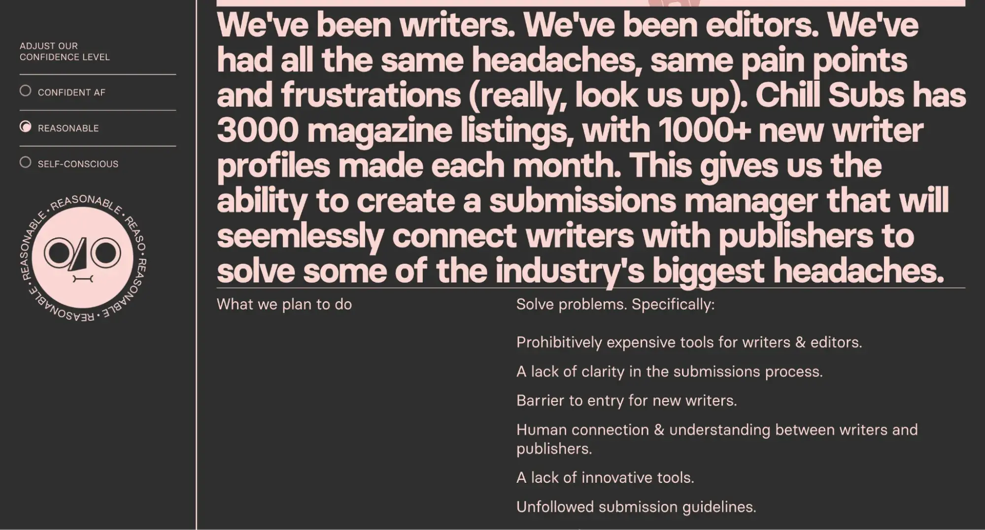
For example, if you sell something that isn’t highly visual, such as a SaaS tool, you might opt for a text-based layout like Chill Subs does in the example below.
But if you’ve got a business that’s very visual, like a travel blog, you might want the full-screen hero image layout. This is yet another layout aspect that Rigby has had to consider throughout her website-building career.
“Content definitely plays a role in the layouts I choose,” Rigby says. “Visitors to travel blogs want to see lots of photos when they’re planning a trip, so for my travel blog’s homepage layout, I chose a website template with a full-screen hero image slider and an image grid beneath that.
“It allowed me to grab my readers’ attention with a variety of high-res photos from my trips.”
This image-heavy website layout didn’t work for her other businesses, though.
“On the other hand, I had a site where I wrote about blogging tips,” she says. “That did not lend itself well to photography, so I knew I couldn’t lean on that in the layout.
“For that site, I chose a homepage with a static hero image section and simple blog post listings beneath that because I knew I wouldn’t be showcasing photography.”
What are some other factors to look at when choosing a website layout? Here’s what I would consider before designing from scratch or choosing a template:
- Your persona’s primary screen size. Focus your design on your readers' preferred screen sizes (while still formatting and testing on other devices).
- How they'll use the site. Websites with lots of written content will want to include search bars, white space, easy navigation links, and more in the user experience.
- What you hope they'll do. A blogger hopes the viewer will click around and stay on their webpage as long as possible. Business websites hope people will place an order. Educational sites hope that viewers will sign up for a trial lesson. This will help you determine your content hierarchy.
With these questions answered, I would then:
- Choose your best layout. Looking at the above website layouts, choose your website's structure.
- Test with real readers. You’d be shocked how many companies don’t test their websites with their audience (even when the need seems obvious). For example, many companies that cater to retired individuals don’t meet older web users’ tech needs, and by not testing, they continue to lose viewers.
Here's how I would apply this insight to the website layout for a marketing blog:
- The viewer is a marketer.
- The screen size is desktop, but the design is responsive for mobile devices and tablets.
- They'll use the site to browse around between resources.
- I hope they'll read multiple articles.
- A good layout for this site is a categorical layout (layout #19).
- The blog post pages themselves will be a single-column layout for readability.
Website Layout FAQs
What are the four main parts of a website layout?
- Header: The header is the top navigation bar on your site. It typically contains your logo and links to your most important pages. It might even have social media icons and a CTA button.
- Hero: The hero is the above-the-fold section that often features an image or video, plus a headline and call-to-action. It’s the most prominent part of a homepage.
- Body: The body is the below-the-fold content of your website that can be filled with text, images, graphics, or videos.
- Footer: The footer is the very bottom of your site. At a minimum, it contains your copyright notice, privacy policy link, and terms and conditions link. It can also have an email subscription form, your logo, contact information, and links to the most important pages of your site.
How do you plan a website layout?
Planning a website layout begins by defining your buyer personas, website goals, budget, and timeline. Then, you need to map out your site architecture. You can do this with a tool like Octopus.do, which lets you create a visual hierarchy of your site’s pages.
The next step is wireframing, where you create the basic framework of each webpage without the actual content, such as copy and images, yet.
How should a website be structured?
A website should be structured based on your buyer persona, the action(s) you want them to take, and the content your website will contain.
Revisit the sitemap I mentioned in step two above. Make your site navigation so that it’s as easy as possible for your buyer persona to take the next step you want them to take.
How do I make a simple page layout?
By far, the easiest way to make a simple page layout is to use a website builder. You can typically choose from hundreds of templates and then drag and drop elements to rearrange the layout however you see fit.
Here’s a list of simple website templates to get you started.
Finding the Perfect Page Layout
It’s not enough to randomly select one of the most common layouts for your website and hope that viewers convert. Finding the perfect page layout is a more involved process, but it’s well worth the investment.
Perhaps over the course of this article, you’ve realized that your site needs a redesign. Don’t sweat it. Check out this free website redesign planning guide to get steps, budget and audit templates, and more to help guide you.
Once you achieve the right look and feel for your website, you have a better chance of growing your audience and converting more leads into customers. Use the ideas above to kickstart your search, and keep testing until you find one that works for you and your visitors.
Editor's note: This post was originally published in June 2021 and has been updated for comprehensiveness.
HubSpot's Free Website Builder
Create and customize your own business website with an easy drag-and-drop website builder.
- Build a website without any coding skills.
- Pre-built themes and templates.
- Built-in marketing tools and features.
- And more!


![15 Brochure Website Examples to Inspire You [+ How to Make One]](https://knowledge.hubspot.com/hubfs/brochure-website-examples-1-20250319-362228.webp)
![25 Webinar Landing Page Examples to Copy in 2025 [+ Design Tips]](https://www.hubspot.com/hubfs/Webinar%20Landing%20Pages.png)
![Creating a Web Design Contract That Keeps Your Project on Track [+ Expert Tips]](https://knowledge.hubspot.com/hubfs/web-design-contract-1-20250312-1603286.webp)