1. Website Responsiveness
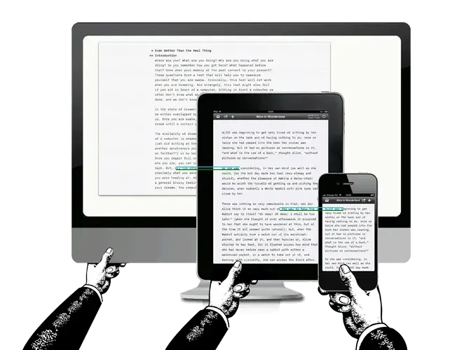
Whether you’re a professional or a novice designer like me, it is crucial that your website is fully responsive. Without a responsive website, you're isolating the many visitors who access your site via mobile devices. According to Statista, in January of 2024, over 60% of global site traffic was thanks to mobile devices (not including tablets).
How to fix it: Because you create a responsive website using flexible grids, I recommend starting there when it comes to making your fully responsive website. From there, you should focus on button placement, utilize scalable vector images, use legible fonts regardless of device size, and test the result.
2. Form and Function
It can be tricky to strike the right balance between aesthetic appeal and functionality. However, I have found you must do this to ensure your visitors get the most out of your site. Though it can be tempting to load your site up with graphics and flashy text, the result of doing so could be that your visitors won‘t be able to decipher where they’re supposed to be looking.
How to fix it: I suggest paying attention to the journey that your website presents. Consider mapping out your website‘s flow and each page’s goal. If you have an element or copy that doesn‘t further enhance the page’s mission, remove it from the page.
Then, you can go back in and add pops of branding as you desire, but be sure to use digestible fonts, present products intuitively, and prioritize simplicity.
3. Accessible Experience
Designing for accessible website experiences regardless of user ability or impairment should always be priority number one. I have found when you offer visitors an inclusive website experience, your business demonstrates its commitment to accessibility. That's both the right thing to do and can enhance brand loyalty.
Plus, there could be legal issues if you don't adhere to specific accessibility standards. (Psst: Website developers also mention this is one of their top challenges.)
Here's an example of how the HubSpot website creates an inclusive, accessible digital space by offering visitors the opportunity to toggle high contrast.
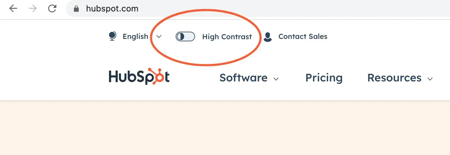
How to fix it: I've created a website accessibility checklist you can follow to make sure your site is up to speed with best practices. I've also rounded up 14 excellent, accessible websites to inspire you.
4. Load Times
I can‘t emphasize the importance of your website loading in a reasonable timeframe. Unfortunately, if your site doesn’t load quickly enough, it doesn‘t matter how great your content is — visitors aren’t going to stick around to find out. Check out these 11 statistics demonstrating exactly how vital page load time is.
How to fix it: There are plenty of strategies you can try to help your site load more quickly. Some of my favorites include working with a performance-optimized hosting provider, compressing your images, caching site pages, and reducing the number of redirects on your site.
5. SEO Best Practices
By now, I’m sure you‘re probably familiar with the importance of search engine optimization (SEO). One of the most frequent web design challenges is forgetting to build SEO into the site’s fabric.
How to fix it: I recommend ensuring your web designers use SEO best practices when building your website. This means appropriately using headings, prioritizing speed, using alt text for images, and making the site index-friendly.
6. User Experience
I know I sound like a broken record, but you must prioritize user experience because it could make or break a visitor‘s decision to return to your website again or look elsewhere. When considering your site’s user experience, evaluate the accessibility, ease of use, and convenience.
How to fix it: The good news? There are plenty of things you can do to fix user experience. Some of the most popular options include using white space, using effective CTAs, optimizing page speed, including images, segmenting information for organization, and differentiating hyperlinks.
7. Website Conversions
Ultimately, you can determine your website‘s success based on how well it converts. I’ve personally found some of the main reasons websites don’t convert well include the following:
- The information presented doesn't apply to visitors
- The website is difficult to navigate or doesn't flow well
- The buttons are not intuitively placed
For instance, take a look at the Apple homepage. When you land on the page, your attention is drawn to the center, where the designer places one colorful button that features the page's main call to action.

How to fix it: To boost the likelihood of your website conversion rates, I cannot stress this enough: it's essential to familiarize yourself with what users want and expect from visiting your site.
Once you understand this, you can begin to create content they‘re interested in. In addition, be mindful of how user experience impacts conversion rate and follow best practices (Think: Keeping paragraphs a reasonable length, using images, and choosing fonts that aren’t difficult to read.)
8. Intuitive Design
I understand how tempting it can be to create a website with unique navigation. But remember: When it comes to website design, functionality needs to be a top priority, or you risk losing many visitors.
How to fix it: Instead of getting creative with your navigation in terms of design, I suggest keeping it simple. Instead, let your copy tell your visitors the story you want to express. Remember: No matter how unique or eye-catching something is, visitors will drift away if it's not easy to follow.
9. Graphic Elements
Graphic elements are an excellent addition to websites for a myriad of reasons. They can break up the text, keep visitors engaged, enhance branding, and tell your organization‘s story. However, they can also add seconds onto your page load time — which doesn’t seem like much but can be make-or-break between visitors bouncing off your site and choosing a competitor's.
How to fix it: Some web design challenges are easier to fix than others, and this one falls into that category. I’ve found you can compress your images before you upload them to your website. Otherwise, your page load time suffers significantly.
10. Browser Performance
Just as you must guarantee your website looks great regardless of device size, it's equally crucial to ensure your site is aesthetically pleasing and performs well, irrespective of the browser.
For instance, older browsers like Internet Explorer might display your content differently because of their age. Users accessing your site on that browser could have a vastly different experience than those visiting on Google Chrome, for instance.
How to fix it: For starters, ensure you are using media types compatible with a wide range of browsers. In addition, I’ve found testing your content to ensure it looks great and performs on older browsers is a worthwhile time investment.
11. Limited Resources
I know (and understand!) that website design can be even trickier than it already is when you are designing a website with a small team or limited resources, whether financial or otherwise.
How to fix it: I've created this robust guide to building your website on a smaller budget or with a compact team. (Yes, it's entirely possible.)
12. White Space
White space can be your best friend or worst enemy. I think one of the trickiest web design challenges is to strike that balance between too much and not enough. If you don‘t have enough white space, you risk your site appearing over-cluttered, confusing, or challenging to navigate. However, if there’s too much, your website could fail to engage visitors.
For instance, the New York magazine homepage effortlessly balances whitespace with information.
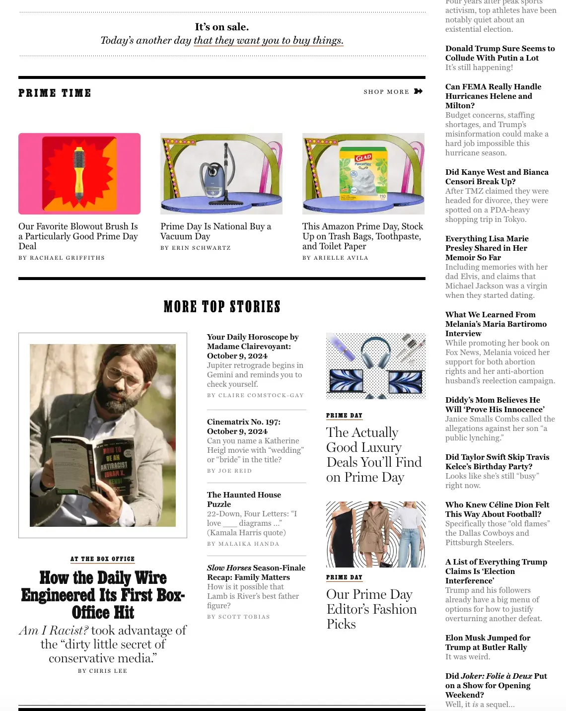
How to fix it: To decipher the right amount of white space, I suggest taking a peep at other websites that successfully use white space. (And no, it’s not cheating. 84% of web designers say they look at finished websites for inspiration.) Once you’ve found a website you like, lay out your website accordingly. If you're using a theme, keep in mind that you might not be able to customize exactly how much white space you want.
13. Video
If your organization has invested heavily in branded videos, you likely want to feature them on your website. Remember how we mentioned graphics could slow your site down? Unfortunately, you have to watch out for videos, too.
How to fix it: If you want a video but don't want to sacrifice load time, I recommend compressing it or converting it to an HTML5-supported format.
14. CTAs
One of the most critical web design challenges is creating visually appealing CTAs. Honestly, I find it easy to overthink CTA design. Your goal is to ensure your CTA matches your branding and stands out, which can be tricky.
How to fix it: I suggest you use buttons for your CTAs. In addition, make sure your CTAs are still authentic to your branding and feature text that is large enough to read and that the color pops. You could also test different button shapes, styles, or colors and see which produces the best results.
15. Website Security
Even though maintaining your website‘s security is not a design-based dilemma, many website designers find it challenging to ensure a website is secure. Security should always be a top priority because cyberattacks could harm your business’s reputation. Plus, website designers need to consider security because it's important to remember that some plugins could expose your site to vulnerabilities.
How to fix it: There‘s no wrong time to ensure your website can hold its own against bad actors attempting to threaten it. You’ll be happy to learn that securing your website doesn't have to be extremely costly. Some of the best ways to secure your site for free include:
- Adding an SSL certificate
- Using passwords that are difficult to guess
- Updating your website frequently
- Training team members with access to your site on what to do and what to avoid
Want to learn more? Check out our complete guide to cybersecurity.
Avoid These Web Design Challenges to Create a Successful Site
Creating a new website or updating an existing one is bound to come with some challenges. Thankfully, overcoming website design challenges is possible. Before you jump into making changes to your existing site, take some time to figure out what you need to do. I personally like using the website grader app to help me identify areas of improvement. (Check it out — it’s free!)
Using this app, you’ll get a quick rundown of issues you can improve to make your website better for your visitors. Once you understand the issue, take some time to review this post’s solutions. If you successfully avoid these web design challenges, you're on the right track to creating an engaging, functional website that will wow visitors, I promise!
Editor's note: This post was originally published in January 2023 and has been updated for comprehensiveness.
Website Design
.png?width=112&height=112&name=Image%20Hackathon%20%E2%80%93%20Vertical%20(50).png)


.png)
