.png?width=112&height=112&name=Image%20Hackathon%20%E2%80%93%20Vertical%20(50).png)
This experience led me to write this piece. I want to show the importance of how website design and marketing should work together to deliver something worthwhile. Let’s find out.
(Spoiler: Redo of a simple landing page can lead to tripling your sales and +300% in conversions ⬇️)
In this article:
- Website Design vs. Marketing
- How Does Web Design Impact Marketing?
- How to Integrate Marketing Into Your Website Design (Step-by-Step Guide)
- 3 Websites Designed With Great Marketing Tactics (Best Examples in 2024)
- Strive for Harmony in Website Design and Marketing
.png)
Free Website Design Inspiration Guide
77 Brilliant Examples of Homepages, Blogs & Landing Pages to Inspire You
- Agency Pages
- Ecommerce Pages
- Tech Company Pages
- And More!
Download Free
All fields are required.
Form not available
Website Design vs. Marketing
Web design and marketing: two sides of the same coin. One builds it, the other fills it.
- Website Design. The process of creating the visual and functional aspects of a website, including layout, color scheme, typography, navigation, and overall user experience (UX).
- Marketing. The strategic activities for promoting a product or service, including market research, advertising, content creation (text and visuals), social media, and SEO.
Think of it this way: Website design is the foundation, the structure that supports your marketing efforts. Marketing, on the other hand, is the strategy, the plan for attracting and engaging your audience.
Without a well-designed website, your marketing messages may fall on deaf ears. At the same time, a beautiful website with no marketing strategy will struggle to attract visitors — or convert those who do land on it. When website design and marketing work in harmony, they will bring what you want and need.
I think a good example is one of Hotjar's case studies.
Brand24, a social listening platform, faced low conversion rates on its free trial sign-up form. CEO Mike Sadowski used Hotjar Recordings to understand user behavior and discovered two main issues: confusion caused by a promo code field and excessive clicking due to distractions.
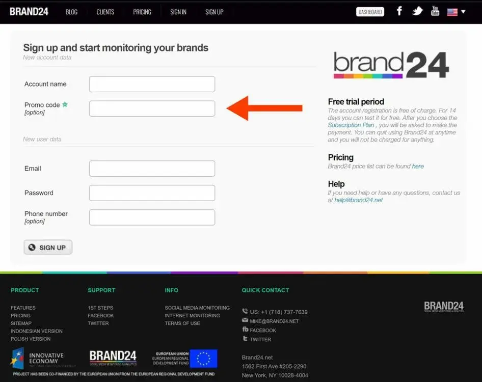
Mike and his team spent 12 hours redesigning the form, simplifying it to include only essential fields and removing unnecessary links.
They also added social proof for credibility. This redesign resulted in a nearly 300% increase in conversions and the conversion rate went from 2.56% to 7.42% + tripling sales.
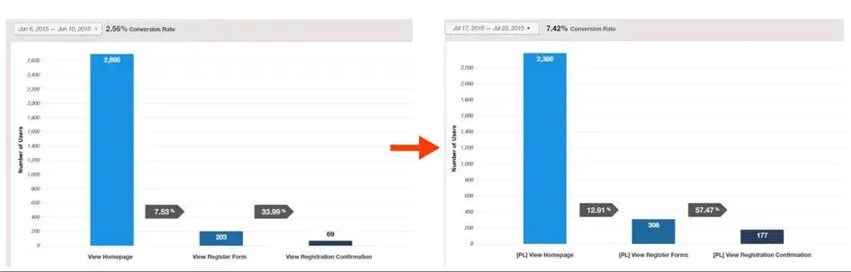
Long story short, users were interested in promo codes they saw on social media, but the cluttered form was preventing them from completing the sign-up process. When it became easier, more sign-ups followed.
How Does Web Design Impact Marketing?
The correlation between great design and marketing success is undeniable. Research shows that:
- 67% of global users would stick to companies that have unique and authentic designs.
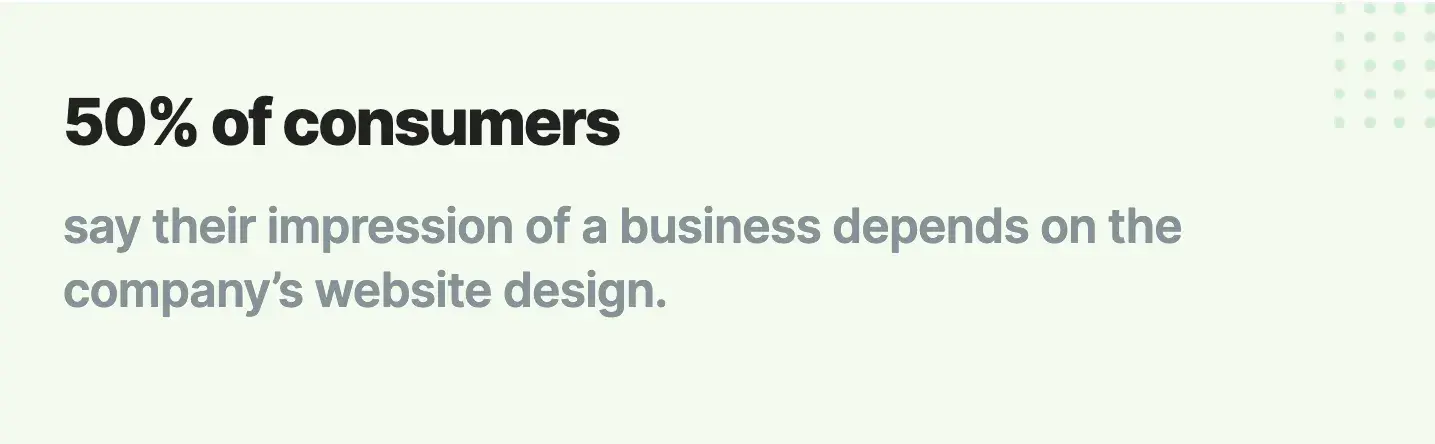
- 50% of consumers judge a business by its website design.
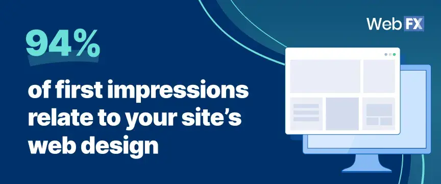
- Web design influences 94% of first impressions of a site.
But how exactly does web design influence marketing? Let’s see.
A professional design builds trust and ranks you higher.
A professional design helps people and Google trust your brand, thereby improving your ranking. When your site looks good and works well, it meets the standards of search engines, so it will naturally bring more visitors.
And when you have a good design, there are high chances that visitors will stay, explore more, and potentially become your new customers.
“Your website design plays a major part in your entire digital marketing strategy,” shares Hannah Francis for Bipper Media SEO secrets podcast.
“It impacts your SEO and your PPC efforts […] Investing in your website is an investment in your company‘s future. So, don’t let an old, unappealing website hurt your bottom line. Instead, invest in website design for small businesses this year. Updating your website can help you discover new ways to reach and appeal to customers online.”
I think Mailchimp’s website presents everything Hannah Francis talked about. Consistent branding, from logo to colors, drives home their identity.
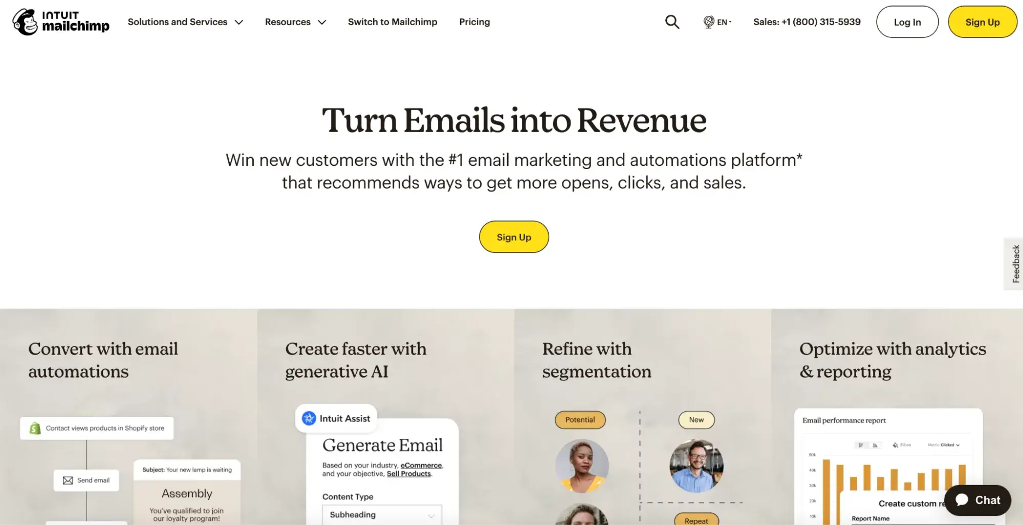
The main message is clear and upfront, with features clearly laid out underneath. The visuals and short descriptions make it easy to get the info quickly.
My favorite part of the site is the fold with a striking black background to highlight impressive numbers:
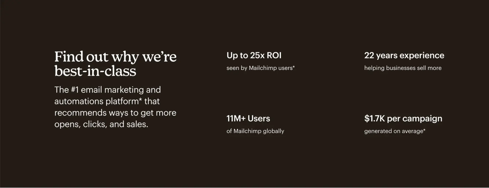
This contrast grabs my attention and makes me, as a potential customer, want to be part of these great results. A top-notch example of marketing and web design synergy.
Using a CMS, like HubSpot’s Content Hub, can help you design a professional website that finds that synergy.
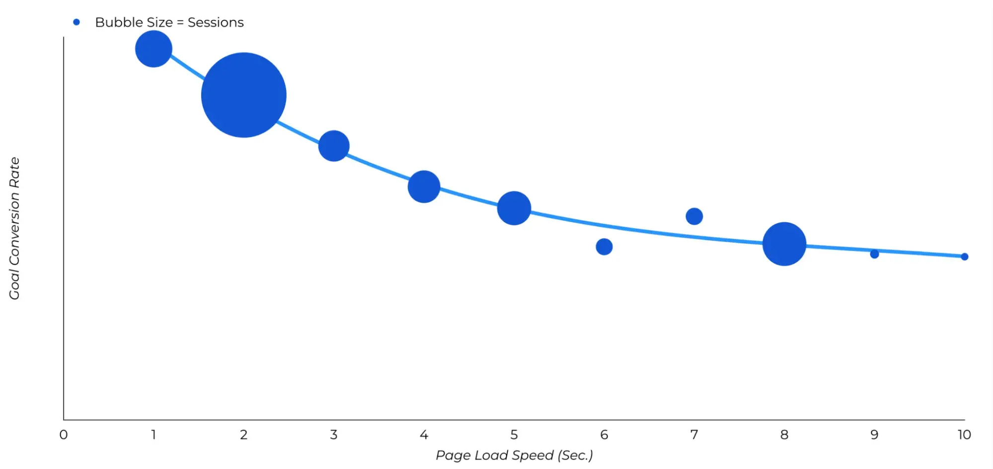
Easy navigation and fast loading times reduce bounce rates.
The best conversion rates happen between 0-4 seconds, which suggests the optimal load time is the same.
The same study revealed that a B2B site that loads in one second has a conversion rate five times higher than one that takes 10 seconds to load. So, keep this in mind if your site takes 3-4 seconds to fully load and you consider it very good.
Remember the cluttered site I mentioned in the intro? I left for that reason.
So, to achieve your desired goals and conversions, make sure your marketing is great, navigation is smooth, and loading times are fast. Regarding navigation, keep it super simple. Put everything important at the top, highlight the main things, and use dropdown menus under each main category.
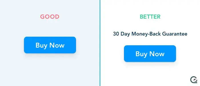
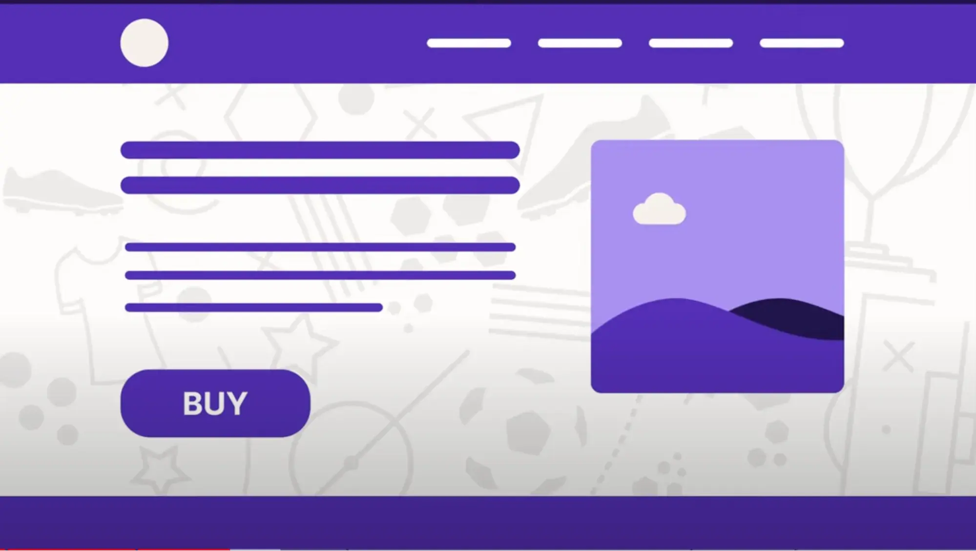
Clear CTAs increase the chances of users taking action.
Let’s revisit the moment a potential customer discovers you through a great social media ad. Say they’re interested in your course and land on an appealing site. They scroll through two screens but get baffled by a confusing or nonreassuring CTA. The likelihood of you losing them is high.
To avoid that, place your CTA button in a prominent position where it’s easy to see, ideally above the fold. Make sure to give a clear explanation above the CTA so the users understand what exactly they get.
For instance:
Don’t forget that button colors are super important, too.
For the best results, use colors that stand out from your background. Green and orange are often effective, but make sure there’s enough contrast so your button is easy to see. Avoid matching button colors with similar background colors.
In the Bipper Media SEO secrets podcast, Hannah Francis also suggests that small businesses should work with website designers to keep their branding and colors consistent across their sites.
For instance, what color do you think of first when I say “HubSpot”? Orange, right?
It follows you on our site, across all pages, social media, and even for CTAs. It’s consistent, and it obviously works.
I also think Slack is a great example of combining web design and marketing. I like Slack’s fun and quirky web design in combo with absolutely amazing (content) marketing. The CTA buttons are practical: “Get started” on desktop and “Get Slack” for iOS on mobile, so you’re prompted to take action based on your device.
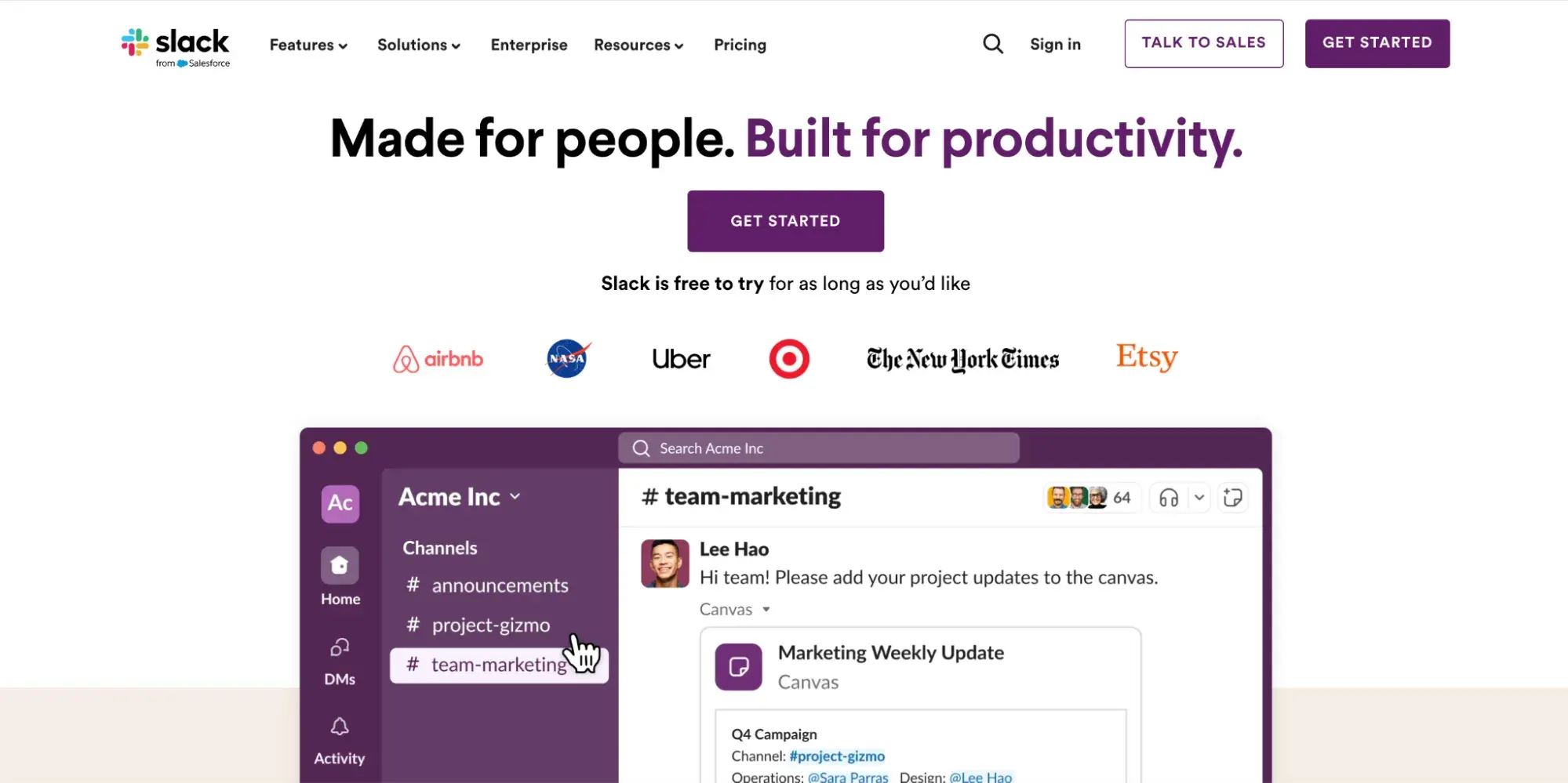
The layout adapts well to different screen sizes — three columns on desktop and one column on mobile for things like customer logos.
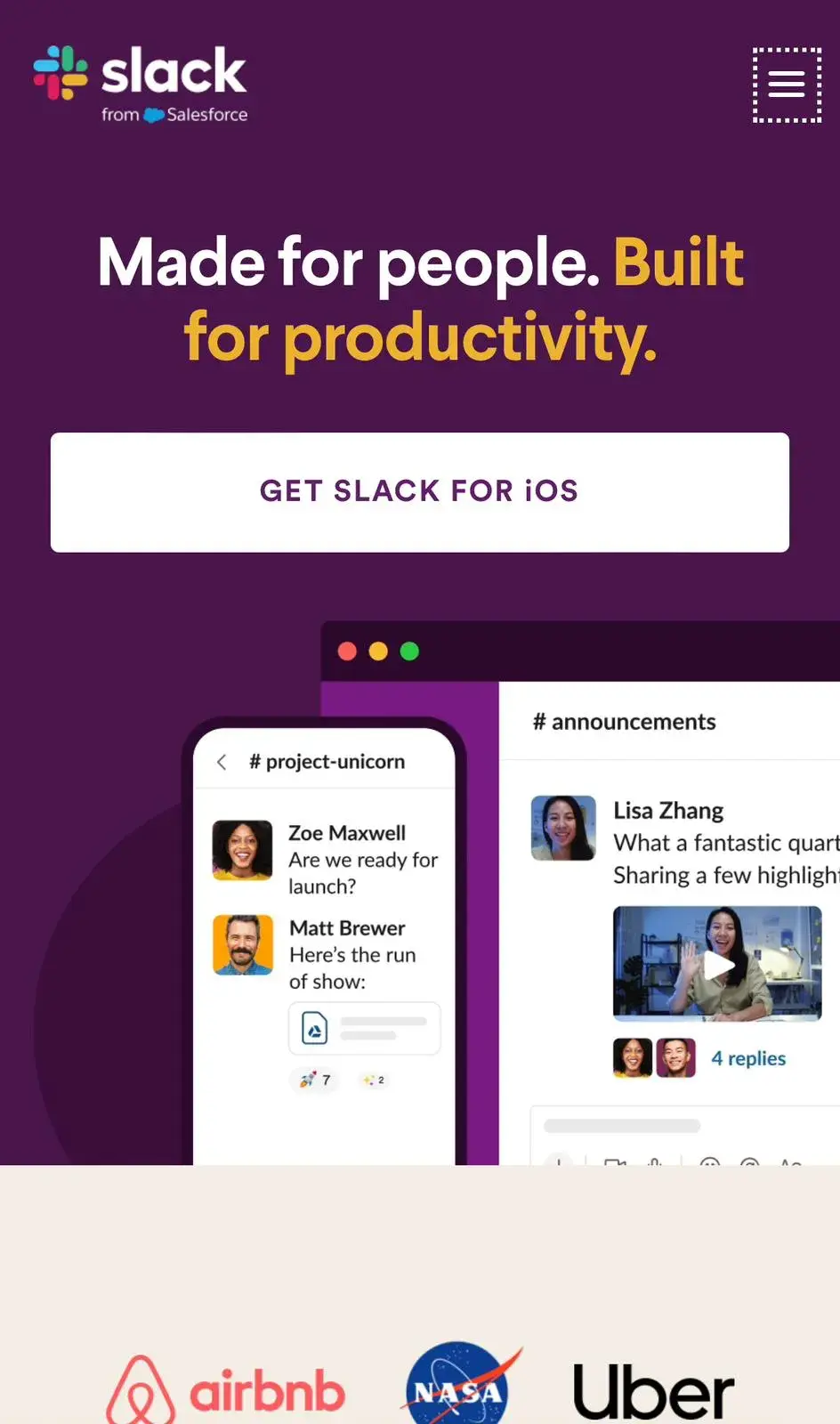
On mobile, the menu turns into a “hamburger icon,” which makes it easy to navigate.
And website copy? Nothing but brilliant.
Aligning web design with marketing campaigns boosts conversions.
Marketing strategies focus on crafting catchy brand messages and campaigns. Your web design should echo them.
How?
If your campaign is all about a new product or specific offer, your website should mirror those colors, images, and messages to keep everything in sync.
In my experience, it’s a good idea to feature the new product/offer prominently on the homepage or as a pop-up to increase the chance of conversion.
Here’s a good example:
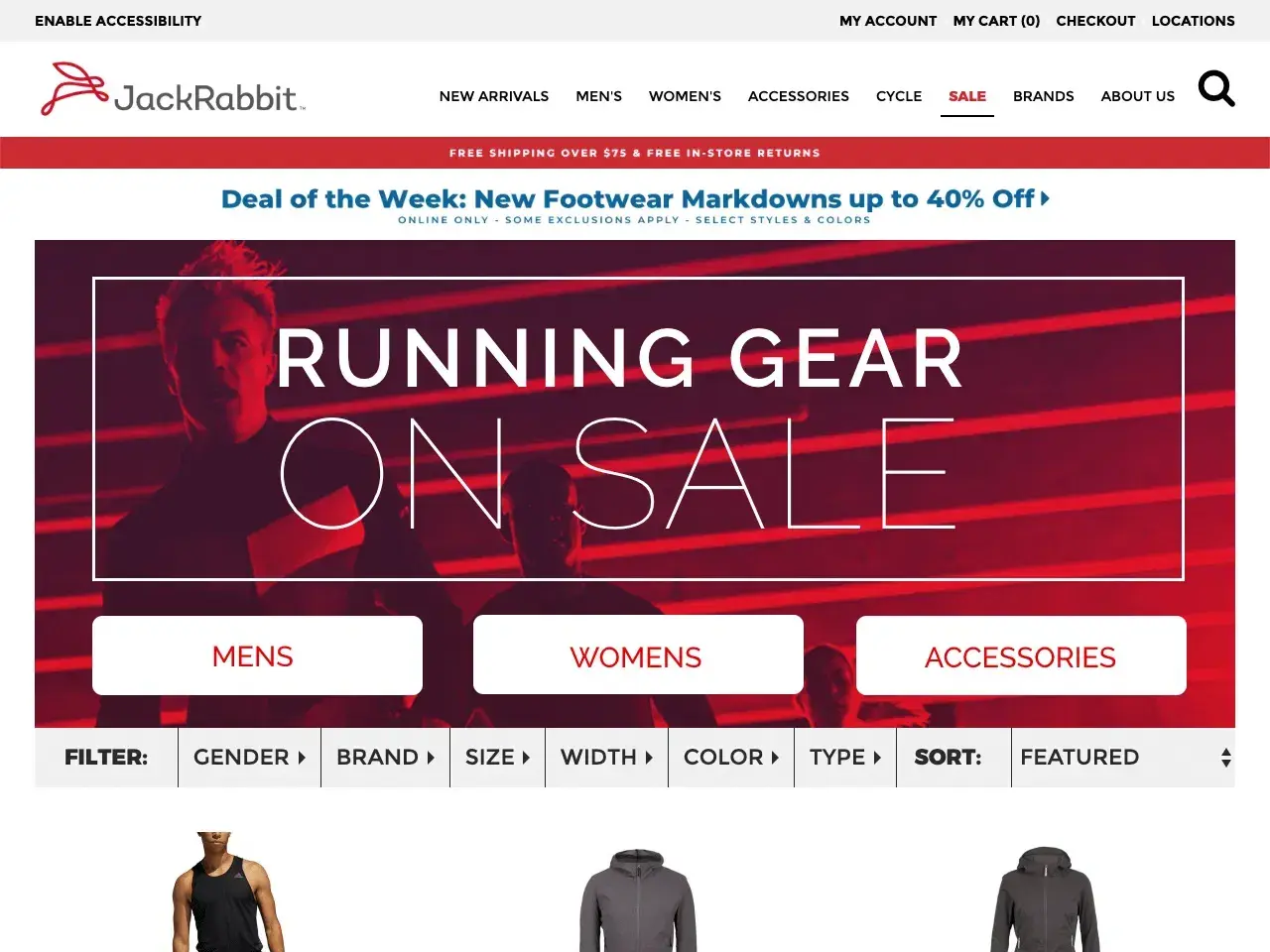
JackRabbit used a “big-screen” message here to promote a limited-time offer, which created a sense of FOMO. I think this is a perfect example of how a website can sync up with a marketing campaign to drive sales.
Easy sharing options build credibility and extend reach.
When content is easy to share, it has the potential to go viral — a single share can lead to multiple shares.
Also, shared content often brings increased organic traffic as people usually click on links shared by friends or followers, whom they may trust more than traditional advertising.

As you can see above, we place sharing options at the bottom and include different social media icons, but you can also position it somewhere in the top-right corner if it fits your overall design.
Free Website Design Inspiration Guide
77 Brilliant Examples of Homepages, Blogs & Landing Pages to Inspire You
- Agency Pages
- Ecommerce Pages
- Tech Company Pages
- And More!
Download Free
All fields are required.
Form not available
How to Integrate Marketing Into Your Website Design (Step-by-Step Guide)
To create a website that not only looks great but also drives marketing results, follow these steps (and check out these 77 brilliant website examples for inspo while you’re at it):
1. Get to know your audience.
Only 65% of marketers have good data on their target audience, leaving 35% in the dark, reveals HubSpot's 2024 State of Marketing report.
Here are the three pillar questions you need to ask yourself when defining your audience:
- Who are they? Think about their age, interests, what they need, and how they talk.
- What do they want from your website? Are they looking for information, a product, or a service?
- How do they use the internet? Do they prefer browsing on their phone or computer?
Pro tip: If you need better audience insights, HubSpot Analytics can help. It offers demographic details and real-time campaign performance data.
2. Homepage = First (and probably last) impression.
Your homepage is your storefront. Make it eye-catching, inviting, and simple to navigate. Choose the colors of your brand and easy-to-read font. Highlight your unique selling points with the right color and font size.
Clear headlines, messages, and visuals should immediately tell visitors what you're about.
What makes you different from the competition? Show them.
“You have about 50 milliseconds to make a good first visual impression,” says Creative Crew with Brad Hussey. “If your site takes 8 seconds to load because of too many fonts, that’s not ideal.”
“Unless you have specific brand guidelines or are a professional designer, stick to using just a few colors. Color theory can be complex, so when in doubt, use black and white, or light shades of black and pale off-white for a sophisticated look.”
https://www.youtube.com/watch?v=ciNN1IpeVyA
3. Develop intuitive navigation.
I recommend using clear menus and intuitive navigation. Think about the path you want visitors to take. Do you want them to read a blog post, watch a video, or buy a product? Design your site to guide them along that path.
Neil Patel advises that putting key items at the start or end of your navigation is most effective. People remember these positions best.
So, place important items at the beginning and less important ones in the middle. Put “Contact” last, usually on the far right.
4. Be careful with CTAs.
Use clear, action-oriented buttons like “Shop Now,” “Learn More,” or “Contact Us.” Place your CTAs strategically — think about where they'll be most effective on each page.
According to Ben Toalson from Podia, placement depends on your visitor’s intent:
- Ready to buy. Place a prominent CTA at the top of the page.
- Considering. Position CTAs between sections that address their questions or concerns, and include a CTA at the bottom of the page to capture those who scroll through.
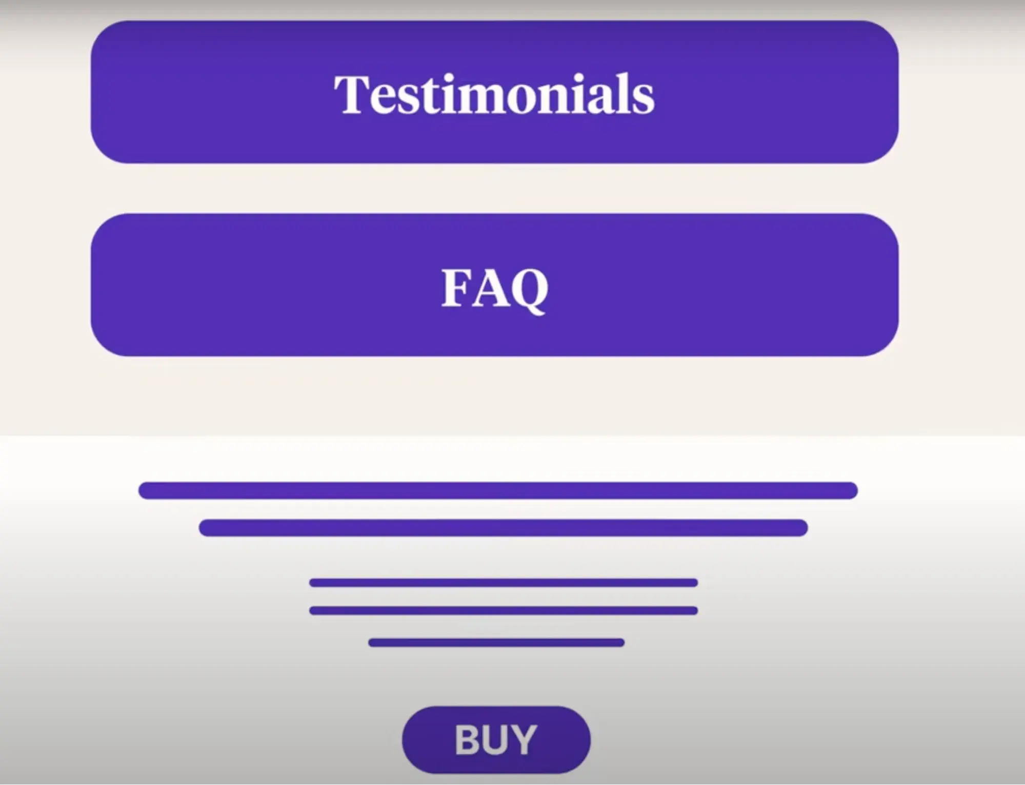
5. Content = The heart and soul of your site.
High-quality content is the backbone of marketing. I suggest using a mix of formats to impress your visitors and make them want to stay and come back for more: blog posts, videos, infographics, customer testimonials… and everything else relevant and valuable.
And, of course, keep it fresh and updated.
“Every piece of content we publish aims to contribute to a larger story [...] Creating thorough, well-researched content helps establish authority and provides long-term value,” advises Vitaly Friedman from Smashing Magazine for Prismic Podcast.
In this podcast, Vitaly also points out that while metrics like bounce rate and time on page can offer some insights, they aren’t always the best indicators of content quality.
A high bounce rate or a short time on page doesn’t necessarily reflect a poor user experience — users might quickly find what they need or, on the other site, might struggle to understand the content.
To understand the nature of these metrics, you have to compare them with conversions. And, ideally, install heatmaps and resort to session recordings to learn customers’ behavior on the site and pinpoint winning and losing CTAs, buttons, texts, etc.
Pro tip: Use the Lucky Orange integration alongside HubSpot to gain the power of a suite of CRO tools, including Dynamic Heatmaps, Session Recordings, Surveys, and Chat. See how website visitors navigate your site and make informed decisions.
6. It's never done.
Your website is a living thing. As your business grows and your audience changes, your website should, too. Keep experimenting and improving. I recommend you try new designs, test different CTAs, and see what resonates best with your audience.
3 Websites Designed With Great Marketing Tactics (Best Examples in 2024)
A great website goes beyond just looking nice. It uses smart design and marketing tactics to grab attention and keep visitors engaged.
Check these examples to see how effective websites can turn casual visits into meaningful interactions.
1. Airbnb
Marketing Tactic: UGC & community building — 15% boost in engagement.
Airbnb often runs campaigns that encourage users to share their content. One example is the “Live There” campaign, which shows how effective this approach can be. Airbnb increased bookings and created a strong sense of community and adventure this way. The campaign invited people to share their real travel experiences, which were then featured on Airbnb’s site. I think this is a great tactic.
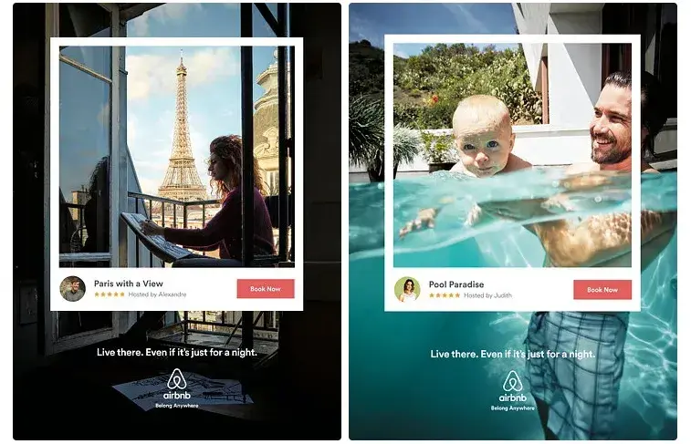
These campaigns change, and so does the content on the website. Airbnb regularly uses this approach, and it’s been shown to be highly effective.
Results:
- 9% rise in brand awareness, reaching peak levels among target demographics.
- 15% boost in engagement, with UGC receiving over 1.5 million interactions.
- 20% increase in booking rates, linking campaign exposure with higher consumer action.
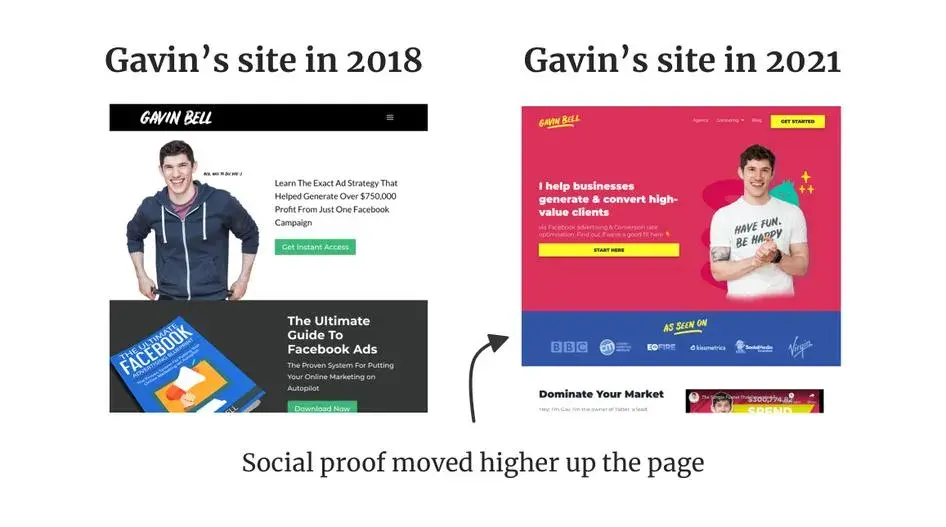
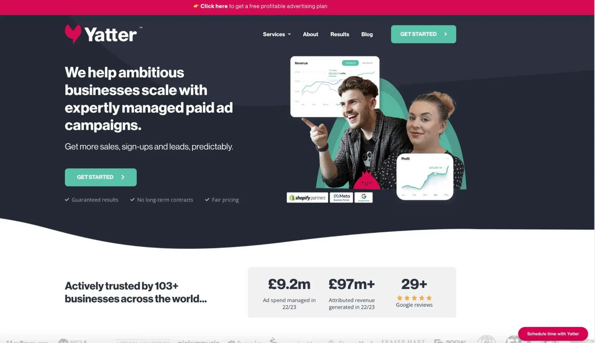
2. Gavin Bell / Yatter
Marketing Tactic: User engagement strategy — 20% sales increase with a simple tweak.
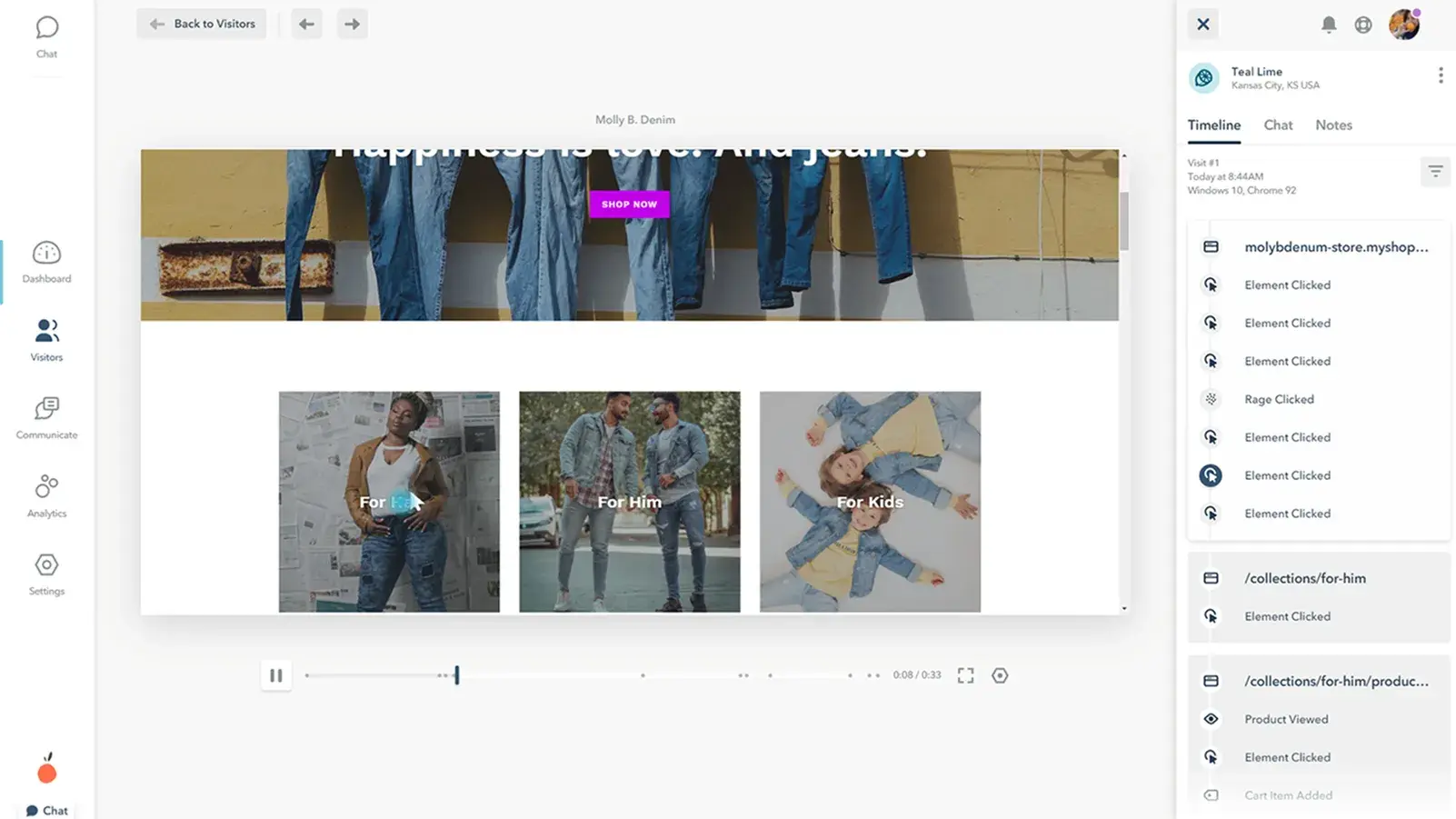
Gavin Bell, the CEO and founder of Yatter, had an issue with low conversions during the first three years. He realized the problem might be in how users interact with the page. So, he used Hotjar to analyze user behavior and made necessary changes which resulted in great improvements.
In 2018, Gavin’s site had social proof (client logos, testimonials) placed lower on the page, resulting in lower visibility and impact on conversions.
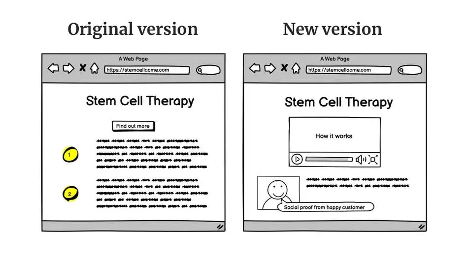
[alt[ Bad vs good version of the homepage
In 2021, after analyzing Hotjar heatmaps and recordings, Gavin moved the social proof higher up on the page. This repositioning increased its visibility and made it more likely to influence potential clients.
Results:
- 20% sales increase with a simple tweak.
- Fixed conversion-impacting bugs.
- 42% conversion rate increase by repositioning content.
Then Gavin launched Yatter, a paid advertising agency, in 2021 and adapted the same principle to its site by placing the social proof higher on the page.
The Transport Library
Marketing Tactic: Improved user experience — tripled conversion rates.
NerdCow, a web design agency, worked towards improving the conversion rates for their client, The Transport Library. The original search bar was cumbersome, especially for older users. Users struggled to distinguish between products they had viewed and those they had not.
It was not visually attractive at all, so the changes were a must.
After removing unnecessary fields from the search bar, usability improved significantly. The site gained a fresh, modern look along with a clear copy, catchy background, and overall attractiveness.
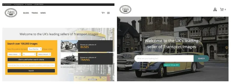
Results:
- The site's conversion rate tripled within two weeks.
- The new abandoned cart email sequence helped recover sales from users who had initially added items to their carts but did not complete the purchase.
Strive for Harmony in Website Design and Marketing
We've seen how a sleek, well-designed website can improve marketing, build trust, and drive conversions. On the flip side, a clunky site can tank even the best marketing efforts. The trick is to find a synergy between these two, where each element complements the other.
My takeaway is that the most important thing is to put the user first — in ads, social media, or on the website itself. This is simply how it must be because, if your efforts are not user-centric, all is in vain. The same applies to good copy. You need something catchy, fun, and emotional — something that touches your users’ souls or solves their issues.
Finally, I’ve learned that you should adopt an analytical mindset. Analyze conversion and drop-off points in the customer journey. Study Google Analytics data and apply additional tools for heatmapping.
Your website is your most valuable marketing asset. Make it count.
Free Website Design Inspiration Guide
77 Brilliant Examples of Homepages, Blogs & Landing Pages to Inspire You
- Agency Pages
- Ecommerce Pages
- Tech Company Pages
- And More!
Download Free
All fields are required.
Form not available
Website Design