
In this article, I’ll show you 28 common types of websites. I'll provide plenty of examples that highlight the distinctions in site design and execution, drawing from my own experience where relevant.
Types of Websites That You Can Make
- Business Websites
- Ecommerce Websites
- Blogging Websites
- Real Estate Websites
- Food and Recipe Websites
- Entertainment Websites
- Wiki Websites
- News Website
- Government Websites
- Nonprofit Organization Website
- Coupon Websites
- Directory Websites
- Booking Websites
- Membership Websites
- Wedding Websites
- Portfolio Websites
- Resume Websites
- Educational Websites
- Job Board Websites
- Forums
- Knowledge Base
- Video Streaming Websites
- Memorial Websites
- Review Sites
- Event Websites
- Search Engines
- Design Inspiration Sites
- Comparison Sites
1. Business Websites
While business websites come in many sizes and shapes, they all aim to present the brand’s products and services to visitors in a way that acquires new customers, clients, and/or partners.
Usually, business websites include descriptions of their offerings and a way to either purchase through the website or contact the team to initiate a sale or partnership.
From there, it’s up to the business to decide what to include on its site — some sites are dense, while others are stripped down with just one or a few pages. It’s all about what best aligns with your branding and what your target market wants to know.
Let’s look at two business sites that show this contrast. Modern Health is a personalized mental healthcare delivery service with a website that explains the app’s purpose, value, features, and plan options for employers. It accomplishes this with a mix of copy, videos, testimonials, infographics, and blog posts.
Modern Health
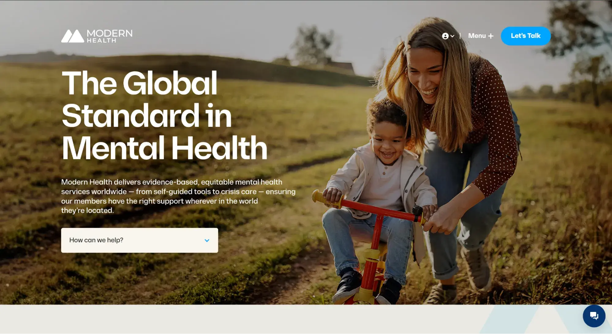
What I like: The website communicates the app's purpose and value through a mix of copy, videos, testimonials, and graphics. I appreciate how it draws attention to its mission around mental health — and the strong imagery draws me in to learn more.
Cleenland
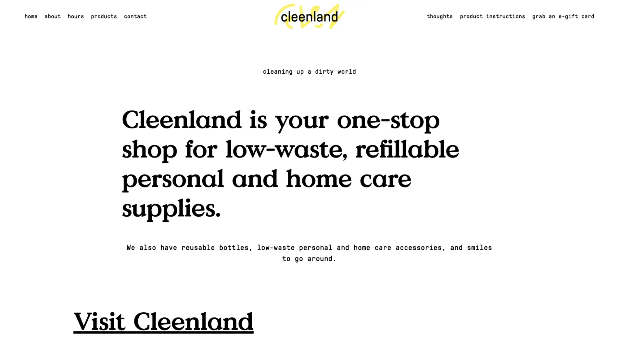
In contrast to Modern Health’s content-rich site, the website for Cambridge-based low-waste shop Cleenland has no frills. The layout and design choices are simple to give prospective customers all the information they need when planning a visit.
What I like: The simple layout aligns perfectly with the company’s mission of reducing waste. I’m impressed by how they use white space to highlight the essential information customers need when planning a visit.

HubSpot's Free Website Builder
Create and customize your own business website with an easy drag-and-drop website builder.
- Build a website without any coding skills.
- Pre-built themes and templates.
- Built-in marketing tools and features.
- And more!
Whatever business site you’re trying to build, the most important thing is that you have a company website. When someone learns about your business and wants to know more, they’re likely to search your name online.
When this happens, you’ll want your website to show up in search engine results, as it’s pretty much assumed any legitimate business these days has a website. If they can’t find yours, they’ll probably lose interest.
There are hundreds of solutions for building business websites (and websites in general), ranging from more involved and customizable content management systems like WordPress and Content Hub to low-touch website builders like Squarespace and Wix.
For those looking for a quick and easy solution, HubSpot's AI Website Generator can design a single-page site based on simple prompts, getting you online in minutes.
Business websites may also include ecommerce, blog, community, and knowledge base components as well, all to engage and convert visitors.
2. Ecommerce Websites
Ecommerce websites sell products, be they physical goods or digital content. Visitors can browse the website’s listings, read product details, and purchase directly from the website.
Ecommerce websites are focused entirely on retail, but business websites, blogs, and other website types may also host an online store for selling products or merchandise.
Ecommerce sites sell all sorts of things, but most stick to a familiar model — products are categorized and presented in a list format, and clicking an item brings you to a dedicated product page. You can usually search for products as well via a search bar.
On each product page, you can add the item to a virtual “shopping cart” or “shopping bag.” At any point, users may enter the checkout process, in which they enter shipping and payment information to complete a purchase. Some website builders and hosting platforms even have different ecommerce specialties.
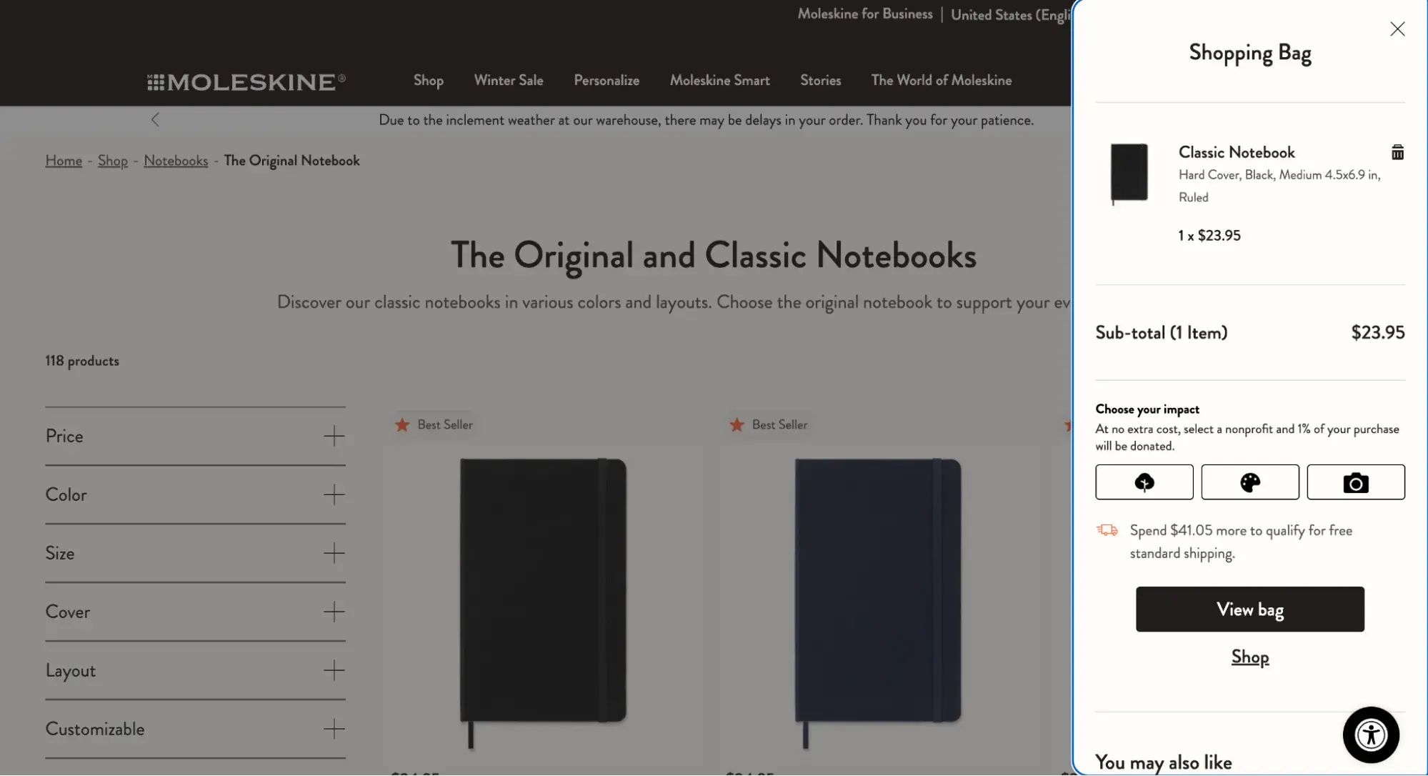
Moleskine
Moleskine, the maker of the iconic notebooks, has all the trappings of an ecommerce website. There’s an online store with a grid layout of images showcasing its products, a sidebar with filters, detailed product listings, and a shopping bag.
Briogeo Hair Products
For an example of a visually engaging, informative ecommerce site, check out Briogeo Hair Products. Its pages capture attention with a rich color palette and vibrant photography to highlight its different products.
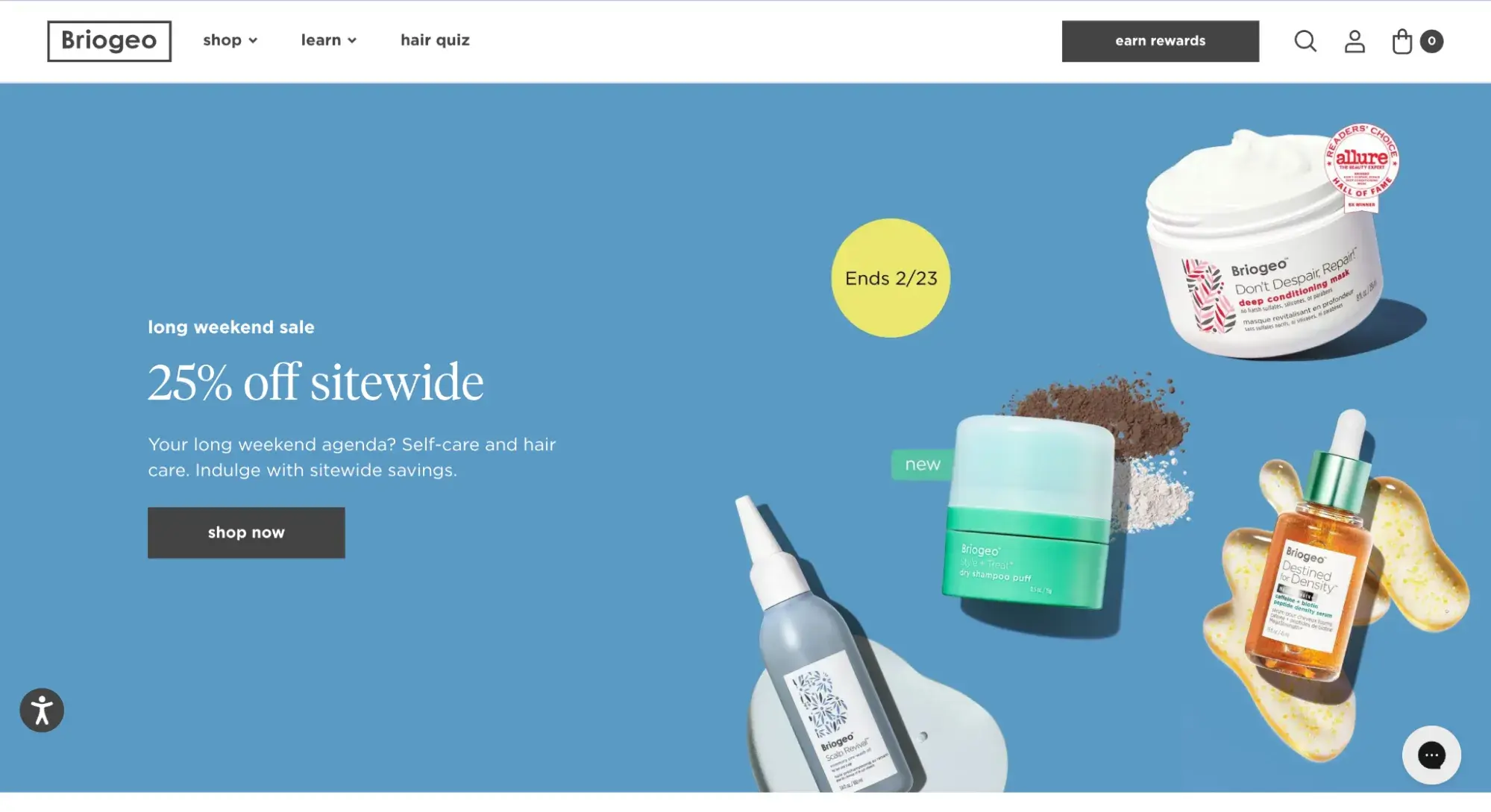
What I like: This website boasts an exceptional design that seamlessly combines captivating visuals, intuitive navigation, and compelling storytelling to create an immersive and user-friendly experience. I also appreciate the customer testimonials, which help to build social proof.
Because ecommerce websites are often large, complex, and require infrastructure to securely handle payments and shipping, ecommerce platforms are a very popular go-to for new businesses launching online stores.
Shopify is the leading option — for a monthly fee, it handles everything from site design to hosting to payment processing. Shopify also integrates with HubSpot to level-up your online marketing, sales, customer service, and analytics capabilities.
3. Blogging Websites
Blogging sites are difficult to define since their use has evolved so much over time. The blog (short for “weblog”) format began as a way for anyone to publish casual, long-form written content about their interests.
Since then, blogging has been adopted by entrepreneurs and businesses to mark their presence online. Today, you can consider a blog to be any website that publishes written content and whose articles (or blog “posts”) are listed in order of most to least recent.
If you’re an online business, a well-written, informative blog can be a major asset to your marketing strategy. It brings traffic to your site, establishes authority on search engines, converts visitors to leads, and eventually convinces those leads to take the next step to become customers. A blog that’s relevant to your business niche proves that you’re knowledgeable and committed to being the best in your industry.
To help your blog content get seen, consider using HubSpot's Content Marketing Software, which can help you plan, create, and optimize your content for better visibility and engagement.
HubSpot
If you need an example of business blogging in action, you’re looking at one. HubSpot writes four popular educational blogs — Marketing, Sales, Service, and Website — each filled with articles to help businesses grow better.
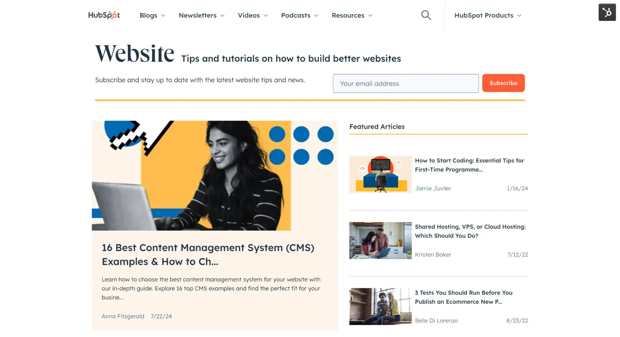
What I like: Featured posts stay “sticky” on the top of the blog, letting HubSpot highlight its most important or popular posts. I also love the email subscription form that’s at the top of the page, allowing HubSpot to grow its list.
Minimalist Baker
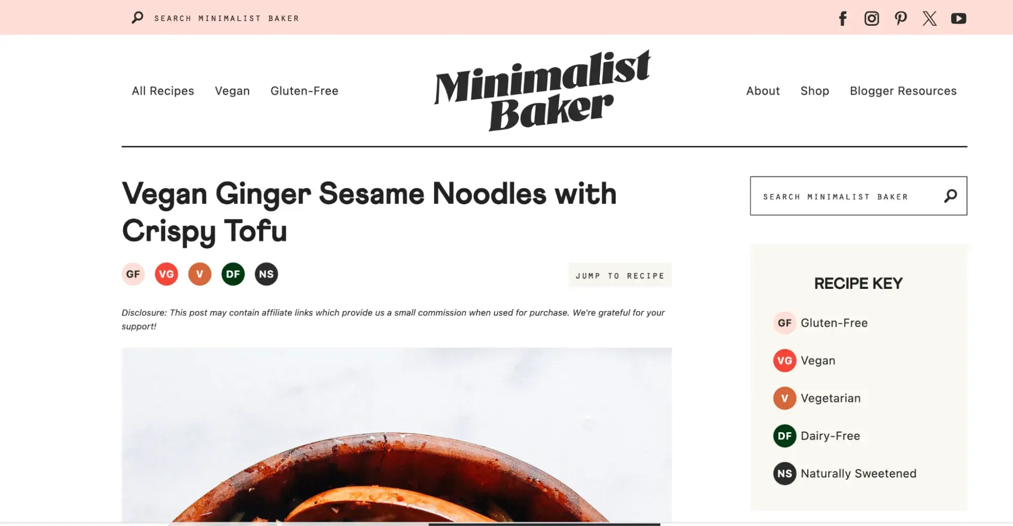
Minimalist Baker takes a different approach to its blogging website, with four columns of images filling the hero section, each a clickable blog post. This works well for food, travel, and other blogs that are highly visual.
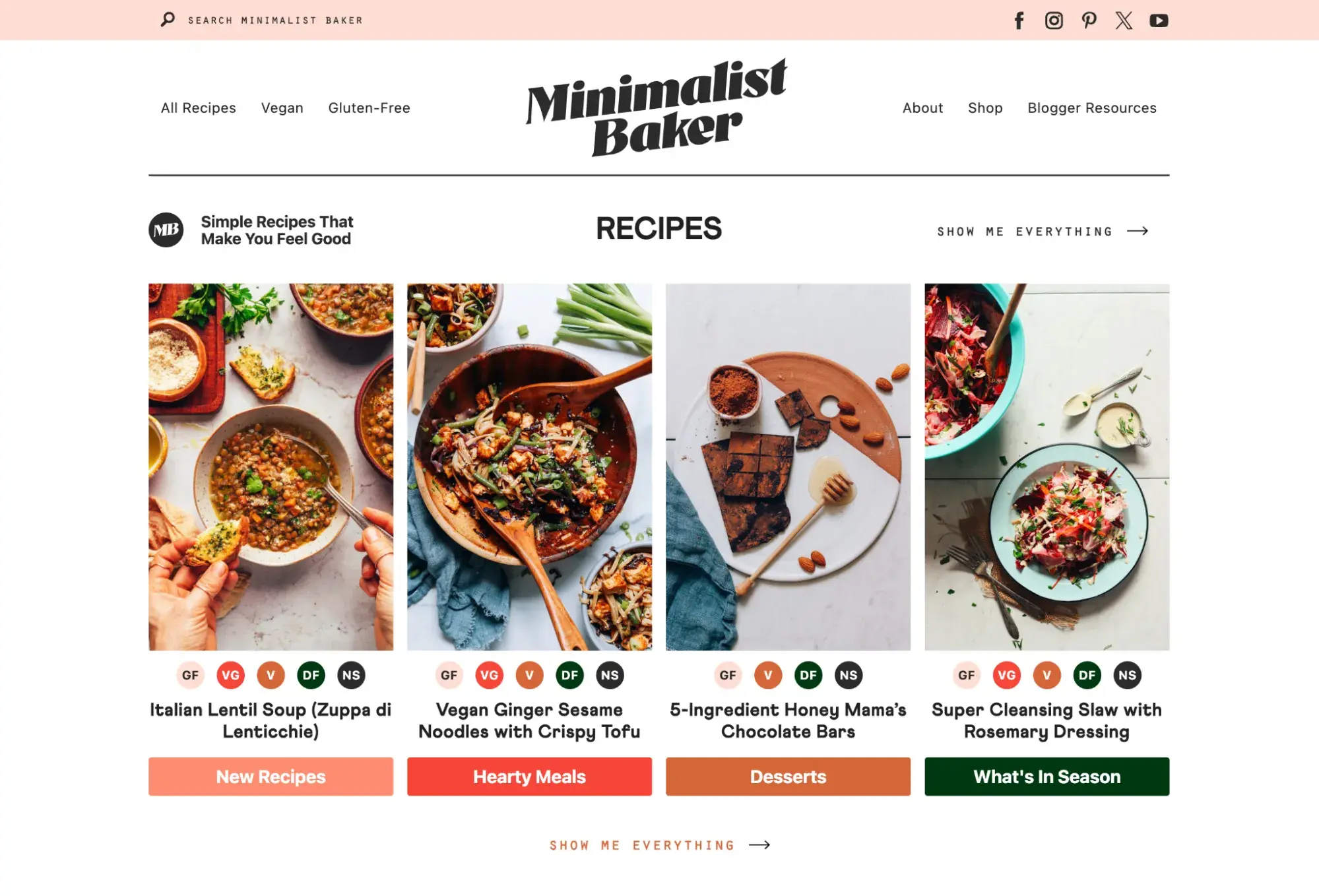
What I like: Minimalist Baker makes navigation easy with clickable recipe icons so readers can easily see if the recipe fits their dietary needs and find more recipes by clicking the icons.
Blogs don’t need to be part of a larger monetization push — they can be a simple way to share your passion. Most popular bloggers get their start this way. So, if you want to launch a blog to share your favorite pasta recipes with your friends and family, go for it.
With HubSpot's free Blog Maker, you can have your blog up and running in no time.
4. Real Estate Websites
Real estate websites are online platforms that list properties for sale or rent, making it easy to search for a dream home or investment property.
Zillow
My go-to site is Zillow. It lets me window shop for houses from my couch, see tons of photos, get all the important details like price and square footage, and even take virtual tours of some places.
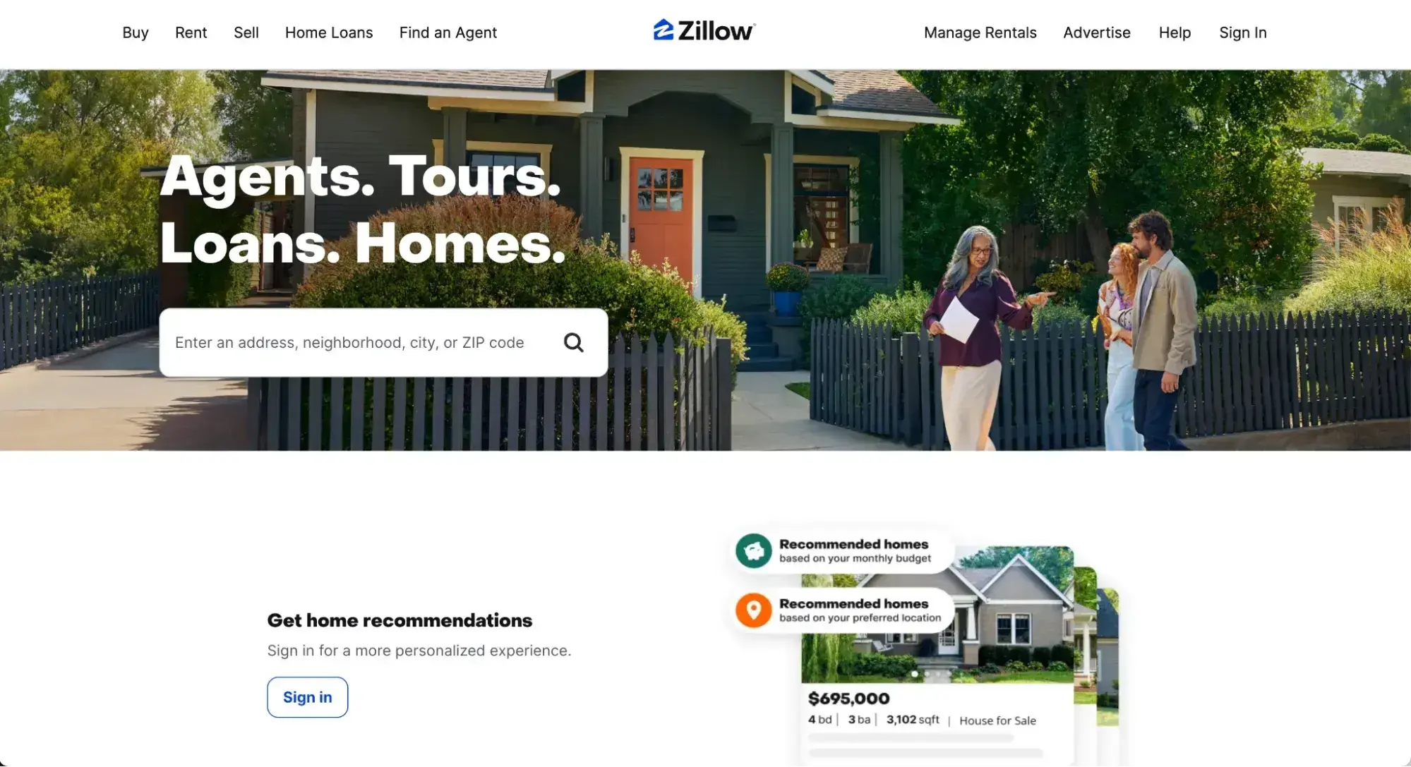
What I like: The map feature is super handy. You can zoom in on neighborhoods you like and see what's available. Plus, it has this cool “estimate” tool that gives you a rough idea of what houses are worth.
The filters are a lifesaver, too. Want a three-bedroom place with a pool under a certain price? Boom, you can set that up in seconds.
HubSpot's Free Website Builder
Create and customize your own business website with an easy drag-and-drop website builder.
- Build a website without any coding skills.
- Pre-built themes and templates.
- Built-in marketing tools and features.
- And more!
5. Food and Recipe Websites
Love to cook but aren’t exactly a pro chef? I’m in the same boat and food and recipe websites are my kitchen heroes. They're like having a bunch of super-skilled cooking buddies right at your fingertips.
A recipe site can be a type of blog (like Minimalist Baker, which we looked at earlier). But not all blogs are recipe sites. The defining characteristics of a recipe site include:
- Ratings or reviews of the recipe
- A “recipe card” that lists the ingredients, cook time, oven temperature, steps, and more
My absolute favorite is AllRecipes. It has recipes for pretty much anything you can think of.
Craving grandma’s apple pie but don’t have her secret recipe? They've probably got something close.
Allrecipes
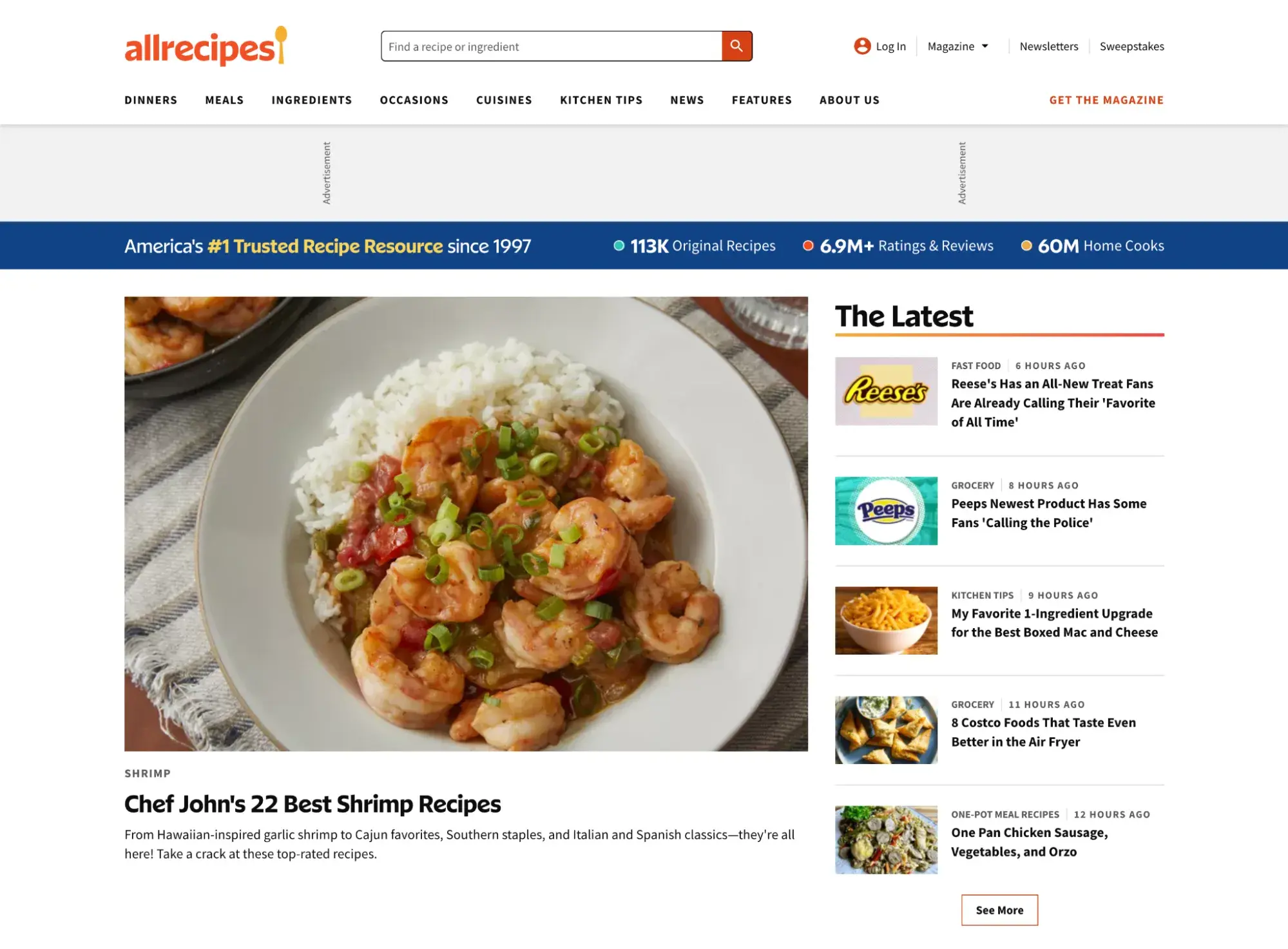
What I like: There are so many features that make finding recipes convenient! The user reviews are goldmines. Real people sharing their tweaks and tips? That’s priceless. It’s saved me from more than a few cooking disasters. The how-to videos are super helpful for tricky techniques. No more guessing what “fold gently” actually means.
6. Entertainment Websites
Entertainment websites aim to, well, entertain. Like blogs, the content on these websites takes the form of articles. However, there’s usually a larger team behind these websites to produce content in larger volumes.
Take Reductress, a satirical news website targeted at women that pokes fun at magazines and media.
Reductress
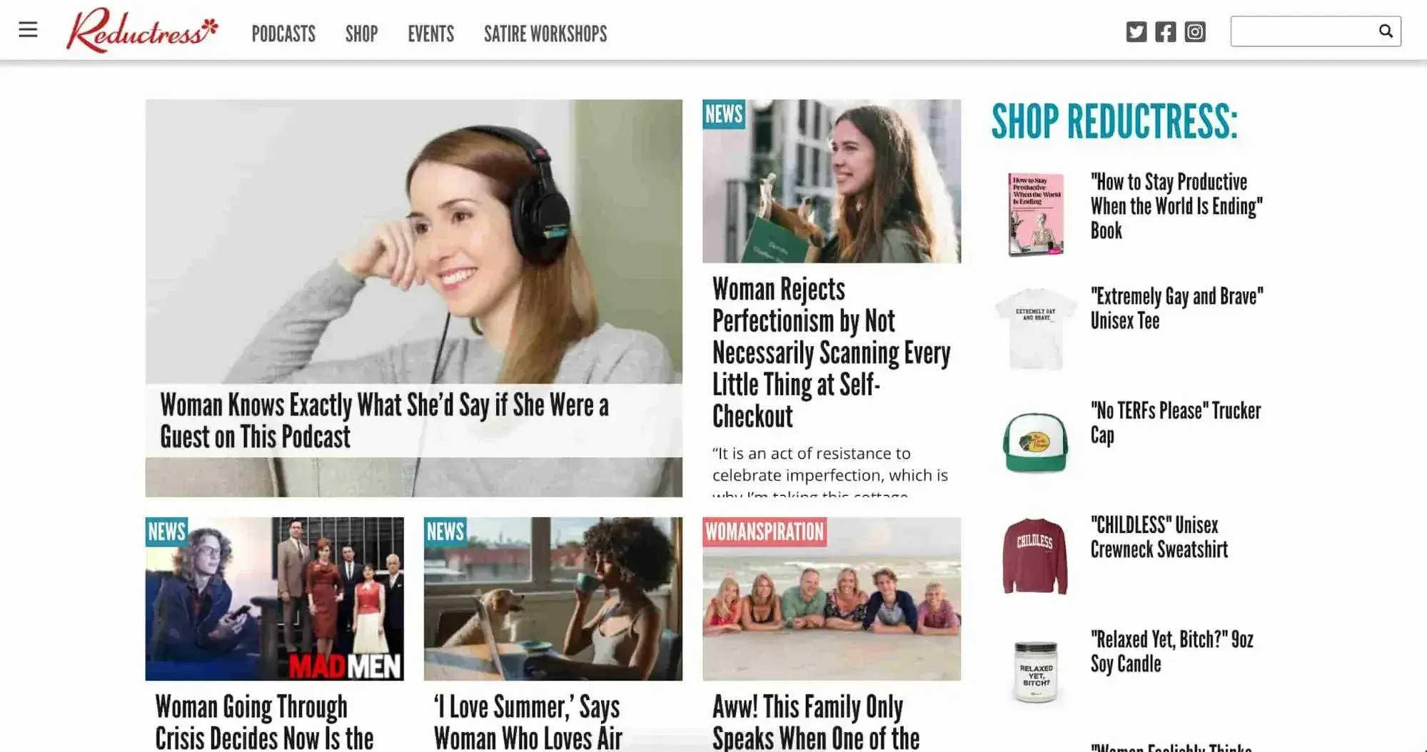
What I like: The site’s design itself is modeled after the news outlets it parodies, right down to categorizing posts by topic, and pairs hilarious titles and subtitles with stock thumbnails to encourage clicks.
Pitchfork
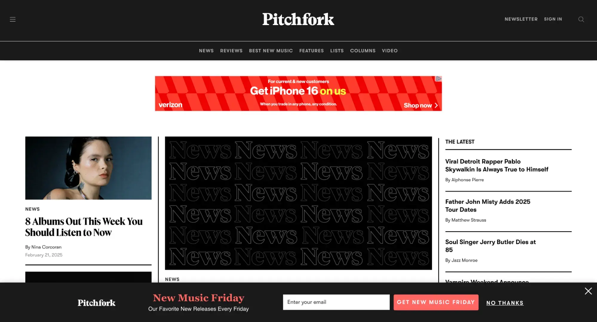
I also like Pitchfork, a music review site that has been around since 1995.
What I like: Pitchfork has a cohesive, elegant front-end design, a sharp color scheme throughout, and clear navigation for everything the publication offers, including news and reviews.
Entertainment websites monetize primarily with display ads, sponsored content, and affiliate links, though they may also sell merchandise through an online store to supplement these forms of income.
7. Wiki Websites
Ever wondered how so much information ends up online? Wikis are often the answer.
Wiki websites are collaborative platforms that allow users to create, edit, and share knowledge collectively.
Here are two examples: Wikipedia and Fandom.
Wikipedia
The free online encyclopedia Wikipedia is probably the most well-known wiki in the world.
Where else can you find information on topics ranging from quantum physics to the California quail? It's a treasure trove of knowledge that’s constantly updated by volunteers worldwide.
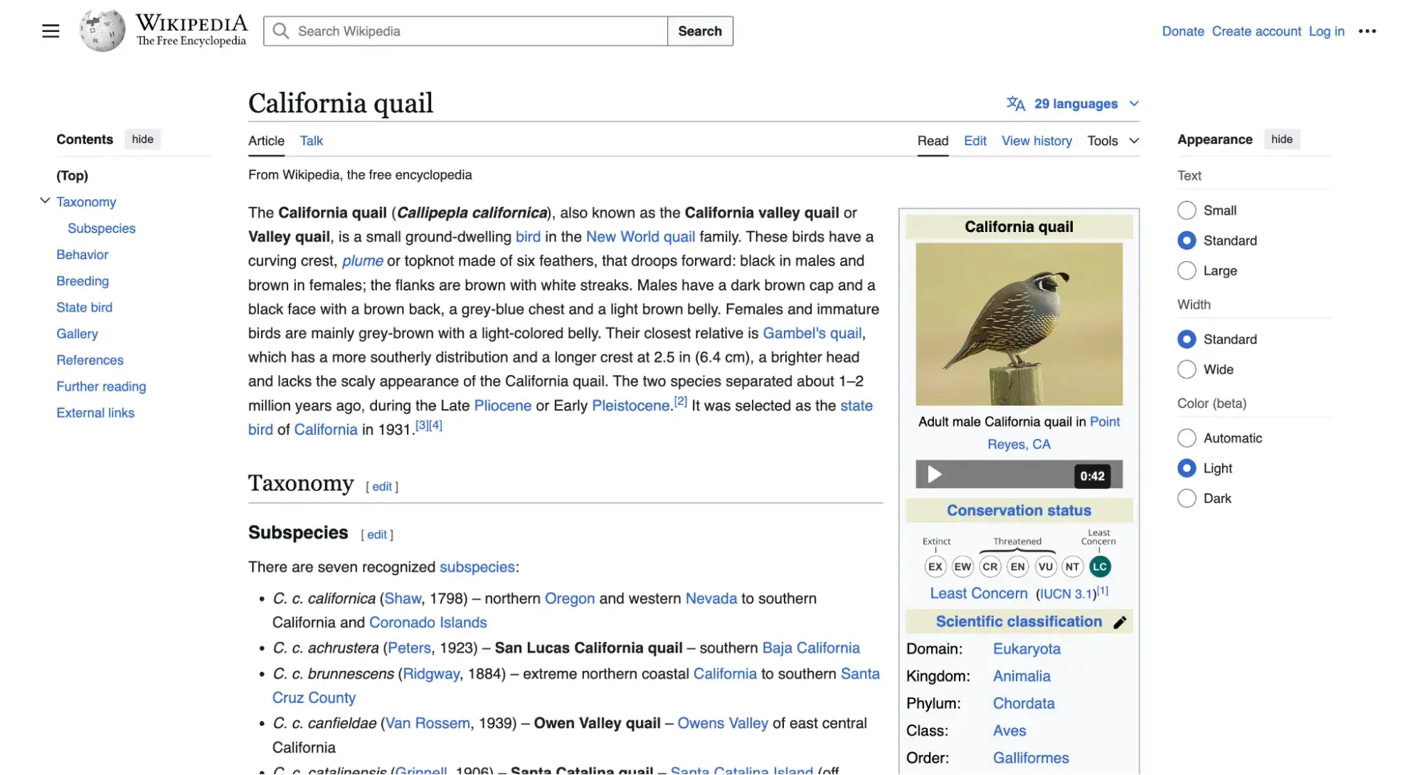
What I like: Wikipedia’s scope and accessibility are incredible. Need a quick overview of a complex topic? Wikipedia’s got you covered.
Want to explore a niche topic? You’ll find plenty of references to guide your research. The interconnected nature of its articles often leads me down fascinating rabbit holes of information.
Fandom
Fandom, on the other hand, caters to enthusiasts of various entertainment franchises. Ever found yourself needing the juicy details on a feud between characters on your favorite TV show? Fandom is the place to go.
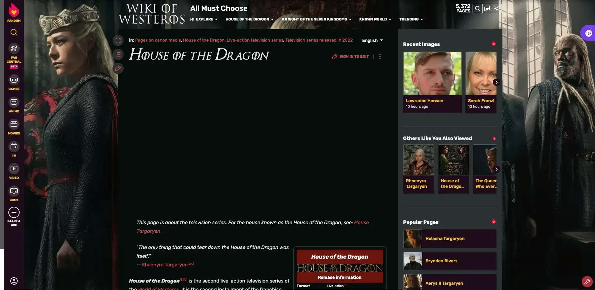
What I like: I love this site’s depth of content for specific topics. The passion of fan communities shines through in the detailed articles and discussions. Whether I'm trying to understand the lore of a video game or looking up obscure facts about a movie series, Fandom rarely disappoints.
8. News Website
News websites are like entertainment sites, but mostly comprise news reports. As such, these sites aim to inform more than entertain. News websites also tend to have a notably different aesthetic than entertainment websites, often with a cleaner layout.
The New York Times
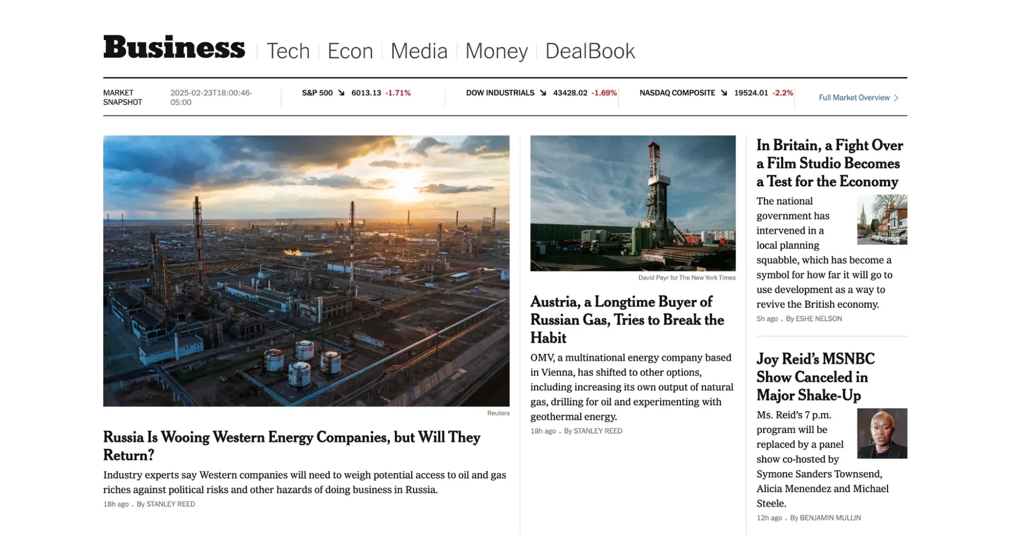
Take The New York Times business section as an example — it heavily uses a grid layout to present the latest stories and typography to mimic its printed counterpart.
What I like: Despite being renowned for its authoritative journalism, I love how The New York Times skillfully incorporates elements of sleek design, engaging visuals, and a user-friendly interface to deliver an outstanding news website experience.
In place of on-page advertising, many news sites offer a subscription for access to their content. The New York Times limits the number of free articles users can view before they must purchase a subscription. Other online news publications place part of their articles behind a paywall or limit the number of free daily articles.
9. Government Websites
Government websites are official online platforms created and maintained by various levels of government to provide information and services to the public. I frequently use these resources to access official information, complete necessary tasks, and stay informed about policies and regulations.
One government website I often use is Canada.ca.
Canada.ca
Canada.ca is the main portal for the Government of Canada and offers a comprehensive range of information and services. I find it to be a reliable starting point for almost any government-related query I have, whether it's about immigration, health care, or employment.
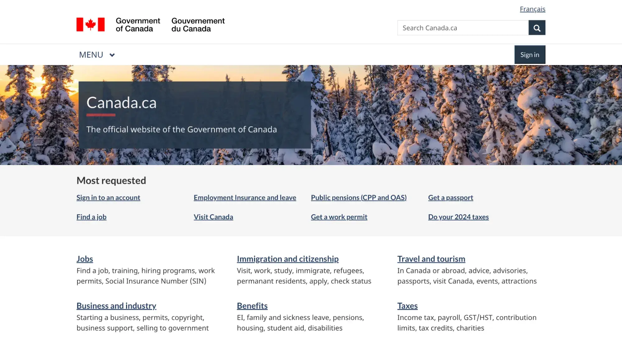
What I like: Its clean, intuitive design. The site is well-organized, with clear categories and a powerful search function. I particularly appreciate the “Most requested” section on the homepage, which often saves me time by highlighting commonly sought-after services and information.
I also like this government website because it’s reliable and comprehensive. When I access information here, I can trust that it's official, up-to-date, and applies specifically to the Canadian context. I especially need this when it comes to understanding my tax obligations.
10. Nonprofit Organization Website
Websites are one of the best ways to establish legitimacy for a business, and the same can be said for nonprofit organizations and non-corporate entities. These types of websites serve to promote an organization, communicate the organization’s purpose, and often request and field donations.
HubSpot's Free Website Builder
Create and customize your own business website with an easy drag-and-drop website builder.
- Build a website without any coding skills.
- Pre-built themes and templates.
- Built-in marketing tools and features.
- And more!
Just because your site isn’t selling a product or service doesn’t mean it can pass off a shoddy design. To be effective, a nonprofit’s website must clearly convey its mission and goals from the homepage with emotional weight, with additional pages going more in-depth on individual projects and initiatives.
I really like it when websites list organizations they’ve collaborated with, testimonials from those they’ve served, a calendar of future events, and a donation CTA to capture new contributors while they’re engaged.
Nonprofits can employ different design approaches, too.
Color of Change
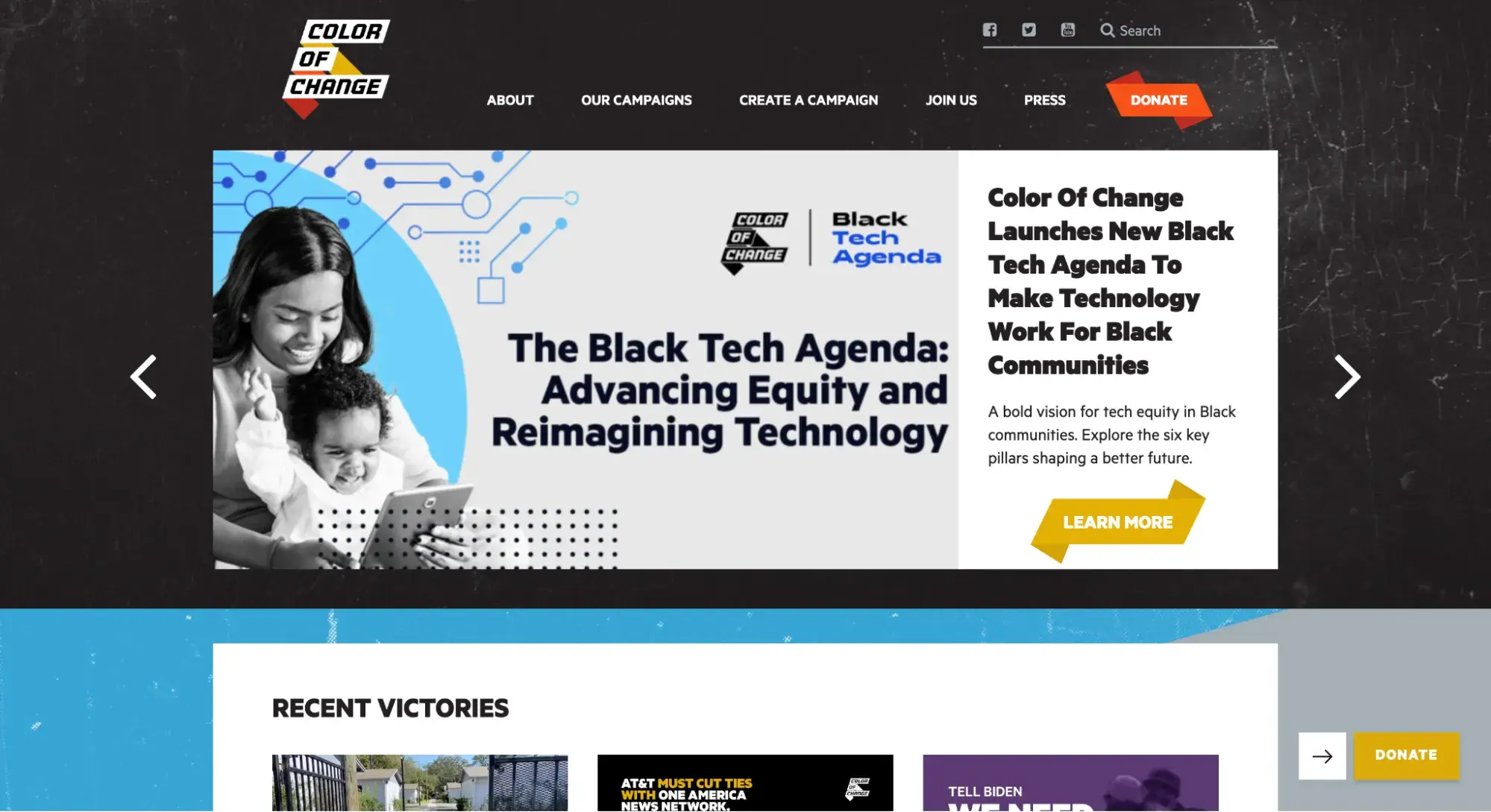
For example, Color of Change is a leading online racial justice organization that empowers its members to campaign for a more equitable and just society for Black people in America.
What I like: Color of Change meets you with a hero image slider showcasing its initiatives and highlighting the CTA to donate. Visitors can scroll to learn more, but this design choice makes a strong first impression on new visitors and potential donors.
Southern Poverty Law Center
Take the Southern Poverty Law Center, another American nonprofit, as an example.
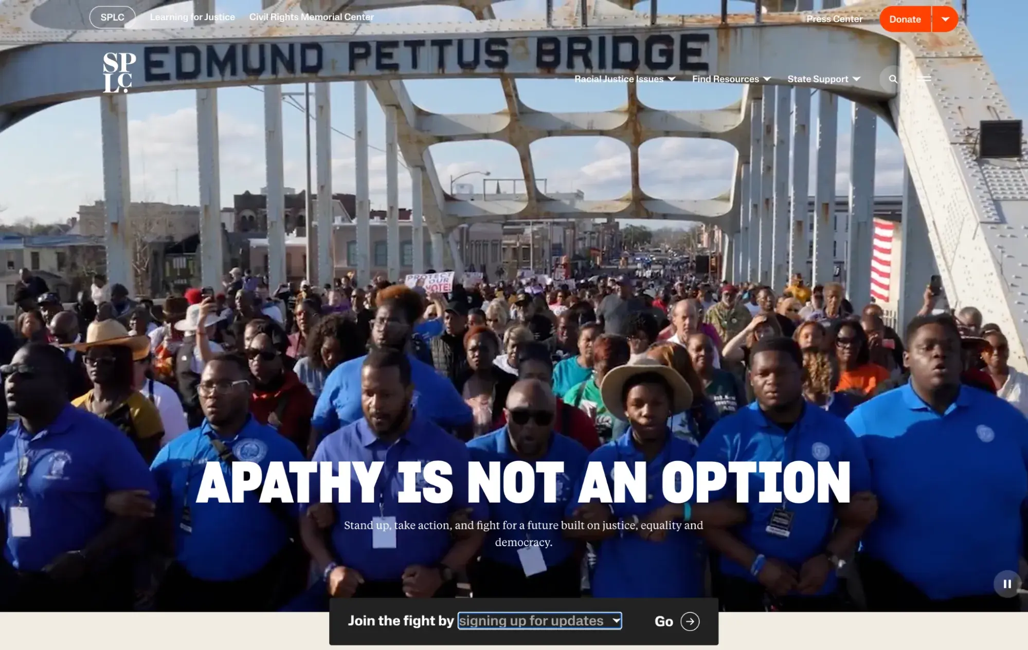
What I like: Southern Poverty Law Center immerses you in its mission with a full-screen video (with no audio) that shows its demonstrations to fight racial justice issues. It also features two prominent CTAs: “Donate” and “Join the fight.”
11. Coupon Websites
Who doesn’t love a good deal? Coupon websites help you find the best offers and reduce your overall spending.
They’re online platforms that aggregate and share promotional codes, discounts, and deals from different retailers and service providers.
Two examples are RetailMeNot and Rakuten.
RetailMeNot
RetailMeNot is a popular coupon site offering discounts for about 20,000 businesses. It covers numerous retailers across various categories, from clothing and electronics to travel and food.
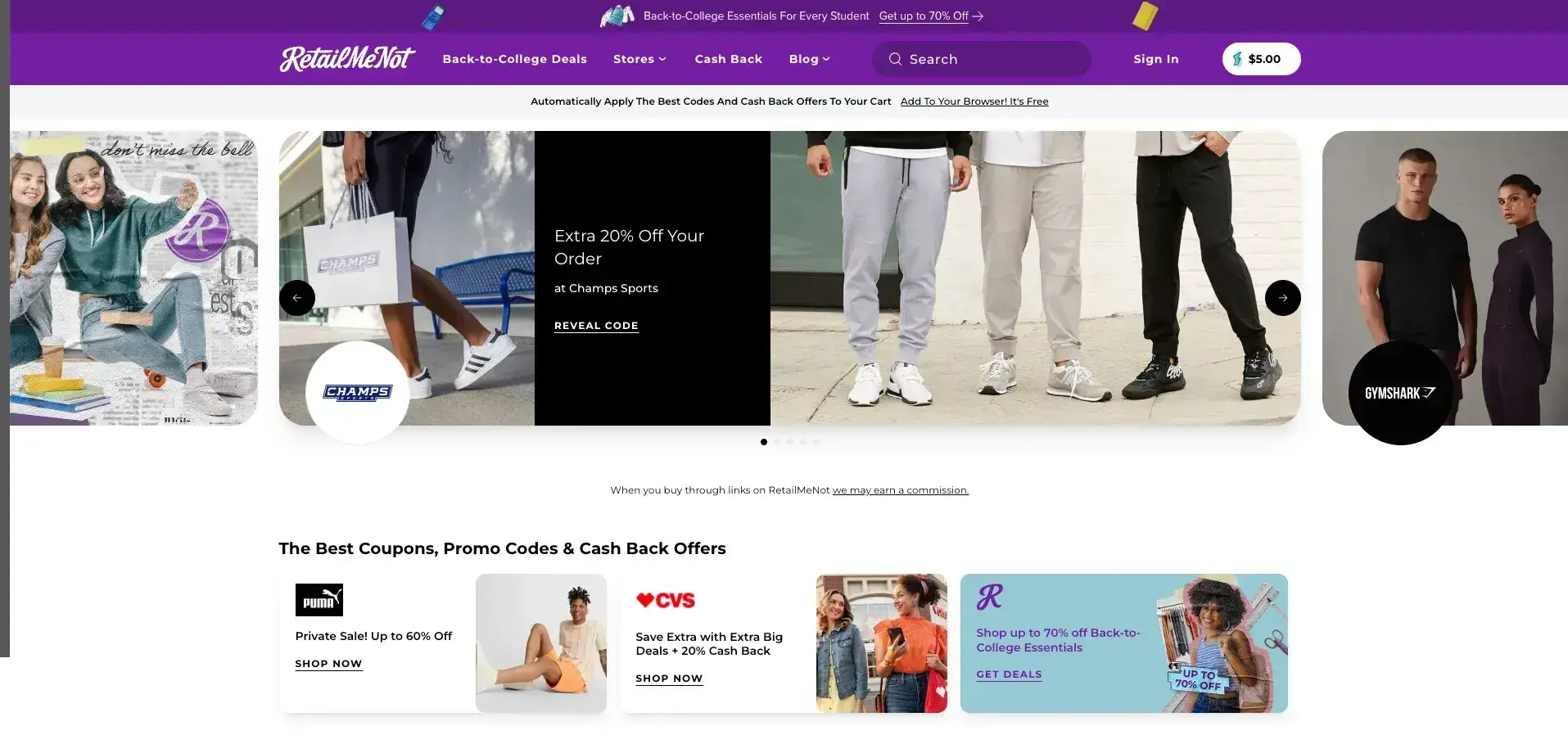
What I like: RetailMeNot has a high volume of coupons available. The site's search function makes it easy to find deals for specific stores or products.
It also provides information such as when the coupon was verified and how many times it was used today, reassuring me of its legitimacy.
Rakuten
Rakuten is another coupon site that I find extremely useful. I can find traditional coupons on the site, but the main draw is that I can earn cash back on my purchases from participating retailers.
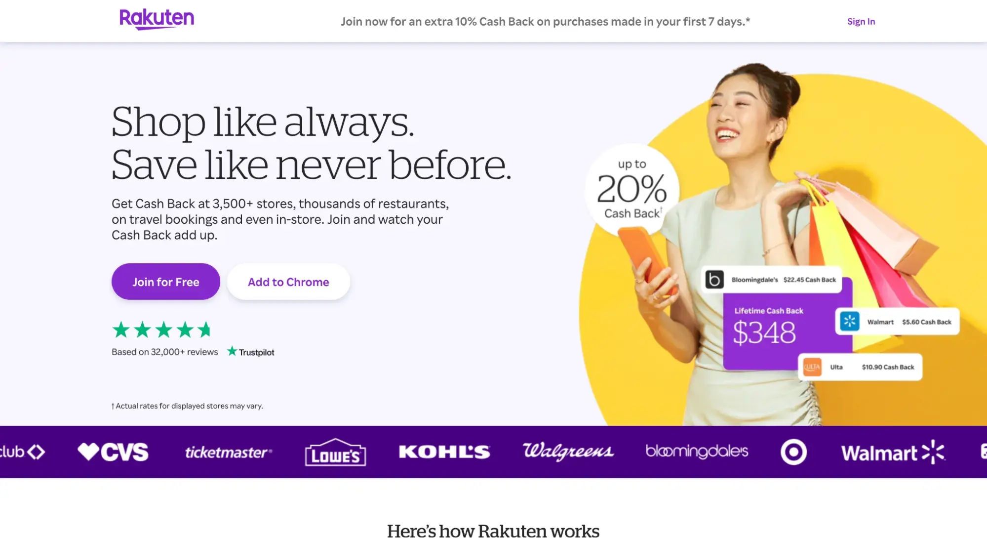
What I like: The site's browser extension is particularly convenient, automatically alerting me to available cashback offers and coupons as I shop online. I also appreciate how Rakuten sends out regular payments that turn my everyday shopping into a source of extra income.
12. Directory Websites
Directory websites compile and organize listings of businesses, services, or individuals in a structured format. They're great for finding and comparing options in various categories. Sometimes, but not always, they include user reviews.
Two directory websites I frequently use are Yelp and Yellow Pages.
Better Business Bureau
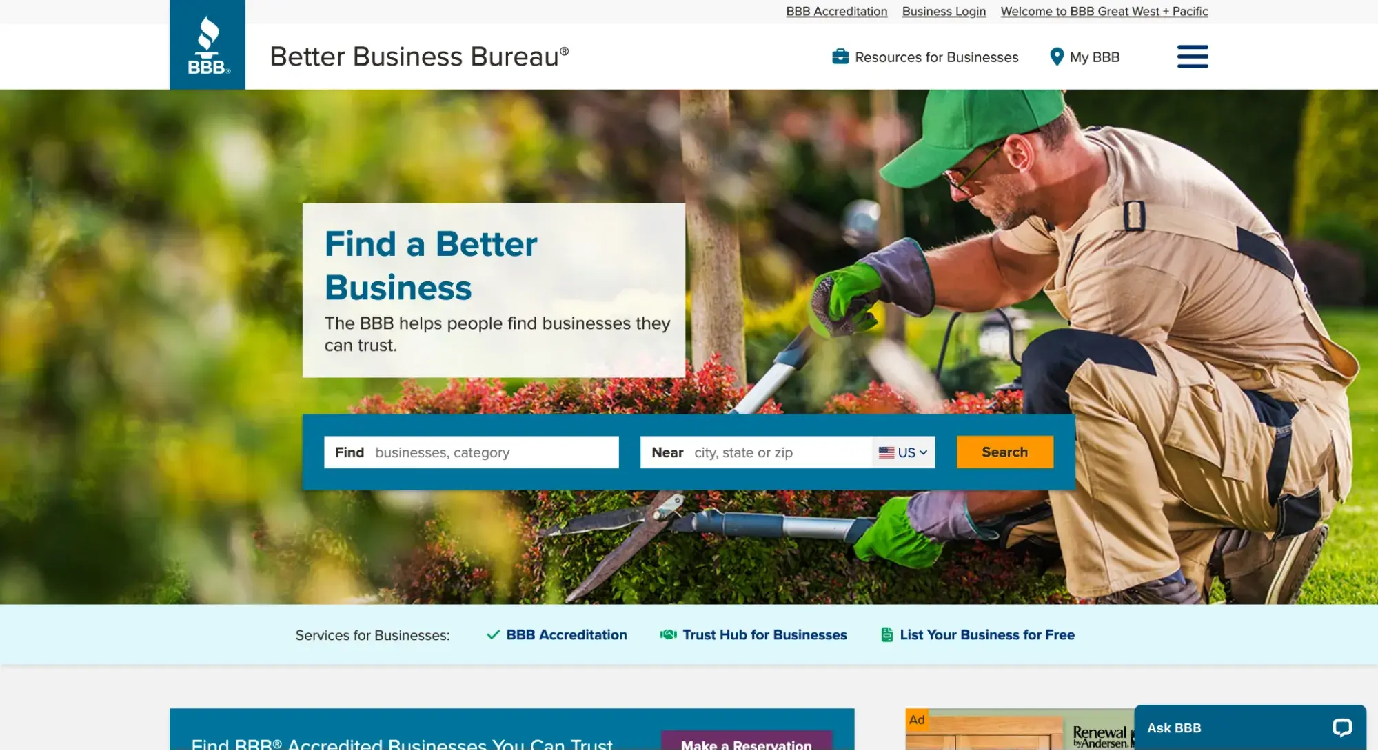
The Better Business Bureau is a nonprofit that runs an online directory of businesses with the goal of building trust between buyers and sellers.
You can search any business and see if it meets the standards of BBB accreditation, find out when it was opened, and maybe even see user reviews or complaints.
Yellow Pages
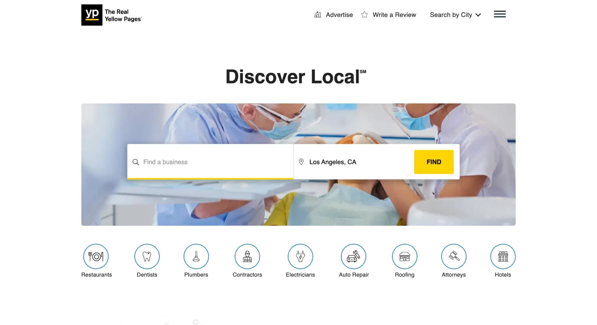
Yellow Pages is a more traditional business directory that has successfully transitioned online. It provides listings for a wide range of businesses and services across various industries.
What I like: Yellow Pages has a straightforward, no-frills approach to business listings. The site is easy to navigate, and I appreciate how it often includes essential information like business hours, contact details, and website links all in one place.
13. Booking Websites
Booking websites make the entire planning process so much easier by connecting travelers with lodging, transportation, and tour packages that they can purchase through the site.
Airbnb
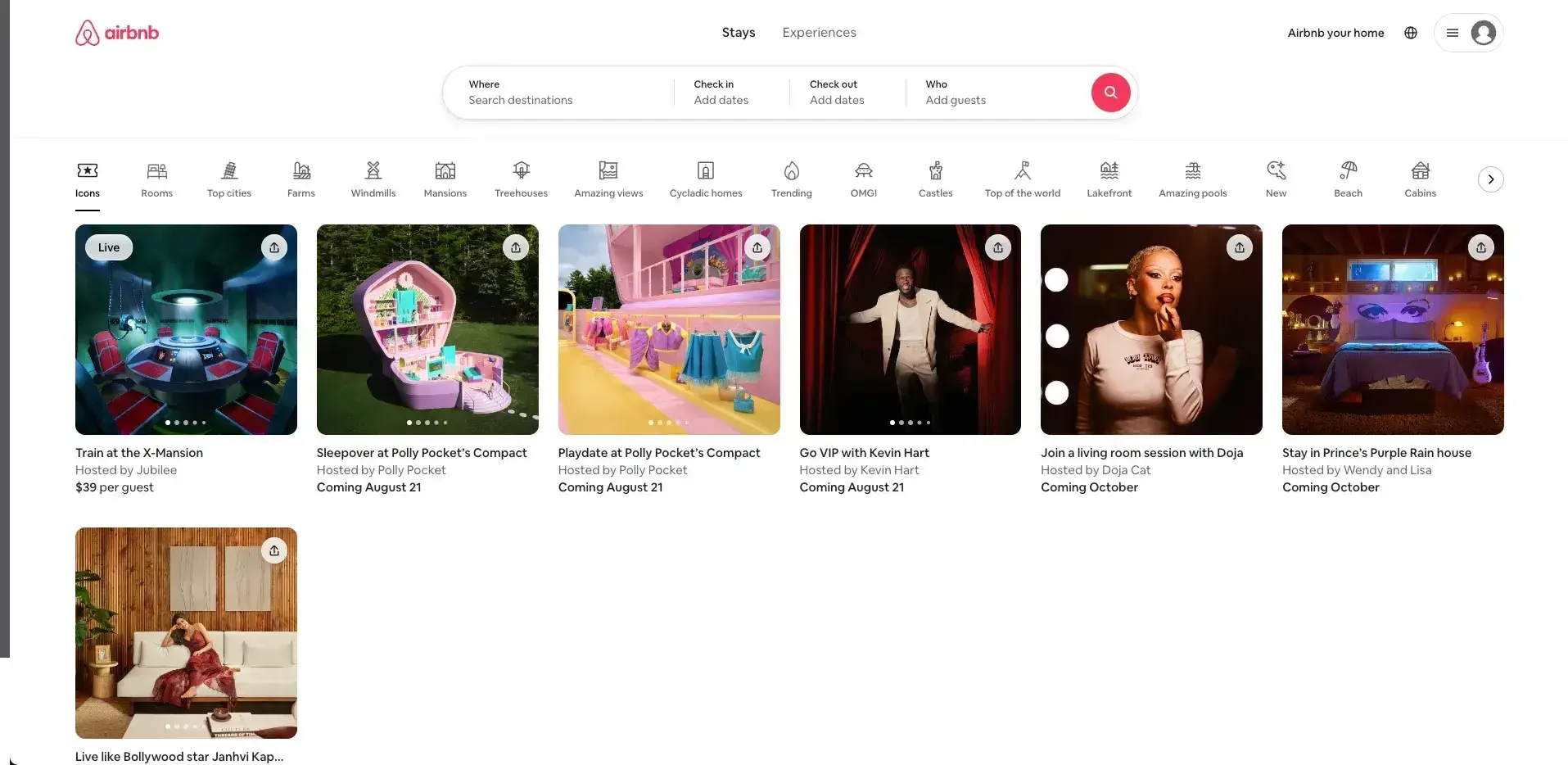
Remember when your options were limited to hotels or hostels? Airbnb changed all that. On this booking website, homeowners can rent out their homes to travelers.
What I like: Airbnb offers a very unique experience. Want to stay in a treehouse in Costa Rica? Or how about a houseboat in Amsterdam? Airbnb makes it possible.
The platform's user-friendly interface, with its detailed listings and honest reviews, helps me find the perfect place to stay. Plus, the ability to communicate directly with hosts gets me insider tips about the local area.
Eventbrite
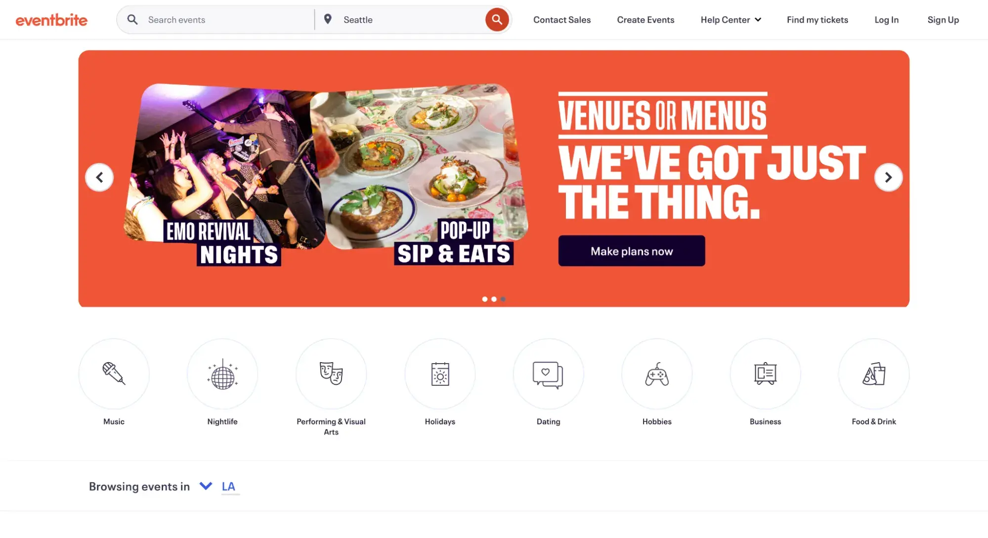
On the other hand, Eventbrite caters to a different kind of booking — events. From concerts and workshops to local community gatherings, Eventbrite has become my go-to for discovering what's happening around me, especially when I want a taste of the local culture while traveling.
What I like: Eventbrite is quite diverse. One day, I might be booking tickets for a rock concert, the next for a cooking class. The platform’s recommendation engine often introduces me to events I wouldn’t have found otherwise.
Plus, the ease of managing my tickets directly through the app? That's a huge bonus in my book.
14. Membership Websites
Membership websites require visitors to register an account to take full advantage of what the site has to offer. These sites range from educational resources to web apps to news and entertainment publications.
In all of these, some or all valuable content is protected and only available to “members” of the website and, in many cases, requires payment to access.
How exactly a membership site’s content and services are gated varies widely — some websites reserve all content for members, while other websites make some items free and others exclusive.
Membership websites may accept one-time payments for access, be subscription-based, or require no payment at all, just a sign-up.
Many sites, particularly those offering video content, monetize videos by gating premium content behind memberships. Blogs, entertainment sites, and news sites have been shifting to this model to generate revenue.
Going
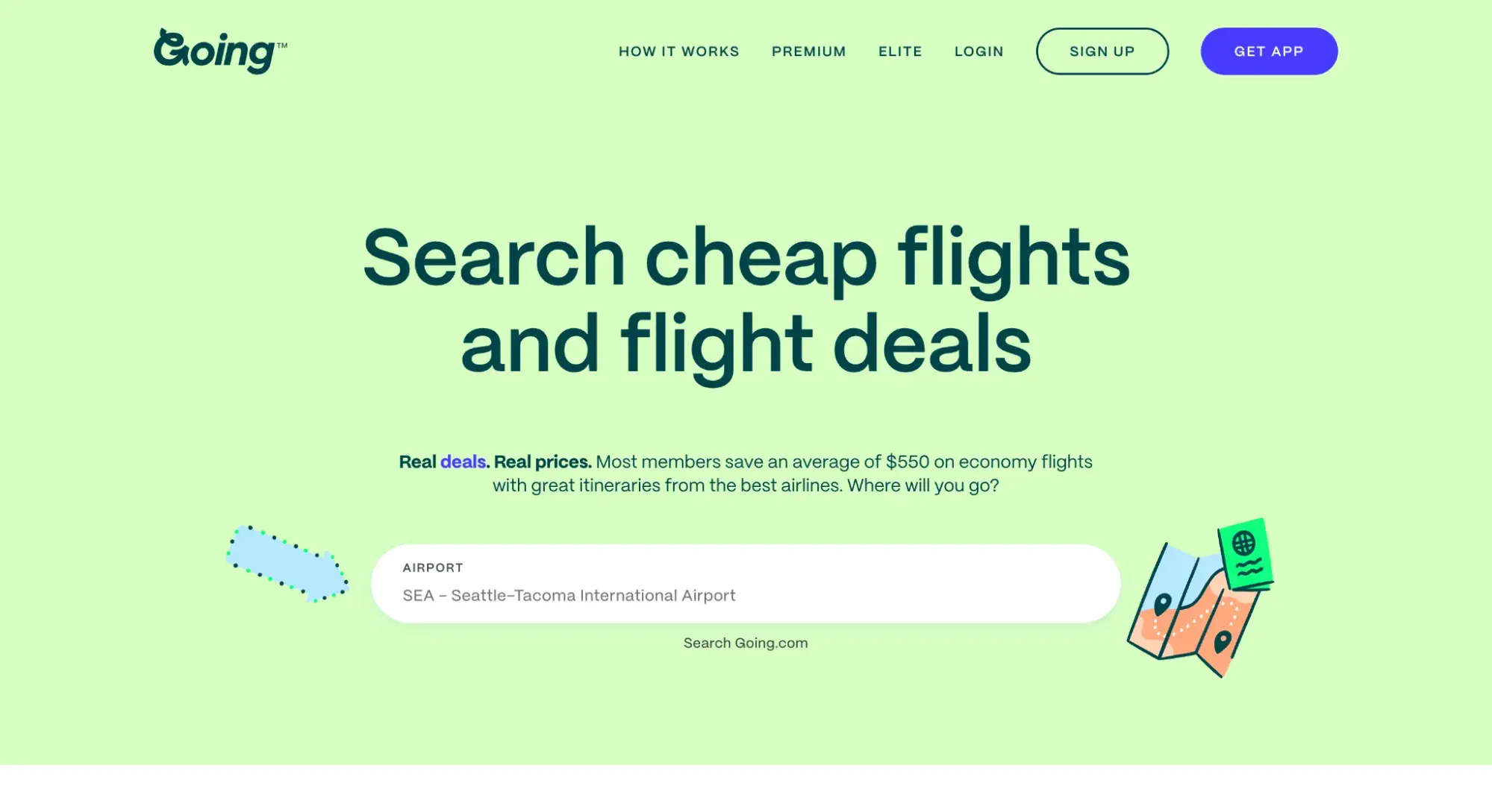
Going, formerly known as Scott’s Cheap Flights, is one example of an effective membership site.
What I like: The service helps me find inexpensive round-trip flights from the United States to popular travel destinations and sends an email alert when it finds a deal for me.
HubSpot's Free Website Builder
Create and customize your own business website with an easy drag-and-drop website builder.
- Build a website without any coding skills.
- Pre-built themes and templates.
- Built-in marketing tools and features.
- And more!
15. Wedding Websites
As someone who’s actually planned their own wedding, I think wedding websites are a Godsend. They’re super convenient for sharing all the important details with your guests in one spot.
You know, things like when and where everything's happening, how to get there, gift ideas, and a way to RSVP without the hassle of snail mail.
The Knot
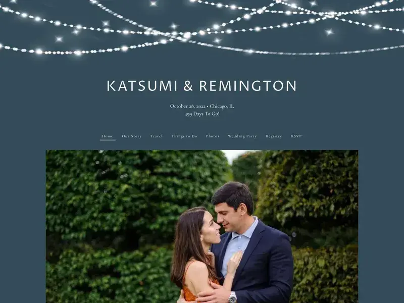
I’m a big fan of The Knot’s website builder. It’s so easy to use, even if you’re not tech-savvy. You can pick a design that matches your wedding vibe, and boom — you've got a pretty site.
The above Katsumi & Remington wedding website is an example of a website built with The Knot.
What I like: The Knot helps you keep track of who’s coming and manage all those guest questions without losing your mind. The privacy settings are great, too. You don’t want just anyone stumbling across your wedding details online, right?
All in all, these websites make the whole planning process way less stressful. When you’re juggling a million wedding tasks, that’s a huge relief!
16. Portfolio Websites
Online portfolios are a great way for creative freelancers and agencies to present their work. Whether you specialize in painting, illustration, film, photography, graphic design, sculpture, prose, or poetry, you can craft a portfolio website that showcases your creative best.
Portfolios are also an option for professionals outside the arts — for instance, programmers can build portfolios for their coding projects, and marketers can use portfolios to recount their most effective campaigns.
As a freelancer, I have benefited greatly from portfolio websites to show off my work and connect me with clients. Portfolio sites usually have your name, headshot, and of course, a portfolio of your work. There's usually an About and Contact page too.
Julie Guzal
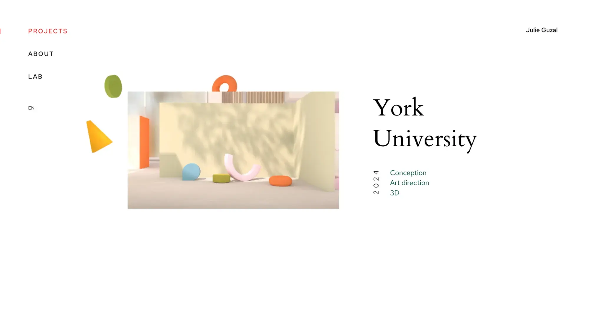
There are thousands of portfolio websites out there to inspire yours. France-based freelance designer Julie Guzal’s is just one example.
What I like: The minimalist, broken grid layout places focus on her work, with several small design quirks to make it memorable. There’s also a prominent (but not distracting) contact button near the bottom to get in touch.
Kiran Shahid
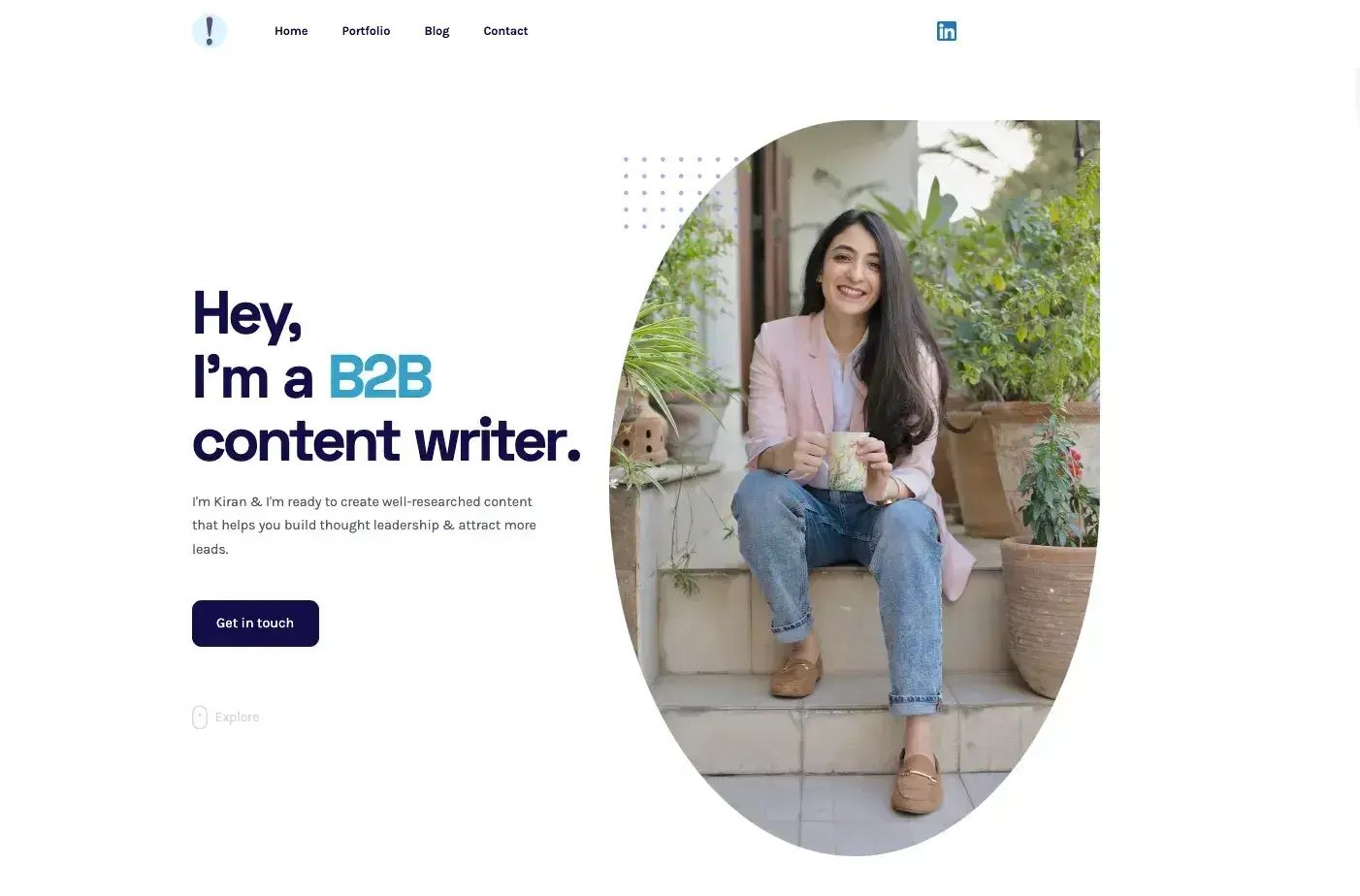
Or hey, you can have a look at my website too.
I created my website using Webflow. The learning curve was a bit steep compared to other website builders like Wix, but buying a template made the process much smoother. Plus, maintaining a website has also been a breeze with Webflow.
Since creative professionals and agencies utilize portfolios to land work with clients, these sites lean more formal in their presentation. For a more casual approach, you might consider a personal website, which we’ll cover next.
17. Resume Websites
As the name implies, resume websites typically showcase your resume online. It might highlight skills, past jobs, and a downloadable PDF of your resume. It might even have a portfolio page.
So how’s it different from a portfolio website? While a portfolio website is typically used by businesses and freelancers, a resume website is typically used by job seekers to land their next position.
Tammy Hart
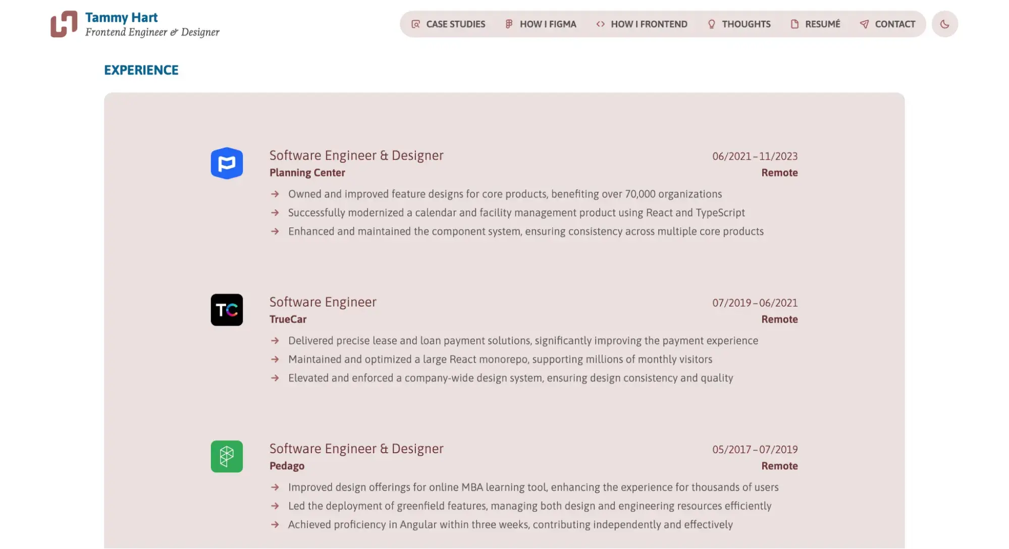
Here’s an example of a resume website by front-end developer and designer Tammy Hart.
This robust website not only features a link to her resume as a PDF, but it also has her experience listed on the website itself, case studies of her past work, and a detailed description of her design and development processes.
What I like: This website is great as a personal resume, as it beautifully displays her strengths, job experience, and best work.
18. Educational Websites
As a freelance writer, I've really felt the pressure to keep upskilling lately, especially with AI shaking up the industry.
One platform I’ve found super helpful is Teachable. Teachable lets experts create courses on pretty much anything. So whether I need to brush up on SEO techniques or learn about the latest AI writing tools, there’s usually a course hosted on Teachable for that.
Teachable
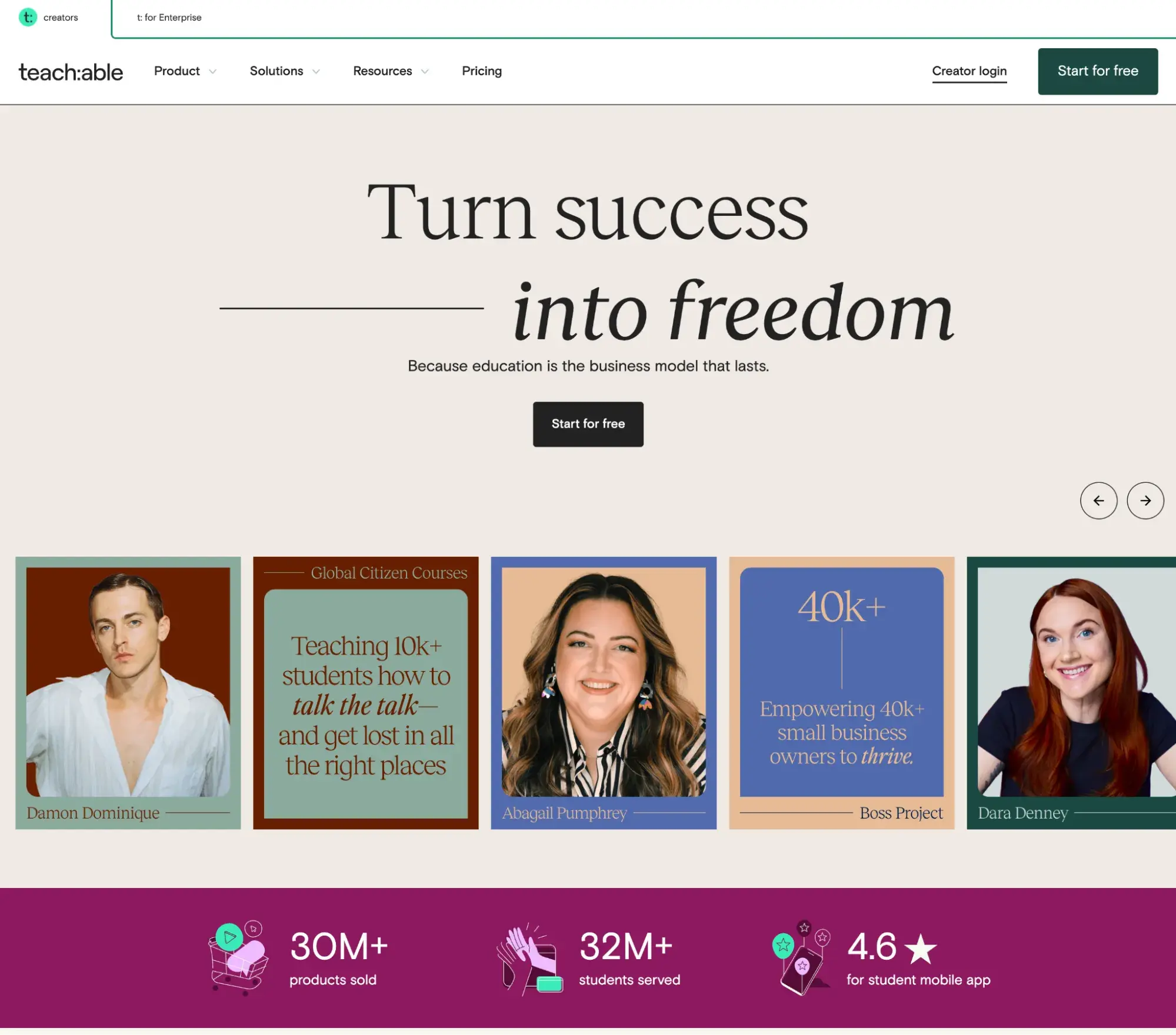
What I like: The website is pretty straightforward — it’s easy to find video lessons, quizzes, and extra materials to help the info stick.
I appreciate how you can track your progress. It’s motivating to see how far you’ve come, especially when you're juggling multiple projects and clients.
Maven
Maven takes a different approach to online learning, and I find it really refreshing. Instead of pre-recorded courses, Maven offers live, cohort-based classes led by industry experts.
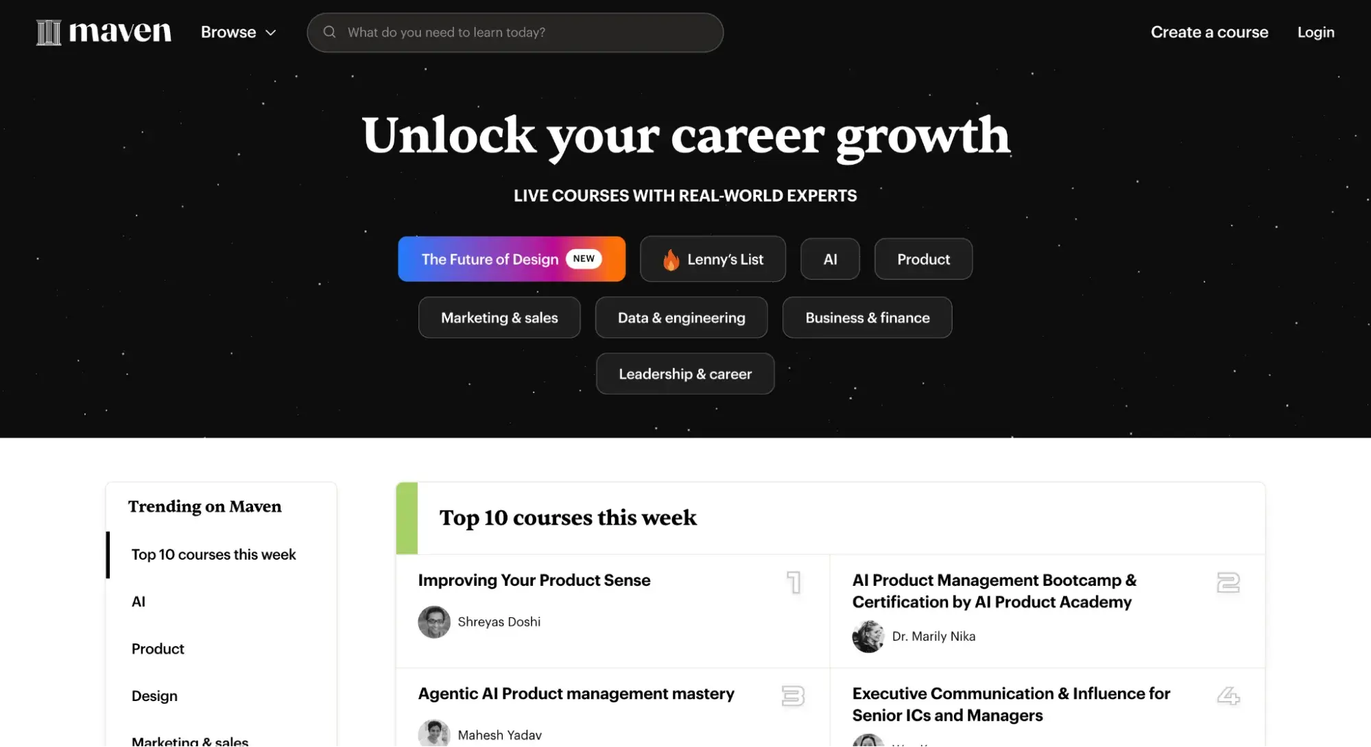
What I like: The courses are typically more intensive and run for a set period, which helps keep me accountable.
One thing to note is that Maven courses often come with a higher price tag than some other platforms. But for the level of expertise and interaction you get, many find it worth the investment.
19. Job Board Websites
Job boards are one-stop shops for finding your next gig. Way easier than the old-school method of pounding the pavement with a stack of resumes, they connect job seekers with employers and list available job opportunities all online.
Indeed
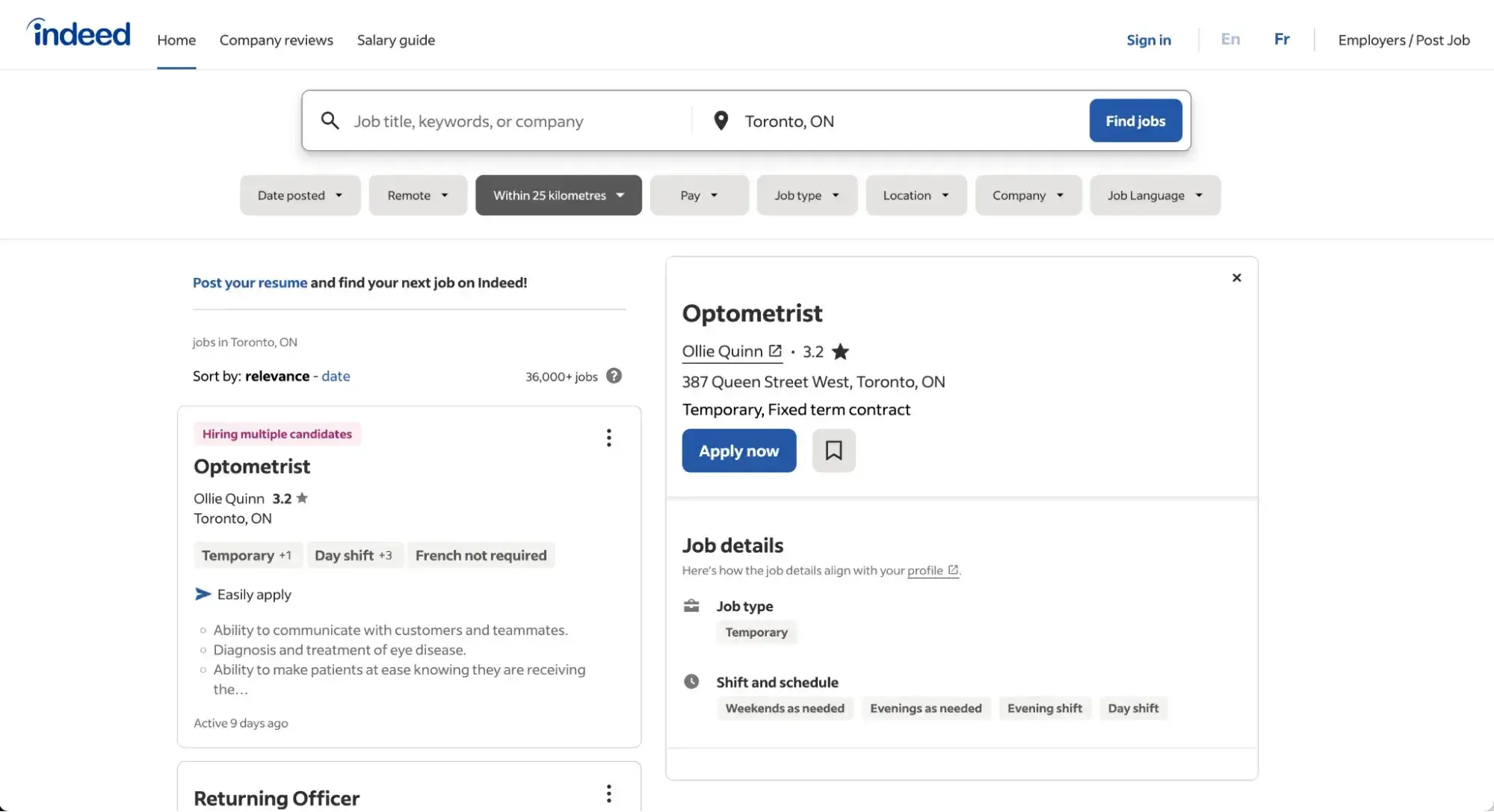
Indeed is a great example of a job board. It's super user-friendly and has tons of listings from all sorts of companies. You can find everything from entry-level jobs to executive positions in pretty much any field.
What I like: The search filters help me narrow things down by salary, location, job type — you name it. The “Easy Apply” feature is awesome too. Sometimes, you can apply for jobs with just a couple of clicks, using your saved resume. No need to fill out a million different application forms.
I also love the company reviews. I can get the inside scoop from current and former employees before I even apply.
20. Forums
Forums are online spaces where you can post questions, thoughts, or ideas and receive responses from other community members. They consist of message boards for different topics and moderators to ensure things stay civil.
HubSpot's Free Website Builder
Create and customize your own business website with an easy drag-and-drop website builder.
- Build a website without any coding skills.
- Pre-built themes and templates.
- Built-in marketing tools and features.
- And more!
If a visitor wants to participate in your forum, they’ll register with an account first — membership can be free, or you can charge for it.
While forum websites certainly exist on their own, they’re also valuable as an extension of an existing site. For example, an educational website may include a forum where students can chat about courses and answer each others’ questions.
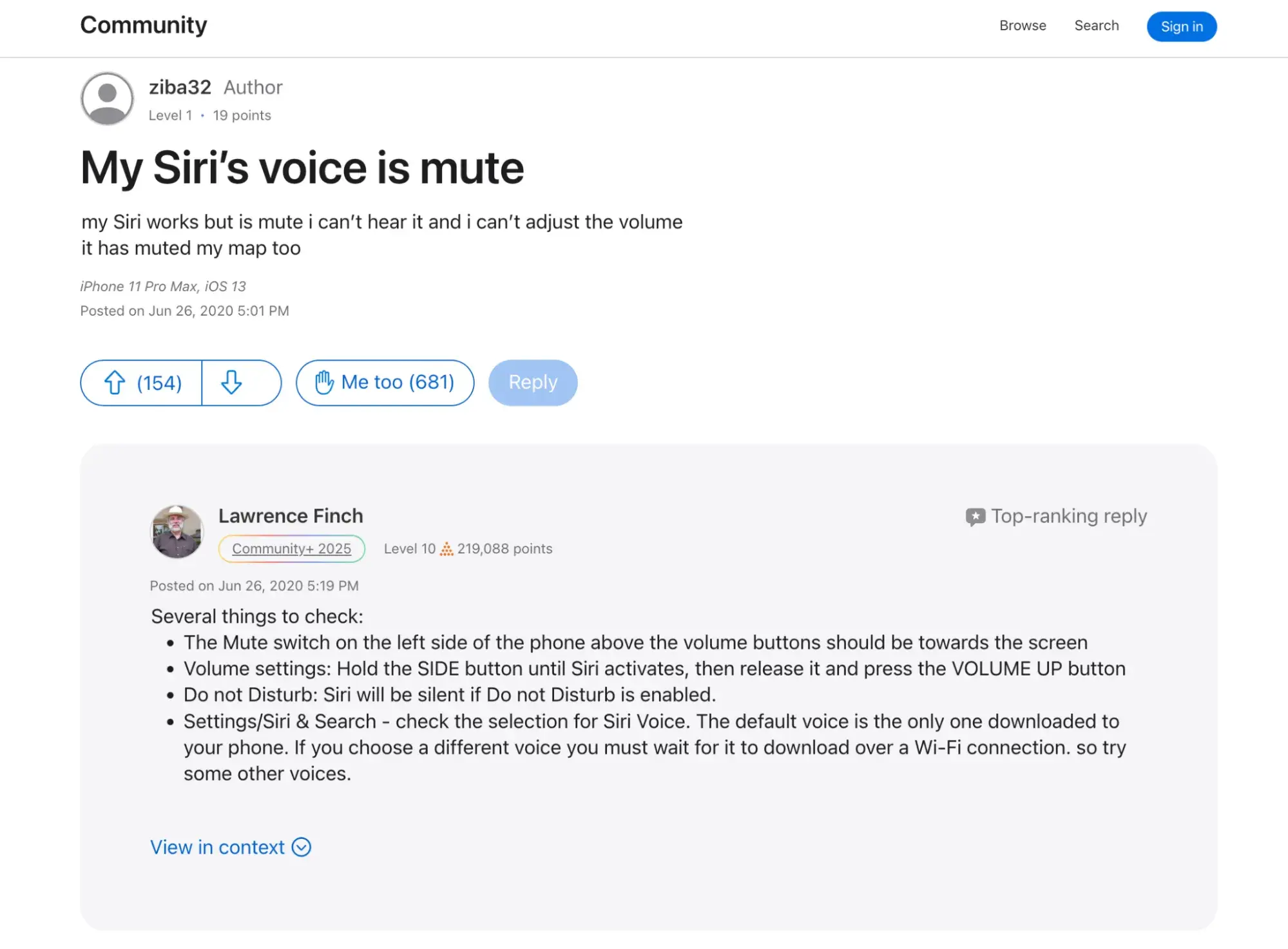
Apple
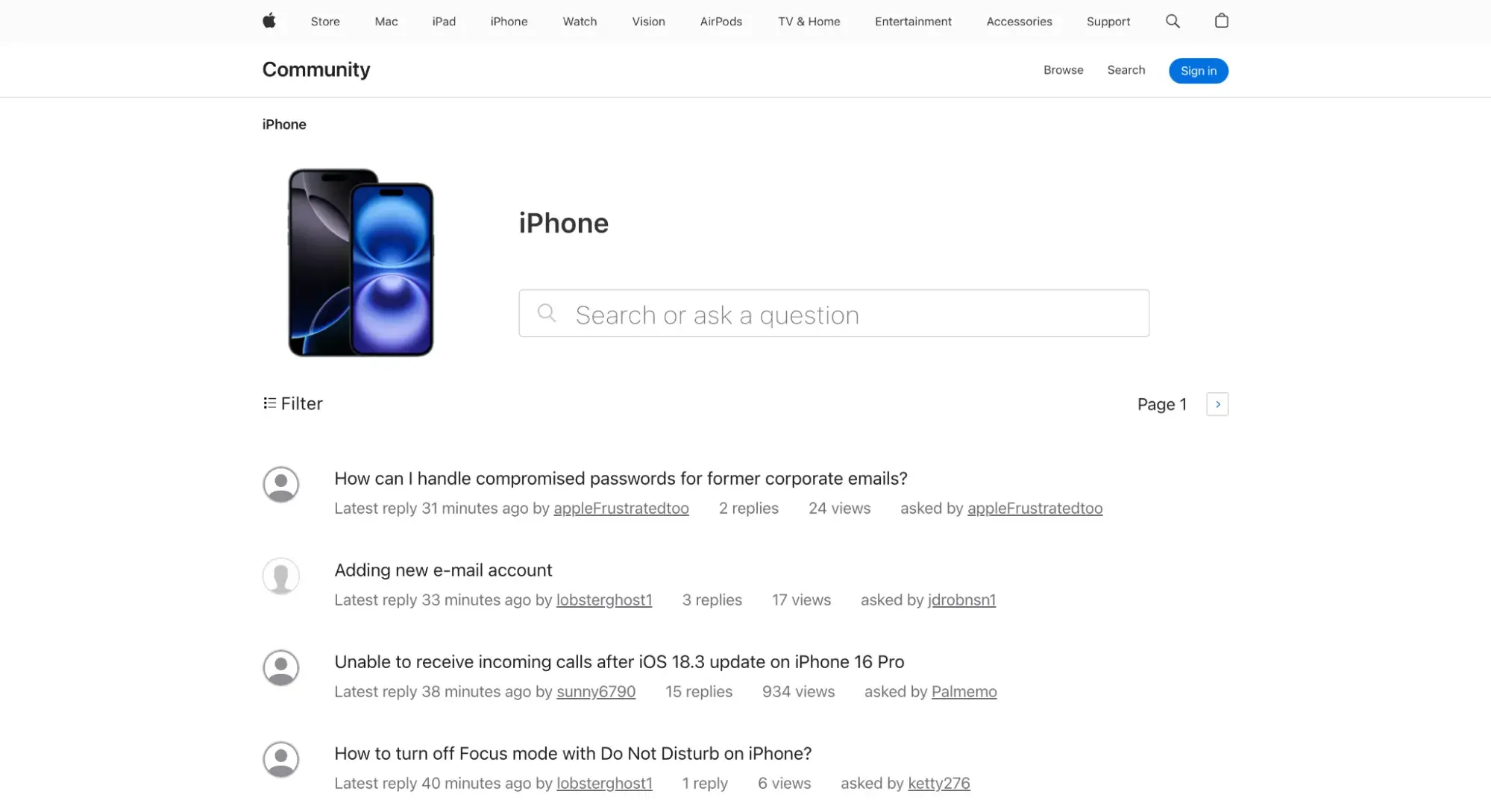
A business might include a community support forum where customers can post questions about products and get help from the community.
Apple does this with its Apple Support Community. It’s a forum website where customers post and answer questions about Apple products, including troubleshooting errors.
What I like: For each question, community members can upvote the most helpful answers, and one will be highlighted and pinned to the top as the “top-ranking reply.” This makes it super easy for me to find the best answer.
SaaS companies also often leverage forums as a support resource. Products with strong developer communities are invaluable in lowering the learning curve of a product — as are knowledge bases, our next website type.
21. Knowledge Base
If you run a business, you can bet that your customers will have questions. To get ahead, you can create a knowledge base, a website that contains documentation and answers to common questions about your product or service.
Unlike forums, which are often contributed to by volunteers, knowledge bases are populated with articles authored by that company’s employees.
Knowledge bases sort their support resources into hierarchies, making them easier to navigate and find what users need. Knowledge bases are typically also searchable — the fewer obstacles between you and your desired resource, the better.
Plus, you can analyze your visitors’ search queries and reshape your product to better address needs. This all works to decrease the number of support requests and makes for a frictionless experience.
Hubspot
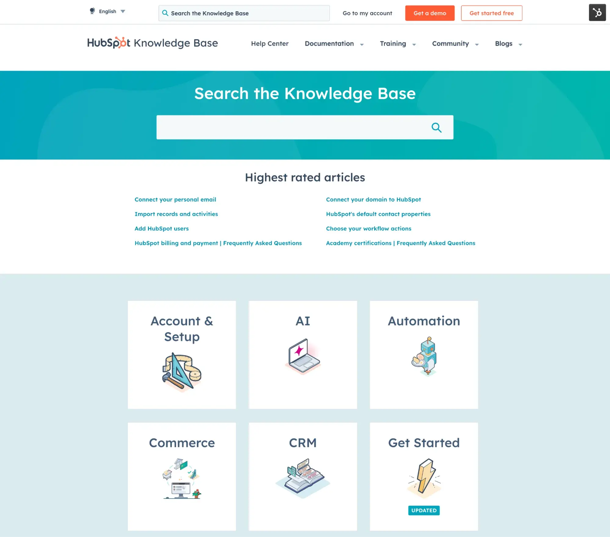
We can look to HubSpot for a model of what a knowledge base can be. The HubSpot knowledge base provides answers to product-related questions and guides for every feature.
Easily searchable, our knowledge base lets you filter queries by resource and see your location on the site with breadcrumbs.
What I like: The neat layout that emphasizes the search bar and different sections with accompanying pictures will keep visitors coming back.
22. Video Streaming Websites
Video streaming sites allow users to watch video content online without downloading the files. You can watch TV shows, movies, vlogs, and more in real time.
Netflix
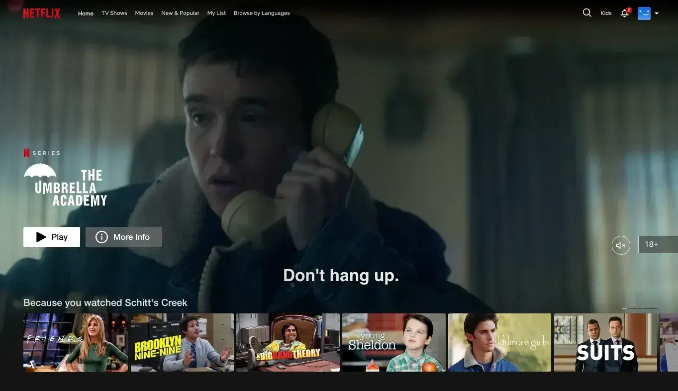
Who hasn’t heard of Netflix?
The popular subscription-based streaming service offers a vast library of movies and TV shows, with personalized recommendations for each user.
What I like: Netflix’s algorithm is pretty spot on. It's constantly learning from my viewing habits to suggest new content I might enjoy. I also appreciate how easy it is to browse and find an old favorite show or discover new ones.
YouTube
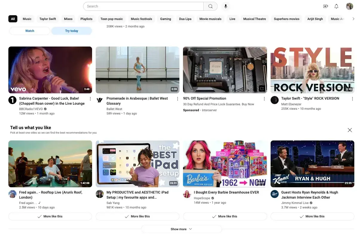
YouTube, on the other hand, is a free platform that hosts user-generated content alongside professional productions. It does, however, offer paid subscriptions if you want to bypass those ads.
What I like: You can find any kind of video on YouTube. Whether I’m looking for educational videos, music, entertainment, or even niche hobby content, I can usually find what I need. The platform’s algorithm is impressively good at suggesting related videos that keep me engaged.
To create a good video streaming website, focus on smooth playback and minimal buffering. Users expect high-quality video that starts quickly and plays without interruption. You also need a robust search and recommendation system to help users discover new content they'll enjoy.
23. Memorial Websites
Memorial websites are online platforms dedicated to honoring loved ones who have passed away. They’re a touching way to celebrate a person's life and create a lasting digital tribute.
Ever Loved
One example of a memorial website platform is Ever Loved. Ever Loved helps you create a personalized memorial page with photos, stories, and even a timeline of the person's life.
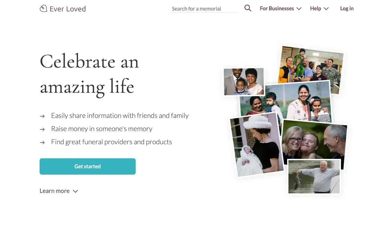
What I like: I appreciate how it combines practical features like funeral event planning and donation collection with more sentimental elements like a guestbook for condolences. The ability to invite others to contribute their memories makes it a collaborative space for healing.
Creating a good memorial website requires a delicate balance of sensitivity and functionality. It's important to provide a respectful, dignified space for remembrance while also including practical features that can help during the difficult time following a loss.
Security is also crucial — you want to ensure that only approved individuals can contribute to or view certain parts of the site if desired.
24. Review Sites
Where would I be without review sites? I rely heavily on customers’ honest reviews before I make any major (or minor) purchase.
And I’m not alone. According to a survey of 6,538 U.S. consumers, nearly everyone — 99.9%! — consults online reviews at least sometimes, while 60.9% do so every time.
Yelp
Yelp is a popular review site that features user ratings and reviews of local businesses, restaurants, and services. It’s an excellent resource for gauging quality and reputation.
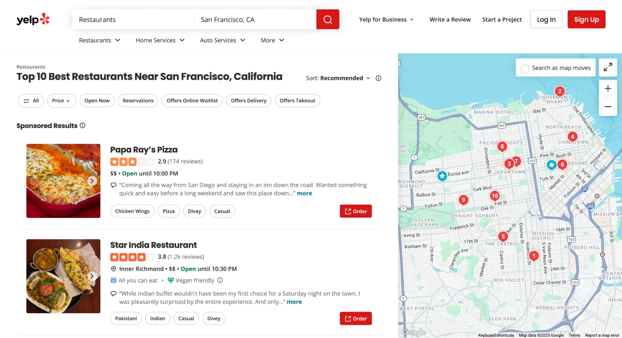
What I like: Yelp offers a comprehensive review system. The ability to read detailed experiences from other users helps me make informed decisions about where to dine, which services to use, or which local businesses to support.
Also, I like how the platform's search filters let me narrow down options based on price range, location, and features.
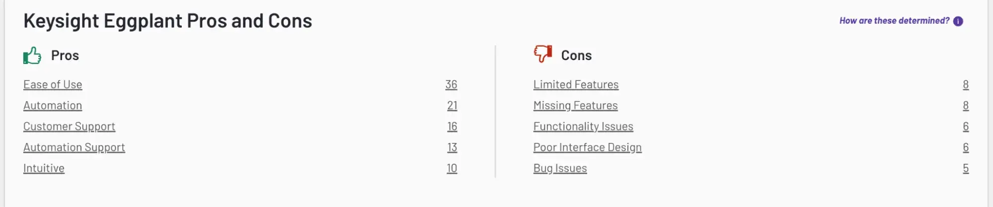
G2
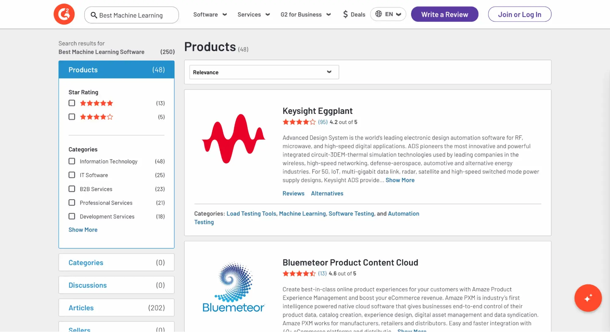
G2 is a business software and services review site that I’ve consulted far too many times to count when doing research for my own business decisions or for an article I’m writing.
It features user-generated reviews, pros and cons of each software/service, and roundups of the best-rated ones.
What I like: I like that G2 compiles the most-mentioned pros and cons at the top of the reviews section. That way, I can click to learn more by reading the reviews that mention a specific benefit or issue.
25. Event Websites
An event website promotes a conference, music festival, retreat, or other large-scale event that requires registration or tickets. The homepage of an event website must prominently convey three crucial things: when the event’s happening, who/what will be there, and how to buy tickets.
Boston Calling Music Festival
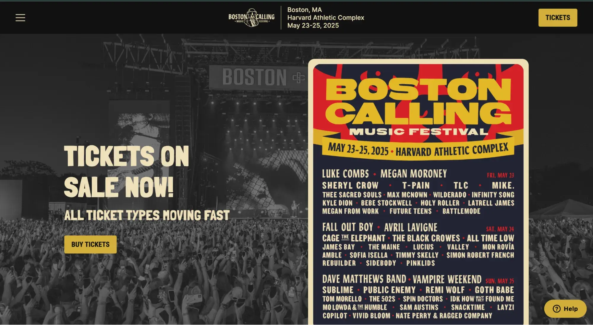
Boston Calling Music Festival’s website manages to fit all three of the above criteria above the fold. The date, lineup, and link to buy tickets are all visible the second you land on the site.
What I like: The sticky navigation bar ensures that I see the date of the musical festival and the tickets CTA button even when I scroll.
26. Search Engines
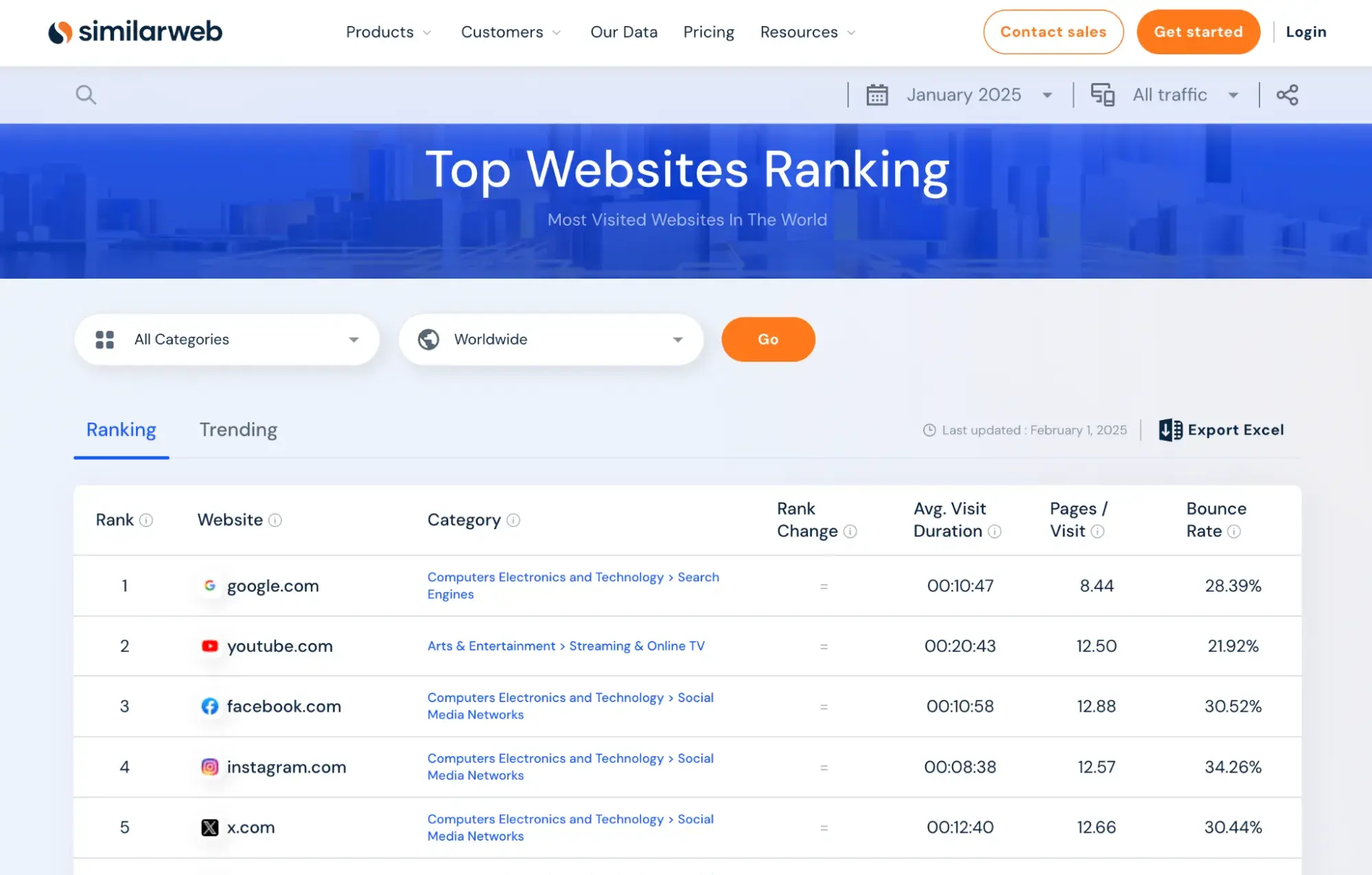
I couldn’t make a list of types of websites without mentioning search engines. According to Similarweb, Google is the most visited website in the world. So, if you can build an even better search engine, you could capture a ton of traffic.
DuckDuckGo
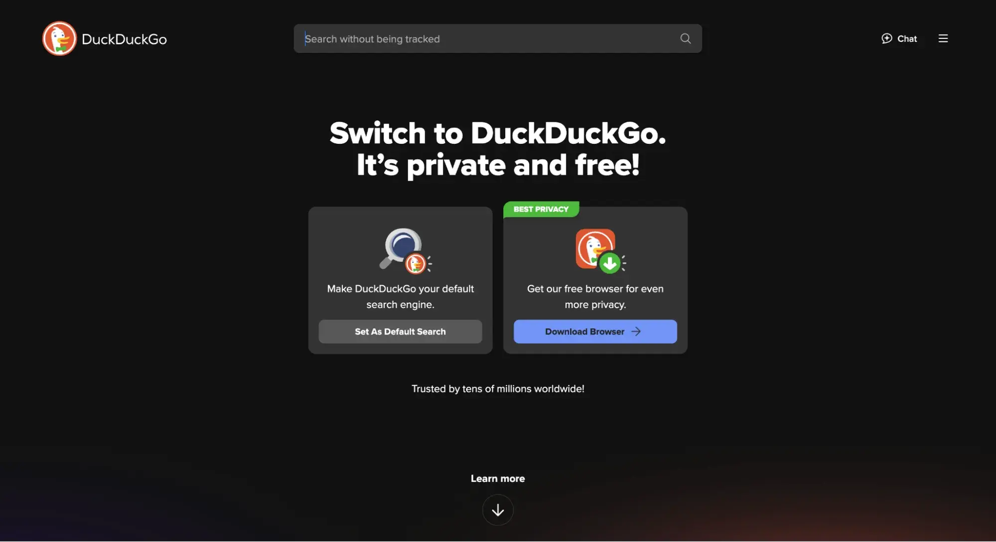
DuckDuckGo‘s differentiator is made clear right there in its search bar: “search without being tracked.” This pro-privacy search engine blocks tracking ads, cookie pop-ups, email trackers, and third-party trackers. It also doesn’t track your search history.
What I like: DuckDuckGo’s UI is extremely similar to Google’s, so it’s intuitive to use. One major difference? It has fewer ads. So if you’re sick of seeing sponsored results at the top of most of your searches, DuckDuckGo is a good alternative.
27. Design Inspiration Sites
Design inspiration sites rely on curation and community submissions. They showcase websites, illustrations, graphic design, and mockups.
Users can often vote on designs or favorite them, and the website often categorizes designs or adds tags to them to make for easy discovery and exploration.
If you’re feeling stale or you need help planning a website redesign, design inspiration sites will give you fresh ideas and get those creative juices flowing.
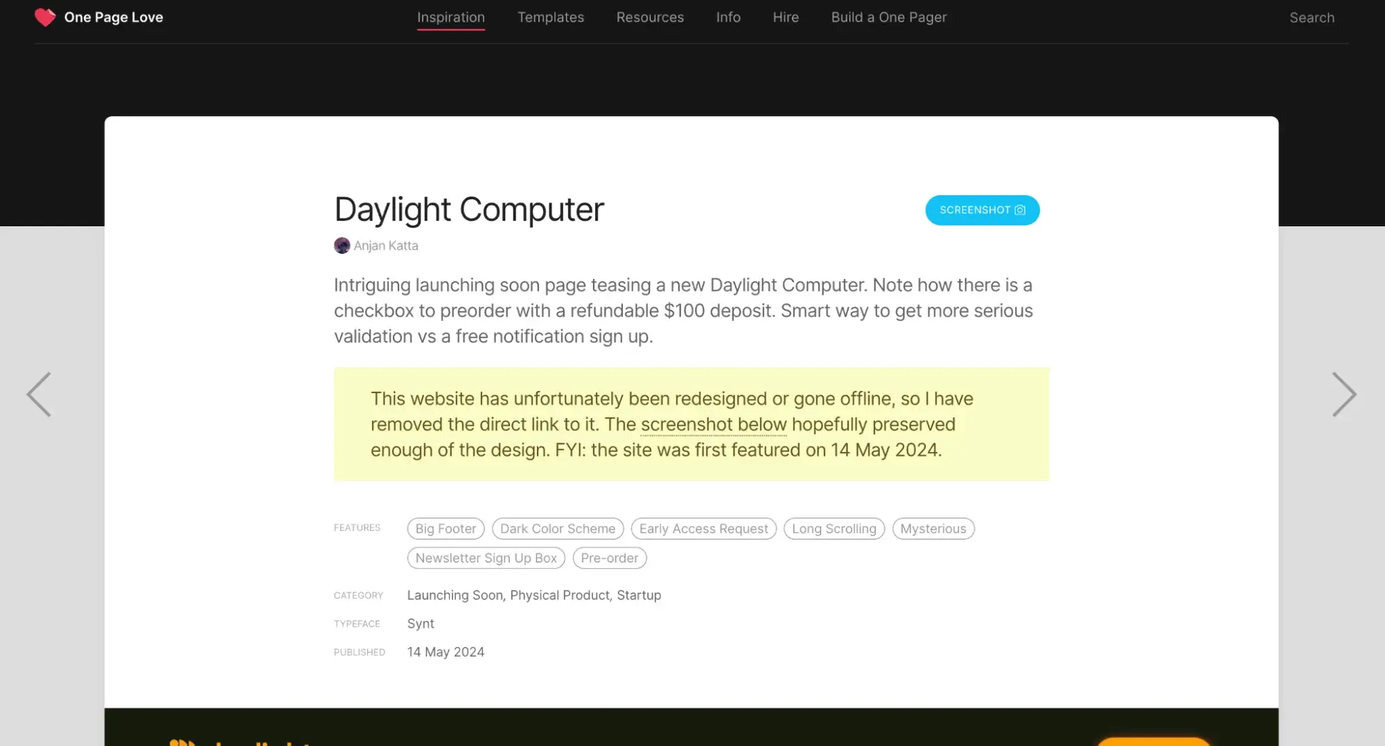
One Page Love
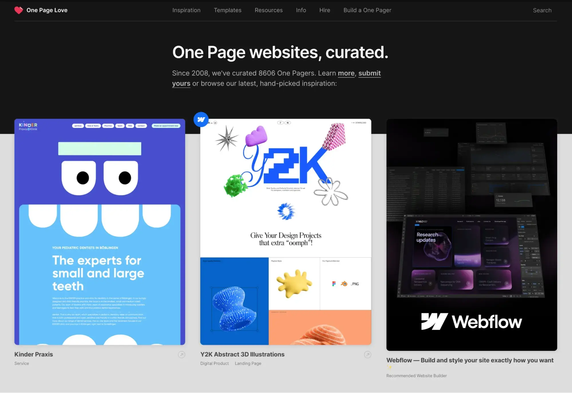
One Page Love curates the best one-page websites on the internet, including through user submissions.
What I like: Rather than merely adding a screenshot of a website with no context, One Page Love goes the extra mile and adds a description of what makes the site great, tags (such as “dark color scheme” and “long scrolling”), and information about the typeface used.
28. Comparison Sites
Comparison sites help shoppers compare different products before deciding which one to purchase. Typically, these are insurance plans of some sort, whether it be health, auto, or life insurance.
Comparison sites make money off of affiliate marketing — they get paid a commission for every sale made through their links.
Go.Compare
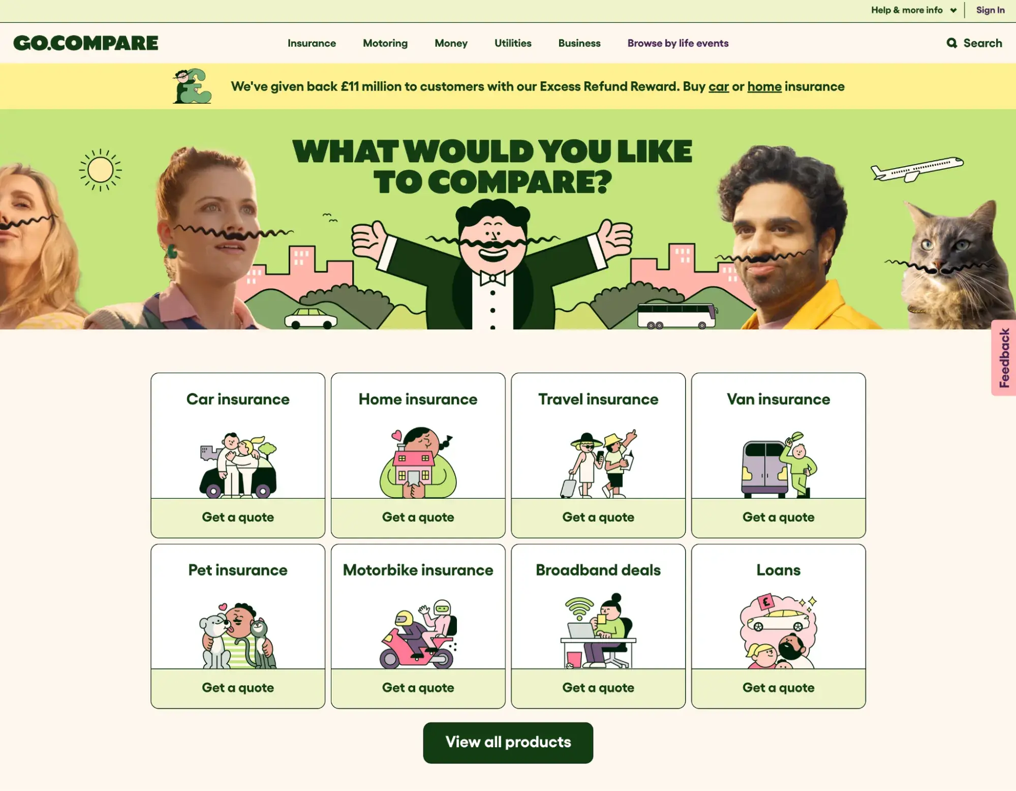
Go.Compare is a UK website that helps shoppers find home insurance, credit cards, pet insurance, broadband deals, and more.
What I like: With its mustachioed people (and cat), bright colors, and straightforward copy, Go.Compare manages to make a comparison website look fun and trustworthy.
It also has clear, easy-to-understand navigation, which is critical given it has so many different products to choose from.
Types of Websites FAQs
What is the most popular type of website?
According to Similarweb, as of January 2025, the most popular website in the world in terms of visits is Google — a search engine. Second is the video streaming site YouTube. And the rest are social media networking sites.
What are the 3 main parts of a website?
The three main parts of a website are as follows:
- Header: The header is the bar that spans the top of a webpage that typically contains the main navigation menu, a logo, and perhaps a CTA button.
- Hero: Most commonly associated with a homepage, the hero section is the above-the-fold area of a webpage that typically has a headline, image or video, and a call to action.
- Footer: The footer is always at the very bottom of a website, and is the last impression you leave on visitors. Usually, it will have links to the most important pages of the website, contact information, copyright notice, and links to legal terms, such as a privacy policy.
What is the difference between a webpage and a website?
A website is made up of webpages. A webpage has an individual URL, like the blog post you’re reading right now (blog.hubspot.com/website/types-of-websites).
The website exists on the domain that each individual URL is housed in (hubspot.com). So, think of the website as the umbrella over the multiple webpages.
What’s your website?
After exploring these 28 types of websites, I have some ideas I can apply to my projects. Reflecting on my own website creation journey, I now see how understanding your niche simplifies the process.
It’s also good to know that your design doesn’t have to reinvent the wheel to make an impact. Explore this website design lookbook for more inspiration, or use website templates to make the process even easier. They’re a great starting point and allow you to customize and add your personal touch without starting from scratch.
Start by referencing the above examples as a jumping-off point, and then tinker with a website builder to start creating your own digital presence today.
Editor's note: This post was originally published in May 2021 and has been updated for comprehensiveness.
HubSpot's Free Website Builder
Create and customize your own business website with an easy drag-and-drop website builder.
- Build a website without any coding skills.
- Pre-built themes and templates.
- Built-in marketing tools and features.
- And more!
Website Design Examples

![15 black and white website designs to inspire your own [+ pro tips]](https://53.fs1.hubspotusercontent-na1.net/hubfs/53/black-and-white-website-design-1-20250520-1336267.webp)

![Gradient Website Design Examples That Prove This Trend Is Far From Over [+Tutorials]](https://lh7-us.googleusercontent.com/htOWIbyCIoCMxSjC4gJunkGnhCzXpccjTrL8NwoGdRdCsSiEmEAxe_qBFkMrzy2Y8d3cwEr_DMzSGHq9Xi-hQFnMJCo8HDQJ1yQGigcSfFxI2QKXo0s7xXSB2sY-eALG1iUqnHXgomcDsnp7AHRSH1s)
![15 Brochure Website Examples to Inspire You [+ How to Make One]](https://53.fs1.hubspotusercontent-na1.net/hubfs/53/brochure-website-examples-1-20250319-362228.webp)

![10 of my favorite interactive websites [+ how I make my own]](https://53.fs1.hubspotusercontent-na1.net/hubfs/53/%5BUse%20(1)-Sep-27-2025-03-02-58-8817-PM.webp)
![30 Furniture Website Design Examples I Love [+ How To Make Your Own]](https://53.fs1.hubspotusercontent-na1.net/hubfs/53/Google%20Drive%20Integration/furniture%20website%20design_32023-1.png)