.png?width=112&height=112&name=Image%20Hackathon%20%E2%80%93%20Square%20(10).png)

In this post, I’ll take a closer look at website navigation design to help you create a system that suits your visitors. I‘ll also explore website navigation best practices and share navigation menu examples. Let’s get started.
Table of Contents
- What is website navigation?
- What is a website navigation menu?
- Website Navigation Best Practices
- What are the types of website navigation?
- Website Navigation Bar Design
- Website Navigation Examples
- Designing Your Website Navigation
What is website navigation?
Website navigation is a collection of user interface components that allows visitors to find content and features on a site. These components can be in the form of copy, link text and buttons, and menus.
Navigation is a core part of your website architecture. It’s also part of the UX concept of wayfinding, which is pretty much what it sounds like. By helping your users find their way across your website, you reduce frustration, improve efficiency, and ensure a good user experience.
While helping visitors move from one web page to another is a main priority, it isn't the only one. Navigation also helps visitors comprehend the relationships between individual pages on a website. But what exactly does that look like in practice? Let’s break it down.
What is a website navigation menu?
A website navigation menu is an organized list of links to other web pages, usually internal site pages. Navigation menus appear in page headers, sidebars, or footers across a website, allowing visitors to access the most useful pages quickly.
Navigation is seen as the tip of the iceberg of a website's information architecture (IA), according to IA analyst Nathaniel Davis in an article for UXmatters.
Below the water‘s surface are the portions of this iceberg the front-end visitor can’t see: the research, strategy, management, and organization that went into building the website’s IA. Above the surface is the navigation interface, most often represented as a series of hypertext links and a search bar.
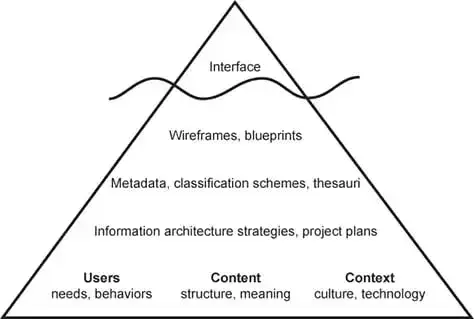
So, your website's IA isn’t visible in the navigation interface but is the foundation of that interface.
This ultimately provides visitors the sense that the content is connected and categorized to meet their needs and expectations but never actually shows all the spreadsheets and diagrams that went into identifying and organizing those relationships among your content.
Here‘s a look at an example of a website’s hierarchy. A little intimidating at first glance, but it’s digestible when you get a feel for what each term means.
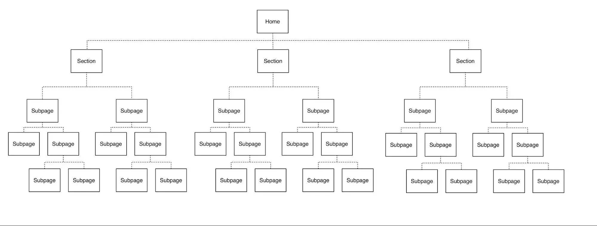
You’d likely only see the three section names in a primary navigation menu from that first level. Then, the subpages will likely be nested in a sub-navigation menu.
.png)
Free UX Research Kit + Templates
3 templates for conducting user tests, summarizing your UX research, and presenting your findings.
- User Testing Template
- UX Research Testing Report Template
- UX Research Presentation Template
Download Free
All fields are required.
Form not available
What is sub-navigation on a website?
Sub-navigation, or local navigation, is the interface where your site visitors can locate lower-level categories of a site's IA. These are usually sub-categories of the main navigation links and are often displayed via dropdown menus.
Take the financial operations platform Ramp for example.
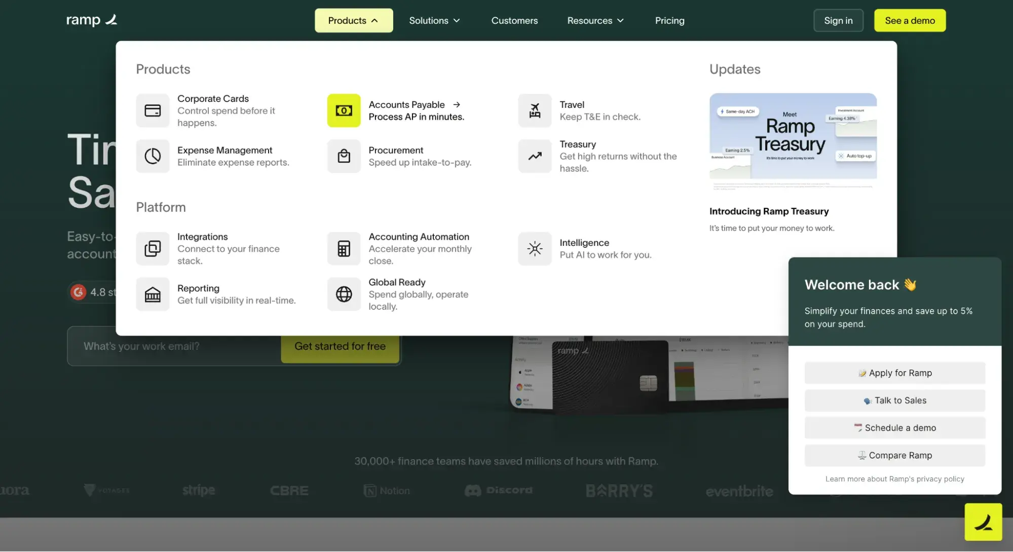
The primary navigation menu contains the navigation item “Products.” When I hover over that item, a sub-navigation menu appears, offering multiple product options, including “Corporate Cards” and “Accounts Payable.”
This is effective because visitors can seamlessly find what they're looking for, but the menu is not overwhelming at first glance. It’s a win-win.
What are the types of website navigation?
Why exactly is website navigation so crucial? Well, for starters, it impacts whether visitors arrive on your homepage and browse or click the “Back” button, leading to the dreaded high bounce rate.
As a result, you should deeply consider the best way to structure your website navigation. And that's where the different kinds of website navigation come into the picture.
How you structure your website navigation depends on your target audience and what format you think would be most intuitive and accessible. Below, I’ll share some common types of website navigation you can consider as you build your site.
Horizontal Navigation Bar
Let's kick it off with the horizontal navigation bar. As you might have guessed, the horizontal navigation bar is the most common type. It lists the major pages side-by-side and places them in the website header.
Many websites feature the same sections, like “About,” “Products,” “Pricing,” and “Contact,” because visitors expect to see them.
While these sections are popular for a reason, you shouldn't be afraid to customize your site by tailoring your menu based on your user research.
Free offer: If you need help conducting research to find out what your website visitors want to see in the navigation bar, download this free UX research kit with templates.
When you build your navigation bar, consider your website’s purpose and audience. What are you trying to achieve on your site, and what are visitors looking for? I recommend you start by answering those two questions and then go from there.
Airtable’s website features a horizontal navigation bar tailored to its B2B customers. As you can see below, it features prominent CTA buttons on the right: “Contact Sales” and “Sign up for free.”

Dropdown Navigation Menu
Up next, we have the dropdown navigation menu. This option is ideal for content-rich sites with a complex IA.
If you want your menu to include plenty of links to pages, you may consider using this option, as there isn’t enough room to list all the links side by side.
Instead, list the most crucial or general items in the top-level navigation bar. Then, you can add the rest in a dropdown menu.
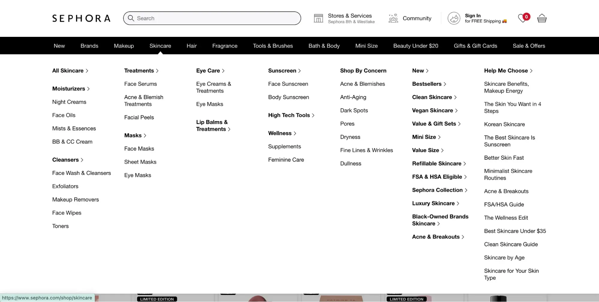
Take Sephora, for instance. This site offers an excellent example since it has so many products and services.
You can hover over any primary navigation link on its website, and a detailed dropdown menu will appear. In the screenshot below, when I hover over “Skincare,” the sub-menu appears.
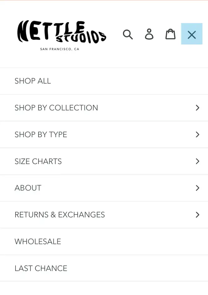
Hamburger Navigation Menu
Though the hamburger menu is most popular on mobile web designs thanks to its compact nature, it can be a smart choice for desktop websites, too.
When visitors click on the two- to three-line hamburger button, a vertical dropdown or horizontal pop-out appears with the navigation links.
If there's limited real estate on your site or you don’t want navigation taking up a large chunk of space, the hamburger navigation menu might be the right pick.
Check out the hamburger menu on Nettle Studio's mobile site.
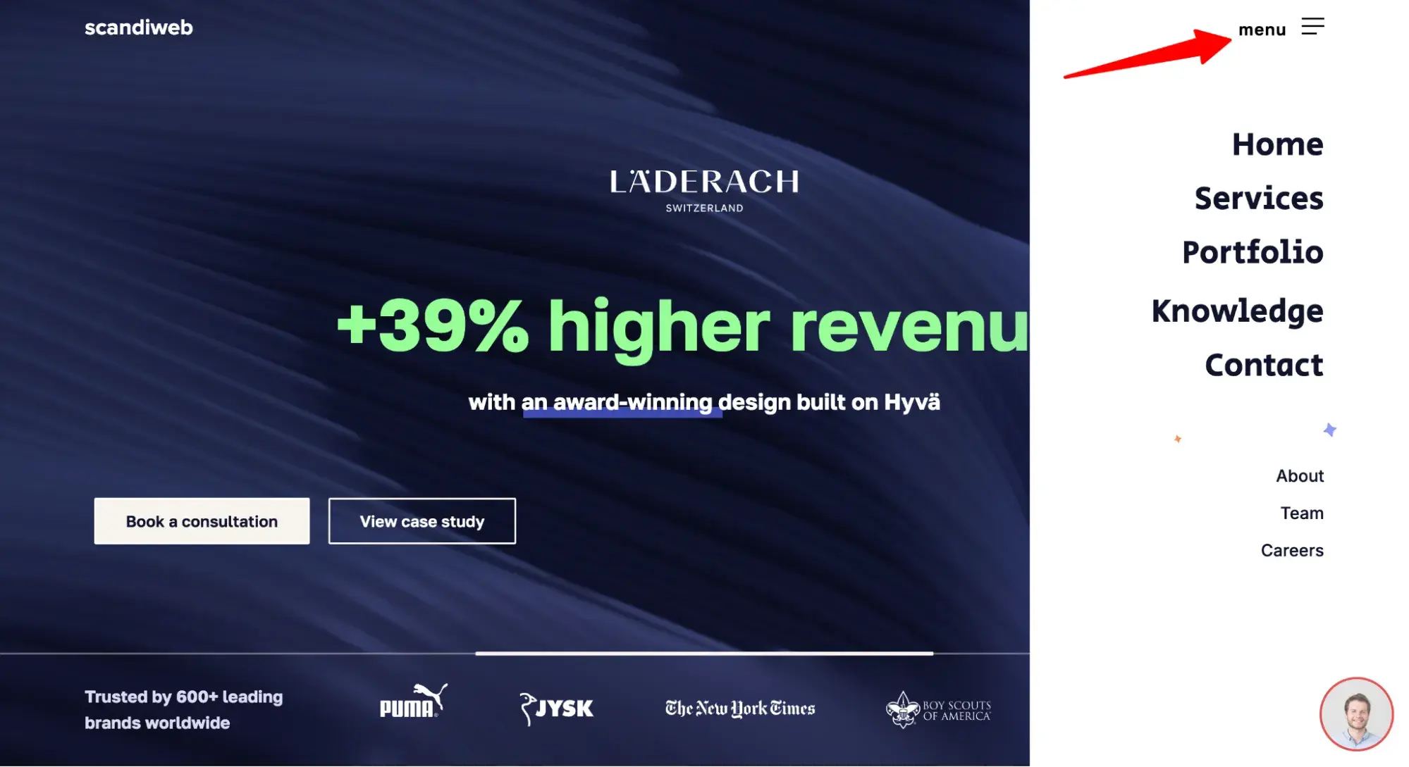
And then see how Scandiweb uses a hamburger menu on its desktop site.
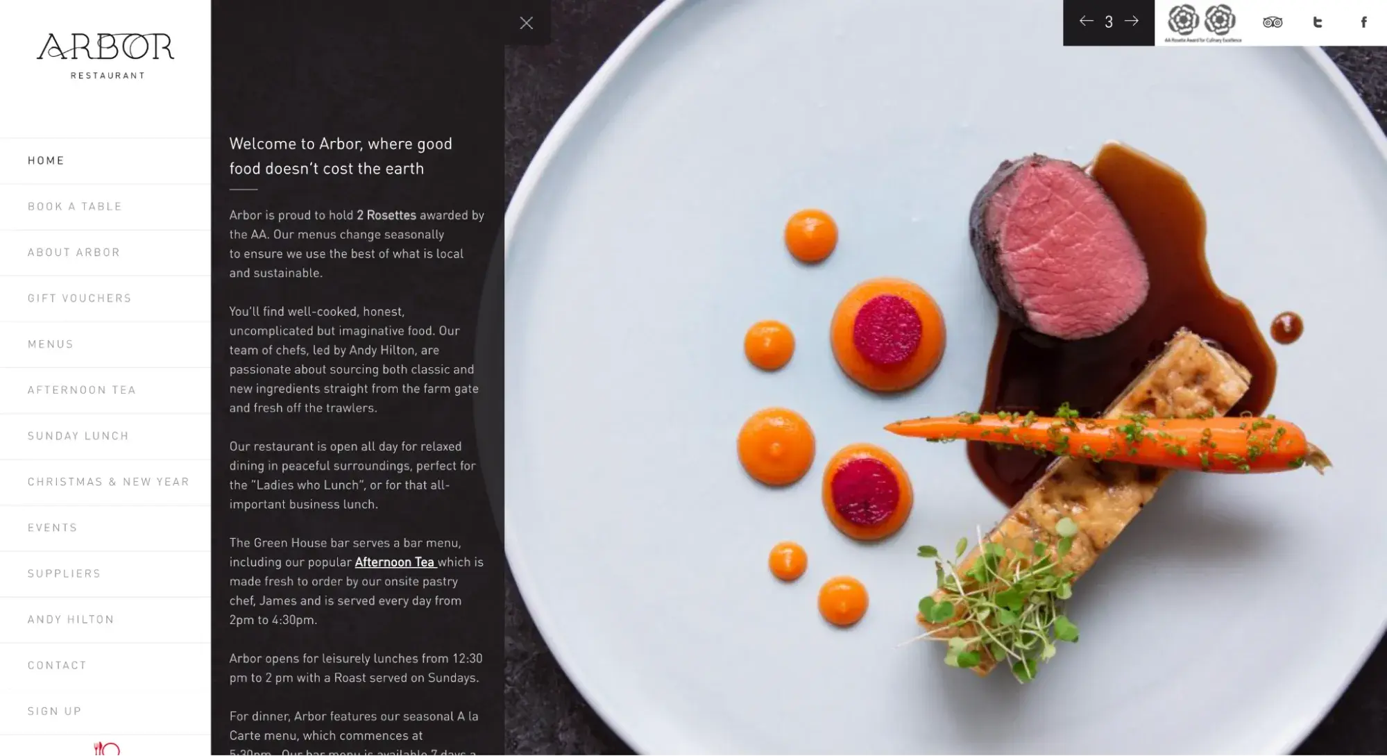
Vertical Sidebar Navigation Menu
Next up we have the vertical sidebar navigation menu. This is an excellent choice for website navigation because it offers a seamless user experience. The items are stacked on top of each other and positioned in the sidebar.
Admittedly, this is less popular than horizontal navigation, but vertical navigation has a real benefit: You can fit more links than in a horizontal menu.
Take a look at Arbor Restaurant's vertical sidebar below.
Footer Navigation Menu
Another option is the footer menu. It is typically paired with — and expands upon — a horizontal navigation bar. If visitors don't see the link they need in the header, they can scroll down to the bottom of the page where they’ll find more options.
Free UX Research Kit + Templates
3 templates for conducting user tests, summarizing your UX research, and presenting your findings.
- User Testing Template
- UX Research Testing Report Template
- UX Research Presentation Template
Download Free
All fields are required.
Form not available
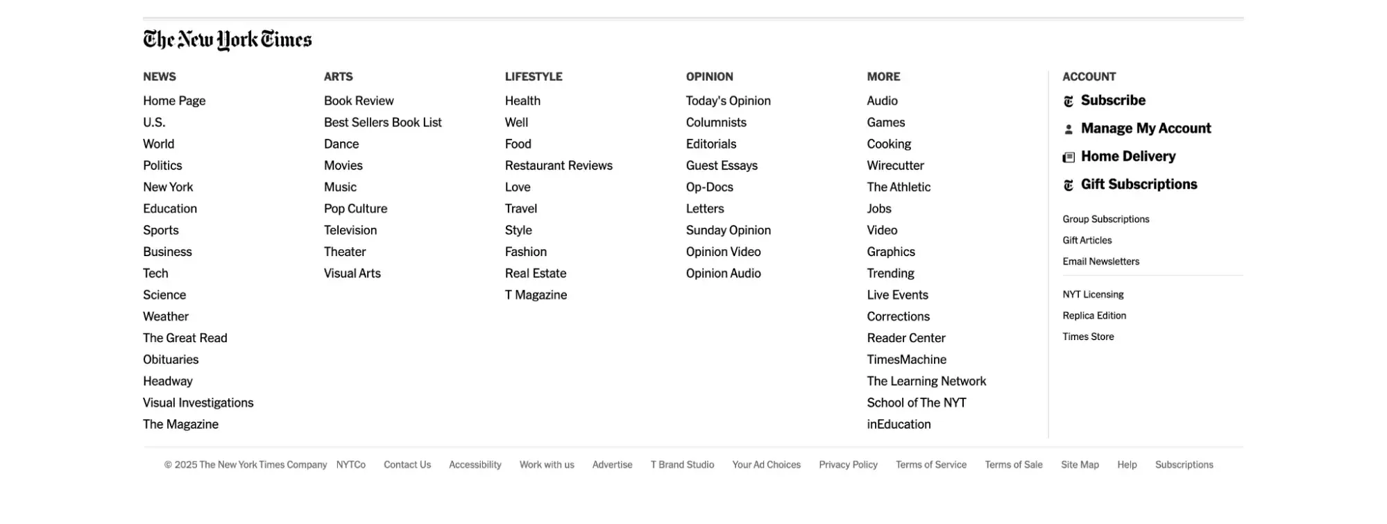
The New York Times has many nav links in its horizontal navigation menu at the top of the page.
Its footer menu has over 50 links, and most of them belong to one of the categories listed in the primary navigation menu. While this does offer easy access to important subpages, it can get overwhelming — so use discretion.
Breadcrumbs
If you need an example of breadcrumb navigation, remember the fairytale of Hansel and Gretel. As the two travel through the woods, the children drop breadcrumbs so that they can find their way home.
Similarly, with breadcrumb navigation, visitors can see where they are in the website's structure. Then, they can retrace their steps to other pages with a simple click.
And the best part of this is that it won’t take up much real estate on your site. This secondary navigation bar is typically made up of text links separated by the “greater than” symbol (>) and placed below the header.
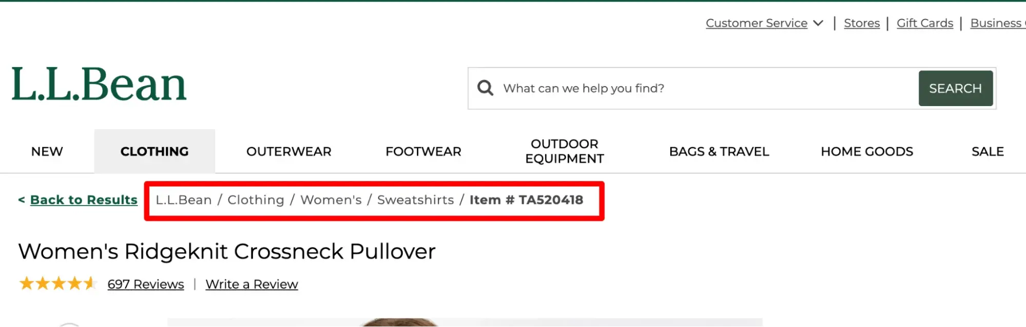
Pro tip: Breadcrumb menus make sense only when the webpage you’re on is part of a path that is at least three layers deep. Otherwise, the simplest solution would be a back button.
As you can see in the L.L.Bean example below, I’ve landed on a page nested five layers deep, so having a clear pathway back to where I started helps me avoid confusion and frustration.
Website Navigation Bar Design
The right way to approach setting up your website navigation is to begin by considering your ideal users. When they land on your site, what are they trying to accomplish? How can you help them get there with as few steps as possible?
When you take this user-centered approach to design, your navigation may look and function differently than another site’s. That's actually a good thing because it means you’re adequately considering your target audience.
Next, I’ll walk you through the design process as you create your website navigation.
What should be included in your website navigation bar?
Your navigation can only contain a few links, likely five to seven at most. That means you must be choosy when it comes to which pages you highlight there.
While every business is different, there are universally standard links to include a top navigation bar. Those include the following:
- Products/Services (what you sell)
- About (who you are)
- Contact (how to reach you)
There are also industry-specific expectations that users have when they land on your site.
So, for example, B2B software websites often have the same menu labels:
- Products
- Solutions
- Resources
- Pricing
- Call-to-action to book a demo or create an account
On the other hand, bakery and restaurant websites often have the following menu labels:
- Menu
- Order
- Hours
But how do you finalize which links should be in your website navigation? Here are some strategies you can use to decipher what your site visitors want to see on your menu.
Card Sorting
Card sorting is a simple user experience technique that helps you get into the minds of your website visitors and design the navigation from their standpoint. And I love that you don't need any UX experience to try this exercise.
To get started, invite people from outside of your organization for a 20-minute exercise. Lay out a stack of index cards on the table, each representing a significant page on your site.
Pro tip: Because this is a significant ask, you should pay your participants or at least reward them with free food or another gift. It’s best practice in UX to provide participants with incentives. This helps decrease no-shows and makes your users feel valued.
Next, ask participants to organize the cards however they feel is natural. Look for trends in how your participants group the pages on your site and ask them how they would name each category.
This is an extremely effective way to understand what feels intuitive to users.
Attribution Reports
Next, your website navigation design can benefit from attribution reporting. If your marketing analytics software provides it, this is perfect for deciding what should go into your main navigation.
This report attributes the number of newly created contacts to their interactions with your business so you can better understand the content and functionality on your site that's converting visitors into leads.
If you use HubSpot as your CRM software, you're a step ahead, as you can easily get started with attribution reports.
Take HubSpot's website, for instance. While some of our content offers garner lots of traffic, the most common pages viewed by people buying HubSpot software include product pages, pricing, case studies, and partners.
Look at our homepage, and you'll see that the navigation reflects this finding and prioritizes those critical pages.
Pro tip: Remember that users are naturally more likely to click the pages that are linked in your website navigation, as it features the most prominent links.
So, even if that’s not what your attribution reports show is popular, if you have a page that’s important to the customer journey, placing it in your navigation could boost its click rates.
Free UX Research Kit + Templates
3 templates for conducting user tests, summarizing your UX research, and presenting your findings.
- User Testing Template
- UX Research Testing Report Template
- UX Research Presentation Template
Download Free
All fields are required.
Form not available
Google Analytics Path Exploration
If you don't have an attribution report, you can still see which pages are essential on your site through Path Exploration in Google Analytics 4 (GA4). (Before GA4, this was called “Users Flow.”)
In Google's own words: “Path exploration uses a tree graph to illustrate the event stream, the collection of events users triggered and the screens they viewed.”
It basically shows you the path that visitors take after they land on your site, granting you insights into the pages that are most important to them.
How should you order your navigation items?
Order matters in website navigation — but don’t overthink it. I’ll go over a bunch of user research about the matter below, but in the end, it’s best to stick to industry norms, as that’s what the user expects.
Cognitive studies provide evidence that web page viewers tend to remember links on either end of the navigation most vividly.
Often referred to as the primacy and recency effects, they speak to the phenomena that words presented either first or last in a list tend to pull more heavily on the attention span of viewers.
So for your website, you'll want to be very intentional about what items you place in these spots. Think about what is most important for your typical visitor.
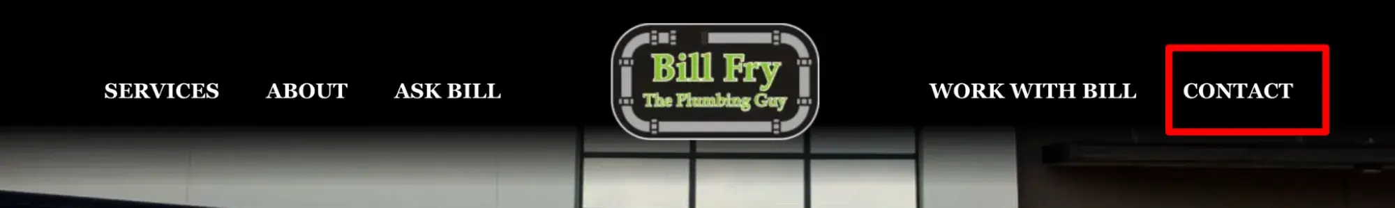
In an article for Neil Patel’s blog, web strategist Andy Crestodina says, “Put your most important items at the beginning of the navigation and the least important items in the middle. 'Contact’ should be the last item on the list, putting it at the far right in top-level horizontal navigation, a standard location.”
Most websites do indeed place “Contact” (or another top call-to-action, such as “Order”) at the end, or far right part, of the list.
That’s true for SaaS companies like HubSpot:
Marketing agencies like Level:

Bakeries:
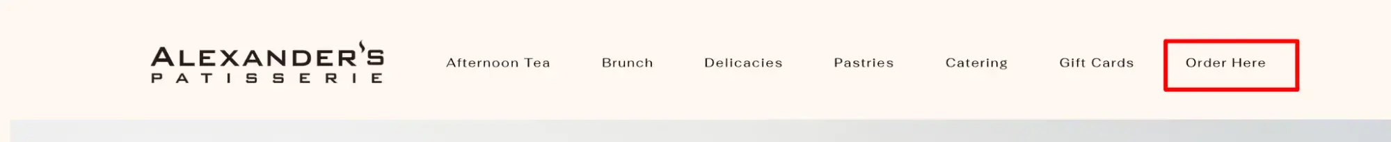
And plumbers:
How should you phrase your navigation options?
The best approach to phrasing your navigation options is to remember this copywriting maxim: “Clear is better than clever.”
When choosing the words to use in your main navigation links, think of the terms your customers would use to describe those pages. Don’t get too creative at the risk of confusing your visitors.
Again, that’s why so many websites have the same words in their navigation: “About,” “Contact, “Products,” and “Services.” These are clear, easy-to-understand labels that consumers have come to expect on websites.
You can break from the norm if the labels are still clear and if, in user research, your users prefer them.
For example, mymind labels its navigation differently, with the words “What,” “Why,” and “How.” Even though these break from the norm, as a user, I still have a general idea of what information I’ll find when I click each link.

Object-Based
Arguably the most clear-cut option for websites is object-based navigation. Object-based navigation places content under concrete (typically noun-only) categories.
HubSpot.com is an example of object-based navigation, as is Emerson College's site below. This type of organization treats the navigation as a table of contents and groups pages into the topics or categories that best fit.

Notice that the navigation links to the right are more action-based than object-based. Let’s define this below.
Action-Based
Action-oriented navigations may be a better fit for other sites. To know when this is appropriate, ask your audience whether they primarily come to your website to learn about something or to take a specific action.
In the example below from Howard University, visitors come with an action in mind. They aren't visiting to read the “About” page — they’re coming to apply, visit, or donate.

Audience-Based
For companies with multiple audiences with clear delineation, you may want to consider audience-based navigation or secondary navigation, as in the example below.
This only works, however, if a visitor can easily classify themselves. For example, you wouldn't want to use small- versus medium-size company, or marketing versus advertising agency, since those lines are often blurred and may leave your audience confused as to where to go first.
In the example below, the University of Washington does an excellent job of using an audience-based approach in its secondary navigation. Visitors can easily classify themselves as students, parents, faculty/staff, or alumni and click the correct link.

Search Engine Optimized
It’s not just your human visitors who use navigation to intuitively find their way across your site — search engine bots, too, use navigation when they crawl your site.
Yes, your website navigation impacts SEO because the links you choose to include in your menus tell Google which pages are most important.
Here’s what Google says: “Google tries to find the best content on your site by analyzing the relationship between pages based on their linkages. This means navigation structures on your site (such as menus and cross page links) can impact Google's understanding of your site structure.
Free UX Research Kit + Templates
3 templates for conducting user tests, summarizing your UX research, and presenting your findings.
- User Testing Template
- UX Research Testing Report Template
- UX Research Presentation Template
Download Free
All fields are required.
Form not available
For example, Google can use information such as the number of links it needs to follow to reach a page and the number of links to a page to infer the relative importance of a page over the rest of your site.”
But does the phrasing of your navigation links impact SEO? I asked HubSpot SEO Content Strategist Killian Kelly.
"Though a cliché, first impressions matter,” Kelly says. “With topical authority being increasingly significant for SEO, your nav bar — often one of the first touchpoints for both users and search engines — is one of the most strategic places to optimize core topics, keywords, and content.”
Website Navigation Examples
Now that you’ve learned tips for optimizing website navigation, let’s check out some navigation menu examples that put those tips into practice — and some that break the rules.
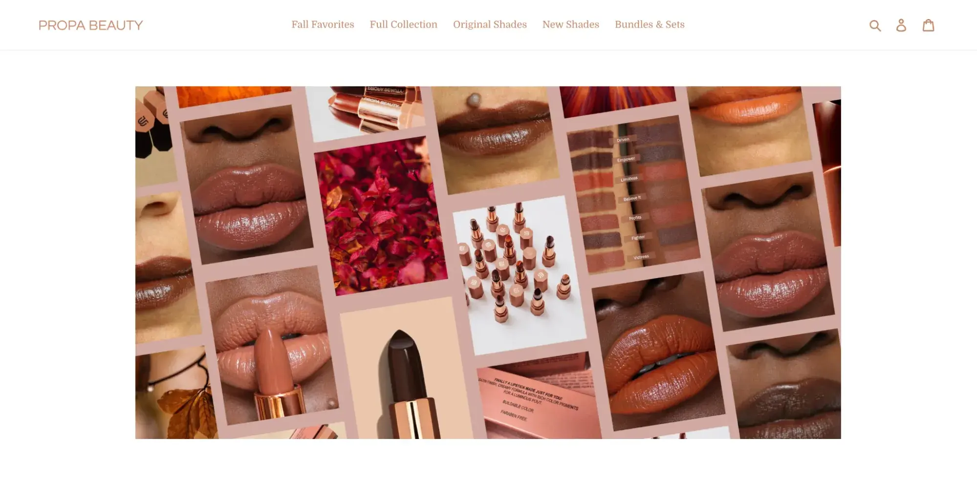
1. Propa Beauty
Propa Beauty has a minimalist horizontal navigation bar designed to generate sales or convert visitors into members.
Its logo is to the left. At the center is a link to its product archive page. To the right, there are three icons: a search box, member login page, and shopping cart.
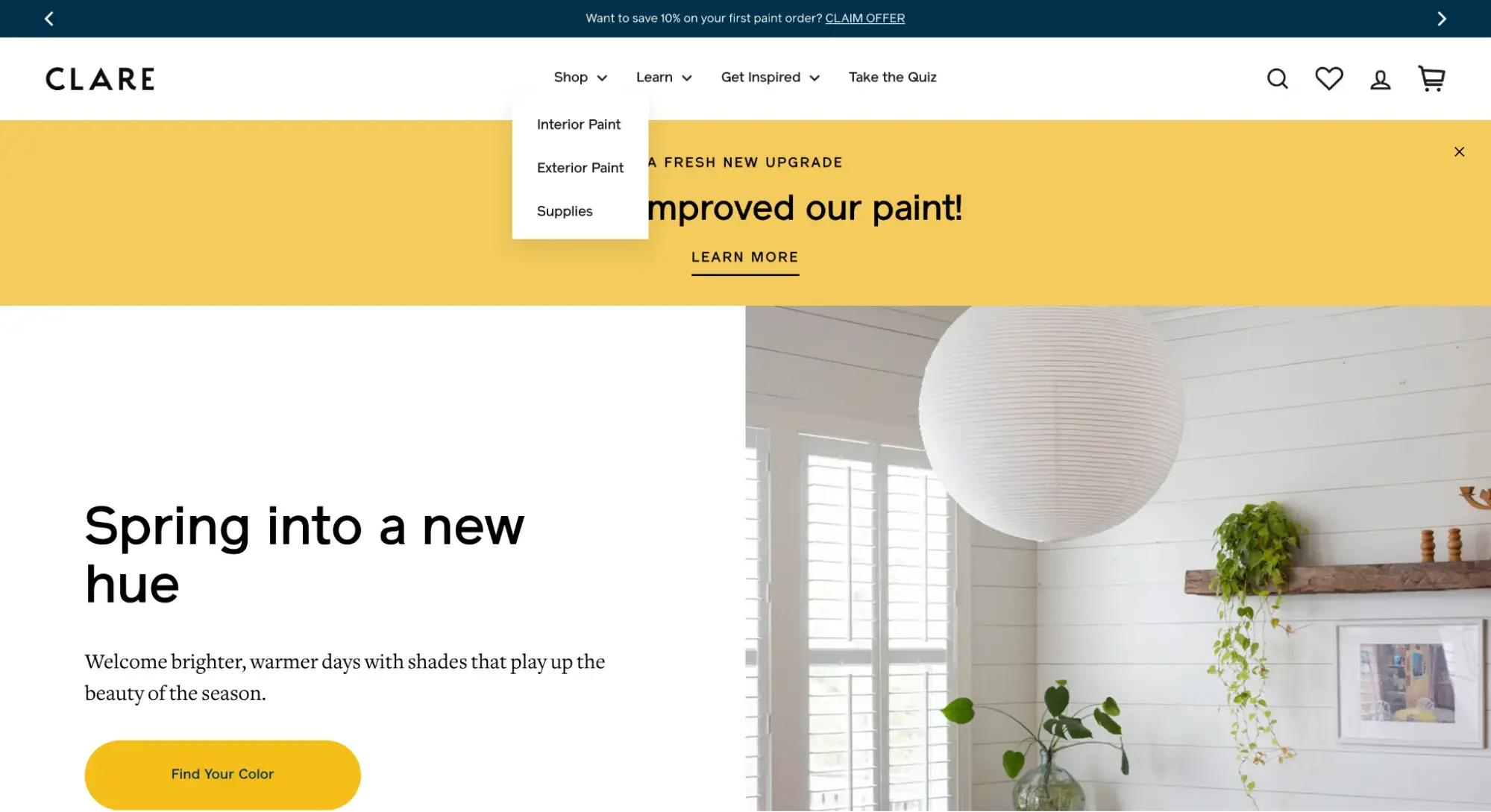
2. Clare
Clare is another ecommerce site with a horizontal navigation bar. Unlike Propa Beauty, however, Clare’s navigation bar is a combined menu.
When the page loads, you can only see the primary navigation. However, if you hover over “Shop,” a dropdown menu appears listing sub-categories of products.
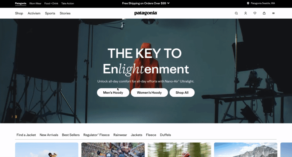
3. Patagonia
Patagonia has one of the most creative navigation menu examples I’ve come across. To accommodate its large catalog, it uses mega menus in two separate places.
On the left, when you click “Shop” in the horizontal navigation bar, a list of links appears showing its main product categories. When you click one of those links, the side panel expands again with more sub-categories.
On the right, when you click the hamburger menu, a full-screen menu slides up from the bottom with even more links about the company.
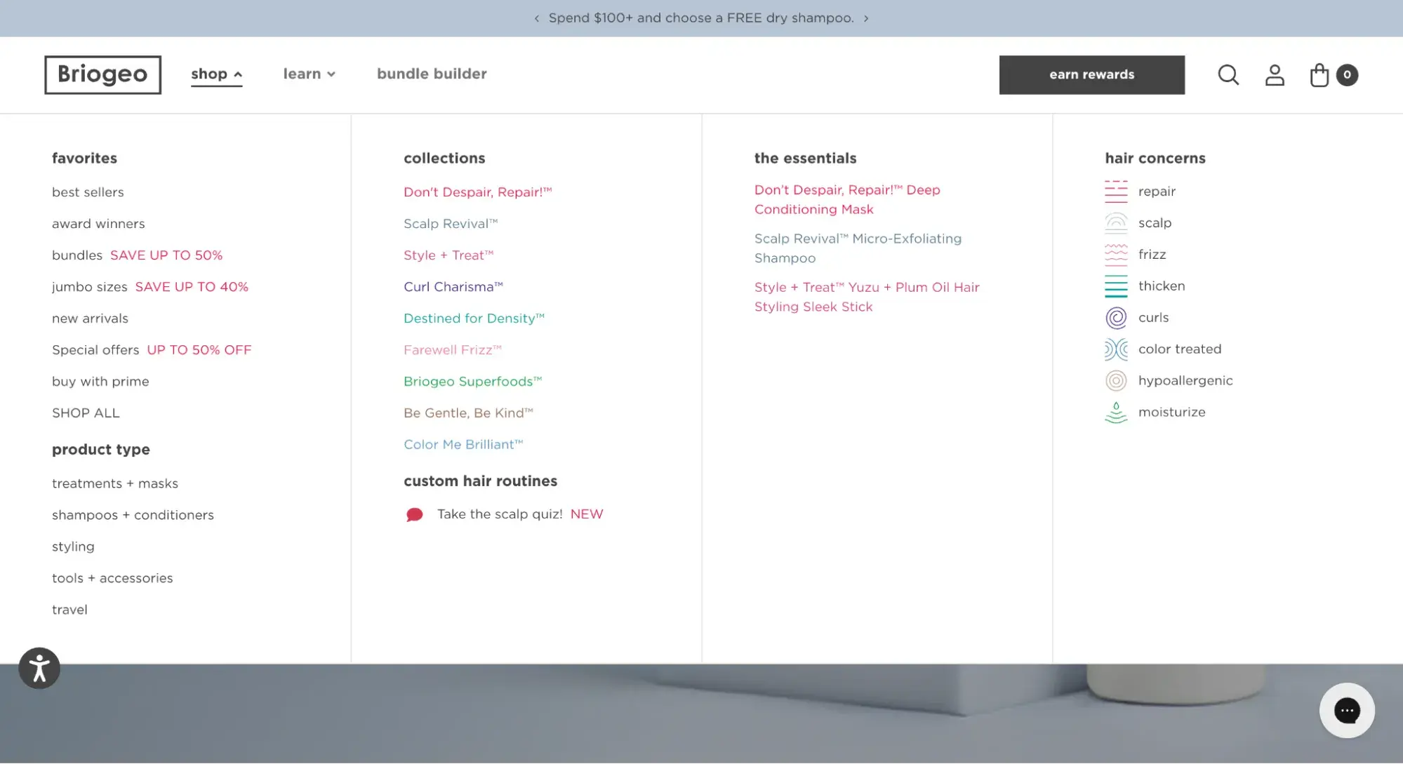
4. Briogeo
Like Patagonia, Briogeo uses a mega menu that reveals different navigational options depending on which item you hover over. The main “shop” item (pictured below) shows a mega menu with colorful text links, plus icons to represent different hair concerns.
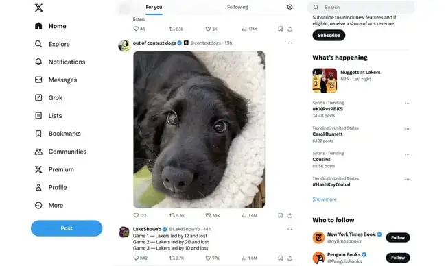
5. X (formerly Twitter)
X features one of the standard navigation types — the vertical sidebar menu — but with a twist. Instead of simply featuring text navigation items, it includes icons next to each item.
The “Home” icon is highlighted because that’s the page I’m on. The only pop of color in the nav bar is the CTA button.
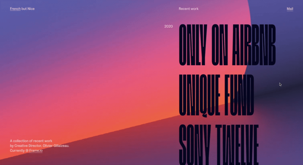
6. Olivier Gillaizeau
The portfolio site of creative director Olivier Gillaizeau features an eye-catching vertical sidebar menu that displays his projects on a timeline.
When you hover over one of the nav items, a video preview of the project appears. Clicking the nav item will take you to a page with more details on the project.
7. Pipcorn
So far, we’ve mostly discussed the functionality of navigation menus, but tweaking the styling can make for a delightful user experience as well.
Take Pipcorn’s website for example: When you hover over “Shop,” a dropdown menu appears with images and branding for each line of its products. Fun and functional!
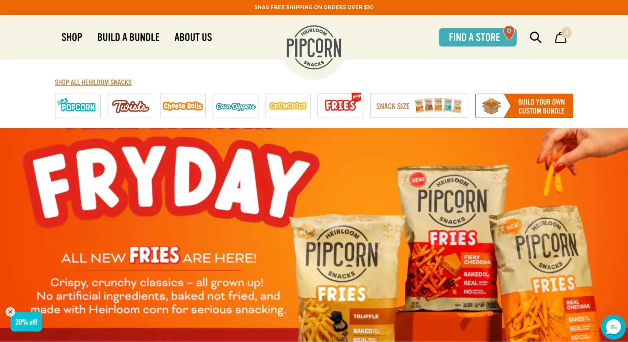
Pro tip: Be mindful of how using images instead of text in your main navigation might hurt website performance. Take it from HubSpot’s Principal Technical SEO Strategist Sylvain Charbit.
“Even items as small as visual icons can significantly impact traffic,” he says. “We saw a case back in 2023 where heavy imagery added to the nav menu contributed to our performance going down by 20%. We fixed it by drastically reducing the weight, and a recovery soon followed."
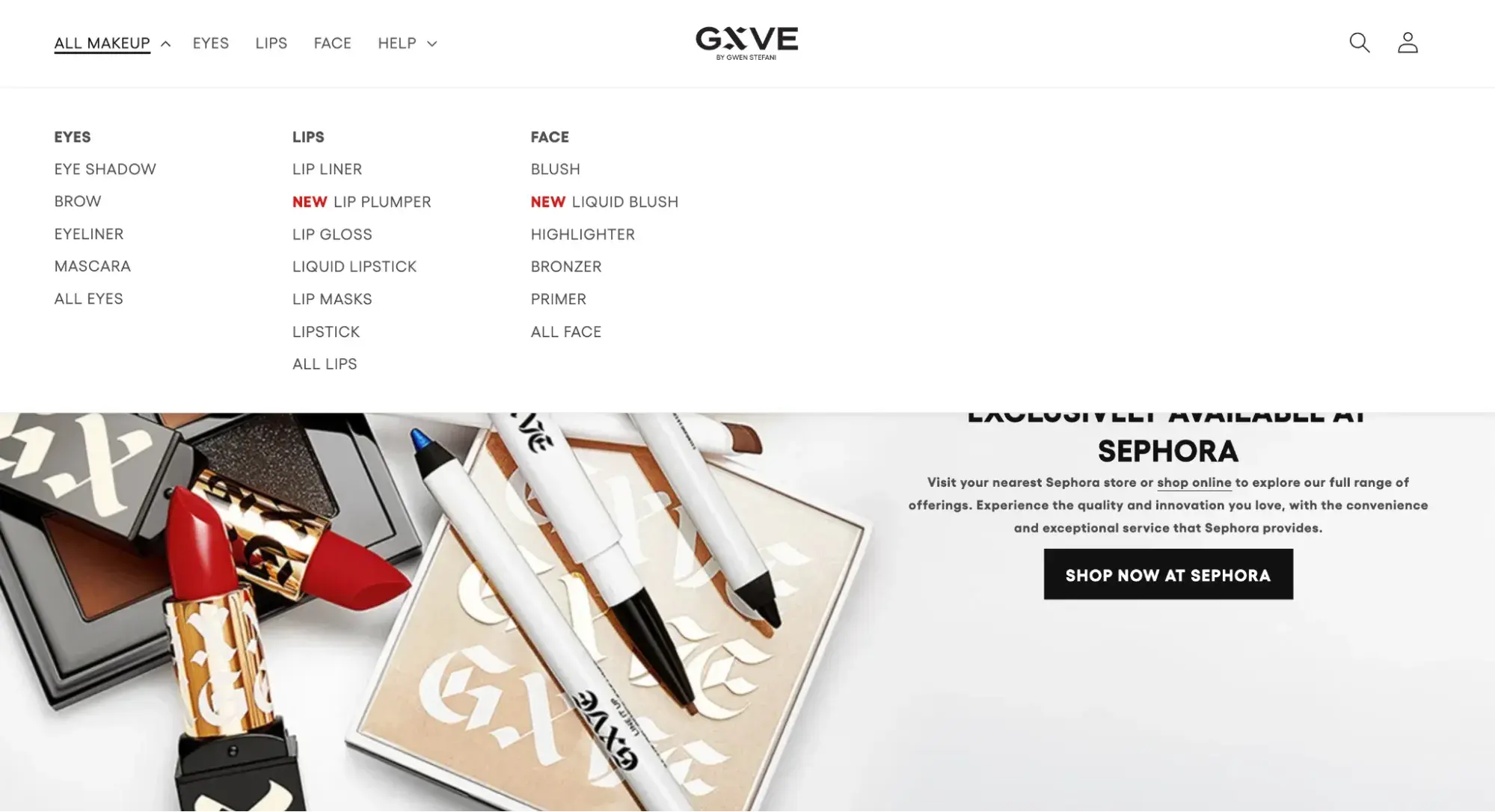
8. GXVE Beauty
The strength of GXVE Beauty's website navigation is its simplicity. The font is clean and the design is minimal, yet it truly offers visitors everything that they want.
If you want to shop for a specific item, just click the category that the makeup falls under: eyes, lips, or face.
If you want to see everything at once, click “All Makeup.”
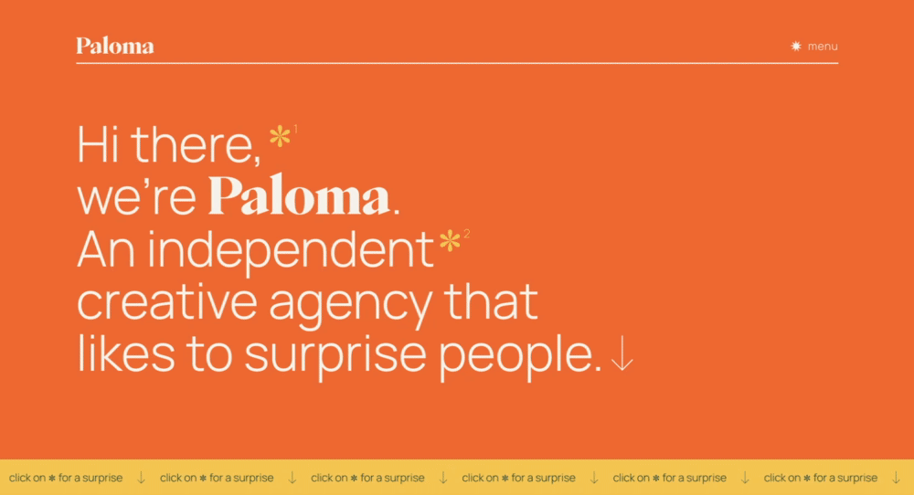
9. Paloma
Paloma’s website navigation is an excellent reminder that you can infuse your site with a healthy dose of playfulness, as long as it is in sync with the rest of your branding.
This creative agency takes the opportunity to tell its brand story with an animated menu when you hover over each page.
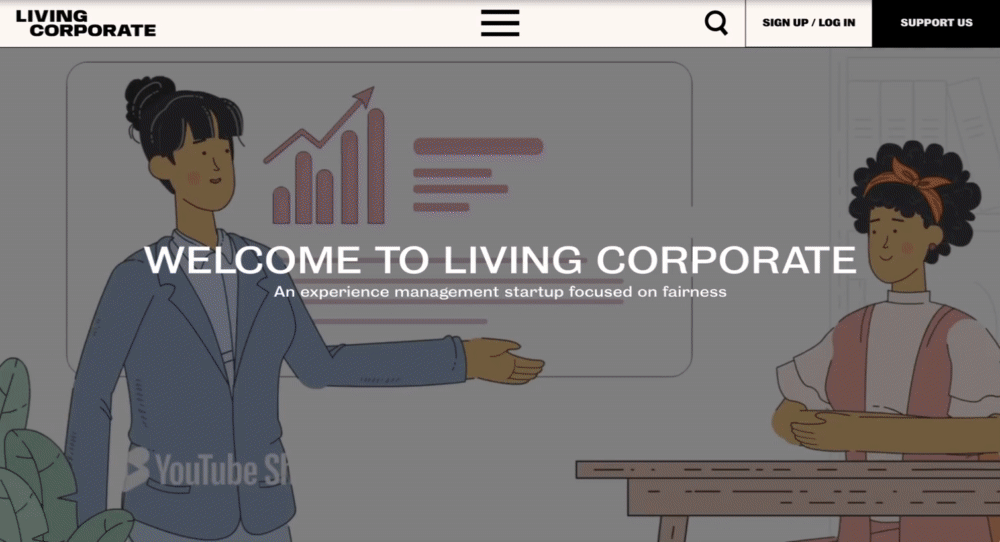
10. Living Corporate
Experience management company Living Corporate's website navigation scores points for uniqueness.
When you click the hamburger icon on top, the mega menu expands and fills the screen. As you hover over the different links, images fill the background, which I appreciate as a fun detail.
11. Lyft
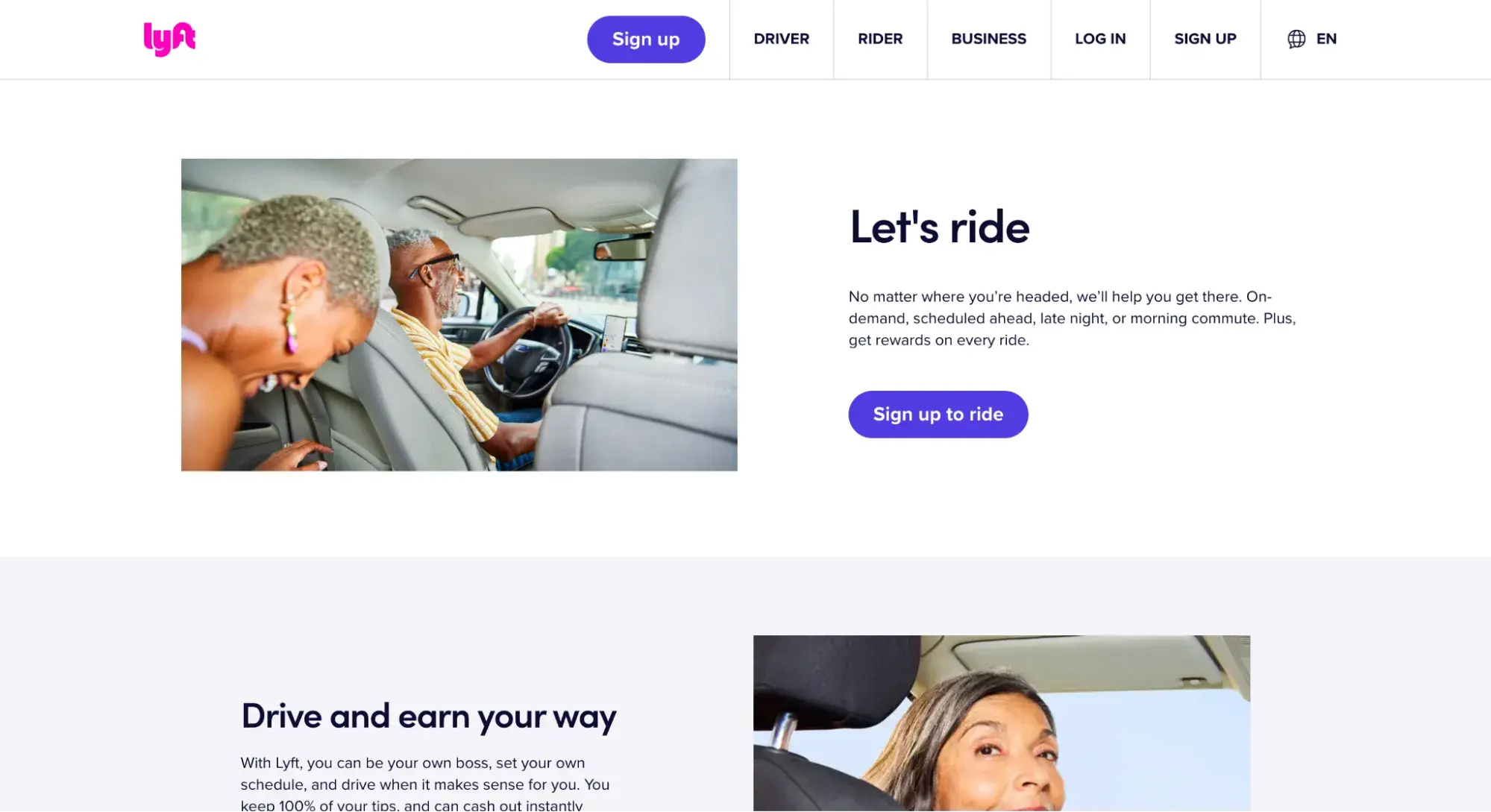
Lyft’s website navigation provides options for each of its personas, whether you’re a rider, driver, or business customer.
This simplistic design allows for a more cohesive experience based on user needs, and there are fewer friction points as well.
12. Dahlia Bakery
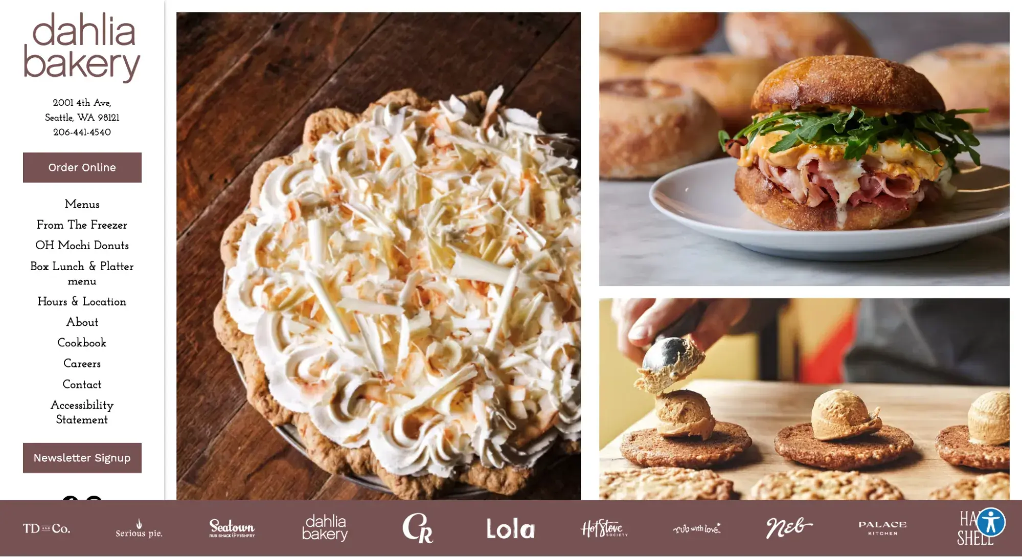
Dahlia Bakery uses a vertical sidebar navigation menu to accommodate more links than it could have with a horizontal navigation bar. That way, visitors see everything important in one glance.
13. ClickUp
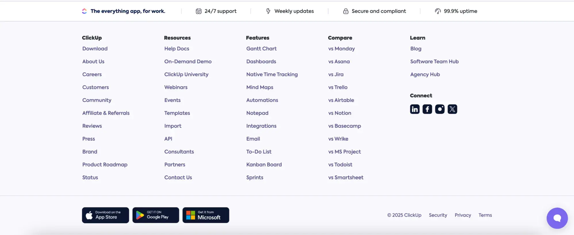
I couldn’t leave you without showing a footer navigation menu example. Here’s a great one from ClickUp that’s a “fat footer,” meaning it takes up most of the screen and contains multiple links.
Now that I’ve shared some of my favorite navigation menu examples, you can understand why these websites excel. However, just emulating what these sites do isn’t enough — there are also some best practices you’ll want to consider.
Free UX Research Kit + Templates
3 templates for conducting user tests, summarizing your UX research, and presenting your findings.
- User Testing Template
- UX Research Testing Report Template
- UX Research Presentation Template
Download Free
All fields are required.
Form not available
Website Navigation Best Practices
- Be consistent.
- Use the main navigation or breadcrumbs to highlight the visitor’s location on your site.
- Design for every screen size.
- Make the most important information accessible.
The golden rule of website navigation? Don't make people think. As you can see from the above website navigation examples, the more obvious it is, the better.
Usability consultant Steve Krug wrote an entire book on this sentiment. Follow these website navigation best practices to enable users to navigate your site without feelings of frustration or confusion.
1. Be consistent.
Consistency is key, and website navigation design is no exception. This is a crucial website navigation best practice because it can make or break the user experience.
Be consistent in how you format and design your navigation interface. This is all about aligning with the current knowledge and expectations of the visitor.
For instance, consider how visitors would feel if your homepage links were black, and an underline appeared when a user hovers their mouse over them. Then, when they check out the “Contact” page, the links are blue, and there's no underline.
That’s confusing, right? Instead, your links should have the same style on every site page. Otherwise, visitors won't know which text is hyperlinked and which isn’t in your navigation menus.
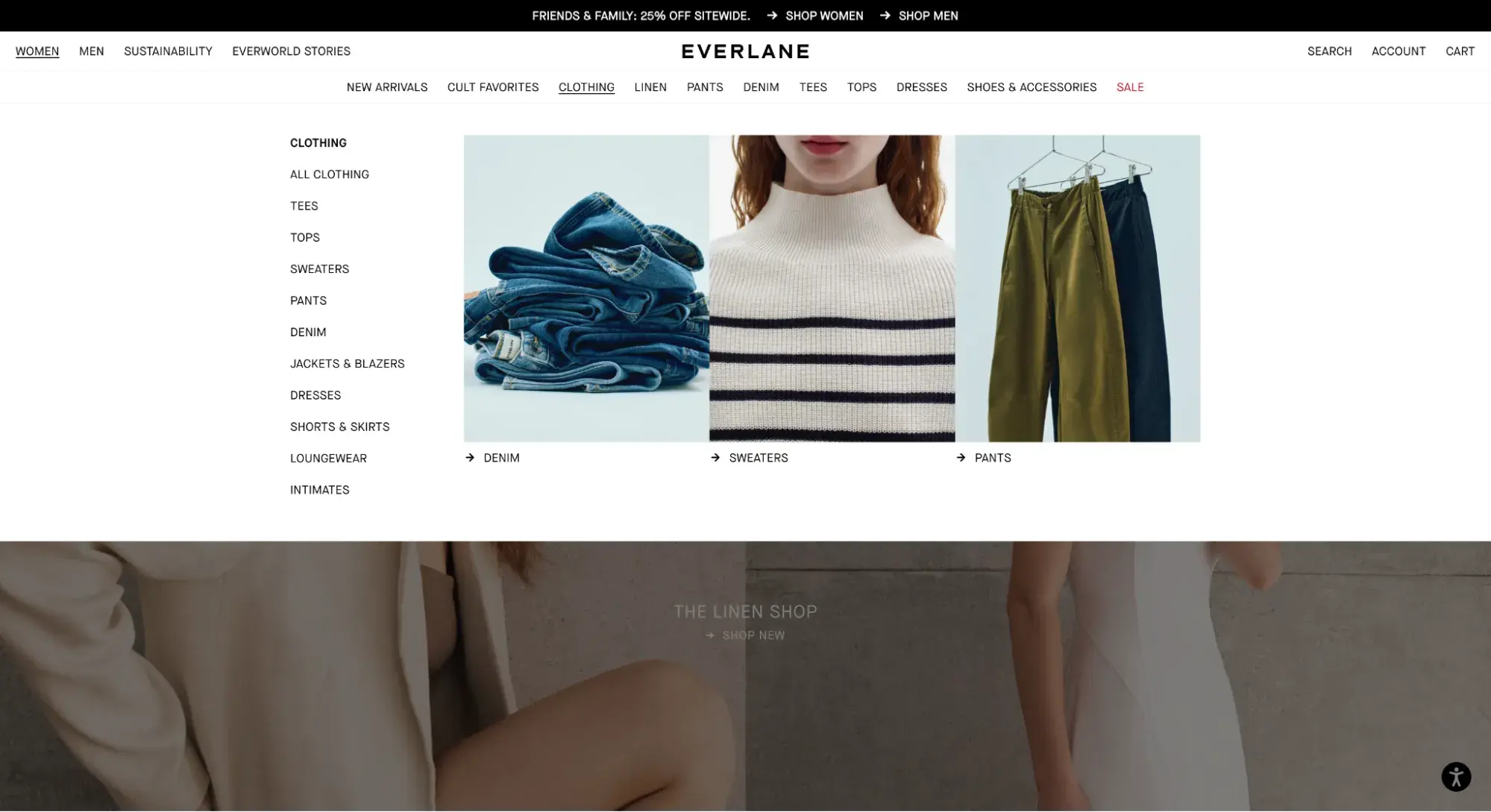
Notice how Everlane’s primary and sub-navigation menus have consistent link styling and typography. The underlining of “Clothing” lets me know that that’s the category I’m hovering over. I can expect that to remain consistent no matter which category I hover over.
2. Use the main navigation or breadcrumbs to highlight the visitor’s location on your site.
Speaking of Everlane’s use of underlining to indicate where I was, another best practice is to orient your visitors by highlighting their location in the top-level navigation.
Everlane does not keep the main navigation highlighted once you stop hovering over it. This is pretty common: According to Baymard Institute, 91% of ecommerce websites don’t highlight the user’s location in the main navigation.
But Baymard’s UX research flags this as a mistake. Without the highlight in the top navigation, users in its research became disoriented.
“During testing, when the current top-level scope wasn’t highlighted in the main navigation, it made it unnecessarily difficult for participants to determine where they were in the site hierarchy,” writes Iva Olah, a UX researcher at Baymard.
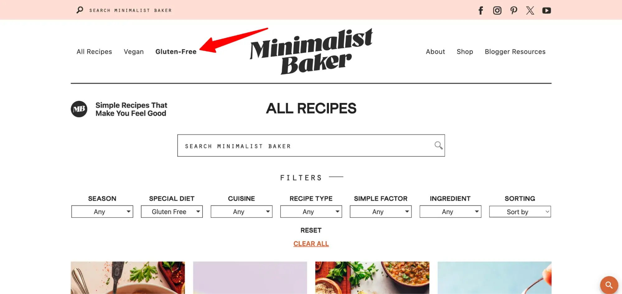
Here’s a good example of how to do it right from Minimalist Baker. The site bolds the page that I’m currently on. Below, you can see that I’ve clicked “Gluten-Free” and am viewing the page of gluten-free recipes.
In the least, you can indicate the user’s location via breadcrumbs, like The North Face does below.
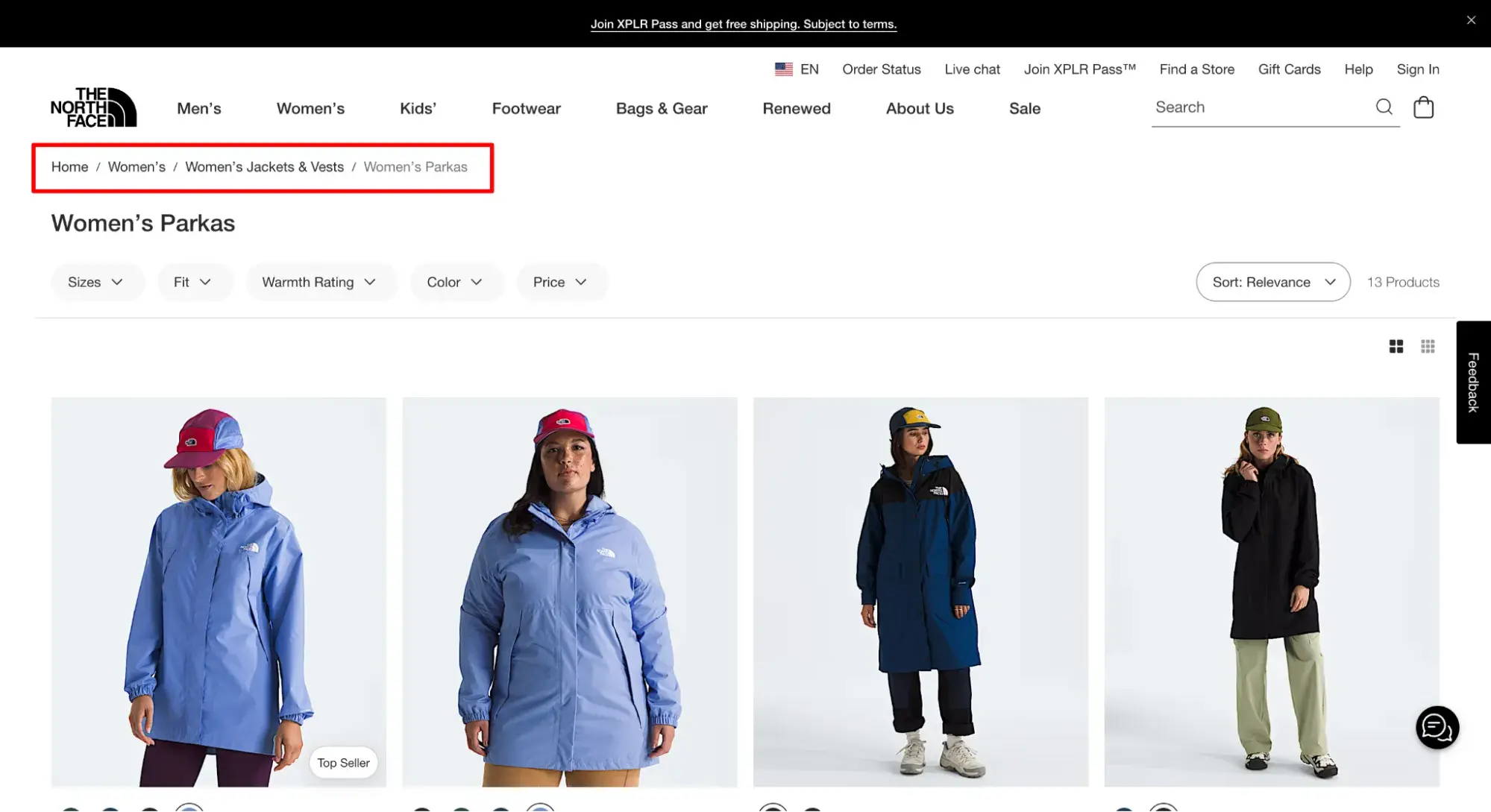
Breadcrumbs are better than nothing, but they may not be enough.
“Even when breadcrumbs are implemented perfectly, some users still rely on the main navigation to help them quickly understand where they are, or to reassure themselves that they are where they thought they were,” writes Olah for Baymard.
3. Design for every screen size.
With mobile devices making up over 62% of global traffic in February 2025, it's increasingly essential your website and navigation are optimized for all screens regardless of size.
When designing your menu, I encourage you to think about mobile first. By starting with the smallest screen size, you'll have to prioritize which links are most important to include in your primary navigation and in what order.
You'll also have to decide which navigation features — like a hamburger button — are necessary on mobile and how they’ll fit into your desktop design.
This will help you shift into designing for larger screen sizes with a clear idea of what pages and navigation features are most important.
Pro tip: Websites must adapt to provide an optimal user experience, whether viewed on a large desktop screen or a small mobile device. Remember this when you arrange your menus. Try your menu with various screen sizes.
Make sure hamburger menus are visible and simple to reach and that lengthy menus don't take up too much room. Keep in mind that a responsive website design modifies its layout according to the screen size.
4. Make the most important information accessible.
Are you familiar with the three-click rule? Essentially, this concept states that every website navigation structure should enable someone to land on any page on a website and find what they need within three clicks.
And though this concept is deeply entrenched in the world of web design, it's been largely discredited.
One study found that users weren't any more likely to quit a task after three clicks than after 12 clicks. The chart below shows that some users made as many as 25 clicks in an attempt to find their desired content.
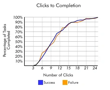
Though the rule might not be exact, the basis teaches us an important principle. You do want to limit the effort required for visitors to access key information or accomplish a task on your site.
Counting clicks is just too superficial a metric. So, instead, we encourage you to invest time in mapping your website, establishing clear pathways, reducing page load time, and removing other friction points in the user journey.
A good way to understand what your clients seek is to put yourself in their shoes. Look into why they’re on your website.
For example, they’d probably like to see your product or service pages to get additional information about your company. This is why having links to these pages on your main navigation is crucial.
Pro tip: I recommend featuring “About Us,” “Blog”, “Contact,” and “Products” or “Services,” but you should take a look at what works best for your specific case. You can use Google Analytics and heatmap tracking to analyze your results, determine what works, and make changes to optimize user experience and outcomes.
Designing Your Website Navigation
When you build your website, thoughtfully design the navigation by considering your visitors and website goals.
Remember: There are humans on the other side of the screen that will have to navigate through your site, and their ability to do so can significantly impact their willingness to stay.
Plus, search engine bots can also benefit from strong website navigation design.
Editor's note: This post was originally published in August 2013 and has been updated for comprehensiveness.
Free UX Research Kit + Templates
3 templates for conducting user tests, summarizing your UX research, and presenting your findings.
- User Testing Template
- UX Research Testing Report Template
- UX Research Presentation Template
Download Free
All fields are required.
Form not available

![How to become a UX designer, a step-by-step guide [expert tips]](https://53.fs1.hubspotusercontent-na1.net/hubfs/53/become-a-ux-designer-1-20240731-321437.webp)


![How to Add a Parallax Scrolling Effect to Your Website [Examples]](https://53.fs1.hubspotusercontent-na1.net/hubfs/53/scroll-Aug-11-2023-05-24-08-8793-PM.png)

![20 UX Design Examples Hand-Picked by Experts [With Analysis]](https://53.fs1.hubspotusercontent-na1.net/hubfs/53/ux-design-examples-1-20250404-8425368.webp)