So, I’ll walk you through building a website from scratch with website builders (and even AI). Let’s dig into it!
Table of Contents
- How to Build Your Website from Scratch
- Building a Website from Scratch Using AI
- Cost to Build a Website from Scratch
- Common Mistakes When Building a Website from Scratch
- Now you can build a website from scratch.
Starting from the ground up with a website is like any project. You need a plan, expected outcomes, and a timeline for completion. Follow along with the steps here, and you’ll have a logical, clear pathway to getting your site up and running.
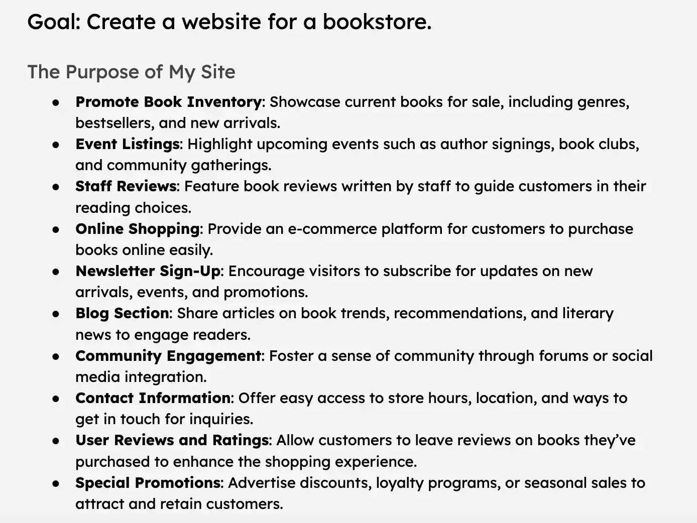
1. Focus on the purpose of your website.
The purpose of your website for visitors and the action you want them to take when they land on it should inform everything about building your new site.
I work with clients in many different industries. Professional services want their website to establish trust, explain their services, and build thought leadership. Software companies want to showcase their product’s value and generate new free trial users.
Local businesses might want online orders or to drive more footfall. A freelancer in creative services needs a portfolio to showcase their work and build their social media presence.
I always take the end goal(s) of the website and make all my decisions from there. So if you’re unsure of where to start, start by defining your site’s goals and purpose.
Pro tip: One of the reasons I like working with website builders like Wix or Content Hub to create a site is the premade templates they provide based on use cases like those I’ve outlined above (but more on that later).
2. Scope your target audiences and define personas.
Fully defining the purpose of your site means understanding your target audience in as much depth as possible.
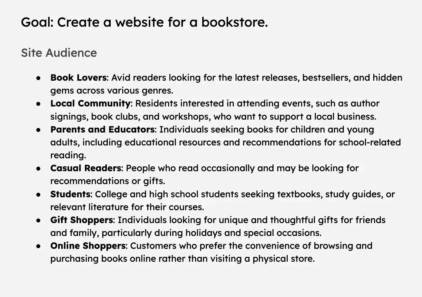
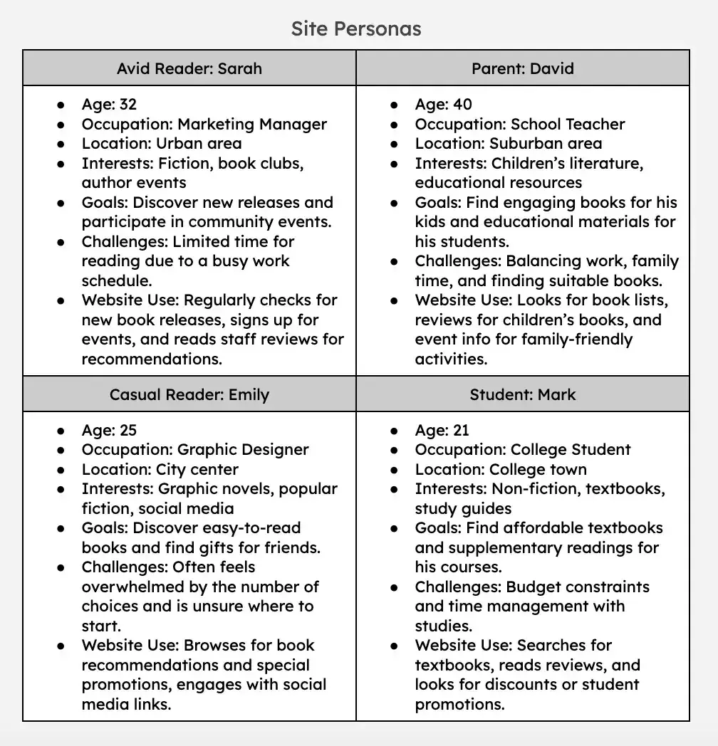
Your target audiences are the general demographics and interests of your target website visitors. Audience personas, on the other hand, are living, breathing characters that embody the typical members of a target audience.
I usually name my personas (e.g., “Sales Sally”) and describe everything from their hobbies and interests to their typical resume, depending on the circumstances. Essentially, I include everything I can that will help me get to know my typical website users.
Pro tip: If you’re having trouble dreaming up personas, here’s a free tool that makes it super easy: Make My Persona.
3. Sketch out your site structure (AKA start wireframing).
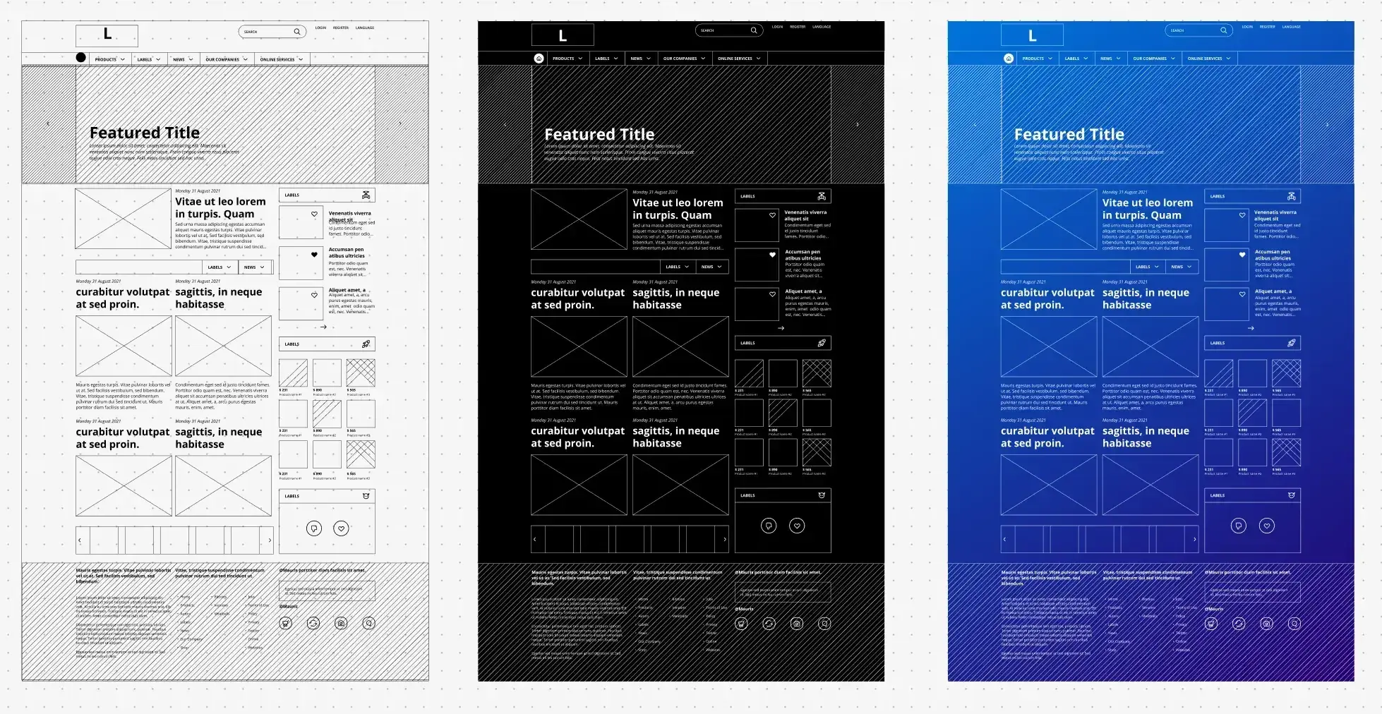
At this stage, I usually feel ready to map out the overall structure of the site through wireframing. Even though things might change a little as I create the site, I want to know:
- What the layout of my homepage will look like and what type of content and messaging I want to include
- Which other pages I want to create, such as product or services pages, an “About Us” page, a blog page, etc.
- How my main navigation menu will look in the website header and how I’ll group different pages together
- What my main call-to-action will be for visitors (book a demo, see our locations, buy now, etc.) and where I’ll place them on different pages.
Plan ahead as much as you can here, even if you end up adding another page or two later.
4. Outline your brand guidelines.
If you look at any good website, you’ll see colors and graphics are not used at random. The whole site needs to have a cohesive look and feel. That’s where brand guidelines come in.
If I get brand guidelines from a designer, I’ll stick to those closely. Otherwise, I need to give myself some clear guideposts for how to build the visual appeal of the site. At a minimum, your brand guidelines should include:
- A logo
- The main colors and variations of them that you want to use
- How and when to use those colors (page or element backgrounds, call-to-action buttons, etc.)
- Any uniform icons or graphics you can use throughout the site
- The font you’ll use for both headings and paragraph text
Pro tip: If you haven’t yet formalized your brand guidelines, download this free brand style guide template to get started.
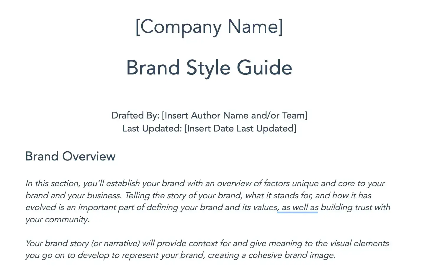
Even if you don’t consider yourself a graphic designer, I recommend completing this exercise even if you base the answers on a premade template in your website builder. It will stop you from veering off course and ending up with pages that don’t look quite right.
5. Choose a website builder.
You can do this at any point in the process really, but now would be the time to select a website builder if you haven’t already.
I mentioned above that my personal favorites are Wix and Content Hub, but there are lots of other options out there.
Other popular choices include Squarespace and Shopify. I recommend checking them all out before you decide.
If you want to build a website from scratch for free, website builders typically offer free plans or free trials.
Want to try your hand at more in-depth website development? Start with these free coding templates.
Pro tip: When I’ve been asked by clients which one to choose, my answer varies. Wix and HubSpot are great options for any type of site and have great plugins and integration options for extra functionalities you might need.
For ecommerce sites, Shopify is a good one-stop-shop, and for professional portfolios or super visual websites, Squarespace also has some really sleek templates available.
6. Register a domain and set up hosting.
Some people choose to do this at the end, just before publishing their site, but I recommend getting this step out of the way now.
Your domain refers to the website address where your site can be found online. These domains need to be purchased, usually with a subscription, and connected to your website builder.
Hosting is the platform that handles the storage of your website to ensure it gets delivered to browsers when people visit your URL.
Lots of website builders do this as a one-stop shop. In Wix, for example, you can find and purchase a domain and take care of your hosting all in one place.
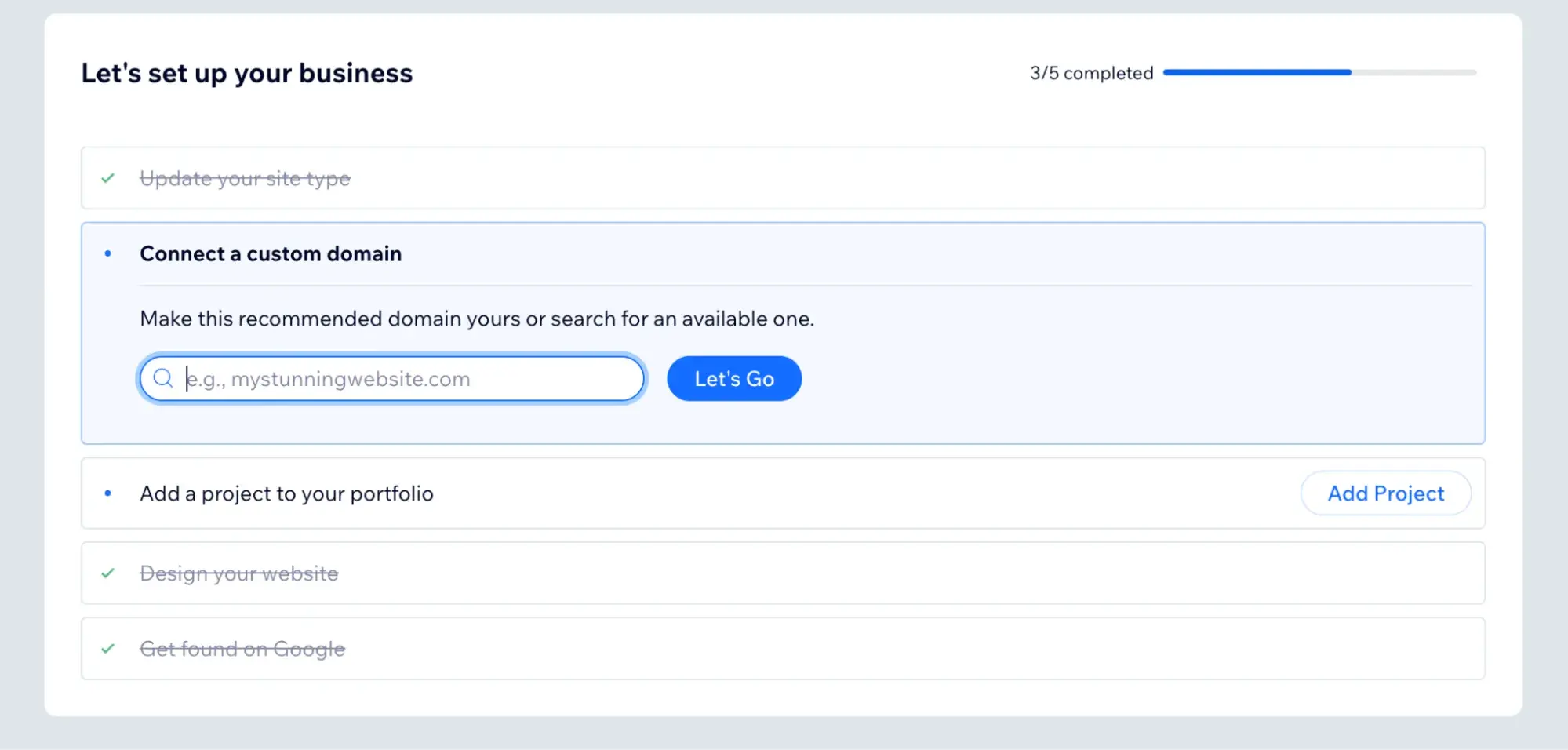
If you’d prefer to use dedicated domain registrars and hosting providers, some well-known examples are GoDaddy and Bluehost. But I find that if you’re not very confident with website development, these site builders do the trick.
Pro tip: If you’re not confident about domain purchasing and hosting, I recommend sticking with your website builder's in-app options. It’s way simpler and less technical.
You can always move your hosting to another provider later. (Just realize that this might also require choosing a new website template, as web designs are often proprietary to the platform they’re on.)
7. Write your website page copy.
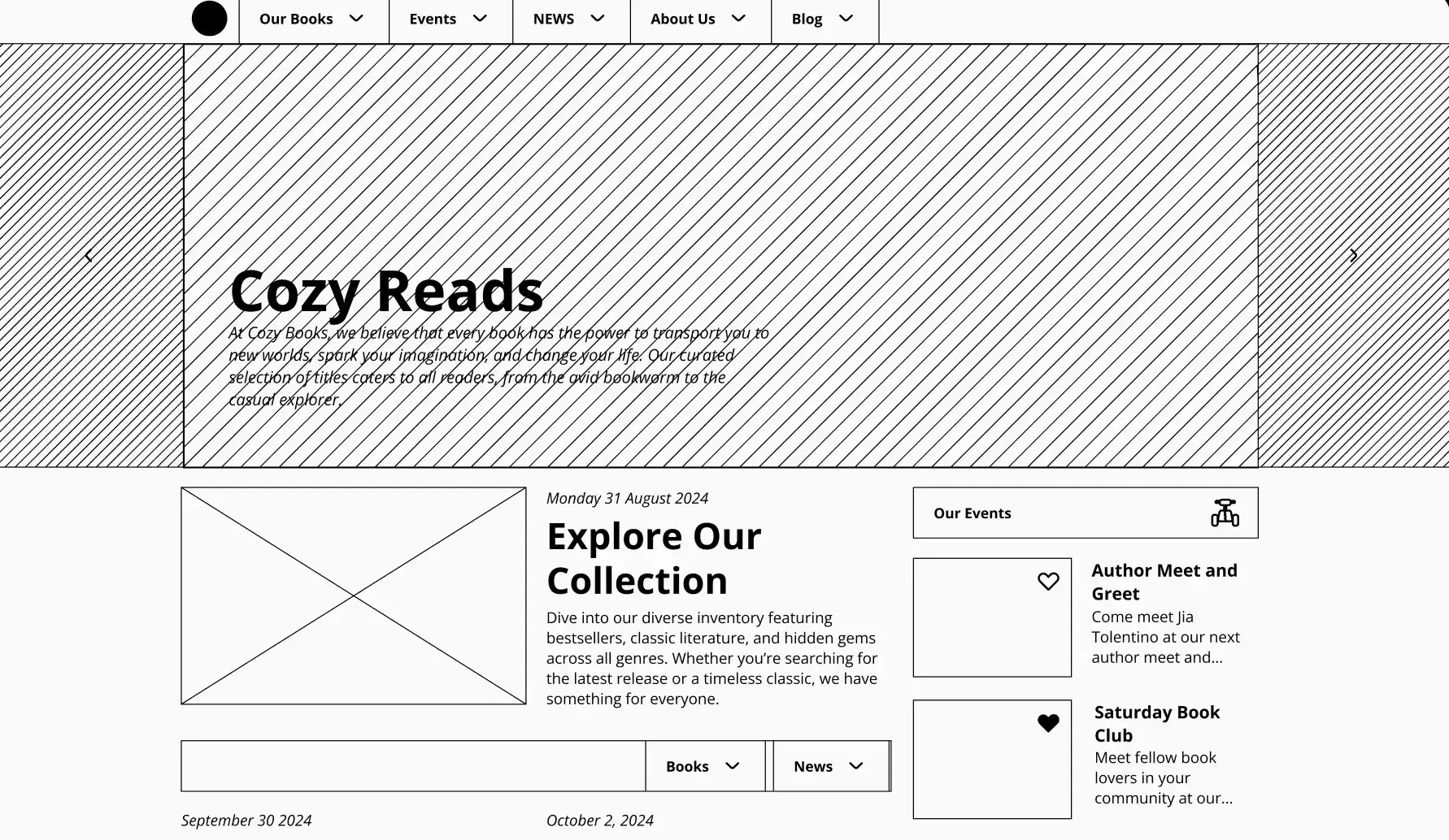
At this stage, I’ll go back to the wireframes I sketched out earlier. Before designing and building the website pages themselves, I want to have some copy ready to go.
Some people prefer to design their web pages and add the copy after. I don’t recommend this, for a few reasons.
First, I find copywriting a great way to test the page layout I’ve come up with. It lets me know if the flow is working, or if I need to add in extra sections or rearrange the page so it makes more sense for the user journey.
Second, building out your design and trying to retrofit better copy is a much more time-consuming task.
You need to rearrange layouts, add extra sections, shuffle around images and graphics — and doing this on a drop-and-drag website builder can take a lot of time and get frustrating.
8. Choose a website template similar to your wireframe and customize it.
Now that my layout is set and I’m satisfied with the copy, I can start putting it all together.
I’ve been working with websites long enough to have decent coding skills. But if it’s your first time building a website, I recommend choosing a website template that has the same major elements as the wireframe you’ve sketched.
Trust me, most websites follow a very, very similar layout. For example, the banner image with three photos beneath (like in my website example below) is extremely common.
Find a website template that’s close enough, and then, in your website builder, you can simply switch out colors and sections according to your brand guidelines and wireframe.

I also highly recommend making liberal use of the “preview” function of your site builder as you work. The pages can look quite different in the editor versus checking what an end user will see.
Pro tip: Make sure you also check the mobile view when previewing your pages. Mobile experience is very important since 63% of website traffic comes from mobile devices. You might need to play around with the mobile layout separately to keep it user friendly.
I generally build all the website pages I need separately and then finalize my website menu at the very end.
9. Optimize your pages for organic search.
Search Engine Optimization (SEO) is the practice of ensuring sites like Google and Bing can access and serve your site in their search results.
This means including keywords related to your products or services in multiple places, such as the meta title, description, and image alt text, otherwise known as HTML tags.
Most website builders have a specific SEO section in the settings of each page where you can add this information and ensure it’s keyword-optimized.
I use tools like Keywords Everywhere and Semrush for keyword research, but you can also try free tools like Google Ads. It has a Keyword Planner that you can use even if you don’t end up running any real ads.
10. Connect any integrations or plugins you need.
Some functionality does not come out of the box in website builders. Typically, I’ll need to add an integration or two with other apps to round out the functionality of the site.
Examples of this might include ecommerce plugins, like Wix Stores for online store functionality, or integrating my HubSpot site with Google Analytics to track the site’s performance.
So, if there’s anything you’d like to add to your site, I recommend browsing the plugin or integrations section of your site builder.
If you already use a CRM, for example, you’ll want to integrate it with your site to capture new leads through any form submissions.
11. Test everything repeatedly.
Once I’m happy with the look and feel of a new site, the final step is QA (AKA making sure everything is working as it should). So, page by page, I’ll go through the website in Preview mode and check for errors.
This includes:
- Fixing any broken links
- Making sure there are no grammar or spelling errors
- Testing every button for the correct destination
- Checking any forms to make sure the data goes where I need it to
- Double checking that meta tags have been added to every page
- Ensuring all visuals are good quality and switching out any blurry images or graphics
These items all have a big impact on the user experience of your website, which has a direct impact on your conversions.
12. Publish your site.
Once I’m happy with the design and functionality, it’s time to push everything live!
Make sure your draft site is connected to your domain (usually found in the main site settings of your website builder) and hit “Publish.”
Pro tip: Even though you tested everything before publishing, I recommend repeating this process after you go live. Sometimes, things can break in the process of publishing, and you might have missed something during the first round of testing, too.
13. Make plans for future changes.
In my experience, a website is never a finished product. There are always improvements to make and things to try out.
Once a site is live, I’ll immediately run a critical eye over it for areas I’d like to improve. Or, I may already have ideas for other pages and user journeys I’d like to build out over time.
Getting a plan in place for future development straight away ensures you're making continual improvements for a better, more user-friendly website.
Building a Website from Scratch Using AI
All right — after walking you through all 13 of the above steps, perhaps you’re thinking, “Sounds great, but I don’t have time for that right now.” Thanks to advances in generative AI, you can use AI website builders to build a website from scratch in minutes.
Now, I know it seems everyone is hyping up AI right now, so I want to be clear: I’ve used at least three different AI website builders in the past few months, and none of them created a website better than what I could have done had I taken the time to follow all 13 steps above.
However, if your main goal is to get a decent website up and running in as quickly as possible, then AI website builders can do that.
When HubSpot Website Blog Editor Amy Rigby tested the Wix AI website builder in October 2024, the results left a lot to be desired, as she writes about in this blog hosting sites post.
Here’s what Wix generated when Rigby asked for a "beauty blog with a focus on sustainable products:”
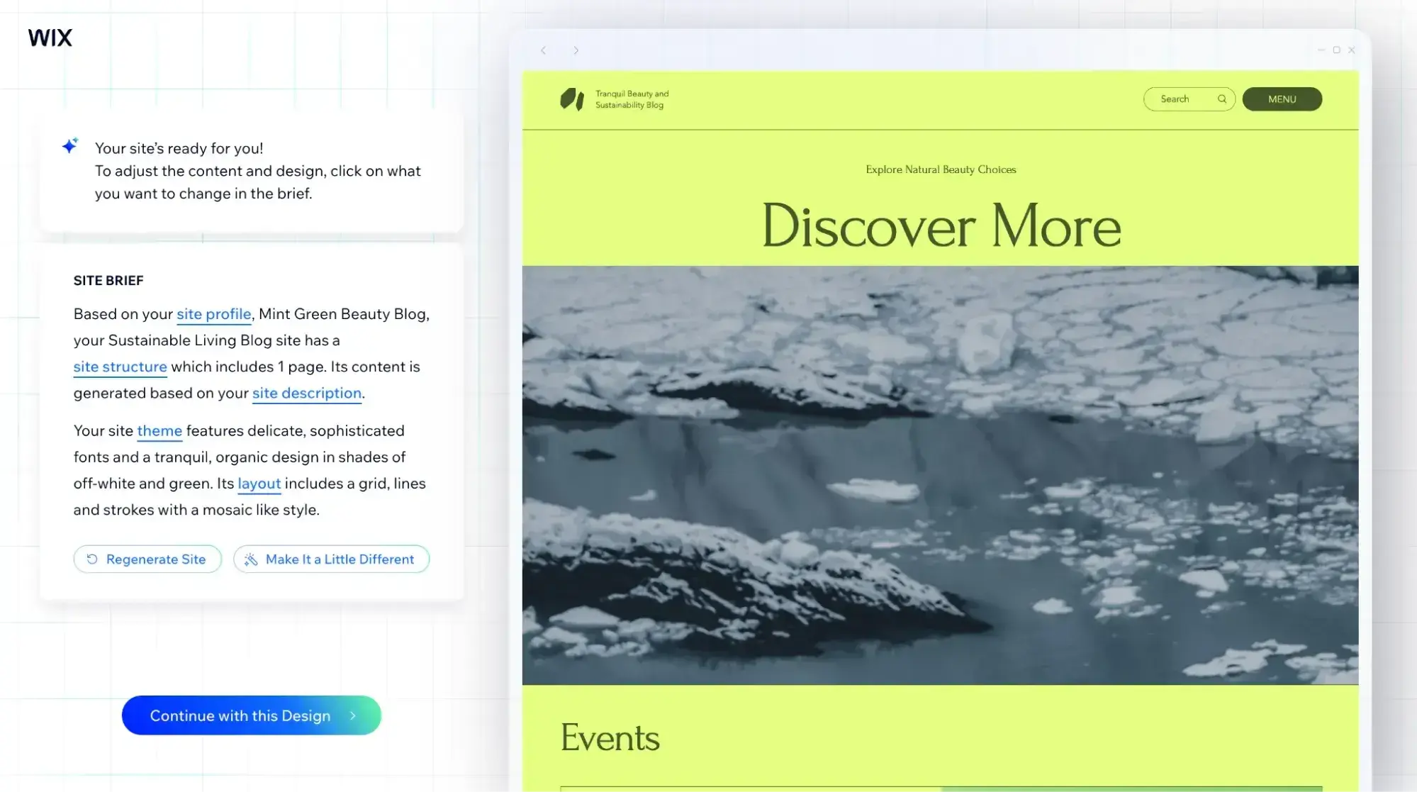
Melting glaciers and a neon green background don’t exactly convey “beauty blog.”
So, now that it’s February 2025, I was curious: Has Wix’s AI website builder gotten better? Let’s find out!
I used basically the same prompts Rigby used when she tried it out in October last year. And here’s what Wix AI website builder gave me:
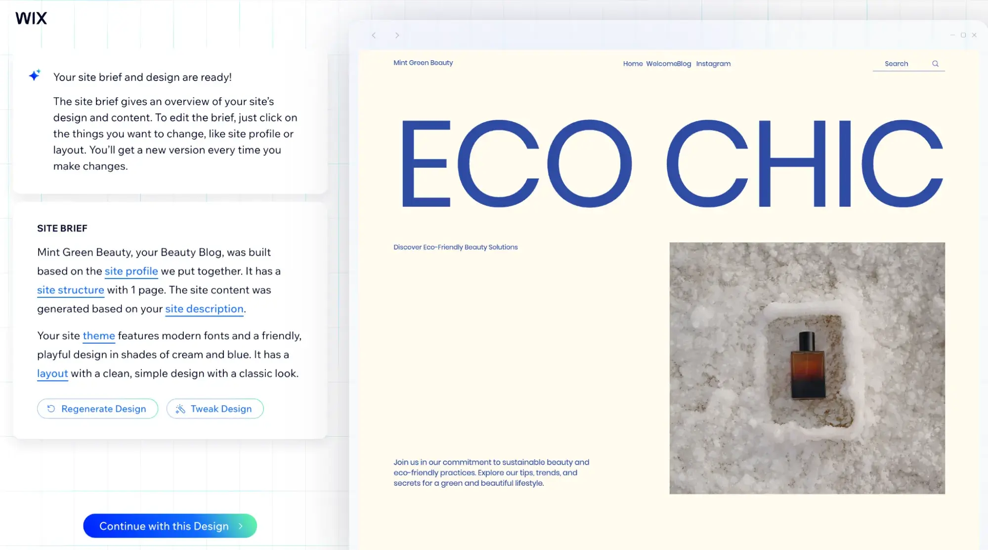
I think it’s much better! Here’s the full homepage:
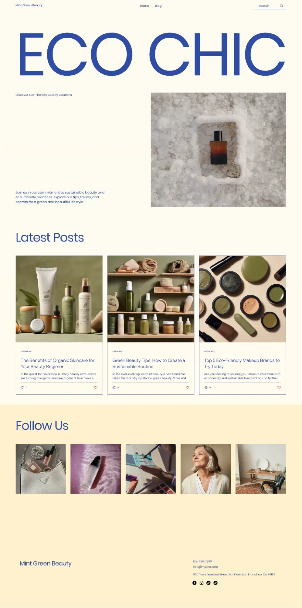
This time around, Wix AI generated a website with product images relevant to the website I described. A big improvement! However, I’d still make tweaks to the layout using the drag-and-drop website builder if I wanted to move forward with this.
Pro tip: If you’re going to use AI to build a website from scratch, I recommend including as much detail as possible in the prompts. Generative AI’s outputs are often only as good as our inputs, so getting good at prompting is crucial to getting an outcome you like.
Though it still has its quirks, AI usage is quickly growing in the web design world. According to HubSpot original research from 2023, 93% of web designers surveyed said they had used an AI tool to help with web design in the past three months. And of those, half of them had used AI for generating full webpage designs.
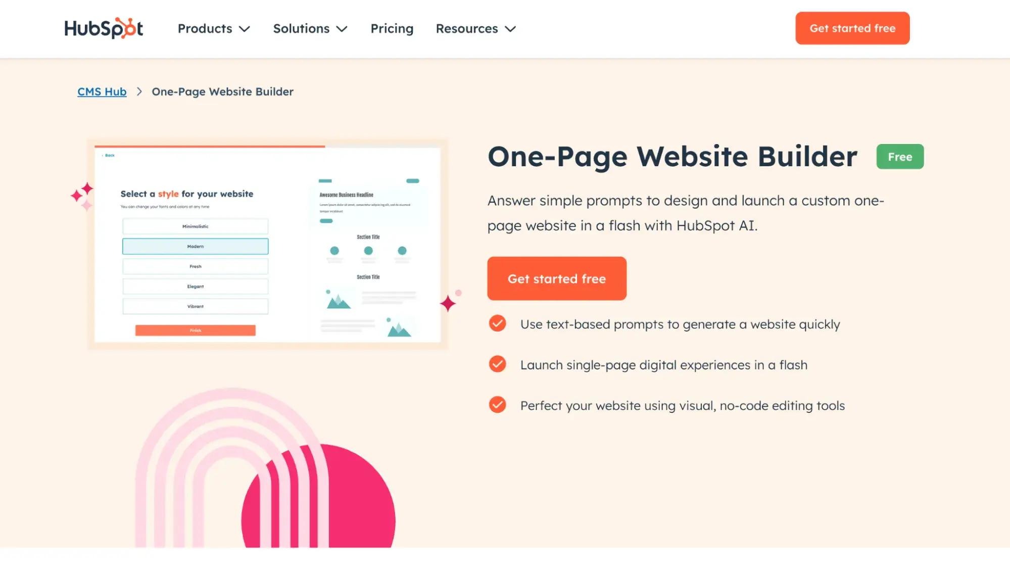
Try it for free: Build a one-page website for your business in minutes with HubSpot’s free AI website builder.
Cost to Build a Website from Scratch
Building a website from scratch can cost literally anywhere from roughly 20 bucks a month with a website builder to $50,000 if you hire an agency to build a custom, complex site. It all depends on a few factors:
- Are you building it yourself, or are you hiring someone else?
- If you're hiring someone else, is it a freelancer or a full-service web design agency?
- Are you creating the content (text, images, videos) for the website, or are you outsourcing content creation?
- Are you working from a website template, or do you want a fully custom-built site?
- Is it a simple five-page portfolio site or a more complex ecommerce site with hundreds of listings?
For each of the above questions, the latter part will add to your costs. The cheapest way, by far, is to use a website builder and DIY. For example, Wix plans start at $17/month.
If you want to outsource to a developer and are curious about the cost, GoodFirms surveyed over 100 web development companies and found the following costs of building a website:
- Simple business website (5-10 pages): $1,000-$15,000
- Mid-range business website (10-20 pages and basic ecommerce features): $15,000-$30,000
- Complex business website (20+ pages and advanced ecommerce features): $30,000-$50,000
Common Mistakes When Building a Website from Scratch
1. Adding too much to your website, making it look crowded.
According to GoodFirms, 84.6% of web designers say that a crowded web design is actually the number one web design mistake that SMBs make. So I wanted to start here.
To avoid creating a crowded website, master the art of whitespace. Resist the urge to fill every area of your website just because you can. If you try to do too much on each webpage, it’s distracting and could hurt conversions because your visitors won’t know where to focus.
Whitespace does not mean it has to be white. It can be any negative space in your design. Here’s an example of whitespace done wonderfully.
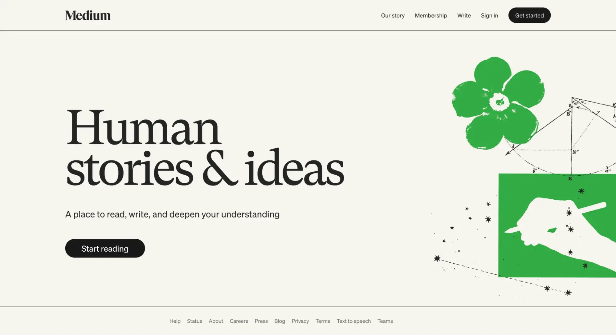
Notice how Medium used minimal text and imagery on its homepage. The green graphics on the right aren’t pushed closer toward the words. Instead, there is space — and lots of it.
What I like: Medium’s intentional design choice lets the webpage “breathe” and helps me as the visitor focus on what matters most: the brief explanation of what Medium is and the CTA buttons urging me to “Start reading” and “Get started.”
2. Failing to make your site accessible.
Sometimes, you might get excited about a certain color combination because it looks aesthetically pleasing to you. But if you choose, say, white text over a turquoise background, there isn’t enough color contrast for people with visual impairments to read it easily.
That’s just one example of an accessibility issue. Web design is also about designing for the user experience, taking into account that users come from all sorts of backgrounds and abilities.
So, what can you do? In the example I just gave about color contrast, you can test your site using free tools such as AudioEye. In the example below, AudioEye tells me that my white-text-on-turquoise-background combination does not meet WCAG standards.
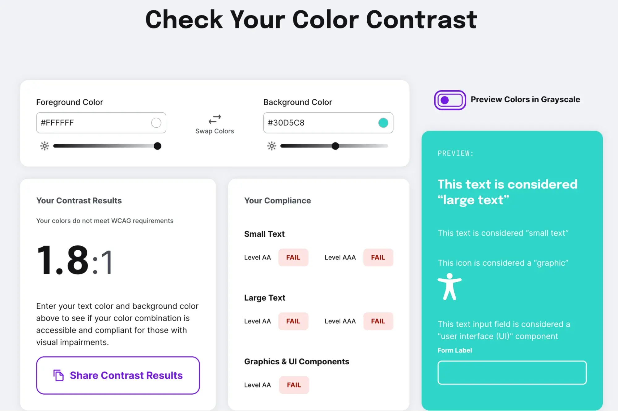
What I like: The AudioEye tool is extremely easy to use. All I had to do was pop in the color codes of the colors I was going to use on my webpage, and it instantly generated a preview, results, and a breakdown of my compliance.
You can also read more in our detailed guide on web accessibility.
3. Prioritizing aesthetics over performance.
Similar to the previous website mistake, it’s common for non-designers to fall in love with a flashy animation or a snazzy video and want to include that design element on their site without thinking about functionality or website performance.
The more media you add to your website, especially large image or video files, the “heavier” the site becomes. And the heavier the site is, the slower it loads.
A fast page speed helps users and boosts your SEO efforts. So, don’t neglect website performance when designing your site.
To ensure your website performs at its best, run it through a tool like Website Grader. Just enter your URL, and you’ll get a detailed report on your website’s performance and what you can do to improve it.
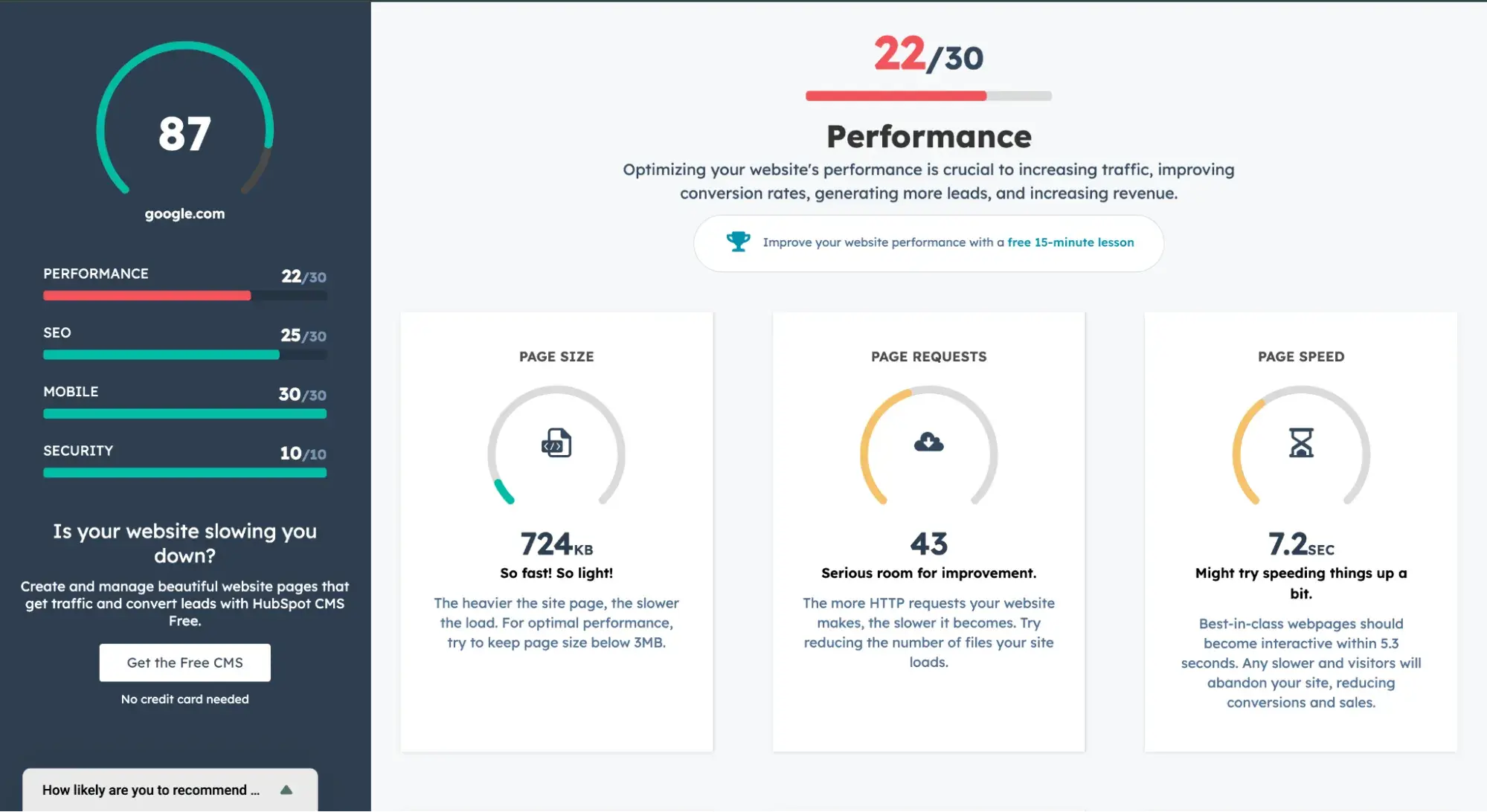
What I like: While I do find Google PageSpeed Insights super useful for assessing performance, it can take a long time to load and can be overwhelming with its many lines of suggestions.
Website Grader is quicker, and its UI is more engaging. This makes it easy for me to quickly get a snapshot of what works for my website and what needs improvement.
Now you can build a website from scratch.
Starting from scratch with a website can feel intimidating. However, the best way to learn how to build a website from scratch is to roll up your sleeves and dive into the process.
I’ve made (and still make) plenty of mistakes when creating websites. But, each mistake is a learning experience that makes me more capable and my websites better. These steps are a great way to put structure around your process to minimize time delays while you learn.
Editor's note: This post was originally published in October 2024 and has been updated for comprehensiveness.






![How to make a website with user accounts and profiles [with WordPress, Wix, and more]](https://53.fs1.hubspotusercontent-na1.net/hubfs/53/%5BUse%20(3).webp)
![How to build a Google Site that looks good and drives business [templates & examples]](https://53.fs1.hubspotusercontent-na1.net/hubfs/53/Website%20Redesign%20Terms.png)

