Avada Theme offers all of this — customization, simple navigation, pre-built websites that can be uploaded in one click, and more. In this post, we’ll take a closer look at this theme’s features. Then, we’ll check out some of the best websites that have been built with Avada.
Avada is appealing because it's easy for beginners to use (with no coding knowledge required), yet flexible enough for professionals to customize.
You can build custom content layouts, customize the styling, choose from a library of Font Awesome fonts, upload custom fonts, and upload images to sliders and other graphical elements. To save time, you can also build your WordPress website by starting with one of the pre-built websites they provide and making adjustments.
Avada Theme Features
Avada has many features that will allow you to build a website to suit your brand. A WooCommerce integration means you can offer an online shop, while image sliders create an attractive way to display content. You can start a blog, share event information, or even add Google Maps to help users find your brick-and-mortar location.
Here's a deep dive into some of Avada's most popular features.
Live Editing
Avada is a website builder that provides the ultimate design flexibility with its drag-and-drop visual interface. You will see your changes instantly as you design your website's content. You'll also have complete control with the live editor that allows you to interact with every design element and layout across your website. In addition, you can customize each page and post layout using the editor, providing excellent flexibility when designing website content.
Design Elements
There are over 120 design and layout elements with endless options to create dynamic, feature-rich content. All you have to do is choose which design element you'd like on your page, click and drag it into place, and customize it to your liking.
You'll have many options among the various pre-built websites, pages, posts, portfolios, images, sliders, widgets, and more. You can quickly import any of the 80+ pre-built websites with a couple of clicks. Plus, you can uninstall specific elements from your site. Avada is also responsive across all devices, so all of your design elements will look great on smartphones, tablets, laptops, and desktops.
Ecommerce
Besides being fully integrated with WooCommerce, Avada also includes a WooCommerce Store Builder allowing you to create an online store and start promoting or selling with Avada right away.
Avada Theme Examples
To get a good idea of just how versatile, attractive, and functional the Avada theme is, here are several websites in different industries to show you that the sky really is the limit with this theme.
1. Saddleback Rider Training

An attractive slider menu paired with bold fonts adorn the Saddleback Rider Training website. The orange and black color scheme makes the experience dramatic, and the clean full-width sections add a sleek feel to the site. This theme is perfect for the individual who’s interested in a daring display of the content on their website.
2. Taktik
Taktik, a French employment agency, uses the Avada theme in a unique way. At the top of the site, they set up a "create your own adventure" of sorts where the website user can identify themselves based on which scenario best describes them: a job seeker or an employer. By making this selection, they are then served an experience tailored to their unique needs. This interface is served up before the top menu and the rest of the homepage, indicating to the reader that Taktik cares about the visitor more than themselves.
3. Manny & Me

Manny & Me is a nanny agency that helps families connect with qualified teachers, tutors, and nannies. In this case, Avada is used to layout bold full-width sections along with clear CTA buttons to guide the user through the site.
This theme is great for business owners who operate their website as a marketplace but prefer to make the experience more personal for their users by connecting vendors to customers on a one-on-one basis.
4. Cobham River Lodge

Cobham River Lodge makes full use of Avada's features to break up information visually. The homepage includes accordion FAQ boxes to conceal lengthy content, counter-style elements to emphasize statistics, and a large footer to house resources and navigation.
If your website will be home to a considerable amount of content, but you want to keep your site architecture relatively flat, the Cobham River Lodge is a great source of inspiration.
5. Russell Brand

Russel Brand's Avada website uses large style graphics and full-width sections in a neutral color format. The nav menu is simple text paired with links to social media sites to encourage further connection. This example of an Avada website shows the versatility it offers for creating a portfolio website.
6. Eruption Group

Eruption's homepage breaks out of the typical static layout with creative text alignment and vertical graphics. What's most impressive is the use of animated typography on the main headline. Below that is a vertical timeline that helps display content concisely with buttons that lead the reader to more in-depth pages. You’ll like the structure of this site if you want visual elements to compliment the copy on your website.
7. Glace Paysanne

Glace Paysanne is an ice cream and dessert company that plays with white space and colorful images and text to highlight their products. The sticky menu at the top is the most prominent Avada feature while a button in the top right corner calls the website visitor to action.
If converting customers on the homepage is important for your business, use Glace Paysanne as a muse for your design.
8. Goroo

Goroo makes custom car mats and showcases their product in a video on the front page. The rest of the homepage uses simple copy paired with lazy load images to provide eye-catching movement. In addition, Goroo doubles down on the gallery-type feature to showcase the different product options they offer.
What makes this Avada website unique is the fact that it only has a few pages — most of the content is contained on the homepage. This makes website navigation easier for the visitor by guiding them to only a few places where they’ll likely convert on a CTA.
9. Emprunte Mon Toutou

This site uses Avada to display a wide banner image at the top of the page which contrasts against the full-screen image. The homepage also uses comparison boxes that highlight their points as the user scrolls to the bottom of the page to find the footer. As the user journeys through the content, the menu at the top stays sticky to make navigation easier.
10. Panda Paper Roll

Panda Paper Roll, a paper products company for cash registers and kiosks, uses a number of Avada elements to showcase their experience, including the mileage-style widget for displaying statistics, a social media bar above their top menu, and a scrolling client menu. Toward the bottom of the homepage, you’ll find quick links and hot categories that visitors can use to navigate to the topics that are important to them.
11. Moni Design
 Moni Design is a graphic design and internet marketing agency. The Avada theme allows Moni Design to clearly organize its content in a vivid and colorful layout. The site features a video background with parallax scrolling to capture users' attention.
Avada's new footer builder feature is on display here, too — Moni Design is wisely using the footer to provide links to all of its social media links. The balance between the video background at the top and the footer links at the bottom creates an engaging user experience that won’t be interrupted by a full menu at the top of the screen.
12. Spohn Design
 Spohn Design is a boutique graphic design firm. They use the Avada theme to create a clean, eye-catching homepage with simple, clear navigation. Users get the wow-factor from the image banner, but the theme's style isn't overly complex or overwhelming. The crisp imagery on this site makes these features pop, so if you’re considering modeling this website, eye-catching graphics might be worth the investment.
13. Heavenly Blooms
 Heavenly Blooms is a floral arrangement company. As you scroll down the front page, you'll notice parallax scrolling in full effect. Avada's photo gallery elements come into play, too, making it easy for the company to display its portfolio highlights. Minimal copy and beautiful visuals bring this site to life, so keep that in mind if you want a similar outcome for your Avada Theme website.
14. Green Leaf Cleaners
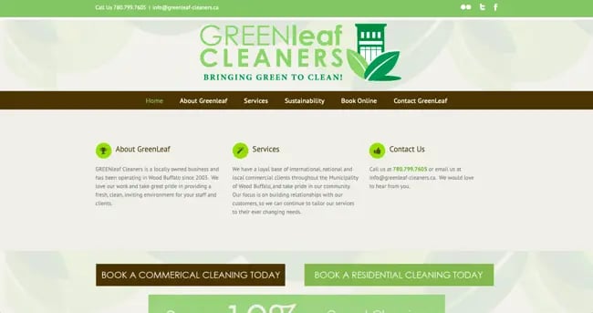
Green Leaf Cleaners is an eco-friendly cleaning company. The Avada theme makes this simple website easy to navigate, so any potential client can quickly find the cleaning services or contact information they need. This layout works well for businesses that have a primary goal of acquiring new customers through its website.
15. Graphictwister
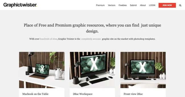
Graphictwister offers graphic design services, so it is only right that it has a crisp, clean, attractive website. It makes the most of the Avada theme's grid layout options to display examples of its services. The grid layout helps organize similar content on the site without confusing visitors as they browse.
16. RedBag Media
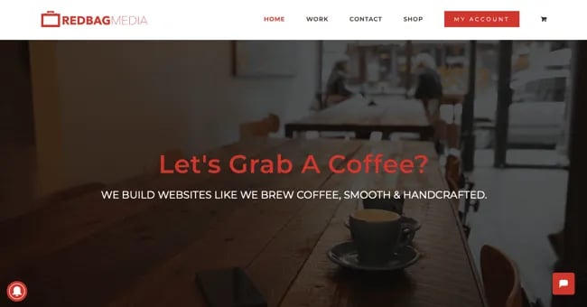
RedBag Media offers web graphics, brandings, and videos. This website features parallax scrolling to capture users' attention, then leads into a grid layout featuring examples of the company's work. The page then ends with Avada theme's contact form to encourage users to get in touch. As an agency or a freelancer, you’ll get to showcase your work and drive consultations with a layout like RedBag Media’s.
17. LittleBig Bikes
 LittleBig Bikes uses the Avada theme to integrate its social media posts on the homepage. Their site also includes an online shop and a slider with testimonials. The footer includes award badges, a newsletter signup form, and three columns of navigation. The graphic chart displaying recommendations for bikes by age group communicates information that would normally take up a lot of space on the page, making for an engaging feature that keeps users on the page.
18. University of Hawaii Maui College

The University of Hawaii Maui College website features a video background with a call-to-action button in the center. Further down the page, the content is separated into columns. The Avada theme also provides a robust footer, which includes quick links, resources for students, contact information, and even a campus map.
19. Charter Bay Homes

The Charter Bay Homes website uses the Avada theme to display an eye-catching banner image that easily directs site visitors to what they’re looking for with an organized navigation bar. Testimonials toward the bottom of the page blend in seamlessly with the content about the quality of a Charter Bay Home.
This implementation of the Avada Theme is text-heavy, but with the right fonts and a beautiful selection of imagery, your site could function just as well.
20. RankPay

RankPay, an SEO services website, features a front-and-center search bar and concise navigation right off the bat. As you scroll, there are various image effects that grab the users' attention and direct eyes toward the large call-to-action buttons. The flat design is inviting and easy to read through which makes it a smart choice for business owners who need to explain complex concepts easily on their site.
21. Gabrielle Vermeij Design
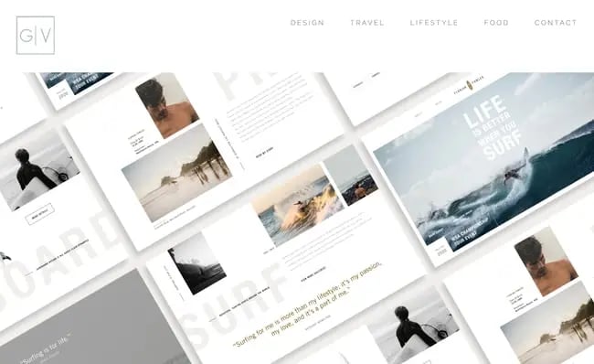
With any design and photography website, you want your work displayed clearly and beautifully. The Avada theme can do this as well, as evidenced by Gabrielle Vermeij's minimalist website that puts the focus on the designer's work. As you scroll down, the portfolio is segmented into different sections on the page, all leading to a footer with a contact button.
22. Pump Fitness

California-based Pump Fitness offers custom personal training regiments, massage therapy, and a pleasant browsing experience thanks to their Avada WordPress site. Its pages implement parallax scrolling combined with high-res images to clearly establish the gym's benefits and expertise.
23. iQuarters

Operating out of New York, New Jersey, and Connecticut, iQuarters brings automation solutions to homeowners around the globe. The website uses Avada theme to bring a sleek, modern appearance to two of its biggest features: smart home audio and smart home lighting. The sticky menu at the top of the page stays with the reader as they peruse the site, giving them a quick way to explore the website further.
iQuarters caters to in-home and enterprise customers, so they’ve done quite a bit of customization for both audiences. If your business operates similarly, bookmark this site to reference for your website design.
24. Simple Logic

Simple Logic uses the Avada theme to create an action-oriented user experience on their website. This website design agency features a hero image with two prominent calls to action — one invites visitors to get a quote and the other to check out the agency’s portfolio. A third CTA rests in the top right corner of the page offering a free web audit.
No matter where a visitor goes on the site, they’ll have an opportunity to get in touch with an agent or receive some information about working with the agency.
25. Yellow Marine Consultancy
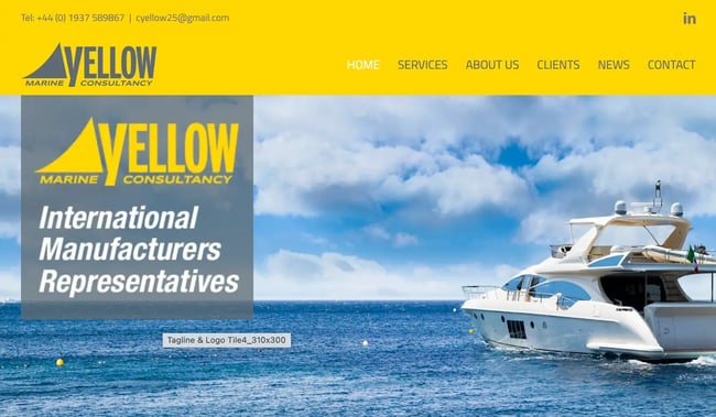
Bold colors, bright visuals, and a lot of contrast make this Avada Theme website a ray of inspiration for any site design. The social media icon for LinkedIn is placed in the top right corner making it visible and accessible as the only social media button on the homepage. As a freelance consultant, you’ll enjoy the professional appeal of this design along with the easy-to-navigate menu.
26. Word Candy

WordCandy helps online businesses create copy, content, and user documentation. The way this company has designed its website using the Avada Theme helps bring its own copy to the forefront. The light-colored text against the dark blue background gives this site the contrast it needs to draw attention to CTAs, featured work, and testimonials.
27. Spirit Halloween
 Spirit Halloween is a popular Halloween store that offers costumes, accessories, and decorations to help people celebrate the spooky season. Spirit uses Avada to create a well-organized layout and intuitive navigation, making it easy for customers to find exactly what they're looking for
28. Visual Studio
 Visual Studio is a powerful integrated development environment (IDE) used by programmers. Using Avada to create its intuitive navigation and visually appealing layout, the design reflects the efficiency and professionalism that developers can expect from Visual Studio, fostering trust and credibility in the software development community.
29. Seagate Blog

Seagate Blog provides insights, news, and resources for data storage solutions and technology. Its website design uses the Avada theme to display a straightforward aesthetic, reflecting the company's approach toward data storage.
30. Systems Research on X
 Systems Research on X is a group of researchers in the Computer Science & Engineering Department at the University of South Carolina. This website uses Avada theme to display various information about the group while highlighting different projects through its rotating images.
Find Out If Avada Is Right For You
The Avada theme for WordPress functions well on just about any type of website. Whether you want to display a portfolio, offer services to clients, or sell unique products, Avada can be customized to fit your needs.
Plus, Avada's advanced features and design elements mean your website will stand out from the crowd, and its simple theme builder will make it easy for you to create the website of your dreams. Try Avada out for yourself to see just how this WordPress theme can work for you.
Editor's note: This post was originally published in February 2020 and has been updated for comprehensiveness.
Wordpress Themes





.jpg)